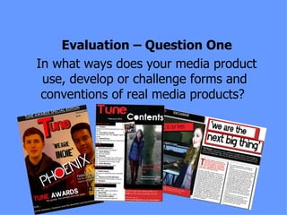
The document analyzes the forms and conventions used in the design of two music magazines, "Tune" and "NME". Both magazines use similar conventions like drop quotes to engage readers, color schemes for branding, and bold artist names for navigation. They differ in elements like masthead placement, number of headlines, and additional band information. The contents pages also share similarities in mastheads and images but differ in additional details and layout. Article layouts across double page spreads employ some shared techniques but vary in elements like quotes, images, and column structure.


