Evaluation By Sean Golding
1) In what way does your media product use, develop or challenge forms and conventions of real media products? The genre I have chosen for my project is the music magazine. I have followed the basic magazine conventions by: At the top of my page in big I have the title of my magazine which is Metal Head.  I have a picture of two people at the front of the magazine using direct address and looking at the camera, this picture is my main article as well and it is in the middle of the page.  The colour of my font reflects the genre of music my magazine which is rock/Metal and the colour of the heading is White and mainly Black. I have a list of my Magazines main articles next to my picture. I have challenged the basic conventions of the music magazine by: I have place the barcode at the side of the page rather then at the bottom I have on listed the name of the bands down the side not the articles this is to attract the audience specially for these bands The band members on the front of the page are wearing T shirts from another band this is to show who their inspirations where. It was vital to stick to the main conventions of magazines because it was a  familiar layout for the audience and they like the familiar. It was vital as well  though to change the magazine a bit too because if it was completely the  same it would be boring and look the same as the other magazines so nobody  would buy it. I feel listing the names of all the bands in my magazine worked  best because after people filled out my questionnaire r out of 6 people said  they wanted to read on because of the bands listed on the front. The fonts  I have used on my magazines front cover suites the genre perfectly with its  creepy rocky feel and it balances well with the background colour behind it.  The main magazine that influenced my magazine was Metal Hammer magazine, which is a rock/metal magazine I based my layout around.
2) How does your media product represent particular social groups. The social group my product is aimed at is young adult Moshers. It represents them as scary looking people that don’t care about anything other then dark music. They wear mainly black T shirts with a hoody over it and black/ dark blue jeans. In their speech they swear a lot so they don’t seem like nice people. These stereotypes I have used in my magazine fit today's stereotypical mosher. I have represented them in the photographs like this because my main audience is going to be the stereotypical moshers, and in order for my magazine to appeal to them I need to give them band members that they can relate to. The only thing id change about these pictures would be the back ground.
3)What kind of media institution might publish your media product and why . My magazine would be published and funded by Dennis publishing because it is similar to their best selling magazine Metal Hammer and it consists of famous bands with big fan bases. Also on a questionnaire I asked 6 people does the front cover make you want to read on?(answers on graph) The publisher will know he is going to make a product with my magazine because of all the famous bands and it is a similar magazine to Metal Hammer.
4) Who would be the audience for your media product. The main audience group for my audience would be  Male aged 15-24 who have an interest in rock/metal  music. This is a good target audience because at this  age people have a lot of pocket money because of  part time jobs and don’t need to spend on family and  food. There is a lot of people that listen to rock music  to it has a mass of customers. My secondary target  would be the same age group but for women now  that more are getting involved in rock bands. My magazine gained a very positive feedback from my target audience because all of them wanted   to read on. Also 4 out of 6 people said they enjoyed reading my main article but 2 people said it was too pointed.   Dave Murray Iron Maidens Guitarist Tarja Turunen Ex-singer for Nightwish
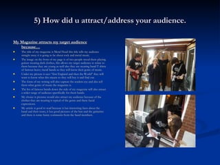
5) How did u attract/address your audience. My Magazine attracts my target audience because… The title of my magazine is Metal Head this title tells my audience straight away it is going to be about rock and metal music. The image on the front of my page is of two people stood there playing guitars wearing dark clothes, this allows my target audience to relate to them because they are young as well also they are wearing band T shirts of famous heavy metal bands so they will know their genre of music. Under my picture it says “first England and then the World” they will want to know what this means so they will buy it and find out. The fonts of my writing will also capture the readers eye and also tell them what genre of music the magazine is. The list of famous bands down the side of my magazine will also attract a wider range of audience specifically for them bands. My choice is pictures would also attract my audience because of the clothes they are wearing is typical of the genre and there facial expressions. My article is good to read because it has interesting facts about the band and their tours, it has good pictures of the ban and the guitarists and there is some funny comments from the band members.
6)What have you learnt about technologies from the process of constructing this product? From completing this project I have learnt a lot such as... How to use a stills camera properly How to edit photos in photo shop Most common bands in rock/metal magazines Who the publish of Metal Hammer magazines is Use a blog properly Good websites to go on for research Typical conventions of a magazine How to use an apple Macs better   Problems I have found with the technology is, using the cut out tool in photo shop is very tedious and difficult to cut around hair and others without including the background in the picture. Apple Macs are also difficult to use for beginners but they do the job much better.
My preliminary Task
My final product
7) Looking back at your preliminary task, what do you feel you have learnt in the progression from it or the final product? A lot has improved from my preliminary task to my final product such as… My heading is interesting to look at which I created, but in the prelim its just a boring mix of fonts. My picture is much better quality and there is more going on in it so it is a lot more interesting to look at. The font stands out a lot more now and suites the genre. The colour scheme works together a lot better with the red, white and black. The cropping on my pictures is a lot neater because I got used to using the tool The magazines layout looks better because I know the genre of magazine pretty well. The facial expressions of my shots suite the genre much more then it did in the prelim. The props and clothing I used in my real worked a lot better too
Conclusion Overall I think that I have made a good product and improved a lot from the preliminary.  I think my best part was the contents page because, the heading of the magazine is very eye catching and it sums up what genre of music the magazine is going to be about, I have chosen a good picture for the front cover because it suites the genre with their clothing, hair style and the guitars, also their facial expressions suite the genre.  I think listing the names of all the bands in the magazine worked well because they are famous bands and will attract people who enjoy their music. I feel the main problem with my magazine was the settings of the pictures I took, the lighting was rubbish and made it difficult to cut my pictures out properly, also my article was too opinionated as said by two people who filled out my questionnaire. I think in the main article I asked some good music related questions and came up with some true and humorous answers.   Looking at the front page id say it is close to Metal Hammer standard of layout and pictures but…looking at my main article its not as close to the real thing but is still good.

Coursework Evaluation Sean Golding

  • 1.
  • 2.
    1) In whatway does your media product use, develop or challenge forms and conventions of real media products? The genre I have chosen for my project is the music magazine. I have followed the basic magazine conventions by: At the top of my page in big I have the title of my magazine which is Metal Head. I have a picture of two people at the front of the magazine using direct address and looking at the camera, this picture is my main article as well and it is in the middle of the page. The colour of my font reflects the genre of music my magazine which is rock/Metal and the colour of the heading is White and mainly Black. I have a list of my Magazines main articles next to my picture. I have challenged the basic conventions of the music magazine by: I have place the barcode at the side of the page rather then at the bottom I have on listed the name of the bands down the side not the articles this is to attract the audience specially for these bands The band members on the front of the page are wearing T shirts from another band this is to show who their inspirations where. It was vital to stick to the main conventions of magazines because it was a familiar layout for the audience and they like the familiar. It was vital as well though to change the magazine a bit too because if it was completely the same it would be boring and look the same as the other magazines so nobody would buy it. I feel listing the names of all the bands in my magazine worked best because after people filled out my questionnaire r out of 6 people said they wanted to read on because of the bands listed on the front. The fonts I have used on my magazines front cover suites the genre perfectly with its creepy rocky feel and it balances well with the background colour behind it. The main magazine that influenced my magazine was Metal Hammer magazine, which is a rock/metal magazine I based my layout around.
  • 3.
    2) How doesyour media product represent particular social groups. The social group my product is aimed at is young adult Moshers. It represents them as scary looking people that don’t care about anything other then dark music. They wear mainly black T shirts with a hoody over it and black/ dark blue jeans. In their speech they swear a lot so they don’t seem like nice people. These stereotypes I have used in my magazine fit today's stereotypical mosher. I have represented them in the photographs like this because my main audience is going to be the stereotypical moshers, and in order for my magazine to appeal to them I need to give them band members that they can relate to. The only thing id change about these pictures would be the back ground.
  • 4.
    3)What kind ofmedia institution might publish your media product and why . My magazine would be published and funded by Dennis publishing because it is similar to their best selling magazine Metal Hammer and it consists of famous bands with big fan bases. Also on a questionnaire I asked 6 people does the front cover make you want to read on?(answers on graph) The publisher will know he is going to make a product with my magazine because of all the famous bands and it is a similar magazine to Metal Hammer.
  • 5.
    4) Who wouldbe the audience for your media product. The main audience group for my audience would be Male aged 15-24 who have an interest in rock/metal music. This is a good target audience because at this age people have a lot of pocket money because of part time jobs and don’t need to spend on family and food. There is a lot of people that listen to rock music to it has a mass of customers. My secondary target would be the same age group but for women now that more are getting involved in rock bands. My magazine gained a very positive feedback from my target audience because all of them wanted to read on. Also 4 out of 6 people said they enjoyed reading my main article but 2 people said it was too pointed. Dave Murray Iron Maidens Guitarist Tarja Turunen Ex-singer for Nightwish
  • 6.
    5) How didu attract/address your audience. My Magazine attracts my target audience because… The title of my magazine is Metal Head this title tells my audience straight away it is going to be about rock and metal music. The image on the front of my page is of two people stood there playing guitars wearing dark clothes, this allows my target audience to relate to them because they are young as well also they are wearing band T shirts of famous heavy metal bands so they will know their genre of music. Under my picture it says “first England and then the World” they will want to know what this means so they will buy it and find out. The fonts of my writing will also capture the readers eye and also tell them what genre of music the magazine is. The list of famous bands down the side of my magazine will also attract a wider range of audience specifically for them bands. My choice is pictures would also attract my audience because of the clothes they are wearing is typical of the genre and there facial expressions. My article is good to read because it has interesting facts about the band and their tours, it has good pictures of the ban and the guitarists and there is some funny comments from the band members.
  • 7.
    6)What have youlearnt about technologies from the process of constructing this product? From completing this project I have learnt a lot such as... How to use a stills camera properly How to edit photos in photo shop Most common bands in rock/metal magazines Who the publish of Metal Hammer magazines is Use a blog properly Good websites to go on for research Typical conventions of a magazine How to use an apple Macs better Problems I have found with the technology is, using the cut out tool in photo shop is very tedious and difficult to cut around hair and others without including the background in the picture. Apple Macs are also difficult to use for beginners but they do the job much better.
  • 8.
  • 9.
  • 10.
    7) Looking backat your preliminary task, what do you feel you have learnt in the progression from it or the final product? A lot has improved from my preliminary task to my final product such as… My heading is interesting to look at which I created, but in the prelim its just a boring mix of fonts. My picture is much better quality and there is more going on in it so it is a lot more interesting to look at. The font stands out a lot more now and suites the genre. The colour scheme works together a lot better with the red, white and black. The cropping on my pictures is a lot neater because I got used to using the tool The magazines layout looks better because I know the genre of magazine pretty well. The facial expressions of my shots suite the genre much more then it did in the prelim. The props and clothing I used in my real worked a lot better too
  • 11.
    Conclusion Overall Ithink that I have made a good product and improved a lot from the preliminary. I think my best part was the contents page because, the heading of the magazine is very eye catching and it sums up what genre of music the magazine is going to be about, I have chosen a good picture for the front cover because it suites the genre with their clothing, hair style and the guitars, also their facial expressions suite the genre. I think listing the names of all the bands in the magazine worked well because they are famous bands and will attract people who enjoy their music. I feel the main problem with my magazine was the settings of the pictures I took, the lighting was rubbish and made it difficult to cut my pictures out properly, also my article was too opinionated as said by two people who filled out my questionnaire. I think in the main article I asked some good music related questions and came up with some true and humorous answers. Looking at the front page id say it is close to Metal Hammer standard of layout and pictures but…looking at my main article its not as close to the real thing but is still good.