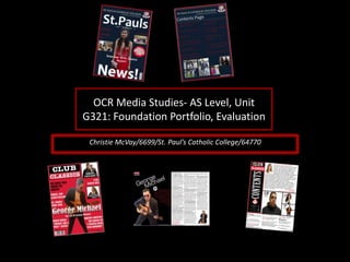
SlideShare a Scribd company logo
1 of 12
OCR Media Studies- AS Level, Unit
G321: Foundation Portfolio, Evaluation
Christie McVay/6699/St. Paul’s Catholic College/64770
In what ways does your Media product use, develop or challenge
forms and conventions of real media products?
The magazine across the 4-pages, ‘repeats’ (Steve Neale) codes and conventions from ‘Classic Pop’ so that
it adds a more realistic style because classic pop is a official, popular magazine with a significant amount
of followers. This is why I thought it would be a good idea to repeat some of their conventions because I
know they are very successful. Therefore there is a clear similarity between my magazine, ‘Club Classics’
and ‘Classic Pop’ in terms of the layout, colour scheme, design and even down to the name.
First of all this is my front page, For my front cover I have done some of the basic conventions that make a
magazine a magazine so; barcode, date, price, issue number, a unique selling point, main image, cover
lines, masthead, strapline.
First of all, both include ‘Classic’ in the masthead as I wanted to follow the theme and appeal to a similar
audience of an older generation. From the comparisons you can denote that I have used, like ‘Classic Pop’
the red background. This was an important feature for me as the back ground in the magazine I am
inspiring my magazine to look like is very eye catching, which has made it sell. So, I copied it to have the
same effect. Also, I have kept the same position of the masthead to make it more realistic and even more
similar. The next main convention is the main headline, as you can denote in ‘Classic Pop’ they have got
the text in white in the bottom center of the screen on top of the main image layer. It is bold and spreads
across one end to the other which is what I tried to replicate in my magazine with ‘George Michael’.
Next I worked on my contents page, this page, likewise with the front cover, I have also tried to replicate
and adapt my work around my magazine of inspiration and my plans for my magazine. in ‘Classic Pop’ they
have made their contents page to look like there are big square images and then by the side of the page
there is a red panel with there log and masthead with information about there social media pages
I have noticed this and decided it would be a good idea to do it as well because I wanted to really ethicise
that I want to have a certain look and theme to my magazine. So this is why I have got less writing then
pictures for example.
The final piece of the work was the double page spread. For this page in ‘Classic Pop’ what they did was
have it over many pages and because it was based on Madonna, it was more about her life, success and
her top singles whereas in mine I needed to have an interview so out of all the pages I have down, this
was the one that looked the least like the magazine of inspiration but I still tried to incorporate aspects of
the magazine.
How does your media product represent particular social
groups?
My media product does not represent any current social groups that
people would see around today although, it does represent a previous
social group from a different decade. As my magazine is based around
the 80’s pop stars and styles, you do not see these sort of things
anymore but around 30 years ago you would of got a lot of people who
would wear and act the way that the celebrities of the 80’s would; hair
styles, clothing, colours etc. If people nowadays did this, it would be
very extreme in the society we are in today. The aim for my magazine
was not to do a new fresh now theme but instead a theme no one
would pick because it is a magazine that is less. The reason that 80s
themed magazines are made is to celebrate and reminisce on the
times, not to represent a social group of the now.
What kind of media institution (Publisher) might distribute
your media product and why?
From the research that was completed pre-production, I would envisage that Anthem
Publishing may publish Club Classics because of the similarities of my magazine to
Classic Pop ‘signifies’ (De Saussure) their style of magazine and theme that they
have chosen to publish is almost a mirror image of my magazine. Not only are
Anthem Publishing the fasting growing British publishing company but they also
publish other magazines which would appeal to my audience, not just Classic Pop
but also, vintage rock, music tech, guitar and also a variety of baking magazines.
These magazines all dominantly appeal to the same type and age range of people
and my magazine would fit in perfectly along side this collection.
Who would be the audience for your media product and why?
Hartley’s seven subjectivities
According to Hartley, I would connote that my audience would be both male and female but I think that there would be a higher
percentage of female readers as opposed to male. Also, I would assume that my Club Classics magazine would have a more
mature, older audience who have lived through the 80’s, have got more knowledge/wisdom about life and have experienced
more in their lives would be more likely to buy my magazine more than any other age group. In terms of class, I think that
the audience will be middle class-upper class due to the fact that they would be able to afford to buy the magazine and will
be able to enjoy reading it because they had a good fun like during that decade because they had the money to and
therefore wouldn’t mind purchasing the magazine. My audience will probably more English dominated in particular and if it
was sold across the world then countries like America and Australia and people of a white ethnicity would also be interested
in the magazine because the artist who are in the magazine are originated from them countries more than any other.
Katz’ Uses & Gratifications theory
According to Katz, my audience could build a personal relationship with the magazine as they can relate to the music taste and era
they the magazine is based in. the whole focus of the magazine is to make it look as inspired of the 80’s as possible and if
they notice this then they maybe can will feel like the magazine has been created by someone who is as passionate of the
80’s as they are. I think to build a ‘personal relationship’ with my audience is very important and I think all magazines
producers can agree that having this link with the audience will benefit both sides as the audience will get what they want of
a magazine but also producers will gain money from the audience and the closer they are with them and the more that the
audience feels like they can relate the better it'll be and the happier the audience.
Maslow’s Hierarchy of needs
According to Maslow’s hierarchy of needs I would say that my audience will be ‘social climbers’ this is because I feel that my
magazine is information to the people who like 80’s music and who have lived through that era but also the younger
generation as this magazine can teach them about the ‘Club Classics’ that were around. Not only does the older generation
like this music but also there is a small group of teens even that would find this appealing as they may have been brought up
around this style of music and grown up to like it so my magazine could give all my audience more information and if they
know all the information then it s just nice to look at and enjoy.
How did you attract/address your audience?
In order to attract my intended target audience I decided to create a magazine in the image and
likeness of ‘Classic Pop’. This is because there audience are the type of people I want to be
purchasing my magazine. I noticed that the magazine of inspiration has a certain look about it
and has a certain colour scheme and layout which I would like to repeat in my magazine to
attract the same audience. First of all my priority was to keep the colours of ‘Classic Pop’
constant throughout my magazine to make it eye catching and obvious the magazine I am trying
to portray. This is so that the audience can see the magazine straight away because it stands out
and they can relate it to the magazine they already like and buy and then will hopefully do the
same with mine.
Next I tried to attract my audience by having a photograph of ‘George Michael’ as the one and only
main image as it is clear in my magazine of inspiration (Classic Pop) that is the style they had
and use. By ‘Classic Pop’ having a main single image of a legend in 80’s music has meant that
the people who loved this artist will straight away been drawn towards the magazine so I
thought that it would be a good idea if I repeated this convention in order to have the same
effect on my target audience.
After I had done these crucial conventions I then noticed that there was a puff/promotion on the
front cover of ‘Classic Pop” magazine of posters of alternate bands and groups of the 80’s,
groups and bands that weren't as heard of but still were around and I think that the readers of
the magazine appreciated this because it wasn’t all about the mainstream artist but also the
less popular ones too. To entice my audience I felt that having the use of a puff/promotion
could be useful because its an add on to the magazine and is a free bee and that looks attractive
and gives that extra push to readers to purchase the magazine.
Finally, I felt like it would be very necessary to have an editorial to my magazine in the contents page
to really address my audience and make them feel like the editor of the magazine is just as
passionate about 80’s music as them so that the magazine is coming from someone that
genuinely enjoyed creating the magazine and wants to express and celebrate it.
What have you learnt about technologies from the process of
constructing this product?
In order for this product to look fit for purpose and appeal to the target audience, I decided to
create the product to look as similar as I could to ‘Classic Pop’ magazine so the conventions I
have done, the way they are laid out, the colours they are, the shapes they are are all done
for a reason. To create the effect of the words shaping themselves around the pictures I
used the pen tool to make the magazine look more authentic as I noticed that my ‘Classic
Pop’ does this so I also did this in my contents page with my editorial and editors picture.
However on the other hand with the front cover image I have done it so that the main
image has got the words going over it instead of the words going around it. This is done
again in my double page spread where ‘George Michael’s’ image has been surrounded with
words as opposed to being covered in words. As with ‘Classic Pop’ this is what they done so
I did it too. I felt that the more I edited it and used specific tools the more real it would look
and more appeal it would look to my audience.
Another tool that was crucial in this production work was the shape tool, my magazine has a lot
of blocks and lines in it to make it look more bold and dramatic. All along I was going to have
a bright red back ground for the front page and stick to the red, blacks and whites like my
magazine of inspiration has and also have a big bold block on my contents page because this
was a big part of the contents page that if I didn’t have replicated, it wouldn't look as good.
However my latest edit was the lines over the contents page around the images and the
white blocks behind the images in the front page and then a black strip around it. I did this
to add to the dramatic and exciting look of the magazine as my magazine of inspiration had
a lot of eye catching shapes with deep colours in them so I thought it would improve the
look of it if I did this.
Photography Planning – Front Cover
These are the original copy’s of my front cover images. These pictures are styled to look like a iconic
celebrity of the 80’s. the first picture is a meant to represent George Michael, the second is a meant
to represent Madonna and the last is a meant to represent Wham. I have got each person to pose in a
way that has been inspired of an image of the celebrity they are a meant to be. I chose these images
because they caught my attention the most when I was doing my research, especially with George
Michael and Madonna, I felt that they were the most powerful and eye catching ones, that would
attract the audience the most as they are the most dramatic.
Photography Planning - Contents
These are the contents
pictures before manipulation.
For this, I researched about
the artist around during the
80’s and then I researched
these individual artists and
looked at there iconic poses
that they have doe on front of
albums etc. This is the reason
why I have got; Leeza standing
with her hands crossed half
way across her face to
represent ‘Bjork’, Matt
representing ‘Prince’ I got him
to look to the side and I
photographed him from a
lower angle like the real
picture. One thing I would
change about this is the
picture of Matt, I would prefer
him to be looking the other
way.
Photography Planning - Interview
These are my photos for my double page spread before manipulation. They
are taken this way to try and get them to look as close to the images of
inspiration as possible. As you already know, my main story and my DPS is
about George Michael, the images I have chosen to re create are the ones
above and I have chosen these ones because they are the style and shape
that I want to fit into my double page spread which will have the interview
writing around them.
The images to the left are my final takes of the images I want in my magazine.
I had to take a range of poses and expressions so that I had other ones to fall
back on but I just wanted the ones that would sit right on the page, using the
space I had free.
I tried to replicate everything and I thought that clothing would be an
important feature to copy otherwise it would just look like it was trying to be
anybody. So, for this I noticed that George Michael’s hair was poufy but
clicked back so I did the same in the way I styled the model. I then thought
that jeans, black leather jacket with a white t-shirt and sun glasses would fit
the picture to a tea so that is why I did this look. Ideally I should of asked the
model to be wearing blue jeans and if I had thought about it more at the time
then I would of done so. If I had one thing to change about these images it
would be the colour of jeans. It is not crucial but it would be a good
improvement.
Audience Feedback
These are voice notes of my Q&A with my target audience. I have interviewed
teachers at my college who are within the ages of 30-50 and are interested in
my sort of magazine. I have had conversations with them regarding the work I
have done talking about the good aspects and ways to improve and reasons
for certain things I have done. Overall, the feedback I have received has been
positive and they have been pleased with the work and most have said that it
is at a professional standard.
Looking back at your Preliminary task, what do you feel you
have learnt in the progression from it to the full product?
Also, by doing a preliminary task, I was able to get a feel for things and
start using Photoshop again and refreshing myself on the tools and
what they do from last year, having studied media previously. The
preliminary task has given me a feel for the tools to use, I was able to
test out different tools and make mistakes and start again and not ruin
a great deal of work whereas I would of if I went straight into doing
the real thing.
I feel that, having completed the preliminary task and learning about the
demands of this production process, I have learnt that it can be quite
time consuming and that it takes a lot of patients as keeping your
hand steady and not rushing to cut out parts of original images that
you don’t need is a delicate job and if done wrong can look dodgy on
the completed product. So I realized I had to be organized with time
and concentration.
My first attempt with cutting out around an image didn't’t come out too
good around the arms because when a picture is so bright it is hard to
see when it starts and ends so I was extra careful the next time. The
second image is the final product of my coursework and it is my final
attempt of it and I feel like due to the practice, my photo looks better
than it would of before. However the only aspect I'm not too keen on I
the lighting in the picture, I didn’t have this before so I didn’t bare this
in mind when the photo was being taken, only once I had imported it.

More Related Content

What's hot

Evaluation: [Music Magazine]
Evaluation: [Music Magazine]Evaluation: [Music Magazine]
Evaluation: [Music Magazine]rebecca
 
AS Media Magazine Evaluation
AS Media Magazine EvaluationAS Media Magazine Evaluation
AS Media Magazine EvaluationNoctisStar
 
Proposal of the magazine2
Proposal of the magazine2Proposal of the magazine2
Proposal of the magazine2samsamleyton6
 
My evaluation
My evaluationMy evaluation
My evaluationemmaeglin
 
Evaluation Presentation
Evaluation PresentationEvaluation Presentation
Evaluation PresentationSamMarie1023
 
Media%20 evaluation%20questions[1]
Media%20 evaluation%20questions[1]Media%20 evaluation%20questions[1]
Media%20 evaluation%20questions[1]beckychapman
 
Music magazine evaluation
Music magazine evaluationMusic magazine evaluation
Music magazine evaluationJoewestall28
 
Music mag evaluation
Music mag evaluationMusic mag evaluation
Music mag evaluationewalshatprior
 
AS Media Final Evaluation
AS Media  Final EvaluationAS Media  Final Evaluation
AS Media Final EvaluationNav Man
 
Evaluation media
Evaluation media Evaluation media
Evaluation media mspired
 
AS Media Studies Music Magazine Evaluation
AS Media Studies Music Magazine EvaluationAS Media Studies Music Magazine Evaluation
AS Media Studies Music Magazine EvaluationSundasBostan
 
Evaluation Presentation
Evaluation PresentationEvaluation Presentation
Evaluation PresentationSamMarie1023
 

What's hot (19)

Evaluation: [Music Magazine]
Evaluation: [Music Magazine]Evaluation: [Music Magazine]
Evaluation: [Music Magazine]
 
AS Media Magazine Evaluation
AS Media Magazine EvaluationAS Media Magazine Evaluation
AS Media Magazine Evaluation
 
Proposal of the magazine2
Proposal of the magazine2Proposal of the magazine2
Proposal of the magazine2
 
My evaluation
My evaluationMy evaluation
My evaluation
 
Media Evaluation
Media EvaluationMedia Evaluation
Media Evaluation
 
Evaluation Presentation
Evaluation PresentationEvaluation Presentation
Evaluation Presentation
 
Evaluation
EvaluationEvaluation
Evaluation
 
Media Studies Magazine Evaluation
Media Studies Magazine EvaluationMedia Studies Magazine Evaluation
Media Studies Magazine Evaluation
 
Media%20 evaluation%20questions[1]
Media%20 evaluation%20questions[1]Media%20 evaluation%20questions[1]
Media%20 evaluation%20questions[1]
 
Evaluation
EvaluationEvaluation
Evaluation
 
evaluation
 evaluation evaluation
evaluation
 
Magazine Evaluation
Magazine EvaluationMagazine Evaluation
Magazine Evaluation
 
Music magazine evaluation
Music magazine evaluationMusic magazine evaluation
Music magazine evaluation
 
Music mag evaluation
Music mag evaluationMusic mag evaluation
Music mag evaluation
 
My eveluation
My eveluationMy eveluation
My eveluation
 
AS Media Final Evaluation
AS Media  Final EvaluationAS Media  Final Evaluation
AS Media Final Evaluation
 
Evaluation media
Evaluation media Evaluation media
Evaluation media
 
AS Media Studies Music Magazine Evaluation
AS Media Studies Music Magazine EvaluationAS Media Studies Music Magazine Evaluation
AS Media Studies Music Magazine Evaluation
 
Evaluation Presentation
Evaluation PresentationEvaluation Presentation
Evaluation Presentation
 

Viewers also liked

BIODATA-PURNENDU DEB ROY.
BIODATA-PURNENDU DEB ROY.BIODATA-PURNENDU DEB ROY.
BIODATA-PURNENDU DEB ROY.baptu Debroy
 
هي الجنّة على الأرض
هي الجنّة على الأرضهي الجنّة على الأرض
هي الجنّة على الأرضchantalkhourry
 
Yat-wbnara201602
Yat-wbnara201602Yat-wbnara201602
Yat-wbnara201602YAT blog
 
2. transaksi dan jurnal umum
2. transaksi dan jurnal umum2. transaksi dan jurnal umum
2. transaksi dan jurnal umumSmansa Puriala
 
Apologize letter
Apologize letterApologize letter
Apologize letterr
 
Turkish students musical taste
Turkish students musical tasteTurkish students musical taste
Turkish students musical tasteKerim Sivrikaya
 
Multiquery optimization on spark
Multiquery optimization on sparkMultiquery optimization on spark
Multiquery optimization on sparkBự Bụng
 
WordPress State of the Word 2012
WordPress State of the Word 2012WordPress State of the Word 2012
WordPress State of the Word 2012photomatt
 

Viewers also liked (9)

BIODATA-PURNENDU DEB ROY.
BIODATA-PURNENDU DEB ROY.BIODATA-PURNENDU DEB ROY.
BIODATA-PURNENDU DEB ROY.
 
هي الجنّة على الأرض
هي الجنّة على الأرضهي الجنّة على الأرض
هي الجنّة على الأرض
 
Yat-wbnara201602
Yat-wbnara201602Yat-wbnara201602
Yat-wbnara201602
 
2. transaksi dan jurnal umum
2. transaksi dan jurnal umum2. transaksi dan jurnal umum
2. transaksi dan jurnal umum
 
3. buku besar
3. buku besar3. buku besar
3. buku besar
 
Apologize letter
Apologize letterApologize letter
Apologize letter
 
Turkish students musical taste
Turkish students musical tasteTurkish students musical taste
Turkish students musical taste
 
Multiquery optimization on spark
Multiquery optimization on sparkMultiquery optimization on spark
Multiquery optimization on spark
 
WordPress State of the Word 2012
WordPress State of the Word 2012WordPress State of the Word 2012
WordPress State of the Word 2012
 

Similar to Reaching the Right Audience: How My Magazine Attracts Fans of 80s Music

Similar to Reaching the Right Audience: How My Magazine Attracts Fans of 80s Music (20)

Music magazine evaluation
Music magazine evaluationMusic magazine evaluation
Music magazine evaluation
 
Media evaluation 2
Media evaluation 2Media evaluation 2
Media evaluation 2
 
Media evaluation 2
Media evaluation 2Media evaluation 2
Media evaluation 2
 
Media evaluation 2
Media evaluation 2Media evaluation 2
Media evaluation 2
 
Media evaluation 2
Media evaluation 2Media evaluation 2
Media evaluation 2
 
Media evaluation 2
Media evaluation 2Media evaluation 2
Media evaluation 2
 
Evaluation
EvaluationEvaluation
Evaluation
 
Evaluation
EvaluationEvaluation
Evaluation
 
Evaluation
EvaluationEvaluation
Evaluation
 
Evaluation
EvaluationEvaluation
Evaluation
 
Evaluation
EvaluationEvaluation
Evaluation
 
Evaluation Questions 4 and 5
Evaluation Questions 4 and 5Evaluation Questions 4 and 5
Evaluation Questions 4 and 5
 
Evaluation
EvaluationEvaluation
Evaluation
 
Evaluation
EvaluationEvaluation
Evaluation
 
Evaluation
EvaluationEvaluation
Evaluation
 
Proposal [autosaved]
Proposal [autosaved]Proposal [autosaved]
Proposal [autosaved]
 
AS Media Evaluation Powerpoint
AS Media Evaluation PowerpointAS Media Evaluation Powerpoint
AS Media Evaluation Powerpoint
 
How Did You Attract Your Audience
How Did You Attract Your AudienceHow Did You Attract Your Audience
How Did You Attract Your Audience
 
Evaluation
EvaluationEvaluation
Evaluation
 
Evaluation
EvaluationEvaluation
Evaluation
 

Reaching the Right Audience: How My Magazine Attracts Fans of 80s Music

  • 1. OCR Media Studies- AS Level, Unit G321: Foundation Portfolio, Evaluation Christie McVay/6699/St. Paul’s Catholic College/64770
  • 2. In what ways does your Media product use, develop or challenge forms and conventions of real media products? The magazine across the 4-pages, ‘repeats’ (Steve Neale) codes and conventions from ‘Classic Pop’ so that it adds a more realistic style because classic pop is a official, popular magazine with a significant amount of followers. This is why I thought it would be a good idea to repeat some of their conventions because I know they are very successful. Therefore there is a clear similarity between my magazine, ‘Club Classics’ and ‘Classic Pop’ in terms of the layout, colour scheme, design and even down to the name. First of all this is my front page, For my front cover I have done some of the basic conventions that make a magazine a magazine so; barcode, date, price, issue number, a unique selling point, main image, cover lines, masthead, strapline. First of all, both include ‘Classic’ in the masthead as I wanted to follow the theme and appeal to a similar audience of an older generation. From the comparisons you can denote that I have used, like ‘Classic Pop’ the red background. This was an important feature for me as the back ground in the magazine I am inspiring my magazine to look like is very eye catching, which has made it sell. So, I copied it to have the same effect. Also, I have kept the same position of the masthead to make it more realistic and even more similar. The next main convention is the main headline, as you can denote in ‘Classic Pop’ they have got the text in white in the bottom center of the screen on top of the main image layer. It is bold and spreads across one end to the other which is what I tried to replicate in my magazine with ‘George Michael’. Next I worked on my contents page, this page, likewise with the front cover, I have also tried to replicate and adapt my work around my magazine of inspiration and my plans for my magazine. in ‘Classic Pop’ they have made their contents page to look like there are big square images and then by the side of the page there is a red panel with there log and masthead with information about there social media pages I have noticed this and decided it would be a good idea to do it as well because I wanted to really ethicise that I want to have a certain look and theme to my magazine. So this is why I have got less writing then pictures for example. The final piece of the work was the double page spread. For this page in ‘Classic Pop’ what they did was have it over many pages and because it was based on Madonna, it was more about her life, success and her top singles whereas in mine I needed to have an interview so out of all the pages I have down, this was the one that looked the least like the magazine of inspiration but I still tried to incorporate aspects of the magazine.
  • 3. How does your media product represent particular social groups? My media product does not represent any current social groups that people would see around today although, it does represent a previous social group from a different decade. As my magazine is based around the 80’s pop stars and styles, you do not see these sort of things anymore but around 30 years ago you would of got a lot of people who would wear and act the way that the celebrities of the 80’s would; hair styles, clothing, colours etc. If people nowadays did this, it would be very extreme in the society we are in today. The aim for my magazine was not to do a new fresh now theme but instead a theme no one would pick because it is a magazine that is less. The reason that 80s themed magazines are made is to celebrate and reminisce on the times, not to represent a social group of the now.
  • 4. What kind of media institution (Publisher) might distribute your media product and why? From the research that was completed pre-production, I would envisage that Anthem Publishing may publish Club Classics because of the similarities of my magazine to Classic Pop ‘signifies’ (De Saussure) their style of magazine and theme that they have chosen to publish is almost a mirror image of my magazine. Not only are Anthem Publishing the fasting growing British publishing company but they also publish other magazines which would appeal to my audience, not just Classic Pop but also, vintage rock, music tech, guitar and also a variety of baking magazines. These magazines all dominantly appeal to the same type and age range of people and my magazine would fit in perfectly along side this collection.
  • 5. Who would be the audience for your media product and why? Hartley’s seven subjectivities According to Hartley, I would connote that my audience would be both male and female but I think that there would be a higher percentage of female readers as opposed to male. Also, I would assume that my Club Classics magazine would have a more mature, older audience who have lived through the 80’s, have got more knowledge/wisdom about life and have experienced more in their lives would be more likely to buy my magazine more than any other age group. In terms of class, I think that the audience will be middle class-upper class due to the fact that they would be able to afford to buy the magazine and will be able to enjoy reading it because they had a good fun like during that decade because they had the money to and therefore wouldn’t mind purchasing the magazine. My audience will probably more English dominated in particular and if it was sold across the world then countries like America and Australia and people of a white ethnicity would also be interested in the magazine because the artist who are in the magazine are originated from them countries more than any other. Katz’ Uses & Gratifications theory According to Katz, my audience could build a personal relationship with the magazine as they can relate to the music taste and era they the magazine is based in. the whole focus of the magazine is to make it look as inspired of the 80’s as possible and if they notice this then they maybe can will feel like the magazine has been created by someone who is as passionate of the 80’s as they are. I think to build a ‘personal relationship’ with my audience is very important and I think all magazines producers can agree that having this link with the audience will benefit both sides as the audience will get what they want of a magazine but also producers will gain money from the audience and the closer they are with them and the more that the audience feels like they can relate the better it'll be and the happier the audience. Maslow’s Hierarchy of needs According to Maslow’s hierarchy of needs I would say that my audience will be ‘social climbers’ this is because I feel that my magazine is information to the people who like 80’s music and who have lived through that era but also the younger generation as this magazine can teach them about the ‘Club Classics’ that were around. Not only does the older generation like this music but also there is a small group of teens even that would find this appealing as they may have been brought up around this style of music and grown up to like it so my magazine could give all my audience more information and if they know all the information then it s just nice to look at and enjoy.
  • 6. How did you attract/address your audience? In order to attract my intended target audience I decided to create a magazine in the image and likeness of ‘Classic Pop’. This is because there audience are the type of people I want to be purchasing my magazine. I noticed that the magazine of inspiration has a certain look about it and has a certain colour scheme and layout which I would like to repeat in my magazine to attract the same audience. First of all my priority was to keep the colours of ‘Classic Pop’ constant throughout my magazine to make it eye catching and obvious the magazine I am trying to portray. This is so that the audience can see the magazine straight away because it stands out and they can relate it to the magazine they already like and buy and then will hopefully do the same with mine. Next I tried to attract my audience by having a photograph of ‘George Michael’ as the one and only main image as it is clear in my magazine of inspiration (Classic Pop) that is the style they had and use. By ‘Classic Pop’ having a main single image of a legend in 80’s music has meant that the people who loved this artist will straight away been drawn towards the magazine so I thought that it would be a good idea if I repeated this convention in order to have the same effect on my target audience. After I had done these crucial conventions I then noticed that there was a puff/promotion on the front cover of ‘Classic Pop” magazine of posters of alternate bands and groups of the 80’s, groups and bands that weren't as heard of but still were around and I think that the readers of the magazine appreciated this because it wasn’t all about the mainstream artist but also the less popular ones too. To entice my audience I felt that having the use of a puff/promotion could be useful because its an add on to the magazine and is a free bee and that looks attractive and gives that extra push to readers to purchase the magazine. Finally, I felt like it would be very necessary to have an editorial to my magazine in the contents page to really address my audience and make them feel like the editor of the magazine is just as passionate about 80’s music as them so that the magazine is coming from someone that genuinely enjoyed creating the magazine and wants to express and celebrate it.
  • 7. What have you learnt about technologies from the process of constructing this product? In order for this product to look fit for purpose and appeal to the target audience, I decided to create the product to look as similar as I could to ‘Classic Pop’ magazine so the conventions I have done, the way they are laid out, the colours they are, the shapes they are are all done for a reason. To create the effect of the words shaping themselves around the pictures I used the pen tool to make the magazine look more authentic as I noticed that my ‘Classic Pop’ does this so I also did this in my contents page with my editorial and editors picture. However on the other hand with the front cover image I have done it so that the main image has got the words going over it instead of the words going around it. This is done again in my double page spread where ‘George Michael’s’ image has been surrounded with words as opposed to being covered in words. As with ‘Classic Pop’ this is what they done so I did it too. I felt that the more I edited it and used specific tools the more real it would look and more appeal it would look to my audience. Another tool that was crucial in this production work was the shape tool, my magazine has a lot of blocks and lines in it to make it look more bold and dramatic. All along I was going to have a bright red back ground for the front page and stick to the red, blacks and whites like my magazine of inspiration has and also have a big bold block on my contents page because this was a big part of the contents page that if I didn’t have replicated, it wouldn't look as good. However my latest edit was the lines over the contents page around the images and the white blocks behind the images in the front page and then a black strip around it. I did this to add to the dramatic and exciting look of the magazine as my magazine of inspiration had a lot of eye catching shapes with deep colours in them so I thought it would improve the look of it if I did this.
  • 8. Photography Planning – Front Cover These are the original copy’s of my front cover images. These pictures are styled to look like a iconic celebrity of the 80’s. the first picture is a meant to represent George Michael, the second is a meant to represent Madonna and the last is a meant to represent Wham. I have got each person to pose in a way that has been inspired of an image of the celebrity they are a meant to be. I chose these images because they caught my attention the most when I was doing my research, especially with George Michael and Madonna, I felt that they were the most powerful and eye catching ones, that would attract the audience the most as they are the most dramatic.
  • 9. Photography Planning - Contents These are the contents pictures before manipulation. For this, I researched about the artist around during the 80’s and then I researched these individual artists and looked at there iconic poses that they have doe on front of albums etc. This is the reason why I have got; Leeza standing with her hands crossed half way across her face to represent ‘Bjork’, Matt representing ‘Prince’ I got him to look to the side and I photographed him from a lower angle like the real picture. One thing I would change about this is the picture of Matt, I would prefer him to be looking the other way.
  • 10. Photography Planning - Interview These are my photos for my double page spread before manipulation. They are taken this way to try and get them to look as close to the images of inspiration as possible. As you already know, my main story and my DPS is about George Michael, the images I have chosen to re create are the ones above and I have chosen these ones because they are the style and shape that I want to fit into my double page spread which will have the interview writing around them. The images to the left are my final takes of the images I want in my magazine. I had to take a range of poses and expressions so that I had other ones to fall back on but I just wanted the ones that would sit right on the page, using the space I had free. I tried to replicate everything and I thought that clothing would be an important feature to copy otherwise it would just look like it was trying to be anybody. So, for this I noticed that George Michael’s hair was poufy but clicked back so I did the same in the way I styled the model. I then thought that jeans, black leather jacket with a white t-shirt and sun glasses would fit the picture to a tea so that is why I did this look. Ideally I should of asked the model to be wearing blue jeans and if I had thought about it more at the time then I would of done so. If I had one thing to change about these images it would be the colour of jeans. It is not crucial but it would be a good improvement.
  • 11. Audience Feedback These are voice notes of my Q&A with my target audience. I have interviewed teachers at my college who are within the ages of 30-50 and are interested in my sort of magazine. I have had conversations with them regarding the work I have done talking about the good aspects and ways to improve and reasons for certain things I have done. Overall, the feedback I have received has been positive and they have been pleased with the work and most have said that it is at a professional standard.
  • 12. Looking back at your Preliminary task, what do you feel you have learnt in the progression from it to the full product? Also, by doing a preliminary task, I was able to get a feel for things and start using Photoshop again and refreshing myself on the tools and what they do from last year, having studied media previously. The preliminary task has given me a feel for the tools to use, I was able to test out different tools and make mistakes and start again and not ruin a great deal of work whereas I would of if I went straight into doing the real thing. I feel that, having completed the preliminary task and learning about the demands of this production process, I have learnt that it can be quite time consuming and that it takes a lot of patients as keeping your hand steady and not rushing to cut out parts of original images that you don’t need is a delicate job and if done wrong can look dodgy on the completed product. So I realized I had to be organized with time and concentration. My first attempt with cutting out around an image didn't’t come out too good around the arms because when a picture is so bright it is hard to see when it starts and ends so I was extra careful the next time. The second image is the final product of my coursework and it is my final attempt of it and I feel like due to the practice, my photo looks better than it would of before. However the only aspect I'm not too keen on I the lighting in the picture, I didn’t have this before so I didn’t bare this in mind when the photo was being taken, only once I had imported it.