In what way does your media
product use, develop or chalenge
 forms and conventions of a real
            product.
Trailer
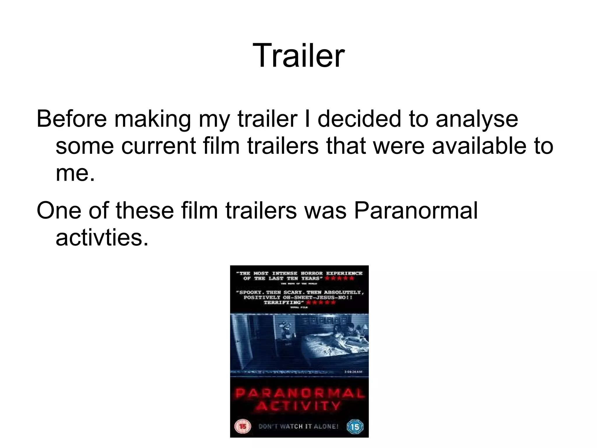
Before making my trailer I decided to analyse
 some current film trailers that were available to
 me.
One of these film trailers was Paranormal
 activties.
What I found out after Analysing
Quick fast shot with little clarity, leaves viewer in
 suspense
Dark areas, dark scene make people feel
 uncomfortable, and start getting scared
Use of victim
Use of final scare
Conventions used and not used.
My product is very similar to products already out
 there were the victim in the end becomes the
 killer.
Like I found in my research I have used small
  snappy shot, in dark areas to keep the viewer in
  suspense and on the edge of there seat.
On my possessed character I made them whiten
 there face to make it look as though something
 had happened to them, this again is something
 I saw when doing my research.
My trailer also starts of happy with the soon to be
 murder walking happy on there phone, where
 as at the end of the film he is possessed with
 his eyes rolled saying he is going to kill
 somebody.
The second section also moves along a lot faster
 than the first section
Film magazine
In order for me to create a good film front cover
  for a magazine I needed to do some research
  to give me some insight.
Codes and conventions I found
The main film was the biggest thing second to the
 title of the magazine.
Often placed at the bottom middle coming up to
 meet the title.
A lead character is normally used and the image
  used gives a clear insight to what the trailer is
  about .
Other headings are present that are not
 necessarily linked to the main film.
The pull line scroll down both sides of the cover.
poster
Aswell as doing trailer and magazine research I
 also went and did research into posters to
 create a good one my self.
Codes and conventions I found
The title is always very clear to see and usually at
 the top of the page.
The image is usually of the victim or villian.
Very often dark colours are used and in most the
 colour red.
Effects are often added to the poster to add the
 scary effect.
There is other heading but not many and not very
 long.
Eval 2
Eval 2

Eval 2

  • 1.
    In what waydoes your media product use, develop or chalenge forms and conventions of a real product.
  • 2.
    Trailer Before making mytrailer I decided to analyse some current film trailers that were available to me. One of these film trailers was Paranormal activties.
  • 3.
    What I foundout after Analysing Quick fast shot with little clarity, leaves viewer in suspense Dark areas, dark scene make people feel uncomfortable, and start getting scared Use of victim Use of final scare
  • 4.
    Conventions used andnot used. My product is very similar to products already out there were the victim in the end becomes the killer. Like I found in my research I have used small snappy shot, in dark areas to keep the viewer in suspense and on the edge of there seat. On my possessed character I made them whiten there face to make it look as though something had happened to them, this again is something I saw when doing my research.
  • 5.
    My trailer alsostarts of happy with the soon to be murder walking happy on there phone, where as at the end of the film he is possessed with his eyes rolled saying he is going to kill somebody. The second section also moves along a lot faster than the first section
  • 6.
    Film magazine In orderfor me to create a good film front cover for a magazine I needed to do some research to give me some insight.
  • 7.
    Codes and conventionsI found The main film was the biggest thing second to the title of the magazine. Often placed at the bottom middle coming up to meet the title. A lead character is normally used and the image used gives a clear insight to what the trailer is about . Other headings are present that are not necessarily linked to the main film. The pull line scroll down both sides of the cover.
  • 8.
    poster Aswell as doingtrailer and magazine research I also went and did research into posters to create a good one my self.
  • 9.
    Codes and conventionsI found The title is always very clear to see and usually at the top of the page. The image is usually of the victim or villian. Very often dark colours are used and in most the colour red. Effects are often added to the poster to add the scary effect. There is other heading but not many and not very long.