This document describes how to create error bar charts in NCSS statistical software. It includes:
1. Examples of different types of error bar charts that can be produced, including ones with standard deviation, standard error, confidence intervals, data range, or percentiles as the error bars.
2. Information on the data structure needed and options for customizing aspects of the error bar chart like the center line, bars, symbols, error bars, layout, and connecting lines.
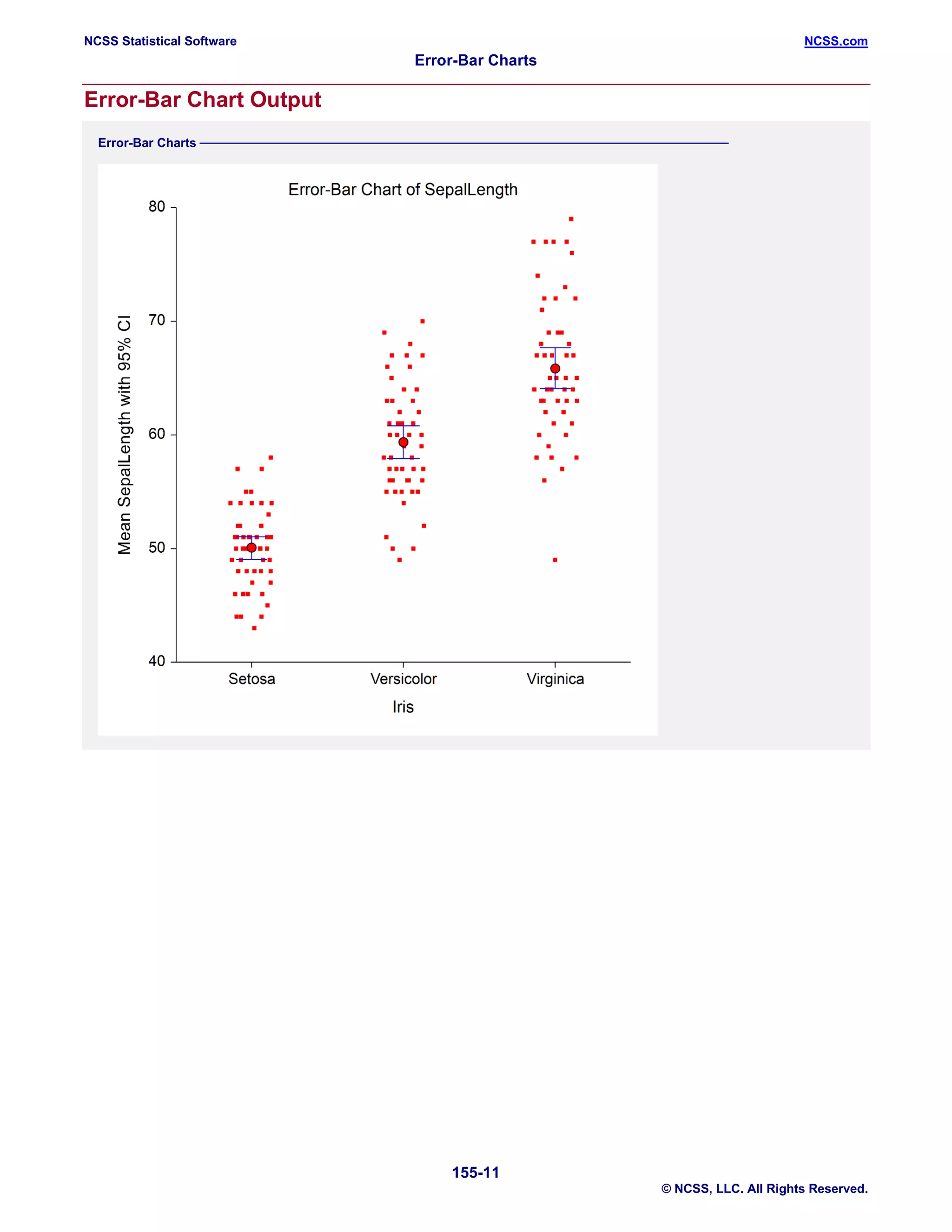
3. Four examples showing how to generate different error bar charts using the Fisher iris and Tree datasets, including ones with subgroups, confidence intervals, and plotting medians instead of means.
Week 2 Project - STAT 3001Student Name Type your name here.docxcockekeshia
Week 2 Project - STAT 3001
Student Name: <Type your name here>
Date: <Enter the date on which you began working on this assignment.>
Instructions: To complete this project, you will need the following materials:
· STATDISK User Manual (found in the classroom in DocSharing)
· Access to the Internet to download the STATDISK program.
This assignment is worth a total of 60 points.
Part I. Histograms and Frequency Tables
Instructions
Answers
1. Open the file Diamonds using menu option Datasets and then Elementary Stats, 9th Edition. This file contains some information about diamonds. What are the names of the variables in this file?
2. Create a histogram for the depth of the diamonds using the Auto-fit option. Paste the chart here. Once your histogram displays, click Turn on Labels to get the height of the bars.
3. Using the information in the above histogram, complete this table. Be sure to include frequency, relative frequency, and cumulative frequency.
Depth
Frequency
Relative Frequency
Cumulative Frequency
57-58.9
59-60.9
61-62.9
63-64.9
a. Using the frequency table above, how many of the diamonds have a depth of 60.9 or less? How do you know?
b. Using the frequency table above, how many of the diamonds have a depth between 59 and 62.9? Show your work.
c. What percent of the diamonds have a depth of 61 or more?
Part II. Comparing Datasets
Instructions
Answers
1. Create a boxplot that compares the color and clarity of the diamonds. Paste it here.
2. Describe the similarities and differences in the data sets. Please be specific to the graph created.
Part III. Finding Descriptive Numbers
Instructions
Answers
3. Open the file named Stowaway (using Datasets and then Elementary Stats, 9th Edition). This gives information on the number of stowaways going west vs east.List all the variables in the dataset.
4. Find the Mean, median, and midrange for the Data in Column 1.
5. Find the Range, variance, and standard deviation for the first column.
6. List any values for the first column that you think may be outliers. Why do you think that?
[Hint: You may want to sort the data and look at the smallest and largest values.]
7. Find the Mean, median, and midrange for the data in Column 2.
8. Find the Range, variance, and standard deviation for the data in Column 2.
9. List any values for the second column that you think may be outliers. Why do you think that?
10. Find the five-number summary for the stowaways data in Columns 1 and 2. You will need to label each of the columns with an appropriate measure in the top row for clarity.
11. Compare number of stowaways going west and east using a boxplot of Columns 1 and 2. Paste your boxplot here
12. Create a histogram for the
Column 1 data and paste it here.
13. Create a histogram for the
Column 2 data and paste it here.
Part IV. Interpreting Statistical Information
The Stowaway data contains two columns, both of which are mea.
Obiee interview questions and answers faqmaheshboggula
The document provides answers to common interview questions about Oracle Business Intelligence Enterprise Edition (OBIEE), which was previously known as Siebel Analytics. It defines key terms like repository and metadata repository. It also describes the end-to-end lifecycle of a Siebel Analytics project and explains concepts like the three-layer architecture, connection pools, alias tables, and different ways to implement security and manage caching.
Create a basic performance point dashboard epcEPC Group
This document provides instructions for creating a basic PerformancePoint dashboard with three key elements:
1) It describes creating a simple dashboard that contains a scorecard, an analytic grid report, and a filter.
2) It orients the user to the Dashboard Designer user interface which is divided into four main areas: the ribbon, workspace browser, center pane, and details pane.
3) It guides the user through creating the dashboard items - selecting a data source, creating an analytic grid report to display data from the source, selecting or creating KPIs, and then generating a scorecard and filter to populate the new dashboard.
The 7 basic quality tools through minitab 18RAMAR BOSE
The document provides an overview of creating and customizing control charts in Minitab. It explains how to create an I-MR chart and Xbar-R chart from sample data files, including how to select test criteria, format scales and axes, and add reference lines. The document also provides general information about when to use control charts and considerations for the type of data needed to create these charts.
This document provides an overview of using SPSS (Statistical Package for the Social Sciences) software. It discusses installing sample data files, introduces the main interface windows including the data view, variable view and output view. It also covers how to define variable types, enter and modify data, perform basic analyses like frequencies and cross tabulations, and create charts from the output. The document is intended to help new users learn the basics of navigating the SPSS program and conducting initial analyses.
This document provides an introduction to ad hoc analysis features in Oracle Hyperion Smart View 11.1.2.3 for Hyperion Planning. It describes how to start ad hoc analysis, drag and drop dimension members, preserve Excel formulas, format cells, display member aliases, refresh grids, zoom in and out on dimensions, keep or remove data, pivot dimensions, and cascade reports across worksheets. The document is intended to help beginners learn the basic functionality of Smart View ad hoc analysis.
The document discusses data mining and the Microsoft SQL Server 2005 Data Mining Add-ins for Excel 2007. It provides an overview of data mining, how the add-in works, its prerequisites, who can use it, and how to use its various tools for data preparation, modeling, validation and connection to SQL Server Analysis Services.
Data mining refers to analyzing data sets to discover hidden patterns and trends. This information can help companies improve strategies for marketing, analyzing customers and markets, increasing revenue, and forecasting sales. Data mining has proven useful in business, computing, biotechnology, and analyzing stock markets. While a relatively new term, data mining has long been used by large corporations to analyze large data sets and draw conclusions. Microsoft has introduced the SQL Server Data Mining Add-ins for Office 2007 to make data mining accessible through a familiar Microsoft Office environment. It connects Excel to the powerful data mining algorithms in SQL Server Analysis Services. The add-in allows users to perform tasks like data preparation, modeling, and validating models with just a few clicks.
This document provides a tutorial on using the basic features of the Dips orientation data analysis program. It explains how to open example data files, view data in grid and stereonet plot views, generate different stereonet plot types like pole plots, scatter plots, and contour plots, and customize the stereonet display. It also describes how to interpret stereonet plots and control plotting options through the sidebar.
SPSS (Statistical Package for the Social Sciences) is a statistical analysis software package that allows users to extract, manage, and analyze data. It provides features like generating reports, charts, descriptive statistics, and complex statistical analyses. While SPSS is easy to use and good for beginners, it has some limitations for advanced users in terms of customizing outputs and performing certain data manipulations. The document then describes the main SPSS interface windows including the data editor, output navigator, and syntax editor. It also covers how to open datasets, define variables, transform data, and create frequency tables and other outputs in SPSS.
This document introduces the basic functionality of the PANalytical X'Pert HighScore Plus v3.0 software. It covers selecting user interfaces and program settings, displaying and manipulating data, opening PDF reference patterns, and performing search-match analysis. The last page lists additional features that can be explored using the help section.
This document provides an overview of how to use SPSS to enter and modify data. It discusses defining variable types like numeric, string, date in the variable view. It also covers creating a new dataset, recoding variables to group data into categories, and using the recoding tool to transform continuous variables into categorical variables for analysis. The document demonstrates how to backup original data before recoding and reintroduces the exceptions for recoding special variable types.
This document provides an overview of using SPSS (Statistical Package for the Social Sciences) software. It introduces the main interfaces for working with data in SPSS, including the data view, variable view, output view, draft view, and syntax view. It also provides instructions for installing sample data files and demonstrates how to generate a basic cross-tabulation output of employment by gender using the automated features.
This guide provides an introduction to using SPSS 14. It includes instructions on starting SPSS, defining variables, entering data, computing new variables, selecting data subsets, and running basic statistical procedures such as frequencies, descriptives, and exploring normality. Key steps covered are creating variables in the Variable View window, entering data in the Data View window, using the Compute function to calculate a new "age" variable, selecting cases where age is less than 30, and analyzing the normality of a variable distribution through histograms, normal Q-Q plots, and Kolmogorov-Smirnov and Shapiro-Wilk tests of normality.
This document provides an overview of the machine learning workbench WEKA. It describes how WEKA can be used to import and preprocess data, build classifiers and clustering models, perform attribute selection and data visualization, and run experiments. Key capabilities mentioned include importing data from various formats, using filters for preprocessing, implementing various learning algorithms like decision trees and SVMs, clustering algorithms, association rule learning, attribute selection methods, and the experimenter for comparing models. The Knowledge Flow GUI is also introduced as a graphical interface in WEKA.
This document is the user guide for EViews 7. It discusses the software's capabilities for single and multiple equation regression analysis, time series analysis, panel data analysis, and multivariate analysis. The guide is divided into several parts that cover basic and advanced tools for regression, time series regression, forecasting from equations, specification testing, instrumental variables models, systems of equations, panel data analysis, and cointegration testing. It provides information on how to specify and estimate regression models in EViews using equation objects.
Collect 50 or more paired quantitative data items. You may use a met.pdfivylinvaydak64229
Collect 50 or more paired quantitative data items. You may use a method similar to the Module 1
discussion to collect and enter data into StatCrunch. You will enter the explanatory variable (x-
value) in column var1. Then, enter the response variable (y-value) in column var2.
a.) Using StatCrunch, compute the sample linear correlation coefficient, R. The Technology
Step-by-Step box at the end of Section 4.1 (page 194) explains how to do so. Do not forget the
video explanation in the Module Notes, if you need it.
b.) Using StatCrunch, find the least-squares regression line equation and plot the scatter diagram,
along with the line. Page 207 (Technology Step-by-Step box) explains how to determine such a
linear equation using StatCrunch. Please note: In order to plot the scatter diagram along with the
line, before clicking Calculate in step 3 of page 207, scroll down to Graphs and make sure Fitted
line plot is selected. Then click Calculate. Then click the right-arrow at the very bottom right
hand side of the results page for the scatter diagram and regression line plot. For an example of
the steps taken and what to expect, click here.
c.) Paste your scatter diagram (with the regression line drawn) and StatCrunch results in the
discussion (by clicking on Options and then Copy. Use Ctrl V to paste it into the discussions).
Try not to use the same data set that another student in the class has used, so your results will be
unique. Make sure your data set is large enough (50 items).
d.) Then, answer the following two questions:
What type of correlation do you observe between the two variables? For ideas, see Figure 4 on
page 181 (Section 4.1).
Would you recommend using this linear model to make predictions about the y-value for a given
x-value? Why or why not?
Solution
Technology Step-by-Step Using StatCrunch:
------------------------------------------------------
Section 1.3 Simple Random Sampling
...........................................................
1. Select Data, highlight Simulate Data, then highlight
Discrete Uniform.
2. Fill in the following window with the appropriate
values. To obtain a simple random sample for the
situation in Example 2, we would enter the values
shown in the figure. The reason we generate 10 rows
of data (instead of 5) is in case any of the random
numbers repeat. Select Simulate, and the random
numbers will appear in the spreadsheet. Note: You
could also select the single dynamic seed radio
button, if you like, to set the seed.
Section 2.1 Drawing Bar Graphs and Pie Charts
Frequency or Relative Frequency Distributions from Raw Data
.....................................................................................................
1. Enter the raw data into the spreadsheet. Name the column variable.
2. Select Stat, highlight Tables, and select Frequency.
3. Click on the variable you wish to summarize and click Calculate.
Bar Graphs from Summarized Data
...............................................................
MANAGEMENT OF DATABASE INFORMATION SYSTEM
Quering database
Queries are the fastest way to search for information in a database. A query is a database feature that enables the user to display records as well to perform calculations on fields from one or multiple tables.
You can analyze a table or tables by using:-
1. Select query or
2. An action query
Action query:-These are queries that are used to make changes in many records at once. They are mostly used to delete, update, add a group of records from one table to another, or create a new table from another table.
Types of action query in Microsoft Access are:-
1. Update-update data in a table.
2. Append query-add data in a table from one or more tables.
3. Make table Query-Creates a new table from a dynaset
4. Delete query-Delete specified records from one or more tables.
Select query
Is a type of query used for searching and analyzing data in one or more tables. It lets the user specify the search criteria and the records that meet those criteria displayed in a dynaset or analyzed depending on the user requirement.
Creating a selected query
1. Ensure that the database you want to create a query for is open
2. Click the query tab, then new
3. In the new query dialog box, choose either to create a query from in Designing view or using Wizard
4. To design from scratch, click design view. The show table dialo
1. The document describes the process for inputting data and calculating drought indices using the DMAP V2.0 tool. It involves importing data via Excel files or NetCDF files, selecting stations and variables, then calculating drought indices like SPI, PDSI, and KBDI.
2. The tool allows importing time series data for rainfall, temperature, soil moisture, and other variables to compute multiple drought indices. Data can be imported from Excel or NetCDF files by selecting stations, variables, and specifying formatting.
3. After inputting data, drought indices are calculated and can be visualized in plots. Severity thresholds can be customized, and drought start dates, durations, and magnitudes are outputted in a
This document discusses how to create and manipulate pivot table reports in Excel. Pivot tables allow users to analyze and manipulate numerical data in spreadsheets to answer questions. The document provides step-by-step instructions for creating a basic pivot table, adding filters, and moving or "pivoting" fields to view the data in different ways. It also describes how to create a pivot chart based on the data in a pivot table report.
The document provides an overview of performance charts in the vSphere Client and how performance metrics are collected and displayed. It discusses the different types of performance charts, the data counters used to collect metrics, the collection levels that determine how much data is gathered, and the collection intervals that specify how statistics are aggregated over time. It also describes when performance data may be unavailable, such as for disconnected hosts or powered off virtual machines.
Brief introduction to histograms and instructions on using Excel's built in histogram functionality. Using min and max to find data range and create bin sizes
This document provides information on histograms and how to create them in Excel. It defines a histogram as a graphical representation of data distribution using bins to count the number of data points within a given range. It explains that histograms can visualize data variation, central tendencies, and range. The document then provides step-by-step instructions for using Excel's built-in function to generate a histogram, including selecting the data range, determining the number and size of bins, and generating an output table and optional chart.
The document discusses various techniques for customizing and protecting a spreadsheet model for an order form, including hiding information, protecting worksheets and cells, modifying toolbars and menus, and checking data through validation and error messages. It also covers presenting sales data through charts and tables, exporting the spreadsheet to the internet, and automation techniques.
IBM InfoSphere Information Analyzer is a tool used for data profiling, data quality assessment, analysis and monitoring. It has capabilities for column analysis, primary key analysis, foreign key analysis, and cross-domain analysis. It provides data quality assessment, monitoring and rule design. Features include advanced analysis and monitoring, integrated rules analysis, and support for heterogeneous data. It helps users understand data structure, relationships and quality.
Data > Consolidate provides a way to combine data from two or more ranges of cells into a new range while running one of several functions (such as Sum or Average) on the data. During consolidation, the contents of cells from several sheets can be combined into one place. The effect is that copies of the identified ranges are stacked with their top left corners at the specified result position, and the selected operation is used in each cell to calculate the result value.
Data Analysis
Creating subtotals
Sharing documents
Saving versions
Calc Macros
The document discusses several quality control tools including:
1) The seven old quality control tools which include cause and effect diagrams, Pareto analysis, scatter diagrams, decision matrices, control charts and brainstorming techniques.
2) Cause and effect diagrams (Ishikawa or fishbone diagrams) which identify potential causes for a problem or effect.
3) Check sheets which collect and analyze defect data through a structured form.
4) Histograms which show the distribution of data values to analyze process performance.
5) Pareto charts which arrange problems by frequency to focus on the most important few issues.
6) Scatter diagrams which look for relationships between variables.
7) Stratification which
The document discusses several quality control tools including:
1) The seven old quality control tools which include cause and effect diagrams, Pareto analysis, scatter diagrams, decision matrices, control charts and brainstorming techniques.
2) Cause and effect diagrams (Ishikawa or fishbone diagrams) which identify potential causes for a problem or effect.
3) Check sheets which collect and analyze defect data through a structured form.
4) Histograms which show the distribution of data values to analyze process performance.
5) Pareto charts which arrange problems or causes by frequency to focus on the most important ones.
6) Scatter diagrams which look for relationships between variables by plotting paired numerical data.
Travis Hills' Endeavors in Minnesota: Fostering Environmental and Economic Pr...Travis Hills MN
Travis Hills of Minnesota developed a method to convert waste into high-value dry fertilizer, significantly enriching soil quality. By providing farmers with a valuable resource derived from waste, Travis Hills helps enhance farm profitability while promoting environmental stewardship. Travis Hills' sustainable practices lead to cost savings and increased revenue for farmers by improving resource efficiency and reducing waste.
The binding of cosmological structures by massless topological defectsSérgio Sacani
Assuming spherical symmetry and weak field, it is shown that if one solves the Poisson equation or the Einstein field
equations sourced by a topological defect, i.e. a singularity of a very specific form, the result is a localized gravitational
field capable of driving flat rotation (i.e. Keplerian circular orbits at a constant speed for all radii) of test masses on a thin
spherical shell without any underlying mass. Moreover, a large-scale structure which exploits this solution by assembling
concentrically a number of such topological defects can establish a flat stellar or galactic rotation curve, and can also deflect
light in the same manner as an equipotential (isothermal) sphere. Thus, the need for dark matter or modified gravity theory is
mitigated, at least in part.
hematic appreciation test is a psychological assessment tool used to measure an individual's appreciation and understanding of specific themes or topics. This test helps to evaluate an individual's ability to connect different ideas and concepts within a given theme, as well as their overall comprehension and interpretation skills. The results of the test can provide valuable insights into an individual's cognitive abilities, creativity, and critical thinking skills
Or: Beyond linear.
Abstract: Equivariant neural networks are neural networks that incorporate symmetries. The nonlinear activation functions in these networks result in interesting nonlinear equivariant maps between simple representations, and motivate the key player of this talk: piecewise linear representation theory.
Disclaimer: No one is perfect, so please mind that there might be mistakes and typos.
dtubbenhauer@gmail.com
Corrected slides: dtubbenhauer.com/talks.html
The use of Nauplii and metanauplii artemia in aquaculture (brine shrimp).pptxMAGOTI ERNEST
Although Artemia has been known to man for centuries, its use as a food for the culture of larval organisms apparently began only in the 1930s, when several investigators found that it made an excellent food for newly hatched fish larvae (Litvinenko et al., 2023). As aquaculture developed in the 1960s and ‘70s, the use of Artemia also became more widespread, due both to its convenience and to its nutritional value for larval organisms (Arenas-Pardo et al., 2024). The fact that Artemia dormant cysts can be stored for long periods in cans, and then used as an off-the-shelf food requiring only 24 h of incubation makes them the most convenient, least labor-intensive, live food available for aquaculture (Sorgeloos & Roubach, 2021). The nutritional value of Artemia, especially for marine organisms, is not constant, but varies both geographically and temporally. During the last decade, however, both the causes of Artemia nutritional variability and methods to improve poorquality Artemia have been identified (Loufi et al., 2024).
Brine shrimp (Artemia spp.) are used in marine aquaculture worldwide. Annually, more than 2,000 metric tons of dry cysts are used for cultivation of fish, crustacean, and shellfish larva. Brine shrimp are important to aquaculture because newly hatched brine shrimp nauplii (larvae) provide a food source for many fish fry (Mozanzadeh et al., 2021). Culture and harvesting of brine shrimp eggs represents another aspect of the aquaculture industry. Nauplii and metanauplii of Artemia, commonly known as brine shrimp, play a crucial role in aquaculture due to their nutritional value and suitability as live feed for many aquatic species, particularly in larval stages (Sorgeloos & Roubach, 2021).
ESR spectroscopy in liquid food and beverages.pptxPRIYANKA PATEL
With increasing population, people need to rely on packaged food stuffs. Packaging of food materials requires the preservation of food. There are various methods for the treatment of food to preserve them and irradiation treatment of food is one of them. It is the most common and the most harmless method for the food preservation as it does not alter the necessary micronutrients of food materials. Although irradiated food doesn’t cause any harm to the human health but still the quality assessment of food is required to provide consumers with necessary information about the food. ESR spectroscopy is the most sophisticated way to investigate the quality of the food and the free radicals induced during the processing of the food. ESR spin trapping technique is useful for the detection of highly unstable radicals in the food. The antioxidant capability of liquid food and beverages in mainly performed by spin trapping technique.
When I was asked to give a companion lecture in support of ‘The Philosophy of Science’ (https://shorturl.at/4pUXz) I decided not to walk through the detail of the many methodologies in order of use. Instead, I chose to employ a long standing, and ongoing, scientific development as an exemplar. And so, I chose the ever evolving story of Thermodynamics as a scientific investigation at its best.
Conducted over a period of >200 years, Thermodynamics R&D, and application, benefitted from the highest levels of professionalism, collaboration, and technical thoroughness. New layers of application, methodology, and practice were made possible by the progressive advance of technology. In turn, this has seen measurement and modelling accuracy continually improved at a micro and macro level.
Perhaps most importantly, Thermodynamics rapidly became a primary tool in the advance of applied science/engineering/technology, spanning micro-tech, to aerospace and cosmology. I can think of no better a story to illustrate the breadth of scientific methodologies and applications at their best.
Current Ms word generated power point presentation covers major details about the micronuclei test. It's significance and assays to conduct it. It is used to detect the micronuclei formation inside the cells of nearly every multicellular organism. It's formation takes place during chromosomal sepration at metaphase.