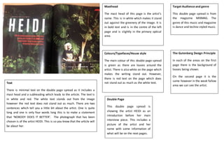
Target Audience and genre
This double page spread is from
the magazine MIXMAG. The
genre of this music and magazine
is dance and techno styled music.
Double Page
This double page spread is
showing the artist HEIDI as an
introduction before her main
interview piece. This includes a
picture of the artist and her
name with some information of
what will be on the next pages.
Colours/Typefaces/House style
The main colour of this double page spread
is green as there are leaves around the
artist. There is also white on the page which
makes the writing stand out. However,
there is red text on the page which does
not stand out as much as the white text.
Masthead
The mast head of this page is the artist’s
name. This is in white which makes it stand
out against the greenery of the image. It is
in bold text and is in the centre of the left
page and is slightly in the primary optical
area.
The Gutenberg Design Principle
In each of the areas on the first
page there is the background of
leaves being shown.
On the second page it is the
same however in the weak fallow
area we can see the artist.
Text
There is minimal text on the double page spread as it includes a
mast head and a subheading which leads to the article. The text is
in white and red. The white text stands out from the image
however the red text does not stand out as much. There are two
sentences which tell you a little bit about the artist. One is quite
long and one is only four words long this is to make a statement
that ‘NOBODY DOES IT BETTER’. The photograph that has been
chosen is of the artist HEIDI. This is so you know that the article will
be about her.

Double Page Spread Of MIXMAG

  • 1.
    Target Audience andgenre This double page spread is from the magazine MIXMAG. The genre of this music and magazine is dance and techno styled music. Double Page This double page spread is showing the artist HEIDI as an introduction before her main interview piece. This includes a picture of the artist and her name with some information of what will be on the next pages. Colours/Typefaces/House style The main colour of this double page spread is green as there are leaves around the artist. There is also white on the page which makes the writing stand out. However, there is red text on the page which does not stand out as much as the white text. Masthead The mast head of this page is the artist’s name. This is in white which makes it stand out against the greenery of the image. It is in bold text and is in the centre of the left page and is slightly in the primary optical area. The Gutenberg Design Principle In each of the areas on the first page there is the background of leaves being shown. On the second page it is the same however in the weak fallow area we can see the artist. Text There is minimal text on the double page spread as it includes a mast head and a subheading which leads to the article. The text is in white and red. The white text stands out from the image however the red text does not stand out as much. There are two sentences which tell you a little bit about the artist. One is quite long and one is only four words long this is to make a statement that ‘NOBODY DOES IT BETTER’. The photograph that has been chosen is of the artist HEIDI. This is so you know that the article will be about her.