
Recommended
Recommended
More Related Content
Similar to Diagramatic Representation.pdf
Similar to Diagramatic Representation.pdf (20)
Recently uploaded
Recently uploaded (20)
Diagramatic Representation.pdf
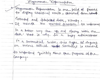
- 1. iarammati Nere Senttm Hqramneti RafruentteniadaKim o Procoa t oispl shdstinl Tem obtamad .totoet olleed and bulated olata, visuly mentad aapm. to undershnd abetter uAYt up md onm wthin tho- bgy admInisttr ma_ConwTCia Seutr tuye of cliagrams Vari 0diiaL_ Sds Slatifis ja esentias t undersand ickly abrnt thaPrvre ou
- 2. A Fa i PietoriaL reretation o# e a t i v hansb2tuumi twoqantHis varie a a
- 3. Graphs and Curves Line graph and curve Suppose we have plotted some points with reference to two perpendicular lines as axesS, 32 D 28 D / B E1 15 A 10 12 Curve Line Graph Fig. 9.5 Fig. 9.6 we will get the proper location of some points, which may be called as A, B, C, D, . . . etc. Now, if wejoin AB, BC, CD,... by separate lines then we will get a line graph (fig. 9.5.) and if we join the points A, B, C, D,.. . by a suitable arch, so that the turning points atB,C,D,. . becomes sinooth, then we will get a 'curve' (fig. 9.6.). Time series Any series of data related with time is the time series. As for example, data on Seasonal Variation of sales and purchase of certain commodities is the time series. Yearly budget of central or any state government, day-wise attendance of students in a class in a week, population according to census report are all the examples o a. time series. Any line graph related to time series is knowiu as Historigram. Historigrams may be of single, two or more variables. If the average monthly income, expenditure and savings of a person are given for last ten years, then taking any one of the data into account, We imay draw a single liistorigranm, or a double historigram with twice of them or with all of tlhem a multi-historigram can be drawn.
- 4. Diagramniatic itefpresentation 209 E x a n n p alnple 9.5. The average inonthiy income, exjpenditure and saviugs of a skilled Luhour in a certain company are given 1or 10 years. Express the data graphically in a s u i t a b l e m a n n e r . Years Average monthly Average mouthly Average monthly income expenditure savings 1989-90 1650 1275 375 1990- 1920 4S0 440 1991-92 2340 1620 r20 1992-93 2760 1975 783 1993-94 280 2250 1030 1994-95 6-40 2800 840 1995 7520 4450 3070 1996-997 12640 8500 1140 1997598 18580 2300 6280 1998-199 23200 14700 8500 Solution: AVERAGE MONTHLY INCOME, EXPENDITURE AND SAVINGS OF A SKILLED LABOUA 25000 20000 Income 15000 - -D- Expenditure 10000 Savings 5000 9 - 1 9 9 0 - 9 2 . 9 9 9 1994-95 1995-9 -99 199 1998 Histograms of two or more variables Fig.9.7 Example 9.6. First 8 batsnen of two teams in a cricket match scóred as following: Batsman 1 2 3 4 5 6 7 S Teain A 87 43 14 29 43 32 20 S Team B 48 57 64 40 0 22 28 30 onare teani-wise performance by irawing line graph. 1991-92 1993-94 S6-97 1997-98
- 5. P'robabilaty aulStatisties Solution: RUNS SCORED BY FIRST 8 BATSMEN OF TWO TEAMS 00 90 TEAM A 70 - -TEAM B 0 0 Batting order of two teams Fig. 9.8 Note: The above are the examples of line graphs but these are not the historigrams as the data is not related with time. Histogram To represent graphically. the frequency distribution of corresponding class intervals, the adjacent rectangular bars are used. The assembly of such adjacent rectangular bars are known as Histogram. The length of the rectaugles are proportional to corresponding frequencies of classes. Karl PearsOu in 1895 first used this nane. Types of histogramn (1) Histogram for ecqual class intervals. (2) Histogram for unequal class intervals Methods of construction (1) When the class intervals are cqual, the hight of the rectangles should be proportional to the corresponcding trequencies of cach class. (2) If there be any discrete type ol class intervals we arc to convert thenu to continuous type. (3) Generally class intervals are to be laken alog horizontal axis and frequ- encies in äny form, along vertical axis. (4) In case of histogram for inequal class intervals, the breadths of the rer- tangles are to be taken projortional to the class width and the heights of the rectangles, proportional to freqieney density ot the respertive class.
- 6. 3.45 3.24 HISTOGRAM A Histogram is a graplh containing a set of rectangles, each being constructedtorepresent the size ofthe class interval by its width andthe frequency in each class-interval byits height. The area of each rectangle is proportional to the frequencyin the respective class-interval andthe total area of the histogram is proportionalto thetotal frequency. A histogram is used to depicta frequency distribution. CUISuuu storam a
- 7. (mapl of rejuene Hctibt.an Th ak, o4 equinty distibacitn are deie t Prelet he chatscrvistie feat ures D ofigtribuuhions °aooding {hIY mor req ny Shape Ond Th mat Conmmmly URed hs ae DHistogra foquany polm C)Feqwnty Curwa Cl) Cum 4tue reawny (ure
- 8. 23. GRAPHIC REPRESENTATION OF A FREQUENCY DISTRIBUTION It is often useful to represent a frequency distribution by means of a diagramn which makes the unwieldy data intelligible and conveys to the eye the general run of the observations. Diagrammatic representation also facilitates the comparison of two or more frequency distributions. We consider below some important types of graphic representation. 2.31. Histogram. In drawing the histogram of a given continuous frequency dtstríbution we first mark off along the x - axis all the class intervals on a suitabie scale. On each class interval erect rectangles with heights proportional to the frequency of the corresponding class interval so that the area of the rectangleis proportional to the frequency of the class. It, however, the classes are of uncqual width then the height of the rectangle will be proportional to the ratio of the frequencies to the width of the classes. The diagram of continuous rectangles so obtained is called histogran1. l aictoTram for an ungrouped freauoncy distrib1ution of a variabic T
- 9. Comprenensive Slatistical Methods TYPEL HISTOGRAM WITH EQUAL CLASS INIERVALS The sizes of class intervals are drawn on I-axis with equal distances and their respe Irequencies on y-axis. Class and its frequency taken together torm a rectangle. The graph at rectangles is known as histogram. Each class has lower and upper values. This gives us two equal ines representing th frequencies. Upper ends of the lines are joined together. This process will give us rectangles. Te heights of the rectangles will be proportional to their frequencies. Example 36. The monthly profits in rupees of 100 shops distributed as follows: Profit per shop 0-100 100-200 200300 300-400 400-500 500 600 No. of shops pective apa of be 20 17 12 18 27 Solution. This is the case of Histogram with equal frequencies. 30 0 100 200 300 400 500 600 Class-Interval [P rofit per shop Fig. 3.41. Histogram showing monthly prolits. Example 37.Draw the histogram for the following data: Marks 0- 10 10 20 20 30 30 40 40 50 50 60 60 -70 S0 40 No. of Students Solution. We represent the class limits along x-axis and frequencies along y-axis. Taking class intervals as bases and the corresponding frequencies (No. of students) as heights, we construct the rectangles to get the histogram of the given frequency distribution as shown in Fig. 3.42. 20 30 70 0 40 Scale: Along x-axis 1 cm = 10 marks Along y-a xis: 1 cm = 10 studenis A 10 20 30 40 50 60 70 Marks- Flg.3.42. Histogram showing marks oblained by sludents. TYPE II. HISTOGRAM WHEN CLASS INTERVALS ARE GIVEN N EXCLUSI FORM, i.e., WHEN CLASS INTERVALS ARE NOT CONTINUOUS In a histogram, it is necessary that the adjacent rectangles be attached to each other. If w to represent the given data (in cxCusivefomm) as such we shall get a bar diagram as there w gaps in between the classes. But in a histogram the bars are continuous without any Be
- 10. The histogram of the given data is given by Fig. 3.49. Note: The crank mark or kink ( ) in the curve on the hornzontal axis means tha lack of space this small distance representss to S. owing he anu Example 45. Draw the histogram of the following frequenc)y distribulion and show th TYPETV HISTOGRAM WITH UNEQUAL CLASS INTERVALS On your graph which represents the total number of wage-eamers in he age-group 19-n 35- 14 15 16- 17 18-20 21-24 25 29 30-34 0 00 Age group 150 i10 I10 No. of wage-earners 120 140 Solution. Here the class intervals have been marked by class-limits. As a result, the uperli of one class does not coincide with the lower limit of the next class. In order to draw a histogm the upper limit of one class must coincide with the lower limit of the next class. To draw a histogm n suchcase where the upper limit of one class does not coincide with the lower limit ofthene class, class limits of all the classes should be extended to their class-boundaries. This ill elt drawing ofa histogram from a frequency distribution in which class intervals are marked byclas limits. In this example, the classes are not of equal width. Some have less width and some have more width. So the histogram should be drawn on the basis of frequency density and not on te basis of frequency. Calculation of Histogram Class-boundary Class-width Frequency densiy Frequency (No. of wage-earners) Class-interval Age group) 13.5 15.5 15.5 17.5 17.5 20.5 (Age groupP) 14 15 120 0 16- 17 140 70 18- 20 150 0 21 24 20.5 24.5 10 27.5 25 -29 24.5 29.5 110 2 34 29.5 34.5 100 20 35 3 39 34.5 39.5 0 18 13.5 15.5 17.5 19 20.5 24.5 29.5 32 34.5 39.5 Class-boundary (Age In years Flg.3.50. Histogram showing the number of wage-eatners. The total number of wage earnerS in the age group 19 -32 is shown by the sn in the histogram. aded area
- 11. DiagraInmiatiC 1ieprescntation 211 Example 9.7. Construct a Histogram tron the followino talla. Weight (in lbs) No. of Men 95-105 105 105-115 210 115-125 125-135 300 175 135-145 255
- 12. Example 9.8. Draw a Histogram of the followingdata: Height in cm No. of Persons 120-129 15 130-139 20 140-154 45 155-159 25 160-179 30
- 13. C o m p r e n E T o m 3.50 Example 42. The following table presents the number ofiterate females in the age pro (10 34) in a town: group 25-29 30-34 20-24 Age group 10-14 15-19 580 290 800 No. ofFemales : 300 980 Draw a histogram to represent the above data. discontinuous distribution. In order to draw a histogram autian. Thedifferenco
- 14. Diagrammatic and Graphic Presentation of Data 3.15 Example 14: The following figures relate to the costof construction of a huuse in Delhi: Ttem :Cement Steel Bricks Timber Labour Miscellaneous Expenditure 20% 18% 10% 15% 25% 12% Represent the data by a suitablediagram.
- 15. 3.14 he Example 13: Draw a pie diagram to represeni ihefollowing data ofinvestmment patterm in the Five Year Plan: 14% Agricuiture andCommunity Development 16% Irrigaiion and Power Small and Organised Industries and Minerals Transport and Communication Social senvices 29% 17% 16% 8 9 Inventories
- 16. Example 15: Draw a suitable diagramforthe following: Expenditure on item Percentage of Total expenditure Food 65 Clothing 10 Housing 12 Fuel andlighting 5 Miscellaneous 8