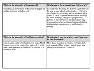
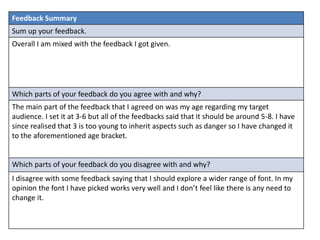
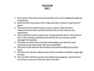
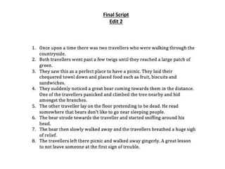
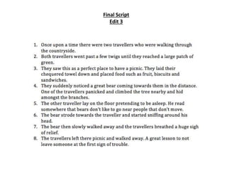
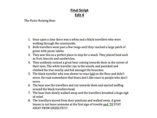
The document provides feedback on a proposal for a children's book project. The strengths highlighted include providing a clear story overview that gives insight into the plot. The production methods and consideration of the target audience are also strengths. Areas for improvement include providing more detail on how image compression may affect quality for the chosen export format. The idea generation shows the creative process but the mood boards could be more developed with additional concepts. The target age range may be too young and adapting the story for parents reading aloud is suggested. Overall the feedback was mixed, but the student agrees the age range should be 5-8 years old rather than 3-6 as originally planned.
Social media marketing and optimization for nonprofitsClinton Cimring
This presentation details the use of social media marketing and campaigns for nonprofits and community based organizations. I use #givingtuesday as an example of the power of social media for a nonprofit in extending its reach and effectively communicating its message to its audience and community of interest.
Hello everyone! I am thrilled to present my latest portfolio on LinkedIn, marking the culmination of my architectural journey thus far. Over the span of five years, I've been fortunate to acquire a wealth of knowledge under the guidance of esteemed professors and industry mentors. From rigorous academic pursuits to practical engagements, each experience has contributed to my growth and refinement as an architecture student. This portfolio not only showcases my projects but also underscores my attention to detail and to innovative architecture as a profession.
Storytelling For The Web: Integrate Storytelling in your Design ProcessChiara Aliotta
In this slides I explain how I have used storytelling techniques to elevate websites and brands and create memorable user experiences. You can discover practical tips as I showcase the elements of good storytelling and its applied to some examples of diverse brands/projects..
Book Formatting: Quality Control Checks for DesignersConfidence Ago
This presentation was made to help designers who work in publishing houses or format books for printing ensure quality.
Quality control is vital to every industry. This is why every department in a company need create a method they use in ensuring quality. This, perhaps, will not only improve the quality of products and bring errors to the barest minimum, but take it to a near perfect finish.
It is beyond a moot point that a good book will somewhat be judged by its cover, but the content of the book remains king. No matter how beautiful the cover, if the quality of writing or presentation is off, that will be a reason for readers not to come back to the book or recommend it.
So, this presentation points designers to some important things that may be missed by an editor that they could eventually discover and call the attention of the editor.
Technoblade The Legacy of a Minecraft Legend.Techno Merch
Technoblade, born Alex on June 1, 1999, was a legendary Minecraft YouTuber known for his sharp wit and exceptional PvP skills. Starting his channel in 2013, he gained nearly 11 million subscribers. His private battle with metastatic sarcoma ended in June 2022, but his enduring legacy continues to inspire millions.
EASY TUTORIAL OF HOW TO USE CAPCUT BY: FEBLESS HERNANEFebless Hernane
CapCut is an easy-to-use video editing app perfect for beginners. To start, download and open CapCut on your phone. Tap "New Project" and select the videos or photos you want to edit. You can trim clips by dragging the edges, add text by tapping "Text," and include music by selecting "Audio." Enhance your video with filters and effects from the "Effects" menu. When you're happy with your video, tap the export button to save and share it. CapCut makes video editing simple and fun for everyone!
Expert Accessory Dwelling Unit (ADU) Drafting ServicesResDraft
Whether you’re looking to create a guest house, a rental unit, or a private retreat, our experienced team will design a space that complements your existing home and maximizes your investment. We provide personalized, comprehensive expert accessory dwelling unit (ADU)drafting solutions tailored to your needs, ensuring a seamless process from concept to completion.
3. Evaluation
What did you like about your image?
In terms of the Dolphin, the aspect that I most like about this design was the effect of fading on
the flukes to actually make it look like its coming out of the water. I was also pleased with how
the sun turned out. I used the effect Gaussian Blur to make it look like the sun is shining. Both of
these aspects add a sense of realism. I was very pleased with this. With the fish I was pleased
with my use of gradient overlay to make the fish come to life as the vast majority of fishes are
multi coloured. I also added in additional shapes that are already in Photoshop such as fish, little
plants and waves. I believe by doing this it adds to the picture in the right way and looks better
for it.
What would you improve if you did it again?
If I did either of these images again, I would possibly look to add more effects to the image such
as rippling in the water but overall I am satisfied with my work that I have produced.
7. Evaluation
What did you like about your images?
On my first rotoscope I was pleased with my use of the stroke tool around he suit. This made it look
realistic and makes the parts of it stand out at the same time. At the time I thought that it would be
difficult to create a faint moustache before I realised that by turning down the opacity did exactly this. I
was very content with how this turned out and certainly was one of the better aspects of this rotoscope.
In terms of my 2nd image I was again impressed with the outlines on the suit for the aforementioned
reasons. For the first time I really took advantage of the smudge tool to create realistic hair and facial
hair. This was undoubtedly the strongest part of this rotoscope. Finally with my last image I was
impressed for the same reasons as the other two. The two main tools that I took advantage of
throughout were Stroke and Smudge.
What would you improve if you did it again?
If I did this again I would look to add even more detail on the face to make the picture more realistic but
still keeping to the cartoon theme. Doing this would in my opinion make it look even better than it
already is. If I did the second image again I would look to try to create a better mouth and to make the
teeth show up. Again similar factors for my 3rd image.
Note: These Backgrounds are simple gradient overlays and backgrounds of that I am not looking to
match of the real life picture.
11. Evaluation
What did you like about your image?
What I most liked about the 1st text based image was of me taking advantage of the different
tools in Photoshop including the character tool to alter the shape and style of the text. I also was
impressed with my name stretched to clearly see the football inside. In terms of my 2nd text
based image I like the effect of the road an the author fading in the foreground. For me this is a
very nice effect. Similarly on the 3rd image, I again took advantage of the transparency tool for
added effect.
What would you improve if you did it again?
If I did these again I would look into even more styles that I so far have not explored or looked
into as of yet. This would include adding further effects and possibly filters.
16. Evaluation
What did you like about your image?
Certainly for the final 2 images I liked my use of features around the actual picture itself, with the
3rd picture having a wave effect to make the car looking like it is in motion, where as the 4th image
I like my use of the shadow like effect to pick out and make the bird stand out even more.
For the first image I am impressed with my use of the Filter Gallery and to explore different
features of it. This was also used on the 2nd image to give it a more artistic look.
What would you improve if you did it again?
If I did these exact four images again I would possibly look into make even more my own but in all
honesty I am very content with my edits that I created.
18. Evaluation
What did you like about your image?
I liked the consistent use of the same filter to keep it more of a comic book effect but to also keep
the realism at the same time. I am also impressed with the 5th image which allowed me to
explore more advanced Photoshop skills.
What would you improve if you did it again?
Possibly think of a more creative storyline. By doing this it could make the storyboard look a bit
better and bring it to life a bit more but overall I am pleased with the outcome that I came out
with.
20. Evaluation
What did you like about your image?
I am impressed with my drawings of the animals. In my opinion this gave it a more illustrated look
to it which is what I was setting out to do in the first place.
What would you improve if you did it again?
If I did this again I would look to add more consistency in the shading of the sky. What I mean by
this is that on my shading I have sometimes shaded upwards, downwards and also sideways at
times. If my shading was consistent all the way through I would probably be looking at a much
better outcome.
24. Mind Map Children’s
Book
Style
Characters
Setting
Stories
Font & Text
Illustrations
Lots of children’s
books use fonts that
are big and bold to
make them stand
out. To follow
children’s books I will
follow a similar style.
The Font I eventually
used is called Chalk
Duster.
I always wanted to base
my story off a fairytale
that involved animals
and then to work off
that.
Lots of
fairytales are
set in the
woods so I
wanted to
follow a
similar path.
In my opinion
fairytales are
better set in
the woods
than they are
in a city for
example.
I will look to
incorporate
detailed
illustrations
whether the
characters will
be human or
animal.
In terms of the
characters I
will look to
make it
detailed to
make kids
understand
what they are
more but still
keep the
cartoon feel to
it.
Originally I wanted
the fairytale to involve
a variety of animals
but in the end I stuck
to bears which led me
to find a fairytale
called the bear and
the two travellers for
which my story will be
based on.
City
Woods
countryside
Rotoscoping
Illustrations
Simple
Wacky
Animals
Humans
Effects
7 basic plots
Overcoming The Monster
Rags To Riches
The Quest
Voyage and Return
Comedy
Rebirth
Tragedy
Precursors
Sketch
(This font
was taken
from the
regular
fonts and
not off the
internet)
26. Two
Travellers
The Bear
and the
Two
Travellers
Cutout of the characters
Title taken from this sentence
More detailed design
taken for a older
audience which is not
applicable to mine
Hand Drawn
unrealistic
Rotoscope Style
Artistic
Real Fairytale that my story
is taken from
27. Proposal
Dimensions
This will be a short book of around 12 pages and will be 245 x 274 mm.
Story Overview
This story will be based off the fairy-tale, The Bear and the Travellers. This will be tweaked slightly but generally
follow a similar storyline. Two travellers were on a long journey through the countryside when they stopped for
a picnic. This however was interrupted by a group of ants who started taking there food. This however went
unnoticed at first by the travellers until the majority of the food has vanished. Both the travellers found the food
at the back of a tree. Approaching the travellers however was a great Bear. They were not sure that the Bear
had seen them, but not wanting to take any risks, the first traveller climbed the tree, while the other lay on the
floor pretending to be dead as he’d heard somewhere that bears don’t like to eat dead flesh. In the end the
bear sniffed around but then walked past. This whole story is to not desert someone at the first sign of trouble.
Export Format
JPEG
Advantages: picture quality is high with small degree of compression. This is important because with low picture
quality there’s no point really. Another advantage is that JPEG’s are small file size, so they won’t take up much
space which will be hugely beneficial in the long run.
Disadvantages: every next step of compressing the image degrades its quality. In my opinion this is a huge
disadvantage because it will become a irritation when compressing.
28. Deadline
6/11/15
Audience
(Think about who you are targeting as your audience. Consider age, gender, class, location and
other characteristics which could define your audience.) The audience I will be targeting will
be Kids. I will range this from 5-8. I started it at 5 because I think it will be slightly too much for
first readers to take in. Gender won’t really be a factor but I imagine boy’s will enjoy this
slightly more since the centre of the story revolves around a bear.
Production Methods
All these pages will be made through rotoscoping the characters but applying filters to the
background. This is because I feel this provides the best cartoon feel to the characters, but still
keeping enough detail to show what and who they are. In terms of the text and title these will
be taken off the default choices and I will not be exploring sites such as DaFont.
29. What are the strengths of the proposal? What areas of the proposal need further work?
One of the many strengths to the proposal is the
story overview. It gives a clear insight into the story
and what we can expect from the final product.
Speaking as someone who’s never heard this tale, I
have a thorough understanding of the story being
produced.
You talk about the details you will include in your
production methods and how they will be altered to
be best suited for the audience.
The export format could of done with some more
detail, especially on how the compression would
effect the overall picture quality. Maybe some more
advantages as well just to show a better
understanding of the file format.
What are the strengths of the idea generation? What areas of idea generation could have been
further developed?
There is a lot of detail in your mind map, we can
see your thought process and how you make each
decision.
The first mood board needs a lot more detail, we
need to see more colours and fonts. Maybe
alternative character designs as well.
30. What are the strengths of the proposal? What areas of the proposal need further work?
I think that the point of the story which is to not
leave people behind is good lesson to teach young
children. The audience of mainly boys works well
as young females aren’t interested in things like
wild animals at such a young age.
I think that the lower age bracket of 3 years is too
young. Children at such a young age don’t really
want to be introduced to aspects of danger and
even death at that age. I think ages of 5 – 8 would
work better with this story.
What are the strengths of the idea generation? What areas of idea generation could have been
further developed?
I think the art style and the cartoon font will attract
young children to the book as young children like
bold, block colours and not a lot of text.
I think that the development pages, especially the
mood boards could use more ideas as the ideas
are all very similar at the moment.
31. What are the strengths of the proposal? What areas of the proposal need further work?
Specific page dimensions and number of pages, as
well as a concise and clear plot.
Consider how it is likely it is that three year olds will
be able to read a book by themselves – there is a
very high chance that they will be reading it with a
parent or carer, or perhaps they may be reading it
for them. Adapt your story or styling to assist
parents or carers that may be reading aloud by
emphasising certain words or phrases with italics,
bold lettering, capitalisation or a different font
entirely.
What are the strengths of the idea generation? What areas of idea generation could have been
further developed?
Lots of areas explored within the mind maps. Mood
boards cover a nice range of art styles, all of which
seem very appealing and colourful to be used in a
children’s book.
More detail regarding production methods. Only
one example of font is given, dafont would give
plenty of other options to consider.
32. Feedback Summary
Sum up your feedback.
Overall I am mixed with the feedback I got given.
Which parts of your feedback do you agree with and why?
The main part of the feedback that I agreed on was my age regarding my target
audience. I set it at 3-6 but all of the feedbacks said that it should be around 5-8. I have
since realised that 3 is too young to inherit aspects such as danger so I have changed it
to the aforementioned age bracket.
Which parts of your feedback do you disagree with and why?
I disagree with some feedback saying that I should explore a wider range of font. In my
opinion the font I have picked works very well and I don’t feel like there is any need to
change it.