A case study of the work that went into designing a real-time data dashboard for chartbeat.com, presented at the O'Reilly Web 2.0 conference in New York, NY 2010.
Gauge Maker Pro - Excel Gauge Chart Add-in. The Gauge Maker Pro that we have made is a special Excel add-in that elevates KPI dashboard making to a new level especially for top managements and analysts but can be useful also for developers.
If you have just started creating dashboards and don’t know where to begin then this app is for you. Don’t worry we’ll help you every step of the way! The Gauge Chart Maker add-in works together with Excel simply and without any trouble.
https://exceldashboardschool.com
Higher computing capacities, lower footprint size of blade servers and highly virtualized infrastructures combined with increasing power densities of racks require lower area size of data centers. Hence, the 2000-square-foot built-up area can now be done with half the size for same compute capacity, thereby changing the cost equations. The upward trend of virtualization and higher power densities with improved thermal efficient data center architectures and technologies will further reduce costs of owning a captive data enter.
The Trellis DCIM (Data Center Infrastructure Managment) Solution is a Dynamic infrastructure optimization Platform. It's the first holistic DCIM platform of hardware, software and services to bridge the critical gap between IT equipment and data center physical infrastructure.
Trellis ensures Availability, Efficiency, Agility for the modern Data Center Infrastructure.
The most easy way to build dashboards and publish it on the web. Easily share your excel data into dashboards and put them on web url so everyone you want can view and interact with the dashboards using filters and prompts.
A brief presentation that explains the origin of Data Center Infrastructure Management (DCIM) Software and its role in Data Center operations. With example of a DCIM Software's functional capabilities, the presentation highlights the business benefits and value it brings to an enterprise. The presentation concludes with Case Study of a DCIM Software deployment in a leading financial services enterprise in India.
How to Create an Interactive DASHBOARD in MS Excelraman109
How to create a DASHBOARD for Management reviews. You may not be having enough time to show the complete 100s of input data, and at the same time management is only interested in short and crisp snapshot. DASHBOARD is the best way of showing all the information in one snapshot. And a step forward is if we can make it Interactive and play with the information.
Panduit Physical Infrastructure Manager™ (PIM™) Software Platform and PViQ Intelligent Hardware combine for a comprehensive data center infrastructure management (DCIM) solution. This intelligent software and hardware provides data center professionals greater staff productivity and visibility of all data center assets along with their connectivity, locations, and relationships. PIM™ solutions allow you to discover, visualize, model, control, report, predict and manage all physical data center assets including the ability to simply deploy new assets and plan capacity for future growth. PIM™ solutions can also help control energy costs, reduce risks and increase operational efficiency.
Case Study: RagingWire – Improving Service Delivery by Extending DCIM to Mana...CA Technologies
RagingWire, a leading colocation provider, will share their innovative approach to converged capacity management and explain how it is helping its customers get a holistic view into available capacity.
In this presentation, you'll also learn how RagingWire is extending CA Data Center Infrastructure Management (DCIM) technology to help better understand both the physical capacity inside the data center as well as the logical capacity of its existing environment.
With a more holistic view into its data center infrastructure, RagingWire can respond more quickly to its internal customers as well as deliver more reliable services to its customers.
For more information on DevOps solutions from CA Technologies, please visit: http://bit.ly/1wbjjqX
Big data is the new black. We have more data than we could use, but what we really need is information. The typical dashboard is completely crammed with colorful 3D pies, uncountable lines and tons of extra-thick tables. And nobody understands anything. Knowledge is power. But to be able to know you first have to understand. In this talk we shall see how to transform a terrible mess into a clean and informative dashboard, moving step by step and explaining the whys between each passage. At my signal... unleash knowledge!
Design Principles of Excel Dashboards & ReportsWiley
Get yourself into a dashboard state of mine with these best practices for Excel dashboards and reports.
Content from Excel Dashboards & Reports For Dummies by Michael Alexander. Learn more: http://bit.ly/FDExcelDashboards
and
SalesForce.com For Dummies by Tom Wong, Liz Kao, Matt Kaufma. Learn more: http://bit.ly/ForDummiesSF
My Agile 2013 session 'Rapid Product Design in the Wild'. In August 2012 Red Gate attended Kscope, a conference for Oracle developers. Instead of doing the usual product demonstrations, we turned our stand into a live lab and took Agile development processes out of the office and in front of our customers. Our stand included an area for customer research, a Kanban board and information radiators in the form of a whiteboard, blank wall and a large digital screen. Over 3 days we ran 9 sprints and conducted 25 customer interviews, using a paper prototype to get feedback. We collected invaluable information about our customers' development environments, how they work with their teams, their processes, tasks and pain points. By the end of the conference my colleague had developed an interactive HTML/CSS prototype which potential customers could evaluate. The team went through several rapid build-measure-learn cycles to improve our product concept and validate the market need.
This presentation explains the process we used and introduces the Live Design Lab Planner, a tool which helps teams to plan this type of rapid product design activity.
Travelocity staged an infomration and training week for the employees in the Curtomer Experience Group. This presentation is a high-level primer about IA, its origins and its practice
Myths and challenges in knowledge extraction and analysis from human-generate...Marco Brambilla
For centuries, science (in German "Wissenschaft") has aimed to create ("schaften") new knowledge ("Wissen") from the observation of physical phenomena, their modelling, and empirical validation. Recently, a new source of knowledge has emerged: not (only) the physical world any more, but the virtual world, namely the Web with its ever-growing stream of data materialized in the form of social network chattering, content produced on demand by crowds of people, messages exchanged among interlinked devices in the Internet of Things. The knowledge we may find there can be dispersed, informal, contradicting, unsubstantiated and ephemeral today, while already tomorrow it may be commonly accepted. The challenge is once again to capture and create knowledge that is new, has not been formalized yet in existing knowledge bases, and is buried inside a big, moving target (the live stream of online data). The myth is that existing tools (spanning fields like semantic web, machine learning, statistics, NLP, and so on) suffice to the objective. While this may still be far from true, some existing approaches are actually addressing the problem and provide preliminary insights into the possibilities that successful attempts may lead to.
The talk explores the mixed realistic-utopian domain of knowledge extraction and reports on some tools and cases where digital and physical world have brought together for better understanding our society.
Even the word ‘work’ doesn’t mean the same as it did in the recent past and the promise of improved performance outcomes made possible by smarter workplace solutions is seductive to business and organisation leaders. At the same time, the promise of a new and more relevant way of working is attractive to people who want a more rewarding and more flexible ‘work’ experience. Process programme management suggests a simple methodology that can’t fail to deliver both. But the reality of delivering tangible and sustainable change outcomes that both excite and reassure a multi-faceted range of expectations requires a rich mix of skills as well as professional and personal commitments.
This presentation is about the challenges faced when doing prototypes and to make sure that these prototypes are useful for the developers.
It is about how the prototyping activity fits into the iterative implementation cycles (Scrum Sprints) and how the triangle of UX, development and visual design works together, in particular if external service providers are involved.
How to Entertain audiences using data led content - Trend Report Spring 2015infogr8
In this seasons trend report, we open the lens to best practice campaigns from across the digital landscape whilst seeking opinions from the data visualisation community on the hot trends coming our way. Campaigns include airbnb, UNESCO, Virgin, IBM, Nike and some exploratory thinking on Tesla. Thought leading opinions from the likes of Alberto Cairo, Georgia Lupi, Andy Kirk.
Held in conjunction with World IA Day 2018, this practical session was an introduction to the core skills and methods of thinking that you will use as part of your day to day work in IA.
Topics covered include the foundations of IA, the importance of a ‘content first’ approach, thinking like a user and how to present your work to clients.
The session was led by Jon Fisher, Head of UX at Nomensa, an award-winning UX design agency based in London, Bristol and Amsterdam.
Held in conjunction with World IA Day 2018, this practical session was an introduction to the core skills and methods of thinking that you can use as part of your day to day work in IA.
Topics covered included the foundations of IA, the importance of a ‘content first’ approach, thinking like a user and how to present your work to clients.
The session was led by Jon Fisher, Head of UX at Nomensa, an award-winning UX design agency based in London, Bristol and Amsterdam.
This is a free event recommended for those new to IA or looking for a refresher on fundamentals.
Following the event, Nomensa will be providing pizza and beers for delegates to enjoy and continue networking.
If you register, but are unable to attend, please give us 48 hours notice so we can reallocate your place.
Introduction to information visualisation for humanities PhDsMia
Training workshop for the CHASE Arts and Humanities in the Digital Age programme. (
This session will give you an overview of a variety of techniques and tools available for data visualisation and analysis in the humanities. You will learn about common types of visualisations and the role of exploratory and explanatory visualisations, explore examples of scholarly visualisations, try some visualisation tools, and know where to find further information about analysing and building data visualisations.
Steffen Frederiksen's presentation at tcworld conference 2017 discussing the evolution of user interfaces from writing to machine-to-machine communication. In the future, we will be creating content for machine first, people second and both the writer and the reader could be bots.
Similar to Designing for a real-time data dashboard (20)
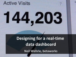
Unleash Your Inner Demon with the "Let's Summon Demons" T-Shirt. Calling all fans of dark humor and edgy fashion! The "Let's Summon Demons" t-shirt is a unique way to express yourself and turn heads.
https://dribbble.com/shots/24253051-Let-s-Summon-Demons-Shirt
White wonder, Work developed by Eva TschoppMansi Shah
White Wonder by Eva Tschopp
A tale about our culture around the use of fertilizers and pesticides visiting small farms around Ahmedabad in Matar and Shilaj.
Book Formatting: Quality Control Checks for DesignersConfidence Ago
This presentation was made to help designers who work in publishing houses or format books for printing ensure quality.
Quality control is vital to every industry. This is why every department in a company need create a method they use in ensuring quality. This, perhaps, will not only improve the quality of products and bring errors to the barest minimum, but take it to a near perfect finish.
It is beyond a moot point that a good book will somewhat be judged by its cover, but the content of the book remains king. No matter how beautiful the cover, if the quality of writing or presentation is off, that will be a reason for readers not to come back to the book or recommend it.
So, this presentation points designers to some important things that may be missed by an editor that they could eventually discover and call the attention of the editor.
Hello everyone! I am thrilled to present my latest portfolio on LinkedIn, marking the culmination of my architectural journey thus far. Over the span of five years, I've been fortunate to acquire a wealth of knowledge under the guidance of esteemed professors and industry mentors. From rigorous academic pursuits to practical engagements, each experience has contributed to my growth and refinement as an architecture student. This portfolio not only showcases my projects but also underscores my attention to detail and to innovative architecture as a profession.
Transforming Brand Perception and Boosting Profitabilityaaryangarg12
In today's digital era, the dynamics of brand perception, consumer behavior, and profitability have been profoundly reshaped by the synergy of branding, social media, and website design. This research paper investigates the transformative power of these elements in influencing how individuals perceive brands and products and how this transformation can be harnessed to drive sales and profitability for businesses.
Through an exploration of brand psychology and consumer behavior, this study sheds light on the intricate ways in which effective branding strategies, strategic social media engagement, and user-centric website design contribute to altering consumers' perceptions. We delve into the principles that underlie successful brand transformations, examining how visual identity, messaging, and storytelling can captivate and resonate with target audiences.
Methodologically, this research employs a comprehensive approach, combining qualitative and quantitative analyses. Real-world case studies illustrate the impact of branding, social media campaigns, and website redesigns on consumer perception, sales figures, and profitability. We assess the various metrics, including brand awareness, customer engagement, conversion rates, and revenue growth, to measure the effectiveness of these strategies.
The results underscore the pivotal role of cohesive branding, social media influence, and website usability in shaping positive brand perceptions, influencing consumer decisions, and ultimately bolstering sales and profitability. This paper provides actionable insights and strategic recommendations for businesses seeking to leverage branding, social media, and website design as potent tools to enhance their market position and financial success.
Expert Accessory Dwelling Unit (ADU) Drafting ServicesResDraft
Whether you’re looking to create a guest house, a rental unit, or a private retreat, our experienced team will design a space that complements your existing home and maximizes your investment. We provide personalized, comprehensive expert accessory dwelling unit (ADU)drafting solutions tailored to your needs, ensuring a seamless process from concept to completion.
I’m going to cover five things: • A brief walkthrough of how we got to the present state of Chartbeat • A case study highlighting three key elements related to the design of chartbeat • A wrapup that points to future directions for chartbeat.
One of the recurrent themes of this talk is that you can’t have a present with a past, so I’m going to start off by telling you a little bit about where chartbeat came from.
Chartbeat started at betaworks, a New York City-based company that invests in and builds companies with a strong focus on social media. Betaworks has a particular way of building products, using a flexible series of gates to shepherd good ideas to market.
Betaworks has started and incubated products like bit.ly and socialflow, which I have worked on, as well as tweetdeck and twitterfeed. All of these have a view on, or a complete focus on, real-time data.
An early internal project was something called Firefly. • Firefly was a real-time chat environment that site owners could include on their site. • Users could chat in real-time and “see” other users on the page. Here you can see how cursors would flit about the page, and users could just click to spawn a chat bubble and start chatting. Firefly didn’t work out well for a number of reasons, but mostly users were completely weirded out by the experience of encountering random users on a website. Another big problem was that sites had to have enough traffic in order to achieve a critical mass of simultaneous users.
And, the quality of the conversation left a lot to be desired.
Fundamentally, I think Firefly was a classic case of a technology looking for a problem to solve. What it did do is scratch some sort of itch regarding real-time data. We learned that site publishers were really, really interested in a couple of features. • One was a user count that showed both the number of total people on the page and the number engaged with Firefly. Firefly also showed what users were doing, such as typing and where their cursor was on the page. • Firefly also had the ability to go back in time, by means of a replay bar at the bottom of the page. Because we were constantly pinging the site, we could we tell you how many people were on the site, what they were doing, where they came from, and what their experience as far as page performance.
The next step was to re-orient these abilities into something clearly less consumer-facing, but no less interesting – a real-time dashboard of site activities. Initially, we thought this would be of use to bloggers and other content publishers paying close attention to Twitter. These were the only people we knew of who were interested in the viral loop and monitoring and responding to events as they happened. We priced it low, thinking people could afford $9.95 a month, and made it easy to install – just a line of code to call some javascript.
Once we had a version up, we immediately began gathering feedback from users. We did using both methodical and more anecdotal approaches – we ran some usability tests with actual users, conducted heuristic evaluations, and listened to our customers talk about the product on Twitter, the support forums and email communications. The initial response was very positive, but patterns emerged that shaped our thinking about the next version. Betaworks felt like it was really onto something now, so it brought in a new and larger team, and settled into a rapid, iterative design/build/test cycles.
The rest of this talk will go into depth on several key learnings and experiences we’ve had over the past year in getting the current version of chartbeat up and running.
For those in the audience who’ve never seen Chartbeat, or would like a refresher, I’ll give you a quick walkthrough of the product. This should also be helpful in illustrating some of the points I’m covering later in the talk.
One of our first realizations, and one that has played the most significant role in shaping how chartbeat has evolved, is that chartbeat is a tool for people on the front lines. These are people who don’t have backgrounds in technology, analytics, or stats. These are not data analysts. These people are creating content, deciding where to place it, and responding to changes in the online environment.
We faced a typical problem in trying to express the data we gathered from user research and anecdotal encounters with users. Since we had a small team – just one and half developers, one general manager, and myself dedicated at about 75% to the project, we needed to prioritize. We used personas and scenarios to help isolate user goals and to focus our development efforts.
We spent a lot of time working together to nail down the first principles of the product and sketching out ideas. Typically, we’ll move from whiteboard, to my sketchbook, to a tool like omnigraffle (for a sketch, not specs), while building out technical prototypes. From these, we did a lot of internal “hallway usability” tests (one of the great things about betaworks is there are always people coming through the office, or people working on completely different things).
We talked to a lot of people who had access to “leading web analytic” tools, and universally they could not or did not want to use them. They can’t find information, and they don’t understand what they are looking at. Nobody but the most die-hard (some would say masochistic) data analyst wants to spend time drilling endlessly through navigational trees to arrive at a single pie chart of data. We worked extremely hard to move from a multi-page dashboard to a one that effectively communicates almost everything in a single view. We only surface the top active pages.
To maintain a single-page view of their data, we’ve allowed users to focus on particluar aspects of the data, but instead of taking them off the page, we effectively “pivot” around their selection and popluate the panels with the subset of relevant data.
Once users are a little acclimated to chartbeat, they begin to ask “what does it mean?”. They want to understand if the values and trends they saw were something to be concerned about. Of course, historical data provides necessary context for the real-time data. The challenge for us, then was how to build a product that provided that without becoming overwhelming or ending up just like so many of the other analytics packages out there.
Showing users historical data raises issues that bump directly into our first principles of simplicity. Chartbeat is pinging and storing a lot of data, and that’s expensive. Typically, displaying historical data has required a lot of fiddling controls to select time periods, etc. We wanted to take a different approach. This illustration is of what’s called the “Coastline paradox”, which describes the dificulty of measuring something like a coastline – what degree of fidelity is adequate to satisfy? http://en.wikipedia.org/wiki/Coastline_paradox
What we’ve arrived at is a series of efforts to push historical data to the periphery, or to layer it in a manner that keeps it unobtrusive but meaningful. A very simple example is the red line that appears at the top of the page. Just by showing the same time period behind it as a gray line immediately shows users if any unusual activity is happening. This also functions as an entrée into deeper historical insights by serving as a global replay control, so instead of a traditional view of historical data, we’ve actually created a “Tivo for your website” that animates the entire dashboard in a replay of events in the past.
Incorporating historical benchmarks into most real-time measurement ensures that the focus is still on real-time and that users never see historical data divorced from it.
One of our First Principles states that our users should be able to derive a clear action from the data presented.
Users typically arriving at chartbeat are asking the same thing: How many people are on my site? What are they doing here? And Where did they come from? Knowing what users want to do on the site let us arrange a default view for them, positioning data where they want to encounter it. Here we see the positions, generally speaking, of where users will locate this information. Not only are they at the top of the page but the layout intentionally conforms to the typical F-shape page-scanning behavior observed online.
The data element that most people are interested in is how many people are on their site right now? Traditional analytics use what is arguably a more immediately intuitive method of counting hits on a site. Chartbeat uses a sampling method, which counts how many visitors are on a site each time, as well as what they are doing across that time. It is somewhat analogous to nightclub, where traditional analytics is like the bouncer, just counting who comes in. On the other hand, imagine a photographer on the inside, taking snapshots of everyone. Not only can you count how many people are there, but you can see what they are doing, how long they stayed there, and even if they made to other rooms in the club.
Of course a key part of developing chartbeat was selecting what chart types to include. We faced a number of issues, some of which were covered earlier in this talk, but essentially boiled down to a few problems: - When did we want to show users trend data (which can obscure explicit numbers, but gives user a sense of relative movement) and when did we want to show counts (which by themselves are hard to make sense of without context)?
An example of where we chose to develop our own chart type is in the Top Pages panel. We spent a lot of time resolving how to display relative page-level traffic. In our first version, we used a standard tree map. Users were very intrigued by it, and claimed to love it, but when I interviewed a number of them, none could correctly display what they were looking at. The tree map would create distorted pictures (arguably, useful) of sites that had extremely high or low volume, or were sites with a lot of traffic through a single page. We came up with something that we feel effectively communicates the vast range of traffic, while making more sites visible and readable. Remember, we are focused on end-users, not data analysts, people who value simplicity and usability over precision.
Users LOVE the kinetic nature of chartbeat. We added several interesting elements that evolved out of earlier explorations. • First, on startup, the dials have a little extra movement that conveys some liveliness. • More typically, the pie chart wedges fly in on page load. • We also flash a background color for each of the pages to indicate upward or downward trending. • And finally, to the right, we have a streaming column of raw hits that we refer to internally as “the Matrix”. From an informational standpoint, these don’t add a whole lot, but users told us they found it mezmerising, and that it gave them a better sense of what visitors were interested in.
In a kind of backhanded compliment, users have tweeted many times how addictive chartbeat is. Next steps are to look for ways to make data more actionable to give front line users what they need to take action on trending items.