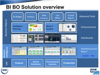
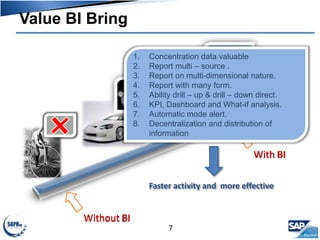
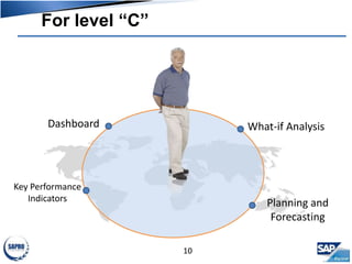
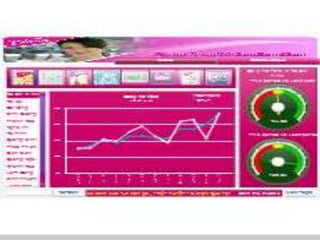
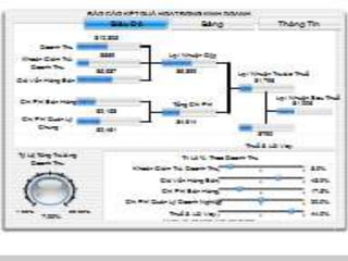
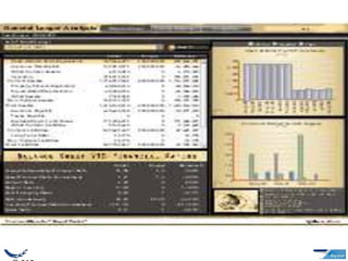
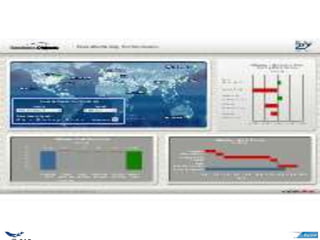
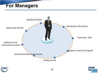
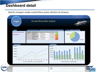
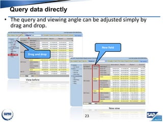
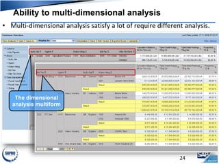
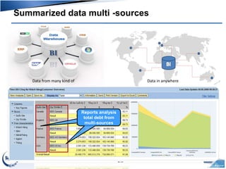
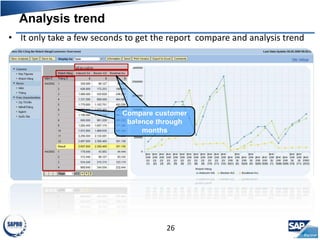
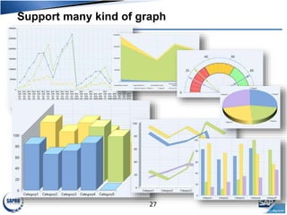
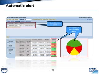
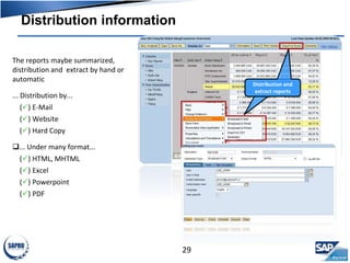
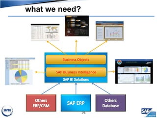
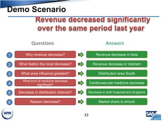
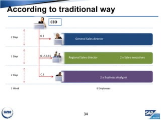
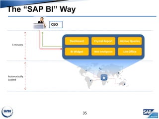
www.sapro.co
Real Value Add
Agenda
2
 Business Intelligence?
 For level “C”
 For Manager Level
 What we need?
 DEMO
BI BO Solution overviewBusinessObjects
Finance
Sales &
Distribution
Production
Procurement &
Inventory
ERP
Business
Intelligence
Multidimensional
Report
Live demo Video
Dashboards
EnhancementsMarkdown
Planning
What-if
Analysis
Advanced ToolsBI Widget
Crystal
Report
Xcelsius
Web
Intelligence
Live
Office
Historical
• How far?
• How fast?
• How high?
BI support you drive
the company strategy
through easy display
4
Without BI
why…?
What happen…? when…?
where…?
Low Insight
Weak
Decisions
Spend resource Mis- centralize data
Belong to personnel
Spend time
5
With BI
Event
Process Execution
Process
Change Crucial Data
Deep InsightAnalyze
Supported
Decisions
Understand
Company’s
status
Minimize kind
of costs
Respond
promptly to
market changes
Take advantage
of knowledge
about analysis
of SAP
6
Value BI Bring
Without BI
With BI
1. Concentration data valuable
2. Report multi – source .
3. Report on multi-dimensional nature.
4. Report with many form.
5. Ability drill – up & drill – down direct.
6. KPI, Dashboard and What-if analysis.
7. Automatic mode alert.
8. Decentralization and distribution of
information
Faster activity and more effective
7
Available at help.sap.com  SAP Best
Practices  Cross-Industry Packages 
Business Intelligence
SAP BI Comes with Ready-to-Use Best Practices
Agenda
9
 Business Intelligence?
 For level “C”
 For manager level
 What we need?
 DEMO
For level “C”
10
Dashboard
Key Performance
Indicators
What-if Analysis
Planning and
Forecasting
11
Agenda
20
 Business Intelligence?
 For lever “C”
 For manager level
 What we need?
 DEMO
For Managers
21
Ability to multi-
dimensional analysis
Query data directly
Summarized data multi-sources
Analysis trend
Support many kind of graph
Automatic alert
Distribution information
Dashboard Detail
Dashboard detail
22
Help for managers maybe usually follow up key indicators of company
View before
Query data directly
23
• The query and viewing angle can be adjusted simply by
drag and drop.
Drag and drop
New field
New view
Ability to multi-dimensional analysis
24
• Multi-dimensional analysis satisfy a lot of require different analysis.
The dimensional
analysis multiform
Summarized data multi -sources
25
Data from many kind of Data in anywhere
Reports analysis
total debt from
multi-sources
Analysis trend
26
• It only take a few seconds to get the report compare and analysis trend
Compare customer
balance through
months
Support many kind of graph
27
Automatic alert
28
Set condition and
alert
The warning is
shown on the
report
Distribution information
29
The reports maybe summarized,
distribution and extract by hand or
automatic
... Distribution by...
() E-Mail
() Website
() Hard Copy
... Under many format...
() HTML, MHTML
() Excel
() Powerpoint
() PDF
Distribution and
extract reports
Agenda
30
 Business Intelligence?
 For level “C”
 For manager level
 What we need?
 DEMO
what we need?
31
Business Objects
SAP Business Intelligence
Agenda
32
 Business Intelligence?
 For level “C”
 For manager level
 What we need?
 DEMO
Demo Scenario
33
Questions Answers
Why revenue decrease? Revenue decrease in Asia
What Nation the most decrease? Revenue decrease in Vietnam
What area influence greatest? Distribution area South
What kind of medicine decrease
significant?
Cardiovascular medicine decrease
Decrease in distribution channel? Decrease in both hospotal and drugstore
Reason decrease? Market share is shrunk
1
2
3
4
5
6
According to traditional way
34
General Sales director
Regional Sales director 2 x Sales executives
CEO
Q 1
Q ,2,3,4,5
Q 6
2 x Business Analyzer
Production director
2 Days
1 Days
2 Days
1 Week 6 Employees
The “SAP BI” Way
35
CEO
Dashboard
BI Widget
Crystal Report
Web Intelligence
Ad-hoc Queries
Life Office
5 minutes
Automatically
Loaded

Demo SAP

  • 1.
  • 2.
    Agenda 2  Business Intelligence? For level “C”  For Manager Level  What we need?  DEMO
  • 3.
    BI BO SolutionoverviewBusinessObjects Finance Sales & Distribution Production Procurement & Inventory ERP Business Intelligence Multidimensional Report Live demo Video Dashboards EnhancementsMarkdown Planning What-if Analysis Advanced ToolsBI Widget Crystal Report Xcelsius Web Intelligence Live Office
  • 4.
    Historical • How far? •How fast? • How high? BI support you drive the company strategy through easy display 4
  • 5.
    Without BI why…? What happen…?when…? where…? Low Insight Weak Decisions Spend resource Mis- centralize data Belong to personnel Spend time 5
  • 6.
    With BI Event Process Execution Process ChangeCrucial Data Deep InsightAnalyze Supported Decisions Understand Company’s status Minimize kind of costs Respond promptly to market changes Take advantage of knowledge about analysis of SAP 6
  • 7.
    Value BI Bring WithoutBI With BI 1. Concentration data valuable 2. Report multi – source . 3. Report on multi-dimensional nature. 4. Report with many form. 5. Ability drill – up & drill – down direct. 6. KPI, Dashboard and What-if analysis. 7. Automatic mode alert. 8. Decentralization and distribution of information Faster activity and more effective 7
  • 8.
    Available at help.sap.com SAP Best Practices  Cross-Industry Packages  Business Intelligence SAP BI Comes with Ready-to-Use Best Practices
  • 9.
    Agenda 9  Business Intelligence? For level “C”  For manager level  What we need?  DEMO
  • 10.
    For level “C” 10 Dashboard KeyPerformance Indicators What-if Analysis Planning and Forecasting
  • 11.
  • 20.
    Agenda 20  Business Intelligence? For lever “C”  For manager level  What we need?  DEMO
  • 21.
    For Managers 21 Ability tomulti- dimensional analysis Query data directly Summarized data multi-sources Analysis trend Support many kind of graph Automatic alert Distribution information Dashboard Detail
  • 22.
    Dashboard detail 22 Help formanagers maybe usually follow up key indicators of company
  • 23.
    View before Query datadirectly 23 • The query and viewing angle can be adjusted simply by drag and drop. Drag and drop New field New view
  • 24.
    Ability to multi-dimensionalanalysis 24 • Multi-dimensional analysis satisfy a lot of require different analysis. The dimensional analysis multiform
  • 25.
    Summarized data multi-sources 25 Data from many kind of Data in anywhere Reports analysis total debt from multi-sources
  • 26.
    Analysis trend 26 • Itonly take a few seconds to get the report compare and analysis trend Compare customer balance through months
  • 27.
    Support many kindof graph 27
  • 28.
    Automatic alert 28 Set conditionand alert The warning is shown on the report
  • 29.
    Distribution information 29 The reportsmaybe summarized, distribution and extract by hand or automatic ... Distribution by... () E-Mail () Website () Hard Copy ... Under many format... () HTML, MHTML () Excel () Powerpoint () PDF Distribution and extract reports
  • 30.
    Agenda 30  Business Intelligence? For level “C”  For manager level  What we need?  DEMO
  • 31.
    what we need? 31 BusinessObjects SAP Business Intelligence
  • 32.
    Agenda 32  Business Intelligence? For level “C”  For manager level  What we need?  DEMO
  • 33.
    Demo Scenario 33 Questions Answers Whyrevenue decrease? Revenue decrease in Asia What Nation the most decrease? Revenue decrease in Vietnam What area influence greatest? Distribution area South What kind of medicine decrease significant? Cardiovascular medicine decrease Decrease in distribution channel? Decrease in both hospotal and drugstore Reason decrease? Market share is shrunk 1 2 3 4 5 6
  • 34.
    According to traditionalway 34 General Sales director Regional Sales director 2 x Sales executives CEO Q 1 Q ,2,3,4,5 Q 6 2 x Business Analyzer Production director 2 Days 1 Days 2 Days 1 Week 6 Employees
  • 35.
    The “SAP BI”Way 35 CEO Dashboard BI Widget Crystal Report Web Intelligence Ad-hoc Queries Life Office 5 minutes Automatically Loaded

Editor's Notes

  • #20 ----------------- To support your selling and prospecting efforts, we had specifically designed a series of executive dashboard in the areas of manufacturing, supply chain, sales & marketing and finance. The first, here, was designed for the head of manufacturing who has worldwide responsibility for improving production quality and flexibility against demand upsides/downsides at lowest cost. The dashboard here allows him to measure the operating performance against key industry metrics of his manufacturing plants located in various parts of the world. The metrics, which in can see at the right, includes: Cost variance % : Just briefly, the cost variance metric expressed here in % refers to the deviation of actual product cost as compare to standard cost in the areas of labor, materials, fixed overhead, and other cost elements. Cycle time: refers to the total lead time in days/hours to manufacture the goods in a specific production run Downside/upside adaptability: refers to the production increase that could be achieved in a fixed 30-day cycle with no impact to cost / inventory Upside flexibility: refers to a plant’s ability to respond quickly to production flunctations, measureed in # of days to achieve unplanned (20%) increase in production with no raw material constraints. The key takeaway here is that the data may reside in multiple instances of SAP, whether it is R/3, BW, legacy shop floor scheduling systems, WMS, etc. It doesn’t matter where the data resides. The value propositions here are that: We offer you access to multiple data sources, regardless if it is SAP. We allow you to transform ordinary data into easily-consumed dashboards for executives, and drill-down to more detailed reports. We offer you a tool that enables you to quickly adapt to new business requirements. Whereas SAP gives you standard, operational reports, often embedded in their applications, we extend the value of SAP by allow you to obtain a single, complete picture of your business--regardless of where the data resides. ---------------------- ------------------- The premise behind this dashboard is to provide a global view of key performance indicators of manufacturing locations and to drill into a medium level of detail to understand where performance is at variance and how it has trended. This dashboard is intended for a global head of manufacturing. An important theme of the dashboard is that it compares performance against industry benchmarks as per the Supply Chain Councils SCOR methodology. Thus it is important to note that the numbers and indicators in the top half are indexed against benchmark rather than being the absolute numbers. Of course, indexed numbers are derived from the real numbers so if you wanted to display those instead, it is of course possible. Within the map, you are able to select one of five metrics to understand at a glance worldwide performance for that metric. Of course, these could be any number of metrics and any type of metric, but we have chosen 5 metrics that are consistent with the SCOR model. Many companies subscribe to this methodology and we, along with SAP, are members of the organization. The five metrics are cost variance %, cycle time, downside adaptability, upside adaptability and upside flexibility. Cost variance % looks at how much your actual production costs differed to your standard cost, cycle time is how long it took to manufacture, downside and upside adaptability is the production reduction or increase that can be achieved in 30 days with no impact on cost or inventory, while upside flexibility is how many days to achieve an unplanned sustainable 20% increase in production with no raw material constraints. You are also able to understand your performance versus your industry peers through the 3 benchmarking levels as suggested by the supply chain council. You may select whether your comparison is against the industry parity level, the industry advantage level, or at the performance level of superior companies in your industry. If the icon is green, then you are better than the benchmark level and if the icon is red you are worse than the benchmark level. You will also note that there is a worldwide icon which enables you to understand the overall company performance versus your chosen benchmark level for the industry. Lastly, you are able to choose a timeframe for your analysis. Here we have quarterly and total year, but again that is easy to change. So for example, if I choose cycle time, 2006 Q1 and choose the advantage benchmark level, then I find that overall I am below the level of companies defined as having an advantage in my industry, but that Shanghai is above that benchmark and therefore operating at a level of advantage to the industry. If I click on superior, then I find that Shanghai is however below that level of benchmark. I can also change the date of the analysis. So again, if I am looking at the advantage level for cycle time, and move through the different time periods, I find that in Q2 Shanghai ceased to operate at an advantage level but Kobe began to. In Q3 no location was at advantage level and in Q4 on Brno was. Consequently, for the full year, no location was overall at Advantage level. The performance of Brno was very interesting in that it achieved advantage level in Q4 for cycle time. Let us analyze that location in more detail. If I click on the Brno icon on the map, the 3 other charts in the dashboard will all change to focus on Brno. On the right hand side, I can see the performance of all 5 metrics against the advantage benchmark. In  Q1 I can see that cost variance made the advantage benchmark but that cycle time was significantly below. If I move to Q2, I note that cost variance maintained it’s performance but that cycle time improved. In Q3, cycle time improved further but cost variance suffered and is now below advantage benchmark. In Q4, where cycle time achieved it’s advantage performance, cost variance became even worse. It looks like, in Brno at least, we are achieving performance in cycle time at the cost of worsening cost variances. I can understand this cost aspect more deeply by using the cost variance waterfall chart. This shows me how much production should have cost against what it actually did, and how those variances are made up ie variances in fixed overheads, labor, materials or variable overheads. As I move from Q1 to Q4, I see that fixed overhead variances and labor variances have moved to become significantly unfavourable. Note that here we are not benchmarking the individual components against the industry but instead comparing them against the expected cost. These absolute variances have resulted in an overall cost variance percentage that is worse than the industry standard for a company performing at advantage level. Lastly, on the bottom right, we have a breakout for actual cycle time by stage of production. This time each individual stage is benchmarked against the industry and we can also see at a glance how our total cycle time compares to the overall industry benchmark. If I return to the map and choose cycle time, 2006 all and parity, and then click on the Worldwide icon, I will see at a glance in the cycle time chart that although I am overall making the parity days for cycle time, my produce & test stage is below industry standard. If I change to advantage level, then I can see that produce & test along with release to deliver is causing me to not achieve an advantage level of manufacturing cycle time days. It looks reasonable to target produce & test to improve overall cycle time performance. It is the longest stage and the one that is below average. Setting the benchmark level back to parity, I see 5 locations that are below average in overall cycle time. I can either click through them, or press the play button to go through them all. It is interesting to note that not all locations with poor or good overall cycle times have a corresponding poor or good cycle time for the longest stage. It may make sense to start an initiative to share best practices from those with a good cycle time for this stage and of course I’ll be able to keep track of the results.