The open web provides statistical and data content in an unorganized manner without the ability to sort or filter results. Library portals to statistical providers offer inconsistent access and dead links. Users drilling down publicly available datasets are left blindly searching or only getting a small amount of information online. Statistical Insight offers a single, friendly interface providing access to over 70,000 reports, 1 million tables, and 700,000 spreadsheets across 5,500 datasets in an organized collection focused specifically on statistical content.
BDVe Webinar Series - Designing Big Data pipelines with Toreador (Ernesto Dam...Big Data Value Association
In the Internet of Everything, huge volumes of multimedia data are generated at very high rates by heterogeneous sources in various formats, such as sensors readings, process logs, structured data from RDBMS, etc. The need of the hour is setting up efficient data pipelines that can compute advanced analytics models on data and use results to customize services, predict future needs or detect anomalies. This Webinar explores the TOREADOR conversational, service-based approach to the easy design of efficient and reusable analytics pipelines to be automatically deployed on a variety of cloud-based execution platforms.
Datavi$: Negotiate Resource Pricing Using Data VisualizationNASIG
Stephanie J. Spratt, presenter
Ready to ask for a reduction in the annual increase of an e-resource product but unclear on how to make your case? Want to try some innovative strategies to avoid spending more than your budget? Want to reduce the amount of heavy renewal work falling right at fiscal close? Attend this presentation to learn techniques on all of that and more!
The speaker will use commonly collected data to show how to combine and visualize metrics to help make a library’s case for requesting reductions in pricing, adjusting service fees, and asking for changes to subscription periods to balance out the renewal workload. Attendees will learn which data to analyze and combine as it relates to pricing negotiations along with the steps involved to make that data come alive in Excel graphs and charts. Alternate data visualization products will also be discussed. The data visualization techniques, not outcomes, will be the focus of this presentation with the goal of attendees taking back which techniques might be worthwhile endeavors at their own institutions. Attendees will also learn about negotiation strategies and internal and external considerations when preparing to negotiate.
Growing an awareness of negotiation techniques and factors in play both inside and outside the library will help librarians make their cases for equitable pricing and models for library resources. The data visualization techniques shown in this presentation will serve as a stepping-off point for any librarian who wishes to use honesty, directness, and real-world scenarios to negotiate pricing for content and other library expenditures.
During the summer of 2014, I worked with The CloudMiner Ltd., a startup based in Hong Kong that provides cloud based mining solutions for mining and investment professionals. I worked with the VP of Engineering and the development team with data analytics and product development.
Turning the Corner at High Speed: How Collections Metrics Are Changing in a H...NASIG
Collections metrics have always been an important component of effectively managing libraries. But today they are more important than ever before as user-focused libraries and information centers attempt to adjust their collections to current and future library user needs. Frequently this requires sharp turns, smart traffic control, and even drafting behind other libraries who might be in the lead at any given stretch in order to achieve ultimate success. In this presentation, perspectives from a corporate library context and a liberal arts college library will be presented. What are the key metrics today vs. five years ago? What factors are at work that create changes in metrics value over time? What changes might we expect to see in the future? These and other questions will be addressed.
Speakers:
Marija Markovic, Independent Consultant
Steve Oberg, Wheaton College (IL)
Tableau’s predictive modeling feature allows users to leverage powerful statistical models to build and update predictive models efficiently while giving them the flexibility to select their predictors, collaborate on the model results within other table calculations, and comprehend and examine a large volume of data. Go through this presentation to discover how Tableau’s predictive modeling feature allows users to leverage powerful statistical models to build and update predictive models efficiently.
Data Visualization: Analyzing your library data provides tips on using Access crosstab query; Excel pivot table and pivot chart; Tableau Public. A presentation at ELUNA, 2015. Supplemental file also available on slideshare.
Presentation about the applicability of the PhD proposal on the Cuban context. Presented on October 17th, 2019 to the Artificial Intelligence and Patterns Recognition Research Group.
Workforce data: supporting local and national workforce planning S23 Sophie40
This workshop will introduce participants to the new workforce data site which holds information on the social services sector’s workforce throughout Scotland. It gives an overview of the data available and how to access it and also point participants in the direction of similar useful data sites providing information on population and service users. Contributed by: Scottish Social Services Council
Expert workshop on Improving activity data for Tier 2 estimates of livestock emissions: Dealing with data gaps
July 17-18, 2018
Summary and workplan
Lini Wollenberg, Sinead Leahy, Harry Clark
Research by AVG shows that although most small businesses understand the need to protect their IT systems, fewer are willing to put it into practice. Out of 2000 SMBs surveyed in the US and UK for the "SMB Landscape Report", more than half (52%) have no IT security guidelines for their staff, while 1 in 7 have no Internet security software or solutions in place at all.
2010 Acura RDX color brochure provided by Park Ave Acura located near Wayne, NJ. Find the 2010 Acura RDX for sale in New Jersey; call about our current sales and incentives at (201) 587-9000.
Creating Effective Data Visualizations in Excel 2016: Some BasicsShalin Hai-Jew
One of the mainstays of a modern software toolkit is Excel 2016, from Microsoft Office 2016. By reputation, Excel is considered a beginner’s tool that self-respecting data analysts would bypass, but Excel is fairly high-powered, can take up to 1.06 million rows of data per set, contains complex statistical analysis capabilities (without the need for scripting), and enables rich data visualizations. It has a number of rich add-ons to empower different analytical and data visualization functionalities. It works as a great bridging tool to more complex types of statistical analyses.
This session walks participants through some basic built-in data visualizations in Excel 2016, including pie charts and doughnuts, bar charts, tree maps and sunburst diagrams, cluster diagrams, spider (radar) charts, scattergraphs, and others. This session will cover how data structures and desired emphases will determine the options for particular data visualizations.
In this session, participants will
review how to load a data table,
read the general data in a data table (or worksheet),
process or clean the data as needed,
use the Recommended Charts feature,
decide which built-in data visualizations to use, and
consider how to add relevant data visualization elements (including data labels, background grids, axis labels, and titles) for a coherent and effective data visualization.
Also, participants will help co-build data visualizations from open-source and other datasets.
Preconference Overview of data visualisation and technologyJen Stirrup
In this module, we will look at an overview of theory and scientific evidence about data visualisation. Understanding the ‘why’ can help to make us better at the ‘how’, regardless of the technology.We will also look at an overview of the Power BI suite of tools.
My talk in the technical meeting "Global Burden of Diseases and Scientific Computation in Health". 25-26 September 2015. FIOCRUZ, Rio de Janeiro, Brazil
Large corporations have to master vast amounts of heterogeneous data in order to stay competitive. While existing approaches have attempted to consolidate and manage the data by forcing it into a single shared data model, data lakes recently emerged that instead provide a central storage point for holding all data sets in their original form.
In this talk, we present eccenca CorporateMemory, which extends the data lake paradigm with a semantic integration layer for managing diverse, but semantically enriched data. eccenca CorporateMemory builds an extensible knowledge graph that employs RDF vocabularies for transforming and linking multiple datasets in order to generate an integrated semantic understanding of the data.
Robert Isele | Head of Data Integration Unit at eccenca GmbH
Presentation at Semantics 2016 in Leipzig in the context with the results of the LEDS project
ONS Local has been established by the Office for National Statistics (ONS) to support evidence-based decision-making at the local level. We aim to host insightful events that connect our users with exciting developments happening in subnational statistics and analysis at the ONS and across other organisations.
On 28th June 2022, Census 2021 released their first results, followed by data covering eight topics and more recently launched a new ‘Create a custom dataset’ tool. We will take you through a tour of the products such as census maps, build a custom area profile, create your own custom dataset tool and pre-built tables, as well as census analysis plans and how you can carry out your own analysis using census data.
This event is open to all, however we anticipate it will be of most interest to anyone working at a local level on Census data or on any Census topics.
If you have any questions, please contact ons.local@ons.gov.uk
DATA SCIENCE IS CATALYZING BUSINESS AND INNOVATION Elvis Muyanja
Today, data science is enabling companies, governments, research centres and other organisations to turn their volumes of big data into valuable and actionable insights. It is important to uncover hidden patterns, unknown correlations, market trends, customer preferences and other useful business information. According to the McKinsey Global Institute, the U.S. alone could face a shortage of about 190,000 data scientists and 1.5 million managers and analysts who can understand and make decisions using big data by 2018. In coming years, data scientists will be vital to all sectors —from law and medicine to media and nonprofits. Has the African continent planned to train the next generation of data scientists required on the continent?
Why are e-Infrastructures useful from a small business perspective?Nikos Manouselis
Slides of talk at seminar for the EuroRIs network (http://www.euroris-net.eu) of National Contact Points (NCPs) for EU funding programmes on Research Infrastructures.
An in-depth virtual session on Einstein Analytics on the Belgian Salesforce Administrators user group. What is Einstein Analytics, how does it compare to standard Salesforce Reports & Dashboards, an in-depth demo and how do you quickstart your knowledge on EA.
Introduction to einstein analytics by Steven Hugo
Subscribe to the Salesforce Belgium User group to get notified of upcoming sessions: https://trailblazercommunitygroups.com/brussels-be-administrators-group/
More info: https://www.vandeveldejan.com
Analytical Innovation: How to Build the Next Generation Data PlatformVMware Tanzu
There was a time when the Enterprise Data Warehouse (EDW) was the only way to provide a 360-degree analytical view of the business. In recent years many organizations have deployed disparate analytics alternatives to the EDW, including: cloud data warehouses, machine learning frameworks, graph databases, geospatial tools, and other technologies. Often these new deployments have resulted in the creation of analytical silos that are too complex to integrate, seriously limiting global insights and innovation.
Join guest speaker, 451 Research’s Jim Curtis and Pivotal’s Jacque Istok for an interactive discussion about some of the overarching trends affecting the data warehousing market, as well as how to build a next generation data platform to accelerate business innovation. During this webinar you will learn:
- The significance of a multi-cloud, infrastructure-agnostic analytics
- What is working and what isn’t, when it comes to analytics integration
- The importance of seamlessly integrating all your analytics in one platform
- How to innovate faster, taking advantage of open source and agile software
Speakers: James Curtis, Senior Analyst, Data Platforms & Analytics, 451 Research & Jacque Istok, Head of Data, Pivotal
Projects are dynamic. Staying ahead of the curve means having real-time access to your project data and it’s leading indicators for actionable intelligence. A real-time, flexible platform Tivitie Insights service enables organizations to visualize critical Microsoft Project Online data in real-time, spot trends as they occur and produce actionable facts for better decision making in a fraction of the time.
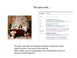
1. The open web….
The open web does not distinguish statistics or data from other
types of content. You cannot sort results by
date, subject, source, or geographic area. Good & bad sources of
data are jumbled together.
1
2. Portals to Statistical Content Providers –
A Source of Frustration
Because library portals provide partial or inconsistent access to statistical
content. Some of these doors will be locked because the links are dead.
2
5. Statistical Insight –
A single friendly interface
Across 70,000 stat reports, one million tables, 700,000 spreadsheets. 5,500
datasets.
5
6. What do Statistical Insight Reference Edition
and DataSets represent?
• The most comprehensive and authoritative collection of
business and social science statistics and datasets available in
the U.S.
• An organized collection focused on statistical content.
• The only such collection with the detailed metadata required
for academic research and citation.
6
12. Statistical DataSets…
…enables users to reach data driven decisions in 3 easy steps.
13. Statistical DataSets…
…enables users to utilize data from many sources.
5,500 datasets
50 billion data points
75% domestic
25% international
50% public domain
50% commercially licensed
14. Statistical DataSets…
…enables users to build graphic-rich charts that track trends.
Data spans 20, 75 to 150 years
Compare data across unrelated
datasets to discover interesting
relationships
15. Statistical DataSets…
…enables users to build graphic-rich charts that rank performance.
Instantly update results
using granular criteria
Narrow ranking to top performers
16. Statistical DataSets…
…enables users to build graphic-rich charts that map stats.
Big picture or granular detail
17. Statistical DataSets…
…enables users to discover and compare correlations between data.
Calculate permits additional user
analysis
Compare
across
sources
19. Easy Analytic Software Inc. (EASI)
• A statistical modeling firm that specializes in consumer demographics.
• Quarries data from the Census Bureau, Bureau of Labor Statistics and
Mediamark.
• Develops model-based indicators of demographic characteristics,
consumer spending and behavior patterns for a wide range of
geographic regions.
www.easidemographics.com
20.
21. Mediamark Research & Intelligence
• Market research firm that annually publishes the Survey of the
American Consumer, which is based on detailed face-to-face
interviews conducted in 26,000 households
• “Used in most media and marketing plans in the country”
• “Primary source of audience data for the U.S. consumer magazine
industry”
• “Most comprehensive and reliable source of multi-media audience
data available”
22. New Products – 2012
Statistical Collection
Print – Sold by Bernan Online – Sold by ProQuest
23. Browse a Group of Related Tables or Search across All
Tables
24
24. ProQuest Statistical Insight Editions
Business – Full Text Reference – Full Text Complete
Basic Facts: Basic Facts: Basic Facts:
• 1300 titles/year • 9,000 titles/year • 500,000 metadata
• 490 sources/year • 1300 sources/year records
• 40% intl content • One million tables • 2500 sources
• From Jan. 2009 • All the full-text in the
Reference Edition
• 8 combinations of
product modules
Content Types: Value-add for Customers: Value-add for Customers:
• Economic indicators • Content aggregation, Same as the Reference
• Business outlook of weekly updates Edition - plus a
economists & experts. • Abstracts, terms, filters finding aid to fiche &
• Salary & benefit data by tailored to statistical GovDocs collections
industry & occupation content back to the 1970s.
• Trade & industry stats • Indexing to the table
line-item level
• Tables In Excel format
Editor's Notes
See your handoutsConsumer BehaviorThis dataset shows US consumer usage and purchasing patterns for over 6,000 products and services. (SAC)Consumer ExpendituresThis dataset shows average annual household expenditures for various types of products and services. (CEX)Consumer Spending AnalyticsBroken out by Total Market, Age Group, Income, Race, and Household Type (CEX)Demographics – CensusThis dataset shows population and household characteristics as reported in Census 2000. Estimates for the current year and projections 5 years forward are based on new data reported in the Census Bureau’s American Community Survey, Census Tiger files, and the US Postal Service mailable household file. Reported by demographics, ancestry, age, income.Demographics - EASI ProfilesThis dataset shows the concentration of particular types of households in a geographic area in relation to the national average for that household type. The values shown are index values (100=national average).Industries – NAICSThis dataset shows number of establishments and employees, by industry. Media UseThis dataset shows US consumer use of various types of media. (Mediamark)Retail SalesThis dataset shows annual retail sales at 13 types of retail establishments (Census of Retail Trade)
The premier piece is MediaMark. It’s a market research firm, the data from which is described as the “most comprehensive and reliable source of multi-media audience data available.”