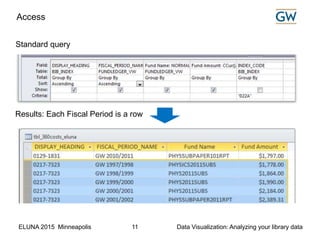
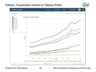
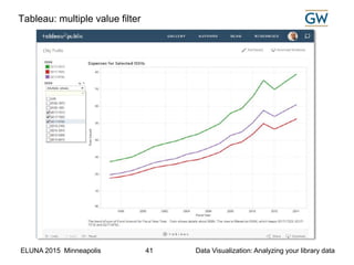
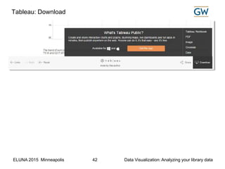
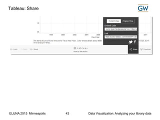
Data Visualization: Analyzing your library data provides tips on using Access crosstab query; Excel pivot table and pivot chart; Tableau Public. A presentation at ELUNA, 2015. Supplemental file also available on slideshare.
2. ELUNA 2015 Minneapolis Data Visualization: Analyzing your library data2
Agenda
Data visualization goals
Access: Crosstab query
Tableau Software
Extract, transform, load (ETL)
Excel: Filters, Pivot table & chart
3. ELUNA 2015 Minneapolis Data Visualization: Analyzing your library data3
Data Visualization Goals
Task: Searching for significant facts
Goal: Discovery
Task: Examining and making sense of data
Goal: Understanding
Task: Conveying information to others
Goal: Informed Decisions
“Why do we visualize quantitative data?” by Stephen Few
http://www.perceptualedge.com/blog/?p=1897
4. ELUNA 2015 Minneapolis Data Visualization: Analyzing your library data4
Extract, transform, load (ETL)
ELUNA
5. ELUNA 2015 Minneapolis Data Visualization: Analyzing your library data5
Extract, Transform, Load
6. ELUNA 2015 Minneapolis Data Visualization: Analyzing your library data6
• Open Interface Web Services API
• Canned Access Reports
• Global Data Change
(Voyager)
Extract, Transform, Load: tools
7. ELUNA 2015 Minneapolis Data Visualization: Analyzing your library data7
• SQL*Plus
- delimited text file
- xml data file
• Linux Shell scripts automation
<XML> XSLT • XML / XSLT stylesheet transform
Extract, Transform, Load: tools
9. ELUNA 2015 Minneapolis Data Visualization: Analyzing your library data9
Extract, Transform, Load: examples
• How to use:
• Access crosstab query
• Excel sort and filter
• Excel Pivot table and Pivot chart
• Tableau Public
Download this supplemental file which
includes:
• Sample Access Report
• SQL*Plus query to output XML data
• Sample XSLT stylesheet to transform
XML data
• OAI / PMH syntax and sample query
• curl syntax and sample query
• JSON sample text, screen shot of a
custom catalog built with Django &
Python
10. ELUNA 2015 Minneapolis Data Visualization: Analyzing your library data10
Access: Crosstab query
ELUNA
11. ELUNA 2015 Minneapolis Data Visualization: Analyzing your library data11
Access
Standard query
Results: Each Fiscal Period is a row
12. ELUNA 2015 Minneapolis Data Visualization: Analyzing your library data12
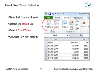
Access Crosstab query: Configuration
Crosstab Row Heading = BIB_INDEX.DISPLAY_HEADING
Crosstab Column Heading = FUNDLEDGER_VW.FISCAL_PERIOD_NAME
Crosstab Value = Expression ‘Fund Amount’ as Sum(CCur([AMOUNT]/100))
Crosstab query
What’s different:
13. ELUNA 2015 Minneapolis Data Visualization: Analyzing your library data13
Access Crosstab query: Results
The crosstab query output shows the year by year expenditure for each ISSN.
The highlighted row for number 0217-7323 is the same dataset from the
standard query, except the values are shown in columns labelled by fiscal year.
Crosstab query results
14. ELUNA 2015 Minneapolis Data Visualization: Analyzing your library data14
Excel: Sort & Filter
ELUNA
15. ELUNA 2015 Minneapolis Data Visualization: Analyzing your library data15
Excel Sort & Filter
16. ELUNA 2015 Minneapolis Data Visualization: Analyzing your library data16
Excel: Pivot Table
ELUNA
17. ELUNA 2015 Minneapolis Data Visualization: Analyzing your library data17
• Select all rows, columns
• Select the Insert tab
• Select Pivot Table
• Choose new worksheet
Excel Pivot Table: Selection
18. ELUNA 2015 Minneapolis Data Visualization: Analyzing your library data18
Excel Pivot Table: Step 1
Step 1. Select field(s)
19. ELUNA 2015 Minneapolis Data Visualization: Analyzing your library data19
Excel Pivot Table: Steps 2 and 3
ISSN
FY
Step 2. Place field(s)
Amount Value field setting:
Sum
Number format
Currency
Step 3. Configure value
20. ELUNA 2015 Minneapolis Data Visualization: Analyzing your library data20
Excel Pivot Table: 2010-2014
• Changed label from Amount to Expenses (cell A3)
• Filtered the FY / fiscal year to 2010 through 2014 (cell B3)
ISSN
FY
21. ELUNA 2015 Minneapolis Data Visualization: Analyzing your library data21
Excel Pivot Table: 2009-2015 with conditional formatting
To create a conditional format:
• Go to the Design tab on the menu and choose a design theme
• Go to the Home tab on the menu, choose a Conditional formatting color
theme
22. ELUNA 2015 Minneapolis Data Visualization: Analyzing your library data22
Excel: Pivot chart
ELUNA
23. ELUNA 2015 Minneapolis Data Visualization: Analyzing your library data23
Excel Pivot Chart: Step 1
24. ELUNA 2015 Minneapolis Data Visualization: Analyzing your library data24
Excel Pivot Chart: Step 2
25. ELUNA 2015 Minneapolis Data Visualization: Analyzing your library data25
Excel Pivot Chart
26. ELUNA 2015 Minneapolis Data Visualization: Analyzing your library data26
Excel Pivot Chart: Legend and Filters
27. ELUNA 2015 Minneapolis Data Visualization: Analyzing your library data27
Excel Pivot Chart: filter applied
30. ELUNA 2015 Minneapolis Data Visualization: Analyzing your library data30
Tableau: Create Tableau Public Account
Introductory Video
31. ELUNA 2015 Minneapolis Data Visualization: Analyzing your library data31
Tableau: Resources. Download the application
32. ELUNA 2015 Minneapolis Data Visualization: Analyzing your library data32
Tableau: Open data file
33. ELUNA 2015 Minneapolis Data Visualization: Analyzing your library data33
Tableau: Worksheet configuration
Drop field here
Drop field here
Dropfieldhere
34. ELUNA 2015 Minneapolis Data Visualization: Analyzing your library data34
Tableau: Rows and Columns Selected
35. ELUNA 2015 Minneapolis Data Visualization: Analyzing your library data35
Tableau “Show Me” wizard
• Tableau’s “Show Me” wizard is programmed to
recognize the available dimensions and measures,
and to guide the user to select an option.
• You can reposition the floating Show Me widget,
or dock it on the menu.
• Click on one of the thumbnails that represent a
type of visualization. Tableau will fill-in the values.
Several variations generated by the Show Me wizard
are shown on the following slides.
36. ELUNA 2015 Minneapolis Data Visualization: Analyzing your library data36
Tableau: Basic pivot table
37. ELUNA 2015 Minneapolis Data Visualization: Analyzing your library data37
Tableau: Color scaled pivot table
38. ELUNA 2015 Minneapolis Data Visualization: Analyzing your library data38
Tableau: Stacked bar chart
39. ELUNA 2015 Minneapolis Data Visualization: Analyzing your library data39
Tableau: Add a filter
40. ELUNA 2015 Minneapolis Data Visualization: Analyzing your library data40
Tableau: Visualization hosted on Tableau Public
41. ELUNA 2015 Minneapolis Data Visualization: Analyzing your library data41
Tableau: multiple value filter
42. ELUNA 2015 Minneapolis Data Visualization: Analyzing your library data42
Tableau: Download
44. ELUNA 2015 Minneapolis Data Visualization: Analyzing your library data44
Tableau: Embedded on a web page
45. ELUNA 2015 Minneapolis Data Visualization: Analyzing your library data45
Contact
Michael Cummings
Library Systems Coordinator
Scholarly Technology Group
The George Washington University
michaelc@gwu.edu
(202) 994-4806
(202) 507-2675 mobile
Slideshare:
http://www.slideshare.net/cummingsdc
github:
https://github.com/cummingsm
ELUNA:
http://documents.el-una.org/view/creators/Cummings=3AMichael=3A=3A.html
Editor's Notes
This presentation is intended for you if you are the go to person for reports from your library system.
We will briefly touch on some ways to get information from your system; I’ll show you how to use some intermediate level skills in Access and Excel to visualize the information; and I’ll introduce you to one of many free tools that are available to visualize datasets, in this case Tableau software.
“The greatest value of a picture is when it forces us to notice what we never expected to see.”
John Tukey
“In God we trust. All others must bring data.”
W. Edwards Deming
“Above all else, show the data”
Edward Tufte
Ex Libris Alma Analytics is a powerful tool that enables libraries to analyze data in their systems. Alma provides a relatively easy interface for managers and staff to create reports and to share reports. Alma users may create informative dashboards that highlight pending tasks. Dashboards may be made available to the appropriate users, and may contain tables, charts, and graphs. The Analytics software uses pre-defined views of the Alma data, sort of a data warehouse approach where the end user doesn’t need to know the database tables and how to create SQL queries.
When they talk about Alma Analytics they say it helps move from descriptive information about what happened to ‘predictive analysis’ and ‘actionable intelligence’
This presentation assumes you don’t yet have Alma Analytics.
In computing, Extract, Transform and Load (ETL) refers to a process in database usage and especially in data warehousing that: Extracts data from homogeneous or heterogeneous data sources. Transforms the data for storing it in proper format or structure for querying and analysis purpose.
The Voyager open interfaces are sets of application programming interfaces (APIs) that enable the interaction between Voyager and other applications provided via the VXWS service in Voyager.
Ex Libris provides a Microsoft Access database (Reports.mdb) containing pre-defined SQL queries, and reports. This Access database, along with a properly configured Oracle ODBC driver for Windows is a tool libraries have been using for years to produce reports from Voyager. The database also includes custom functions that enable query developers to access MARC fields and subfields, some of which are not stored in the Oracle relational database tables.
Librarians can easily make mass data changes to bibliographic, holdings, and authority records with the Global Data Change utility. It is also a tool that can be used to perform queries to generate a set of records which may be exported.
The free verson of Oracle’s SQL driver may be downloaded from the Oracle web site. When configured to use a read-only user account, the driver may be used to connect to an Oracle database (e.g., Voyager).
In a Linux environment, you can use cron to schedule) and automate the process of parsing, formatting, and distributing the results. See presentation from ELUNA 2012, “From Voyager to your website: Using Linux Shell scriptsand Oracle SQL*Plus to generate web pages.” The slides are available on SlideShare. http://www.slideshare.net/cummingsdc
Oracle SQL*Plus supports output to XML as an alternative to standard tab-delimited or pipe-delimited SQL output. I provide an example in a document I prepared as a supplement to this presentation.
Today we are going to delve into Access and Excel a little bit.
There are many other options of course, but time does not permit going through them in any detail here.
We cover about half of the document today,
The rest of the file can be downloaded from slideshare at http://www.slideshare.net/cummingsdc
A frequently asked question is something along the lines “What change occurred in X over the pass N months/years?”
This is an example of a standard query to retrieve information for a set of ISSN values for each fiscal period. It matches certain ISSN values. The format of the output is a new row for every year.
Display heading is the ISSN. There will still be a row, but the fiscal year will the column heading and the amount spent will be the table cells
Data cleanup is almost always necessary to “transform” data extracted from a system. Typically you will need to compensate for inconsistent abbreviations (e.g., Fund Names), or you may want to convert a data element from a string to a number, convert a date, etc.
Google Refine aka “Open Refine” is an excellent tool for cleaning up data. Excel also has several functions that do the job.
When you provide an Excel dataset to users, you may want remind them that the Excel sort and filter function may be used to select certain data and hide others based on filter criteria. Show the users where to turn on the feature in the menu bar, and how to apply filters on the column headings
A pivot table is basically the same as the crosstab view. Continuing with the example of a list of expenses for each fiscal year for a set of ISSN, follow these steps.
The section labelled “Pivot Table Field List” identifies the columns in the source spreadsheet:
ISSN, FISCAL_PERIOD_NAME, Amount, FY.
Below that section, there are four areas, Report Filter, Column Labels, Row Labels, and Values.
The instruction panel on the left explains that the next step is to choose fields.
When you initially add “Amount” as a value, it defaults to a count. You need to do an extra step to configure it as a sum having currency format.
Now we can see each ISSN, with the amount per year.
Step-by-step
1.Select the field ISSN, drag and drop ISSN to the Row Labels section
2.Select the field FY, drag and drop FY to the Column Labels section
3.Select the field Amount, drag and drop Amount to the Values section
4.Click on the Amount in the Values section
5.Select Value Field Settings, select Sum
6.Click Number Format, select Currency
7.Select cell A3 ‘Amount’, change it to ‘Expenses
8.To limit the view, Select FY (cell B3), choose 2010 through 2014
Next, let’s see how to convert the pivot table into a graphic.
Go to the Options group in the menu bar. You should see an option for PivotChart.
Select the PivotChart option
On the Insert Chart dialog box select the Line graph
The chart is generated.
The chart is actually interactive. You can filter by ISSN and by Fiscal year.
This 0217 set seems to be escalating in cost quite a bit!
Tableau software is one of the leaders in the business intelligence and analytics area.
We started using the free web-hosted version, “Tableau Public” a couple of years ago.
This year the Division of IT at George Washington University began hosting the enterprise version for internal users.
The free version of the software ”Tableau Public” provides up to 1 Gigabyte of online storage per user. Although Tableau Public has fewer features than the full version, it is a good place to evaluate the product.
Using Tableau is also a great way to learn the concepts of “dimension” vs “measures” that are common among business intelligence tools -- including Oracle BI which is the tool underlying Ex Libris’ Alma Analytics.
View the short introductory video.
You will have access to numerous training videos from your user account.
Select ‘Download the App’ from the menu. The download executable wizard makes it simple to install. You’ll be creating “workbooks” which you can upload to the Tableau Public server.
Tableau Public will open spreadsheets or text files. The commercial product is compatible with a wide variety of databases.
Tableau determined that there are some numeric values in the imported data. It assigns the Fund Amount as a “measure.” The “dimensions” are character/string fields and a date field, “Fydt.” This is similar to Excel’s Pivot table wizard.
Step-by-step
Drag and drop the dimension “Fydt” to the top of the worksheet
Drag and drop the display heading to the left column
Rename display heading as ISSN
Observe that Tableau is waiting for you to add something into the middle of the worksheet where it currently repeats “Abc”
You could continue manually, or use one click on the Show Me wizard.
Tableau can produce a basic crosstab table similar to the results of the Access Crosstab query or Excel PivotTable.
When the option on the top right is selected, Tableau converts the plain table to a colorized table where of values, and a legend has been added.
One click on the stacked bar option triggers Tableau to create a stacked bar graph with a legend. You can see that combined costs decreased from 2011 to 2012 when three ISSN were not purchased.
You can experiment by selecting other graphing options. The show me guide has greyed-out some options which are not appropriate. For example since we don’t have geocoding the maps option is greyed-out.
Let’s select the time series line graph option which is most similar to what we tried in Excel. The time series graph is displayed on the next page.
Go to the Analysis menu, select quick filter, and choose ISSN. There are many options for the format of the filter, for this example I chose a multi-select checkbox.
You could add more worksheets to the visualization. Each worksheet may be displayed as a separate tab when the visualization is posted online. You may also display multiple worksheets in one view as a ‘dashboard.’
After I am satisfied with the configuration of my visualization is save the worksheet to the web. It is hosted at public.tableau.com under my account. https://public.tableau.com/profile/mikegwu#!/
The top three lines stand out as funds that increase more dramatically than the others. To isolate the top three, we apply the filter on the three ISSN numbers starting with “0217”.
When the user hovers their mouse over the line it displays the ISSN, Year, and Amount are displayed.
A user may download the visualization or the underlying data. Several options are available including Tableau workbook, PDF, Image, Crosstab, and Data.
A user may share the visualization. They can share the original view or the view they have created by applying filters. The user may share via FaceBook or Twitter, they may copy the link to the visualization, or copy the embed code which may be used to display the visualization within a web page.
This visualization, though hosted at Tableau Public, is shown embedded in an HTML page.