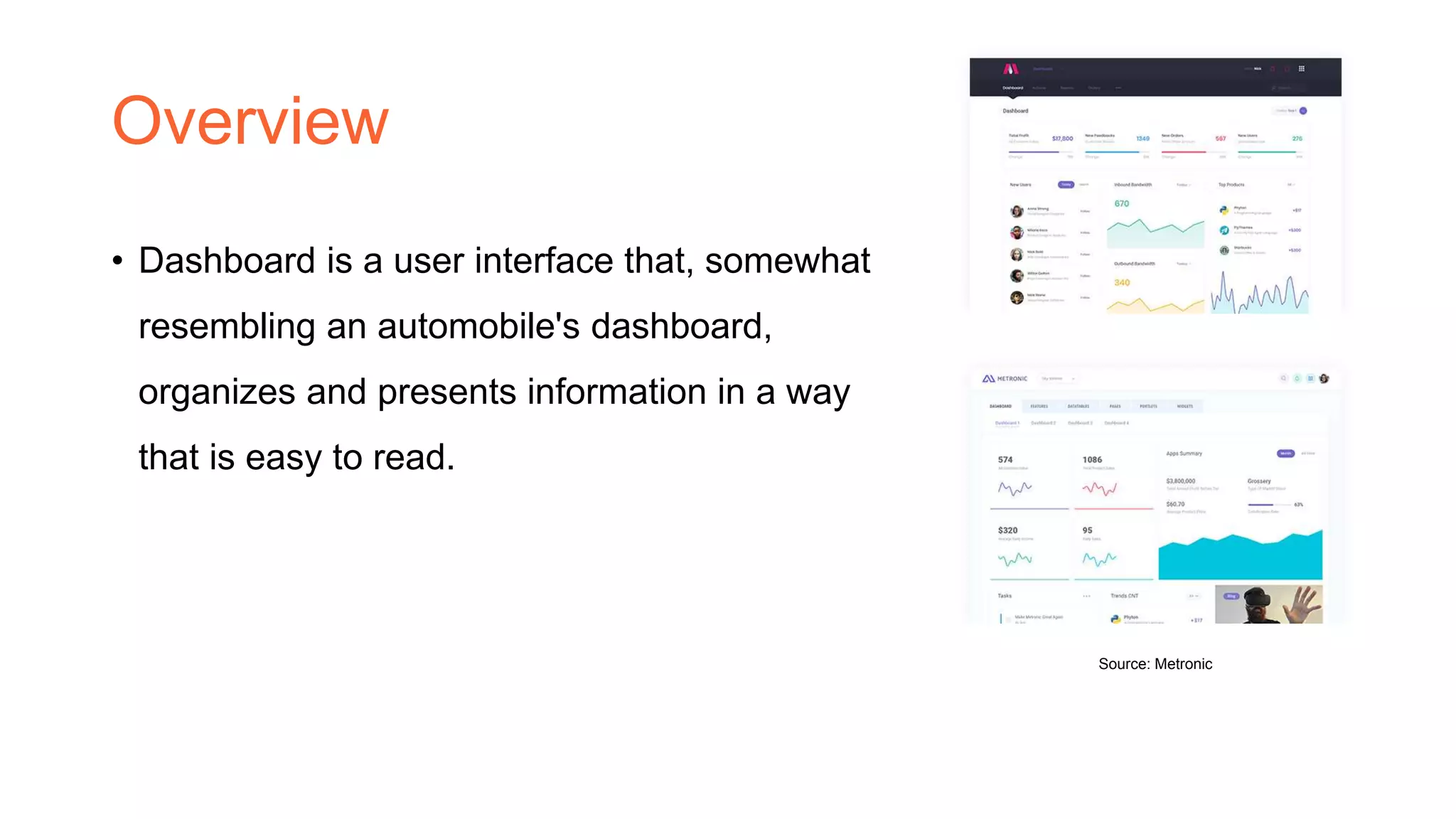
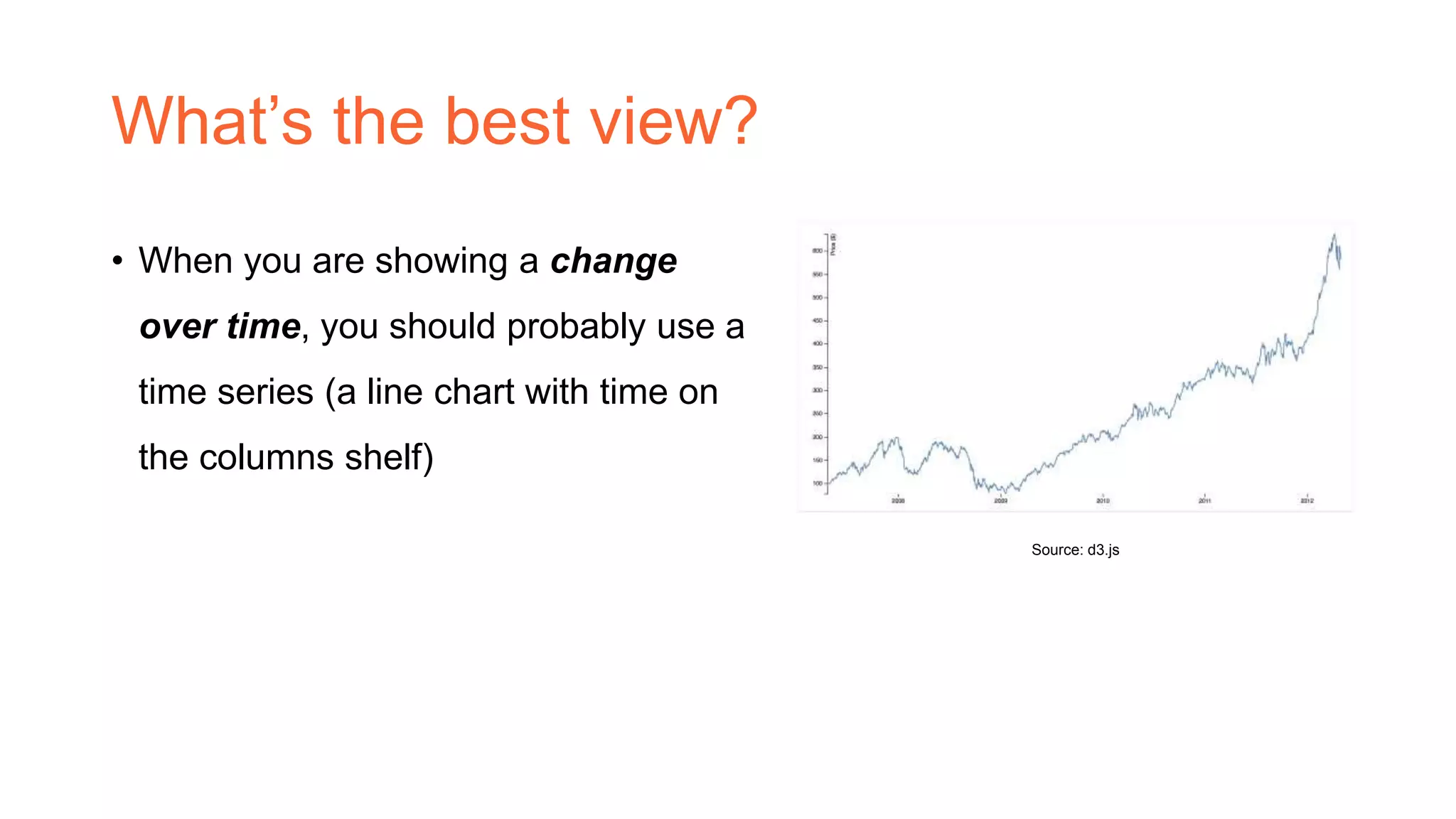
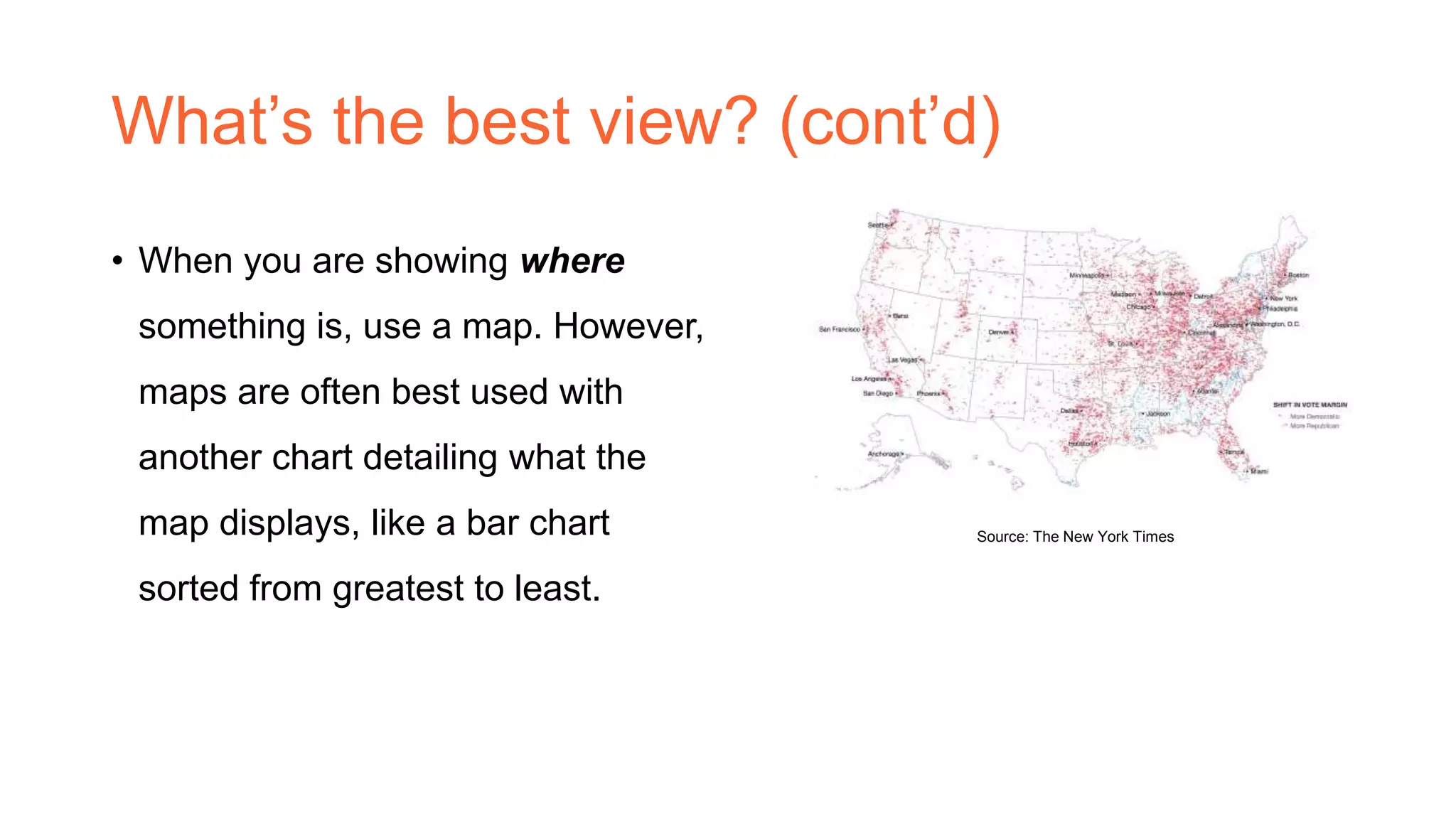
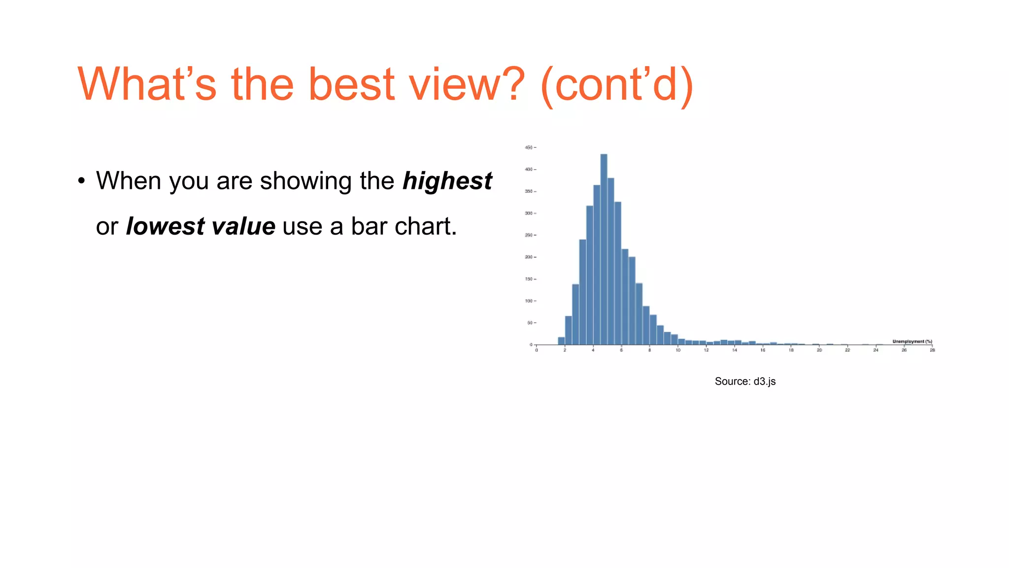
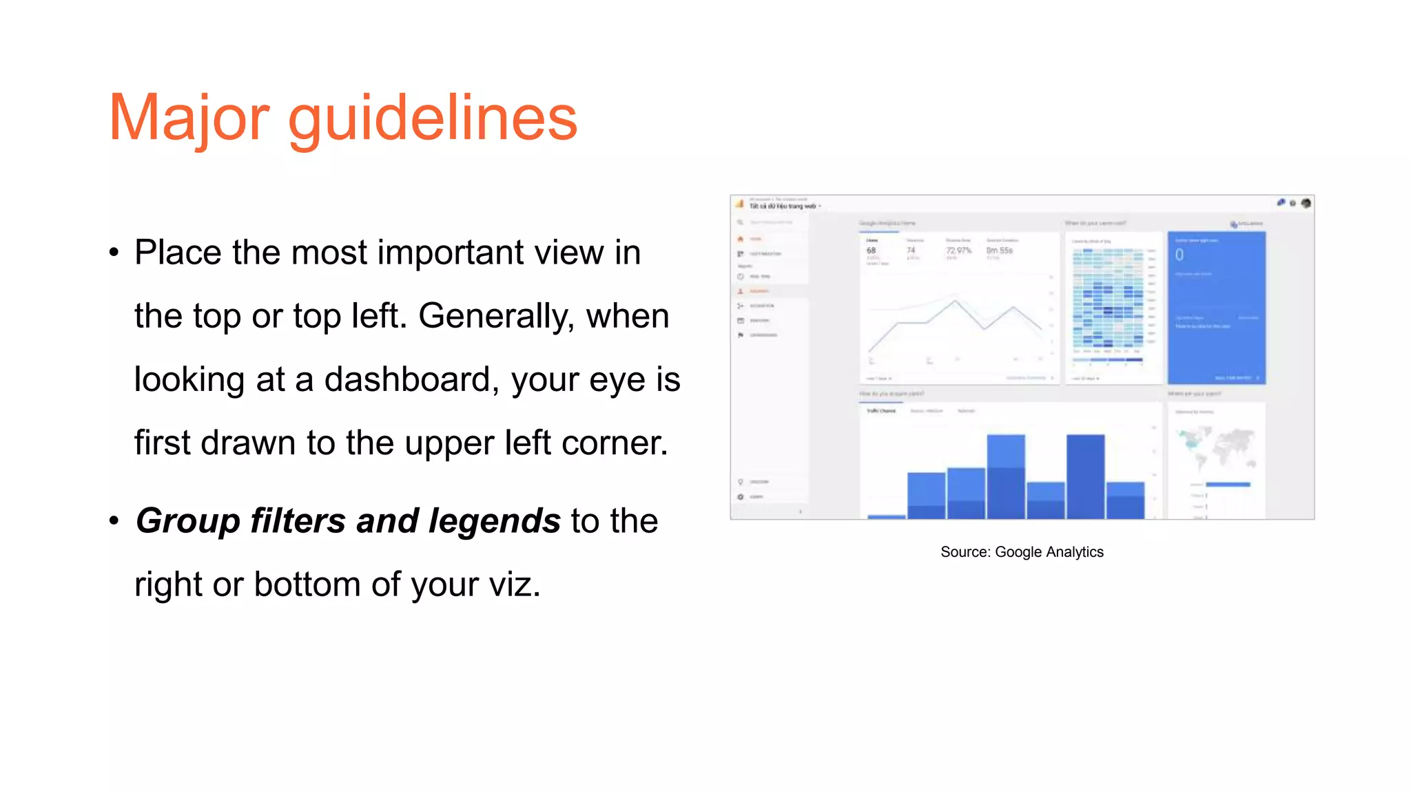
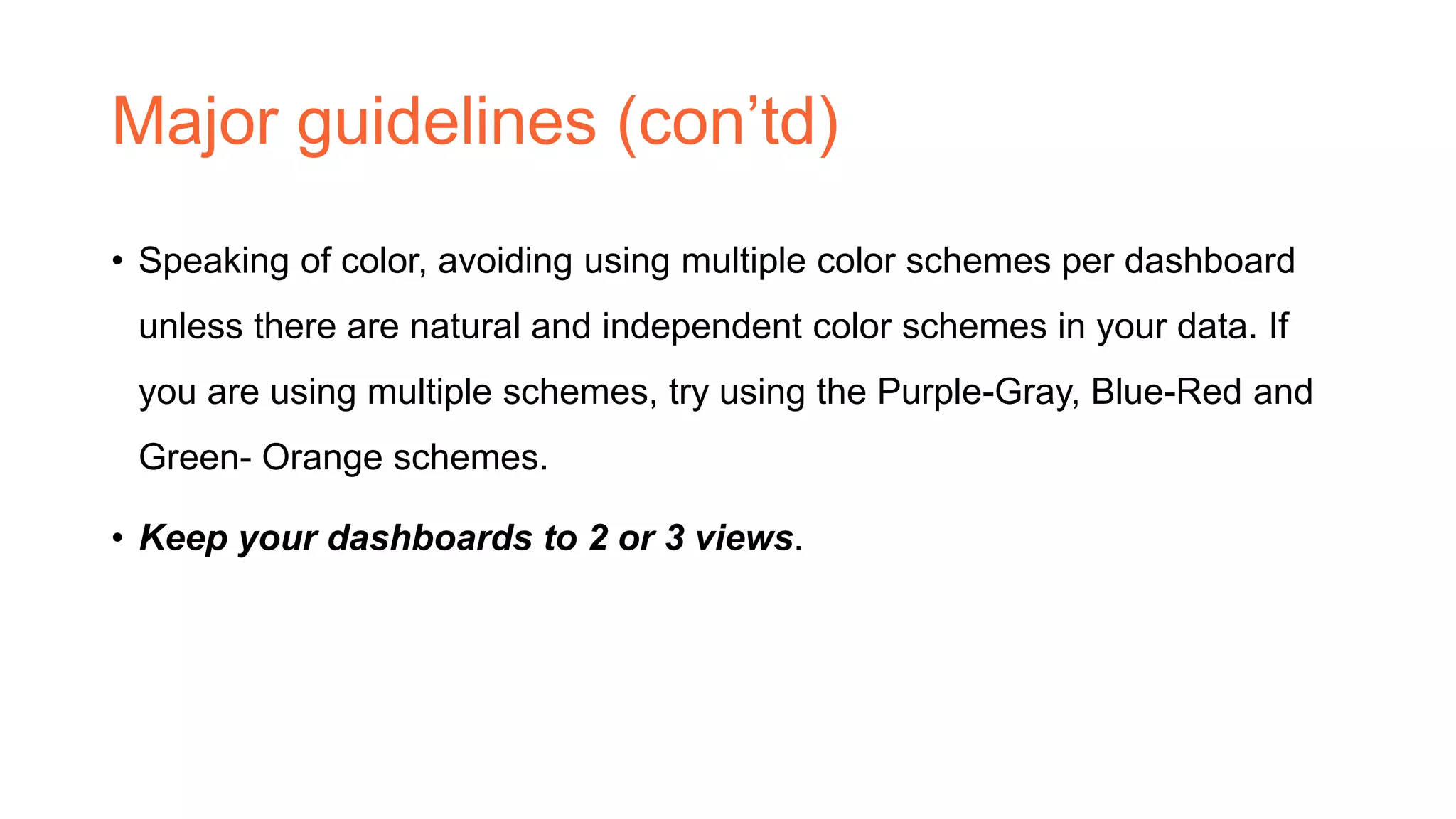
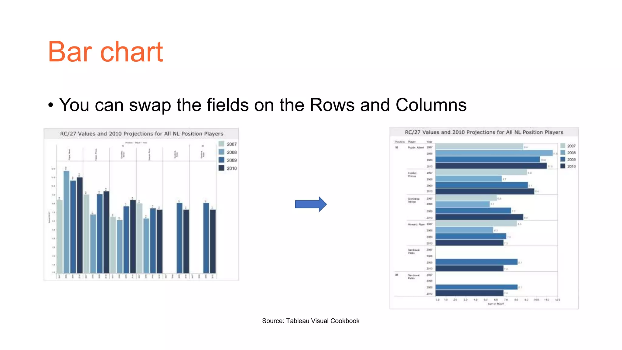
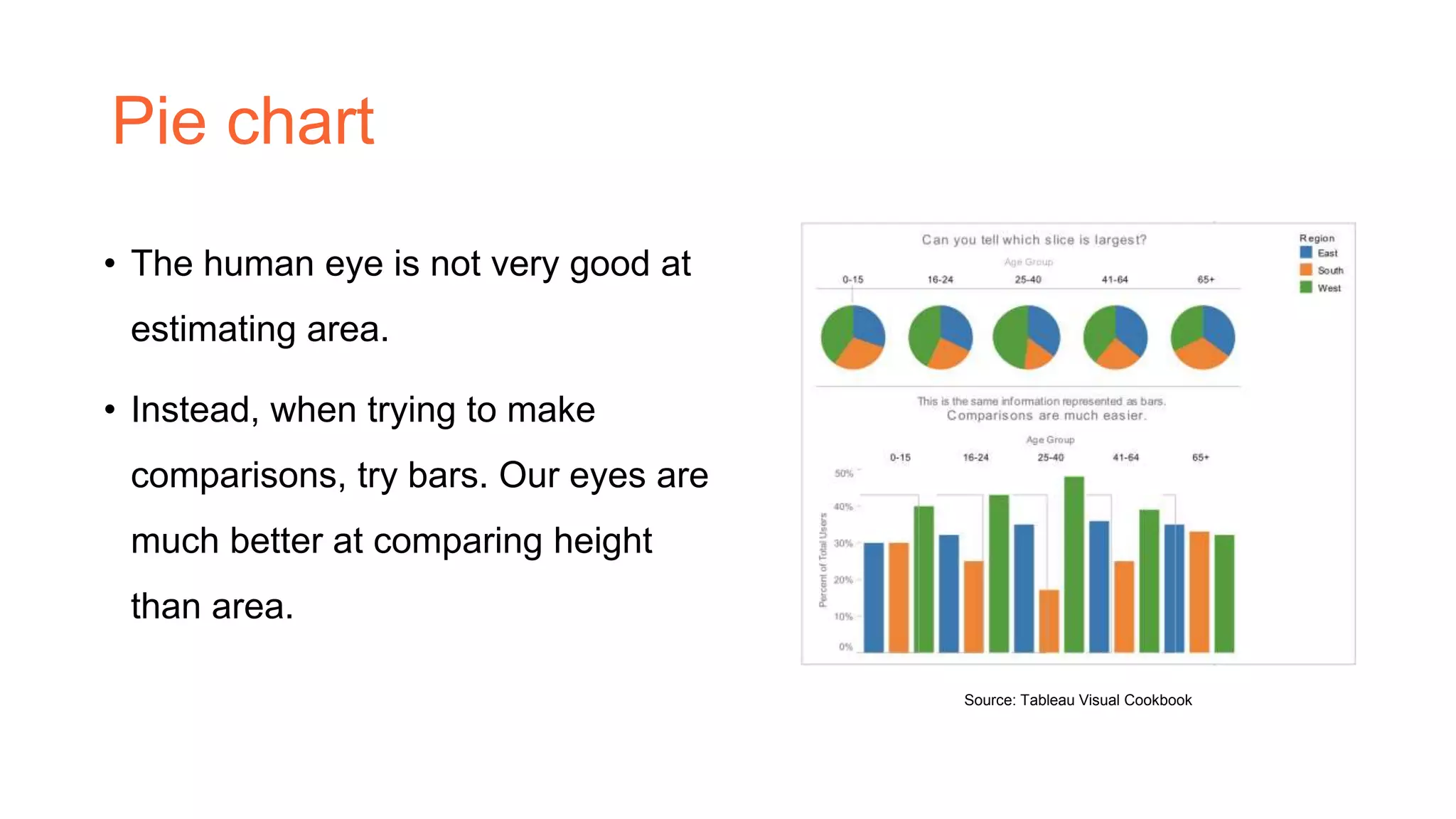
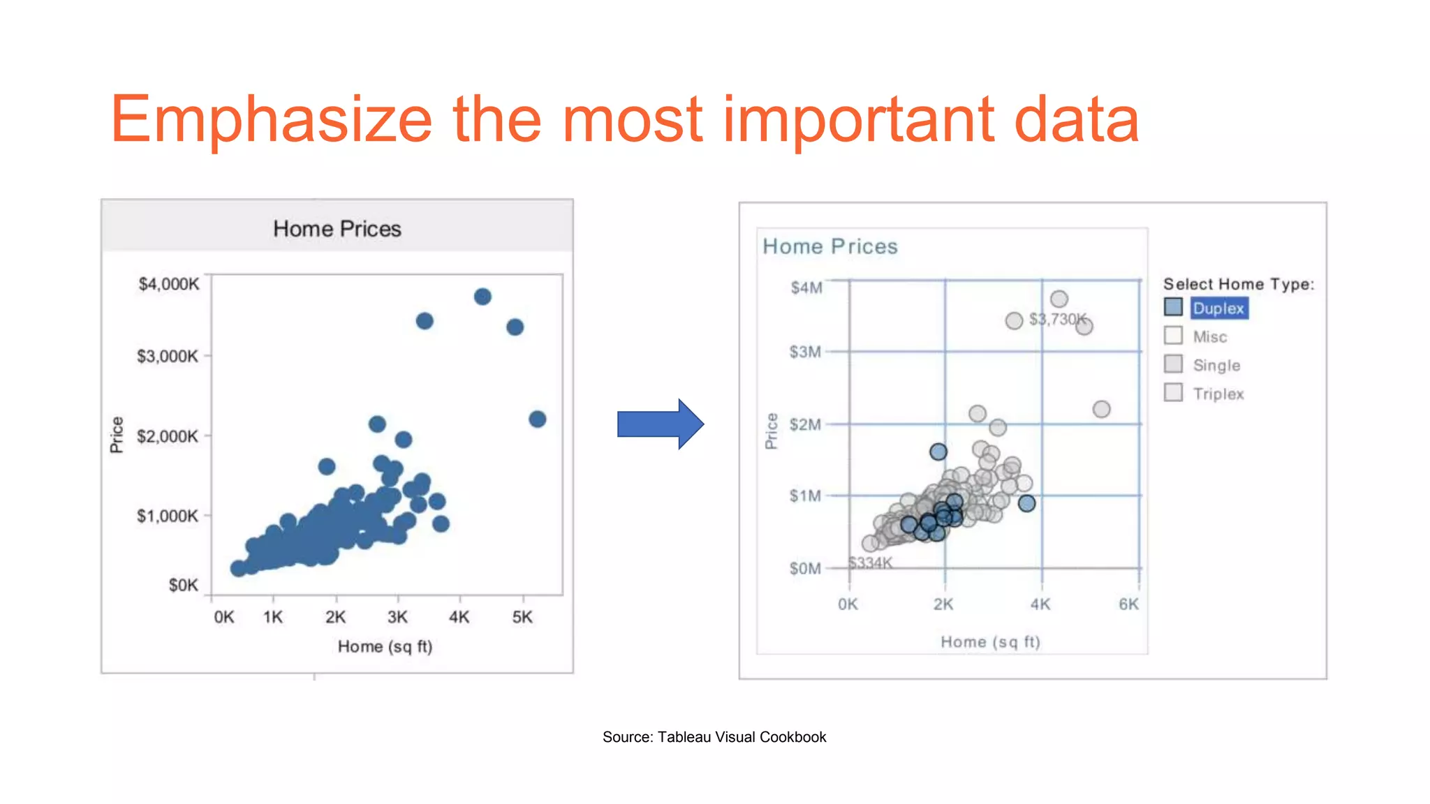
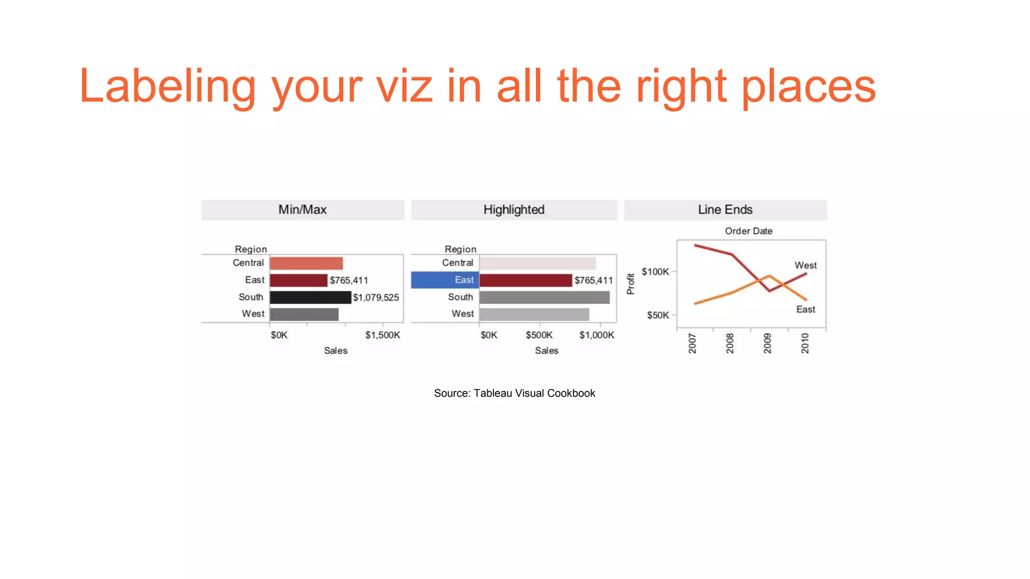
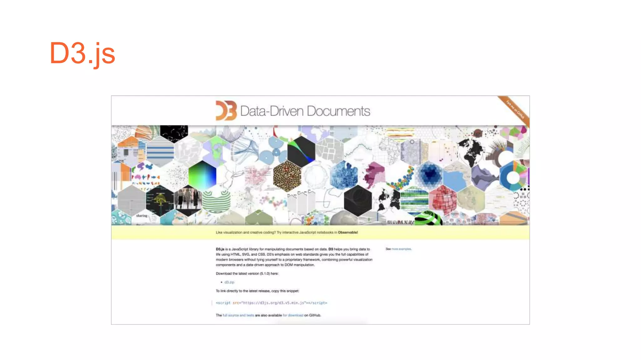
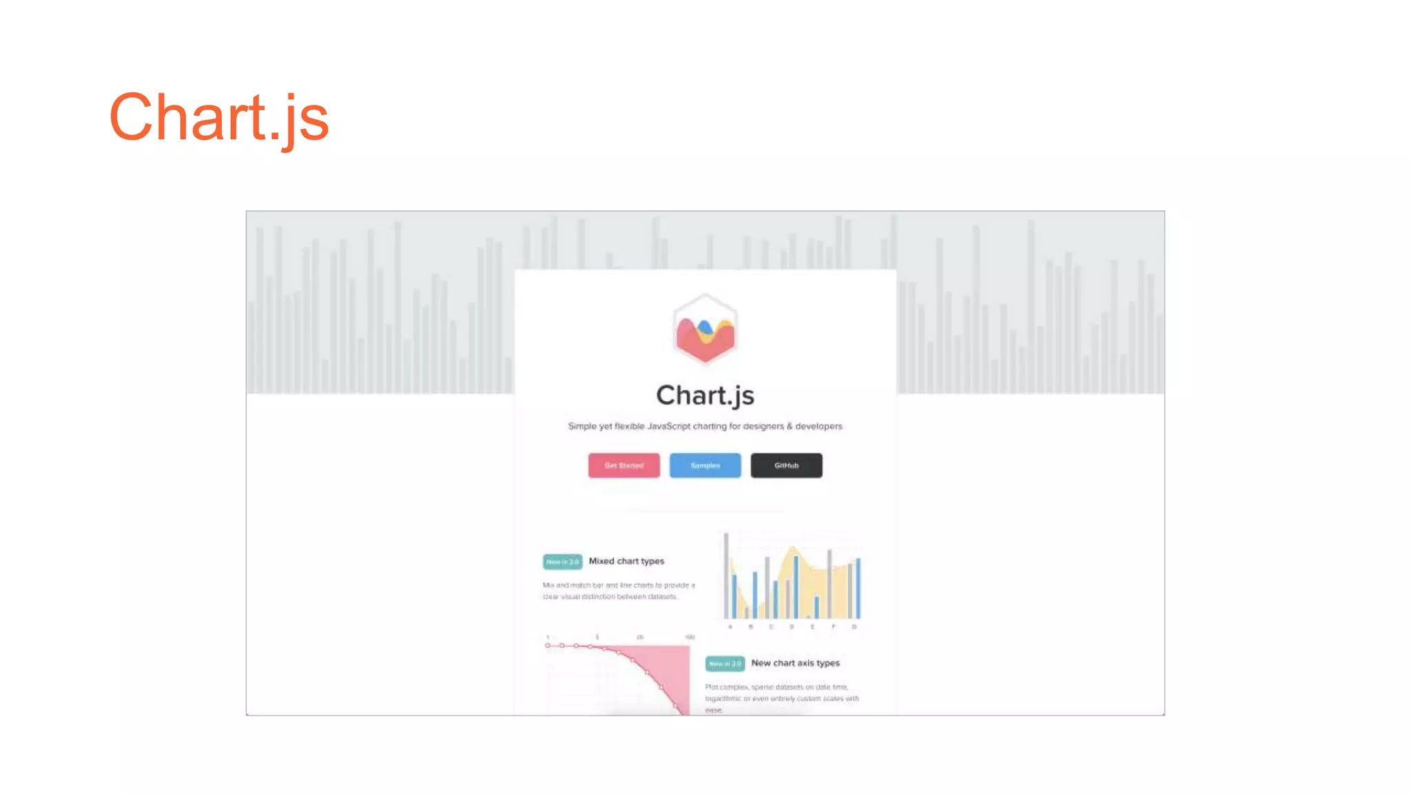
Dashboard Guidelines
Nam Vo
Overview
• Dashboard is a user interface that, somewhat
resembling an automobile's dashboard,
organizes and presents information in a way
that is easy to read.
Source: Metronic
What’s the best view?
• When you are showing a change
over time, you should probably use a
time series (a line chart with time on
the columns shelf)
Source: d3.js
What’s the best view? (cont’d)
• When you are showing where
something is, use a map. However,
maps are often best used with
another chart detailing what the
map displays, like a bar chart
sorted from greatest to least.
Source: The New York Times
What’s the best view? (cont’d)
• When you are showing the highest
or lowest value use a bar chart.
Source: d3.js
Major guidelines
• Place the most important view in
the top or top left. Generally, when
looking at a dashboard, your eye is
first drawn to the upper left corner.
• Group filters and legends to the
right or bottom of your viz.
Source: Google Analytics
Major guidelines (con’td)
• Speaking of color, avoiding using multiple color schemes per dashboard
unless there are natural and independent color schemes in your data. If
you are using multiple schemes, try using the Purple-Gray, Blue-Red and
Green- Orange schemes.
• Keep your dashboards to 2 or 3 views.
Another view
Your solution is not my problem
Bar chart
• You can swap the fields on the Rows and Columns
Source: Tableau Visual Cookbook
Pie chart
• The human eye is not very good at
estimating area.
• Instead, when trying to make
comparisons, try bars. Our eyes are
much better at comparing height
than area.
Source: Tableau Visual Cookbook
Emphasize the most important data
Source: Tableau Visual Cookbook
Labeling your viz in all the right places
Source: Tableau Visual Cookbook
Libraries
Make it better
D3.js
Chart.js
References
• Tableau, Tableau Visual Cookbook
• https://searchcio.techtarget.com/definition/dashboard
• https://d3js.org/

Dashboard guidelines

  • 1.
  • 2.
    Overview • Dashboard isa user interface that, somewhat resembling an automobile's dashboard, organizes and presents information in a way that is easy to read. Source: Metronic
  • 3.
    What’s the bestview? • When you are showing a change over time, you should probably use a time series (a line chart with time on the columns shelf) Source: d3.js
  • 4.
    What’s the bestview? (cont’d) • When you are showing where something is, use a map. However, maps are often best used with another chart detailing what the map displays, like a bar chart sorted from greatest to least. Source: The New York Times
  • 5.
    What’s the bestview? (cont’d) • When you are showing the highest or lowest value use a bar chart. Source: d3.js
  • 6.
    Major guidelines • Placethe most important view in the top or top left. Generally, when looking at a dashboard, your eye is first drawn to the upper left corner. • Group filters and legends to the right or bottom of your viz. Source: Google Analytics
  • 7.
    Major guidelines (con’td) •Speaking of color, avoiding using multiple color schemes per dashboard unless there are natural and independent color schemes in your data. If you are using multiple schemes, try using the Purple-Gray, Blue-Red and Green- Orange schemes. • Keep your dashboards to 2 or 3 views.
  • 8.
    Another view Your solutionis not my problem
  • 9.
    Bar chart • Youcan swap the fields on the Rows and Columns Source: Tableau Visual Cookbook
  • 10.
    Pie chart • Thehuman eye is not very good at estimating area. • Instead, when trying to make comparisons, try bars. Our eyes are much better at comparing height than area. Source: Tableau Visual Cookbook
  • 11.
    Emphasize the mostimportant data Source: Tableau Visual Cookbook
  • 12.
    Labeling your vizin all the right places Source: Tableau Visual Cookbook
  • 13.
  • 14.
  • 15.
  • 16.
    References • Tableau, TableauVisual Cookbook • https://searchcio.techtarget.com/definition/dashboard • https://d3js.org/