VIP Call Girls Service Hitech City Hyderabad Call +91-8250192130
css-presentation-for mid career engineers.ppt
1. STANFORD UNIVERSITY • INFORMATION TECHNOLOGY SERVICES
Using Cascading Style Sheets
Mark Branom
IT Services Technology Training
650.725.1717
markb@stanford.edu
http://www.stanford.edu/people/markb/
This handout accompanies classroom instruction provided by the IT Services Technology Training group at Stanford University.
While it is not intended as a stand-alone tutorial, it may be helpful for review of materials taught in the course.
2. STANFORD UNIVERSITY • INFORMATION TECHNOLOGY SERVICES
4/1/2024 Using Cascading Style Sheets slide 1
What are Cascading Style Sheets?
Cascading Style Sheets (CSS) were established by the World Wide Web
Consortium (W3C). The CSS specification allows for more control over
the look, or style, of web pages or other XML files by providing a
central location, or sheet, where you can define how certain HTML
(Hyper-Text Markup Language) or XML (eXtensible Markup
Language) tags are going to be interpreted by the browser.
Why is it called “cascading”? In CSS, multiple styles can be applied to
a particular document (usually a web page or XML file). The browser
will interpret these styles in a cascading fashion:
• Style rules set up site-wide are overridden by styles located within individual pages.
• Individual pages are overridden by styles inside an individual tag.
• In addition, the end user can set up styles in the browser that will override the author’s
styles.
• All matching rules for a particular selector will be applied, except where they conflict
with each other (in which case, the latter rule would be applied, as determined by the
cascade). In the following example, <h2> tags would be displayed in red and italics
(but not blue):
h2 {font-style: italic;}
h2 {color: darkblue;}
h2 {color: red;}
3. STANFORD UNIVERSITY • INFORMATION TECHNOLOGY SERVICES
4/1/2024 Using Cascading Style Sheets slide 2
What are Cascading Style Sheets? continued
To properly see the effects of the Style Sheets, your visitors will need to use a
web browser that is version 4.0 or newer. Fortunately, using CSS does not cause
web pages to break when viewed on older browsers; however, the styles won’t
appear as defined. Since most people these days are using Internet Explorer 6,
Netscape 7, or Firefox 1 or newer, most browsers can properly display CSS.
CSS-aware browsers apply their own stylesheet for every HTML element as the
first set of rules in the cascade, and this set of rules form the default display for
every element. For example, most browsers treat the <p> tag as a block
element, as though there were the explicit declaration p { display: block;}
By using CSS, you modify the default settings by overriding these implicit styles
with an explicit declaration (for more on the block display, see slide 17).
By using CSS, you can also control text formatting and location on the page.
Using CSS can eliminate the need for tables as a layout tool. With CSS, logos
can be created using just text, instead of having to rely on graphics. These
changes make pages more accessible to a wider audience.
CSS Specifications:
• CSS 1: http://www.w3.org/TR/REC-CSS1-961217.html
• CSS 2: http://www.w3.org/TR/CSS2/
• CSS 2.1: http://www.w3.org/TR/CSS21/
Differences between CSS 1, CSS 2, and CSS 2.1:
• Between CSS 1 and CSS 2: http://www.w3.org/TR/CSS2/changes.html
• Between CSS 2 and CSS 2.1: http://www.w3.org/TR/CSS21/changes.html
4. STANFORD UNIVERSITY • INFORMATION TECHNOLOGY SERVICES
4/1/2024 Using Cascading Style Sheets slide 3
Pros and Cons of Using CSS
Pros
• Greater designer control of the appearance of the page
• Easier management of site-wide changes
• Greater accessibility to web sites by non-graphical browsers and
web-page-reading software
Cons
• Different browsers may interpret Style Sheets in different ways
• Some styles may not be seen at all on some browsers
5. STANFORD UNIVERSITY • INFORMATION TECHNOLOGY SERVICES
4/1/2024 Using Cascading Style Sheets slide 4
CSS Examples
The CSS Zen Garden shows some of the most advanced uses of CSS:
http://www.csszengarden.com/
CSS in the real world: ajc.com's 'News Break'
http://www.holovaty.com/blog/archive/2002/09/28/2340
Web Standards Tech Briefing – with CSS:
http://techbriefings.stanford.edu/web_standards/example1.html
Web Standards Tech Briefing – without CSS :
http://techbriefings.stanford.edu/web_standards/example2.html
6. STANFORD UNIVERSITY • INFORMATION TECHNOLOGY SERVICES
4/1/2024 Using Cascading Style Sheets slide 5
CSS Basics
Under standard HTML, to create a web site with
<h2> tags that have the standard features of a Header
tag (that is, their own paragraph, bold, with a size
change) and also are dark blue, you have to code each
one as follows:
<h2><font color="darkblue">This is a darkblue H2 tag</font></h2>
That’s a lot of information to type every time you
want to use a dark blue <h2> tag. Using CSS, all you
need to do is type a regular <h2> tag. The style
information will be included in the Style Sheet as
follows:
h2 { color: darkblue;}
7. STANFORD UNIVERSITY • INFORMATION TECHNOLOGY SERVICES
4/1/2024 Using Cascading Style Sheets slide 6
CSS Rules
To change the color of ALL <h2> tags from darkblue to green,
simply change the called for color to “green.” The next time
anyone sees the site, all the <h2> tags on all the pages will be
green instead of darkblue.
These styles are called rules. Each rule consists of a selector and
a declaration (which is made up of a property and a value).
In the example below, h2 is the selector, color is the property,
and darkblue is the value. When used with web pages, selectors
are usually HTML tags.
h2 { color: darkblue;}
Syntax for a CSS rule:
selector { property: value; }
8. STANFORD UNIVERSITY • INFORMATION TECHNOLOGY SERVICES
4/1/2024 Using Cascading Style Sheets slide 7
Grouping Styles and Selectors
Each rule can include multiple styles by simply separating them by semicolons:
h2 { color: darkblue; font-style: italic;}
Additionally, multiple selectors that have the same styles can be grouped by separating them with commas:
h1, h2, h3 { color: darkblue; font-style: italic;}
Contextual selectors allow you to specify that something will change, but only when it is used in conjunction
with something else. With the following style, strong will be displayed in red, but only when it occurs
within li within ul.
ul li strong { color: red;}
Elements being modified by contextual selectors need not appear immediately inside one another (using
this style, blah would still be red text: <ul><ol><li><strong> blah </strong></li></ol></ul>).
Direct child selectors allow you to specify that something will change, but only those that are immediately
inside of another element. With the following style, only those strong elements that are directly inside of
an h1 will be purple; no strong tags deeper within the sheet will be purple.
h1 > strong { color: purple;}
Adjacent selectors allow you to specify that something will change, but only when preceded by something
else. With the following style, only those links (a) that are preceded by an h2 will be green.
h2 + a { color: green;}
Elements being modified by adjacent selectors appear immediately after one another. Using this style, this
link would be green: <h2>Visit Stanford!</h2><a href="http://www.stanford.edu">click here</a>.
This link would not: <h2>Visit Stanford! <a href="http://www.stanford.edu">click here</a></h2>.
You can also group selectors by attribute. With the following style, centered h2 tags (<h2 align="center">)
will be surrounded by a dotted border:
h2[align="center"] { border: dotted;}
9. STANFORD UNIVERSITY • INFORMATION TECHNOLOGY SERVICES
4/1/2024 Using Cascading Style Sheets slide 8
Where do you put the styles?
Style information can be located in three places:
• External to the pages in a site
• Internal to each page
• Inline with individual tags
Generally, creating an external style sheet file is the
preferred method. To take full advantage of CSS, the
Style Sheet for a site should be in this one external
file, so that any changes will apply throughout the
site. This also means that only one style document
has to be downloaded for a single site.
10. STANFORD UNIVERSITY • INFORMATION TECHNOLOGY SERVICES
4/1/2024 Using Cascading Style Sheets slide 9
Style Location: External
The most common place to put style information is in an external
document that each page of a web site points to directly.
Any changes made to this single document will then be applied
throughout the entire web site as each page is accessed by users.
External Style Sheets have a .css extension.
When linking to an external style sheet, you can also specify separate
style sheets by media type:
• all - Suitable for all devices.
• aural - Intended for speech synthesizers.
• braille - Intended for braille tactile feedback devices.
• embossed - Intended for paged braille printers.
• handheld - Intended for handheld devices (typically small screen, monochrome,
limited bandwidth).
• print - Intended for paged, opaque material and for documents viewed on screen in
print preview mode.
• projection - Intended for projected presentations
• screen - Intended primarily for color computer screens.
• tty - Intended for media using a fixed-pitch character grid, such as teletypes, terminals,
or portable devices with limited display capabilities.
• tv - Intended for television-type devices
11. STANFORD UNIVERSITY • INFORMATION TECHNOLOGY SERVICES
4/1/2024 Using Cascading Style Sheets slide 10
External example
Text that appears in the basic.css style sheet document:
h2 {font-family: Arial, sans-serif; font-style: italic; color: green;}
p {font-family: Courier, monotype; font-style: bold; color: red; }
Text that appears in the print.css style sheet document:
h2 {font-family: Book Antiqua, Times, serif; font-style: italic; }
p {font-family: Courier, monotype; font-style: bold; }
HTML document, using the <link> tag method
<head>
<link rel="stylesheet" type="text/css"
href="basic.css" media="all" />
<link rel="stylesheet" type="text/css"
href="print.css" media="print" />
</head>
HTML document, using the @import and @media method
<head>
<style type="text/css">
<!--
@import url("basic.css") all;
@media url("print.css") print;
-->
</style>
</head>
12. STANFORD UNIVERSITY • INFORMATION TECHNOLOGY SERVICES
4/1/2024 Using Cascading Style Sheets slide 11
Style Location: Internal
Style information can also be included in the <head>
section of an individual web page. This tends to work
best when a single page needs to have a slightly
different look than the rest of the site.
13. STANFORD UNIVERSITY • INFORMATION TECHNOLOGY SERVICES
4/1/2024 Using Cascading Style Sheets slide 12
Style Location: Inline
For extreme control, style information can be
included in an individual tag. The style effects only
that tag and no others in the document. This option
is most useful for those rare occasions when a single
tag needs to have a slightly different style.
14. STANFORD UNIVERSITY • INFORMATION TECHNOLOGY SERVICES
4/1/2024 Using Cascading Style Sheets slide 13
Hierarchy of styles
When style information is located in all three places in one site,
the hierarchy is as follows:
• External Style Sheets affect the entire site.
• Internal styles affect only their own pages and override external styles.
• Inline styles affect only their own tags and override both internal and
external styles.
For example, if an external Style Sheet sets <h2> tags to purple
and a particular page has an internal style that changes that
color to orange, the <h2> tags will be orange only on that page
and nowhere else in the site. If there is a single <h2> tag on that
page which specifies green as its color, then the color for that
one tag will be green. All other <h2> tags on that page would
be orange; the <h2> tags on the rest of the site would be purple.
15. STANFORD UNIVERSITY • INFORMATION TECHNOLOGY SERVICES
4/1/2024 Using Cascading Style Sheets slide 14
!important
Normally, the last rule listed in the cascade will take precedence
over previous rules. In this example, the body font will be
Verdana, not Times.
body {font-family: Times;
font-family: Verdana;}
However, by entering !important in a rule, that rule will take
precedence, regardless of its location. In this example, the body
font will be Times, not Verdana.
body {font-family: Times !important;
font-family: Verdana;}
Note: !important does not work with all properties in Internet Explorer.
16. STANFORD UNIVERSITY • INFORMATION TECHNOLOGY SERVICES
4/1/2024 Using Cascading Style Sheets slide 15
Classes and IDs
HTML has two attributes that make CSS even more useful: class and ID. They
make it easy to apply style to just about any tag.
Classes can describe a generic style that can be applied to any HTML element, or
can be created for specific elements.
When defining a style for elements with a particular class attribute in the Style
Sheet, declare a rule using a dot (.) followed by the class name. To limit the style
to a particular element with that class attribute, use a selector combining the tag
name with a dot followed immediately by the class name.
• The following rule would apply to any element with the attribute class=“shade"
.shade { background: yellow; }
• The following rule would apply only to paragraph tags with the class shade (<p class="shade">)
p.shade { background: red; }
IDs are similar to classes, but IDs are unique – they can only be used with one
instance of an element within a document.
When defining a CSS rule using an ID-based selector, use a
number/pound/hash sign (#) followed by the style name. To limit the style to a
particular element with that id attribute, use a selector combining the tag name
with a # and then the id name.
• The following rule would apply to any element with the attribute id="intro"
#intro { font-size: 2em; }
• The following rule would apply only to heading 1 tags with the id intro (<h1 id="intro">)
h1#intro { color: green; }
17. STANFORD UNIVERSITY • INFORMATION TECHNOLOGY SERVICES
4/1/2024 Using Cascading Style Sheets slide 16
Class example
Here’s an example of a web page with an internal CSS
style with a class called “highlight”:
18. STANFORD UNIVERSITY • INFORMATION TECHNOLOGY SERVICES
4/1/2024 Using Cascading Style Sheets slide 17
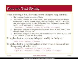
Inline vs. Block Display (HTML)
All HTML elements (tags) are assigned a display
property value of either inline or block.
Inline elements display in browsers horizontally.
[INLINE ELEMENT 1] [INLINE ELEMENT 2] [INLINE ELEMENT 3]
Block elements display in browsers vertically (stacked
one on top of the other).
[BLOCK ELEMENT 1]
[BLOCK ELEMENT 2]
[BLOCK ELEMENT 3]
Examples of inline elements:
<a> <img> <strong> <em> <span>
Examples of block elements:
<p> <h1-h6> <div> <hr> <table> <ul> <ol>
19. STANFORD UNIVERSITY • INFORMATION TECHNOLOGY SERVICES
4/1/2024 Using Cascading Style Sheets slide 18
Inline vs. Block Display (CSS)
Using CSS, you can change this inherent display
property:
• To force a block display, use the declaration display: block;
• To force an inline display, use the declaration display: inline;
• To force a list, use the declaration display: list-item;
• To hide elements matching the selector, use the declaration
display: none;
20. STANFORD UNIVERSITY • INFORMATION TECHNOLOGY SERVICES
4/1/2024 Using Cascading Style Sheets slide 19
Example – display: block;
Normally, <a> tags display inline.
But, if you add the style a {display: block;},
they will display as a vertical navigation menu:
21. STANFORD UNIVERSITY • INFORMATION TECHNOLOGY SERVICES
4/1/2024 Using Cascading Style Sheets slide 20
Example – display: inline;
Normally, the heading tags display in block format:
But, to have them display inline, add the style
h1,h2,h3 {display: inline;}:
22. STANFORD UNIVERSITY • INFORMATION TECHNOLOGY SERVICES
4/1/2024 Using Cascading Style Sheets slide 21
Span and Div
There are two tags that are particularly useful when
using CSS: <span> and <div>. They are both
container tags that have minimal formatting
associated with them.
The <span> tag is an inline element that simply
holds text without doing anything special to it.
The <div> tag is a block element and causes the text
it encloses to start on a new line.
Using <span> and <div> tags in conjunction with
classes and IDs allows for great flexibility in creating
pages.
23. STANFORD UNIVERSITY • INFORMATION TECHNOLOGY SERVICES
4/1/2024 Using Cascading Style Sheets slide 22
Example using SPAN, DIV, Class, and ID
Here’s an example of a web page using a class, an id,
and the span and div tags:
24. STANFORD UNIVERSITY • INFORMATION TECHNOLOGY SERVICES
4/1/2024 Using Cascading Style Sheets slide 23
Unit Measurements
In CSS, you can measure units either in absolute values or in relative values.
Absolute values are fixed, specific values. Since they are exact measurements, they allow
the designer complete control over the display of the web pages.
mm, cm, in, pt, pc, xx-small, x-small, small, medium, large, x-large, xx-large
Relative values have no fixed, specific values, and are calculated in comparison to
something else (usually the size of the default font or line size). Because different computers
have different video cards, screen sizes, and users have differing eyesight abilities, relative
values tend to be a better choice. They give the designer less absolute control but it often
creates a better experience for the visitor.
em, ex, px, larger, smaller, num%
Examples:
body { font-size: 12px; }
h1, h2, h3 { line-height: 200%;}
Note – a warning about using percentages: if you use percentages, and nest an element
inside of that same element, the percentages will be cumulative.
25. STANFORD UNIVERSITY • INFORMATION TECHNOLOGY SERVICES
4/1/2024 Using Cascading Style Sheets slide 24
Font and Text Styling
When choosing a font, there are several things to keep in mind:
1. Not everyone has the same set of fonts.
2. If you use a font that the visitor doesn’t have, the page will display in the
default font (usually Times), unless you provide more choices. To do this,
add more than one font in your declaration, and always end with the font
family (serif, sans-serif, or monospace):
font-family: Verdana, Arial, Helvetica, sans-serif
3. Documents designed to be printed tend to look better in Serif fonts (Times,
Georgia, Book Antiqua, etc.)
4. Documents designed to be viewed onscreen tend to look better in Sans-serif
fonts (Verdana, Arial, Helvetica, etc.)
To apply a font to the entire web page, modify the body tag:
body {font-family: Verdana;}
To apply a font to a specific section of text, create a class, and use
the span tag with that class:
.neatstuff {font-family: Comic Sans MS;}
<span class="neatstuff">This is in Comic Sans</span>
26. STANFORD UNIVERSITY • INFORMATION TECHNOLOGY SERVICES
4/1/2024 Using Cascading Style Sheets slide 25
Modifying List Elements
By default, unordered lists (<ul>) appear as bullets and ordered
lists (<ol>) appear as numbers in HTML.
Using CSS, you can modify how list items will appear:
• Properties:
list-style, list-style-type, list-style-image, list-style-position
• Values:
disc, circle, square, decimal, decimal-leading-zero, lower-roman,
upper-roman, lower-alpha, upper-alpha, lower-greek, lower-latin,
upper-latin, hebrew, armenian, georgian, cjk-ideographic, hiragana,
katakana, hiragana-iroha, katakana-iroha, none, url("graphic.gif")
Examples:
ul { list-style: disc; }
ol { list-style: upper-roman;}
li { list-style: url("blackball.gif");}
ul li { list-style-position: inside;}
27. STANFORD UNIVERSITY • INFORMATION TECHNOLOGY SERVICES
4/1/2024 Using Cascading Style Sheets slide 26
The Box Model
When the browser draws an object on a page, it places it into an
invisible rectangular space called a “bounding box.”
You can specify the size, look, and feel of the margins, the
padding, the border, and the content of the box.
Internet Explorer interprets CSS box styles differently than
most other web browsers.
In CSS1, the width property is defined as the distance between
the left and right edges of the bounding box that surrounds the
element's content.
Likewise, the height property is defined in CSS as the distance
between the top and bottom edges of the bounding box.
In Internet Explorer, however, the width and height
properties also include the border and padding belts that
surround the element's bounding box.
28. STANFORD UNIVERSITY • INFORMATION TECHNOLOGY SERVICES
4/1/2024 Using Cascading Style Sheets slide 27
The Box Model: IE vs. CSS
CSS Standard Internet Explorer
29. STANFORD UNIVERSITY • INFORMATION TECHNOLOGY SERVICES
4/1/2024 Using Cascading Style Sheets slide 28
Pseudo-elements and Pseudo-classes
Two special predefined groupings, called pseudo-elements and pseudo-
classes, are used in CSS to deal with special situations that do not exist
with standard HTML. For example, under standard HTML, there is no
way to automatically change the look and feel of the first letter or line of
a paragraph. But by using the pseudo-element :first-letter you
can specify a style that affects it:
p:first-letter { font-size: 200%; color:red;}
Under standard HTML, there is no mechanism to deal with mouse
movements. But with CSS, the pseudo-class :hover can be used to
change the style of a link. In this example, a:hover is used to change
the link color to red and the underlining to disappear whenever a
mouse hovers over links:
a:hover {color: #ff0000; text-decoration: none;)
To change the style of links, use the pseudo-class :link
To change the style of visited links, use the pseudo-class :visited
a:link {color: #00f; font-weight: bold;)
a:visited {color: purple; border: groove;}
30. STANFORD UNIVERSITY • INFORMATION TECHNOLOGY SERVICES
4/1/2024 Using Cascading Style Sheets slide 29
Positioning
Using CSS, you can place elements exactly on a page
using a technique called “positioning.” Positioning is
determined by an X axis and Y axis. To specify a
specific point on the screen, you can use the X and Y
coordinate for that point.
There are several ways to specify position in CSS:
absolute, relative, fixed, inherit, and static.
The three most often used are absolute, relative, and
fixed.
Internet Explorer 6 only recognizes absolute and
relative.
31. STANFORD UNIVERSITY • INFORMATION TECHNOLOGY SERVICES
4/1/2024 Using Cascading Style Sheets slide 30
Absolute, Relative, Fixed, Inherit, and Static Positioning
Absolute positioning defines the position of a given bounding box from
the top and left side margins of the web page. This not only allows
objects to be placed in an exact location, it also allows objects to be
placed one on top of another.
Relative positioning defines the positioning in such a way that
elements are offset from the previous element in the HTML code. This
allows objects to be placed in relation to one another.
Fixed positioning defines the position of a given box relative to the
window and remains in its specified location even as the content scrolls
underneath it. This value does not work in Internet Explorer 6 or
earlier. In IE 7, the browser must be in “standards-compliance mode”.
Inherit positioning explicitly sets the value to that of the parent (if the
parent is position:absolute, the child will be position:absolute; if the
parent is position:fixed, the child will be position:fixed).
Static positioning is the default. It defines the position of a given box
essentially as an unpositioned element – it flows in the normal
rendering sequence of the web page.
32. STANFORD UNIVERSITY • INFORMATION TECHNOLOGY SERVICES
4/1/2024 Using Cascading Style Sheets slide 31
Absolute Positioning Example
33. STANFORD UNIVERSITY • INFORMATION TECHNOLOGY SERVICES
4/1/2024 Using Cascading Style Sheets slide 32
Relative Positioning Example
34. STANFORD UNIVERSITY • INFORMATION TECHNOLOGY SERVICES
4/1/2024 Using Cascading Style Sheets slide 33
Fixed Positioning – code view
<!DOCTYPE html PUBLIC "-//W3C//DTD XHTML 1.0
Transitional//EN"
"http://www.w3.org/TR/xhtml1/DTD/xhtml1-
transitional.dtd">
<html xmlns="http://www.w3.org/1999/xhtml">
<head>
<meta http-equiv="Content-Type" content="text/html;
charset=iso-8859-1" />
<title>Untitled Document</title>
<style type="text/css">
<!--
#links {
position:fixed;
border:dotted;
border-color:#000000;
width:20%;
height:100%;
z-index:1;
left: 0px;
top: 0px;
background-color: #FFFFCC;
}
#main {
position:absolute;
left:25%;
top:0px;
width:70%;
}
-->
</style>
</head>
<body>
<div id="main">
<p>Lorem ipsum dolor sit amet, consectetuer adipiscing
elit. Quisque ultrices, nibh ac rhoncus fermentum,
orci sem dapibus nisi, sed tincidunt lectus lectus at
augue. In consectetuer vehicula enim. In hac habitasse
platea dictumst. Donec a nisl vitae tortor tristique
viverra. Sed at lorem a ante lobortis molestie.
Nulla ullamcorper urna accumsan diam. Aliquam non
eros. Pellentesque egestas ultricies enim. Aenean
lobortis. Nulla interdum commodo turpis. Sed ut mi id
elit vehicula sollicitudin. Sed lobortis, ligula sit
amet euismod egestas, mi ante iaculis nunc, ut
rhoncus magna lectus ac arcu. In hac habitasse platea
dictumst. Proin quis ligula vitae quam pharetra
adipiscing. Pellentesque tincidunt suscipit nibh. Ut
fermentum suscipit justo. </p>
<p>Fusce purus lectus, ultricies nec, aliquam at,
facilisis id, arcu. Vestibulum quis mi vel massa
porta hendrerit. Nulla ullamcorper ligula nec lectus.
Quisque tempor, augue in molestie gravida, eros arcu
luctus tortor, eu dignissim diam urna sed urna. Ut
dictum ultrices lacus. In hac habitasse platea
dictumst. Suspendisse sed purus blandit metus
ultricies suscipit. Proin diam justo, consequat id,
rhoncus eget, facilisis ut, lacus. Vivamus dignissim
dui in justo. Suspendisse elit. Nam nulla tortor,
fringilla sed, faucibus quis, ullamcorper a, leo.
Fusce blandit condimentum turpis. Pellentesque vel
odio et odio suscipit egestas. Nullam ullamcorper
sagittis ipsum. Maecenas fringilla malesuada pede.
Duis ut quam. </p>
</div>
<div id="links">
<p>This area is fixed and will never move. It's good for
things like navigation bars.</p>
<ul>
<li><a href="page1.html">Page 1</a></li>
<li><a href="page2.html">Page 2</a></li>
<li><a href="page3.html">Page 3</a></li>
<li><a href="page4.html">Page 4</a></li>
<li><a href="page5.html">Page 5</a></li>
</ul>
</div></body></html>
35. STANFORD UNIVERSITY • INFORMATION TECHNOLOGY SERVICES
4/1/2024 Using Cascading Style Sheets slide 34
Fixed Positioning – Firefox web browser
36. STANFORD UNIVERSITY • INFORMATION TECHNOLOGY SERVICES
4/1/2024 Using Cascading Style Sheets slide 35
Layers and the “Bounding Box”
When the browser draws an object on a page, it places it into an
invisible rectangular space called a “bounding box.” You can set
the box’s exact location on the page or offset it from other
objects on the page. As mentioned in the previous slides, you
can also specify the size of the box.
With CSS, these boxes can be stacked one on top of another as
layers. Horizontal and vertical positioning happen along the X
and Y axes, and the layered positioning happens along the Z
axis.
The Z axis is set using the CSS style z-index, which allows you
to specify which layer appears on top of the others. By setting
the z-index higher or lower, an object can move up and down
a stack. The higher the z-index, the more “on top” it is.
37. STANFORD UNIVERSITY • INFORMATION TECHNOLOGY SERVICES
4/1/2024 Using Cascading Style Sheets slide 36
Layering Example 1
38. STANFORD UNIVERSITY • INFORMATION TECHNOLOGY SERVICES
4/1/2024 Using Cascading Style Sheets slide 37
Layering Example 2
39. STANFORD UNIVERSITY • INFORMATION TECHNOLOGY SERVICES
4/1/2024 Using Cascading Style Sheets slide 38
Float
If you want to wrap content around other content
(such as text around a picture), you can use the
float property.
The float property determines on which side of the
bounding box the element aligns so that the other
content wraps around it.
40. STANFORD UNIVERSITY • INFORMATION TECHNOLOGY SERVICES
4/1/2024 Using Cascading Style Sheets slide 39
Float Example 1 – float: right
41. STANFORD UNIVERSITY • INFORMATION TECHNOLOGY SERVICES
4/1/2024 Using Cascading Style Sheets slide 40
Float Example 2 – float: left
42. STANFORD UNIVERSITY • INFORMATION TECHNOLOGY SERVICES
4/1/2024 Using Cascading Style Sheets slide 41
Resources
A List Apart – articles on practical issues and suggestions for working with CSS correctly
http://www.alistapart.com/topics/code/css
Example XHTML Pages, with and without the CSS Style Sheet:
http://techbriefings.stanford.edu/web_standards/example1.html
http://techbriefings.stanford.edu/web_standards/example2.html
http://techbriefings.stanford.edu/web_standards/example.css
The CSS Zen Garden shows some of the most advanced uses of CSS:
http://www.csszengarden.com/
CSS in the real world: ajc.com's 'News Break':
http://www.holovaty.com/blog/archive/2002/09/28/2340
Microsoft's CSS Information:
http://msdn.microsoft.com/workshop/author/css/reference/attributes.asp
Microsoft's Style Sheet Demonstrations:
http://www.microsoft.com/typography/css/gallery/extract1.htm
http://www.microsoft.com/typography/css/gallery/slide1.htm
W3C Style Examples
http://www.w3.org/Style/Examples/007
W3C CSS 2.1 Specifications:
http://www.w3.org/TR/CSS21/
W3Schools CSS Tutorial:
http://www.w3schools.com/css
W3Schools CSS Reference:
http://www.w3schools.com/css/css_reference.asp
Webmonkey’s Cascading Style Sheet Guide:
http://www.webmonkey.com/reference/stylesheet_guide/
Brian Wilson’s Cascading Style Sheet Reference Guide:
http://www.blooberry.com/indexdot/css/index.html