The document summarizes CSS1 properties for font, color, and background. It defines syntax, possible values, default values, applicable elements, and inheritance for properties like font-family, font-size, color, background-color, background-image, background-repeat, background-attachment, and background-position. Examples are given for setting values for each property.
The document summarizes CSS1 font properties including font-family, font-style, font-variant, font-weight, font-size, and the shorthand font property. It provides the syntax, possible values, initial values, elements applied to, and whether each property is inherited for each font property defined in CSS1. Examples are given for how to specify each property in a CSS style sheet. Warnings are also provided about browser bugs in early versions of Internet Explorer related to font sizes.
This document discusses various CSS text formatting options including font families, styles, sizes, colors, spacing, alignment, and decoration. It provides examples for setting font styles like italic, bold, and small caps. It also covers formatting text properties such as line height, letter spacing, background colors, indentation, and alignment.
This document discusses various methods for styling colors and backgrounds in CSS, including:
1) Using named color values or RGB, HSL, and RGBa values to specify foreground and background colors.
2) Applying background images, adjusting their position, size, and repetition.
3) Creating gradients using functions like linear-gradient() and radial-gradient().
4) Attaching external style sheets to HTML documents using <link> tags or @import rules.
The document discusses various CSS properties that control the visual presentation of element boxes, including:
- Box dimensions, padding, borders, margins, and display roles can be specified.
- Padding adds space within the border. Borders define lines around elements. Margins add space outside borders.
- Border styles, widths, colors, and radii can style box edges. Drop shadows add visual effects.
- Box sizing, overflow, and display properties control box behavior in page layouts.
This document introduces CSS (Cascading Style Sheets) by providing an overview of its key concepts and features in 3 sentences or less:
CSS allows precise control over the layout, formatting, and styling of HTML documents through style rules that select elements and declare how they should be displayed; style rules can be defined internally, embedded in the HTML, or linked externally via a separate .css file and applied via selectors, properties, and values; the cascade resolves conflicts between multiple applied styles based on source, specificity, and order.
This document provides examples of how to use CSS (Cascading Style Sheets) to style and format HTML elements. It includes sections on background styling, text formatting, links, lists, tables, positioning, and more. Each section shows the CSS code to achieve various styling effects like setting colors, fonts, sizes, positioning elements, and other visual properties.
The document provides information on various HTML elements for styling and formatting text, including comments, style attributes, colors, fonts, borders, padding, and margins. It also covers CSS for defining styles through inline, internal, and external stylesheets. Additional topics include HTML tables, lists, links, and images. Key elements covered are tags for headings, paragraphs, bold, italics, superscript, formatting text size and color, and applying styles through CSS selectors like id and class.
At first glance, CSS line-height seems very simple, but there is a lot going on below the surface. Line-height is important for any designer or front end developer to understand as it can impact almost every aspect of our layouts.
A simple, step-by-step presentation on CSS line-height. Covers leading, how to apply various line-height values, as well as line-height and the inline box model. Hope you find it useful!
The document discusses CSS properties for backgrounds, borders, margins, and padding. It provides examples of how to set the background-color, background-image, border styles/colors/widths, margin sizes, and padding amounts for various HTML elements using CSS. The properties covered include background-color, background-image, background-repeat, border-style, border-color, border-width, margin, padding, and their shorthand versions. Possible values for each property are also listed.
The Cascading Style Sheets Specification ( CSS ) is a computer language that is used to write formatting instructions ( rules ). These rules tell a web browser how webpage content should 'look'— in terms of: layout. position, alignment, width, height, etc.
The document provides information about CSS (Cascading Style Sheets), including what CSS is, why it's used, how it solved problems with HTML, and some key CSS concepts. CSS is used to define styles and layout for web pages. It allows separation of document content from document presentation and saves work by controlling multiple page styles in one file. CSS removes formatting tags from HTML and solves issues that arose when tags like <font> were added to HTML for formatting.
Yellow truck top view powerpoint presentation slides ppt templatesSlideTeam.net
The document contains illustrations of a yellow truck from multiple views, including top view, front impact view, and rear impact view. Each illustration is labeled and contains various labeled parts of the truck like the steering wheel, seats, doors, trunk, and others. Below each image is a block of text prompting the user to add their own text descriptions.
Blue family car top view powerpoint presentation templatesSlideTeam.net
The document contains illustrations and descriptions of a blue family car from different views. Top view diagrams show the exterior features of the car like doors, seats, steering wheel, trunk, and tail lights. A side view diagram labels interior components such as the dashboard, shifter knob, and center console. Instructions are provided on how to edit the PowerPoint slides, including ungrouping objects and changing colors.
Red family car top view powerpoint presentation slides ppt templatesSlideTeam.net
The document contains diagrams and images depicting the top view, front impact view, and rear impact view of a red family car. Key features labeled include the steering wheel, doors, seats, shifter knob, tail lights, trunk, side view mirrors, speakers, gauges, headlights, grille, front fender, and bumper. The document demonstrates how to edit and customize the images in PowerPoint by ungrouping objects and changing colors.
Red truck top view powerpoint presentation slides ppt templatesSlideTeam.net
The document contains illustrations of a red truck from multiple views, including top views showing details of the truck interior and exterior, as well as rear and front impact views. Labels identify various parts of the truck like the steering wheel, seats, doors, trunk, and others. The illustrations are meant to be editable in PowerPoint, allowing changes to properties like color, size, and orientation.
This document provides an overview of CSS (Cascading Style Sheets) and how it can be used to control the style and layout of web pages. CSS handles the presentation and look of HTML elements, allowing control over colors, fonts, spacing, sizes, backgrounds and other visual effects. CSS rules are made up of selectors, properties and values that are interpreted by browsers. Styles can be defined internally, inline, or through external style sheets for easier maintenance. The document also covers CSS syntax, selectors, measurement units, colors, and background properties.
Blue family car top view powerpoint presentation slides ppt templatesSlideTeam.net
The document contains illustrations and descriptions of the top view, front impact view, and rear impact view of a blue family car. Key features labeled include the steering wheel, seats, doors, trunk, tail lights, head lights, grille, and more. All images are said to be 100% editable in PowerPoint to allow changing colors, sizes, and orientations of icons. Instructions are provided for ungrouping objects and editing colors.
Blue truck top view powerpoint presentation slides ppt templatesSlideTeam.net
The document contains illustrations of a blue truck from different views, including the top view, rear impact view, and front impact view. The illustrations are labeled and include details like the steering wheel, seats, doors, tail lights, trunk, side view mirrors, gauges, headlights, grille, and hood. All images are editable in PowerPoint and can be modified by changing properties like color, size, and orientation. The document provides instructions for how to ungroup objects and edit their color in PowerPoint.
Pickup brown truck top view powerpoint presentation slides ppt templatesSlideTeam.net
The document contains diagrams and images of a pickup truck, including top views showing various internal and external components like the steering wheel, gauges, and cargo area. Labels are included throughout identifying parts of the truck. The document suggests including text descriptions of the diagrams.
Yellow truck top view powerpoint presentation templatesSlideTeam.net
The document contains diagrams and images of a yellow truck from multiple views including top view, front impact view, and rear impact view. Each image is labeled and can be edited in PowerPoint by changing properties like color, size, and orientation. The images are grouped but can be ungrouped to modify individually. This allows for customization of truck diagrams for presentations.
Blue truck top view powerpoint presentation templatesSlideTeam.net
The document contains diagrams and images of a blue truck from different angles (top view, rear impact, front impact) with labels for its various parts like the steering wheel, doors, trunk, etc. There are instructions to add text descriptions to each image. The purpose seems to be to create a presentation or manual about the parts of a truck.
Pickup brown truck top view powerpoint presentation templatesSlideTeam.net
The document contains diagrams and labels showing the top view and components of a pickup truck, including the steering wheel, shifter knob, cargo area, seats, doors, tail lights, trunk, side view mirrors, speakers, gauges, headlights, hood, and bumper. Labels are provided throughout for adding explanatory text next to each component.
The document describes various Visual Basic programming concepts including declaring variables, constants, conditional statements using IF/THEN/ELSE, and using GOTO statements. It defines variables like name and grade and assigns values. Conditional logic is demonstrated checking the grade variable against thresholds to set the Text1 variable value. GOTO statements are shown to transfer program flow to labeled lines.
Red beetle car top view powerpoint presentation slides ppt templatesSlideTeam.net
The document contains illustrations and descriptions of the top view, front impact view, and rear impact view of a red beetle car. Key features labeled include the steering wheel, doors, seats, shifter knob, side view mirrors, gauges, tail lights, trunk, center console, speakers, head lights, grille, hood, and front and rear impacts areas. The illustrations appear to be from a presentation on car design and include notes on editing and customizing the images.
This document provides an overview of formatting text with CSS, including font properties, text effects, list styles, and selector types. It discusses font-related properties like font-family, size, weight, and style. It also covers line settings, text alignment, decoration, and capitalization. List style properties for choosing markers and position are described. Finally, it summarizes selector types like descendent, ID, class, and universal selectors, as well as the concept of specificity.
The CSS font properties define the appearance of text on a webpage. This includes properties that set the font family, style, size, variant, and weight. Common font families include serif fonts like Times New Roman that have small lines at the ends of characters, and sans-serif fonts like Arial that do not have these extra lines. Font size can be set in pixels, ems, or viewport width percentages to control text size and allow user resizing. Font style controls whether text is normal or italic, weight makes it normal or bold, and variant sets small caps formatting.
Cascading Style Sheets (CSS) is a style sheet language used to describe the presentation of HTML and XML documents. CSS separates document content from document presentation, enabling control over elements like layout, colors, and fonts. This separation improves accessibility, flexibility, and maintenance of web pages. CSS can format pages for different rendering methods like on-screen, in print, and for speech-based browsers.
This document discusses CSS font properties that can be used to format text, including font-family, font-size, font-weight, font-style, font-variant, line-height, text-indent, text-align, text-decoration, text-transform, letter-spacing, and word-spacing. It provides examples of how to set these properties in CSS code and explains what values they can be set to, such as keywords like normal and bold for font-weight or length measurements for properties like letter-spacing.
This document discusses various CSS properties for styling text, including:
1) Font properties like font-family, font-size, and font-weight that control which fonts are used and their size and boldness. Font-size can be set using keywords, lengths, percentages, or ems.
2) Text alignment properties like text-align that control how text is aligned, such as left, right, center, or justified.
3) Text decoration properties like text-decoration that can add effects like underlines, overlines, or strikethroughs.
4) Line height properties like line-height that control spacing between lines of text.
The document discusses various CSS properties for styling fonts, text, links, borders, and outlines. It defines properties like font-family, font-size, text-align, border-style, and outline-width. Examples are provided to demonstrate how each property can be used to style text and elements on a webpage. Key CSS properties and their possible values are summarized in tables for easy reference. Code snippets and HTML examples further illustrate the use of these properties in practice.
The document discusses CSS outline properties, including outline style, color, and width. It describes common outline styles like dotted, dashed, solid, and double. It provides an example of how to apply different outline styles to paragraph elements with class selectors. The document also covers CSS font properties like font family, style, size, weight, and variant. It demonstrates how to set font styles and sizes in pixels and ems. Additionally, the document discusses CSS for styling text, links, lists, tables, and using max-width.
Cascading Style Sheets (CSS) allow separation of document content from document presentation, including elements like fonts, sizes, colors and positioning. There are three main ways to apply CSS rules: inline within HTML tags; embedded within <style> tags in the <head>; or in an external .css file linked via <link>. CSS rules contain selectors that target elements, and declarations that set property-value pairs to style them, such as font-size: 12px. CSS provides control over various text properties including font, size, style, alignment, spacing, decoration and transformation.
CSS gives you control over the appearance of text on your Web pages, you can use font styles, different different texts and color names to give a sober look to your webpage.
Cascading Style Sheets (CSS) is a mechanism for adding style to HTML documents. CSS allows complete control over layout, design and formatting of web pages. CSS properties can be applied inline, internally via <style> tags, or externally via linked style sheets. CSS uses selectors to apply styles to HTML elements based on their id, class, type and other attributes. Declarations are made up of properties and values to specify styles.
CSS inheritance allows descendant elements to inherit certain CSS properties from their ancestor elements. This helps reduce the amount of CSS code needed and makes styling easier. Key properties like color, font-size, and font-family are inherited by default. Font-size inheritance works by inheriting the calculated pixel value rather than the actual percentage or EM value. Understanding inheritance is important for efficiently writing CSS with less code.
The document discusses various topics in CSS including font families, the box model, text formatting and positioning, and table formatting. It defines five font families - serif, sans-serif, script, monospace, and fantasy - and describes their common uses. It also explains the box model of margins, padding, borders, and background, and properties for text alignment, positioning, and table styling.
CSS (Cascading Style Sheets) is a stylesheet language used to describe the presentation of HTML documents. CSS allows you to control the color, font, size, spacing, and other aspects of HTML elements. CSS properties like background, text, font, links, lists and box model can be used to format HTML elements. CSS rules have selectors that specify the element to which a declaration applies, and declarations that contain property-value pairs that define the presentation of the element.
CSS Notes in PDF, Easy to understand. For beginner to advanced. ...syedfaisal759877
CSS is the language we use to style an HTML document.
CSS describes how HTML elements should be displayed.
This tutorial will teach you CSS from basic to advanced.
This document provides an introduction to CSS (Cascading Style Sheets). It discusses key CSS concepts like selectors, properties, values and syntax. It also covers different ways to apply CSS like inline, internal and external stylesheets. Common CSS properties for formatting text like font, color, text-decoration are described. The document also discusses CSS box model and different units of measurement in CSS.
The document provides an introduction to CSS (Cascading Style Sheets) and describes various CSS concepts including: internal and external style sheets, text formatting properties like color, alignment, and decoration, font properties, CSS selectors like element, class, and ID selectors, working with tables, lists, the CSS box model, and backgrounds. Key points covered include the different ways to insert CSS stylesheets, how selectors are used to target elements, and properties for formatting text, backgrounds, tables, and boxes.
The document discusses various HTML text formatting tags such as headings (<h1>-<h6>), paragraphs (<p>), centering content (<center>), line breaks (<br>), and horizontal rules (<hr>). It also covers presentational tags for bold (<b>), italics (<i>), underline (<u>), strikethrough (<strike>), monospaced (<tt>), superscript (<sup>), and subscript (<sub>) text. The document provides examples and attributes for many of these tags.
The document discusses CSS units like pixels, ems, and rems. Pixels are fixed units, while ems and rems are relative units that scale with font sizes. Ems are relative to the parent element's font size, while rems are always relative to the root/HTML element's font size. The document also covers CSS inheritance, colors, resets, and the box model.
1. CSS1 Properties
Syntax Used in Property Definitions
<Foo>
Value of type Foo. Common types are discussed in the Units section.
Foo
A keyword that must appear literally (though without case sensitivity). Commas and slashes must
also appear literally.
ABC
A must occur, then B, then C, in that order.
A|B
A or B must occur.
A || B
A or B or both must occur, in any order.
[ Foo ]
Brackets are used to group items together.
Foo*
Foo is repeated zero or more times.
Foo+
Foo is repeated one or more times.
Foo?
Foo is optional.
Foo{A,B}
Foo must occur at least A times and at most B times.
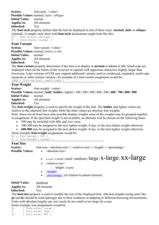
Font Properties
Font Family
Syntax: font-family: [[<family-name> | <generic-family>],]* [<family-name> | <generic-
family>]
Possible Values: <family-name>
• Any font family name may be used
<generic-family>
• serif (e.g., Times)
• sans-serif (e.g., Arial or Helvetica)
• cursive (e.g., Zapf-Chancery)
• fantasy (e.g., Western)
• monospace (e.g., Courier)
Initial Value: Determined by browser
Applies to: All elements
Inherited: Yes
Font families may be assigned by a specific font name or a generic font family. Obviously, defining a
specific font will not be as likely to match as a generic font family. Multiple family assignments can be
made, and if a specific font assignment is made it should be followed by a generic family name in case the
first choice is not present.
A sample font-family declaration might look like this:
P { font-family: "New Century Schoolbook", Times, serif }
Notice that the first two assignments are specific type faces: New Century Schoolbook and Times.
However, since both of them are serif fonts, the generic font family is listed as a backup in case the system
does not have either of these but has another serif font which meets the qualifications.
Any font name containing whitespace must be quoted, with either single or double quotes.
The font family may also be given with the font property.
Font Style
2. Syntax: font-style: <value>
Possible Values: normal | italic | oblique
Initial Value: normal
Applies to: All elements
Inherited: Yes
The font-style property defines that the font be displayed in one of three ways: normal, italic or oblique
(slanted). A sample style sheet with font-style declarations might look like this:
H1 { font-style: oblique }
P { font-style: normal }
Font Variant
Syntax: font-variant: <value>
Possible Values: normal | SMALL-CAPS
Initial Value: normal
Applies to: All elements
Inherited: Yes
The font-variant property determines if the font is to display in normal or SMALL-CAPS. Small-caps are
displayed when all the letters of the word are in capitals with uppercase characters slightly larger than
lowercase. Later versions of CSS may support additional variants such as condensed, expanded, small-caps
numerals or other custom variants. An example of a font-variant assignment would be:
SPAN { font-variant: small-caps }
Font Weight
Syntax: font-weight: <value>
Possible Values: normal | bold | bolder | lighter | 100 | 200 | 300 | 400 | 500 | 600 | 700 | 800 | 900
Initial Value: normal
Applies to: All elements
Inherited: Yes
The font-weight property is used to specify the weight of the font. The bolder and lighter values are
relative to the inherited font weight, while the other values are absolute font weights.
Note: Since not all fonts have nine possible display weights some of the weights may be grouped together
in assignment. If the specified weight is not available, an alternate will be chosen on the following basis:
• 500 may be switched with 400, and vice versa
• 100-300 may be assigned to the next lighter weight, if any, or the next darker weight otherwise
• 600-900 may be assigned to the next darker weight, if any, or the next lighter weight otherwise
Some example font-weight assignments would be:
H1 { font-weight: 800 }
P { font-weight: normal }
Font Size
Syntax: font-size: <absolute-size> | <relative-size> | <length> | <percentage>
Possible Values: • <absolute-size>
• | x-small | small | medium | large |
xx-small x-large | xx-large
• <relative-size>
o larger | smaller
• <length>
• <percentage> (in relation to parent element)
Initial Value: medium
Applies to: All elements
Inherited: Yes
The font-size property is used to modify the size of the displayed font. Absolute lengths (using units like
pt and in) should be used sparingly due to their weakness in adapting to different browsing environments.
Fonts with absolute lengths can very easily be too small or too large for a user.
Some example size assignments would be:
H1 { font-size: large }
P { font-size: 12pt }
LI { font-size: 90% }
3. STRONG { font-size: larger }
Authors should be aware that Microsoft Internet Explorer 3.x incorrectly treats em and ex units as pixels,
which can easily make text using these units unreadable. The browser also incorrectly applies percentage
values relative to its default font size for the selector, rather than relative to the parent element's font size.
This makes rules like
H1 { font-size: 200% }
dangerous in that the size will be twice IE's default font size for level-one headings, rather than twice the
parent element's font size. In this case, BODY would most likely be the parent element, and it would likely
define a medium font size, whereas the default level-one heading font size imposed by IE would probably
be considered xx-large.
Given these bugs, authors should take care in using percentage values for font-size, and should probably
avoid em and ex units for this property.
Font
Syntax: font: <value>
Possible Values:[ <font-style> || <font-variant> || <font-weight> ]? <font-size> [ / <line-height> ]? <font-
family>
Initial Value: Not defined
Applies to: All elements
Inherited: Yes
The font property may be used as a shorthand for the various font properties, as well as the line height. For
example,
P { font: italic bold 12pt/14pt Times, serif }
specifies paragraphs with a bold and italic Times or serif font with a size of 12 points and a line height of
14 points.
Color and Background Properties
Color
Syntax: color: <color>
Initial Value: Determined by browser
Applies to: All elements
Inherited: Yes
The color property allows authors to specify the color of an element. See the Units section for color value
descriptions. Some example color rules include:
H1 { color: blue }
H2 { color: #000080 }
H3 { color: #0c0 }
To help avoid conflicts with user style sheets, background and color properties should always be
specified together.
Background Color
Syntax: background-color: <value>
Possible Values: <color> | transparent
Initial Value: transparent
Applies to: All elements
Inherited: No
The background-color property sets the background color of an element. For example:
BODY { background-color: white } H1 { background-color: #000080 }
To help avoid conflicts with user style sheets, background-image should be specified whenever
background-color is used. In most cases, background-image: none is suitable.
Authors may also use the shorthand background property, which is currently better supported than the
background-color property.
Background Image
Syntax: background-image: <value>
Possible Values: <url> | none
Initial Value: none
Applies to: All elements
Inherited: No
The background-image property sets the background image of an element. For example:
4. BODY { background-image: url(/images/foo.gif) }
P { background-image: url(http://www.htmlhelp.com/bg.png) }
When a background image is defined, a similar background color should also be defined for those not
loading images.
Authors may also use the shorthand background property, which is currently better supported than the
background-image property.
Background Repeat
Syntax: background-repeat: <value>
Possible Values: repeat | repeat-x | repeat-y | no-repeat
Initial Value: repeat
Applies to: All elements
Inherited: No
The background-repeat property determines how a specified background image is repeated. The repeat-x
value will repeat the image horizontally while the repeat-y value will repeat the image vertically. For
example:
BODY { background: white url(candybar.gif);
background-repeat: repeat-x }
In the above example, the image will only be tiled horizontally.
Authors may also use the shorthand background property, which is currently better supported than the
background-repeat property.
Background Attachment
Syntax: background-attachment: <value>
Possible Values: scroll | fixed
Initial Value: scroll
Applies to: All elements
Inherited: No
The background-attachment property determines if a specified background image will scroll with the
content or be fixed with regard to the canvas. For example, the following specifies a fixed background
image:
BODY { background: white url(candybar.gif);
background-attachment: fixed }
Authors may also use the shorthand background property, which is currently better supported than the
background-attachment property.
Background Position
Syntax: background-position: <value>
Possible Values: [<percentage> | <length>]{1,2} | [top | center | bottom] || [left | center | right]
Initial Value: 0% 0%
Applies to: Block-level and replaced elements
Inherited: No
The background-position property gives the initial position of a specified background image. This
property may only be applied to block-level elements and replaced elements. (A replaced element is one
for which only the intrinsic dimensions are known; HTML replaced elements include IMG, INPUT,
TEXTAREA, SELECT, and OBJECT.)
The easiest way to assign a background position is with keywords:
• Horizontal keywords (left, center, right)
• Vertical keywords (top, center, bottom)
Percentages and lengths may also be used to assign the position of the background image. Percentages are
relative to the size of the element. Although lengths are allowed, they are not recommended due to their
inherent weakness in dealing with differing display resolutions.
When using percentages or lengths, the horizontal position is specified first, followed by the vertical
position. A value such as 20% 65% specifies that the point 20% across and 65% down the image be
placed at the point 20% across and 65% down the element. A value such as 5px 10px specifies that the
upper left corner of the image be placed 5 pixels to the right of and 10 pixels below the upper left corner of
the element.
5. If only the horizontal value is given, the vertical position will be 50%. Combinations of lengths and
percentages are allowed, as are negative positions. For example, 10% -2cm is permitted. However,
percentages and lengths cannot be combined with keywords.
The keywords are interpreted as follows:
• top left = left top = 0% 0%
• top = top center = center top = 50% 0%
• right top = top right = 100% 0%
• left = left center = center left = 0% 50%
• center = center center = 50% 50%
• right = right center = center right = 100% 50%
• bottom left = left bottom = 0% 100%
• bottom = bottom center = center bottom = 50% 100%
• bottom right = right bottom = 100% 100%
If the background image is fixed with regard to the canvas, the image is placed relative to the canvas
instead of the element.
Authors may also use the shorthand background property, which is currently better supported than the
background-position property.
Background
Syntax: background: <value>
Possible <background-color> || <background-image> || <background-repeat> || <background-
Values: attachment> || <background-position>
Initial Value: Not defined
Applies to: All elements
Inherited: No
The background property is a shorthand for the more specific background-related properties. Some
examples of background declarations follow:
BODY { background: white url(http://www.htmlhelp.com/foo.gif) }
BLOCKQUOTE { background: #7fffd4 }
P { background: url(../backgrounds/pawn.png) #f0f8ff fixed }
TABLE { background: #0c0 url(leaves.jpg) no-repeat bottom right }
A value not specified will receive its initial value. For example, in the first three rules above, the
background-position property will be set to 0% 0%.
To help avoid conflicts with user style sheets, background and color properties should always be
specified together.
Text Properties
Word Spacing
Syntax: word-spacing: <value>
Possible Values: normal | <length>
Initial Value: normal
Applies to: All elements
Inherited: Yes
The word-spacing property defines an additional amount of space between words. The value must be in
the length format; negative values are permitted.
Examples:
P EM { word-spacing: 0.4em }
P.note { word-spacing: -0.2em }
Letter Spacing
Syntax: letter-spacing: <value>
Possible Values: normal | <length>
Initial Value: normal
Applies to: All elements
Inherited: Yes
The letter-spacing property defines an additional amount of space between characters. The value must be
in the length format; negative values are permitted. A setting of 0 will prevent justification.
Examples:
H1 { letter-spacing: 0.1em }
6. P.note { letter-spacing: -0.1em }
Text Decoration
Syntax: text-decoration: <value>
Possible Values: none | [ underline || overline || line-through || blink ]
Initial Value: none
Applies to: All elements
Inherited: No
The text-decoration property allows text to be decorated through one of five properties: underline,
overline, line-through, blink, or the default, none.
For example, one can suggest that links not be underlined with
A:link, A:visited, A:active { text-decoration: none }
Vertical Alignment
Syntax: vertical-align: <value>
Possible Values: baseline | sub | super | top | text-top | middle | bottom | text-bottom | <percentage>
Initial Value: baseline
Applies to: Inline elements
Inherited: No
The vertical-align property may be used to alter the vertical positioning of an inline element, relative to its
parent element or to the element's line. (An inline element is one which has no line break before and after
it, for example, EM, A, and IMG in HTML.)
The value may be a percentage relative to the element's line-height property, which would raise the
element's baseline the specified amount above the parent's baseline. Negative values are permitted.
The value may also be a keyword. The following keywords affect the positioning relative to the parent
element:
• baseline (align baselines of element and parent)
• middle (align vertical midpoint of element with baseline plus half the x-height--the height of the
letter "x"--of the parent)
• sub (subscript)
• super (superscript)
• text-top (align tops of element and parent's font)
• text-bottom (align bottoms of element and parent's font)
The keywords affecting the positioning relative to the element's line are
• top (align top of element with tallest element on the line)
• bottom (align bottom of element with lowest element on the line)
The vertical-align property is particularly useful for aligning images. Some examples follow:
IMG.middle { vertical-align: middle }
IMG { vertical-align: 50% }
.exponent { vertical-align: super }
Text Transformation
Syntax: text-transform: <value>
Possible Values: none | capitalize | UPPERCASE | lowercase
Initial Value: none
Applies to: All elements
Inherited: Yes
The text-transform property allows text to be transformed by one of four properties:
• capitalize (capitalizes first character of each word)
• uppercase (capitalizes all characters of each word)
• lowercase (uses small letters for all characters of each word)
• none (the initial value)
Examples:
H1 { text-transform: uppercase }
H2 { text-transform: capitalize }
The text-transform property should only be used to express a stylistic desire. It would be inappropriate,
for example, to use text-transform to capitalize a list of countries or names.
Text Alignment
Syntax: text-align: <value>
7. Possible Values: left | right | center | justify
Initial Value: Determined by browser
Applies to: Block-level elements
Inherited: Yes
The text-align property can be applied to block-level elements (P, H1, etc.) to give the alignment of the
element's text. This property is similar in function to HTML's ALIGN attribute on paragraphs, headings,
and divisions.
Some examples follow:
H1 { text-align: center }
P.newspaper { text-align: justify }
Text Indentation
Syntax: text-indent: <value>
Possible Values: <length> | <percentage>
Initial Value: 0
Applies to: Block-level elements
Inherited: Yes
The text-indent property can be applied to block-level elements (P, H1, etc.) to define the amount of
indentation that the first line of the element should receive. The value must be a length or a percentage;
percentages refer to the parent element's width. A common use of text-indent would be to indent a
paragraph:
P { text-indent: 5em }
Line Height
Syntax: line-height: <value>
Possible Values: normal | <number> | <length> | <percentage>
Initial Value: normal
Applies to: All elements
Inherited: Yes
The line-height property will accept a value to control the spacing between baselines of text. When the
value is a number, the line height is calculated by multiplying the element's font size by the number.
Percentage values are relative to the element's font size. Negative values are not permitted.
Line height may also be given in the font property along with a font size.
The line-height property could be used to double space text:
P { line-height: 200% }
Microsoft Internet Explorer 3.x incorrectly treats number values and values with em or ex units as pixel
values. This bug can easily make pages unreadable, and so authors should avoid provoking it wherever
possible; percentage units are often a good choice.
Box Properties
Top Margin
Syntax: margin-top: <value>
Possible Values: <length> | <percentage> | auto
Initial Value: 0
Applies to: All elements
Inherited: No
The margin-top property sets the top margin of an element by specifying a length or a percentage.
Percentage values refer to the parent element's width. Negative margins are permitted.
For example, the following rule would eliminate the top margin of a document:
BODY { margin-top: 0 }
Note that adjoining vertical margins are collapsed to use the maximum of the margin values.
Right Margin
Syntax: margin-right: <value>
Possible Values: <length> | <percentage> | auto
Initial Value: 0
Applies to: All elements
Inherited: No
8. The margin-right property sets the right margin of an element by specifying a length or a percentage.
Percentage values refer to the parent element's width. Negative margins are permitted.
Example:
P.narrow { margin-right: 50% }
Note that adjoining horizontal margins are not collapsed.
Bottom Margin
Syntax: margin-bottom: <value>
Possible Values: <length> | <percentage> | auto
Initial Value: 0
Applies to: All elements
Inherited: No
The margin-bottom property sets the bottom margin of an element by specifying a length or a percentage.
Percentage values refer to the parent element's width. Negative margins are permitted.
Example:
DT { margin-bottom: 3em }
Note that adjoining vertical margins are collapsed to use the maximum of the margin values.
Left Margin
Syntax: margin-left: <value>
Possible Values: <length> | <percentage> | auto
Initial Value: 0
Applies to: All elements
Inherited: No
The margin-left property sets the left margin of an element by specifying a length or a percentage.
Percentage values refer to the parent element's width. Negative margins are permitted.
Example:
ADDRESS { margin-left: 50% }
Note that adjoining horizontal margins are not collapsed.
Margin
Syntax: margin: <value>
Possible Values: [ <length> | <percentage> | auto ]{1,4}
Initial Value: Not defined
Applies to: All elements
Inherited: No
The margin property sets the margins of an element by specifying between one and four values, where
each value is a length, a percentage, or auto. Percentage values refer to the parent element's width.
Negative margins are permitted.
If four values are given, they apply to top, right, bottom, and left margin, respectively. If one value is
given, it applies to all sides. If two or three values are given, the missing values are taken from the opposite
side.
Examples of margin declarations include:
BODY { margin: 5em } /* all margins 5em */
P { margin: 2em 4em } /* top and bottom margins 2em,
left and right margins 4em */
DIV { margin: 1em 2em 3em 4em } /* top margin 1em,
right margin 2em,
bottom margin 3em,
left margin 4em */
Note that adjoining vertical margins are collapsed to use the maximum of the margin values. Horizontal
margins are not collapsed.
Using the margin property allows one to set all margins; alternatively, the properties margin-top,
margin-bottom, margin-left, and margin-right may be used.
Top Padding
Syntax: padding-top: <value>
Possible Values: <length> | <percentage>
Initial Value: 0
Applies to: All elements
Inherited: No
9. The padding-top property describes how much space to put between the top border and the content of the
selector. The value is either a length or a percentage. Percentage values refer to the parent element's width.
Negative values are not permitted.
Right Padding
Syntax: padding-right: <value>
Possible Values: <length> | <percentage>
Initial Value: 0
Applies to: All elements
Inherited: No
The padding-right property describes how much space to put between the right border and the content of
the selector. The value is either a length or a percentage. Percentage values refer to the parent element's
width. Negative values are not permitted.
Bottom Padding
Syntax: padding-bottom: <value>
Possible Values: <length> | <percentage>
Initial Value: 0
Applies to: All elements
Inherited: No
The padding-bottom property describes how much space to put between the bottom border and the
content of the selector. The value is either a length or a percentage. Percentage values refer to the parent
element's width. Negative values are not permitted.
Left Padding
Syntax: padding-left: <value>
Possible Values: <length> | <percentage>
Initial Value: 0
Applies to: All elements
Inherited: No
The padding-left property describes how much space to put between the left border and the content of the
selector. The value is either a length or a percentage. Percentage values refer to the parent element's width.
Negative values are not permitted.
Padding
Syntax: padding: <value>
Possible Values: [ <length> | <percentage> ]{1,4}
Initial Value: 0
Applies to: All elements
Inherited: No
The padding property is a shorthand for the padding-top, padding-right, padding-bottom, and padding-
left properties.
An element's padding is the amount of space between the border and the content of the element. Between
one and four values are given, where each value is either a length or a percentage. Percentage values refer
to the parent element's width. Negative values are not permitted.
If four values are given, they apply to top, right, bottom, and left padding, respectively. If one value is
given, it applies to all sides. If two or three values are given, the missing values are taken from the opposite
side.
For example, the following rule sets the top padding to 2em, the right padding to 4em, the bottom padding
to 5em, and the left padding to 4em:
BLOCKQUOTE { padding: 2em 4em 5em }
Top Border Width
Syntax: border-top-width: <value>
Possible Values: thin | medium | thick | <length>
Initial Value: medium
Applies to: All elements
Inherited: No
10. The border-top-width property is used to specify the width of an element's top border. The value may be
one of three keywords, which are not affected by font size, or a length, which can be used to achieve
relative widths. Negative values are not allowed.
One may also use the border-top, border-width, or border shorthand properties.
Right Border Width
Syntax: border-right-width: <value>
Possible Values: thin | medium | thick | <length>
Initial Value: medium
Applies to: All elements
Inherited: No
The border-right-width property is used to specify the width of an element's right border. The value may
be one of three keywords, which are not affected by font size, or a length, which can be used to achieve
relative widths. Negative values are not allowed.
One may also use the border-right, border-width, or border shorthand properties.
Bottom Border Width
Syntax: border-bottom-width: <value>
Possible Values: thin | medium | thick | <length>
Initial Value: medium
Applies to: All elements
Inherited: No
The border-bottom-width property is used to specify the width of an element's bottom border. The value
may be one of three keywords, which are not affected by font size, or a length, which can be used to
achieve relative widths. Negative values are not allowed.
One may also use the border-bottom, border-width, or border shorthand properties.
Left Border Width
Syntax: border-left-width: <value>
Possible Values: thin | medium | thick | <length>
Initial Value: medium
Applies to: All elements
Inherited: No
The border-left-width property is used to specify the width of an element's left border. The value may be
one of three keywords, which are not affected by font size, or a length, which can be used to achieve
relative widths. Negative values are not allowed.
One may also use the border-left, border-width, or border shorthand properties.
Border Width
Syntax: border-width: <value>
Possible Values: [ thin | medium | thick | <length> ]{1,4}
Initial Value: Not defined
Applies to: All elements
Inherited: No
The border-width property is used to set the border width of an element by specifying between one and
four values, where each value is a keyword or a length. Negative lengths are not permitted.
If four values are given, they apply to top, right, bottom, and left border width, respectively. If one value is
given, it applies to all sides. If two or three values are given, the missing values are taken from the opposite
side.
This property is a shorthand for the border-top-width, border-right-width, border-bottom-width, and
border-left-width properties.
One may also use the border shorthand property.
Border Color
Syntax: border-color: <value>
Possible Values: <color>{1,4}
Initial Value: The value of the color property
Applies to: All elements
Inherited: No
11. The border-color property sets the color of an element's border. Between one and four color values are
specified. If four values are given, they apply to top, right, bottom, and left border color, respectively. If
one value is given, it applies to all sides. If two or three values are given, the missing values are taken from
the opposite side.
One may also use the border shorthand property.
Border Style
Syntax: border-style: <value>
Possible Values: [ none | dotted | dashed | solid | double | groove | ridge | inset | outset ]{1,4}
Initial Value: none
Applies to: All elements
Inherited: No
The border-style property sets the style of an element's border. This property must be specified for the
border to be visible.
Between one and four keywords are specified. If four values are given, they apply to top, right, bottom,
and left border style, respectively. If one value is given, it applies to all sides. If two or three values are
given, the missing values are taken from the opposite side.
One may also use the border shorthand property.
Top Border
Syntax: border-top: <value>
Possible Values: <border-top-width> || <border-style> || <color>
Initial Value: Not defined
Applies to: All elements
Inherited: No
The border-top property is a shorthand for setting the width, style, and color of an element's top border.
Note that only one border-style value may be given.
One may also use the border shorthand property.
Right Border
Syntax: border-right: <value>
Possible Values: <border-right-width> || <border-style> || <color>
Initial Value: Not defined
Applies to: All elements
Inherited: No
The border-right property is a shorthand for setting the width, style, and color of an element's right
border.
Note that only one border-style value may be given.
One may also use the border shorthand property.
Bottom Border
Syntax: border-bottom: <value>
Possible Values: <border-bottom-width> || <border-style> || <color>
Initial Value: Not defined
Applies to: All elements
Inherited: No
The border-bottom property is a shorthand for setting the width, style, and color of an element's bottom
border.
Note that only one border-style value may be given.
One may also use the border shorthand property.
Left Border
Syntax: border-left: <value>
Possible Values: <border-left-width> || <border-style> || <color>
Initial Value: Not defined
Applies to: All elements
Inherited: No
The border-left property is a shorthand for setting the width, style, and color of an element's left border.
Note that only one border-style value may be given.
One may also use the border shorthand property.
12. Border
Syntax: border: <value>
Possible Values: <border-width> || <border-style> || <color>
Initial Value: Not defined
Applies to: All elements
Inherited: No
The border property is a shorthand for setting the width, style, and color of an element's border.
Examples of border declarations include:
H2 { border: groove 3em }
A:link { border: solid blue }
A:visited { border: thin dotted #800080 }
A:active { border: thick double red }
The border property can only set all four borders; only one border width and border style may be given.
To give different values to an element's four borders, an author must use one or more of the border-top,
border-right, border-bottom, border-left, border-color, border-width, border-style, border-top-
width, border-right-width, border-bottom-width, or border-left-width properties.
Width
Syntax: width: <value>
Possible Values: <length> | <percentage> | auto
Initial Value: auto
Applies to: Block-level and replaced elements
Inherited: No
Each block-level or replaced element can be given a width, specified as a length, a percentage, or as auto.
(A replaced element is one for which only the intrinsic dimensions are known; HTML replaced elements
include IMG, INPUT, TEXTAREA, SELECT, and OBJECT.) The initial value for the width property
is auto, which results in the element's intrinsic width (i.e., the width of the element itself, for example the
width of an image). Percentages refer to the parent element's width. Negative values are not allowed.
This property could be used to give common widths to some INPUT elements, such as submit and reset
buttons:
INPUT.button { width: 10em }
Height
Syntax: height: <value>
Possible Values: <length> | auto
Initial Value: auto
Applies to: Block-level and replaced elements
Inherited: No
Each block-level or replaced element can be given a height, specified as a length or as auto. (A replaced
element is one for which only the intrinsic dimensions are known; HTML replaced elements include IMG,
INPUT, TEXTAREA, SELECT, and OBJECT.) The initial value for the height property is auto, which
results in the element's intrinsic height (i.e., the height of the element itself, for example the height of an
image). Negative lengths are not allowed.
As with the width property, height can be used to scale an image:
IMG.foo { width: 40px; height: 40px }
In most cases, authors are advised to scale the image in an image editing program, since browsers will not
likely scale images with high quality, and since scaling down causes the user to download an unnecessarily
large file. However, scaling through the width and height properties is a useful option for user-defined
style sheets in order to overcome vision problems.
Float
Syntax: float: <value>
Possible Values: left | right | none
Initial Value: none
Applies to: All elements
Inherited: No
The float property allows authors to wrap text around an element. This is identical in purpose to
HTML 3.2's ALIGN=left and ALIGN=right for the IMG element, but CSS1 allows all elements to
"float," not just the images and tables that HTML 3.2 allows.
13. Clear
Syntax: clear: <value>
Possible Values: none | left | right | both
Initial Value: none
Applies to: All elements
Inherited: No
The clear property specifies if an element allows floating elements to its sides. A value of left moves the
element below any floating element on its left; right acts similarly for floating elements on the right. Other
values are none, which is the initial value, and both, which moves the element below floating elements on
both of its sides. This property is similar in function to HTML 3.2's <BR CLEAR=left|right|all|none>,
but it can be applied to all elements.
Classification Properties
Display
Syntax: display: <value>
Possible Values: block | inline | list-item | none
Initial Value: block
Applies to: All elements
Inherited: No
The display property is used to define an element with one of four values:
• block (a line break before and after the element)
• inline (no line break before and after the element)
• list-item (same as block except a list-item marker is added)
• none (no display)
Each element typically is given a default display value by the browser, based on suggested rendering in the
HTML specification.
The display property can be dangerous because of its ability to display elements in what would otherwise
be an improper format. The use of the value none will turn off display of the element to which it is
assigned, including any children elements!
Whitespace
Syntax: white-space: <value>
Possible Values: normal | pre | nowrap
Initial Value: normal
Applies to: All elements
Inherited: Yes
The white-space property will determine how spaces within the element are treated. This property takes
one of three values:
• normal (collapses multiple spaces into one)
• pre (does not collapse multiple spaces)
• nowrap (does not allow line wrapping without a <BR> tag)
List Style Type
Syntax: list-style-type: <value>
Possible Values: disc | circle | square | decimal | lower-roman | upper-roman | lower-alpha | upper-alpha |
none
Initial Value: disc
Applies to: Elements with display value list-item
Inherited: Yes
The list-style-type property specifies the type of list-item marker, and is used if list-style-image is none or
if image loading is turned off.
Examples:
LI.square { list-style-type: square }
UL.plain { list-style-type: none }
OL { list-style-type: upper-alpha } /* A B C D E etc. */
OL OL { list-style-type: decimal } /* 1 2 3 4 5 etc. */
OL OL OL { list-style-type: lower-roman } /* i ii iii iv v etc. */
List Style Image
14. Syntax: list-style-image: <value>
Possible Values: <url> | none
Initial Value: none
Applies to: Elements with display value list-item
Inherited: Yes
The list-style-image property specifies the image that will be used as list-item marker when image loading
is turned on, replacing the marker specified in the list-style-type property.
Examples:
UL.check { list-style-image: url(/LI-markers/checkmark.gif) }
UL LI.x { list-style-image: url(x.png) }
List Style Position
Syntax: list-style-position: <value>
Possible Values: inside | outside
Initial Value: outside
Applies to: Elements with display value list-item
Inherited: Yes
The list-style-position property takes the value inside or outside, with outside being the default. This
property determines where the marker is placed in regard to the list item. If the value inside is used, the
lines will wrap under the marker instead of being indented. An example rendering is:
Outside rendering:
* List item 1
second line of list item
Inside rendering:
* List item 1
second line of list item
List Style
Syntax: list-style: <value>
Possible Values: <list-style-type> || <list-style-position> || <url>
Initial Value: Not defined
Applies to: Elements with display value list-item
Inherited: Yes
The list-style property is a shorthand for the list-style-type, list-style-position, and list-style-image
properties.
Examples:
LI.square { list-style: square inside }
UL.plain { list-style: none }
UL.check { list-style: url(/LI-markers/checkmark.gif) circle }
OL { list-style: upper-alpha }
OL OL { list-style: lower-roman inside }
Units
Length Units
A length value is formed by an optional + or -, followed by a number, followed by a two-letter
abbreviation that indicates the unit. There are no spaces in a length value; e.g., 1.3 em is not a valid length
value, but 1.3em is valid. A length of 0 does not require the two-letter unit identifier.
Both relative and absolute length units are supported in CSS1. Relative units give a length relative to
another length property, and are preferred since they will better adjust to different media. The following
relative units are available:
• em (ems, the height of the element's font)
• ex (x-height, the height of the letter "x")
• px (pixels, relative to the canvas resolution)
Absolute length units are highly dependent on the output medium, and so are less useful than relative units.
The following absolute units are available:
• in (inches; 1in=2.54cm)
• cm (centimeters; 1cm=10mm)
• mm (millimeters)
• pt (points; 1pt=1/72in)
15. • pc (picas; 1pc=12pt)
Percentage Units
A percentage value is formed by an optional + or -, followed by a number, followed by %. There are no
spaces in a percentage value.
Percentage values are relative to other values, as defined for each property. Most often the percentage
value is relative to the element's font size.
Color Units
A color value is a keyword or a numerical RGB specification.
The 16 keywords are taken from the Windows VGA palette: aqua, black, blue, fuchsia, gray, green,
lime, maroon, navy, olive, purple, red, silver, teal, white, and yellow.
RGB colors are given in one of four ways:
• #rrggbb (e.g., #00cc00)
• #rgb (e.g., #0c0)
• rgb(x,x,x) where x is an integer between 0 and 255 inclusive (e.g., rgb(0,204,0))
• rgb(y%,y%,y%) where y is a number between 0.0 and 100.0 inclusive (e.g., rgb(0%,80%,0%))
The examples above all specify the same color.
Douglas R. Jacobson has also developed a handy quick reference RGB Color Chart (61 kB).
URLs
A URL value is given by url(foo), where foo is the URL. The URL may be optionally quoted with either
single (') or double (") quotes and may contain whitespace before or after the (optionally quoted) URL.
Parentheses, commas, spaces, single quotes, or double quotes in the URL must be escaped with a
backslash. Partial URLs are interpreted relative to the style sheet source, not to the HTML source.
Note that Netscape Navigator 4.x incorrectly interprets partial URLs relative to the HTML source. Given
this bug, authors may wish to use full URLs where possible.
Examples:
BODY { background: url(stripe.gif) }
BODY { background: url(http://www.htmlhelp.com/stripe.gif) }
BODY { background: url( stripe.gif ) }
BODY { background: url("stripe.gif") }
BODY { background: url("Ulalume".png) } /* quotes in URL escaped */