Download as PDF, PPTX


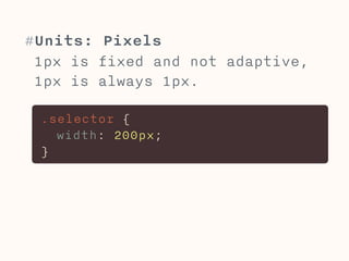
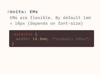
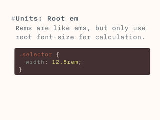
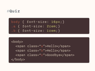
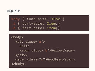

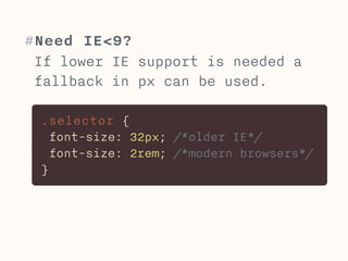
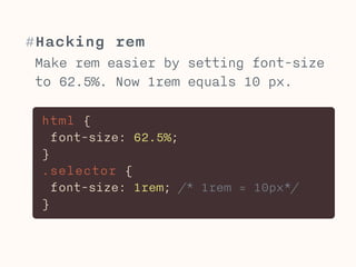
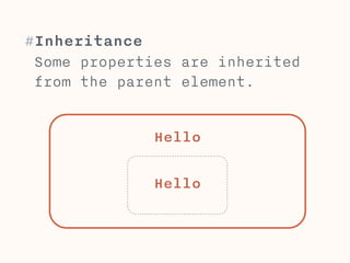
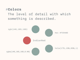
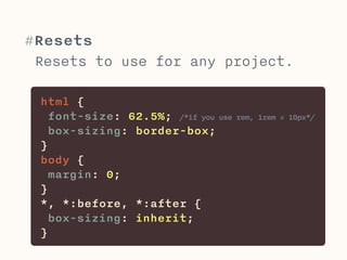
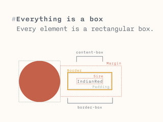

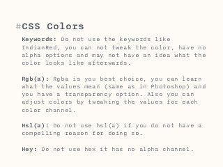
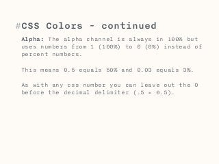
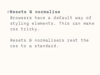
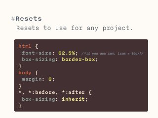
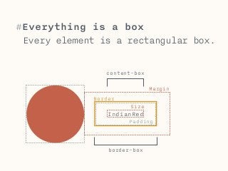
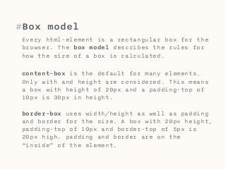


The document discusses CSS units like pixels, ems, and rems. Pixels are fixed units, while ems and rems are relative units that scale with font sizes. Ems are relative to the parent element's font size, while rems are always relative to the root/HTML element's font size. The document also covers CSS inheritance, colors, resets, and the box model.