


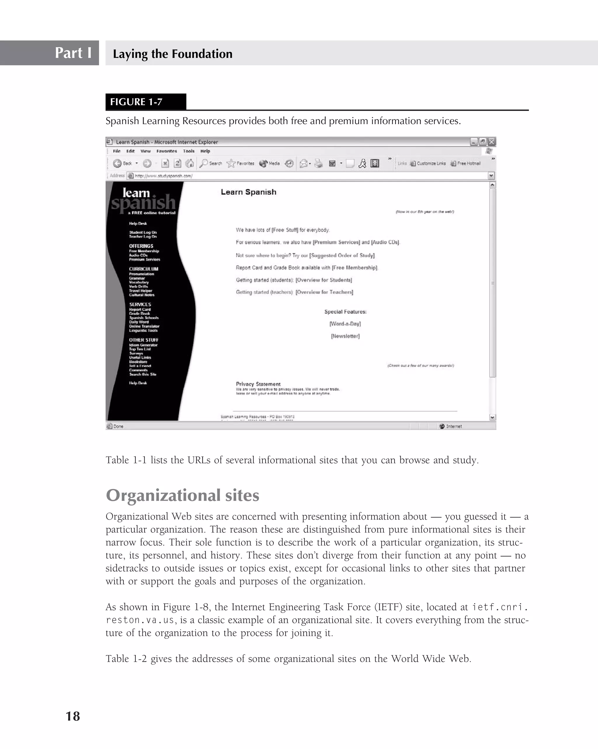


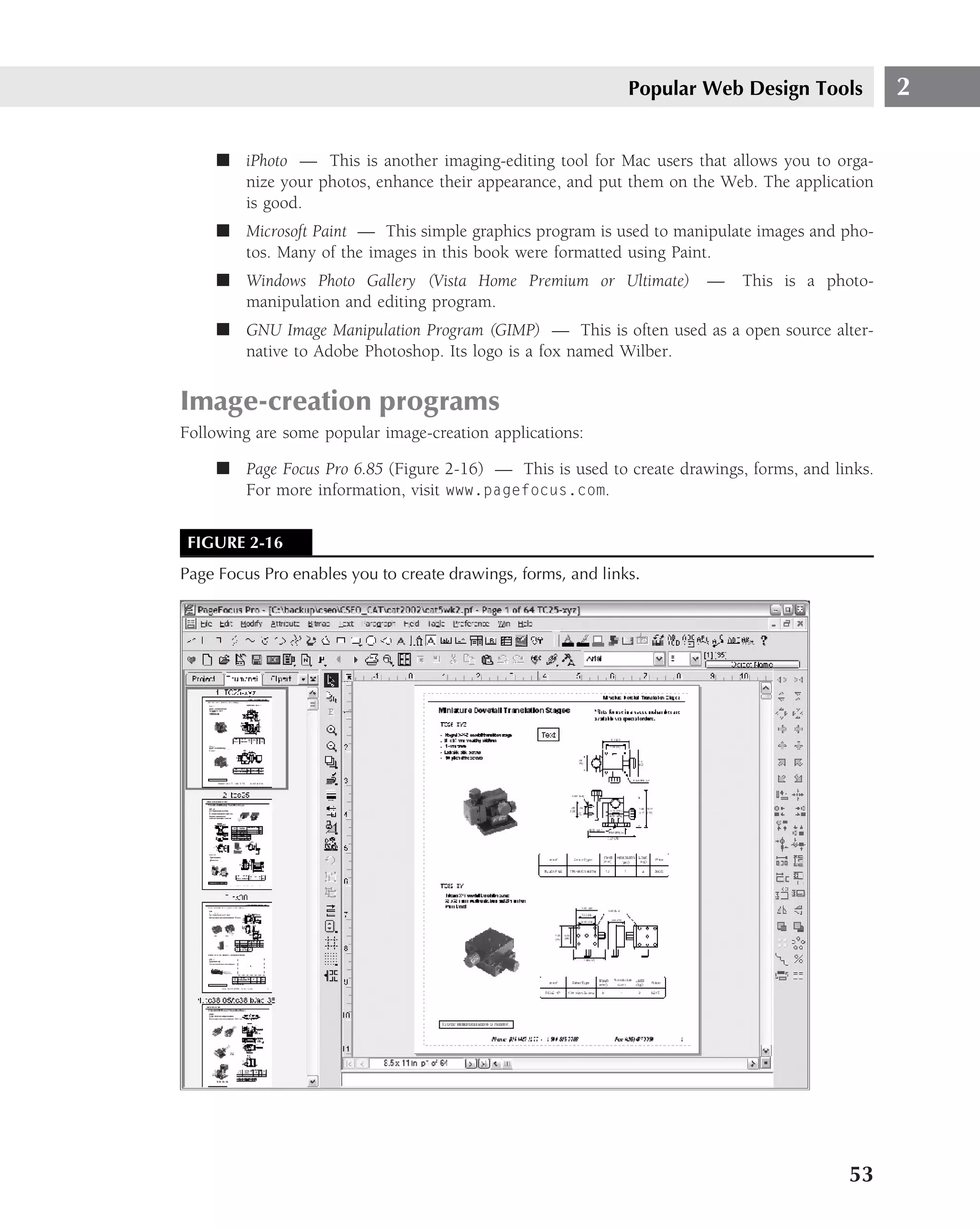
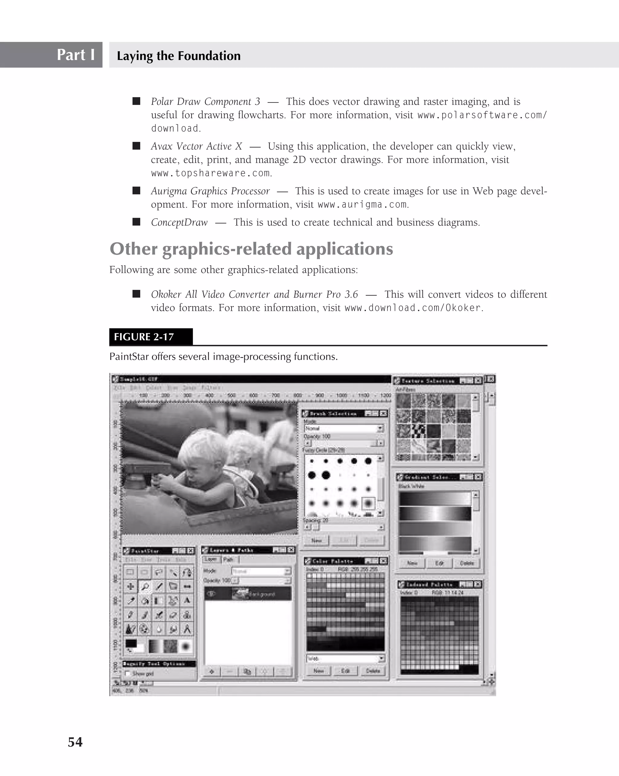


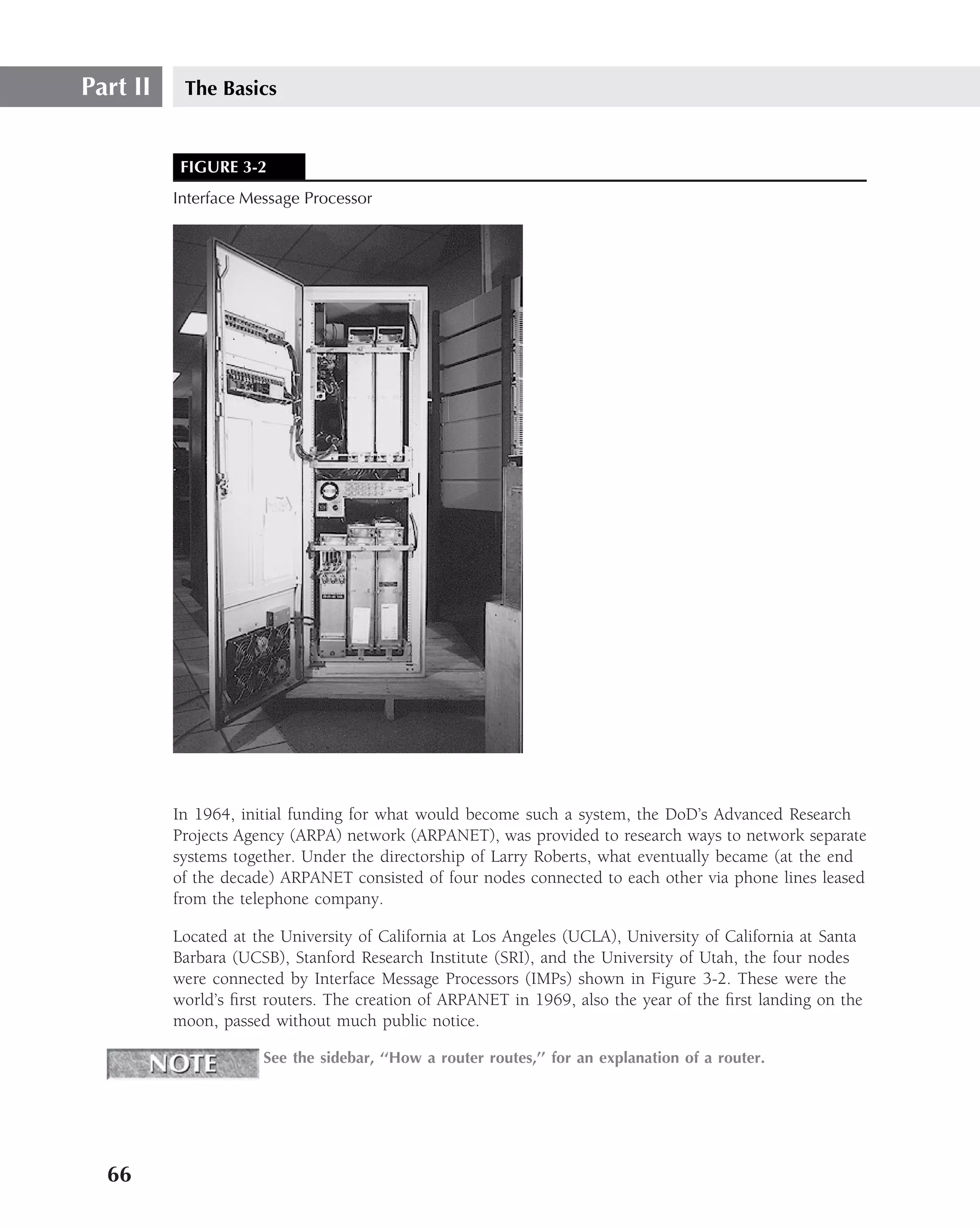
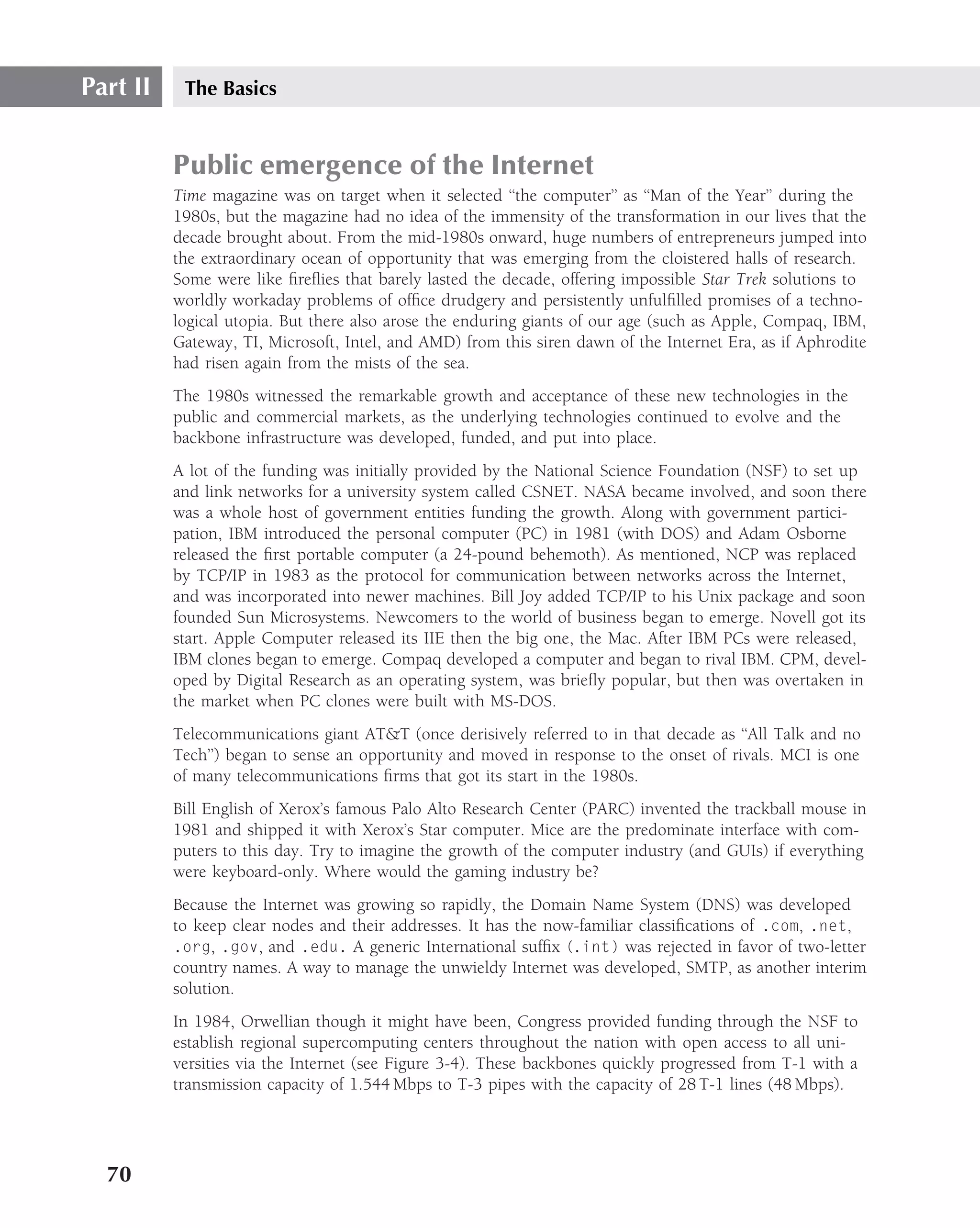
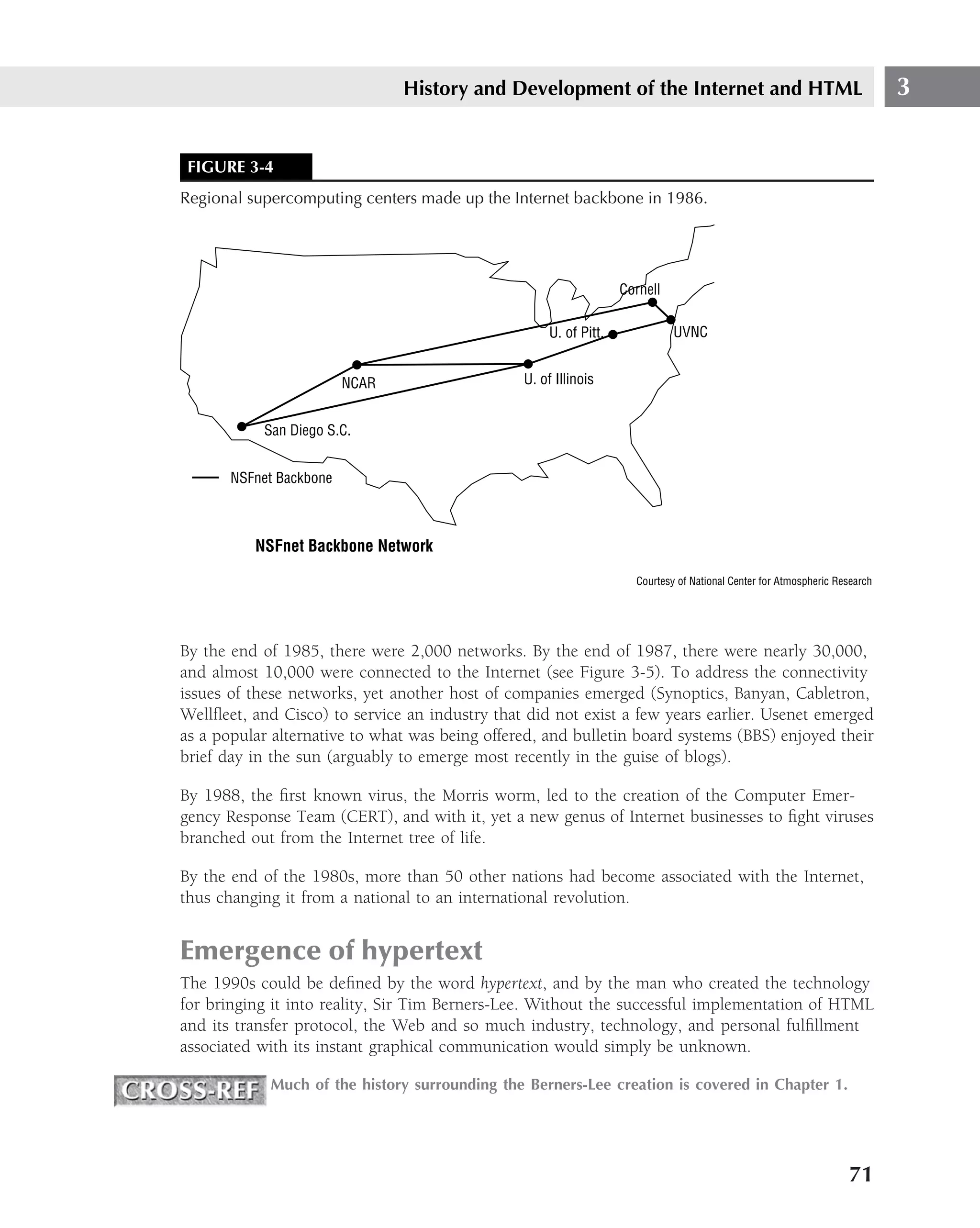


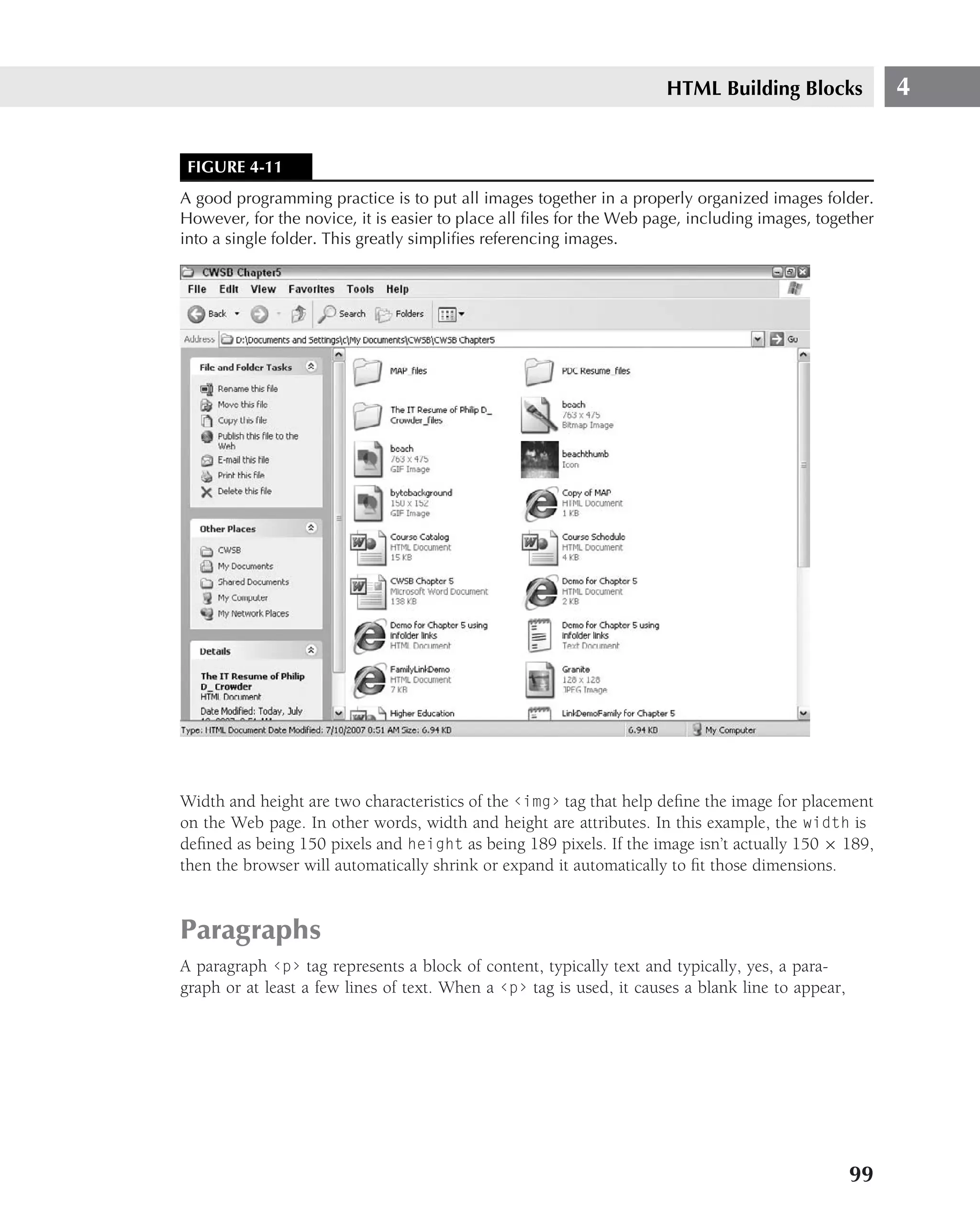
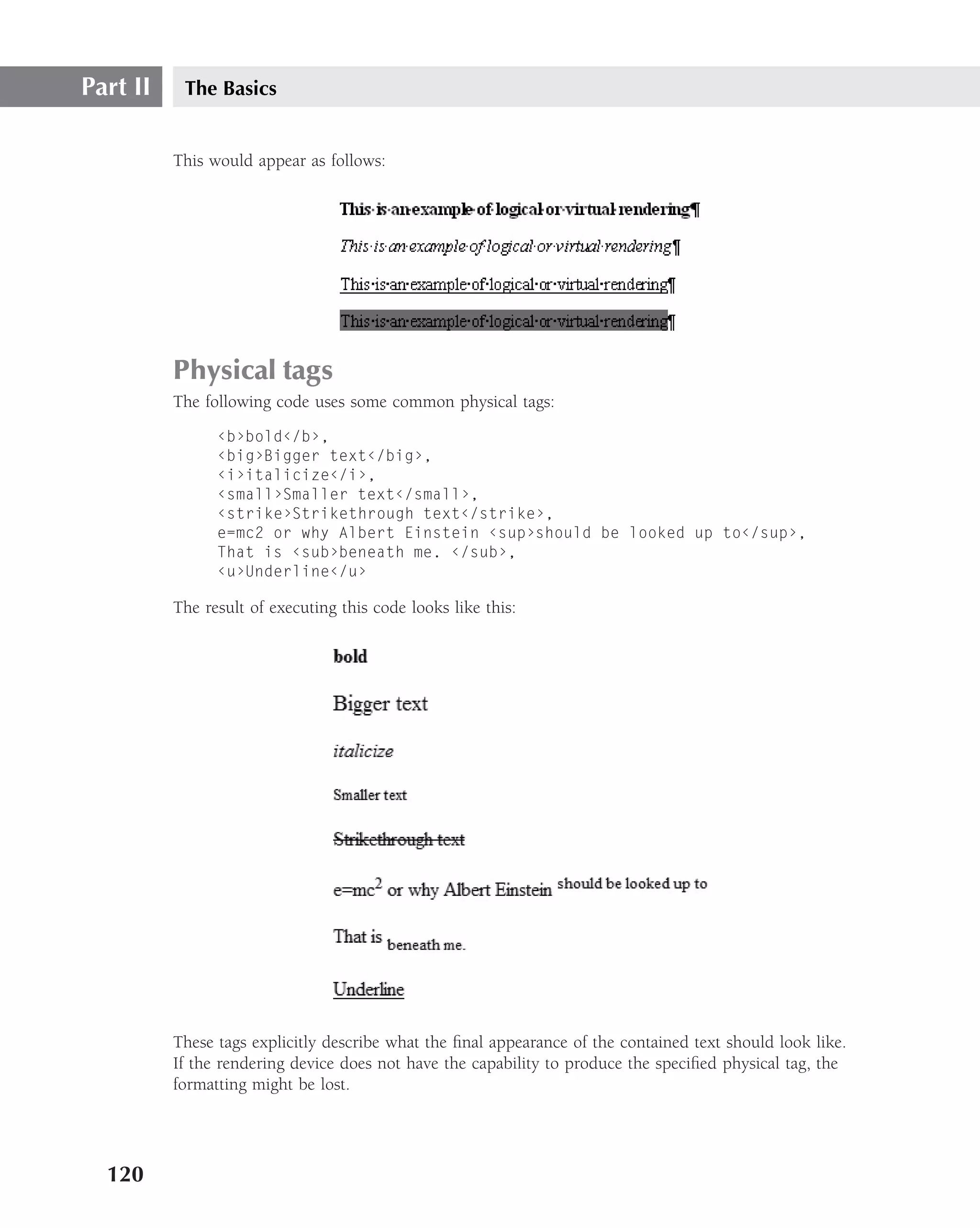
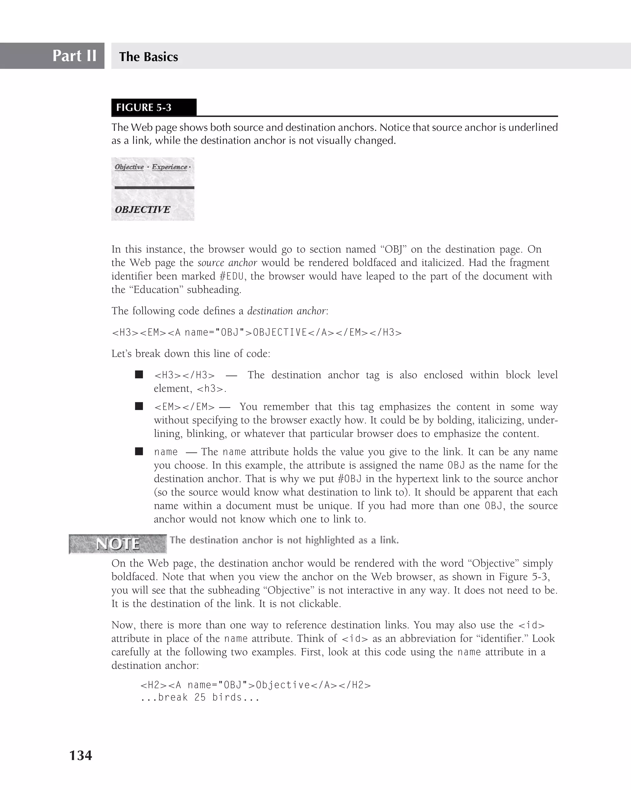
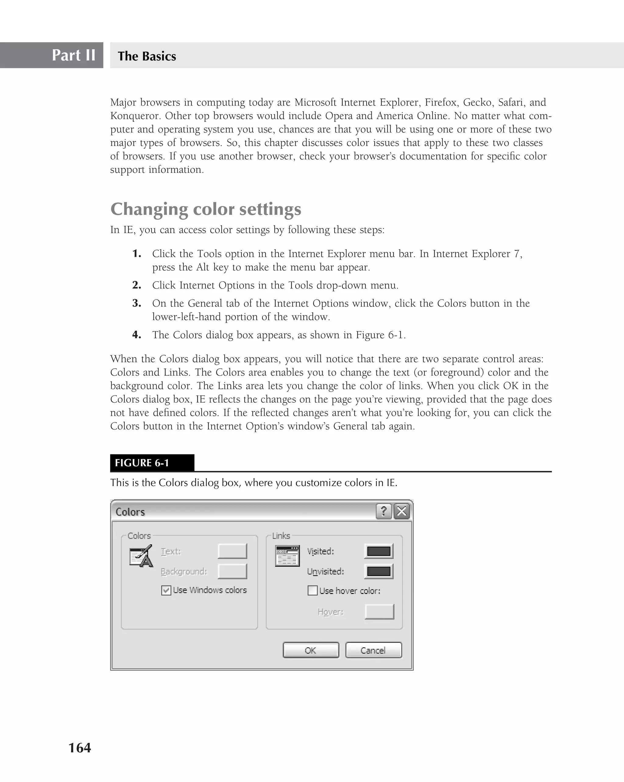
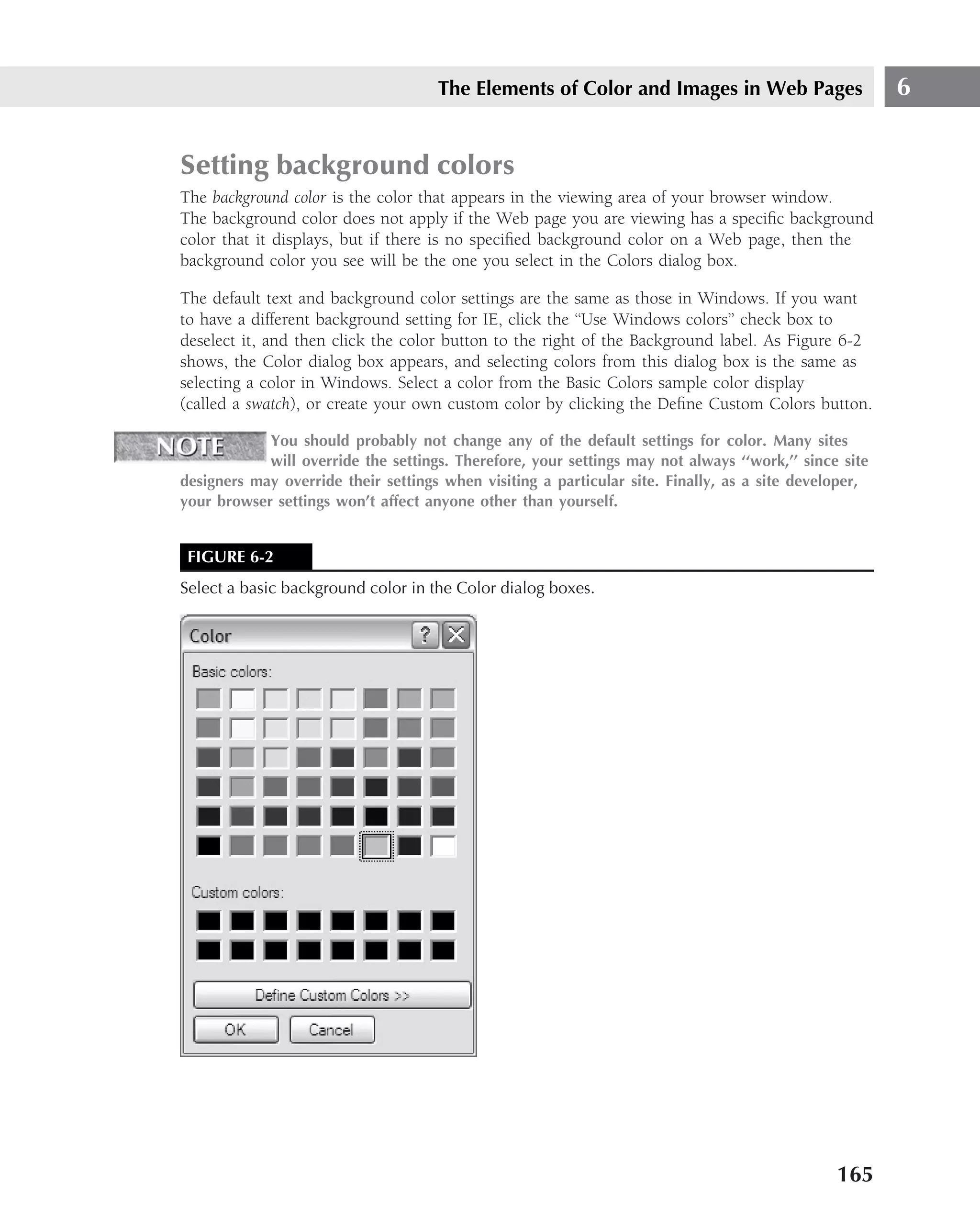
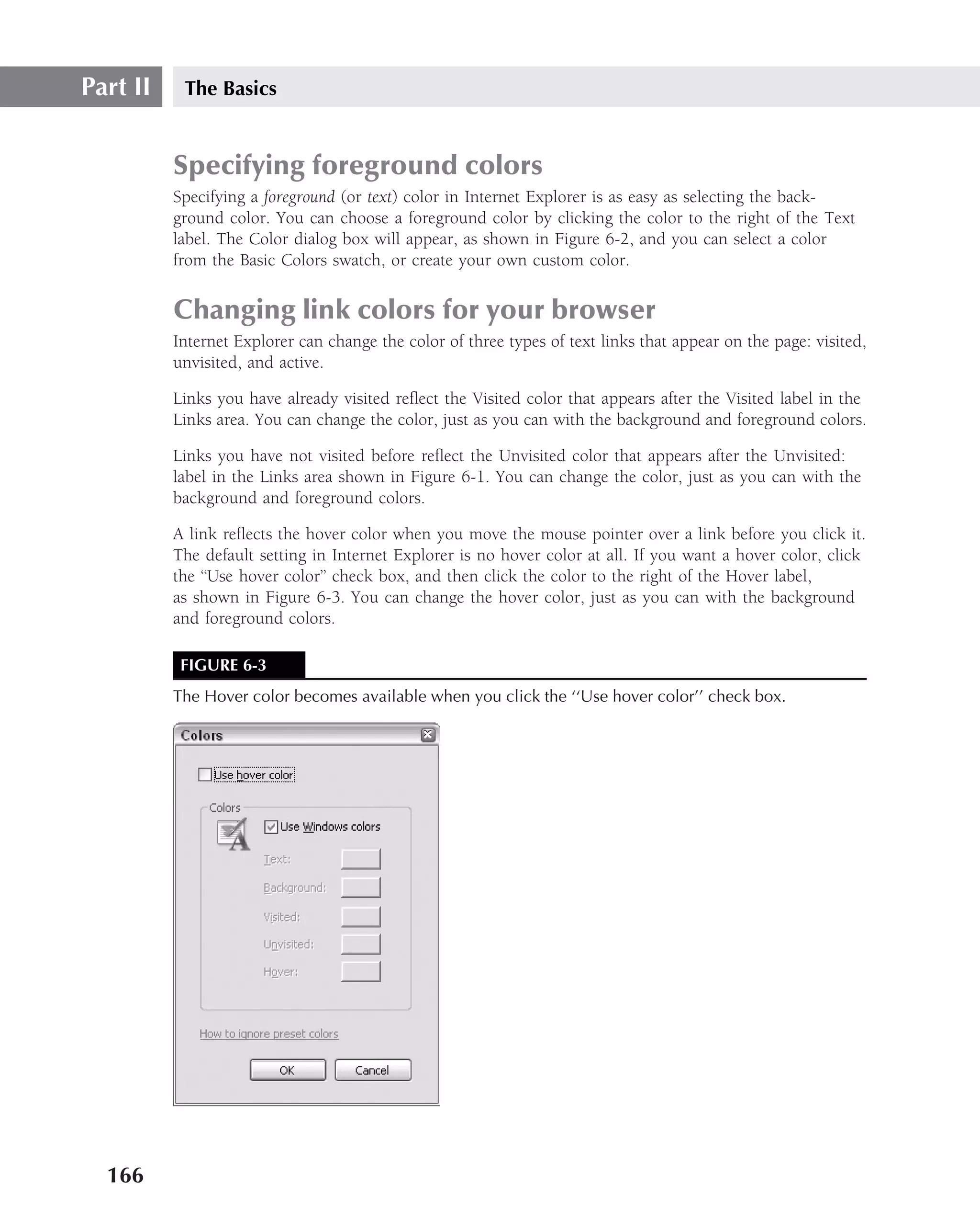
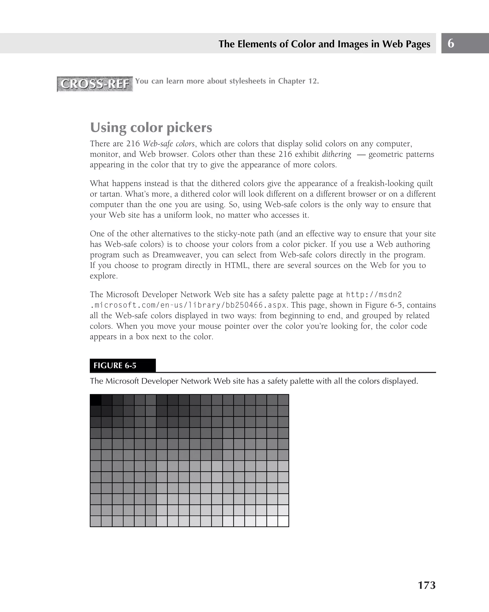
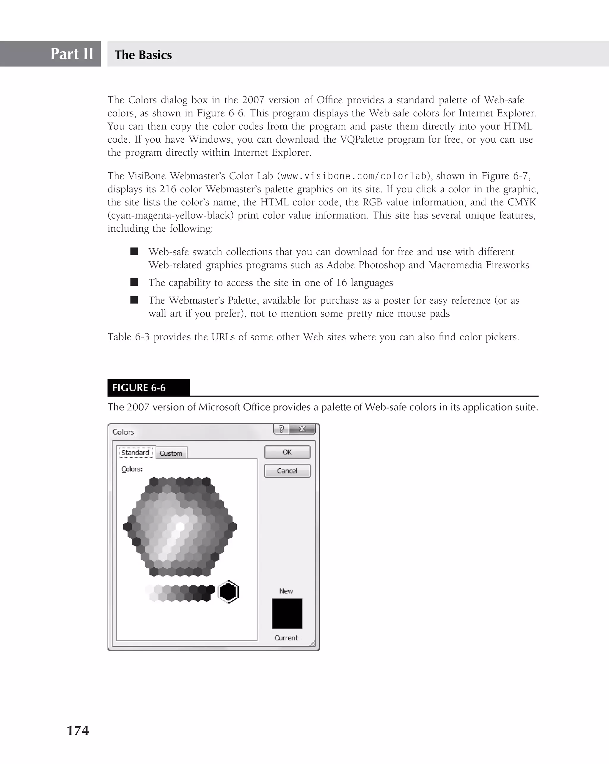
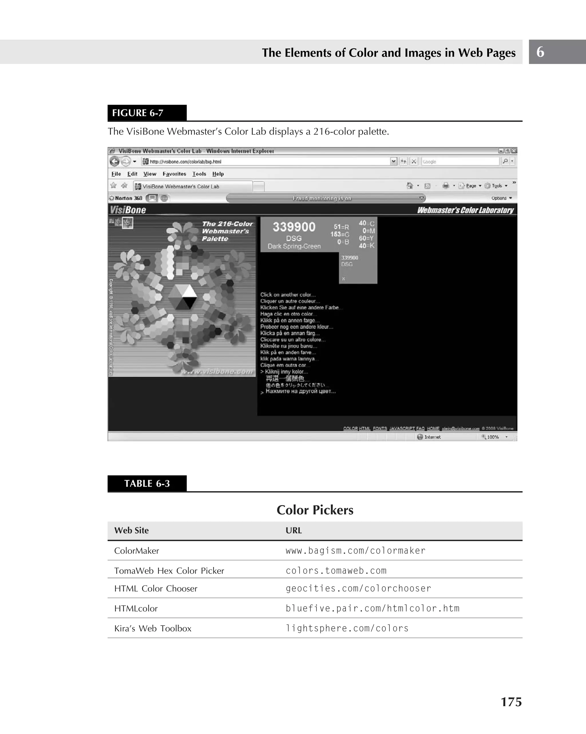
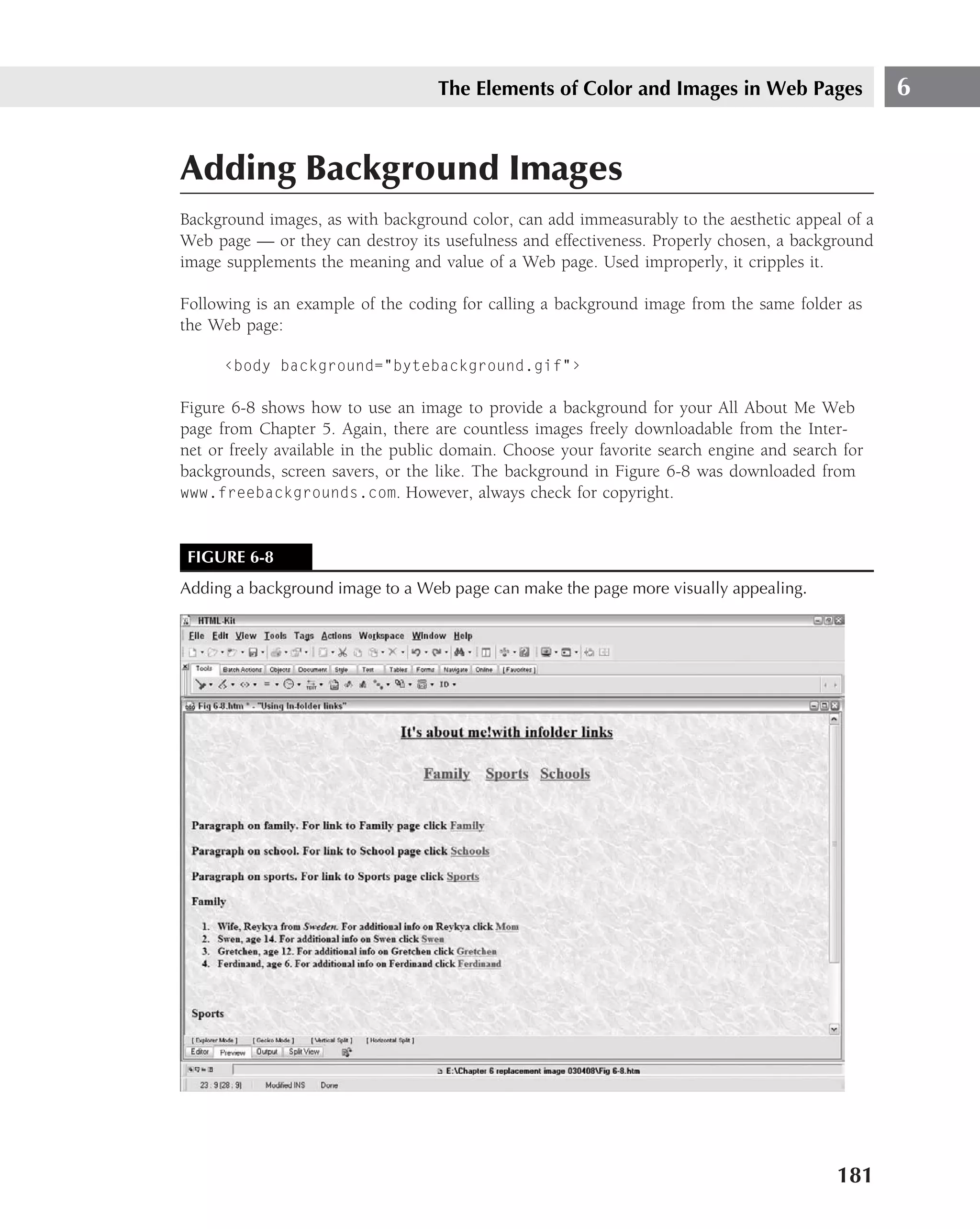
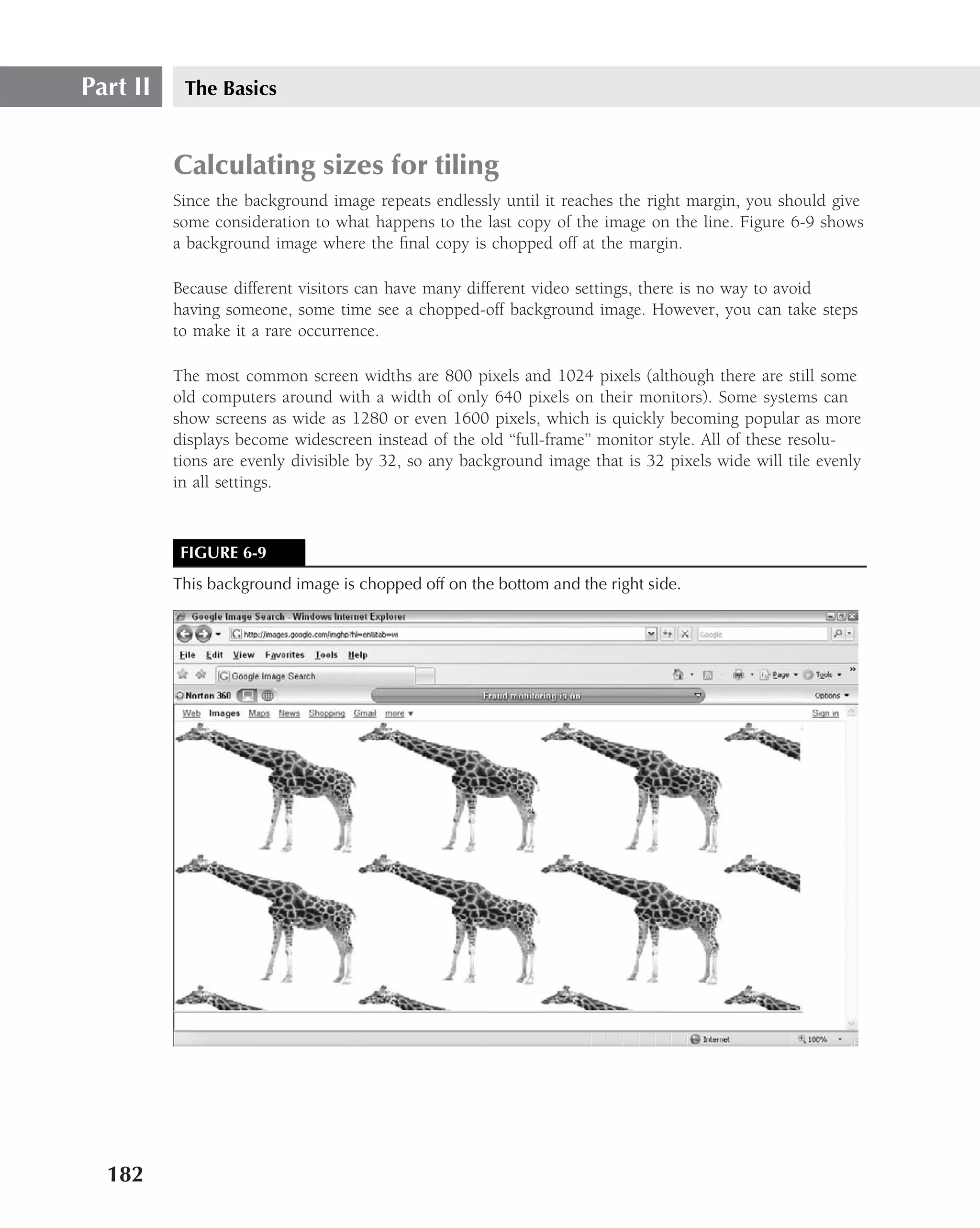
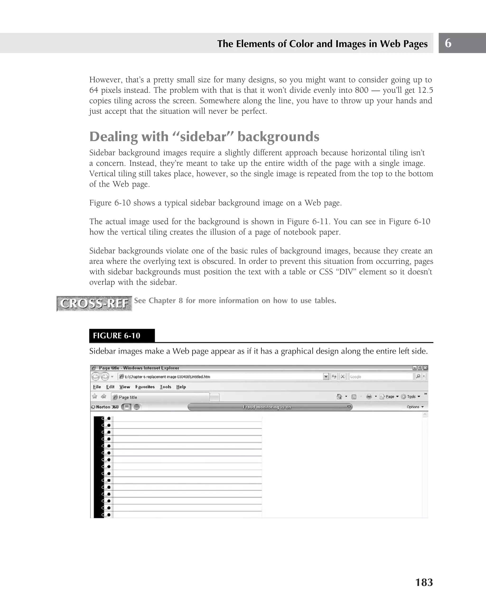
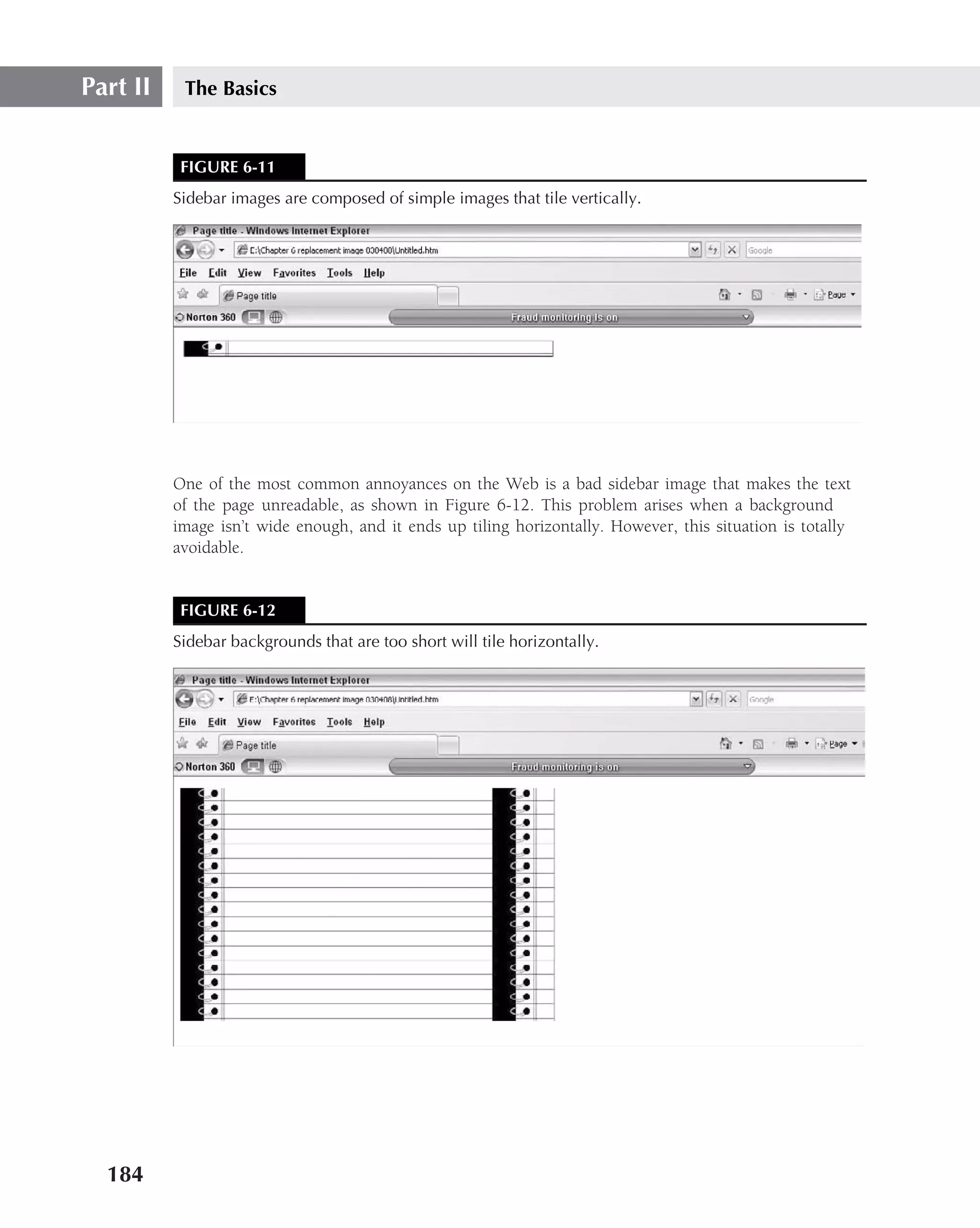
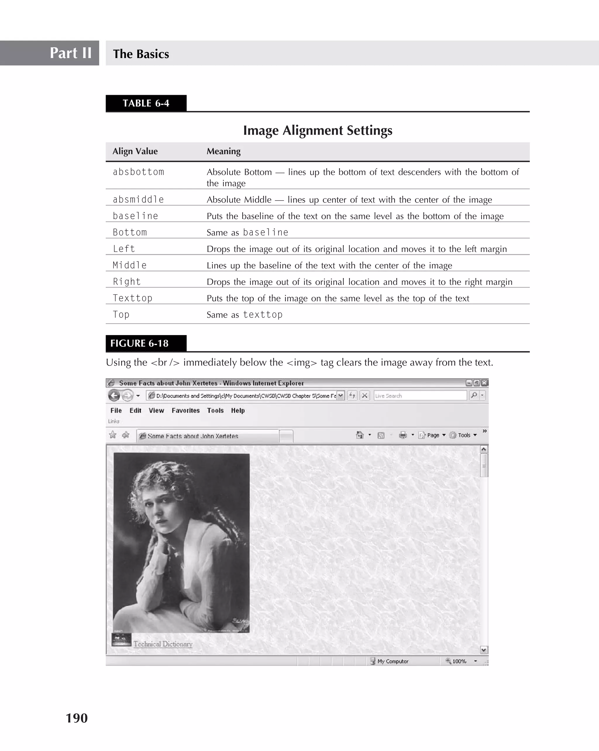
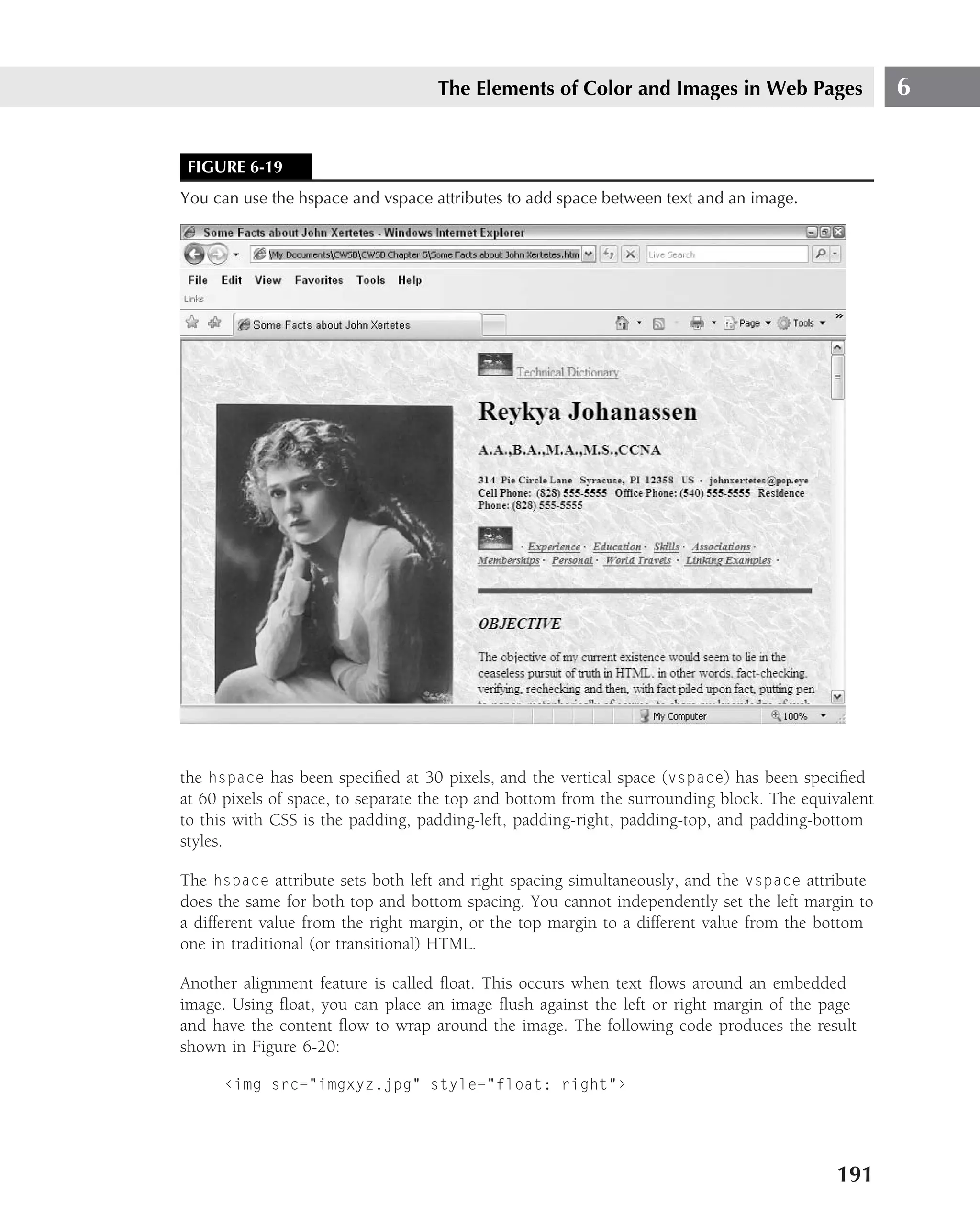
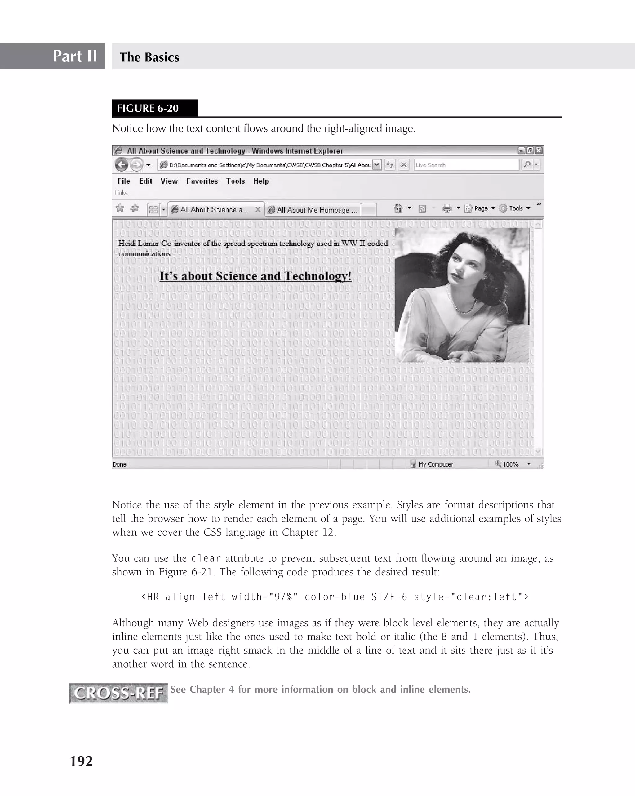
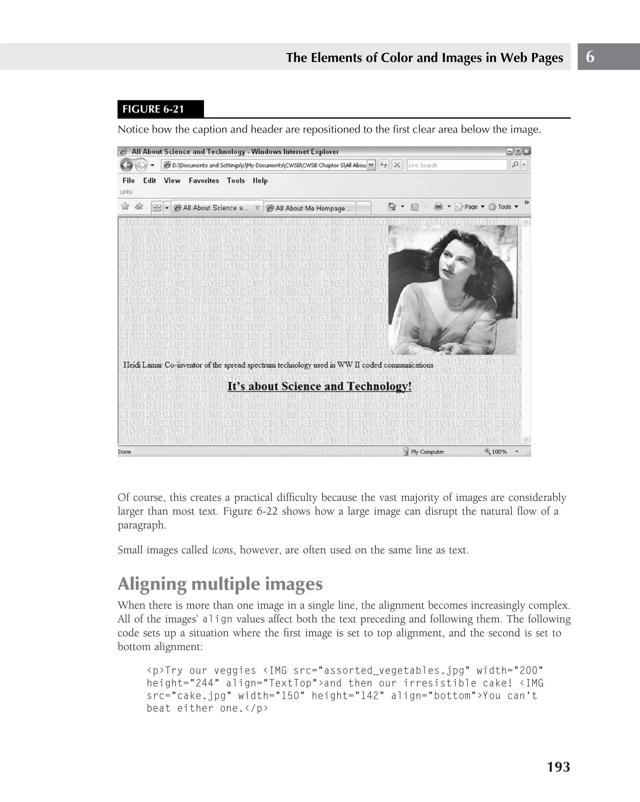
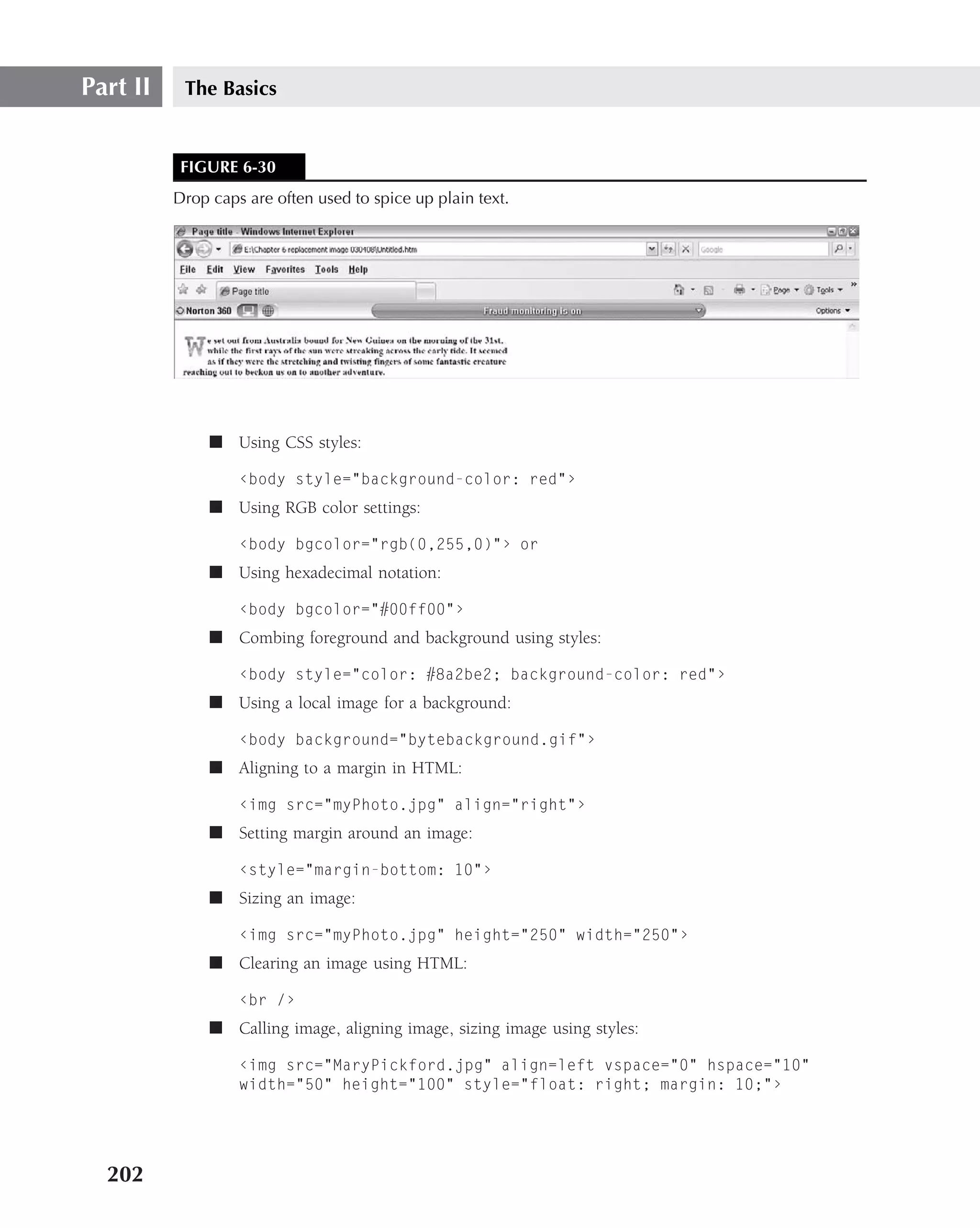
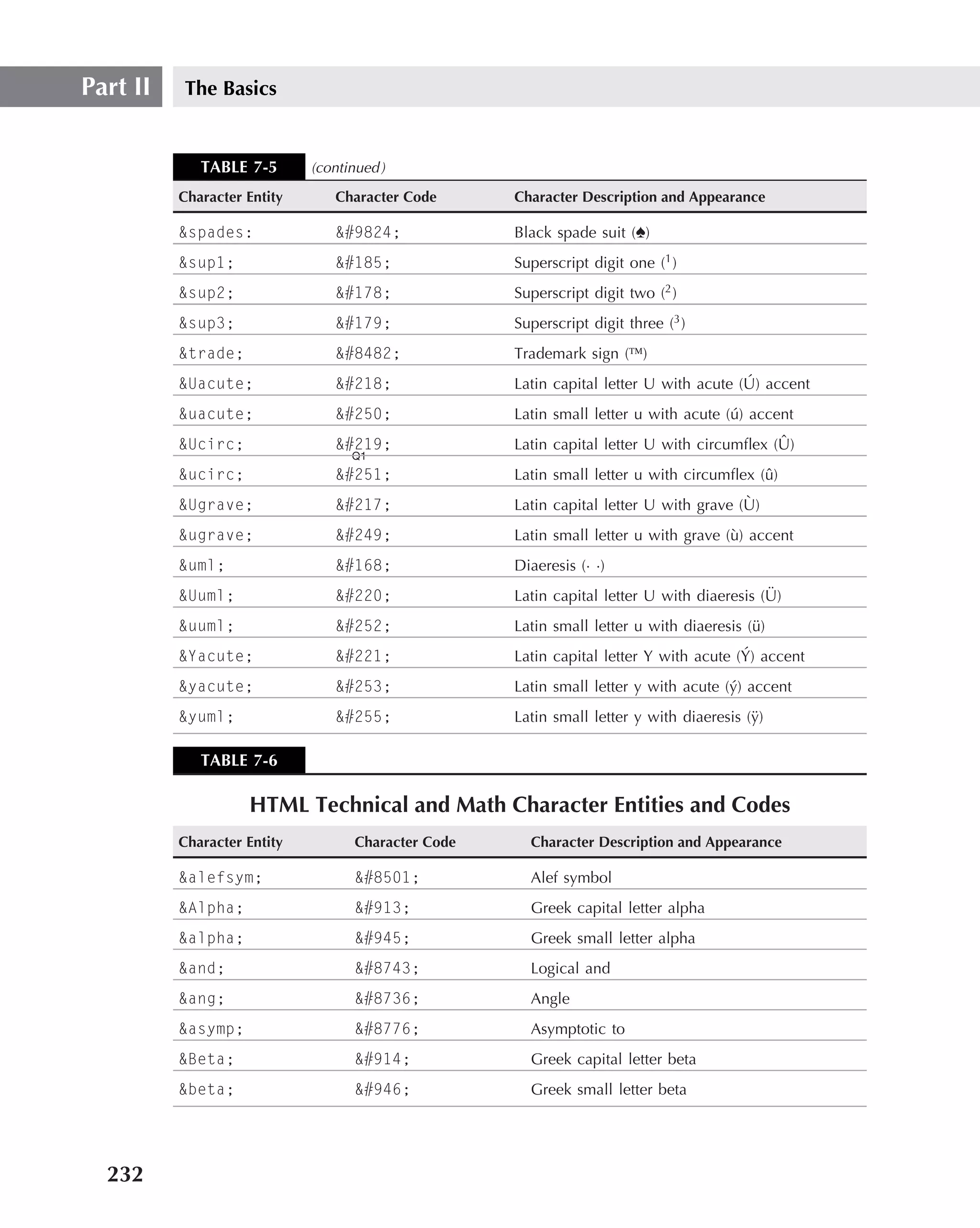
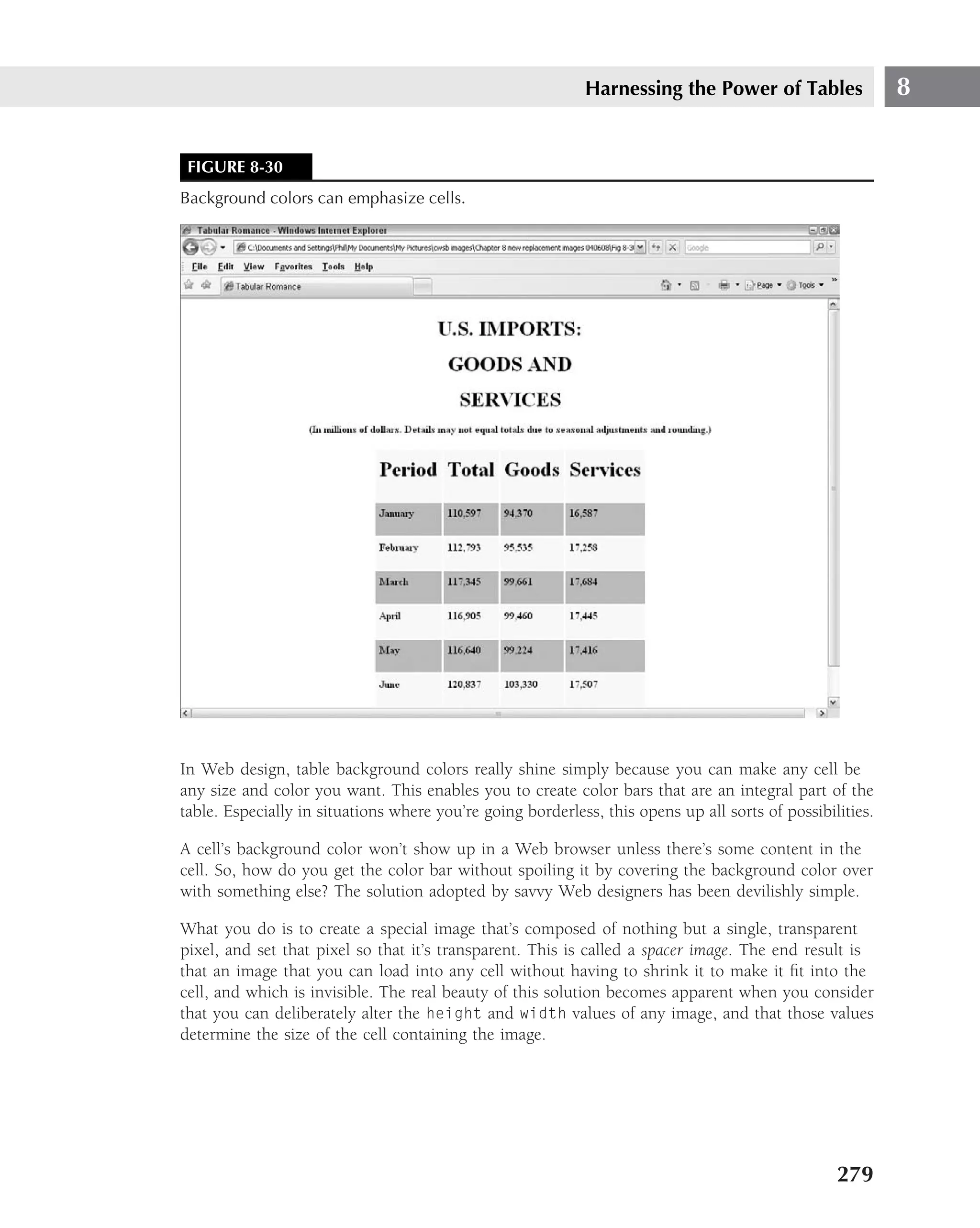
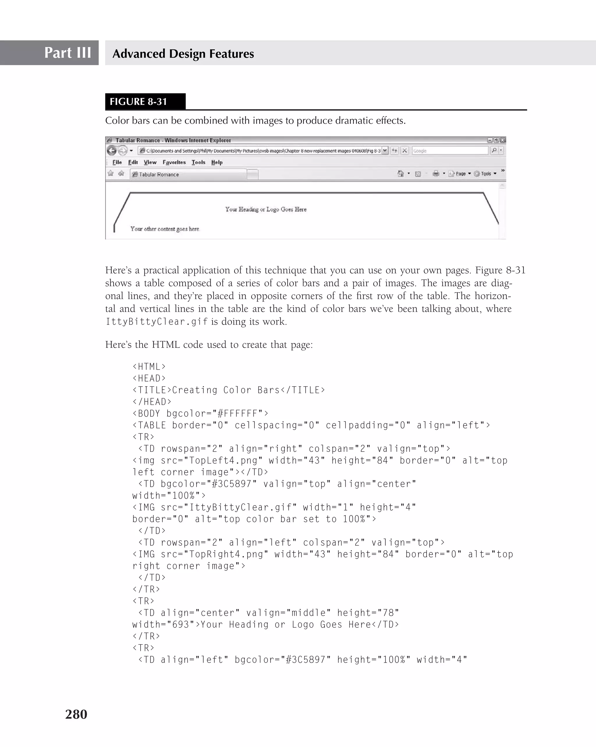
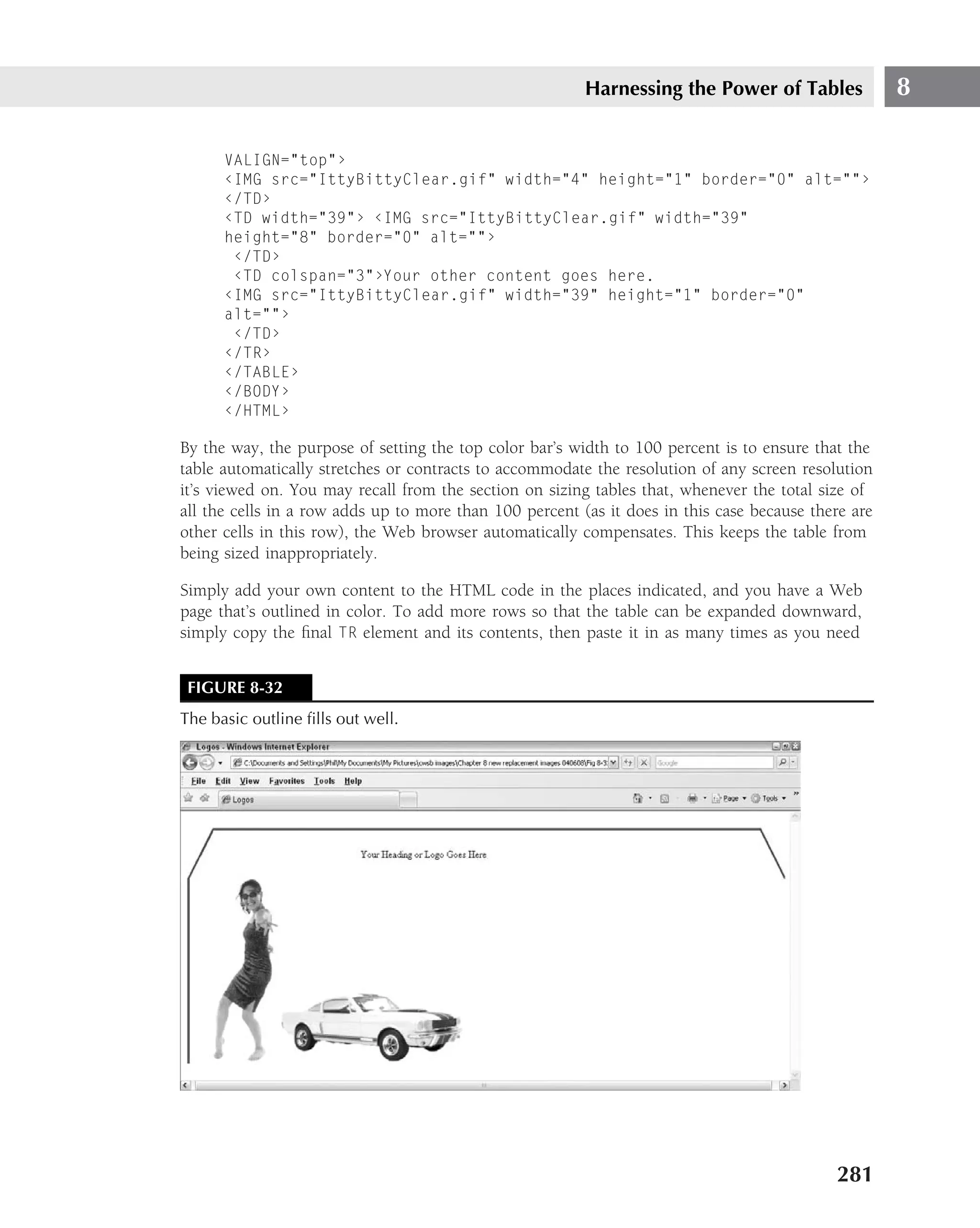
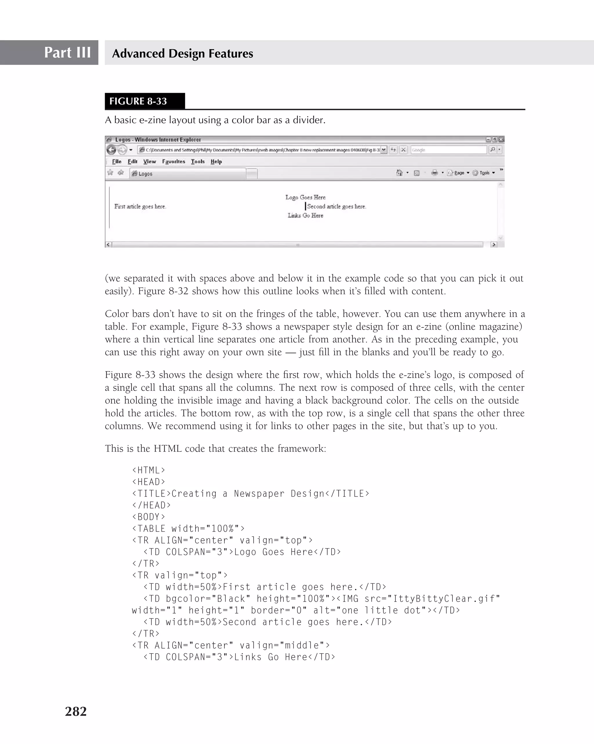
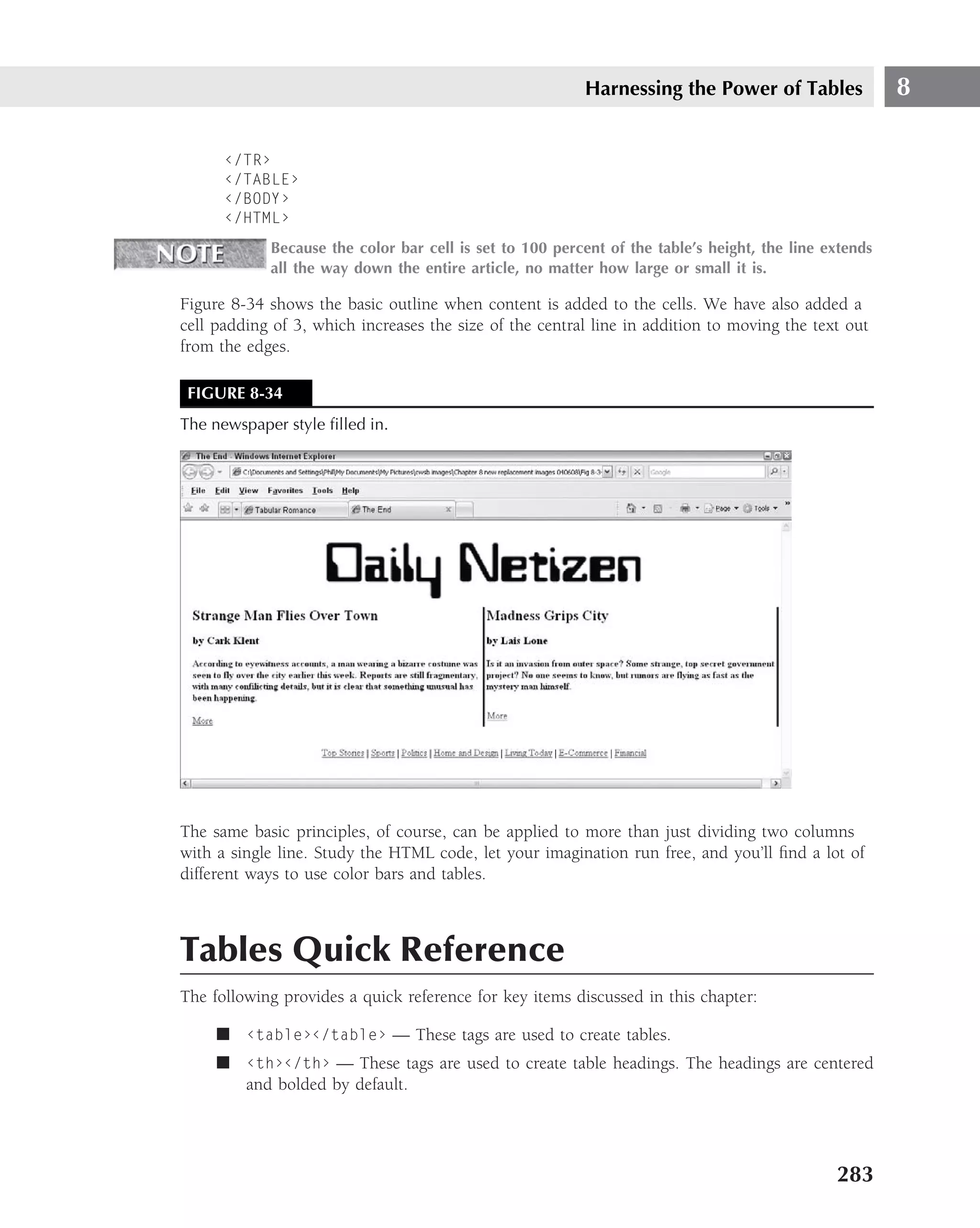
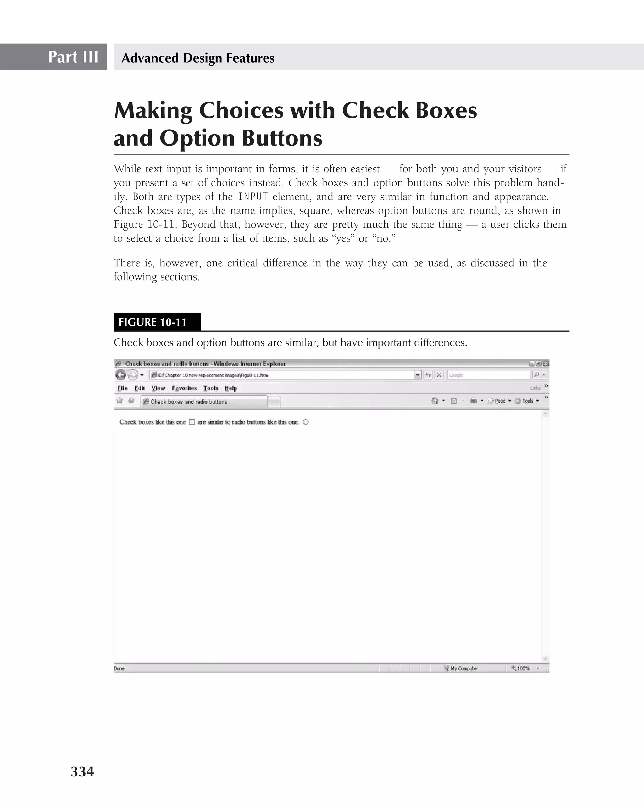
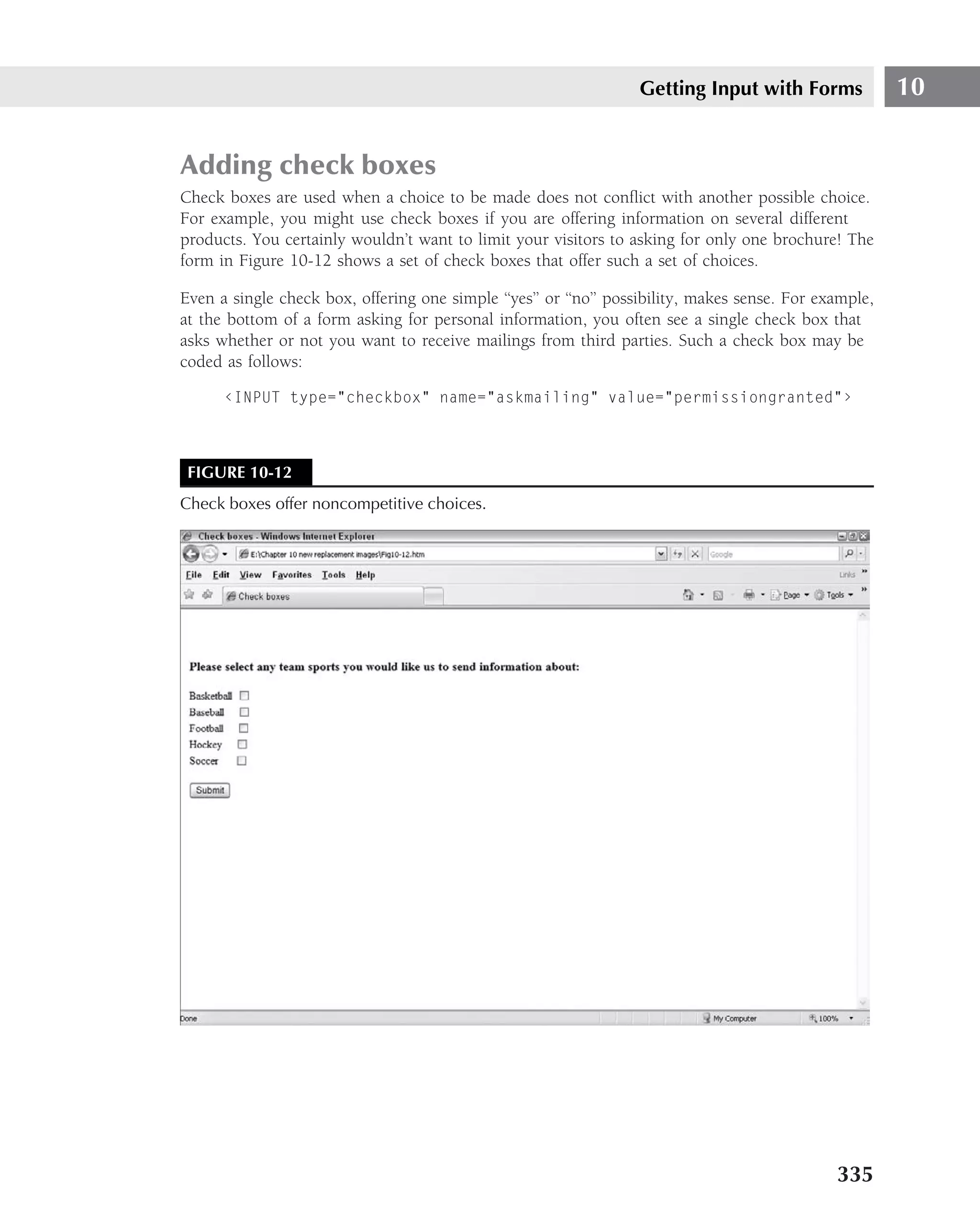
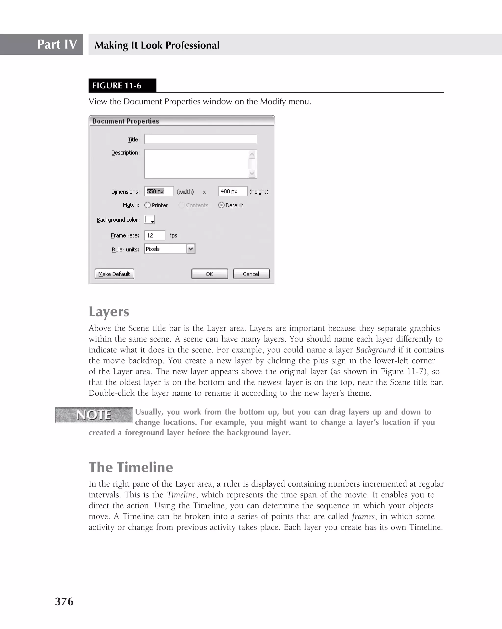
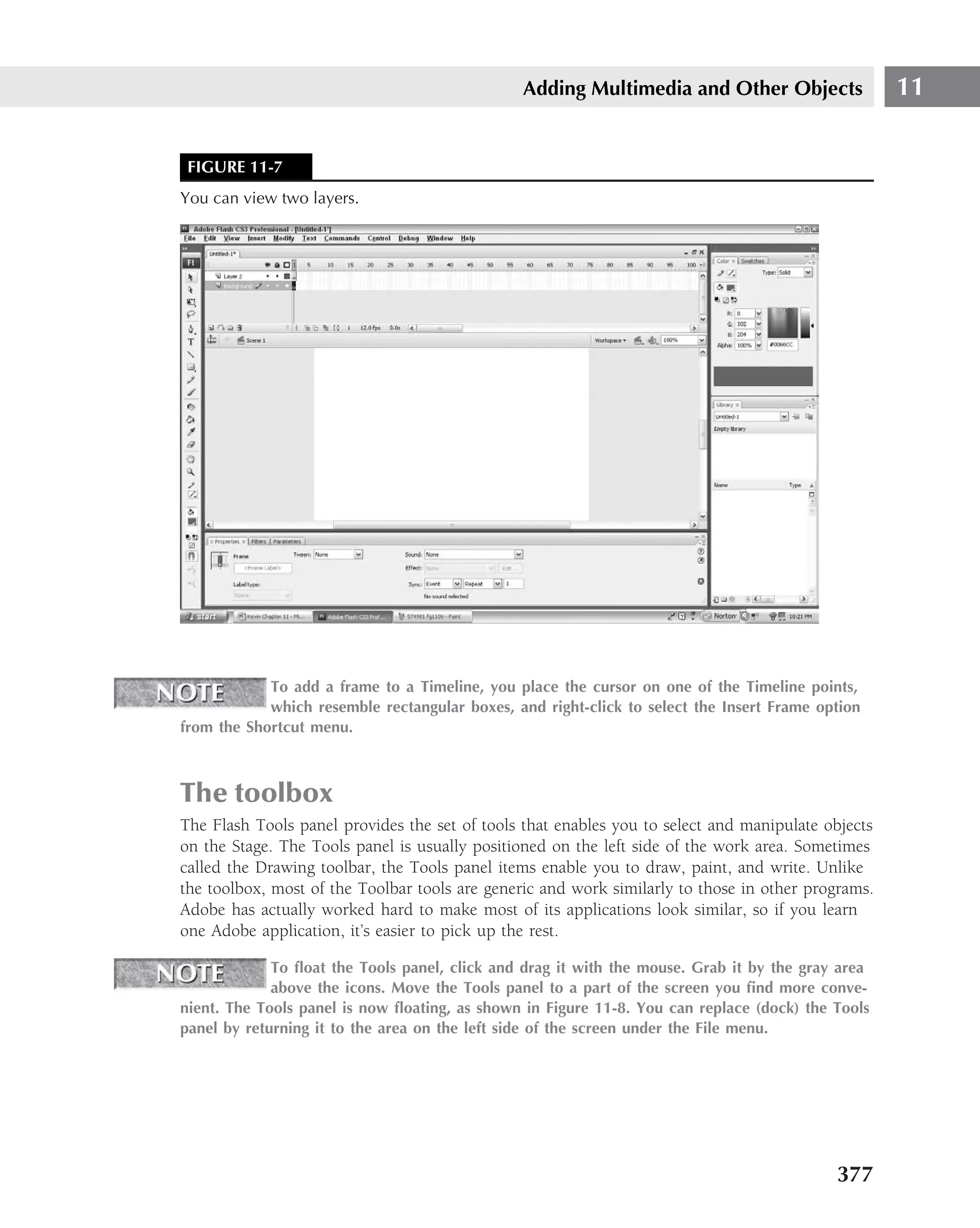
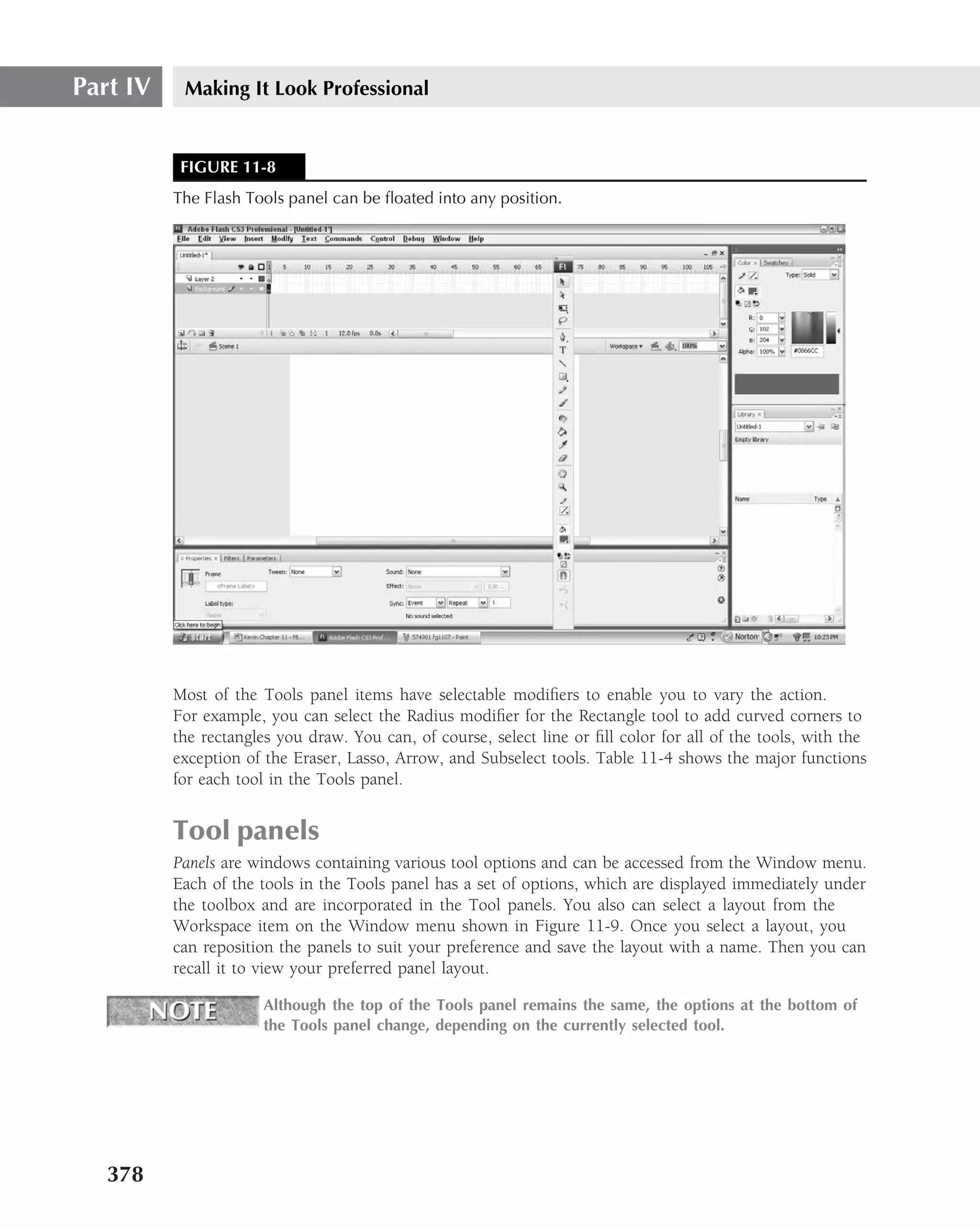
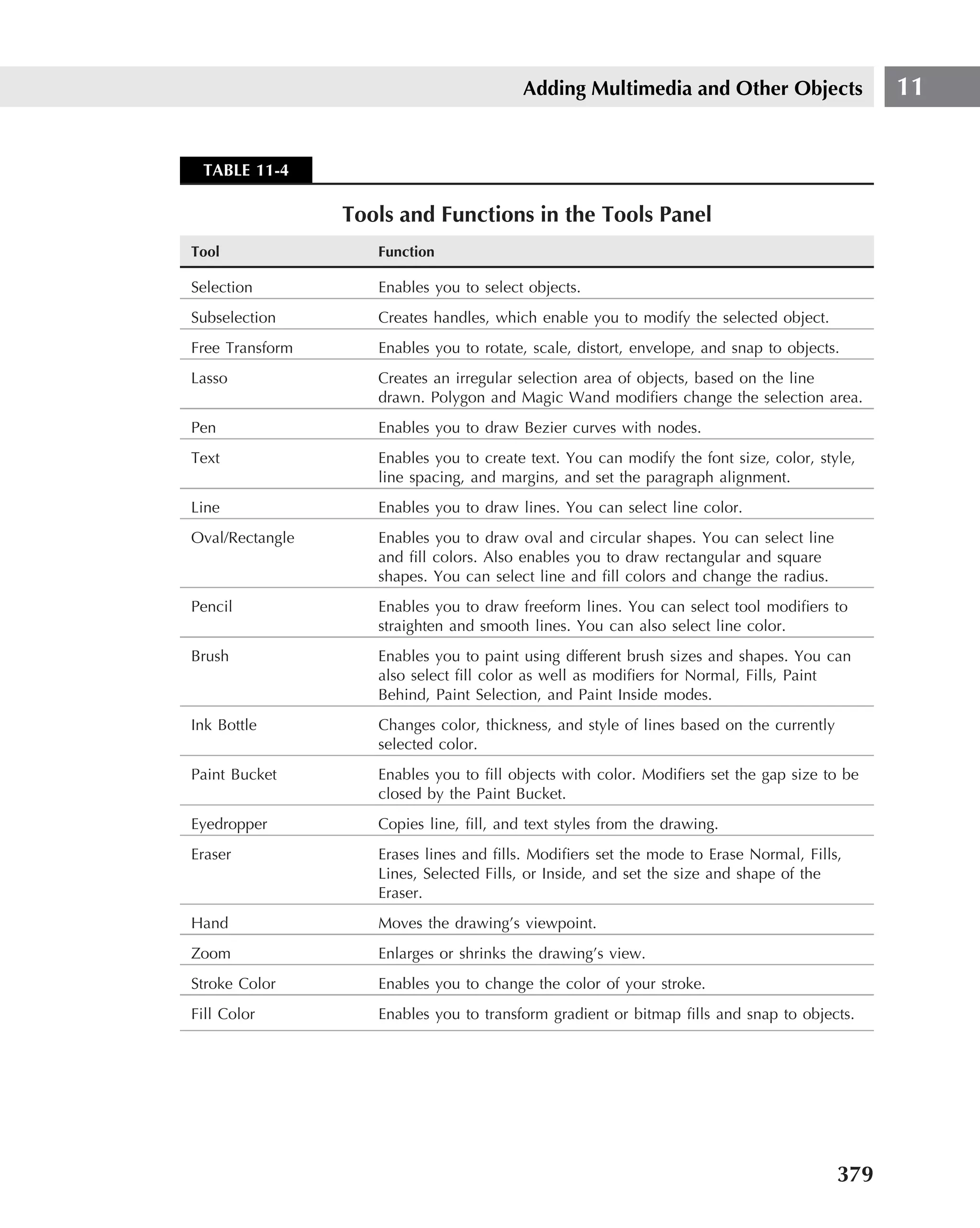
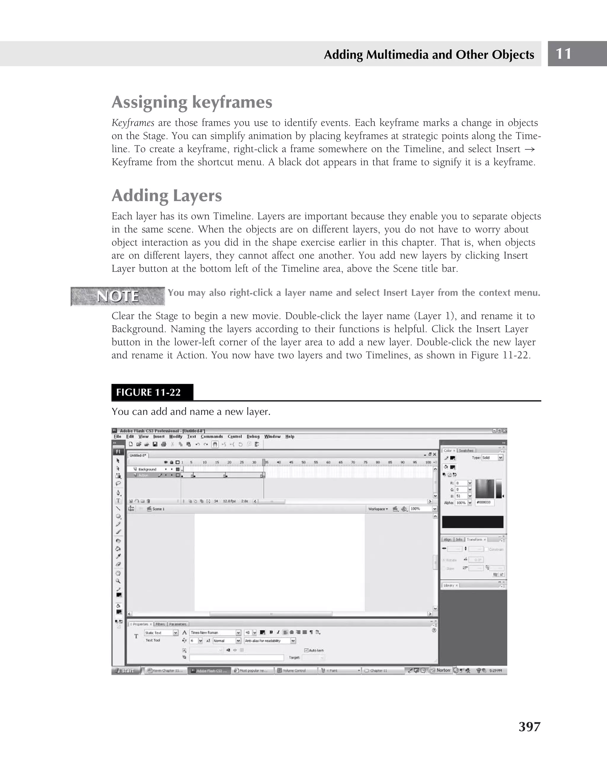
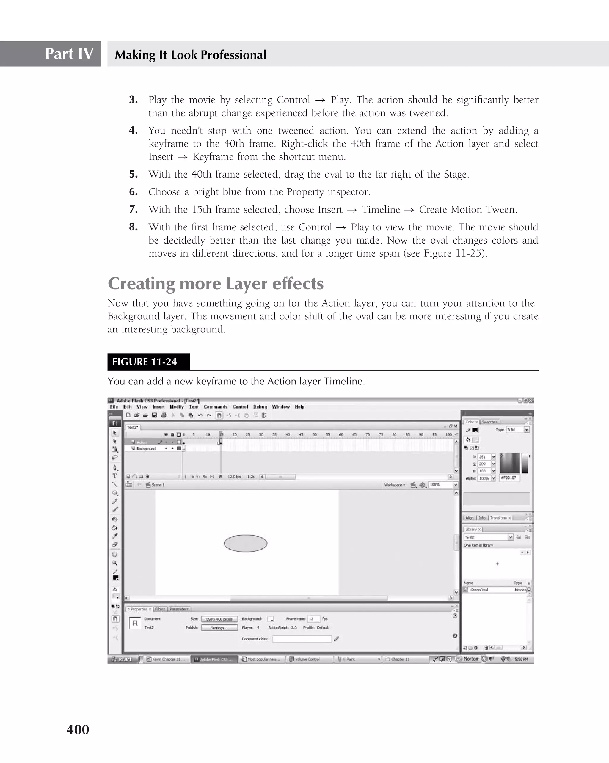
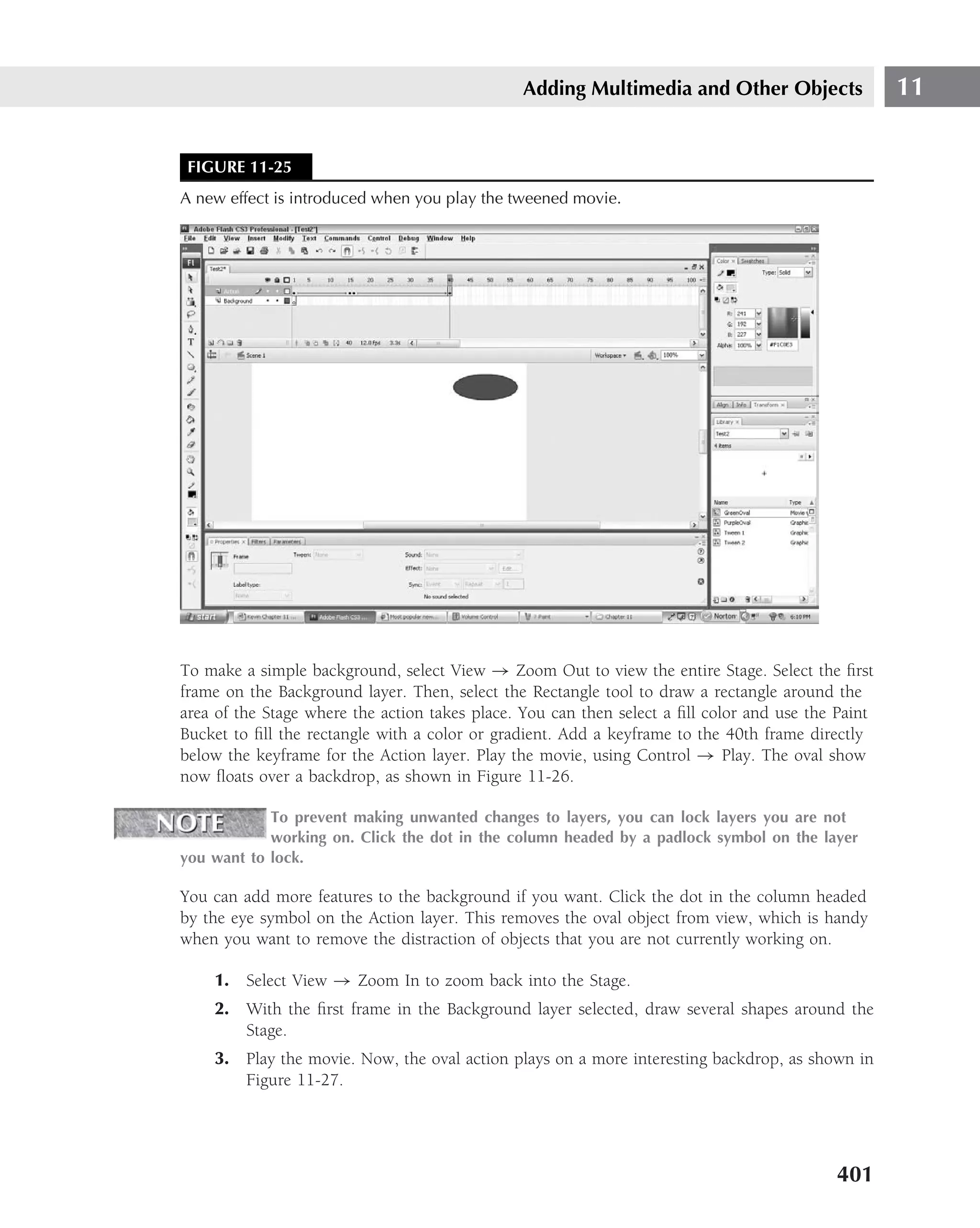
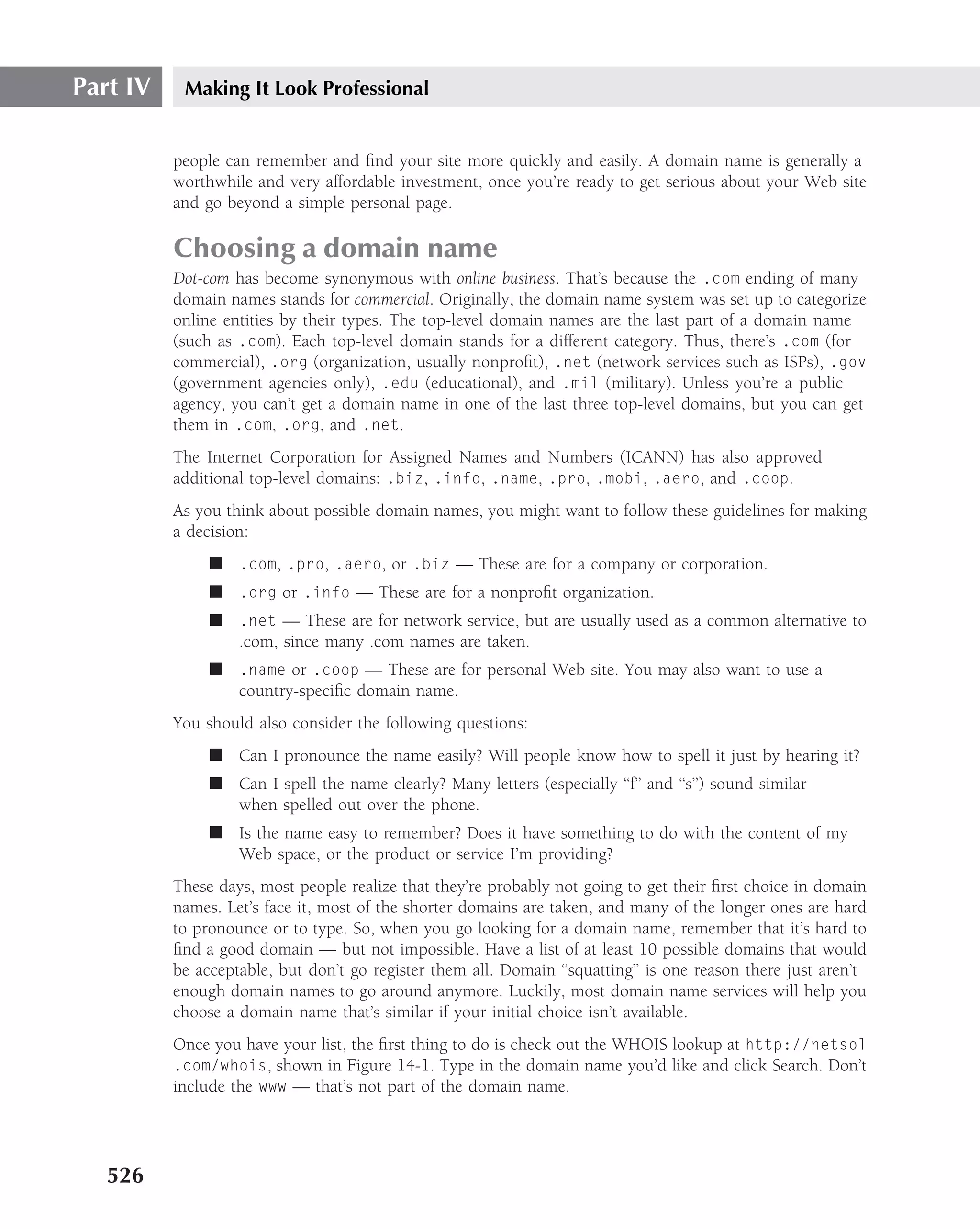
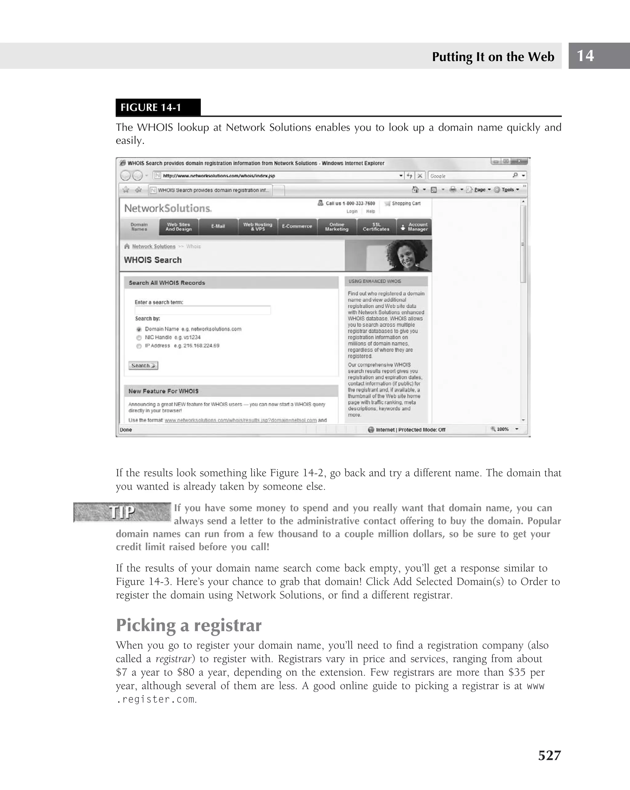
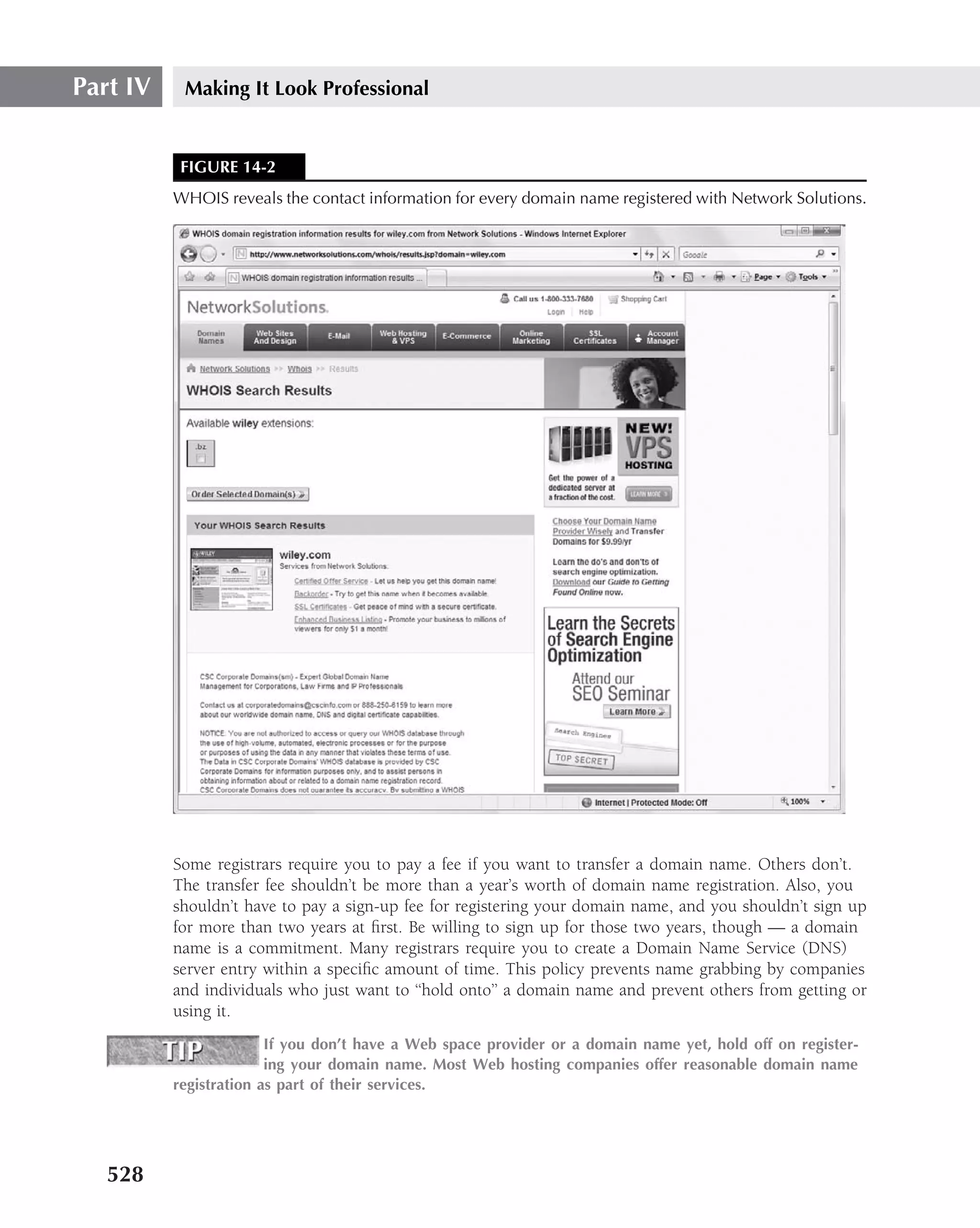
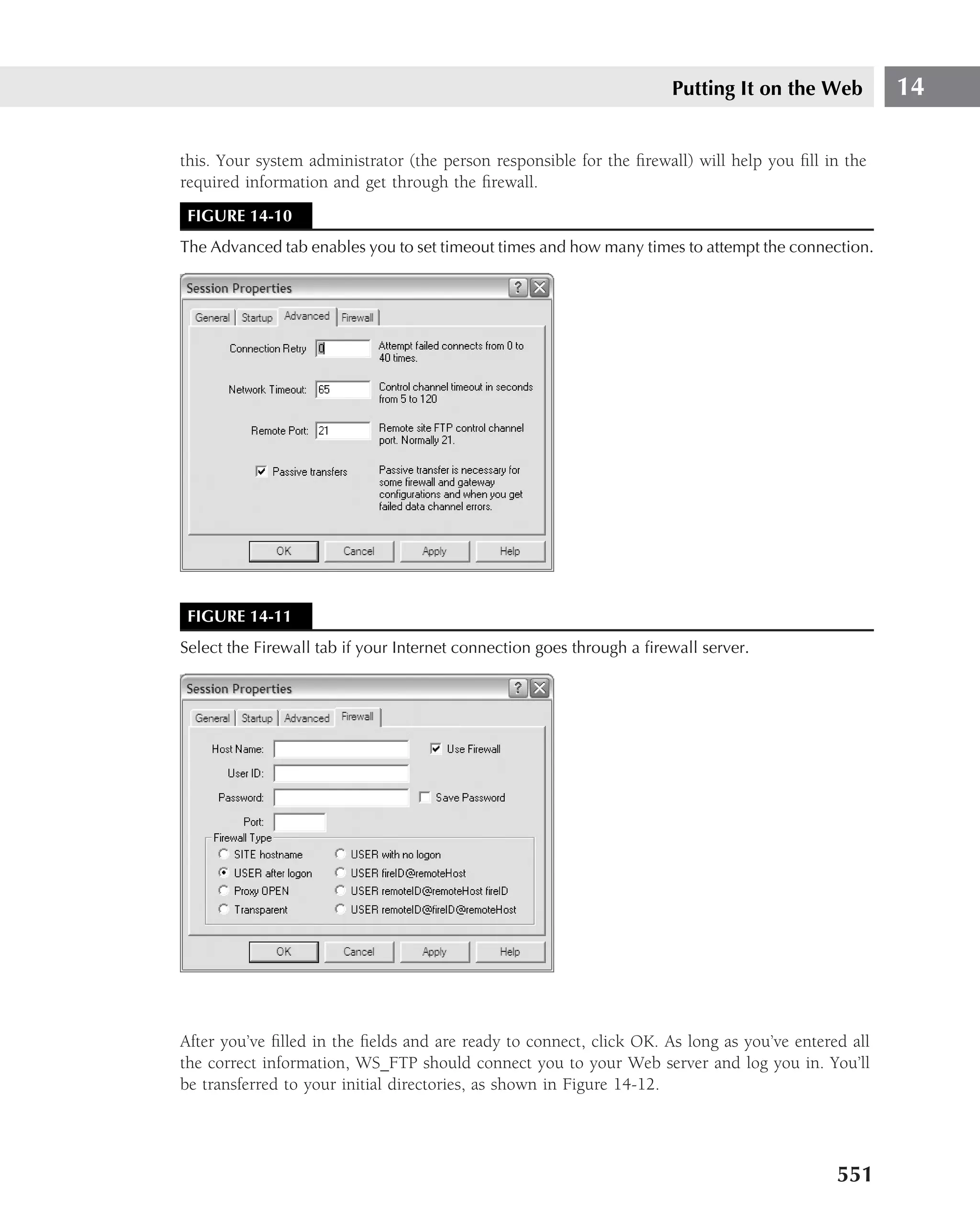
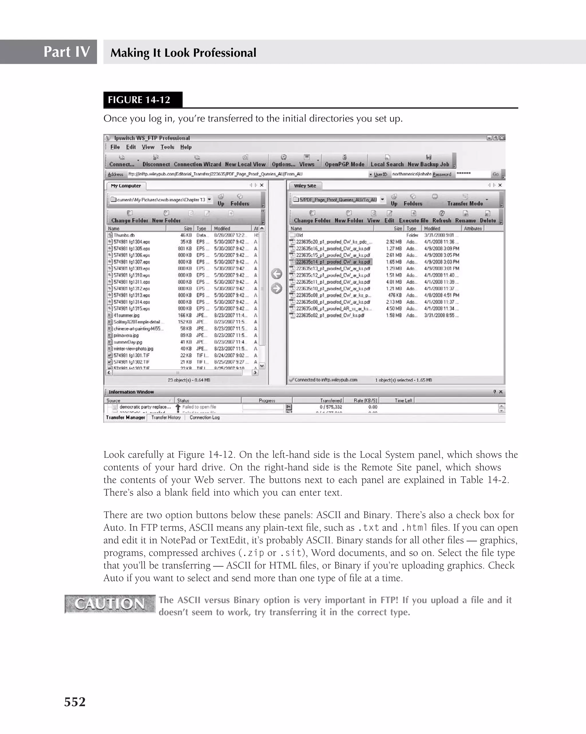
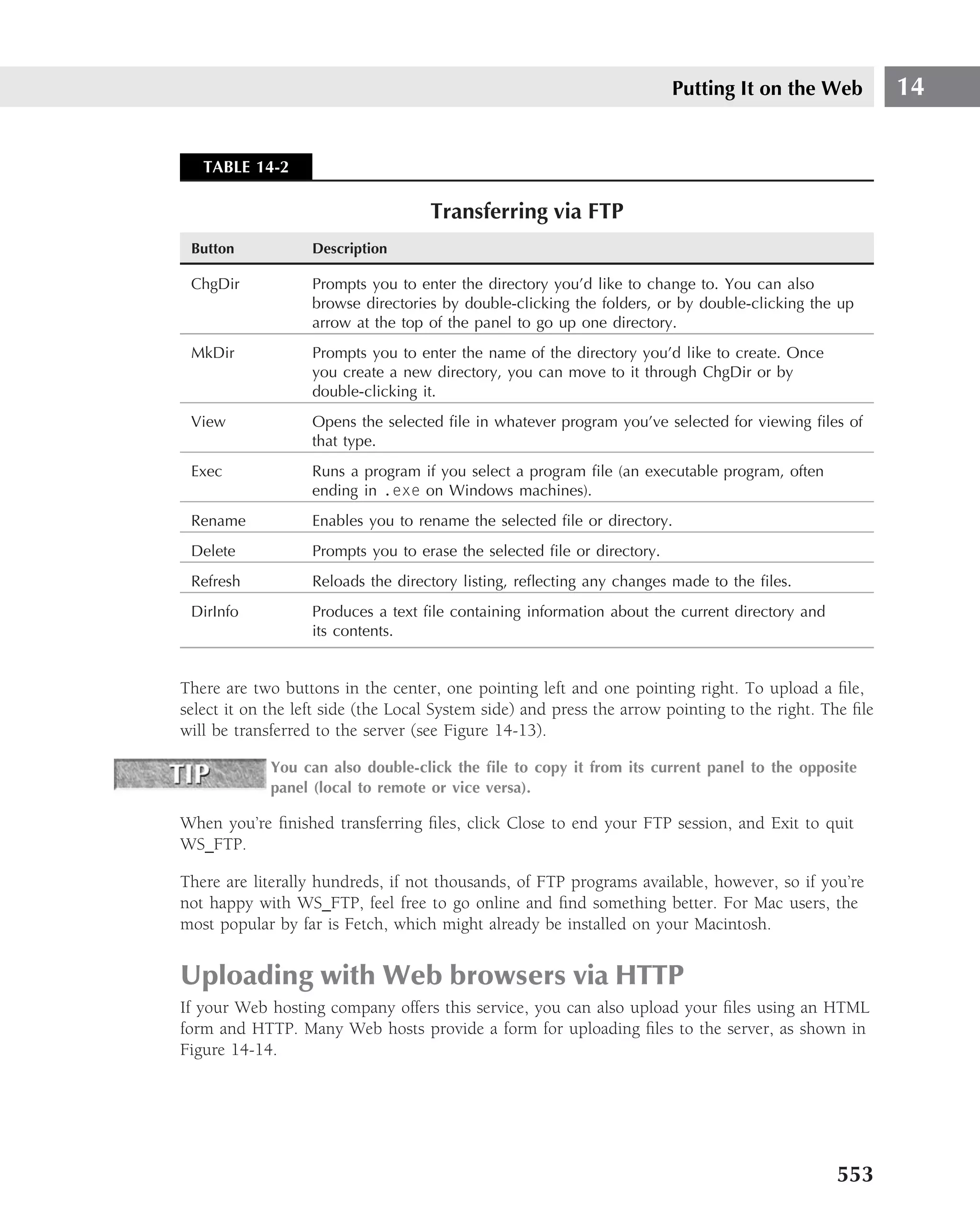
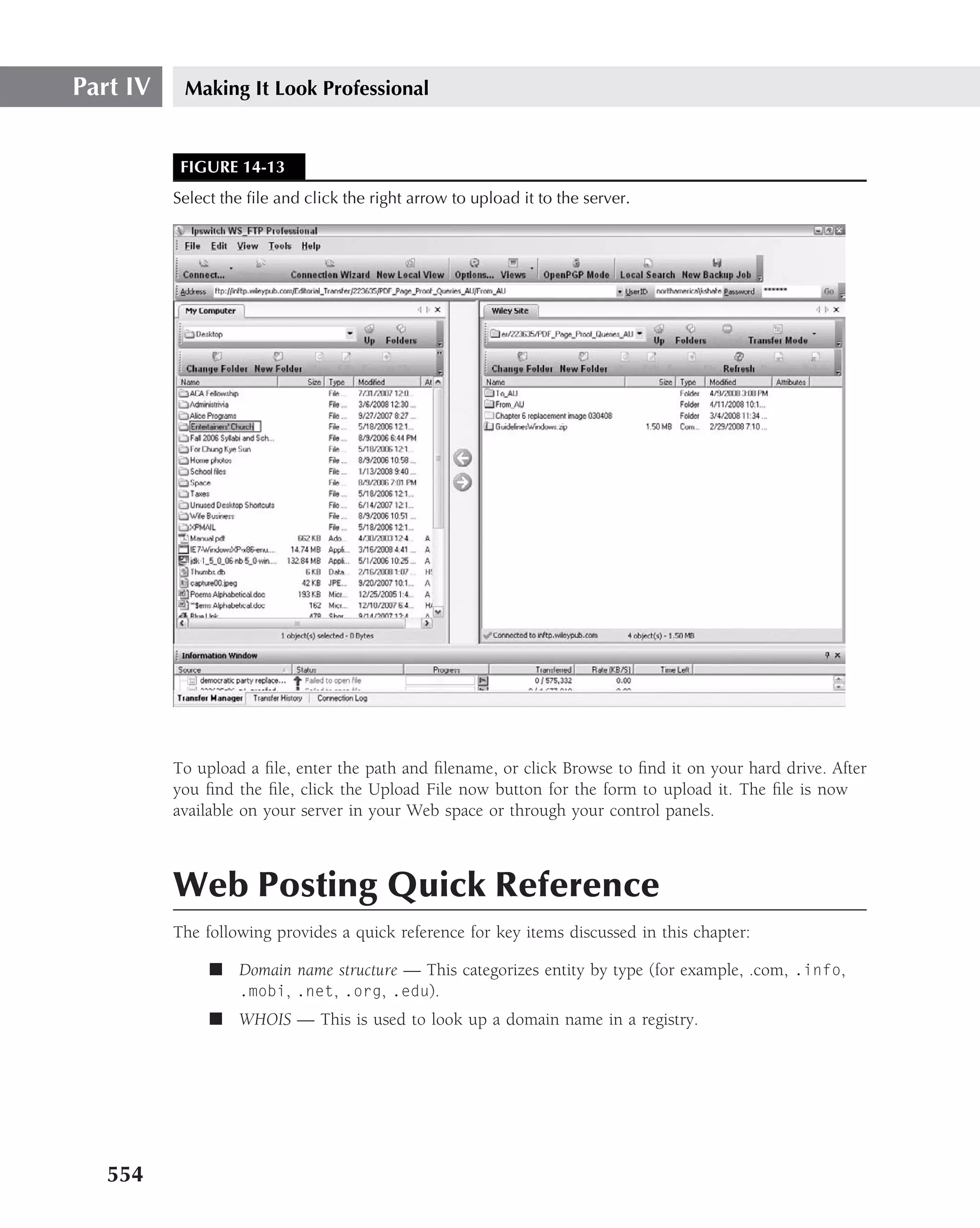
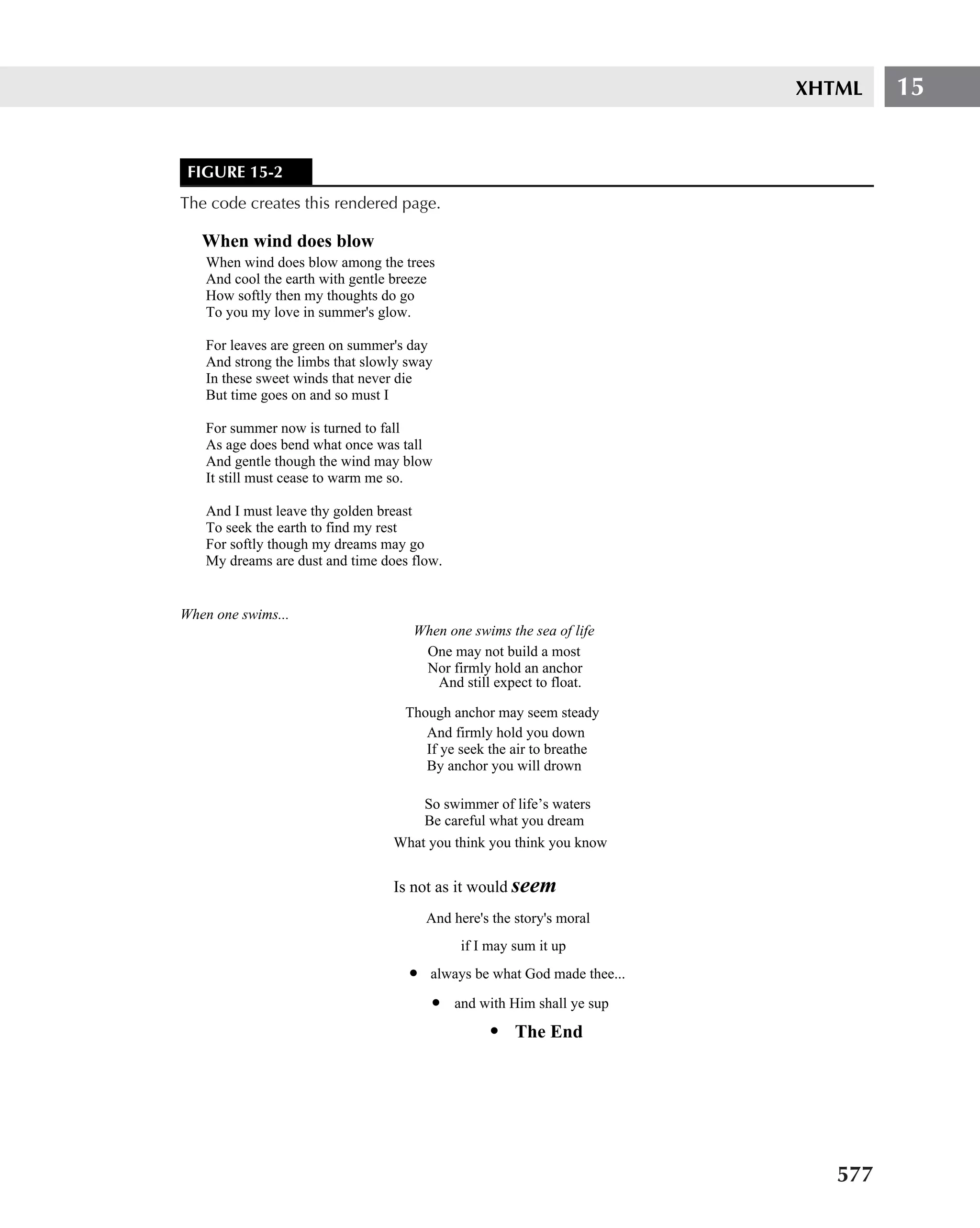
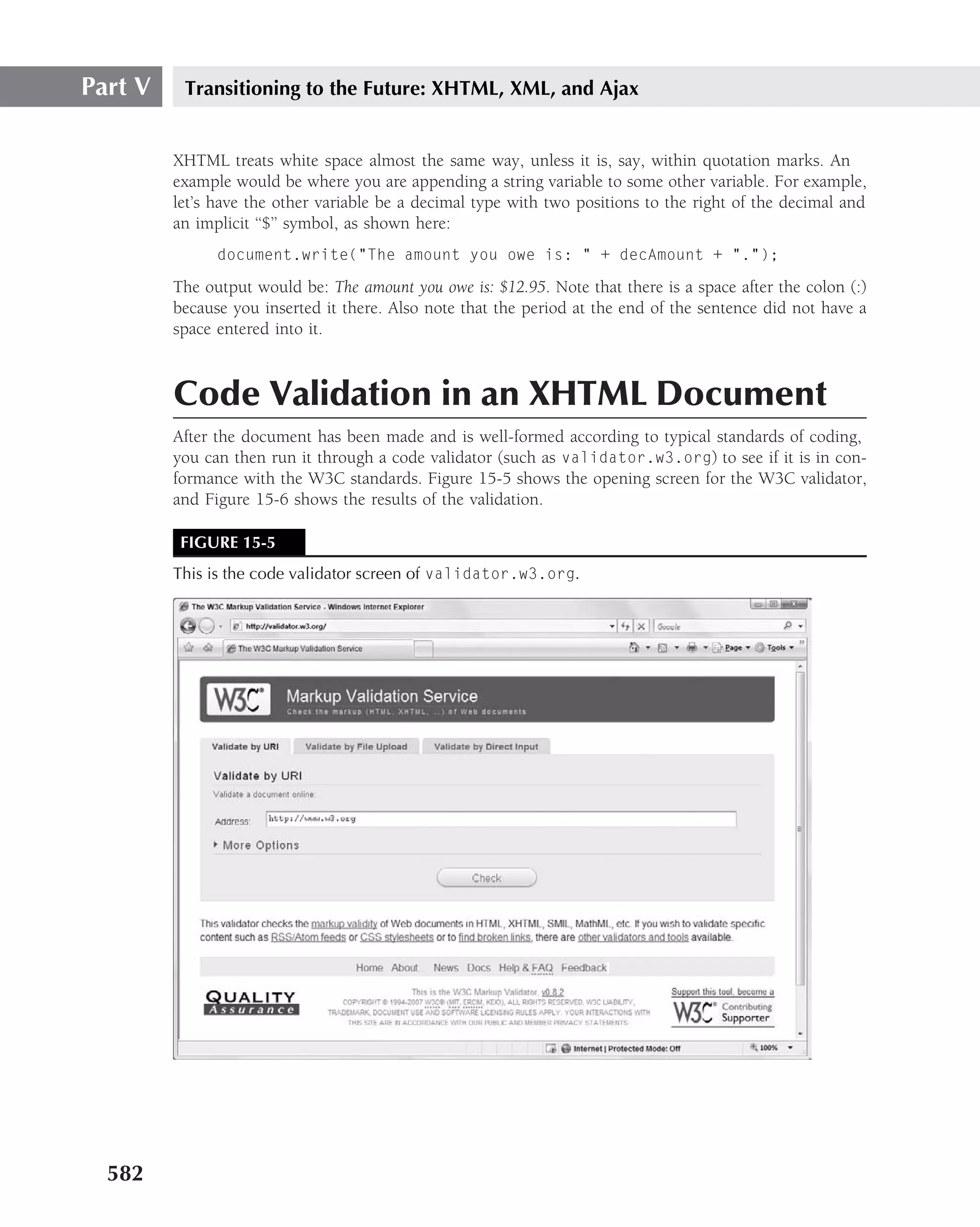
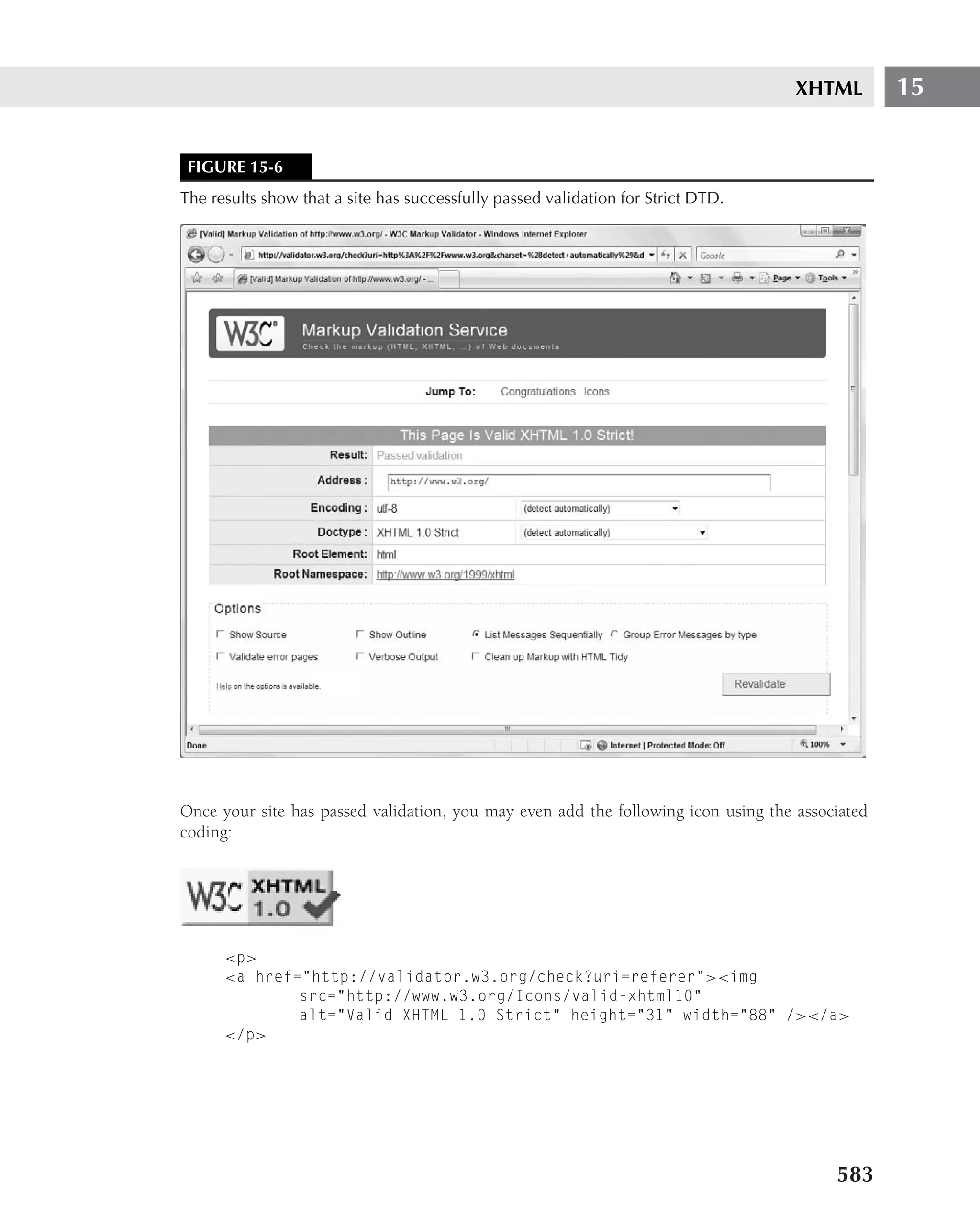
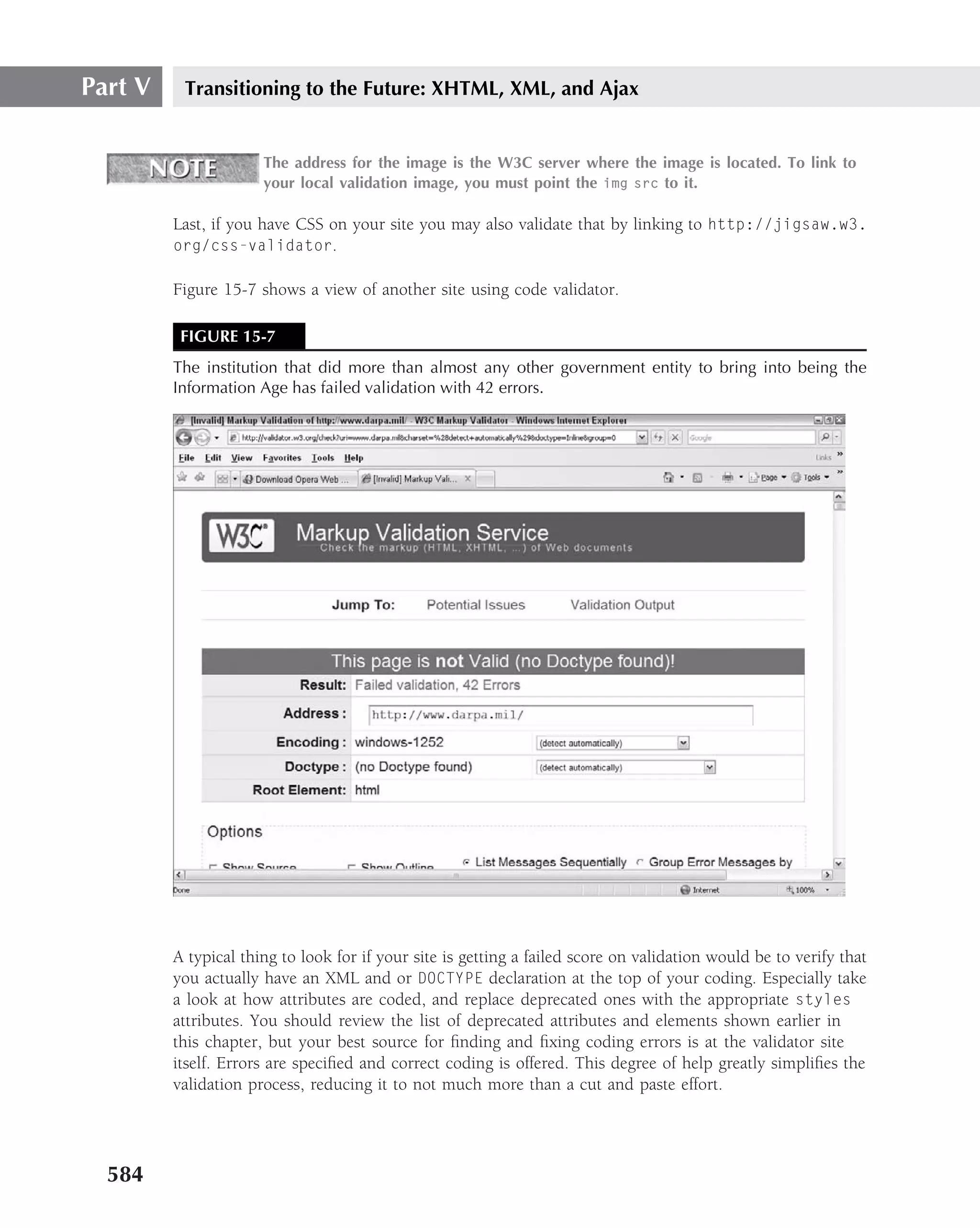
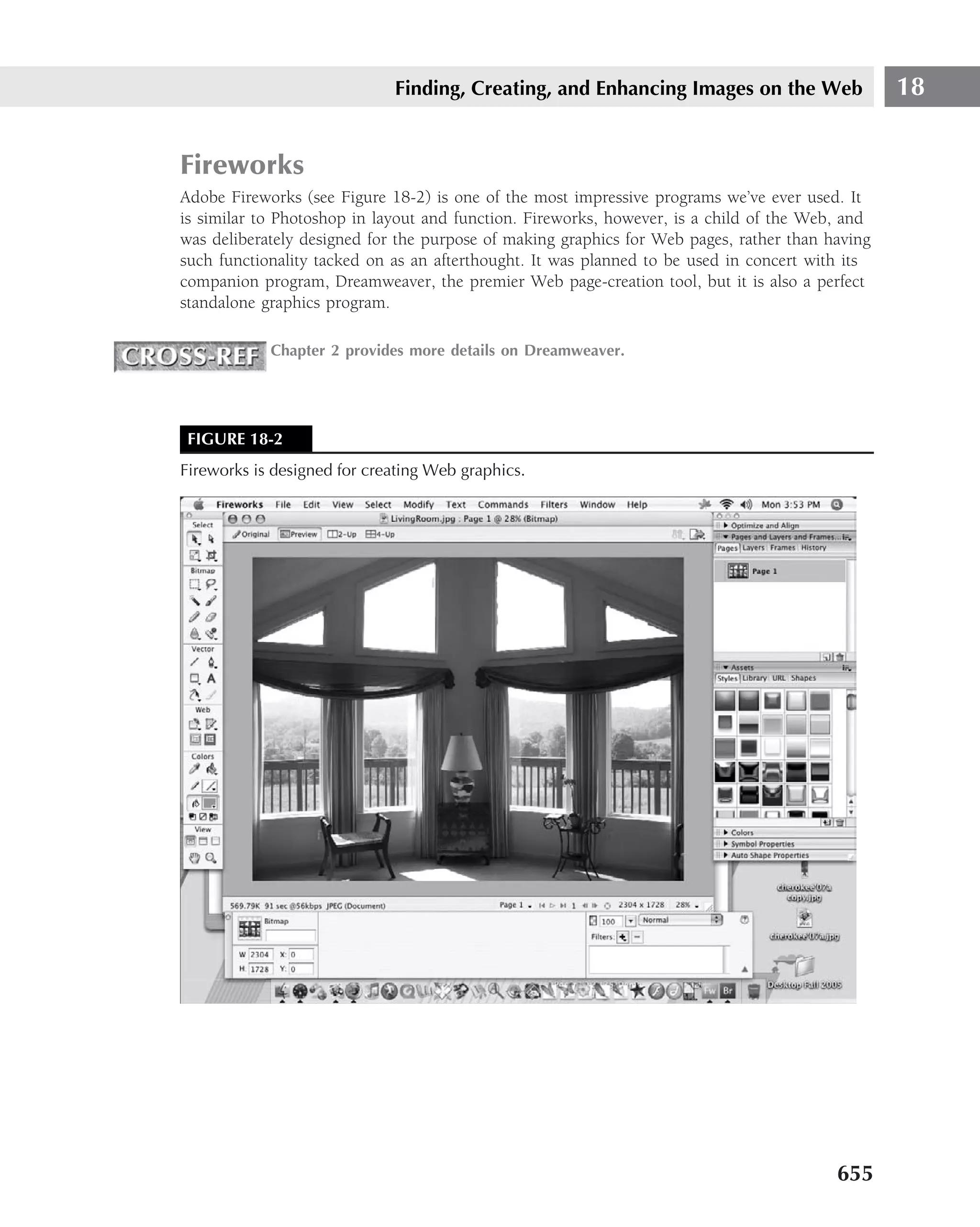
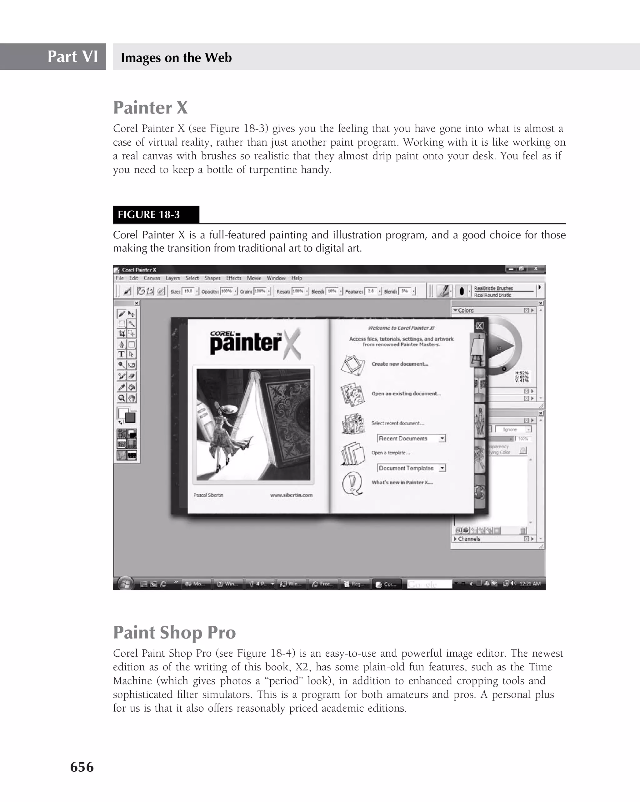
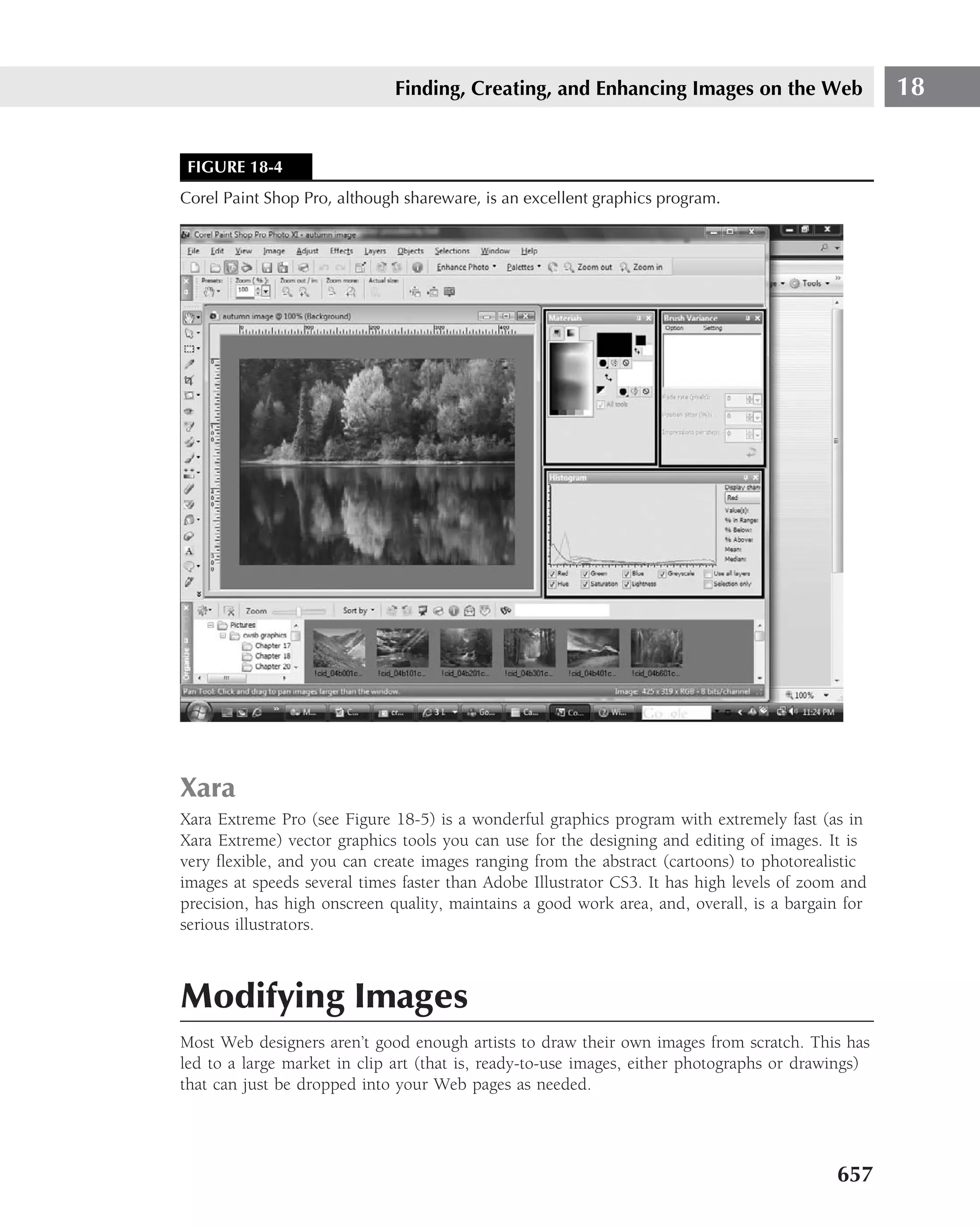
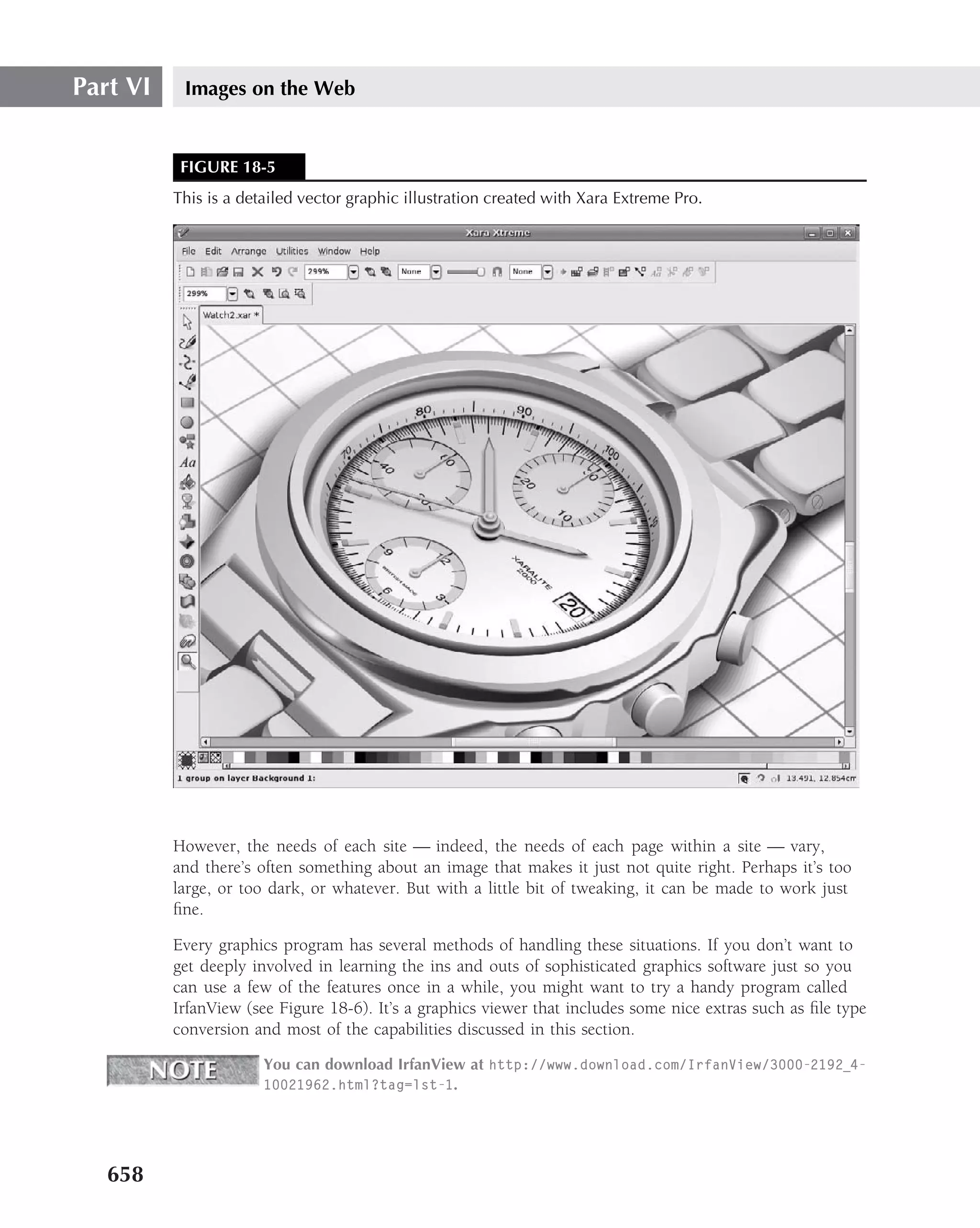
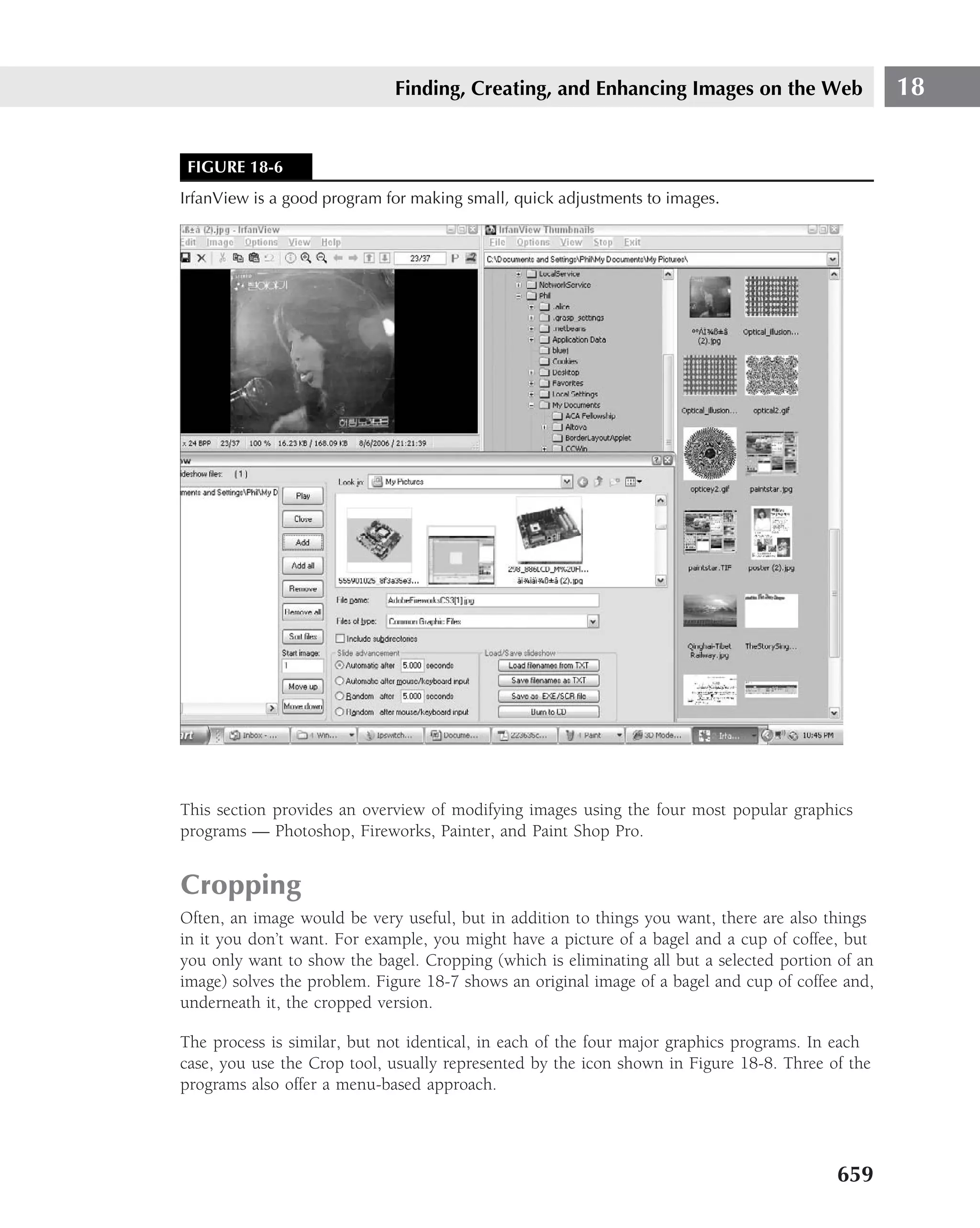
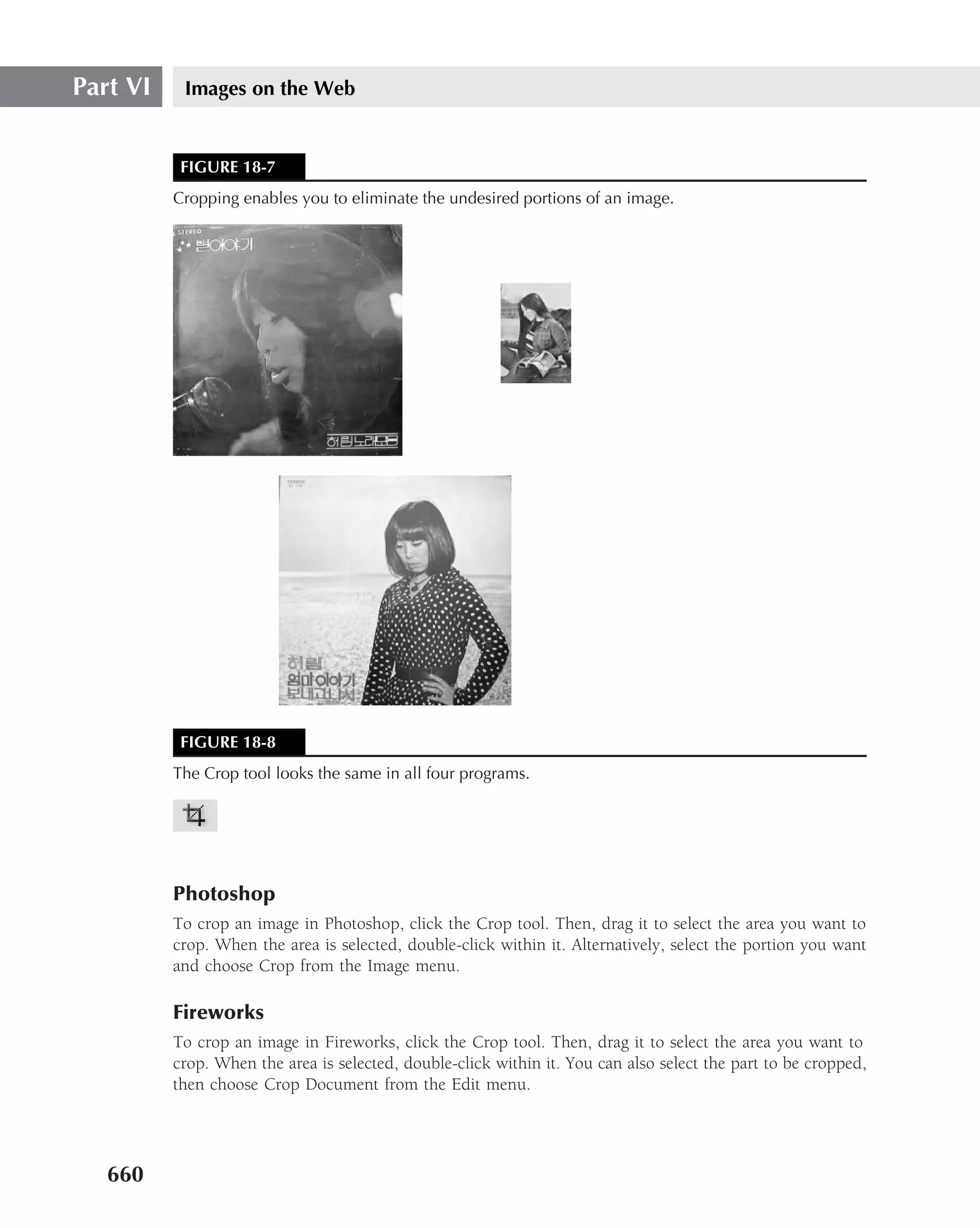
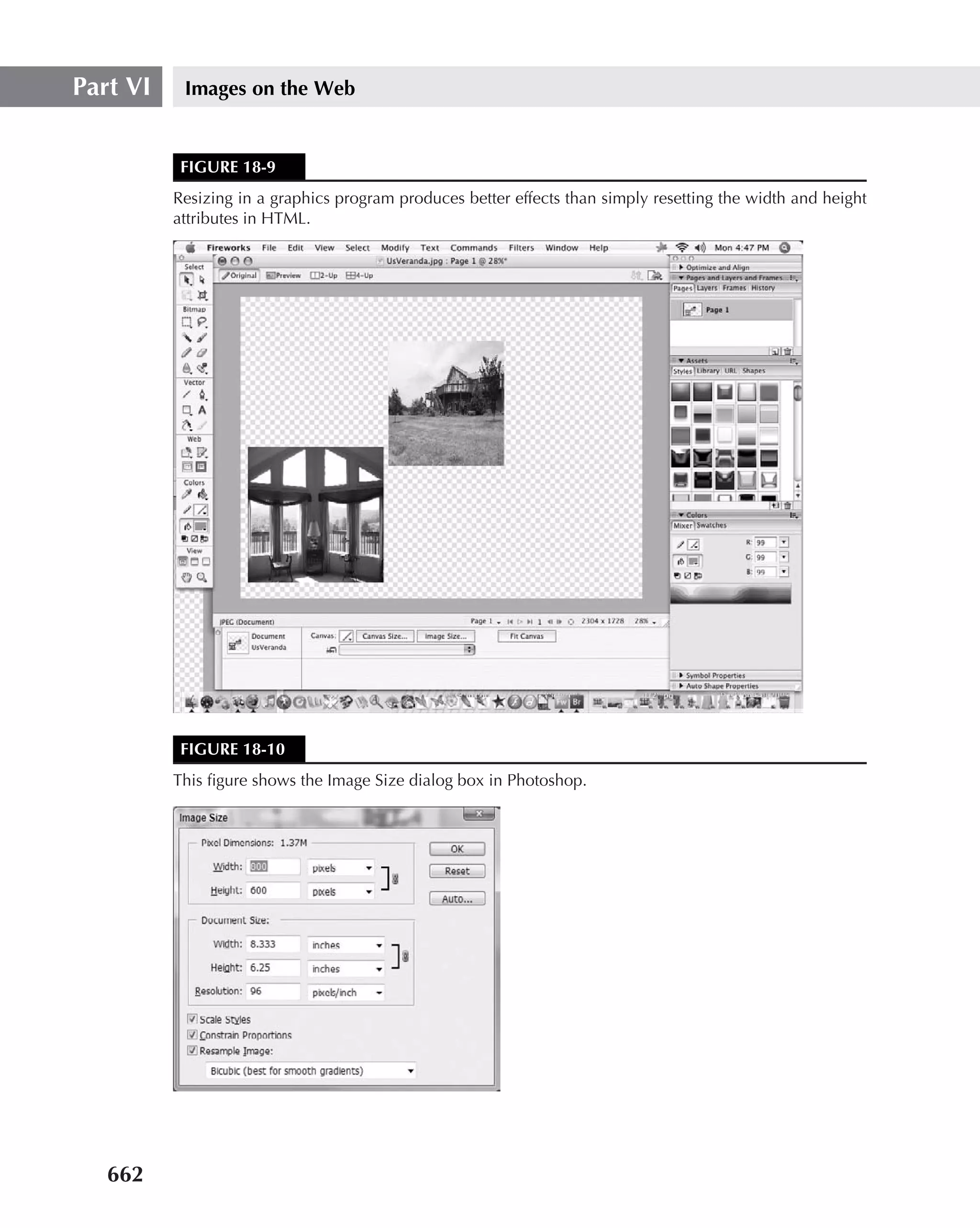
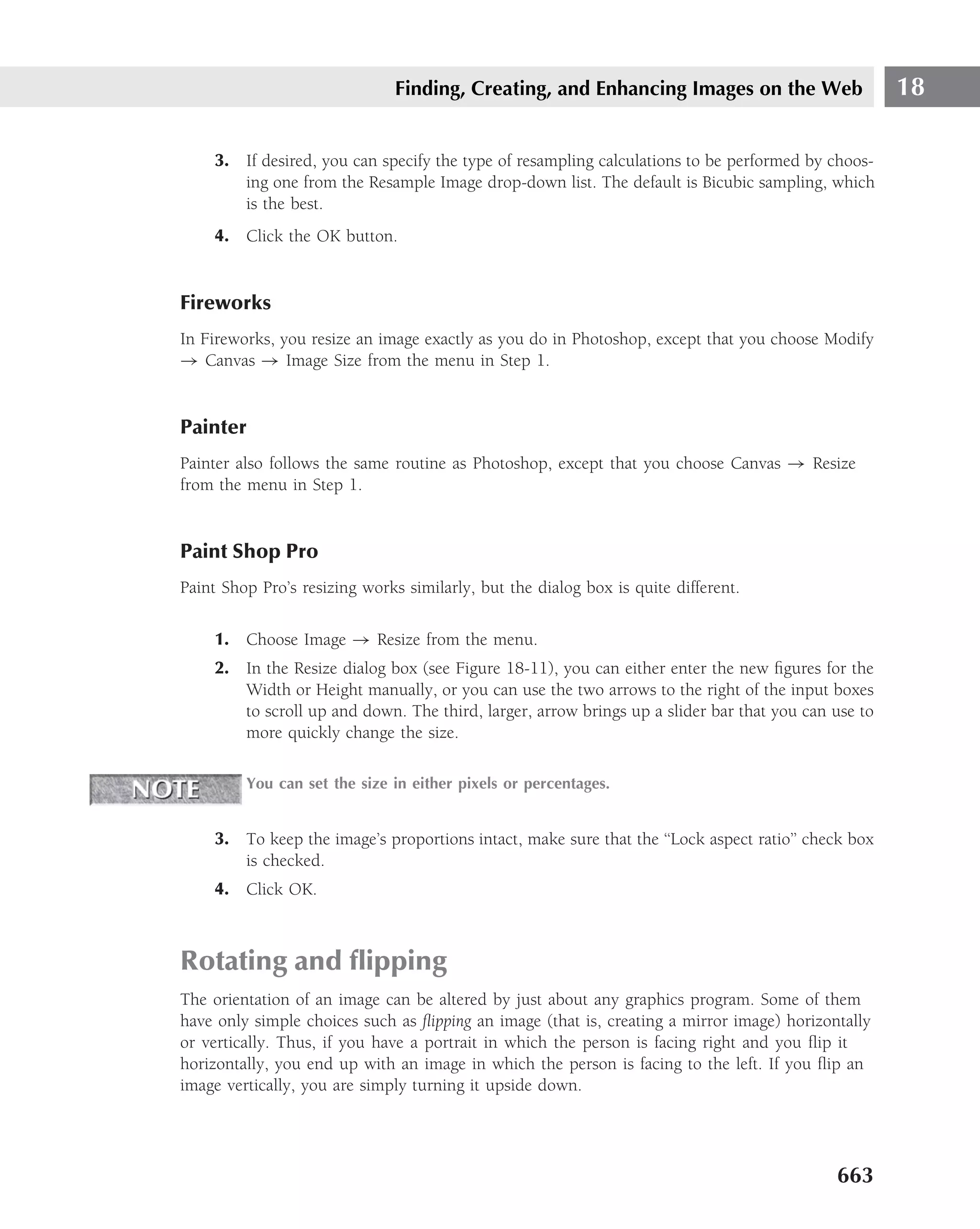
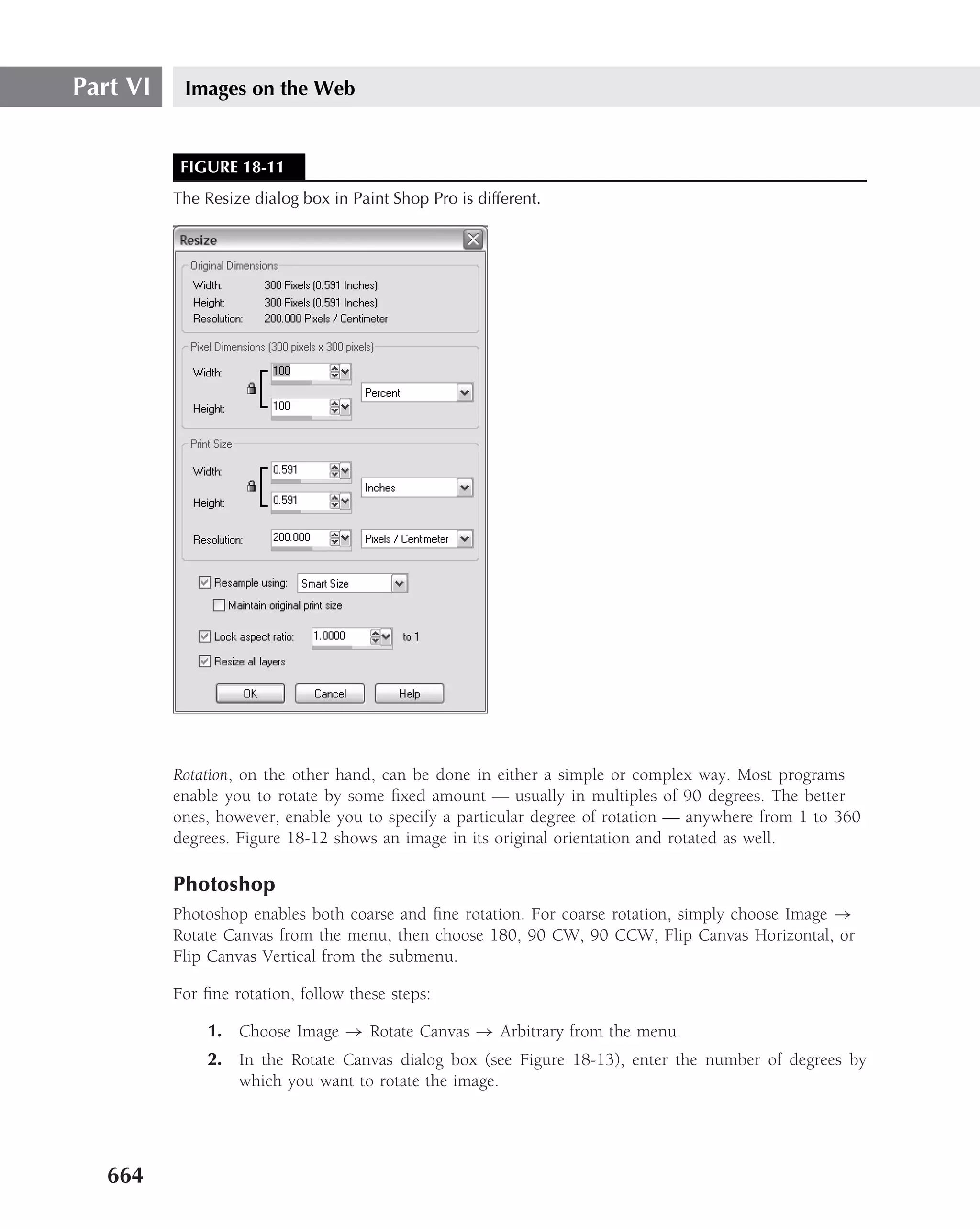
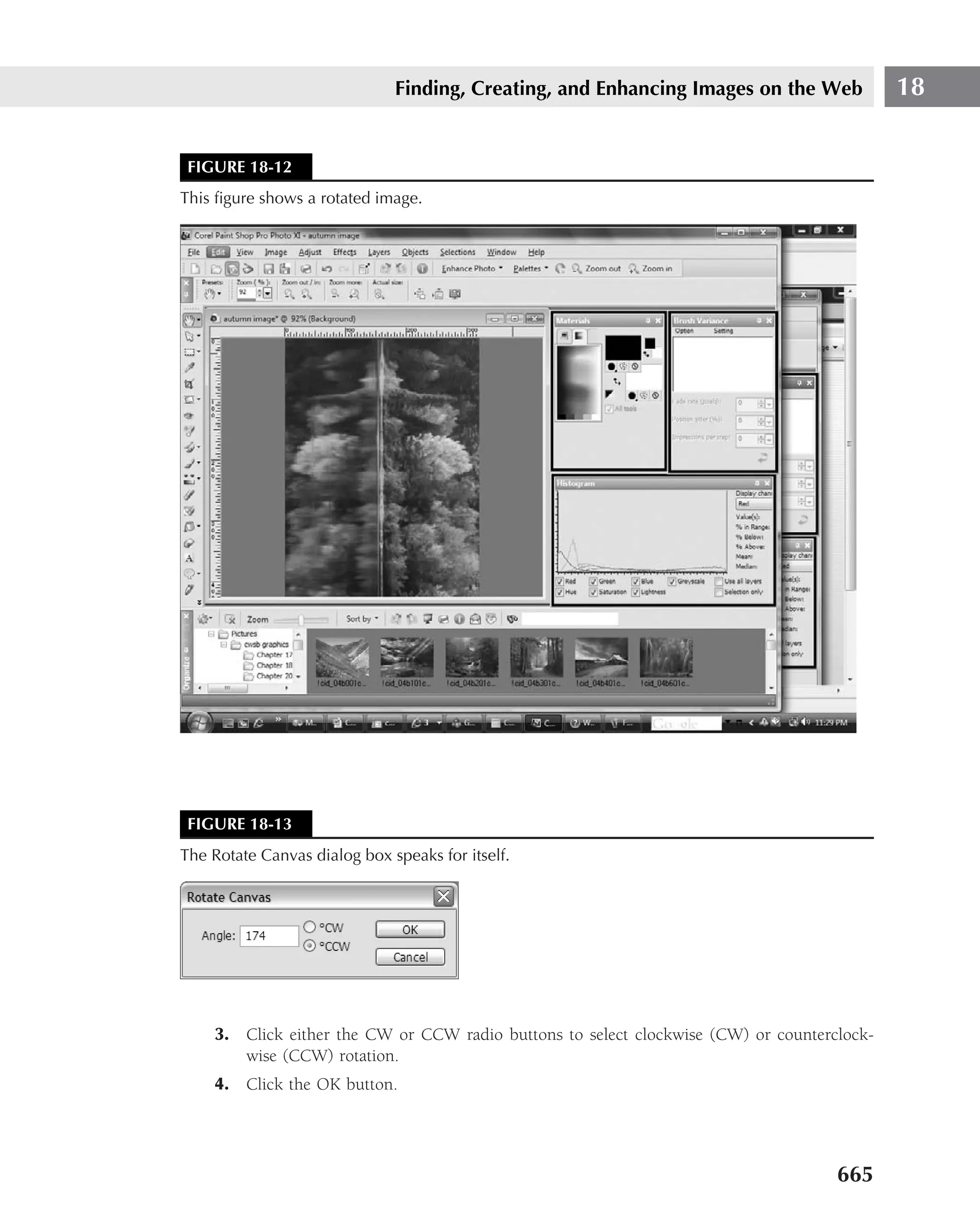
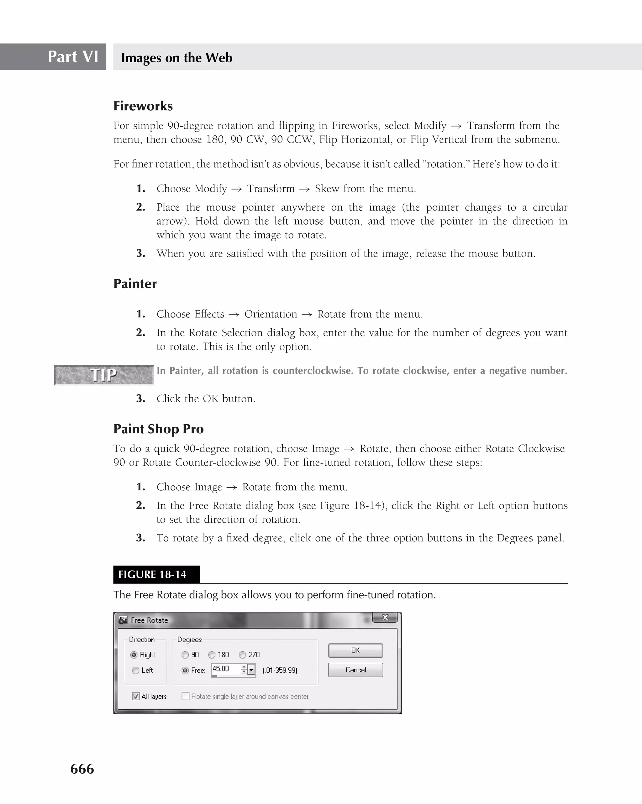
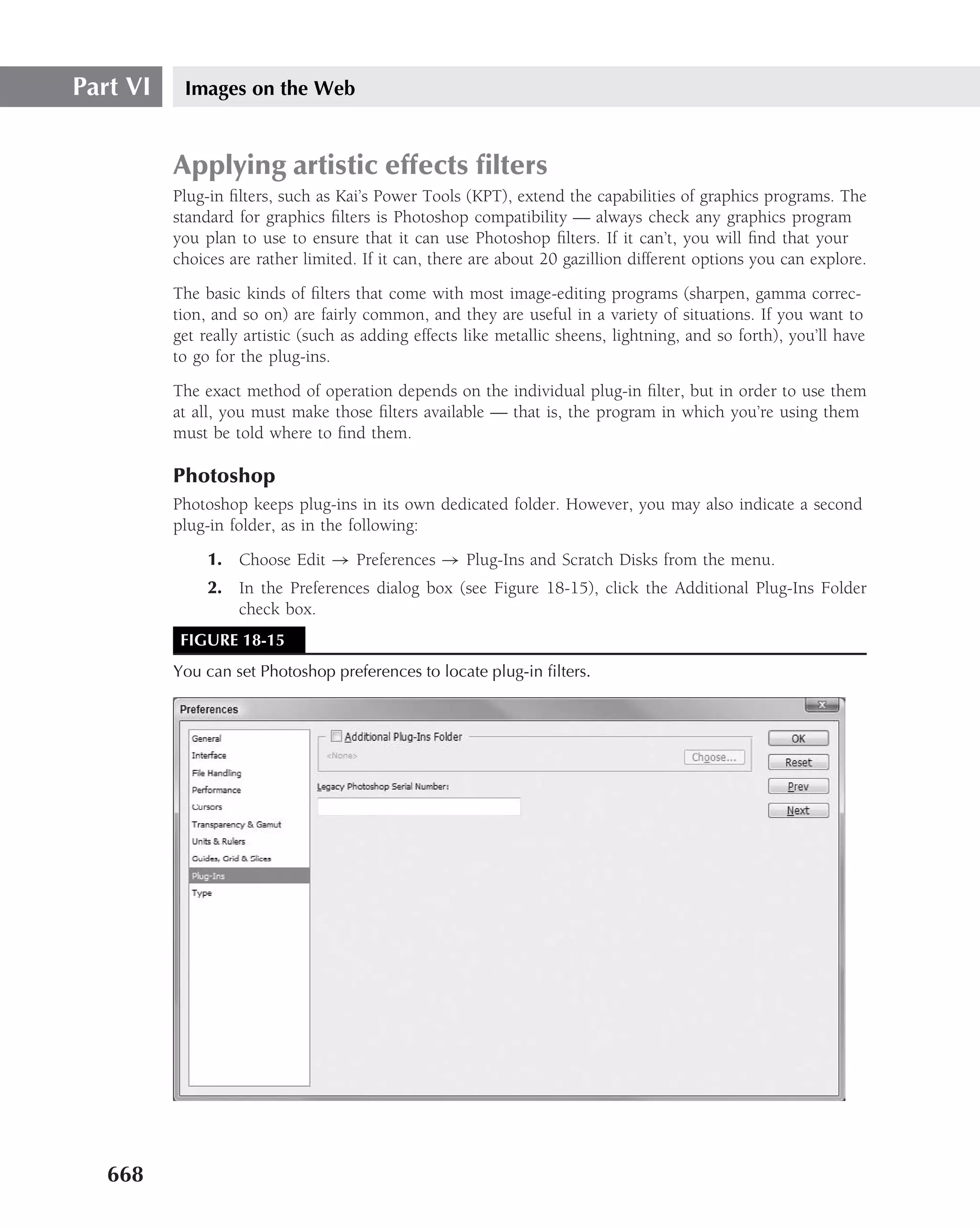
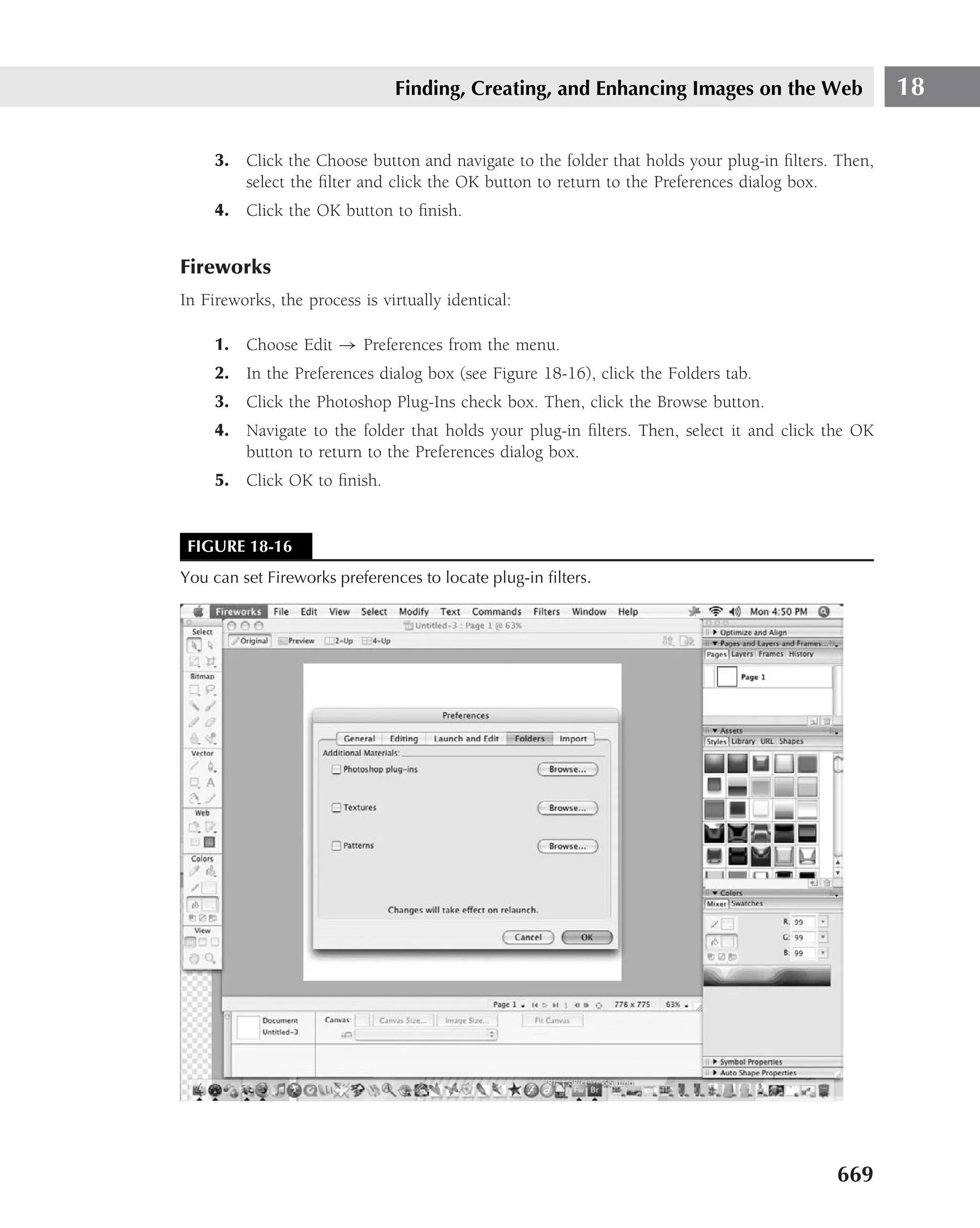
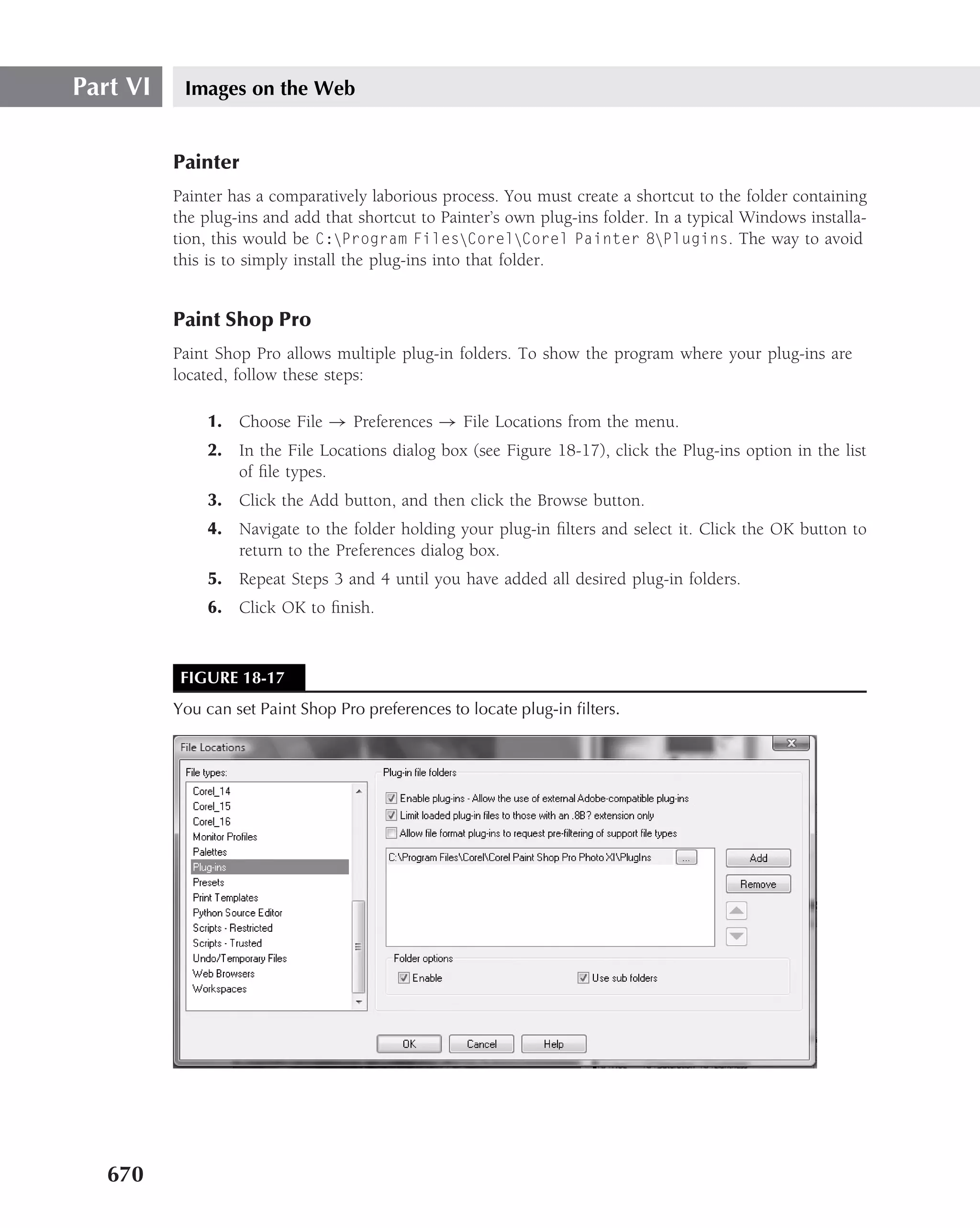
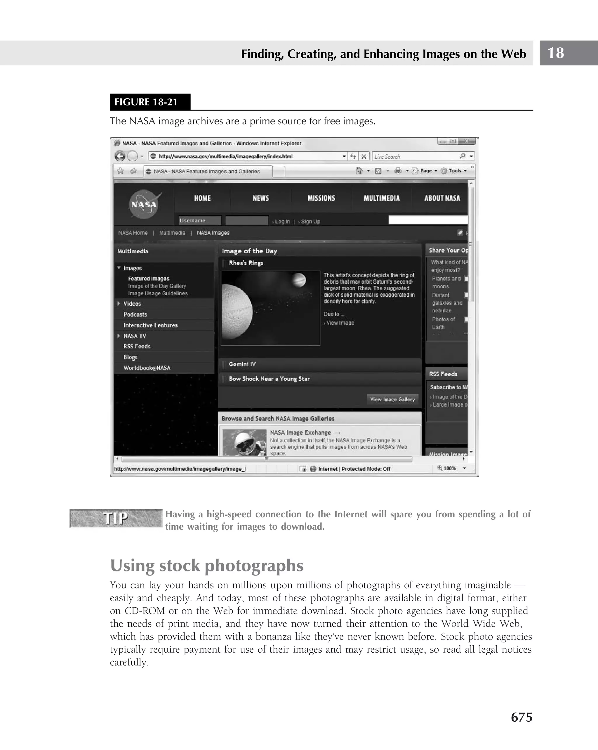
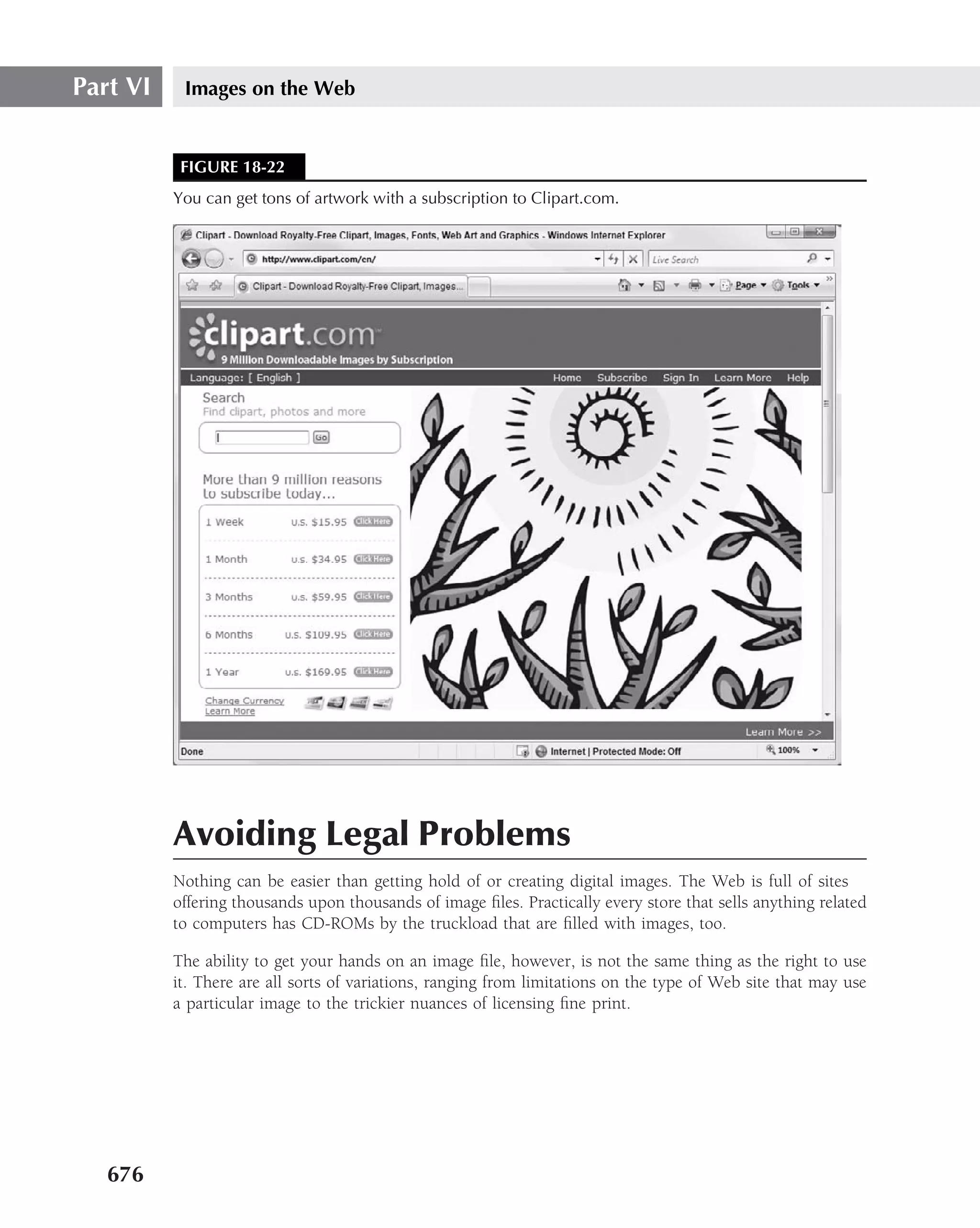
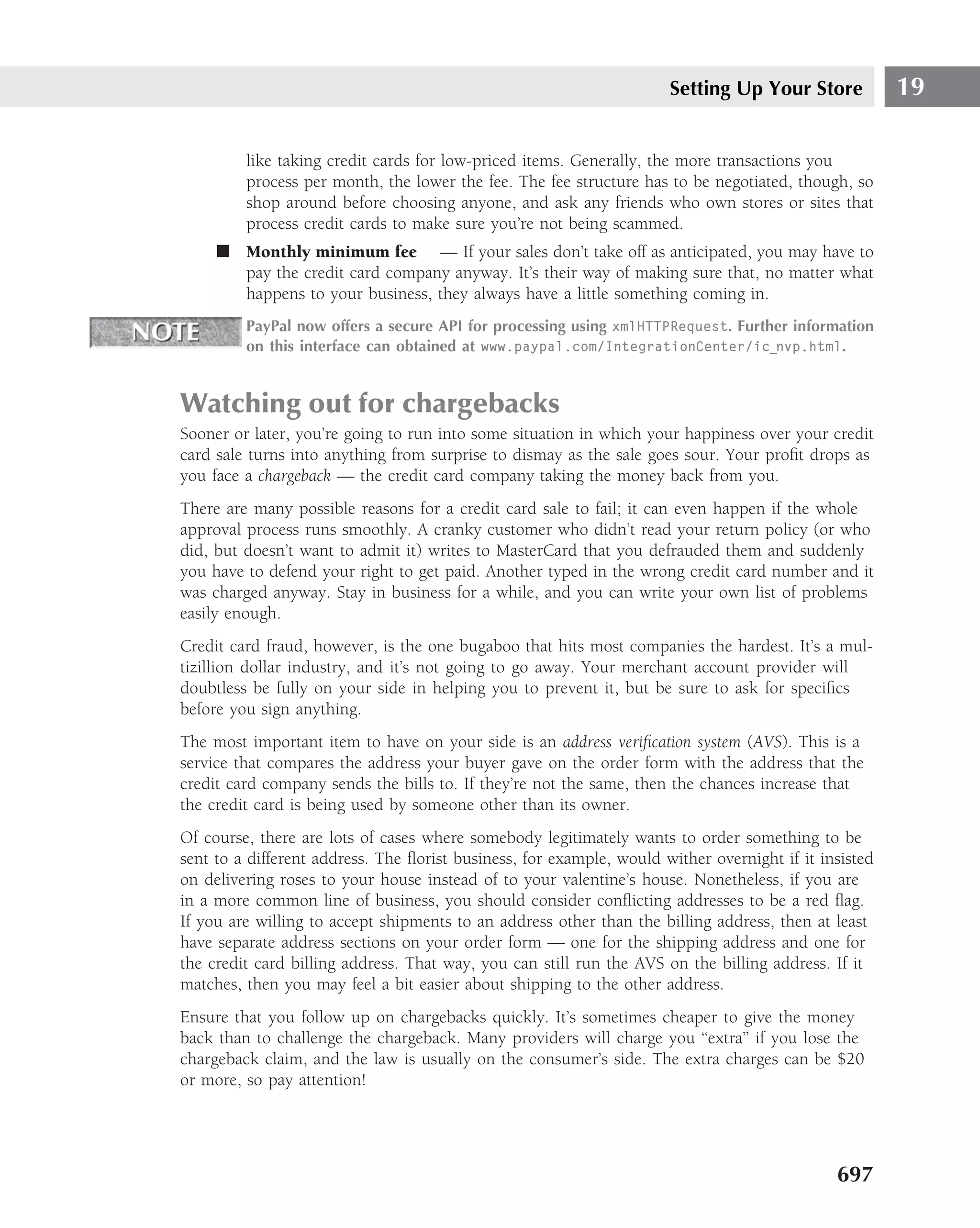
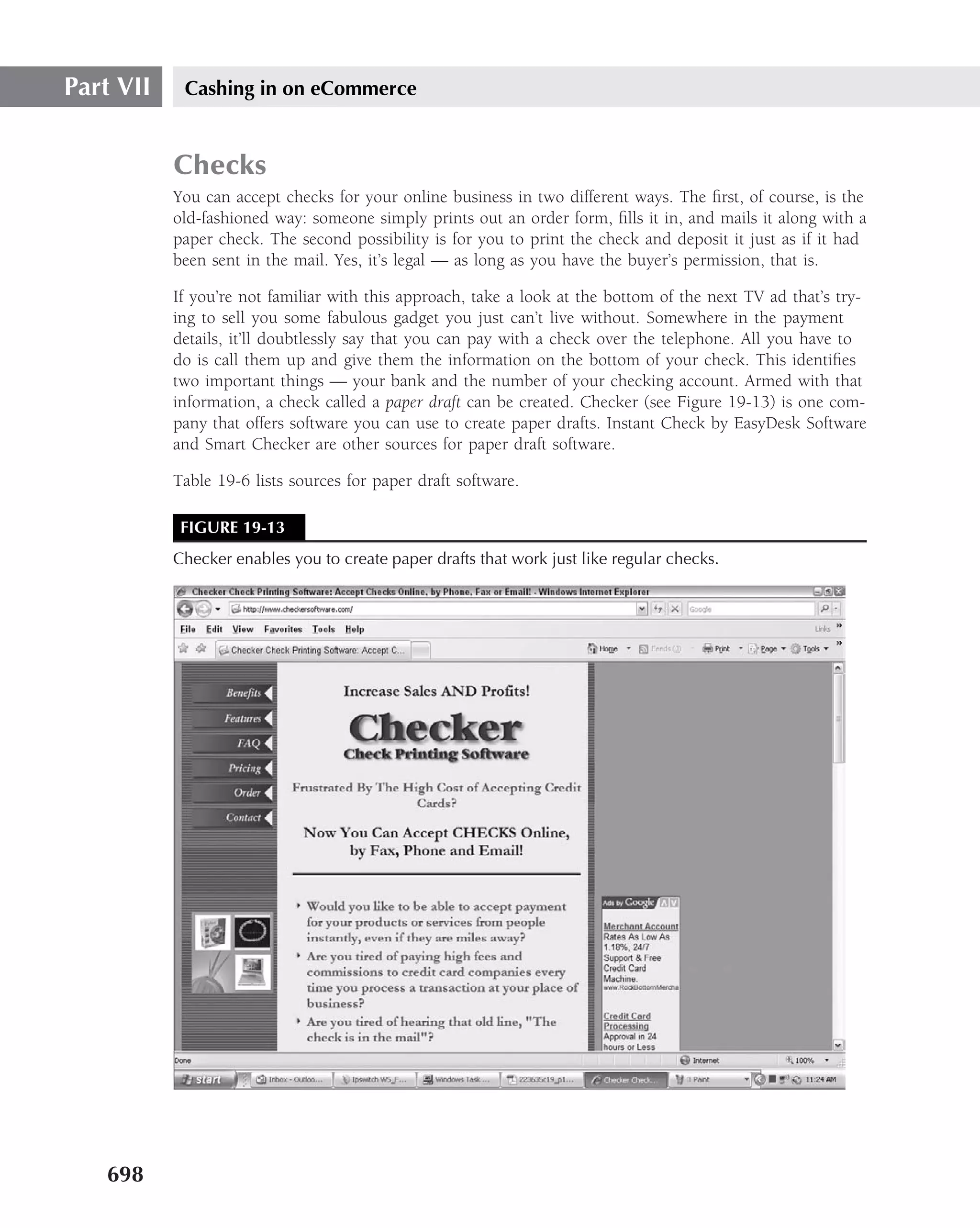
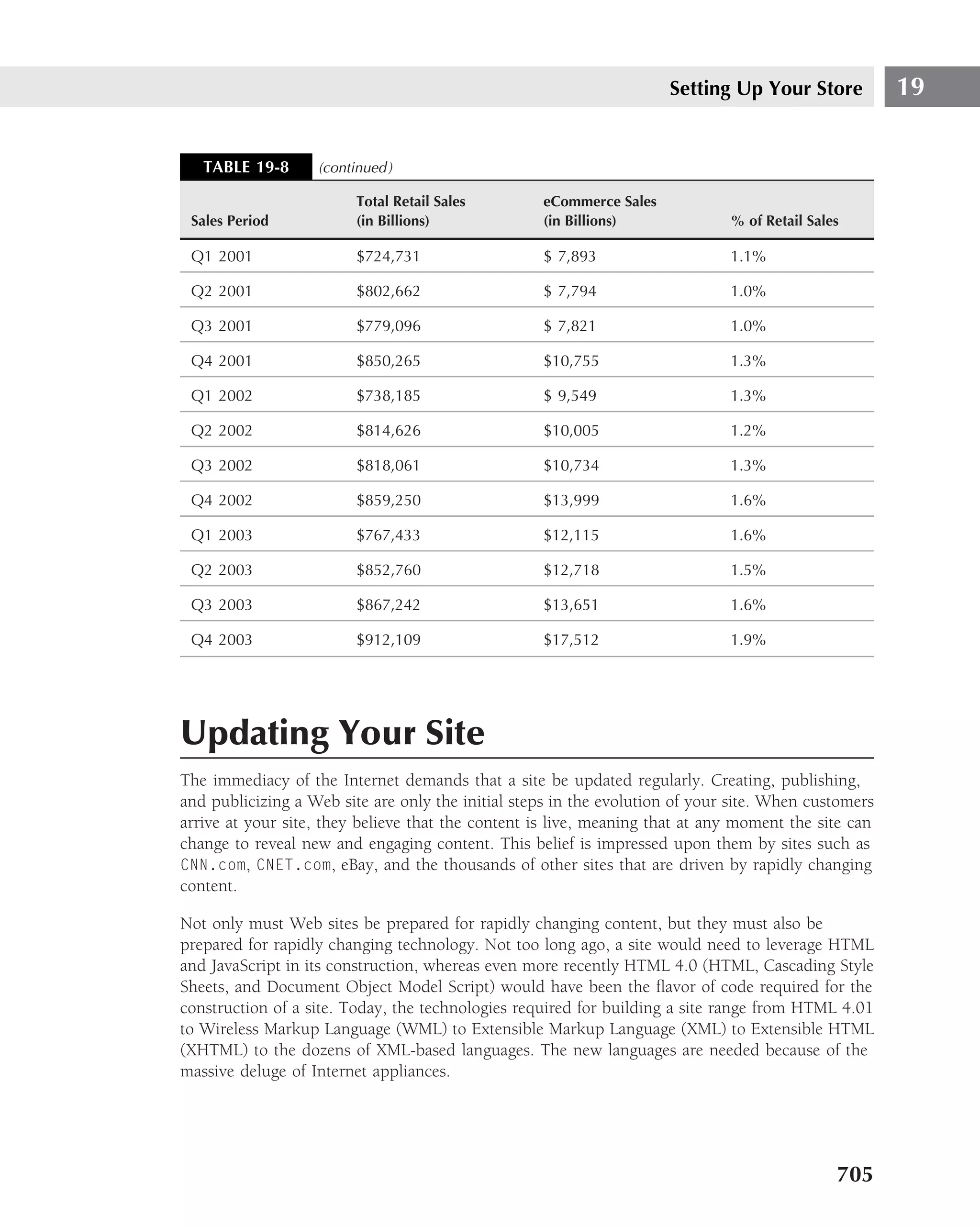
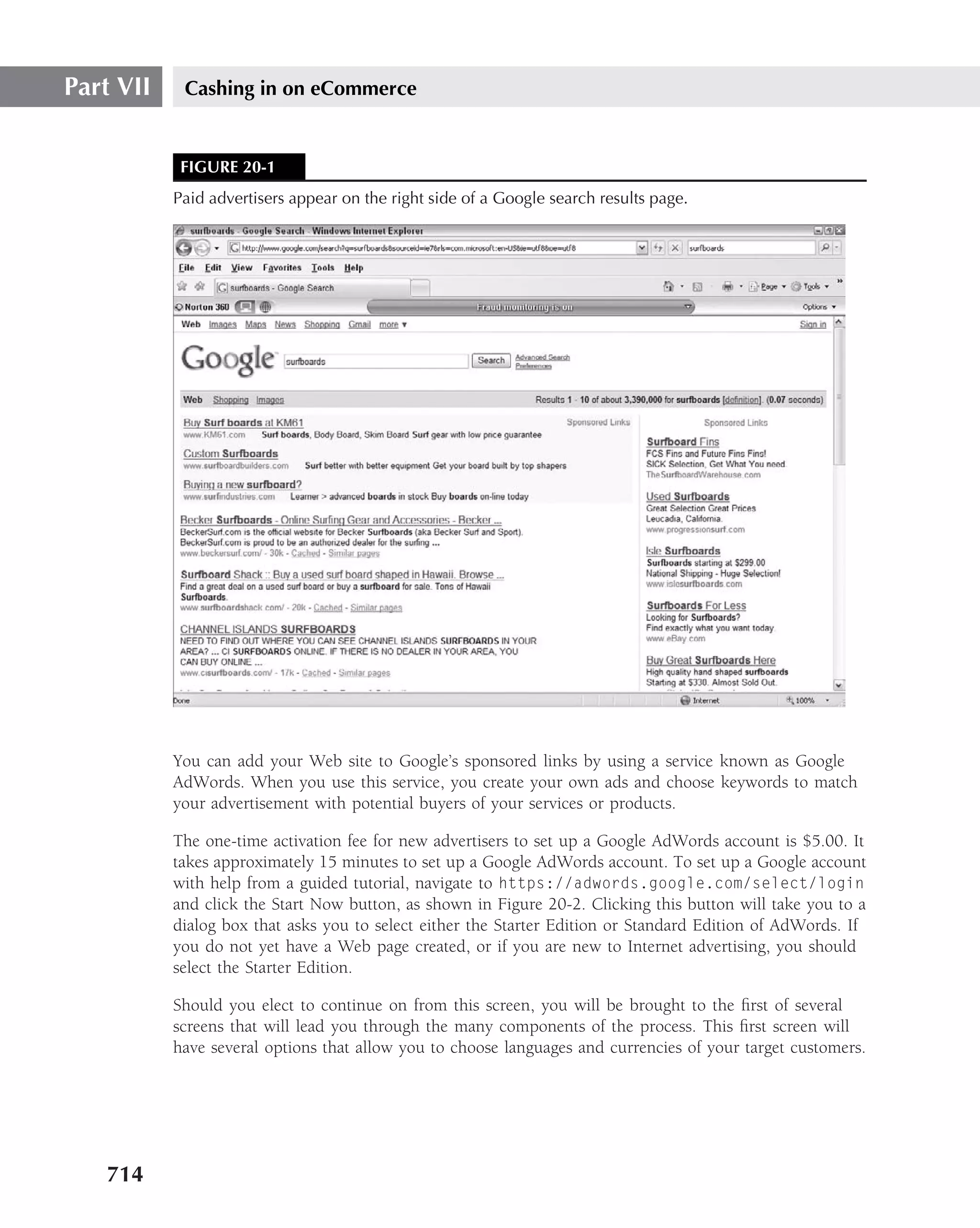
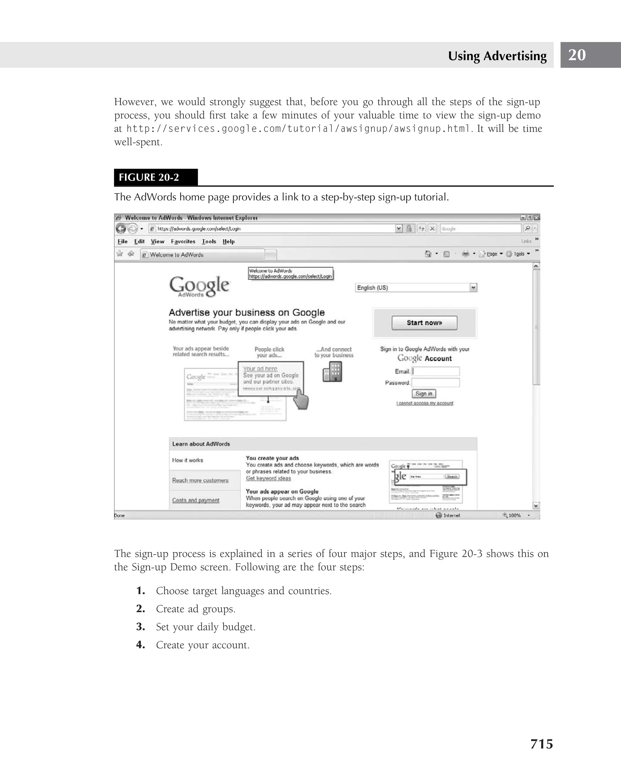
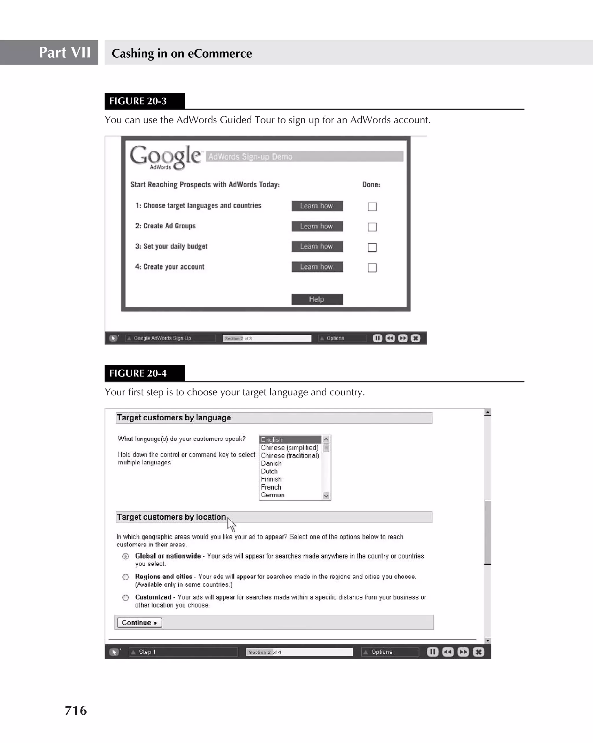
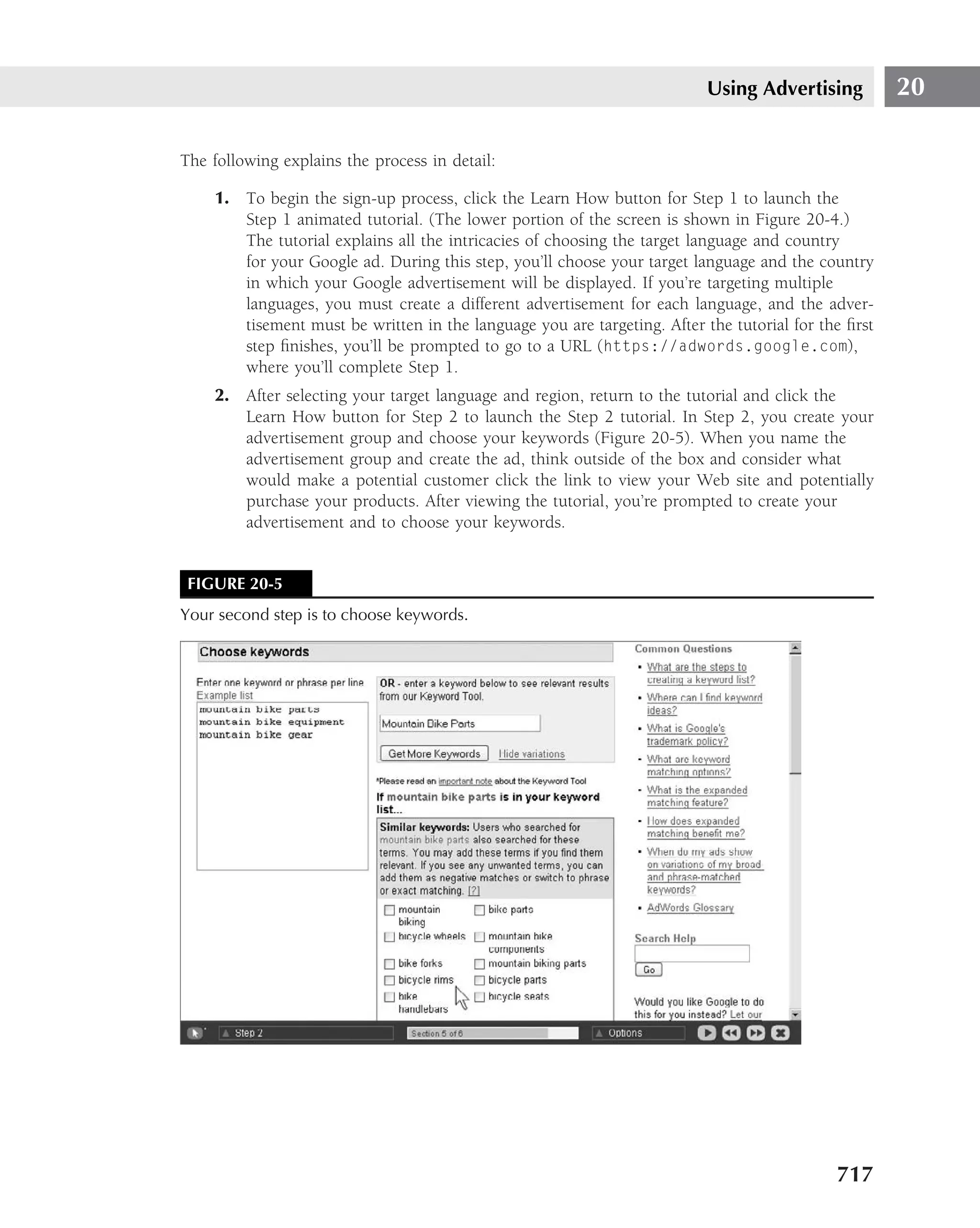
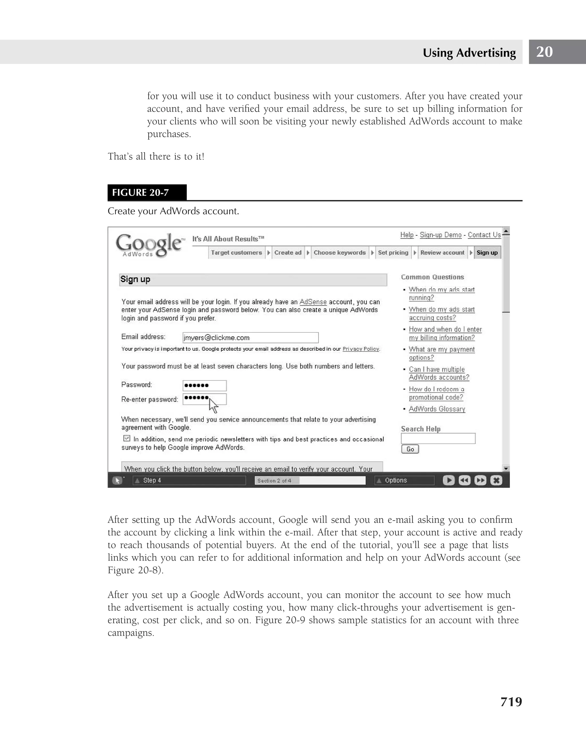
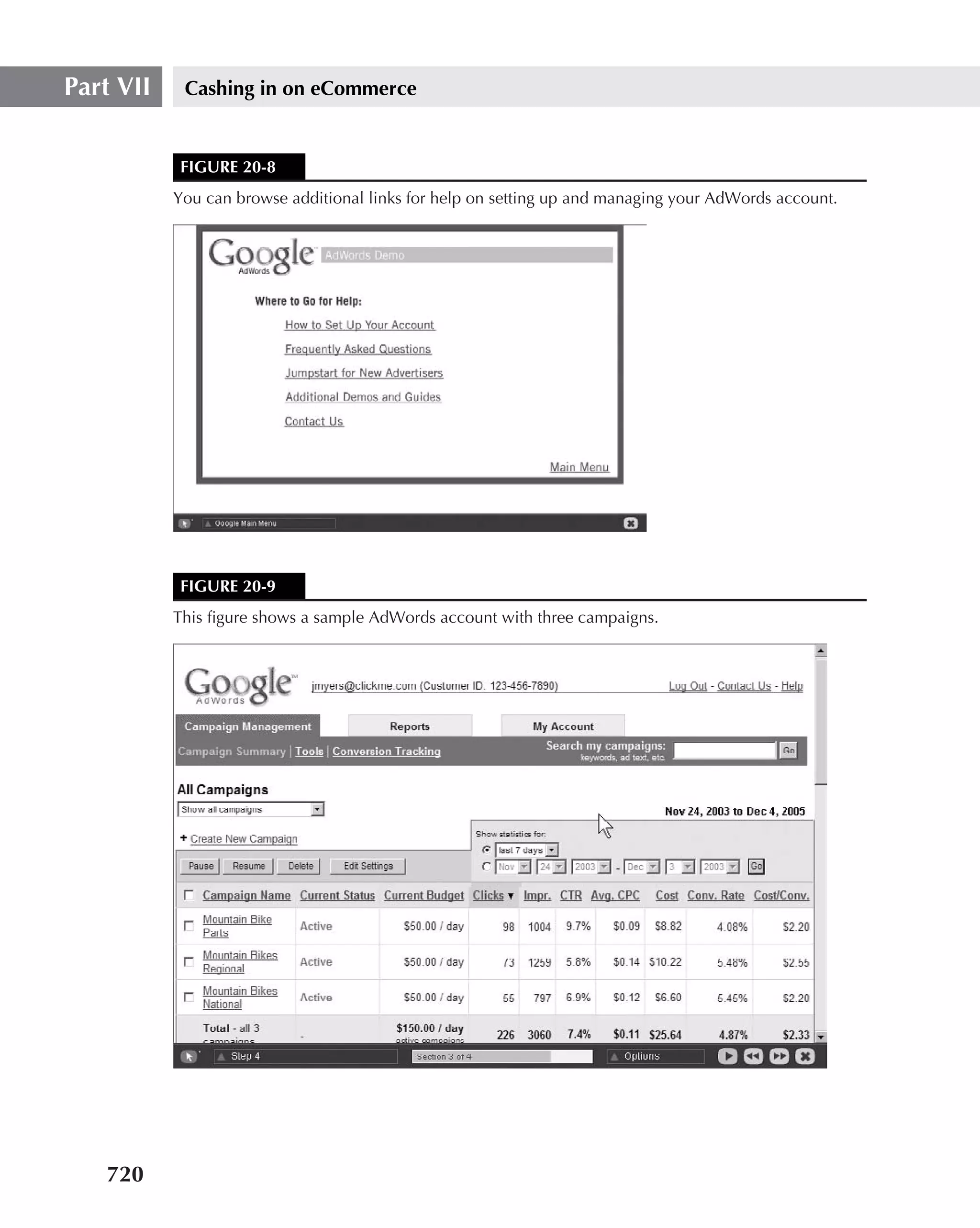
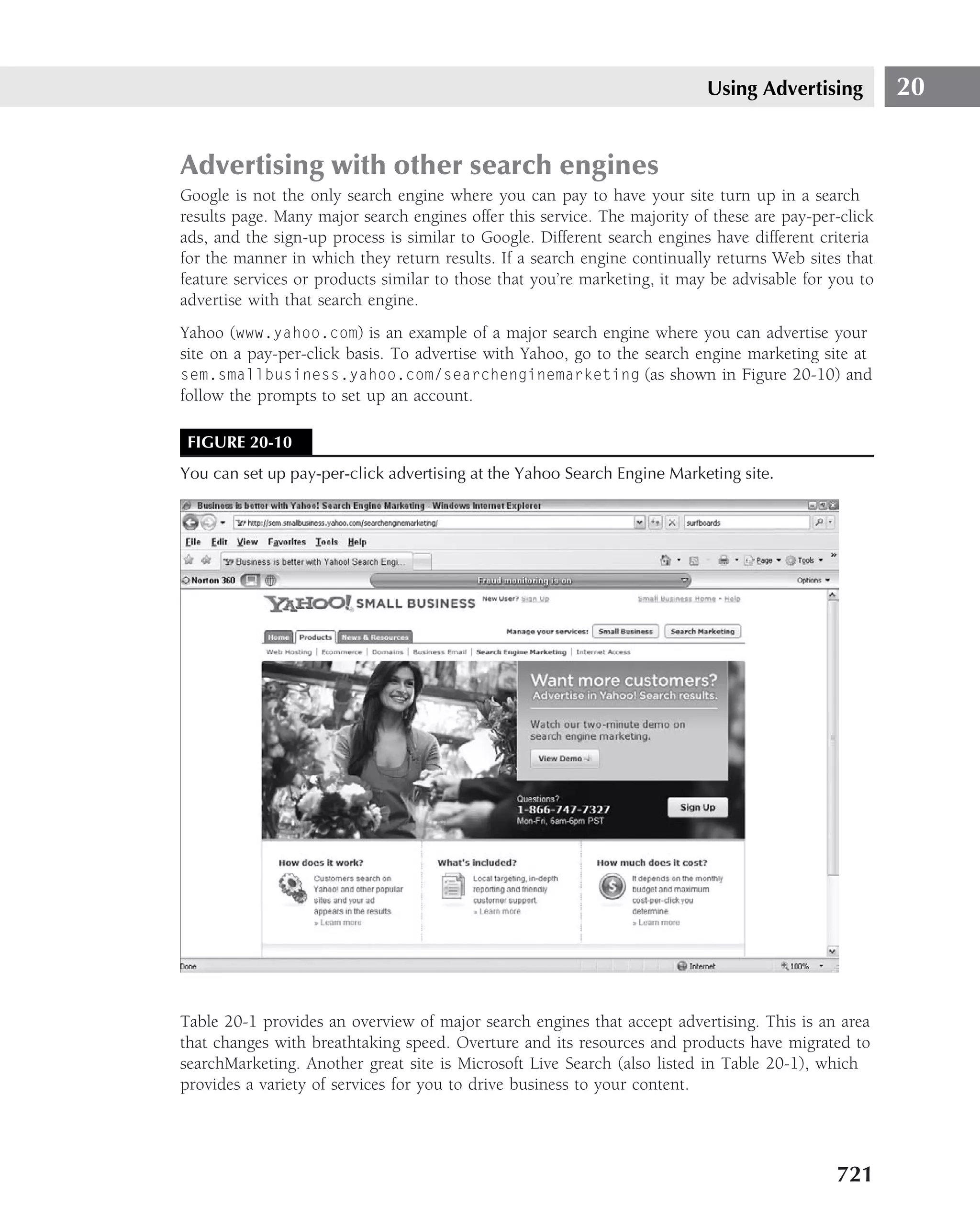
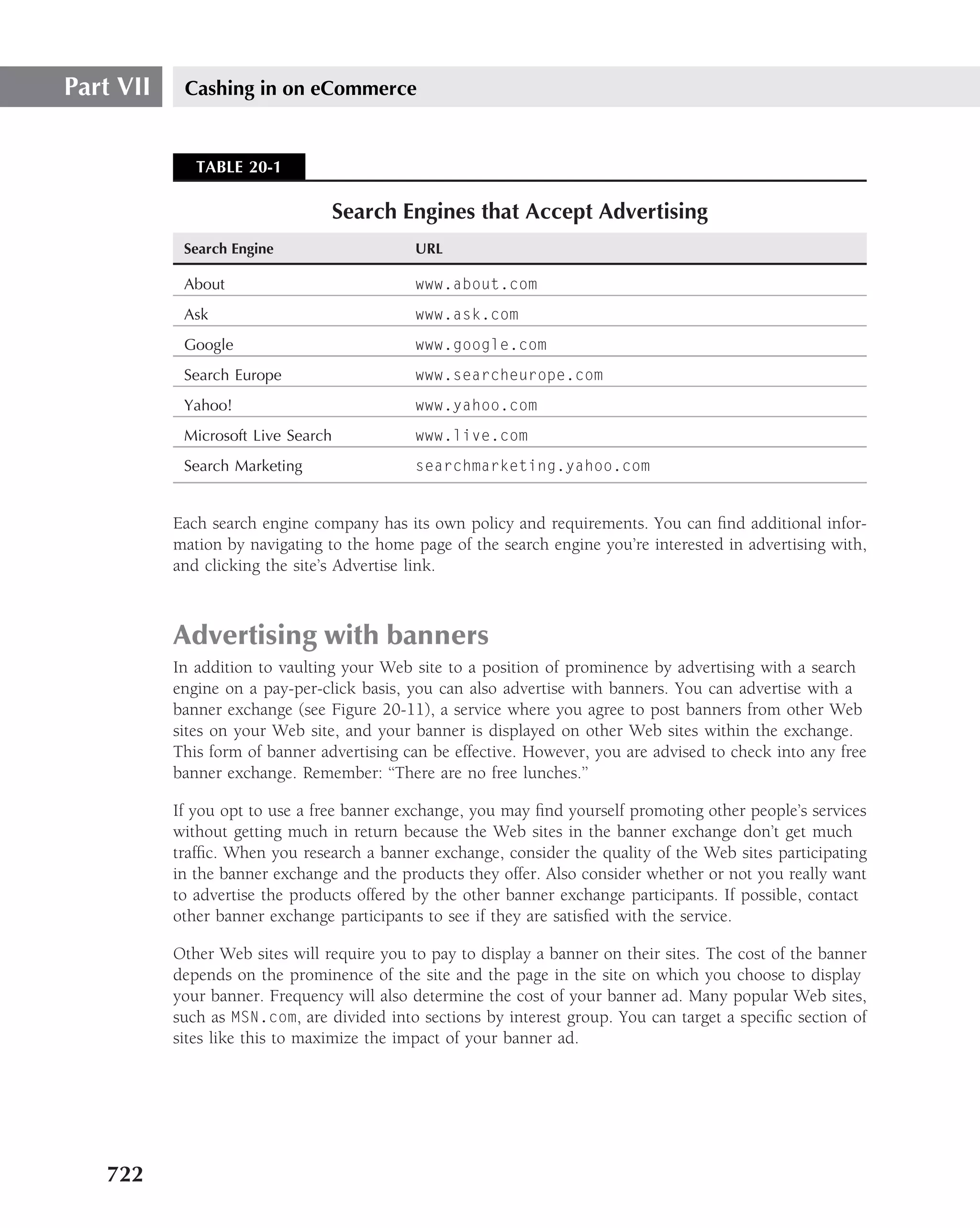
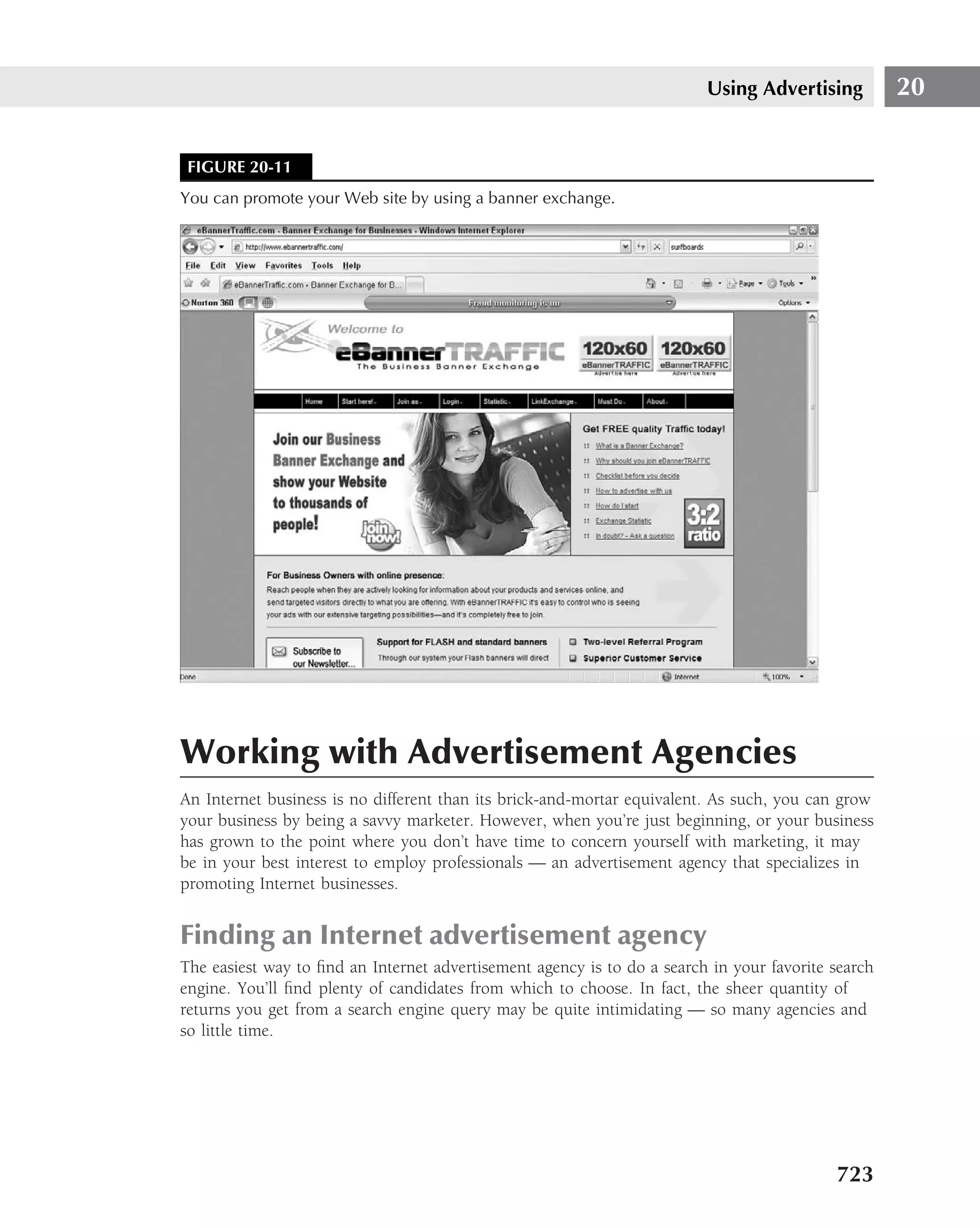
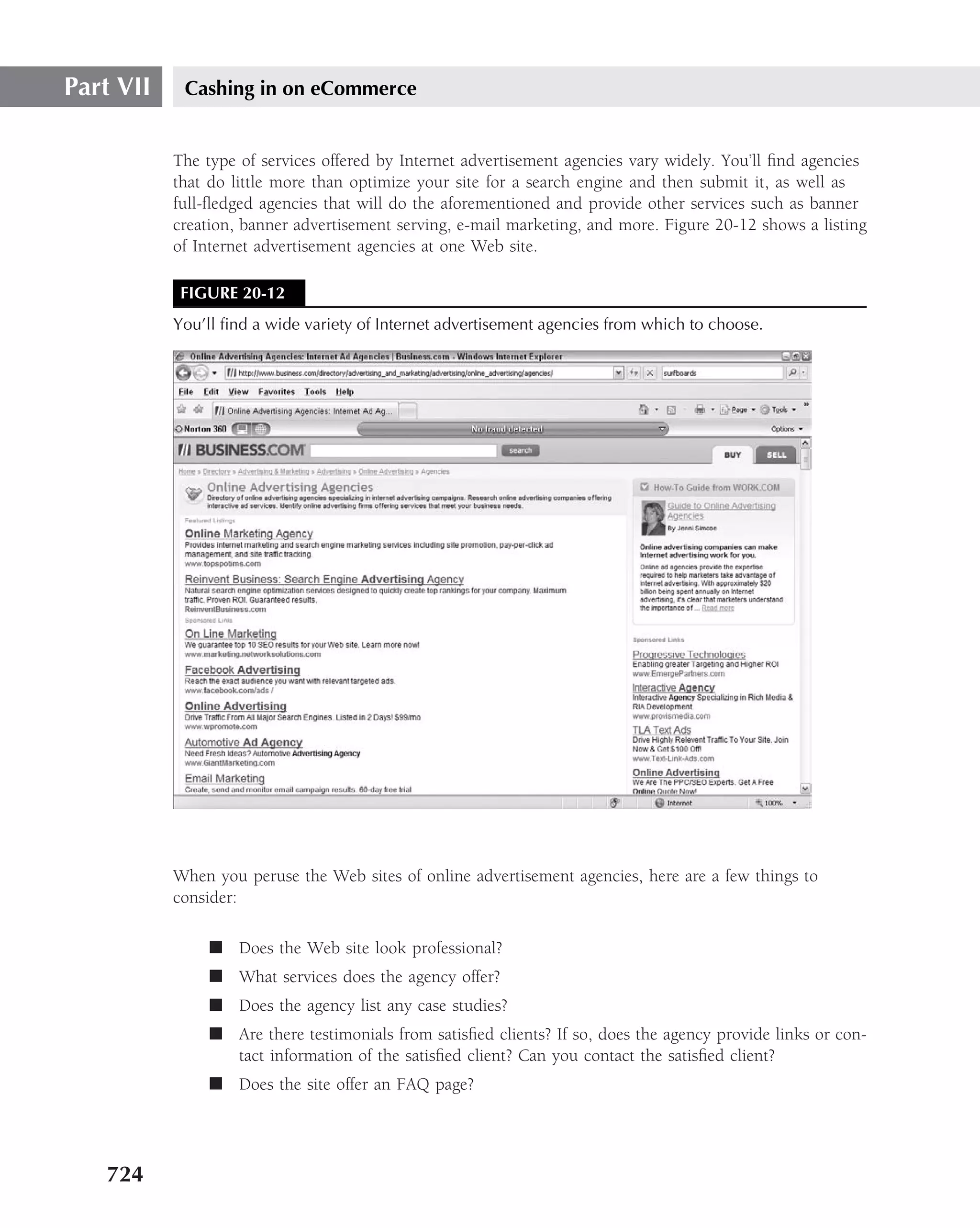
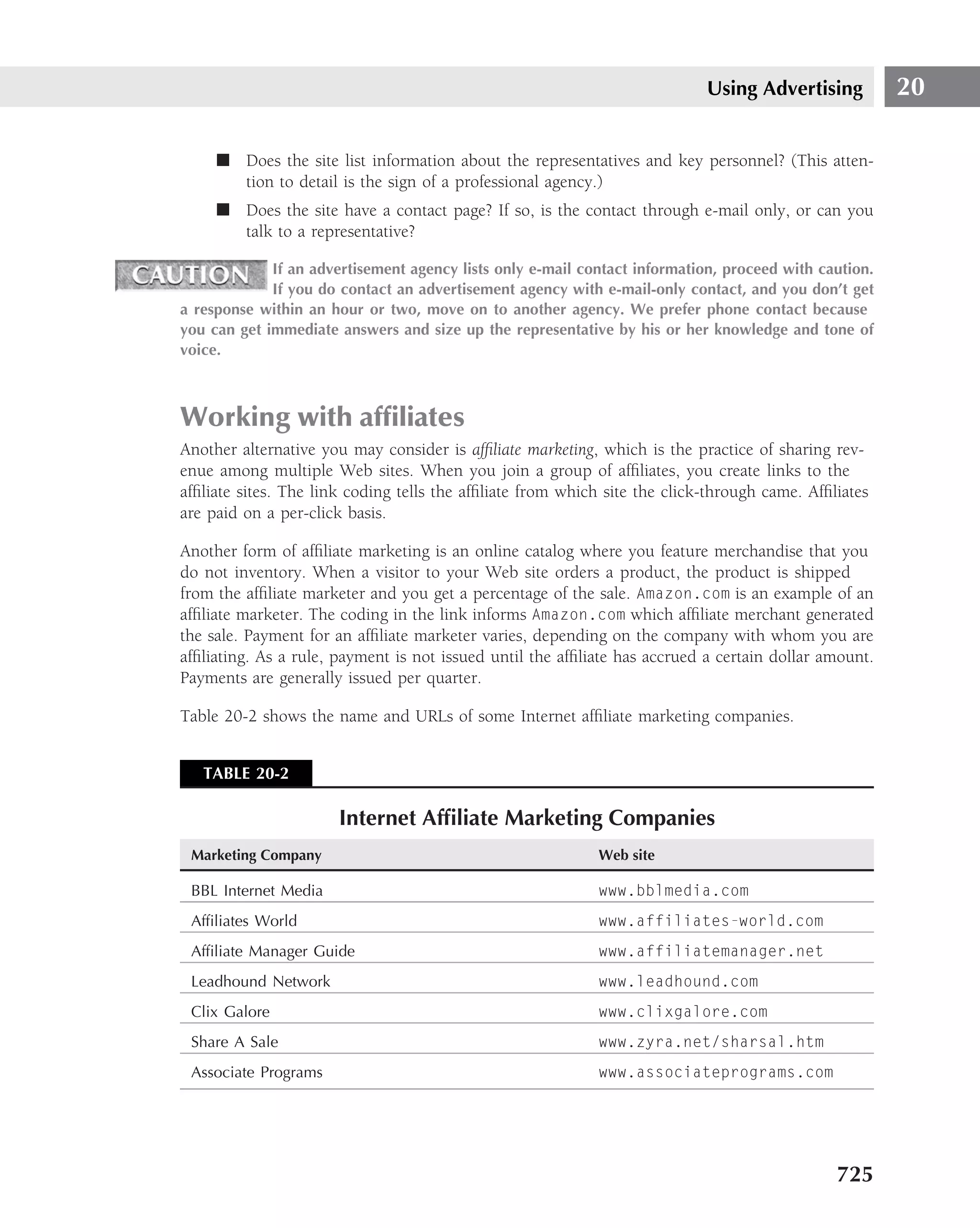
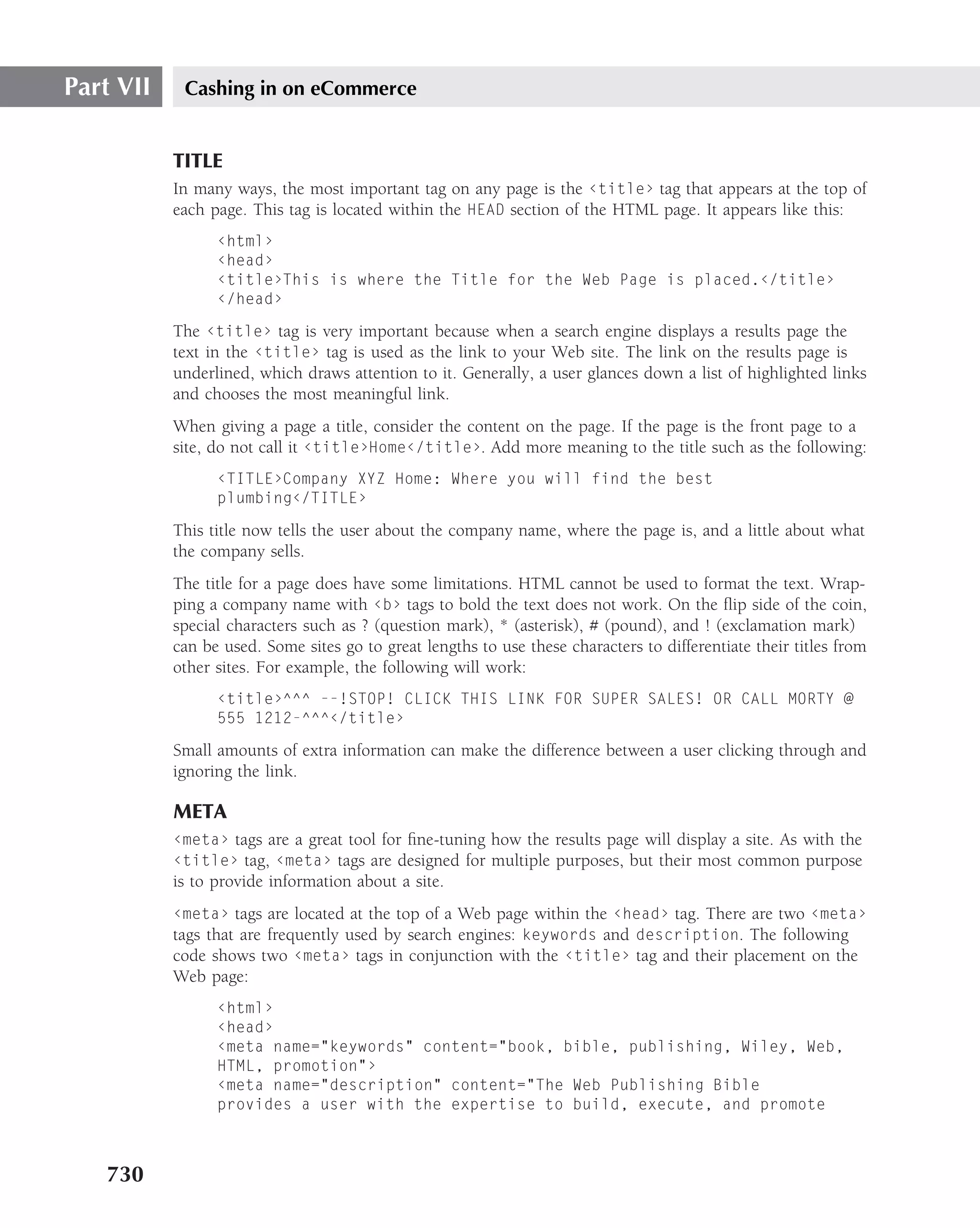
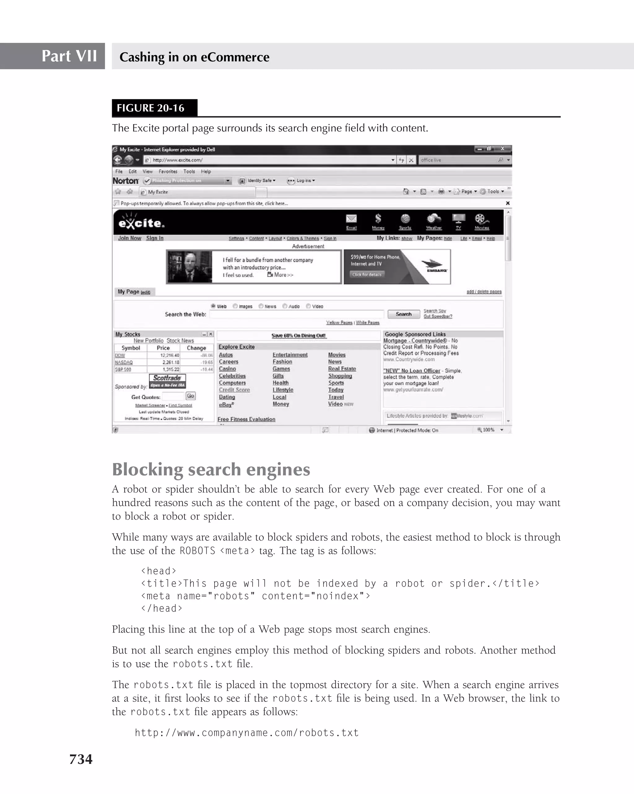
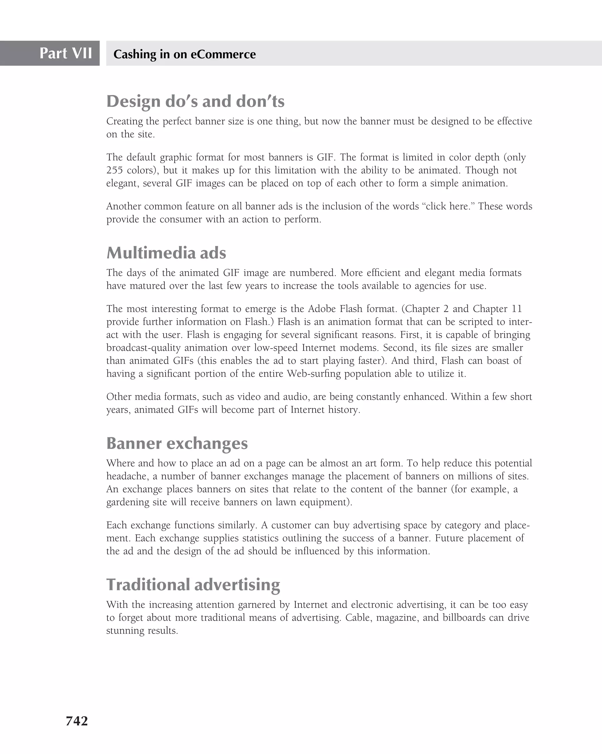
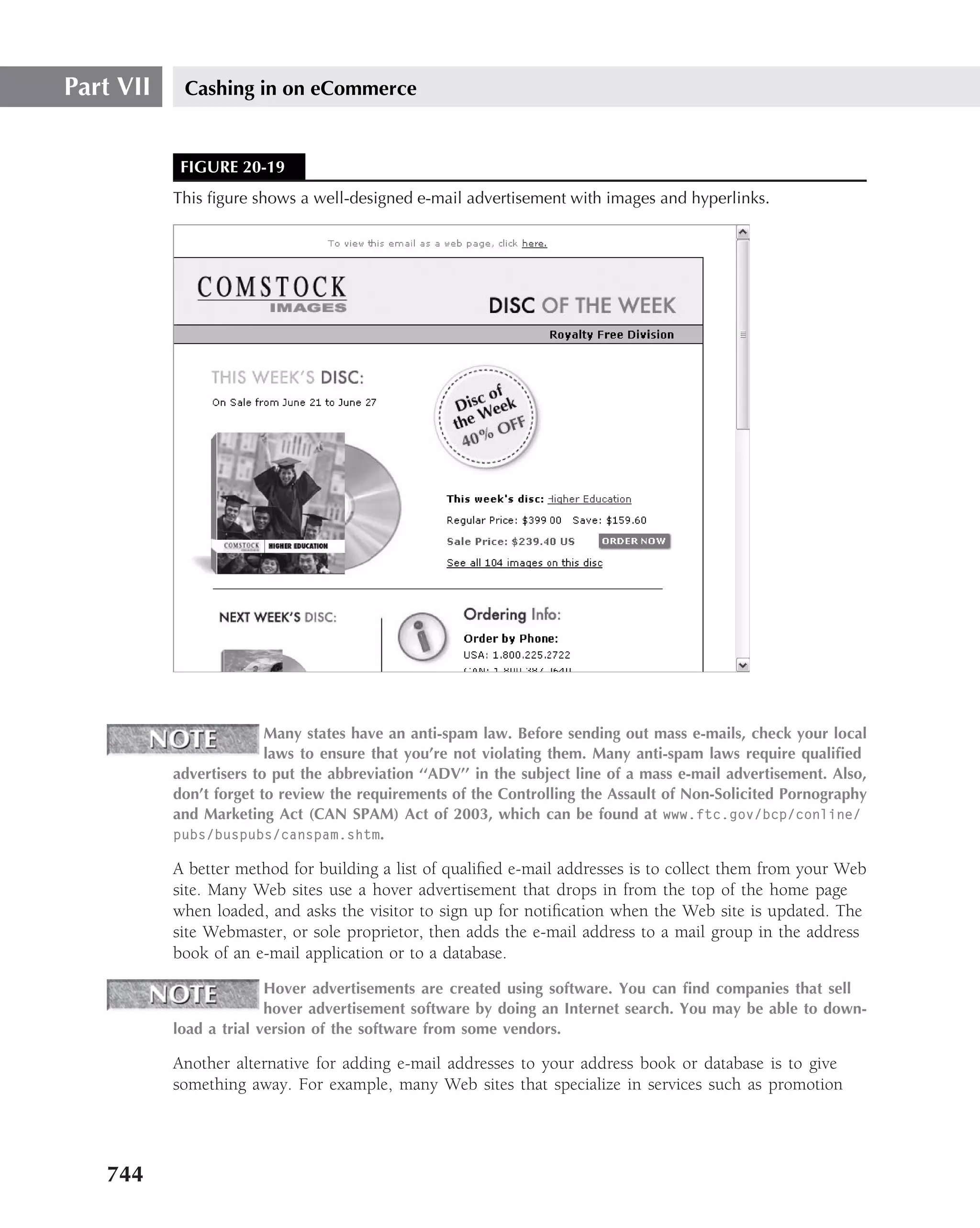
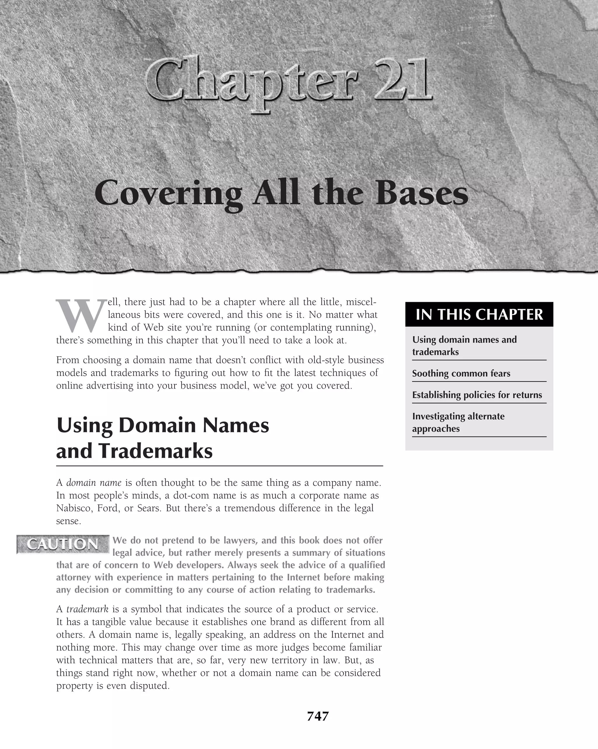
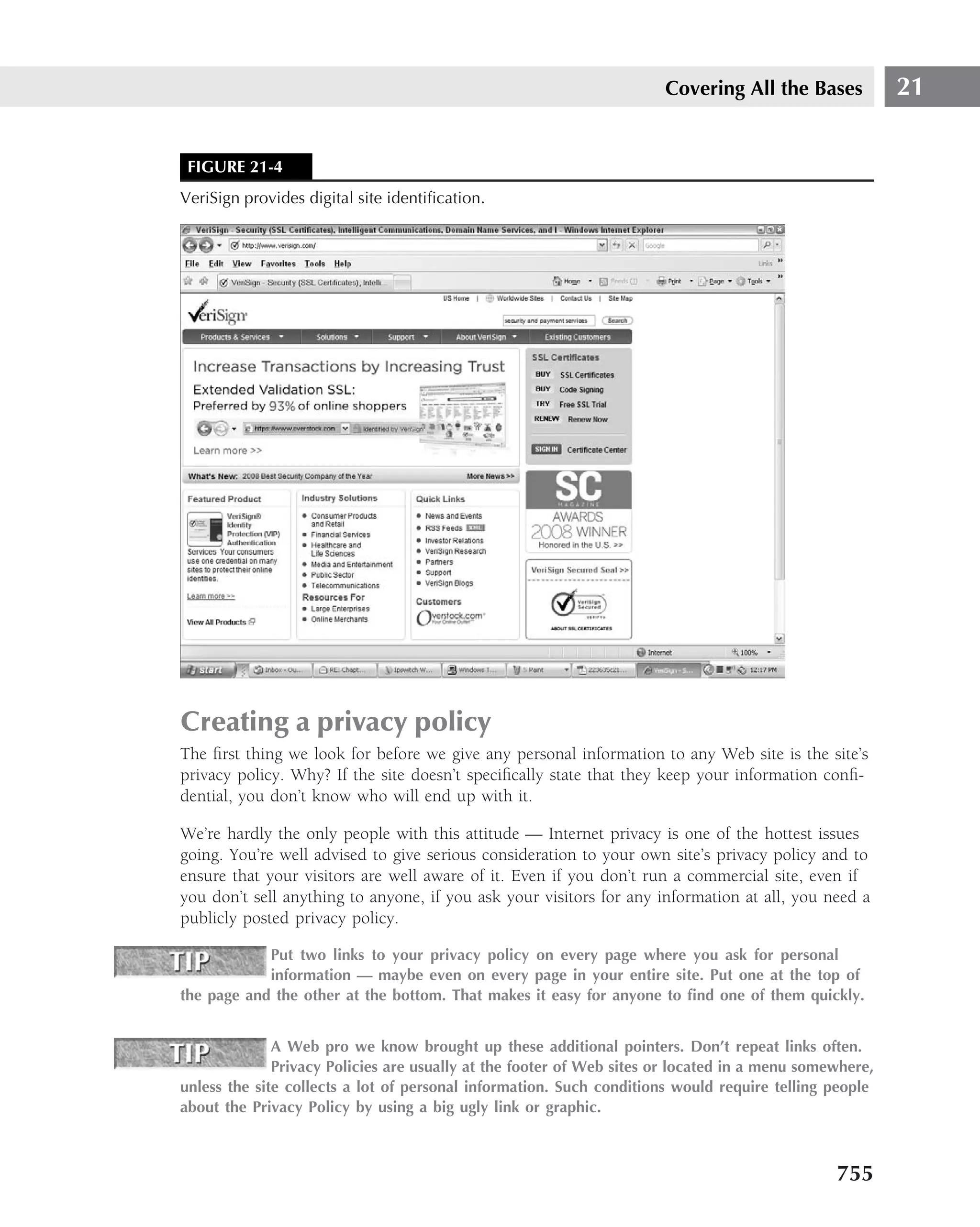
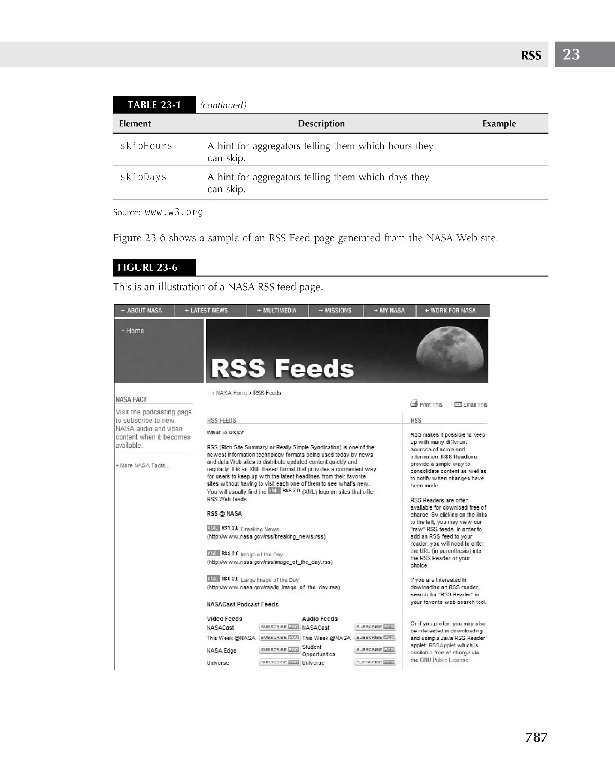
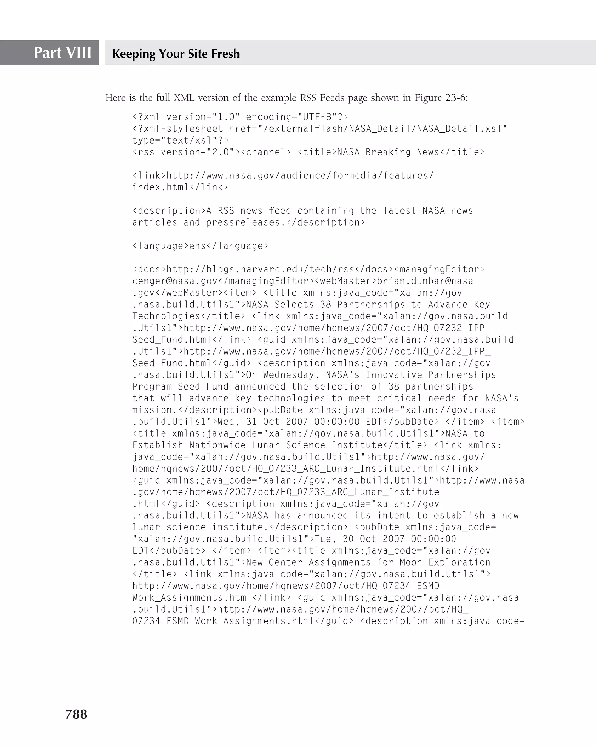
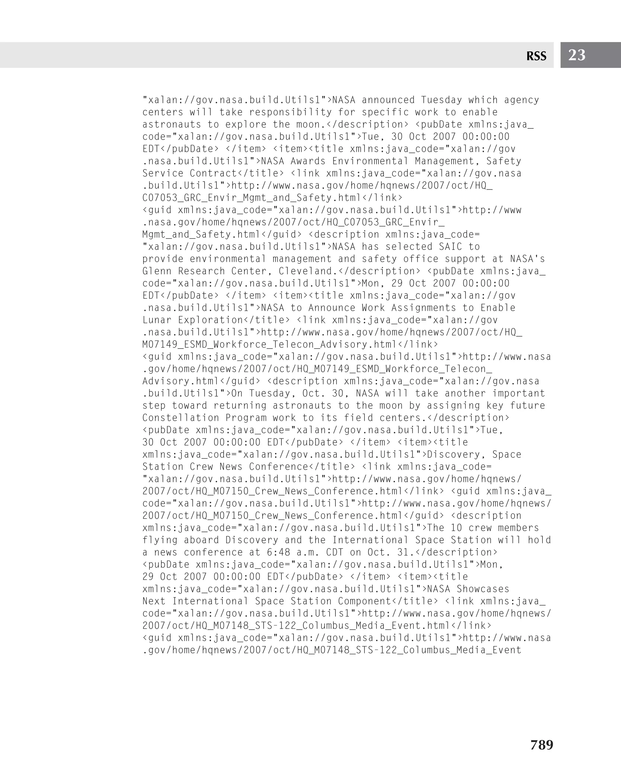
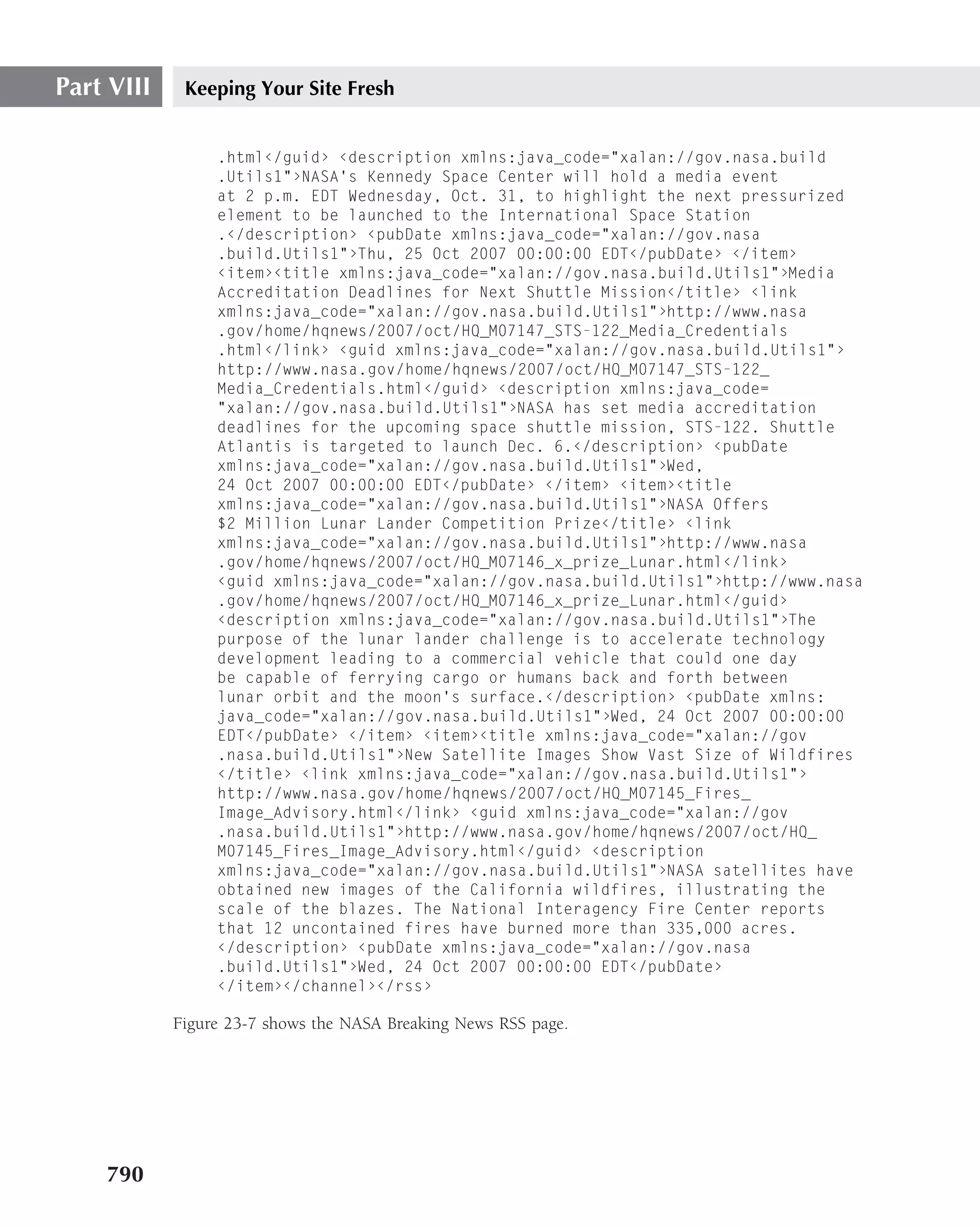
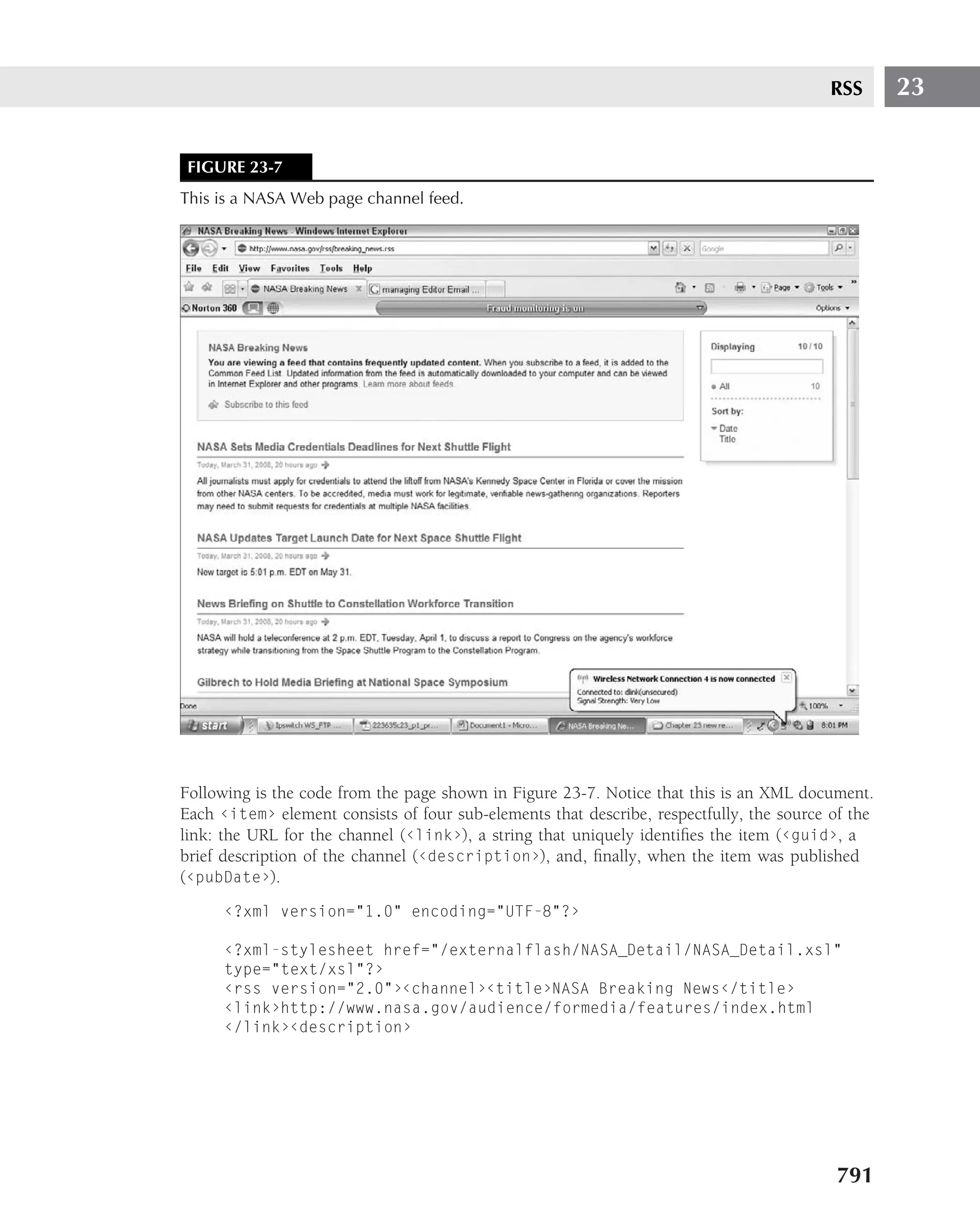
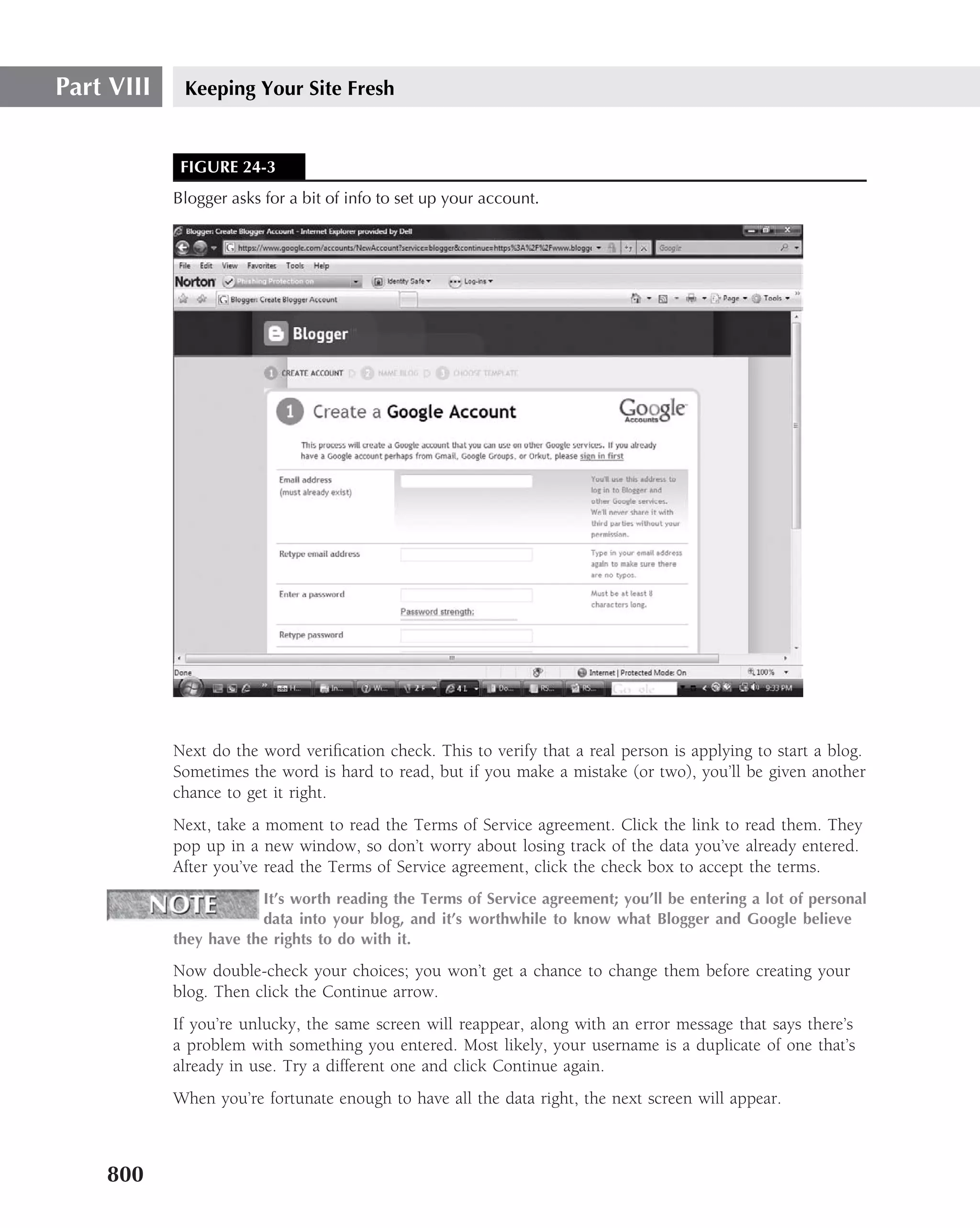
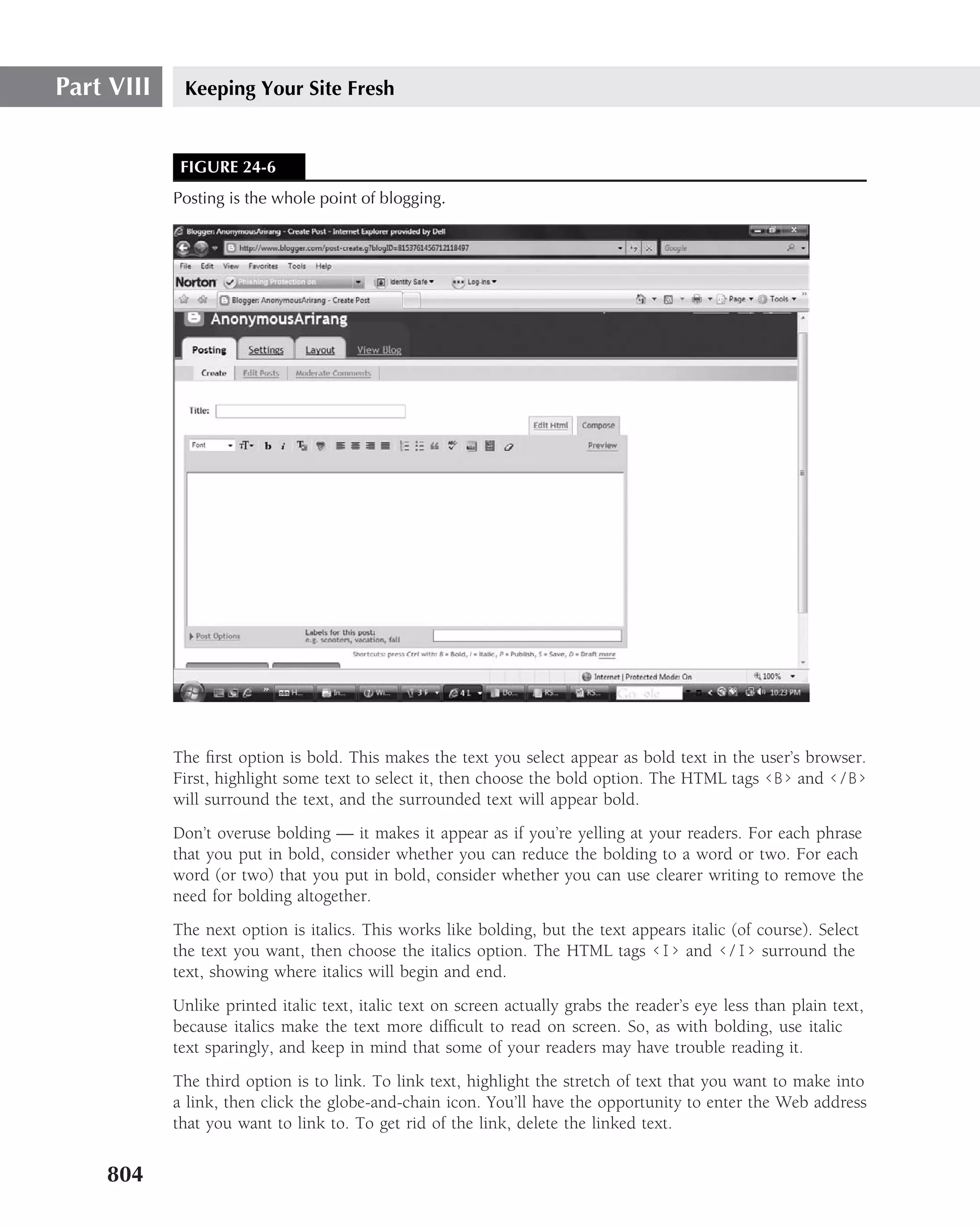
![Part II The Basics
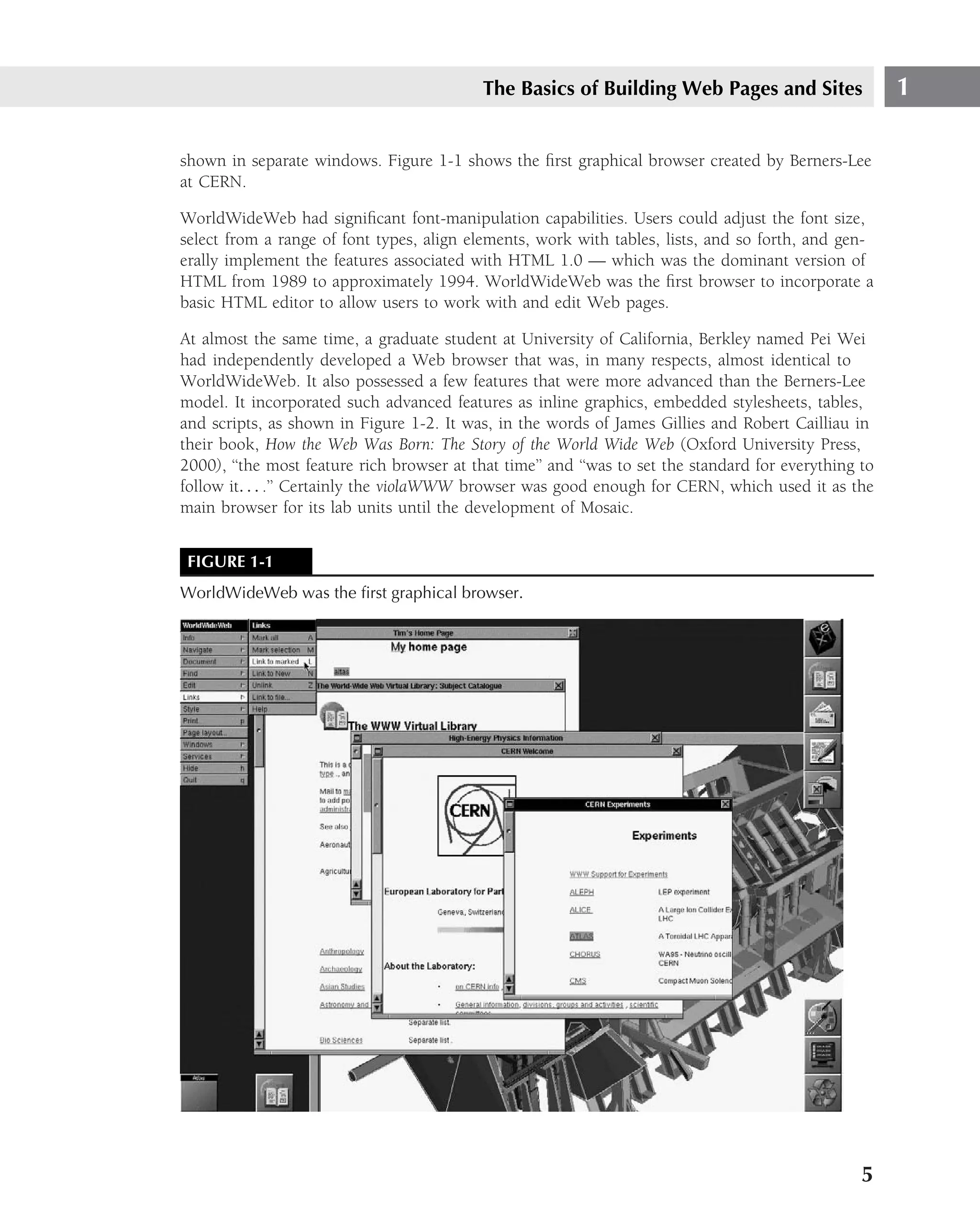
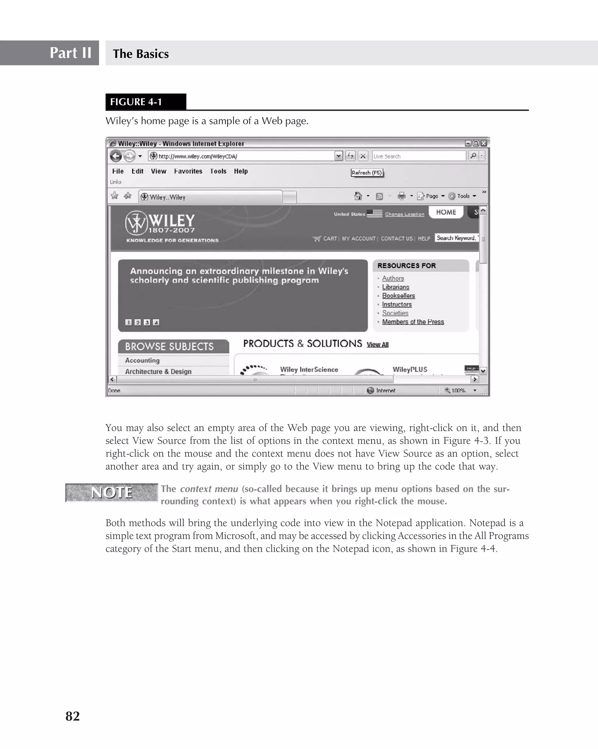
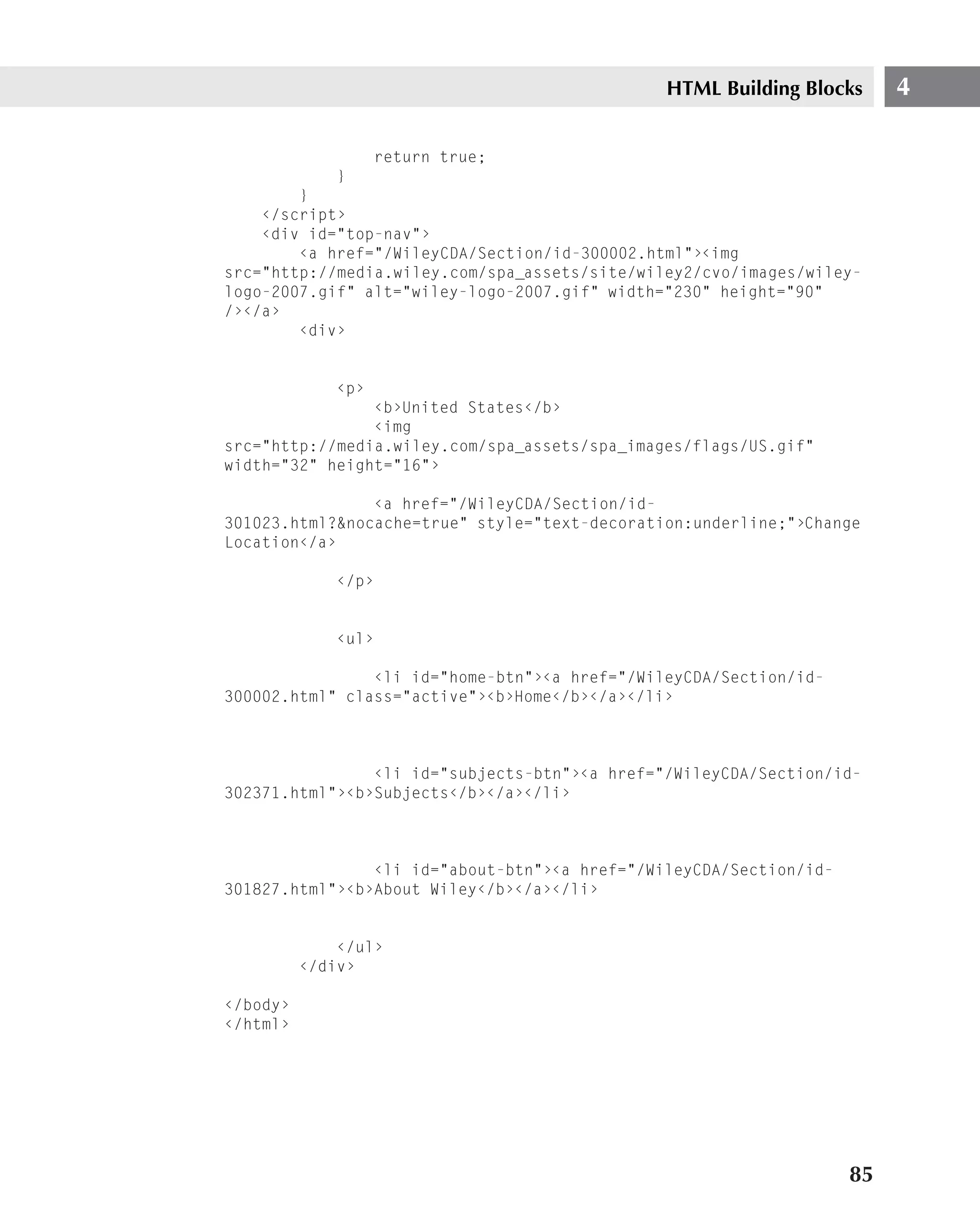
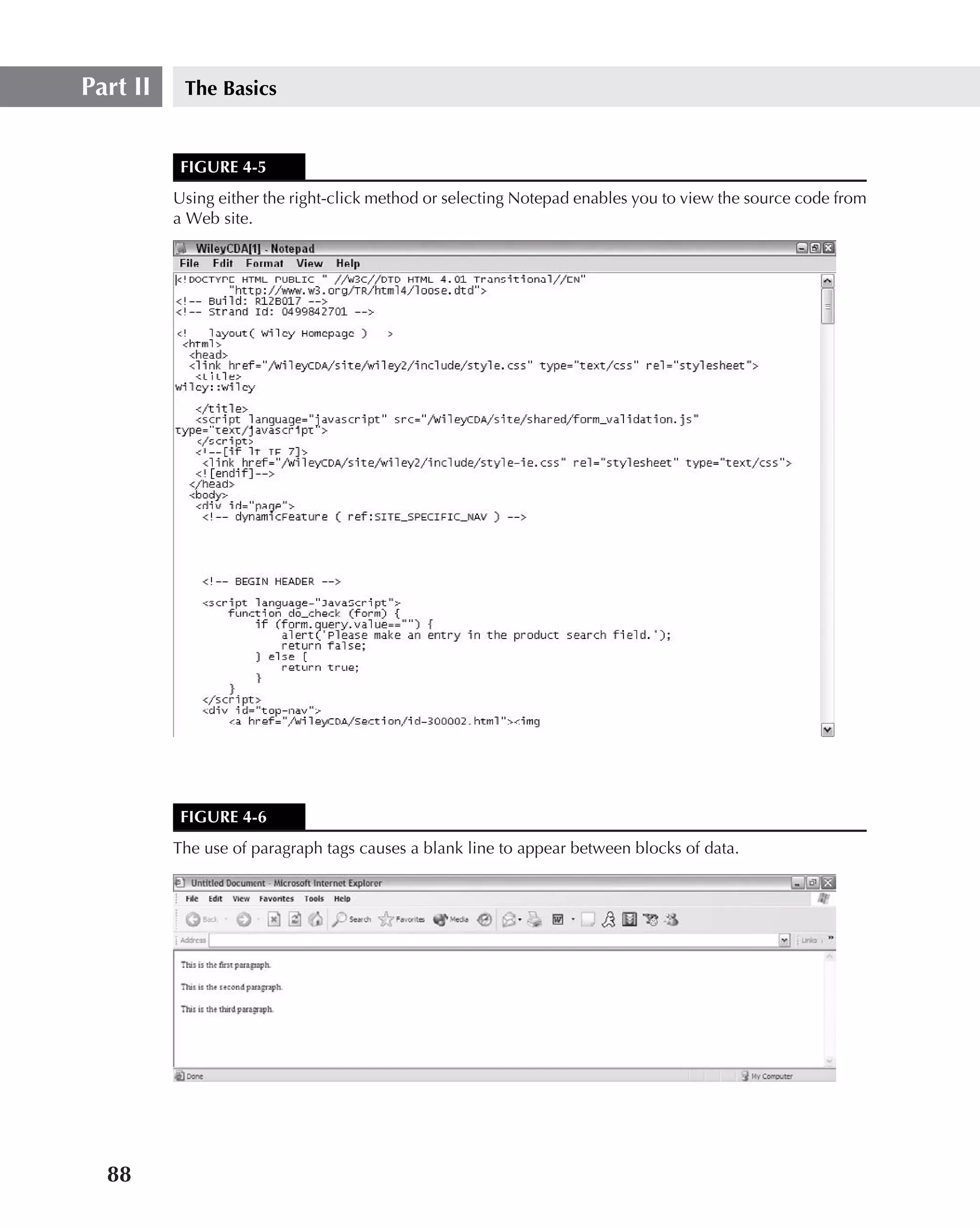
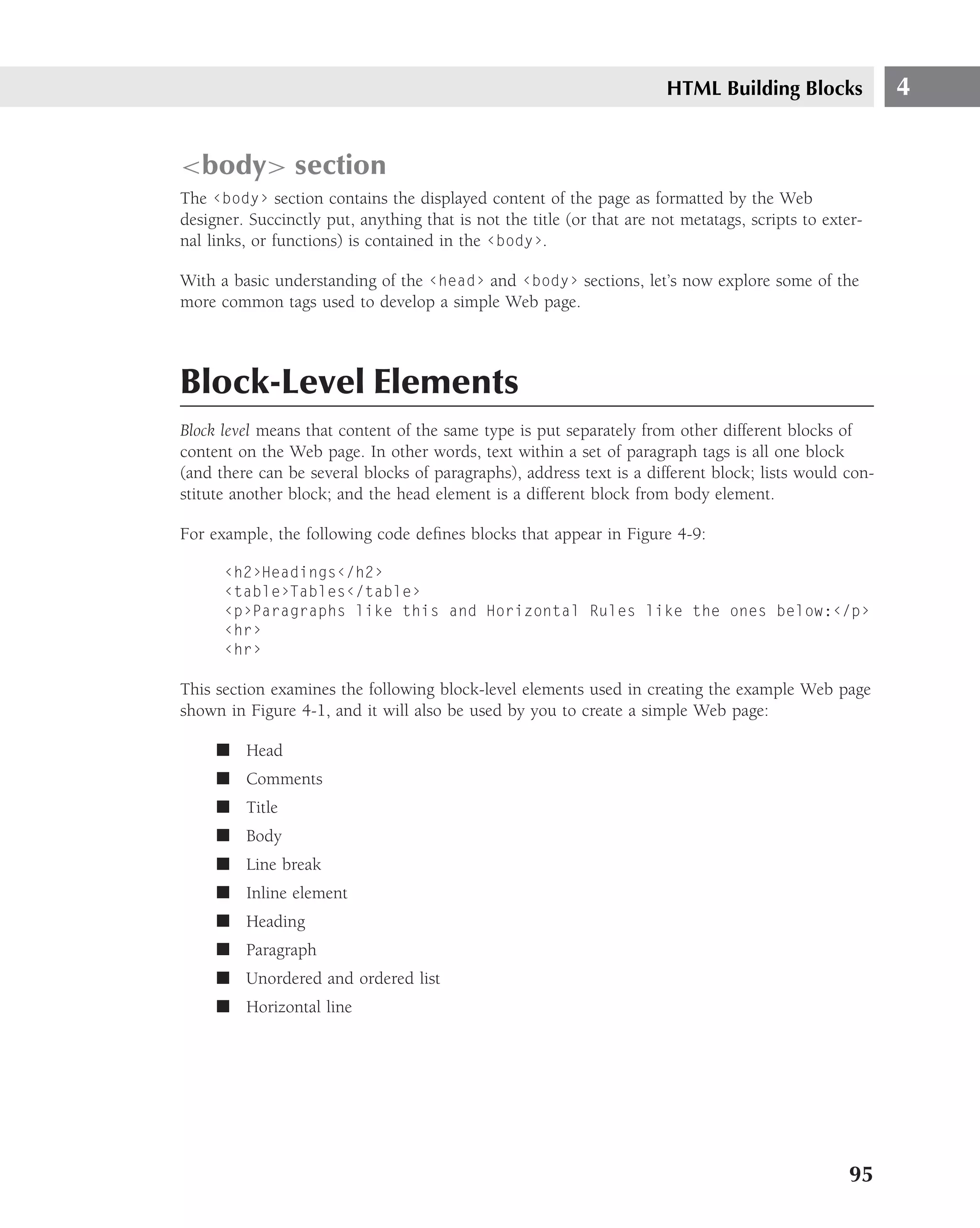
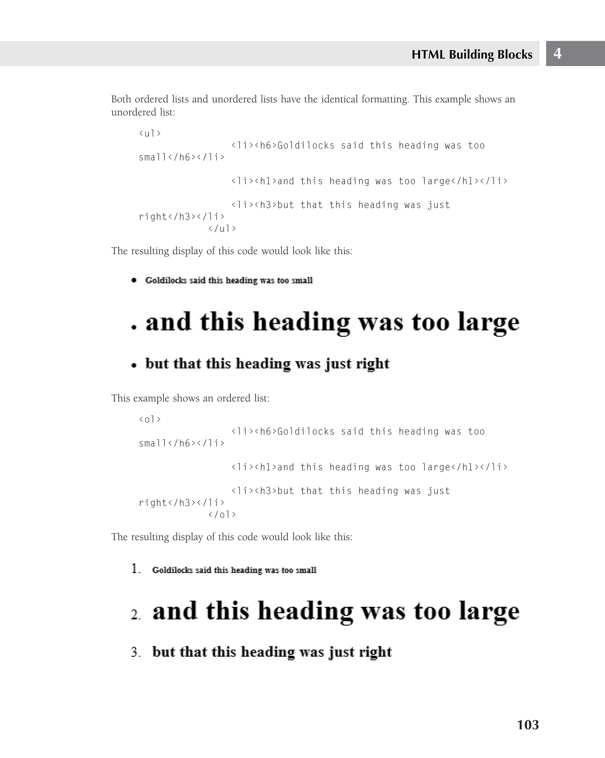
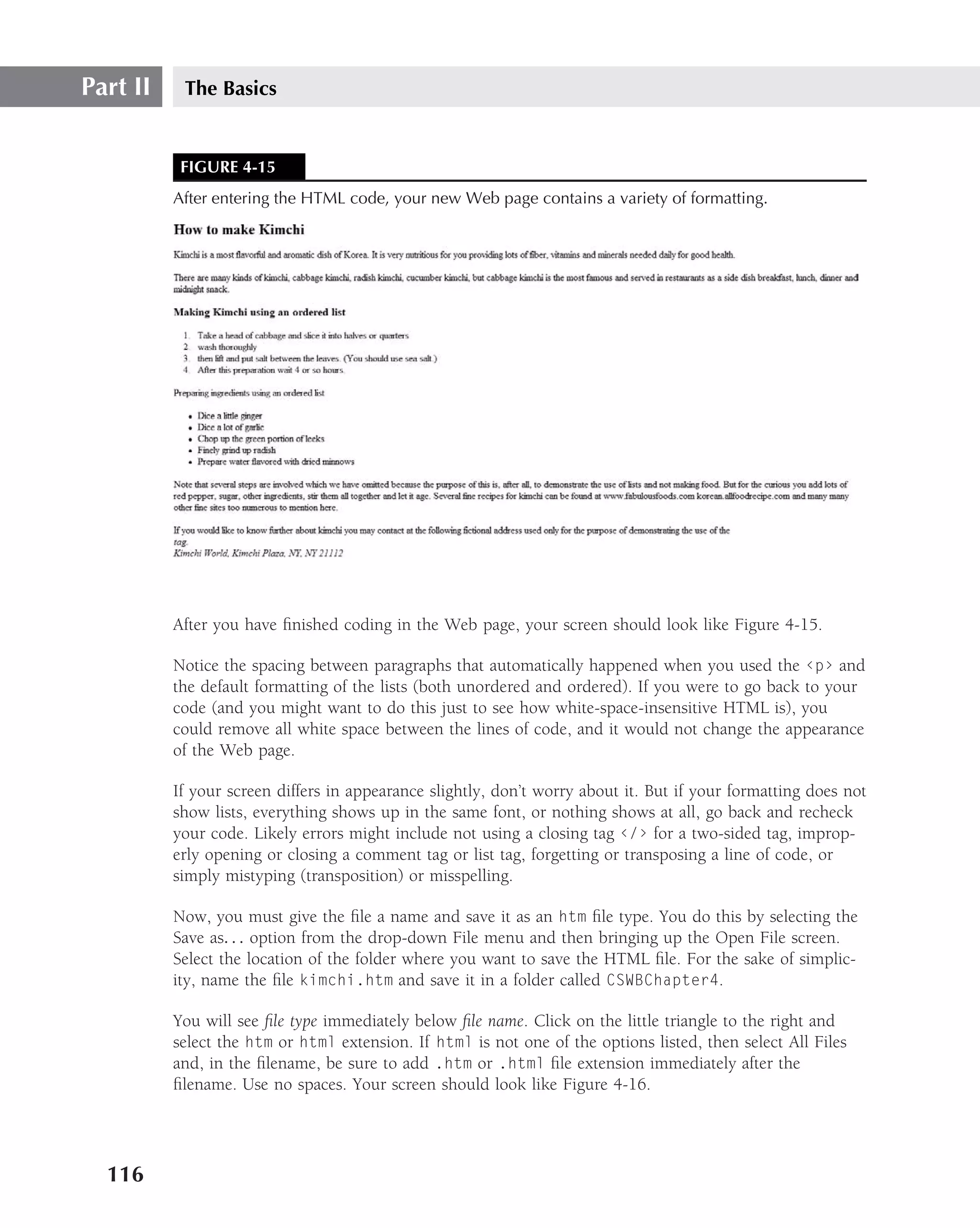
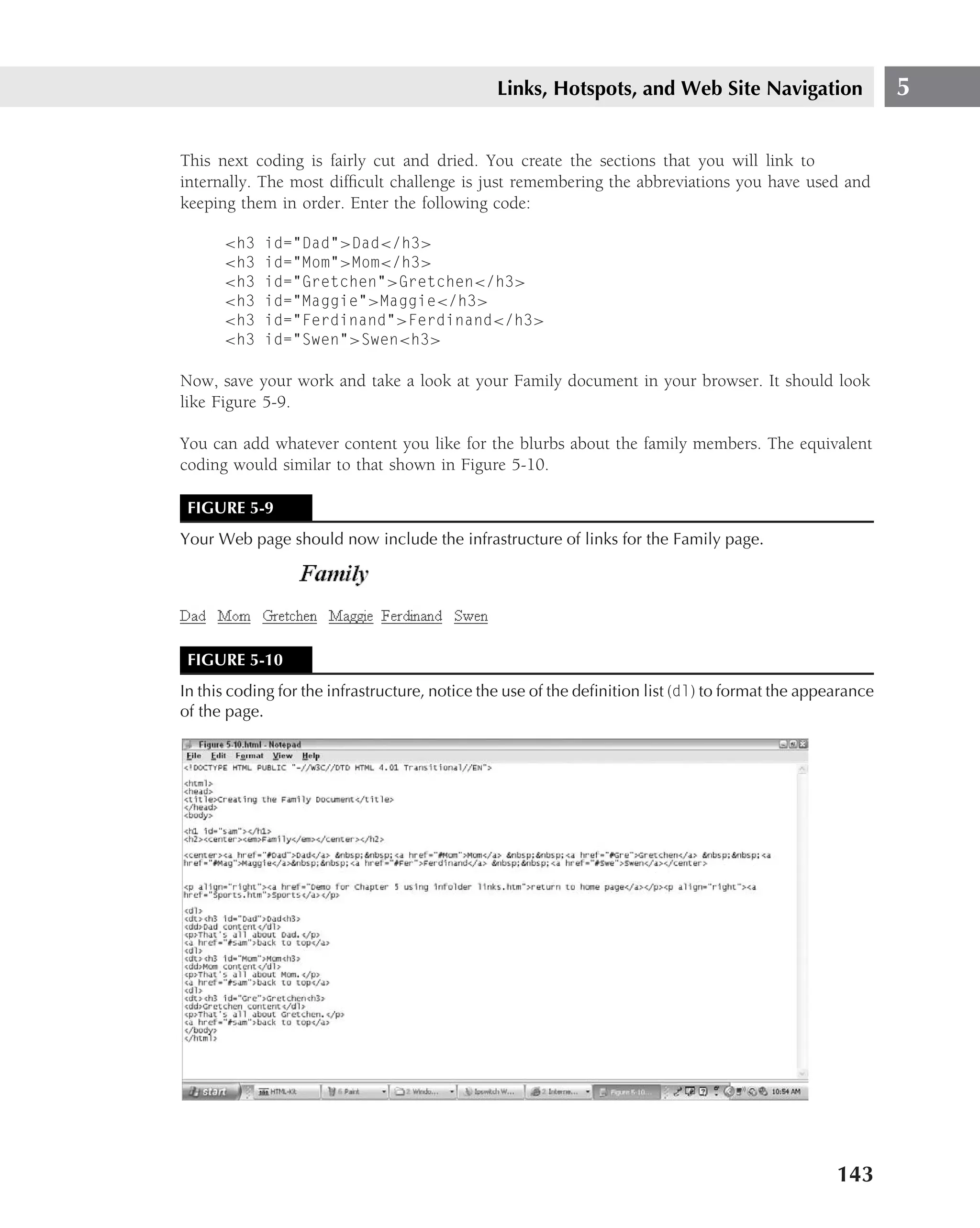
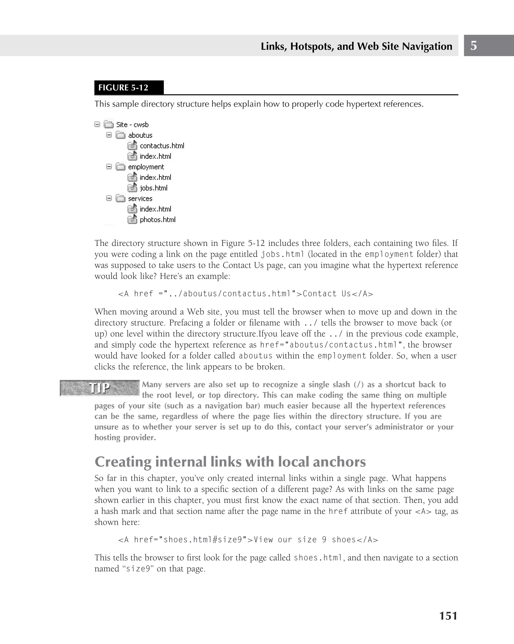
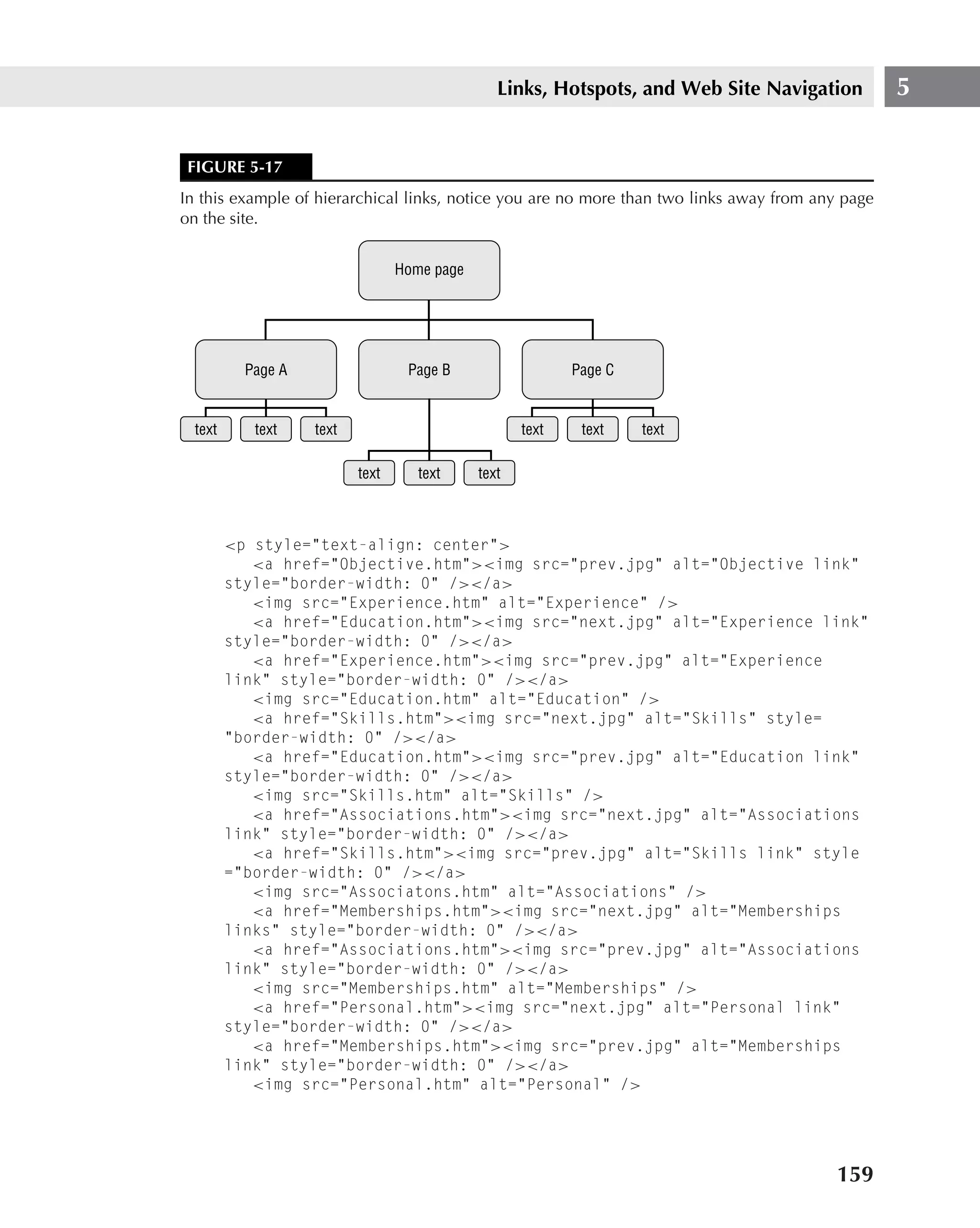
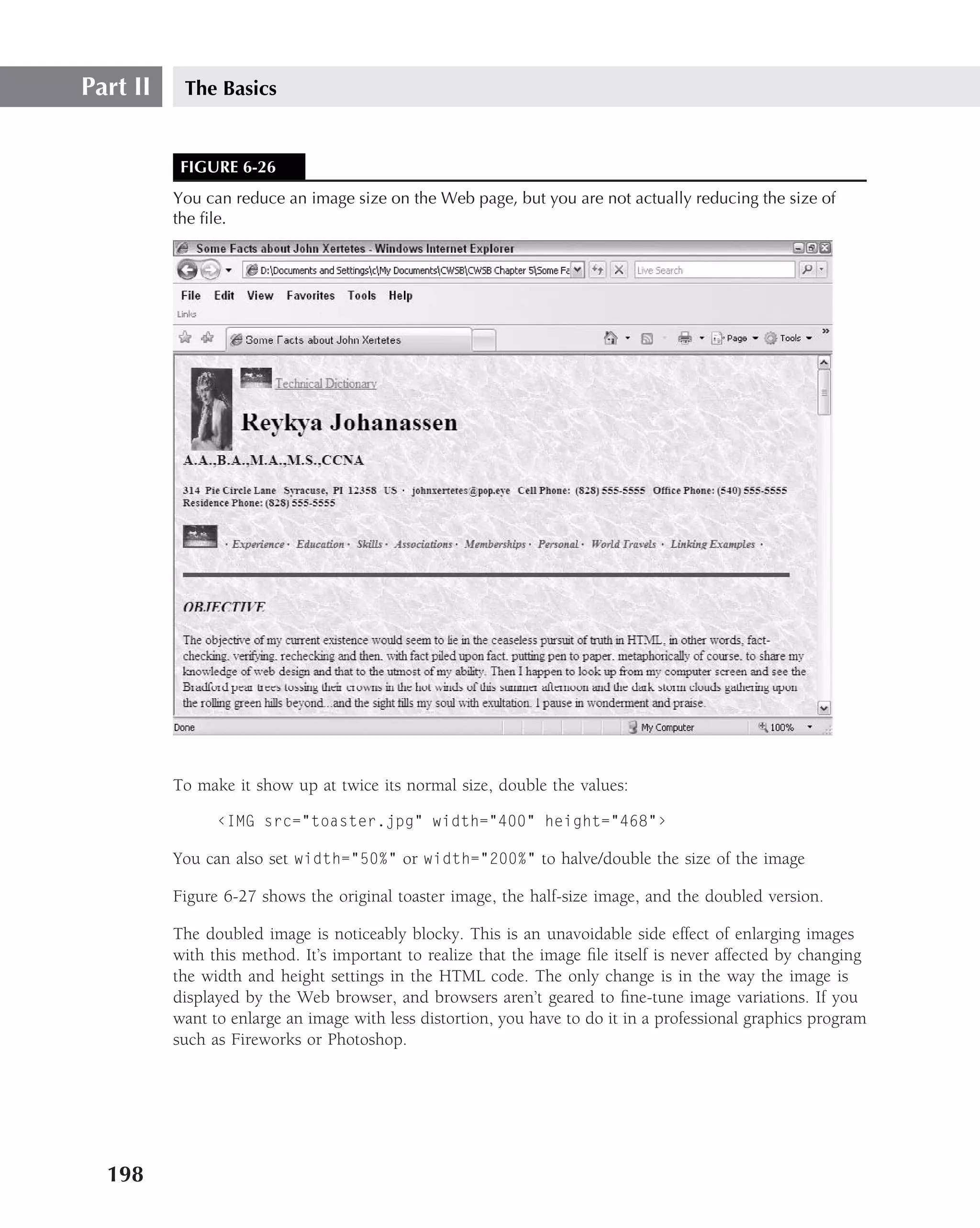
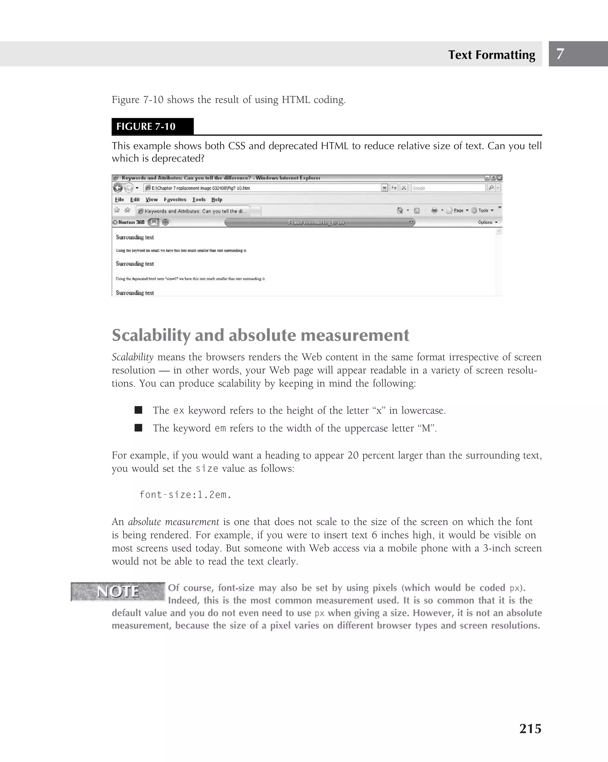
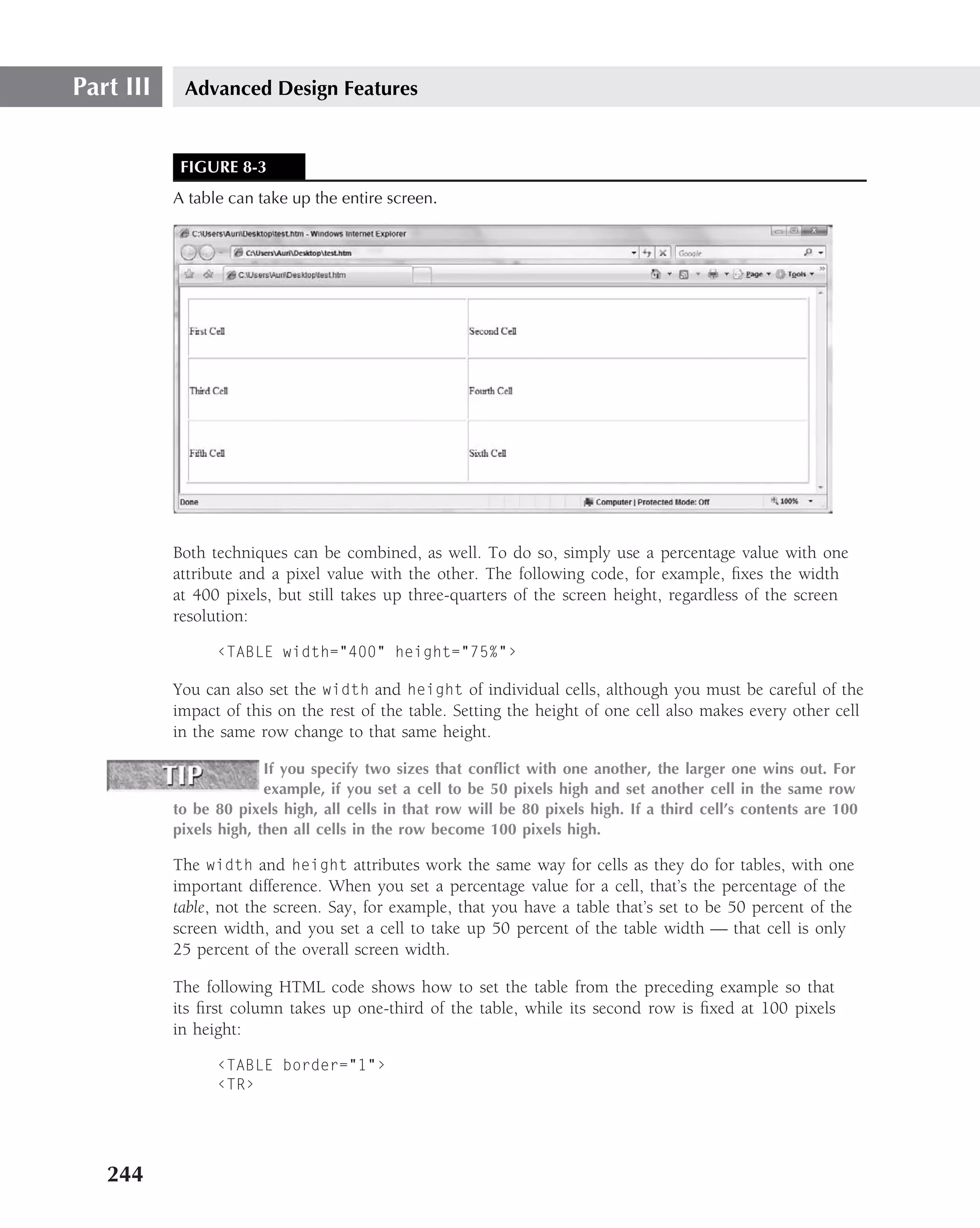
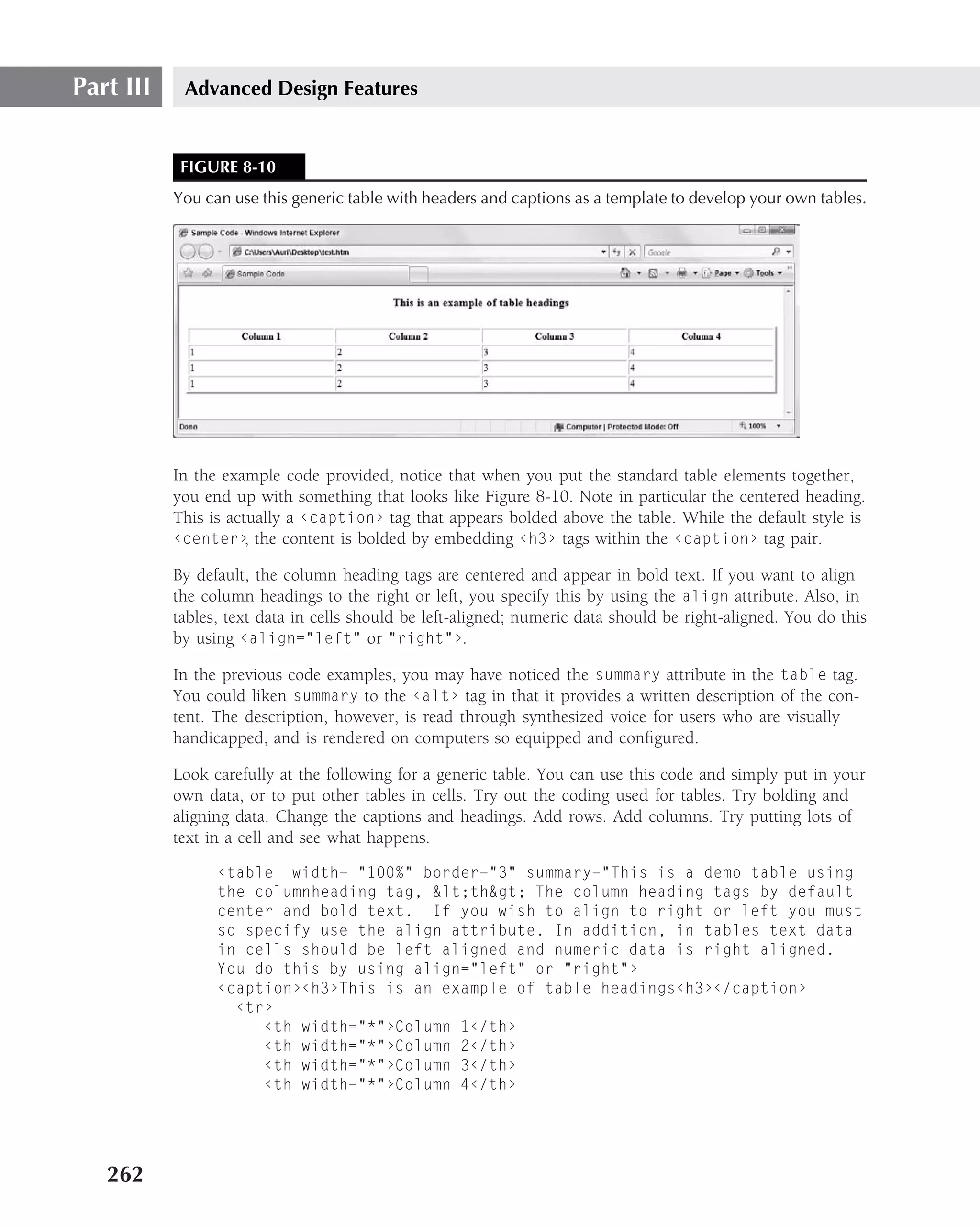
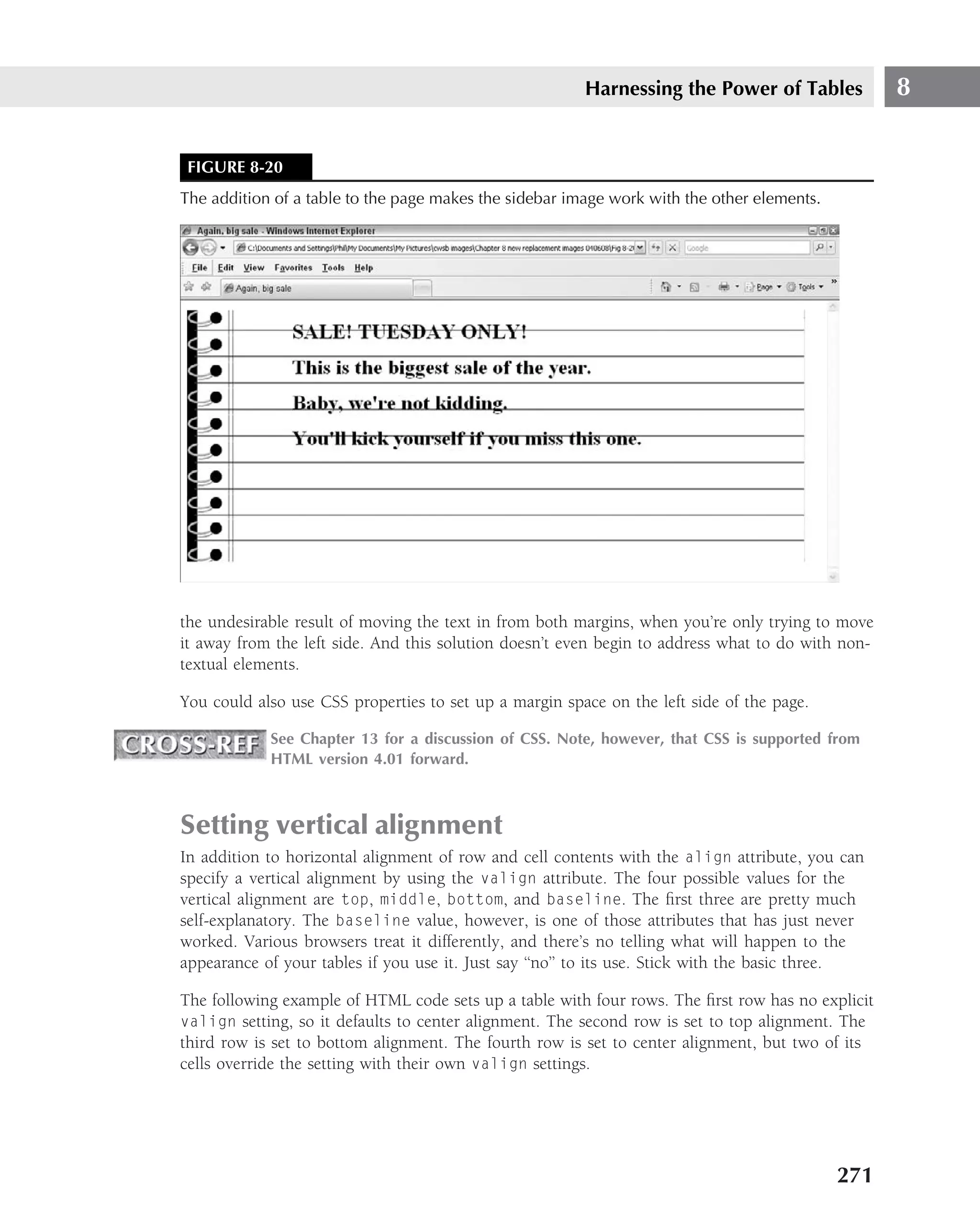
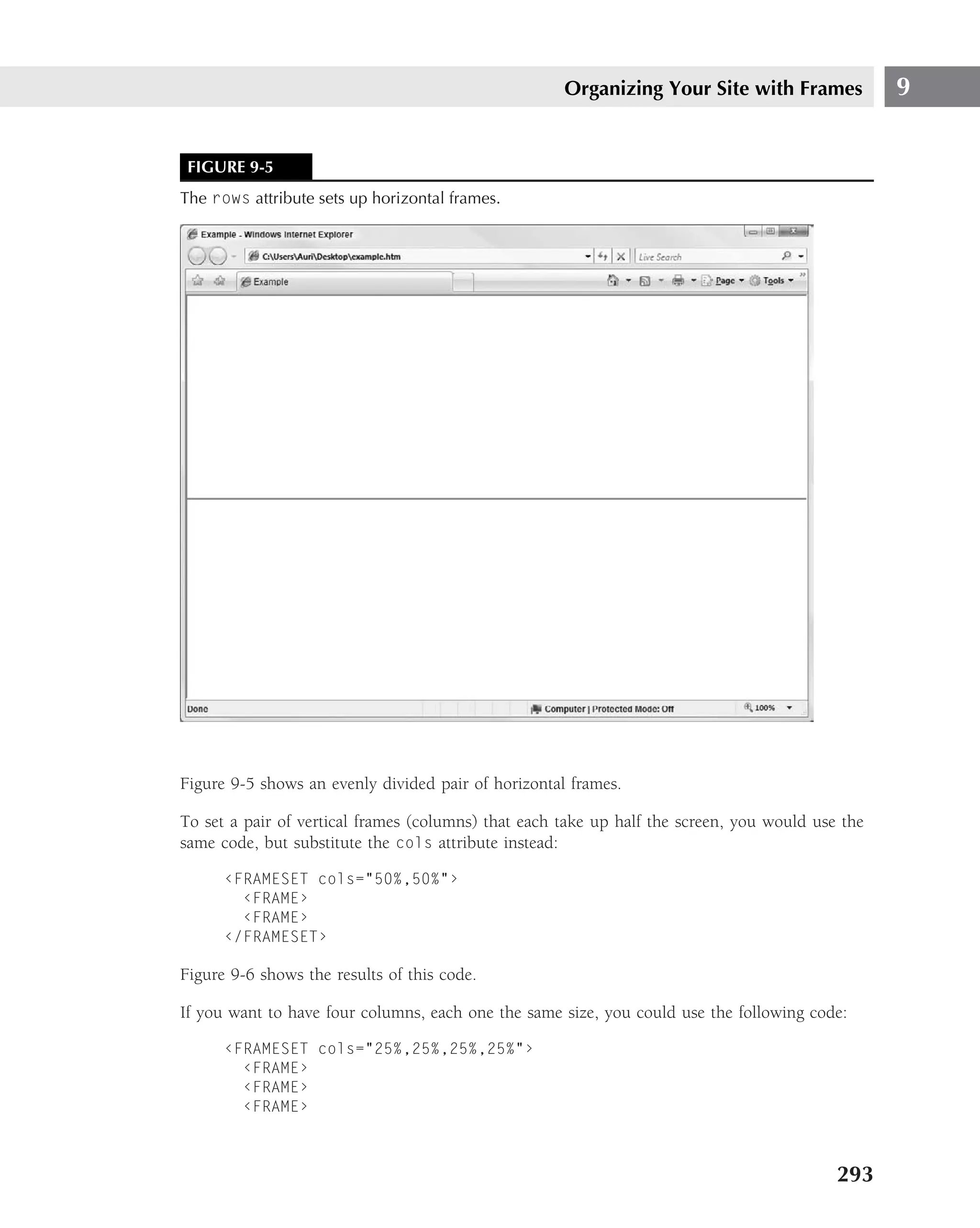
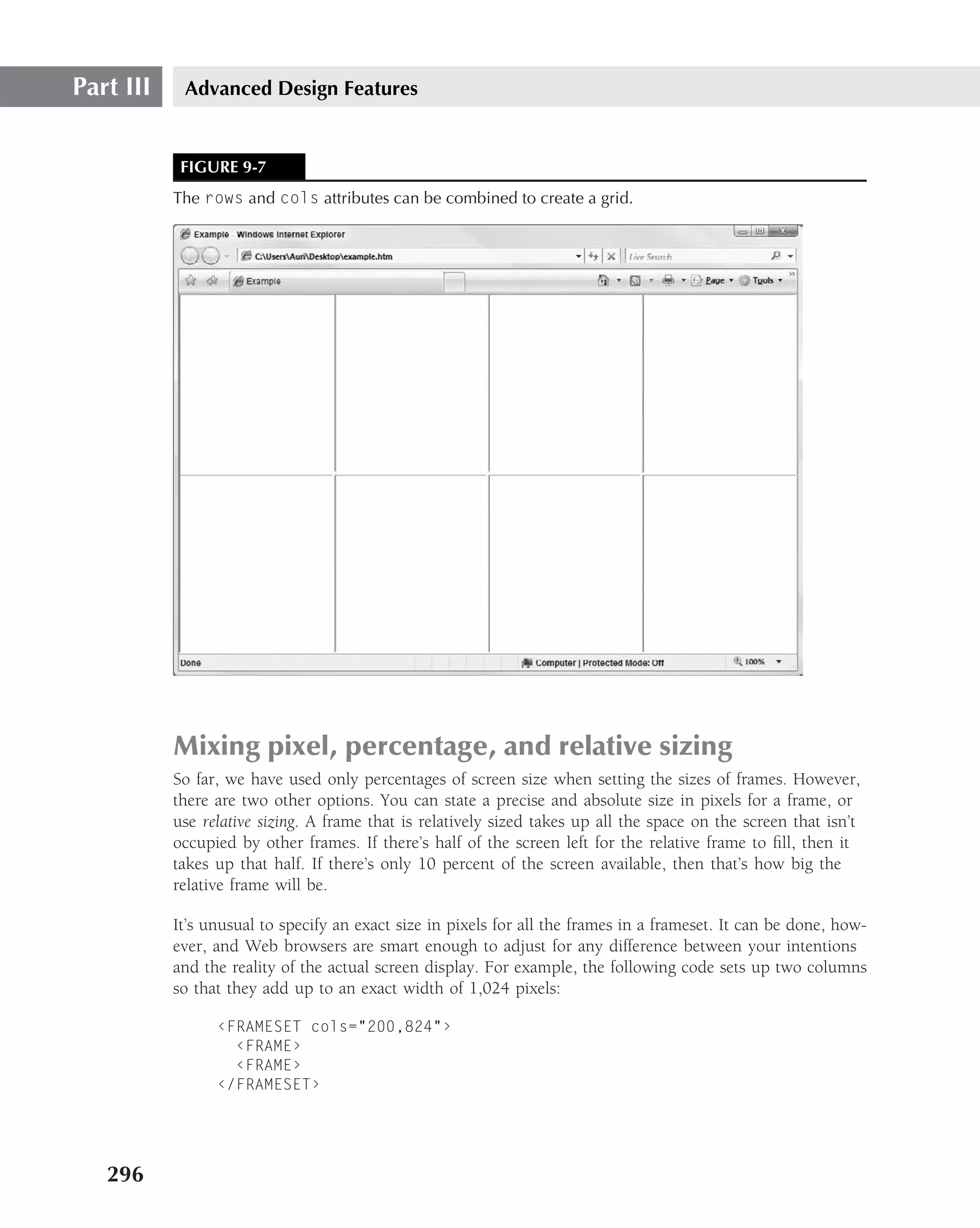
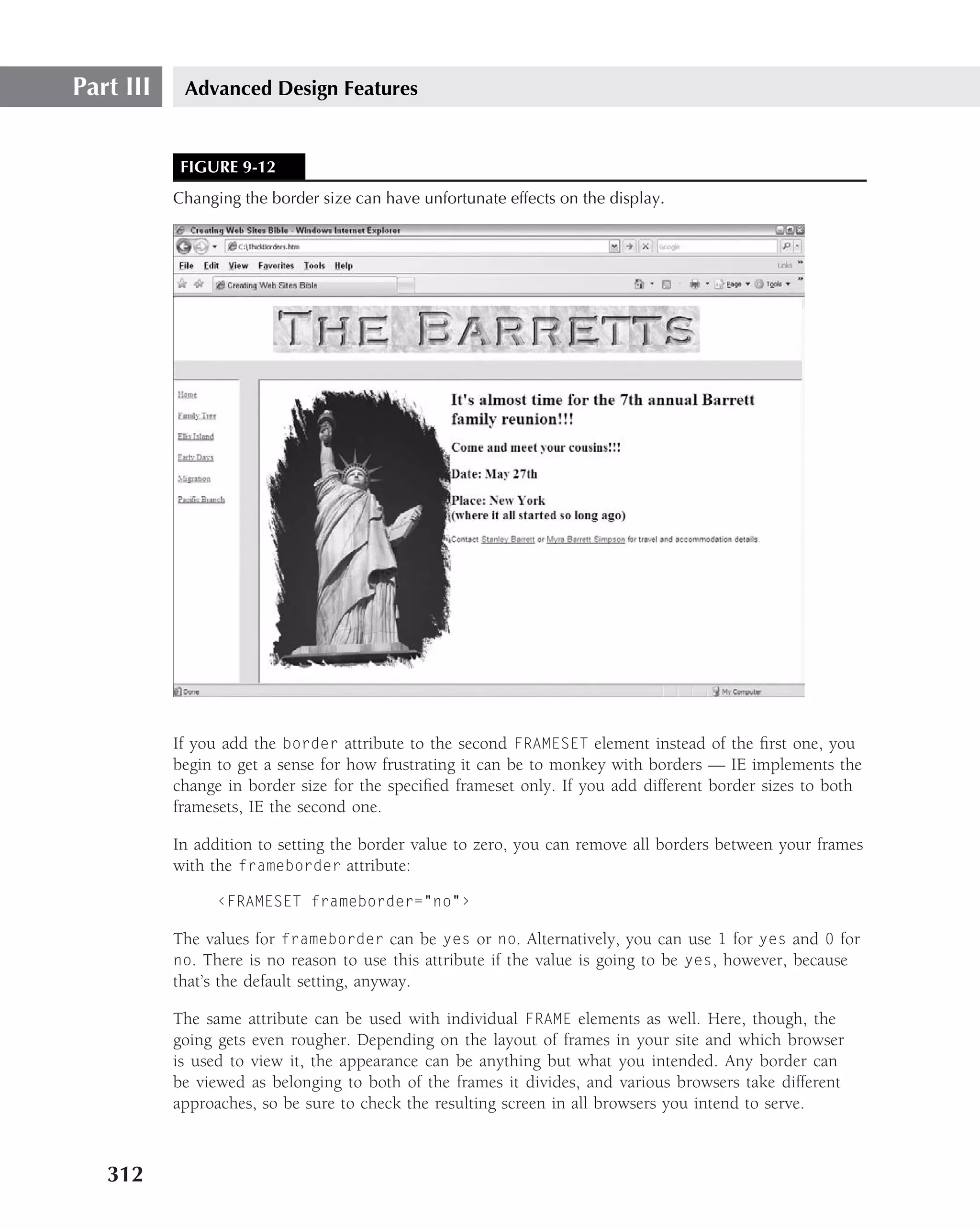
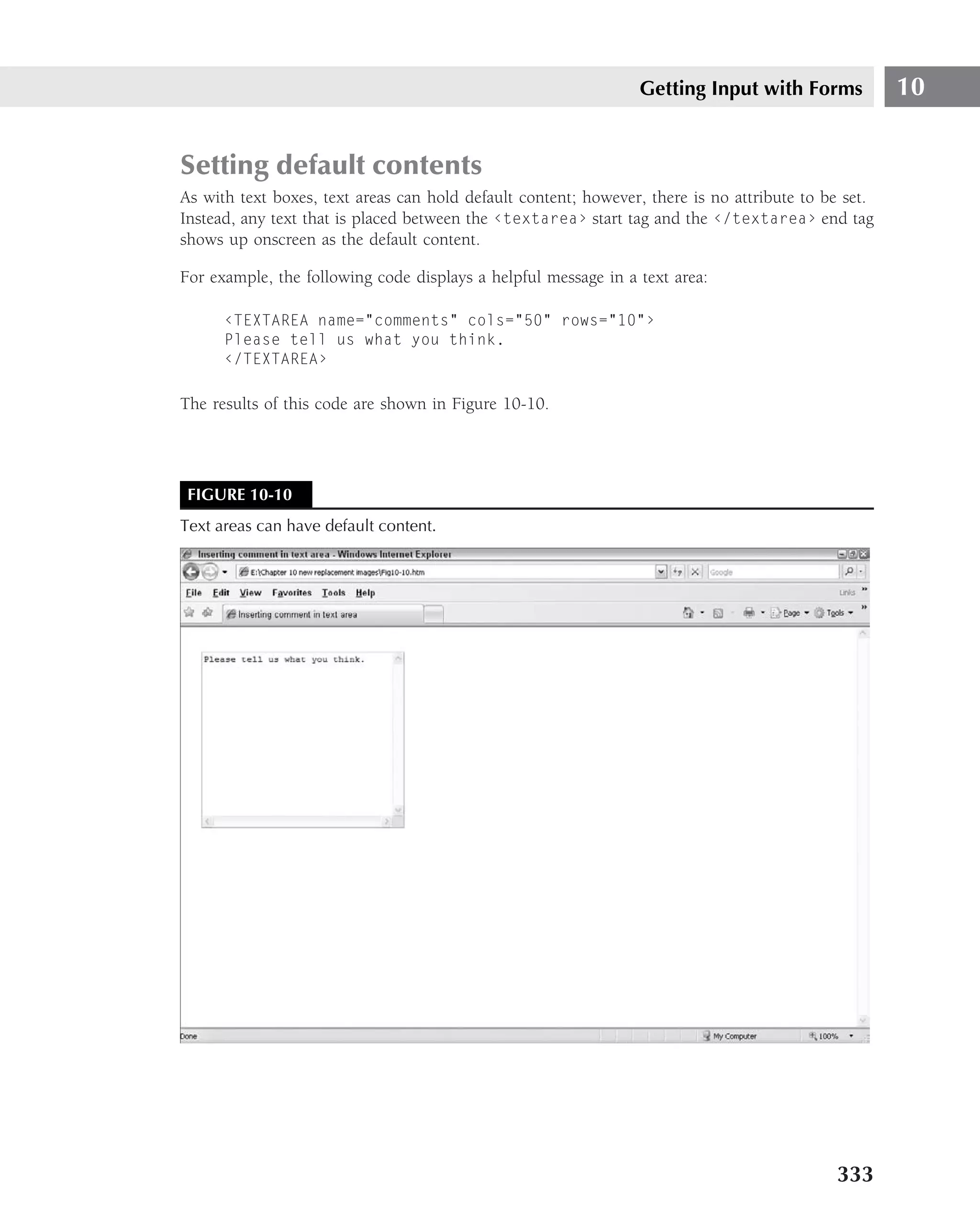
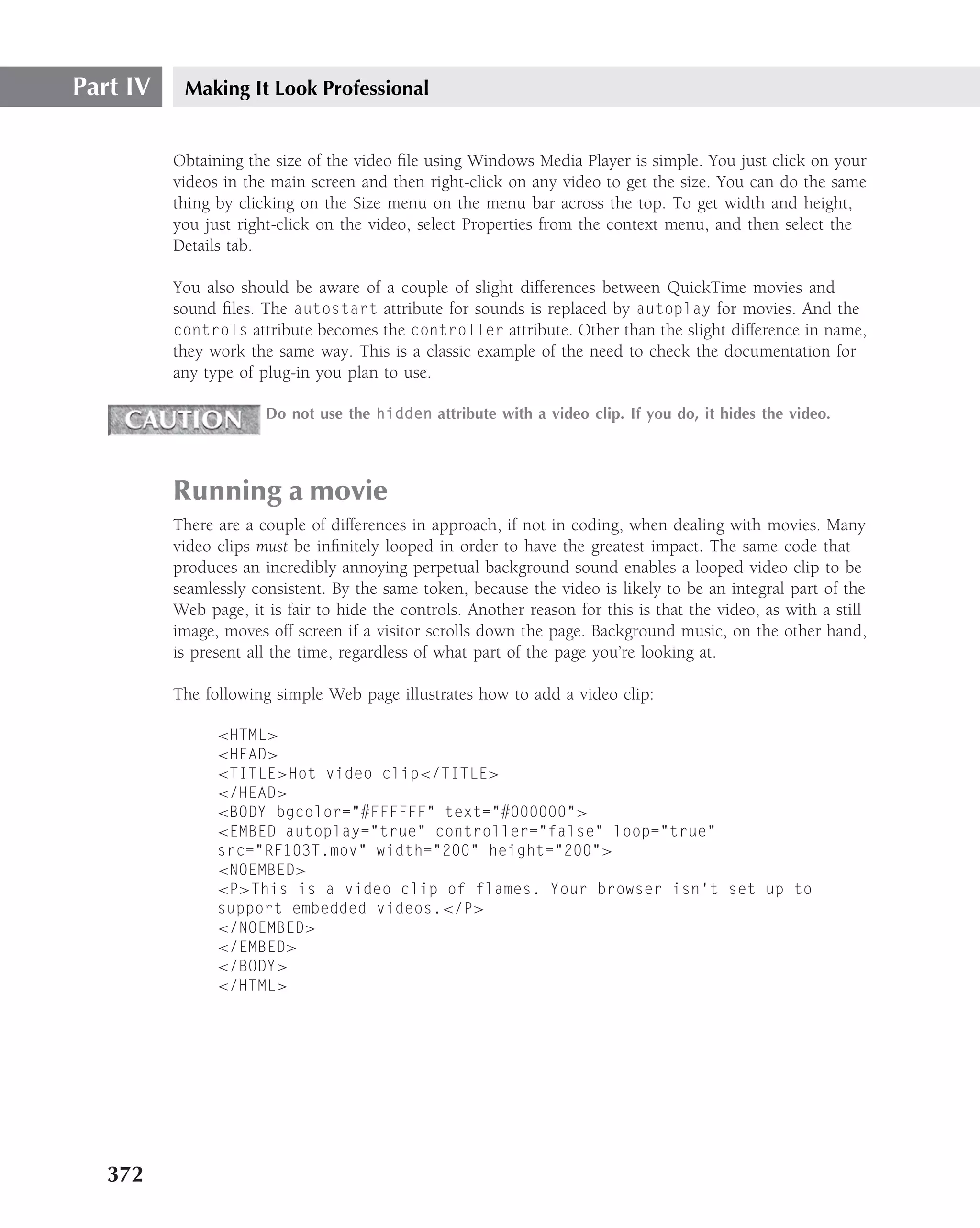
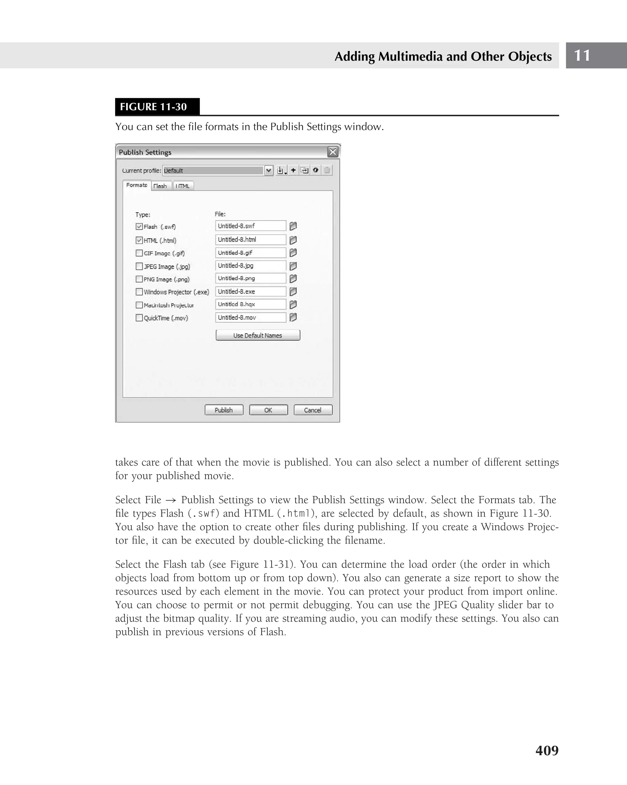
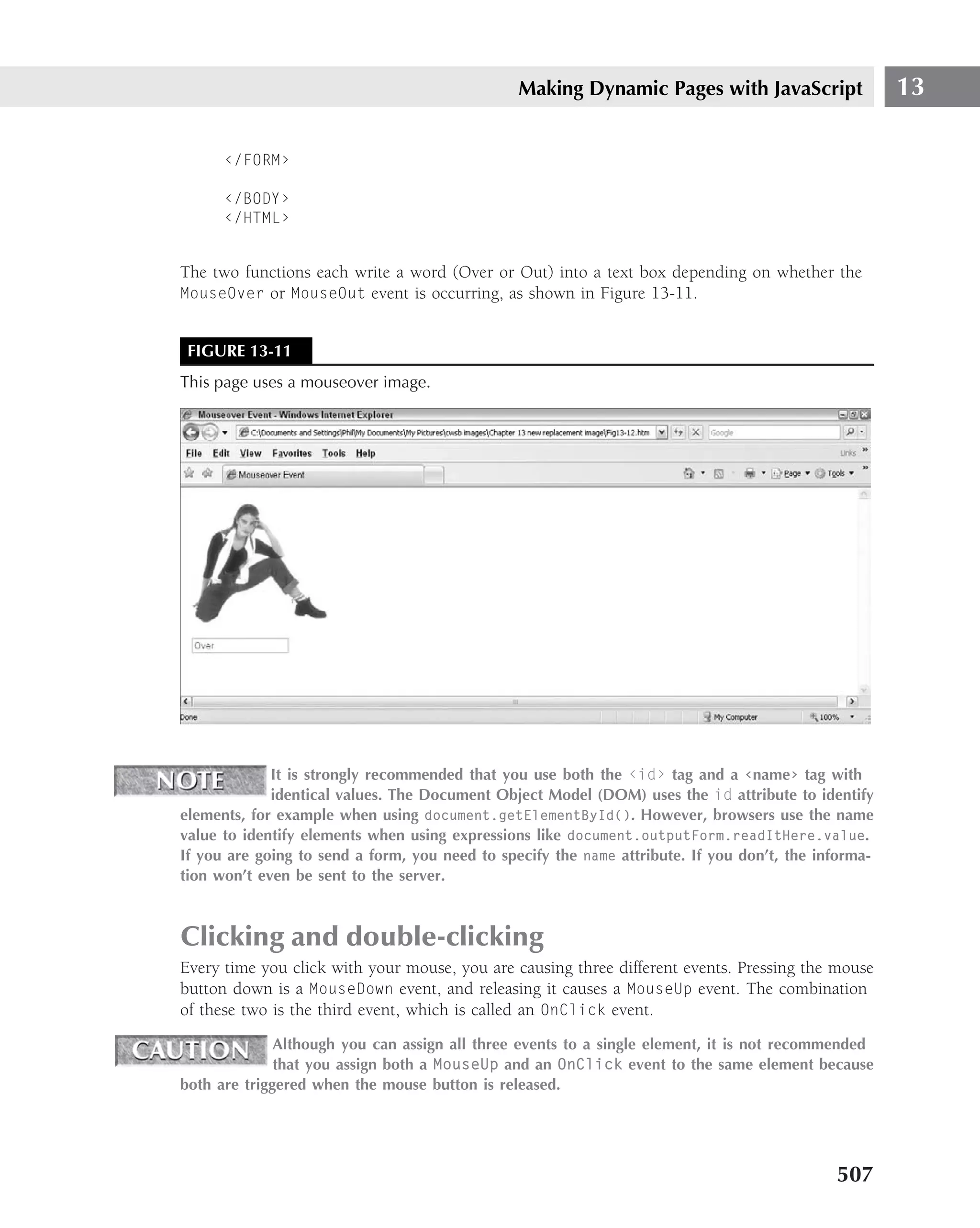
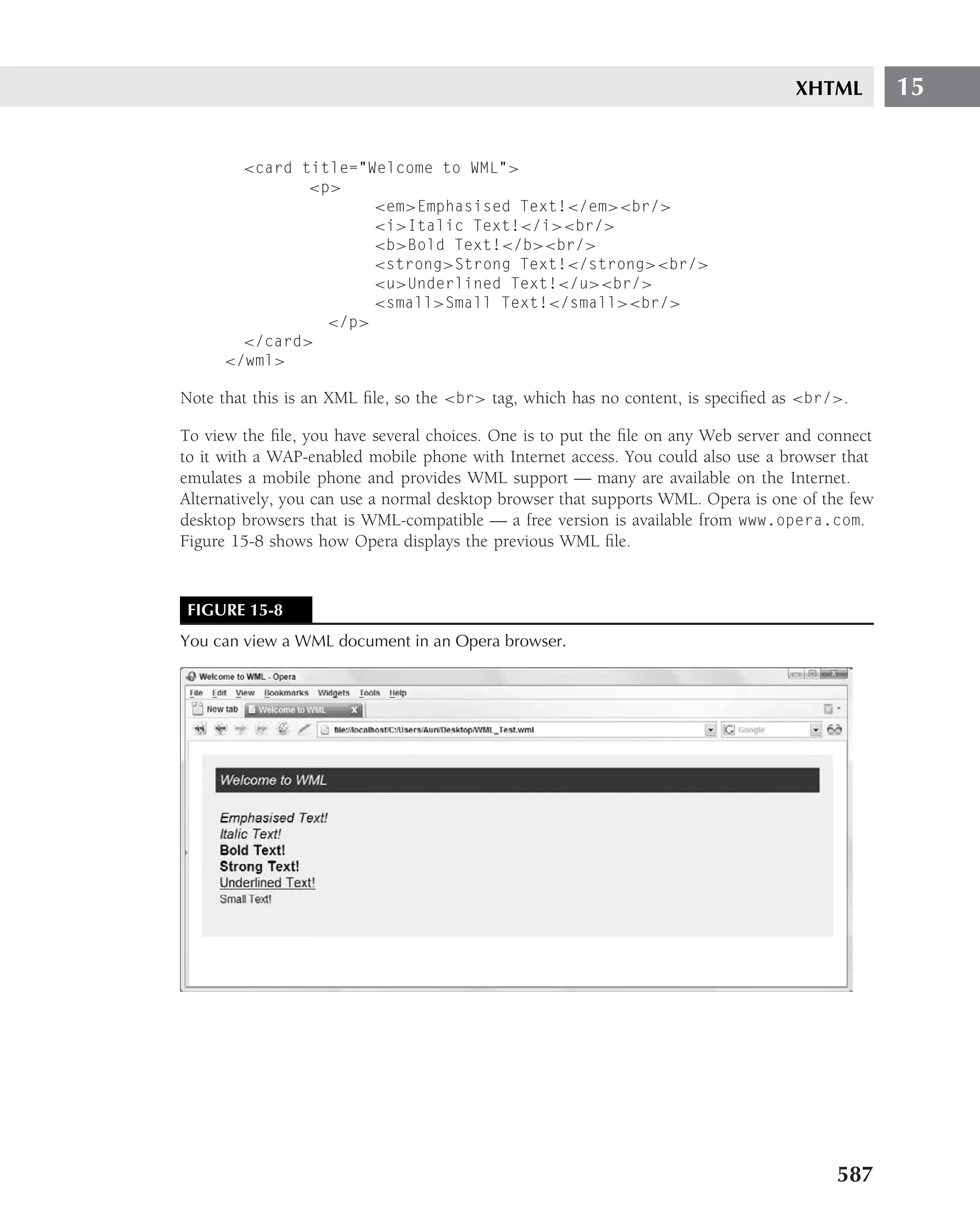
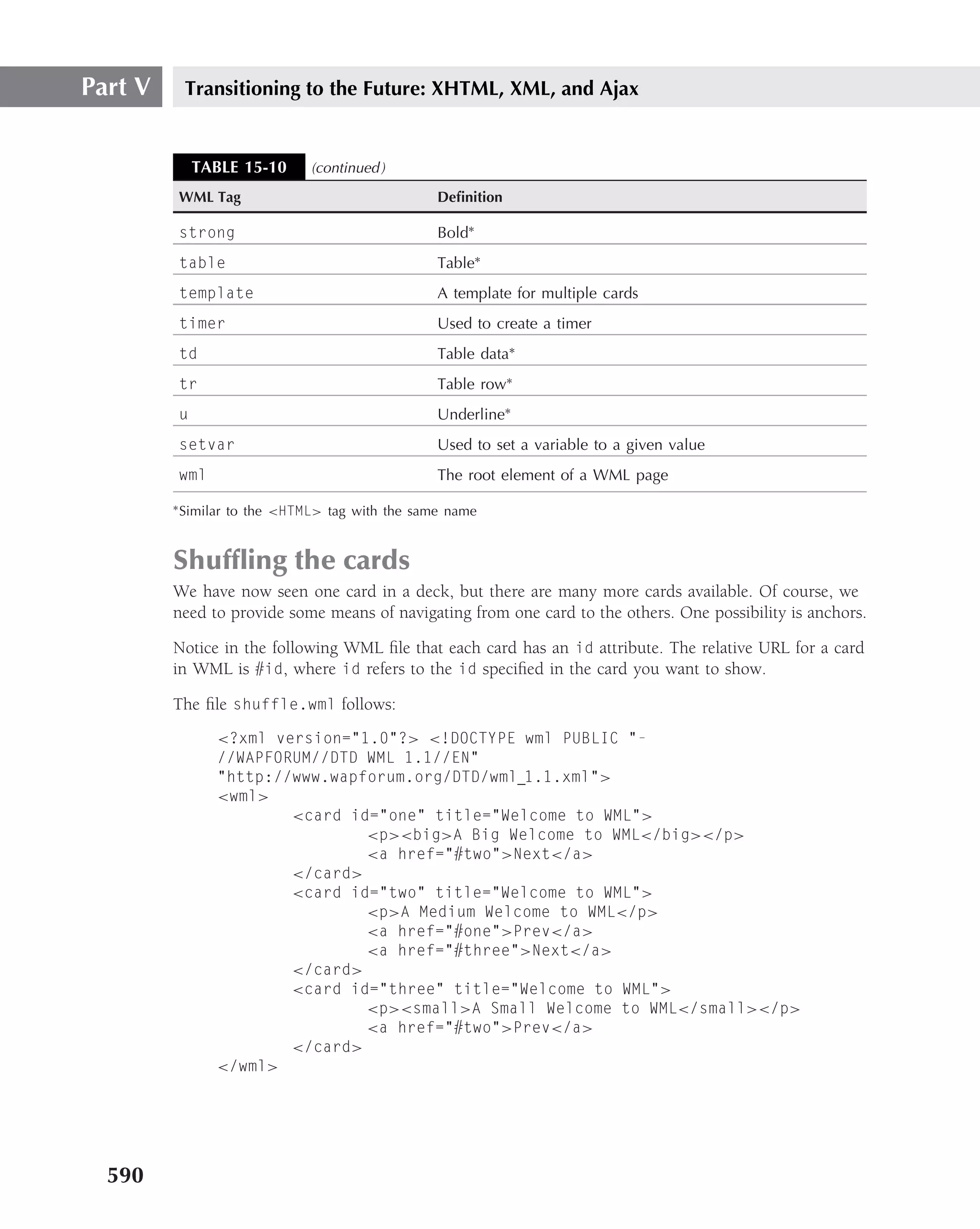
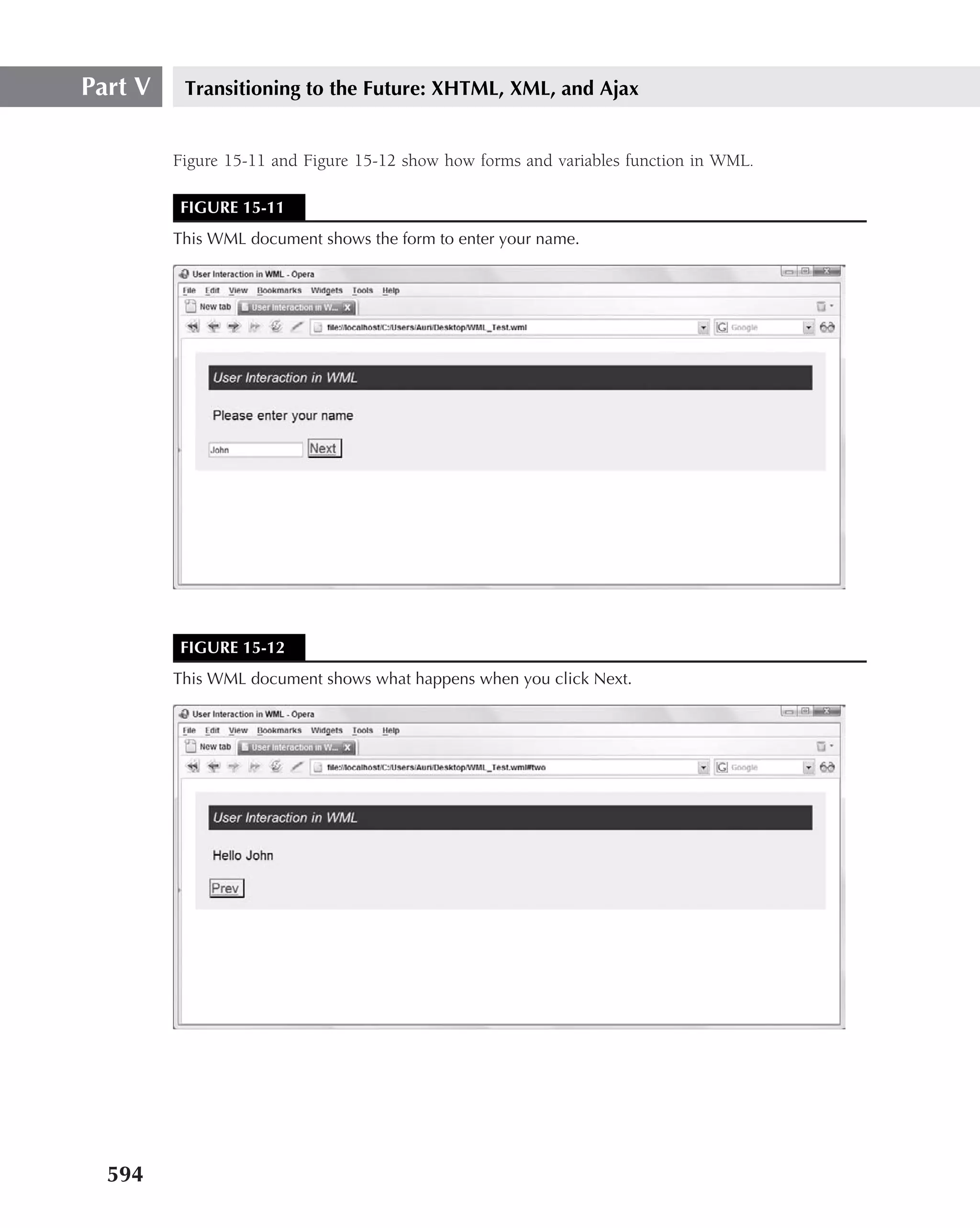
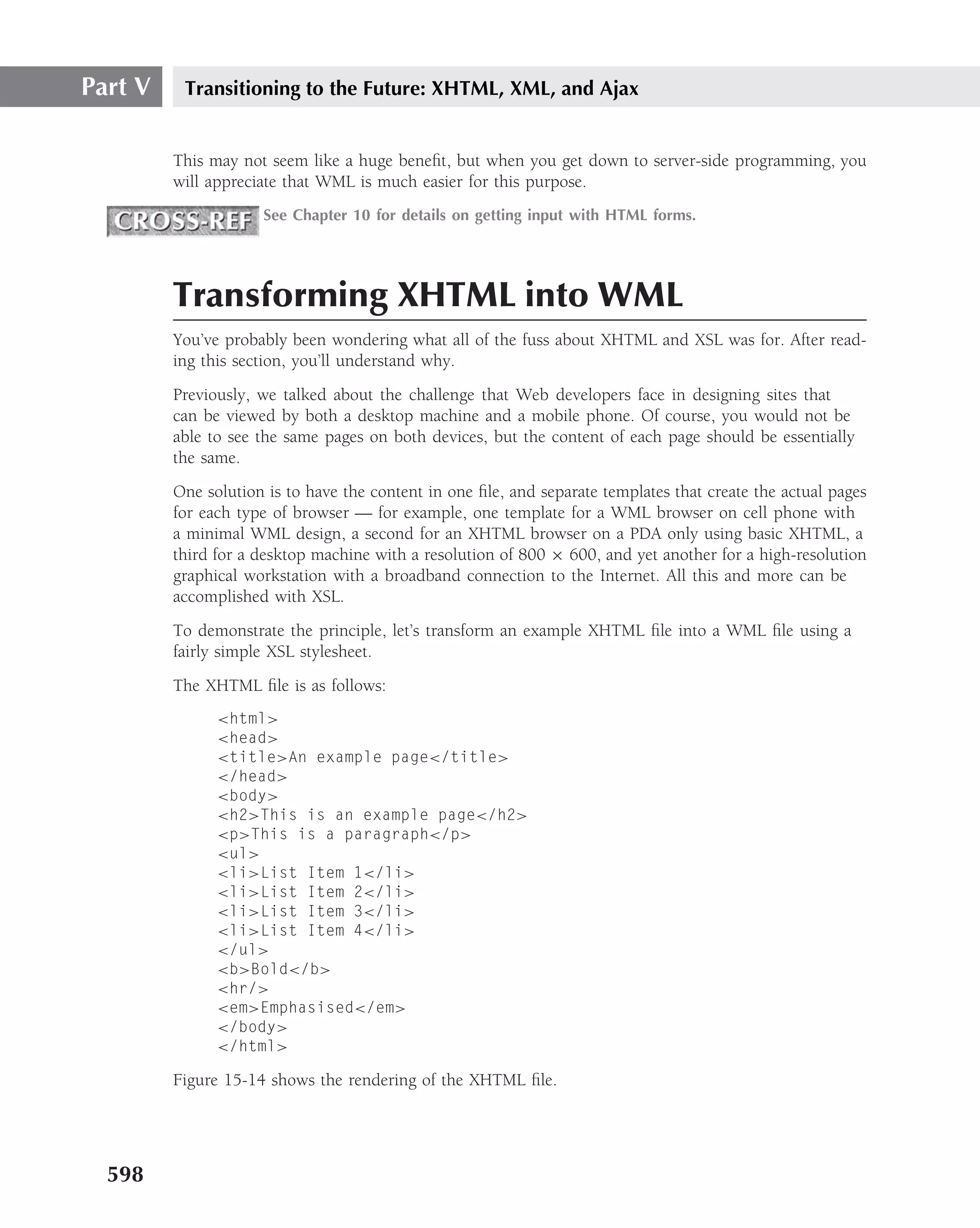
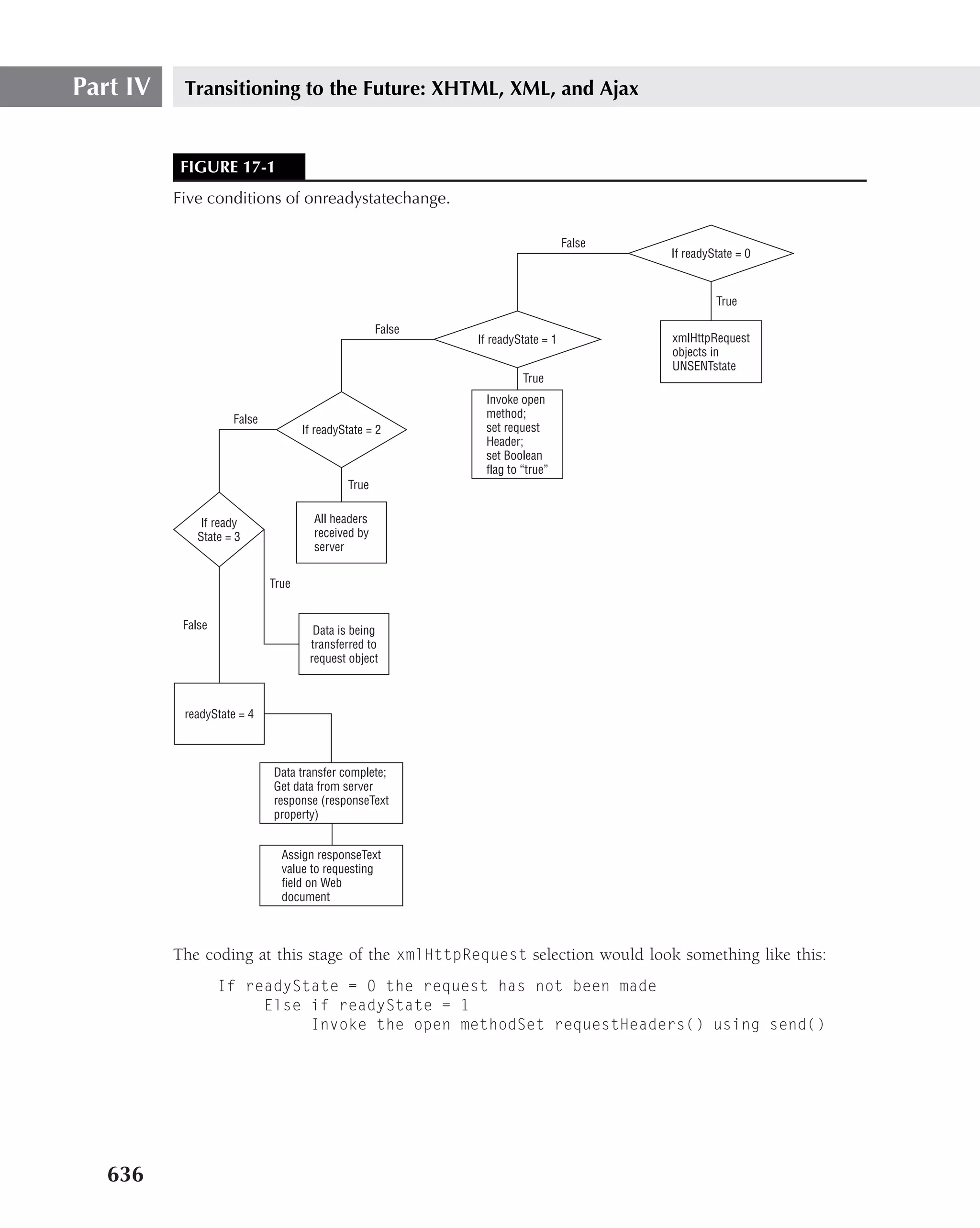
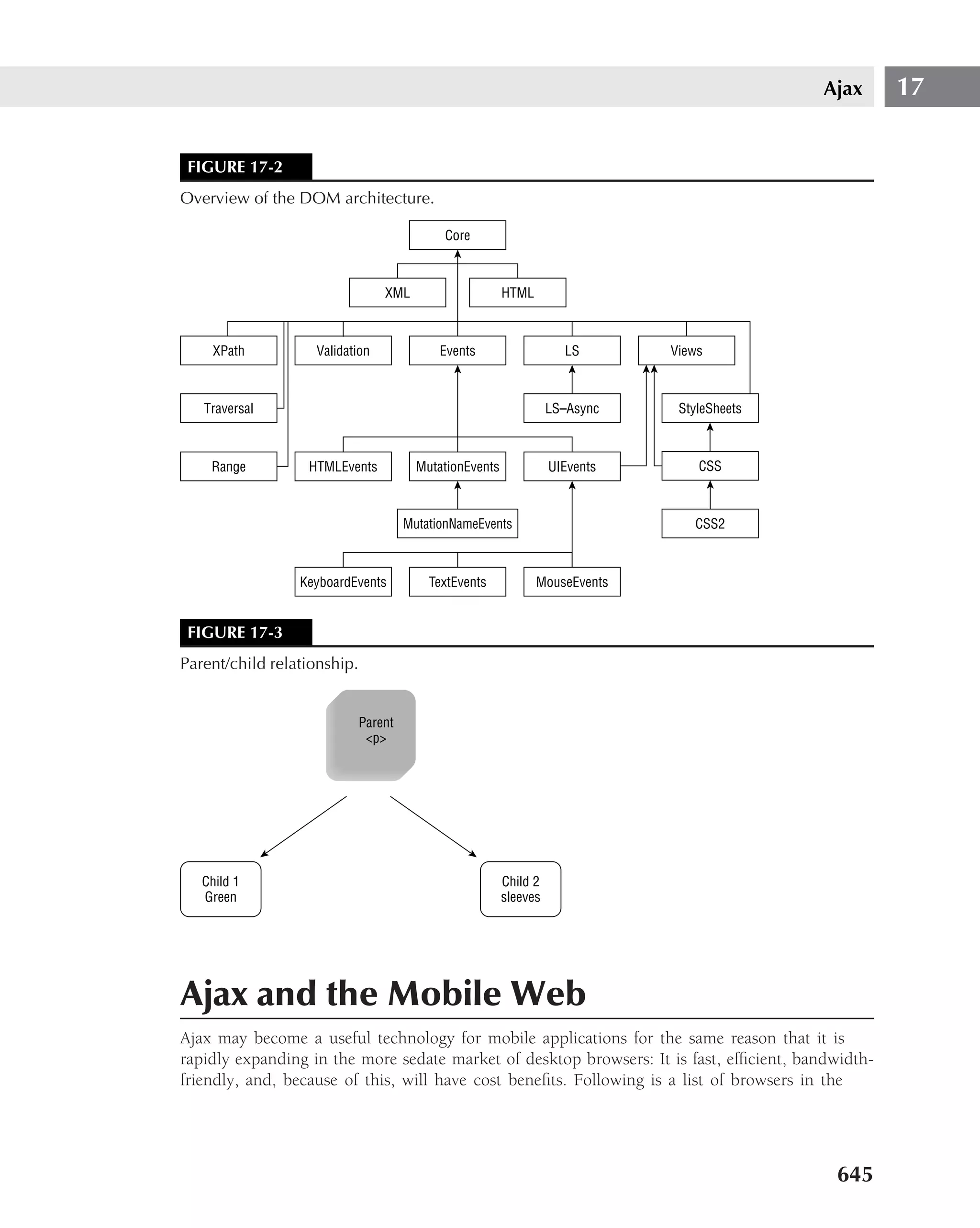
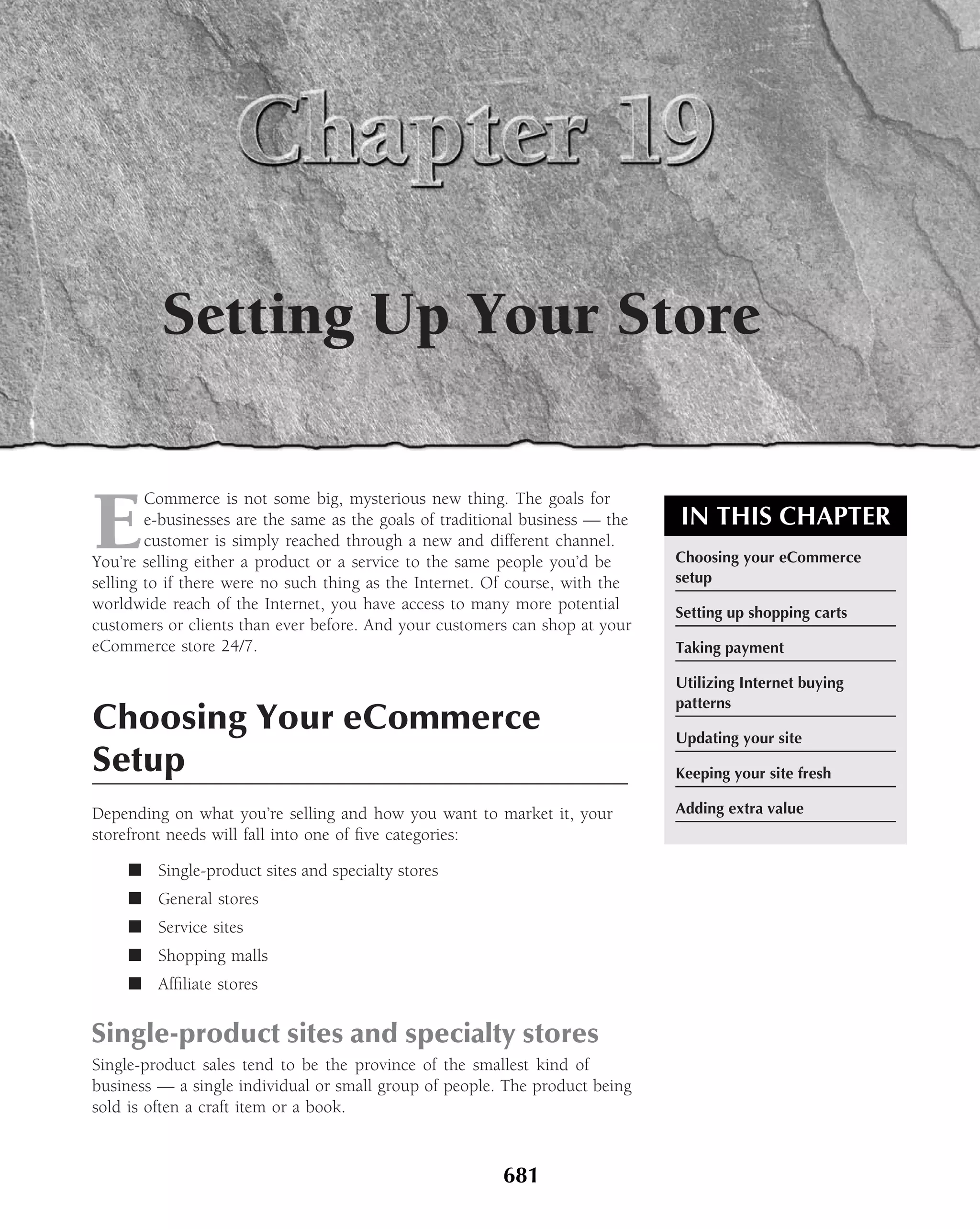
In the example Web site shown in Figure 4-5, the following is the complete underlying code
that is used to render the page:
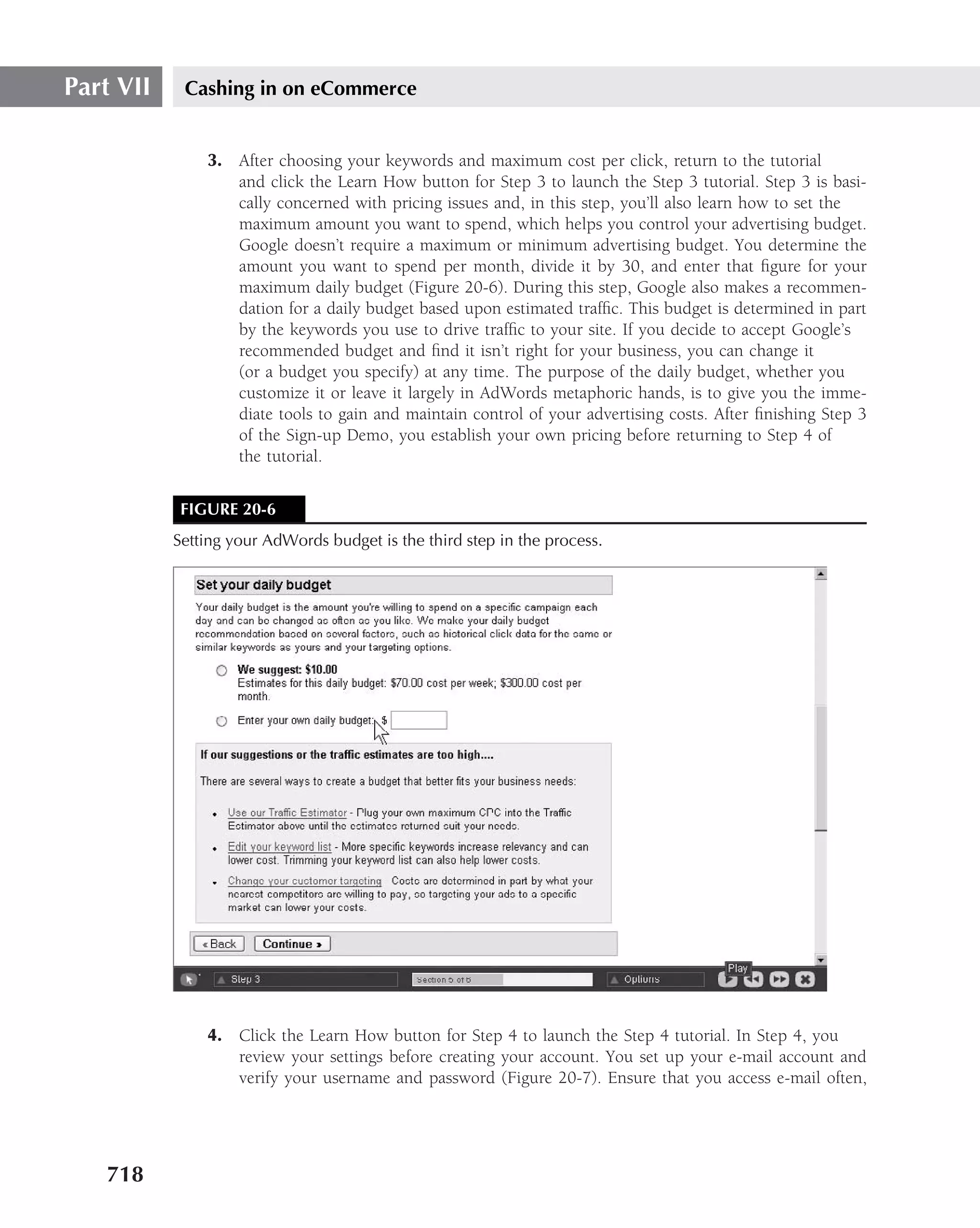
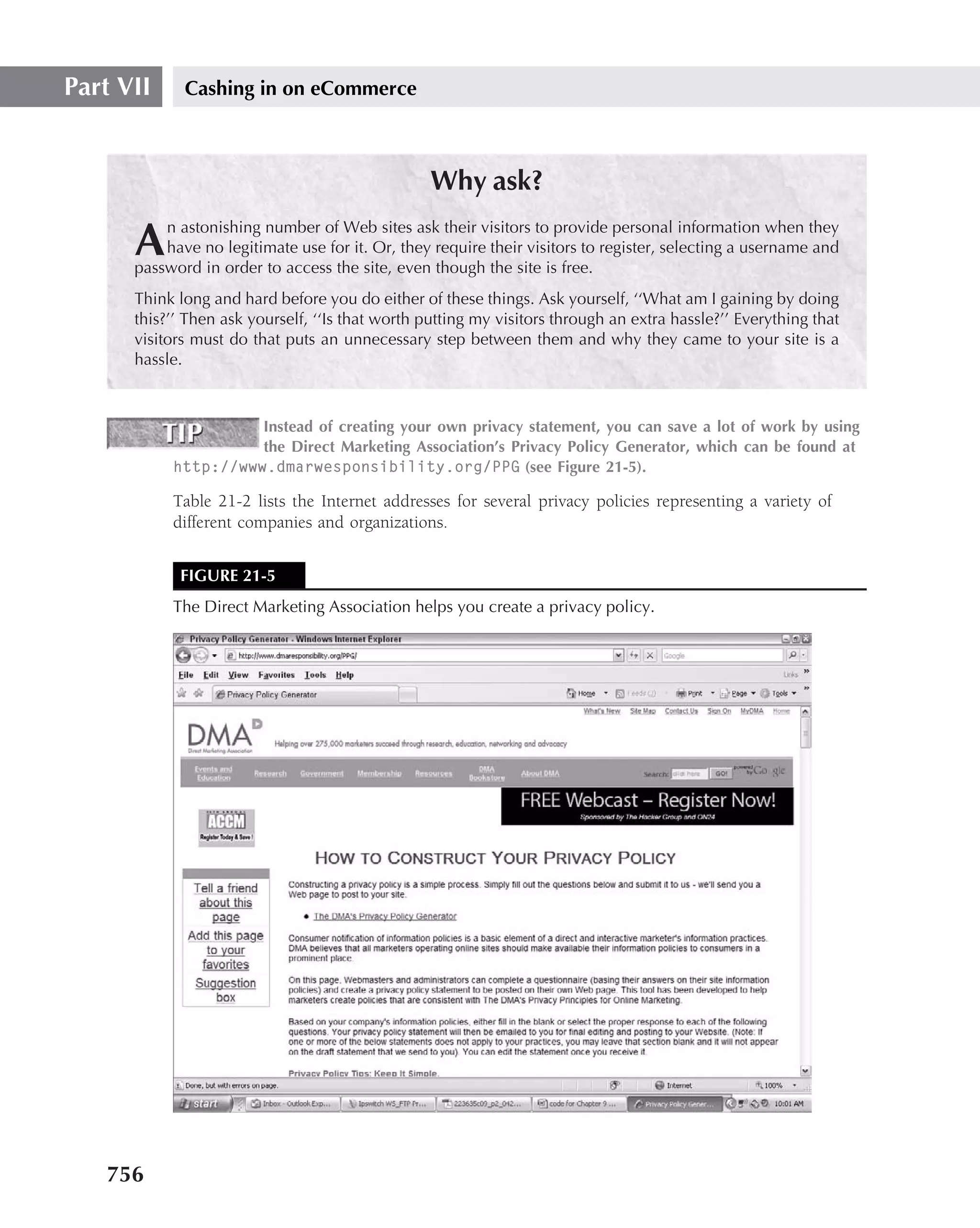
DOCTYPE HTML PUBLIC "-//W3C//DTD HTML 4.01 Transitional//EN"
"http://www.w3.org/TR/html4/loose.dtd"›
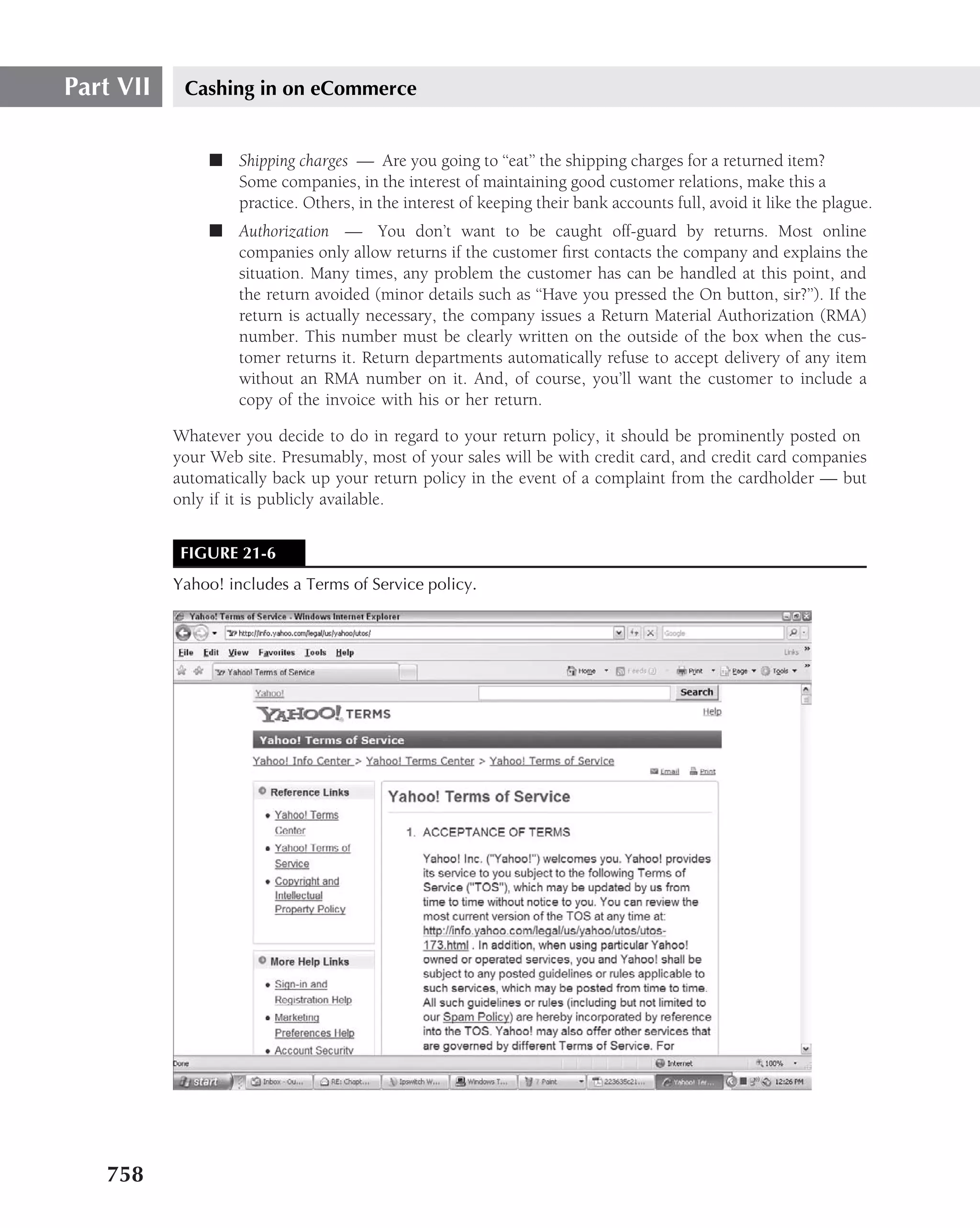
‹!-- Build: R12B015 --›
‹!-- Strand Id: 0114864306 --›
‹!-- layout( Wiley Homepage ) --›
‹html›
‹head›
‹link href="/WileyCDA/site/wiley2/include/style.css"
type="text/css"rel="stylesheet"›
‹title›
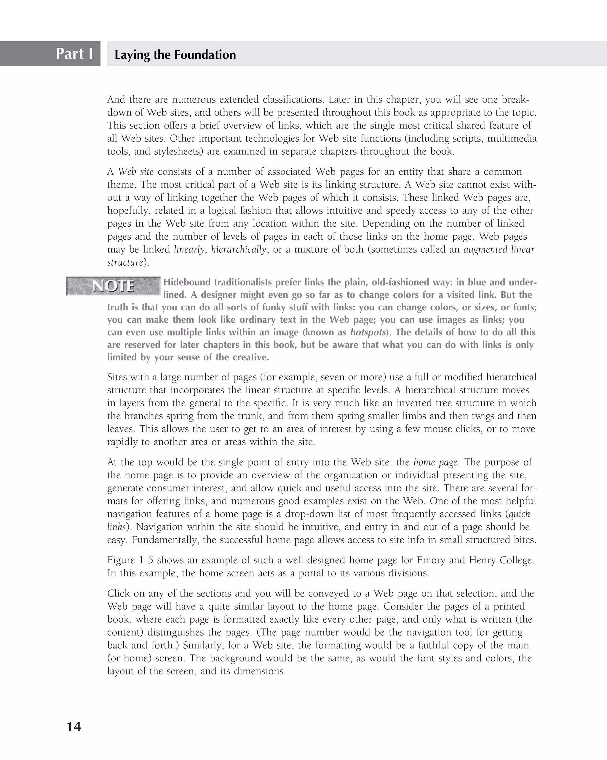
Wiley::Wiley
‹/title›
‹script language="javascript" src="/WileyCDA/site/shared/
form_validation.js" type="text/javascript"›
‹/script›
‹!--[if lt IE 7]›
‹link href="/WileyCDA/site/wiley2/include/style-ie.css"
rel="stylesheet" type="text/css"›
‹![endif]--›
‹/head›
‹body›
‹div id="page"›
‹!-- dynamicFeature ( ref:SITE_SPECIFIC_NAV ) --›
‹!-- BEGIN HEADER --›
‹script language="JavaScript"›
function do_check (form) {
if (form.query.value=="") {
alert(’Please make an entry in the product search
field.’);
return false;
} else {
84](https://image.slidesharecdn.com/creating-web-sites-bible-jun-2008-100327061205-phpapp01/75/Creating-Web-Sites-Bible-Jun-2008-120-2048.jpg)

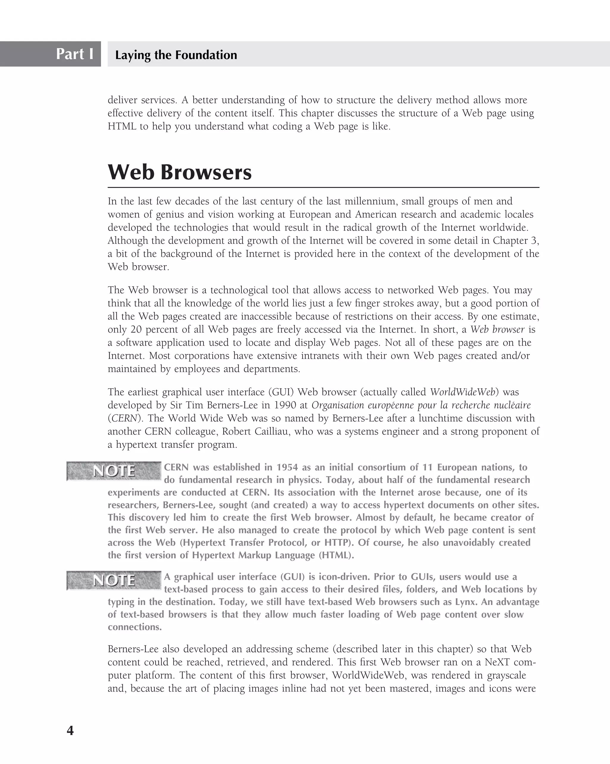
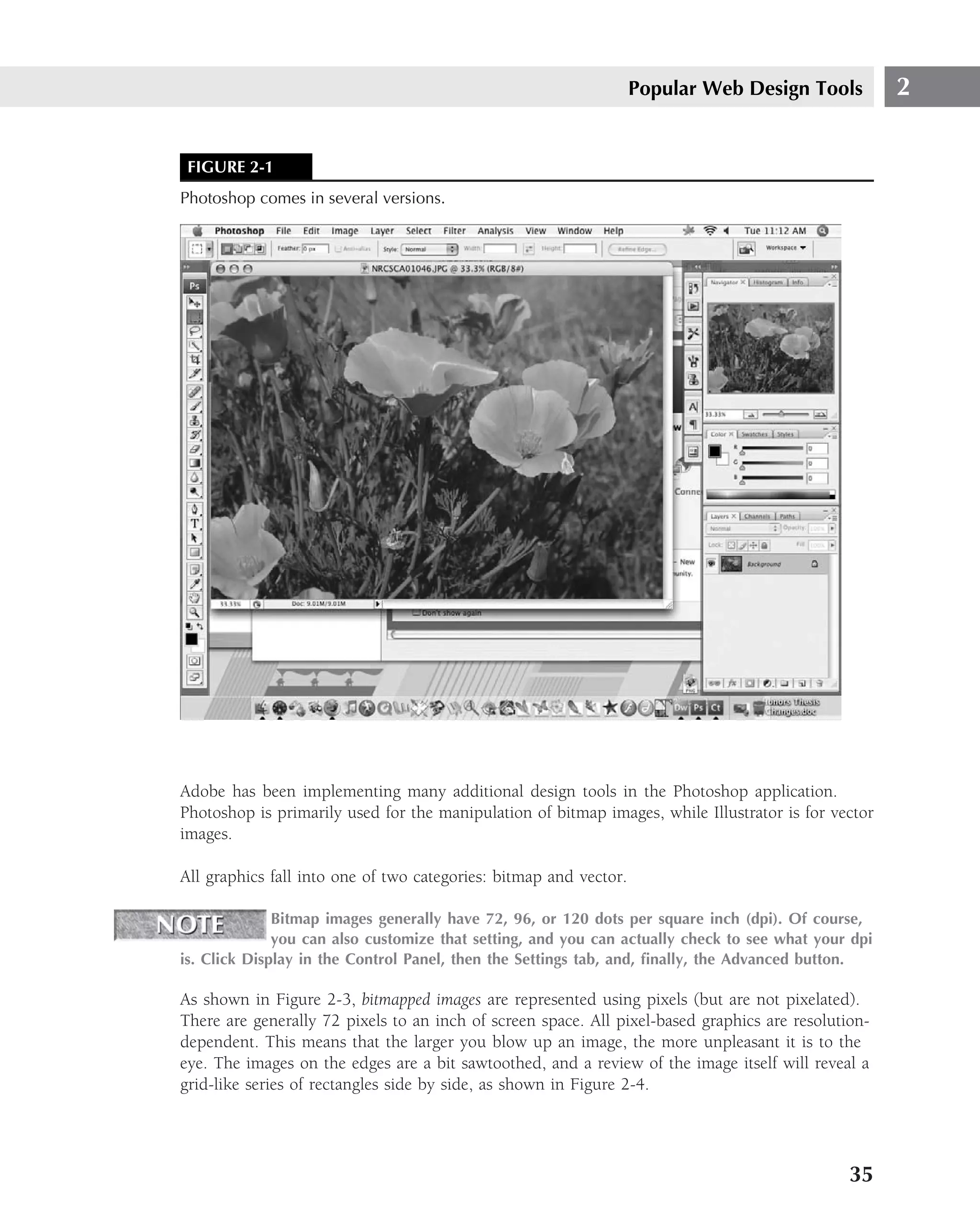
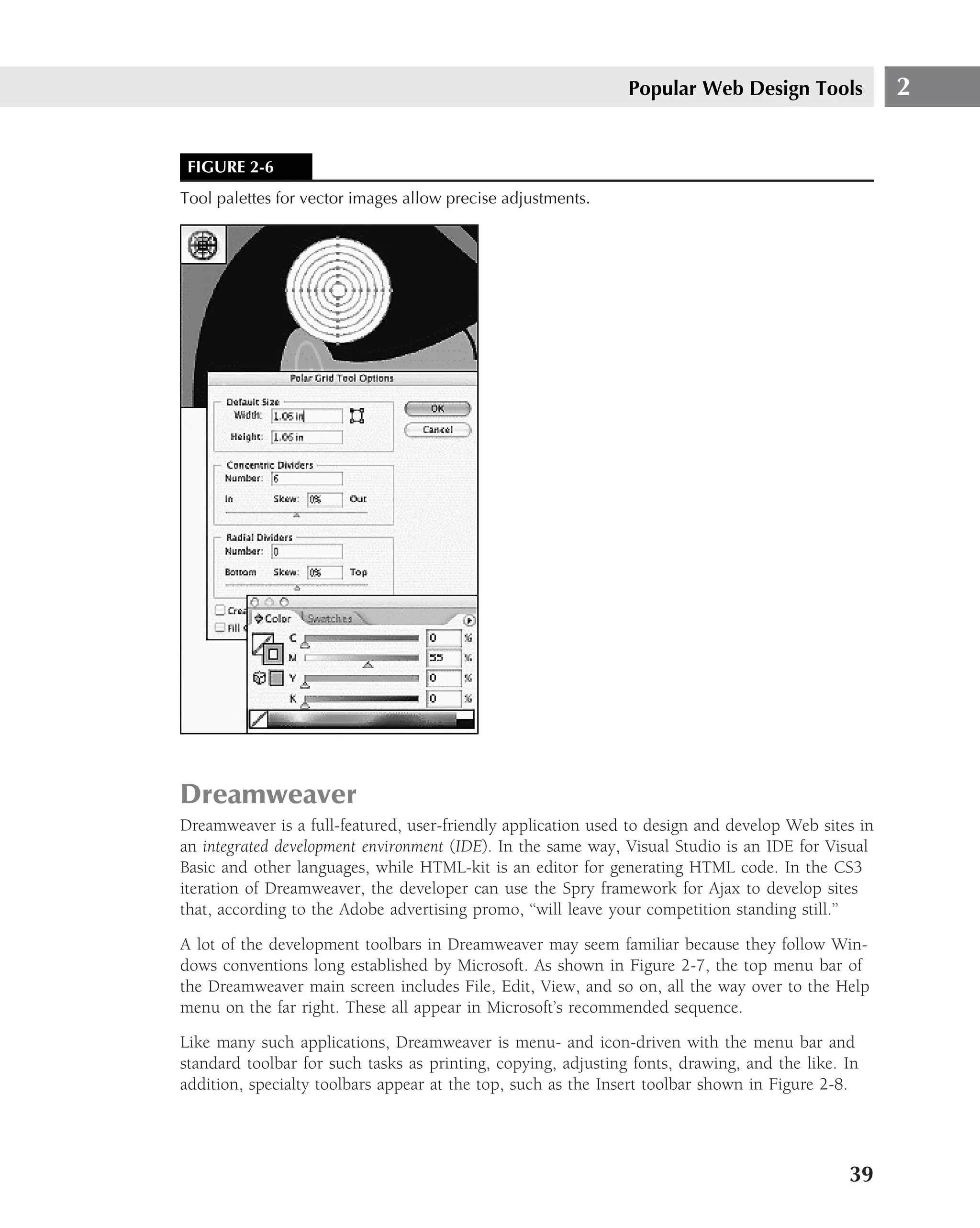
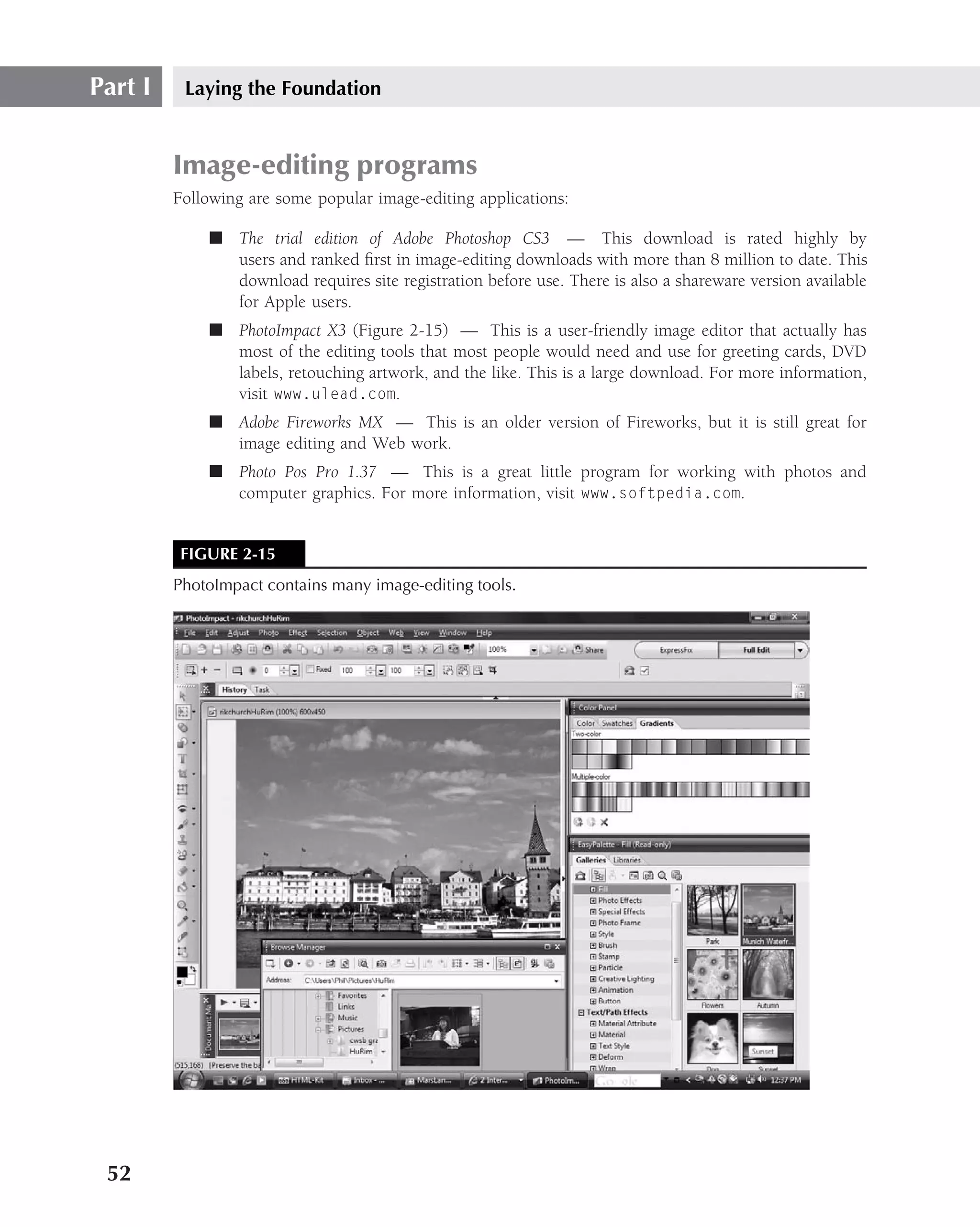
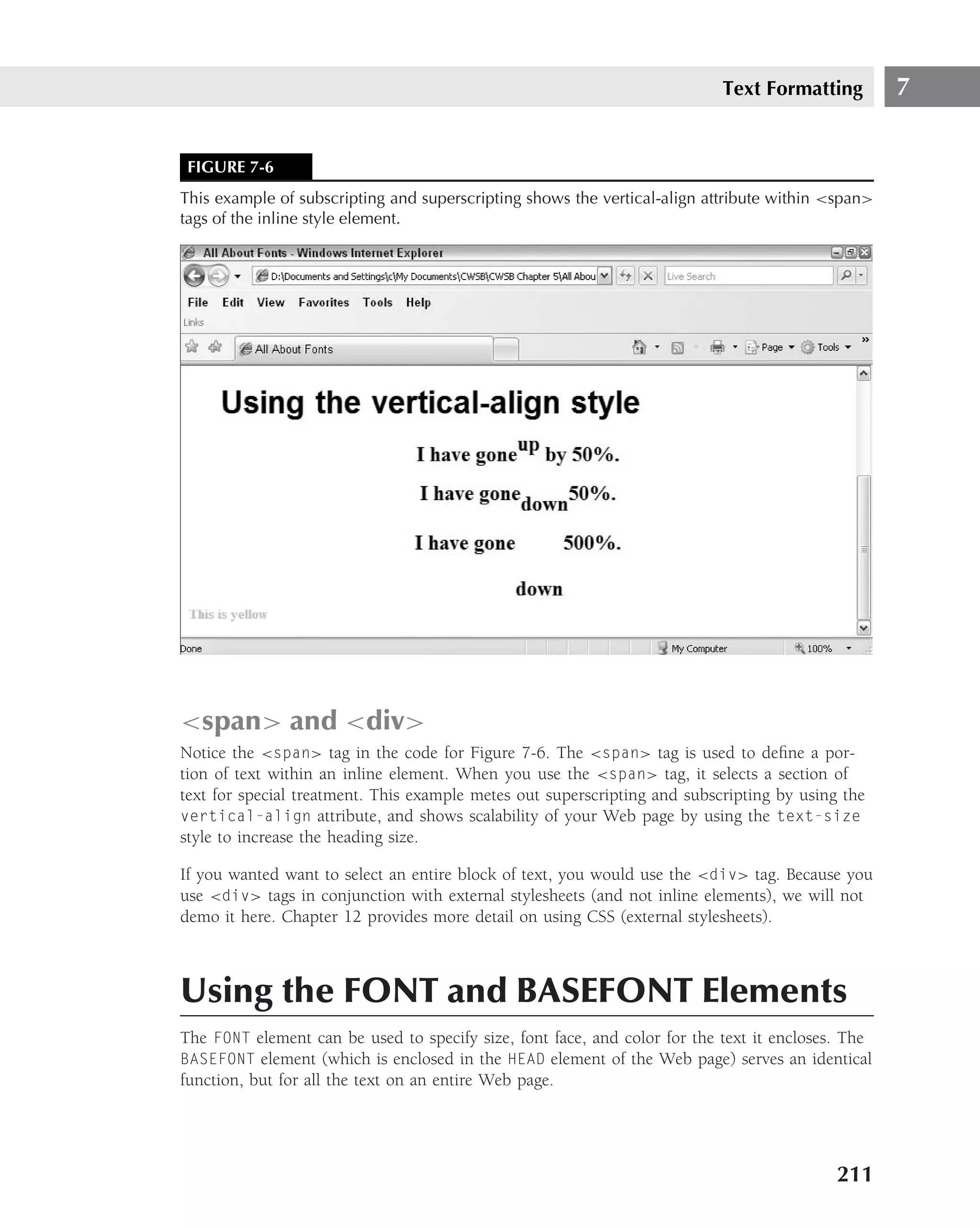
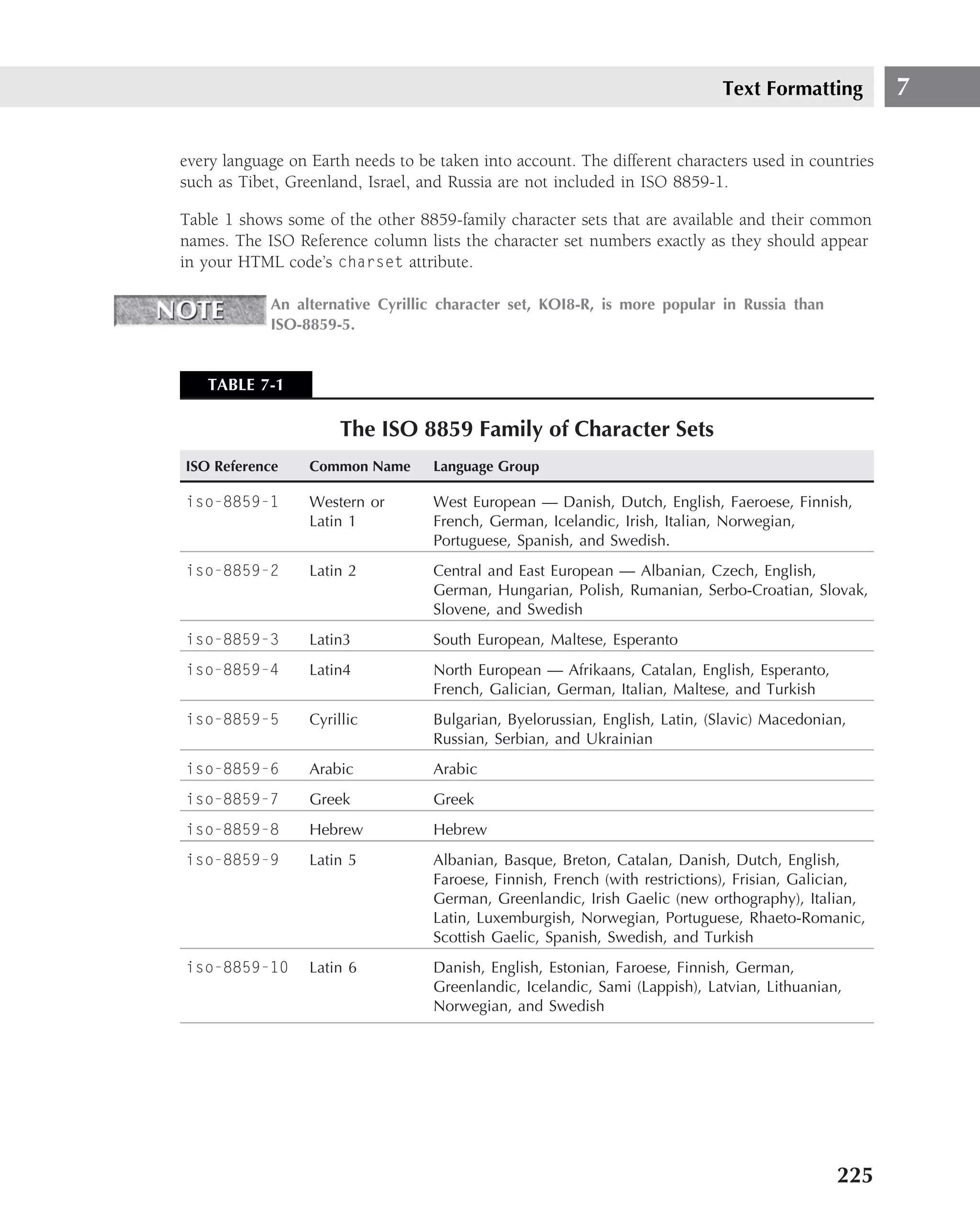
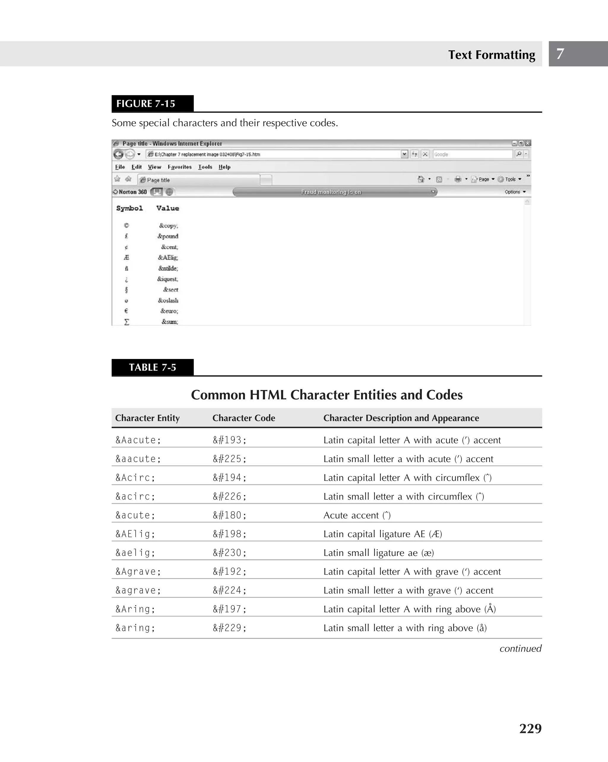
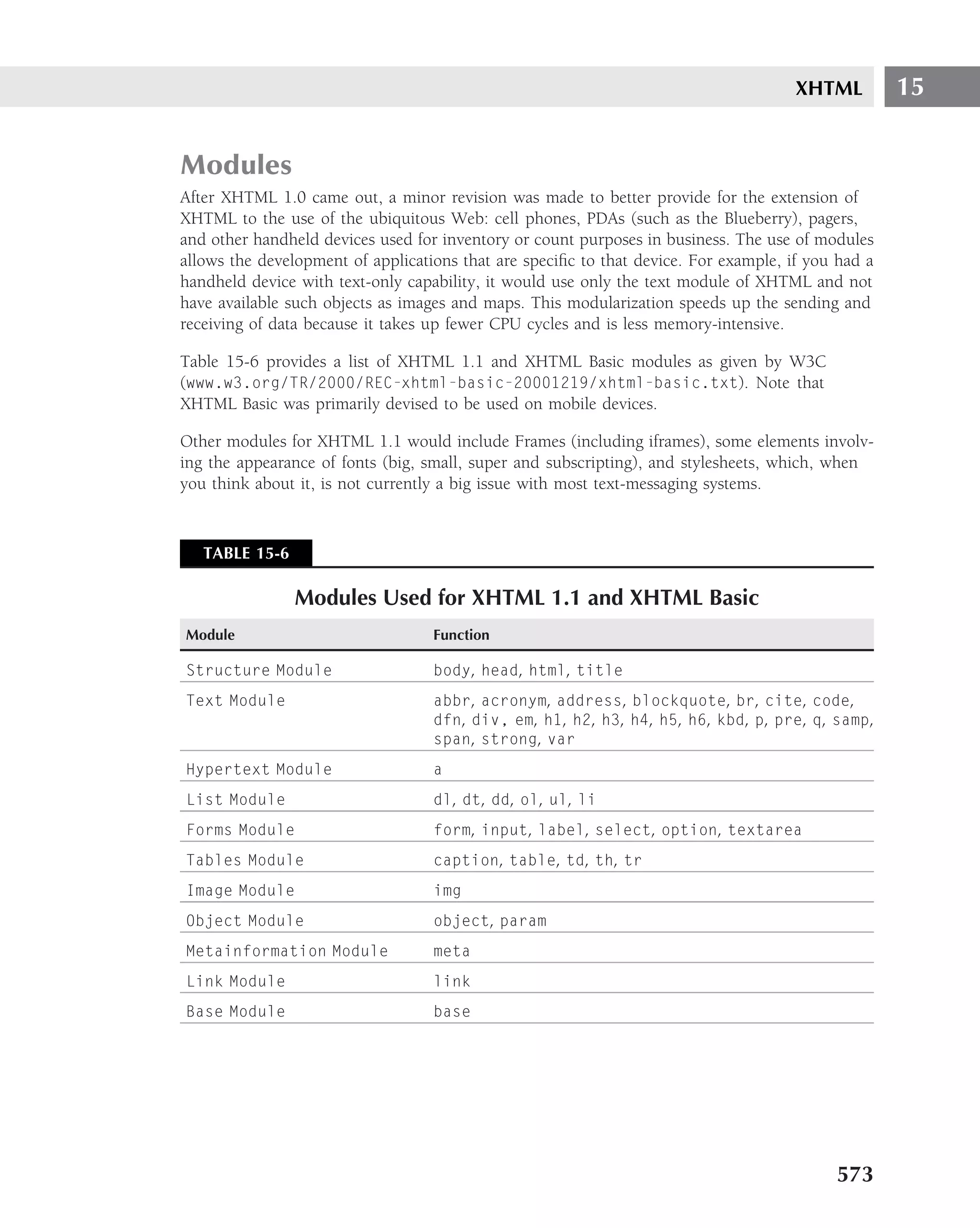
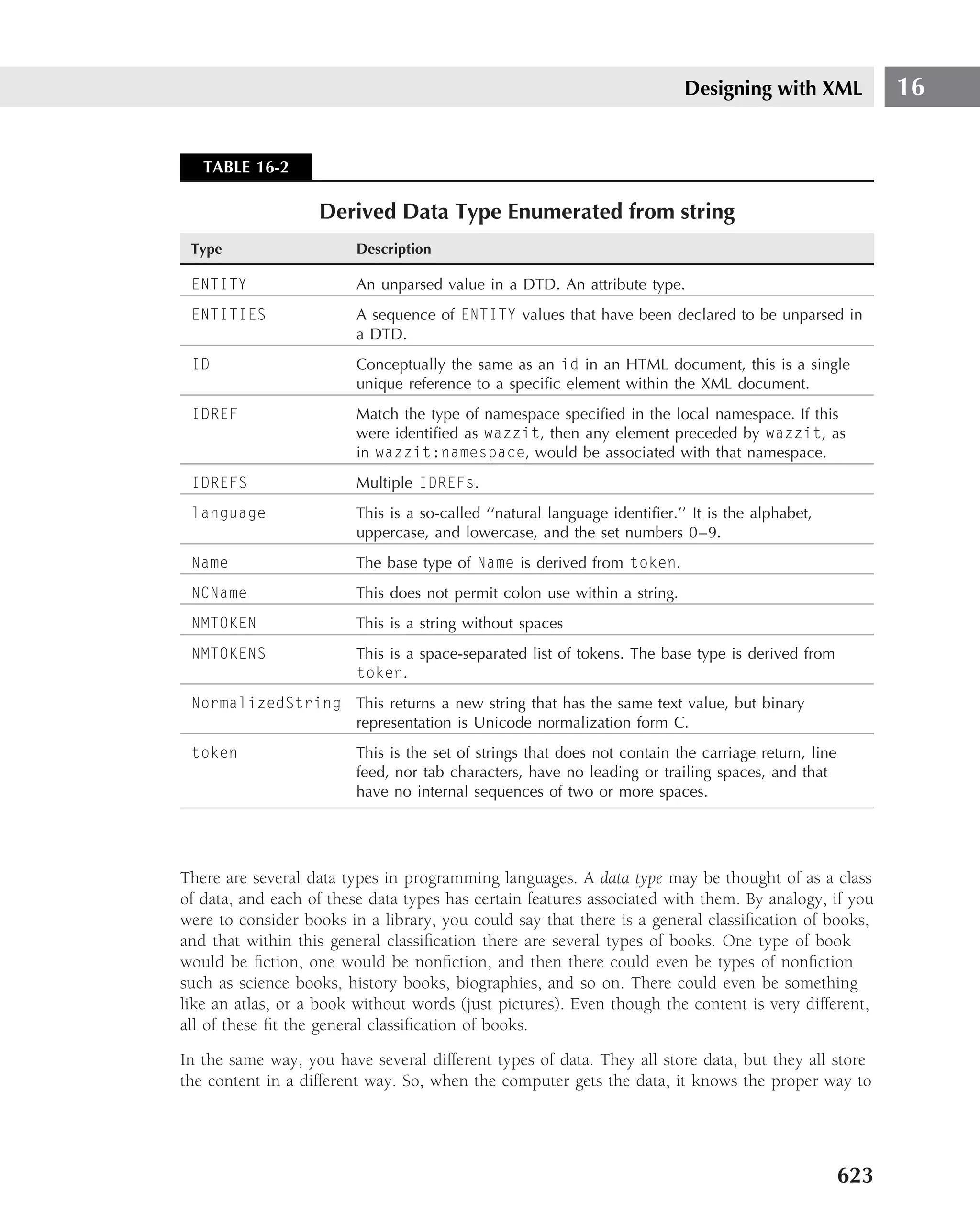
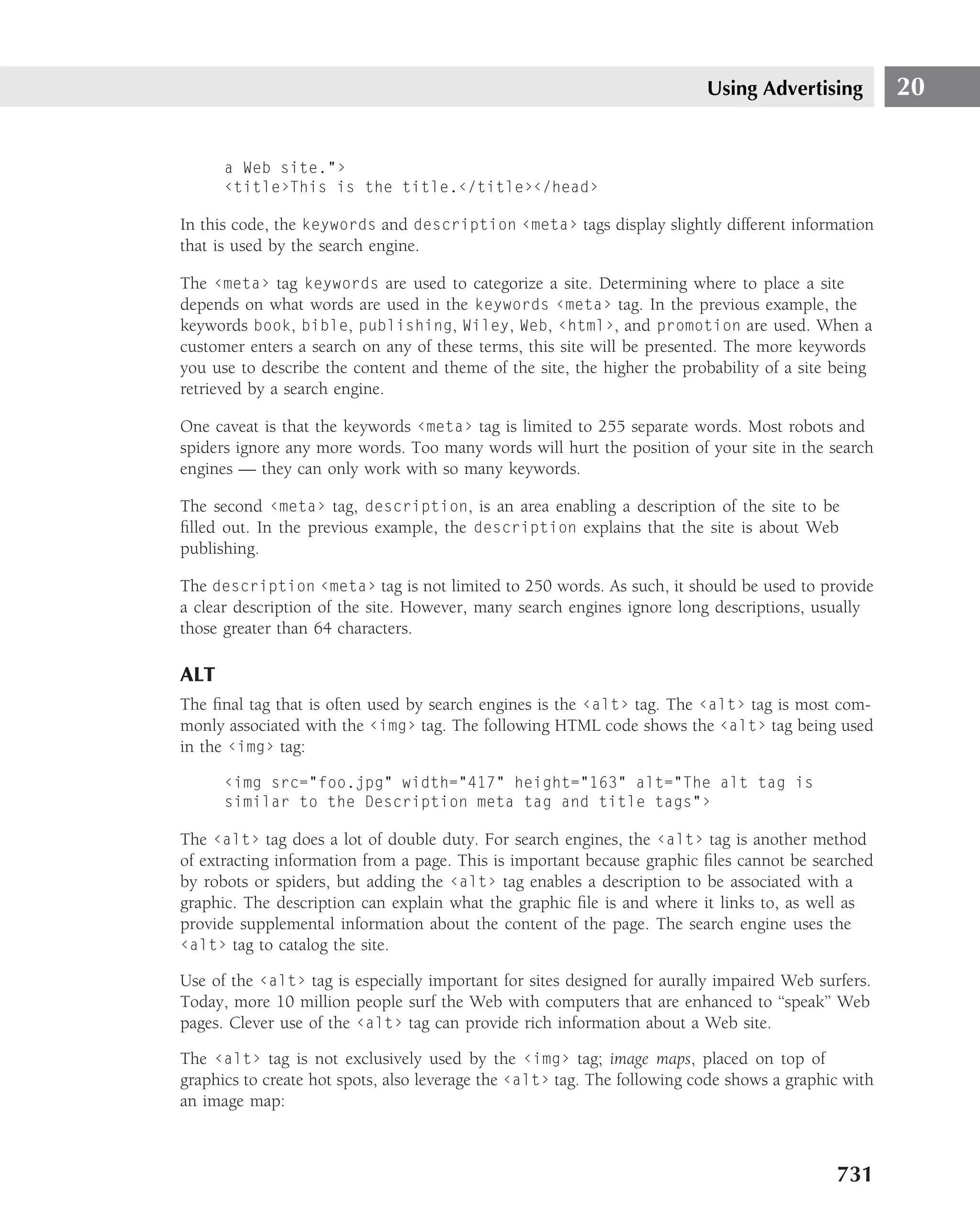
![HTML Building Blocks 4
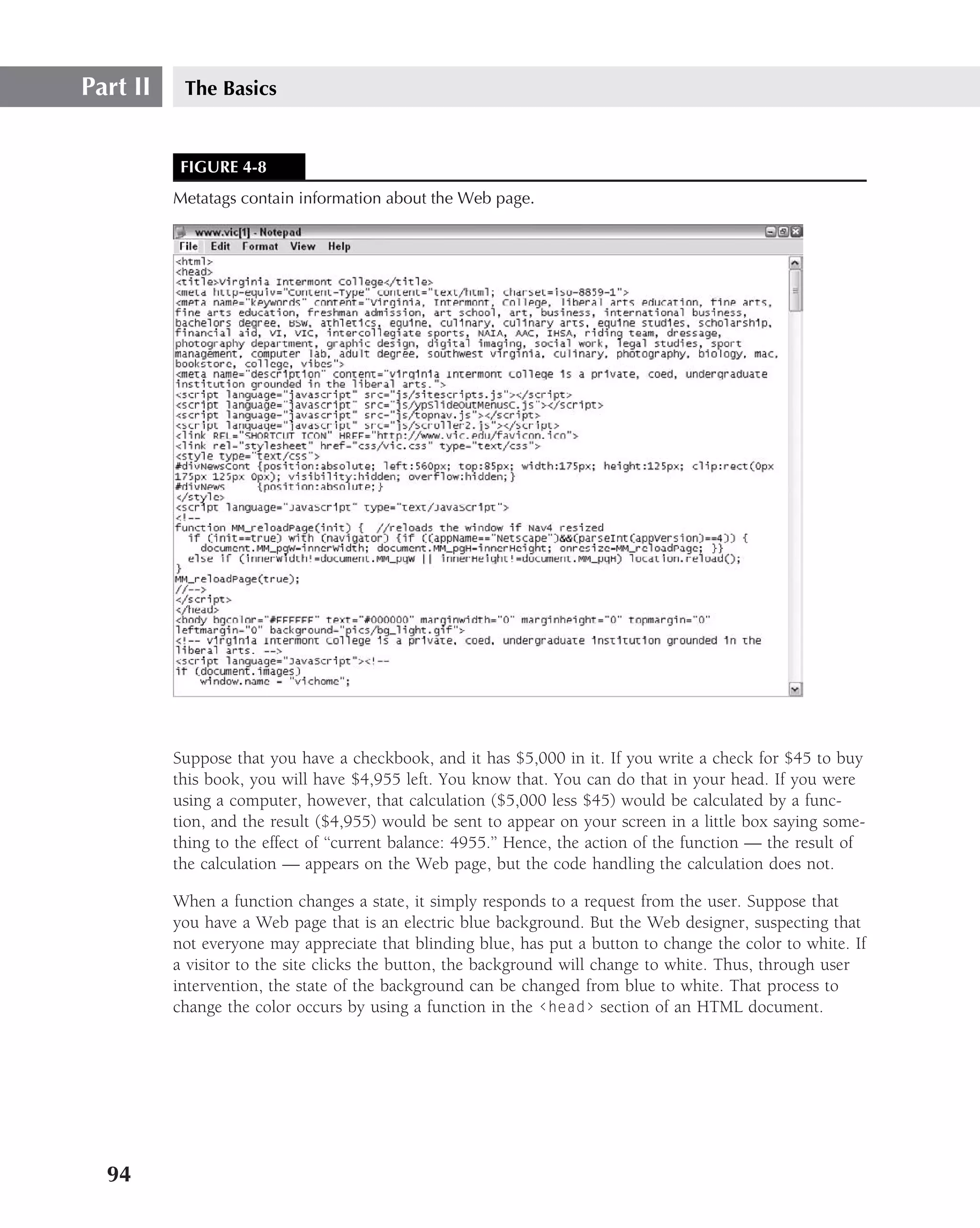
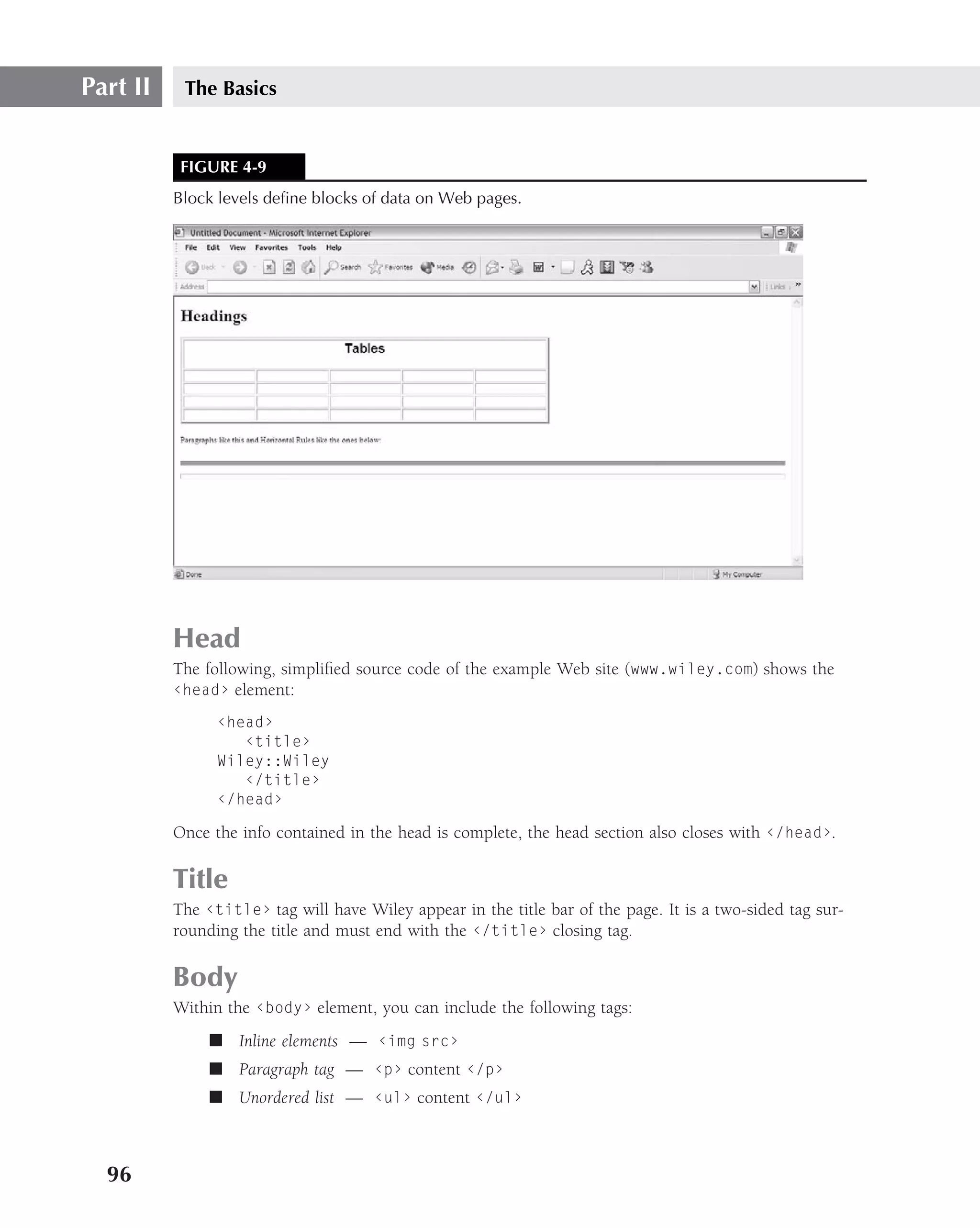
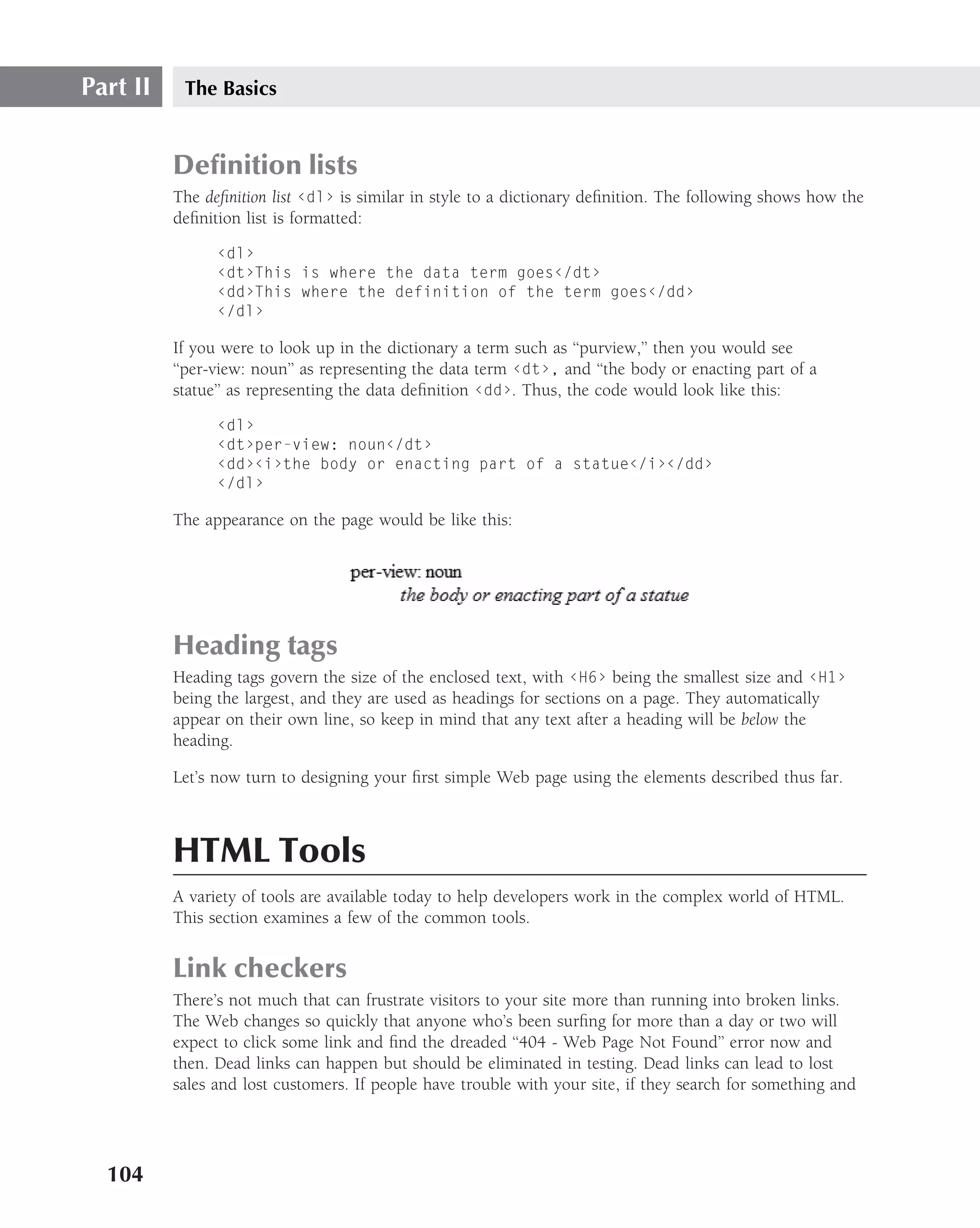
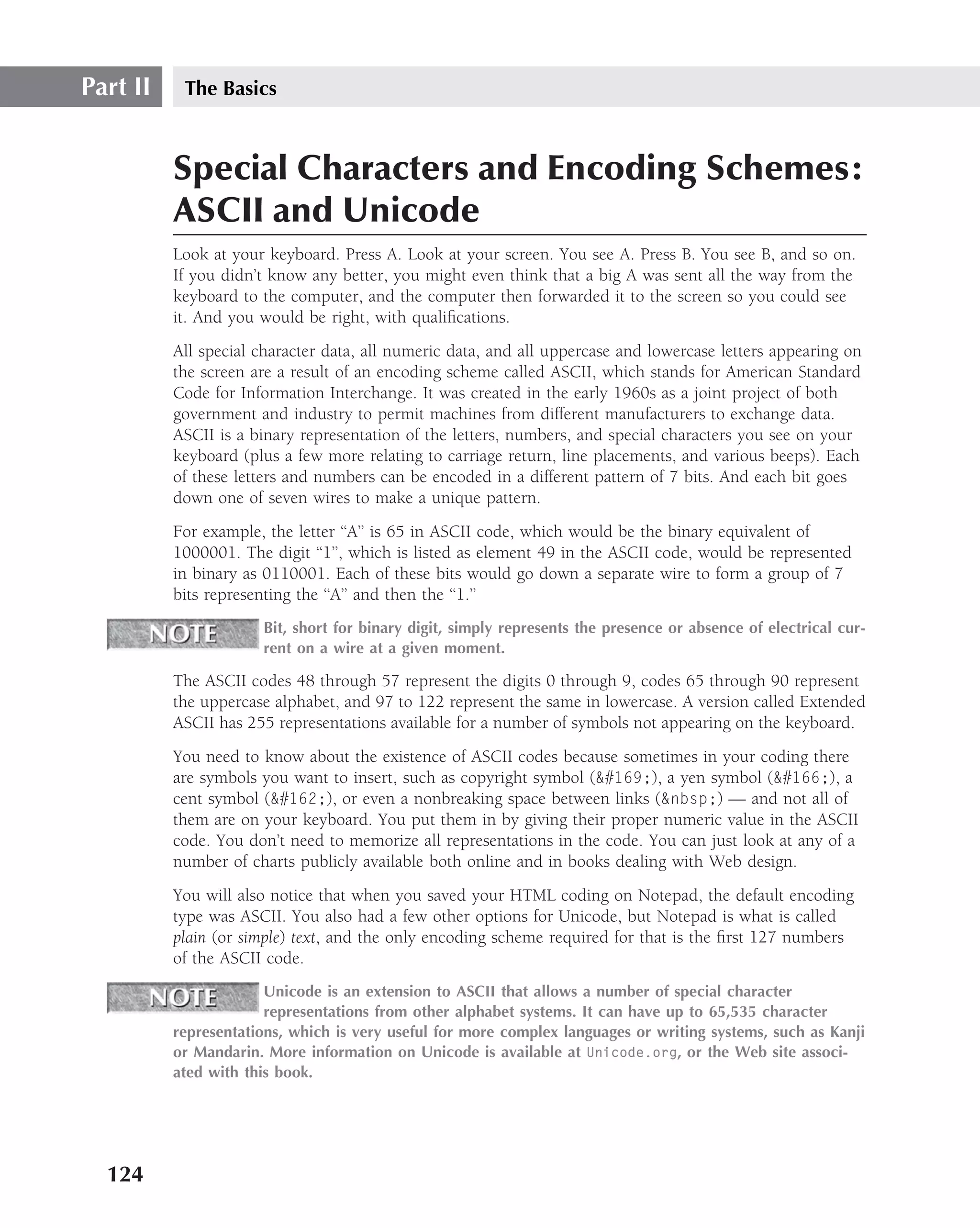
<head> section
Within the ‹head› tags are the nonprintable elements of the Web page. These would be the
description of the Web page, including statement of purpose, date, last created/modified ver-
sion, programmer information set off by comment tags, and any associated meta tags (metadata).
Comment tags are set off by using the following format:
‹!-- This is where you make a comment --›
Comments
Comments may be multi-line and only cease when the end tag --› is inserted. The program
does not read or interpret comments as executable code. It simply skips over the commented
lines. Here is an example of a comment section giving info about the program and
programmer:
‹!--This web page was constructed by John Q. Programmer on July 4,
2007. Its purpose is to demonstrate the use of the following
common tags: ‹hr›, ‹p›, ‹ol›, ‹ul›, ‹li›, ‹address› --›
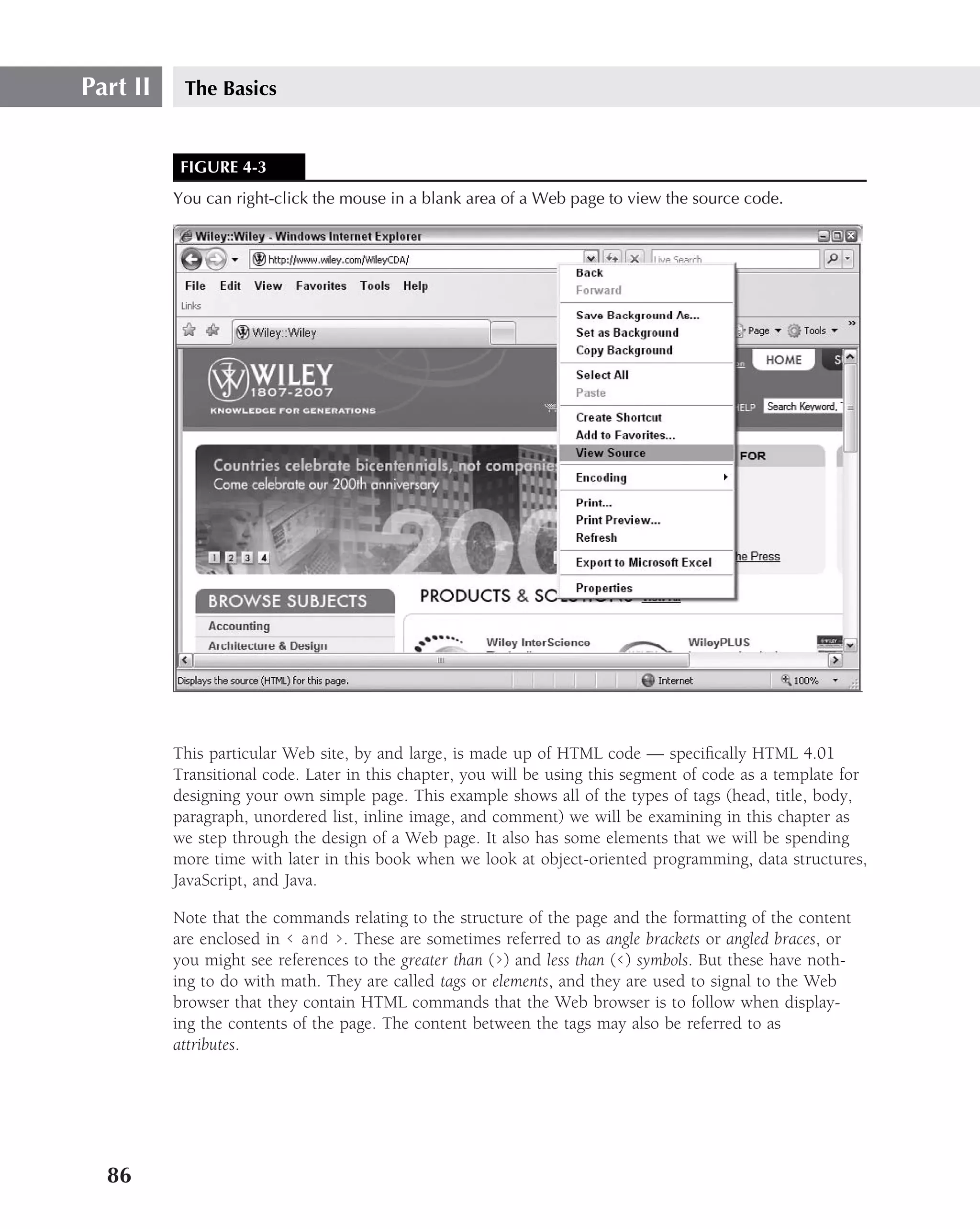
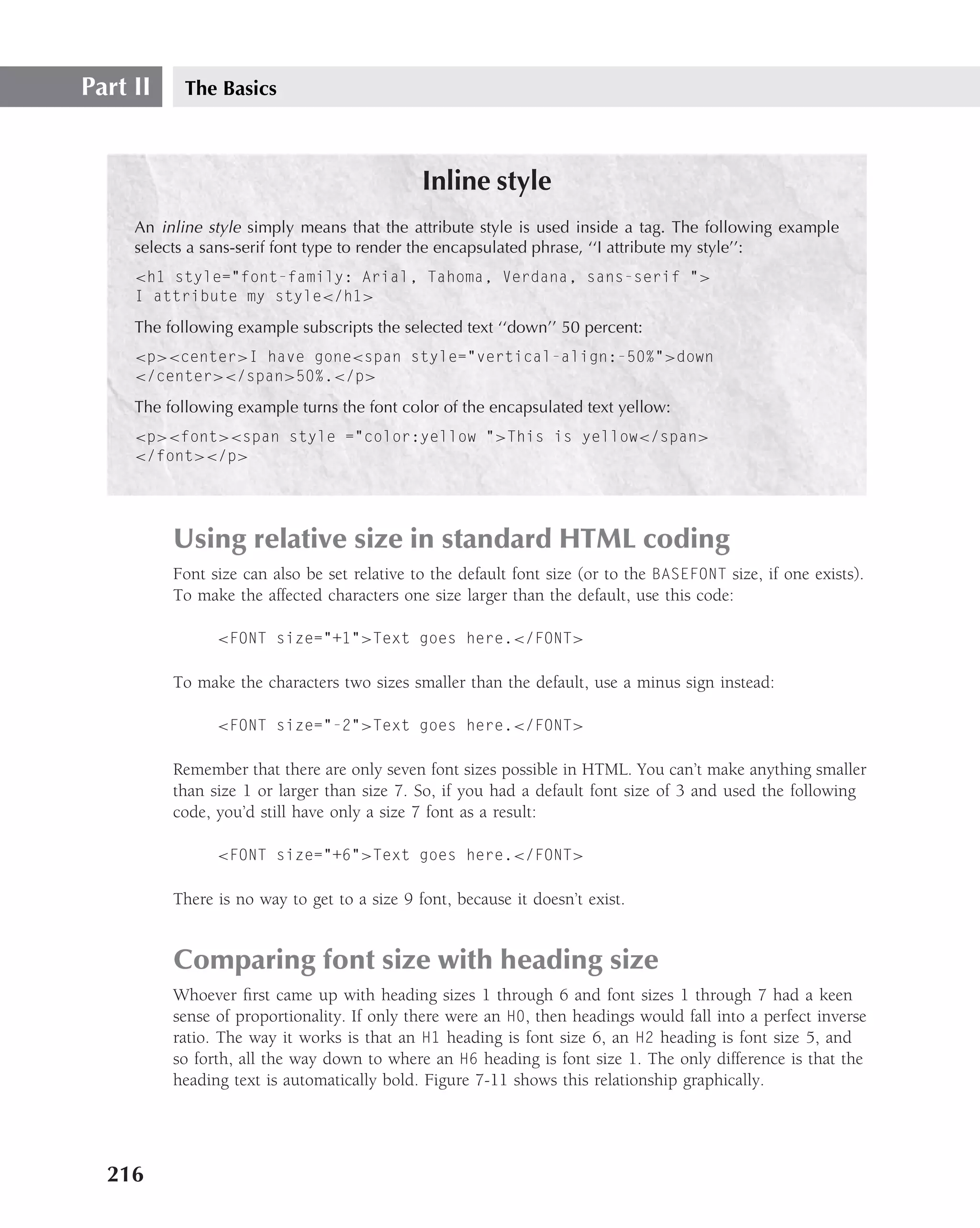
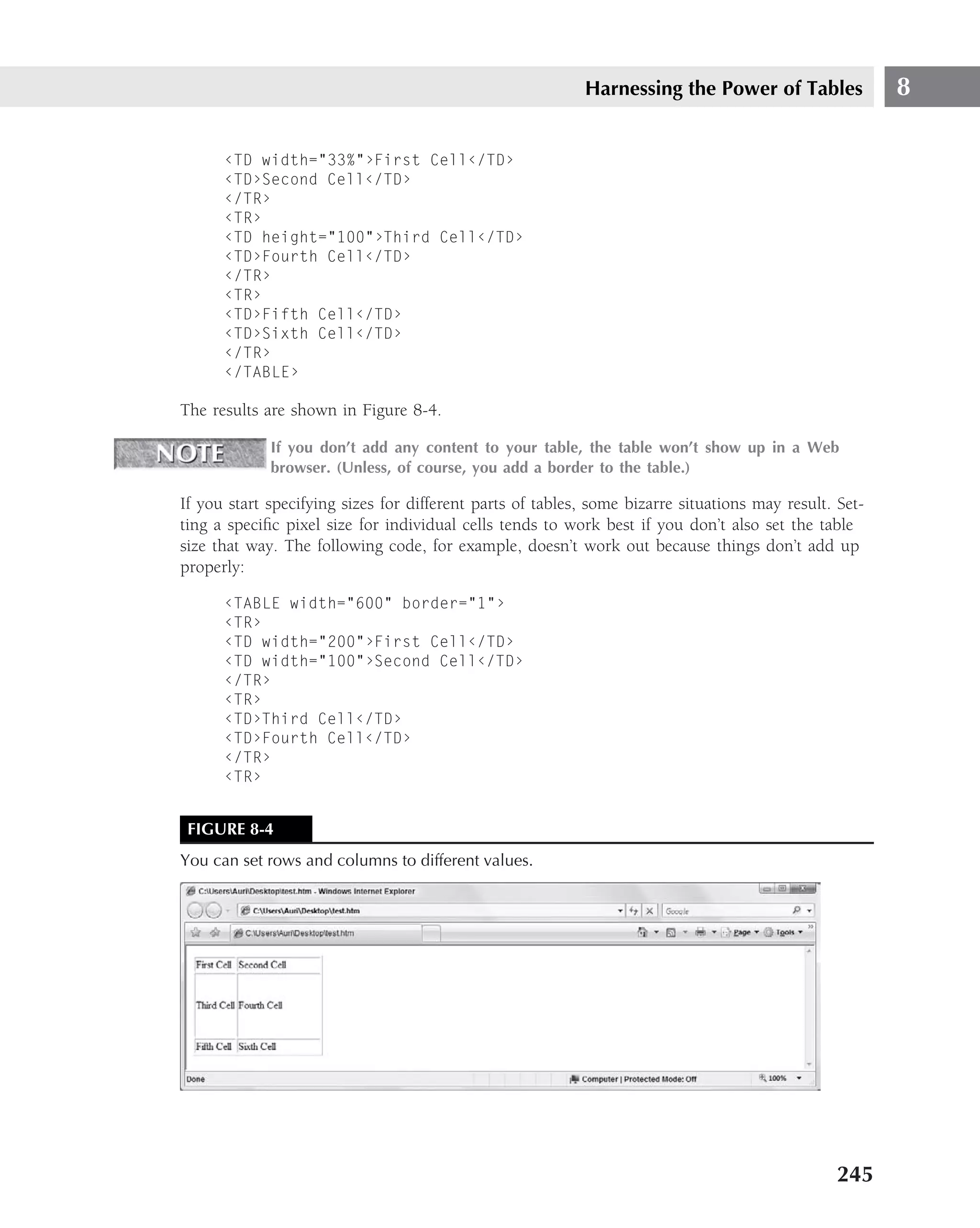
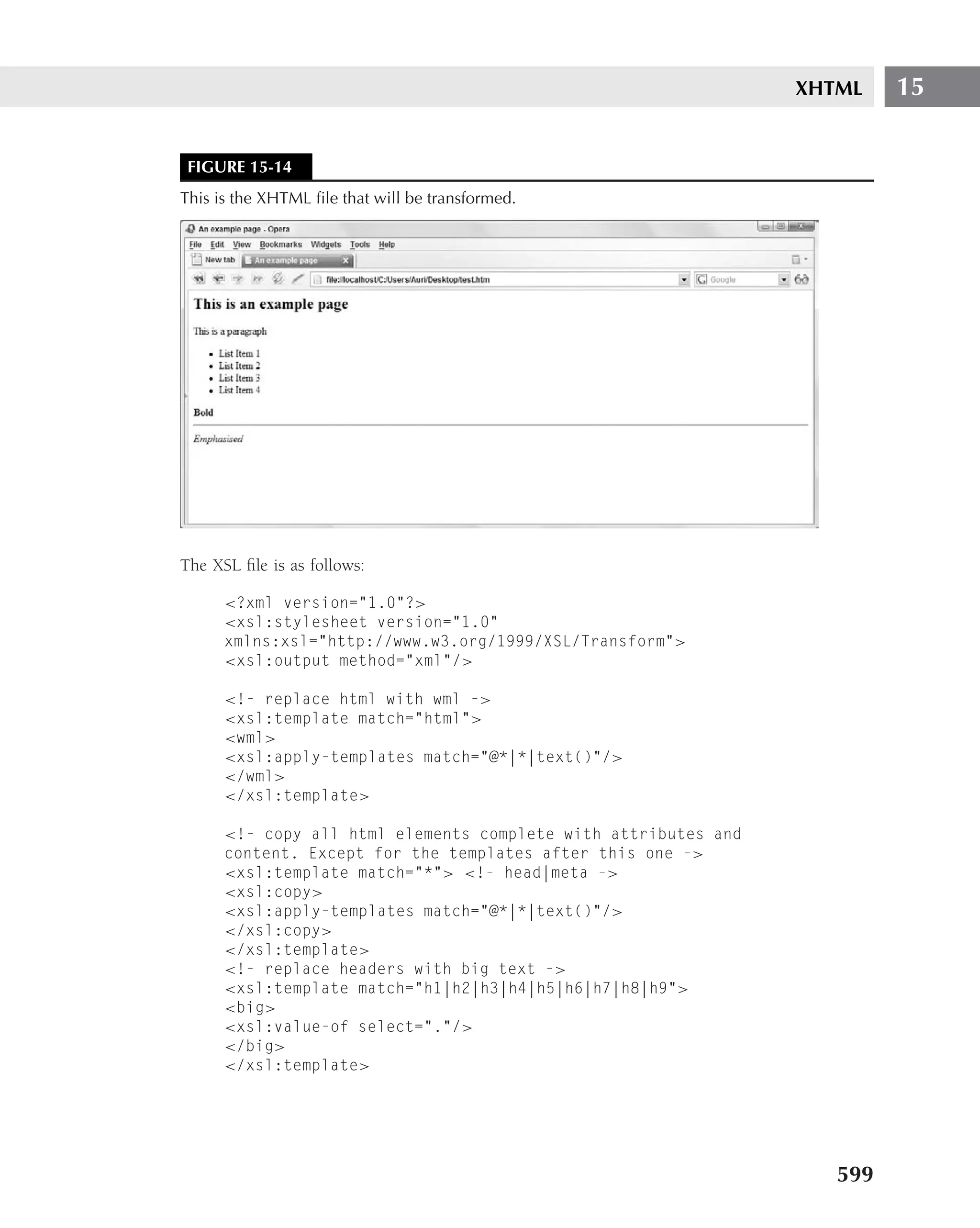
Here is a section of actual comment code from the head of the example Web site (Figure 4-1):
‹!--[if lt IE 7]›
‹link href="/WileyCDA/site/wiley2/include/style-ie.css"
rel="stylesheet" type="text/css"›
‹!--[endif]--›
What this says in English is that if this Web browser trying to access the site is less than IE 7.0,
then link it to the Internet Explorer styles page located at the address listed in the href. That’s
all (endif).
Comments may also appear in the ‹body› block of the document where they would be used to
briefly explain the purpose of a subsection of the program (such as a subroutine, subprogram,
submodule, and so on). Comments may also explain the next iteration or the setting of flags for
a decision structure, or explain the values of a multivalued variable in a case structure. The fol-
lowing is an illustration of a comment regarding a function call:
‹!--This case structure is to allow users to input which direction
they want to move player on a map --›
‹script›
/* This is a JavaScript function and the commented section uses this
comments tag */
switch(direction)
{
case ’n’:
go_north();
91](https://image.slidesharecdn.com/creating-web-sites-bible-jun-2008-100327061205-phpapp01/75/Creating-Web-Sites-Bible-Jun-2008-127-2048.jpg)
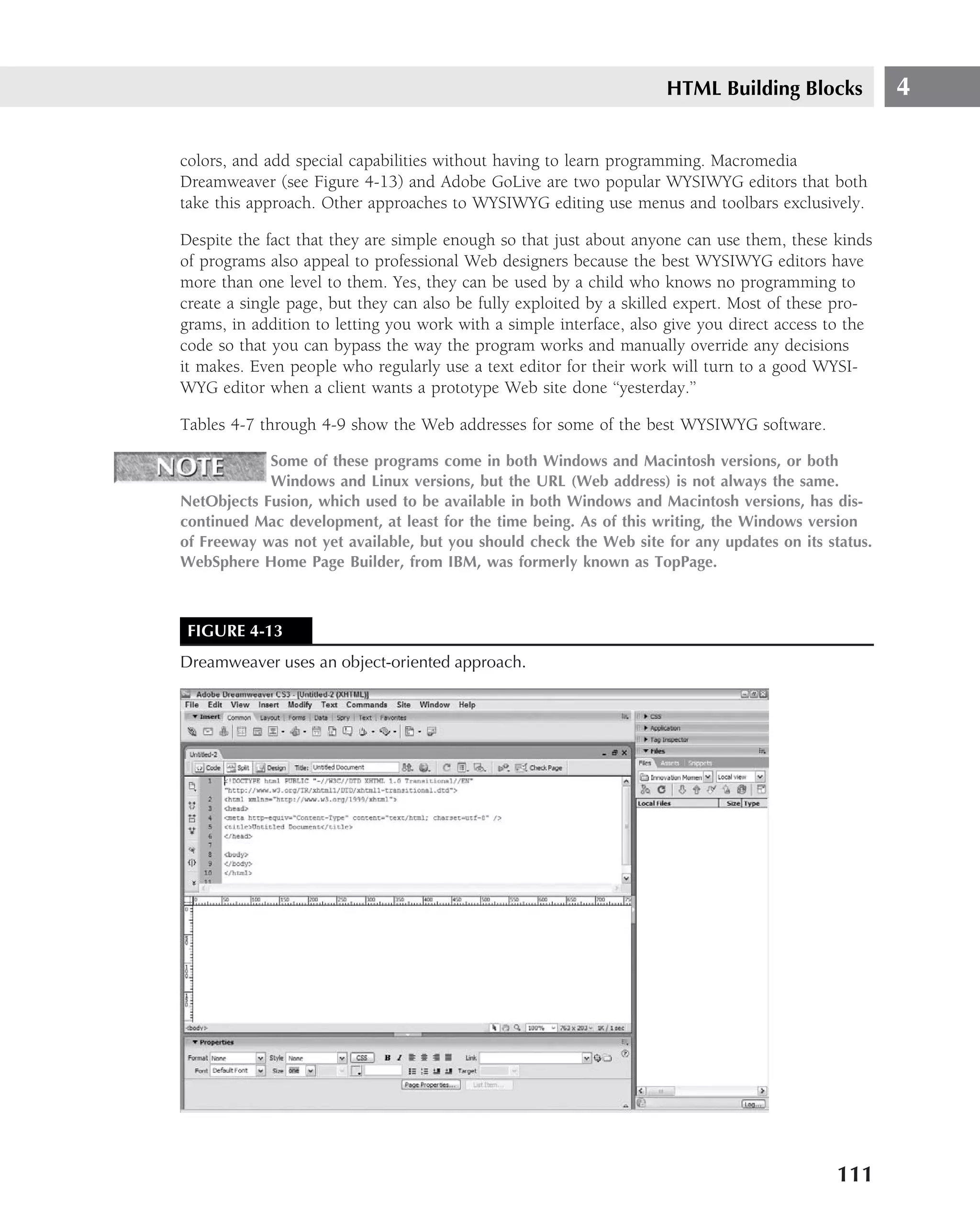
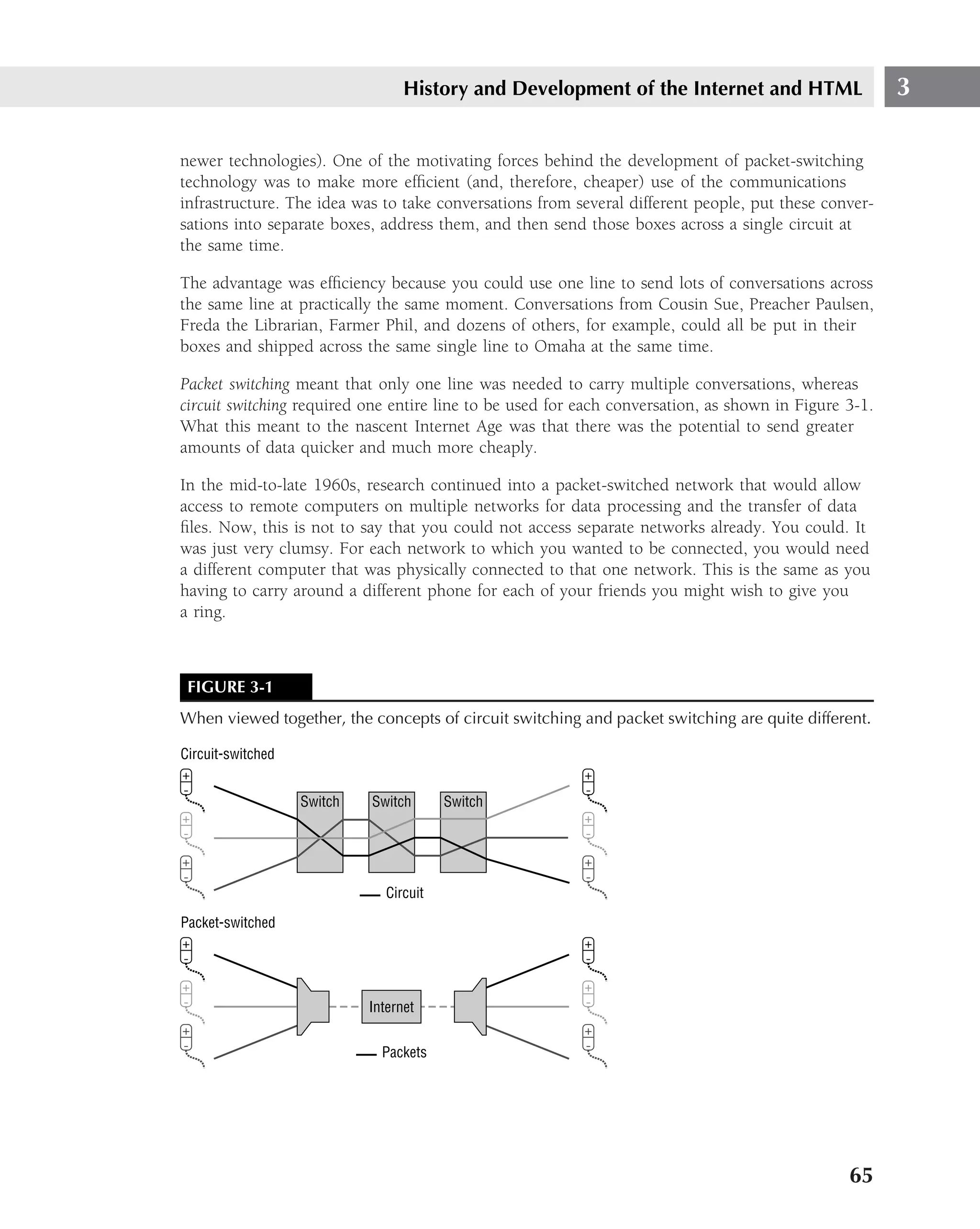
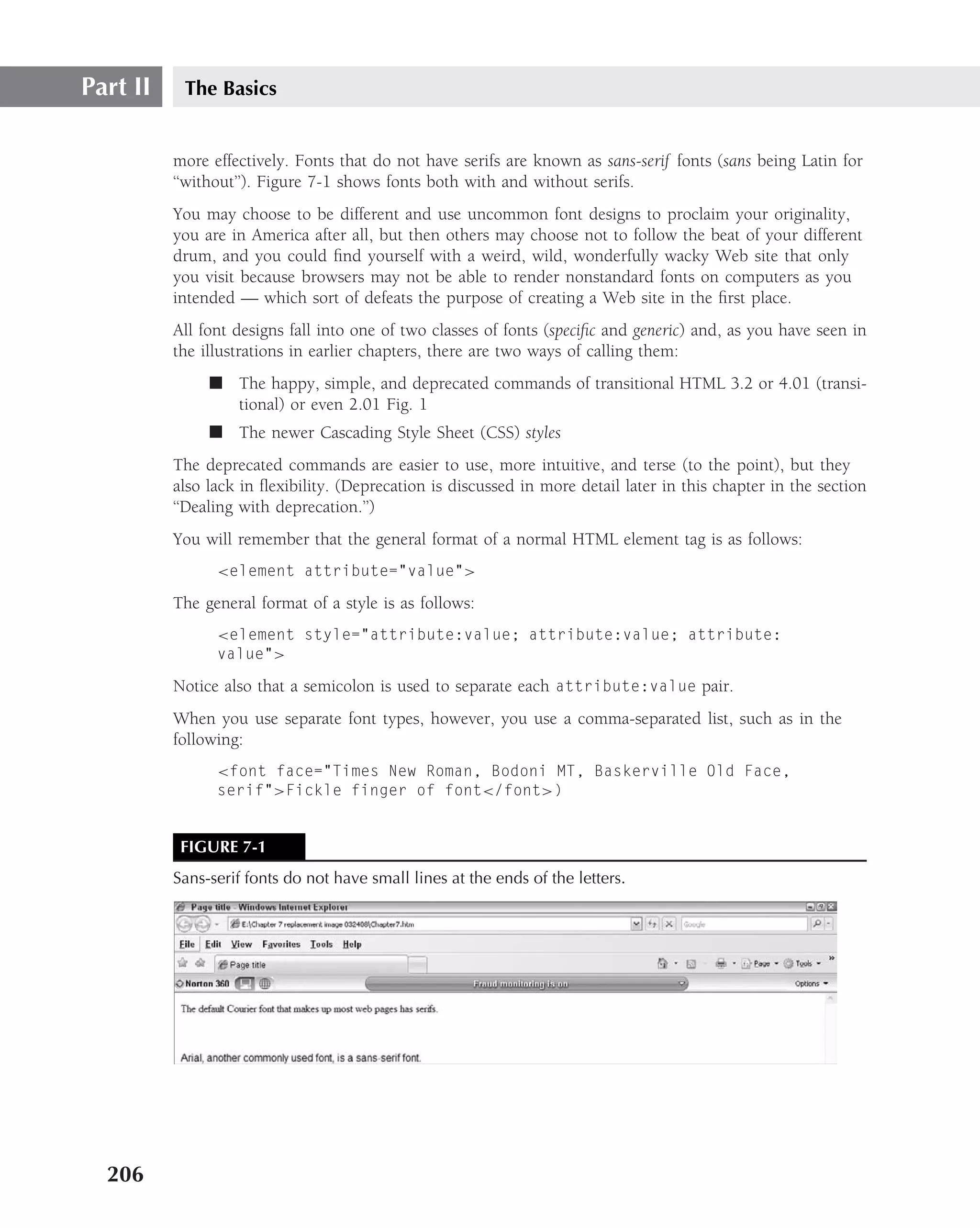
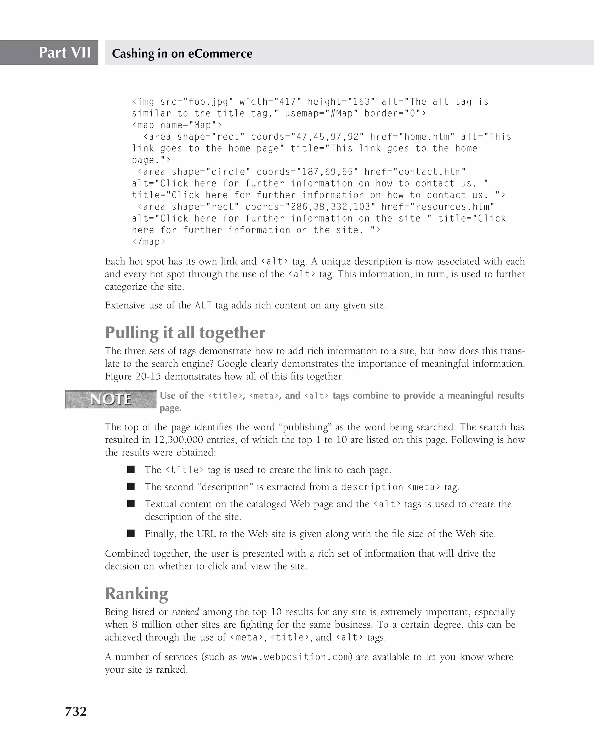
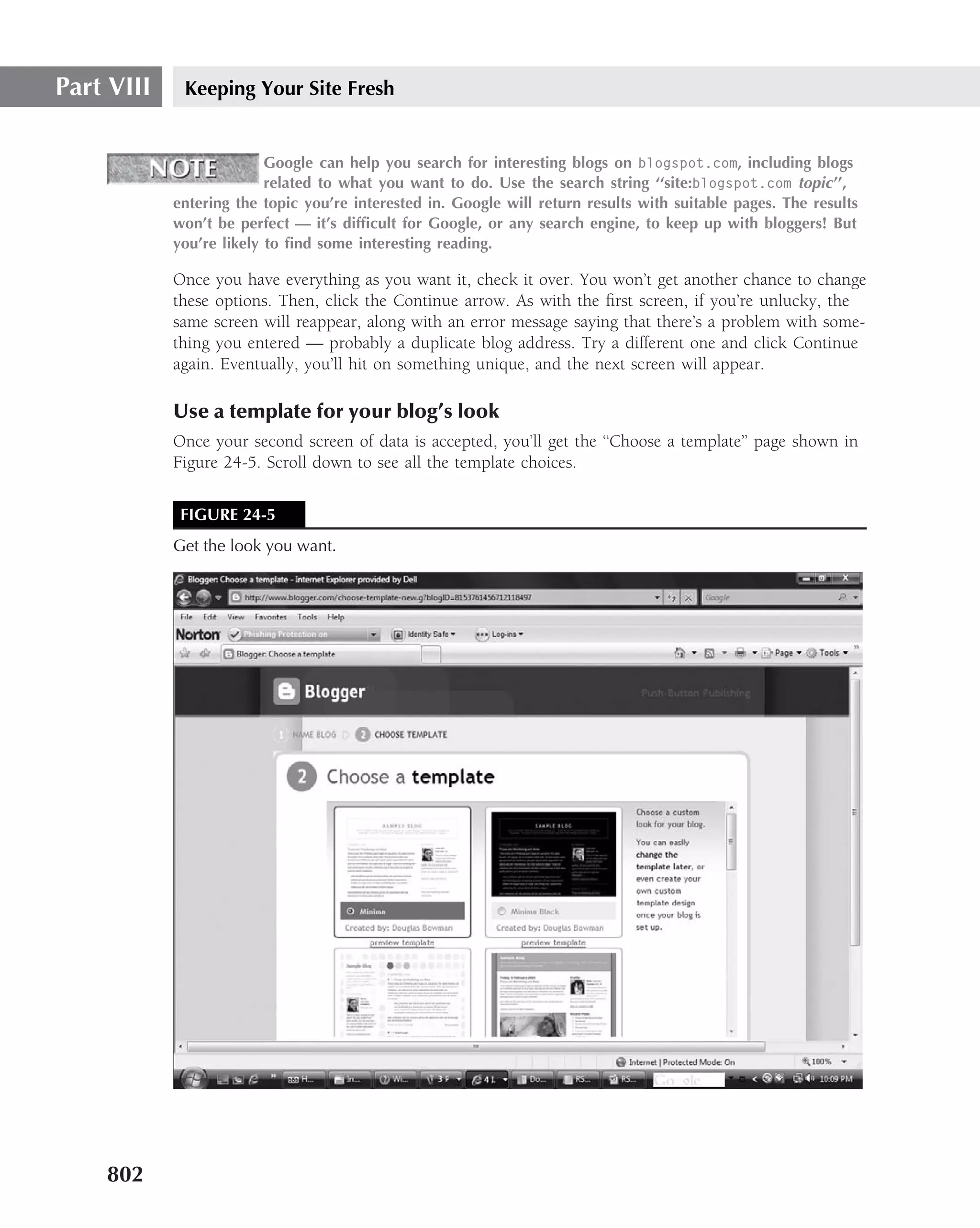
![Part II The Basics
Word code gives HTML validator programs fits. However, most Web browsers perform a great
deal of error checking and correction, so using Word to create Web pages is not a totally
impossible option. If you want to work in a WYSIWYG environment on the Windows operating
system and you have Word, you might as well give it a try before you buy a serious Web page
creation program, but we’d advise against using it to do anything significant or important.
Be sure to always test any Web project you do with more than one company’s Web
browser. If possible, test with different versions of the same browser, too, and view
the page on as many platforms as you can. If you’re using Windows, for example, and don’t have
a Linux box or a Mac, ask a friend to surf to your pages and report on them. If you don’t know
anyone who has a different system, try asking for help on the alt.www.webmaster Usenet news-
group.
Exceptions to the rule
As with practically any ‘‘definitive’’ categorization, there are no doubt exceptions to this one, and
it could easily be argued that there are some unusual Web authoring programs that fall between
the cracks. What should you make of Caligari iSpace software, for example? Although techni-
cally a 3D Web graphics program that’s usually employed in conjunction with a traditional Web
authoring tool such as Dreamweaver, it can be used all by itself to create Web pages complete
with text and an impressive number of bells and whistles.
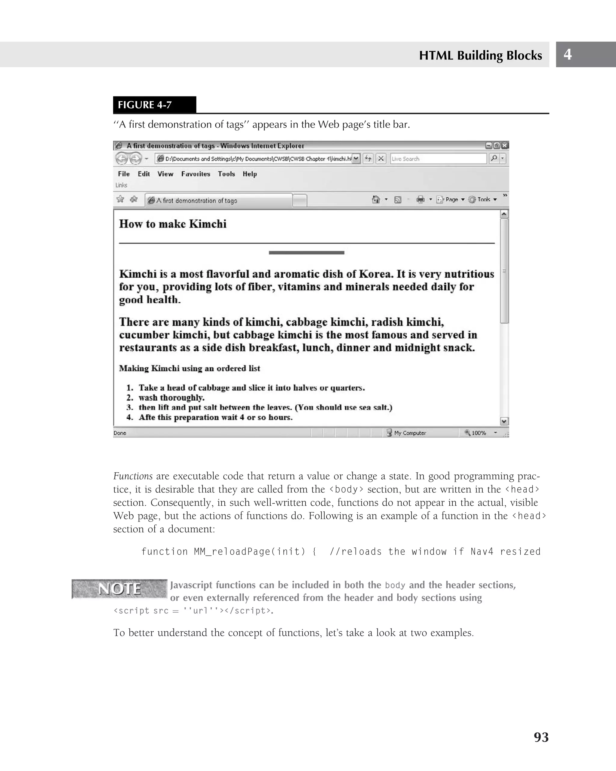
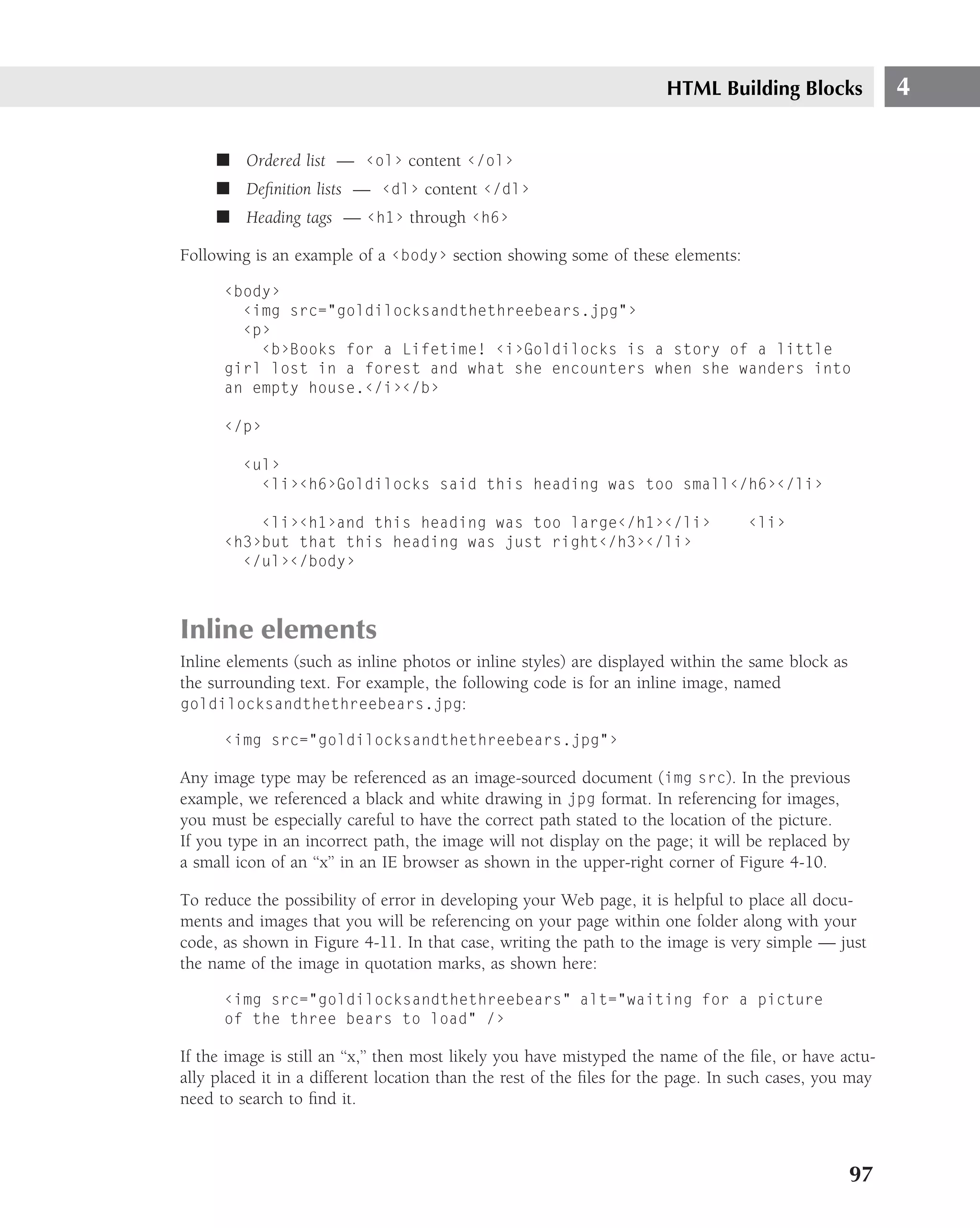
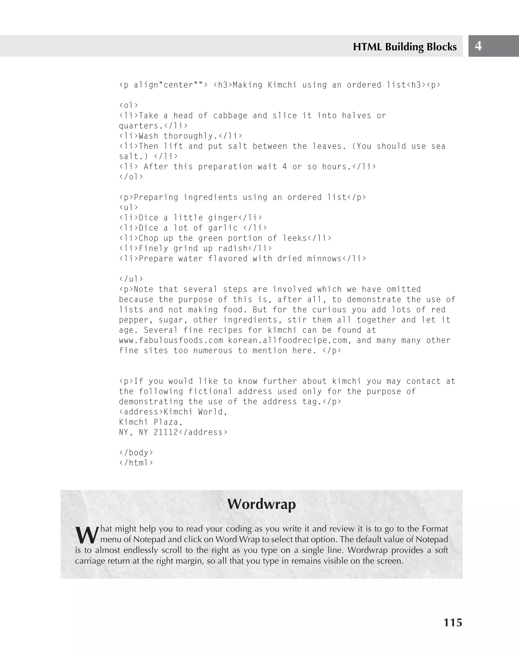
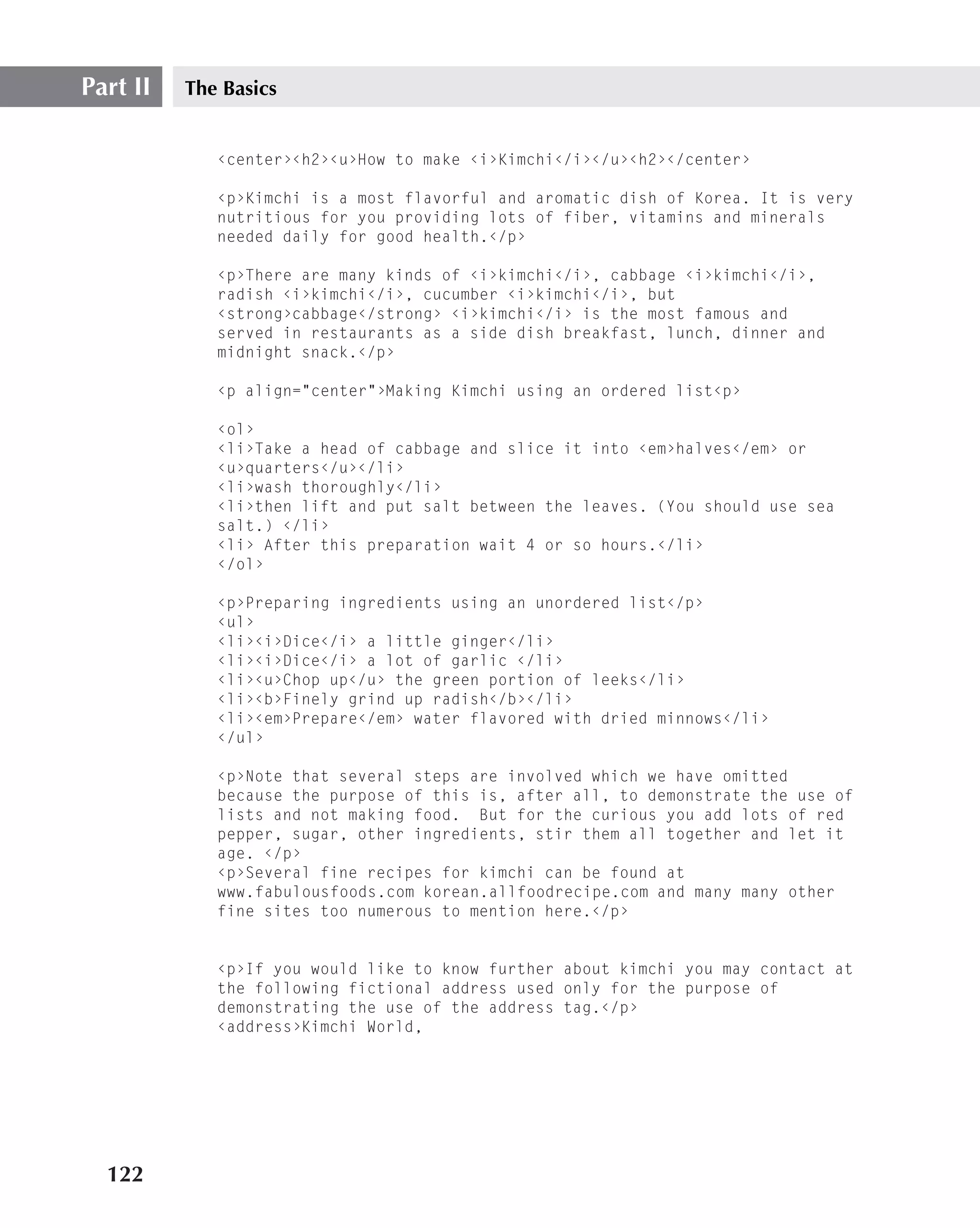
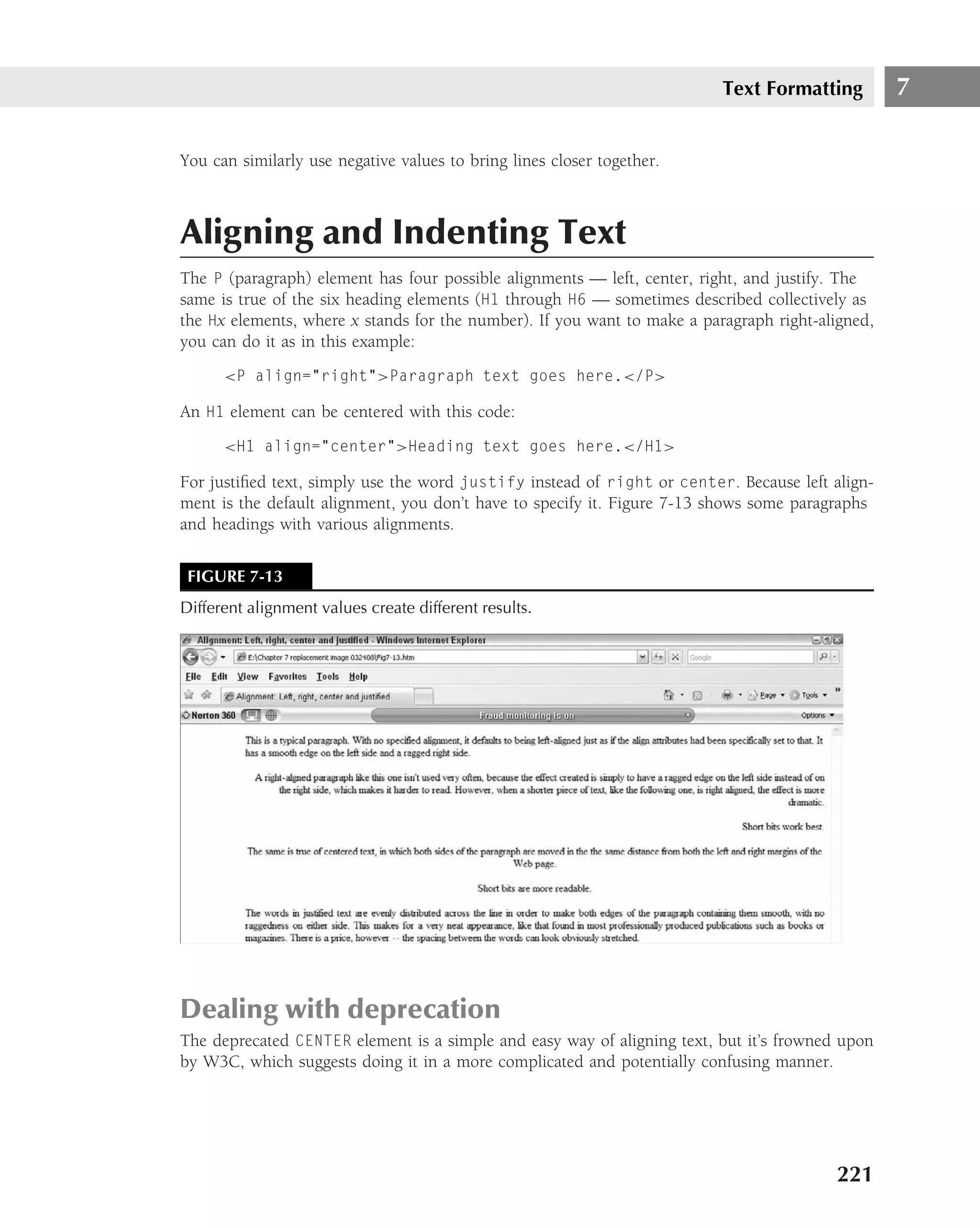
Designing a Simple Web Page
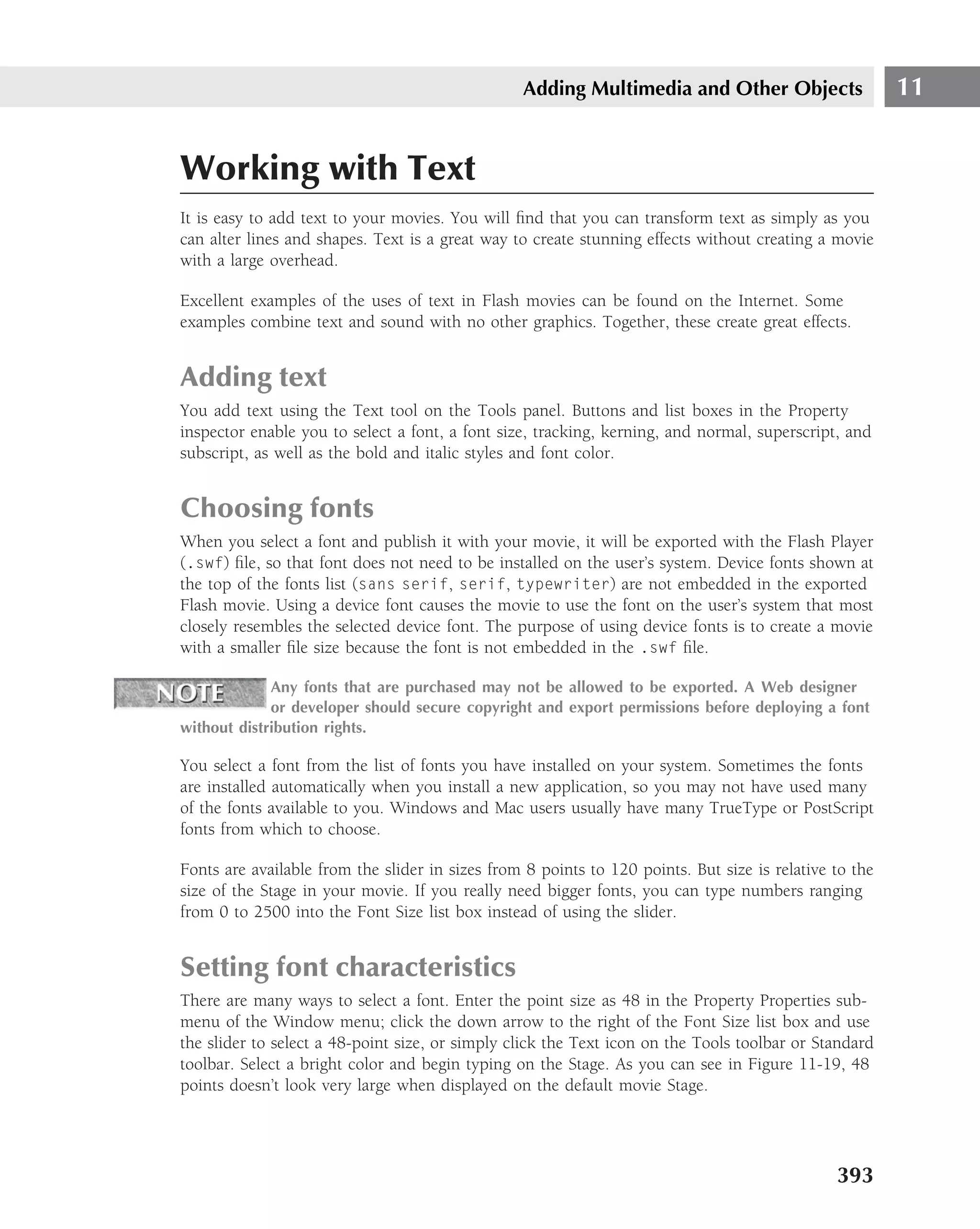
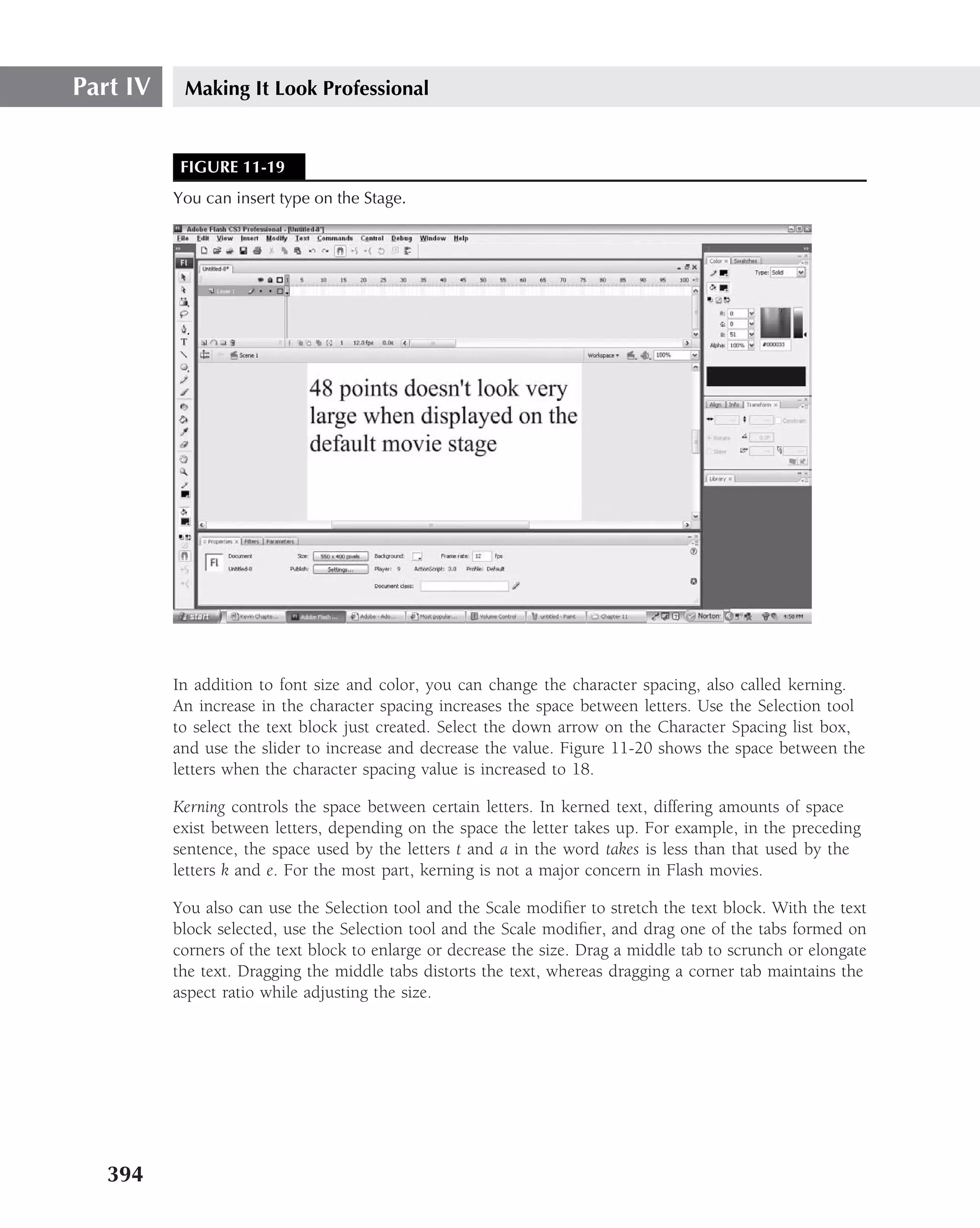
The first thing to do is to click on Notepad, which will present you with a blank document.
Then, type in the following:
‹html›
‹head›
‹title› A first demonstration of tags‹/title›
‹!--This web page was constructed by [your name] on [insert date].
Its purpose is to demonstrate the use of the following common tags:
‹hx›, ‹p›, ‹ol›, ‹ul›, ‹li›, ‹address› --›
‹/head›
‹body›
‹h2›How to make Kimchi‹h2›
‹p›Kimchi is a most flavorful and aromatic dish of Korea. It is very
nutritious for you providing lots of fiber, vitamins and minerals
needed daily for good health.‹/p›
‹p›There are many kinds of kimchi, cabbage kimchi, radish kimchi,
cucumber kimchi, but cabbage kimchi is the most famous and served
in restaurants as a side dish breakfast, lunch, dinner and midnight
snack.‹/p›
114](https://image.slidesharecdn.com/creating-web-sites-bible-jun-2008-100327061205-phpapp01/75/Creating-Web-Sites-Bible-Jun-2008-150-2048.jpg)
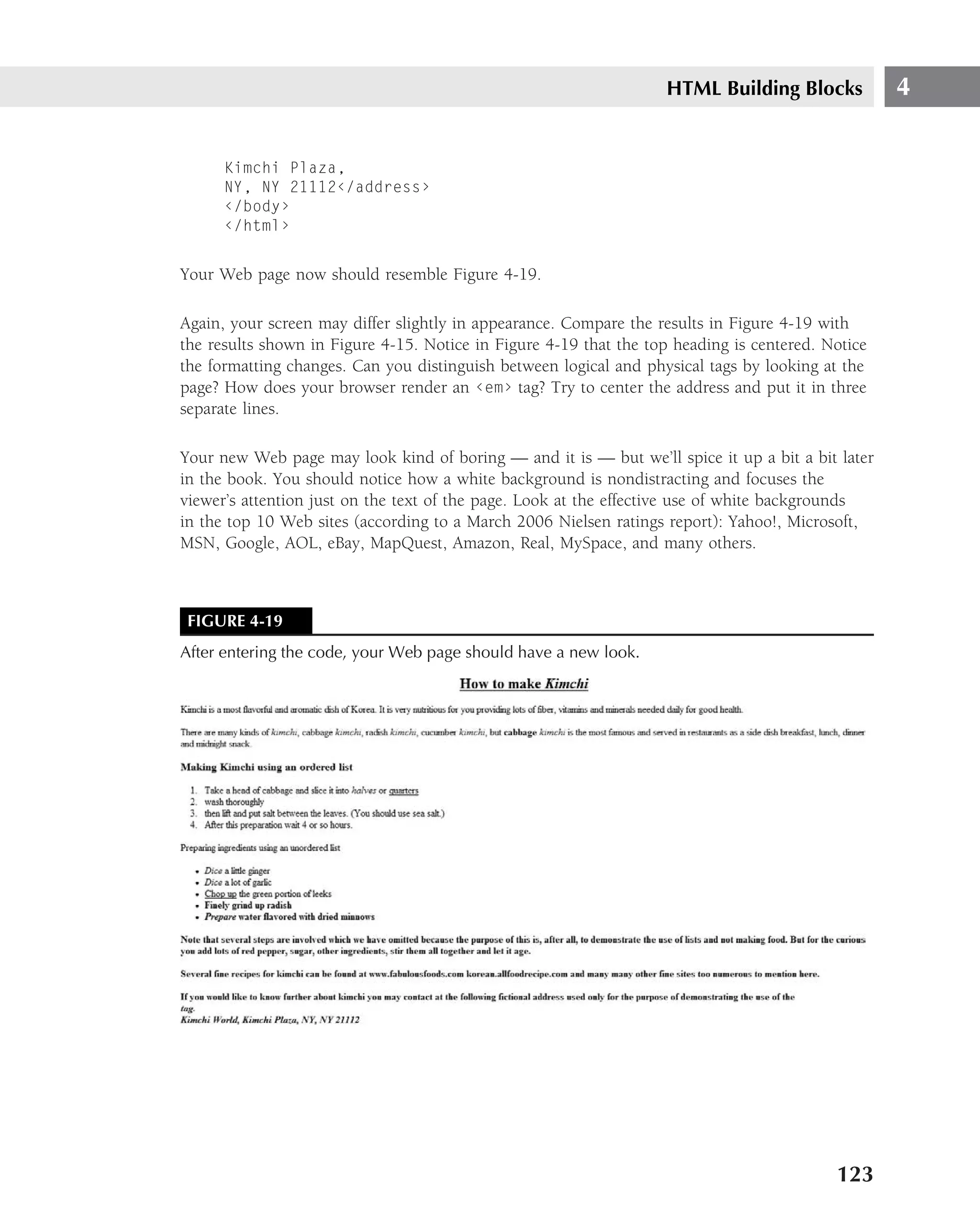
![HTML Building Blocks 4
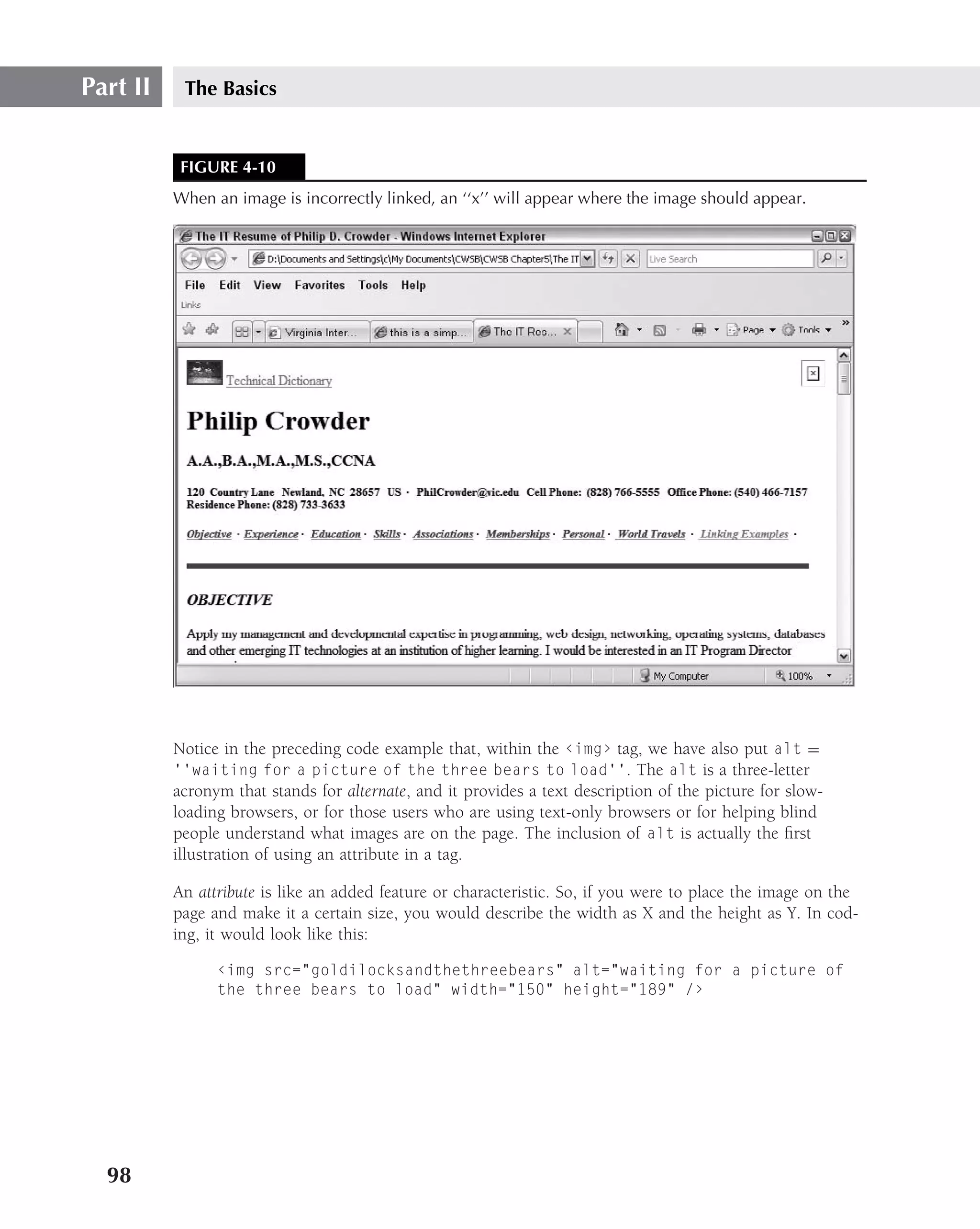
Logical tags
Here are some common logical tags:
‹abbr›TCP/IP‹/abbr›
‹acronym›SONET‹/acronym›
‹cite›Don’t quote me on this, but... ‹/cite›
‹code›if (form.query.value=="") {
alert(’Please make an entry in the product search
field.’);
return false;
} else {
return true;
} ‹/code›
‹dfn›terms and definitions‹/dfn›
‹em›italic can be emphasis‹/em›
‹strong›Strong and Bold‹/strong›
Logical tags do not include any final rendering guidelines. They describe instead how the con-
tent is to be represented in the context of the document. The benefit of logical tags is that the
intent of the programmer can still be carried out.
Practice with tags of both styles and you will develop a subset of tags that fit your preferences as
a developer to meet your programming needs.
Incorporating logical and physical tags
Now, let’s work with some of those elements just described for your Web page. Let’s use the fol-
lowing tags: ‹b›, ‹i›, ‹u›, ‹center›, ‹hx› (where x represents any number between 1 and
6), ‹em›, and ‹strong›. Enter the following code:
‹html›
‹head›
‹title› A first demonstration of tags‹/title›
‹!--This web page was constructed by [your name] on [insert date].
Its purpose is to demonstrate the use of the following tags: ‹b›,
‹i›, ‹u›, ‹center›, ‹hx› (where x represents any number between 1 and 6),
and ‹em›, ‹strong› --›
‹/head›
‹body›
121](https://image.slidesharecdn.com/creating-web-sites-bible-jun-2008-100327061205-phpapp01/75/Creating-Web-Sites-Bible-Jun-2008-157-2048.jpg)
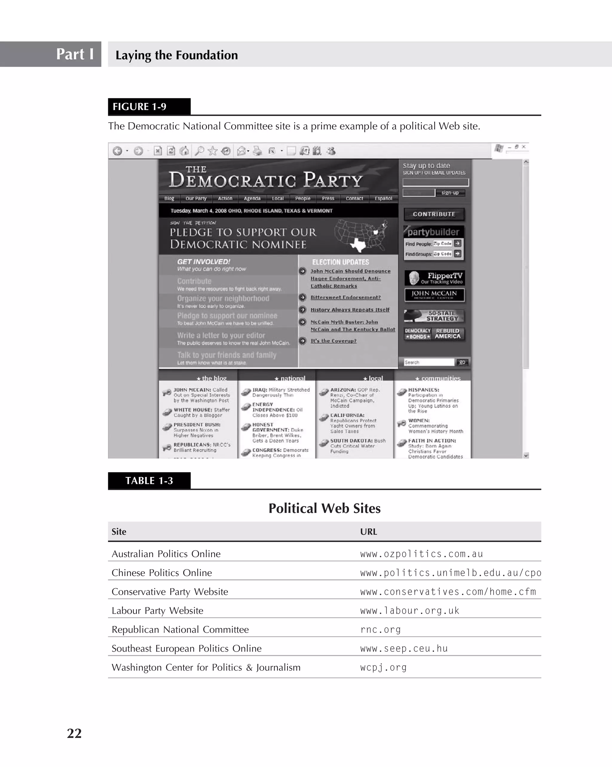
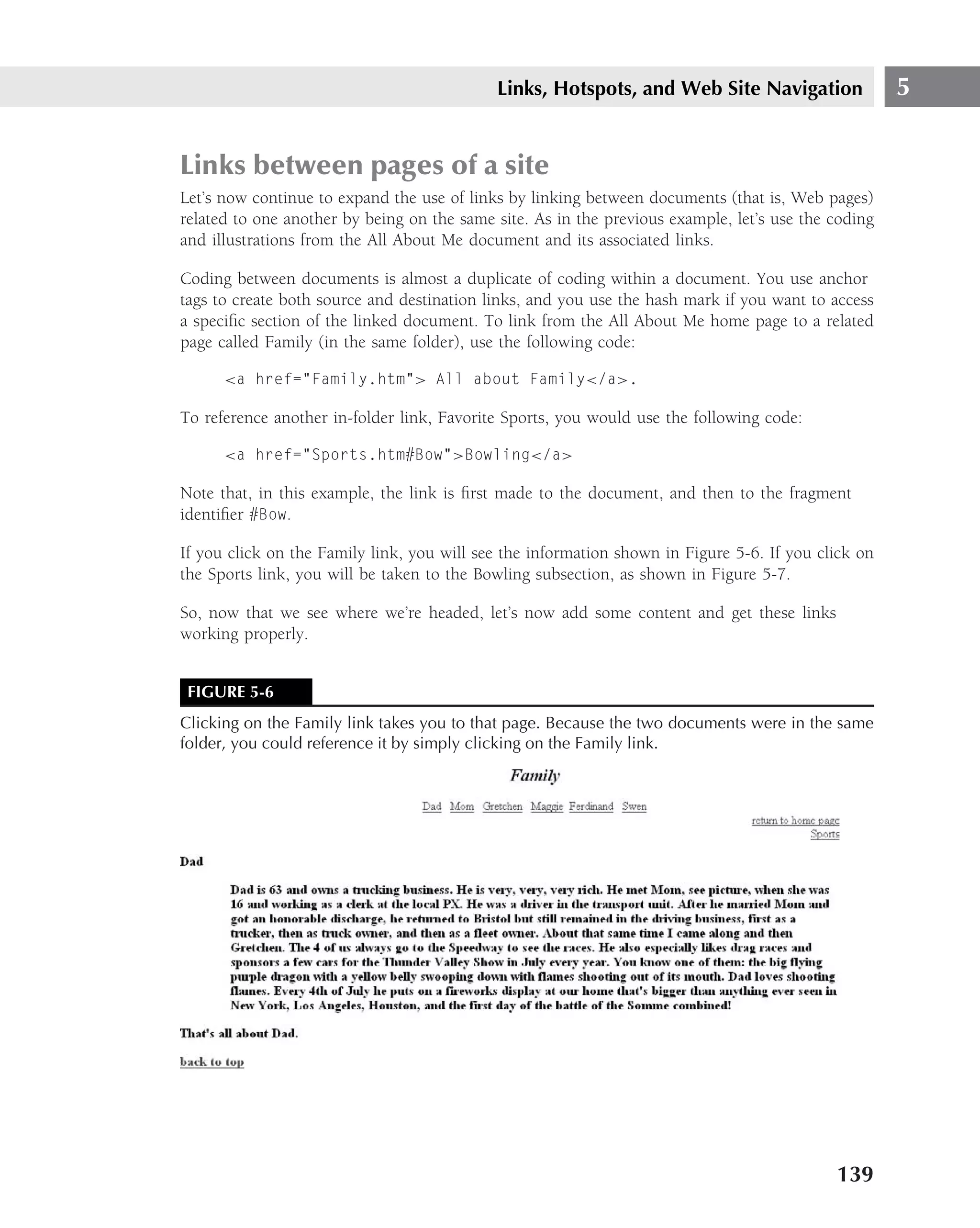
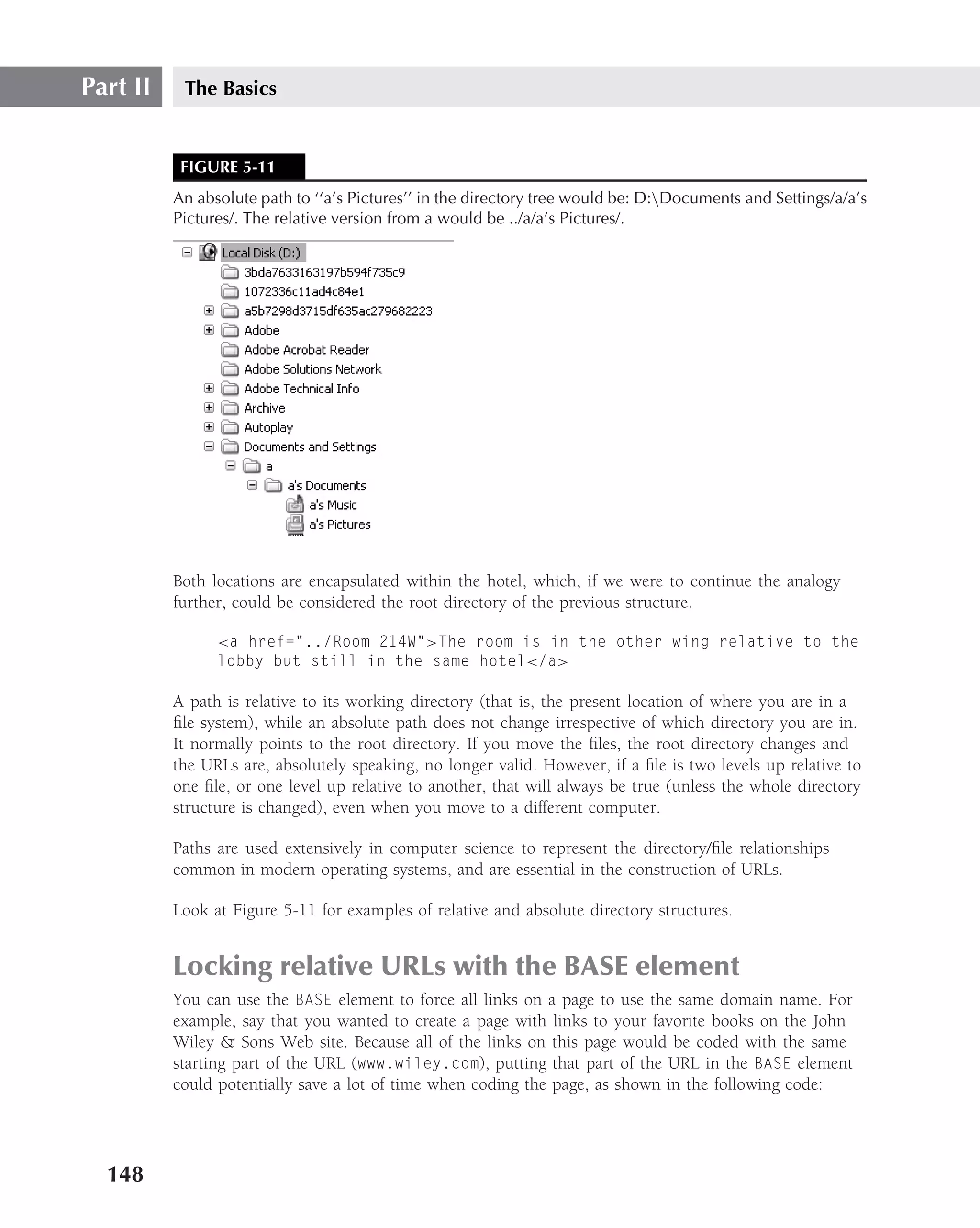
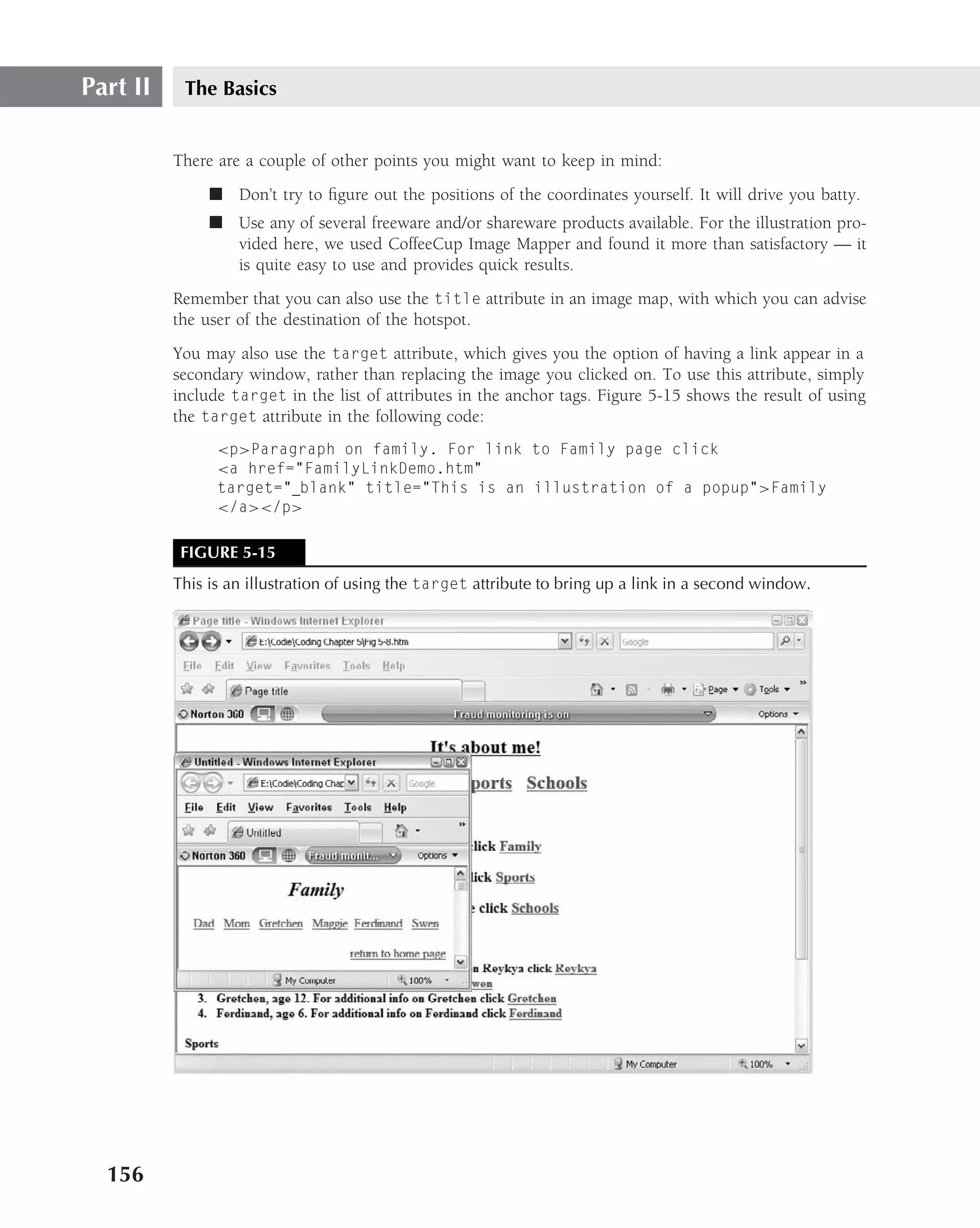
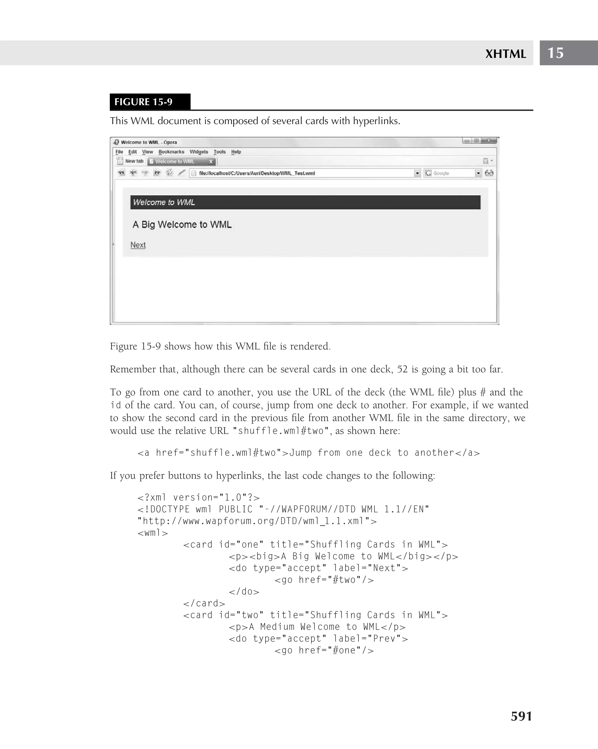
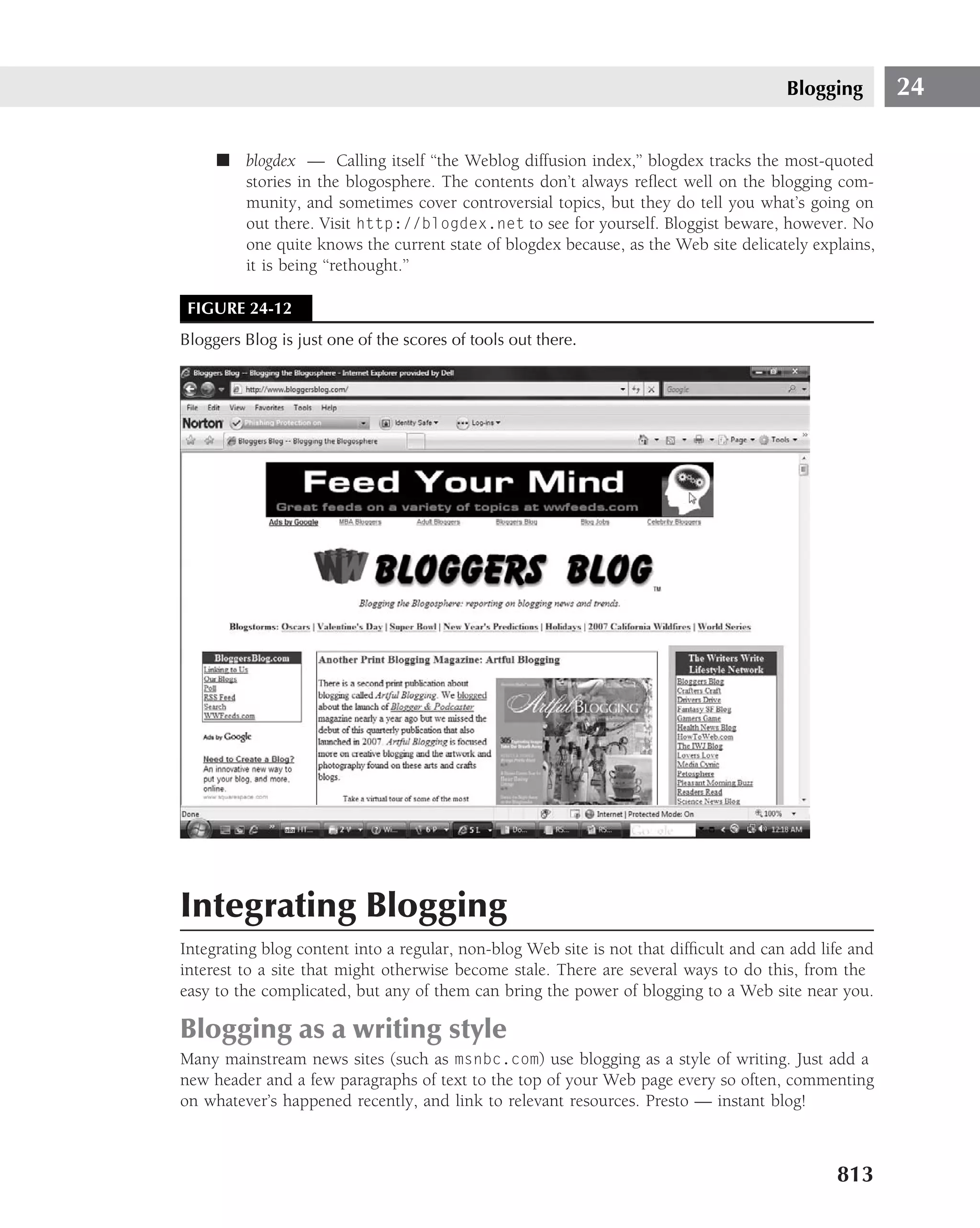
![Links, Hotspots, and Web Site Navigation 5
continued
<link href="/WileyCDA/site/wiley2/include/style.css" type="text/css"
rel="stylesheet">
<title>
Wiley::Wiley
</title>
<script language="javascript" src="/WileyCDA/site/shared/form validation.js"
type="text/javascript">
</script>
<!--[if lt IE 7]>
<link href="/WileyCDA/site/wiley2/include/style-ie.css" rel="stylesheet"
type="text/css">
<!--[endif]-->
</head>
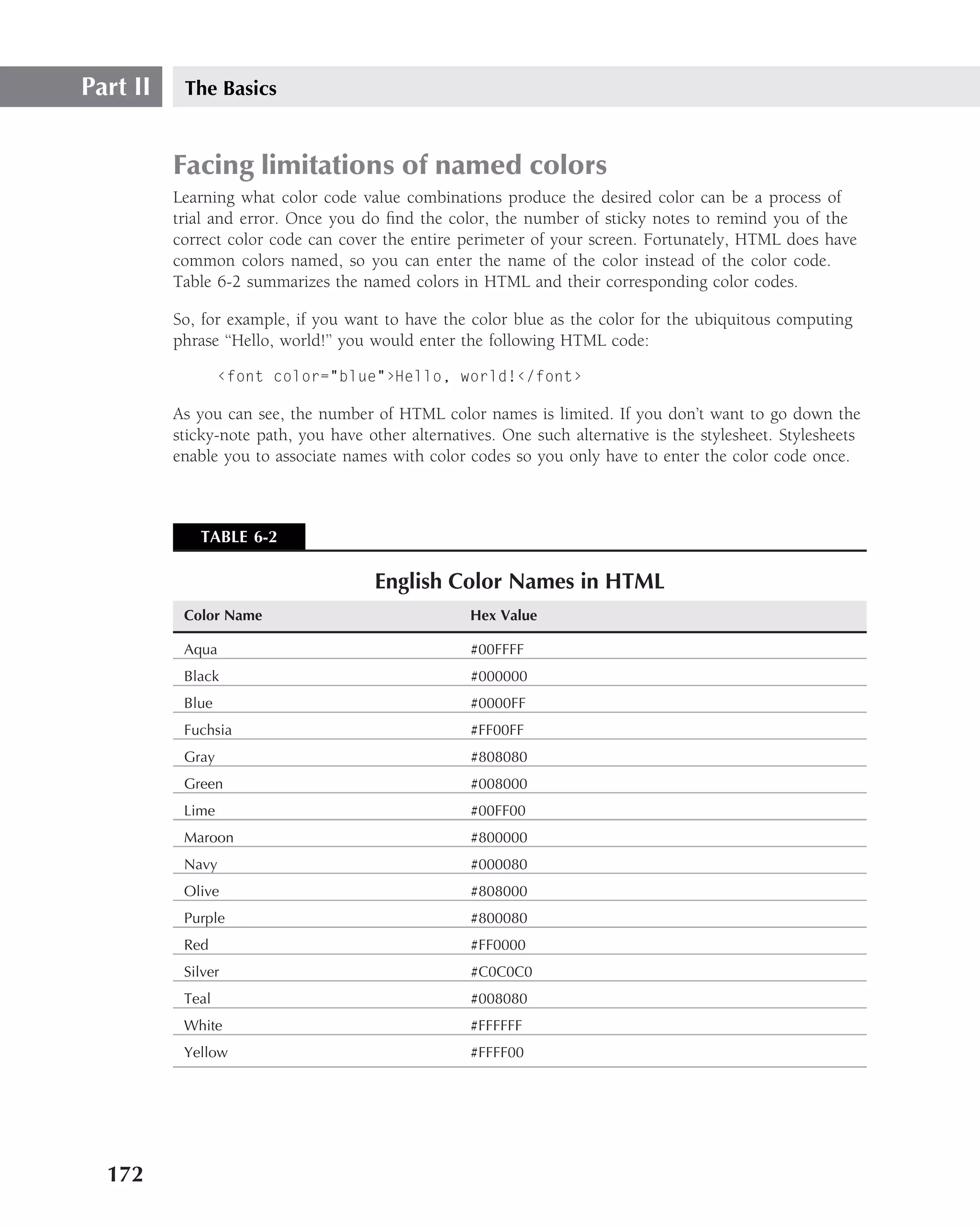
The tag, as currently implemented, appears only in the <head> section of the document.
As you can see in the line <link href="/WileyCDA/site/wiley2/include/style.css"
type="text/css" rel="stylesheet">, the link refers to a stylesheet, style.css, located on
the WileyCDA site. The second link refers to another stylesheet, style-ie.css, in the same
location as the first link tag.
If you were to look at more link tags in the source code of this site, you would see that they all
appear in the <head> section, and they all refer to stylesheets. What you may reasonably infer
from this is that the link tag has limited applicability at present. The link tag may eventually have
broader application, but it is presently mostly used only in the <head> section of a document to
link to stylesheets.
And, as you now know, any element in the <head> does not appear in a Web browser’s content
pane.
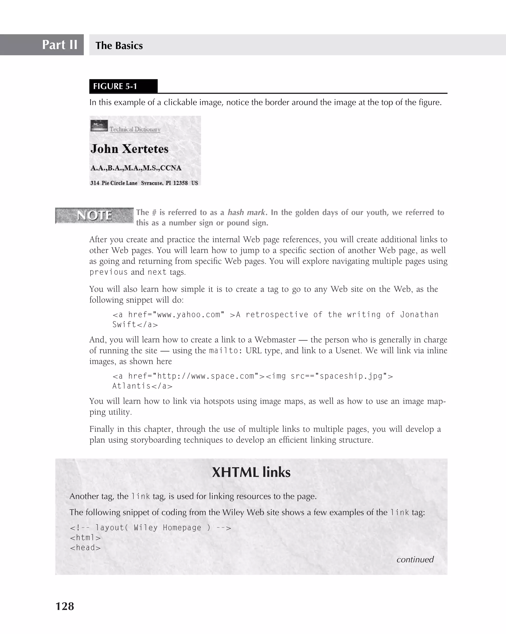
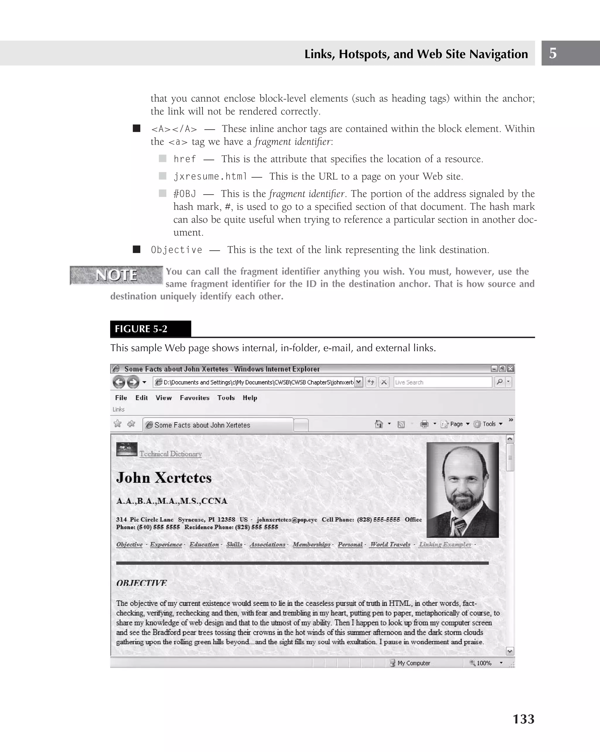
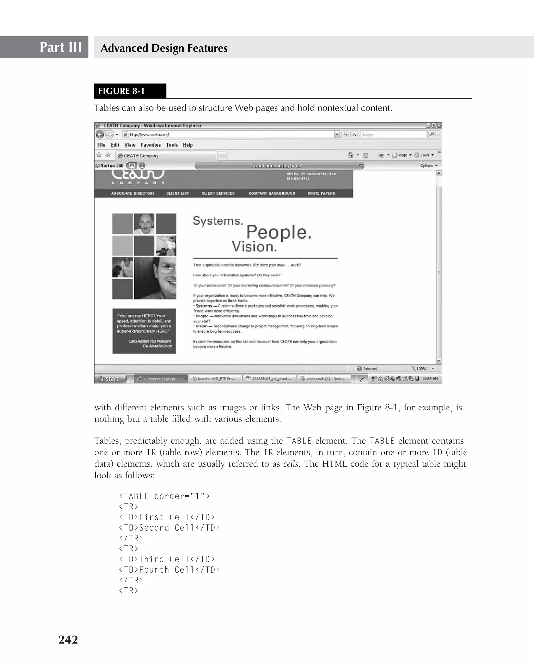
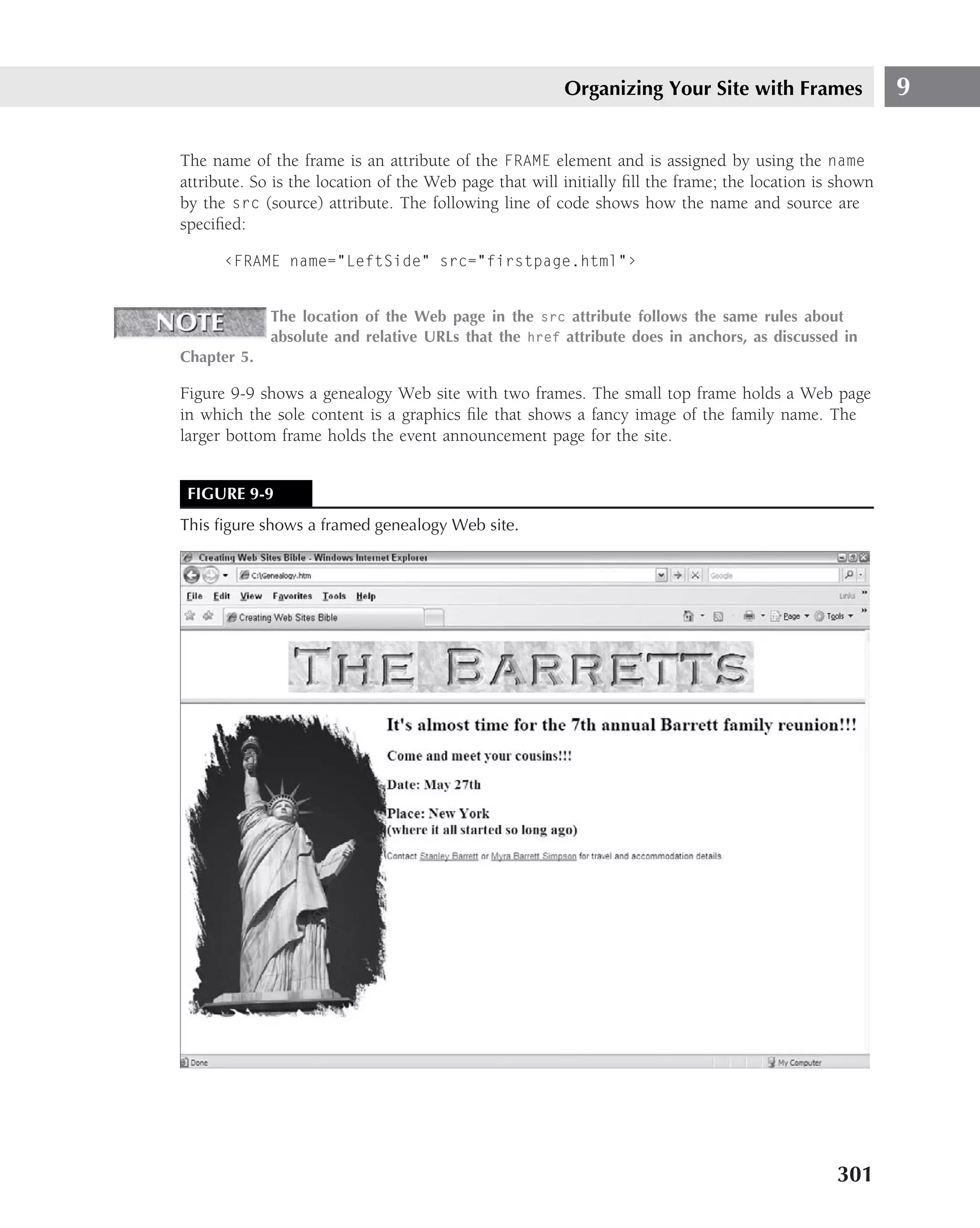
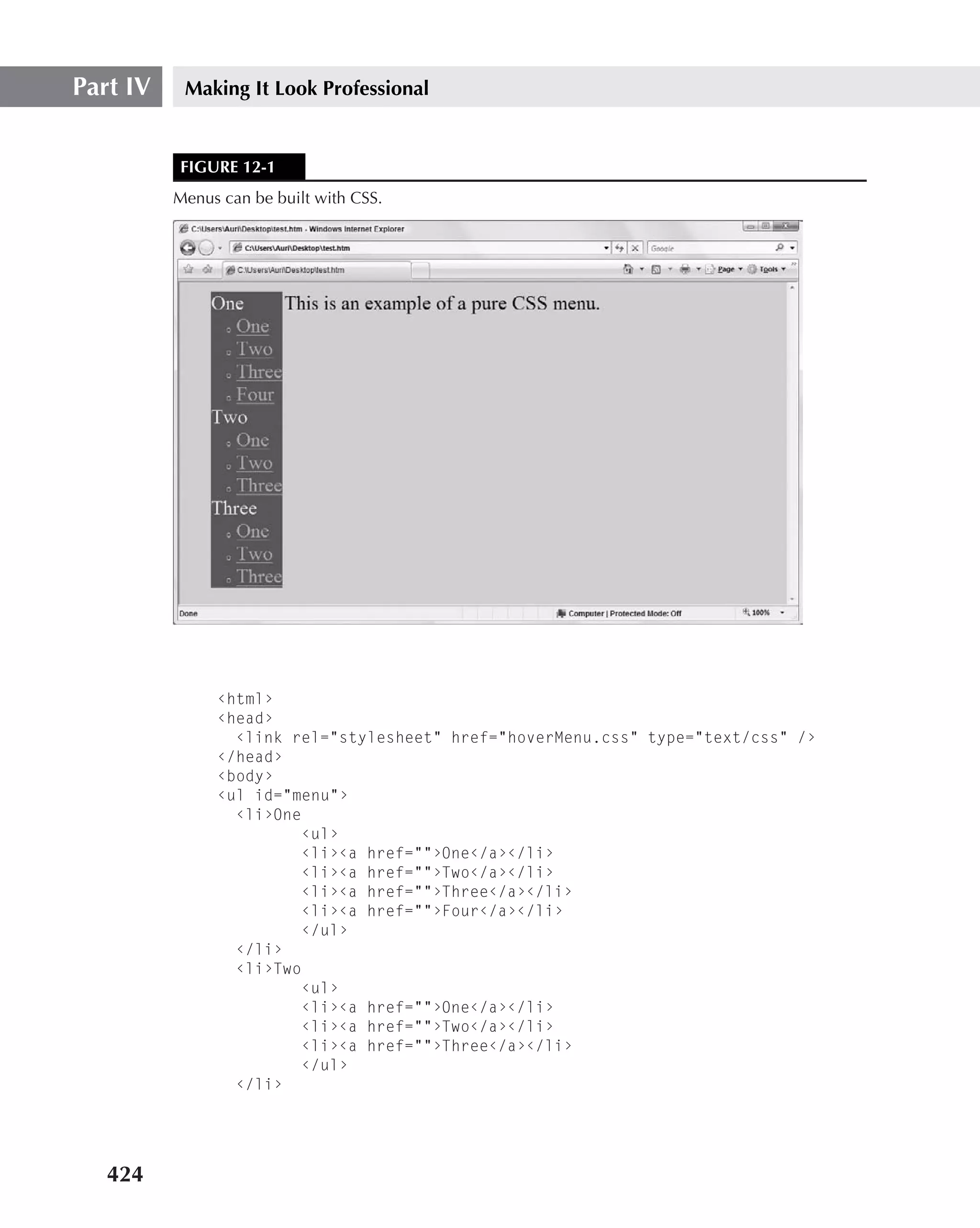
Example Web Site
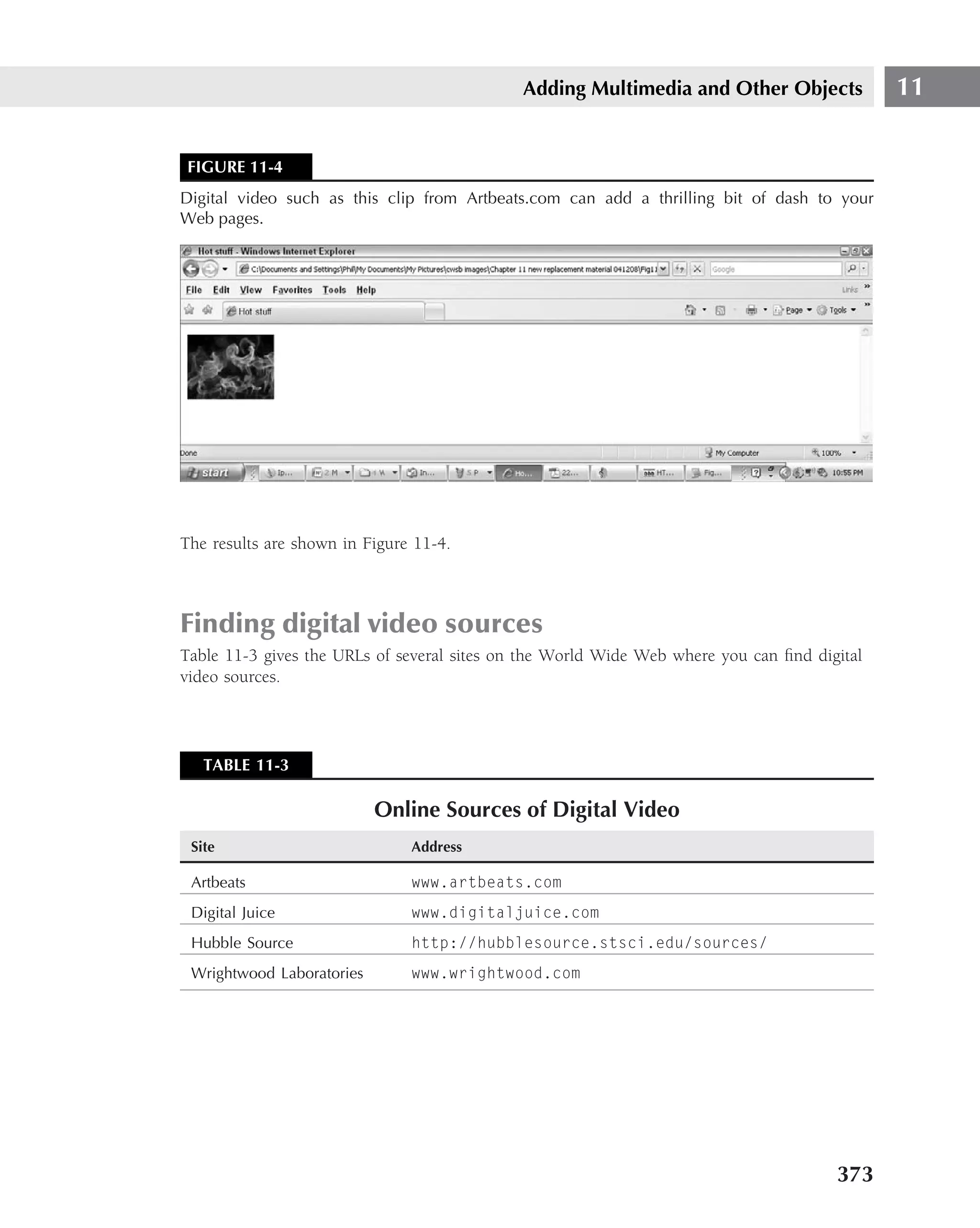
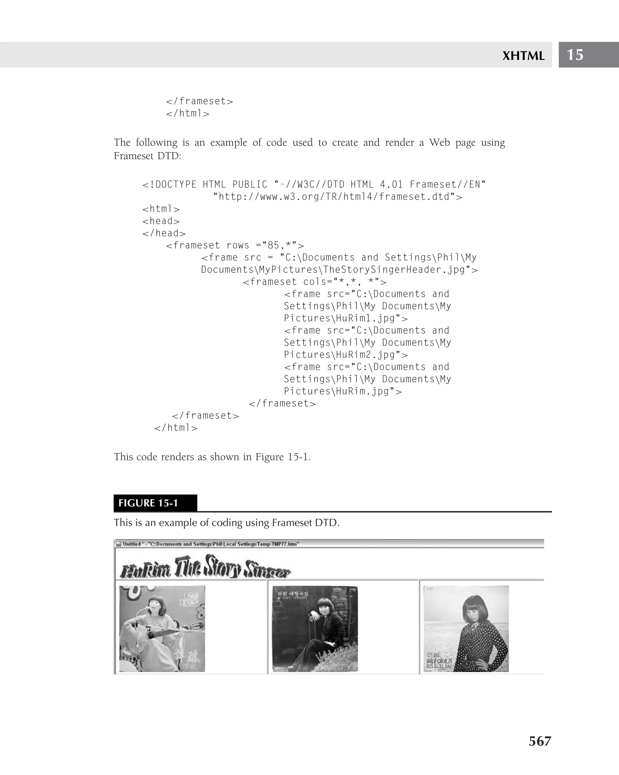
Listing 5-1 shows the source code of a site used in some of the examples for this chapter. The
purpose of the source code shown here is to introduce the reader to several additional features
of a Web page with links to other sites. This site incorporates links (internally and externally),
images, and image maps. Each of the new features will be explained in context of the page, and
then further illustrated in separate sections of the chapter.
LISTING 5-1
Example Source Code
<!DOCTYPE HTML PUBLIC "-//W3C//DTD HTML 4.0 Transitional//EN">
<HTML><HEAD><TITLE>Some Facts about John Xertetes</TITLE>
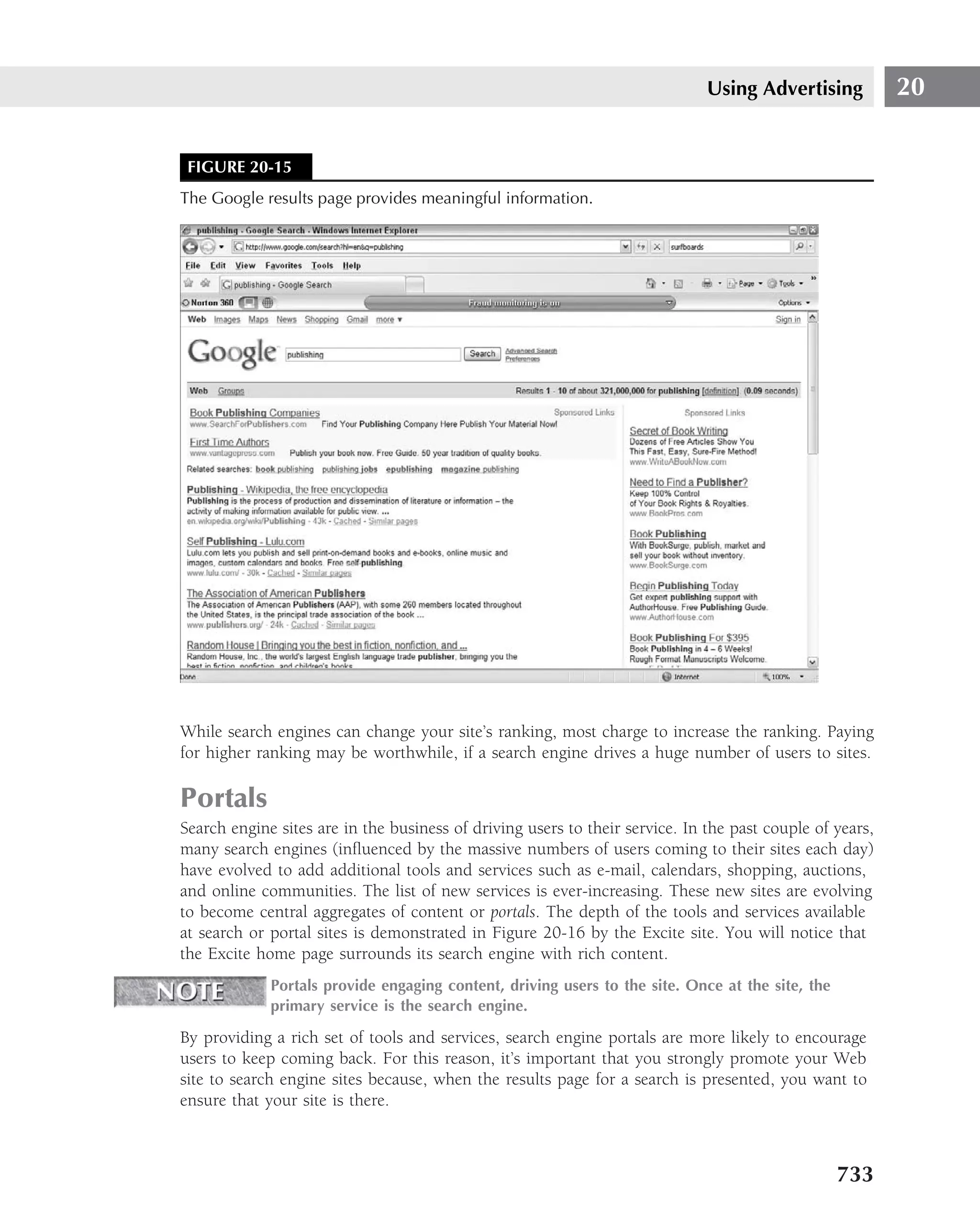
129](https://image.slidesharecdn.com/creating-web-sites-bible-jun-2008-100327061205-phpapp01/75/Creating-Web-Sites-Bible-Jun-2008-165-2048.jpg)
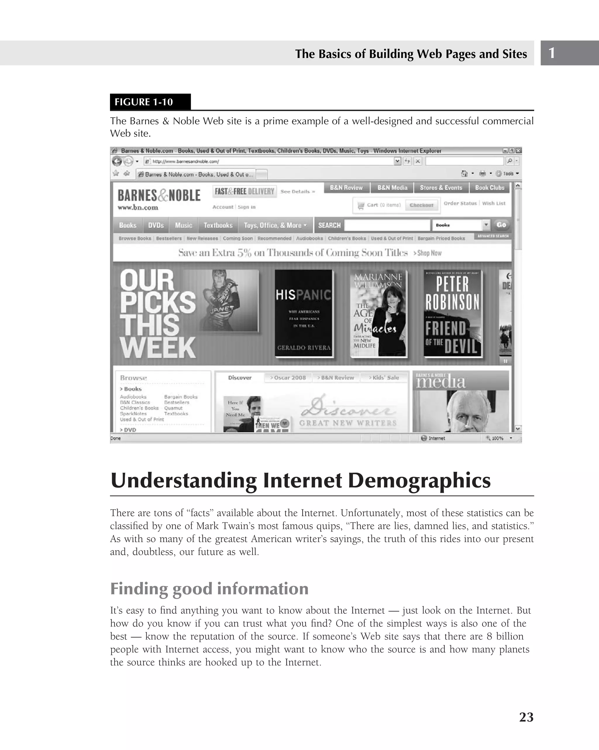
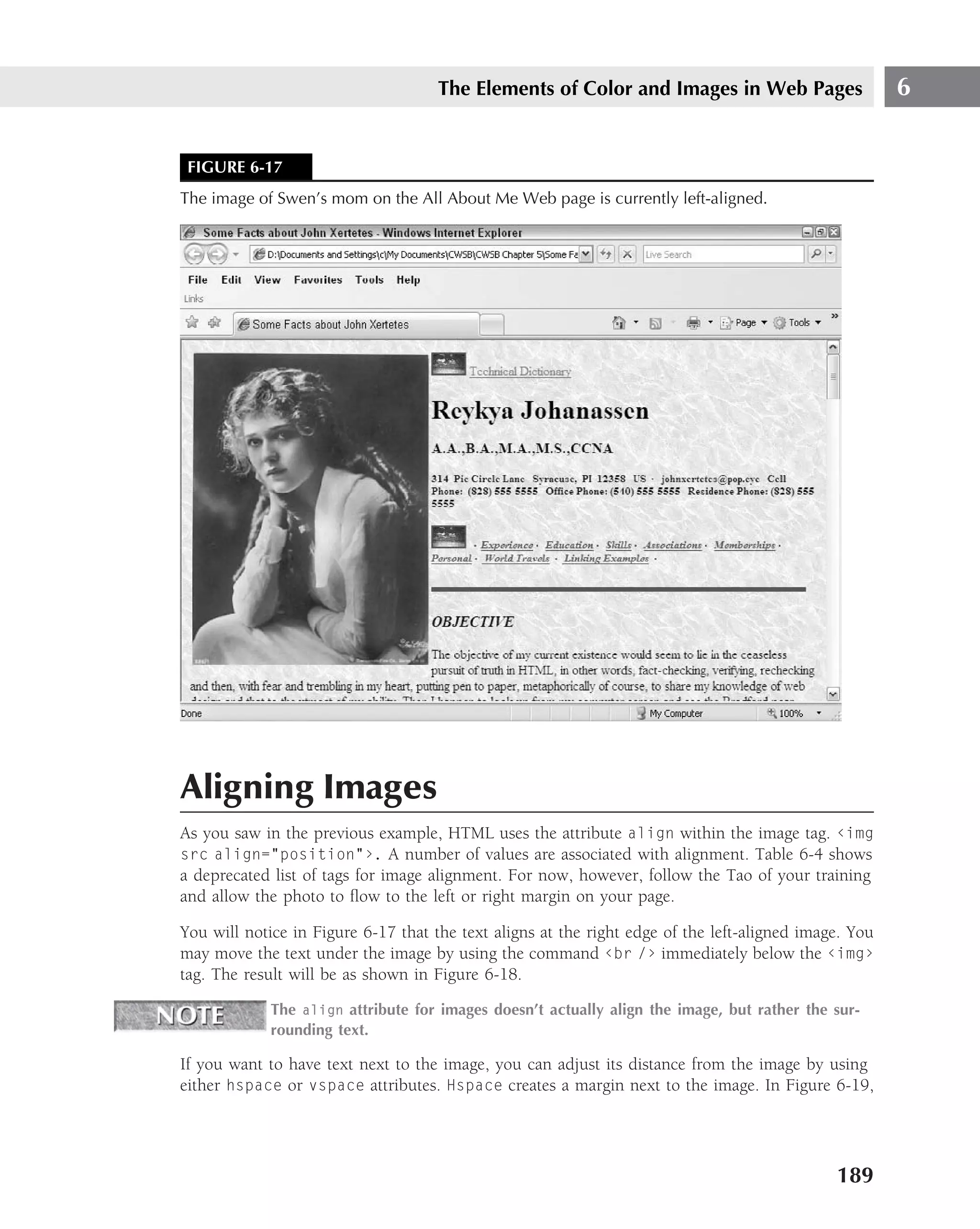
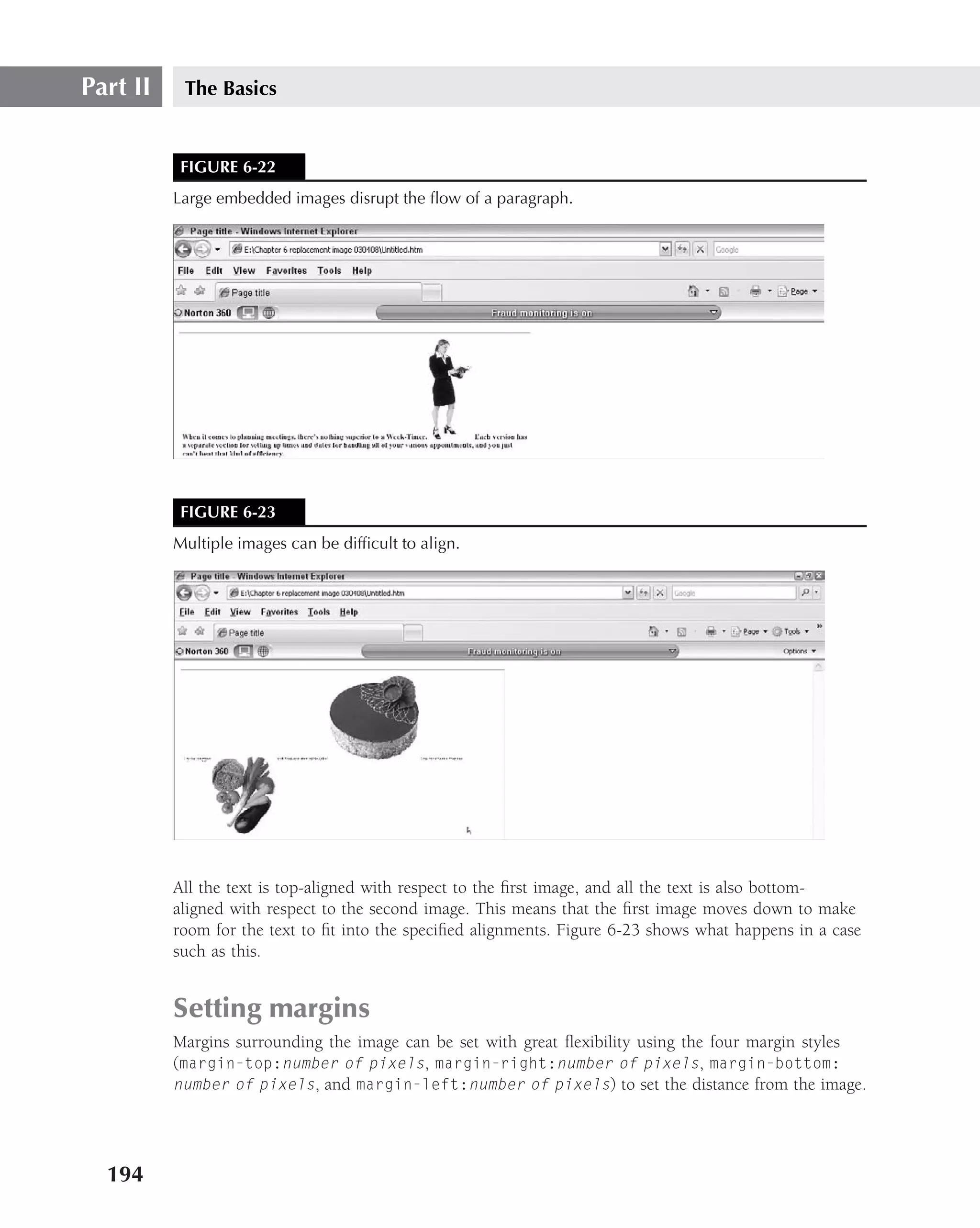
![Part II The Basics
2. Now, go to the File menu and select Save As. Save the file with the name AllAboutMe.
htm (do not forget the htm extension!). Ensure that the File Type is All Files. Save this
file in a folder called Chapter 5, for example, and save it either in your My Doucuments
folder or on your Desktop so that it’ll be easy to find.
Remember to save this file, and the other files you will be creating, in the same folder
3. Next, go to your Web browser, and open the site using the Browse button on the dialog
box.
4. Verify that the title bar shows ‘‘All About Me’’ in the title. There should be nothing on
the screen, of course. You haven’t input any content in the body, yet.
5. Close the page and open Notepad again, and add the following comments in the
<head> section.
<!-- This web page was constructed by [your name] on [insert
date]. Its purpose is to demonstrate the use of source and
destination anchors using, hash mark, and both id and Name
attributes. These will be demonstrated by the development of an
autobiographical web Page -->
6. Within the <body> section, center an h2 size of heading that will appear at the top of
your Web page. Emphasize it in some way.
7. Now, make three links three lines below the heading. Enter the following code exactly:
<p><center><a href="#Fam">Family</a>
<a href="#Spo">Sports</a> <a
href="#Sch">Schools</a></center></p>
8. Go down a line. Put in a blue horizontal line all the way across the page. Go down two
lines using the <br> tag.
9. Enter the following code, exactly as shown:
<h2><a href Name=Fam>Family</a> </h2></p>
<p>Paragraph on family.</p>
<p id="Spo">Sports</p>
<p>Paragraph on sports</p>
<p id="Sch">School</p>
<p> Paragraph on school</p>
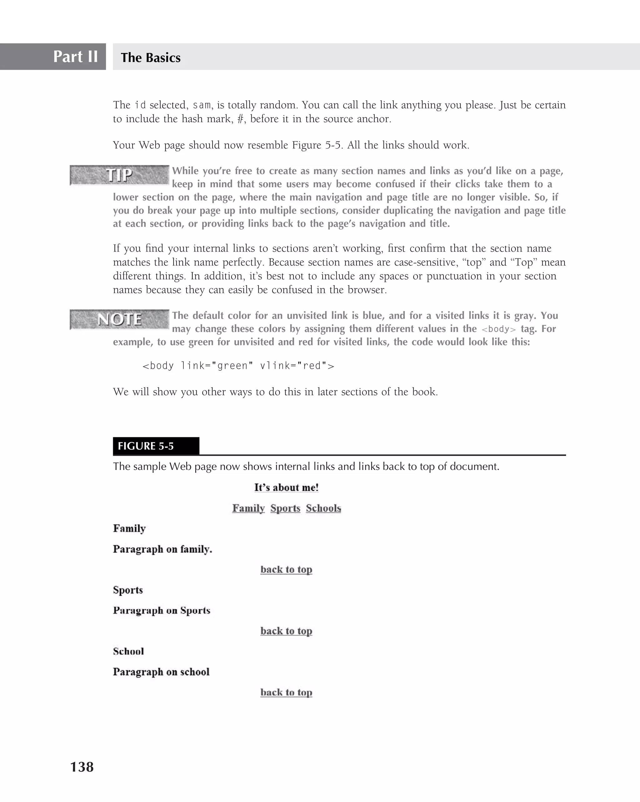
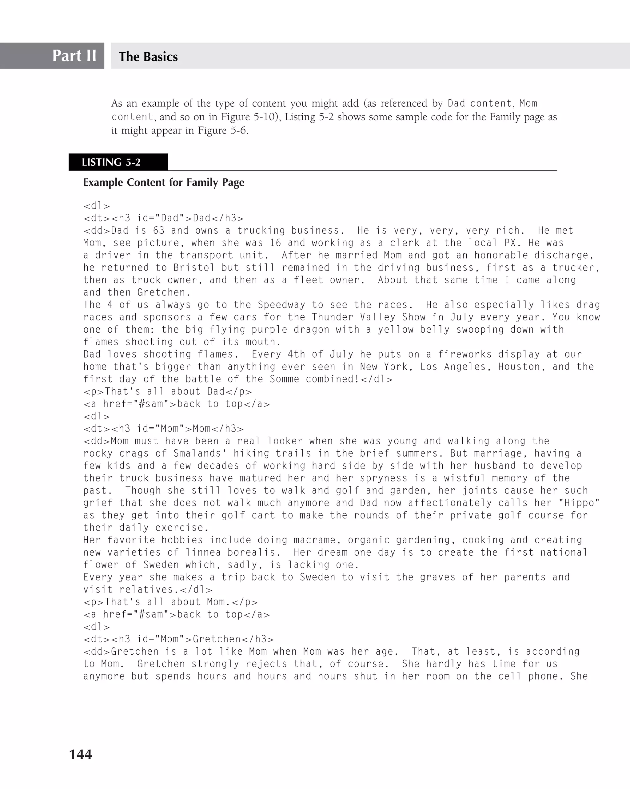
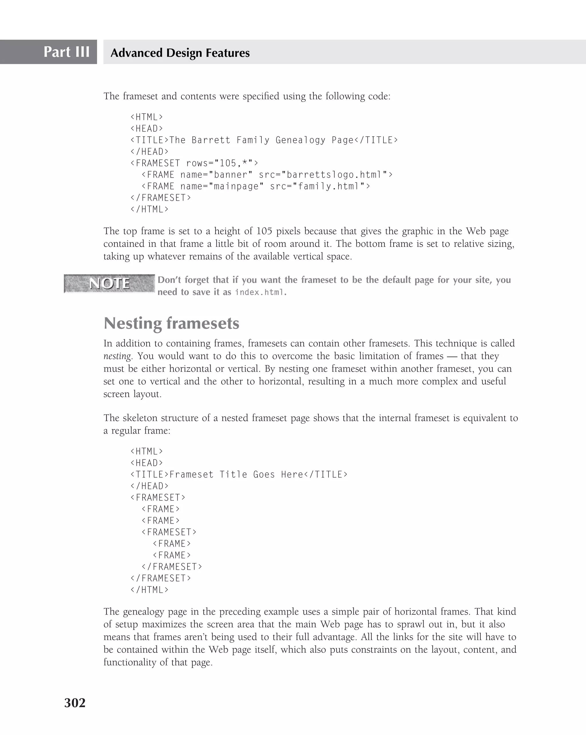
10. Save the file and bring it up in your browser. It should look something like Figure 5-4.
Test your links: They should work.
If your Web page doesn’t have working links, or if it looks substantially different from
Figure 5-4, go back and recheck your coding. You probably made an error in spelling or forgot
to close a tag. If you can’t find any errors, start over again.
136](https://image.slidesharecdn.com/creating-web-sites-bible-jun-2008-100327061205-phpapp01/75/Creating-Web-Sites-Bible-Jun-2008-172-2048.jpg)


![Part IV Making It Look Professional
background-image
■ Value — ‹url› | none
■ Initial value — None
■ Applies to — All elements
■ Inherited — No
■ Percentage values — N/A
background-position
■ Value — [‹percentage› | ‹length›]{1,2} | [top | center | bottom] ||
[left | center | right]
■ Initial value — 0% 0%
■ Applies to — Block-level and replaced elements
■ Inherited — No
■ Percentage values — Refer to the size of the element itself
background-repeat
■ Value — repeat | repeat-x | repeat-y | no-repeat
■ Initial value — repeat
■ Applies to — All elements
■ Inherited — No
■ Percentage values — N/A
border
■ Value — ‹border-width› || ‹border-style› || ‹color›
■ Initial value — Not defined for shorthand properties
■ Applies to — All elements
■ Inherited — No
■ Percentage values — N/A
border-color
■ Value — ‹color›{1,4}
■ Initial value — The value of the color property
■ Applies to — All elements
■ Inherited — No
■ Percentage values — N/A
428](https://image.slidesharecdn.com/creating-web-sites-bible-jun-2008-100327061205-phpapp01/75/Creating-Web-Sites-Bible-Jun-2008-464-2048.jpg)
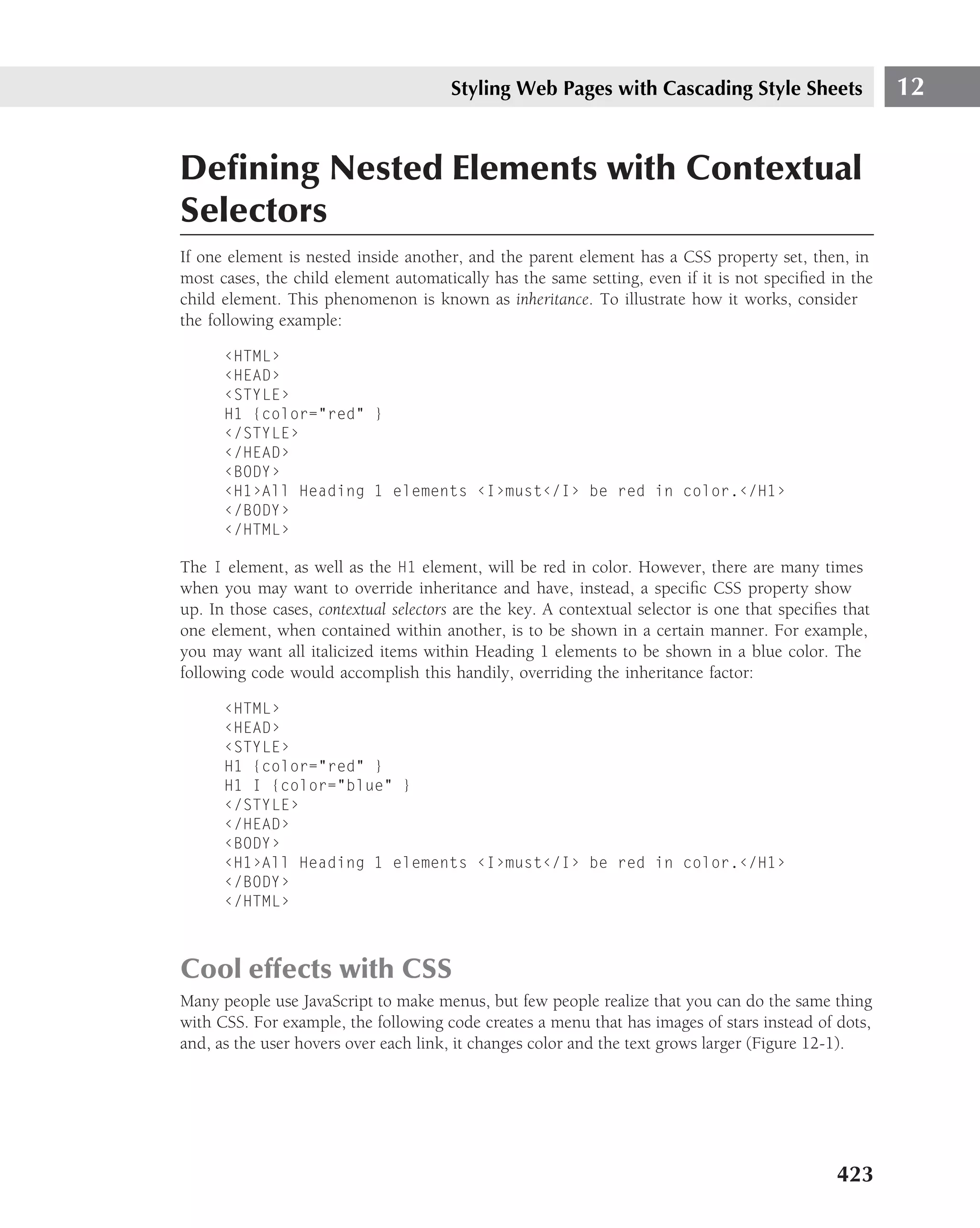
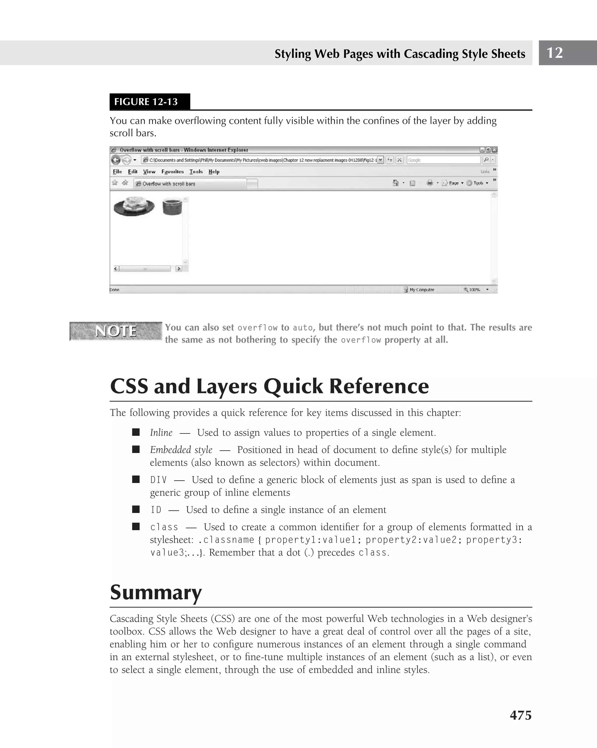
![Styling Web Pages with Cascading Style Sheets 12
border-style
■ Value — None | dotted | dashed | solid | double | groove | ridge | inset
| outset
■ Initial value — None
■ Applies to — All elements
■ Inherited — No
■ Percentage values — N/A
border-top, border-right, border-bottom, border-left
■ Value — ‹border-top-width› || ‹border-style› || ‹color›
■ Initial value — Not defined for shorthand properties
■ Applies to — All elements
■ Inherited — No
■ Percentage values — N/A
border-width
■ Value — [thin | medium | thick | ‹length›]{1,4}
■ Initial value — Not defined for shorthand properties
■ Applies to — All elements
■ Inherited — No
■ Percentage values — N/A
border-top-width, border-right-width, border-bottom-width,
border-left-width
■ Value — thin | medium | thick | ‹length›
■ Initial value — medium
■ Applies to — All elements
■ Inherited — No
■ Percentage values — N/A
clear
■ Value — none | left | right | both
■ Initial — None
■ Applies to — All elements
429](https://image.slidesharecdn.com/creating-web-sites-bible-jun-2008-100327061205-phpapp01/75/Creating-Web-Sites-Bible-Jun-2008-465-2048.jpg)
![Part IV Making It Look Professional
■ Inherited — No
■ Percentage values — N/A
color
■ Value — ‹color›
■ Initial value — UA specific
■ Applies to — All elements
■ Inherited — Yes
■ Percentage values — N/A
display
■ Value — block | inline | list-item | none
■ Initial value — block
■ Applies to — All elements
■ Inherited — No
■ Percentage values — N/A
float
■ Value — left | right | none
■ Initial value — None
■ Applies to — All elements
■ Inherited — No
■ Percentage values — N/A
font
■ Value — [ ‹font-style› || ‹font-variant› || ‹font-weight› ]? ‹font-
size› [ / ‹line-height› ]? ‹font-family›
■ Initial value — Not defined for shorthand properties
■ Applies to — All elements
■ Inherited — Yes
■ Percentage values — Allowed on ‹font-size› and ‹line-height›
font-family
■ Value — [[ ‹family-name› | ‹generic-family› ],]* [ ‹family-name› |
‹generic-family› ]
■ Initial value — Depends on user agent
430](https://image.slidesharecdn.com/creating-web-sites-bible-jun-2008-100327061205-phpapp01/75/Creating-Web-Sites-Bible-Jun-2008-466-2048.jpg)
![Part IV Making It Look Professional
■ Applies to — Block-level and replaced elements
■ Inherited — No
■ Percentage values — N/A
letter-spacing
■ Value — normal | ‹length›
■ Initial value — normal
■ Applies to — All elements
■ Inherited — Yes
■ Percentage values — N/A
line-height
■ Value — normal | ‹number› | ‹length› | ‹percentage›
■ Initial value — Normal
■ Applies to — All elements
■ Inherited — Yes
■ Percentage values — Relative to the font size of the element itself
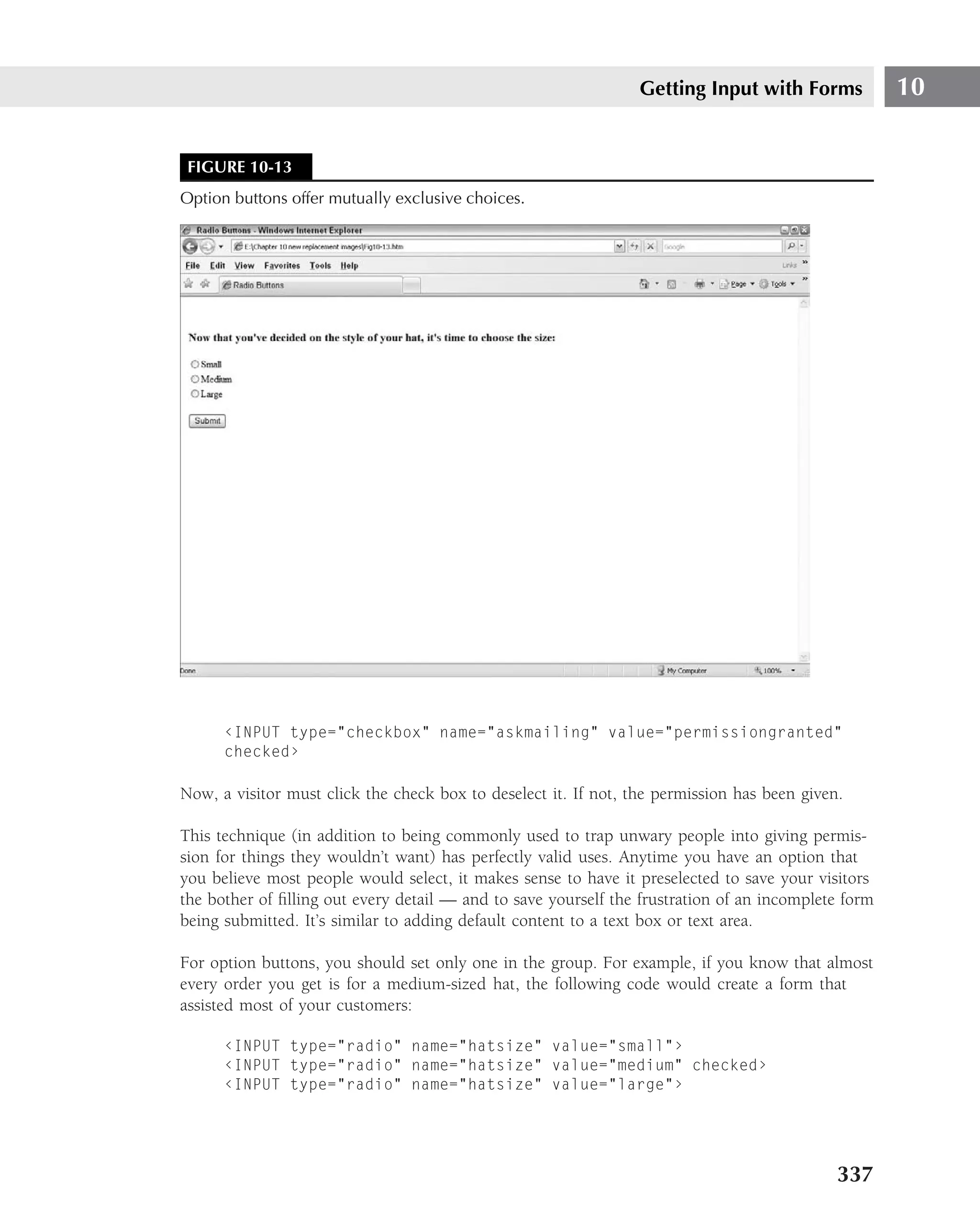
list-style
■ Value — [disc | circle | square | decimal | lower-roman | upper-
roman | lower-alpha | upper-alpha | none] || [inside | outside]
|| [‹url› | none]
■ Initial value — Not defined for shorthand properties
■ Applies to — Elements with display value list-item
■ Inherited — Yes
■ Percentage values — N/A
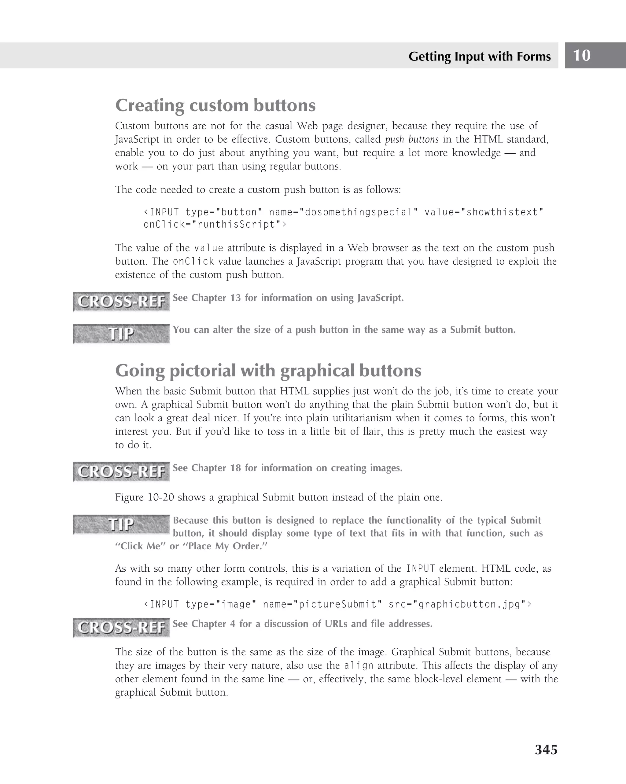
list-style-image
■ Value — ‹url› | none
■ Initial value — none
■ Applies to — Elements with display value list-item
■ Inherited — Yes
■ Percentage values — N/A
432](https://image.slidesharecdn.com/creating-web-sites-bible-jun-2008-100327061205-phpapp01/75/Creating-Web-Sites-Bible-Jun-2008-468-2048.jpg)
![Styling Web Pages with Cascading Style Sheets 12
list-style-position
■ Value — inside | outside
■ Initial value — outside
■ Applies to — Elements with display value list-item
■ Inherited — Yes
■ Percentage values — N/A
list-style-type
■ Value — disc | circle | square | decimal | lower-roman | upper-roman |
lower-alpha | upper-alpha | none
■ Initial value — disc
■ Applies to — Elements with display value list-item
■ Inherited — Yes
■ Percentage values — N/A
margin
■ Value — [ ‹length› | ‹percentage› | auto ] {1,4}
■ Initial value — Not defined for shorthand properties
■ Applies to — All elements
■ Inherited — No
■ Percentage values — Refer to width of closest block-level ancestor
margin-top, margin-right, margin-bottom, margin-left
■ Value — ‹length› | ‹percentage› | auto
■ Initial value — 0
■ Applies to — All elements
■ Inherited — No
■ Percentage values — Refer to width of the closest block-level ancestor
padding
■ Value — [ ‹length› | ‹percentage› ] {1,4}
■ Initial value — Not defined for shorthand properties
433](https://image.slidesharecdn.com/creating-web-sites-bible-jun-2008-100327061205-phpapp01/75/Creating-Web-Sites-Bible-Jun-2008-469-2048.jpg)
![Part IV Making It Look Professional
■ Applies to — All elements
■ Inherited — No
■ Percentage values — Refer to width of closest block-level ancestor
padding-top, padding-right, padding-bottom, padding-left
■ Value — ‹length› | ‹percentage›
■ Initial value — 0
■ Applies to — All elements
■ Inherited — No
■ Percentage values — Refer to width of closest block-level ancestor
text-align
■ Value — left | right | center | justify
■ Initial value — UA specific
■ Applies to — Block-level elements
■ Inherited value — Yes
■ Percentage values — N/A
text-decoration
■ Value — none | [ underline || overline || line-through || blink ]
■ Initial value — none
■ Applies to — All elements
■ Inherited — No, but elements should match their parent
■ Percentage values — N/A
text-indent
■ Value — ‹length› | ‹percentage›
■ Initial value — 0
■ Applies to — Block-level elements
■ Inherited — Yes
■ Percentage values — Refer to parent element’s width
text-transform
■ Value — capitalize | uppercase | lowercase | none
■ Initial value — none
434](https://image.slidesharecdn.com/creating-web-sites-bible-jun-2008-100327061205-phpapp01/75/Creating-Web-Sites-Bible-Jun-2008-470-2048.jpg)
![Part IV Making It Look Professional
specification is www.w3.org/TR/REC-CSS2. Although the specification carries no specific copy-
right notice, we assume that the usual requirement of adding the following notice to information
taken from W3C documents still applies:
Copyright © World Wide Web Consortium, (Massachusetts Institute of Technology,
Institut National de Recherche en Informatique et en Automatique, Keio University).
All Rights Reserved.
The properties in the following listing are specified by name (in alphabetical order), and then the
following information is presented:
■ Values — Shows all possible values that can be used with this property.
■ Initial value — Shows the default value if none is specified.
■ Applies to — Shows the elements the property can be applied to.
■ Inherited — Shows if the property can be inherited.
■ Percentages — Shows how percentages are handled.
■ Media groups — Shows which media group (visual, aural, print, and so on) the property
is intended for.
Following is a breakdown of CSS2 properties.
azimuth
■ Values — ‹angle› | [[ left-side | far-left | left | center-left | center
| center-right | right | far-right | right-side ] || behind ] | leftwards
| rightwards | inherit
■ Initial value — center
■ Applies to — All
■ Inherited — Yes
■ Percentages — N/A
■ Media groups — Aural
background
■ Values — [‘background-color’ || ‘background-image’ || ‘background-
repeat’ || ‘background-attachment’ || ‘background-position’] | inherit
■ Initial value — Not defined for shorthand properties
■ Applies to — All
■ Inherited — No
■ Percentages — Allowed on background-position
■ Media groups — Visual
436](https://image.slidesharecdn.com/creating-web-sites-bible-jun-2008-100327061205-phpapp01/75/Creating-Web-Sites-Bible-Jun-2008-472-2048.jpg)
![Styling Web Pages with Cascading Style Sheets 12
background-attachment
■ Values — scroll | fixed | inherit
■ Initial value — scroll
■ Applies to — All
■ Inherited — No
■ Percentages — N/A
■ Media groups — Visual
background-color
■ Values — ‹color› | transparent | inherit
■ Initial value — transparent
■ Applies to — All
■ Inherited — No
■ Percentages — N/A
■ Media groups — Visual
background-image
■ Values — ‹uri› | none | inherit
■ Initial value — none
■ Applies to — All
■ Inherited — No
■ Percentages — N/A
■ Media groups — Visual
background-position
■ Values — [ [‹percentage› | ‹length› ] {1,2} | [ [top | center | bottom] ||
[left | center | right] ] ] | inherit
■ Initial value — 0% 0%
■ Applies to — Block-level and replaced elements
■ Inherited — No
■ Percentages — Refer to the size of the box itself
■ Media groups — Visual
437](https://image.slidesharecdn.com/creating-web-sites-bible-jun-2008-100327061205-phpapp01/75/Creating-Web-Sites-Bible-Jun-2008-473-2048.jpg)
![Part IV Making It Look Professional
background-repeat
■ Values — repeat | repeat-x | repeat-y | no-repeat | inherit
■ Initial value — repeat
■ Applies to — All
■ Inherited — No
■ Percentages — N/A
■ Media groups — Visual
border
■ Values — [ ‘border-width’ || ‘border-style’ || ‹color› ] | inherit
■ Initial value — See individual properties
■ Applies to — All
■ Inherited — No
■ Percentages — N/A
■ Media groups — Visual
border-collapse
■ Values — collapse | separate | inherit
■ Initial value — collapse
■ Applies to — table and inline-table elements
■ Inherited — Yes
■ Percentages — N/A
■ Media groups — Visual
border-color
■ Values — ‹color›{1,4} | transparent | inherit
■ Initial value — See individual properties
■ Applies to — All
■ Inherited — No
■ Percentages — N/A
■ Media groups — Visual
border-spacing
■ Values — ‹length› ‹length›? | inherit
■ Initial value — 0
438](https://image.slidesharecdn.com/creating-web-sites-bible-jun-2008-100327061205-phpapp01/75/Creating-Web-Sites-Bible-Jun-2008-474-2048.jpg)
![Styling Web Pages with Cascading Style Sheets 12
■ Applies to — table and inline-table elements
■ Inherited — Yes
■ Percentages — N/A
■ Media groups — Visual
border-style
■ Values — ‹border-style› {1,4} | inherit
■ Initial value — See individual properties
■ Applies to — All
■ Inherited — No
■ Percentages — N/A
■ Media groups — Visual
border-top, border-right, border-bottom, border-left
■ Values — [ ‘border-top-width’ || ‘border-style’ || ‹color› ] | inherit
■ Initial value — See individual properties
■ Applies to — All
■ Inherited — No
■ Percentages — N/A
■ Media groups — Visual
border-top-color, border-right-color, border-bottom-color,
border-left-color
■ Values — ‹color› | inherit
■ Initial value — The value of the color property
■ Applies to — All
■ Inherited — No
■ Percentages — N/A
■ Media groups — Visual
border-top-style, border-right-style, border-bottom-style, border-left-style
■ Values — ‹border-style› | inherit
■ Initial value — None
■ Applies to — All
■ Inherited — No
439](https://image.slidesharecdn.com/creating-web-sites-bible-jun-2008-100327061205-phpapp01/75/Creating-Web-Sites-Bible-Jun-2008-475-2048.jpg)
![Styling Web Pages with Cascading Style Sheets 12
clear
■ Values — none | left | right | both | inherit
■ Initial value — none
■ Applies to — Block-level elements
■ Inherited — No
■ Percentages — N/A
■ Media groups — Visual
clip
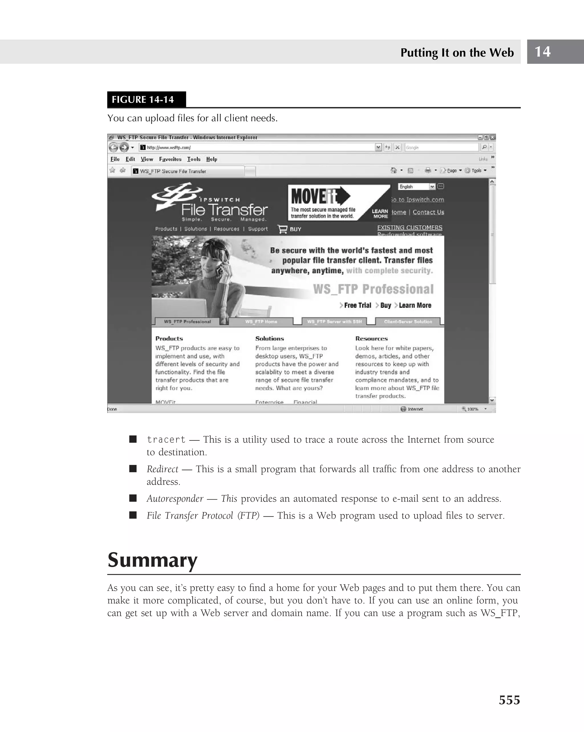
■ Values — ‹shape› | auto | inherit
■ Initial value — auto
■ Applies to — Block-level and replaced elements
■ Inherited — No
■ Percentages — N/A
■ Media groups — Visual
color
■ Values — ‹color› | inherit
■ Initial value — Depends on user agent
■ Applies to — All
■ Inherited — Yes
■ Percentages — N/A
■ Media groups — Visual
content
■ Values — [ ‹string› | ‹uri› | ‹counter› | attr(X) | open-quote | close-
quote | no-open-quote | no-close-quote ]+ | inherit
■ Initial value — Empty string
■ Applies to — :before and :after pseudo-elements
■ Inherited — No
■ Percentages — N/A
■ Media groups — All
441](https://image.slidesharecdn.com/creating-web-sites-bible-jun-2008-100327061205-phpapp01/75/Creating-Web-Sites-Bible-Jun-2008-477-2048.jpg)
![Part IV Making It Look Professional
counter-increment
■ Values — [ ‹identifier› ‹integer›?]+ | none | inherit
■ Initial value — none
■ Applies to — All
■ Inherited — No
■ Percentages — N/A
■ Media groups — All
counter-reset
■ Values — [ ‹identifier› ‹integer›?]+ | none | inherit
■ Initial value — none
■ Applies to — All
■ Inherited — No
■ Percentages — N/A
■ Media groups — All
cue
■ Values — [ ‘cue-before’ || ‘cue-after’ ] | inherit
■ Initial value — XX
■ Applies to — All
■ Inherited — No
■ Percentages — N/A
■ Media groups — Aural
cue-after
■ Values — ‹uri› | none | inherit
■ Initial value — none
■ Applies to — All
■ Inherited — No
■ Percentages — N/A
■ Media groups — Aural
442](https://image.slidesharecdn.com/creating-web-sites-bible-jun-2008-100327061205-phpapp01/75/Creating-Web-Sites-Bible-Jun-2008-478-2048.jpg)
![Styling Web Pages with Cascading Style Sheets 12
cue-before
■ Values — ‹uri› | none | inherit
■ Initial value — none
■ Applies to — All
■ Inherited — No
■ Percentages — N/A
■ Media groups — Aural
cursor
■ Values — [ [‹uri› ,]* [ auto | crosshair | default | pointer | move |
e-resize | ne-resize | nw-resize | n-resize | se-resize | sw-resize |
s-resize | w-resize| text | wait | help ] ] | inherit
■ Initial value — auto
■ Applies to — All
■ Inherited — Yes
■ Percentages — N/A
■ Media groups — Visual, interactive
direction
■ Values — ltr | rtl | inherit
■ Initial value — ltr
■ Applies to — All elements, but see prose
■ Inherited — Yes
■ Percentages — N/A
■ Media groups — Visual
The cautionary message, ’’but see prose,’’ basically tells the author or user to ignore
the properties in author and user stylesheets.
display
■ Values — inline | block | list-item | run-in | compact | marker | table
| inline-table | table-row-group | table-header-group | table-footer-
group | table-row | table-column-group | table-column | table-cell |
table-caption | none | inherit
■ Initial value — inline
■ Applies to — All
443](https://image.slidesharecdn.com/creating-web-sites-bible-jun-2008-100327061205-phpapp01/75/Creating-Web-Sites-Bible-Jun-2008-479-2048.jpg)
![Part IV Making It Look Professional
■ Inherited — No
■ Percentages — N/A
■ Media groups — All
elevation
■ Values — ‹angle› | below | level | above | higher | lower | inherit
■ Initial value — level
■ Applies to — All
■ Inherited — Yes
■ Percentages — N/A
■ Media groups — Aural
empty-cells
■ Values — show | hide | inherit
■ Initial value — show
■ Applies to — table-cell elements
■ Inherited — Yes
■ Percentages — N/A
■ Media groups — Visual
float
■ Values — left | right | none | inherit
■ Initial value — none
■ Applies to — All but positioned elements and generated content
■ Inherited — No
■ Percentages — N/A
■ Media groups — Visual
font
■ Values — [ [ ‘font-style’ || ‘font-variant’ || ‘font-weight’ ]? ‘font-
size’ [ / ‘line-height’ ]? ‘font-family’ ] | caption | icon | menu |
message-box | small-caption | status-bar | inherit
■ Initial value — See individual properties
■ Applies to — All
444](https://image.slidesharecdn.com/creating-web-sites-bible-jun-2008-100327061205-phpapp01/75/Creating-Web-Sites-Bible-Jun-2008-480-2048.jpg)
![Styling Web Pages with Cascading Style Sheets 12
■ Inherited — Yes
■ Percentages — Allowed on font-size and line-height
■ Media groups — Visual
font-family
■ Values — [[ ‹family-name› | ‹generic-family› ],]* [ ‹family-name› |
‹generic-family› ] | inherit
■ Initial value — Depends on user agent
■ Applies to — All
■ Inherited — Yes
■ Percentages — N/A
■ Media groups — Visual
font-size
■ Values — ‹absolute-size› | ‹relative-size› | ‹length› | ‹percentage› |
inherit
■ Initial value — medium
■ Applies to — All
■ Inherited — Yes, the computed value is inherited
■ Percentages — Refer to parent element’s font size
■ Media groups — Visual
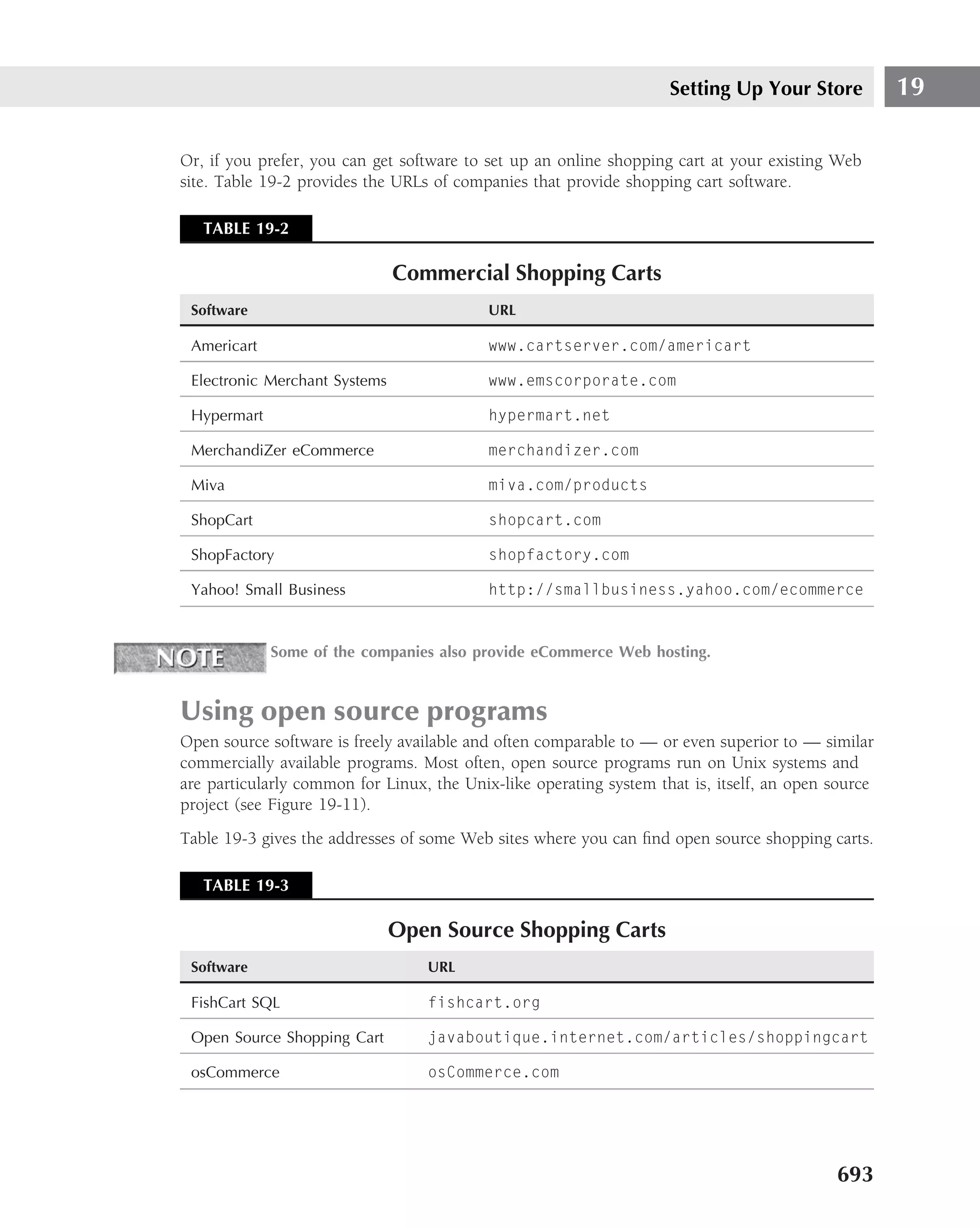
font-size-adjust
■ Values — ‹number› | none | inherit
■ Initial value — none
■ Applies to — All
■ Inherited — Yes
■ Percentages — N/A
■ Media groups — Visual
font-stretch
■ Values — normal | wider | narrower | ultra-condensed | extra-condensed
| condensed | semi-condensed | semi-expanded | expanded | extra-
expanded | ultra-expanded | inherit
■ Initial value — normal
■ Applies to — All
445](https://image.slidesharecdn.com/creating-web-sites-bible-jun-2008-100327061205-phpapp01/75/Creating-Web-Sites-Bible-Jun-2008-481-2048.jpg)
![Styling Web Pages with Cascading Style Sheets 12
■ Inherited — No
■ Percentages — See prose
■ Media groups — Visual
The cautionary message, ’’but see prose,’’ basically tells the author or user to ignore
the properties in author and user stylesheets.
left
■ Values — ‹length› | ‹percentage› | auto | inherit
■ Initial value — auto
■ Applies to — Positioned elements
■ Inherited — No
■ Percentages — Refer to width of containing block
■ Media groups — Visual
letter-spacing
■ Values — normal | ‹length› | inherit
■ Initial value — normal
■ Applies to — All
■ Inherited — Yes
■ Percentages — N/A
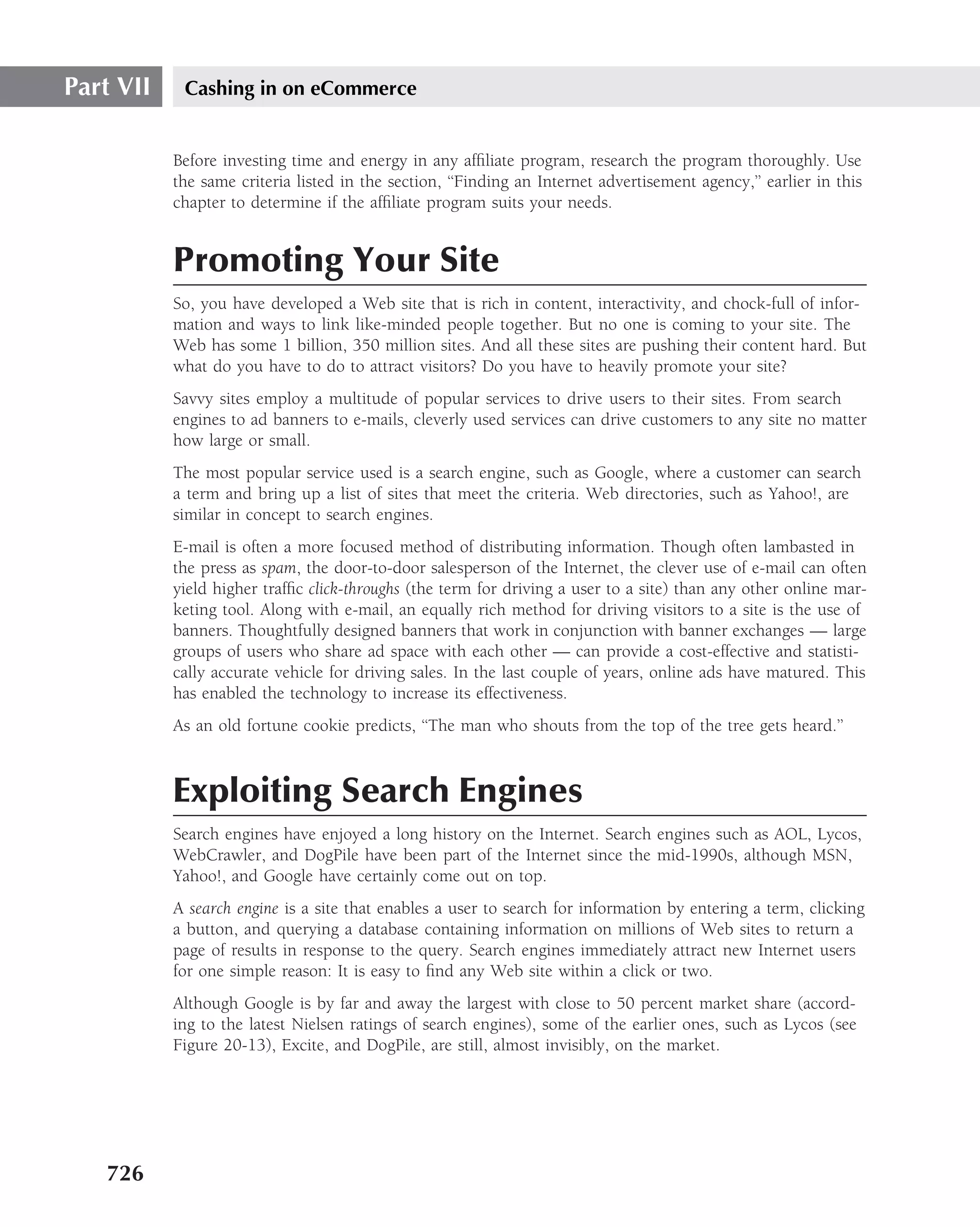
■ Media groups — Visual
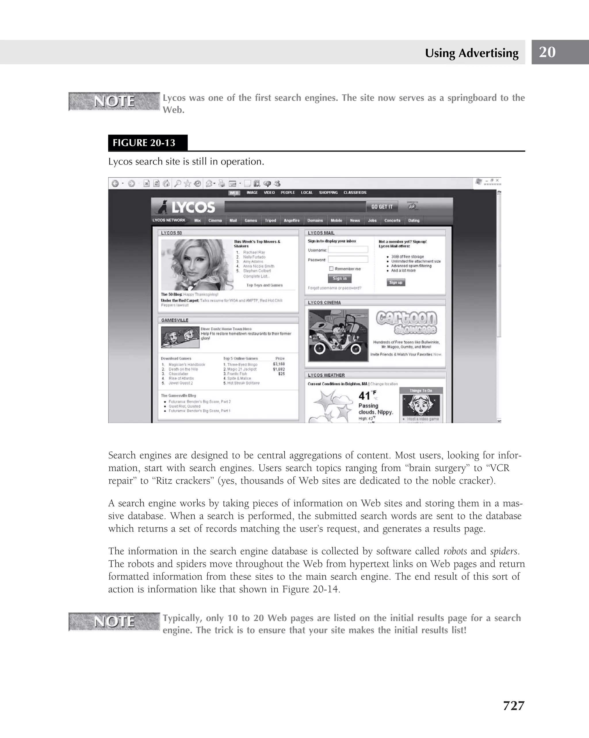
line-height
■ Values — normal | ‹number› | ‹length› | ‹percentage› | inherit
■ Initial value — normal
■ Applies to — All
■ Inherited — Yes
■ Percentages — Refer to the font size of the element itself
■ Media groups — Visual
list-style
■ Values — [ ‘list-style-type’ || ‘list-style-position’ || ‘list-style-
image’ ] | inherit
■ Initial value — Not defined for shorthand properties
447](https://image.slidesharecdn.com/creating-web-sites-bible-jun-2008-100327061205-phpapp01/75/Creating-Web-Sites-Bible-Jun-2008-483-2048.jpg)
![Styling Web Pages with Cascading Style Sheets 12
margin
■ Values — ‹margin-width› {1,4} | inherit
■ Initial value — Not defined for shorthand properties
■ Applies to — All
■ Inherited — No
■ Percentages — Refer to width of containing block
■ Media groups — Visual
margin-top, margin-right, margin-bottom, margin-left
■ Values — ‹margin-width› | inherit
■ Initial value — 0
■ Applies to — All
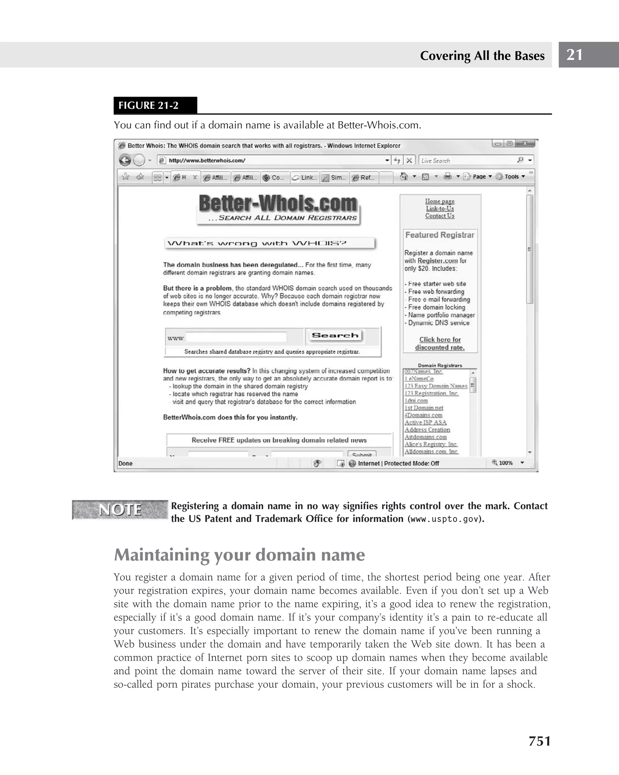
■ Inherited — No
■ Percentages — Refer to width of containing block
■ Media groups — Visual
marker-offset
■ Values — ‹length› | auto | inherit
■ Initial value — auto
■ Applies to — Elements with display: marker
■ Inherited — No
■ Percentages — N/A
■ Media groups — Visual
marks
■ Values — [ crop || cross ] | none | inherit
■ Initial value — none
■ Applies to — Page context
■ Inherited — N/A
■ Percentages — N/A
■ Media groups — Visual, paged
449](https://image.slidesharecdn.com/creating-web-sites-bible-jun-2008-100327061205-phpapp01/75/Creating-Web-Sites-Bible-Jun-2008-485-2048.jpg)
![Styling Web Pages with Cascading Style Sheets 12
orphans
■ Values — ‹integer› | inherit
■ Initial value — 2
■ Applies to — Block-level elements
■ Inherited — Yes
■ Percentages — N/A
■ Media groups — Visual, paged
outline
■ Values — [ ‘outline-color’ || ‘outline-style’ || ‘outline-width’ ]
| inherit
■ Initial value — See individual properties
■ Applies to — All
■ Inherited — No
■ Percentages — N/A
■ Media groups — Visual, interactive
outline-color
■ Values — ‹color› | invert | inherit
■ Initial value — invert
■ Applies to — All
■ Inherited — No
■ Percentages — N/A
■ Media groups — Visual, interactive
outline-style
■ Values — ‹border-style› | inherit
■ Initial value — none
■ Applies to — All
■ Inherited — No
■ Percentages — N/A
■ Media groups — Visual, interactive
451](https://image.slidesharecdn.com/creating-web-sites-bible-jun-2008-100327061205-phpapp01/75/Creating-Web-Sites-Bible-Jun-2008-487-2048.jpg)

![Part IV Making It Look Professional
pause
■ Values — [ [‹time› | ‹percentage›]{1,2} ] | inherit
■ Initial value — Depends on user agent
■ Applies to — All
■ Inherited — No
■ Percentages — See descriptions of pause-after and pause-before
■ Media groups — Aural
pause-after
■ Values — ‹time› | ‹percentage› | inherit
■ Initial value — Depends on user agent
■ Applies to — All
■ Inherited — No
■ Percentages — See prose
■ Media groups — Aural
The cautionary message, ’’but see prose,’’ basically tells the author or user to ignore
the properties in author and user stylesheets.
pause-before
■ Values — ‹time› | ‹percentage› | inherit
■ Initial value — Depends on user agent
■ Applies to — All
■ Inherited — No
■ Percentages — See prose
■ Media groups — Aural
pitch
■ Values — ‹frequency› | x-low | low | medium | high | x-high | inherit
■ Initial value — medium
■ Applies to — All
■ Inherited — Yes
■ Percentages — N/A
■ Media groups — Aural
454](https://image.slidesharecdn.com/creating-web-sites-bible-jun-2008-100327061205-phpapp01/75/Creating-Web-Sites-Bible-Jun-2008-490-2048.jpg)
![Styling Web Pages with Cascading Style Sheets 12
pitch-range
■ Values — ‹number› | inherit
■ Initial value — 50
■ Applies to — All
■ Inherited — Yes
■ Percentages — N/A
■ Media groups — Aural
play-during
■ Values — ‹uri› mix? repeat? | auto | none | inherit
■ Initial value — Auto
■ Applies to — All
■ Inherited — No
■ Percentages — N/A
■ Media groups — Aural
position
■ Values — static | relative | absolute | fixed | inherit
■ Initial value — static
■ Applies to — All elements, but not to generated content
■ Inherited — No
■ Percentages — N/A
■ Media groups — Visual
quotes
■ Values — [‹string› ‹string›]+ | none | inherit
■ Initial value — Depends on user agent
■ Applies to — All
■ Inherited — Yes
■ Percentages — N/A
■ Media groups — Visual
455](https://image.slidesharecdn.com/creating-web-sites-bible-jun-2008-100327061205-phpapp01/75/Creating-Web-Sites-Bible-Jun-2008-491-2048.jpg)
![Part IV Making It Look Professional
stress
■ Values — ‹number› | inherit
■ Initial value — 50
■ Applies to — All
■ Inherited — Yes
■ Percentages — N/A
■ Media groups — Aural
table-layout
■ Values — auto | fixed | inherit
■ Initial value — auto
■ Applies to — table and inline-table elements
■ Inherited — No
■ Percentages — N/A
■ Media groups — Visual
text-align
■ Values — left | right | center | justify | ‹string› | inherit
■ Initial value — Depends on user agent and writing direction
■ Applies to — Block-level elements
■ Inherited — Yes
■ Percentages — N/A
■ Media groups — Visual
text-decoration
■ Values — none | [ underline || overline || line-through || blink ]
| inherit
■ Initial value — none
■ Applies to — All
■ Inherited — No (see prose)
■ Percentages — N/A
■ Media groups — Visual
458](https://image.slidesharecdn.com/creating-web-sites-bible-jun-2008-100327061205-phpapp01/75/Creating-Web-Sites-Bible-Jun-2008-494-2048.jpg)
![Styling Web Pages with Cascading Style Sheets 12
The cautionary message, ‘‘see prose,’’ refers to the distinction between inline and
block level when using this feature. All descendants of element inherit specified
text feature.
text-indent
■ Values — ‹length› | ‹percentage› | inherit
■ Initial value — 0
■ Applies to — Block-level elements
■ Inherited — Yes
■ Percentages — Refer to width of containing block
■ Media groups — Visual
text-shadow
■ Values — none | [‹color› || ‹length› ‹length› ‹length›? ,]* [‹color› ||
‹length› ‹length› ‹length›?] | inherit
■ Initial value — none
■ Applies to — All
■ Inherited — No (see prose)
■ Percentages — N/A
■ Media groups — Visual
The cautionary message, ‘‘see prose,’’ refers to the distinction between inline and
block level when using this feature. All descendants of element inherit specified
text feature.
text-transform
■ Values — capitalize | uppercase | lowercase | none | inherit
■ Initial value — none
■ Applies to — All
■ Inherited — Yes
■ Percentages — N/A
■ Media groups — Visual
top
■ Values — ‹length› | ‹percentage› | auto | inherit
■ Initial value — auto
459](https://image.slidesharecdn.com/creating-web-sites-bible-jun-2008-100327061205-phpapp01/75/Creating-Web-Sites-Bible-Jun-2008-495-2048.jpg)
![Styling Web Pages with Cascading Style Sheets 12
voice-family
■ Values — [[ ‹specific-voice› | ‹generic-voice› ],]* [ ‹specific-voice›
| ‹generic-voice› ] | inherit
■ Initial value — Depends on user agent
■ Applies to — All
■ Inherited — Yes
■ Percentages — N/A
■ Media groups — Aural
volume
■ Values — ‹number› | ‹percentage› | silent | x-soft | soft | medium | loud
| x-loud | inherit
■ Initial value — medium
■ Applies to — All
■ Inherited — Yes
■ Percentages — Refer to inherited value
■ Media groups — Aural
white-space
■ Values — normal | pre | nowrap | inherit
■ Initial value — normal
■ Applies to — Block-level elements
■ Inherited — Yes
■ Percentages — N/A
■ Media groups — Visual
widows
■ Values — ‹integer› | inherit
■ Initial value — 2
■ Applies to — Block-level elements
■ Inherited — Yes
■ Percentages — N/A
■ Media groups — Visual, paged
461](https://image.slidesharecdn.com/creating-web-sites-bible-jun-2008-100327061205-phpapp01/75/Creating-Web-Sites-Bible-Jun-2008-497-2048.jpg)


![Part IV Making It Look Professional
document.write("Every mile is two in winter.");
}
}
}
You will note that it is easy to make a mistake in coding, especially with the curly braces ({ }),
so you may wish to simplify the coding by using a feature known as a switch (or case) structure.
A switch structure allows you to check for multiple values of a single variable. In the earlier
example, this variable was season.
Here is the same if. . .else structure rewritten as a case structure:
switch (season) {
case "spring":
document.write("The Earth is like a child that knows poems.");
break;
case "summer":
document.write("To see the summer sky is poetry.");
break;
case "autumn":
document.write("Autumn is a second spring, where every leaf is a
flower.");
break;
case "winter":
document.write("Every mile is two in winter.");
break;
}
You would really not necessarily deem this to be shorter than a selection structure, but you have
neatly reduced the number of curly braces from 12 to 2. In other words, you have eliminated 10
possible sources of error.
You may have noticed the use of the break statement. This drops the execution of the pro-
gram out of the case structure once the proper match has been made. If the break statement
were absent, the case structure would still work, but the output would be different. In the first
instance, let us say the value of season is summer. The output then would be: "To see the
summer sky is poetry."
If the break statements were omitted, however, and the variable were still to be summer, the
output would be:
To see the summer sky is poetry.
Autumn is a second spring where every leaf is a flower.
Every mile is two in winter.
Finally, you may, even more simply, put the multivalued variable, season, in an array.
var Season = new Array();
season[0] = "spring";
498](https://image.slidesharecdn.com/creating-web-sites-bible-jun-2008-100327061205-phpapp01/75/Creating-Web-Sites-Bible-Jun-2008-534-2048.jpg)
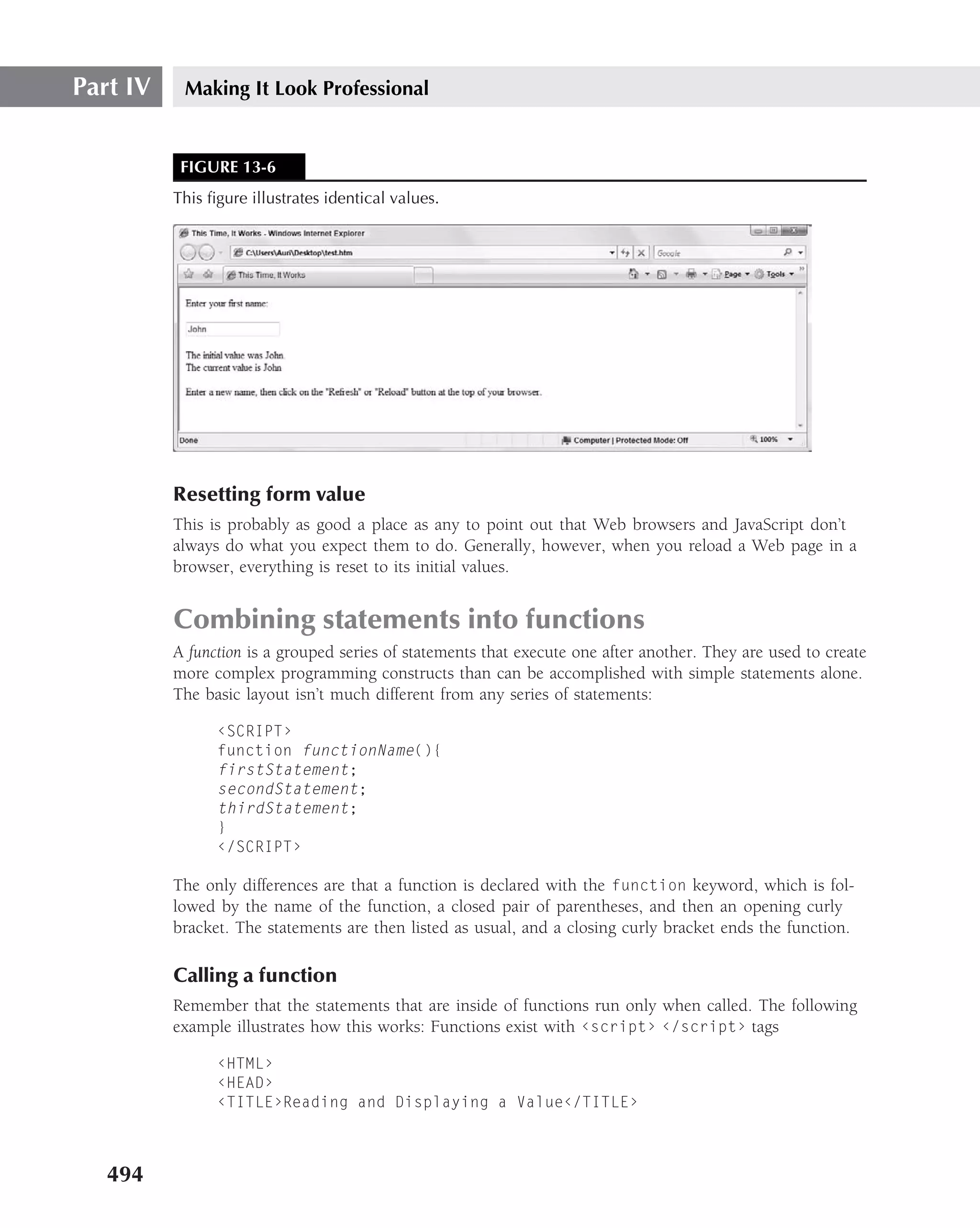
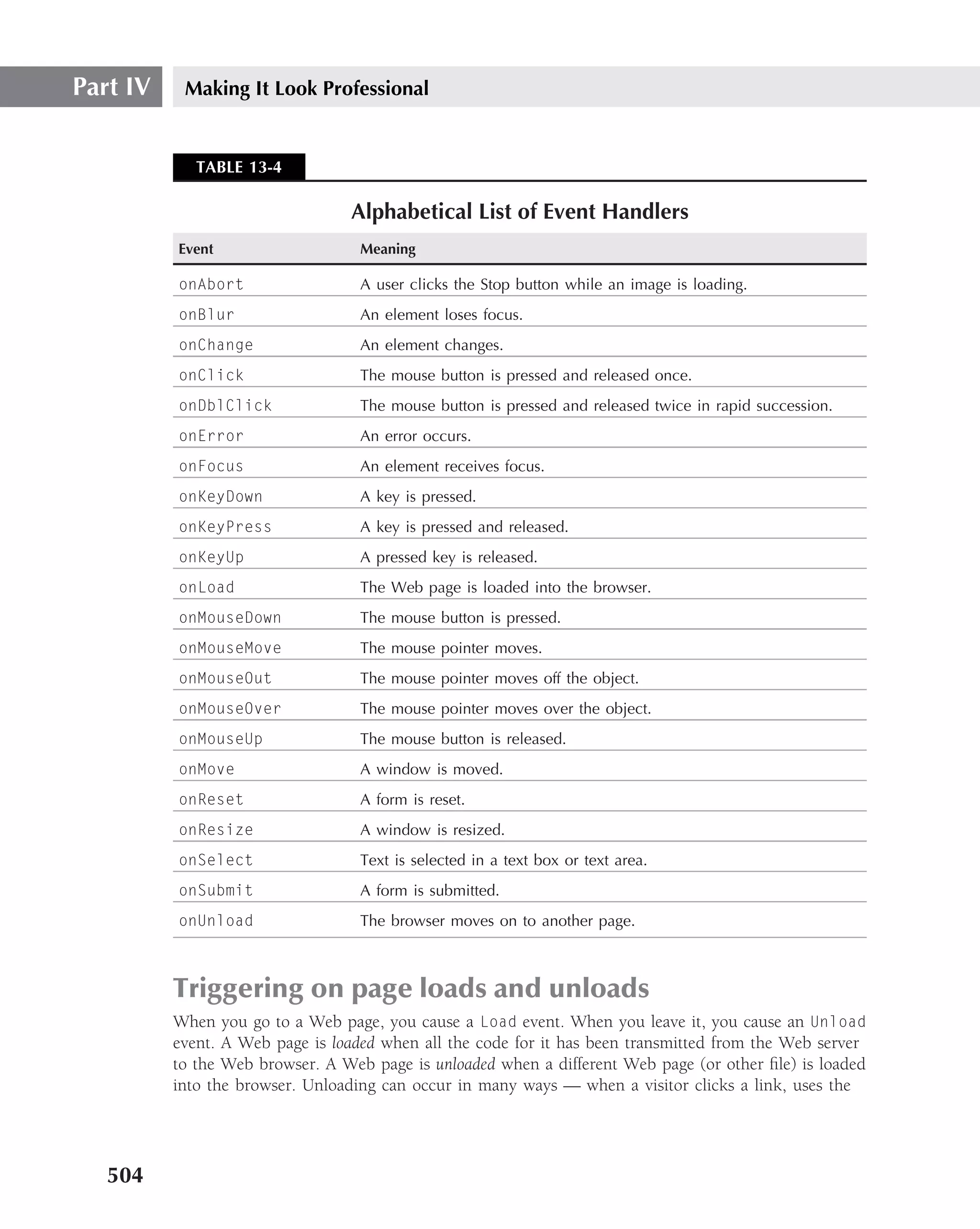
![Making Dynamic Pages with JavaScript 13
season[1] = "summer";
season[2] = "autumn";
season[3] = "winter";
However, the number of values is rather small for an array.
If you need to test for multiple conditions before deciding what action to take, if statements
can be nested so that one condition is tested after another one is passed. This says, ‘‘If the first
condition is true, then — and only then — check to see if the second condition is true. If the
second one is true, too, then take an action.’’ The following is the JavaScript version:
if (thisIsTrue) {
if (thatIsTrue) {
doThis;
}
}
The following example tests first to see if a credit card number is correct, and then checks to
see if the balance of available credit is enough to pay for the product. The credit limit is not
checked unless the card number is a valid one. Only if both of these comparisons are true will
the purchase be completed.
if (cardNumber == valid) {
if (limit == highEnough) {
completePurchase();
}
}
You can also nest an if statement within an if...else statement, an if... else statement
within an if statement, or an if...else statement within another if...else statement. The
levels of complexity you can reach are truly mind-blowing, allowing for a practically infinite
number of conditional decisions.
As with any other kind of power, it’s best to exercise this in moderation. If you have
37 different if...else statements nested within 24 different if statements that are
themselves nested within another dozen if...else statements, you’ll never be able to untangle
things if you need to modify the code later. When code appears to be too complex, rethink your
approach.
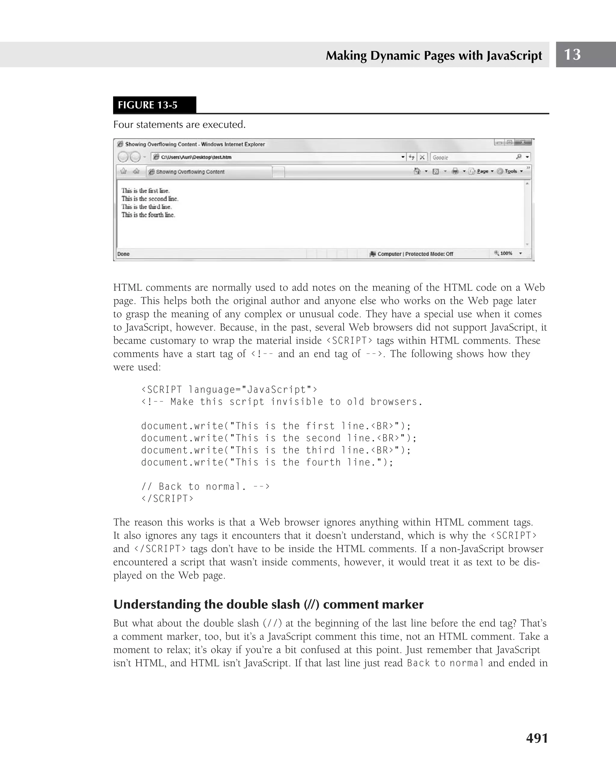
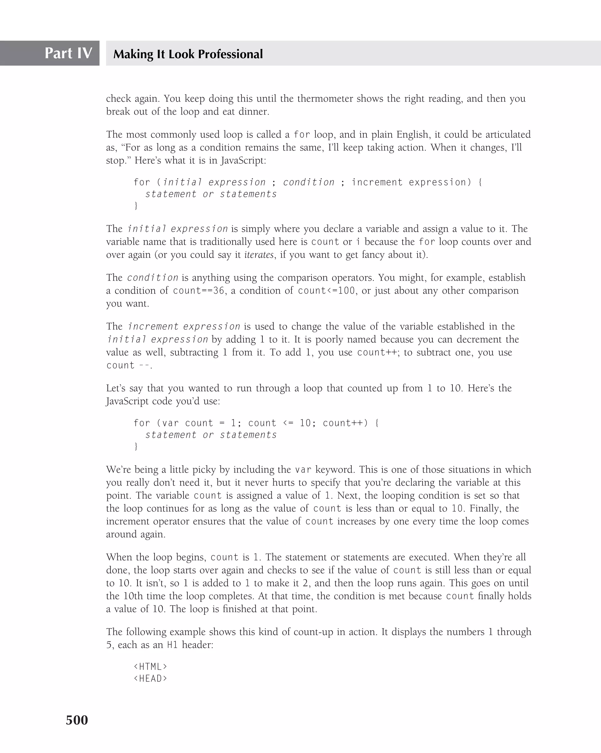
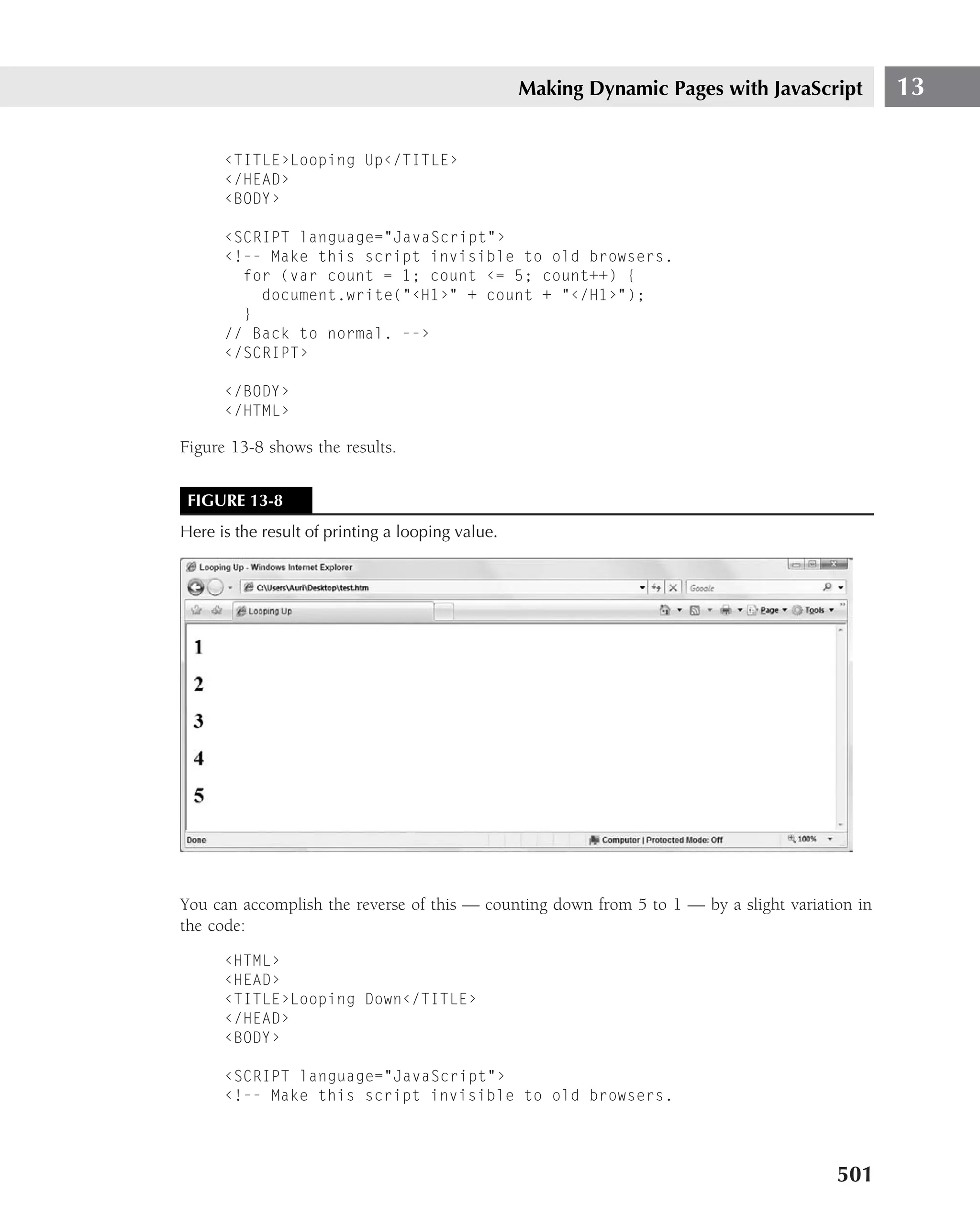
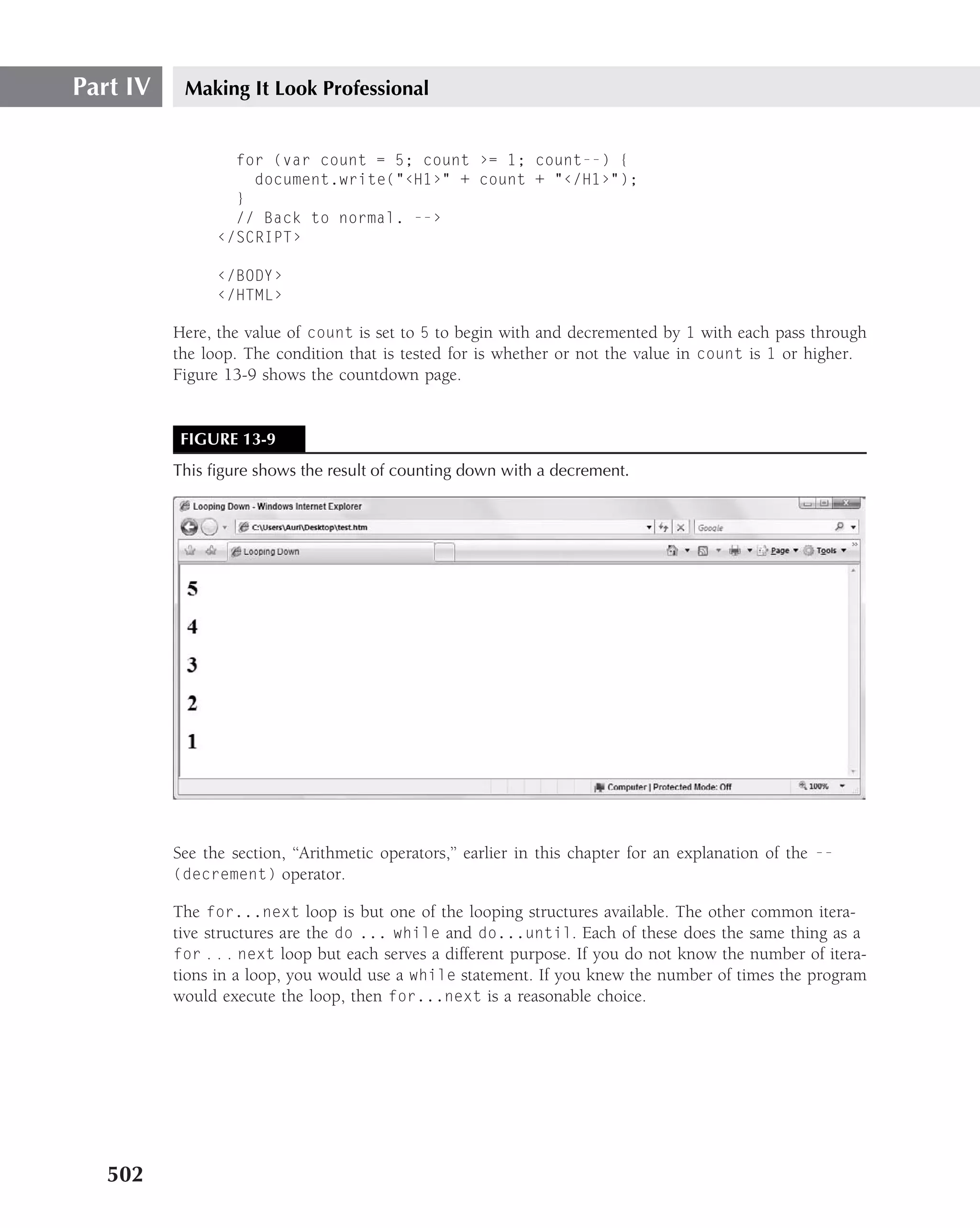
Going in loops
Most of us spend at least some time running around in circles. In JavaScript, you sometimes
want to do this deliberately — a loop, in programming terms. If you’ve ever cooked a turkey
on Thanksgiving, you already know all about loops. You open the oven and look at the meat
thermometer to see if it’s up to the ‘‘poultry’’ mark yet. If it isn’t, you wait a little while, and then
499](https://image.slidesharecdn.com/creating-web-sites-bible-jun-2008-100327061205-phpapp01/75/Creating-Web-Sites-Bible-Jun-2008-535-2048.jpg)
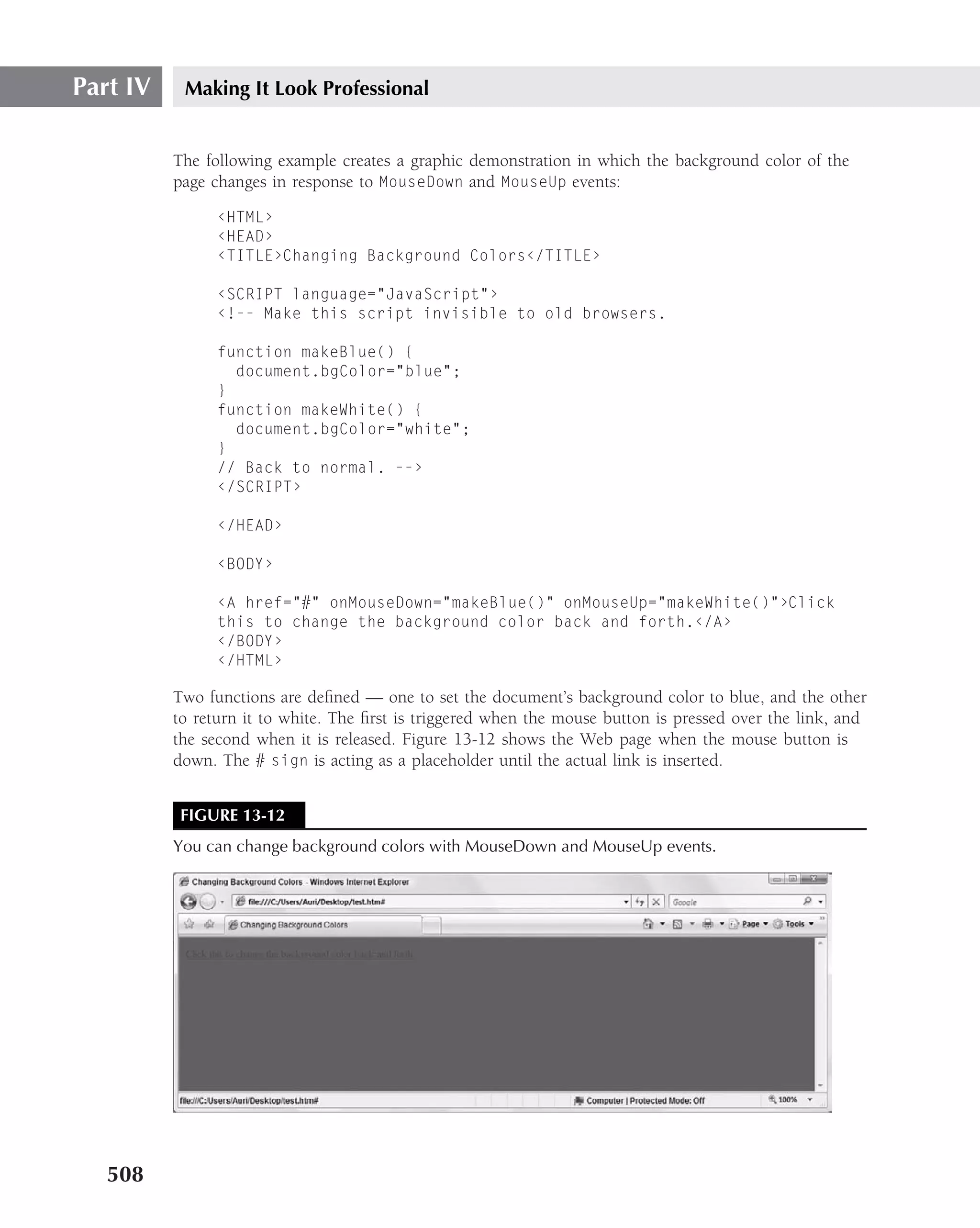
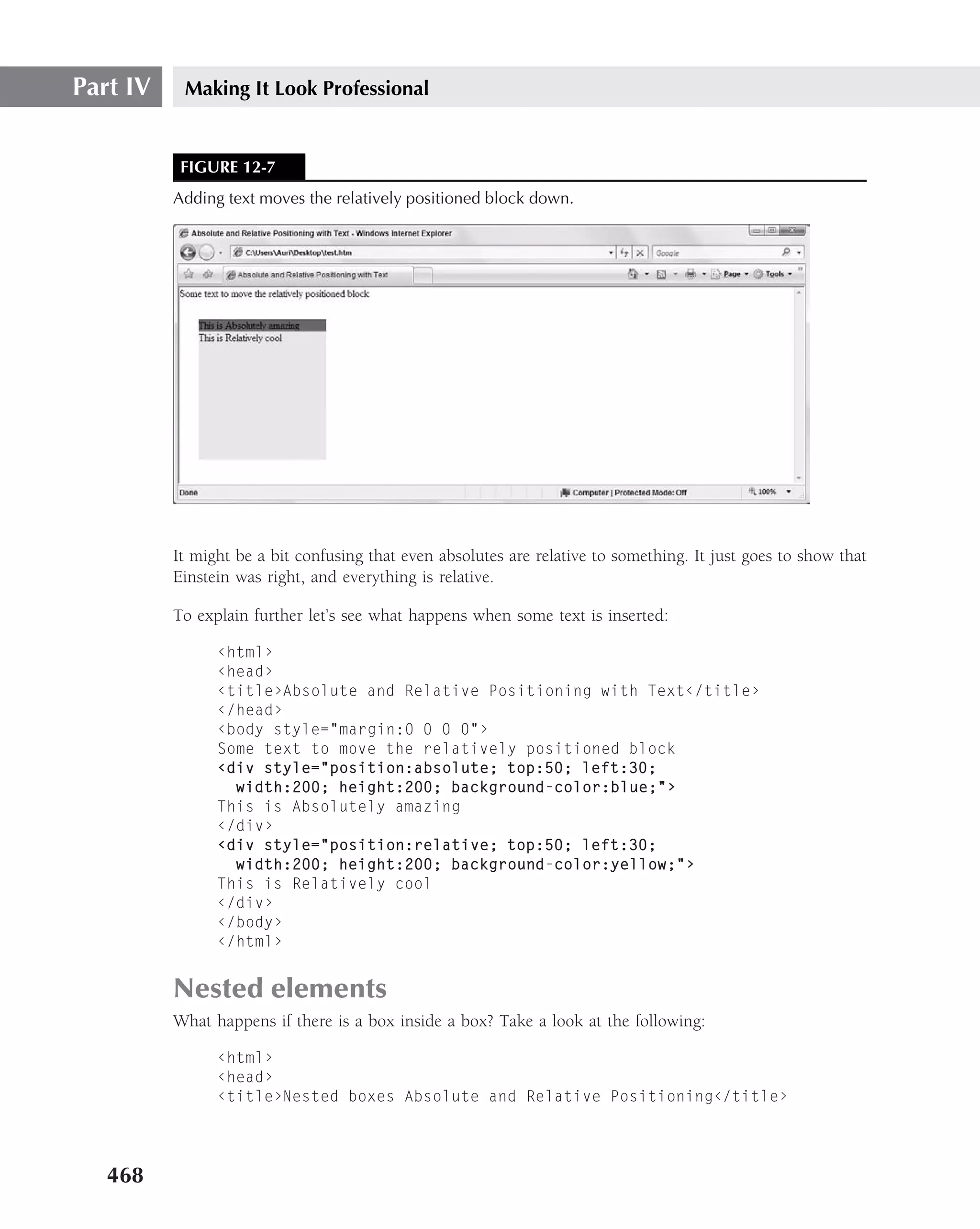
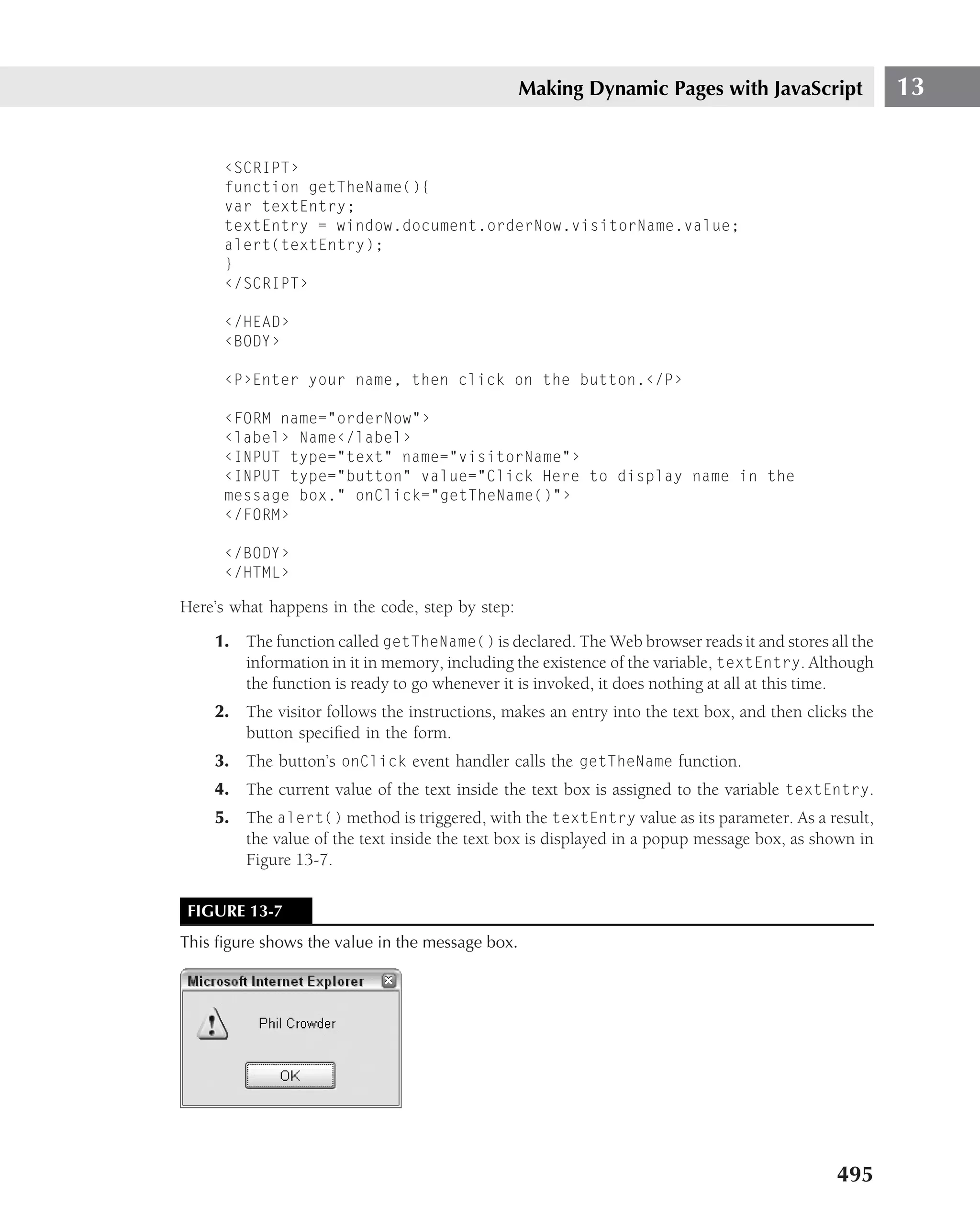
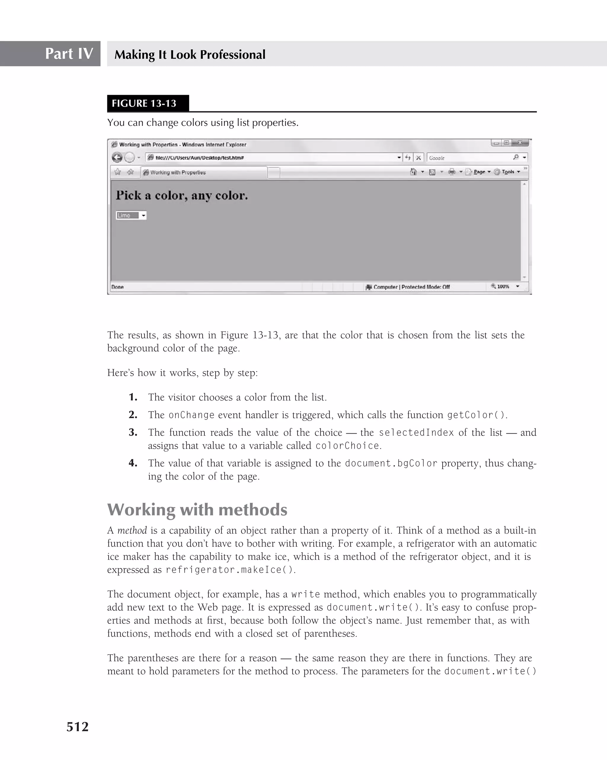
![Making Dynamic Pages with JavaScript 13
From that point on, all you have to do is to work with the variable. The following example shows
how this can be done in a form that allows a visitor to change the background color of the page:
‹HTML›
‹HEAD›
‹TITLE›Working with Properties‹/TITLE›
‹SCRIPT language="JavaScript"›
‹!-- Make this script invisible to old browsers.
function getColor(){
colorChoice = document.pickAColor.visitorColor.options[document
.pickAColor.visitorColor.selectedIndex].value;
document.bgColor = colorChoice;
}
// Back to normal. --›
‹/SCRIPT›
‹/HEAD›
‹BODY bgcolor="Green"›
‹H1›Pick a color, any color.‹/H1›
‹FORM id="pickAColor" name="pickAColor"›
‹SELECT id="visitorColor" name="visitorColor" onChange="getColor()"›
‹OPTION value="Aqua"›Aqua‹/OPTION›
‹OPTION value="Black"›Black‹/OPTION›
‹OPTION value="Blue"›Blue‹/OPTION›
‹OPTION value="Fuschia"›Fuschia‹/OPTION›
‹OPTION value="Gray"›Gray‹/OPTION›
‹OPTION value="Green"›Green‹/OPTION›
‹OPTION value="Lime"›Lime‹/OPTION›
‹OPTION value="Maroon"›Maroon‹/OPTION›
‹OPTION value="Navy"›Navy‹/OPTION›
‹OPTION value="Olive"›Olive‹/OPTION›
‹OPTION value="Purple"›Purple‹/OPTION›
‹OPTION value="Red"›Red‹/OPTION›
‹OPTION value="Silver"›Silver‹/OPTION›
‹OPTION value="Teal"›Teal‹/OPTION›
‹OPTION value="White"›White‹/OPTION›
‹OPTION value="Yellow"›Yellow‹/OPTION›
‹/SELECT›
‹/FORM›
‹/BODY›
‹/HTML›
511](https://image.slidesharecdn.com/creating-web-sites-bible-jun-2008-100327061205-phpapp01/75/Creating-Web-Sites-Bible-Jun-2008-547-2048.jpg)
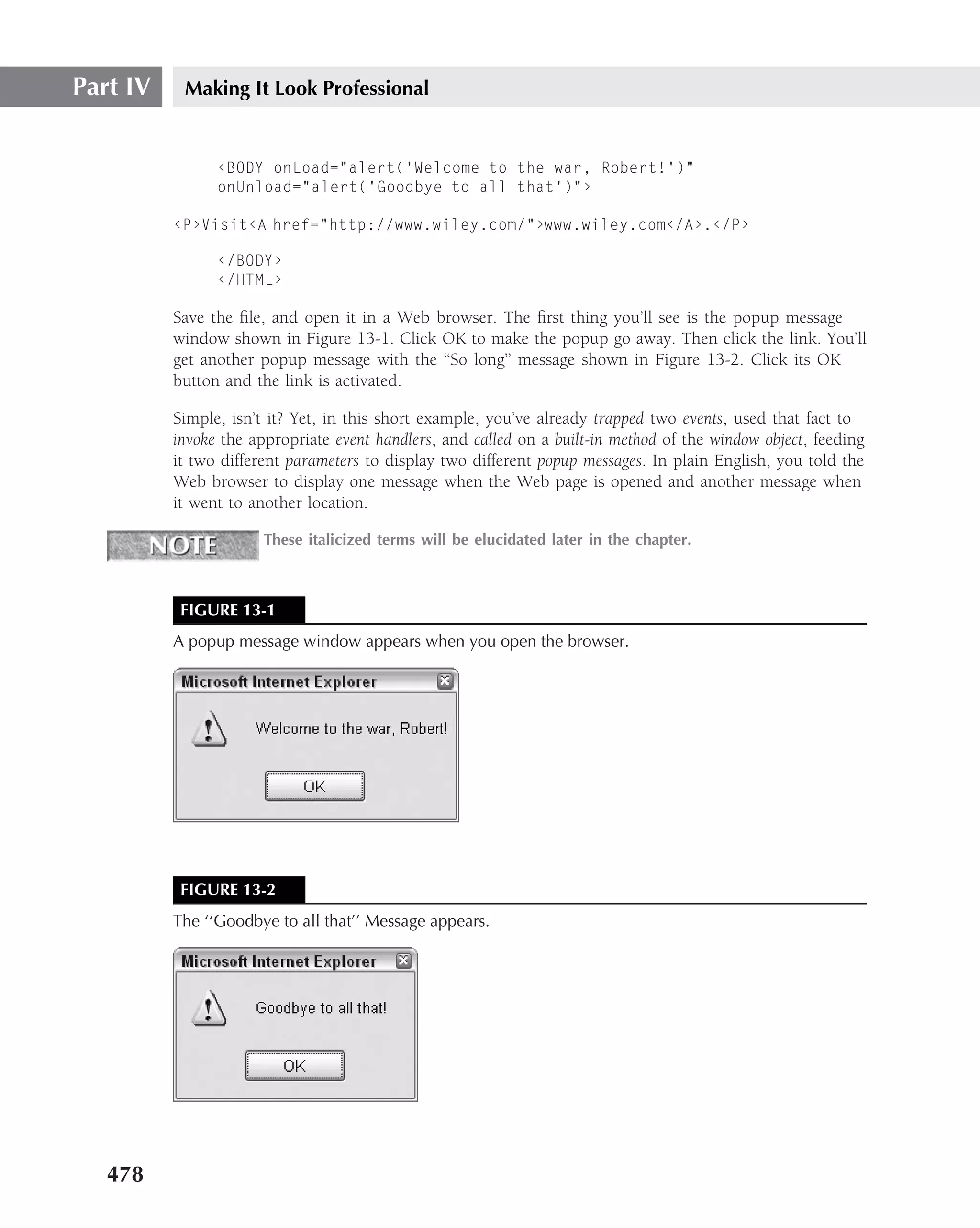
![Making Dynamic Pages with JavaScript 13
method are the text or HTML code to be placed onto the Web page. To add the sentence, ‘‘Hey,
I’m changing the page!’’ to the page, you would write the following:
document.write(Hey, I’m changing the page!);
Remember, you’re not limited to adding only plain text — you can use HTML code as well. The
following variation is just as valid as the original example:
document.write(Hey, I’m ‹I›changing‹/I› the page!);
Form Validation
One of the most common uses of JavaScript is to validate forms before they are submitted to the
Web server.
The following code shows how to verify that the data in a form contains a name and an e-mail
address. It uses regular expressions to perform the validation.
‹html›
‹head›
‹title›Validating Forms‹/title›
‹script language="JavaScript"›
‹!-- Make this script invisible to old browsers.
function check()
{
if (document.form.name.value.length==0 )
{
alert ("You must enter your name");
return false;
};
var nameRe=new RegExp("^[A-Za-z]+$");
if (!nameRe.test(document.form.name.value))
{
alert ("You must enter your name only alphabetic characters
are allowed no spaces");
return false;
}
var emailRe=new RegExp("^ [A-Za-z0-9]+@[A-Za-z0-9.]+$");
if (!emailRe.test(document.form.email.value))
{
alert ("You must enter a valid email address eg: user@host
.com");
return false;
}
return true;
513](https://image.slidesharecdn.com/creating-web-sites-bible-jun-2008-100327061205-phpapp01/75/Creating-Web-Sites-Bible-Jun-2008-549-2048.jpg)
![Part IV Making It Look Professional
};
// Back to normal. --›
‹/script›
‹/head›
‹body›
‹form id="form" name="form" onSubmit="return check();"›
First Name ‹INPUT type="text" id="name" name="name"›
Email ‹INPUT type="text" id="email" name="email"›
‹input type="submit" value="Send"›
‹/form›
‹/body›
‹/html›
In the form, we specify the onSubmit handler to call the function check before the form is
submitted. If the event handler returns false, then the form is not submitted, so we say return
check(). The check function validates the form and returns true if it is valid.
The following expression returns the number of characters in the string entered in the name text
box. If it is zero then we ask the user to enter something.
document.form.name.value.length
Now for the complicated part — regular expressions. Regular expressions (REs) are used to
search for matches of a particular character sequence in text. They are part of many program-
ming languages — the Unix operating system uses them extensively in tools from the command
line, and they have been included in JavaScript since version 1.1.
The following is brief (and simplified) explanation of REs.
You are probably familiar with wildcard characters such as ? (representing one character) and
* (representing any number of characters) in the DOS and Unix command line. The regular
expression for ? would be a period (.), followed by any character, or alternatively [A-Za-z0-9],
which means one character in the ranges of A to Z, a to z, and 0 to 9. If it is not in the given
ranges, then it doesn’t match. So, for *, it would be:
.*
or alternatively:
[A-Za-z0-9]*
The * at the end means zero or more of the preceding character or range of characters. It’s a bit
confusing that the RE for * has a * in it, but you have to bear in mind that they are different
514](https://image.slidesharecdn.com/creating-web-sites-bible-jun-2008-100327061205-phpapp01/75/Creating-Web-Sites-Bible-Jun-2008-550-2048.jpg)
![Making Dynamic Pages with JavaScript 13
syntaxes. If we wanted one or more, we could write:
[A-Za-z0-9][A-Za-z0-9]*
But there is a better way:
[A-Za-z0-9]+
Here, + means one or more of the previous expression. In the preceding code, we checked the
name with:
RegExp("^ [A-Za-z]+$")
This is because when the test method of the RE is called it returns true if the character sequence
is found anywhere in the text. However, we want it to only return true if the whole text given
corresponds to the RE. The ^ character specifies the start of the text and the $ specifies the end
of the text.
So, ^[A-Za-z]+$ translates into English as a match for text that, from start to end, is composed
of a sequence of one or more alphabetic characters. Now for the e-mail:
^ [A-Za-z0-9]+@[A-Za-z0-9.]+$
It starts with a sequence of one or more alphanumeric characters, has a @ in the middle, and
then ends with a sequence of one or more alphanumeric characters. However, this isn’t quite
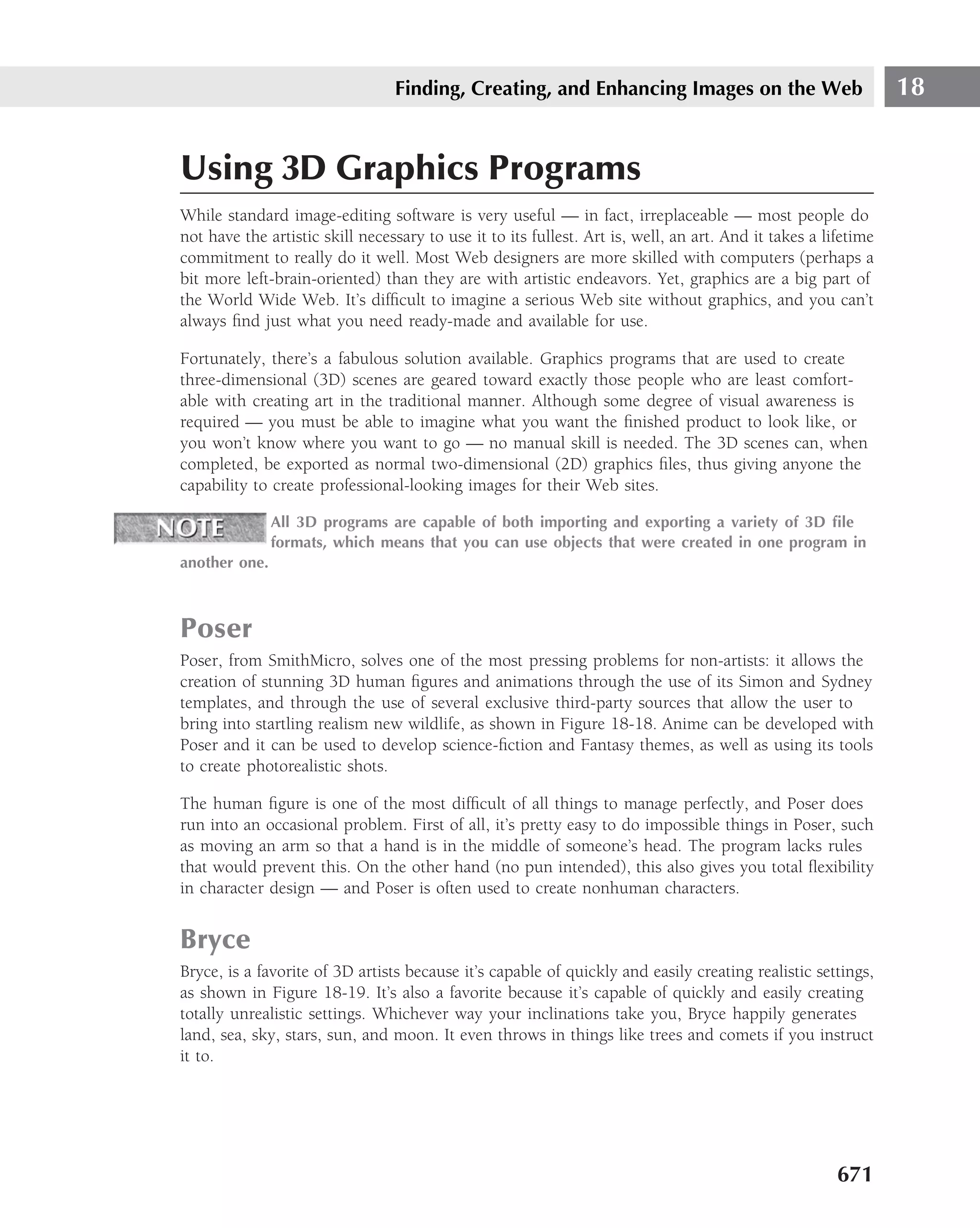
specific enough for a real e-mail address. If you really want to graduate in REs, take a look at
the following:
^[A-Za-z0-9]+[-A-Za-z0-9._]*@([-A-Za-z0-9]+.)+[A-Za-z]{2,5}$
Table 13-5 takes you through this complex example of REs step by step.
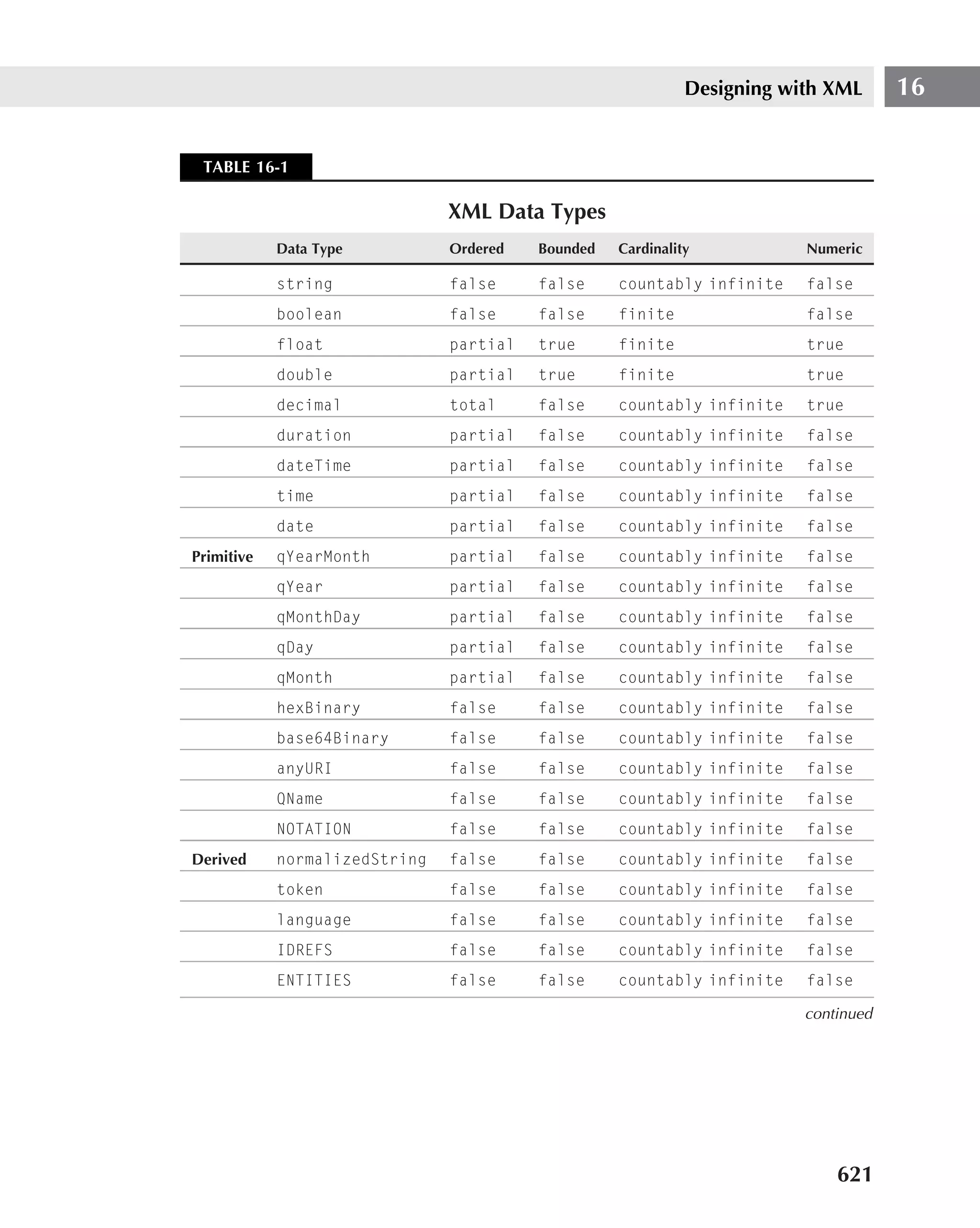
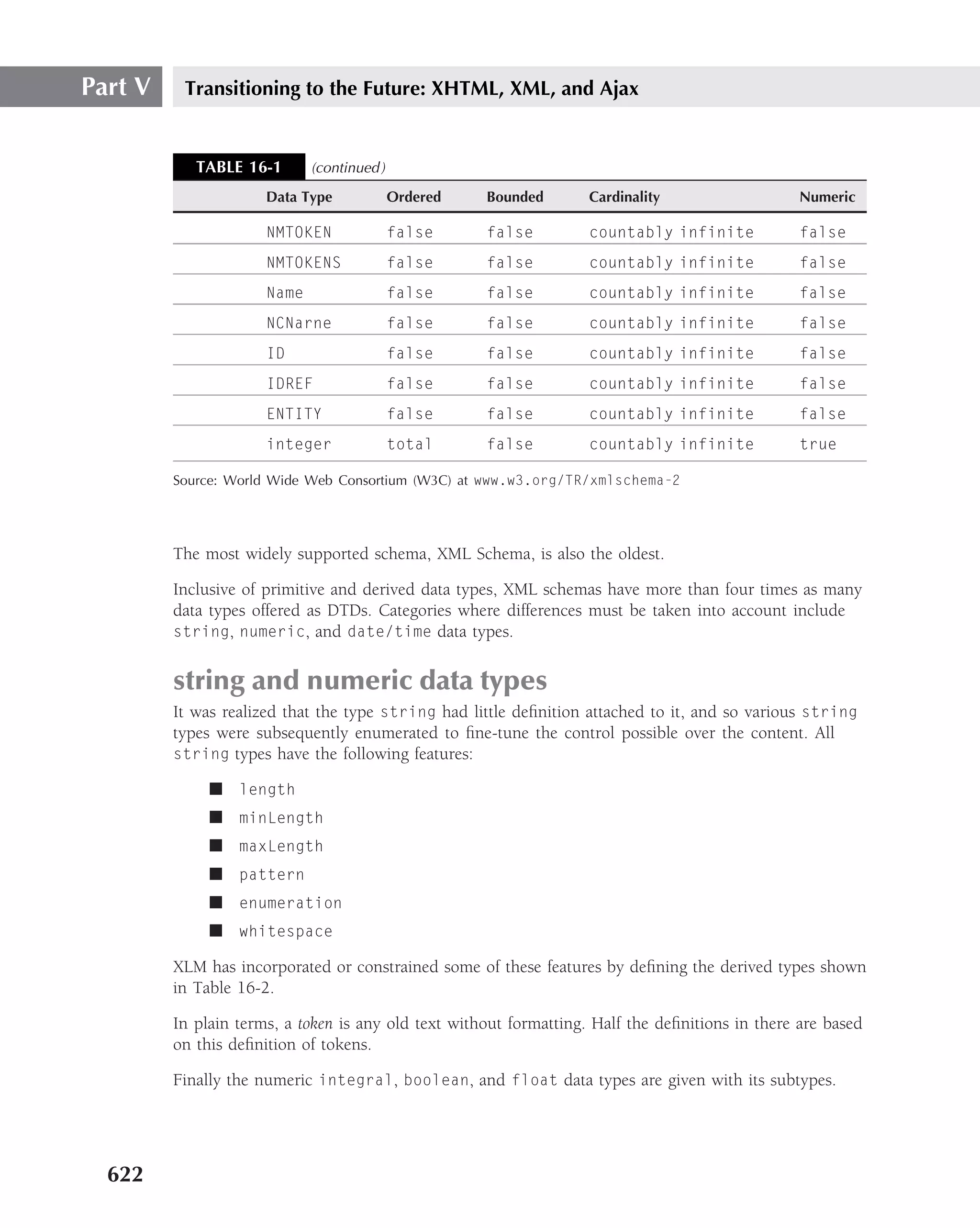
TABLE 13-5
Complex Example of Regular Expressions
Part of the Regular Expression Explanation
ˆ Starts with.
[A-Za-z0-9] + A sequence of one or more alphanumeric characters.
[-A-Za-z0-9. ]* A sequence of zero or more alphanumeric characters or -, . or _.
The – is specified as the first character because in this position it
doesn’t signify a range just the character itself.
([-A-Za-z0-9] + .) + The brackets turn a list of expressions into one group expression,
so this really means one or more of the sequences alphanumeric
character or - followed by a ., so this matched abc.xyz.
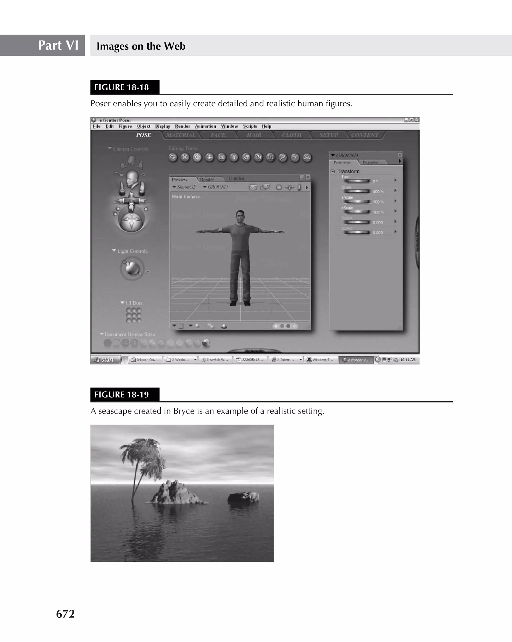
515](https://image.slidesharecdn.com/creating-web-sites-bible-jun-2008-100327061205-phpapp01/75/Creating-Web-Sites-Bible-Jun-2008-551-2048.jpg)
![Part IV Making It Look Professional
You can also check to see if check boxes, option buttons, or menu options are being selected.
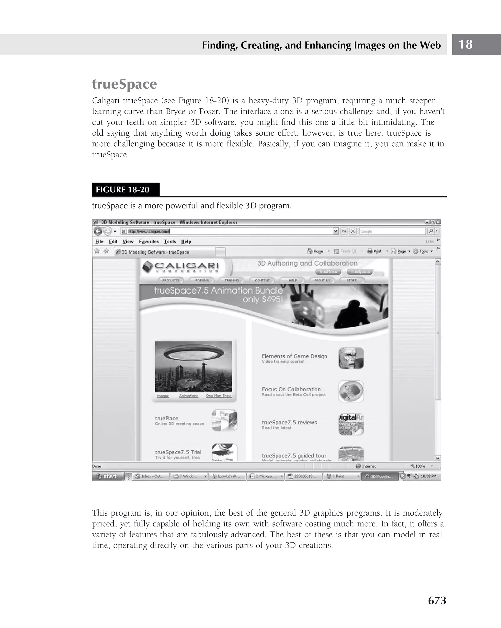
The following example shows how:
‹html›
‹head›
‹title›Validating Forms‹/title›
‹script language="JavaScript"›
‹!-- Make this script invisible to old browsers.
function check()
{
if(! (document.form.football.checked && document.form
.swimming.checked))
{
alert("We only accept members who play football and swim so
you might as well select them both");
return false;
}
if (document.form.gender[0].checked)
{
alert("You have to select your gender");
return false;
}
if (document.form.language.selectedIndex==0)
{
alert("Please select a language");
return false; }
return true;
};
// Back to normal. --›
‹/script›
‹/head›
‹body›
‹h2›Club Membership‹/h2›
‹form id="form" name="form" onSubmit="return check();"›
First Name ‹INPUT type="text" id="name" name="name"›
‹br›
Gender
‹input type="radio" name="gender" value="none" checked="checked"›
‹input type="radio" name="gender" value="male"›
‹input type="radio" name="gender" value="female"›
‹br›
Hobbies
‹input type="checkbox" name="football"›
‹input type="checkbox" name="swimming"›
516](https://image.slidesharecdn.com/creating-web-sites-bible-jun-2008-100327061205-phpapp01/75/Creating-Web-Sites-Bible-Jun-2008-552-2048.jpg)


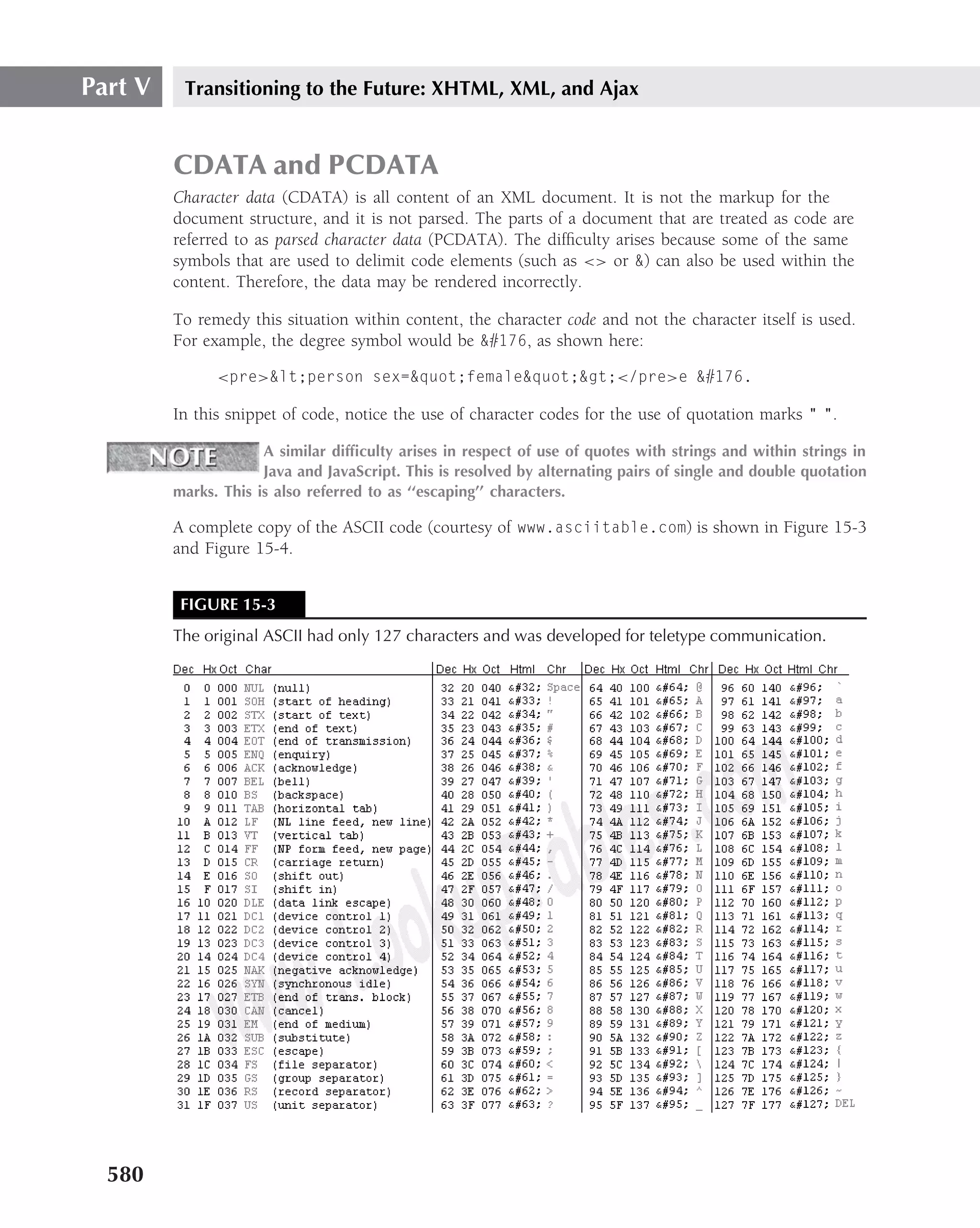
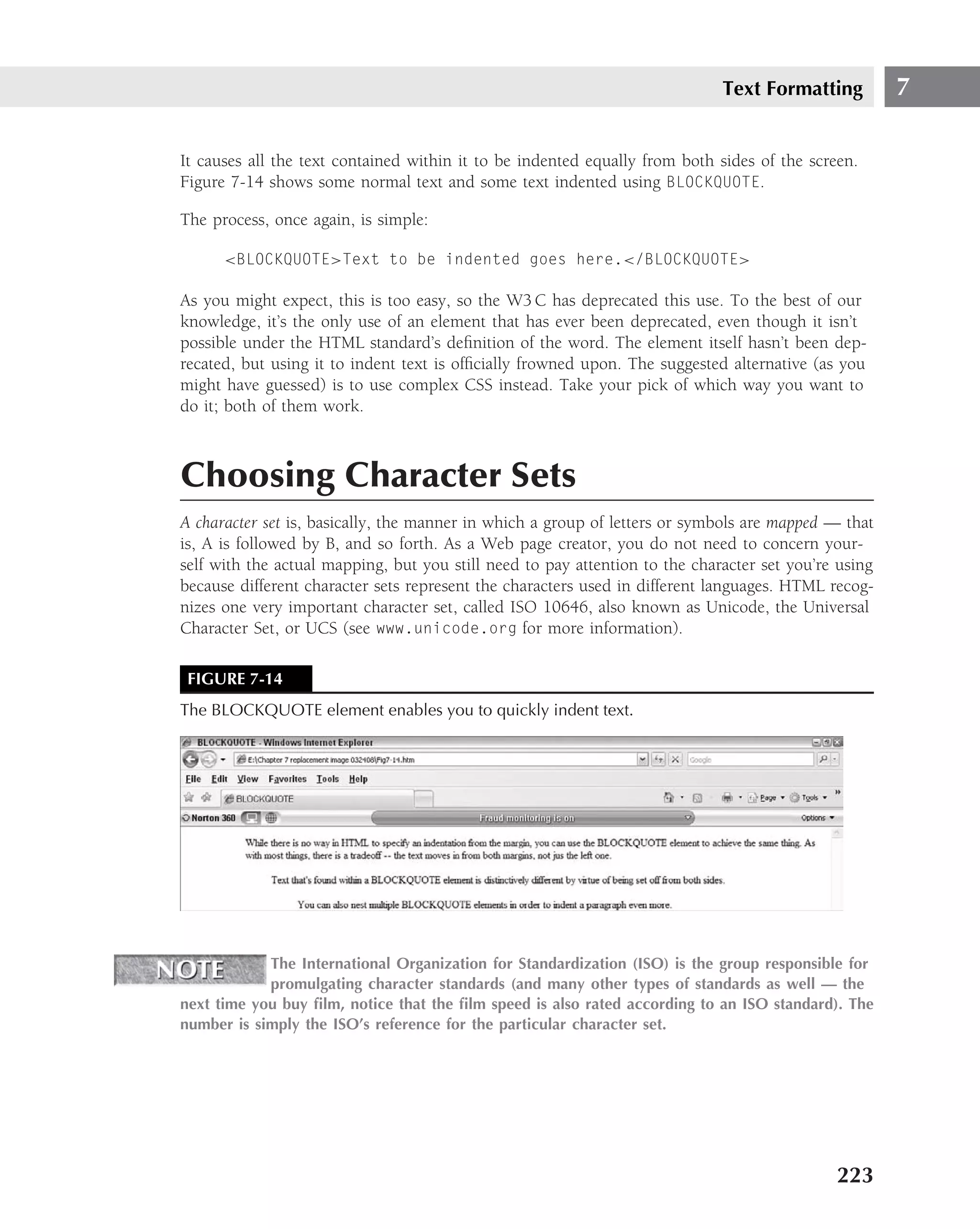
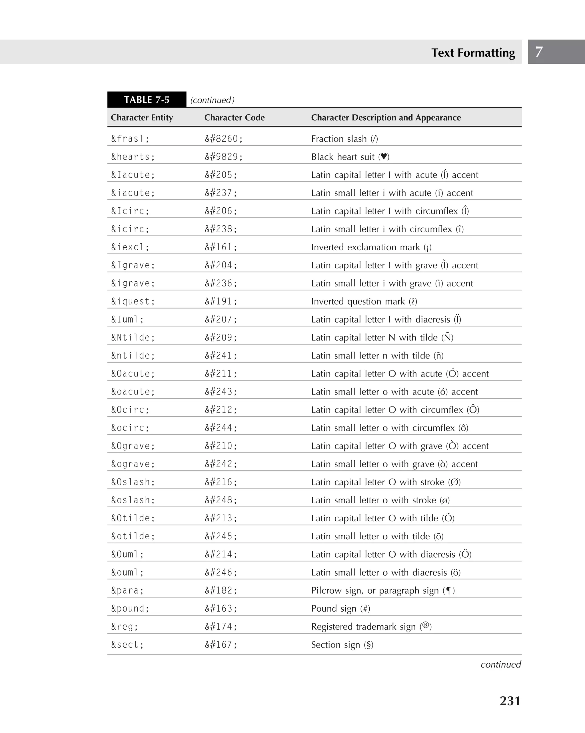
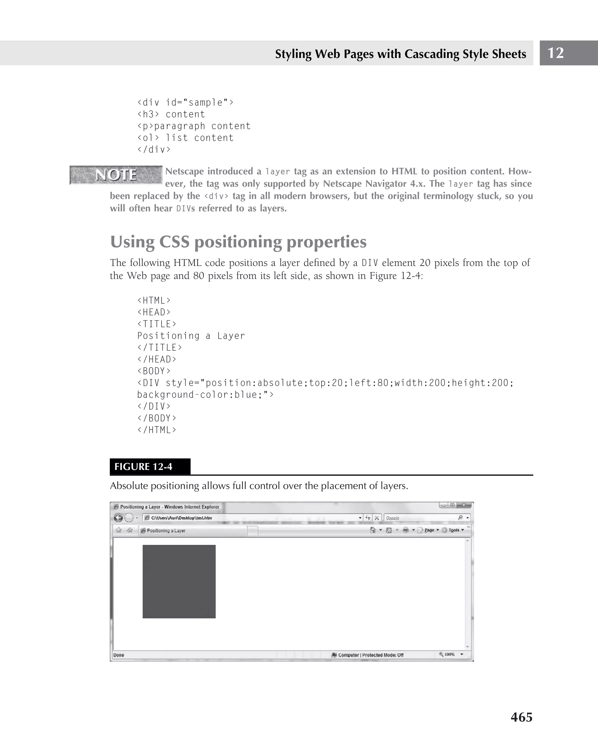
![XHTML 15
FIGURE 15-4
The extended ASCII code was implemented to provide a character set for numerous other symbols
that exceeded the limits of the original ASCII.
In the event that data had embedded in it multiple instances of characters that could be misread
by the browser as parsed rather than unparsed data (and cause a system crash), the data could
be enclosed within a set of brackets that indicated the parser should ignore the data within the
brackets. Occasionally, when using style commands, you may have data that would cause the
system to render the page incorrectly, and this would be a good candidate to enclose within
the brackets.
The formatting of a CDATA block is:
<![CDATA [
Enter the code you do not wish to be rendered here.
]]>
You will automatically note that the one piece of code you cannot use in a CDATA
block is the brackets because the parser, or Web browser, might read it.
White space
After the CDATA and the PCDATA have been dealt with, pretty much all that remains is the
white space. In HTML, the white space is automatically removed unless preserved by the use of
the <pre>structured content </pre> element.
581](https://image.slidesharecdn.com/creating-web-sites-bible-jun-2008-100327061205-phpapp01/75/Creating-Web-Sites-Bible-Jun-2008-617-2048.jpg)

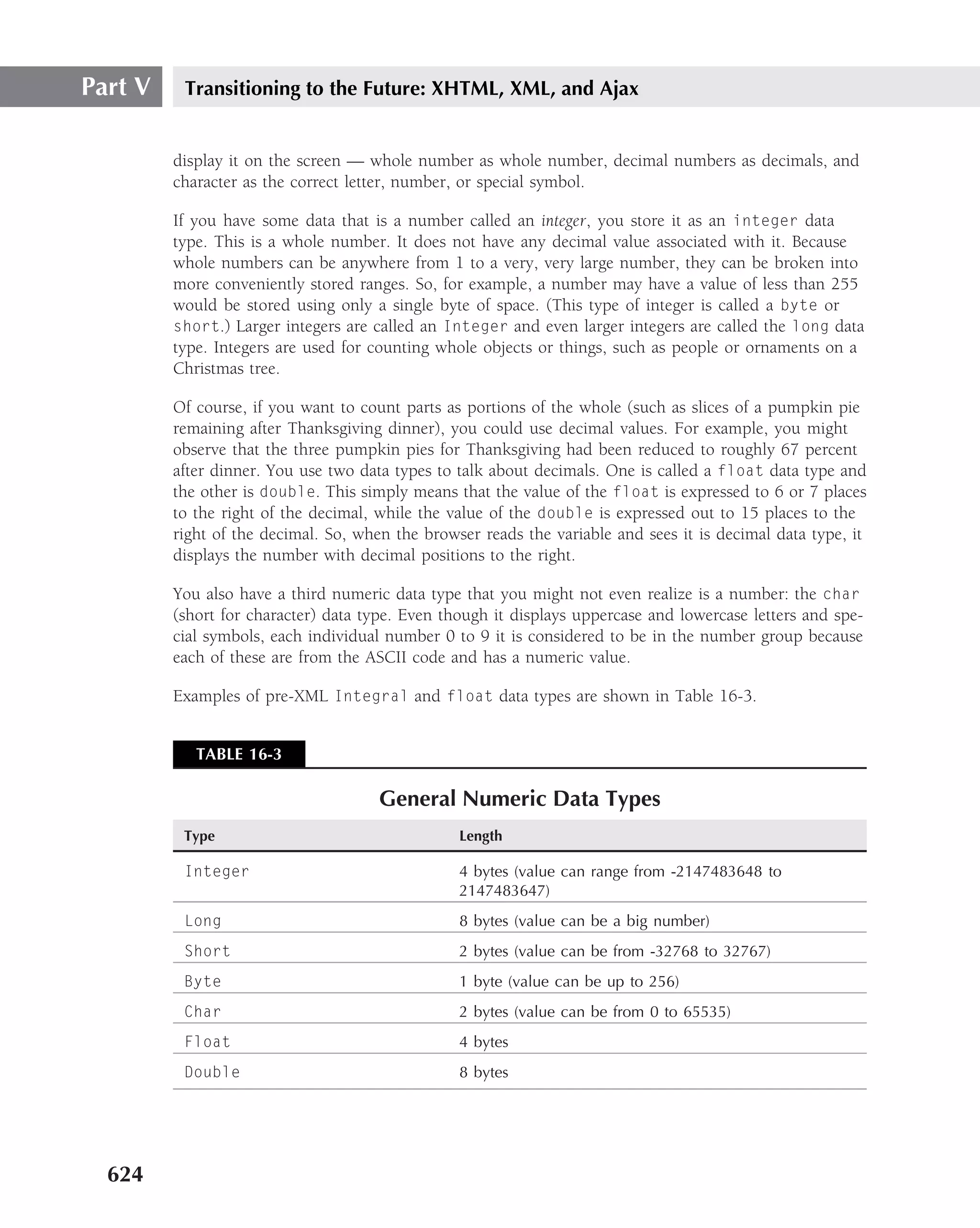
![Part V Transitioning to the Future: XHTML, XML, and Ajax
{
case 1: System.out.println("Go to the Gym");
break;
case 2: System.out.println("Go to the Humanities Bldg.");
break;
case 3: System.out.println("Go to Harrison-Jones");
break;
case 4: System.out.println("Go to Science Hall");
break;
}
Following is the same document formatted in XML using Microsoft Word to create it and then
saving the document as an XML document type. We have omitted monumental parts of it, but
we just wanted to give you a better sense of the coding.
<html xmlns:v="urn:schemas-microsoft-com:vml"
xmlns:o="urn:schemas-microsoft-com:office:office"
xmlns:w="urn:schemas-microsoft-com:office:word"
xmlns="http://www.w3.org/TR/REC-html40">
<head>
<meta http-equiv=Content-Type content="text/html; charset=us-ascii">
<meta name=ProgId content=Word.Document>
<meta name=Generator content="Microsoft Word 11">
<meta name=Originator content="Microsoft Word 11">
<link rel=File-List href="DB5C578F files/filelist.xml">
<link rel=Edit-Time-Data href="DB5C578F files/editdata.mso">
<!--[if !mso]>
<style>
v:* {behavior:url(#default#VML);}
o:* {behavior:url(#default#VML);}
w:* {behavior:url(#default#VML);}
.shape {behavior:url(#default#VML);}
</style>
<![endif]-->
<title>Sample case or switch structure</title>
<!--[if gte mso 9]><xml>
</o:shapelayout></xml><![endif]-->
</head>
Note that the preceding code completes the <head> structure. The <body> has several divisions
<div> in it to distinguish the sections, and, of course, each section has the standard HTML block
elements of <p> and other tag identifiers (such as span and class). In the following code, the
<table> structure with multiple <tr> and <td> is also used:
<body lang=EN-US style=’tab-interval:.5in’>
<div class=Section1>
<p class=MsoTitle>Sample case or switch structure</p>
<p class=MsoNormal><o:p> </o:p></p>
<p class=MsoNormal>Int gradeLevel;</p>
614](https://image.slidesharecdn.com/creating-web-sites-bible-jun-2008-100327061205-phpapp01/75/Creating-Web-Sites-Bible-Jun-2008-650-2048.jpg)
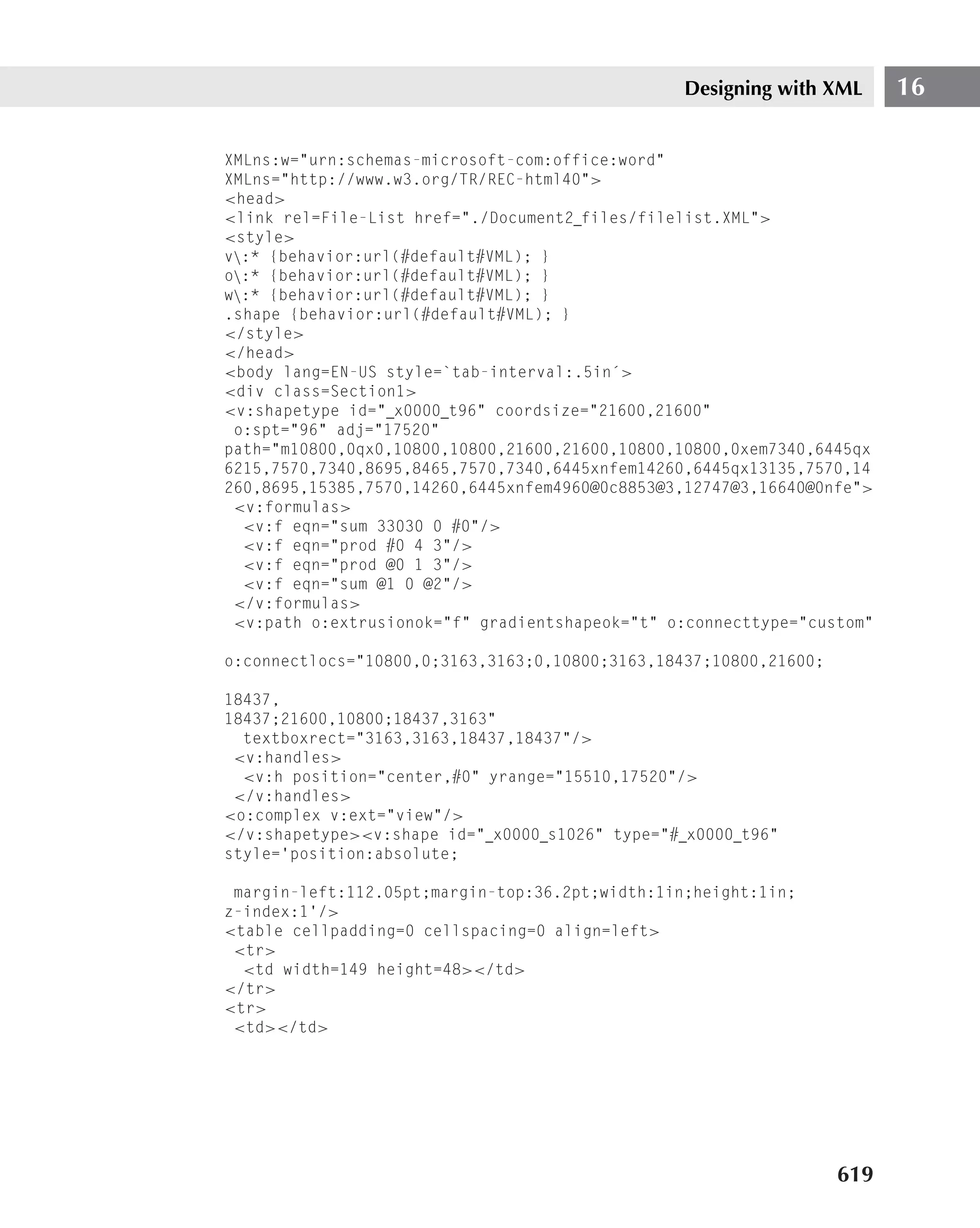
![Designing with XML 16
style=’position:absolute;
z-index:2’ from="1in,1.85pt" to="1in,19.85pt">
<v:stroke endarrow="block"/>
</v:line><![endif]--><![if !vml]><span style=’mso-ignore:vglayout’>
<table cellpadding=0 cellspacing=0 align=left>
<tr>
<td width=90 height=1></td>
</tr>
<tr>
<td></td>
<td><img width=12 height=27 src="DB5C578F files/image002.gif"
v:shapes=" x0000 s1028"></td>
</tr>
</table>
</span><![endif]><o:p> </o:p></p>
<br style=’mso-ignore:vglayout’ clear=ALL>
</div>
</body>
</html>
You might remember that a big advantage of a case structure over a nested if
structure is efficiency.
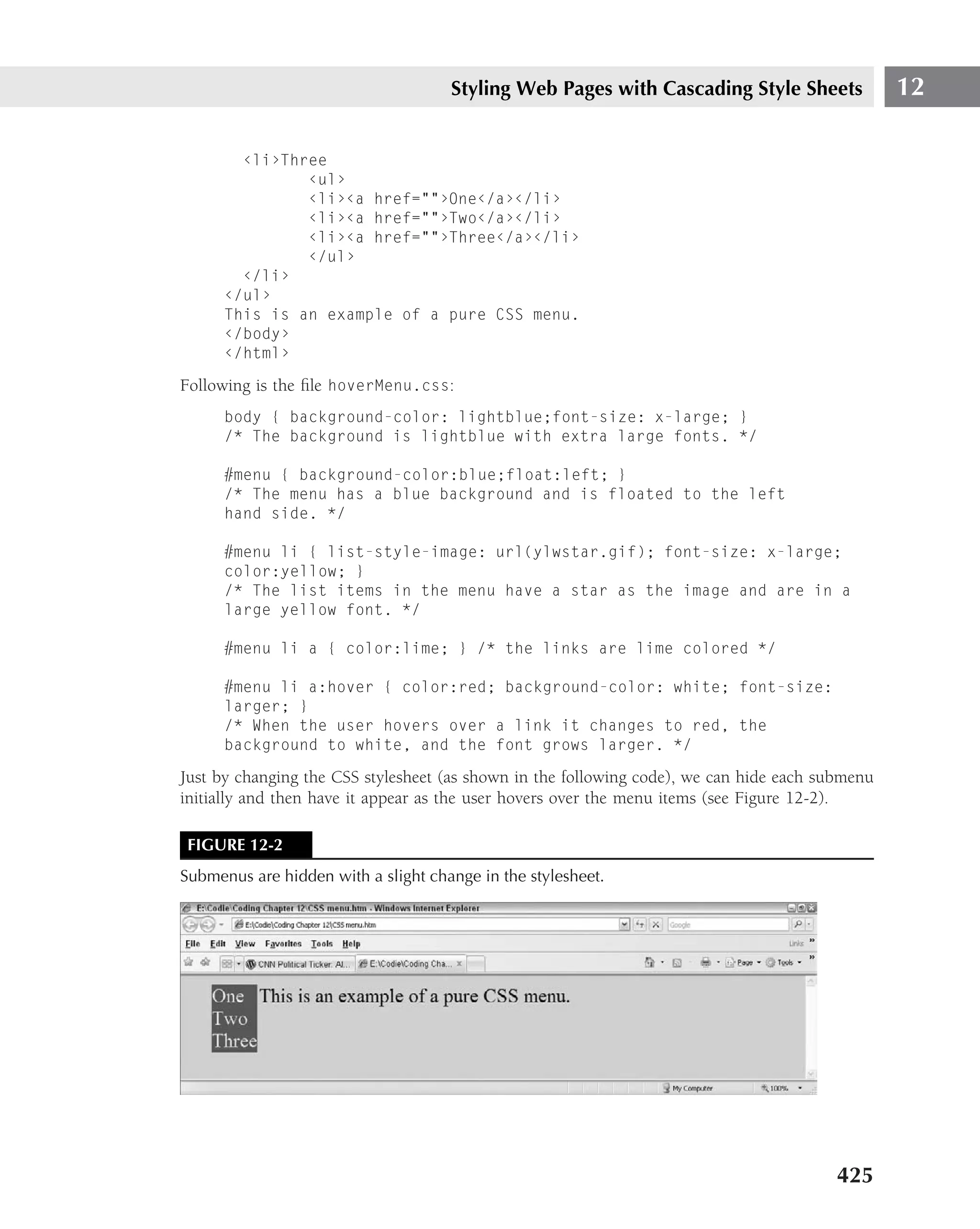
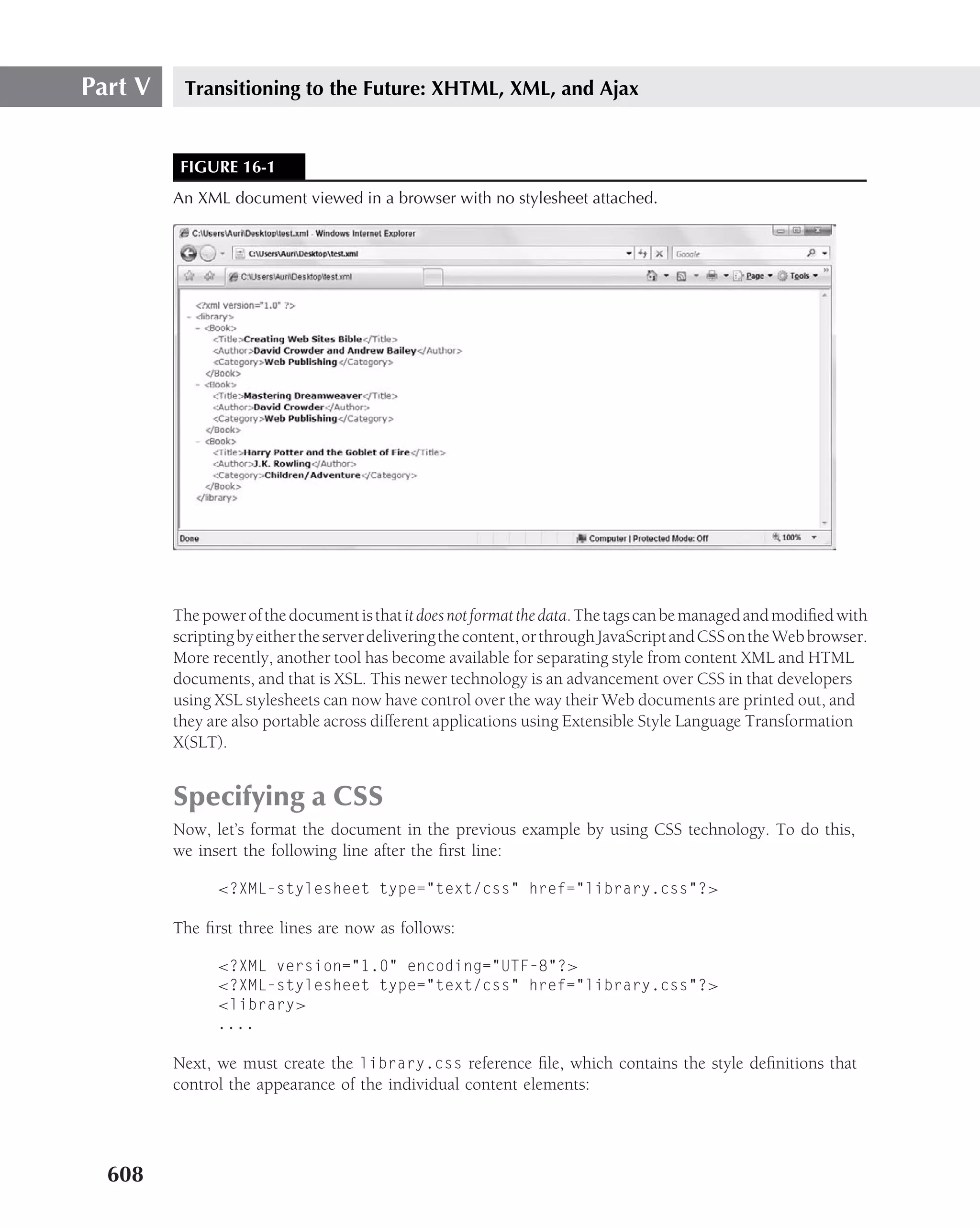
XSL is very complicated at first sight, because it uses a different concept of programming. Tak-
ing a page from object-oriented programming (OOP), you might call this type of programming
template-oriented programming.
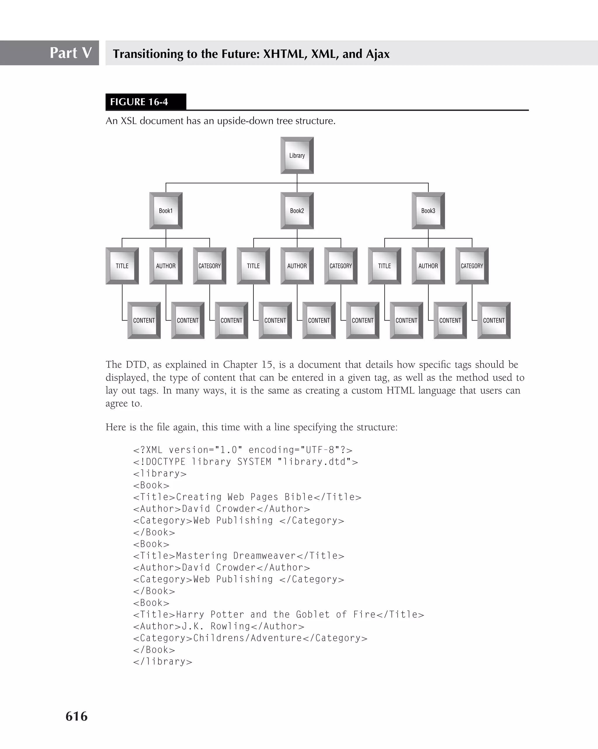
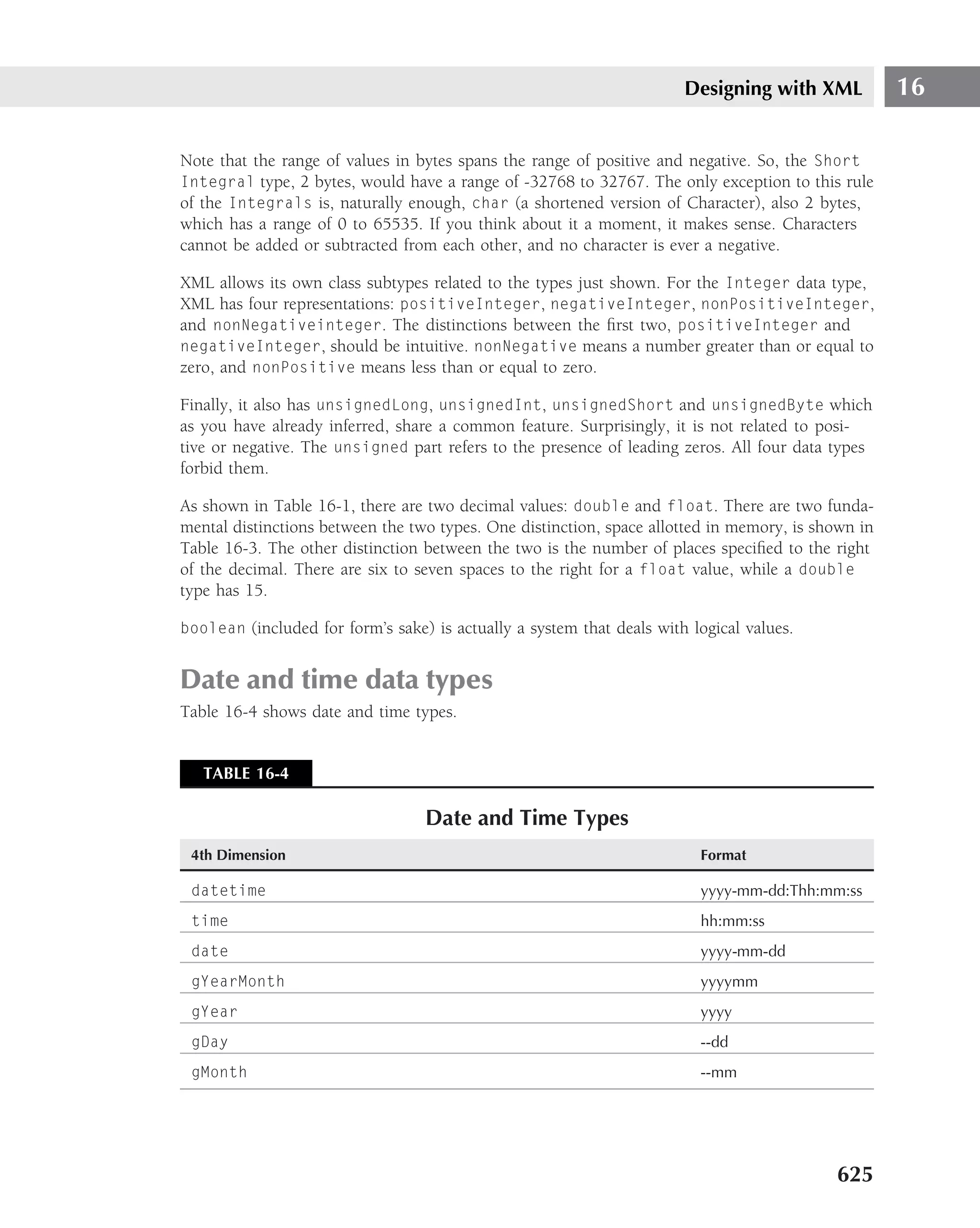
To understand XSL, you must think of an XML document as an upside-down tree with the root
at the top, as shown in Figure 16-4. The tree shown in Figure 16-4 represents the document
structure and, although you cannot see the labels, the color coding represents the top-down
document structure, showing the flow from root: library to the three branches of each book
name (the second row). Derived from each of the three book names are the Title, Author, and
Category of each book (the third row). Subordinate to those (the last row) is the content for
each of the above document nodes.
Defining the structure of an XML document
For the stylesheet, library.css, we assumed that the library had books as child elements and
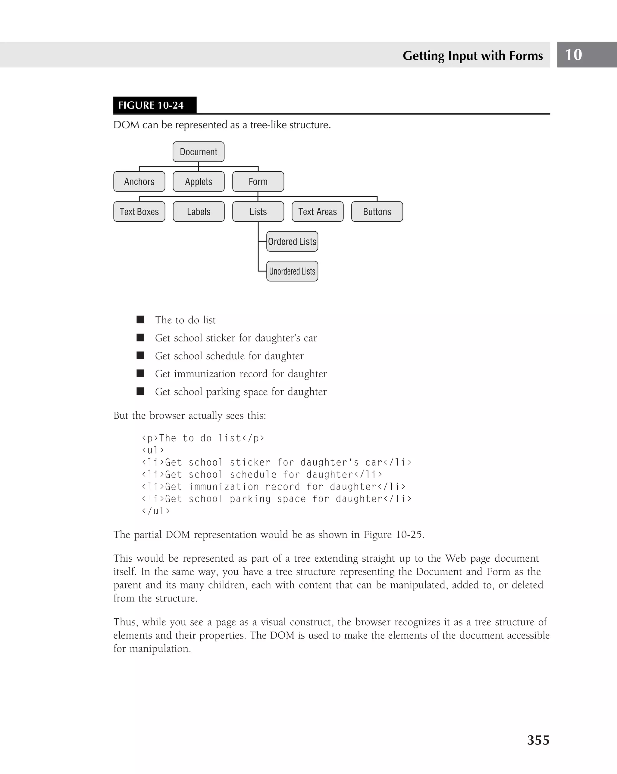
that each book had Title, Author, and Category child elements. If this isn’t the case, then
the stylesheet won’t produce an error — it will just do what it’s instructed to do. For example,
if the library has children that are shelves, which, in turn, contain the book elements, the previous
stylesheet would not show any books, because we instructed it to match only books that are
children of the library element.
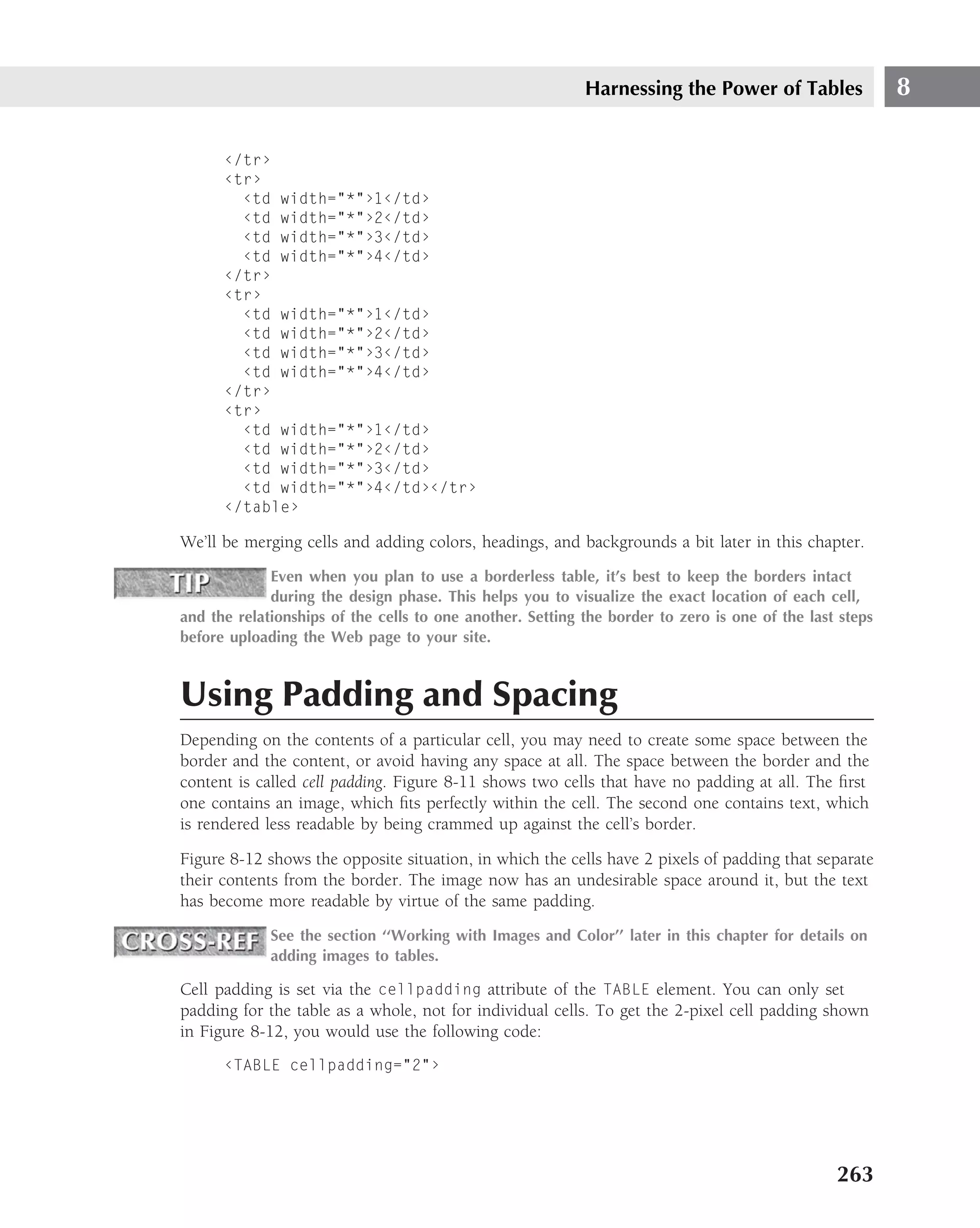
How can we define the structure of the document to make sure it is valid? There are two solu-
tions: a DTD or XML Schema. A DTD is much simpler but not as powerful as the XML Schema.
615](https://image.slidesharecdn.com/creating-web-sites-bible-jun-2008-100327061205-phpapp01/75/Creating-Web-Sites-Bible-Jun-2008-651-2048.jpg)


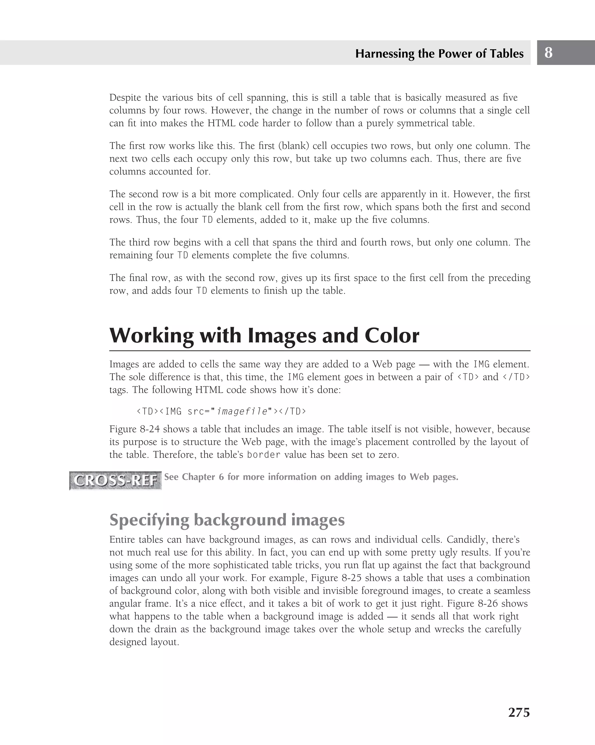
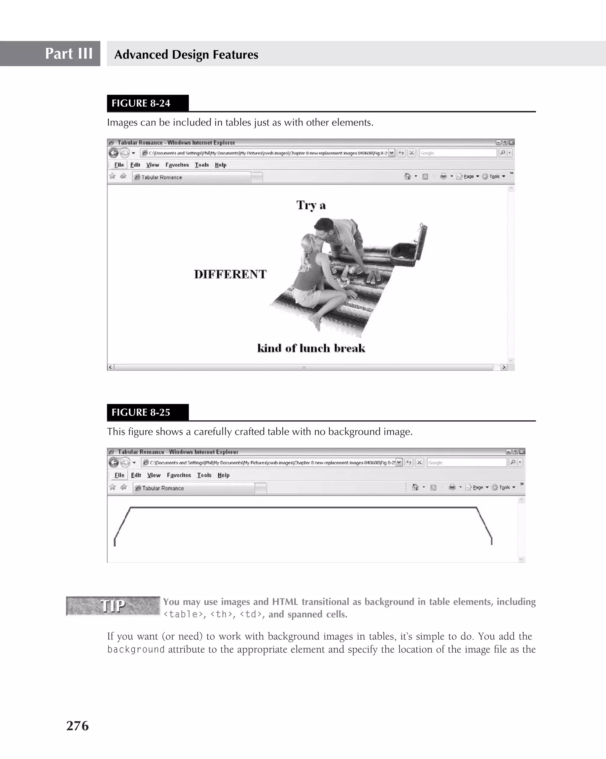
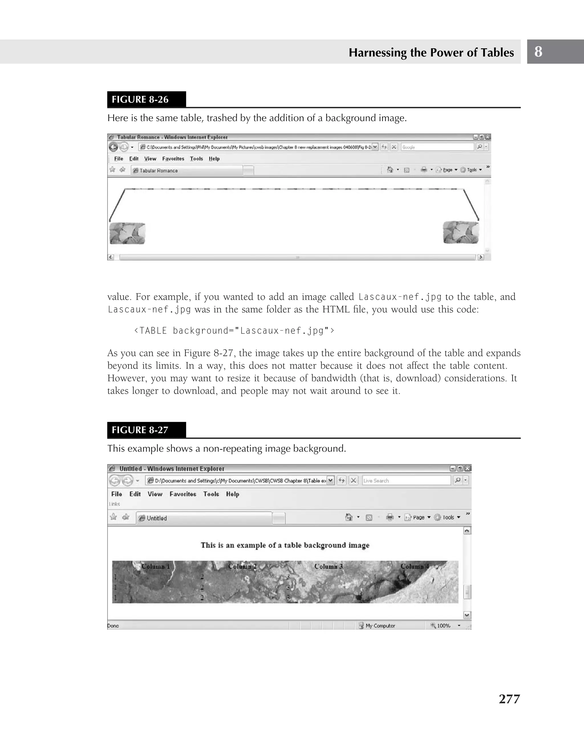
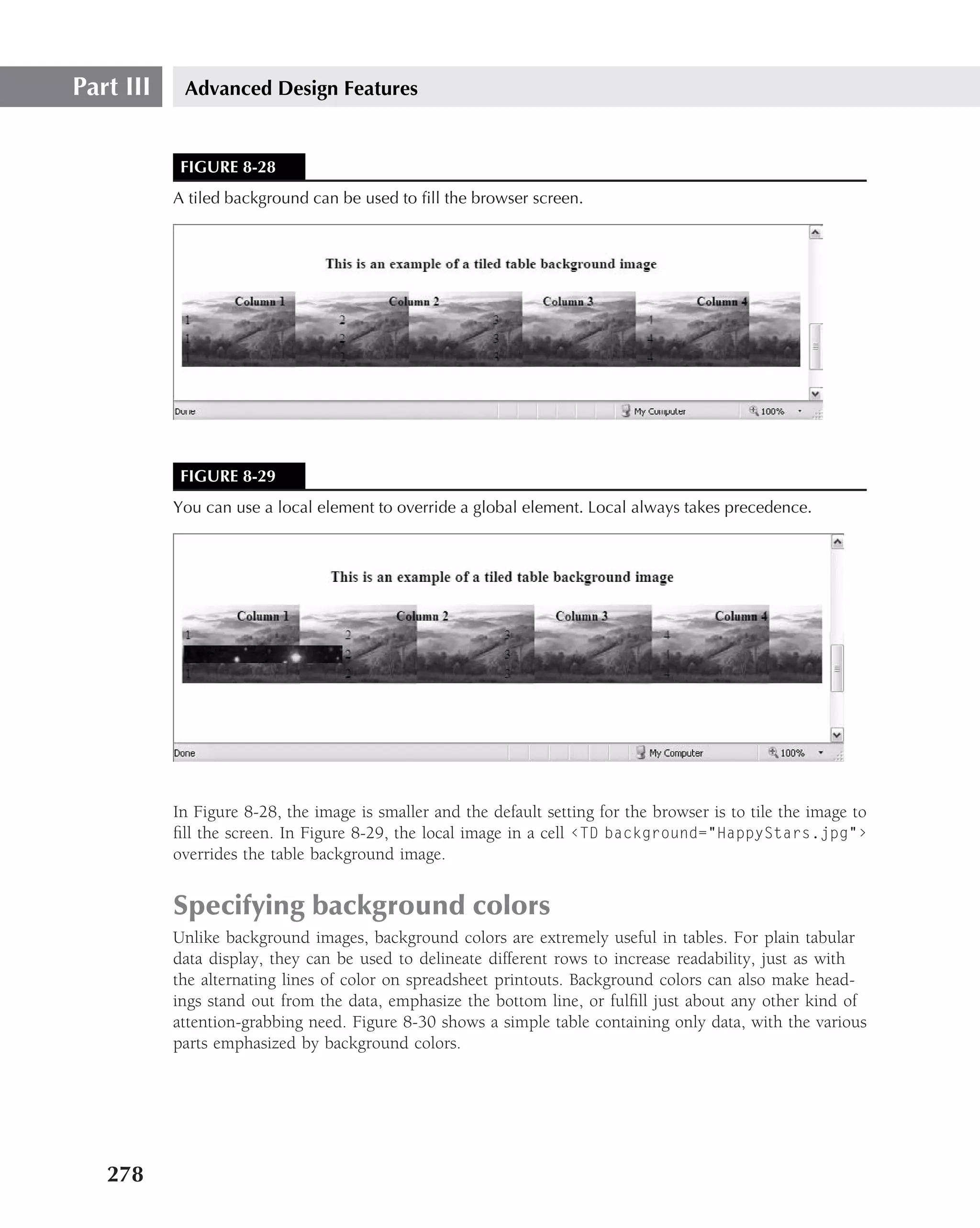
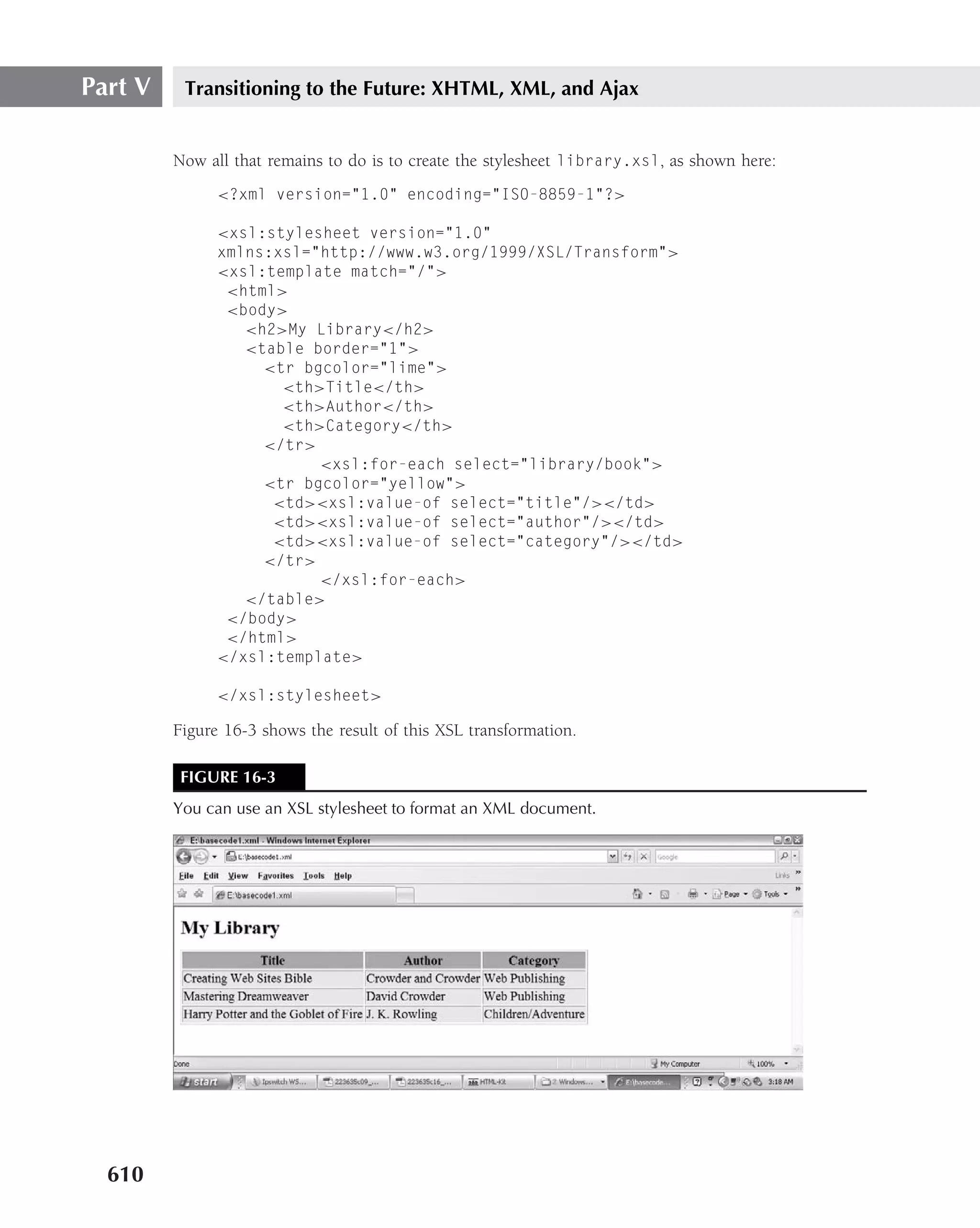
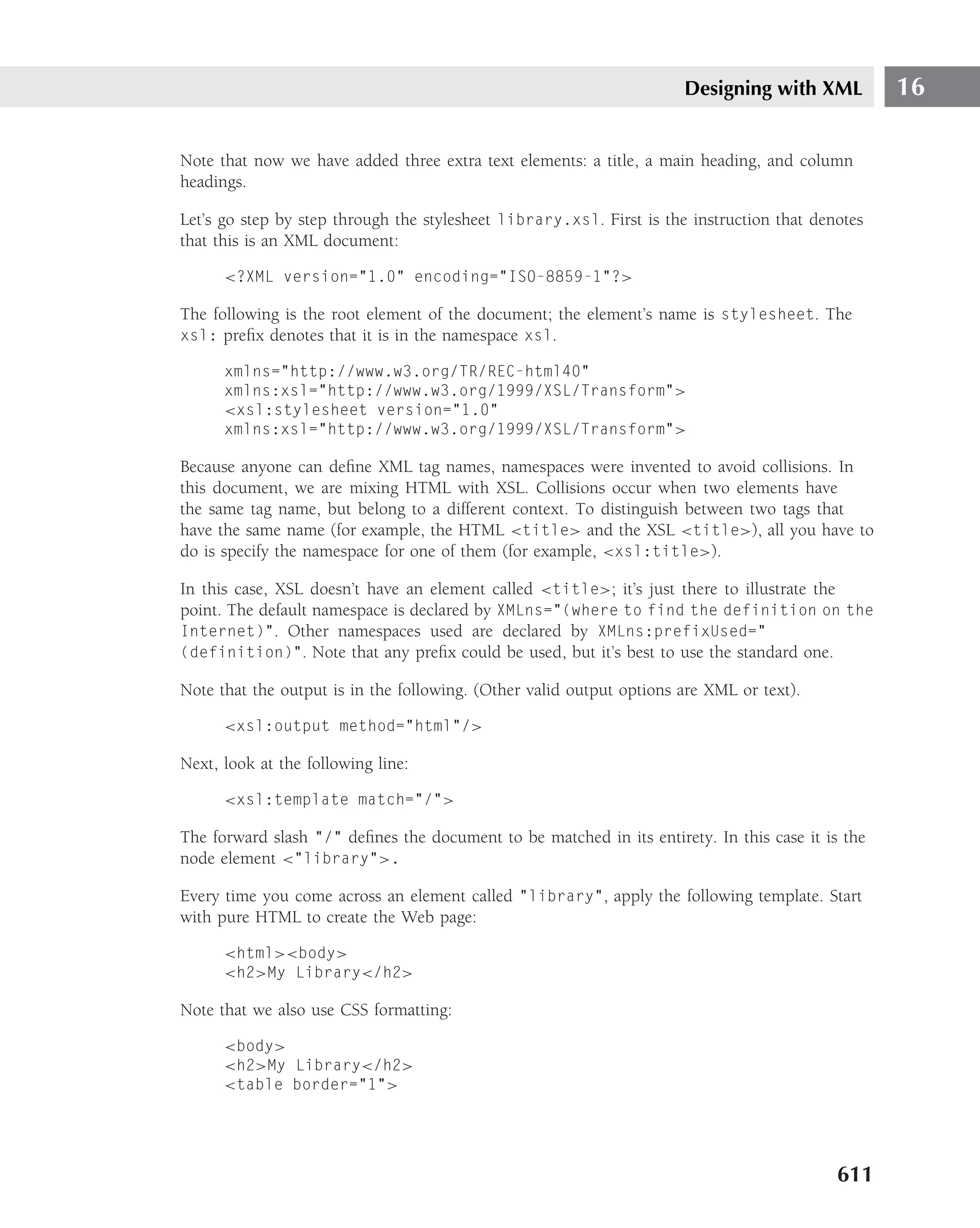
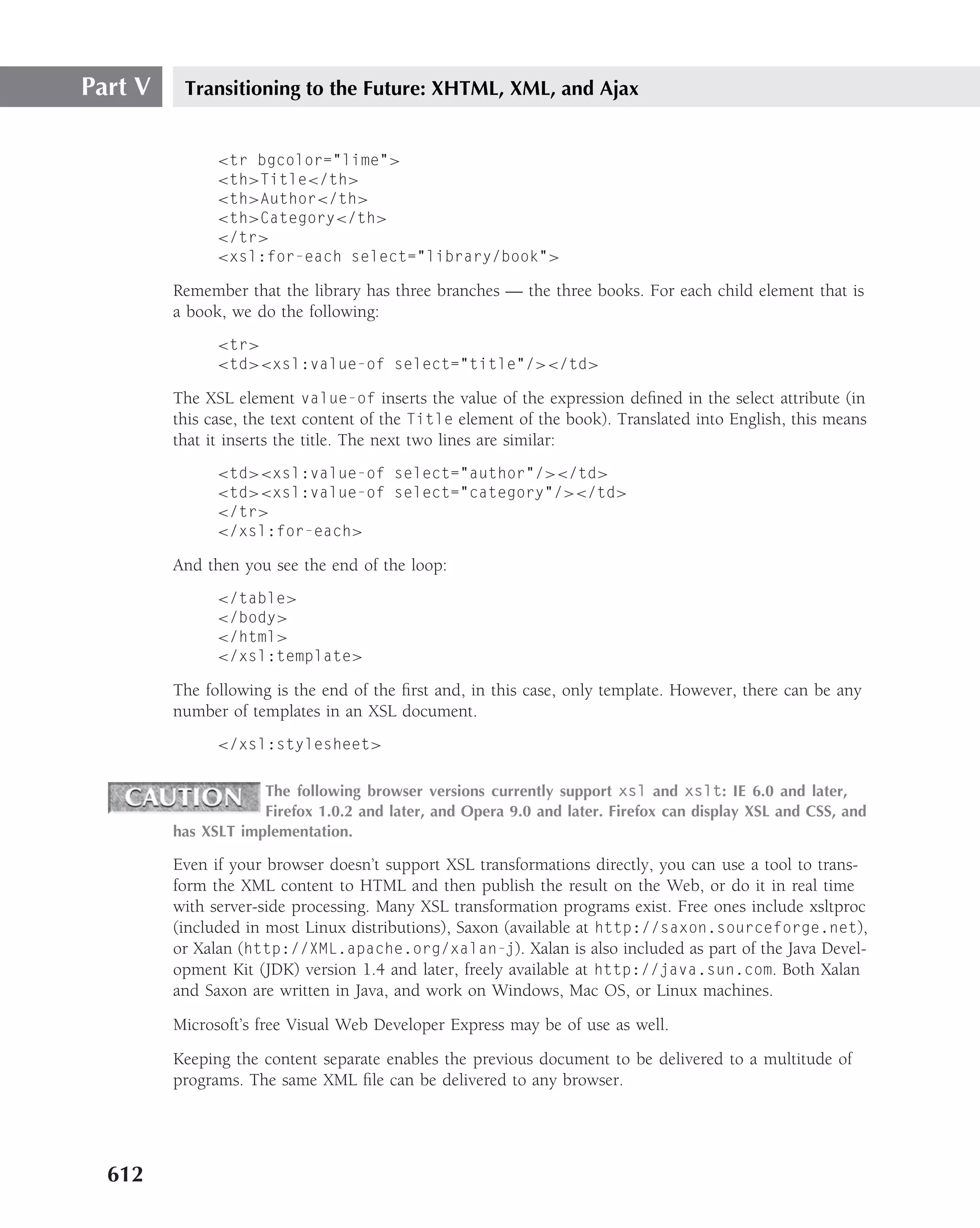
This document provides information about the third edition of the book "Creating Web Sites Bible" published by Wiley Publishing, Inc. It was written by Philip Crowder with David A. Crowder. Some key details include: - The book covers topics such as building web pages, popular web design tools, HTML basics, links and navigation, multimedia, CSS, JavaScript, publishing websites, and more. - It was published by Wiley Publishing, Inc. in 2008. - The authors thank various individuals and organizations who contributed to and supported the creation of the book.