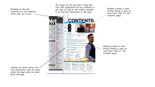
The document provides feedback on a magazine's contents page layout. It notes that the branding is only visible once at the top. The headings are written in bold for easy reading but the columns of content are messy, with some columns going across and others down the page. The images at the top also lack clear corresponding text links, making the page confusing to navigate.
Motion in the Middle: RubyMotion as a Gateway to Mobile DevelopmentMatthew Salerno
In the past year or so, RubyMotion (RM) has gained its share of both adherents and skeptics. Some criticize RM for being too far removed from the underlying Cocoa frameworks, while others claim the toolchain isn’t "Ruby" enough. While there is certainly merit to these conflicting objections, it is because of these supposed flaws, and not in spite of them, that RubyMotion is an excellent tool for producing iOS apps. By leveraging both the power of the Objective-C frameworks and the speed and expressiveness of Ruby (not to mention opening up the iOS ecosystem to the historically prolific open source Ruby community), RM has the potential to greatly expand the iOS developer base and change the mobile landscape for the better. In his talk, "Motion in the Middle," Matthew discusses the ways in which RubyMotion enables elegant, Ruby-esque design while exposing enough of the iOS/Cocoa frameworks to allow for wide-ranging and highly extendable applications.
1. Branding at the top
(reference to the magazine
title) only see it once.
Heading written in bold
writing making in easy to
read (clear that it’s the
contents page).
Columns are quite messy (not
very distinctive) some are going
across the page some are going
down the page.
The images at the top don’t really have
text links underneath and are confusing as
you have to look at the number beneath
it to find the information on the page.