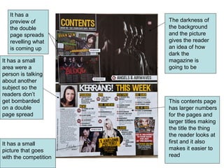
1. It has a
preview of The darkness of
the double the background
page spreads and the picture
revelling what gives the reader
is coming up an idea of how
dark the
It has a small magazine is
area were a going to be
person is talking
about another
subject so the
readers don’t
get bombarded This contents page
on a double has larger numbers
page spread for the pages and
larger titles making
the title the thing
the reader looks at
It has a small first and it also
picture that goes makes it easier to
with the competition read
2. The board at The masthead is
the top is a simple and
good idea as it recognisable as it is
has the date a simple name
the magazine
was released
and the issue
number
The man in the picture
is standing confident
It has a good
with his glasses on an
colour for the
empty road
writing to stand
out and it is a
large size so it The background is
is easy to read simple meaning all
and it also has of the readers
a cover story to attention is on the
entice people to person in the middle
go to the page
with the cover
story