
More Related Content
Viewers also liked
Viewers also liked (17)
Similar to Compare & Contrast Poster
Similar to Compare & Contrast Poster (20)
More from chelsea alexander
More from chelsea alexander (7)
Recently uploaded
Recently uploaded (20)
Compare & Contrast Poster
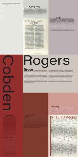
- 1. RogersBruce Rogers was the designer of this print of The Holy Bible It is said that he was one of the most accurate and elegant designers of his time. He traveled between countries to work in the field of design, he worked in oxford press and the riverside press in cambridge. “Rogers had come to Boston in 1895 and was hired in 1896 by Houghton Mifflin to design trade books and ad- vertisements at its Riverside Press in Cambridge.” In this book The Holy Bible He used his created typeface known as Centaur which is a roman based type that has Sans. He was best known for his works of The Holy Bible & The Essays of Mon- taigne. Both had different forms of his Centaur typeface. The Essays of Montaigne was cut more toward the original typeface from 1400’s and The Holy Bible became his product of the Centaur typeface. Bruce Rogers decided to organize the first page of The Holy Bible by changing it ver- tically so the viewer sees more of a divide and center in the middle of page.The Origin of this print is in Oxford, United Kingdom created by the Oxford University Press which was historically created in 1478. The Oxford University Press has contributed many elegant forms of prints throughout the years and has sold many of these prints to the US and around the world - to promote higher education and further knowl- edge. “Oxford University Press has a rich history which can be traced back to the earliest days of printing. The first book was printed in Oxford in 1478, just two years after Caxton set up the first printing press in England. The University was involved with several printers in Oxford over the next century.” (Oxford University Press) Cobden ThomasSander- son and Emmery Walker created a printing press called “The Doves Press”. These artists had created this press because they both had a passion for the elegant forms of type and design. The Doves Press was only one of the many hundreds of other printing companies that started in the 20th Century, but in re- ality there was a fair amount of competition to acquire business. In many of their prints they lacked a certain kind ornamentation that other companies had. Other companies had created ornamentation through the images surrounding the text. The Doves Press instead emphasized parts of the text with typographic ornamentation by using color and changing the size of letters. In the case of “The Holy Bible” The Doves Press had emphasized an entire first sentence of the bible, and framed the page with one letter. As the press was cre- ated, they both had designed a new typeface for their prints ; although Thomas Cobden took most of the credit for the creation of the Doves Type it was mutual work between the two. As they started to lose revenue in the early 1917’s Thomas Cobden decided to leave The Doves Press and took all of the type with him. Instead of locking away the type or hiding it, He decided to throw all of the Doves Type into The River Thames. Afterwards the Doves Type was practically impossible to find, until recent- ly a man named Robert Green had decided to go searching for the The Doves Type in The Thames River earlier this year (2015).He dis- covered that much of the type was still missing but he was able to acquire many lowercase and uppercase letters. A big difference is the color between these two pieces of The Holy Bi- ble. In The Holy Bible made by Thomas Cobden & Emmery Walker the use of color is purposeful. The use of red is always used to alert and draw a viewer in to see the most significant part of a piece. The red not only frames the page but it runs into the begin- ning of the first sentence of the bible - Emphasizing the importance of the text: “In the beginning”. As for the next The Holy Bible designed by Bruce Rogers, in an article “The Printing and the mind of Man” it states that this piece of work was the “Most monumen- tal form given to The Holy Bible since Baskerville’s of 1796’s.” Johanna Drucker, A Criti- cal History guide: Design History. Most believe that “Monumental Aesthetic” was what he was looking for in this specific book The Holy Bible, So there was no ornamentation or color only elegant typography. Rogers did not believe that ornamentation would serve a purpose because he wanted typography to be the elegant forms of each page. -Oxford University Press | University of Oxford.University of Oxford. -”The Gorgeous Typeface That Drove Men Mad and Sparked a 100-Year Mystery. -”Bruce Rogers and His Centaur.” Harvard Magazine. Harvard -Johanna Drucker “A Critical History Guide” ChelseaAlexanderRISD2015 The typefacesbetween the two are fairly similar but also different The typography used in The Holy Bible by The Oxford University Press was created by a man named Bruce Rogers, He had called his typeface “Cen- taur” Which was considered to be influenced by 15th Century Typeface. In The Holy Bible Created by The Doves Press Designed by Emmery Walker & Thomas Cobden Sanderson the typography found on this page relates to the centaur very well. Although they are similar there are also big differences, such as the print of the long “I” in the Doves Press Print, is greatly elaborated to show the empha- sis in the first letter. The Doves type is much more straight in comparison to the “Centaur” . The Doves type for example has structured bold letters with slight indentions that lead to into the stems of the letters, while the Centuar typeface has only curved serifs and thin letters through the page. “TheHolyBible”ByTheDovesPress1903 One similaritythat these two posters share is that both of these pieces of The Holy Bible have serif types. The reasoning behind this Phenomenon is that These two designs wanted to meet the perfect standard of elegancy and classical form. Both have a truely magnificent typeface, the type is eligant because the serif’s are clas- sical. The use of serif shows that there is a continuing flow between letters almost as a parttern, to show a beautiful continuation of type throughout the piece The Layout of the typographybetween the two are both very different. In The Holy bible designed by Bruce Rogers Oxford University Press. There is a split space down the center of the page separating two para- graphs. In The Holy Bible by Thomas Cobden Sanderson & Emmery Walker, the entire page is centered with about ½ an inch of space on each side of the columns. It is also simply framed by the long letter I on the side of the page itself. Which leads the viewer to believe that these decisions speak of the way the designers wanted to portray the bible, and how they themselves view the bible. “The Holy Bible” The Oxford Press 1935