Download to read offline
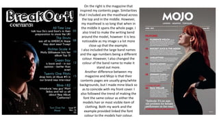
The document describes the similarities and differences between the contents page the author created and the magazine Mojo that inspired it. Both included a masthead across the top and in the middle. However, the author's masthead spanned the entire page. Font colors were chosen to match hair or clothing colors of models on both pages. The main difference was the author used a black background instead of grey/white to match the front cover.


