Download as PDF, PPTX


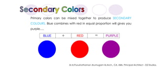


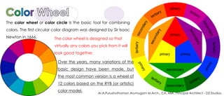


The document discusses color theory and the principles of color mixing and harmony. It explains that color is the visual property corresponding to categories like red and blue. Primary colors are red, yellow and blue, and can be mixed to produce secondary colors like green, purple and orange. Tertiary colors are mixes of primary and secondary colors. The color wheel is used to select harmonious color combinations like complementary, analogous, warm, and cool colors. Proper use of color theory principles allows for effective color scheme design.


