
More Related Content
Viewers also liked
Viewers also liked (13)
Recently uploaded
Recently uploaded (20)
Circle graphs[1]
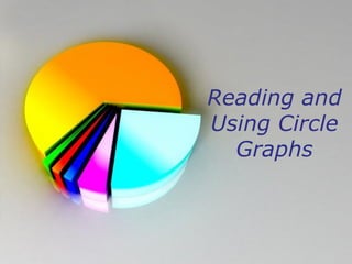
- 1. Reading and Using Circle Graphs Powerpoint Templates Page 1
- 2. Reading Pie Graphs Powerpoint Templates Page 2
- 3. Answer the following questions by reading the chart: Powerpoint Templates Page 3
- 4. What percent of income goes to transportation? • A: 27% • B: 3% • C: 9% • D: 13% Powerpoint Templates Page 4
- 5. WRONG! Try Again! YES NO Powerpoint Templates Page 5
- 6. CORRECT! ANSWER: D: 13% NEXT QUESTION Powerpoint Templates Page 6
- 7. 3% IS USED FOR WHAT EXPENSES? • A: Health • B: Entertainment and Health • C: Misc and Health • D: Misc and Insurance Powerpoint Templates Page 7
- 8. WRONG! TRY AGAIN! YES NO! Powerpoint Templates Page 8
- 9. Correct ANSWER: HEALTH AND MISC. NEXT QUESTION Powerpoint Templates Page 9
- 10. What percent of income is used on housing and food? • A: 27% • B: 20% • C: 46% • D: 47% Powerpoint Templates Page 10
- 11. WRONG! TRY AGAIN! YES NO Powerpoint Templates Page 11
- 12. CORRECT! Answer: 47% Add: 27% + 20% Powerpoint Templates Page 12
- 13. QUESTIONS?? Powerpoint Templates Page 13