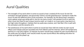
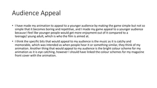
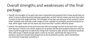
Here are some suggestions for your video game, magazine, and advertisement layouts based on your research:
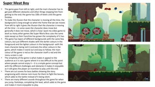
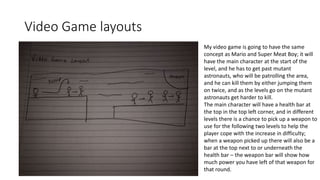
Video Game Layout:
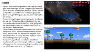
- Simple side-scrolling gameplay from left to right
- Long background that scrolls to give illusion of character movement
- Layered backgrounds with foreground/background color differentiation
- Main character stands out against backgrounds (e.g. red character)
- Clear UI elements like health bar, inventory, etc. at top of screen
- Varied sound effects and music to add engagement
- Cutscenes for story/boss battles
Magazine Layout:
- Bold masthead in prominent color that matches game
- Large cover image/character(s) in center to draw