1. MARCH 2011 chainstoreage.com 41
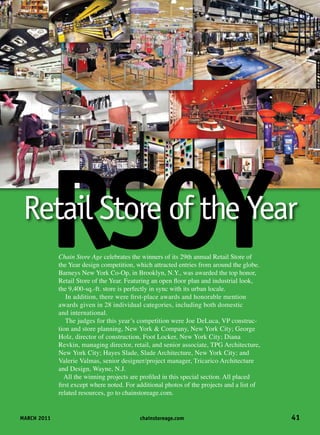
Chain Store Age celebrates the winners of its 29th annual Retail Store of
the Year design competition, which attracted entries from around the globe.
Barneys New York Co-Op, in Brooklyn, N.Y., was awarded the top honor,
Retail Store of the Year. Featuring an open floor plan and industrial look,
the 9,400-sq.-ft. store is perfectly in sync with its urban locale.
In addition, there were first-place awards and honorable mention
awards given in 28 individual categories, including both domestic
and international.
The judges for this year’s competition were Joe DeLuca, VP construc-
tion and store planning, New York & Company, New York City; George
Holz, director of construction, Foot Locker, New York City; Diana
Revkin, managing director, retail, and senior associate, TPG Architecture,
New York City; Hayes Slade, Slade Architecture, New York City; and
Valerie Valmas, senior designer/project manager, Tricarico Architecture
and Design, Wayne, N.J.
All the winning projects are profiled in this special section. All placed
first except where noted. For additional photos of the projects and a list of
related resources, go to chainstoreage.com.
RSOYRetail Store of the Year
2. 42 chainstoreage.com MARCH 2011
Retail Store of the Year
Best Overall Entry
Barneys New York Co-Op
Brooklyn, N.Y.
Design: AEdifica, Montreal
Barneys New York Co-Op, in Brooklyn, N.Y., took top
honors in Chain Store Age’s 29th annual Store of the
Year Retail Design Competition. In addition to being
named best overall entry, or Store of the Year, the
two-level, 9,400-sq.-ft. store placed first in two other
categories: softlines (5, sq. ft. to 15,000 sq. ft.) and
fitting rooms.
Barneys Co-Op, designed by AEdifica, Montreal, has
a minimalist, uncluttered and modern-urban look that
embodies the essence of the Co-Op brand and directs all
attention to the designer merchandise on display. With
a design theme inspired by the avant-garde art galler-
ies that abound in the area, the store is in tune with the
emerging character of the neighborhood, while being re-
spectful of Brooklyn’s history. An art gallery feel perme-
ates the space even as it remains grounded and inclusive.
“The presence of raw materials and industrial finishes
helps to balance things out and echoes the Brooklyn
vibe,” said Stéphane Bernier, director of retail design,
AEdifica, Montreal, which served as design firm and
architect on the project. “The color palette is restricted to
shades of white and gray, and the materials to rustic pine
and hot-rolled steel.”
The main floor is designed to echo the ambience
of a modern art gallery. It is a raw space with an
open floor plan, painted concrete blocks, black-
ened steel and exposed conduits. Large solid-timber
tables, reminiscent of makeshift workbenches or
drafting tables, serve as jewelry display tables and
also as the cashwraps.
The lower floor, with its reclaimed-wood clad floors
and walls, is styled as the living quarters of an artist-in-
residence. It has a warmer, more intimate feel. Couches,
area rugs and fitting rooms dressed with bathroom tiles
contribute to the loft-like environment.
“The sharp contrast in tonality and materials between
the ground floor and basement adds a dose of energy to
the space,” Bernier said.
An industrial staircase, with a sequence of wood and
steel steps, connects the two levels and creates a strong
visual element in the basement.
FITTING ROOMS: The fitting rooms on each floor have
their own distinct environment.
“The overall concept of “reversed contrast” was used:
The predominantly white sales area on the ground floor
has wood-clad fitting rooms, while the basement, with
Wood timber floors, repurposed industrial tables, retro chairs and area rugs give a warm feel to the lower level of Barneys New York Co-Op.
StéphaneBrügger,Montreal
3. MARCH 2011 chainstoreage.com 43
its wood floor and walls, has white-tiled fitting rooms,”
Bernier explained.
The ground-floor men’s fitting rooms feature reclaimed
wood cladding and sand-colored wool carpet. Standard
industrial hollow-steel doors are painted dark gray and cen-
tered within a supersized door frame. Other features include
a full-height mirror with a hot-rolled steel frame with back-
lighting and a bench made of reclaimed solid timber.
The same basic concept was applied to the ground-floor
women’s fitting rooms, with the addition of a large bench
upholstered with a silver metallic fabric and a painted mural
on the exterior walls.
In contrast, the basement-level fitting rooms are designed
as “repurposed washrooms” to further express the “artist’s
living quarters” theme of the space.
“The walls are clad with white metro tiles installed in a
brick pattern, and the floor is made up of a white hexagonal
mosaic tile,” Bernier said.
To add a touch of warmth, a beige wool area rug is in-
stalled in each cabin, acting as the artist’s “shower mat.”
CHALLENGES: The project was not without its challenges.
“Convincing customers to go down to a basement is
always a challenge in retail,” Bernier said. “We wanted
the basement to feel inviting and reward the customer
with a rich, vibrant and creative experience. This is why
we came up with our metaphor of the ‘artist in residence’s
living quarters.’ ”
Another challenge was the fairly low
ceilings, which eliminated the option of
concealing the pipes and conduits. As a
solution, the design team chose to keep
the space raw and celebrate the mechani-
cal components. Fake pipes and dummy
panels were added to create a sculptural
effect behind the cashwrap and enhance the
industrial look.
“The cashwrap is my favorite part of the
store,” Bernier said. “We’re really excited
by the graphical motif and sculptural ef-
fect of that corner wall, with the electri-
cal conduits on one side creating a very
linear texture, while the array of electrical
panels on the other side creates a mosaic
of odd-sized rectangles. The inside joke
around this feature is that we imagined it
as the entrance exam for an electrician:
How fast he could figure out which panels
are blank and which panels are ‘live’
would determine if he was qualified to
work in the store!”
The raw industrial backbone of the space is evident
on the ground floor. The building’s main power
conduits and panels are located directly behind the
cashwrap (left).
A collection of artist’s illustrations add a whimsical touch to the women’s apparel
fitting rooms, which are clad with reclaimed wood slats.
4. Retail Store of the Year
46 chainstoreage.com MARCH 2011
Softlines
(less than 5,000 sq. ft.)
Honorable Mention
Verona Vibe
Gatineau, Quebec
Design: Ruscio Studio, Montreal
A dramatic design with an all-red color
palette creates a sense a fashion and
passion at Verona Vibe, while provid-
ing the ideal platform for showcasing
hot footwear brands. The all-red motif
extends from the flooring to the wall to
the ceiling, making the 1,800-sq.-ft. a
standout to passers-by. Black and white
cut-out graphics make a powerful visual
statement against the bold red back-
ground and help define the store brand to
its hip, young demographic.
Softlines (less than 5,000 sq. ft.)
Merrell
Rockford, Mich.
Design: FRCH Design Worldwide, Cincinnati
In keeping with the attitude and personality of the
brand, the new Merrell prototype brings the outdoors
in with a design that relates to customers’ personal
outdoor experiences and offers an exploration of the
senses. Perimeter sliding-door fixtures hung with
rustic-looking barn door hardware allow open stock on
the floor, making the merchandise completely acces-
sible to customers. Strategically placed outdoor graph-
ics enhance the overall theme, as do fixture materials
and decor accents. Items that might have been collected
while wearing the products on display are featured on a
curated wall.
WolverineWorldWide,Rockford,Mich.
Leeza Studio, Longueuil, Quebec
5. Retail Store of the Year
MARCH 2011 chainstoreage.com 47
• Judges Award for Innovation
• Softlines (5,000 to 15,000 sq. ft.) Honorable Mention
The Flagship Store Powered by Reebok
East Rutherford, N.J.
Design: Chute Gerdeman Retail, Columbus, Ohio
Challenged to design one store to serve both the New York Jets and New York Giants, the
design team of Flagship Store Powered by Reebok, at the New Meadowland Stadium, rose
to the occasion, creating a memorable, state-of-the-art shopping experience. A combination
of projected graphics, color LED lighting, flexible and mobile fixtures, hidden merchandise
storage and a rotating perim-
eter display system allows
the 9,600-sq.-ft. space to
transform from the Jets to Gi-
ants overnight for the teams’
respective home games. The
stylish, ultra-modern design
features gleaming white floor-
to-ceiling striped bands that
simulate the dramatic highs
and lows of a football game.
Softlines (greater than 15,000 sq. ft.)
Aéropostale
New York City
Design: GHA design studios, Montreal
AdamFriedberg,NewYorkCity
Mark Steele Photography,
Columbus, Ohio
Aéropostale pays homage to its New
York City roots in the design of its
Times Square flagship. Iconic Big
Apple images are incorporated in a
holistic manner throughout the two-
level, 19,000-sq.-ft. space, which
also reflects the chain’s classic col-
legiate beginnings. In a novel twist,
a prime piece of second-floor real
estate features a balcony area where
customers can be filmed dancing,
with their images later projected on
the LED façade.
6. Retail Store of the Year
50 chainstoreage.com MARCH 2011
Department Store
Liverpool Polanco
Mexico City, Mexico
Design: FRCH Design Worldwide,
Cincinnati
A simple but powerful design solution provides
Liverpool Polanco with an international sensibility
and makes shopping at the remodeled store a cap-
tivating experience. The design creates a rhythm
of salon-styled shop vignettes, with merchandise
presented in unexpected ways. A double-height
atrium with monumental columns connect the
ground level with the mezzanine above, creating
a dramatic central hub that acts as the visual heart
of the 504,009-sq.-ft. store.
Department Store
Honorable Mention
Bloomingdale’s
Santa Monica, Calif.
Design: Mancini•Duffy, New York City
Taking a design cue from the surrounding beachside
community, the design team of Bloomingdale’s used
subtle references to capture the “beach chic” South-
ern California lifestyle. The 101,00-sq.-ft. store is an
imaginative departure from Bloomingdale’s larger
units. Even the retailer’s iconic black-and-white
checkerboard floor is reinterpreted in stenciled con-
crete. Unexpected splashes of color, varied textures
and lively contrasts make for a look of weathered
elegance. The store’s unique feel is evident through-
out, from the mannequins that float overhead on
a ceiling-mounted conveyor belt to the 6-ft.-high
retractable Chinese lantern-styled pods that serve as
dressing rooms.
GreyCrawford,SantaFe,N.M.
FRCH Design Worldwide, Cincinnati
7. Retail Store of the Year
MARCH 2011 chainstoreage.com 51
Hardlines
(less than 5,000 sq. ft.)
metroPCS Digital Loft
Orlando, Fla.
Design: MillerZell Inc., Atlanta
Visitors to Orlando’s Amway Center sports venue can play and interact
with the latest in interactive digital technology and state-of-the art com-
munications devices at metroPCS Digital Loft. The 986-sq.-ft. space
commands attention with its blend of reflective materials, cutting-edge
digital projections and touch screens, and bold color. Semi-circular pod
configurations create key social areas within the area, while curving
forms, shapes and seating facilitate traffic flow. Theater-inspired lighting
provides enhanced drama at night.
Hardlines (less than 5,000 sq. ft.)
Honorable Mention
Lego
New York City
Architect: Friar Associates, Farmington, Conn.
The playfulness and creativity of the Lego brand is combined
with the notable architecture of Rockefeller Center in the com-
pany’s first standalone store in New York City. Standard Lego
elements are used to create an immersive experience throughout
the 5,000-sq.-ft. space. Lego’s signature “pick-a-brick” wall
rises 17 ft. between both levels of the store. Store elements,
from lighting fixtures to furnishings, reference the brick form.
Hardlines (less than 5,000 sq. ft.)
Honorable Mention
Britto
Miami
Design: ID & Design International, Fort Lauderdale, Fla.
Britto, at Miami International Airport, is the first-ever store de-
voted to the art and accessories of Brazilian artist Romero Britto.
The 1,350-sq.-ft. shop displays goods in a sleek, contemporary
museum-like environment. Back-lit acrylics, black accents, crys-
talized glass tiles and a black ceiling soffit with gridded lenses are
dramatically integrated into a white backdrop.
RobertBensonPhotography,Hartford,Conn.
ID&DesignInternational,FortLauderdale,Fla.CreativeSourcesPhotography,Atlanta
8. Retail Store of the Year
52 chainstoreage.com MARCH 2011
Hardlines
(greater than 15,000 sq. ft.)
“R” Superstore
(Toys“R”Us/Babies“R”Us)
King of Prussia, Pa.
Design: Toys “R” Us design team, Wayne, N.J.
The new, integrated store format of Toys “R” Us and Babies
“R” Us offers convenient, one-stop shopping. The design brings
both brands together in a streamlined, contemporary shopping
environment that is easy to navigate. Interior floor finishes and
paint colors provide a warm, neutral backdrop that lets the mer-
chandise take center stage. Integrated visual graphics provide
colorful accents.
Discount/Mass Merchant
The Exchange
Tinker Air Force Base,
Oklahoma City, Okla.
Design: Chute German Retail,
Columbus, Ohio
The Army & Air Force Exchange Service (AAFES)
has updated its brand identity and retail format
under a new banner, The Exchange. The design
provides a fresh, modern and customer-friendly
shopping experience, one custom designed for the
military lifestyle. Vibrant imagery, lively colors
and branded patterns give an upbeat, energetic feel
to the 174,015-sq.-ft. store. The space is divided
into three distinct merchandise worlds: home, life
and style. Key departments within the worlds are given destina-
tion treatments, with their own decor elements. The store package
is modular — all architectural fixturing and signage components
are movable and shippable around the world.
Toys “R” Us, Wayne, N.J.
Mark Steele Photography, Columbus, Ohio
9. Retail Store of the Year
Exterior
Honorable Mention
Walgreens
Oak Park, Ill.
Architect: Camburas & Theodore,
Des Plaines, Ill.
New architecture is blended seamlessly
with the old in Walgreens’ Oak Park site.
The project saw the adaptive reuse of the
existing historic Collins Building shell
(c. 1922), whose facade was completely
restored. The new addition has a modern
look but is also complementary to the neo-
classical Collins structure.
54 chainstoreage.com MARCH 2011
PadgettandCompany,Chicago
Exterior
Red Door Spa
Phoenix
Architect: cmda design bureau inc.,
Scottsdale, Ariz.
With an architectural design inspired by the
work of Frank Lloyd Wright, the exterior of
Red Door Spa, in Phoenix, evokes a strong
yet tranquil presence. The façade pulls off
the enviable feat of being both easily brand-
definable, as well as reflecting the local archi-
tectural styles of the surrounding community.
10. Retail Store of the Year
56 chainstoreage.com MARCH 2011
Supermarket
Honorable Mention
Calgary Co-Op
Calgary, Alberta, Canada
Design: King Retail Solutions,
Eugene, Ore.
With a “Modern Chateau” theme that combines old and new architectural elements, Calgary Co-Op offers a distinctive
shopping environment. The grand entry is lit like the public space of a chateau to convey a sense of arrival. Contem-
porary, chandelier-like clustered rings create a focal point in the produce and food service sections, while conceal-
ing overhead lighting. To make the small-scaled store appear larger, the design team opened the center area through
exposed trusses and ducts.
Supermarket
Lakeview Grocery
New Orleans
Design: King Retail Solutions, Eugene, Ore.
A clean, uplifting design, familiar but updated, con-
veys a sense of trust and value at Lakeview Grocery.
Located in the part of New Orleans hardest hit by
Hurricane Katrina, the 22,000-sq.-ft. supermarket has
a welcoming, neighborhood feel, enhanced with a
50’s-inspired color palette, fun imagery and nautical-
inspired, hand-painted signs that reference adjacent
Lake Pontchartrain. Simple, basic materials, such as
stained plywoods and sealed concrete, reinforce the
store’s value persona.
11. Retail Store of the Year
58 chainstoreage.com MARCH 2011
Convenience Store
Swiss Farms
Milmont Park, Pa.
Design: Chute Gerdeman Retail,
Columbus, Ohio
Swiss Farms’ new prototype is de-
signed to communicate freshness,
speed and efficiency, all of which are
central to the drive-through chain’s
updated market positioning. The new
brand identity creates a “fresh from
the farm” feel, with its iconic rooster,
sunrise imagery and fresh color palette.
New digital menu boards feature prod-
uct offerings, promotions and large-
scale visuals. The glass façade with
tiered merchandising allows for greater
visibility of product assortment, while
interior fixtures are designed and laid
out to enhance quick-pick access.
Supermarket
Honorable Mention
Longo’s
Toronto
Design: Watt International, Toronto
The design of Longo’s downtown Toronto
store embodies the company’s heritage and
its passion for food and freshness. Shadow
boxes installed on the bulkhead of the produce
department reflect the grocer’s “Fresh from the
fields” positioning. Graphics complement the
interior architecture, and also turn the struc-
tural columns in the basement location into
communication vehicles.
Si Hoang, Toronto
Brandon Jones Photography, Columbus, Ohio
12. Retail Store of the Year
60 chainstoreage.com MARCH 2011
Restaurant
Chairman’s Suites
Toronto
Design: II by IV Design Associates,
Toronto
Classic, simple but luxe materials lend an
exclusive, upscale masculine feel to the
members-only Chairman’s Suites. Located in
Air Canada Centre, Toronto’s premier sports
and entertainment venue, the 4,500-sq.-ft. space is fashioned with deep rosewood, Italian vanilla marble, polished bronze,
leather and black painted glass in a matte and gloss finish for added texture. The visual pièce de résistance is the main bar and
its striking wall cladding. Stunning ceiling detail with concealed lighting draws the eye up in The Portal, a short tunnel that
leads to the lounge space.
Restaurant
Honorable Mention
Autostrada
Vaughan, Ontario, Canada
Design: II By IV Design Associates, Toronto
The designers of Autostrada took inspiration from the
restaurant’s name, which in Italian means “highway.”
Among the unique elements are a sunken dining area
encircled by a laser-cut, custom-lacquered screen of
inverted trapezoids (the symbol for highway on Italian
road signs) and a massive feature wall that rises 14 ft.
and is affixed with an oversized, custom-crafted three-
dimensional lacquered installation of a Pirelli tire tread.
DavidWhittaker,Toronto
DavidWhittaker,Toronto
13. Retail Store of the Year
62 chainstoreage.com MARCH 2011
Casual Dining
White Castle/
Laughing Noodle
Springfield, Ohio
Design: Big Red Rooster,
Columbus, Ohio
White Castle/Laughing Noodle, a new
concept from White Castle, combines the
company’s signature burger offerings with
international noodle dishes. The bold use
of color and distinctive seating options
create an environment that encourages
patrons to dine in. Oversized graphics cre-
ate a fun, family-friendly environment that
evokes the brand’s personality.
Casual Dining
Honorable Mention
Tom & Eddie’s
Chicago
Design: Big Red Rooster, Columbus, Ohio
A new, upscale, better-burger concept, Tom & Eddie’s
takes its design cues from traditional steakhouse restau-
rants but offers them up with a fresh, modern twist. A
vibrant color palette, double-sided fireplace and varied
seating options enhance the welcoming feel. Oversized
graphics illustrate fresh ingredients while educating
customers as they stand in line.
Mark Steele Photography, Columbus, Ohio
MarkSteele,Columbus,Ohio
14. Retail Store of the Year
Specialty Food
SAQ Signature
Quebec City, Quebec
Design: AEdifica, Montreal
Taking its inspiration from the ambience
of an authentic chateau wine cellar, SAQ
Signature elevates shopping for exclusive
wines and fine liquors to a new level. The
5,000-sq.-ft. space is built within the foun-
dation walls. Buttresses and pillars along
the bearing walls add a sense of rhythm.
Massive pillars clad in black slate define
the architecture and create intimate display
alcoves. Coats of arms and quotes from fa-
mous poets are used to inspire the consumer.
64 chainstoreage.com MARCH 2011
Specialty Food
Honorable Mention
The Culinary Institute
of America
St. Helena, Calif.
Design: Miroglio Architecture + Design,
Oakland, Calif.
The relationship of food and contemporary living is
spotlighted in the design of The Culinary Institute of
America’s on-site campus store. The materials and
finishes are in keeping with those used in the cooking
process and include stainless steel, maple butcher block
and glass. A curving, overhead stainless steel “range
hood/pot rack” serves as the primary organizing design
element of the project. To keep the ceiling as exposed as
possible, all the utilities are located within the trunk duct
of this central element.
Sid Lee, Montreal
DavidWakelyPhotography,SanFrancisco
15. Retail Store of the Year
Attraction Retailing
Disney Store
Montebello, Calif.
Design: Disney Stores Worldwide, Pasadena, Calif.
Designed to deliver “the best 30 minutes of a child’s day,”
the new Disney Store format offers immersive and interactive
experiences inspired by favorite Disney characters and sto-
ries. Among the attractions: a Princess Castle, complete with
a Magic Mirror in which, with the wave of a wand, a princess
appears. Other key features include Lucite trees on which video
is projected, a state-of-the-art theater where guests can select
their own Disney content, and a custom car-building experience
inspired by Disney-Pixar’s animated Cars film.
66 chainstoreage.com MARCH 2011
Home Improvement
Almacenes Corona
Bogotá, Colombia
Design: Watt International, Toronto
A modern design creates the ultimate inspirational
center for kitchen and bath renovation materials and ac-
cessories at Almacenes Corona. The 4,304-sq.-ft. space
was designed to accommodate all aspects of the renova-
tion process and highlight the retailer’s “best of the
best” merchandise selection. Fully realized hubs show-
case Corona’s products in use. In-store graphics call
attention to the different services and solutions Corona
offers, from interior design to professional installation.
ElisaVillegasFotografia,Bogotá,Colombia
PeterBrenner,Glendora,Calif.
16. Retail Store of the Year
68 chainstoreage.com MARCH 2011
In-store Shop
Women’s Shoe Dept., Macy’s
Oakbrook, Ill.
Design: Charles Sparks + Company, Westchester, Ill.
A remodel has brought new
sophistication to one of Macy’s
signature businesses: women’s
shoes. A light, tonal palette of
color and finishes, modular tables
and residentially inspired furni-
ture enhances the upscale feel.
A semi-transparent screen-like
segmentation of spaces allow trend
statements to flow easily within the
overall plan and expand or contract
as businesses change. Seating
interacts with display surfaces to
lead customers through the space.
CharlieMayerPhotography,OakPark,Ill.
Pop-Up Store
Ridemakerz
Lake Buena Vista, Fla.
Design: Ridemakerz, Irvine, Calif.; Oei Design,
Scottsdale, Ariz.; Kick Design, New York City
Ridemakerz brings its garage-themed, make-your-own-
toy-car concept to a temporary location in Downtown
Disney. The 16,359-sq.-ft. space, a former Virgin
Records Megastore, has been transformed into Rider-
makerz’s signature immersive experience. The design
team dealt with the enormous size of the store by adding
such extras as a radio-control test track and an auto salon
showcasing eight show-quality vehicles.
17. Retail Store of the Year
70 chainstoreage.com MARCH 2011
Kiosk
International Currency Exchange
Quebec City, Quebec
Design: Ruscio Studio, Montreal
International Currency Exchange’s sleek,
futuristic design is intended to facilitate
its expansion into upscale malls across
Canada. Visually striking but also secure,
the ICE kiosk is fashioned out of Corian,
which eliminates unsightly edges. The
“bird’s nest” panel is made of polycarbon-
ate panels laminated with MDF and a high
catalyzed paint finish that offers a striking
contrast to the turquoise backdrop. An
angled tower showcasing the currency-
rates ticker and screen serve as the focal
point of the kiosk.
Cashwrap
7 For All Mankind
Santa Monica, Calif.
Design: 7 For All Mankind in-house design
team, Los Angeles
A prominent feature in the overall design of the space,
the cashwrap at 7 For All Mankind is noteworthy for its
focus on clean lines and interlocking planes. Video of
campaign imagery is projected onto the metal-shroud
cashwrap’s cantilevered wood-plank backwrap. A 9-ft.
long burnished-bronze planter, filled with succulents, on
the backwrap counter complements the sense of a casual-
modern Southern California home that the store design
projects. The planter also helps prevent sales associates
from cluttering up the back area with merchandise.
Leeza Studio, Longueuil, Quebec
18. Retail Store of the Year
MARCH 2011 chainstoreage.com 71
Service
Honorable Mention
Red Door Spa
Bellevue, Wash.
Design: Red Door Spa design & construction team
Inviting and serene, Red Door Spa is the quintessential relaxation desti-
nation and an oasis of comfort in The Shops at the Bravern, in Bellevue,
Wash. The design incorporates glass-beaded wall coverings, textured
stone walls and tranquil images of nature, which combine to define the
look of Red Door as one of contemporary elegance.
Service
Donato Salon + Spa
Toronto
Design: II By IV Design Associates, Toronto
Donato Salon + Spa delivers a luxurious boutique expe-
rience that is in keeping with the salon’s target high-end
clientele but accessible to all who want the ultimate in
pampering. The designers used changes in the flooring
and other subtle cues to differentiate the retail space
from the salon and spa. In the product merchandising
area, items are artfully arranged uniformly inside hand-
some, lacquered wood armoires.
DavidWhittaker,Toronto
Drug Store
Duane Reade
New York City
Design consultants: Durnan, Jackman,
Saffer Associates, Toronto; CBX,
New York City
From its boutique-styled cosmetics department to its branded life-
style signage, Duane Reade’s updated format strikes an inviting
and contemporary note in midtown Manhattan. The 13,600-sq.-ft.
drug store is bright and airy, with large expansive full-height win-
dows and glass railing panels. Vaulted drywall bulkheads, painted
in signature brand colors, and signage with a series of suspended
circular lights add height and reinforce the spacious feel. Andrew Walker, New York City
19. Retail Store of the Year
72 chainstoreage.com MARCH 2011
Showroom
Snaidero USA
New York City
Design: Giorgio Borruso Design,
Marina Del Rey, Calif.
Snaidero USA’s kitchens, living and
bathrooms showroom is designed not as
a direct simulation of a living space, but
instead as a “fossil imprint.” Staggered
strips that wrap through the 3,195-sq.-ft.
space are meant to recall geological stria-
tions of previously defined layers — like
a trace of what might have been before.
Strips of horizontal paneling structure
with a chalkboard finish wrap the walls of
the corner office and into the conference
room, where they form display shelving.
Showroom
Honorable Mention
Centura
Montreal
Design: GHA design studios,
Montreal
An architectural Scandinavian-
inspired neutral palette with fashion
appeal served as the design direc-
tion for Centura. The contemporary
design elevates the tile shopping
experience of contractors, architects
and designers to a new, upgraded
level. An eco-friendly approach is
integrated into all aspects of the
project, and is reflected in a 30-ft.-high “living” wall of
English ivy, complete with a running fountain.
Magda Biernat Photography, New York City
Yves Lefebvre, Montreal
20. Retail Store of the Year
MARCH 2011 chainstoreage.com 73
Italian footwear and accessories retailer
Carlo Pazolini makes a bold statement in
Milan with a new store concept as modern
as it is innovative. The design uses the
shape of an infant’s foot as an iconic “cell”
in an emerging network of shelving and
seating. The front undulated wall presents a
shelving system of rounded and elongated
multicolor seats. The central area hosts
black metal tubes, while the cash desk area
is a white, clean surface. Utilizing color,
material and shape, the visual composition
shifts as one movies through the 4,155-sq.-
ft. store. A brushed stainless-steel frame
encases the cashwrap, as the wall itself
continues its movement through the space.
International Softlines
Levi’s
London
Design: Checkland Kindleysides,
Cossington, Leicester, U.K.
A sweeping interior rebuild has turned Levi’s U.K.
flagship into the ultimate brand and jeanswear ex-
perience. The 8,500-sq.-ft. store is designed as an
artisan’s working environment. It is visually cap-
tivating, engaging customers as they explore the
origins of denim and the evolution of the Levi’s
brand. From the canvas on the fitting room walls
to the tailor’s leg forms, every detail references the
legacy of the Levi’s brand.
Alberto Ferrero, Torino, Italy
Keith Parry, London
International Softlines
Honorable Mention
Carlo Pazolini
Milan, Italy
Design: Giorgio Borruso Design, Marina Del Ray, Calif.
21. Retail Store of the Year
74 chainstoreage.com MARCH 2011
International Department
Store
Lotte
Seoul, South Korea
Design: FRCH Design Worldwide,
Cincinnati
A remodel has given new style and buzz to
Lotte, transforming the 500,000-sq.-ft.-plus de-
partment store into a fashion-forward shopping
destination with broad appeal. The modern aes-
thetic is defined through classic colors, natural
elements and patterned materials. Understated,
elegant finishes appeal to the classic customer,
while playful colors, fun display and organic
materials encourage younger shoppers to linger.
International Department Store
Honorable Mention
Lotte
Busan, South Korea
Design: ID & Design International,
Fort Lauderdale, Fla.
Located in the bustling Gwangbok harbor district of
Busan, South Korea, the 650,000-sq.-ft. Lotte offers 11
floors of up-to-the-moment fashions for affluent urban
shoppers. Inspired by the waterfront locale, the design
team created a central atrium of kinetic architectural
forms in a twisting motion that frames a central sculpture
of 10,000 aluminum, fish-like forms spiraling upwards.
Theatrical use of lighting throughout the space reinforce
the water theme.
Lotte Design Division, Seoul
22. Retail Store of the Year
MARCH 2011 chainstoreage.com 75
International Supermarket
Landmark Supermarket
Manila, Philippines
Design: Hugh A. Boyd, Montclair, N.J.
International Hardlines (less than 10,000 sq. ft.)
Nokia Experience Centre
Delhi, India
Design: Fitch, Mumbai, India
Sleek and futuristic-looking, the Nokia Experi-
ence Center embodies the Nokia brand in tone
and design. A white-on-white color palette
maximizes the feeling of space and height in
the 2,500-sq.-ft. space, where a wraparound
oak plank reception area featuring a large 3-D
“Hello” welcomes visitors. Nokia’s three solu-
tions zones — style, entertainment and business
— are showcased in three, ceiling-hung organic-
shaped pods with plasma screens that show
live feeds on each solution. The main space is
dominated by a color-changing LED back-lit
glass wall. Nokia’s commitment to sustainability
is brought to life with a live vertical garden.
TotoLabrador,QuezonCity,Philippines
Located in a basement space
below the Landmark Department
Store, the renovated Landmark
Supermarket has a streamlined,
ultra-modern look. With ceiling
heights that average only 11 ft.,
the design team created a sense
of spaciousness by suspending
a series of light colored, floating
planes below the exposed, dark-
painted ceiling structure.
23. Retail Store of the Year
76 chainstoreage.com MARCH 2011
International Hardlines
(less than 10,000 sq. ft.)
Honorable Mention
Holpe+
Shenzhen, China
Design: rkd retail/iQ, Bangkok
An open-sell presentation of mobile technology
distinguishes Holpe+, whose design elements
and materials combine to create an upscale
specialty store impression. A dramatic feature
wall adds a sculptural element starting at the en-
trance and carries through the 1,615-sq.-ft. shop.
Unique design elements include undulating ceil-
ings punctuated with linear reveals. Customers
can update and download content and services
directly to their mobile devices via touch screens
on feature “runway” fixtures.
International Hardlines
(over 10,000 sq. ft.)
Suning Elite
Shenzhen, China
Design: rkd retail/iQ, Bangkok
Complementary colors and materials
are fashioned into a crisp, contempo-
rary environment that focuses attention
on the merchandise at Suning Elite. The
13,928-sq.-ft. store is organized into
three merchandise worlds. An experi-
ence zone, created by a unique, semi-
enclosed exhibit component, is located
within each world, offering brands the
opportunity to present an entire lifestyle
presentation of their merchandise.
Pruk Dejkamhang
Pruk Dejkamhang