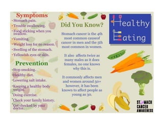
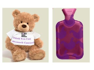
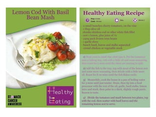
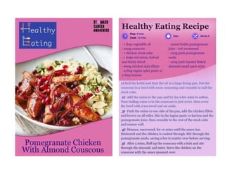
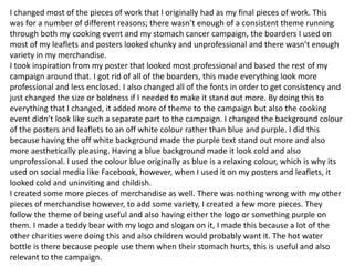
This document summarizes an evaluation of a social action campaign about stomach cancer awareness. The creator feels that the final pieces, including posters, leaflets, merchandise, and a cooking event, effectively communicate their message and are appropriate for the target older audience. Feedback from surveys confirmed the pieces appropriately inform people about stomach cancer. While early designs were less polished, the creator improved their work and feels the final pieces meet the purpose of raising awareness about stomach cancer symptoms and prevention.
Instructions for Submissions thorugh G- Classroom.pptxJheel Barad
This presentation provides a briefing on how to upload submissions and documents in Google Classroom. It was prepared as part of an orientation for new Sainik School in-service teacher trainees. As a training officer, my goal is to ensure that you are comfortable and proficient with this essential tool for managing assignments and fostering student engagement.
The Roman Empire A Historical Colossus.pdfkaushalkr1407
The Roman Empire, a vast and enduring power, stands as one of history's most remarkable civilizations, leaving an indelible imprint on the world. It emerged from the Roman Republic, transitioning into an imperial powerhouse under the leadership of Augustus Caesar in 27 BCE. This transformation marked the beginning of an era defined by unprecedented territorial expansion, architectural marvels, and profound cultural influence.
The empire's roots lie in the city of Rome, founded, according to legend, by Romulus in 753 BCE. Over centuries, Rome evolved from a small settlement to a formidable republic, characterized by a complex political system with elected officials and checks on power. However, internal strife, class conflicts, and military ambitions paved the way for the end of the Republic. Julius Caesar’s dictatorship and subsequent assassination in 44 BCE created a power vacuum, leading to a civil war. Octavian, later Augustus, emerged victorious, heralding the Roman Empire’s birth.
Under Augustus, the empire experienced the Pax Romana, a 200-year period of relative peace and stability. Augustus reformed the military, established efficient administrative systems, and initiated grand construction projects. The empire's borders expanded, encompassing territories from Britain to Egypt and from Spain to the Euphrates. Roman legions, renowned for their discipline and engineering prowess, secured and maintained these vast territories, building roads, fortifications, and cities that facilitated control and integration.
The Roman Empire’s society was hierarchical, with a rigid class system. At the top were the patricians, wealthy elites who held significant political power. Below them were the plebeians, free citizens with limited political influence, and the vast numbers of slaves who formed the backbone of the economy. The family unit was central, governed by the paterfamilias, the male head who held absolute authority.
Culturally, the Romans were eclectic, absorbing and adapting elements from the civilizations they encountered, particularly the Greeks. Roman art, literature, and philosophy reflected this synthesis, creating a rich cultural tapestry. Latin, the Roman language, became the lingua franca of the Western world, influencing numerous modern languages.
Roman architecture and engineering achievements were monumental. They perfected the arch, vault, and dome, constructing enduring structures like the Colosseum, Pantheon, and aqueducts. These engineering marvels not only showcased Roman ingenuity but also served practical purposes, from public entertainment to water supply.
Introduction to AI for Nonprofits with Tapp NetworkTechSoup
Dive into the world of AI! Experts Jon Hill and Tareq Monaur will guide you through AI's role in enhancing nonprofit websites and basic marketing strategies, making it easy to understand and apply.
Operation “Blue Star” is the only event in the history of Independent India where the state went into war with its own people. Even after about 40 years it is not clear if it was culmination of states anger over people of the region, a political game of power or start of dictatorial chapter in the democratic setup.
The people of Punjab felt alienated from main stream due to denial of their just demands during a long democratic struggle since independence. As it happen all over the word, it led to militant struggle with great loss of lives of military, police and civilian personnel. Killing of Indira Gandhi and massacre of innocent Sikhs in Delhi and other India cities was also associated with this movement.
Embracing GenAI - A Strategic ImperativePeter Windle
Artificial Intelligence (AI) technologies such as Generative AI, Image Generators and Large Language Models have had a dramatic impact on teaching, learning and assessment over the past 18 months. The most immediate threat AI posed was to Academic Integrity with Higher Education Institutes (HEIs) focusing their efforts on combating the use of GenAI in assessment. Guidelines were developed for staff and students, policies put in place too. Innovative educators have forged paths in the use of Generative AI for teaching, learning and assessments leading to pockets of transformation springing up across HEIs, often with little or no top-down guidance, support or direction.
This Gasta posits a strategic approach to integrating AI into HEIs to prepare staff, students and the curriculum for an evolving world and workplace. We will highlight the advantages of working with these technologies beyond the realm of teaching, learning and assessment by considering prompt engineering skills, industry impact, curriculum changes, and the need for staff upskilling. In contrast, not engaging strategically with Generative AI poses risks, including falling behind peers, missed opportunities and failing to ensure our graduates remain employable. The rapid evolution of AI technologies necessitates a proactive and strategic approach if we are to remain relevant.
June 3, 2024 Anti-Semitism Letter Sent to MIT President Kornbluth and MIT Cor...Levi Shapiro
Letter from the Congress of the United States regarding Anti-Semitism sent June 3rd to MIT President Sally Kornbluth, MIT Corp Chair, Mark Gorenberg
Dear Dr. Kornbluth and Mr. Gorenberg,
The US House of Representatives is deeply concerned by ongoing and pervasive acts of antisemitic
harassment and intimidation at the Massachusetts Institute of Technology (MIT). Failing to act decisively to ensure a safe learning environment for all students would be a grave dereliction of your responsibilities as President of MIT and Chair of the MIT Corporation.
This Congress will not stand idly by and allow an environment hostile to Jewish students to persist. The House believes that your institution is in violation of Title VI of the Civil Rights Act, and the inability or
unwillingness to rectify this violation through action requires accountability.
Postsecondary education is a unique opportunity for students to learn and have their ideas and beliefs challenged. However, universities receiving hundreds of millions of federal funds annually have denied
students that opportunity and have been hijacked to become venues for the promotion of terrorism, antisemitic harassment and intimidation, unlawful encampments, and in some cases, assaults and riots.
The House of Representatives will not countenance the use of federal funds to indoctrinate students into hateful, antisemitic, anti-American supporters of terrorism. Investigations into campus antisemitism by the Committee on Education and the Workforce and the Committee on Ways and Means have been expanded into a Congress-wide probe across all relevant jurisdictions to address this national crisis. The undersigned Committees will conduct oversight into the use of federal funds at MIT and its learning environment under authorities granted to each Committee.
• The Committee on Education and the Workforce has been investigating your institution since December 7, 2023. The Committee has broad jurisdiction over postsecondary education, including its compliance with Title VI of the Civil Rights Act, campus safety concerns over disruptions to the learning environment, and the awarding of federal student aid under the Higher Education Act.
• The Committee on Oversight and Accountability is investigating the sources of funding and other support flowing to groups espousing pro-Hamas propaganda and engaged in antisemitic harassment and intimidation of students. The Committee on Oversight and Accountability is the principal oversight committee of the US House of Representatives and has broad authority to investigate “any matter” at “any time” under House Rule X.
• The Committee on Ways and Means has been investigating several universities since November 15, 2023, when the Committee held a hearing entitled From Ivory Towers to Dark Corners: Investigating the Nexus Between Antisemitism, Tax-Exempt Universities, and Terror Financing. The Committee followed the hearing with letters to those institutions on January 10, 202
Read| The latest issue of The Challenger is here! We are thrilled to announce that our school paper has qualified for the NATIONAL SCHOOLS PRESS CONFERENCE (NSPC) 2024. Thank you for your unwavering support and trust. Dive into the stories that made us stand out!
Synthetic Fiber Construction in lab .pptxPavel ( NSTU)
Synthetic fiber production is a fascinating and complex field that blends chemistry, engineering, and environmental science. By understanding these aspects, students can gain a comprehensive view of synthetic fiber production, its impact on society and the environment, and the potential for future innovations. Synthetic fibers play a crucial role in modern society, impacting various aspects of daily life, industry, and the environment. ynthetic fibers are integral to modern life, offering a range of benefits from cost-effectiveness and versatility to innovative applications and performance characteristics. While they pose environmental challenges, ongoing research and development aim to create more sustainable and eco-friendly alternatives. Understanding the importance of synthetic fibers helps in appreciating their role in the economy, industry, and daily life, while also emphasizing the need for sustainable practices and innovation.
Acetabularia Information For Class 9 .docxvaibhavrinwa19
Acetabularia acetabulum is a single-celled green alga that in its vegetative state is morphologically differentiated into a basal rhizoid and an axially elongated stalk, which bears whorls of branching hairs. The single diploid nucleus resides in the rhizoid.
Unit 8 - Information and Communication Technology (Paper I).pdfThiyagu K
This slides describes the basic concepts of ICT, basics of Email, Emerging Technology and Digital Initiatives in Education. This presentations aligns with the UGC Paper I syllabus.
2. Are your pieces fit for their intended purpose?
I feel that the final pieces are fit for purpose as they inform the target audience about
stomach cancer. This was the main purpose of this stomach cancer campaign, it needed
to raise awareness by telling people about the symptoms and possible ways to avoid
developing stomach cancer.
By making a variety of merchandise, posters, leaflets and a cooking event, I tried to meet
the interests of my target audience, which was an older audience mainly. The posters
and leaflets give facts and advice about stomach cancer, this fits the purpose of informing
people of stomach cancer. The merchandise helps to raise awareness about this
campaign and therefore helping more people become informed about stomach cancer.
The cooking event would try and give people healthy eating advice and tips in order to try
and prevent stomach cancer in and also make people more healthy.
The things that I have created for this campaign communicate my message clearly, they
all inform and spread awareness in a way that is appropriate for my target audience,
people 30+, to make sure that this was correct I created a survey for feedback. All of the
people who did the survey said that it effectively informs people about stomach cancer in
a way that is appealing to my target audience.
Do they communicate your message clearly?
Are they appropriate for your target audience?
3. The first poster is the original idea, it uses a woman looking
distressed to try and get peoples attention and also uses a
distressed font to highlight this point. The image I used for this
first poster isn’t an original image however, I used a woman
more of the age group to highlight the fact the poster is giving.
The layout for this poster is more basic than the layout for the
second poster as I had to design the layout around the image,
with the second poster I took the image myself so I could
make the layout of the poster how I wanted it rather than how
it had to be due to the image.
Both of these posters have the text ‘I didn’t think I could get
stomach cancer…’, this is making people think as if it was
them who actually had stomach cancer. This makes people
think about actually getting checked by a doctor and start
eating healthily.
I took inspiration for the purple banners on the posters from
the ‘be clear on cancer’ posters and leaflets. They used them
in a more effective way than mine, I think this is due to the
purple on my posters being to dark . Also the text I used for ‘I
didn’t think I could get stomach cancer’, doesn’t fit with the
seriousness of the words and the poster.
I feel the second poster has more of a professional aesthetic
compared to the first poster, this will help it appeal to the older
audience that it is intended for as the first poster would
probably appeal more to a younger audience as it isn’t as
smooth and clean with the layout.
4. These are two posters that I designed for stomach cancer
awareness. They use original images so that I could design the
poster how I wanted rather than having to design the poster
around the stock images that I would have had to have used.
The first one uses my brother, dad and grandad to show the
stomach cancer risk growing as they get older, this is highlighted
with the shadows.
The second poster is the same image of my grandad but with facts
about stomach cancer.
I feel that by showing real people in the poster rather than just
facts, it creates more of an emotive feel to the campaign. This is a
technique that I found some campaigns did to get the same effect,
like with the stand up to cancer videos and some posters. Also the
race for life adverts that show why people are doing the race for
life. These techniques make campaigns more effective and make
people remember them.
I feel that the first poster appeals to a wide audience as it uses
different age groups to highlight that it can effect people before
they even have stomach cancer.
The second poster appeals to the most common age group of
stomach cancer sufferers because it is using a person from that
age group.
I like both of these posters, however I feel the first is of a more
professional standard than the second, this is because it uses less
words but has more effect than the second. The first is the make
you think and inform, the second is just to inform, I feel that I would
find the second in a doctors surgery.
5. This is the leaflet I designed for the stomach cancer
campaign. It is fairly basic in its layout and colour
scheme. The colour scheme follows the the rest of
the campaign because the colour for stomach
cancer is purple, this makes it more recognisable
when you are looking for different information on
different cancers, for example, pink is breast cancer
and you know that from all of the campaigns that go
alongside which are mostly pink based.
I feel this leaflet fit the purpose for its intended
audience as it gives clear facts in a simple format
that is easy to read and therefore understand. I also
feel that it will appeal to the target audience as its
clear and simple and straight to the point. It also
uses a tactic of reminding people that they want to
grow old and meet their grandchildren, this will make
people think harder about if they are ignoring the
signs an about eating healthier.
I don’t like this leaflet as much as my second leaflet,
this is because this was one of the first things that I
created for this campaign within the first week of
five. I feel the second leaflet I produced for my
cooking event was on more of a professional
standard than this poster, however as a first attempt
I don’t think the poster is too bad but it is also not as
aesthetically pleasing as the second leaflet.
6. This is the leaflet I designed for my cooking
event. The cooking event was something I
created so that I could appeal to the older
audience in a more hands on way than just
a website or different types of merchandise.
This leaflet includes information about
stomach cancer but also ways to be
healthier in an attempt to try and prevent
stomach cancer from a occurring.
I feel this leaflet is fit for the purpose of
informing and spreading awareness about
stomach cancer and also trying to help
people prevent developing stomach cancer.
This leaflet has more going on in it that my
other leaflet, which is why I prefer the leaflet
as a whole. I don’t think there is anything
that I would change about this leaflet.
7. These are the two logos that I’ve designed, the first is for my
general stomach cancer campaign and the second is for the
cooking event.
The first logo uses a distressed looking font and also features a
purple stomach to replace the ‘O’, this is to make the logo stand
out from other cancer awareness campaigns.
I took inspiration for this logo from other cancer awareness
campaigns like ‘be clear on cancer’ and ‘stand up to cancer’. They
used distressed looking fonts as well but did not use a stomach
like I did for the ‘O’, this is probably because their campaigns are
more generalised.
The ‘healthy eating’ logo is made of cooking utensils, that were
rotoscoped, this is to promote that cooking will be involved in the
event and that it isn’t just a lecture about how to eat healthily.
I thought of this whilst designing the logo as originally the ‘H’ and
the ‘E’ were going to be normal letters, but I felt it followed more of
theme to have objects to do with the event, like I had done with
the stomach in the overall campaign.
I feel these logos are fit for the purpose and successfully promote
the campaign and event by informing people what it is about. I
also think that both of these logos are aesthetically pleasing and
are appropriate for the target audience. The answers that I
gathered from my survey would also back this point up, all of the
people that took part in the survey said that these logos were
appropriate for this audience.
8. Compare and contrast your original intentions
with the outcomes you arrived at.
My original intentions came from when I was creating mood boards ,mind maps, planning, what
colour schemes I will use etc. and what I wanted my social action campaign to be.
In the idea generation, I created had 4 ideas that I then went into further detail with on a mood
board. I then decided on the final idea, cancer awareness. The other ideas for the campaign I
had included bullying, cancer awareness (general), alcoholism and mental health. I then chose
cancer awareness but realised that to raise awareness for all cancers would take a lot longer
than the five weeks I had to design and create everything. I then decided to find three cancers
that needed awareness, I did this by researching the 5 most common cancers and choosing 3.
The 3 I chose then went into my mind map, breast cancer, prostate cancer and stomach cancer.
I went with stomach cancer as I feel the breast cancer and prostate cancer have had a lot of
awareness raised and therefore I would become to repetitive of things that had already been
done. Stomach cancer has had barely any awareness raised even though it is one of the most
common types.
I then created a mood board about existing cancer campaigns and took note of the poster
design, wording, colour schemes and logos. This helped me decide on my final designs and
ideas. My original intentions were quite similar to the final campaign, however I feel it looks a lot
more professional than I had originally thought it might. I have a colour scheme and logo that are
consistent throughout all of my campaign, which I gathered all of the information about from this
prior research of different campaigns etc.
9.
10. The logo on the left was one of the first that I designed for the general campaign. I didn’t like
this as a logo to put out everywhere as I feel it looks dated and unprofessional. The original
idea behind it was that using purple and yellow, contrasting colours, it would stand out more.
However, I think the font and layout creates a dated look which is why I designed something
more modern and aesthetically pleasing.
The second logo is the final one that I used throughout the campaign, I feel its more modern
than the first as I took inspiration from the ‘Be Clear On Cancer’ campaign. There only
similarities between mine and their campaign logo are the distressed looking font and the bold
text. Mine is different in layout, colour and the use of a stomach image within the word
‘stomach’. The distressed font makes it look more modern that the first logo as its more
popular as a font than just plain text, it also adds another level to the campaign, showing that
stomach cancer is distressing like the font.
11. The first poster is the original, it is nearly exactly the same
as the second however, the wording is different on the
main piece of text on the second to the first. The first read
‘Don’t let stomach cancer get you down.’, this was to go
with the person siting on the floor in a distressed looking
way. This worked well however, using the work ‘get’
instead of ‘knock’ like in the second poster, it made it
sound like cancer wasn’t anything very serious and that
you can just get over it. By using the word ‘knock’ instead
more accurately describes what happens when you have
cancer.
The poster shows people as a silhouette and one person
that stands out in purple, this is showing further what it
feels like to have cancer. I also used silhouettes to show it
can be anyone. For this poster, I took inspiration from the
conservative poster from the 80’s, it doesn’t have the
same message however, I like the queuing and the
faceless people which is what I took from the government
poster .
I feel that the wording in the second and final poster is
more emotive than in the first and this is why I prefer it
overall. I feel it looks clean and professional but appealing
to all ages and genders.
12. The first poster was the first draft, it is fairly plain and not particularly interesting. It displays the information
clearly and includes an image of Jamie Oliver, the celebrity chef that would give some of the demonstrations
of the ‘healthy eating’ cooking, and it includes both logos to show he association between the two campaigns.
The fruit and veg that you can see behind the text in the second poster is one of the themes of the ‘healthy
eating’ event. This also makes the second poster more interesting without drawing too much attention away
from the information of the poster.
I used Jamie Oliver as the celebrity chef for this as he is famous for trying to push healthy eating in school and
homes, so for this event he was a good match. I also took inspiration for the title ‘Jamie Does Healthy Eating’
from his TV programs and books, it is part of his brand and people know about it, this will help with making
people aware that the event is happening.
I feel that the second poster is definitely more aesthetically pleasing and also ties in with the rest of the
products etc. for this ‘healthy eating’ event. It looks more professional that the first draft as it isn’t as basic but
still looks clean and clear even though it has more going on.
13. How effective are the techniques you have used?
I used a range of techniques to create some interesting effects
and images for different parts of my campaign. For example, I
rotoscoped fruit and vegetables for the healthy eating, I also
rotoscoped the kitchen utensils for the healthy eating logo.
This means that I created the same image but slightly different
as it is has more of a animated look about it with less detail, you
can have more detail however I preferred mine to look more
animated.
This is an image I used on the back of my cancer
awareness leaflet. I used a lasso tool in order to cut this
image out of the original background, this isn’t an original
image from me. I then used an effect called ‘plastic wrap’
on photoshop, this let me keep all of the detail I wanted
but make the people purple so that it stood out next to
the blue background and followed the colour scheme.
I feel that these techniques have been effective to create some interesting and different things
that stand out. I think that the fruit and vegetables that I rotoscoped are definitely more
aesthetically pleasing than the the image with the effect on it, this is because it is cleaner and
fits more with the overall theme.
14. Is the content effective?
These are some of the responses from the feedback of my work from my survey. 100% of
people who took the survey said that everything I have done informs people in an effective
way, which was the the point of this campaign.
This is backed-up further by peoples comments, people say that they have learnt more about
this type of cancer already because of the ‘helpful resources’ and ‘lots of statistical information’.
They also commented on how ‘fresh’ everything looks and with ‘nice presentable aesthetics’
and I have ‘included plenty of information in an interesting way’.
15. What impact do you think your advertising
campaign will have on the public?
I think the impact will be short but effective. I
think this because there are always new
campaigns and people are very set in their
ways so its difficult to persuade people to
change their habits, as someone commented.
They are mainly positive comments and very
truthful, the comments let me know that I
need to add more information to my leaflets.
In an emotive way, I think that my advertising will have an impact on the public. This is
because I have used images that will appeal and speak to a wide audience. For instance, the
image on the back of my first leaflet, it reminds people that they do want to grow old and see
their grandchildren. I also used emotive language and imagery in the poster with the woman.
The poster with the older man appeals to people of that age and also makes people feel more
relatable and therefore want to read it. The poster with the three men getting older is a very
relatable poster, this is because most people can relate to the fact that cancer is a risk and can
be hereditary, by showing that the risk increases the older you get by using people from the
same family getting older.
16. What are the technical and aesthetic qualities of
your work?
I have used a variety of different technical and aesthetic qualities in my work. The colour scheme I
have used is a light blue and dark purple, these have been featured in most of my work. This adds
continuity and therefore makes my products more recognisable. There are both technical and
aesthetic reasons behind these decisions, the technical is to make it stand out and be recognisable
as part of the stomach cancer brand, the aesthetic is because these colours work well together and
it is easy to read the purple on the blue background.
The cooking event was inspired by the fact that stomach cancer can be caused by what you eat,
this is one of the variable things that cause stomach cancer that can be changed in peoples lives.
The event its self is based around changing peoples diets in a way that isn’t too drastic however, a
lot healthier and easy to do. This is so that it would appeal to a wider audience. I also tried to make
it appeal to a wider audience by including Jamie Oliver as the celebrity chef, as he is famous for
trying to get people to eat healthier, this would also build a wider following and therefore create
more awareness for this campaign. The aesthetic qualities of the event featured the blue and
purple colour scheme however, included the fruit and vegetables to show that the event was about
healthy eating. I also created a separate logo for the event as it was more appealing to look at this
logo that the stomach cancer logo as I wanted people to be thinking about food rather than
stomach cancer. I did include the stomach cancer logo within the healthy eating event but it was
smaller, I only included it to show the association between the two things.
17. I found a picture of Jamie
Oliver leaning on a
surface, I wanted him to
look as if he was leaning
on the logo the show that
he was involved in this
campaign. To create this
effect, I polygon lasso
tooled his hand separate
from his body and cut out
the thumb in order to
make it look as though it
is behind the logo.
There are no fruit
and vegetables
behind this text, this
is because I selected
the fruit and veg that
was behind here and
deleted it is that the
text was easier to
read.
The legs that are here were not part of the original image, this is
because they weren’t there in the original image as the image was
cropped. I used the clone stamp tool to create the legs, I would have
used the content aware tool however there was not enough of the
jeans included in the original image to do this effectively. By creating
the legs myself, I could make him as tall or short as I needed him to
be for this poster.
The font that I used for this title is different than the other fonts on
this poster, this is to make it stand out and be clear. I positioned it
at the top left so it is easier and more natural place to read from.
18. The purple background here
is a lighter purple than I have
been using in other pieces of
work, this is to make the fruit
and veg stand out more
clearly.
To create these carrots, I
rotoscoped around the
original image of this bunch
of carrots. I then used
different shades to create a
simplistic yet realistic look to
them. I also used the colour
range tool in order to get
some of the basic texture
from the original image.
To create the shine on the
apple, I used the colour range
tool to get an effective shine
that helped make the apple
look more realistic. I also used
a darker shade of red in
center of the shine to further
highlight it.
For the layout of this ‘wallpaper’, I evenly spread all of the fruit and veg in a line and
then moved it down and one along to make a diagonal design, I feel this looks clean
and clear and isn’t too distracting as a background design.
19. I placed my logo on the
pen, to make it more
realistic, I used the warp
tool to make the logo look
like it was actually on the
pen.
I used a simple text on a
plain background as I feel
that it is gender neutral
and simple yet it gets the
message across in an
effective way. The text is
written in purple as it is
the colour of my
campaign.
The logo for stomach cancer awareness is
included on the apron to promote the
campaign, I chose an apron as a way of
promoting it as it is a useful product that can
be used and is aesthetically pleasing.
31. I changed most of the pieces of work that I originally had as my final pieces of work. This
was for a number of different reasons; there wasn’t enough of a consistent theme running
through both my cooking event and my stomach cancer campaign, the boarders I used on
most of my leaflets and posters looked chunky and unprofessional and there wasn’t enough
variety in my merchandise.
I took inspiration from my poster that looked most professional and based the rest of my
campaign around that. I got rid of all of the boarders, this made everything look more
professional and less enclosed. I also changed all of the fonts in order to get consistency and
just changed the size or boldness if I needed to make it stand out more. By doing this to
everything that I changed, it added more of theme to the campaign but also the cooking
event didn’t look like such a separate part to the campaign. I changed the background colour
of the posters and leaflets to an off white colour rather than blue and purple. I did this
because having the off white background made the purple text stand out more and also
more aesthetically pleasing. Having a blue background made it look cold and also
unprofessional. I used the colour blue originally as blue is a relaxing colour, which is why its
used on social media like Facebook, however, when I used it on my posters and leaflets, it
looked cold and uninviting and childish.
I created some more pieces of merchandise as well. There was nothing wrong with my other
pieces of merchandise however, to add some variety, I created a few more pieces. They
follow the theme of being useful and also having either the logo or something purple on
them. I made a teddy bear with my logo and slogan on it, I made this because a lot of the
other charities were doing this and also children would probably want it. The hot water
bottle is there because people use them when their stomach hurts, this is useful and also
relevant to the campaign.