Download to read offline


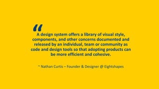

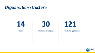

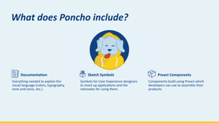

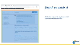
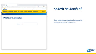
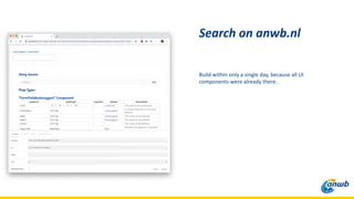
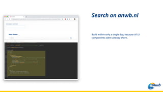
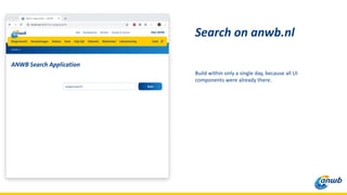
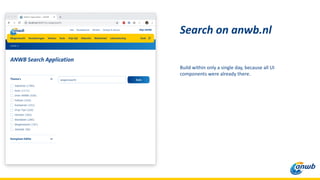
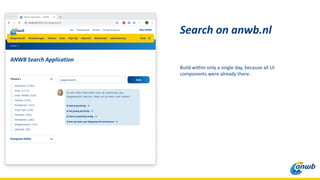
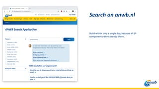


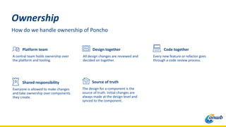
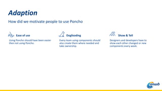
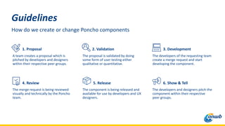
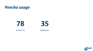

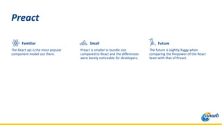
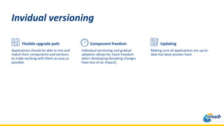


The document summarizes a front-end lead's discussion of their organization's design system called Poncho. It describes Poncho as including documentation, Sketch symbols, and Preact components to help 14 teams build products more efficiently. The process for Poncho involves shared ownership and review. It also discusses how they motivated adoption of Poncho and the technical choices including using Preact for its smaller size compared to React.


![[Srijan Wednesday Webinars] Building a High Performance QA Team](https://cdn.slidesharecdn.com/ss_thumbnails/srijan2016karim-161117105408-thumbnail.jpg?width=640&height=640&fit=bounds)


![20260201 [FOSDEM] gomodjail - library sandboxing for Go modules.pdf](https://cdn.slidesharecdn.com/ss_thumbnails/20260201fosdemgomodjail-librarysandboxingforgomodules-260201225659-76609ec4-thumbnail.jpg?width=640&height=640&fit=bounds)


