1. Brand Guidelines
Presentation and consistency is a key aspect of our brand as it will be promoted around the world. Our branding needs to be
consistent to ensure that audiences from every corner of the world can recognise it easily. Our branding will consist of a logo
which will be the artist’s name. this will be used on several products and documents such as posters, album covers, merchandise
and advertisements. These guidelines will be for all those involved in promoting Noreen Ahmed in anyway. The logo cannot be
copied for external uses as it is not copyright free. Logo should be in high definition all times.
The logo must have a transparent background. Colour can be chosen from black, white or red depending on background. It should
not have any effects such as drop shadow or bevel.
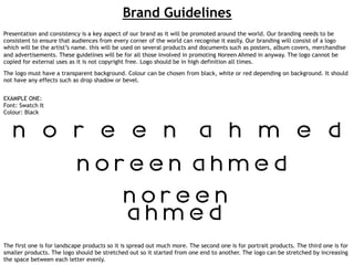
EXAMPLE ONE:
Font: Swatch It
Colour: Black
The first one is for landscape products so it is spread out much more. The second one is for portrait products. The third one is for
smaller products. The logo should be stretched out so it started from one end to another. The logo can be stretched by increasing
the space between each letter evenly.
2. EXAMPLE TWO:
Font: Swatch It
Colour: White
No background should be used as it should have a transparent background. Background is used in this document to show a
clearer guideline.
4. This the font used ‘Swatch It’. As shown, there is no punctuation available with this font. If punctuation ever
needed then use font ‘Century Gothic’.