Download to read offline

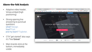
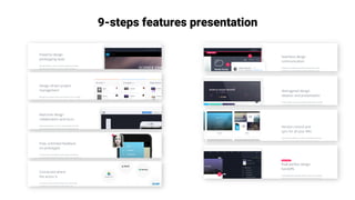
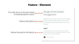
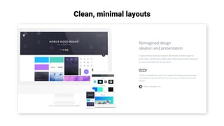
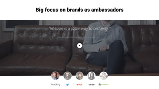
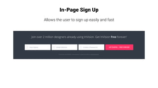
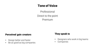
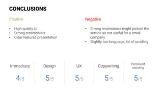

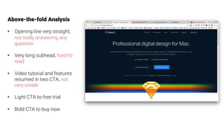
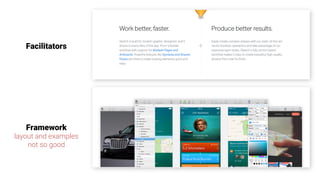
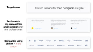
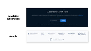
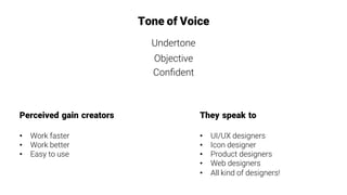
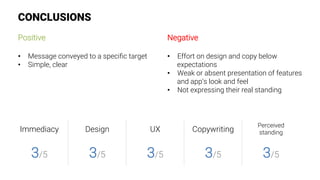

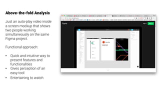
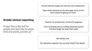
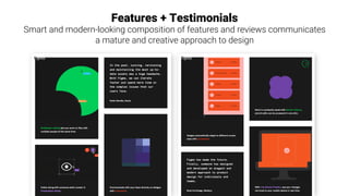
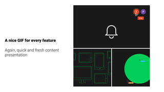
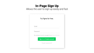
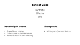
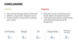

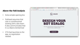
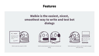
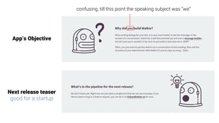
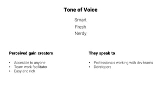
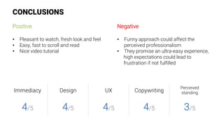

The document provides an analysis of the landing pages of four design tools: InVision, Sketch, Figma, and Walkie. For each tool, it examines elements above the fold, features presentation, tone of voice, perceived benefits, and conclusions. Some of the key findings include that InVision has a strong opening and clear feature presentation, while Sketch could improve its design, copywriting and demonstrate its value more effectively. Figma utilizes minimal copy and engaging visuals like gifs to quickly showcase its features and collaboration benefits. Walkie aims to be easy to use and facilitate teamwork, but its fun approach may impact its perceived professionalism.


![9 Lead Gen Tactics From 2 Rapidly Growing Startups [Webinar]](https://cdn.slidesharecdn.com/ss_thumbnails/9leadgentacticsfrom2rapidlygrowingstartups-141001153456-phpapp02-thumbnail.jpg?width=640&height=640&fit=bounds)


