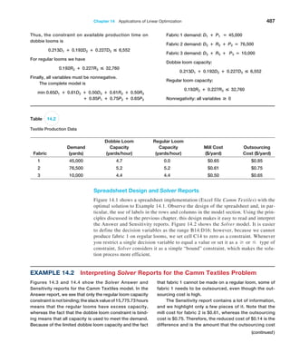
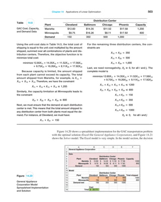
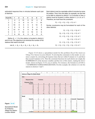
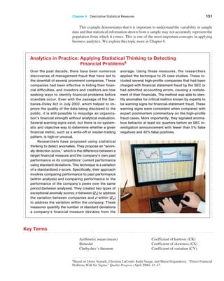
This document provides an overview of business analytics methods, models, and decisions. It begins with an intentionally blank page, then provides a table of contents outlining the book's parts and chapters on topics including descriptive analytics, predictive analytics, prescriptive analytics, linear and integer optimization, and decision analysis. The preface states that the second edition has been updated with new examples and case studies.


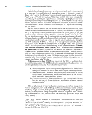
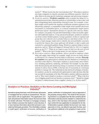
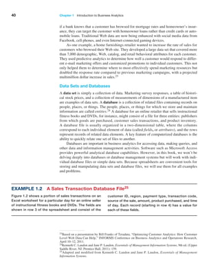


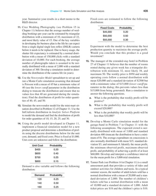
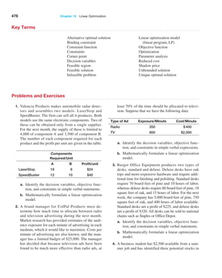
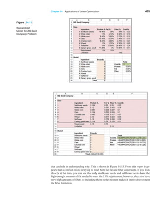
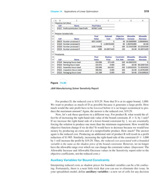
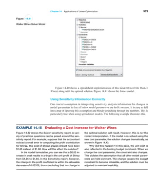
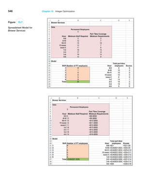
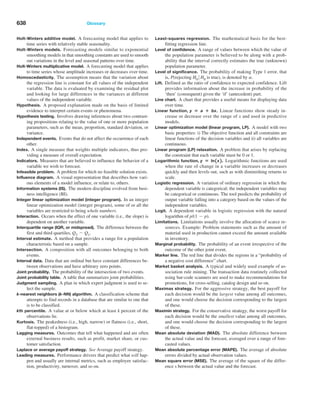
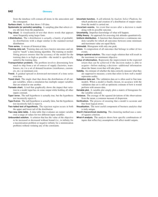
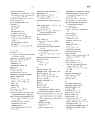
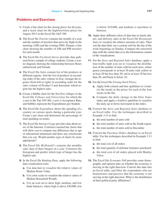
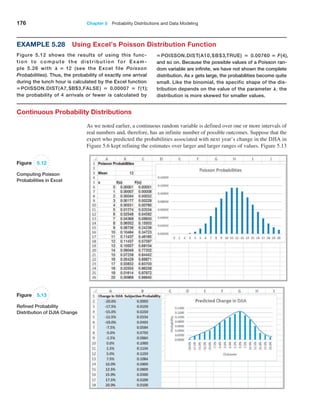
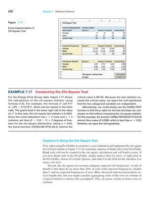
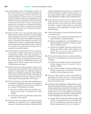
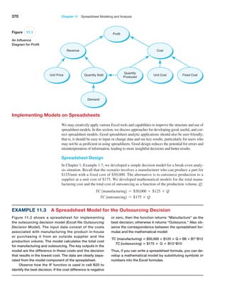
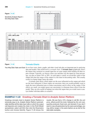
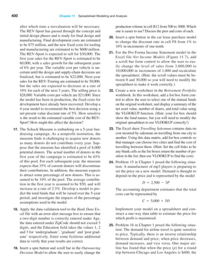
![Chapter 2 Analytics on Spreadsheets 69
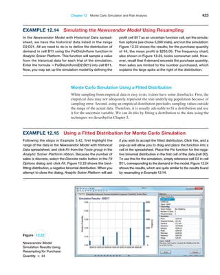
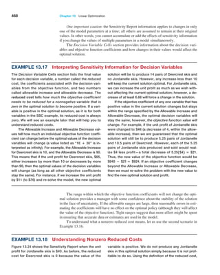
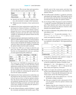
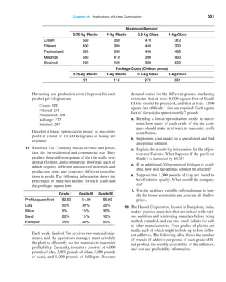
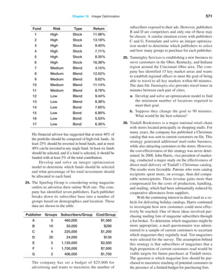
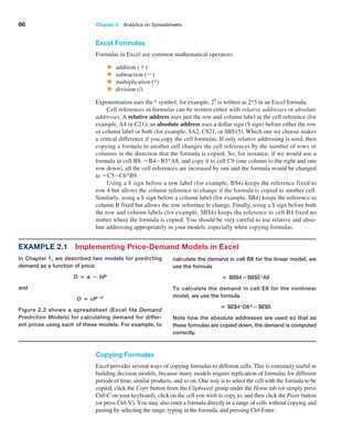
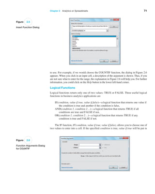
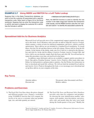
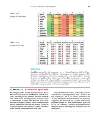
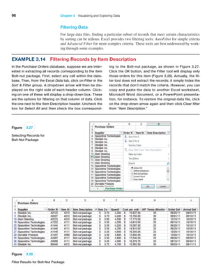
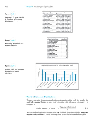
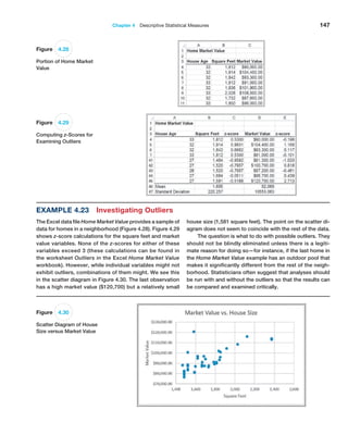
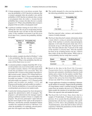
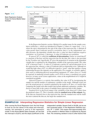
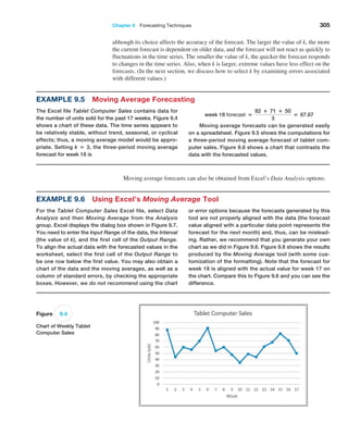
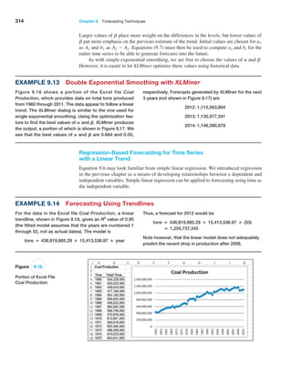
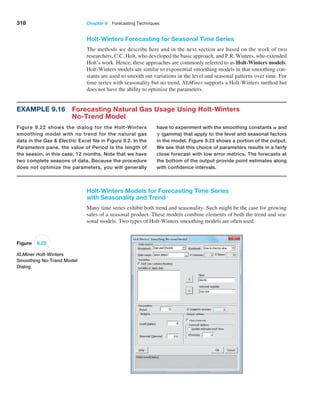
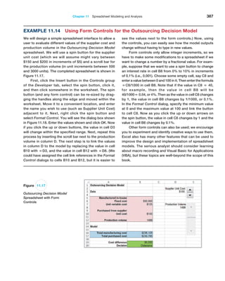
The results are shown in Figure 2.3. In this figure, we used
the split-screen feature in Excel to reduce the number of
rows shown in the spreadsheet. To find the smallest and
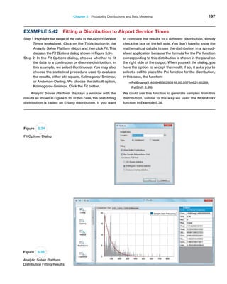
largest quantity of any item ordered, we use the MIN and
MAX functions for the data in column F. Thus, the formula
in cell B99 is =MIN(F4:F97) and the formula in cell B100
is =MAX(F4:F97). To find the total order costs, we sum the
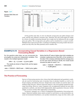
data in column G using the SUM function: =SUM(G4:G97);
this is the formula in cell B101. To find the average number
of A/P months, we use the AVERAGE function for the data in
column H. The formula in cell B102 is =AVERAGE(H4:H97).
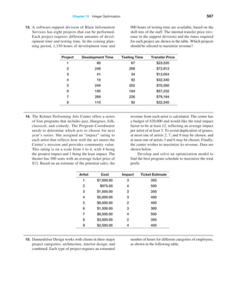
To find the number of purchase orders placed, use the
COUNT function. Note that the COUNT function counts
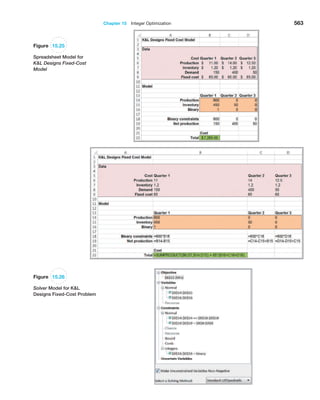
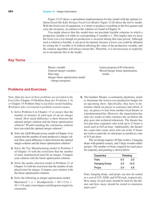
only the number of cells in a range that contain numbers,
so we could not use it in columns A, B, or D; however, any
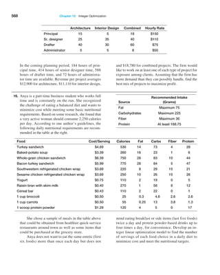
other column would be acceptable. Using the item numbers
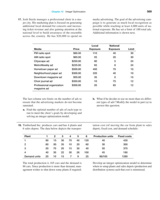
in column C, the formula in cell B103 is =COUNT(C4:C97).
To find the number of orders placed for O-rings, we use the
COUNTIF function. For this example, the formula used in
cell B104 is =COUNTIF(D4:D97, “O-Ring”). We could have
also used the cell reference for any cell containing the text
O-Ring, such as = COUNTIF(D4:D97,D12). To find the
number of orders with A/P terms less than 30 months,
use the formula =COUNTIF(H4:H97,“30”) in cell B105.
Finally, to count the number of O-Ring orders for Space-
time Technologies, we use =COUNTIFS(D4:D97,“O-Ring”,
A4:A97,“Spacetime Technologies”).
IF-type functions are also available for other calculations. For example, the func-
tions SUMIF, AVERAGEIF, SUMIFS, and AVERAGEIFS can be used to embed IF
logic within mathematical functions. For instance, the syntax of SUMIF is SUMIF(range,
criterion, [sum range]). “Sum range” is an optional argument that allows you to add cells
in a different range. Thus, in the Purchase Orders database, to find the total cost of all
airframe fasteners, we would use
SUMIF(D4:D97, “Airframe fasteners”, G4:G97)
This function looks for Airframe fasteners in the range D4:D97, but then sums the associ-
ated values in column G (cost per order).
Functions for Specific Applications
Excel has a wide variety of other functions for statistical, financial, and other applications,
many of which we introduce and use throughout the text. For instance, some financial mod-
els that we develop require the calculation of net present value (NPV). Net present value
(also called discounted cash flow) measures the worth of a stream of cash flows, taking into
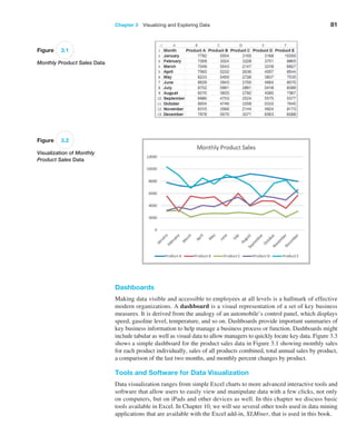
Figure 2.3
Application of Excel Functions
to Purchase Orders Data](https://image.slidesharecdn.com/book-230309160846-8faa1145/85/Book-pdf-70-320.jpg)
![Chapter 2 Analytics on Spreadsheets 73
condition within an IF function; for example, =IF(AND(B1=3,C1=5),12,22). Here,
if cell B1=3 and cell C1=5, then the value of the function is 12; otherwise it is 22.
Using Excel Lookup Functions for Database Queries
In Chapter 1 we noted that business intelligence was instrumental in the evolution of busi-
ness analytics. Organizations often need to extract key information from a database to sup-
port customer service representatives, technical support, manufacturing, and other needs.
Excel provides some useful functions for finding specific data in a spreadsheet. These are:
VLOOKUP(lookup_value, table_array, col_index_num, [range lookup]) looks up a
value in the leftmost column of a table (specified by the table_array) and returns
a value in the same row from a column you specify (col_index_num).
HLOOKUP(lookup_value, table_array, row_index_num, [range lookup]) looks up a
value in the top row of a table and returns a value in the same column from a row
you specify.
INDEX(array, row_num, col_num) returns a value or reference of the cell at the in-
tersection of a particular row and column in a given range.
MATCH(lookup_value, lookup_array, match_type) returns the relative position of
an item in an array that matches a specified value in a specified order.
In the VLOOKUP and HLOOKUP functions, range lookup is optional. If this is omit-
ted or set as True, then the first column of the table must be sorted in ascending numerical
order. If an exact match for the lookup_value is found in the first column, then Excel will
return the value the col_index_num of that row. If an exact match is not found, Excel will
choose the row with the largest value in the first column that is less than the lookup_value.
If range lookup is false, then Excel seeks an exact match in the first column of the table
range. If no exact match is found, Excel will return #N/A (not available). We recommend
that you specify the range lookup to avoid errors.
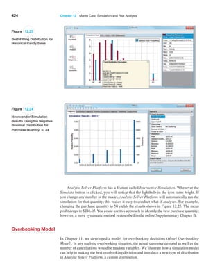
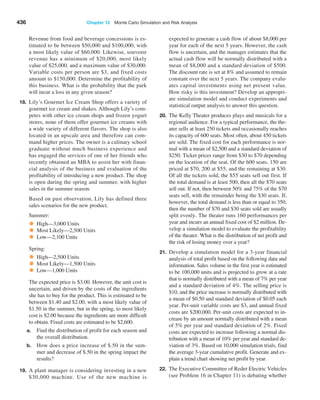
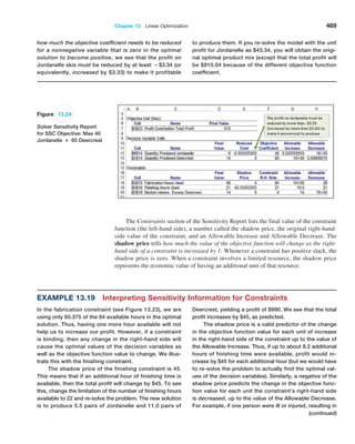
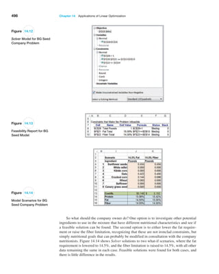
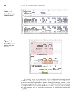
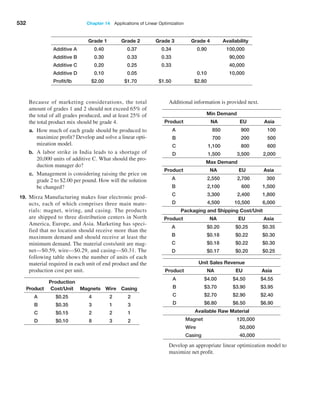
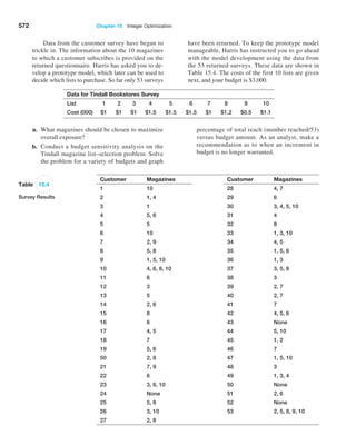
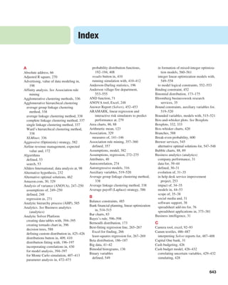
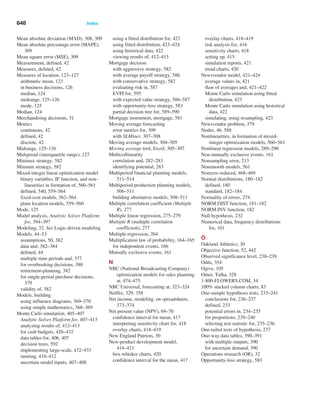
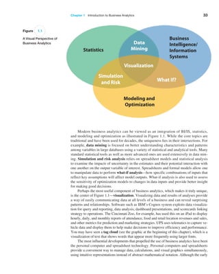
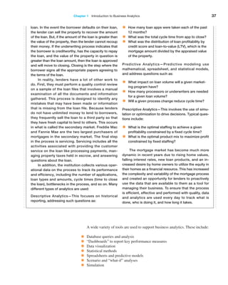
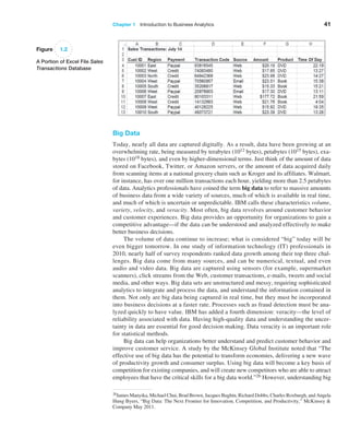
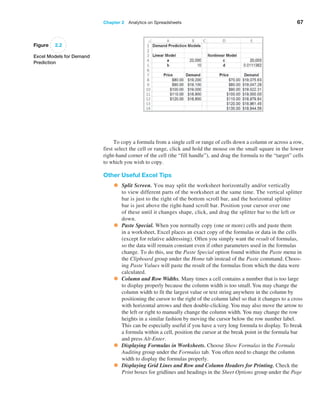
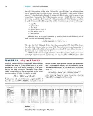
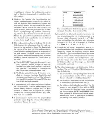
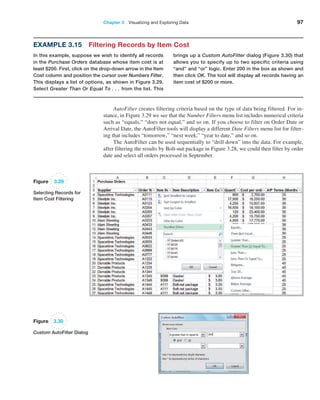
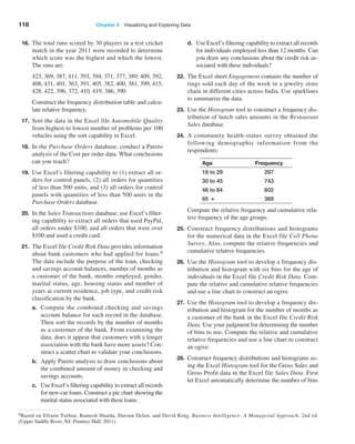
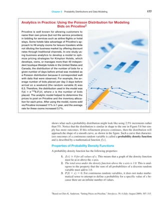
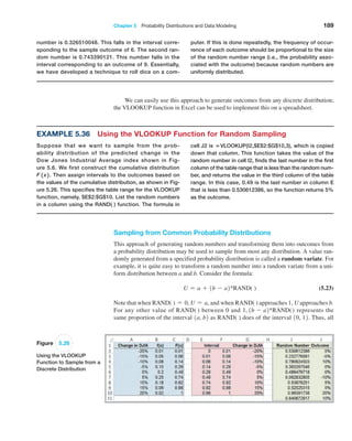
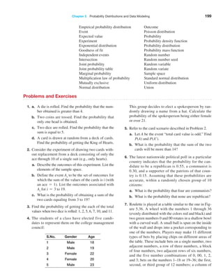
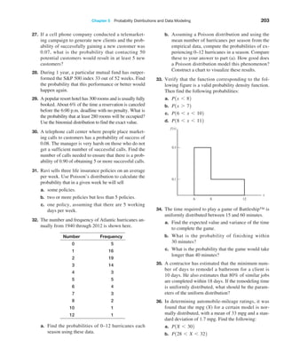
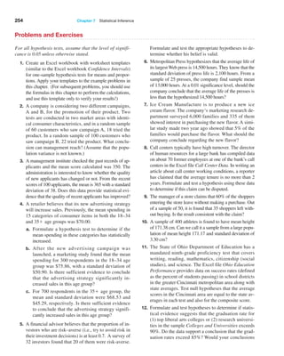
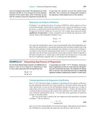
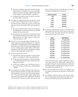
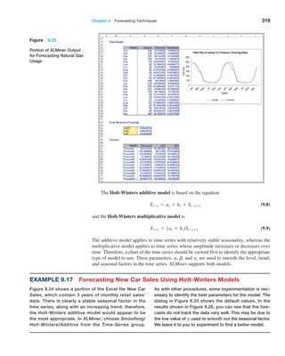
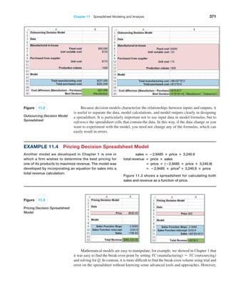
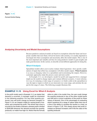
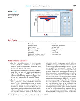
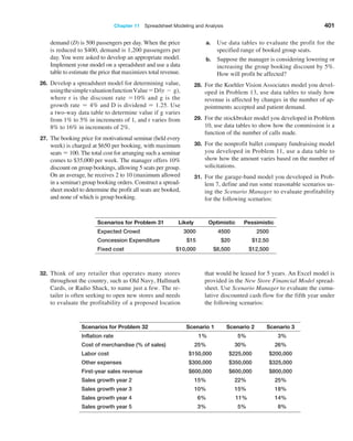
Example 2.5 Using the VLOOKUP Function
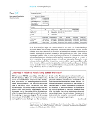
In Chapter 1, we introduced a database of sales trans-
actions for a firm that sells instructional fitness books
and DVDs (Excel file Sales Transactions). The database
is sorted by customer ID, and a portion of it is shown
in Figure 2.8. Suppose that a customer calls a repre-
sentative about a payment issue. The representative
finds the customer ID—for example, 10007—and needs
to look up the type of payment and transaction code.
We may use the VLOOKUP function to do this. In the
function VLOOKUP(lookup_value, table_array, col_
index_num), lookup_value represents the customer ID.
The table_array is the range of the data in the spread-
sheet; in this case, it is the range A4:H475. The value
for col_index_num represents the column in the table
range we wish to retrieve. For the type of payment, this
is column 3; for the transaction code, this is column 4.
Note that the first column is already sorted in ascending
numerical order, so we can either omit the range lookup
argument or set it as true. Thus, if we enter the formula
below in any blank cell of the spreadsheet:
=VLOOKUP(10007,$A$4:$H$475,3)
returns the payment type, Credit. If we use the following
formula:
=VLOOKUP(10007,$A$4:$H$475,4)
the function returns the transaction code, 80103311.
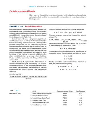
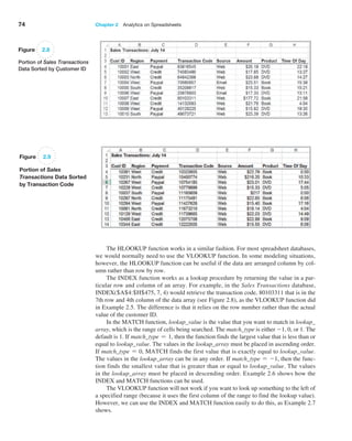
Now suppose the database was sorted by transaction
code so that the customer ID column is no longer in ascend-
ing numerical order as shown in Figure 2.9. If we use the
function =VLOOKUP(10007,$A$4:$H$475,4, True), Excel
returns #N/A. However, if we change the range lookup argu-
ment to False, then the function
returns the correct value of
the transaction code.](https://image.slidesharecdn.com/book-230309160846-8faa1145/85/Book-pdf-74-320.jpg)


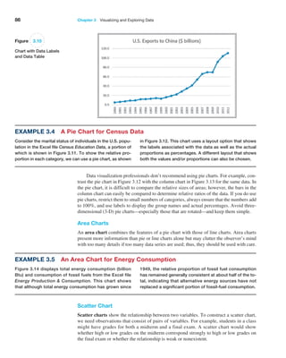
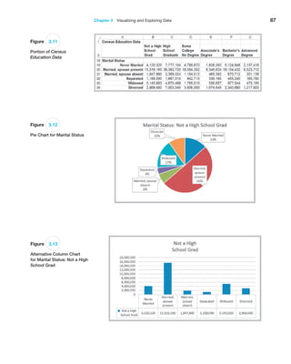

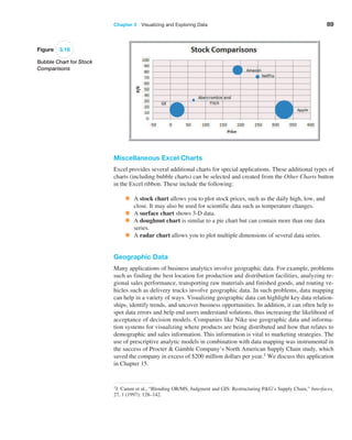
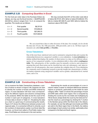
![94 Chapter 3 Visualizing and Exploring Data
An Excel table allows you to use table references to perform basic calculations, as the
next example illustrates.
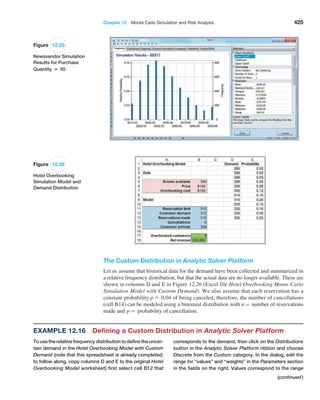
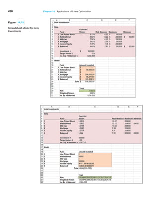
Example 3.11 Table-Based Calculations
Suppose that in the Credit Risk Data table, we wish to
calculate the total amount of savings in column C. We
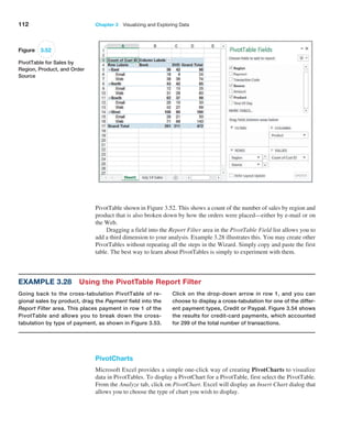
could, of course, simply use the function SUM(C4:C428).
However, with a table, we could use the formula
=SUM(Table1[Savings]). The table name, Table1, can
be found (and changed) in the Properties group of the
Table Tools Design tab. Note that Savings is the name
of the header in column C. One of the advantages of do-
ing this is that if we add new records to the table, the
calculation will be updated automatically, and we don’t
have to change the range in the formula or get a wrong
result if we forget to. As another example, we could
find the number of home owners using the function
=COUNTIF(Table1[Housing], “Own”).
If you add additional records at the end of the table, they will automatically be in-
cluded and formatted, and if you create a chart based on the data, the chart will automati-
cally be updated if you add new records.
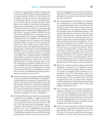
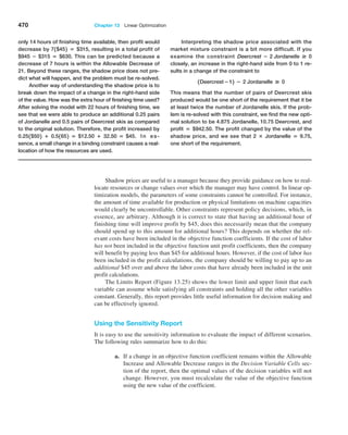
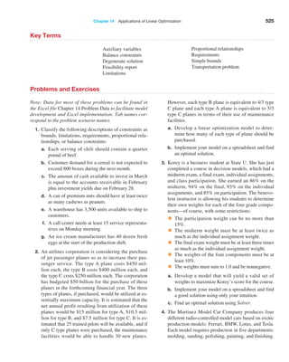
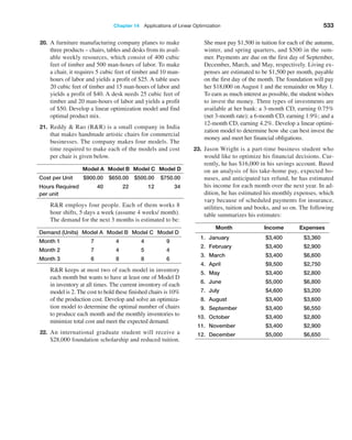
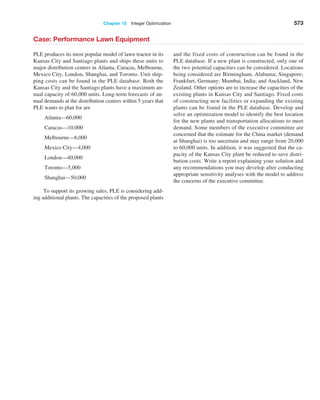
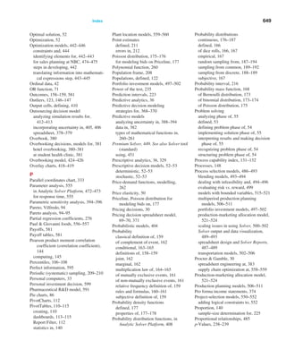
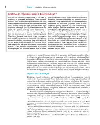
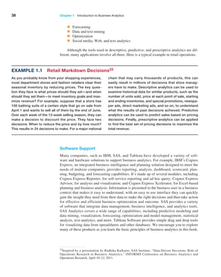
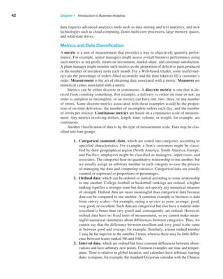
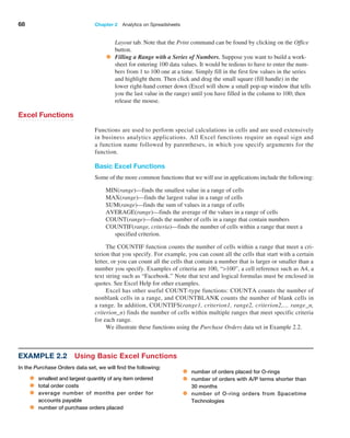
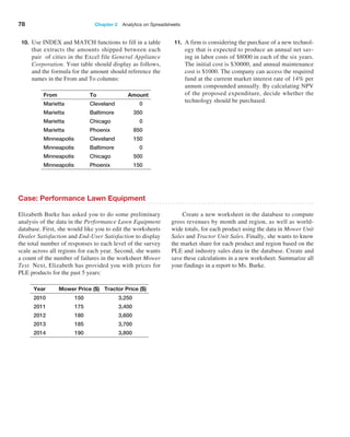
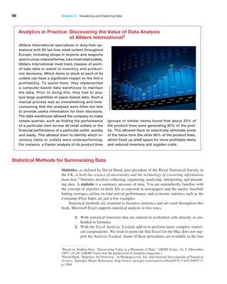
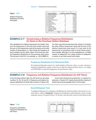
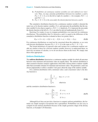
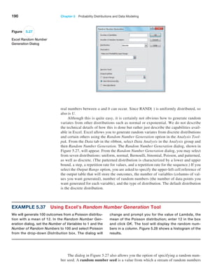
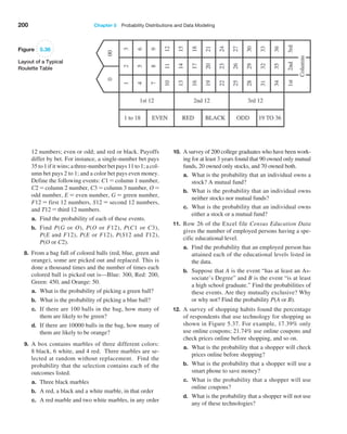
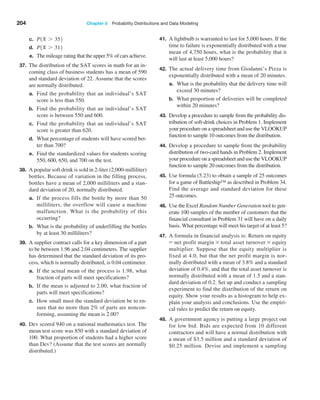
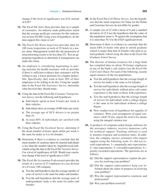
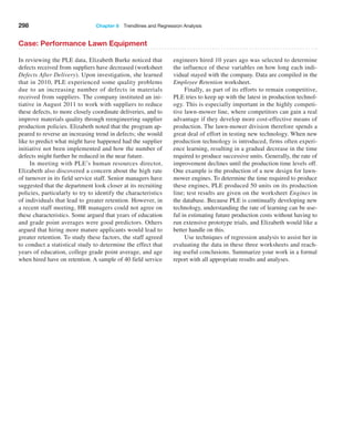
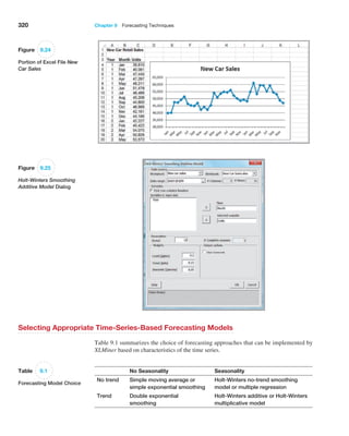
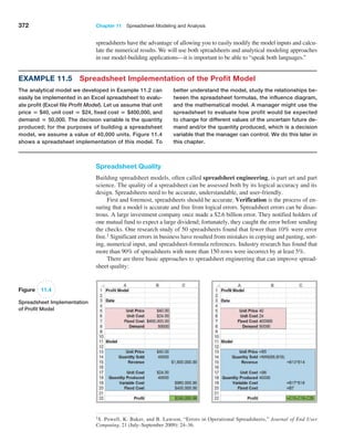
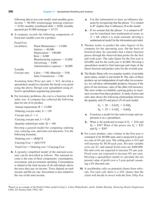
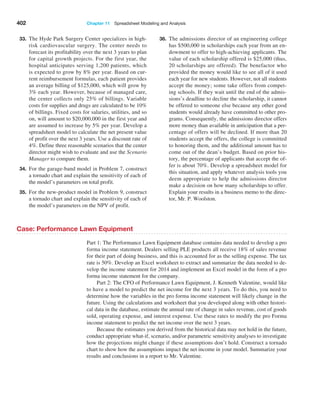
Sorting Data in Excel
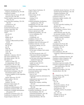
Excel provides many ways to sort lists by rows or column or in ascending or descending
order and using custom sorting schemes. The sort buttons in Excel can be found under the
Data tab in the Sort Filter group (see Figure 3.24). Select a single cell in the column
you want to sort on and click the “AZ down arrow” button to sort from smallest to largest
or the “AZ up arrow” button to sort from largest to smallest. You may also click the Sort
button to specify criteria for more advanced sorting capabilities.
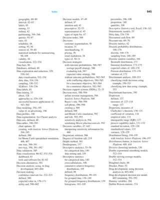
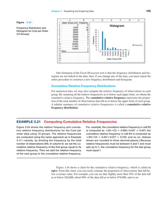
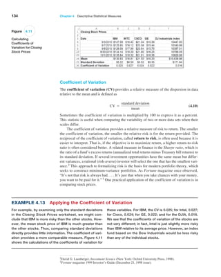
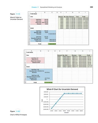
Example 3.12 Sorting Data in the Purchase Orders Database
In Chapter 1 (Figure 1.3), we introduced a data set for
purchase orders for an aircraft-component manufac-
turer. Suppose we wish to sort the data by supplier.
Click on any cell in column A of the data (but not the
header cell A3) and then the “AZ down” button in the
Data tab. Excel will select the entire range of the data
and sort by name of supplier in column A, a portion of
which is shown in Figure 3.25. This allows you to easily
identify the records that correspond to all orders from a
particular supplier.
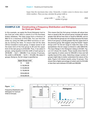
Pareto Analysis
Pareto analysis is a term named after an Italian economist, Vilfredo Pareto, who, in 1906,
observed that a large proportion of the wealth in Italy was owned by a relatively small
proportion of the people. The Pareto principle is often seen in many business situations.
For example, a large percentage of sales usually comes from a small percentage of cus-
tomers, a large percentage of quality defects stems from just a couple of sources, or a large
percentage of inventory value corresponds to a small percentage of items. As a result,
the Pareto principle is also often called the “80–20 rule,” referring to the generic situ-
Figure 3.24
Excel Ribbon Data Tab](https://image.slidesharecdn.com/book-230309160846-8faa1145/85/Book-pdf-95-320.jpg)
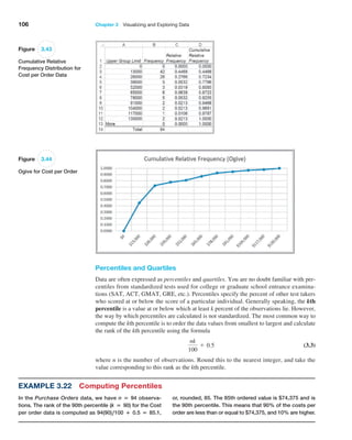

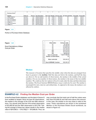
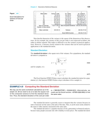
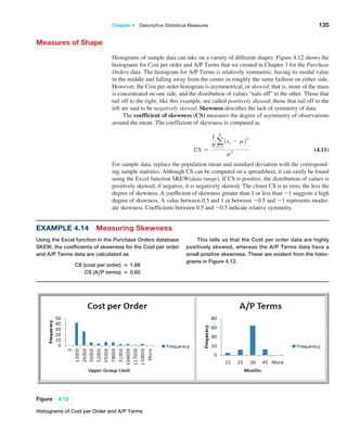
![Chapter 4 Descriptive Statistical Measures 131
For many data sets encountered in practice, such as the Cost per order data, the
percentages are generally much higher than what Chebyshev’s theorem specifies. These
are
reflected in what are called the empirical rules:
1. Approximately 68% of the observations will fall within one standard deviation
of the mean, or between x - s and x + s.
2. Approximately 95% of the observations will fall within two standard deviations
of the mean, or within x { 2s.
3. Approximately 99.7% of the observations will fall within three standard
deviations of the mean, or within x { 3s.
We see that the Cost per order data reflect these empirical rules rather closely. Depend-
ing on the data and the shape of the frequency distribution, the actual percentages may be
higher or lower.
Two or three standard deviations around the mean are commonly used to describe
the variability of most practical sets of data. As an example, suppose that a retailer
knows that on average, an order is delivered by standard ground transportation in 8 days
with a standard deviation of 1 day. Using the second empirical rule, the retailer can,
therefore, tell a customer with confidence that their package should arrive within 6 to
10 days.
As another example, it is important to ensure that the output from a manufacturing
process meets the specifications that engineers and designers require. The dimensions
for a typical manufactured part are usually specified by a target, or ideal, value as well
as a tolerance, or “fudge factor,” that recognizes that variation will exist in most manu-
facturing processes due to factors such as materials, machines, work methods,
human
performance, environmental conditions, and so on. For example, a part dimension
might be specified as 5.00 { 0.2 cm. This simply means that a part having a dimension
between 4.80 and 5.20 cm will be acceptable; anything outside of this range would be
classified as defective. To measure how well a manufacturing process can achieve the
specifications, we usually take a sample of output, measure the dimension, compute
the total variation using the third
empirical rule (i.e., estimate the total variation by six
standard deviations), and then compare the result to the specifications by dividing the
specification range by the total variation. The result is called the process capability
index, denoted as Cp:
Cp =
upper specification - lower specification
total variation
(4.8)
Manufacturers use this index to evaluate the quality of their products and determine when
they need to make improvements in their processes.
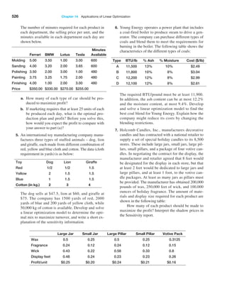
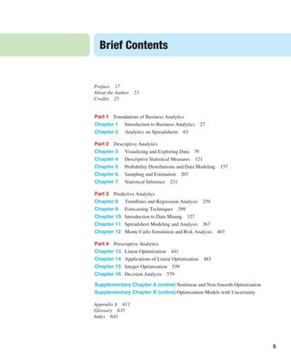
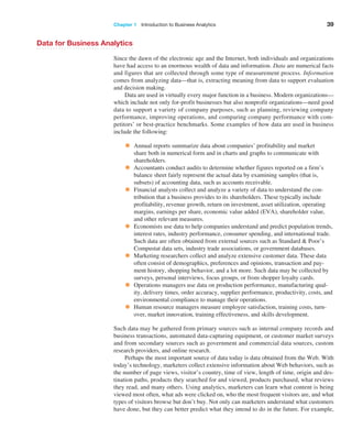
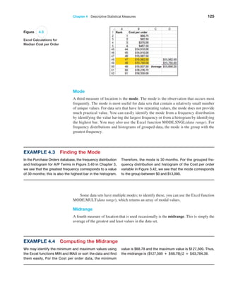
Example 4.10 Applying Chebyshev’s Theorem
For Cost per order data in the Purchase Orders data-
base, a two standard deviation interval around the mean
is [−$33,390.34, $85,980.98]. If we count the number of
observations within this interval, we find that 89 of 94, or
94.68%, fall within two standard deviations of the mean.
A three-standard deviation interval is [ − $63,233.17,
$115,823.81], and we see that 92 of 94, or 97.9%, fall in
this interval. Both are above at least 75% and at least
89% of Chebyshev’s Theorem.](https://image.slidesharecdn.com/book-230309160846-8faa1145/85/Book-pdf-132-320.jpg)
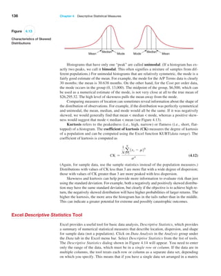
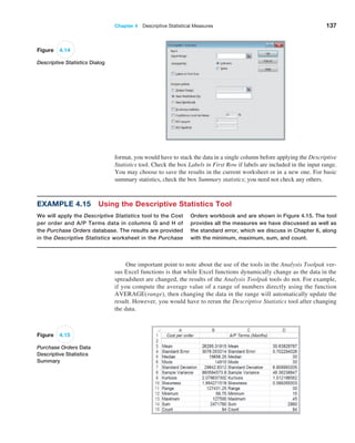
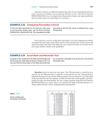
![138 Chapter 4 Descriptive Statistical Measures
Descriptive Statistics for Grouped Data
In some situations, data may already be grouped in a frequency distribution, and we
may not have access to the raw data. This is often the case when extracting informa-
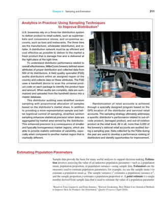
tion from government databases such as the Census Bureau or Bureau of Labor Statis-
tics. In these situations, we cannot compute the mean or variance using the standard
formulas.
When sample data are summarized in a frequency distribution, the mean of a popula-
tion may be computed using the formula
m =
a
N
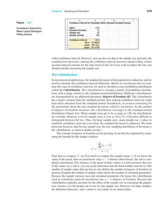
i=1
fixi
N
(4.13)
For samples, the formula is similar:
x =
a
n
i=1
fixi
n
(4.14)
where fi is the frequency of observation i. Essentially, we multiply the frequency by the
value of observation i, add them up, and divide by the number of observations.
We may use similar formulas to compute the population variance for grouped
data,
s2
=
a
N
i=1
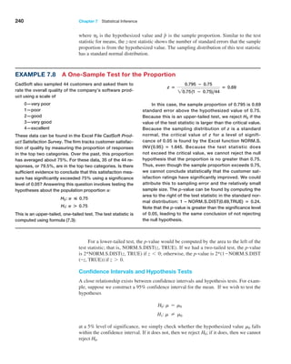
fi1xi - m22
N
(4.15)
and sample variance,
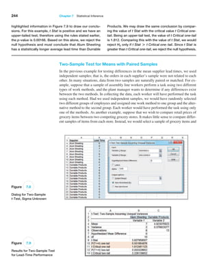
s2
=
a
n
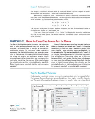
i=1
fi1xi - x22
n - 1
(4.16)
To find the standard deviation, take the square root of the variance, as we did earlier.
Note the similarities between these formulas and formulas (4.13) and (4.14). In multi-
plying the values by the frequency, we are essentially adding the same values fi times. So
they really are the same formulas, just expressed differently.
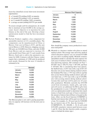
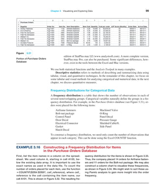
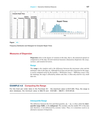
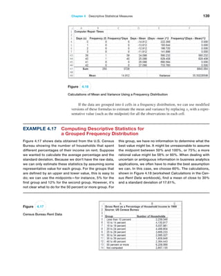
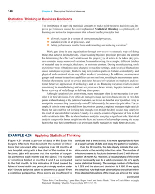
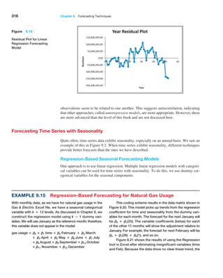
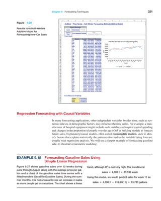
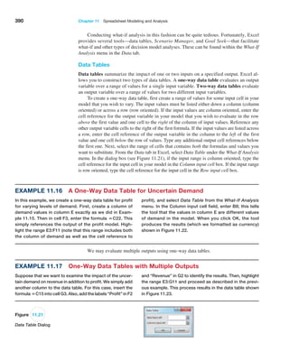
Example 4.16 Computing Statistical Measures from Frequency Distributions
The worksheet Statistical Calculations in the Computer
Repair Times workbook shows the calculations of the
mean and variance using formulas (4.14) and (4.16) for the
frequency distribution of repair times. A portion of this is
shown in Figure 4.16. In column C, we multiply the fre-
quency by the value of the observations [the numerator
in formula (4.14)] and then divide by n, the sum of the
frequencies in column B, to find the mean in cell C49.
Columns D, E, and F provide the calculations needed to
find the variance. We divide the sum of the data in column
F by n − 1 = 249 to find the variance in cell F49.](https://image.slidesharecdn.com/book-230309160846-8faa1145/85/Book-pdf-139-320.jpg)

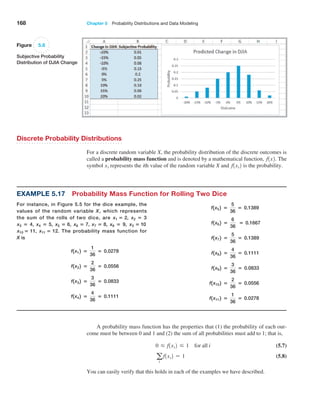
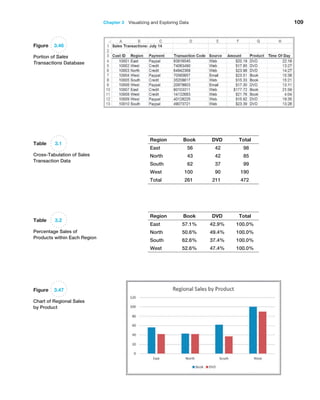
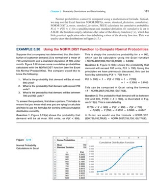
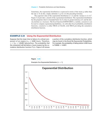
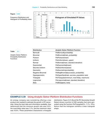
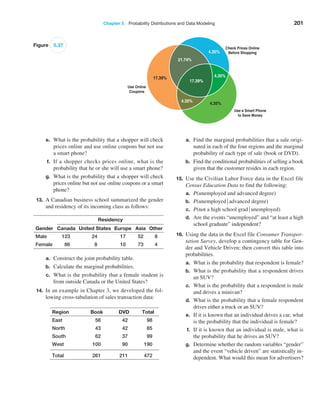
![Chapter 5 Probability Distributions and Data Modeling 169
A cumulative distribution function, F1x2, specifies the probability that the ran-
dom variable X assumes a value less than or equal to a specified value, x. This is also
denoted as P1X … x2 and read as “the probability that the random variable X is less
than or equal to x.”
Example 5.18 Using the Cumulative Distribution Function
The cumulative distribution function for rolling two dice
is shown in Figure 5.7, along with an Excel line chart
that describes it visually from the worksheet CumDist in
the Dice Rolls Excel file. To use this, suppose we want
to know the probability of rolling a 6 or less. We simply
look up the cumulative probability for 6, which is 0.5833.
Alternatively, we could locate the point for x = 6 in the
chart and estimate the probability from the graph. Also
note that since the probability of rolling a 6 or less is
0.5833, then the probability of the complementary event
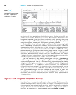
(rolling a 7 or more) is 1−0.5833 = 0.4167. We can also
use the
cumulative distribution function to find probabili-
ties over intervals. For example, to find the probability
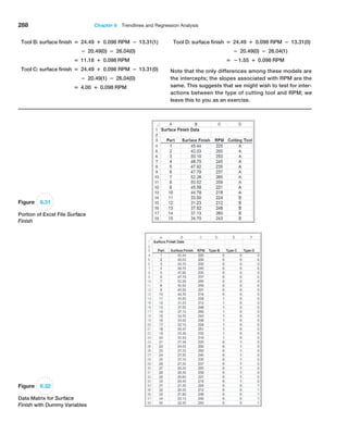
of rolling a number between 4 and 8, P14 X 82, we
can find P1X 82 and subtract P1X 32; that is,
P14 X 82 = P1X 82 − P1X 32
= 0.7222 − 0.0833 = 0.6389.
A word of caution. Be careful with the endpoints
when computing probabilities over intervals for discrete
distributions; because 4 is included in the interval we wish
to compute, we need to subtract P1X 32, not P1X 42.
Figure 5.7
Cumulative Distribution
Function for Rolling
Two Dice
Expected Value of a Discrete Random Variable
The expected value of a random variable corresponds to the notion of the mean, or
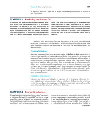
average, for a sample. For a discrete random variable X, the expected value, denoted
E[X], is the weighted average of all possible outcomes, where the weights are the
probabilities:
E3X4 = a
∞
i=1
xi f1xi2 (5.9)](https://image.slidesharecdn.com/book-230309160846-8faa1145/85/Book-pdf-170-320.jpg)
![170 Chapter 5 Probability Distributions and Data Modeling
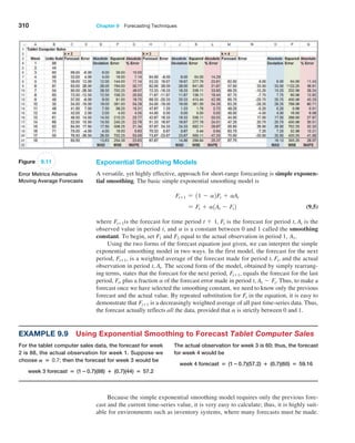
Note the similarity to computing the population mean using formula (4.13) in Chapter 4:
m =
a
N
i=1
fixi
N
If we write this as the sum of xi multiplied by 1fiN2, then we can think of fiN as
the probability of xi. Then this expression for the mean has the same basic form as the
expected value formula.
Example 5.19 Computing the Expected Value
We may apply formula (5.9) to the probability distribu-
tion of rolling two dice. We multiply the outcome 2 by its
probability 1/36, add this to the product of the outcome 3
and its probability, and so on. Continuing in this fashion,
the expected value is
E[X] = 210.02782 + 310.05562 + 410.08332 + 510.011112
+ 610.13892 + 710.16672 + 810.13892 + 910.11112
+ 1010.08332 + 1110.05562 + 1210.02782 = 7
Figure 5.8 shows these calculations in an Excel
spreadsheet (worksheet Expected Value in the Dice Rolls
Excel file). As expected (no pun intended), the average
value of the roll of two dice is 7.
Using Expected Value in Making Decisions
Expected value can be helpful in making a variety of decisions, even those we see in
daily life.
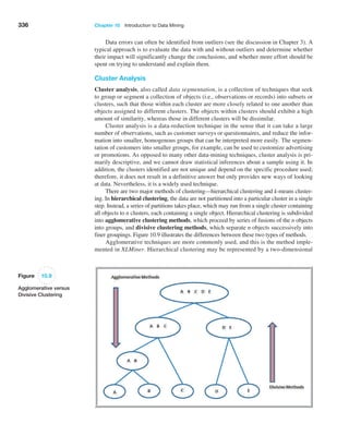
Example 5.20 Expected Value on Television
One of the author’s favorite examples stemmed from
a task in season 1 of Donald Trump’s TV show, The
Apprentice. Teams were required to select an artist and
sell his or her art for the highest total amount of money.
One team selected a mainstream artist who specialized in
abstract art that sold for between $1,000 and $2,000; the
second team chose an avant-garde artist whose surreal-
ist and rather controversial art was priced much higher.
Guess who won? The first team did, because the proba-
bility of selling a piece of mainstream art was much higher
than the avant-garde artist whose bizarre art (the team
members themselves didn’t even like it!) had a very low
probability of a sale. A back-of-the-envelope
expected
value calculation would have easily predicted the winner.
A popular game show that took TV audiences by
storm several years ago was called Deal or No Deal. The
game involved a set of numbered briefcases that contain
amounts of money from 1 cent to $1,000,000. Contes-
tants begin choosing cases to be opened and removed,
and their amounts are shown. After each set of cases is
opened, the banker offers the contestant an amount of
money to quit the game, which the contestant may either
choose or reject. Early in the game, the banker’s offer
is usually less than the expected value of the remaining
cases, providing an incentive to continue. However, as the
number of remaining cases becomes small, the banker’s
offers approach or may even exceed the average of the
remaining cases. Most people press on until the bitter end
and often walk away with a smaller amount than they could
have had they been able to estimate the expected value of
the remaining cases and make a more rational decision.
In one case, a contestant had five briefcases left with
$100, $400, $1,000, $50,000, and $300,000. Because the
choice of each case is equally likely, the expected value
was 0.21$100 + $400 + $1000 + $50,000 + $300,0002 =
$70,300 and the banker offered $80,000 to quit. Instead,
she said “No Deal” and proceeded to open the $300,000
suitcase, eliminating it from the game, and took the next
banker’s offer of $21,000, which was more than 60%
larger than the expected value of the remaining cases.1
1“Deal or No Deal: A Statistical Deal.” www.pearsonified.com/2006/03/deal_or_no_deal_the_real_deal.php](https://image.slidesharecdn.com/book-230309160846-8faa1145/85/Book-pdf-171-320.jpg)
![Chapter 5 Probability Distributions and Data Modeling 171
Figure 5.8
Expected Value Calculations
for Rolling Two Dice
It is important to understand that the expected value is a “long-run average” and is
appropriate for decisions that occur on a repeated basis. For one-time decisions, however,
you need to consider the downside risk and the upside potential of the decision. The fol-
lowing example illustrates this.
Decisions based on expected values are common in real estate development, day
trading, and pharmaceutical research projects. Drug development is a good example.
The cost of research and development projects in the pharmaceutical industry is gener-
ally in the hundreds of millions of dollars and often approaches $1 billion. Many projects
never make it to clinical trials or might not get approved by the Food and Drug Admin-
istration. Statistics indicate that 7 of 10 products fail to return the cost of the company’s
capital. However, large firms can absorb such losses because the return from one or two
blockbuster drugs can easily offset these losses. On an average basis, drug companies
make a net profit from these decisions.
repeatedly over the long run, you would lose an aver-
age of $25.00 each time you play. Of course, for any one
game, you would either lose $50 or win $24,950. So the
question becomes, Is the risk of losing $50 worth the
potential of winning $24,950? Although the expected
value is negative, you might take the chance because the
upside
potential is large relative to what you might lose,
and, after all, it is for charity. However, if your potential
loss is large, you might not take the chance, even if the
expected value were positive.
Example 5.21 Expected Value of a Charitable Raffle
Suppose that you are offered the chance to buy one
of 1,000 tickets sold in a charity raffle for $50, with the
prize being $25,000. Clearly, the probability of winning
is 1
1,000, or 0.001, whereas the probability of losing is
1 − 0.001 − 0.999. The random variable X is your net
winnings, and its probability distribution is
x f(x)
−$50 0.999
$24,950 0.001
Theexpectedvalue,E[ X ], is −$50(0.999) + $24,950(0.001)
= −$25.00. This means that if you played this game](https://image.slidesharecdn.com/book-230309160846-8faa1145/85/Book-pdf-172-320.jpg)
![172 Chapter 5 Probability Distributions and Data Modeling
Variance of a Discrete Random Variable
We may compute the variance, Var[X], of a discrete random variable X as a weighted av-
erage of the squared deviations from the expected value:
Var[X] = a
∞
j=1
1xj - E[X]22
f1xj2 (5.10)
Figure 5.9
Variance Calculations for
Rolling Two Dice
Example 5.22 Airline Revenue Management
Let us consider a simplified version of the typical revenue
management process that airlines use. At any date prior to a
scheduled flight, airlines must make a decision as to whether
to reduce ticket prices to stimulate demand for unfilled seats.
If the airline does not discount the fare, empty seats might
not be sold and the airline will lose revenue. If the airline dis-
counts the remaining seats too early (and could have sold
them at the higher fare), they would lose profit. The decision
depends on the probability p of selling a full-fare ticket if they
choose not to discount the price. Because an airline makes
hundreds or thousands of such decisions each day, the ex-
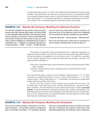
pected value approach is appropriate.
Assume that only two fares are available: full and dis-
count. Suppose that a full-fare ticket is $560, the discount
fare is $400, and p = 0.75. For simplification, assume that
if the price is reduced, then any remaining seats would be
sold at that price. The expected value of not discounting
the price is 0.25 (0) + 0.75($560) = $420. Because this is
higher than the discounted price, the airline should not dis-
count at this time. In reality, airlines constantly update the
probability p based on the information they collect and an-
alyze in a database. When the value of p drops below the
break-even point: $400 = p($560), or p = 0.714, then it is
beneficial to discount. It can also work in reverse; if demand
is such that the probability that a higher-fare ticket would be
sold, then the price may be adjusted upward. This is why
published fares constantly change and why you may receive
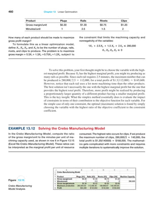
last-minute discount offers or may pay higher prices if you
wait too long to book a reservation. Other industries such as
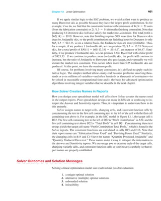
hotels and cruise lines use similar decision strategies.
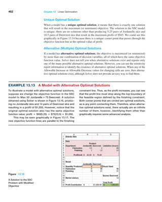
Similar to our discussion in Chapter 4, the variance measures the uncertainty of the ran-
dom variable; the higher the variance, the higher the uncertainty of the outcome. Although
variances are easier to work with mathematically, we usually measure the variability of a
random variable by its standard deviation, which is simply the square root of the variance.
shows these calculations in an Excel spreadsheet (work-
sheet Variance in Random Variable Calculations Excel file).
Example 5.23 Computing the Variance of a Random Variable
We may apply formula (5.10) to calculate the variance of
the probability distribution of rolling two dice. Figure 5.9](https://image.slidesharecdn.com/book-230309160846-8faa1145/85/Book-pdf-173-320.jpg)
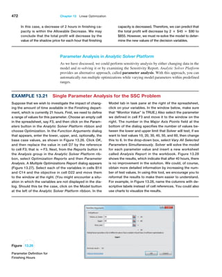
![Chapter 5 Probability Distributions and Data Modeling 179
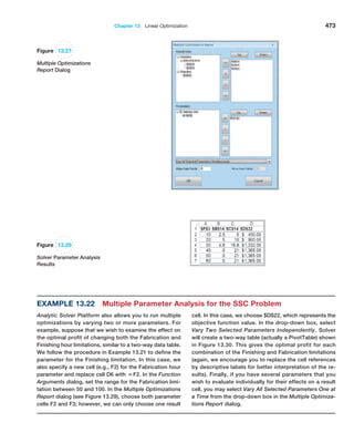
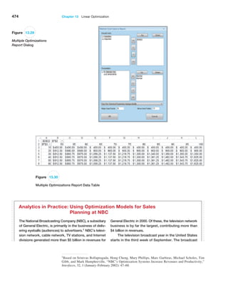
The expected value and variance of a uniform random variable X are computed as
follows:
E[X] =
a + b
2
(5.18)
Var[X] =
1b - a22
12
(5.19)
A variation of the uniform distribution is one for which the random variable is re-
stricted to integer values between a and b (also integers); this is called a discrete uniform
Example 5.29 Computing Uniform Probabilities
Suppose that sales revenue, X, for a product varies uni-
formly each week between a = $1000 and b = $2000.
The density function is f1x2 = 1 , 12000 − 10002 = 1 ,1000
and is shown in Figure 5.14. Note that the area under the
density is function is 1.0, which you can easily verify by mul-
tiplying the height by the width of the rectangle.
Suppose we wish to find the probability that sales
revenue will be less than x = $1,300. We could do this in
two ways. First, compute the area under the density func-
tion using geometry, as shown in Figure 5.15. The area is
1 1 ,1,000 2 1 300 2 = 0.30. Alternatively, we could use for-
mula (5.17) to compute F1 1,3002 :
F11,3002 = 11,300 − 1,0002 ,12,000 − 1,0002 = 0.30
In either case, the probability is 0.30.
Now suppose we wish to find the probability that
revenue will be between $1,500 and $1,700. Again, using
geometrical arguments (see Figure 5.16), the area of the
rectangle between $1,500 and $1,700 is 11 ,1,0002 12002 =
0.2. We may also use formula (5.15) and compute it as
follows:
P(1,500 X 1,700) = P( X 1,700) − P( X 1,500)
= F(1,700) − F(1,500)
=
11,700 − 1,0002
12,000 − 1,0002
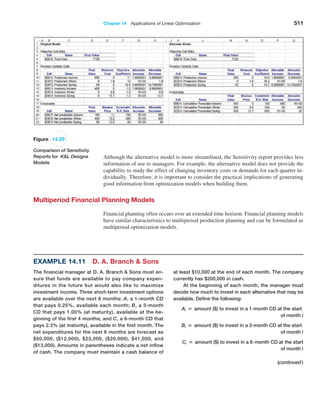
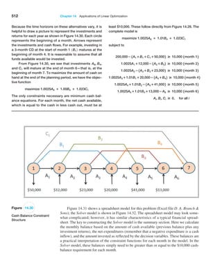
−
(1,500 − 1,000)
(2,000 − 1,000)
= 0.7 − 0.5 = 0.2
1/1,000
$1,000 $2,000
Figure 5.14
Uniform Probability Density
Function
1/1,000
$
1
,
0
0
0
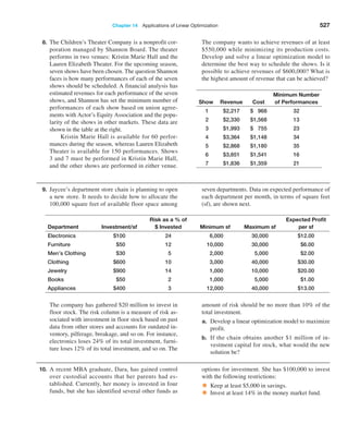
$
1
,
3
0
0
$
2
,
0
0
0
Figure 5.15
Probability that X * $1,300
$
1
,
0
0
0
$
1
,
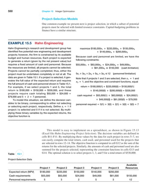
5
0
0
$
2
,
0
0
0
$
1
,
7
0
0
1/1,000
Figure 5.16
P($1,500 * X * $1,700)](https://image.slidesharecdn.com/book-230309160846-8faa1145/85/Book-pdf-180-320.jpg)


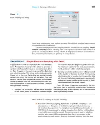
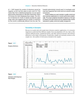
![Chapter 6 Sampling and Estimation 215
Sampling Distributions
We can quantify the sampling error in estimating the mean for any unknown population.
To do this, we need to characterize the sampling distribution of the mean.
Sampling Distribution of the Mean
The means of all possible samples of a fixed size n from some population will form a
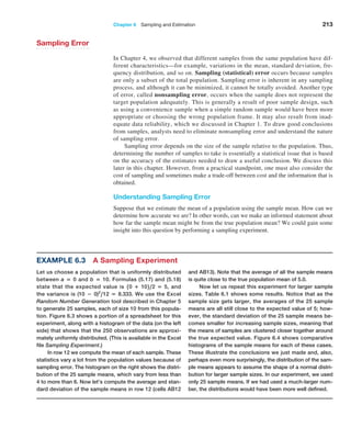
distribution that we call the sampling distribution of the mean. The histograms in Fig
ure 6.4 are approximations to the sampling distributions of the mean based on 25 samples.
Statisticians have shown two key results about the sampling distribution of the mean.
First, the standard deviation of the sampling distribution of the mean, called the standard
error of the mean, is computed as
Standard Error of the Mean = s 1n (6.1)
where s is the standard deviation of the population from which the individual observations
are drawn and n is the sample size. From this formula, we see that as n increases, the standard
error decreases, just as our experiment demonstrated. This suggests that the estimates of the
mean that we obtain from larger sample sizes provide greater accuracy in estimating the true
population mean. In other words, larger sample sizes have less sampling error.
Example 6.4 Estimating Sampling Error Using the Empirical Rules
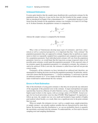
Using the results in Table 6.1 and the empirical rule for
three standard deviations around the mean, we could
state, for example, that using a sample size of 10, the dis-
tribution of sample means should fall approximately from
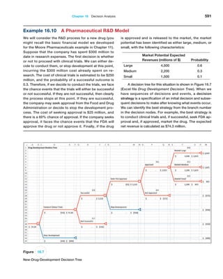
5.0 − 3(0.816673) = 2.55 t o 5.0 + 3(0.816673) = 7.45.
Thus, there is considerable error in estimating the mean
using a sample of only 10. For a sample of size 25,
we would expect the sample means to fall between
5.0 − 3(0.451351) = 3.65 to 5.0 + 3(0.451351) = 6.35.
Note that as the sample size increased, the error
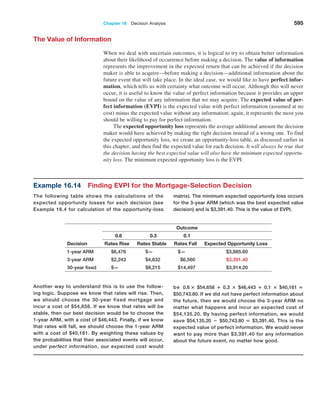
decreased. For sample sizes of 100 and 500, the intervals
are [4.09, 5.91] and [4.76, 5.24].
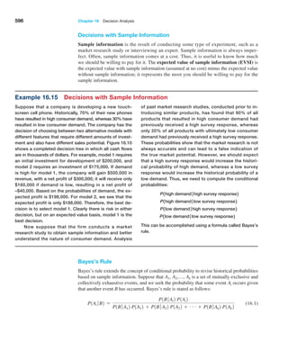
Example 6.5 Computing the Standard Error of the Mean
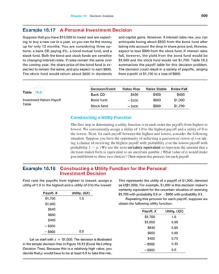
For our experiment, we know that the variance of the pop-
ulation is 8.33 (because the values were uniformly distrib-
uted). Therefore, the standard deviation of the population
is S = 2.89. We may compute the standard error of the
mean for each of the sample sizes in our
experiment using
formula (6.1). For example, with n = 10, we have
Standard Error of the Mean = S,!n = 2.89,!10 = 0.914
For the remaining data in Table 6.1 we have the following:
Sample Size, n Standard Error of the Mean
10 0.914
25 0.577
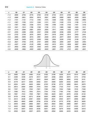
100 0.289
500 0.129
The standard deviations shown in Table 6.1 are simply estimates of the standard error of
the mean based on the limited number of 25 samples. If we compare these estimates with the
theoretical values in the previous example, we see that they are close but not exactly the same.
This is because the true standard error is based on all possible sample means in the sampling
If we apply the empirical rules to these results, we can estimate the sampling error
associated with one of the sample sizes we have chosen.](https://image.slidesharecdn.com/book-230309160846-8faa1145/85/Book-pdf-216-320.jpg)
![216 Chapter 6 Sampling and Estimation
distribution, whereas we used only 25. If you repeat the experiment with a larger number of
samples, the observed values of the standard error would be closer to these theoretical values.
In practice, we will never know the true population standard deviation and generally
take only a limited sample of n observations. However, we may estimate the standard error
of the mean using the sample data by simply dividing the sample standard deviation by the
square root of n.
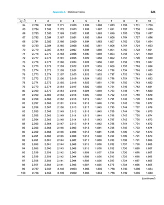
The second result that statisticians have shown is called the central limit theorem,
one of the most important practical results in statistics that makes systematic inference
possible. The central limit theorem states that if the sample size is large enough, the
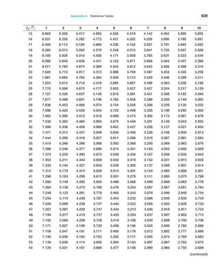
sampling distribution of the mean is approximately normally distributed, regardless of
the distribution of the population and that the mean of the sampling distribution will be
the same as that of the population. This is exactly what we observed in our experiment.
The distribution of the population was uniform, yet the sampling distribution of the mean
converges to the shape of a normal distribution as the sample size increases. The central
limit theorem also states that if the population is normally distributed, then the sampling
distribution of the mean will also be normal for any sample size. The central limit theo
rem allows us to use the theory we learned about calculating probabilities for normal
distributions to draw conclusions about sample means.
Applying the Sampling Distribution of the Mean
The key to applying sampling distribution of the mean correctly is to understand whether
the probability that you wish to compute relates to an individual observation or to the
mean of a sample. If it relates to the mean of a sample, then you must use the sampling
distribution of the mean, whose standard deviation is the standard error, s 1n.
Interval Estimates
An interval estimate provides a range for a population characteristic based on a sample.
Intervals are quite useful in statistics because they provide more information than a point
estimate. Intervals specify a range of plausible values for the characteristic of interest
and a way of assessing “how plausible” they are. In general, a 10011 - a2% probability
interval is any interval [A, B] such that the probability of falling between A and B is
1 - a. Probability intervals are often centered on the mean or median. For instance,
Example 6.6 Using the Standard Error in Probability Calculations
Suppose that the size of individual customer orders (in
dollars), X, from a major discount book publisher Web site
is normally distributed with a mean of $36 and standard
deviation of $8. The probability that the next individual
who places an order at the Web site will make a purchase
of more than $40 can be found by calculating
1 − NORM.DIST(40,36,8,TRUE) = 1 − 0.6915 = 0.3085
Now suppose that a sample of 16 customers is chosen.
What is the probability that the mean purchase for these 16
customers will exceed $40? To find this, we must realize that
we must use the sampling distribution of the mean to carry
out the appropriate calculations. The sampling distribution
of the mean will have a mean of $36 but a standard error of
$8, !16 = $2. Then the probability that the mean purchase
exceeds $40 for a sample size of n = 16 is
1 − NORM.DIST(40,36,2,TRUE) = 1 − 0.9772 = 0.0228
Although about 30% of individuals will make pur-
chases exceeding $40, the chance that 16 customers will
collectively average more than $40 is much smaller. It
would be very unlikely for all 16 customers to make high-
volume purchases, because some individual purchases
would as likely be less than $36 as more, making the vari-
ability of the mean purchase amount for the sample of 16
much smaller than for individuals.](https://image.slidesharecdn.com/book-230309160846-8faa1145/85/Book-pdf-217-320.jpg)
![Chapter 6 Sampling and Estimation 217
Example 6.7 Interval Estimates in the News
We see interval estimates in the news all the time when
trying to estimate the mean or proportion of a population.
Interval estimates are often constructed by taking a point
estimate and adding and subtracting a margin of error
that is based on the sample size. For example, a
Gallup
poll might report that 56% of voters support a certain
candidate with a margin of error of ±3%. We would
conclude that the true percentage of voters that support
the candidate is most likely between 53% and 59%.
Therefore, we would have a lot of confidence in predict-
ing that the candidate would win a forthcoming election.
If, however, the poll showed a 52% level of support with
a margin of error of±4%, we might not be as confident
in predicting a win because the true percentage of sup-
portive voters is likely to be somewhere between 48%
and 56%.
The question you might be asking at this point is how to calculate the error associ
ated with a point estimate. In national surveys and political polls, such margins of error
are usually stated, but they are never properly explained. To understand them, we need to
introduce the concept of confidence intervals.
Confidence Intervals
Confidence interval estimates provide a way of assessing the accuracy of a point estimate.
A confidence interval is a range of values between which the value of the population pa
rameter is believed to be, along with a probability that the interval correctly estimates the
true (unknown) population parameter. This probability is called the level of confidence, de
noted by 1 - a, where a is a number between 0 and 1. The level of confidence is usually
expressed as a percent; common values are 90%, 95%, or 99%. (Note that if the level of
confidence is 90%, then a = 0.1.) The margin of error depends on the level of confidence
and the sample size. For example, suppose that the margin of error for some sample size and
a level of confidence of 95% is calculated to be 2.0. One sample might yield a point estimate
of 10. Then, a 95% confidence interval would be [8, 12]. However, this interval may or may
not include the true population mean. If we take a different sample, we will most likely have
a different point estimate, say, 10.4, which, given the same margin of error, would yield the
interval estimate [8.4, 12.4]. Again, this may or may not include the true population mean.
If we chose 100 different samples, leading to 100 different interval estimates, we would ex
pect that 95% of them—the level of confidence—would contain the true population mean.
We would say we are “95% confident” that the interval we obtain from sample data contains
the true population mean. The higher the confidence level, the more assurance we have that
the interval contains the true population parameter. As the confidence level increases, the
confidence interval becomes wider to provide higher levels of assurance. You can view a as
the risk of incorrectly concluding that the confidence interval contains the true mean.
When national surveys or political polls report an interval estimate, they are actu
ally confidence intervals. However, the level of confidence is generally not stated because
the average person would probably not understand the concept or terminology. While not
stated, you can probably assume that the level of confidence is 95%, as this is the most
common value used in practice (however, the Bureau of Labor Statistics tends to use 90%
quite often).
in a normal distribution, the mean plus or minus 1 standard deviation describes an
approximate 68% probability interval around the mean. As another example, the 5th and
95th percentiles in a data set constitute a 90% probability interval.](https://image.slidesharecdn.com/book-230309160846-8faa1145/85/Book-pdf-218-320.jpg)
![218 Chapter 6 Sampling and Estimation
Many different types of confidence intervals may be developed. The formulas used
depend on the population parameter we are trying to estimate and possibly other character
istics or assumptions about the population. We illustrate a few types of confidence intervals.
Confidence Interval for the Mean with Known
Population Standard Deviation
The simplest type of confidence interval is for the mean of a population where the standard
deviation is assumed to be known. You should realize, however, that in nearly all practical
sampling applications, the population standard deviation will not be known. However, in
some applications, such as measurements of parts from an automated machine, a process
might have a very stable variance that has been established over a long history, and it can
reasonably be assumed that the standard deviation is known.
A 10011 - a2% confidence interval for the population mean m based on a sample
of size n with a sample mean x and a known population standard deviation s is given by
x { za/21s 1n2 (6.2)
Note that this formula is simply the sample mean (point estimate) plus or minus a margin
of error.
The margin of error is a number za2 multiplied by the standard error of the sampling
distribution of the mean, s 1n. The value za2 represents the value of a standard normal
random variable that has an upper tail probability of a2 or, equivalently, a cumulative
probability of 1 - a2. It may be found from the standard normal table (see Table A.1 in
Appendix A at the end of the book) or may be computed in Excel using the value of the
function NORM.S.INV11 - a22. For example, if a = 0.05 (for a 95% confidence
interval), then NORM.S.INV10.9752 = 1.96; if a = 0.10 (for a 90% confidence interval),
then NORM.S.INV10.952 = 1.645, and so on.
Although formula (6.2) can easily be implemented in a spreadsheet, the Excel func
tion CONFIDENCE.NORM(alpha, standard_deviation, size) can be used to compute the
margin of error term, za2 s 1n; thus, the confidence interval is the sample mean {
CONFIDENCE.NORM(alpha, standard_deviation, size).
Example 6.8
Computing a Confidence Interval
with a Known Standard Deviation
In a production process for filling bottles of liquid deter-
gent, historical data have shown that the variance in the
volume is constant; however, clogs in the filling machine
often affect the average volume. The historical standard
deviation is 15 milliliters. In filling 800-milliliter bottles, a
sample of 25 found an average volume of 796 milliliters.
Using formula (6.2), a 95% confidence interval for the
population mean is
x ± zA/2 (S,!n)
= 796 ± 1.96(15, !25) = 796 ± 5.88, or [790.12, 801.88]
The worksheet Population Mean Sigma Known in the
Excel workbook Confidence Intervals computes this inter-
val using the CONFIDENCE.NORM function to compute
the margin of error in cell B9, as shown in Figure 6.5.
As the level of confidence, 1 - a, decreases, za2 decreases, and the confidence in
terval becomes narrower. For example, a 90% confidence interval will be narrower than a
95% confidence interval. Similarly, a 99% confidence interval will be wider than a 95%
confidence interval. Essentially, you must trade off a higher level of accuracy with the risk
that the confidence interval does not contain the true mean. Smaller risk will result in a](https://image.slidesharecdn.com/book-230309160846-8faa1145/85/Book-pdf-219-320.jpg)
![220 Chapter 6 Sampling and Estimation
Confidence Interval for the Mean with Unknown
Population Standard Deviation
The formula for a 10011 - a2% confidence interval for the mean m when the population
standard deviation is unknown is
x { ta2,n-11s 1n2 (6.3)
where ta2,n-1 is the value from the t-distribution with n - 1 degrees of freedom, giving
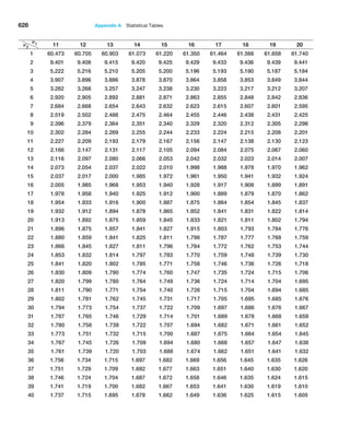
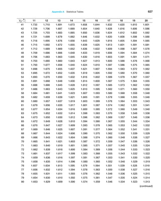
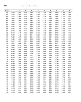
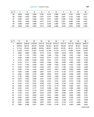
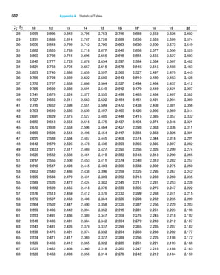
an upper-tail probability of a2. We may find t-values in Table A.2 in Appendix A at the
end of the book or by using the Excel function T.INV11 - a2, n - 12 or the function
T.INV.2T1a, n - 12. The Excel function CONFIDENCE.T(alpha, standard_deviation,
size) can be used to compute the margin of error term, ta2,n-1(s 1n); thus, the confi
dence interval is the sample mean {CONFIDENCE.T.
Figure 6.6
Comparison of the
t-Distribution to the
Standard Normal Distribution
Confidence Interval for a Proportion
For categorical variables such as gender (male or female), education (high school, col
lege, post-graduate), and so on, we are usually interested in the proportion of observa
tions in a sample that has a certain characteristic. An unbiased estimator of a population
proportion p (this is not the number pi = 3.14159 . . . ) is the statistic p̂ = xn (the sam-
ple proportion), where x is the number in the sample having the desired characteristic
and n is the sample size.
Example 6.9
Computing a Confidence Interval
with Unknown Standard Deviation
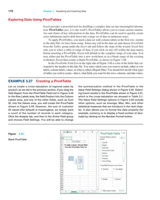
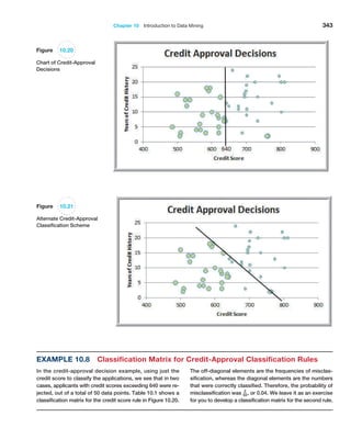
In the Excel file Credit Approval Decisions, a large bank
has sample data used in making credit approval deci-
sions (see Figure 6.7). Suppose that we want to find a
95% confidence interval for the mean revolving balance
for the population of applicants that own a home. First,
sort the data by homeowner and compute the mean and
standard deviation of the revolving balance for the sam-
ple of homeowners. This results in x = $12,630.37 and
s = $5393.38. The sample size is n = 27, so the standard
error s,!n = $ 1037.96. The t-distribution has 26 degrees
of freedom; therefore, t.025,26 = 2.056. Using formula (6.3),
the confidence interval is $12,630.37 ±2.056($1037.96)
or [$10,496, $14,764]. The worksheet Population Mean
Sigma Unknown in the Excel workbook Confidence
Intervals computes this interval using the CONFIDENCE.T
function to compute the margin of error in cell B10, as
shown in Figure 6.8.](https://image.slidesharecdn.com/book-230309160846-8faa1145/85/Book-pdf-221-320.jpg)
![Chapter 6 Sampling and Estimation 221
Figure 6.7
Portion of Excel File Credit Approval Decisions
Figure 6.8
Confidence Interval for
Mean Revolving Balance
of Homeowners
A 10011 - a2% confidence interval for the proportion is
n
p { za/2
A
n
p11 - n
p2
n
(6.4)
Notice that as with the mean, the confidence interval is the point estimate plus or
minus some margin of error. In this case, 2p
n11 - p
n2n is the standard error for the sam
pling distribution of the proportion. Excel does not have a function for computing the
margin of error, but it can easily be implemented on a spreadsheet.
Example 6.10 Computing a Confidence Interval for a Proportion
The last column in the Excel file Insurance Survey (see
Figure 6.9) describes whether a sample of employees
would be willing to pay a lower premium for a higher de-
ductible for their health insurance. Suppose we are inter-
ested in the proportion of individuals who answered yes.
We may easily confirm that 6 out of the 24 employees, or
25%, answered yes. Thus, a point estimate for the pro-
portion answering yes is p
n = 0.25. Using formula (6.4),
we find that a 95% confidence interval for the proportion
of employees answering yes is
0.25 ± 1.96
A
0.25(0.75)
24
= 0.25 ± 0.173, or [0.077, 0.423]
The worksheet Population Mean Sigma Unknown in
the Excel workbook Confidence Intervals computes this
interval, as shown in Figure 6.10. Notice that this is a
fairly wide confidence interval, suggesting that we have
quite a bit of uncertainty as to the true value of the popu-
lation proportion. This is because of the relatively small
sample size.](https://image.slidesharecdn.com/book-230309160846-8faa1145/85/Book-pdf-222-320.jpg)
![222 Chapter 6 Sampling and Estimation
Figure 6.9
Portion of Excel File Insurance Survey
Figure 6.10
Confidence Interval for the
Proportion
Example 6.11
Drawing a Conclusion about a Population
Mean Using a Confidence Interval
In packaging a commodity product such as laundry de-
tergent, the manufacturer must ensure that the packages
contain the stated amount to meet government regulations.
In Example 6.8, we saw an example where the required
volume is 800 milliliters, yet the sample average was only
796
milliliters. Does this indicate a serious problem? Not
necessarily. The 95% confidence interval for the mean we
computed in Figure 6.5 was [790.12, 801.88]. Although the
sample mean is less than 800, the sample does not pro-
vide sufficient evidence to draw that conclusion that the
Additional Types of Confidence Intervals
Confidence intervals may be calculated for other population parameters such as a
variance
or standard deviation and also for differences in the means or proportions of two popula
tions. The concepts are similar to the types of confidence intervals we have discussed, but
many of the formulas are rather complex and more difficult to implement on a spreadsheet.
Some advanced software packages and spreadsheet add-ins provide additional
support.
Therefore, we do not discuss them in this book, but we do suggest that you consult other
books and statistical references should you need to use them, now that you understand the
basic concepts underlying them.
Using Confidence Intervals for Decision Making
Confidence intervals can be used in many ways to support business decisions.](https://image.slidesharecdn.com/book-230309160846-8faa1145/85/Book-pdf-223-320.jpg)
![Chapter 6 Sampling and Estimation 223
population mean is less than 800 because 800 is contained
within the confidence interval. In fact, it is just as plausible
that the population mean is 801. We cannot tell definitively
because of the sampling error. However, suppose that the
sample average is 792. Using the Excel worksheet Population
Mean Sigma Known in the workbook Confidence Intervals,
we find that the confidence interval for the mean would be
[786.12, 797.88]. In this case, we would conclude that it is
highly unlikely that the population mean is 800 milliliters be-
cause the confidence interval falls completely below 800;
the manufacturer should check and adjust the equipment to
meet the standard.
Prediction Intervals
Another type of interval used in estimation is a prediction interval. A prediction interval
is one that provides a range for predicting the value of a new observation from the same
population. This is different from a confidence interval, which provides an interval esti
mate of a population parameter, such as the mean or proportion. A confidence interval is
associated with the sampling distribution of a statistic, but a prediction interval is associ
ated with the distribution of the random variable itself.
When the population standard deviation is unknown, a 10011 - a2% prediction in
terval for a new observation is
x { ta2,n-1a
s
A
1 +
1
n
b (6.5)
Note that this interval is wider than the confidence interval in formula (6.3) by virtue of
the additional value of 1 under the square root. This is because, in addition to estimat
ing the population mean, we must also account for the variability of the new observation
around the mean.
One important thing to realize also is that in formula (6.3) for a confidence interval, as
n gets large, the error term tends to zero so the confidence interval converges on the mean.
However, in the prediction interval formula (6.5), as n gets large, the error term converges
to ta2, n-11s2, which is simply a 10011 - a2% probability interval. Because we are trying
to predict a new observation from the population, there will always be uncertainty.
The next example shows how to interpret a confidence interval for a proportion.
Example 6.12 Using a Confidence Interval to Predict Election Returns
Suppose that an exit poll of 1,300 voters found that 692
voted for a particular candidate in a two-person race. This
represents a proportion of 53.23% of the sample. Could we
conclude that the candidate will likely win the election? A
95% confidence interval for the proportion is [0.505, 0.559].
This suggests that the population proportion of voters
who favor this candidate is highly likely to exceed 50%,
so it is safe to predict the winner. On the other hand,
suppose that only 670 of the 1,300 voters voted for the
candidate, a sample proportion of 0.515. The confidence
interval for the population proportion is [0.488, 0.543].
Even though the sample proportion is larger than 50%, the
sampling error is large, and the confidence interval sug-
gests that it is reasonably likely that the true population
proportion could be less than 50%, so it would not be wise
to predict the winner based on this information.](https://image.slidesharecdn.com/book-230309160846-8faa1145/85/Book-pdf-224-320.jpg)
![224 Chapter 6 Sampling and Estimation
Confidence Intervals and Sample Size
An important question in sampling is the size of the sample to take. Note that in all the
formulas for confidence intervals, the sample size plays a critical role in determining the
width of the confidence interval. As the sample size increases, the width of the confidence
interval decreases, providing a more accurate estimate of the true population parameter. In
many applications, we would like to control the margin of error in a confidence interval.
For example, in reporting voter preferences, we might wish to ensure that the margin of
error is{2%. Fortunately, it is relatively easy to determine the appropriate sample size
needed to estimate the population parameter within a specified level of precision.
The formulas for determining sample sizes to achieve a given margin of error are based
on the confidence interval half-widths. For example, consider the confidence interval for
the mean with a known population standard deviation we introduced in formula (6.2):
x { za2a
s
2n
b
Suppose we want the width of the confidence interval on either side of the mean (i.e.,
the margin of error) to be at most E. In other words,
E Ú za2a
s
2n
b
Solving for n, we find:
n Ú 1za222s2
E2
(6.6)
In a similar fashion, we can compute the sample size required to achieve a desired
confidence interval half-width for a proportion by solving the following equation (based
on formula (6.4) using the population proportion p in the margin of error term) for n:
E Ú za22p11 - p2n
This yields
n Ú 1za222
p11 - p2
E2
(6.7)
In practice, the value of p will not be known. You could use the sample proportion
from a preliminary sample as an estimate of p to plan the sample size, but this might
require several iterations and additional samples to find the sample size that yields the
required precision. When no information is available, the most conservative estimate is to
set p = 0.5. This maximizes the quantity p11 - p2 in the formula, resulting in the sam
ple size that will guarantee the required precision no matter what the true proportion is.
Example 6.13 Computing a Prediction Interval
In estimating the revolving balance in the Excel file Credit
Approval Decisions in Example 6.9, we may use for-
mula (6.5) to compute a 95% prediction interval for the
revolving balance of a new homeowner as
$12,630.37 ± 2.056($5,393.38) A1 +
1
27
, or
[$338.10, $23,922.64]
Note that compared with Example 6.9, the size of the
prediction interval is considerably wider than that of the
confidence interval.](https://image.slidesharecdn.com/book-230309160846-8faa1145/85/Book-pdf-225-320.jpg)
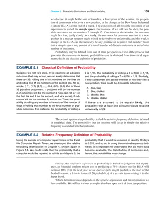
![Chapter 6 Sampling and Estimation 225
Example 6.14 Sample Size Determination for the Mean
In the liquid detergent example (Example 6.8), the con-
fidence interval we computed in Figure 6.5 was [790.12,
801.88]. The width of the confidence interval is ±5.88
milliliters, which represents the sampling error. Suppose
the manufacturer would like the sampling error to be at
most 3 milliliters. Using formula (6.6), we may compute
the required sample size as follows:
n # 1 zA2 22
(S2
)
E2
= 11.9622
(152
)
32
= 96.04
Rounding up we find that that 97 samples would be
needed. To verify this, Figure 6.11 shows that if a sample
of 97 is used along with the same sample mean and stan-
dard deviation, the confidence interval does indeed have a
sampling error of error less than 3 milliliters.
Figure 6.11
Confidence Interval for
the Mean Using a
Sample Size = 97
Of course, we generally do not know the population standard deviation prior to finding
the sample size. A commonsense approach would be to take an initial sample to estimate
the population standard deviation using the sample standard deviation s and determine the
required sample size, collecting additional data if needed. If the half-width of the resulting
confidence interval is within the required margin of error, then we clearly have achieved
our goal. If not, we can use the new sample standard deviation s to determine a new
sample size and collect additional data as needed. Note that if s changes significantly, we
still might not have achieved the desired precision and might have to repeat the process.
Usually, however, this will be unnecessary.
Example 6.15 Sample Size Determination for a Proportion
For the voting example we discussed, suppose that we
wish to determine the number of voters to poll to ensure
a sampling error of at most ± 2%. As we stated, when no
information is available, the most conservative approach
is to use 0.5 for the estimate of the true proportion. Using
formula (6.7) with P = 0.5, the number of voters to poll
to obtain a 95% confidence interval on the proportion of
voters that choose a particular candidate with a precision
of ± 0.02 or less is
n # 1 zA/222
P(1 − P)
E2
= 1 1.962 2
(0.5) (1 − 0.5)
0.022
= 2,401](https://image.slidesharecdn.com/book-230309160846-8faa1145/85/Book-pdf-226-320.jpg)

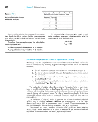
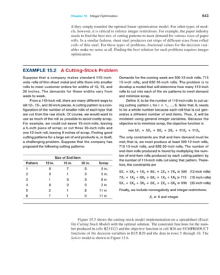
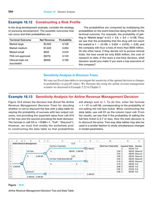
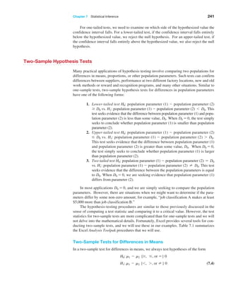
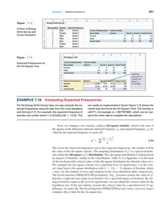
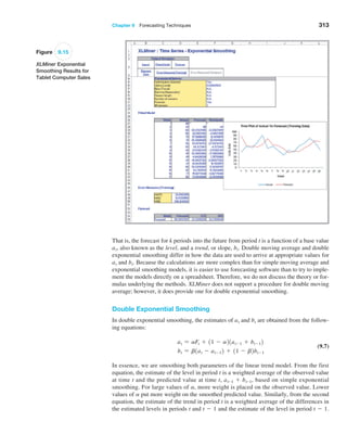
![236 Chapter 7 Statistical Inference
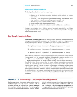
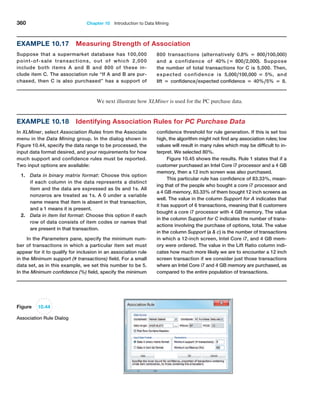
Example 7.4 Computing the Test Statistic
For the CadSoft example, the average response time for
the sample of 44 customers is x = 21.91 minutes and
the sample standard deviation is s = 19.49. The hypoth-
esized mean is M0 = 25. You might wonder why we even
have to test the hypothesis statistically when the sample
average of 21.91 is clearly less than 25. The reason is be-
cause of sampling error. It is quite possible that the popu-
lation mean truly is 25 or more and that we were just lucky
to draw a sample whose mean was smaller. Because of
potential sampling error, it would be dangerous to con-
clude that the company was meeting its goal just by look-
ing at the sample mean without better statistical evidence.
Because we don’t know the value of the population
standard deviation, the proper test statistic to use is for-
mula (7.2):
t =
x − M0
s,1n
Therefore, the value of the test statistic is
t =
x − M0
s,1n
=
21.91 − 25
19.49 144
=
− 3.09
2.938
= −1.05
Observe that the numerator is the distance between the
sample mean (21.91) and the hypothesized value (25). By
dividing by the standard error, the value of t represents
the number of standard errors the sample mean is from
the hypothesized value. In this case, the sample mean is
1.05 standard errors below the hypothesized value of 25.
This notion provides the fundamental basis for the hy-
pothesis test—if the sample mean is “too far” away from
the hypothesized value, then the null hypothesis should
be rejected.
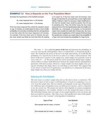
Drawing a Conclusion
The conclusion to reject or fail to reject H0 is based on comparing the value of the test sta-
tistic to a “critical value” from the sampling distribution of the test statistic when the null
hypothesis is true and the chosen level of significance, a. The sampling distribution of the
test statistic is usually the normal distribution, t-distribution, or some other well-known
distribution. For example, the sampling distribution of the z-test statistic in formula (7.1)
is a standard normal distribution; the t-test statistic in formula (7.2) has a t-distribution
with n - 1 degrees of freedom. For a one-tailed test, the critical value is the number of
standard errors away from the hypothesized value for which the probability of exceeding
the critical value is a. If a = 0.05, for example, then we are saying that there is only a
5% chance that a sample mean will be that far away from the hypothesized value purely
because of sampling error and should this occur, it suggests that the true population mean
is different from what was hypothesized.
The critical value divides the sampling distribution into two parts, a rejection region
and a nonrejection region. If the null hypothesis is false, it is more likely that the test sta-
tistic will fall into the rejection region. If it does, we reject the null hypothesis; otherwise,
we fail to reject it. The rejection region is chosen so that the probability of the test statistic
falling into it if H0 is true is the probability of a Type I error, a.
The rejection region occurs in the tails of the sampling distribution of the test statistic
and depends on the structure of the hypothesis test, as shown in Figure 7.2. If the null
hypothesis is structured as = and the alternative hypothesis as ≠, then we would reject
H0 if the test statistic is either significantly high or low. In this case, the rejection region
will occur in both the upper and lower tail of the distribution [see Figure 7.2(a)]. This is
called a two-tailed test of hypothesis. Because the probability that the test statistic falls
into the rejection region, given that H0 is true, the combined area of both tails must be a;
each tail has an area of a2.](https://image.slidesharecdn.com/book-230309160846-8faa1145/85/Book-pdf-237-320.jpg)
![Chapter 7 Statistical Inference 237
The other types of hypothesis tests, which specify a direction of relationship (where
H0 is either Ú or …), are called one-tailed tests of hypothesis. In this case, the rejection
region occurs only in one tail of the distribution [see Figure 7.2(b)]. Determining the cor-
rect tail of the distribution to use as the rejection region for a one-tailed test is easy. If H1
is stated as 6 , the rejection region is in the lower tail; if H1 is stated as 7, the rejection
region is in the upper tail (just think of the inequality as an arrow pointing to the proper tail
direction).
Two-tailed tests have both upper and lower critical values, whereas one-tailed tests
have either a lower or upper critical value. For standard normal and t-distributions, which
have a mean of zero, lower-tail critical values are negative; upper-tail critical values are
positive.
Critical values make it easy to determine whether or not the test statistic falls in the
rejection region of the proper sampling distribution. For example, for an upper one-tailed
test, if the test statistic is greater than the critical value, the decision would be to reject the
null hypothesis. Similarly, for a lower one-tailed test, if the test statistic is less than the
critical value, we would reject the null hypothesis. For a two-tailed test, if the test statistic
is either greater than the upper critical value or less than the lower critical value, the deci-
sion would be to reject the null hypothesis.
Lower critical value
(a) Two-tailed test
/2
/2
Upper critical value
Critical value
Critical value
Lower one-tailed test Upper one-tailed test
(b) One-tailed tests
Rejection Region
Rejection
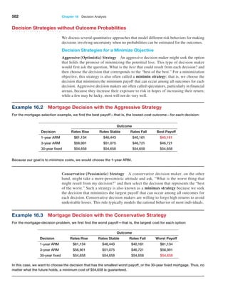
Region
Rejection
Region
Figure 7.2
Illustration of Rejection
Regions in Hypothesis
Testing
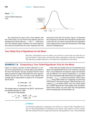
Example 7.5 Finding the Critical Value and Drawing a Conclusion
For the CadSoft example, if the level of significance is
0.05, then the critical value for a one-tail test is the
value of the t-distribution with n − 1 degrees of free-
dom that provides a tail area of 0.05, that is, tA,n−1.
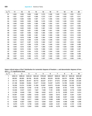
We may find t-values in Table A.2 in Appendix A at
the end of the book or by using the Excel function
T.INV(1 − A, n - 1). Thus, the critical value is t0.05,43 =
T.INV10.95,432 = 1.68. Because the t-distribution is sym-
metric with a mean of 0 and this is a lower-tail test, we use
the negative of this number (− 1.68) as the critical value.](https://image.slidesharecdn.com/book-230309160846-8faa1145/85/Book-pdf-238-320.jpg)


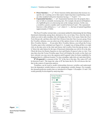
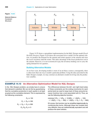
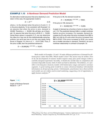
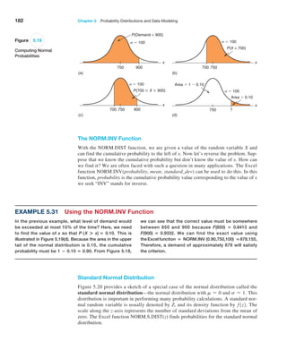
![272 Chapter 8 Trendlines and Regression Analysis
Confidence Intervals for Regression Coefficients
Confidence intervals (Lower 95% and Upper 95% values in the output) provide informa-
tion about the unknown values of the true regression coefficients, accounting for sampling
error. They tell us what we can reasonably expect to be the ranges for the population inter-
cept and slope at a 95% confidence level.
We may also use confidence intervals to test hypotheses about the regression coeffi-
cients. For example, in Figure 8.12, we see that neither confidence interval includes zero;
therefore, we can conclude that b0 and b1 are statistically different from zero. Similarly,
we can use them to test the hypotheses that the regression coefficients equal some value
other than zero. For example, to test the hypotheses
H0: b1 = B1
H1: b1 ≠ B1
we need only check whether B1 falls within the confidence interval for the slope. If it does
not, then we reject the null hypothesis, otherwise we fail to reject it.
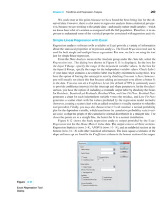
Example 8.8 Interpreting Hypothesis Tests for Regression Coefficients
For the Home Market Value example, note that the value
of t Stat is computed by dividing the coefficient by the
standard error using formula (8.8). For instance, t Stat for
the slope is 35.036372585.16738385 = 6.780292234.
Because Excel does not provide the critical value with
which to compare the t Stat value, we may use the
p-value to draw a conclusion. Because the p-values for
both coefficients are essentially zero, we would
conclude
that neither coefficient is statistically equal to zero. Note
that the p-value associated with the test for the slope
coefficient, Square Feet, is equal to the Significance F
value. This will always be true for a regression model
with one independent variable because it is the only ex-
planatory variable. However, as we shall see, this will not
be the case for multiple regression models.
Example 8.9 Interpreting Confidence Intervals for Regression Coefficients
For the Home Market Value data, a 95% confidence in-
terval for the intercept is [14,823, 50,523]. Similarly, a
95% confidence interval for the slope is [24.59, 45.48].
Although the regression model is Y
n = 32,673 + 35.036X,
the confidence intervals suggest a bit of uncertainty
about predictions using the model. Thus, although we
estimated that a house with 1,750 square feet has a
market value of 32,673 + 35.036(1,750) = $93,986,
if the true population parameters are at the extremes
of the confidence intervals, the estimate might be as
low as 14,823 + 24.59(1,750) = $57,855 or as high as
50,523 + 45.48(1,750) = $130,113. Narrower confidence
intervals provide more accuracy in our predictions.
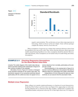
Residual Analysis and Regression Assumptions
Recall that residuals are the observed errors, which are the differences between the actual
values and the estimated values of the dependent variable using the regression equation.
Figure 8.13 shows a portion of the residual table generated by the Excel Regression tool.
The residual output includes, for each observation, the predicted value using the estimated
regression equation, the residual, and the standard residual. The residual is simply the dif-
ference between the actual value of the dependent variable and the predicted value, or
Yi - Y
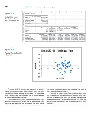
ni. Figure 8.14 shows the residual plot generated by the Excel tool. This chart is actu-
ally a scatter chart of the residuals with the values of the independent variable on the x-axis.](https://image.slidesharecdn.com/book-230309160846-8faa1145/85/Book-pdf-273-320.jpg)


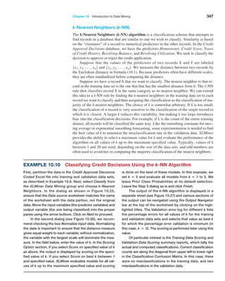
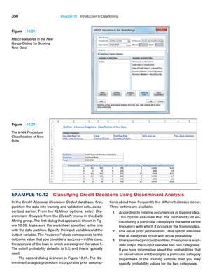
![366 Chapter 10 Introduction to Data Mining
8The data and description of this case are based on the HATCO example on pages 28–29 in Joseph F. Hair, Jr., Rolph E. Anderson, Ronald L.
Tatham, and William C. Black, Multivariate Analysis, 5th ed. (Upper Saddle River, NJ: Prentice Hall, 1998).
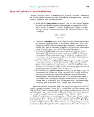
Case: Performance Lawn Equipment
The worksheet Purchasing Survey in the Performance
Lawn Care database provides data related to predict-
ing the level of business (Usage Level) obtained from a
third-party survey of purchasing managers of customers
Performance Lawn Care.8 The seven PLE attributes rated
by each respondent are
Delivery speed—the amount of time it takes to deliver
the product once an order is confirmed
Price level—the perceived level of price charged by
PLE
Price flexibility—the perceived willingness of PLE
representatives to negotiate price on all types of purchases
Manufacturing image—the overall image of the
manufacturer
Overall service—the overall level of service neces-
sary for maintaining a satisfactory relationship between
PLE and the purchaser
Sales force image—the overall image of the PLE’s
sales force
Product quality—perceived level of quality
Responses to these seven variables were obtained us-
ing a graphic rating scale, where a 10-centimeter line was
drawn between endpoints labeled “poor” and “excellent.”
Respondents indicated their perceptions using a mark on
the line, which was measured from the left endpoint. The
result was a scale from 0 to 10 rounded to one decimal
place.
Two measures were obtained that reflected the out-
comes of the respondent’s purchase relationships with
PLE:
Usage level—how much of the firm’s total product is
purchased from PLE, measured on a 100-point scale, rang-
ing from 0% to 100%
Satisfaction level—how satisfied the purchaser is with
past purchases from PLE, measured on the same graphic
rating scale as perceptions 1 through 7
The data also include four characteristics of the respond-
ing firms:
Size of firm—size relative to others in this market
(0 = small; 1 = large)
Purchasing structure—the purchasing method used in
a particular company (1 = centralized procurement, 0 =
decentralized procurement)
Industry—the industry classification of the purchaser
[1 = retail (resale such as Home Depot), 0 = private
(nonresale, such as a landscaper)]
Buying type—a variable that has three categories
(1 = new purchase, 2 = modified rebuy, 3 = straight
rebuy)
Elizabeth Burke would like to understand what she
learned from these data. Apply appropriate data-mining
techniques to analyze the data. For example, can PLE
segment customers into groups with similar perceptions
about the company? Can cause-and-effect models provide
insight about the drivers of satisfaction and usage level?
Summarize your results in a report to Ms. Burke.](https://image.slidesharecdn.com/book-230309160846-8faa1145/85/Book-pdf-367-320.jpg)

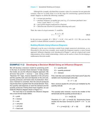
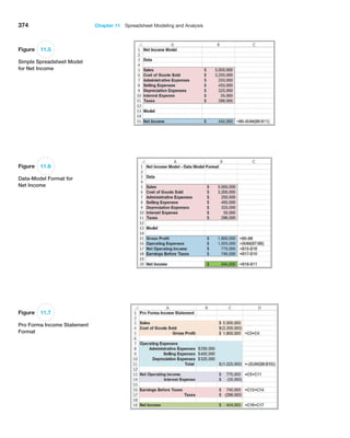
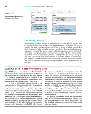
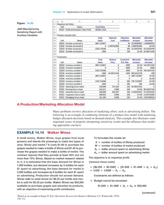
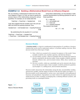
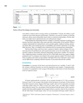
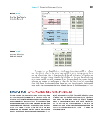
![384 Chapter 11 Spreadsheet Modeling and Analysis
Figure 11.13
Markdown
Pricing Model
Spreadsheet
we can find values for a and b by solving these two equa-
tions simultaneously based on the data the store obtained.
7 = a − b × $70.00
32.2 = a − b × $49.00
This leads to the linear demand model:
daily sales = 91 − 1.2 × price
We may also use Excel’s SLOPE and INTERCEPT
functions to find the slope and intercept of the straight
line between the two points ($70, 7) and ($49, 32.2); this is
incorporated into the Excel model that follows.
Because this model suggests that higher sales can
be driven by price discounts, the marketing department
has the basis for making improved discounting decisions.
For instance, suppose they decide to sell at full retail
price for x days and then discount the price by y% for the
remainder of the selling season, followed by the clearance
sale. What total revenue could they predict?
We can compute this easily. Selling at the full retail
price for x days yields revenue of
full retail price revenue = 7 unitsday × x days
× $70.00 = $490.00x
The markdown price applies for the remaining 50 − x days:
markdown price = $70(100% − y%)
daily sales = a − b × markdown price
= 91 − 1.2 × $70 x (100% − y%)
units sold at markdown = daily sales × (50 − x) as
long as this is less than or equal to the number of units
remaining in inventory from full retail sales. If not, this
number needs to be adjusted.
Then we can compute the markdown revenue as
markdown revenue = units sold x markdown price
Finally, the remaining inventory after 50 days is
clearance inventory = 1000 − units sold at full retail
− units sold at markdown
= 1,000 − 7x − [91−1.2
× $70.00 × (100% − y%)]
× (50 − x)
This amount is sold at a price of $21.00, resulting in
revenue of
clearance price revenue = 31,000 − 7x − [91− 1.2
× $70.00 × 1100% − y%2]
× 150 − x2 4 × $21.00
The total revenue would be found by adding the models
developed for full retail price revenue, discounted price
revenue, and clearance price revenue.
Figure 11.13 shows a spreadsheet implementation of
this model (Excel file Markdown Pricing Model). By chang-
ing the values in cells B7 and B8, the marketing manager
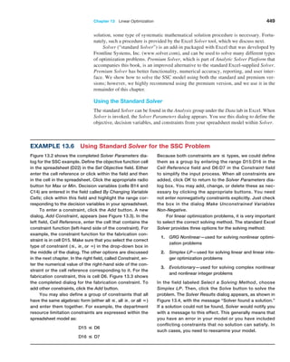
could predict the revenue that could be achieved for dif-
ferent markdown decisions.](https://image.slidesharecdn.com/book-230309160846-8faa1145/85/Book-pdf-385-320.jpg)


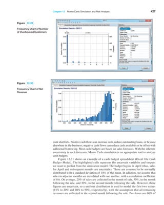
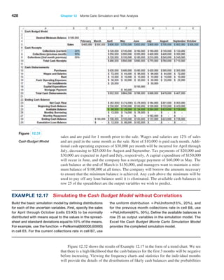
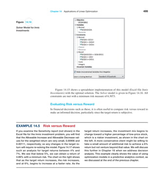
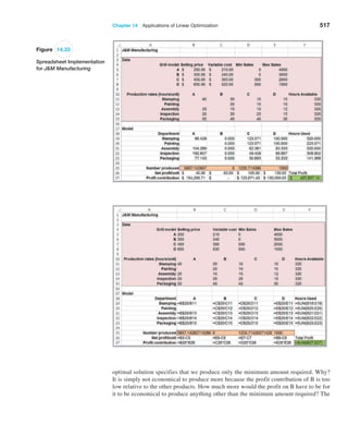
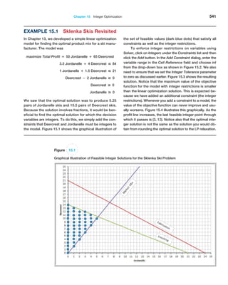
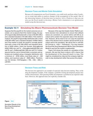
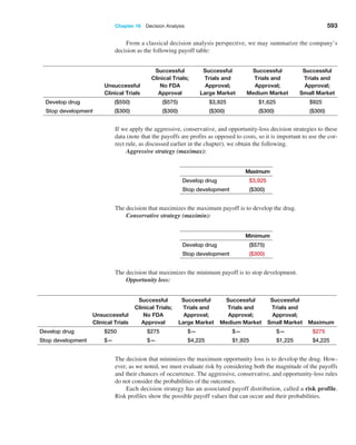
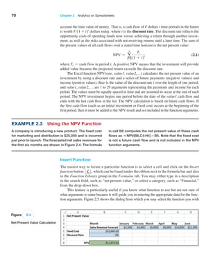
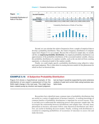
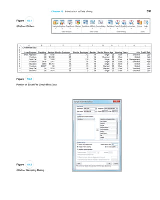
![406 Chapter 12 Monte Carlo Simulation and Risk Analysis
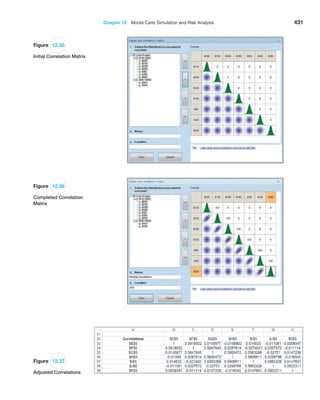
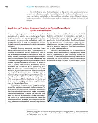
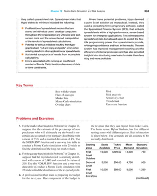
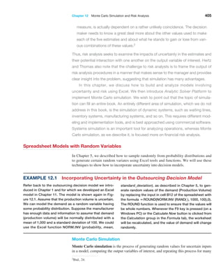
trials to understand the distribution of the output results. For example, in the
outsourcing
decision model, we can randomly generate the production volume and compute the cost dif-
ference and associated decision and then repeat this for some number of trials. Monte Carlo
simulation can easily be accomplished on a spreadsheet using a data table.
Figure 12.1
Outsourcing Decision Model
Spreadsheet
Example 12.2
Using Data Tables for Monte Carlo Spreadsheet Simulation
Figure 12.2 shows a Monte Carlo simulation for the outsourc-
ing decision model (Excel file Outsourcing Decision Monte
Carlo Simulation Model). First, construct a data table (see
Chapter 11) by listing the number of trials down a column
(here we used 20 trials) and referencing the cells associated
with demand, the difference, and the decision in cells E3,
F3, and G3, respectively (i.e., the formula in cell E3 is =B12;
in cell F3, =B19; and in cell G3, =B20). Select the range
of the table (D3:G23)—and here’s the trick—in the Column
Input Cell field in the Data Table dialog, enter any blank cell
in the spreadsheet. This is done because the trial number
does not relate to any parameter in the model; we simply
want to repeat the spreadsheet recalculation independently
for each row of the data table, knowing that the demand will
change each time because of the use of the RAND function
in the demand formula.
As you can see from the results, each trial has a
randomly generated demand. The data table process
substitutes these demands into cell B12 and finds the as-
sociated difference and decision in columns F and G. The
average difference is $535, and 55% of the trials resulted
in outsourcing as the best decision; the histogram shows
the distribution of the results. These results might suggest
that, although the future demand is not known, the manu-
facturer’s best choice might be to outsource. However,
there is a risk that this may not be the best decision.
The small number of trials that we used in this exam-
ple makes sampling error an important issue. We could
easily obtain significantly different results if we repeat the
simulation (by pressing the F9 key on a Windows PC). For
example, repeated simulations yielded the following per-
centages for outsourcing as the best decision: 40%, 60%,
65%, 45%, 75%, 45%, and 35%. There is considerable
variability in the results, but this can be reduced by using
a larger number of trials.
To understand this variability better, let us construct
a confidence interval for the proportion of decisions
that result in a manufacturing recommendation with the
sample size (number of trials) n = 20 using the data in
Figure 12.2. Using formula (6.4) from Chapter 6, a 95%
confidence interval for the proportion is 0.55 ± 1.96
B
0.5510.452
20
= 0.55 ± 0.22, or [0.33, 0.77]. Because the
CI includes values below and above 0.5, this suggests that
we have little certainty as to the best decision. However,
if we obtained the same proportion using 1,000 trials, the
confidence interval would be 0.55 ± 1.96
B
0.5510.452
1000
=
0.55 ± 0.03, or [0.52, 0.58]. This would indicate that we
would have confidence that outsourcing would be the
better decision more than half the time.](https://image.slidesharecdn.com/book-230309160846-8faa1145/85/Book-pdf-407-320.jpg)
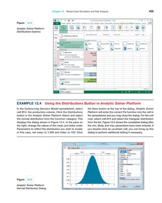
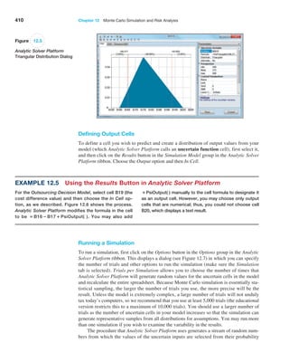
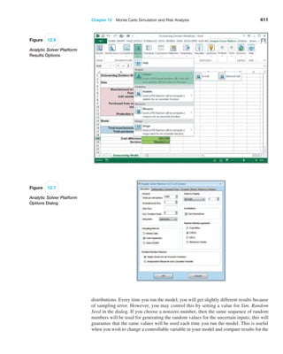
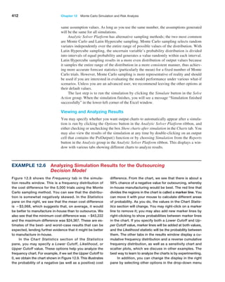
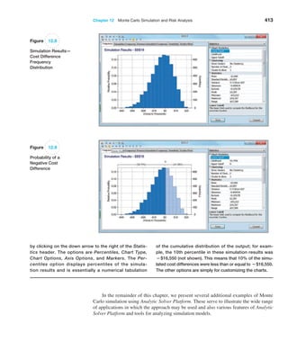
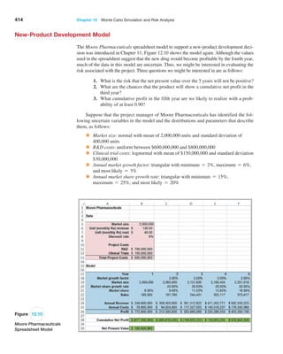
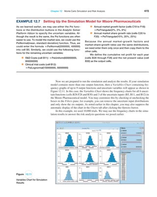
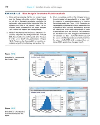
![Chapter 12 Monte Carlo Simulation and Risk Analysis 417
Figure 12.14
Percentiles for Fifth-Year
Cumulative Net Profit
Confidence Interval for the Mean
Monte Carlo simulation is essentially a sampling experiment. Each time you run a simu-
lation, you will obtain slightly different results as we observed in Example 12.2 for the
outsourcing decision model. Therefore, statistics such as the mean are a single observation
from a sample of n trials from some unknown population. In Chapter 6, we discussed how
to construct a confidence interval for the population mean to measure the error in estimat-
ing the true population mean. We may use the statistical information to construct a confi-
dence interval for the mean using a variant of formula (6.3) in Chapter 6:
x { za21s 1n2 (12.1)
Because a Monte Carlo simulation will generally have a very large number of trials (we
used 10,000), we may use the standard normal z-value instead of the t-distribution in the
confidence interval formula.
Example 12.9
A Confidence Interval for the Mean Net Present Value
We will construct a 95% confidence interval for the mean NPV
using the simulation results from the Moore Pharmaceuticals
example. From statistics shown in Figure 12.12, we have
mean = $200,608,120
standard deviation = $220,980,564
n = 10,000
For a 95% confidence interval, zA2 = 1.96. Therefore,
using formula (12.1), a 95% confidence interval for the
mean would be
$200,608,120 ± 1.961220,980,564,!10,0002,
or [$196,276,901, $204,939,339]
This means that if we ran the simulation again with dif-
ferent random inputs, we could expect the mean NPV to
generally fall within this interval. To reduce the size of the
confidence interval, we would need to run the simulation
for a larger number of trials. For most risk analysis appli-
cations, however, the mean is less important than the ac-
tual distribution of outcomes.](https://image.slidesharecdn.com/book-230309160846-8faa1145/85/Book-pdf-418-320.jpg)