Bar graphs
•
2 likes•756 views
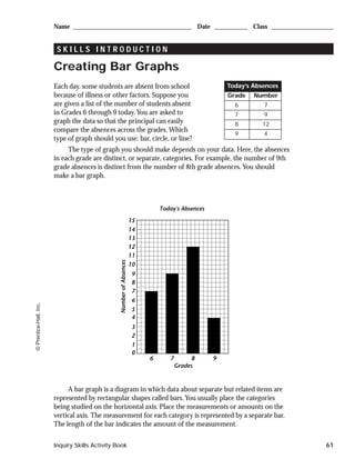
This document provides instructions for creating a bar graph to display student absence data by grade. It explains that a bar graph is appropriate when displaying separate but related categorical data, with the categories on the x-axis and measurements on the y-axis represented by rectangular bars of varying heights. An example bar graph is given showing the number of absent students by grade for a single day, with tips provided for constructing bar graphs, including organizing the data, scaling the axes appropriately, and labeling the graph.
Report
Share
Report
Share
Download to read offline

Recommended
The purpose of this lab is to explore basic properties of the Jovian.docx
The purpose of this lab is to explore basic properties of the Jovian planets and to examine geologic processes on some of the larger moons of the outer solar system.
Part 1: A Comparison of Planetary Sizes
Background
As we saw last week, a basic property of planets is their size. To compare sizes, we can compare the diameter (distance from one side to the other) of one planet to another, or we can compare the radius (half the diameter) of one planet to another.
Graphing All the Major Planets
Table 1. The average diameters* of the planets in our solar system in kilometers (km)
MercuryVenusEarthMarsJupiterSaturnUranusNeptune487912,10412,7426779139,822116,46450,72449,244
*Data source:
AstronomyNotes.com
Size comparison is better shown graphically than with numbers. You have already done this for the terrestrial planets in last week's lab.
The image above shows an example of what you will be doing. Remember scientific notation. The numbers on the axes are 0; 20,000; 40,000; and 60,000; and refer to kilometers. In order to plot a circle representing a planet with a 70,000 km diameter, I first took the radius (35,000 which is half the diameter), moved along the x-axis to 35,000, and drew a line up from zero that was 70,000 units long. Then I repeated this for the y-axis and sketched in the circle around the “+” that I’d drawn. Detail about drawing the circles were shown in the video last week.
Table 1 gives the average diameters for the planets in our solar system in kilometers. Use this data to plot circles representing the different planets to their correct sizes on the graph paper provided (
.png version
;
.docx version
; and
.pdf version
). Use a different color for each circle. Clearly identify which circle corresponds to which planet (labels or keys to colors). When you have finished, upload your completed graph to the correct assignment box.
Figure 1. Example of graph paper used for plotting planet sizes. Links to downloadable
.png
,
.docx
, and
.pdf
versions.
UPLOAD TO
ASSIGNMENT BOX
FOR LAB 5 - Solar-System-Planet-Sizes
Upload your diagram to the Assignment Box—name your files: [Yourlastname]_Solar_System_Planet_Sizes
In addition to looking at a graphical representation, we sometimes compare objects by saying how many times larger or smaller one is relative to the other. For example: If one student is 5.5 feet tall, and another is 6 feet tall, then we can say that the taller student is 1.1 times taller than the shorter student or that the shorter student is 0.92 times shorter than the taller student. This is done by simply dividing one number into another.
Lab 5: Question 1
Jupiter and Saturn are similar in size, but Jupiter is the largest planet in the solar system. Jupiter is _________ times larger than Saturn. Enter a number only. Use two significant figure [example, 2.2 or 22]
Lab 5: Question 2
SHORT ESSAY: Spend a bit of time looking at the graph you've created. Describe the variation that y.
ExoplanetsBig Idea Planets orbiting other stars have characteri.docx
Exoplanets
Big Idea: Planets orbiting other stars have characteristics similar and different to our own solar system of planets orbiting our Sun
Goal: Students will conduct a structured series of scaffolded scientific inquiries about the nature of observed exoplanets using the Internet sites prescribed, particularly the Exoplanet Data Explorer.
Computer Setup: Access URL http://exoplanets.org
Resources: Solar System Data Table, calculator, and these pages
SOLAR SYSTEM DATA TABLE
NAME
MASS
(MEarth)
MASS
(MJupiter)
PERIOD
(Earth-Years)
[Earth-Days]
SEMI-MAJOR AXIS DISTANCE (AU)
Object Name
How many times larger than (or fraction of) planet Earth’s mass
How many times larger than (or fraction of) planet Jupiter’s mass
How many Earth-years the planet takes to orbit our Sun
How many Earth-Sun distances away the planet orbits our Sun
Mercury
0.06
0.0002
0.24 [88]
0.39
Venus
0.82
0.003
0.62 [226]
0.72
Earth
1.00
0.003
1.00 [365]
1.00
Mars
0.11
0.0003
1.88 [687]
1.52
Jupiter
318
1.00
11.86 [4332]
5.20
Saturn
95.2
0.299
29.5 [10,775]
9.54
Uranus
14.5
0.046
84.0 [30,681]
19.2
Neptune
17.1
0.054
165 [60,266]
30.1
Pluto *
0.002
0.00001
249 [90,947]
39.5
Note: Pluto* is not currently be defined as a planet by the International Astronomical Union. Numerical data obtained from http://www.nasm.si.edu/research/ceps/etp/ss/ss_planetdata.html
Phase I: Exploration Part A
A histogram is a bar-chart showing the number of objects in a particular category. Use the SOLAR SYSTEM DATA TABLE above and sketch histograms for each of the following.
1) Title: Distribution of Orbital Distance: Number of Planets Closer and Farther than Earth’s Orbital Distance
2) Title: Distribution of Masses: Number of Planets with Masses Less than Earth’s Mass and Greater than Earth’s Mass
3) Title: Distribution of Orbital Periods: P < PEarth; PEarth ≤ PERIOD ≤ PJupiter; P > PJupiter
Phase I: Exploration Part B
A correlation-diagram is a graph of dots showing how two characteristics, or variables, are related. Use the SOLAR SYSTEM DATA TABLE above and sketch a correlation-diagram for each of the following.
4) Title: Distance (AU) vs. Period (Years) for Planets Closer than Jupiter (not including Jupiter)
(Vertical Y-axis Distance versus Horizontal X-axis Period)
5) Title: Distance (AU) vs. Period (Years) for Planets With Orbits Jupiter-sized and larger
(Vertical Y-axis Distance versus Horizontal X-axis Period)
6) Title: Distance (AU) vs. Mass (MEarth) for all Solar System Planets
(Vertical Y-axis Distance versus Horizontal X-axis Mass)
Phase I: Exploration Part C
The notion of correlation is the idea that two characteristics are closely related to one another. IMPORTANT NOTE: CORRELATION IS NOT THE SAME AS CAUSE-AND-EFFECT.
7) One of the two graphs below is Intelligence versus Height and the other is Weight versus Height. In the space below, precisely explain your reasoning about why which is which. Which one shows ...
Lab 6 tracking the night sky ii part i a coordinate syste
Lab 6 tracking the night sky ii part i a coordinate syste
Lab 6 tracking the night sky ii part i a coordinate syste
Lab 6 tracking the night sky ii part i a coordinate syste
ExoplanetsBig Idea Planets orbiting other stars have characteri.docx
Exoplanets
Big Idea: Planets orbiting other stars have characteristics similar and different to our own solar system of planets orbiting our Sun
Goal: Students will conduct a structured series of scaffolded scientific inquiries about the nature of observed exoplanets using the Internet sites prescribed, particularly the Exoplanet Data Explorer.
Computer Setup: Access URL http://exoplanets.org
Resources: Solar System Data Table, calculator, and these pages
SOLAR SYSTEM DATA TABLE
NAME
MASS
(MEarth)
MASS
(MJupiter)
PERIOD
(Earth-Years)
[Earth-Days]
SEMI-MAJOR AXIS DISTANCE (AU)
Object Name
How many times larger than (or fraction of) planet Earth’s mass
How many times larger than (or fraction of) planet Jupiter’s mass
How many Earth-years the planet takes to orbit our Sun
How many Earth-Sun distances away the planet orbits our Sun
Mercury
0.06
0.0002
0.24 [88]
0.39
Venus
0.82
0.003
0.62 [226]
0.72
Earth
1.00
0.003
1.00 [365]
1.00
Mars
0.11
0.0003
1.88 [687]
1.52
Jupiter
318
1.00
11.86 [4332]
5.20
Saturn
95.2
0.299
29.5 [10,775]
9.54
Uranus
14.5
0.046
84.0 [30,681]
19.2
Neptune
17.1
0.054
165 [60,266]
30.1
Pluto *
0.002
0.00001
249 [90,947]
39.5
Note: Pluto* is not currently be defined as a planet by the International Astronomical Union. Numerical data obtained from http://www.nasm.si.edu/research/ceps/etp/ss/ss_planetdata.html
Phase I: Exploration Part A
A histogram is a bar-chart showing the number of objects in a particular category. Use the SOLAR SYSTEM DATA TABLE above and sketch histograms for each of the following.
1) Title: Distribution of Orbital Distance: Number of Planets Closer and Farther than Earth’s Orbital Distance
Less than 1 Earth orbit
Equal to or greater than 1 Earth orbit
7654321
2) Title: Distribution of Masses: Number of Planets with Masses Less than Earth’s Mass and Greater than Earth’s Mass
Less than 1 Earth mass
Equal to or greater than 1 Earth mass
7654321
3) Title: Distribution of Orbital Periods: P < PEarth; PEarth ≤ PERIOD ≤ PJupiter; P > PJupiter
Less than 1 Earth orbit
PEarth ≤ PERIOD ≤ PJupiter
More than 1 Jupiter orbit
7654321
Phase I: Exploration Part B
A correlation-diagram is a graph of dots showing how two characteristics, or variables, are related. Use the SOLAR SYSTEM DATA TABLE above and sketch a correlation-diagram for each of the following.
4) Title: Distance (AU) vs. Period (Years) for Planets Closer than Jupiter (not including Jupiter)
(Vertical Y-axis Distance versus Horizontal X-axis Period)
| | | | |
1 2 3 4 5
PERIOD (years)
3.53.02.52.01.51.00.5
Distance (AU)
5) Title: Distance (AU) vs. Period (Years) for Planets With Orbits Jupiter-sized and larger
(Vertical Y-axis Distance versus Horizontal X-axis Period)
| | | | |
50 100 150 200 250
.
Objectives Stars have a number of properties which, at first gl.docx
Objectives: Stars have a number of properties which, at first glance, may appear to be unrelated. But further analysis shows that they are related after all. Two astronomers, independently of each other, plotted the luminosities of a number of stars versus their temperatures to create what is now known as the "Hertzsprung-Russell", or "H-R" diagram (named after the scientists who invented it), which allows us to study this relationship between properties.
In this lab, you will find that for the majority of stars there is a definite relationship between temperature and luminosity. You will also find out that other properties of stars are also related. In fact, the H-R diagram contains a surprisingly large amount of information in one simple graph.
I. Plotting and understanding the H-R diagram
In the two tables and graph that follow, Temperatures are in Kelvins (K), and Luminosities and Masses are given in units relative to the Sun; the units are called: "Solar Luminosities" and "Solar Masses" respectively, which are abbreviated as L☉ and M☉. Note that the values for the Sun in these units are 1.0 L☉ and 1.0 M☉ by definition. You may ignore the column "Spectral Type" in the tables.
First is a list of the 25 nearest stars in the sky, starting with the nearest:
Next is a list of the 25 visually brightest stars in the sky, starting with the brightest (this list shares a few entries in common with the previous list):
Finally, here is a graph showing each star's Temperature versus Luminosity. Data for the nearest stars have been plotted using a box symbol, while data for the brightest stars have been plotted using an x. For the FIVE stars that appear on both lists, they are plotted on the graph using BOTH symbols -- so you will see a box with an x inside, which looks rather like a filled-in box.
Print out or save a copy of this H-R Diagram (image opens in new browser window, or you can download a PDF of the graph here) so you can draw and write on it in order to answer the following questions. You can either draw on a paper copy, or digitally annotate a copy of the file on your computer. Whether you choose the paper or computer drawing method, you will be handing in your drawing at the end, so be sure to follow all instructions that tell you to write or draw on it! Instructions to write or draw on the diagram will be indicated by an underline, like this.
1.
You should see a general trend among a majority of the stars. This trend is called the "Main Sequence". Circle the main sequence on your diagram -- that is, circle the stars which follow the trend that you observe; the stars are called "main sequence stars", and the trend is the main sequence.
How many stars does it include?
Count the stars and type a whole number: stars.
2.
Describe this trend in one brief but complete sentence in your own words, making sure to include the properties of the stars that are represented (see the graph axes!) and HOW they are related to one anothe.
Assignment 3.1 Determining Causes and Effects– Draft VersionThe.docx
Assignment 3.1: Determining Causes and Effects– Draft Version
The following scenarios on which to focus your cause and effect paper. Research the topic and include credible sources to support claims. Identify your purpose clearly, incorporate audience needs, establish a desired tone, and organize information/claims effectively.
2. The director of your state unemployment agency has asked you (a public relations specialist) to write about the causes and effects of unemployment on an individual/family. The paper will be presented to the agency as they make decisions about reaching out to those who need jobs.
Write a four to five (4-5) page paper in which you:
1. Provide a clear thesis statement.
2. Describe the major cause.
3. Describe a leading second cause
4. Describe two (2) economic effects of the cause..
5. Describe two (2) effects on people.
6. Develop a coherently structured paper with an introduction, body, and conclusion.
7. Provide three (3) relevant and credible sources to support claims. Note: Wikipedia and other Websites do not qualify as academic resources.
Your assignment must follow these formatting requirements:
· Be typed, double spaced, using Times New Roman font (size 12), with one-inch margins on all sides; references must follow APA or school-specific format. Check with your professor for any additional instructions.
· Include a cover page containing the title of the assignment, the student’s name, the professor’s name, the course title, and the date. The cover page and the reference page are not included in the required page length.
The specific course learning outcomes associated with this assignment are:
· Associate the features of audience, purpose, and text with various genres.
· Recognize the elements and correct use of a thesis statement.
· Recognize how to organize ideas with transitional words, phrases, and sentences.
· Incorporate relevant, correctly documented sources to substantiate claims.
· Apply the writing process to develop various writing genres.
· Write clearly and concisely about selected topics using proper writing mechanics.
· Use technology and information resources to research selected issues for this course.
Using References in your Lab Writeup
Make sure you both cite the reference that you use in the body of your text, AND
provide a reference list at the end of your writeup.
For example, to cite references within the body of your lab writeup:
In this lab we examined how different fish like to eat different kinds of algae. The red
algae are the largest group of algae (Abbott, 1999). Therefore, we focused on red algae
in this lab. Many red algae are quite edible and some of the best known red algae
include those that are eaten in sushi (sushiworld.com). Algae are also quite nutritious
(Markeley, 2010). Our fish came from tidepools, which are located in the area between
high and low tide (Mahon and Mahon, 1994). According to our lab manual (WOU
Biology, 2011), our fish were col ...
Stem and-leaf-diagram-ppt.-dfs
The presentation is about Basic Statistics-Stem and Leaf Diagram, Line and Scatter Diagrams-by Dr. Farhana Shaheen
NATS 1740 AssignmentSun, Earth and Moon SystemThis assignmen.docx
NATS 1740 Assignment
Sun, Earth and Moon System
This assignment requires that you print this file that you answer on the last 2 printed sheets. Staple those 2 sheets together and bring them to class on 26 February.
READ CAREFULLY the description of this work. Remember that Earth orbits around the Sun and Moon orbits around the Earth. The other motion that we are going to consider is the Earth’s spin around its axis. A good idea is to view again the video "Why does the moon change shape? “
The Earth and the Sun: Daily (Diurnal) Motion
Pretend your head is the Earth, and your eyes are you looking up into the sky from Earth’s Northern Hemisphere. Imagine a bright light in the front of the room to represent the Sun. To represent the Earth spinning on its axis, stand up and turn around COUNTER-CLOCKWISE (as seen from above). As you turn, the time of day at the location of your eyes changes. One complete turn of your head (360 degrees) represents 24 hours.
Although the exact rising and setting times (and thus the duration of the day) depend on the time of the year and on the location on Earth, for this assignment we consider the day equally divided by sunrise, noon, sunset and midnight.
Now you can answer question 1, remember that here you are studying the Earth’s daily (24 hours) motion, so that the position of Earth with respect to the Sun can be considered fixed.
1. On your assignment answer sheet, make four simple drawings of the Earth and the light rays from the Sun, clearly showing your location on Earth at sunrise, sunset, noon and midnight. The viewpoint for all drawings should be looking down on the Earth from far above the North Pole. Show the direction in which the Earth is spinning. (Note: in this and following questions some marks will be deducted if the arrows are missing).
The Motion and Phases of the Moon
Now pretend that you have a tennis ball next to your head representing the Moon (Your head and the tennis ball are the same relative size as the Earth and the Moon). We are going to recreate the phases of the Moon (its changing appearance with time) as seen from Earth. When the Moon’s phase is full, its entire surface as seen from the Earth is lit by the Sun.
2. Sketch the relative positions of the Earth, Moon and the Sun rays when the Moon is full. The moon orbits the Earth in the same direction that the Earth spins (see question 1); indicate this direction with an arrow. In a second sketch show the position of Earth, Moon and the Sun rays when it is a new Moon (when none of its surface as seen from the Earth is lit up by the Sun).
3. About what time is it for you when the full Moon is highest in the sky ? For question 3, turn around as you have done in question 1 and find out what time is it for you when the full Moon is highest in the sky (when you are looking at the tennis ball straight ahead).
4. Now turn yourself counterclockwise until the tennis ball is just about to disappear from view; that is, when the Mo.
Exercise 1Using the data above in Table 1, make a plot of right .docx
Exercise 1
Using the data above in Table 1, make a plot of right ascension versus declination on your printed out Milky Way Globular Clusters Distribution Graph (Diagram 1-the top plot). RA is along the x-axis and goes from 0 to 24 hours, Dec is on the y-axis and goes from +90 to 0 to –90 degrees.) Insert the plot into your lab report with your signature and date.
You will type your answers to the below questions in your lab report and then scan/photo your graph(s) and insert them into your lab document. Again, it would be helpful to review the Exploration from Module 1: “Math Primer for Astronomy” (note this contains link for a free online scientific calculator). There are also good math examples in the Appendix of our eText.
Would you describe the distribution of clusters on the plot as random, or is there a pattern (explain your answer)?
Now look at your plot and point in the direction in which you see most of the globular clusters. This is the general direction of the Galactic Center. Estimate the center of the distribution of the globular clusters. Also estimate (no calculation required — just an educated estimate) the accuracy of determining this center. You have now determined the rough center of our Galaxy!
RA = ____________________ ± ________________
Dec = ____________________ ± ________________
Shapely was correct in thinking that the distribution of globular clusters could reveal something about the Galaxy as a whole. He went one step further. He used the locations of the globular clusters to determine the distance to the Galactic Center. His result was surprisingly accurate and differed from the modern value by less than 10%. So, let’s follow in his footsteps.
The next step is to determine the distance to the clusters. Shapely did this by using RR Lyrae stars. These are variable stars, which have a relatively narrow range of luminosities. From the difference between the apparent magnitudes (measured from his photographic plates) and the absolute magnitudes (calculated from the luminosities), he calculated the distances in parsecs to the star (via: m - M = 5log10(d) + 5). So now we have the distances and the directions of the globular clusters and we can determine the 3-dimensional distributions of the globular clusters relative to us.
However, we will use a different coordinate system that is based on galactic latitude and longitude rather than RA and Dec. The plane of the Galaxy is designated as “0 latitude”. Why would we want to do this? RA and Dec is a messy coordinate system that depends on our orientation in space and the earth’s rotation around its axis. The system based on galactic latitude and longitude is therefore simpler. However, it means that we have to transform the measured RA and DEC positions of the globular clusters and galactic latitude and longitude. To simplify things even further, let’s express the galactic latitude and longitude in terms of x, y, and z coordinates. The advantage of this is that x,.
Exploration Study and Information1. Exercise Constellation Obse.docx
Exploration Study and Information
1. Exercise: Constellation Observation Portion
Materials Required
Pencil
Print out five (5) copies of the
Constellation Observation form
(Points will be lost if you do not use the forms provided)
A Constellation map/chart (for the correct current season) options: you can use the Appendices in our eText; you can use the freeware, Stellarium program; a phone app; you could use the star map found in the center of a current issue of "Astronomy" or "Sky and Telescope" magazine; or find your star map online. We suggest that you do not buy the plastic circular devices called a planisphere; they are too small and, as a result, too distorted. But they can be used in a bind.
Flashlight (see below for advice)
If you live in the heart of a light-polluted city you may have to find a
safe
location away from the city. Identifying constellations is easier if you select a clear, moonless night and get as far from city lights as possible.
Always try to have someone to accompany you, never go to a dark location on your own!!
Scanner or digital camera
Background Information and Example:
In this lab you are going to be observing the Big Dipper which is part of Ursa Major, along with 4 other constellations (that have 4 or more stars in the outline). Depending on the semester and time of year your constellations for that season will vary. Please use our discussion on Constellations as a starting point.
It will help a lot if you can get away from the city lights as far as possible and on a night when the moon is not up.
For this lab you can use an app or print out sky charts, etc. to help you find your constellations. But no matter which method, you want to be sure that once you find the constellation you are looking for, you put your reference aside and draw what YOU personally see in the sky. To look at your charts use a flashlight covered with several layers of paper or red plastic wrap so it not too bright. That way you will not destroy your night vision every time you turn it on.
NOTE: you never want to be outside of your yard in a dark area alone. Always go with a friend or family member and be safe!
Here is an example observation:
Example Observation
Constellation Observation
Student’s Name
Date
Abby Astronomer
Dec. 1, 2013
Time
Location (city & latitude/longitude)
9:26pm
Denver, 39 degrees N, 104 degrees W
Official name of Constellation
Big Dipper, within the constellation Ursa Major
DRAWING: (Includes angular separation measurements and altitude of lowest star coming from the horizon and direction you are facing.)
Depending on the time of year you will not see The Big Dipper as it is shown above, it will appear lower or higher at times and will "tilt" so that the cup is up, down or sideways. It will always be in the North.
Although you can do this lab in one night, it would be great if you can go out over a period of a few weeks at nearly the same time each night and see how the co.
Visualization-1
Contains different types of Data Visualizations, best practices to follow for each case and what type of visualization should be made for different kinds of datasets.
Brightness at Varying Distances LabImage by Borb CC license
Brightness at Varying Distances Lab
Image by Borb CC license: http://en.wikipedia.org/wiki/Inverse-square_law#/media/File:Inverse_square_law.svg
Purpose: In this lab, you will look at how light leaving a star “spreads out” and how this spreading can be used to determine the brightness of the star at different distances. While the focus of this lab is on light, your results will apply equally well to sound and the loudness of sounds at varying distances.
Equipment: This lab uses the optics bench, a square of aluminum foil sandwiched between two squares of paraffin wax, a lens holder to hold the wax, three incandescent light bulbs of equal wattage with bases, and three optics stands. The lab also requires access to the internet and a ruler.
Let’s start this lab by introducing the basic question that we want to answer.
Part 1: Introducing the Question
At the front of the class is an optics bench with two identical light bulbs on opposite sides of a wax block. In the center of the wax block is a piece of reflective foil. The foil ensures that each side of the wax is only illuminated by one of the light bulbs.
In a moment, the instructor will turn on the light bulbs and turn off the overhead light.
1. How does the brightness of each side of the wax block compare when the bulbs are both equal
distances from the wax?
a) Both sides of the wax are approximately the same brightness
b) The left side of the wax is noticeably brighter
c) The right side of the wax is noticeably brighter
Your question for this experiment is: If we add a second identical light bulb to the left side of the optics track, how far must the two light bulbs be from the wax in order to make both sides of the wax appear equally bright?
2. What is your prediction? If the single light bulb on the right side is 20 cm from the wax, how
far away do you think the two light bulbs will need to be from the wax in order to produce an
equal amount of brightness on their side of the wax?
Part 2: Computer Simulation
Open your internet browser and go to the online Flux Simulator at http://astro.unl.edu/classaction/animations/stellarprops/lightdetector.html. The simulation shows two light bulbs and two light sensors. The number on the sensors can be considered a numerical value of the brightness at that location. Take a few minutes to play around with the controls and see what you can do to increase and decrease the brightness readings.
3*. Set the wattage of the top bulb to 50 and use the simulation and your calculator to fill in the
table below. For columns 3 and 4, note that B1 is always 3.979.
Distance from bulb
Brightness Value
B1/R
B1/R2
R = 1.0
B1 = 3.979
R = 2.0
B =
R = 3.0
B =
R = 4.0
B =
R = 5.0
B =
*Note that in the last column, only R is squared, B1 is not being squared.
4. The brightness value at R = 2.0 is:
a) approximately half of the brightness value at R = 1.0
b) significantly more than hal ...
Brightness at Varying Distances LabImage by Borb CC license.docx
Brightness at Varying Distances Lab
Image by Borb CC license: http://en.wikipedia.org/wiki/Inverse-square_law#/media/File:Inverse_square_law.svg
Purpose: In this lab, you will look at how light leaving a star “spreads out” and how this spreading can be used to determine the brightness of the star at different distances. While the focus of this lab is on light, your results will apply equally well to sound and the loudness of sounds at varying distances.
Equipment: This lab uses the optics bench, a square of aluminum foil sandwiched between two squares of paraffin wax, a lens holder to hold the wax, three incandescent light bulbs of equal wattage with bases, and three optics stands. The lab also requires access to the internet and a ruler.
Let’s start this lab by introducing the basic question that we want to answer.
Part 1: Introducing the Question
At the front of the class is an optics bench with two identical light bulbs on opposite sides of a wax block. In the center of the wax block is a piece of reflective foil. The foil ensures that each side of the wax is only illuminated by one of the light bulbs.
In a moment, the instructor will turn on the light bulbs and turn off the overhead light.
1. How does the brightness of each side of the wax block compare when the bulbs are both equal
distances from the wax?
a) Both sides of the wax are approximately the same brightness
b) The left side of the wax is noticeably brighter
c) The right side of the wax is noticeably brighter
Your question for this experiment is: If we add a second identical light bulb to the left side of the optics track, how far must the two light bulbs be from the wax in order to make both sides of the wax appear equally bright?
2. What is your prediction? If the single light bulb on the right side is 20 cm from the wax, how
far away do you think the two light bulbs will need to be from the wax in order to produce an
equal amount of brightness on their side of the wax?
Part 2: Computer Simulation
Open your internet browser and go to the online Flux Simulator at http://astro.unl.edu/classaction/animations/stellarprops/lightdetector.html. The simulation shows two light bulbs and two light sensors. The number on the sensors can be considered a numerical value of the brightness at that location. Take a few minutes to play around with the controls and see what you can do to increase and decrease the brightness readings.
3*. Set the wattage of the top bulb to 50 and use the simulation and your calculator to fill in the
table below. For columns 3 and 4, note that B1 is always 3.979.
Distance from bulb
Brightness Value
B1/R
B1/R2
R = 1.0
B1 = 3.979
R = 2.0
B =
R = 3.0
B =
R = 4.0
B =
R = 5.0
B =
*Note that in the last column, only R is squared, B1 is not being squared.
4. The brightness value at R = 2.0 is:
a) approximately half of the brightness value at R = 1.0
b) significantly more than hal ...
Four square-introduction dewey
Taken from Edmond Public Schools with recommended grade levels added by Dewey Elementary :)
More Related Content
Similar to Bar graphs
ExoplanetsBig Idea Planets orbiting other stars have characteri.docx
Exoplanets
Big Idea: Planets orbiting other stars have characteristics similar and different to our own solar system of planets orbiting our Sun
Goal: Students will conduct a structured series of scaffolded scientific inquiries about the nature of observed exoplanets using the Internet sites prescribed, particularly the Exoplanet Data Explorer.
Computer Setup: Access URL http://exoplanets.org
Resources: Solar System Data Table, calculator, and these pages
SOLAR SYSTEM DATA TABLE
NAME
MASS
(MEarth)
MASS
(MJupiter)
PERIOD
(Earth-Years)
[Earth-Days]
SEMI-MAJOR AXIS DISTANCE (AU)
Object Name
How many times larger than (or fraction of) planet Earth’s mass
How many times larger than (or fraction of) planet Jupiter’s mass
How many Earth-years the planet takes to orbit our Sun
How many Earth-Sun distances away the planet orbits our Sun
Mercury
0.06
0.0002
0.24 [88]
0.39
Venus
0.82
0.003
0.62 [226]
0.72
Earth
1.00
0.003
1.00 [365]
1.00
Mars
0.11
0.0003
1.88 [687]
1.52
Jupiter
318
1.00
11.86 [4332]
5.20
Saturn
95.2
0.299
29.5 [10,775]
9.54
Uranus
14.5
0.046
84.0 [30,681]
19.2
Neptune
17.1
0.054
165 [60,266]
30.1
Pluto *
0.002
0.00001
249 [90,947]
39.5
Note: Pluto* is not currently be defined as a planet by the International Astronomical Union. Numerical data obtained from http://www.nasm.si.edu/research/ceps/etp/ss/ss_planetdata.html
Phase I: Exploration Part A
A histogram is a bar-chart showing the number of objects in a particular category. Use the SOLAR SYSTEM DATA TABLE above and sketch histograms for each of the following.
1) Title: Distribution of Orbital Distance: Number of Planets Closer and Farther than Earth’s Orbital Distance
Less than 1 Earth orbit
Equal to or greater than 1 Earth orbit
7654321
2) Title: Distribution of Masses: Number of Planets with Masses Less than Earth’s Mass and Greater than Earth’s Mass
Less than 1 Earth mass
Equal to or greater than 1 Earth mass
7654321
3) Title: Distribution of Orbital Periods: P < PEarth; PEarth ≤ PERIOD ≤ PJupiter; P > PJupiter
Less than 1 Earth orbit
PEarth ≤ PERIOD ≤ PJupiter
More than 1 Jupiter orbit
7654321
Phase I: Exploration Part B
A correlation-diagram is a graph of dots showing how two characteristics, or variables, are related. Use the SOLAR SYSTEM DATA TABLE above and sketch a correlation-diagram for each of the following.
4) Title: Distance (AU) vs. Period (Years) for Planets Closer than Jupiter (not including Jupiter)
(Vertical Y-axis Distance versus Horizontal X-axis Period)
| | | | |
1 2 3 4 5
PERIOD (years)
3.53.02.52.01.51.00.5
Distance (AU)
5) Title: Distance (AU) vs. Period (Years) for Planets With Orbits Jupiter-sized and larger
(Vertical Y-axis Distance versus Horizontal X-axis Period)
| | | | |
50 100 150 200 250
.
Objectives Stars have a number of properties which, at first gl.docx
Objectives: Stars have a number of properties which, at first glance, may appear to be unrelated. But further analysis shows that they are related after all. Two astronomers, independently of each other, plotted the luminosities of a number of stars versus their temperatures to create what is now known as the "Hertzsprung-Russell", or "H-R" diagram (named after the scientists who invented it), which allows us to study this relationship between properties.
In this lab, you will find that for the majority of stars there is a definite relationship between temperature and luminosity. You will also find out that other properties of stars are also related. In fact, the H-R diagram contains a surprisingly large amount of information in one simple graph.
I. Plotting and understanding the H-R diagram
In the two tables and graph that follow, Temperatures are in Kelvins (K), and Luminosities and Masses are given in units relative to the Sun; the units are called: "Solar Luminosities" and "Solar Masses" respectively, which are abbreviated as L☉ and M☉. Note that the values for the Sun in these units are 1.0 L☉ and 1.0 M☉ by definition. You may ignore the column "Spectral Type" in the tables.
First is a list of the 25 nearest stars in the sky, starting with the nearest:
Next is a list of the 25 visually brightest stars in the sky, starting with the brightest (this list shares a few entries in common with the previous list):
Finally, here is a graph showing each star's Temperature versus Luminosity. Data for the nearest stars have been plotted using a box symbol, while data for the brightest stars have been plotted using an x. For the FIVE stars that appear on both lists, they are plotted on the graph using BOTH symbols -- so you will see a box with an x inside, which looks rather like a filled-in box.
Print out or save a copy of this H-R Diagram (image opens in new browser window, or you can download a PDF of the graph here) so you can draw and write on it in order to answer the following questions. You can either draw on a paper copy, or digitally annotate a copy of the file on your computer. Whether you choose the paper or computer drawing method, you will be handing in your drawing at the end, so be sure to follow all instructions that tell you to write or draw on it! Instructions to write or draw on the diagram will be indicated by an underline, like this.
1.
You should see a general trend among a majority of the stars. This trend is called the "Main Sequence". Circle the main sequence on your diagram -- that is, circle the stars which follow the trend that you observe; the stars are called "main sequence stars", and the trend is the main sequence.
How many stars does it include?
Count the stars and type a whole number: stars.
2.
Describe this trend in one brief but complete sentence in your own words, making sure to include the properties of the stars that are represented (see the graph axes!) and HOW they are related to one anothe.
Assignment 3.1 Determining Causes and Effects– Draft VersionThe.docx
Assignment 3.1: Determining Causes and Effects– Draft Version
The following scenarios on which to focus your cause and effect paper. Research the topic and include credible sources to support claims. Identify your purpose clearly, incorporate audience needs, establish a desired tone, and organize information/claims effectively.
2. The director of your state unemployment agency has asked you (a public relations specialist) to write about the causes and effects of unemployment on an individual/family. The paper will be presented to the agency as they make decisions about reaching out to those who need jobs.
Write a four to five (4-5) page paper in which you:
1. Provide a clear thesis statement.
2. Describe the major cause.
3. Describe a leading second cause
4. Describe two (2) economic effects of the cause..
5. Describe two (2) effects on people.
6. Develop a coherently structured paper with an introduction, body, and conclusion.
7. Provide three (3) relevant and credible sources to support claims. Note: Wikipedia and other Websites do not qualify as academic resources.
Your assignment must follow these formatting requirements:
· Be typed, double spaced, using Times New Roman font (size 12), with one-inch margins on all sides; references must follow APA or school-specific format. Check with your professor for any additional instructions.
· Include a cover page containing the title of the assignment, the student’s name, the professor’s name, the course title, and the date. The cover page and the reference page are not included in the required page length.
The specific course learning outcomes associated with this assignment are:
· Associate the features of audience, purpose, and text with various genres.
· Recognize the elements and correct use of a thesis statement.
· Recognize how to organize ideas with transitional words, phrases, and sentences.
· Incorporate relevant, correctly documented sources to substantiate claims.
· Apply the writing process to develop various writing genres.
· Write clearly and concisely about selected topics using proper writing mechanics.
· Use technology and information resources to research selected issues for this course.
Using References in your Lab Writeup
Make sure you both cite the reference that you use in the body of your text, AND
provide a reference list at the end of your writeup.
For example, to cite references within the body of your lab writeup:
In this lab we examined how different fish like to eat different kinds of algae. The red
algae are the largest group of algae (Abbott, 1999). Therefore, we focused on red algae
in this lab. Many red algae are quite edible and some of the best known red algae
include those that are eaten in sushi (sushiworld.com). Algae are also quite nutritious
(Markeley, 2010). Our fish came from tidepools, which are located in the area between
high and low tide (Mahon and Mahon, 1994). According to our lab manual (WOU
Biology, 2011), our fish were col ...
Stem and-leaf-diagram-ppt.-dfs
The presentation is about Basic Statistics-Stem and Leaf Diagram, Line and Scatter Diagrams-by Dr. Farhana Shaheen
NATS 1740 AssignmentSun, Earth and Moon SystemThis assignmen.docx
NATS 1740 Assignment
Sun, Earth and Moon System
This assignment requires that you print this file that you answer on the last 2 printed sheets. Staple those 2 sheets together and bring them to class on 26 February.
READ CAREFULLY the description of this work. Remember that Earth orbits around the Sun and Moon orbits around the Earth. The other motion that we are going to consider is the Earth’s spin around its axis. A good idea is to view again the video "Why does the moon change shape? “
The Earth and the Sun: Daily (Diurnal) Motion
Pretend your head is the Earth, and your eyes are you looking up into the sky from Earth’s Northern Hemisphere. Imagine a bright light in the front of the room to represent the Sun. To represent the Earth spinning on its axis, stand up and turn around COUNTER-CLOCKWISE (as seen from above). As you turn, the time of day at the location of your eyes changes. One complete turn of your head (360 degrees) represents 24 hours.
Although the exact rising and setting times (and thus the duration of the day) depend on the time of the year and on the location on Earth, for this assignment we consider the day equally divided by sunrise, noon, sunset and midnight.
Now you can answer question 1, remember that here you are studying the Earth’s daily (24 hours) motion, so that the position of Earth with respect to the Sun can be considered fixed.
1. On your assignment answer sheet, make four simple drawings of the Earth and the light rays from the Sun, clearly showing your location on Earth at sunrise, sunset, noon and midnight. The viewpoint for all drawings should be looking down on the Earth from far above the North Pole. Show the direction in which the Earth is spinning. (Note: in this and following questions some marks will be deducted if the arrows are missing).
The Motion and Phases of the Moon
Now pretend that you have a tennis ball next to your head representing the Moon (Your head and the tennis ball are the same relative size as the Earth and the Moon). We are going to recreate the phases of the Moon (its changing appearance with time) as seen from Earth. When the Moon’s phase is full, its entire surface as seen from the Earth is lit by the Sun.
2. Sketch the relative positions of the Earth, Moon and the Sun rays when the Moon is full. The moon orbits the Earth in the same direction that the Earth spins (see question 1); indicate this direction with an arrow. In a second sketch show the position of Earth, Moon and the Sun rays when it is a new Moon (when none of its surface as seen from the Earth is lit up by the Sun).
3. About what time is it for you when the full Moon is highest in the sky ? For question 3, turn around as you have done in question 1 and find out what time is it for you when the full Moon is highest in the sky (when you are looking at the tennis ball straight ahead).
4. Now turn yourself counterclockwise until the tennis ball is just about to disappear from view; that is, when the Mo.
Exercise 1Using the data above in Table 1, make a plot of right .docx
Exercise 1
Using the data above in Table 1, make a plot of right ascension versus declination on your printed out Milky Way Globular Clusters Distribution Graph (Diagram 1-the top plot). RA is along the x-axis and goes from 0 to 24 hours, Dec is on the y-axis and goes from +90 to 0 to –90 degrees.) Insert the plot into your lab report with your signature and date.
You will type your answers to the below questions in your lab report and then scan/photo your graph(s) and insert them into your lab document. Again, it would be helpful to review the Exploration from Module 1: “Math Primer for Astronomy” (note this contains link for a free online scientific calculator). There are also good math examples in the Appendix of our eText.
Would you describe the distribution of clusters on the plot as random, or is there a pattern (explain your answer)?
Now look at your plot and point in the direction in which you see most of the globular clusters. This is the general direction of the Galactic Center. Estimate the center of the distribution of the globular clusters. Also estimate (no calculation required — just an educated estimate) the accuracy of determining this center. You have now determined the rough center of our Galaxy!
RA = ____________________ ± ________________
Dec = ____________________ ± ________________
Shapely was correct in thinking that the distribution of globular clusters could reveal something about the Galaxy as a whole. He went one step further. He used the locations of the globular clusters to determine the distance to the Galactic Center. His result was surprisingly accurate and differed from the modern value by less than 10%. So, let’s follow in his footsteps.
The next step is to determine the distance to the clusters. Shapely did this by using RR Lyrae stars. These are variable stars, which have a relatively narrow range of luminosities. From the difference between the apparent magnitudes (measured from his photographic plates) and the absolute magnitudes (calculated from the luminosities), he calculated the distances in parsecs to the star (via: m - M = 5log10(d) + 5). So now we have the distances and the directions of the globular clusters and we can determine the 3-dimensional distributions of the globular clusters relative to us.
However, we will use a different coordinate system that is based on galactic latitude and longitude rather than RA and Dec. The plane of the Galaxy is designated as “0 latitude”. Why would we want to do this? RA and Dec is a messy coordinate system that depends on our orientation in space and the earth’s rotation around its axis. The system based on galactic latitude and longitude is therefore simpler. However, it means that we have to transform the measured RA and DEC positions of the globular clusters and galactic latitude and longitude. To simplify things even further, let’s express the galactic latitude and longitude in terms of x, y, and z coordinates. The advantage of this is that x,.
Exploration Study and Information1. Exercise Constellation Obse.docx
Exploration Study and Information
1. Exercise: Constellation Observation Portion
Materials Required
Pencil
Print out five (5) copies of the
Constellation Observation form
(Points will be lost if you do not use the forms provided)
A Constellation map/chart (for the correct current season) options: you can use the Appendices in our eText; you can use the freeware, Stellarium program; a phone app; you could use the star map found in the center of a current issue of "Astronomy" or "Sky and Telescope" magazine; or find your star map online. We suggest that you do not buy the plastic circular devices called a planisphere; they are too small and, as a result, too distorted. But they can be used in a bind.
Flashlight (see below for advice)
If you live in the heart of a light-polluted city you may have to find a
safe
location away from the city. Identifying constellations is easier if you select a clear, moonless night and get as far from city lights as possible.
Always try to have someone to accompany you, never go to a dark location on your own!!
Scanner or digital camera
Background Information and Example:
In this lab you are going to be observing the Big Dipper which is part of Ursa Major, along with 4 other constellations (that have 4 or more stars in the outline). Depending on the semester and time of year your constellations for that season will vary. Please use our discussion on Constellations as a starting point.
It will help a lot if you can get away from the city lights as far as possible and on a night when the moon is not up.
For this lab you can use an app or print out sky charts, etc. to help you find your constellations. But no matter which method, you want to be sure that once you find the constellation you are looking for, you put your reference aside and draw what YOU personally see in the sky. To look at your charts use a flashlight covered with several layers of paper or red plastic wrap so it not too bright. That way you will not destroy your night vision every time you turn it on.
NOTE: you never want to be outside of your yard in a dark area alone. Always go with a friend or family member and be safe!
Here is an example observation:
Example Observation
Constellation Observation
Student’s Name
Date
Abby Astronomer
Dec. 1, 2013
Time
Location (city & latitude/longitude)
9:26pm
Denver, 39 degrees N, 104 degrees W
Official name of Constellation
Big Dipper, within the constellation Ursa Major
DRAWING: (Includes angular separation measurements and altitude of lowest star coming from the horizon and direction you are facing.)
Depending on the time of year you will not see The Big Dipper as it is shown above, it will appear lower or higher at times and will "tilt" so that the cup is up, down or sideways. It will always be in the North.
Although you can do this lab in one night, it would be great if you can go out over a period of a few weeks at nearly the same time each night and see how the co.
Visualization-1
Contains different types of Data Visualizations, best practices to follow for each case and what type of visualization should be made for different kinds of datasets.
Brightness at Varying Distances LabImage by Borb CC license
Brightness at Varying Distances Lab
Image by Borb CC license: http://en.wikipedia.org/wiki/Inverse-square_law#/media/File:Inverse_square_law.svg
Purpose: In this lab, you will look at how light leaving a star “spreads out” and how this spreading can be used to determine the brightness of the star at different distances. While the focus of this lab is on light, your results will apply equally well to sound and the loudness of sounds at varying distances.
Equipment: This lab uses the optics bench, a square of aluminum foil sandwiched between two squares of paraffin wax, a lens holder to hold the wax, three incandescent light bulbs of equal wattage with bases, and three optics stands. The lab also requires access to the internet and a ruler.
Let’s start this lab by introducing the basic question that we want to answer.
Part 1: Introducing the Question
At the front of the class is an optics bench with two identical light bulbs on opposite sides of a wax block. In the center of the wax block is a piece of reflective foil. The foil ensures that each side of the wax is only illuminated by one of the light bulbs.
In a moment, the instructor will turn on the light bulbs and turn off the overhead light.
1. How does the brightness of each side of the wax block compare when the bulbs are both equal
distances from the wax?
a) Both sides of the wax are approximately the same brightness
b) The left side of the wax is noticeably brighter
c) The right side of the wax is noticeably brighter
Your question for this experiment is: If we add a second identical light bulb to the left side of the optics track, how far must the two light bulbs be from the wax in order to make both sides of the wax appear equally bright?
2. What is your prediction? If the single light bulb on the right side is 20 cm from the wax, how
far away do you think the two light bulbs will need to be from the wax in order to produce an
equal amount of brightness on their side of the wax?
Part 2: Computer Simulation
Open your internet browser and go to the online Flux Simulator at http://astro.unl.edu/classaction/animations/stellarprops/lightdetector.html. The simulation shows two light bulbs and two light sensors. The number on the sensors can be considered a numerical value of the brightness at that location. Take a few minutes to play around with the controls and see what you can do to increase and decrease the brightness readings.
3*. Set the wattage of the top bulb to 50 and use the simulation and your calculator to fill in the
table below. For columns 3 and 4, note that B1 is always 3.979.
Distance from bulb
Brightness Value
B1/R
B1/R2
R = 1.0
B1 = 3.979
R = 2.0
B =
R = 3.0
B =
R = 4.0
B =
R = 5.0
B =
*Note that in the last column, only R is squared, B1 is not being squared.
4. The brightness value at R = 2.0 is:
a) approximately half of the brightness value at R = 1.0
b) significantly more than hal ...
Brightness at Varying Distances LabImage by Borb CC license.docx
Brightness at Varying Distances Lab
Image by Borb CC license: http://en.wikipedia.org/wiki/Inverse-square_law#/media/File:Inverse_square_law.svg
Purpose: In this lab, you will look at how light leaving a star “spreads out” and how this spreading can be used to determine the brightness of the star at different distances. While the focus of this lab is on light, your results will apply equally well to sound and the loudness of sounds at varying distances.
Equipment: This lab uses the optics bench, a square of aluminum foil sandwiched between two squares of paraffin wax, a lens holder to hold the wax, three incandescent light bulbs of equal wattage with bases, and three optics stands. The lab also requires access to the internet and a ruler.
Let’s start this lab by introducing the basic question that we want to answer.
Part 1: Introducing the Question
At the front of the class is an optics bench with two identical light bulbs on opposite sides of a wax block. In the center of the wax block is a piece of reflective foil. The foil ensures that each side of the wax is only illuminated by one of the light bulbs.
In a moment, the instructor will turn on the light bulbs and turn off the overhead light.
1. How does the brightness of each side of the wax block compare when the bulbs are both equal
distances from the wax?
a) Both sides of the wax are approximately the same brightness
b) The left side of the wax is noticeably brighter
c) The right side of the wax is noticeably brighter
Your question for this experiment is: If we add a second identical light bulb to the left side of the optics track, how far must the two light bulbs be from the wax in order to make both sides of the wax appear equally bright?
2. What is your prediction? If the single light bulb on the right side is 20 cm from the wax, how
far away do you think the two light bulbs will need to be from the wax in order to produce an
equal amount of brightness on their side of the wax?
Part 2: Computer Simulation
Open your internet browser and go to the online Flux Simulator at http://astro.unl.edu/classaction/animations/stellarprops/lightdetector.html. The simulation shows two light bulbs and two light sensors. The number on the sensors can be considered a numerical value of the brightness at that location. Take a few minutes to play around with the controls and see what you can do to increase and decrease the brightness readings.
3*. Set the wattage of the top bulb to 50 and use the simulation and your calculator to fill in the
table below. For columns 3 and 4, note that B1 is always 3.979.
Distance from bulb
Brightness Value
B1/R
B1/R2
R = 1.0
B1 = 3.979
R = 2.0
B =
R = 3.0
B =
R = 4.0
B =
R = 5.0
B =
*Note that in the last column, only R is squared, B1 is not being squared.
4. The brightness value at R = 2.0 is:
a) approximately half of the brightness value at R = 1.0
b) significantly more than hal ...
Similar to Bar graphs (20)
ExoplanetsBig Idea Planets orbiting other stars have characteri.docx
ExoplanetsBig Idea Planets orbiting other stars have characteri.docx
Objectives Stars have a number of properties which, at first gl.docx
Objectives Stars have a number of properties which, at first gl.docx
Assignment 3.1 Determining Causes and Effects– Draft VersionThe.docx
Assignment 3.1 Determining Causes and Effects– Draft VersionThe.docx
NATS 1740 AssignmentSun, Earth and Moon SystemThis assignmen.docx
NATS 1740 AssignmentSun, Earth and Moon SystemThis assignmen.docx
Exercise 1Using the data above in Table 1, make a plot of right .docx
Exercise 1Using the data above in Table 1, make a plot of right .docx
Exploration Study and Information1. Exercise Constellation Obse.docx
Exploration Study and Information1. Exercise Constellation Obse.docx
Brightness at Varying Distances LabImage by Borb CC license
Brightness at Varying Distances LabImage by Borb CC license
Brightness at Varying Distances LabImage by Borb CC license.docx
Brightness at Varying Distances LabImage by Borb CC license.docx
More from Mrs. Henley
Four square-introduction dewey
Taken from Edmond Public Schools with recommended grade levels added by Dewey Elementary :)
0 scientific method rubric
This is a middle school level rubric which would be true for 6th, 7th, and 8th grade courses.
Virtual microscope
Worksheet to go along with virtual microscope found at:
http://www.udel.edu/biology/ketcham/microscope/
More from Mrs. Henley (20)
Recently uploaded
Overview on Edible Vaccine: Pros & Cons with Mechanism
This ppt include the description of the edible vaccine i.e. a new concept over the traditional vaccine administered by injection.
Digital Tools and AI for Teaching Learning and Research
This Presentation in details discusses on Digital Tools and AI for Teaching Learning and Research
The approach at University of Liverpool.pptx
How libraries can support authors with open access requirements for UKRI funded books
Wednesday 22 May 2024, 14:00-15:00.
The French Revolution Class 9 Study Material pdf free download
The French Revolution, which began in 1789, was a period of radical social and political upheaval in France. It marked the decline of absolute monarchies, the rise of secular and democratic republics, and the eventual rise of Napoleon Bonaparte. This revolutionary period is crucial in understanding the transition from feudalism to modernity in Europe.
For more information, visit-www.vavaclasses.com
Unit 8 - Information and Communication Technology (Paper I).pdf
This slides describes the basic concepts of ICT, basics of Email, Emerging Technology and Digital Initiatives in Education. This presentations aligns with the UGC Paper I syllabus.
Best Digital Marketing Institute In NOIDA
Safalta Digital marketing institute in Noida, provide complete applications that encompass a huge range of virtual advertising and marketing additives, which includes search engine optimization, virtual communication advertising, pay-per-click on marketing, content material advertising, internet analytics, and greater. These university courses are designed for students who possess a comprehensive understanding of virtual marketing strategies and attributes.Safalta Digital Marketing Institute in Noida is a first choice for young individuals or students who are looking to start their careers in the field of digital advertising. The institute gives specialized courses designed and certification.
for beginners, providing thorough training in areas such as SEO, digital communication marketing, and PPC training in Noida. After finishing the program, students receive the certifications recognised by top different universitie, setting a strong foundation for a successful career in digital marketing.
BÀI TẬP BỔ TRỢ TIẾNG ANH GLOBAL SUCCESS LỚP 3 - CẢ NĂM (CÓ FILE NGHE VÀ ĐÁP Á...
BÀI TẬP BỔ TRỢ TIẾNG ANH GLOBAL SUCCESS LỚP 3 - CẢ NĂM (CÓ FILE NGHE VÀ ĐÁP Á...Nguyen Thanh Tu Collection
https://app.box.com/s/hqnndn05v4q5a4k4jd597rkdbda0fniiJune 3, 2024 Anti-Semitism Letter Sent to MIT President Kornbluth and MIT Cor...
Letter from the Congress of the United States regarding Anti-Semitism sent June 3rd to MIT President Sally Kornbluth, MIT Corp Chair, Mark Gorenberg
Dear Dr. Kornbluth and Mr. Gorenberg,
The US House of Representatives is deeply concerned by ongoing and pervasive acts of antisemitic
harassment and intimidation at the Massachusetts Institute of Technology (MIT). Failing to act decisively to ensure a safe learning environment for all students would be a grave dereliction of your responsibilities as President of MIT and Chair of the MIT Corporation.
This Congress will not stand idly by and allow an environment hostile to Jewish students to persist. The House believes that your institution is in violation of Title VI of the Civil Rights Act, and the inability or
unwillingness to rectify this violation through action requires accountability.
Postsecondary education is a unique opportunity for students to learn and have their ideas and beliefs challenged. However, universities receiving hundreds of millions of federal funds annually have denied
students that opportunity and have been hijacked to become venues for the promotion of terrorism, antisemitic harassment and intimidation, unlawful encampments, and in some cases, assaults and riots.
The House of Representatives will not countenance the use of federal funds to indoctrinate students into hateful, antisemitic, anti-American supporters of terrorism. Investigations into campus antisemitism by the Committee on Education and the Workforce and the Committee on Ways and Means have been expanded into a Congress-wide probe across all relevant jurisdictions to address this national crisis. The undersigned Committees will conduct oversight into the use of federal funds at MIT and its learning environment under authorities granted to each Committee.
• The Committee on Education and the Workforce has been investigating your institution since December 7, 2023. The Committee has broad jurisdiction over postsecondary education, including its compliance with Title VI of the Civil Rights Act, campus safety concerns over disruptions to the learning environment, and the awarding of federal student aid under the Higher Education Act.
• The Committee on Oversight and Accountability is investigating the sources of funding and other support flowing to groups espousing pro-Hamas propaganda and engaged in antisemitic harassment and intimidation of students. The Committee on Oversight and Accountability is the principal oversight committee of the US House of Representatives and has broad authority to investigate “any matter” at “any time” under House Rule X.
• The Committee on Ways and Means has been investigating several universities since November 15, 2023, when the Committee held a hearing entitled From Ivory Towers to Dark Corners: Investigating the Nexus Between Antisemitism, Tax-Exempt Universities, and Terror Financing. The Committee followed the hearing with letters to those institutions on January 10, 202
How to Make a Field invisible in Odoo 17
It is possible to hide or invisible some fields in odoo. Commonly using “invisible” attribute in the field definition to invisible the fields. This slide will show how to make a field invisible in odoo 17.
Home assignment II on Spectroscopy 2024 Answers.pdf
Answers to Home assignment on UV-Visible spectroscopy: Calculation of wavelength of UV-Visible absorption
CACJapan - GROUP Presentation 1- Wk 4.pdf
Macroeconomics- Movie Location
This will be used as part of your Personal Professional Portfolio once graded.
Objective:
Prepare a presentation or a paper using research, basic comparative analysis, data organization and application of economic information. You will make an informed assessment of an economic climate outside of the United States to accomplish an entertainment industry objective.
Chapter 3 - Islamic Banking Products and Services.pptx
Chapter 3 - Islamic Banking Products and Services.pptxMohd Adib Abd Muin, Senior Lecturer at Universiti Utara Malaysia
This slide is prepared for master's students (MIFB & MIBS) UUM. May it be useful to all.Digital Artifact 2 - Investigating Pavilion Designs
Digital Artifact 2 - Pavilions
NGV Architecture Commission Competition
MPavilion Commission Competition
Other Pavilion Designs
Embracing GenAI - A Strategic Imperative
Artificial Intelligence (AI) technologies such as Generative AI, Image Generators and Large Language Models have had a dramatic impact on teaching, learning and assessment over the past 18 months. The most immediate threat AI posed was to Academic Integrity with Higher Education Institutes (HEIs) focusing their efforts on combating the use of GenAI in assessment. Guidelines were developed for staff and students, policies put in place too. Innovative educators have forged paths in the use of Generative AI for teaching, learning and assessments leading to pockets of transformation springing up across HEIs, often with little or no top-down guidance, support or direction.
This Gasta posits a strategic approach to integrating AI into HEIs to prepare staff, students and the curriculum for an evolving world and workplace. We will highlight the advantages of working with these technologies beyond the realm of teaching, learning and assessment by considering prompt engineering skills, industry impact, curriculum changes, and the need for staff upskilling. In contrast, not engaging strategically with Generative AI poses risks, including falling behind peers, missed opportunities and failing to ensure our graduates remain employable. The rapid evolution of AI technologies necessitates a proactive and strategic approach if we are to remain relevant.
"Protectable subject matters, Protection in biotechnology, Protection of othe...
Protectable subject matters, Protection in biotechnology, Protection of other biological materials, Ownership and period of protection
special B.ed 2nd year old paper_20240531.pdf
Instagram:-
https://instagram.com/special_education_needs_01?igshid=YmMyMTA2M2Y=
WhatsApp:-
https://chat.whatsapp.com/JVakNIYlSV94x7bwunO3Dc
YouTube:-
https://youtube.com/@special_education_needs
Teligram :- https://t.me/special_education_needs
Slide Shere :-
https://www.slideshare.net/shabnambano20?utm_campaign=profiletracking&utm_medium=sssite&utm_source=ssslideview
How libraries can support authors with open access requirements for UKRI fund...
How libraries can support authors with open access requirements for UKRI funded books
Wednesday 22 May 2024, 14:00-15:00.
Recently uploaded (20)
Overview on Edible Vaccine: Pros & Cons with Mechanism
Overview on Edible Vaccine: Pros & Cons with Mechanism
Digital Tools and AI for Teaching Learning and Research
Digital Tools and AI for Teaching Learning and Research
The French Revolution Class 9 Study Material pdf free download
The French Revolution Class 9 Study Material pdf free download
Unit 8 - Information and Communication Technology (Paper I).pdf
Unit 8 - Information and Communication Technology (Paper I).pdf
BÀI TẬP BỔ TRỢ TIẾNG ANH GLOBAL SUCCESS LỚP 3 - CẢ NĂM (CÓ FILE NGHE VÀ ĐÁP Á...
BÀI TẬP BỔ TRỢ TIẾNG ANH GLOBAL SUCCESS LỚP 3 - CẢ NĂM (CÓ FILE NGHE VÀ ĐÁP Á...
June 3, 2024 Anti-Semitism Letter Sent to MIT President Kornbluth and MIT Cor...
June 3, 2024 Anti-Semitism Letter Sent to MIT President Kornbluth and MIT Cor...
Home assignment II on Spectroscopy 2024 Answers.pdf
Home assignment II on Spectroscopy 2024 Answers.pdf
Chapter 3 - Islamic Banking Products and Services.pptx
Chapter 3 - Islamic Banking Products and Services.pptx
Digital Artifact 2 - Investigating Pavilion Designs
Digital Artifact 2 - Investigating Pavilion Designs
"Protectable subject matters, Protection in biotechnology, Protection of othe...
"Protectable subject matters, Protection in biotechnology, Protection of othe...
How libraries can support authors with open access requirements for UKRI fund...
How libraries can support authors with open access requirements for UKRI fund...
Bar graphs
- 1. Name ____________________________________ Date __________ Class ___________________ SKILLS INTRODUCTION Creating Bar Graphs Each day, some students are absent from school Today’s Absences because of illness or other factors. Suppose you Grade Number are given a list of the number of students absent 6 7 in Grades 6 through 9 today. You are asked to 7 9 graph the data so that the principal can easily 8 12 compare the absences across the grades. Which 9 4 type of graph should you use: bar, circle, or line? The type of graph you should make depends on your data. Here, the absences in each grade are distinct, or separate, categories. For example, the number of 9th grade absences is distinct from the number of 8th grade absences. You should make a bar graph. © Prentice-Hall, Inc. A bar graph is a diagram in which data about separate but related items are represented by rectangular shapes called bars. You usually place the categories being studied on the horizontal axis. Place the measurements or amounts on the vertical axis. The measurement for each category is represented by a separate bar. The length of the bar indicates the amount of the measurement. Inquiry Skills Activity Book 61
- 2. Name ____________________________________ Date __________ Class ___________________ Constructing Bar Graphs (continued) In science, bar graphs usually have simple rectangular shapes to indicate the measurements. Sometimes in newspaper and magazines, bar graphs use drawings that represent the measurements. For example, each absent student could be rep- resented by the drawing of a person. For larger numbers, a drawing could stand for 10 students. But regardless of the way the measurement is represented, bar graphs make it easy to read and compare the separate but related data. v Tips for Constructing Bar Graphs 1. Organize your data in a table. A table makes it easier for you to construct a graph. 2. Draw horizontal and vertical axes on a sheet of graph paper. 3. Place the category being studied, or the manipulated variable, on the horizontal axis. Place the measurements that have been made, or the responding variable, on the vertical axis. Label both axes. 4. Determine the scale for the measurements to be shown on the vertical axis. Choose a scale that lets you represent all the values in your data table. Each square on the graph paper will represent a certain amount. All squares have the same value. In the example on the previous page, each square represents one absent student. 5. On the horizontal axis, show a bar for each category being represented. Use an equal number of squares for the width of each bar and leave a space of at least one square between the bars. In this example, three squares are used for each bar. A space of two squares has been left between the bars. 6. Using your data, draw in the bars. Remember, all the bars must have the same width. © Prentice-Hall, Inc. 7. Write a title for your bar graph. Checkpoint Which of the following examples would you show in a bar graph? (1) the average weight of a dog during each year of its life (2) the numbers of dogs, cats, birds, fish, and other pets people cared for during the previous year Explain your answer. 62 Inquiry Skills Activity Book
- 3. Name ____________________________________ Date __________ Class ___________________ SKILLS PRACTICE Creating Bar Graphs Answer the questions below on the back of this page. Use a sheet of graph paper to make the graph. The table below shows the relative diameters of the planets in our solar system in Earth units. That means that Earth is represented as having a diameter of 1 Earth unit. The planet Uranus, which has a diameter that is four times the size of Earth’s diameter, is represented by 4 Earth units. The planets are listed in order of their distance from the sun. Mercury is the closest, and Pluto is the farthest away. Diameters of the Planets in Earth Units Planet Diameter in Earth Units Mercury 0.40 Venus 0.95 Earth 1.00 Mars 0.50 Jupiter 11.20 Saturn 9.50 Uranus 4.00 Neptune 3.90 Pluto 0.20 1. On which axis will you place the names of the planets? (Hint: The planets are similar to a category being studied, or a manipulated variable. List the planets in © Prentice-Hall, Inc. the same order as in the table, starting with Mercury.) 2. Notice that the measurements you need to represent include some numbers between 0 and 1, with the largest number between 11 and 12. What scale will you use to represent the planet diameters? (Hint: You may need to estimate the height of certain bars.) 3. On a sheet of graph paper, make a bar graph that displays the data in the table. 4. Think About It Suppose you made a bar graph showing the planets’ dis- tances from the sun, and you listed them in the same order as in this graph. How would the new graph be similar to the graph you just made? How would it be different? Inquiry Skills Activity Book 63