Download as PDF, PPTX


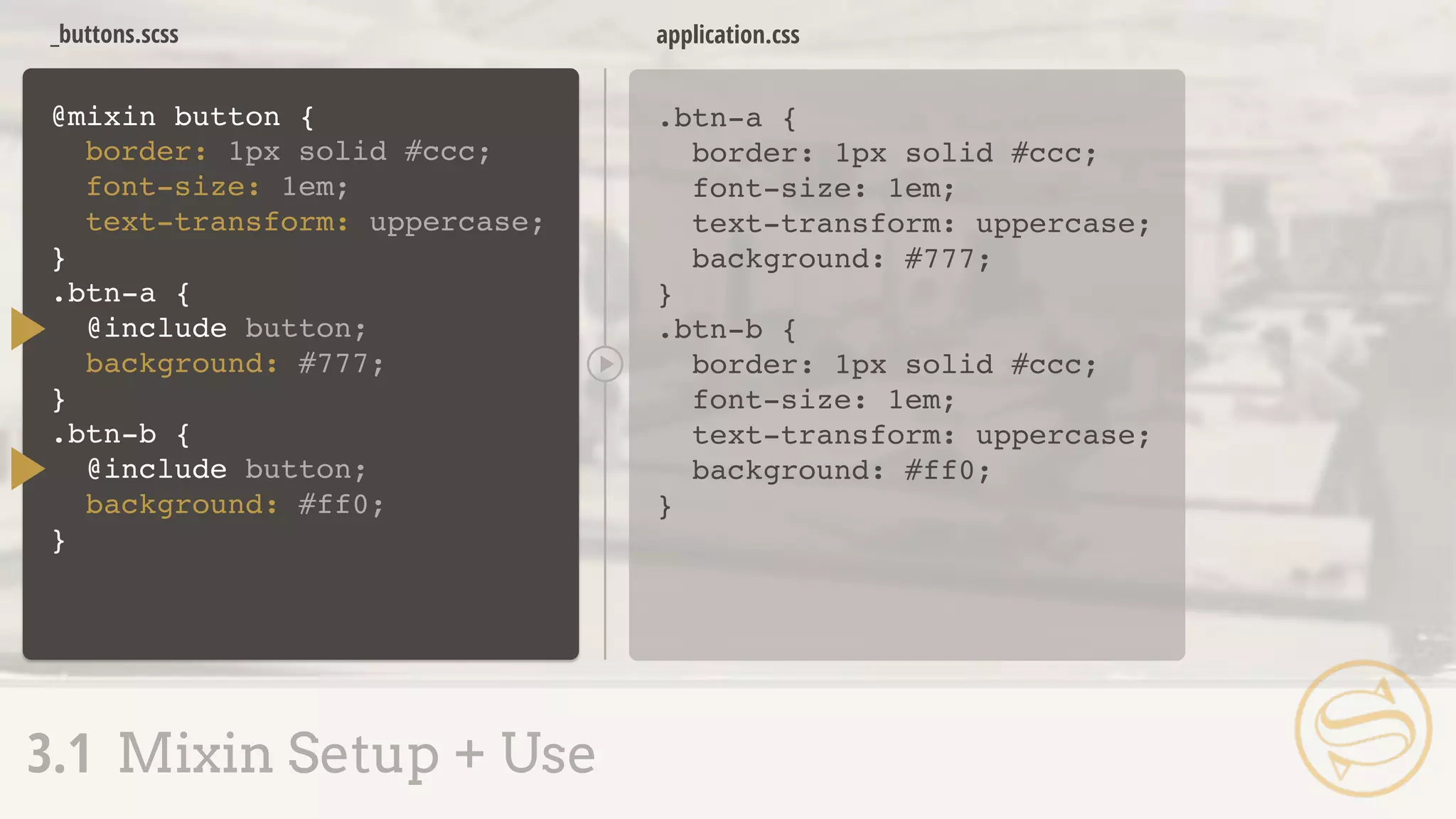
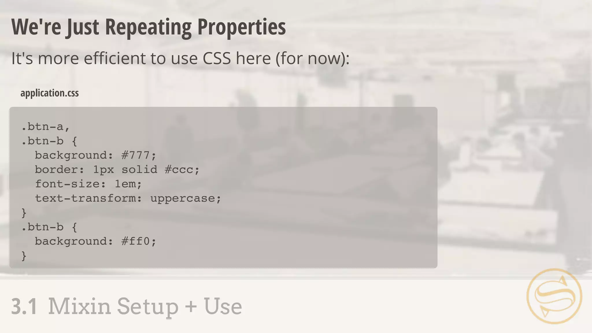
![.btn-a {
background: #777;
border: 1px solid #ccc;
font-size: 1em;
text-transform: uppercase;
}
.btn-b {
background: #ff0;
border: 1px solid #ccc;
font-size: 1em;
text-transform: uppercase;
}
application.css
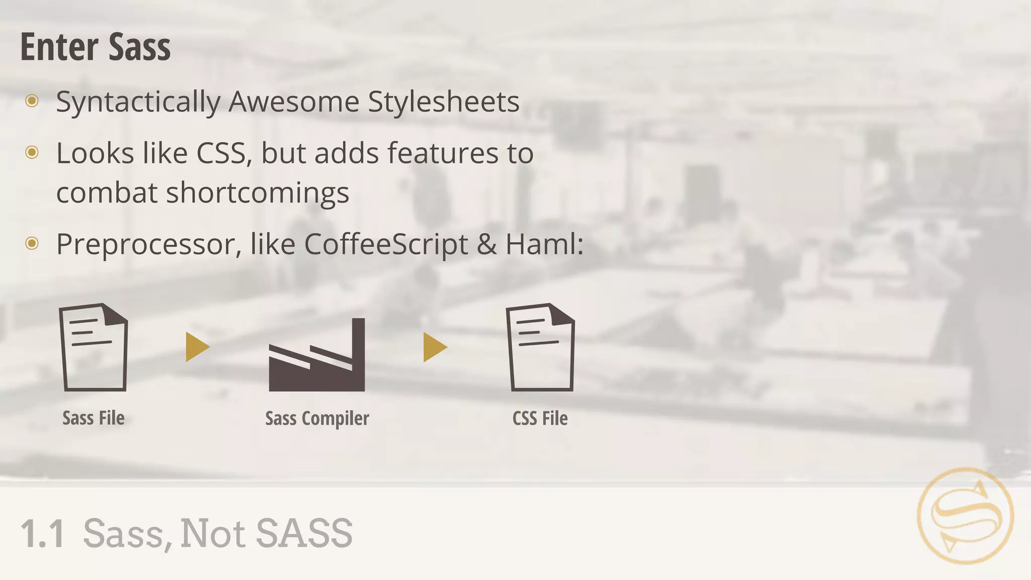
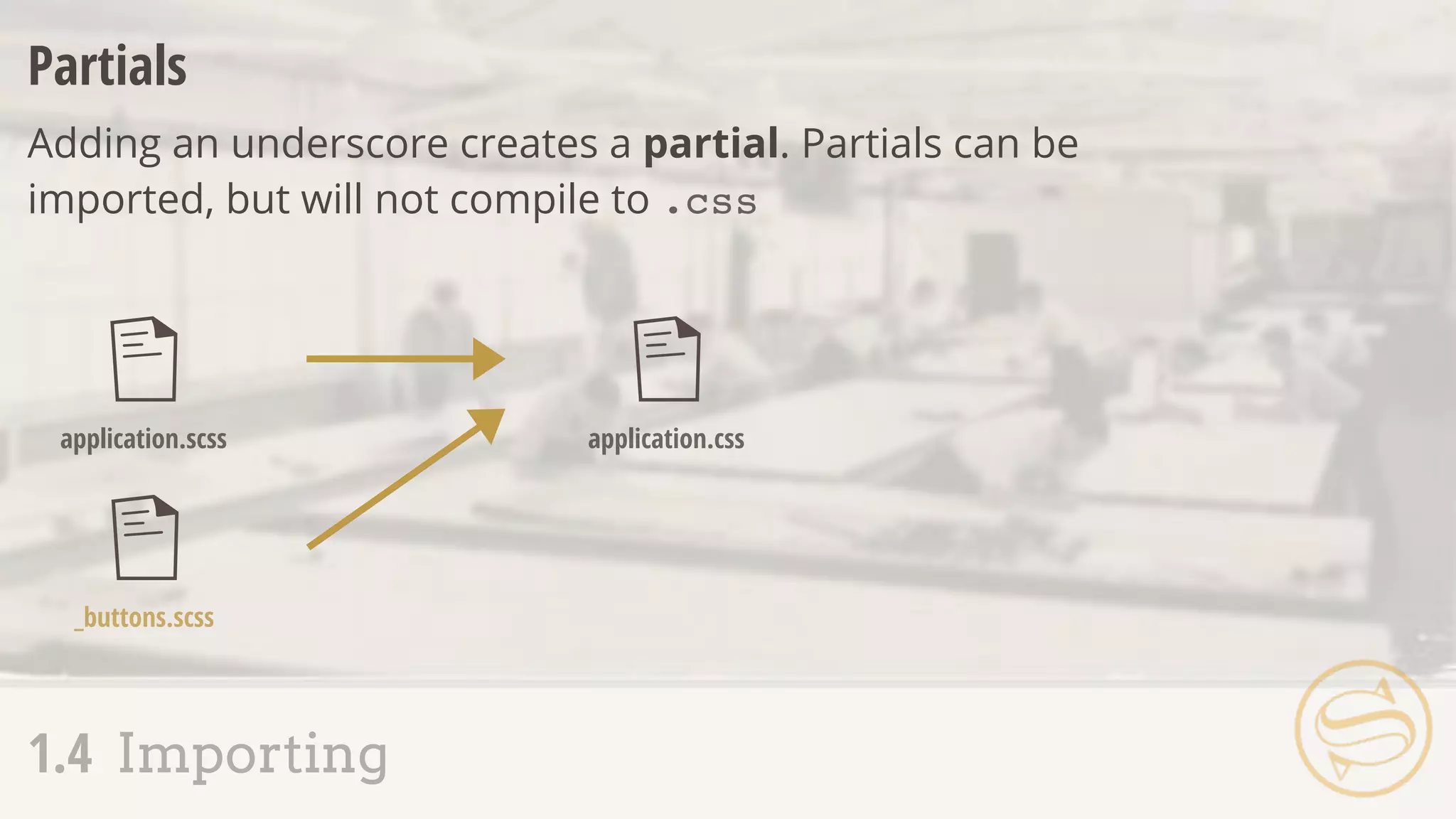
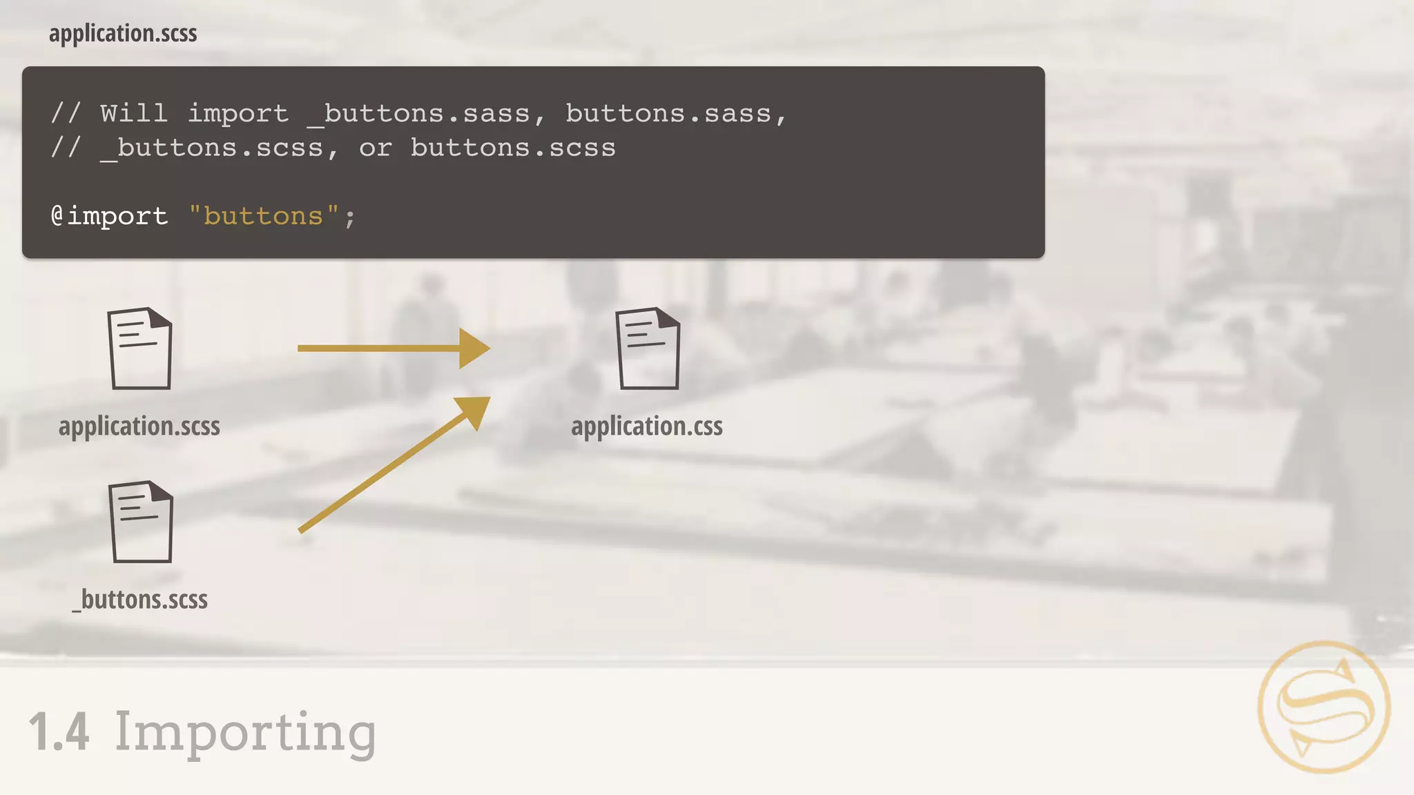
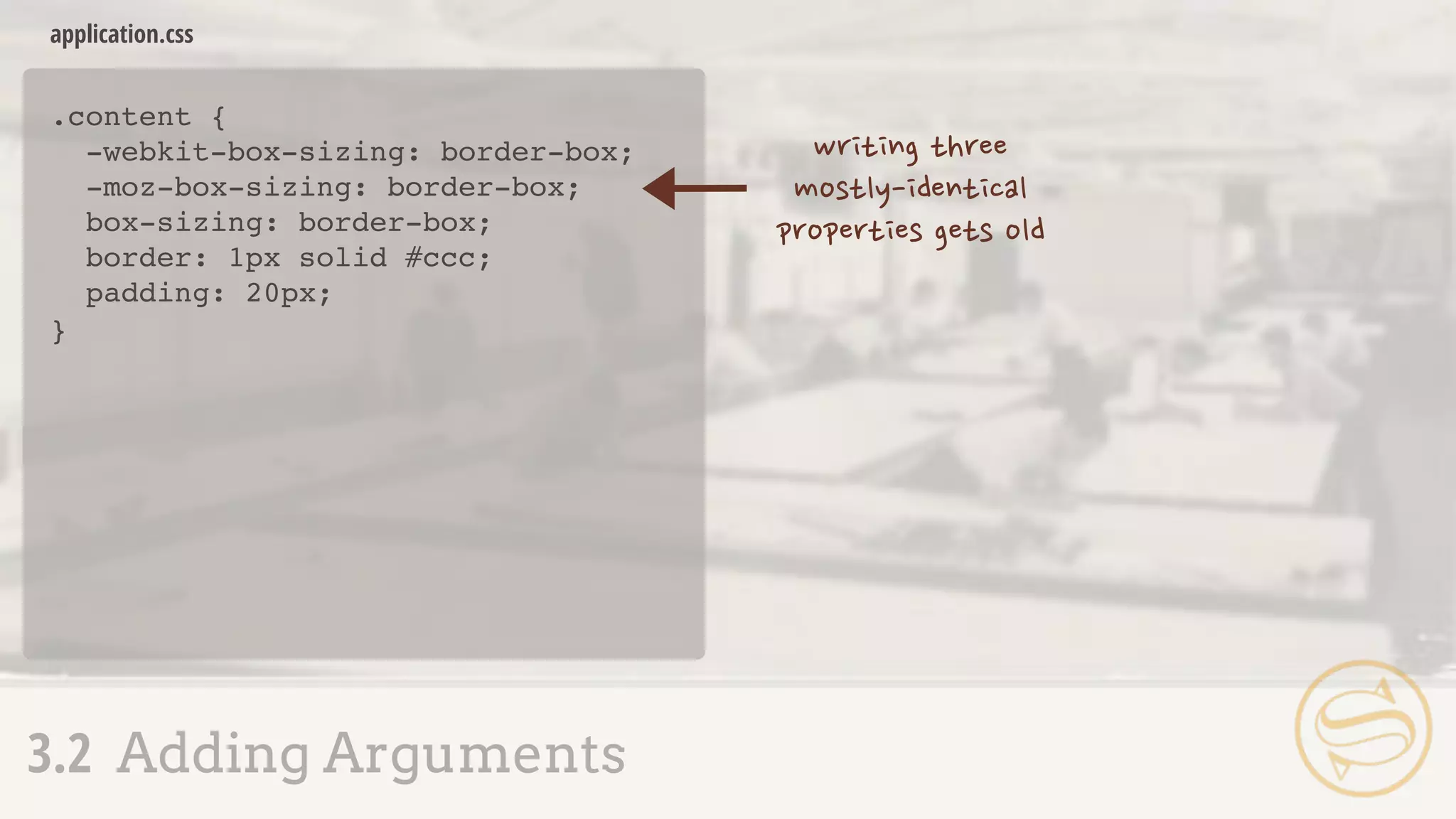
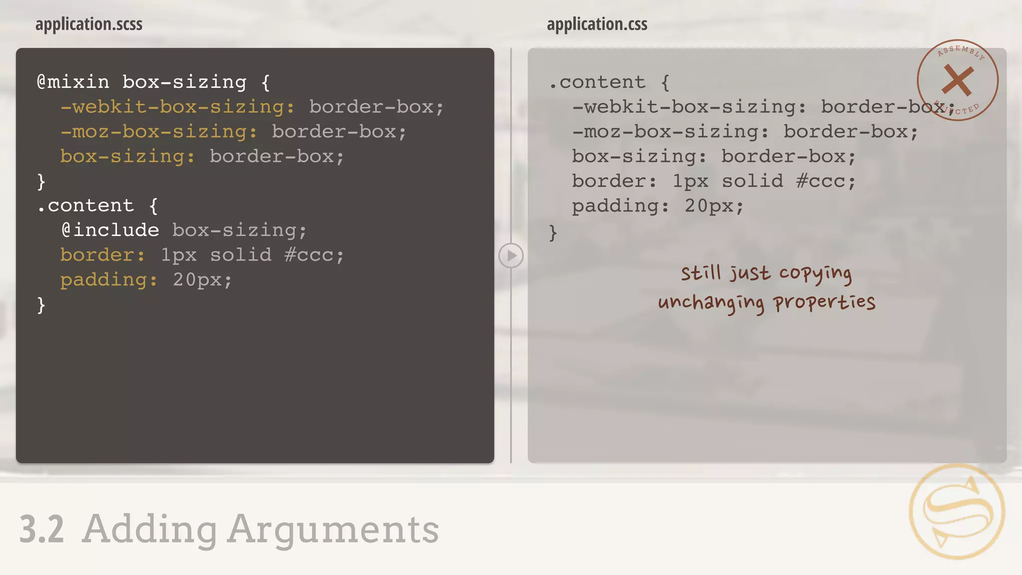
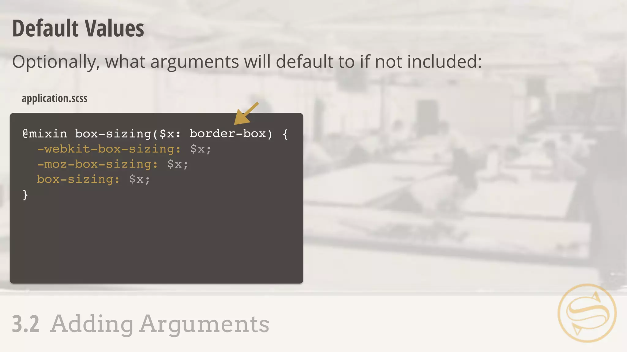
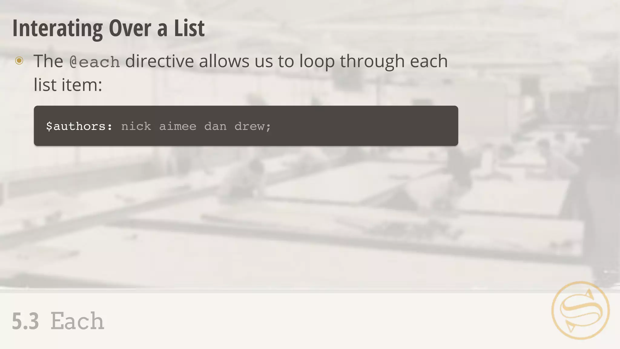
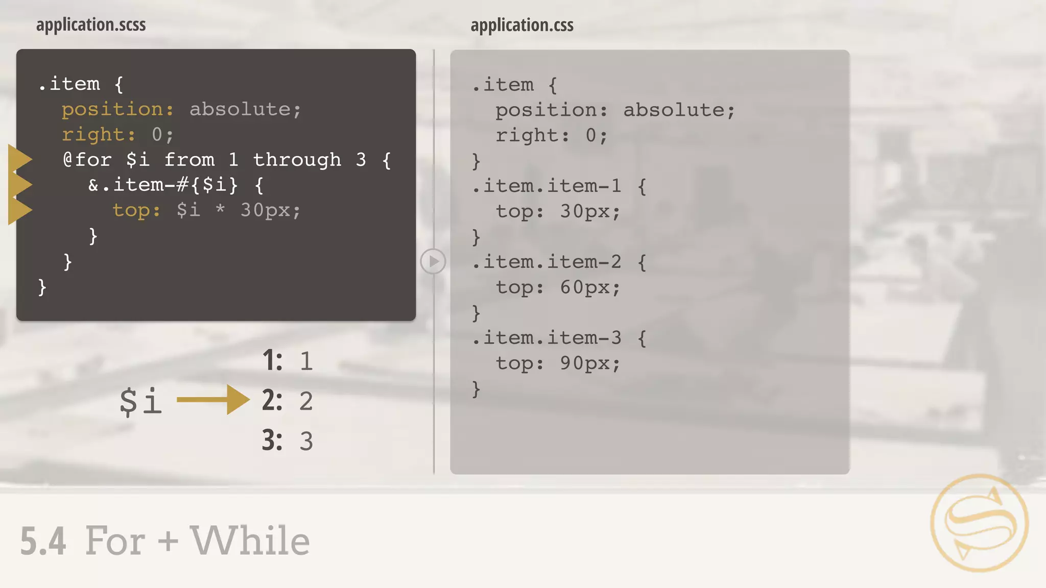
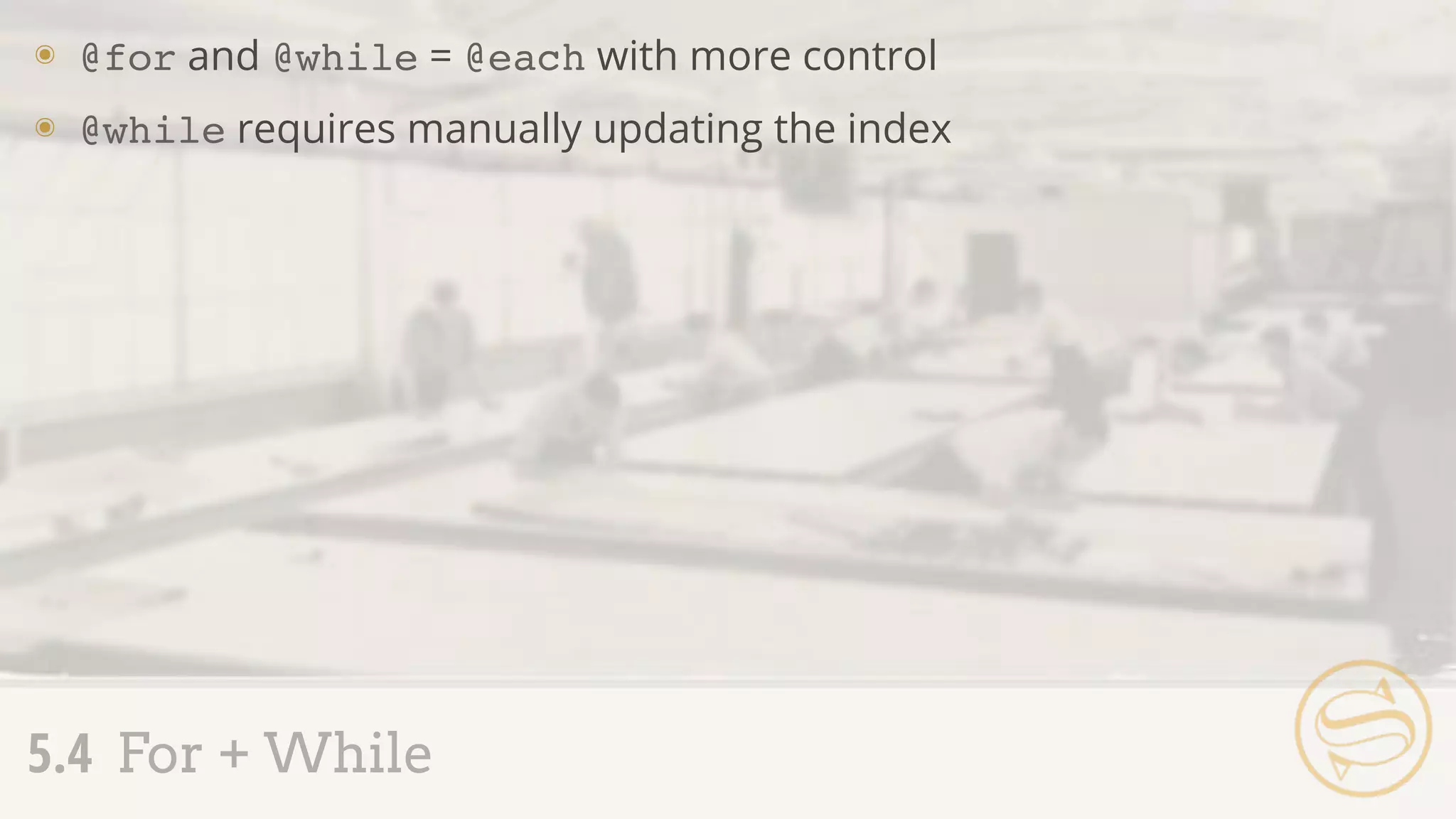
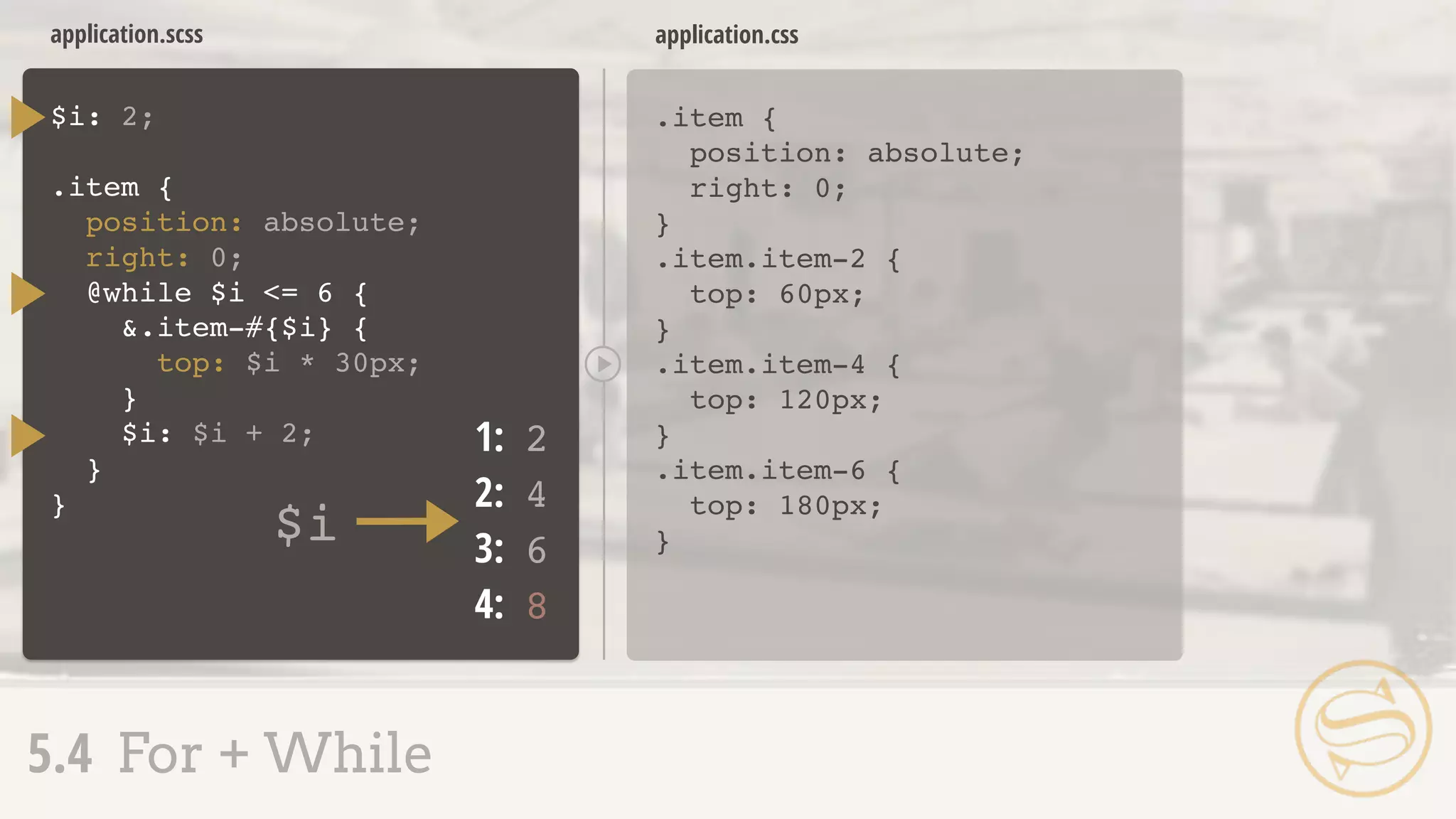
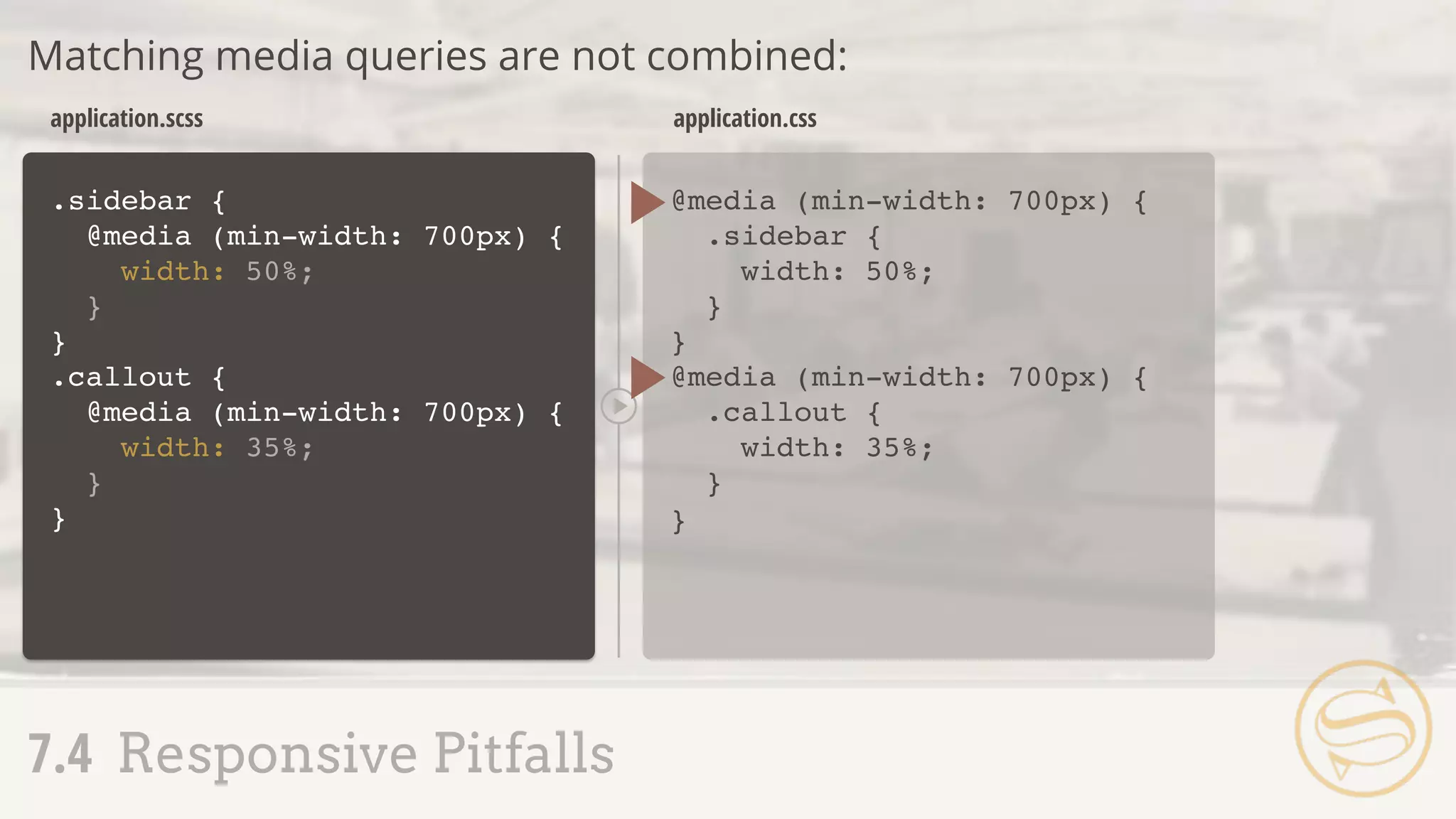
3.1 Mixin Setup + Use
A S S E M B L Y
R
E J E C T E D
]
]](https://image.slidesharecdn.com/sass-160611182912/75/Assembling-Sass-52-2048.jpg)
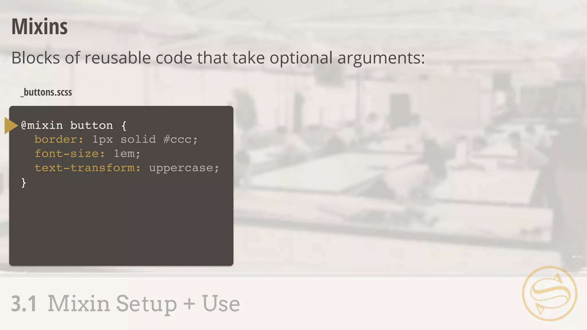


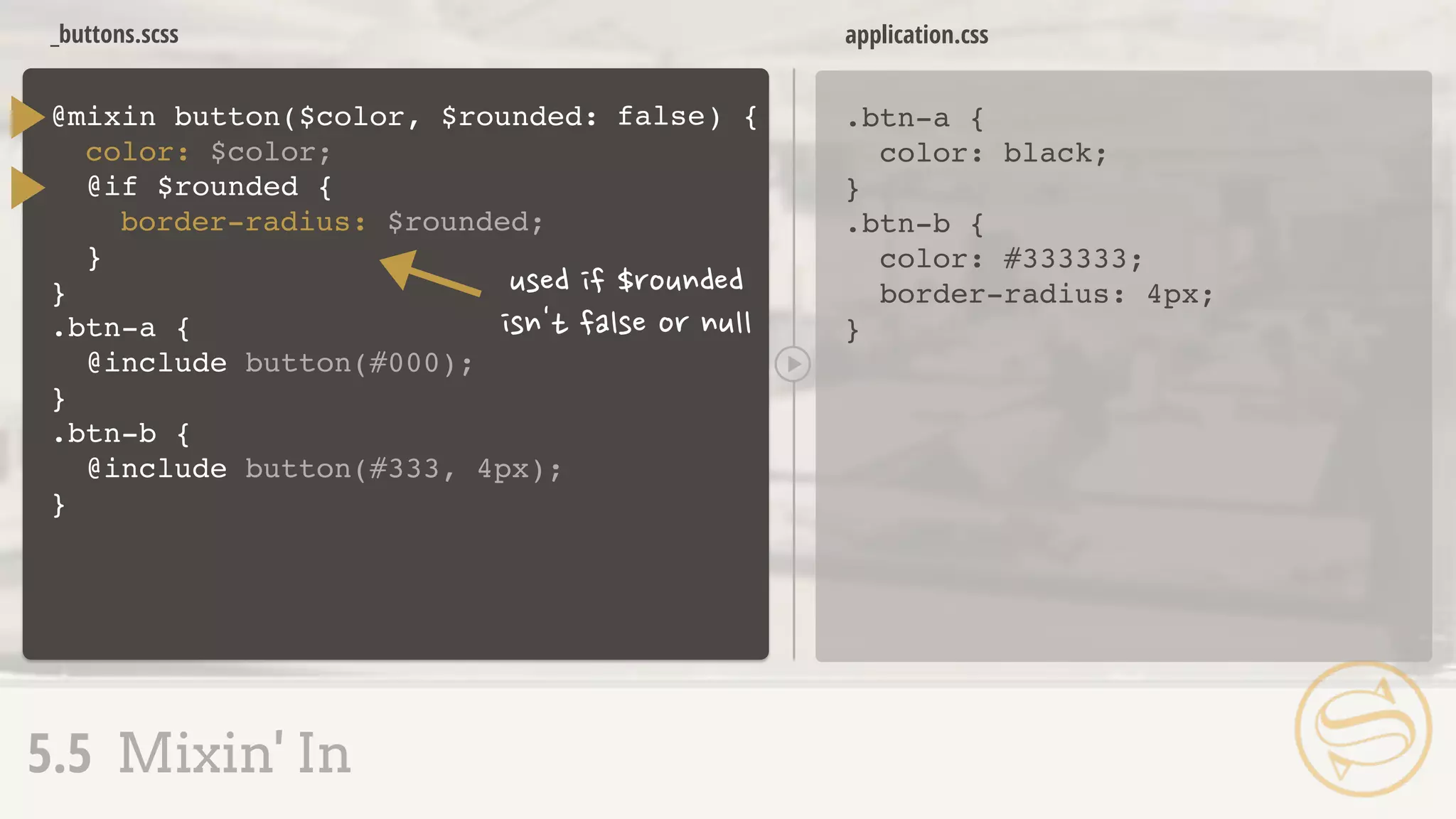
![@mixin button {
border: 1px solid #ccc;
font-size: 1em;
text-transform: uppercase;
}
.btn-a {
@include button;
background: #777;
}
.btn-b {
@include button;
background: #ff0;
}
_buttons.scss
.btn-a {
border: 1px solid #ccc;
font-size: 1em;
text-transform: uppercase;
background: #777;
}
.btn-b {
border: 1px solid #ccc;
font-size: 1em;
text-transform: uppercase;
background: #ff0;
}
application.css
A S S E M B L Y
R
E J E C T E D
3.1 Mixin Setup + Use
]
]](https://image.slidesharecdn.com/sass-160611182912/75/Assembling-Sass-57-2048.jpg)


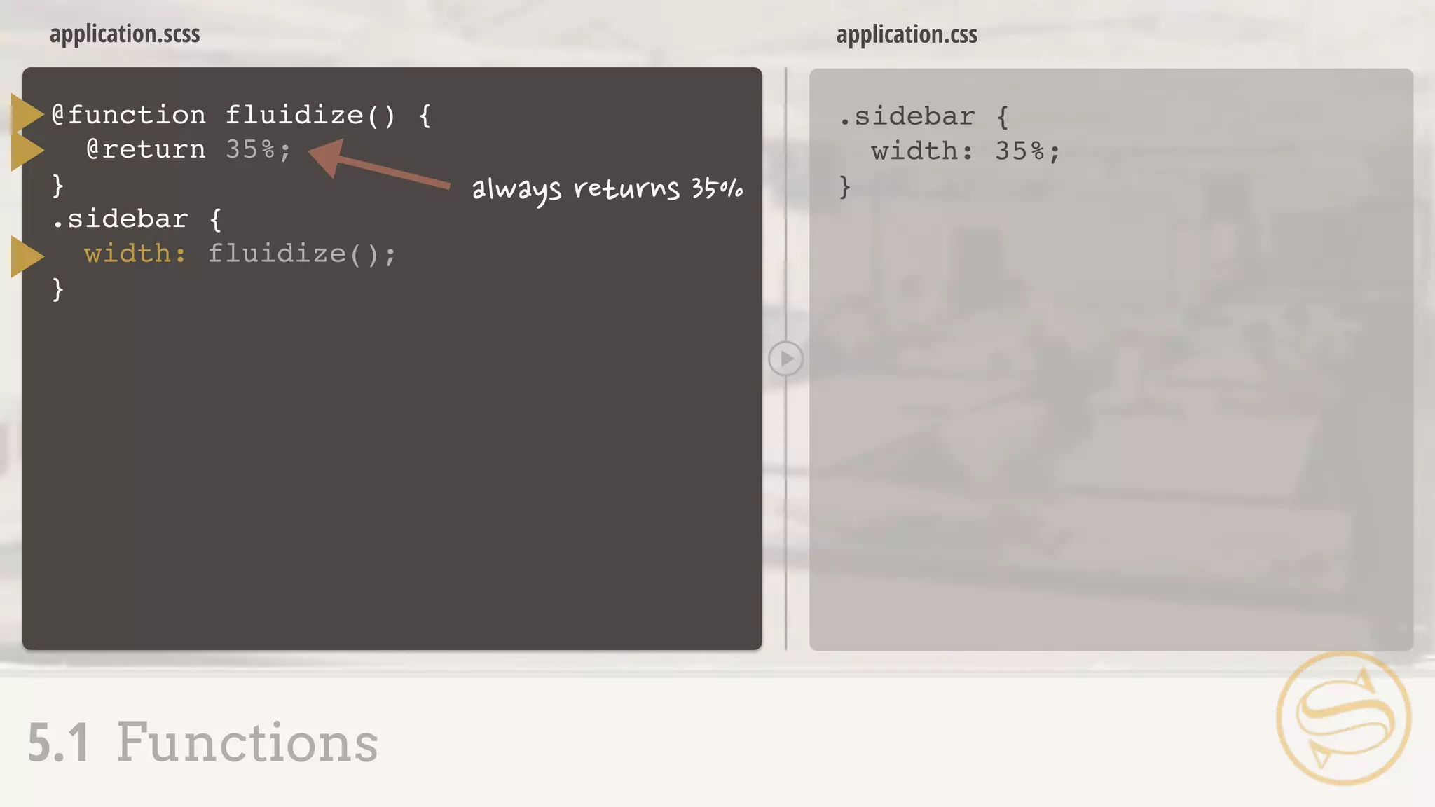


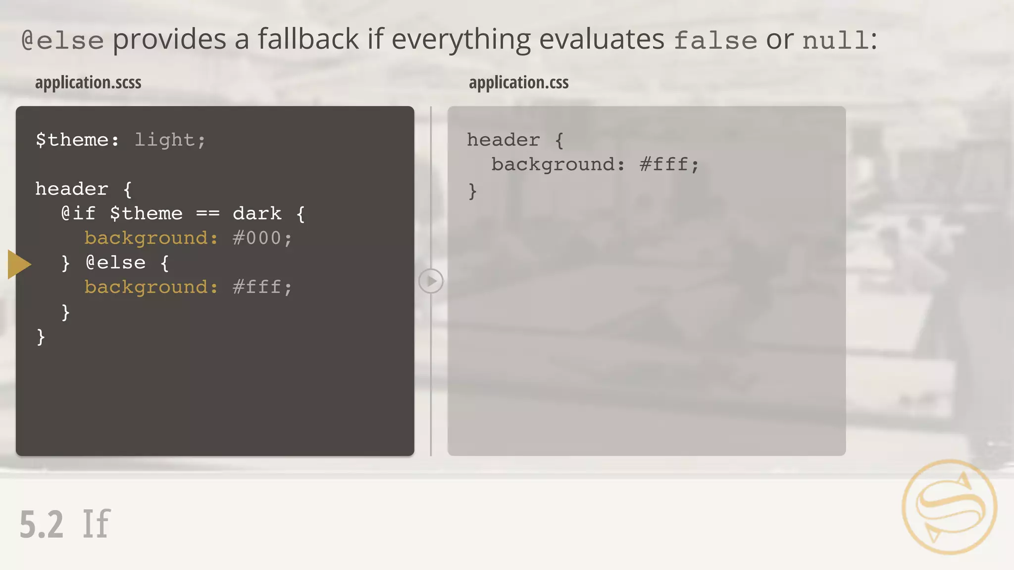


This document provides an introduction and overview of key concepts in Sass (Syntactically Awesome Style Sheets), a CSS preprocessor. It discusses Sass features like variables, nesting, mixins, and more. Sections include explaining the difference between Sass and SCSS syntax, how to use variables and assign different data types, scoping rules for variables, nesting selectors to reduce repetition, creating reusable code blocks with mixins, and passing arguments to mixins. The overall document serves as a foundation for learning the core aspects of the Sass preprocessor.


![Date difference[1]](https://cdn.slidesharecdn.com/ss_thumbnails/date-difference1-130203121126-phpapp01-thumbnail.jpg?width=640&height=640&fit=bounds)


![Seller Deck - Presentation [Concert L2].PPTX](https://cdn.slidesharecdn.com/ss_thumbnails/sellerdeck-presentationconcertl2-251219171156-24982daf-thumbnail.jpg?width=640&height=640&fit=bounds)


