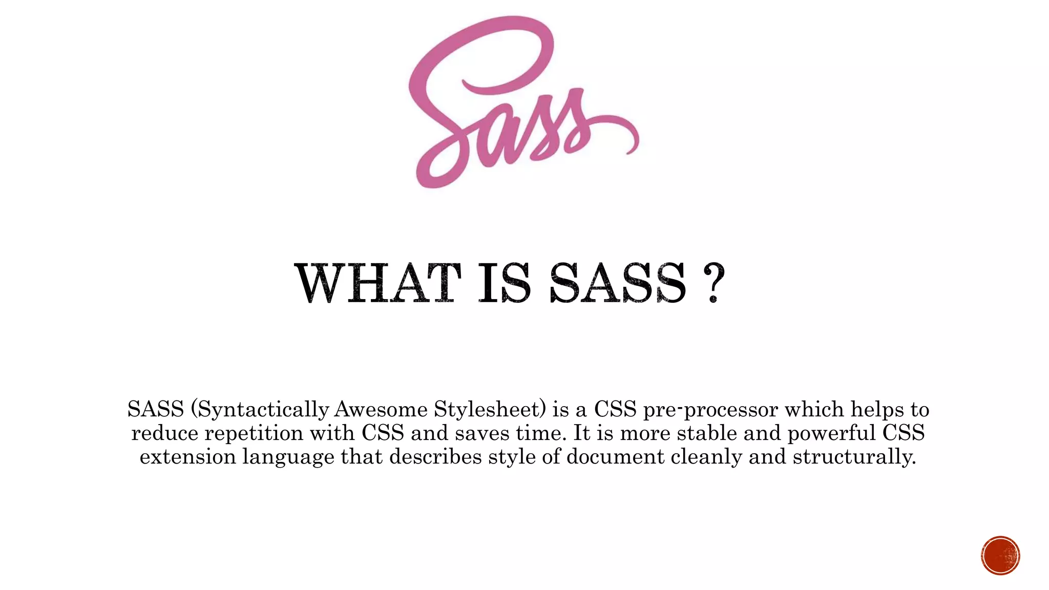
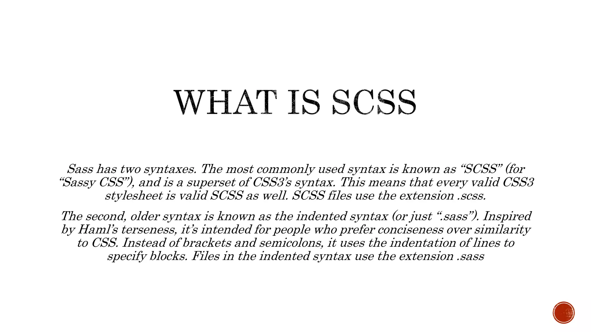
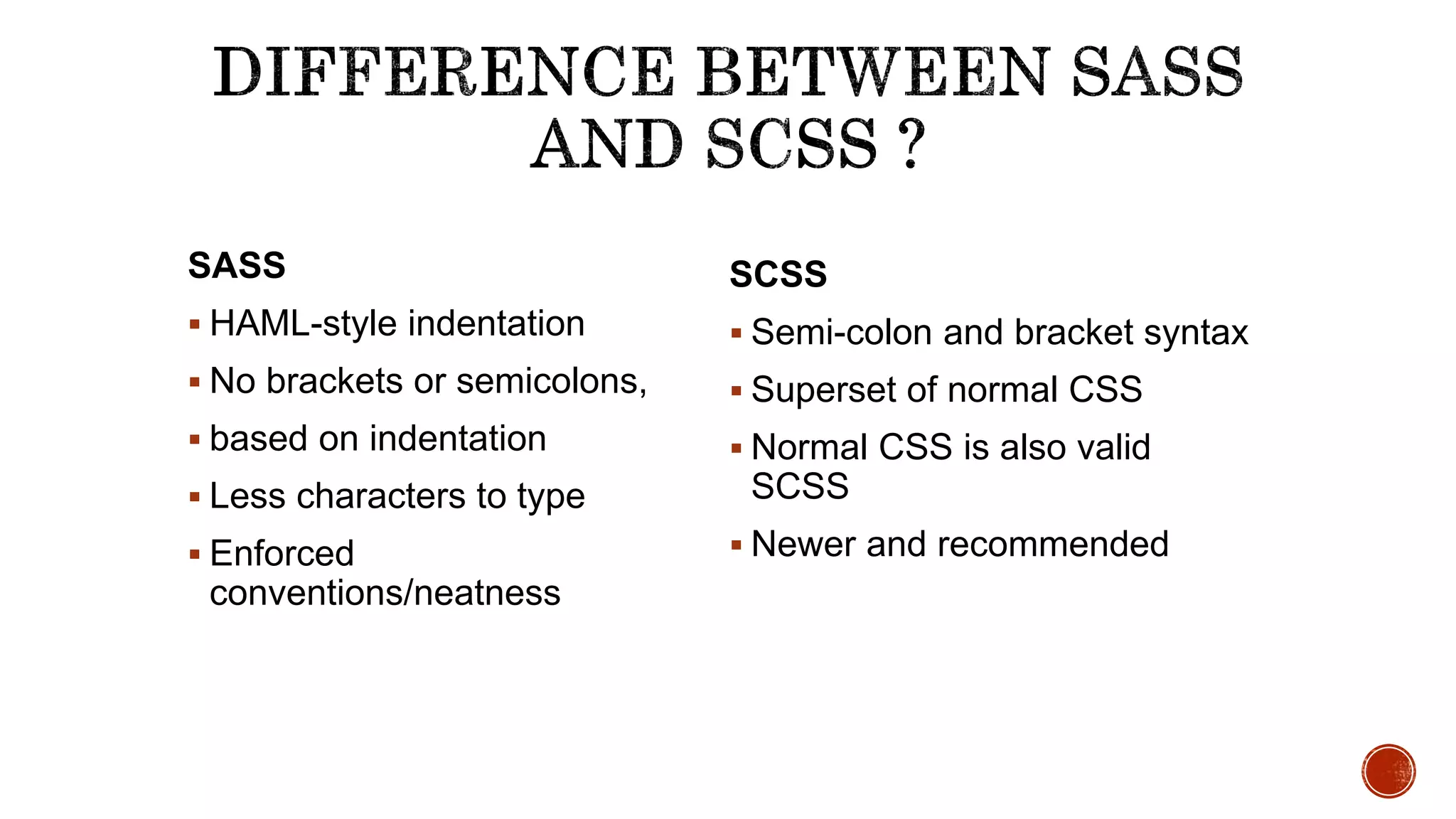
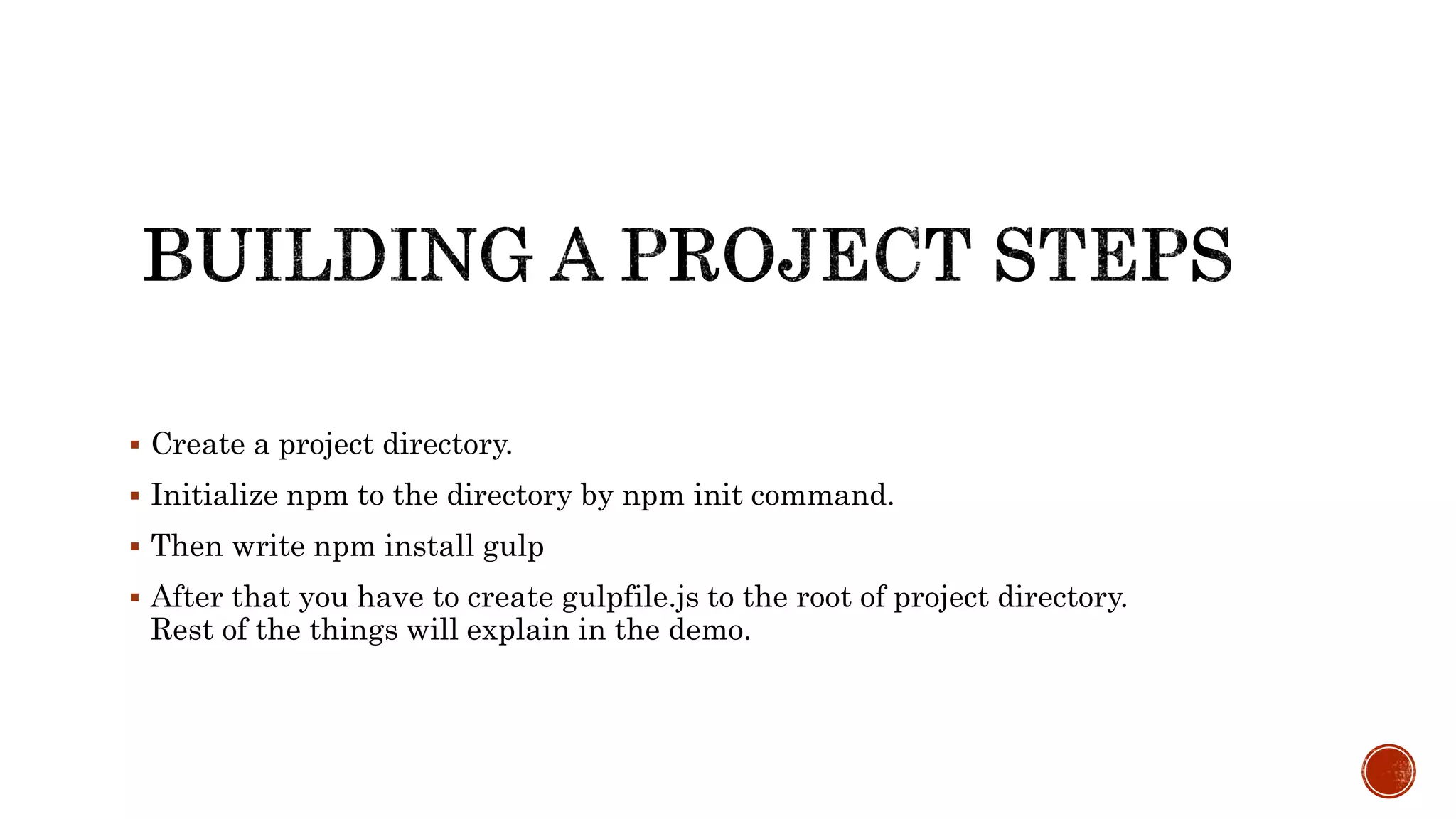
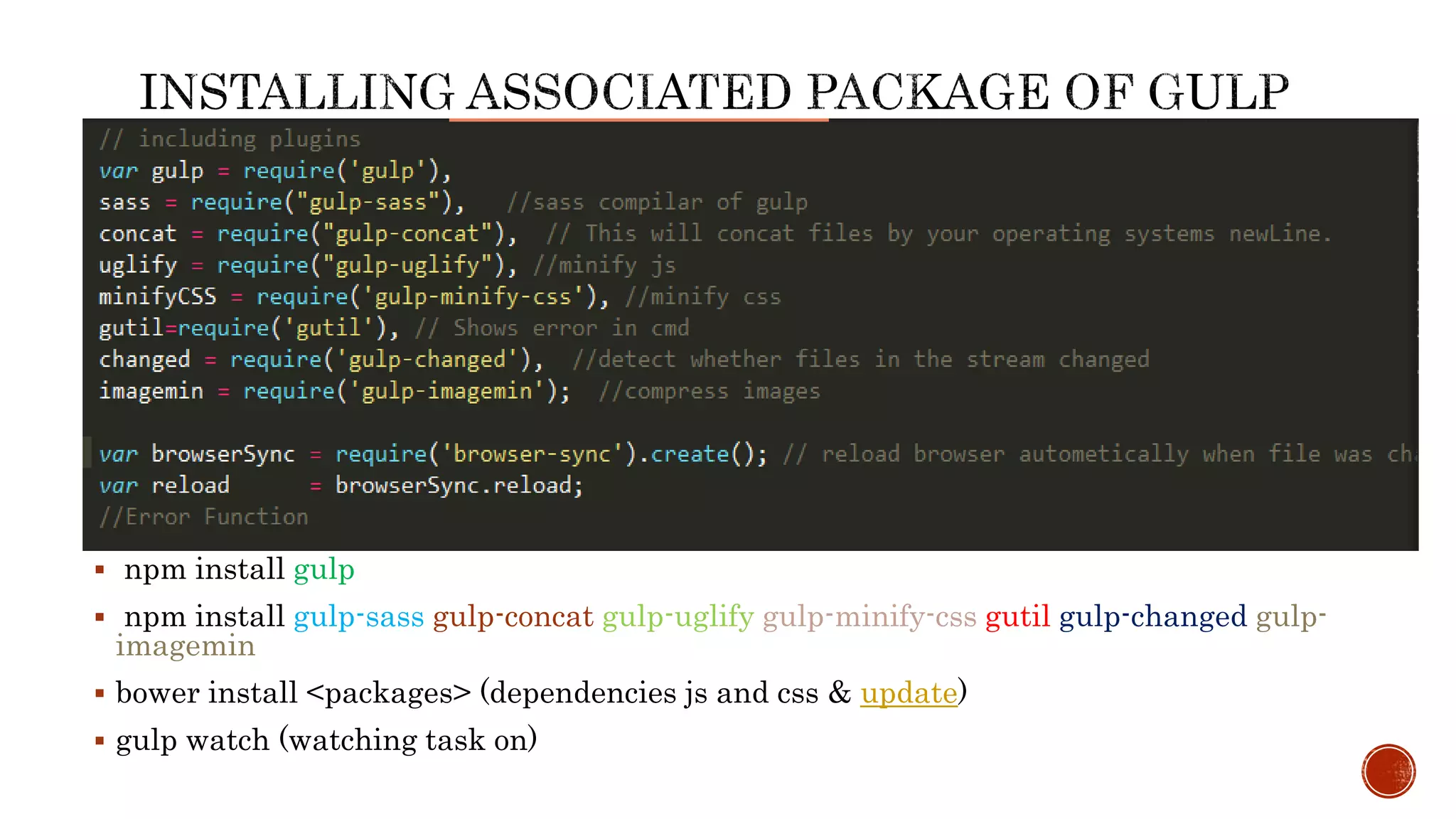
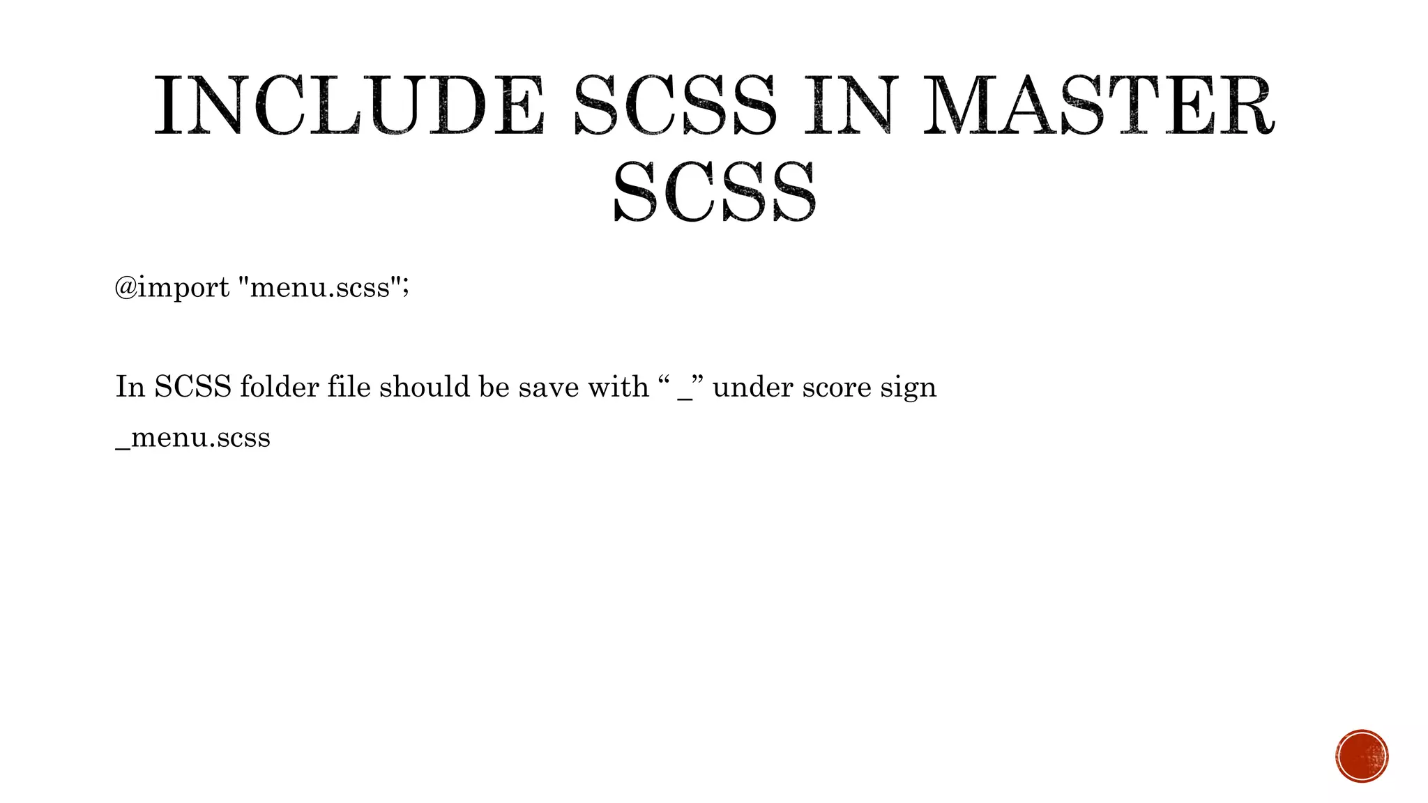
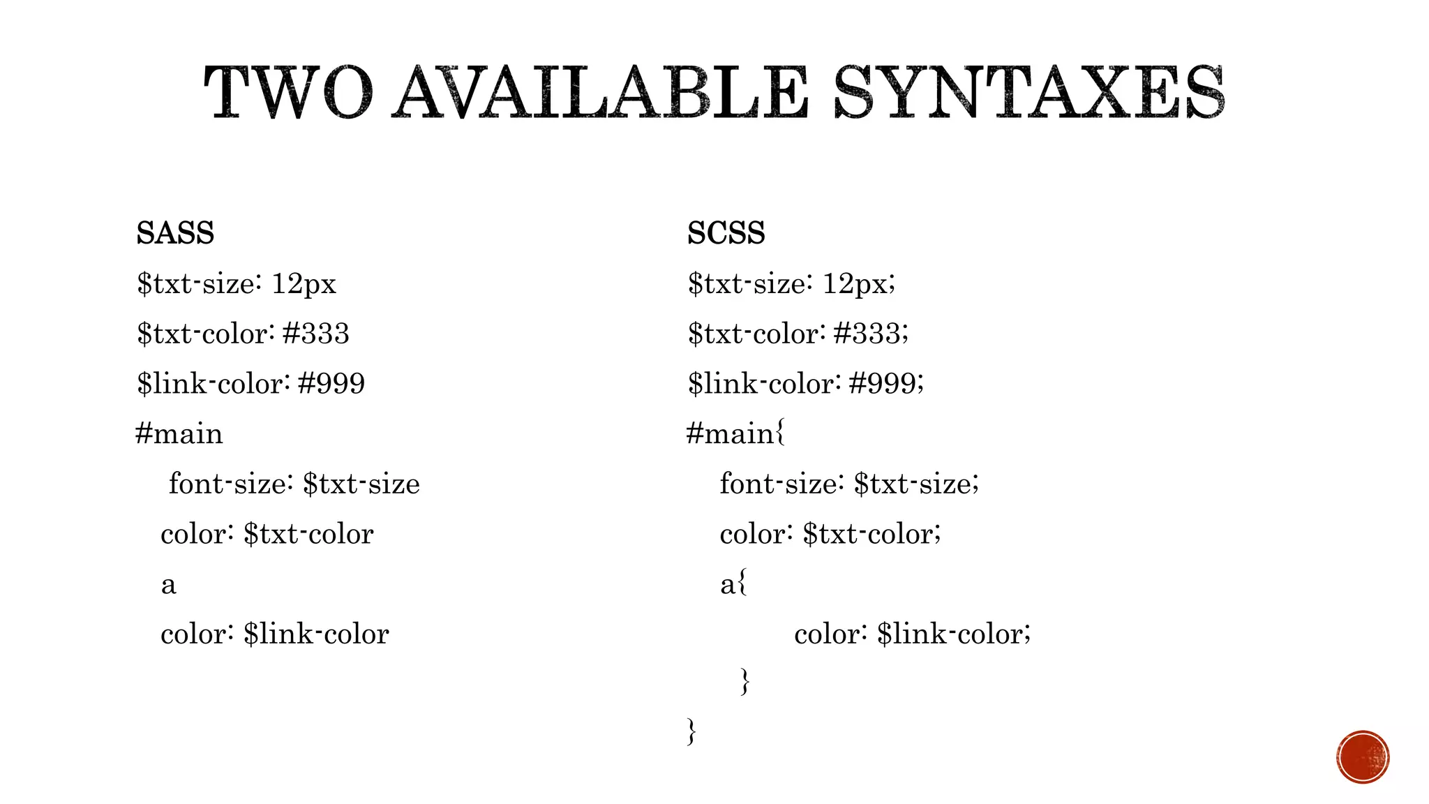
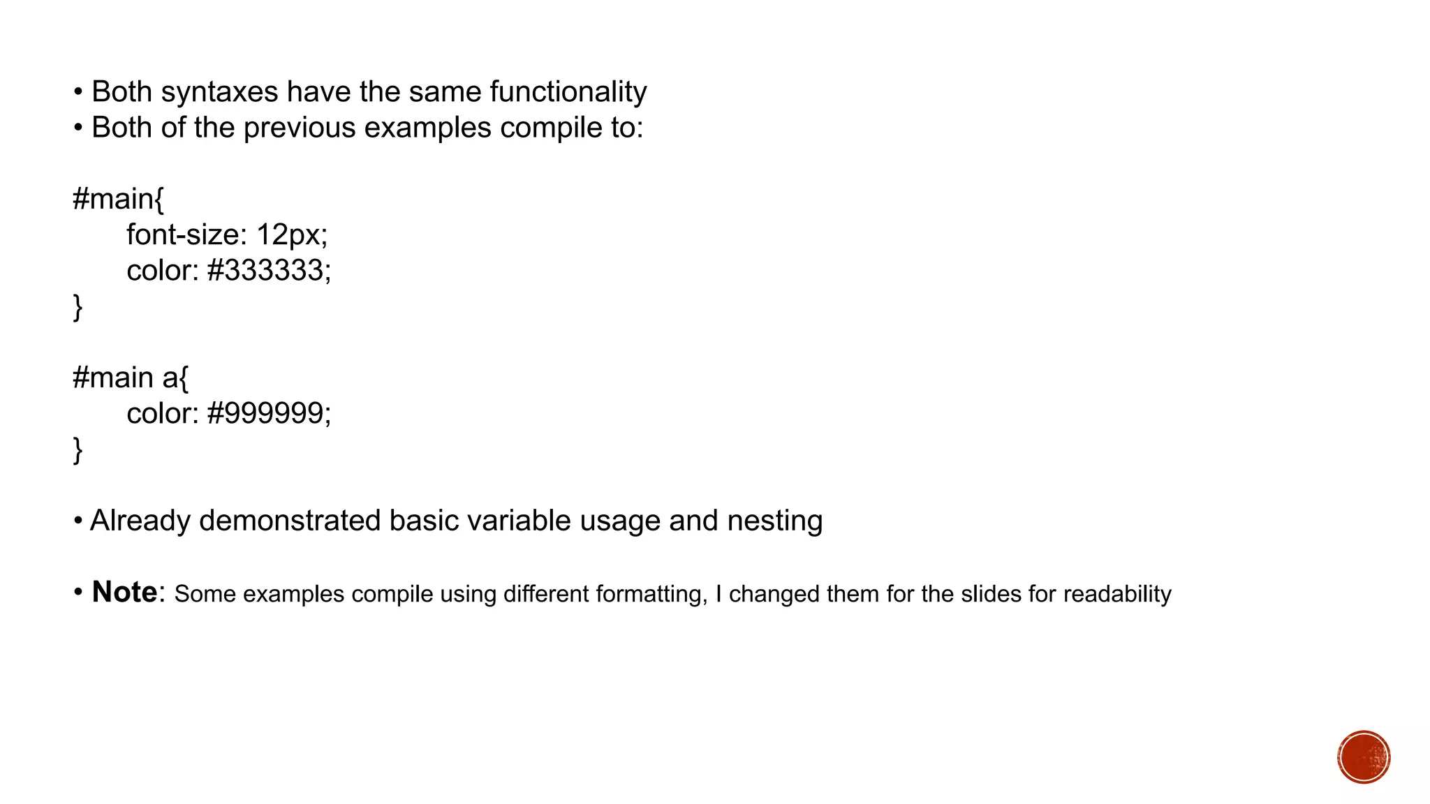
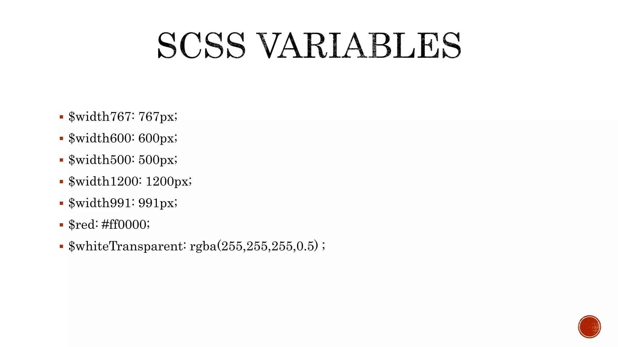
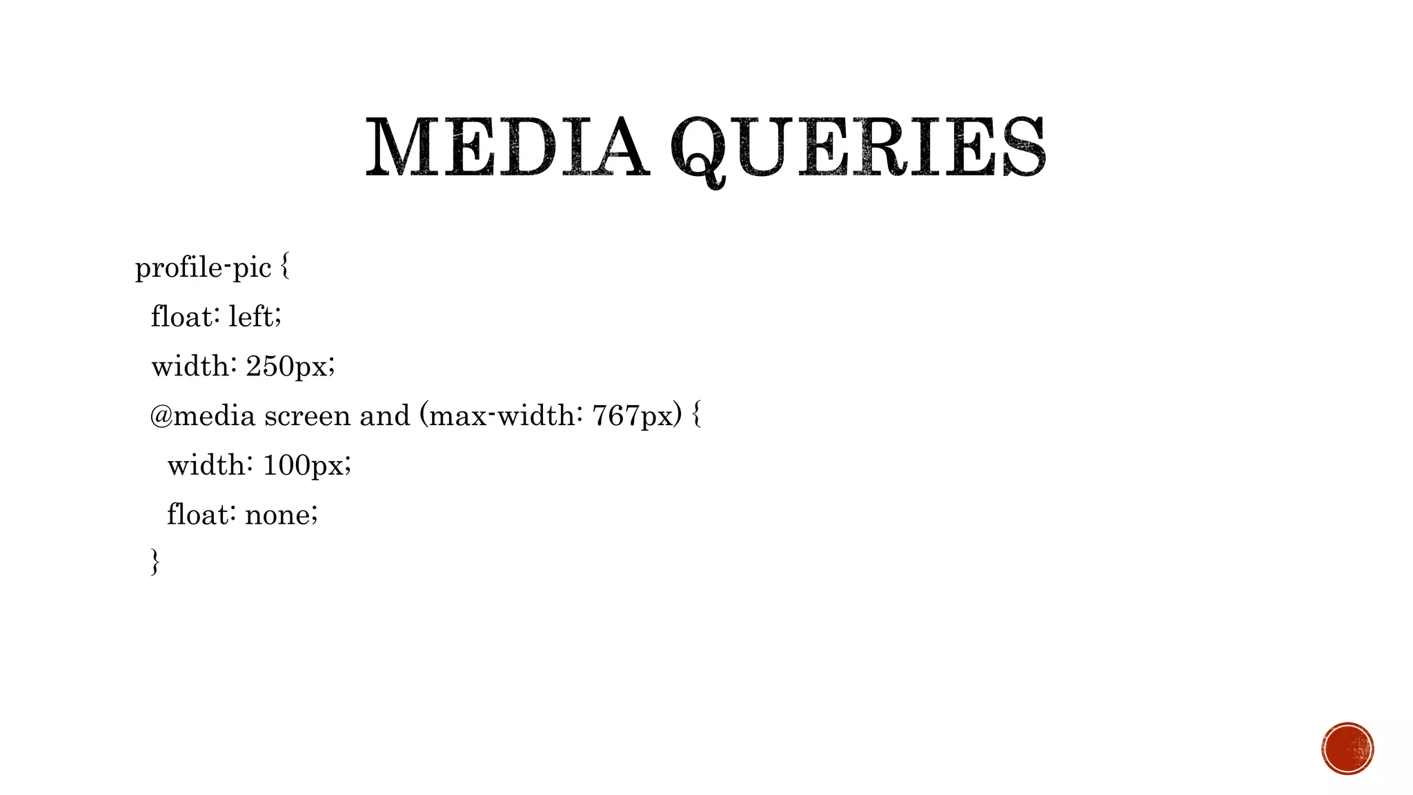
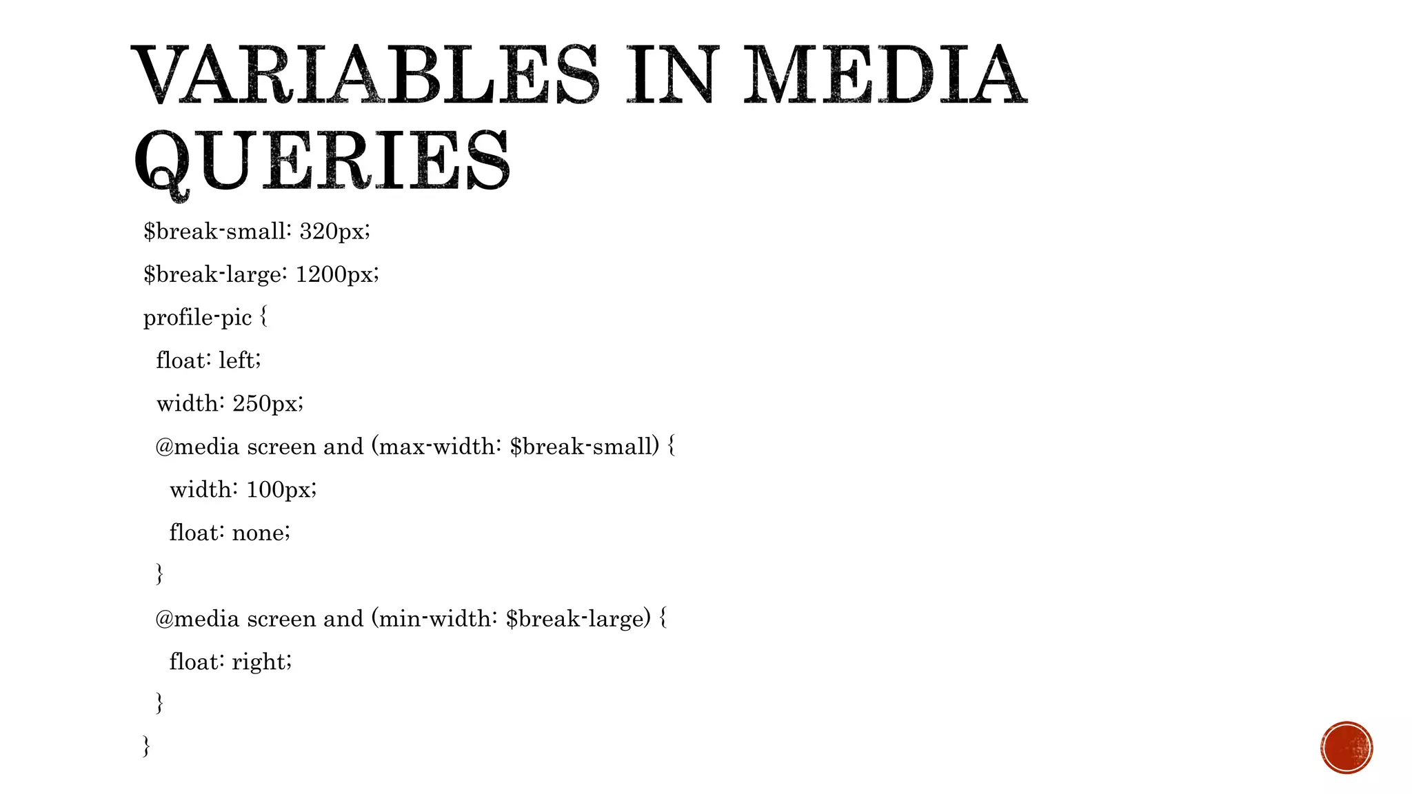
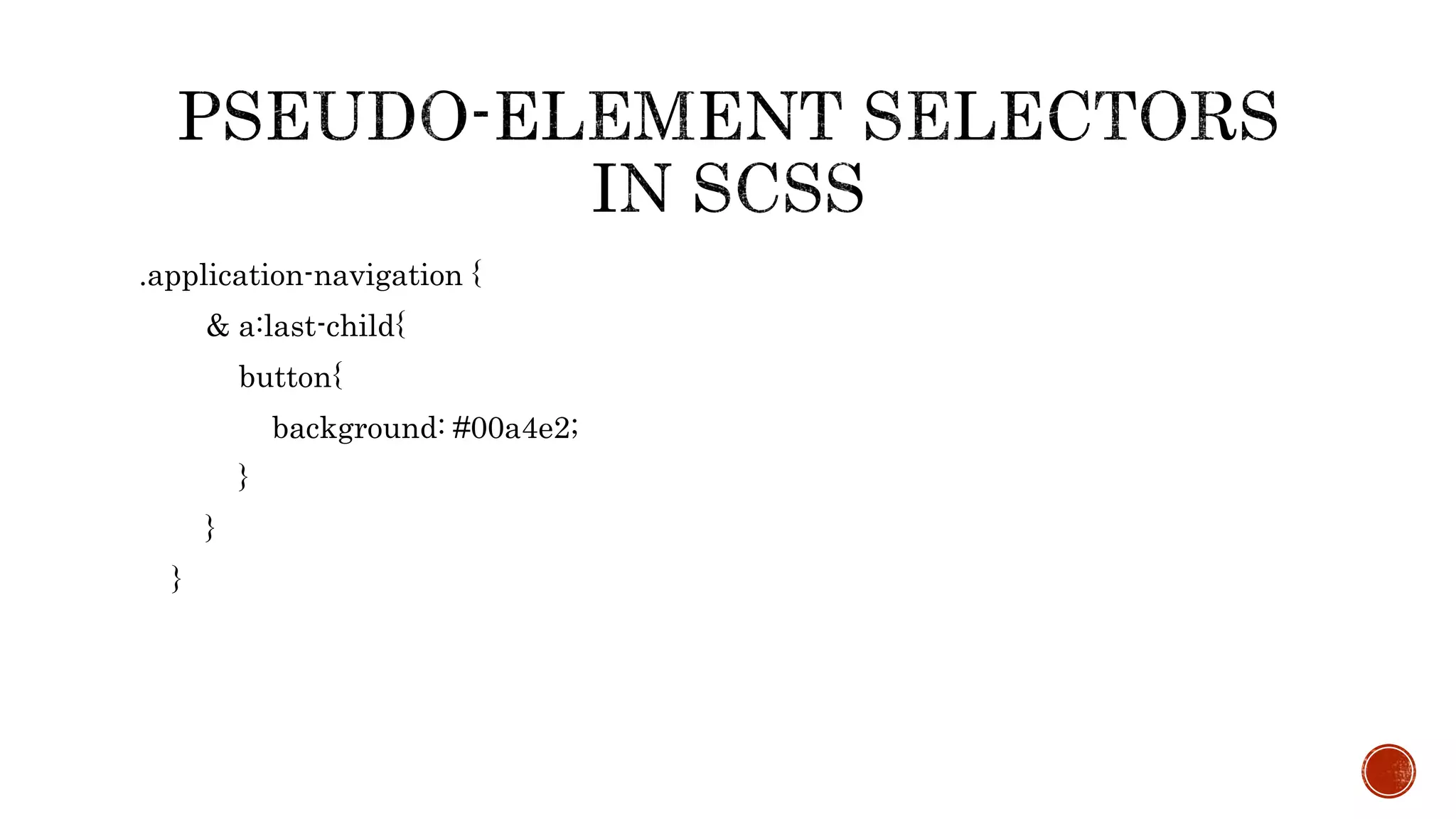
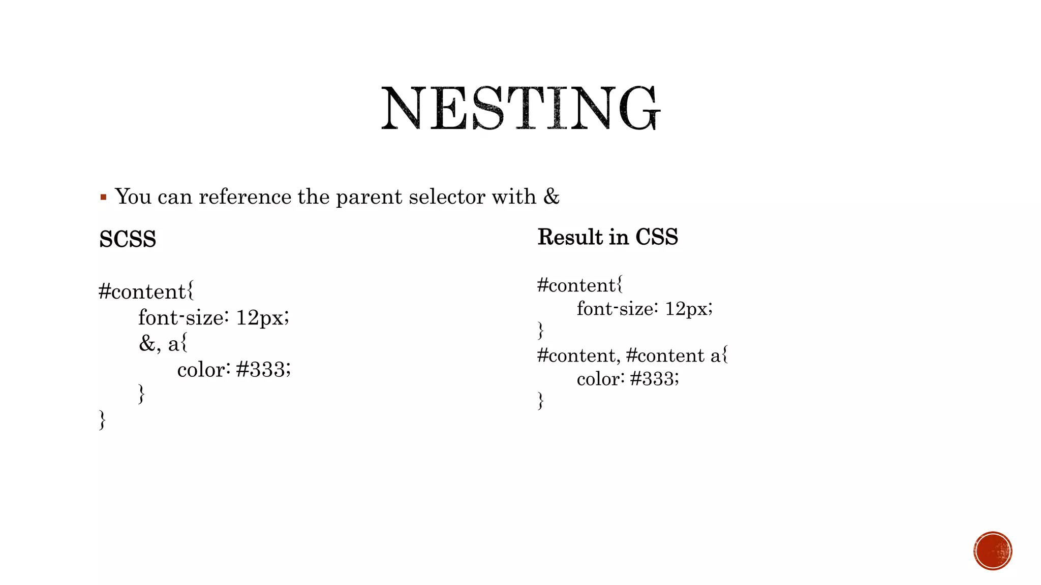
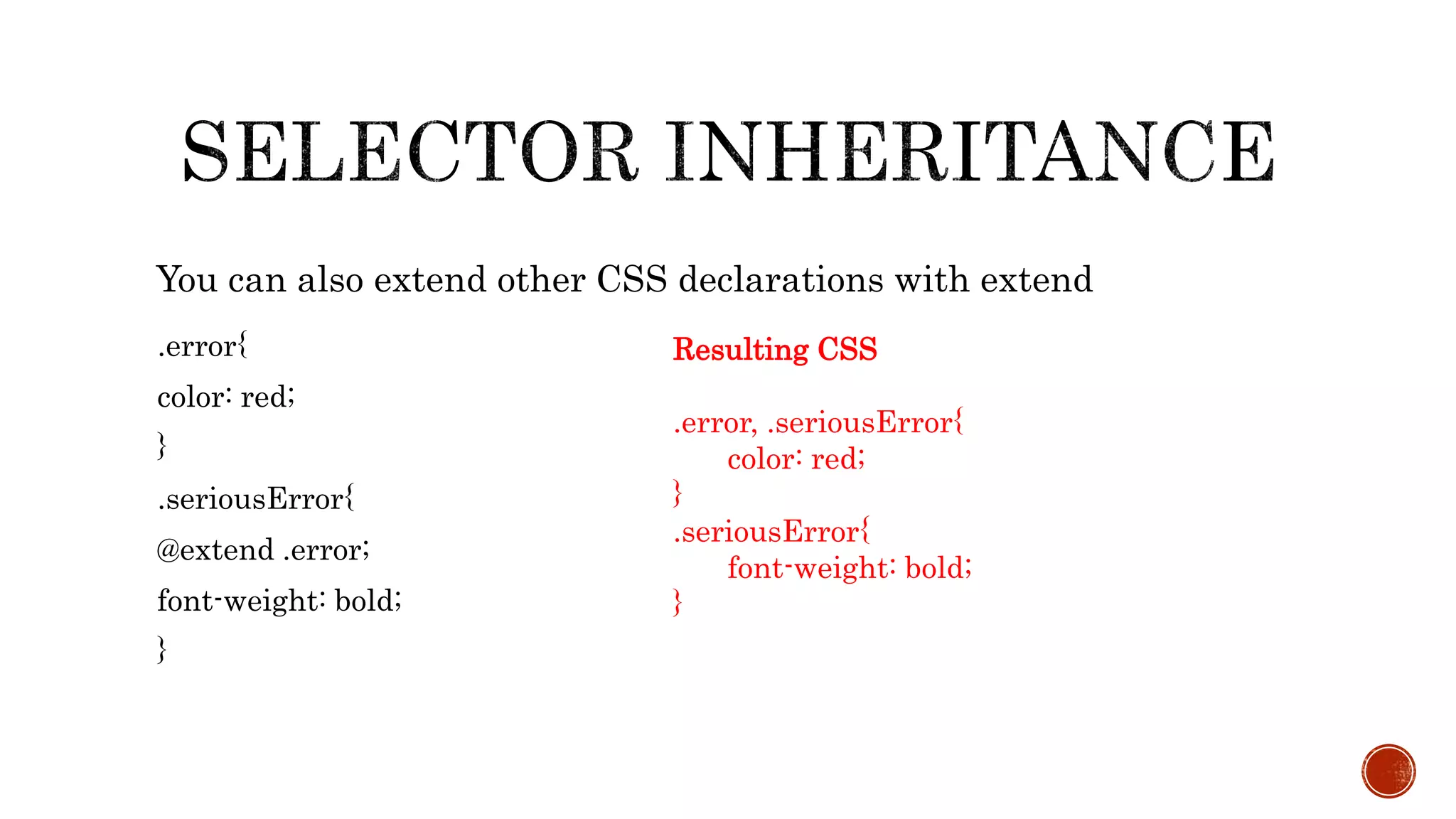
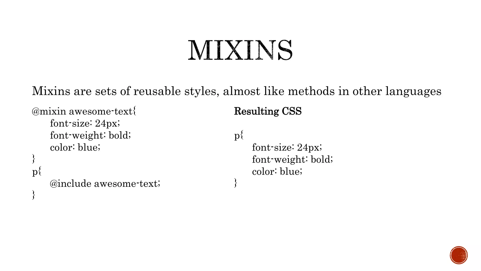
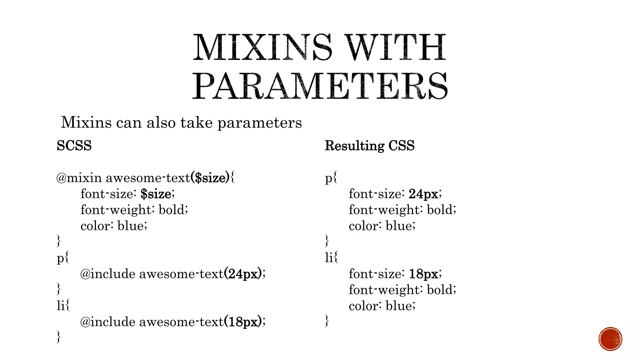
Sass's SCSS syntax is a superset of CSS.
SASS (Syntactically Awesome Stylesheet) is a CSS pre-processor which helps to
reduce repetition with CSS and saves time. It is more stable and powerful CSS
extension language that describes style of document cleanly and structurally.
Sass has two syntaxes. The most commonly used syntax is known as “SCSS” (for
“Sassy CSS”), and is a superset of CSS3’s syntax. This means that every valid CSS3
stylesheet is valid SCSS as well. SCSS files use the extension .scss.
The second, older syntax is known as the indented syntax (or just “.sass”). Inspired
by Haml’s terseness, it’s intended for people who prefer conciseness over similarity
to CSS. Instead of brackets and semicolons, it uses the indentation of lines to
specify blocks. Files in the indented syntax use the extension .sass
SASS
 HAML-style indentation
 No brackets or semicolons,
 based on indentation
 Less characters to type
 Enforced
conventions/neatness
SCSS
 Semi-colon and bracket syntax
 Superset of normal CSS
 Normal CSS is also valid
SCSS
 Newer and recommended
Sass allows you to write reusable methods and use logic statements, e., loops, and
conditionals.
Sass user can access Compass library and use some awesome features like dynamic sprite
map generation, legacy browser hacks and cross-browser support for CSS3 features.
Compass also allows you to add an external framework like Blueprint, Foundation or
Bootstrap on top.
In LESS, you can write a basic logic statement using a ‘guarded mixin’, which is equivalent
to Sass if statements.
In LESS, you can loop through numeric values using recursive functions while Sass allows
you to iterate any kind of data In Sass, you can write your own handy functions.
 Scss need a compiler to make scss to normal css.
There are a couple of ways to start using Sass.
1. APPLICATIONS
2. COMMAND LINE
We are using command line to watch live changes of the development of frontend.
Command line approach can be done various ways.
1. npm
2. Chocolatey
3. Homebrew (OsX)
We are using npm (Node Package Manager) to compile the scss to css.
 Gulp is a toolkit for automating development workflow.
 Gulp is a nodejs package and install with npm and npm is a package manager
ships with nodejs. So before installing gulp you need to install following things.
 Install nodejs to your system.
 Install gulp, follow the gulp document.
 Create a project directory.
 Initialize npm to the directory by npm init command.
 Then write npm install gulp
 After that you have to create gulpfile.js to the root of project directory.
Rest of the things will explain in the demo.
 npm install gulp
 npm install gulp-sass gulp-concat gulp-uglify gulp-minify-css gutil gulp-changed gulp-
imagemin
 bower install <packages> (dependencies js and css & update)
 gulp watch (watching task on)
@import "menu.scss";
In SCSS folder file should be save with “ _” under score sign
_menu.scss
SASS
$txt-size: 12px
$txt-color: #333
$link-color: #999
#main
font-size: $txt-size
color: $txt-color
a
color: $link-color
SCSS
$txt-size: 12px;
$txt-color: #333;
$link-color: #999;
#main{
font-size: $txt-size;
color: $txt-color;
a{
color: $link-color;
}
}
• Both syntaxes have the same functionality
• Both of the previous examples compile to:
#main{
font-size: 12px;
color: #333333;
}
#main a{
color: #999999;
}
• Already demonstrated basic variable usage and nesting
• Note: Some examples compile using different formatting, I changed them for the slides for readability
 $width767: 767px;
 $width600: 600px;
 $width500: 500px;
 $width1200: 1200px;
 $width991: 991px;
 $red: #ff0000;
 $whiteTransparent: rgba(255,255,255,0.5) ;
profile-pic {
float: left;
width: 250px;
@media screen and (max-width: 767px) {
width: 100px;
float: none;
}
$break-small: 320px;
$break-large: 1200px;
profile-pic {
float: left;
width: 250px;
@media screen and (max-width: $break-small) {
width: 100px;
float: none;
}
@media screen and (min-width: $break-large) {
float: right;
}
}
.application-navigation {
& a:last-child{
button{
background: #00a4e2;
}
}
}
 You can reference the parent selector with &
SCSS
#content{
font-size: 12px;
&, a{
color: #333;
}
}
Result in CSS
#content{
font-size: 12px;
}
#content, #content a{
color: #333;
}
.error{
color: red;
}
.seriousError{
@extend .error;
font-weight: bold;
}
You can also extend other CSS declarations with extend
Resulting CSS
.error, .seriousError{
color: red;
}
.seriousError{
font-weight: bold;
}
Mixins are sets of reusable styles, almost like methods in other languages
@mixin awesome-text{
font-size: 24px;
font-weight: bold;
color: blue;
}
p{
@include awesome-text;
}
Resulting CSS
p{
font-size: 24px;
font-weight: bold;
color: blue;
}
Mixins can also take parameters
SCSS
@mixin awesome-text($size){
font-size: $size;
font-weight: bold;
color: blue;
}
p{
@include awesome-text(24px);
}
li{
@include awesome-text(18px);
}
Resulting CSS
p{
font-size: 24px;
font-weight: bold;
color: blue;
}
li{
font-size: 18px;
font-weight: bold;
color: blue;
}
PRESENTED BY
Ashutosh Bhardwaj
Kaushik Das
www.citytechcorp.com

Syntactically Awesome Stylesheet - A workshop by Citytech Software

  • 1.
    Sass's SCSS syntaxis a superset of CSS.
  • 2.
    SASS (Syntactically AwesomeStylesheet) is a CSS pre-processor which helps to reduce repetition with CSS and saves time. It is more stable and powerful CSS extension language that describes style of document cleanly and structurally.
  • 3.
    Sass has twosyntaxes. The most commonly used syntax is known as “SCSS” (for “Sassy CSS”), and is a superset of CSS3’s syntax. This means that every valid CSS3 stylesheet is valid SCSS as well. SCSS files use the extension .scss. The second, older syntax is known as the indented syntax (or just “.sass”). Inspired by Haml’s terseness, it’s intended for people who prefer conciseness over similarity to CSS. Instead of brackets and semicolons, it uses the indentation of lines to specify blocks. Files in the indented syntax use the extension .sass
  • 4.
    SASS  HAML-style indentation No brackets or semicolons,  based on indentation  Less characters to type  Enforced conventions/neatness SCSS  Semi-colon and bracket syntax  Superset of normal CSS  Normal CSS is also valid SCSS  Newer and recommended
  • 5.
    Sass allows youto write reusable methods and use logic statements, e., loops, and conditionals. Sass user can access Compass library and use some awesome features like dynamic sprite map generation, legacy browser hacks and cross-browser support for CSS3 features. Compass also allows you to add an external framework like Blueprint, Foundation or Bootstrap on top. In LESS, you can write a basic logic statement using a ‘guarded mixin’, which is equivalent to Sass if statements. In LESS, you can loop through numeric values using recursive functions while Sass allows you to iterate any kind of data In Sass, you can write your own handy functions.
  • 6.
     Scss needa compiler to make scss to normal css. There are a couple of ways to start using Sass. 1. APPLICATIONS 2. COMMAND LINE We are using command line to watch live changes of the development of frontend. Command line approach can be done various ways. 1. npm 2. Chocolatey 3. Homebrew (OsX) We are using npm (Node Package Manager) to compile the scss to css.
  • 7.
     Gulp isa toolkit for automating development workflow.
  • 8.
     Gulp isa nodejs package and install with npm and npm is a package manager ships with nodejs. So before installing gulp you need to install following things.  Install nodejs to your system.  Install gulp, follow the gulp document.
  • 9.
     Create aproject directory.  Initialize npm to the directory by npm init command.  Then write npm install gulp  After that you have to create gulpfile.js to the root of project directory. Rest of the things will explain in the demo.
  • 10.
     npm installgulp  npm install gulp-sass gulp-concat gulp-uglify gulp-minify-css gutil gulp-changed gulp- imagemin  bower install <packages> (dependencies js and css & update)  gulp watch (watching task on)
  • 11.
    @import "menu.scss"; In SCSSfolder file should be save with “ _” under score sign _menu.scss
  • 12.
    SASS $txt-size: 12px $txt-color: #333 $link-color:#999 #main font-size: $txt-size color: $txt-color a color: $link-color SCSS $txt-size: 12px; $txt-color: #333; $link-color: #999; #main{ font-size: $txt-size; color: $txt-color; a{ color: $link-color; } }
  • 13.
    • Both syntaxeshave the same functionality • Both of the previous examples compile to: #main{ font-size: 12px; color: #333333; } #main a{ color: #999999; } • Already demonstrated basic variable usage and nesting • Note: Some examples compile using different formatting, I changed them for the slides for readability
  • 14.
     $width767: 767px; $width600: 600px;  $width500: 500px;  $width1200: 1200px;  $width991: 991px;  $red: #ff0000;  $whiteTransparent: rgba(255,255,255,0.5) ;
  • 15.
    profile-pic { float: left; width:250px; @media screen and (max-width: 767px) { width: 100px; float: none; }
  • 16.
    $break-small: 320px; $break-large: 1200px; profile-pic{ float: left; width: 250px; @media screen and (max-width: $break-small) { width: 100px; float: none; } @media screen and (min-width: $break-large) { float: right; } }
  • 17.
  • 18.
     You canreference the parent selector with & SCSS #content{ font-size: 12px; &, a{ color: #333; } } Result in CSS #content{ font-size: 12px; } #content, #content a{ color: #333; }
  • 19.
    .error{ color: red; } .seriousError{ @extend .error; font-weight:bold; } You can also extend other CSS declarations with extend Resulting CSS .error, .seriousError{ color: red; } .seriousError{ font-weight: bold; }
  • 20.
    Mixins are setsof reusable styles, almost like methods in other languages @mixin awesome-text{ font-size: 24px; font-weight: bold; color: blue; } p{ @include awesome-text; } Resulting CSS p{ font-size: 24px; font-weight: bold; color: blue; }
  • 21.
    Mixins can alsotake parameters SCSS @mixin awesome-text($size){ font-size: $size; font-weight: bold; color: blue; } p{ @include awesome-text(24px); } li{ @include awesome-text(18px); } Resulting CSS p{ font-size: 24px; font-weight: bold; color: blue; } li{ font-size: 18px; font-weight: bold; color: blue; }
  • 22.