Daniel Burka - Iterative Design StrategiesDaniel Burka
This workshop at MeshU 2008 focuses on ways to start projects and then take your work through phases of refinement and adjustment. Looking at examples from Digg, Pownce, and elsewhere, we'll talk about creating a visual language, adapting to user feedback, and iterating your web projects over time.
Session 3: Sketching and User-centered DesignLeanna Gingras
This week's UX class covers good design, brainstorming and concepting, sketching, design rules of thumb, and the art of critique. There's a LOT of sketching exercises. Learn by doing!
These are lecture slides for the User Experience class I'm teaching at SVC. Learn more here: http://svc-ux1.leannagingras.com/
Slides for my UX1 class at Seattle School of Visual Concepts.This week is all about looking at the problem space from 1000 feet up. Starting with the big picture makes it much easier to create a user experience that hangs together and make sense. Concepts covered: personas, design narratives, scenarios, user journey maps, user flows, storyboarding, sketchboarding
Slides for session 1 of my class at SVC. Part 1 gets at what it means to user experience. What's a good user experience? What are the different ways of doing UX? Part 2 is about interviewing - the most central skill a UX practitioner can have.
Developing online resources fleet air arm museum 18 oct 2010Martin Bazley
Powerpoint slides used as part of: Developing online resources 18th October 2010 - Planning, evaluating, creating and testing online resources including for whiteboards
Fleet Air Arm Museum, RNAS Yeovilton
Ilchester, Somerset, BA22 8HT
1. Reviewing Existing Products
Student Name: Sam Lount
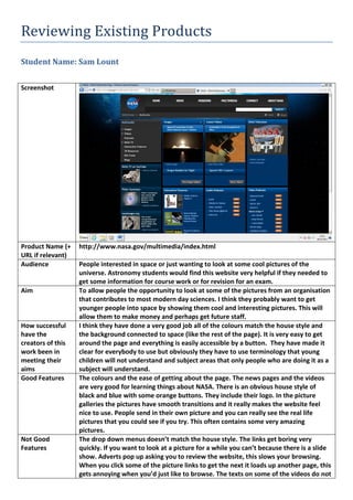
Screenshot
Product Name (+
URL if relevant)
http://www.nasa.gov/multimedia/index.html
Audience People interested in space or just wanting to look at some cool pictures of the
universe. Astronomy students would find this website very helpful if they needed to
get some information for course work or for revision for an exam.
Aim To allow people the opportunity to look at some of the pictures from an organisation
that contributes to most modern day sciences. I think they probably want to get
younger people into space by showing them cool and interesting pictures. This will
allow them to make money and perhaps get future staff.
How successful
have the
creators of this
work been in
meeting their
aims
I think they have done a very good job all of the colours match the house style and
the background connected to space (like the rest of the page). It is very easy to get
around the page and everything is easily accessible by a button. They have made it
clear for everybody to use but obviously they have to use terminology that young
children will not understand and subject areas that only people who are doing it as a
subject will understand.
Good Features The colours and the ease of getting about the page. The news pages and the videos
are very good for learning things about NASA. There is an obvious house style of
black and blue with some orange buttons. They include their logo. In the picture
galleries the pictures have smooth transitions and it really makes the website feel
nice to use. People send in their own picture and you can really see the real life
pictures that you could see if you try. This often contains some very amazing
pictures.
Not Good
Features
The drop down menus doesn’t match the house style. The links get boring very
quickly. If you want to look at a picture for a while you can’t because there is a slide
show. Adverts pop up asking you to review the website, this slows your browsing.
When you click some of the picture links to get the next it loads up another page, this
gets annoying when you’d just like to browse. The texts on some of the videos do not
2. match and this doesn’t makes the videos look very professional.
Possible
Improvements
The picture quality wasn’t amazing and the pictures of astronauts soon get boring.
Make an option to make the pictures full screen and let people choose whether or
not to have a slideshow feature available. Some of the pages you link to don’t follow
the house style and I think this makes the website a little messy; they could make the
other pages to fit in with the rest of the page.
Possible
elements for use
The background is very nice and I will probably use a background that matches my
theme. A slideshow would allow the viewer to look at my pictures with ease. I will
separate my page on to different pages and not over crowd certain pages.
Elements to
avoid
A drop down menu that does not match. Links off photos. Too much information on a
multimedia page, some younger viewers may not understand. Some of the
interactive features don’t interest me and I don’t think many people will enjoy those.