Analysis of totp
•Download as PPT, PDF•
0 likes•182 views
The document provides an analysis of the layout and design of the Top of the Pops (TOTP) magazine website and magazine pages. It notes that the masthead uses bold pink font that may appeal to female readers. The contents page sets articles in three columns with many images and bold text to engage readers. The double-page spread layout is simple with large prominent images balanced with text in three columns, aimed at younger readers due to the use of color. Background details are provided on the history and target demographic of the long-running TOTP magazine supplement to the TV show.
Report
Share
Report
Share

Recommended
Dps analysis
This document summarizes and analyzes three double page spreads from alternative music magazines. It discusses the layouts, visual elements, and tactics used in each spread. The spreads profile Mark Ronson, an unnamed Gallagher brother, and Lady Gaga. Key points examined include the use of titles, photos, text formatting, colors, and placement of elements to attract and guide readers' attention. The analyses suggest the spreads aim to intrigue readers with gossip, portray celebrities as relatable, and push readers to consume the provided content through strategic design choices.
Magazine front covers
This document analyzes the key elements of magazine front covers including the masthead, dateline, main image, cover lines, main cover line, and conventions like price and issue information. It discusses how magazines use techniques like large prominent images and text to attract readers' attention at newsstands. The document also provides definitions of connotation and denotation and includes some "golden rules" for making magazine covers appealing like featuring youth, beauty, wealth, and entertainment over politics.
Existing names
There are four main types of names used for music magazines: acronyms, phrases, connotative names, and compound names. Acronyms shorten longer names to initial letters, like NME standing for New Musical Express. Phrases use longer word combinations as names, such as Top of The Pops and Smash Hits. Connotative names relate to the genre through implied meanings, for example Q suggesting cueing music. Compound names directly state the genre covered, such as Classic Rock and Metal Hammer indicating their focus on those styles.
Magazine questions
The front cover of a music magazine features an image of Mark Ronson holding a trumpet. It is a medium shot intended to attract readers by looking at them. Information on the front cover like article previews and the magazine title are arranged around the image. Red and black text stand out against the white background. Ronson holding a broken trumpet symbolizes the end of his past. The contents page features multiple fonts and images to highlight articles and catch readers' eyes. It targets a younger audience with informal language and topics they can relate to like music and celebrities.
Similarities and differences between 3 music genre magazines
The document analyzes and compares the front cover designs of three magazines - Billboard, Hip Hop, and We Love Pop. All three magazines utilize mid-shot portraits of models making eye contact with the camera. Billboard features a single image while Hip Hop has two and We Love Pop has nine. The color schemes, use of graphics, placement of cover lines and plugs, fonts, and positioning of logos and prices are also compared across the three magazines. Common design conventions like placing the barcode and price at the bottom are noted, as well as some unconventional design choices by We Love Pop.
Lo 3 proposal 2 the music magazine
The document provides details on a proposed print music magazine called TMM (The Music Magazine). Key points:
- The magazine will focus on hip hop/rap genre and feature small, unsigned bands to distinguish itself from competitors XXL and VIBE.
- Content will include photos, articles, album reviews, concert reports, and lyrics.
- The target audience is males and females aged 16-23, particularly students interested in music.
- The magazine will be 40 pages long, in A4 size, with a weekly frequency to provide timely information, and cost £2.99 per issue.
Analysis of kerrang music magazine
The document analyzes different elements of the Kerrang music magazine, including the masthead, contents page, and double-page spread (DPS). The masthead uses a dramatic font and image to suggest rebellion. The contents page continues the style with colorful images and messages to engage readers. The DPS uses a picture-led layout with multiple images, columns of text in different fonts and colors, and flashers to highlight information and grab attention.
Task 6 pp
This document discusses the musical genre of hip hop. It provides a brief history of hip hop, noting its origins in African and African American musical traditions like dub music and jazz poetry. The document lists some seminal hip hop artists like Jay-Z, Drake, Kanye West, Lil Wayne, and Eminem. Imagery commonly associated with hip hop includes DJing, rapping or rhythmic spoken word, and elements of African American culture.
Building your WordPress business WordCamp Boston 2013
The document discusses strategies for building a successful WordPress business as an entrepreneur or freelancer. It provides tips from several experts, including focusing on specific skills, saying no to distractions and wrong clients, creating systems, charging higher rates, developing multiple streams of revenue, and selling based on value through products. A common thread is saying no to the things that don't align with your goals.
The Startup Platform Website Bootcamp
This document provides an overview and agenda for a website bootcamp on building a better WordPress website and copy in 1 hour. It covers planning content and choosing a platform, with a deep dive on content questions and layout. It recommends WordPress for its ease of use and features. The document discusses aligning copy, design, and development, defining the target customer, prioritizing content, and incorporating keywords. It provides tips on writing headlines and how much copy is too much. It also discusses choosing themes, testing and iterating content, and creating a content calendar for continuous learning and improvement.
Modul cilik cerdas
Modul ini memberikan pengenalan kepada murid tentang huruf-huruf, simbol, bentuk, dan suku kata dasar menggunakan metode bermain dan bergerak untuk mempelajari bahasa. Ia juga mengajar teknik membaca 'TAS' dan menghubungkan abjad dengan anggota tubuh untuk memudahkan pembelajaran. Modul ini bertujuan membantu kanak-kanak mengenal asas bahasa dengan cara interaktif dan menyeronokkan.
Smash hits analysis
The magazine cover uses pink and white colors with yellow accents to stand out important details, reflecting the magazines young female target audience. The cover is heavily image-based with the main artist photo and additional celebrity shots. Key information like the artist name and magazine title are written in bold, casual fonts to appeal to readers. The magazine aims to attract fans of pop music and television with gossip and lyrics and uses conventions like pull quotes and flashers to highlight features.
Smash hits analysis
Analysis of Smash Hits magazine, cover, content and Double page spread and SH background information.
TOTP magazine analysis
The TOTP magazine targets young girls aged 10-15 through use of bright colors, large engaging text, and celebrities popular with this demographic. Key connecting elements between the front cover, contents page, and double page spread include the use of colorful and non-standard layouts, bold titles, and an informal chatty tone. The magazine's clear house style stands out from competitors with its vibrant colors, big engaging text, and focus on entertainment over music content alone. [/SUMMARY]
What’s on tv’ listings magazine analysis
The document analyzes the layout and design elements of a TV listings magazine article to inform the creation of the author's own TV listings feature. It describes key components like the title being larger than the picture to draw attention, characters in the picture reinforcing the featured show, a smaller picture and caption making the interview more interesting, questions in blue and answers in red for readability, and including air time, channel and genre information as well as a website link to further promote the program.
Analysing music magazines- Top of the Pops
The document analyzes different elements of a music magazine's front cover, contents page, and double page article spread. It finds that the front cover uses images of attractive celebrities like the Jonas Brothers to target young girls aged 10-14. Pink fonts and colors are used to attract this female audience. Cover lines promote fashion, celebrity gossip, and competitions related to pop music. The contents page similarly uses pink fonts and informal language. Article spreads employ interviews, quotations, and multiple complimentary images related to the topic. Website details are included to encourage reader engagement. Consistent elements like fonts, layout, language, and colors connect the different magazine components.
Analysing music magazines! NME
The magazine uses a consistent house style with bold masthead in 3 colors. The front cover features a large image of Dizzee Rascal that catches the eye and relates to his music style. Inside, articles are separated into sections with bold headings and an index. The double page spread again features Dizzee Rascal to promote the article about how he has changed. The target audience is 15-25 year olds interested in artists like Kasabian, Muse, and Dizzee Rascal. The consistent use of images, language, and house style connect the different parts of the magazine.
Case Study
The document provides background information and analysis of the magazine Top of the Pops. It began publication in 1995 and focuses on pop music, artists, and culture. The target audience is young teenage girls interested in music, fashion, and celebrity gossip. The magazine uses bright colors, large images of artists, and an informal tone to appeal to this audience. It also includes news, interviews, quizzes and posters related to popular artists. While the content and target audience have remained consistent, the magazine has evolved over time in its design and additional online/TV offerings.
Case Study
This document provides a case study of the magazine Top of the Pops, which was first published in 1995. It remains a monthly magazine targeted towards teenage girls, focusing on pop music, artists, and culture. While the content and target audience have remained consistent over time, the magazine has evolved stylistically, maintaining a casual, informal tone along with bright colors and large images to appeal to its young readers. It continues to be a success published by BBC magazines, focusing on music news, celebrity gossip, fashion tips, and connecting with its audience.
Mood Board
This document provides circulation data and descriptions of the covers of several music magazines, including:
- NME targets an indie audience aged 15-30 with serious-looking subjects and bold fonts.
- Smash Hits targets young girls aged 9-13 with a busy, childish style and many images.
- Future Music appeals to hardcore music fans with messy layout and focus on music creation over celebrities.
- Kerrang uses black and white with models blending in and the title above for contrast. It aims for males aged 15-30.
- Top of the Pops targets female teenagers with references to boy bands and groups in bright pink colors and many images and fonts.
- Mojo represents the main story
Music magazines
The document provides information about the covers and contents of four different music magazines from different genres and time periods:
1) NME (punk rock/indie rock magazine from 1976) uses a limited color scheme and large images on the cover to attract readers. The contents page neatly lists articles and bands. Features use photos and distinct text formatting.
2) The Source (hip hop magazine from 1988) also prioritizes large cover images and uses minimal yet distinctive text. The contents are clearly laid out. Features contrast photos with brand advertisements.
3) Top of the Pops (pop magazine from 1995) employs varied colors and fonts on the cover to appeal to its young audience. It focuses more on photos
We love pop magazine analysis
This document analyzes the design and content of a pop magazine aimed at young females. The magazine uses bright pinks, whites and blues in its color scheme. Its masthead features a speech icon to identify it as a magazine focused on gossip. The front cover features the popular boy band One Direction, engaging the audience with happy facial expressions. Inside, articles discuss the band and other entertainment topics like TV and music. Photos include captions and page numbers to prompt readers to specific pages. Throughout, the magazine utilizes codes like hearts and school themes that would appeal to its target demographic of teenage girls.
Magazine Conventions
The document discusses how magazine front covers are designed and laid out. It explains that the masthead is prominently displayed in large font at the top left to identify the magazine. The main headline and large central image work together to convey the key article being featured. Additional elements like taglines and anchorage help provide context and meaning. Color schemes, font styles and photo angles are deliberately chosen to attract readers' attention and match the tone of the magazine, which aims to be lively and catch the interest of teenage audiences. Careful use of space throughout the cover effectively presents important information to readers.
Detailed class analysis of music magazine
The document analyzes the front cover, contents page, and a double page spread of the NME magazine. It finds that the magazine uses bright colors, large images of popular artists, and appealing text to attract its target young, music-interested audience. Key details like the masthead and taglines are prominently displayed to draw readers' attention. The magazine also lists many bands to appeal to readers and encourages subscriptions on the contents page. Overall, the document examines how the magazine's design strategically markets to its audience of 25 year olds interested in music, films, and trends.
Analysis of Nme
The document provides details about the layout and design elements of the NME (New Musical Express) magazine. It analyzes the masthead, cover, contents page, and a double page article spread. Key connections between the sections include consistent use of color (red, black, white), large bold titles, and an edgy layout with columns rather than straight text alignment. The target audience is identified as trendy, educated music fans aged 17-30. Elements like celebrity images and event listings are used to attract this demographic.
Music magazine ananlyiss
The document analyzes the cover of a pop music magazine. It examines various design elements like the masthead, images, color scheme, layout and typography. The analysis finds that the pink and sparkly masthead suggests a young female audience. The main image of singer Jessie J wearing black contrasts the bright colors. The layout and variety of typography create an inviting and busy overall design that would appeal to younger readers.
Analysing
This document discusses the conventions used in various magazine covers, contents pages, and spreads. It analyzes how effective they are and whether they follow typical conventions. Key conventions highlighted include using bold colors and fonts, large images of famous artists, and advertising free items. The target audiences and music genres represented are also assessed. Overall, the document provides insights into magazine design conventions and ideas for layouts.
More Related Content
Viewers also liked
Task 6 pp
This document discusses the musical genre of hip hop. It provides a brief history of hip hop, noting its origins in African and African American musical traditions like dub music and jazz poetry. The document lists some seminal hip hop artists like Jay-Z, Drake, Kanye West, Lil Wayne, and Eminem. Imagery commonly associated with hip hop includes DJing, rapping or rhythmic spoken word, and elements of African American culture.
Building your WordPress business WordCamp Boston 2013
The document discusses strategies for building a successful WordPress business as an entrepreneur or freelancer. It provides tips from several experts, including focusing on specific skills, saying no to distractions and wrong clients, creating systems, charging higher rates, developing multiple streams of revenue, and selling based on value through products. A common thread is saying no to the things that don't align with your goals.
The Startup Platform Website Bootcamp
This document provides an overview and agenda for a website bootcamp on building a better WordPress website and copy in 1 hour. It covers planning content and choosing a platform, with a deep dive on content questions and layout. It recommends WordPress for its ease of use and features. The document discusses aligning copy, design, and development, defining the target customer, prioritizing content, and incorporating keywords. It provides tips on writing headlines and how much copy is too much. It also discusses choosing themes, testing and iterating content, and creating a content calendar for continuous learning and improvement.
Modul cilik cerdas
Modul ini memberikan pengenalan kepada murid tentang huruf-huruf, simbol, bentuk, dan suku kata dasar menggunakan metode bermain dan bergerak untuk mempelajari bahasa. Ia juga mengajar teknik membaca 'TAS' dan menghubungkan abjad dengan anggota tubuh untuk memudahkan pembelajaran. Modul ini bertujuan membantu kanak-kanak mengenal asas bahasa dengan cara interaktif dan menyeronokkan.
Viewers also liked (6)
Building your WordPress business WordCamp Boston 2013
Building your WordPress business WordCamp Boston 2013
Similar to Analysis of totp
Smash hits analysis
The magazine cover uses pink and white colors with yellow accents to stand out important details, reflecting the magazines young female target audience. The cover is heavily image-based with the main artist photo and additional celebrity shots. Key information like the artist name and magazine title are written in bold, casual fonts to appeal to readers. The magazine aims to attract fans of pop music and television with gossip and lyrics and uses conventions like pull quotes and flashers to highlight features.
Smash hits analysis
Analysis of Smash Hits magazine, cover, content and Double page spread and SH background information.
TOTP magazine analysis
The TOTP magazine targets young girls aged 10-15 through use of bright colors, large engaging text, and celebrities popular with this demographic. Key connecting elements between the front cover, contents page, and double page spread include the use of colorful and non-standard layouts, bold titles, and an informal chatty tone. The magazine's clear house style stands out from competitors with its vibrant colors, big engaging text, and focus on entertainment over music content alone. [/SUMMARY]
What’s on tv’ listings magazine analysis
The document analyzes the layout and design elements of a TV listings magazine article to inform the creation of the author's own TV listings feature. It describes key components like the title being larger than the picture to draw attention, characters in the picture reinforcing the featured show, a smaller picture and caption making the interview more interesting, questions in blue and answers in red for readability, and including air time, channel and genre information as well as a website link to further promote the program.
Analysing music magazines- Top of the Pops
The document analyzes different elements of a music magazine's front cover, contents page, and double page article spread. It finds that the front cover uses images of attractive celebrities like the Jonas Brothers to target young girls aged 10-14. Pink fonts and colors are used to attract this female audience. Cover lines promote fashion, celebrity gossip, and competitions related to pop music. The contents page similarly uses pink fonts and informal language. Article spreads employ interviews, quotations, and multiple complimentary images related to the topic. Website details are included to encourage reader engagement. Consistent elements like fonts, layout, language, and colors connect the different magazine components.
Analysing music magazines! NME
The magazine uses a consistent house style with bold masthead in 3 colors. The front cover features a large image of Dizzee Rascal that catches the eye and relates to his music style. Inside, articles are separated into sections with bold headings and an index. The double page spread again features Dizzee Rascal to promote the article about how he has changed. The target audience is 15-25 year olds interested in artists like Kasabian, Muse, and Dizzee Rascal. The consistent use of images, language, and house style connect the different parts of the magazine.
Case Study
The document provides background information and analysis of the magazine Top of the Pops. It began publication in 1995 and focuses on pop music, artists, and culture. The target audience is young teenage girls interested in music, fashion, and celebrity gossip. The magazine uses bright colors, large images of artists, and an informal tone to appeal to this audience. It also includes news, interviews, quizzes and posters related to popular artists. While the content and target audience have remained consistent, the magazine has evolved over time in its design and additional online/TV offerings.
Case Study
This document provides a case study of the magazine Top of the Pops, which was first published in 1995. It remains a monthly magazine targeted towards teenage girls, focusing on pop music, artists, and culture. While the content and target audience have remained consistent over time, the magazine has evolved stylistically, maintaining a casual, informal tone along with bright colors and large images to appeal to its young readers. It continues to be a success published by BBC magazines, focusing on music news, celebrity gossip, fashion tips, and connecting with its audience.
Mood Board
This document provides circulation data and descriptions of the covers of several music magazines, including:
- NME targets an indie audience aged 15-30 with serious-looking subjects and bold fonts.
- Smash Hits targets young girls aged 9-13 with a busy, childish style and many images.
- Future Music appeals to hardcore music fans with messy layout and focus on music creation over celebrities.
- Kerrang uses black and white with models blending in and the title above for contrast. It aims for males aged 15-30.
- Top of the Pops targets female teenagers with references to boy bands and groups in bright pink colors and many images and fonts.
- Mojo represents the main story
Music magazines
The document provides information about the covers and contents of four different music magazines from different genres and time periods:
1) NME (punk rock/indie rock magazine from 1976) uses a limited color scheme and large images on the cover to attract readers. The contents page neatly lists articles and bands. Features use photos and distinct text formatting.
2) The Source (hip hop magazine from 1988) also prioritizes large cover images and uses minimal yet distinctive text. The contents are clearly laid out. Features contrast photos with brand advertisements.
3) Top of the Pops (pop magazine from 1995) employs varied colors and fonts on the cover to appeal to its young audience. It focuses more on photos
We love pop magazine analysis
This document analyzes the design and content of a pop magazine aimed at young females. The magazine uses bright pinks, whites and blues in its color scheme. Its masthead features a speech icon to identify it as a magazine focused on gossip. The front cover features the popular boy band One Direction, engaging the audience with happy facial expressions. Inside, articles discuss the band and other entertainment topics like TV and music. Photos include captions and page numbers to prompt readers to specific pages. Throughout, the magazine utilizes codes like hearts and school themes that would appeal to its target demographic of teenage girls.
Magazine Conventions
The document discusses how magazine front covers are designed and laid out. It explains that the masthead is prominently displayed in large font at the top left to identify the magazine. The main headline and large central image work together to convey the key article being featured. Additional elements like taglines and anchorage help provide context and meaning. Color schemes, font styles and photo angles are deliberately chosen to attract readers' attention and match the tone of the magazine, which aims to be lively and catch the interest of teenage audiences. Careful use of space throughout the cover effectively presents important information to readers.
Detailed class analysis of music magazine
The document analyzes the front cover, contents page, and a double page spread of the NME magazine. It finds that the magazine uses bright colors, large images of popular artists, and appealing text to attract its target young, music-interested audience. Key details like the masthead and taglines are prominently displayed to draw readers' attention. The magazine also lists many bands to appeal to readers and encourages subscriptions on the contents page. Overall, the document examines how the magazine's design strategically markets to its audience of 25 year olds interested in music, films, and trends.
Analysis of Nme
The document provides details about the layout and design elements of the NME (New Musical Express) magazine. It analyzes the masthead, cover, contents page, and a double page article spread. Key connections between the sections include consistent use of color (red, black, white), large bold titles, and an edgy layout with columns rather than straight text alignment. The target audience is identified as trendy, educated music fans aged 17-30. Elements like celebrity images and event listings are used to attract this demographic.
Music magazine ananlyiss
The document analyzes the cover of a pop music magazine. It examines various design elements like the masthead, images, color scheme, layout and typography. The analysis finds that the pink and sparkly masthead suggests a young female audience. The main image of singer Jessie J wearing black contrasts the bright colors. The layout and variety of typography create an inviting and busy overall design that would appeal to younger readers.
Analysing
This document discusses the conventions used in various magazine covers, contents pages, and spreads. It analyzes how effective they are and whether they follow typical conventions. Key conventions highlighted include using bold colors and fonts, large images of famous artists, and advertising free items. The target audiences and music genres represented are also assessed. Overall, the document provides insights into magazine design conventions and ideas for layouts.
Analysing magazines-NME
The document summarizes and analyzes different elements of the front cover, contents page, and a double page article spread from a music magazine (NME). It discusses the purpose and design of elements like the masthead, images, headlines, captions, and language used. These elements are intended to attract the magazine's target audience of 15-25 year olds interested in artists like Skepta and Dizzee Rascal. Imagery like Dizzee Rascal spraying graffiti and references to partying connect the content to the audience. Consistent use of style, images, and language across the different pages ties the magazine together as a cohesive publication.
Photo shop (masthead)
The document discusses potential masthead designs for a pop music magazine. It proposes eight different masthead options:
1. "Pop addiction" - Highlights the genre of pop music and is meant to convey that readers will get "addicted" to pop once they start reading.
2. "Pop PARTY" - Uses alliteration and is meant to convey an exciting, fun vibe like a party to attract readers.
3. "The world of Pop" - Indicates the magazine will cover pop music broadly and include content for everybody.
4. "Pop's Plenty" - Uses alliteration and implies the magazine will have plenty of content about pop music.
5. "OT
Photo shop (masthead)
The document discusses potential masthead options for a pop music magazine. It proposes eight different masthead designs:
1. "Pop addiction" - Highlights the genre of pop music and is meant to convey that readers will get "addicted" to pop once they start reading.
2. "Pop PARTY" - Uses alliteration and is meant to convey an exciting, fun vibe like a party to attract readers.
3. "The world of Pop" - Indicates the magazine will cover pop music broadly and include content for everybody.
4. "Pop's Plenty" - Uses alliteration and implies the magazine will have plenty of content about pop music.
5. "OT
Ancillary research
This document contains summaries of several magazine spreads and radio advertisements. It analyzes how they adhere to conventions in their design and content. For the Teletubbies magazine spread, it notes the large dominant image, use of rule of thirds, and side-by-side comparisons. The Lewis vs. Morse spread divides images using rule of thirds and places relevant text near images. The Doctor Who spread features a main image and smaller related ones, uses rule of thirds, and matches image and text color schemes.
Similar to Analysis of totp (20)
More from SahraStyles
Task 8
The document discusses planning for a new music magazine focused on hip-hop. It includes questions to gauge a target audience of teenage hip-hop fans' interests, including their favorite artists, what attracts them to hip-hop, how much they would pay for a magazine, and what content and design features would appeal most to them or encourage them to buy the magazine. Responses will help inform the creation of the new hip-hop magazine.
Task 5 pp
VIBE was a popular hip hop magazine founded in 1993 by producer Quincy Jones, targeting teenagers. It featured the latest hip hop artists and music. Over time it changed ownership between various publishing companies. XXL Magazine was founded in 1997 by former staffers of The Source magazine to also cover hip hop music and culture. It took over Scratch magazine in 2006 and has also published various special projects related to hip hop artists and music. Both magazines provided news and coverage of popular hip hop artists appealing to teenage audiences.
Production of the magazine
The document describes the process of designing the magazine cover, contents page, and a double page spread (DPS). For the cover, the creator added the main image, masthead, date, price, and additional cover lines. For the contents page, a front cover image and headings were included. For the DPS, an image and header were first added, followed by a pull quote, second image, and article with alternating black and red text.
Media Coursework
The document analyzes various aspects of NME Magazine, including its masthead, headers, images, and layouts. The masthead uses the colors red, white, and black throughout for branding consistency. Headers are in block capitals to draw attention. Cover images feature artists like Dizzee Rascal dressed in the magazine's colors. The content and article pages employ the magazine's house style through visual cues and column-based formatting to attract their target audience of 16-19 year old rock and indie music fans.
More from SahraStyles (6)
Recently uploaded
一比一原版(Teesside毕业证)英国提赛德大学毕业证如何办理
原件一模一样【微信:WP101A】【(Teesside毕业证)英国提赛德大学毕业证学位证成绩单】【微信:WP101A】(留信学历认证永久存档查询)采用学校原版纸张、特殊工艺完全按照原版一比一制作(包括:隐形水印,阴影底纹,钢印LOGO烫金烫银,LOGO烫金烫银复合重叠,文字图案浮雕,激光镭射,紫外荧光,温感,复印防伪)行业标杆!精益求精,诚心合作,真诚制作!多年品质 ,按需精细制作,24小时接单,全套进口原装设备,十五年致力于帮助留学生解决难题,业务范围有加拿大、英国、澳洲、韩国、美国、新加坡,新西兰等学历材料,包您满意。
【业务选择办理准则】
一、工作未确定,回国需先给父母、亲戚朋友看下文凭的情况,办理一份就读学校的毕业证【微信:WP101A】文凭即可
二、回国进私企、外企、自己做生意的情况,这些单位是不查询毕业证真伪的,而且国内没有渠道去查询国外文凭的真假,也不需要提供真实教育部认证。鉴于此,办理一份毕业证【微信:WP101A】即可
三、进国企,银行,事业单位,考公务员等等,这些单位是必需要提供真实教育部认证的,办理教育部认证所需资料众多且烦琐,所有材料您都必须提供原件,我们凭借丰富的经验,快捷的绿色通道帮您快速整合材料,让您少走弯路。
留信网认证的作用:
1:该专业认证可证明留学生真实身份【微信:WP101A】
2:同时对留学生所学专业登记给予评定
3:国家专业人才认证中心颁发入库证书
4:这个认证书并且可以归档倒地方
5:凡事获得留信网入网的信息将会逐步更新到个人身份内,将在公安局网内查询个人身份证信息后,同步读取人才网入库信息
6:个人职称评审加20分
7:个人信誉贷款加10分
8:在国家人才网主办的国家网络招聘大会中纳入资料,供国家高端企业选择人才
→ 【关于价格问题(保证一手价格)
我们所定的价格是非常合理的,而且我们现在做得单子大多数都是代理和回头客户介绍的所以一般现在有新的单子 我给客户的都是第一手的代理价格,因为我想坦诚对待大家 不想跟大家在价格方面浪费时间
对于老客户或者被老客户介绍过来的朋友,我们都会适当给一些优惠。
选择实体注册公司办理,更放心,更安全!我们的承诺:可来公司面谈,可签订合同,会陪同客户一起到教育部认证窗口递交认证材料,客户在教育部官方认证查询网站查询到认证通过结果后付款,不成功不收费!
办理(Teesside毕业证)英国提赛德大学毕业证学位证【微信:WP101A 】外观非常精致,由特殊纸质材料制成,上面印有校徽、校名、毕业生姓名、专业等信息。
办理(Teesside毕业证)英国提赛德大学毕业证学位证【微信:WP101A 】格式相对统一,各专业都有相应的模板。通常包括以下部分:
校徽:象征着学校的荣誉和传承。
校名:学校英文全称
授予学位:本部分将注明获得的具体学位名称。
毕业生姓名:这是最重要的信息之一,标志着该证书是由特定人员获得的。
颁发日期:这是毕业正式生效的时间,也代表着毕业生学业的结束。
其他信息:根据不同的专业和学位,可能会有一些特定的信息或章节。
办理(Teesside毕业证)英国提赛德大学毕业证学位证【微信:WP101A 】价值很高,需要妥善保管。一般来说,应放置在安全、干燥、防潮的地方,避免长时间暴露在阳光下。如需使用,最好使用复印件而不是原件,以免丢失。
综上所述,办理(Teesside毕业证)英国提赛德大学毕业证学位证【微信:WP101A 】是证明身份和学历的高价值文件。外观简单庄重,格式统一,包括重要的个人信息和发布日期。对持有人来说,妥善保管是非常重要的。
一比一原版澳洲查理斯特大学毕业证(CSU学位证)如何办理
原件一模一样【微信:WP101A】【澳洲查理斯特大学毕业证(CSU学位证)成绩单】【微信:WP101A】(留信学历认证永久存档查询)采用学校原版纸张、特殊工艺完全按照原版一比一制作(包括:隐形水印,阴影底纹,钢印LOGO烫金烫银,LOGO烫金烫银复合重叠,文字图案浮雕,激光镭射,紫外荧光,温感,复印防伪)行业标杆!精益求精,诚心合作,真诚制作!多年品质 ,按需精细制作,24小时接单,全套进口原装设备,十五年致力于帮助留学生解决难题,业务范围有加拿大、英国、澳洲、韩国、美国、新加坡,新西兰等学历材料,包您满意。
【业务选择办理准则】
一、工作未确定,回国需先给父母、亲戚朋友看下文凭的情况,办理一份就读学校的毕业证【微信:WP101A】文凭即可
二、回国进私企、外企、自己做生意的情况,这些单位是不查询毕业证真伪的,而且国内没有渠道去查询国外文凭的真假,也不需要提供真实教育部认证。鉴于此,办理一份毕业证【微信:WP101A】即可
三、进国企,银行,事业单位,考公务员等等,这些单位是必需要提供真实教育部认证的,办理教育部认证所需资料众多且烦琐,所有材料您都必须提供原件,我们凭借丰富的经验,快捷的绿色通道帮您快速整合材料,让您少走弯路。
留信网认证的作用:
1:该专业认证可证明留学生真实身份【微信:WP101A】
2:同时对留学生所学专业登记给予评定
3:国家专业人才认证中心颁发入库证书
4:这个认证书并且可以归档倒地方
5:凡事获得留信网入网的信息将会逐步更新到个人身份内,将在公安局网内查询个人身份证信息后,同步读取人才网入库信息
6:个人职称评审加20分
7:个人信誉贷款加10分
8:在国家人才网主办的国家网络招聘大会中纳入资料,供国家高端企业选择人才
→ 【关于价格问题(保证一手价格)
我们所定的价格是非常合理的,而且我们现在做得单子大多数都是代理和回头客户介绍的所以一般现在有新的单子 我给客户的都是第一手的代理价格,因为我想坦诚对待大家 不想跟大家在价格方面浪费时间
对于老客户或者被老客户介绍过来的朋友,我们都会适当给一些优惠。
选择实体注册公司办理,更放心,更安全!我们的承诺:可来公司面谈,可签订合同,会陪同客户一起到教育部认证窗口递交认证材料,客户在教育部官方认证查询网站查询到认证通过结果后付款,不成功不收费!
办理澳洲查理斯特大学毕业证(CSU学位证)学位证【微信:WP101A 】外观非常精致,由特殊纸质材料制成,上面印有校徽、校名、毕业生姓名、专业等信息。
办理澳洲查理斯特大学毕业证(CSU学位证)学位证【微信:WP101A 】格式相对统一,各专业都有相应的模板。通常包括以下部分:
校徽:象征着学校的荣誉和传承。
校名:学校英文全称
授予学位:本部分将注明获得的具体学位名称。
毕业生姓名:这是最重要的信息之一,标志着该证书是由特定人员获得的。
颁发日期:这是毕业正式生效的时间,也代表着毕业生学业的结束。
其他信息:根据不同的专业和学位,可能会有一些特定的信息或章节。
办理澳洲查理斯特大学毕业证(CSU学位证)学位证【微信:WP101A 】价值很高,需要妥善保管。一般来说,应放置在安全、干燥、防潮的地方,避免长时间暴露在阳光下。如需使用,最好使用复印件而不是原件,以免丢失。
综上所述,办理澳洲查理斯特大学毕业证(CSU学位证)学位证【微信:WP101A 】是证明身份和学历的高价值文件。外观简单庄重,格式统一,包括重要的个人信息和发布日期。对持有人来说,妥善保管是非常重要的。
一比一原版(UC毕业证书)堪培拉大学毕业证如何办理
原件一模一样【微信:WP101A】【(UC毕业证书)堪培拉大学毕业证学位证成绩单】【微信:WP101A】(留信学历认证永久存档查询)采用学校原版纸张、特殊工艺完全按照原版一比一制作(包括:隐形水印,阴影底纹,钢印LOGO烫金烫银,LOGO烫金烫银复合重叠,文字图案浮雕,激光镭射,紫外荧光,温感,复印防伪)行业标杆!精益求精,诚心合作,真诚制作!多年品质 ,按需精细制作,24小时接单,全套进口原装设备,十五年致力于帮助留学生解决难题,业务范围有加拿大、英国、澳洲、韩国、美国、新加坡,新西兰等学历材料,包您满意。
【业务选择办理准则】
一、工作未确定,回国需先给父母、亲戚朋友看下文凭的情况,办理一份就读学校的毕业证【微信:WP101A】文凭即可
二、回国进私企、外企、自己做生意的情况,这些单位是不查询毕业证真伪的,而且国内没有渠道去查询国外文凭的真假,也不需要提供真实教育部认证。鉴于此,办理一份毕业证【微信:WP101A】即可
三、进国企,银行,事业单位,考公务员等等,这些单位是必需要提供真实教育部认证的,办理教育部认证所需资料众多且烦琐,所有材料您都必须提供原件,我们凭借丰富的经验,快捷的绿色通道帮您快速整合材料,让您少走弯路。
留信网认证的作用:
1:该专业认证可证明留学生真实身份【微信:WP101A】
2:同时对留学生所学专业登记给予评定
3:国家专业人才认证中心颁发入库证书
4:这个认证书并且可以归档倒地方
5:凡事获得留信网入网的信息将会逐步更新到个人身份内,将在公安局网内查询个人身份证信息后,同步读取人才网入库信息
6:个人职称评审加20分
7:个人信誉贷款加10分
8:在国家人才网主办的国家网络招聘大会中纳入资料,供国家高端企业选择人才
→ 【关于价格问题(保证一手价格)
我们所定的价格是非常合理的,而且我们现在做得单子大多数都是代理和回头客户介绍的所以一般现在有新的单子 我给客户的都是第一手的代理价格,因为我想坦诚对待大家 不想跟大家在价格方面浪费时间
对于老客户或者被老客户介绍过来的朋友,我们都会适当给一些优惠。
选择实体注册公司办理,更放心,更安全!我们的承诺:可来公司面谈,可签订合同,会陪同客户一起到教育部认证窗口递交认证材料,客户在教育部官方认证查询网站查询到认证通过结果后付款,不成功不收费!
办理(UC毕业证书)堪培拉大学毕业证学位证【微信:WP101A 】外观非常精致,由特殊纸质材料制成,上面印有校徽、校名、毕业生姓名、专业等信息。
办理(UC毕业证书)堪培拉大学毕业证学位证【微信:WP101A 】格式相对统一,各专业都有相应的模板。通常包括以下部分:
校徽:象征着学校的荣誉和传承。
校名:学校英文全称
授予学位:本部分将注明获得的具体学位名称。
毕业生姓名:这是最重要的信息之一,标志着该证书是由特定人员获得的。
颁发日期:这是毕业正式生效的时间,也代表着毕业生学业的结束。
其他信息:根据不同的专业和学位,可能会有一些特定的信息或章节。
办理(UC毕业证书)堪培拉大学毕业证学位证【微信:WP101A 】价值很高,需要妥善保管。一般来说,应放置在安全、干燥、防潮的地方,避免长时间暴露在阳光下。如需使用,最好使用复印件而不是原件,以免丢失。
综上所述,办理(UC毕业证书)堪培拉大学毕业证学位证【微信:WP101A 】是证明身份和学历的高价值文件。外观简单庄重,格式统一,包括重要的个人信息和发布日期。对持有人来说,妥善保管是非常重要的。
原版制作(MDIS毕业证书)新加坡管理发展学院毕业证学位证一模一样
学校原件一模一样【微信:741003700 】《(MDIS毕业证书)新加坡管理发展学院毕业证学位证》【微信:741003700 】学位证,留信认证(真实可查,永久存档)原件一模一样纸张工艺/offer、雅思、外壳等材料/诚信可靠,可直接看成品样本,帮您解决无法毕业带来的各种难题!外壳,原版制作,诚信可靠,可直接看成品样本。行业标杆!精益求精,诚心合作,真诚制作!多年品质 ,按需精细制作,24小时接单,全套进口原装设备。十五年致力于帮助留学生解决难题,包您满意。
本公司拥有海外各大学样板无数,能完美还原。
1:1完美还原海外各大学毕业材料上的工艺:水印,阴影底纹,钢印LOGO烫金烫银,LOGO烫金烫银复合重叠。文字图案浮雕、激光镭射、紫外荧光、温感、复印防伪等防伪工艺。材料咨询办理、认证咨询办理请加学历顾问Q/微741003700
【主营项目】
一.毕业证【q微741003700】成绩单、使馆认证、教育部认证、雅思托福成绩单、学生卡等!
二.真实使馆公证(即留学回国人员证明,不成功不收费)
三.真实教育部学历学位认证(教育部存档!教育部留服网站永久可查)
四.办理各国各大学文凭(一对一专业服务,可全程监控跟踪进度)
如果您处于以下几种情况:
◇在校期间,因各种原因未能顺利毕业……拿不到官方毕业证【q/微741003700】
◇面对父母的压力,希望尽快拿到;
◇不清楚认证流程以及材料该如何准备;
◇回国时间很长,忘记办理;
◇回国马上就要找工作,办给用人单位看;
◇企事业单位必须要求办理的
◇需要报考公务员、购买免税车、落转户口
◇申请留学生创业基金
留信网认证的作用:
1:该专业认证可证明留学生真实身份
2:同时对留学生所学专业登记给予评定
3:国家专业人才认证中心颁发入库证书
4:这个认证书并且可以归档倒地方
5:凡事获得留信网入网的信息将会逐步更新到个人身份内,将在公安局网内查询个人身份证信息后,同步读取人才网入库信息
6:个人职称评审加20分
7:个人信誉贷款加10分
8:在国家人才网主办的国家网络招聘大会中纳入资料,供国家高端企业选择人才
一比一原版澳洲科廷科技大学毕业证(Curtin毕业证)如何办理
原件一模一样【微信:WP101A】【澳洲科廷科技大学毕业证(Curtin毕业证)学位证成绩单】【微信:WP101A】(留信学历认证永久存档查询)采用学校原版纸张、特殊工艺完全按照原版一比一制作(包括:隐形水印,阴影底纹,钢印LOGO烫金烫银,LOGO烫金烫银复合重叠,文字图案浮雕,激光镭射,紫外荧光,温感,复印防伪)行业标杆!精益求精,诚心合作,真诚制作!多年品质 ,按需精细制作,24小时接单,全套进口原装设备,十五年致力于帮助留学生解决难题,业务范围有加拿大、英国、澳洲、韩国、美国、新加坡,新西兰等学历材料,包您满意。
【业务选择办理准则】
一、工作未确定,回国需先给父母、亲戚朋友看下文凭的情况,办理一份就读学校的毕业证【微信:WP101A】文凭即可
二、回国进私企、外企、自己做生意的情况,这些单位是不查询毕业证真伪的,而且国内没有渠道去查询国外文凭的真假,也不需要提供真实教育部认证。鉴于此,办理一份毕业证【微信:WP101A】即可
三、进国企,银行,事业单位,考公务员等等,这些单位是必需要提供真实教育部认证的,办理教育部认证所需资料众多且烦琐,所有材料您都必须提供原件,我们凭借丰富的经验,快捷的绿色通道帮您快速整合材料,让您少走弯路。
留信网认证的作用:
1:该专业认证可证明留学生真实身份【微信:WP101A】
2:同时对留学生所学专业登记给予评定
3:国家专业人才认证中心颁发入库证书
4:这个认证书并且可以归档倒地方
5:凡事获得留信网入网的信息将会逐步更新到个人身份内,将在公安局网内查询个人身份证信息后,同步读取人才网入库信息
6:个人职称评审加20分
7:个人信誉贷款加10分
8:在国家人才网主办的国家网络招聘大会中纳入资料,供国家高端企业选择人才
→ 【关于价格问题(保证一手价格)
我们所定的价格是非常合理的,而且我们现在做得单子大多数都是代理和回头客户介绍的所以一般现在有新的单子 我给客户的都是第一手的代理价格,因为我想坦诚对待大家 不想跟大家在价格方面浪费时间
对于老客户或者被老客户介绍过来的朋友,我们都会适当给一些优惠。
选择实体注册公司办理,更放心,更安全!我们的承诺:可来公司面谈,可签订合同,会陪同客户一起到教育部认证窗口递交认证材料,客户在教育部官方认证查询网站查询到认证通过结果后付款,不成功不收费!
办理澳洲科廷科技大学毕业证(Curtin毕业证)学位证【微信:WP101A 】外观非常精致,由特殊纸质材料制成,上面印有校徽、校名、毕业生姓名、专业等信息。
办理澳洲科廷科技大学毕业证(Curtin毕业证)学位证【微信:WP101A 】格式相对统一,各专业都有相应的模板。通常包括以下部分:
校徽:象征着学校的荣誉和传承。
校名:学校英文全称
授予学位:本部分将注明获得的具体学位名称。
毕业生姓名:这是最重要的信息之一,标志着该证书是由特定人员获得的。
颁发日期:这是毕业正式生效的时间,也代表着毕业生学业的结束。
其他信息:根据不同的专业和学位,可能会有一些特定的信息或章节。
办理澳洲科廷科技大学毕业证(Curtin毕业证)学位证【微信:WP101A 】价值很高,需要妥善保管。一般来说,应放置在安全、干燥、防潮的地方,避免长时间暴露在阳光下。如需使用,最好使用复印件而不是原件,以免丢失。
综上所述,办理澳洲科廷科技大学毕业证(Curtin毕业证)学位证【微信:WP101A 】是证明身份和学历的高价值文件。外观简单庄重,格式统一,包括重要的个人信息和发布日期。对持有人来说,妥善保管是非常重要的。
一比一原版(Rice毕业证)美国莱斯大学毕业证如何办理
原件一模一样【微信:WP101A】【(Rice毕业证)美国莱斯大学毕业证学位证成绩单】【微信:WP101A】(留信学历认证永久存档查询)采用学校原版纸张、特殊工艺完全按照原版一比一制作(包括:隐形水印,阴影底纹,钢印LOGO烫金烫银,LOGO烫金烫银复合重叠,文字图案浮雕,激光镭射,紫外荧光,温感,复印防伪)行业标杆!精益求精,诚心合作,真诚制作!多年品质 ,按需精细制作,24小时接单,全套进口原装设备,十五年致力于帮助留学生解决难题,业务范围有加拿大、英国、澳洲、韩国、美国、新加坡,新西兰等学历材料,包您满意。
【业务选择办理准则】
一、工作未确定,回国需先给父母、亲戚朋友看下文凭的情况,办理一份就读学校的毕业证【微信:WP101A】文凭即可
二、回国进私企、外企、自己做生意的情况,这些单位是不查询毕业证真伪的,而且国内没有渠道去查询国外文凭的真假,也不需要提供真实教育部认证。鉴于此,办理一份毕业证【微信:WP101A】即可
三、进国企,银行,事业单位,考公务员等等,这些单位是必需要提供真实教育部认证的,办理教育部认证所需资料众多且烦琐,所有材料您都必须提供原件,我们凭借丰富的经验,快捷的绿色通道帮您快速整合材料,让您少走弯路。
留信网认证的作用:
1:该专业认证可证明留学生真实身份【微信:WP101A】
2:同时对留学生所学专业登记给予评定
3:国家专业人才认证中心颁发入库证书
4:这个认证书并且可以归档倒地方
5:凡事获得留信网入网的信息将会逐步更新到个人身份内,将在公安局网内查询个人身份证信息后,同步读取人才网入库信息
6:个人职称评审加20分
7:个人信誉贷款加10分
8:在国家人才网主办的国家网络招聘大会中纳入资料,供国家高端企业选择人才
→ 【关于价格问题(保证一手价格)
我们所定的价格是非常合理的,而且我们现在做得单子大多数都是代理和回头客户介绍的所以一般现在有新的单子 我给客户的都是第一手的代理价格,因为我想坦诚对待大家 不想跟大家在价格方面浪费时间
对于老客户或者被老客户介绍过来的朋友,我们都会适当给一些优惠。
选择实体注册公司办理,更放心,更安全!我们的承诺:可来公司面谈,可签订合同,会陪同客户一起到教育部认证窗口递交认证材料,客户在教育部官方认证查询网站查询到认证通过结果后付款,不成功不收费!
办理(Rice毕业证)美国莱斯大学毕业证学位证【微信:WP101A 】外观非常精致,由特殊纸质材料制成,上面印有校徽、校名、毕业生姓名、专业等信息。
办理(Rice毕业证)美国莱斯大学毕业证学位证【微信:WP101A 】格式相对统一,各专业都有相应的模板。通常包括以下部分:
校徽:象征着学校的荣誉和传承。
校名:学校英文全称
授予学位:本部分将注明获得的具体学位名称。
毕业生姓名:这是最重要的信息之一,标志着该证书是由特定人员获得的。
颁发日期:这是毕业正式生效的时间,也代表着毕业生学业的结束。
其他信息:根据不同的专业和学位,可能会有一些特定的信息或章节。
办理(Rice毕业证)美国莱斯大学毕业证学位证【微信:WP101A 】价值很高,需要妥善保管。一般来说,应放置在安全、干燥、防潮的地方,避免长时间暴露在阳光下。如需使用,最好使用复印件而不是原件,以免丢失。
综上所述,办理(Rice毕业证)美国莱斯大学毕业证学位证【微信:WP101A 】是证明身份和学历的高价值文件。外观简单庄重,格式统一,包括重要的个人信息和发布日期。对持有人来说,妥善保管是非常重要的。
一比一原版美国加州大学欧文分校毕业证(UCI学位证)如何办理
原件一模一样【微信:WP101A】【美国加州大学欧文分校毕业证(UCI学位证)成绩单】【微信:WP101A】(留信学历认证永久存档查询)采用学校原版纸张、特殊工艺完全按照原版一比一制作(包括:隐形水印,阴影底纹,钢印LOGO烫金烫银,LOGO烫金烫银复合重叠,文字图案浮雕,激光镭射,紫外荧光,温感,复印防伪)行业标杆!精益求精,诚心合作,真诚制作!多年品质 ,按需精细制作,24小时接单,全套进口原装设备,十五年致力于帮助留学生解决难题,业务范围有加拿大、英国、澳洲、韩国、美国、新加坡,新西兰等学历材料,包您满意。
【业务选择办理准则】
一、工作未确定,回国需先给父母、亲戚朋友看下文凭的情况,办理一份就读学校的毕业证【微信:WP101A】文凭即可
二、回国进私企、外企、自己做生意的情况,这些单位是不查询毕业证真伪的,而且国内没有渠道去查询国外文凭的真假,也不需要提供真实教育部认证。鉴于此,办理一份毕业证【微信:WP101A】即可
三、进国企,银行,事业单位,考公务员等等,这些单位是必需要提供真实教育部认证的,办理教育部认证所需资料众多且烦琐,所有材料您都必须提供原件,我们凭借丰富的经验,快捷的绿色通道帮您快速整合材料,让您少走弯路。
留信网认证的作用:
1:该专业认证可证明留学生真实身份【微信:WP101A】
2:同时对留学生所学专业登记给予评定
3:国家专业人才认证中心颁发入库证书
4:这个认证书并且可以归档倒地方
5:凡事获得留信网入网的信息将会逐步更新到个人身份内,将在公安局网内查询个人身份证信息后,同步读取人才网入库信息
6:个人职称评审加20分
7:个人信誉贷款加10分
8:在国家人才网主办的国家网络招聘大会中纳入资料,供国家高端企业选择人才
→ 【关于价格问题(保证一手价格)
我们所定的价格是非常合理的,而且我们现在做得单子大多数都是代理和回头客户介绍的所以一般现在有新的单子 我给客户的都是第一手的代理价格,因为我想坦诚对待大家 不想跟大家在价格方面浪费时间
对于老客户或者被老客户介绍过来的朋友,我们都会适当给一些优惠。
选择实体注册公司办理,更放心,更安全!我们的承诺:可来公司面谈,可签订合同,会陪同客户一起到教育部认证窗口递交认证材料,客户在教育部官方认证查询网站查询到认证通过结果后付款,不成功不收费!
办理美国加州大学欧文分校毕业证(UCI学位证)学位证【微信:WP101A 】外观非常精致,由特殊纸质材料制成,上面印有校徽、校名、毕业生姓名、专业等信息。
办理美国加州大学欧文分校毕业证(UCI学位证)学位证【微信:WP101A 】格式相对统一,各专业都有相应的模板。通常包括以下部分:
校徽:象征着学校的荣誉和传承。
校名:学校英文全称
授予学位:本部分将注明获得的具体学位名称。
毕业生姓名:这是最重要的信息之一,标志着该证书是由特定人员获得的。
颁发日期:这是毕业正式生效的时间,也代表着毕业生学业的结束。
其他信息:根据不同的专业和学位,可能会有一些特定的信息或章节。
办理美国加州大学欧文分校毕业证(UCI学位证)学位证【微信:WP101A 】价值很高,需要妥善保管。一般来说,应放置在安全、干燥、防潮的地方,避免长时间暴露在阳光下。如需使用,最好使用复印件而不是原件,以免丢失。
综上所述,办理美国加州大学欧文分校毕业证(UCI学位证)学位证【微信:WP101A 】是证明身份和学历的高价值文件。外观简单庄重,格式统一,包括重要的个人信息和发布日期。对持有人来说,妥善保管是非常重要的。
一比一原版马里兰大学毕业证(UMD毕业证书)如何办理
学校原件一模一样【微信:6496090】【马里兰大学毕业证(UMD毕业证书)成绩单学位证】【微信:6496090】(留信学历认证永久存档查询)采用学校原版纸张、特殊工艺完全按照原版一比一制作(包括:隐形水印,阴影底纹,钢印LOGO烫金烫银,LOGO烫金烫银复合重叠,文字图案浮雕,激光镭射,紫外荧光,温感,复印防伪)行业标杆!精益求精,诚心合作,真诚制作!多年品质 ,按需精细制作,24小时接单,全套进口原装设备,十五年致力于帮助留学生解决难题,业务范围有加拿大、英国、澳洲、韩国、美国、新加坡,新西兰等学历材料,包您满意。
【业务选择办理准则】
一、工作未确定,回国需先给父母、亲戚朋友看下文凭的情况,办理一份就读学校的毕业证【微信:6496090】文凭即可
二、回国进私企、外企、自己做生意的情况,这些单位是不查询毕业证真伪的,而且国内没有渠道去查询国外文凭的真假,也不需要提供真实教育部认证。鉴于此,办理一份毕业证【微信:6496090】即可
三、进国企,银行,事业单位,考公务员等等,这些单位是必需要提供真实教育部认证的,办理教育部认证所需资料众多且烦琐,所有材料您都必须提供原件,我们凭借丰富的经验,快捷的绿色通道帮您快速整合材料,让您少走弯路。
留信网认证的作用:
1:该专业认证可证明留学生真实身份【微信:6496090】
2:同时对留学生所学专业登记给予评定
3:国家专业人才认证中心颁发入库证书
4:这个认证书并且可以归档倒地方
5:凡事获得留信网入网的信息将会逐步更新到个人身份内,将在公安局网内查询个人身份证信息后,同步读取人才网入库信息
6:个人职称评审加20分
7:个人信誉贷款加10分
8:在国家人才网主办的国家网络招聘大会中纳入资料,供国家高端企业选择人才
→ 【关于价格问题(保证一手价格)
我们所定的价格是非常合理的,而且我们现在做得单子大多数都是代理和回头客户介绍的所以一般现在有新的单子 我给客户的都是第一手的代理价格,因为我想坦诚对待大家 不想跟大家在价格方面浪费时间
对于老客户或者被老客户介绍过来的朋友,我们都会适当给一些优惠。
选择实体注册公司办理,更放心,更安全!我们的承诺:可来公司面谈,可签订合同,会陪同客户一起到教育部认证窗口递交认证材料,客户在教育部官方认证查询网站查询到认证通过结果后付款,不成功不收费!
办理马里兰大学毕业证(UMD毕业证书)【微信:6496090 】外观非常简单,由纸质材料制成,上面印有校徽、校名、毕业生姓名、专业等信息。
办理马里兰大学毕业证(UMD毕业证书)【微信:6496090 】格式相对统一,各专业都有相应的模板。通常包括以下部分:
校徽:象征着学校的荣誉和传承。
校名:学校英文全称
授予学位:本部分将注明获得的具体学位名称。
毕业生姓名:这是最重要的信息之一,标志着该证书是由特定人员获得的。
颁发日期:这是毕业正式生效的时间,也代表着毕业生学业的结束。
其他信息:根据不同的专业和学位,可能会有一些特定的信息或章节。
办理马里兰大学毕业证(UMD毕业证书)【微信:6496090 】价值很高,需要妥善保管。一般来说,应放置在安全、干燥、防潮的地方,避免长时间暴露在阳光下。如需使用,最好使用复印件而不是原件,以免丢失。
综上所述,办理马里兰大学毕业证(UMD毕业证书)【微信:6496090 】是证明身份和学历的高价值文件。外观简单庄重,格式统一,包括重要的个人信息和发布日期。对持有人来说,妥善保管是非常重要的。
一比一原版(UWE毕业证书)西英格兰大学毕业证如何办理
原件一模一样【微信:WP101A】【(UWE毕业证书)西英格兰大学毕业证学位证成绩单】【微信:WP101A】(留信学历认证永久存档查询)采用学校原版纸张、特殊工艺完全按照原版一比一制作(包括:隐形水印,阴影底纹,钢印LOGO烫金烫银,LOGO烫金烫银复合重叠,文字图案浮雕,激光镭射,紫外荧光,温感,复印防伪)行业标杆!精益求精,诚心合作,真诚制作!多年品质 ,按需精细制作,24小时接单,全套进口原装设备,十五年致力于帮助留学生解决难题,业务范围有加拿大、英国、澳洲、韩国、美国、新加坡,新西兰等学历材料,包您满意。
【业务选择办理准则】
一、工作未确定,回国需先给父母、亲戚朋友看下文凭的情况,办理一份就读学校的毕业证【微信:WP101A】文凭即可
二、回国进私企、外企、自己做生意的情况,这些单位是不查询毕业证真伪的,而且国内没有渠道去查询国外文凭的真假,也不需要提供真实教育部认证。鉴于此,办理一份毕业证【微信:WP101A】即可
三、进国企,银行,事业单位,考公务员等等,这些单位是必需要提供真实教育部认证的,办理教育部认证所需资料众多且烦琐,所有材料您都必须提供原件,我们凭借丰富的经验,快捷的绿色通道帮您快速整合材料,让您少走弯路。
留信网认证的作用:
1:该专业认证可证明留学生真实身份【微信:WP101A】
2:同时对留学生所学专业登记给予评定
3:国家专业人才认证中心颁发入库证书
4:这个认证书并且可以归档倒地方
5:凡事获得留信网入网的信息将会逐步更新到个人身份内,将在公安局网内查询个人身份证信息后,同步读取人才网入库信息
6:个人职称评审加20分
7:个人信誉贷款加10分
8:在国家人才网主办的国家网络招聘大会中纳入资料,供国家高端企业选择人才
→ 【关于价格问题(保证一手价格)
我们所定的价格是非常合理的,而且我们现在做得单子大多数都是代理和回头客户介绍的所以一般现在有新的单子 我给客户的都是第一手的代理价格,因为我想坦诚对待大家 不想跟大家在价格方面浪费时间
对于老客户或者被老客户介绍过来的朋友,我们都会适当给一些优惠。
选择实体注册公司办理,更放心,更安全!我们的承诺:可来公司面谈,可签订合同,会陪同客户一起到教育部认证窗口递交认证材料,客户在教育部官方认证查询网站查询到认证通过结果后付款,不成功不收费!
办理(UWE毕业证书)西英格兰大学毕业证学位证【微信:WP101A 】外观非常精致,由特殊纸质材料制成,上面印有校徽、校名、毕业生姓名、专业等信息。
办理(UWE毕业证书)西英格兰大学毕业证学位证【微信:WP101A 】格式相对统一,各专业都有相应的模板。通常包括以下部分:
校徽:象征着学校的荣誉和传承。
校名:学校英文全称
授予学位:本部分将注明获得的具体学位名称。
毕业生姓名:这是最重要的信息之一,标志着该证书是由特定人员获得的。
颁发日期:这是毕业正式生效的时间,也代表着毕业生学业的结束。
其他信息:根据不同的专业和学位,可能会有一些特定的信息或章节。
办理(UWE毕业证书)西英格兰大学毕业证学位证【微信:WP101A 】价值很高,需要妥善保管。一般来说,应放置在安全、干燥、防潮的地方,避免长时间暴露在阳光下。如需使用,最好使用复印件而不是原件,以免丢失。
综上所述,办理(UWE毕业证书)西英格兰大学毕业证学位证【微信:WP101A 】是证明身份和学历的高价值文件。外观简单庄重,格式统一,包括重要的个人信息和发布日期。对持有人来说,妥善保管是非常重要的。
一比一原版(UoN毕业证书)纽卡斯尔大学毕业证如何办理
原件一模一样【微信:WP101A】【(UoN毕业证书)纽卡斯尔大学毕业证学位证成绩单】【微信:WP101A】(留信学历认证永久存档查询)采用学校原版纸张、特殊工艺完全按照原版一比一制作(包括:隐形水印,阴影底纹,钢印LOGO烫金烫银,LOGO烫金烫银复合重叠,文字图案浮雕,激光镭射,紫外荧光,温感,复印防伪)行业标杆!精益求精,诚心合作,真诚制作!多年品质 ,按需精细制作,24小时接单,全套进口原装设备,十五年致力于帮助留学生解决难题,业务范围有加拿大、英国、澳洲、韩国、美国、新加坡,新西兰等学历材料,包您满意。
【业务选择办理准则】
一、工作未确定,回国需先给父母、亲戚朋友看下文凭的情况,办理一份就读学校的毕业证【微信:WP101A】文凭即可
二、回国进私企、外企、自己做生意的情况,这些单位是不查询毕业证真伪的,而且国内没有渠道去查询国外文凭的真假,也不需要提供真实教育部认证。鉴于此,办理一份毕业证【微信:WP101A】即可
三、进国企,银行,事业单位,考公务员等等,这些单位是必需要提供真实教育部认证的,办理教育部认证所需资料众多且烦琐,所有材料您都必须提供原件,我们凭借丰富的经验,快捷的绿色通道帮您快速整合材料,让您少走弯路。
留信网认证的作用:
1:该专业认证可证明留学生真实身份【微信:WP101A】
2:同时对留学生所学专业登记给予评定
3:国家专业人才认证中心颁发入库证书
4:这个认证书并且可以归档倒地方
5:凡事获得留信网入网的信息将会逐步更新到个人身份内,将在公安局网内查询个人身份证信息后,同步读取人才网入库信息
6:个人职称评审加20分
7:个人信誉贷款加10分
8:在国家人才网主办的国家网络招聘大会中纳入资料,供国家高端企业选择人才
→ 【关于价格问题(保证一手价格)
我们所定的价格是非常合理的,而且我们现在做得单子大多数都是代理和回头客户介绍的所以一般现在有新的单子 我给客户的都是第一手的代理价格,因为我想坦诚对待大家 不想跟大家在价格方面浪费时间
对于老客户或者被老客户介绍过来的朋友,我们都会适当给一些优惠。
选择实体注册公司办理,更放心,更安全!我们的承诺:可来公司面谈,可签订合同,会陪同客户一起到教育部认证窗口递交认证材料,客户在教育部官方认证查询网站查询到认证通过结果后付款,不成功不收费!
办理(UoN毕业证书)纽卡斯尔大学毕业证学位证【微信:WP101A 】外观非常精致,由特殊纸质材料制成,上面印有校徽、校名、毕业生姓名、专业等信息。
办理(UoN毕业证书)纽卡斯尔大学毕业证学位证【微信:WP101A 】格式相对统一,各专业都有相应的模板。通常包括以下部分:
校徽:象征着学校的荣誉和传承。
校名:学校英文全称
授予学位:本部分将注明获得的具体学位名称。
毕业生姓名:这是最重要的信息之一,标志着该证书是由特定人员获得的。
颁发日期:这是毕业正式生效的时间,也代表着毕业生学业的结束。
其他信息:根据不同的专业和学位,可能会有一些特定的信息或章节。
办理(UoN毕业证书)纽卡斯尔大学毕业证学位证【微信:WP101A 】价值很高,需要妥善保管。一般来说,应放置在安全、干燥、防潮的地方,避免长时间暴露在阳光下。如需使用,最好使用复印件而不是原件,以免丢失。
综上所述,办理(UoN毕业证书)纽卡斯尔大学毕业证学位证【微信:WP101A 】是证明身份和学历的高价值文件。外观简单庄重,格式统一,包括重要的个人信息和发布日期。对持有人来说,妥善保管是非常重要的。
Practical eLearning Makeovers for Everyone
Welcome to Practical eLearning Makeovers for Everyone. In this presentation, we’ll take a look at a bunch of easy-to-use visual design tips and tricks. And we’ll do this by using them to spruce up some eLearning screens that are in dire need of a new look.
一比一原版美国旧金山大学毕业证(USF学位证)如何办理
原件一模一样【微信:WP101A】【美国旧金山大学毕业证(USF学位证)成绩单】【微信:WP101A】(留信学历认证永久存档查询)采用学校原版纸张、特殊工艺完全按照原版一比一制作(包括:隐形水印,阴影底纹,钢印LOGO烫金烫银,LOGO烫金烫银复合重叠,文字图案浮雕,激光镭射,紫外荧光,温感,复印防伪)行业标杆!精益求精,诚心合作,真诚制作!多年品质 ,按需精细制作,24小时接单,全套进口原装设备,十五年致力于帮助留学生解决难题,业务范围有加拿大、英国、澳洲、韩国、美国、新加坡,新西兰等学历材料,包您满意。
【业务选择办理准则】
一、工作未确定,回国需先给父母、亲戚朋友看下文凭的情况,办理一份就读学校的毕业证【微信:WP101A】文凭即可
二、回国进私企、外企、自己做生意的情况,这些单位是不查询毕业证真伪的,而且国内没有渠道去查询国外文凭的真假,也不需要提供真实教育部认证。鉴于此,办理一份毕业证【微信:WP101A】即可
三、进国企,银行,事业单位,考公务员等等,这些单位是必需要提供真实教育部认证的,办理教育部认证所需资料众多且烦琐,所有材料您都必须提供原件,我们凭借丰富的经验,快捷的绿色通道帮您快速整合材料,让您少走弯路。
留信网认证的作用:
1:该专业认证可证明留学生真实身份【微信:WP101A】
2:同时对留学生所学专业登记给予评定
3:国家专业人才认证中心颁发入库证书
4:这个认证书并且可以归档倒地方
5:凡事获得留信网入网的信息将会逐步更新到个人身份内,将在公安局网内查询个人身份证信息后,同步读取人才网入库信息
6:个人职称评审加20分
7:个人信誉贷款加10分
8:在国家人才网主办的国家网络招聘大会中纳入资料,供国家高端企业选择人才
→ 【关于价格问题(保证一手价格)
我们所定的价格是非常合理的,而且我们现在做得单子大多数都是代理和回头客户介绍的所以一般现在有新的单子 我给客户的都是第一手的代理价格,因为我想坦诚对待大家 不想跟大家在价格方面浪费时间
对于老客户或者被老客户介绍过来的朋友,我们都会适当给一些优惠。
选择实体注册公司办理,更放心,更安全!我们的承诺:可来公司面谈,可签订合同,会陪同客户一起到教育部认证窗口递交认证材料,客户在教育部官方认证查询网站查询到认证通过结果后付款,不成功不收费!
办理美国旧金山大学毕业证(USF学位证)学位证【微信:WP101A 】外观非常精致,由特殊纸质材料制成,上面印有校徽、校名、毕业生姓名、专业等信息。
办理美国旧金山大学毕业证(USF学位证)学位证【微信:WP101A 】格式相对统一,各专业都有相应的模板。通常包括以下部分:
校徽:象征着学校的荣誉和传承。
校名:学校英文全称
授予学位:本部分将注明获得的具体学位名称。
毕业生姓名:这是最重要的信息之一,标志着该证书是由特定人员获得的。
颁发日期:这是毕业正式生效的时间,也代表着毕业生学业的结束。
其他信息:根据不同的专业和学位,可能会有一些特定的信息或章节。
办理美国旧金山大学毕业证(USF学位证)学位证【微信:WP101A 】价值很高,需要妥善保管。一般来说,应放置在安全、干燥、防潮的地方,避免长时间暴露在阳光下。如需使用,最好使用复印件而不是原件,以免丢失。
综上所述,办理美国旧金山大学毕业证(USF学位证)学位证【微信:WP101A 】是证明身份和学历的高价值文件。外观简单庄重,格式统一,包括重要的个人信息和发布日期。对持有人来说,妥善保管是非常重要的。
一比一原版(Coventry毕业证)英国考文垂大学毕业证如何办理
原件一模一样【微信:WP101A】【(Coventry毕业证)英国考文垂大学毕业证学位证成绩单】【微信:WP101A】(留信学历认证永久存档查询)采用学校原版纸张、特殊工艺完全按照原版一比一制作(包括:隐形水印,阴影底纹,钢印LOGO烫金烫银,LOGO烫金烫银复合重叠,文字图案浮雕,激光镭射,紫外荧光,温感,复印防伪)行业标杆!精益求精,诚心合作,真诚制作!多年品质 ,按需精细制作,24小时接单,全套进口原装设备,十五年致力于帮助留学生解决难题,业务范围有加拿大、英国、澳洲、韩国、美国、新加坡,新西兰等学历材料,包您满意。
【业务选择办理准则】
一、工作未确定,回国需先给父母、亲戚朋友看下文凭的情况,办理一份就读学校的毕业证【微信:WP101A】文凭即可
二、回国进私企、外企、自己做生意的情况,这些单位是不查询毕业证真伪的,而且国内没有渠道去查询国外文凭的真假,也不需要提供真实教育部认证。鉴于此,办理一份毕业证【微信:WP101A】即可
三、进国企,银行,事业单位,考公务员等等,这些单位是必需要提供真实教育部认证的,办理教育部认证所需资料众多且烦琐,所有材料您都必须提供原件,我们凭借丰富的经验,快捷的绿色通道帮您快速整合材料,让您少走弯路。
留信网认证的作用:
1:该专业认证可证明留学生真实身份【微信:WP101A】
2:同时对留学生所学专业登记给予评定
3:国家专业人才认证中心颁发入库证书
4:这个认证书并且可以归档倒地方
5:凡事获得留信网入网的信息将会逐步更新到个人身份内,将在公安局网内查询个人身份证信息后,同步读取人才网入库信息
6:个人职称评审加20分
7:个人信誉贷款加10分
8:在国家人才网主办的国家网络招聘大会中纳入资料,供国家高端企业选择人才
→ 【关于价格问题(保证一手价格)
我们所定的价格是非常合理的,而且我们现在做得单子大多数都是代理和回头客户介绍的所以一般现在有新的单子 我给客户的都是第一手的代理价格,因为我想坦诚对待大家 不想跟大家在价格方面浪费时间
对于老客户或者被老客户介绍过来的朋友,我们都会适当给一些优惠。
选择实体注册公司办理,更放心,更安全!我们的承诺:可来公司面谈,可签订合同,会陪同客户一起到教育部认证窗口递交认证材料,客户在教育部官方认证查询网站查询到认证通过结果后付款,不成功不收费!
办理(Coventry毕业证)英国考文垂大学毕业证学位证【微信:WP101A 】外观非常精致,由特殊纸质材料制成,上面印有校徽、校名、毕业生姓名、专业等信息。
办理(Coventry毕业证)英国考文垂大学毕业证学位证【微信:WP101A 】格式相对统一,各专业都有相应的模板。通常包括以下部分:
校徽:象征着学校的荣誉和传承。
校名:学校英文全称
授予学位:本部分将注明获得的具体学位名称。
毕业生姓名:这是最重要的信息之一,标志着该证书是由特定人员获得的。
颁发日期:这是毕业正式生效的时间,也代表着毕业生学业的结束。
其他信息:根据不同的专业和学位,可能会有一些特定的信息或章节。
办理(Coventry毕业证)英国考文垂大学毕业证学位证【微信:WP101A 】价值很高,需要妥善保管。一般来说,应放置在安全、干燥、防潮的地方,避免长时间暴露在阳光下。如需使用,最好使用复印件而不是原件,以免丢失。
综上所述,办理(Coventry毕业证)英国考文垂大学毕业证学位证【微信:WP101A 】是证明身份和学历的高价值文件。外观简单庄重,格式统一,包括重要的个人信息和发布日期。对持有人来说,妥善保管是非常重要的。
International Upcycling Research Network advisory board meeting 4
Slides used for the International Upcycling Research Network advisory board 4 (last one). The project is based at De Montfort University in Leicester, UK, and funded by the Arts and Humanities Research Council.
一比一原版(CSUEB毕业证)美国加州州立大学东湾分校毕业证如何办理
原件一模一样【微信:WP101A】【(CSUEB毕业证)美国加州州立大学东湾分校毕业证学位证成绩单】【微信:WP101A】(留信学历认证永久存档查询)采用学校原版纸张、特殊工艺完全按照原版一比一制作(包括:隐形水印,阴影底纹,钢印LOGO烫金烫银,LOGO烫金烫银复合重叠,文字图案浮雕,激光镭射,紫外荧光,温感,复印防伪)行业标杆!精益求精,诚心合作,真诚制作!多年品质 ,按需精细制作,24小时接单,全套进口原装设备,十五年致力于帮助留学生解决难题,业务范围有加拿大、英国、澳洲、韩国、美国、新加坡,新西兰等学历材料,包您满意。
【业务选择办理准则】
一、工作未确定,回国需先给父母、亲戚朋友看下文凭的情况,办理一份就读学校的毕业证【微信:WP101A】文凭即可
二、回国进私企、外企、自己做生意的情况,这些单位是不查询毕业证真伪的,而且国内没有渠道去查询国外文凭的真假,也不需要提供真实教育部认证。鉴于此,办理一份毕业证【微信:WP101A】即可
三、进国企,银行,事业单位,考公务员等等,这些单位是必需要提供真实教育部认证的,办理教育部认证所需资料众多且烦琐,所有材料您都必须提供原件,我们凭借丰富的经验,快捷的绿色通道帮您快速整合材料,让您少走弯路。
留信网认证的作用:
1:该专业认证可证明留学生真实身份【微信:WP101A】
2:同时对留学生所学专业登记给予评定
3:国家专业人才认证中心颁发入库证书
4:这个认证书并且可以归档倒地方
5:凡事获得留信网入网的信息将会逐步更新到个人身份内,将在公安局网内查询个人身份证信息后,同步读取人才网入库信息
6:个人职称评审加20分
7:个人信誉贷款加10分
8:在国家人才网主办的国家网络招聘大会中纳入资料,供国家高端企业选择人才
→ 【关于价格问题(保证一手价格)
我们所定的价格是非常合理的,而且我们现在做得单子大多数都是代理和回头客户介绍的所以一般现在有新的单子 我给客户的都是第一手的代理价格,因为我想坦诚对待大家 不想跟大家在价格方面浪费时间
对于老客户或者被老客户介绍过来的朋友,我们都会适当给一些优惠。
选择实体注册公司办理,更放心,更安全!我们的承诺:可来公司面谈,可签订合同,会陪同客户一起到教育部认证窗口递交认证材料,客户在教育部官方认证查询网站查询到认证通过结果后付款,不成功不收费!
办理(CSUEB毕业证)美国加州州立大学东湾分校毕业证学位证【微信:WP101A 】外观非常精致,由特殊纸质材料制成,上面印有校徽、校名、毕业生姓名、专业等信息。
办理(CSUEB毕业证)美国加州州立大学东湾分校毕业证学位证【微信:WP101A 】格式相对统一,各专业都有相应的模板。通常包括以下部分:
校徽:象征着学校的荣誉和传承。
校名:学校英文全称
授予学位:本部分将注明获得的具体学位名称。
毕业生姓名:这是最重要的信息之一,标志着该证书是由特定人员获得的。
颁发日期:这是毕业正式生效的时间,也代表着毕业生学业的结束。
其他信息:根据不同的专业和学位,可能会有一些特定的信息或章节。
办理(CSUEB毕业证)美国加州州立大学东湾分校毕业证学位证【微信:WP101A 】价值很高,需要妥善保管。一般来说,应放置在安全、干燥、防潮的地方,避免长时间暴露在阳光下。如需使用,最好使用复印件而不是原件,以免丢失。
综上所述,办理(CSUEB毕业证)美国加州州立大学东湾分校毕业证学位证【微信:WP101A 】是证明身份和学历的高价值文件。外观简单庄重,格式统一,包括重要的个人信息和发布日期。对持有人来说,妥善保管是非常重要的。
一比一原版(Hull毕业证)英国哈珀亚当斯大学毕业证如何办理
原件一模一样【微信:WP101A】【(Hull毕业证)英国哈珀亚当斯大学毕业证学位证成绩单】【微信:WP101A】(留信学历认证永久存档查询)采用学校原版纸张、特殊工艺完全按照原版一比一制作(包括:隐形水印,阴影底纹,钢印LOGO烫金烫银,LOGO烫金烫银复合重叠,文字图案浮雕,激光镭射,紫外荧光,温感,复印防伪)行业标杆!精益求精,诚心合作,真诚制作!多年品质 ,按需精细制作,24小时接单,全套进口原装设备,十五年致力于帮助留学生解决难题,业务范围有加拿大、英国、澳洲、韩国、美国、新加坡,新西兰等学历材料,包您满意。
【业务选择办理准则】
一、工作未确定,回国需先给父母、亲戚朋友看下文凭的情况,办理一份就读学校的毕业证【微信:WP101A】文凭即可
二、回国进私企、外企、自己做生意的情况,这些单位是不查询毕业证真伪的,而且国内没有渠道去查询国外文凭的真假,也不需要提供真实教育部认证。鉴于此,办理一份毕业证【微信:WP101A】即可
三、进国企,银行,事业单位,考公务员等等,这些单位是必需要提供真实教育部认证的,办理教育部认证所需资料众多且烦琐,所有材料您都必须提供原件,我们凭借丰富的经验,快捷的绿色通道帮您快速整合材料,让您少走弯路。
留信网认证的作用:
1:该专业认证可证明留学生真实身份【微信:WP101A】
2:同时对留学生所学专业登记给予评定
3:国家专业人才认证中心颁发入库证书
4:这个认证书并且可以归档倒地方
5:凡事获得留信网入网的信息将会逐步更新到个人身份内,将在公安局网内查询个人身份证信息后,同步读取人才网入库信息
6:个人职称评审加20分
7:个人信誉贷款加10分
8:在国家人才网主办的国家网络招聘大会中纳入资料,供国家高端企业选择人才
→ 【关于价格问题(保证一手价格)
我们所定的价格是非常合理的,而且我们现在做得单子大多数都是代理和回头客户介绍的所以一般现在有新的单子 我给客户的都是第一手的代理价格,因为我想坦诚对待大家 不想跟大家在价格方面浪费时间
对于老客户或者被老客户介绍过来的朋友,我们都会适当给一些优惠。
选择实体注册公司办理,更放心,更安全!我们的承诺:可来公司面谈,可签订合同,会陪同客户一起到教育部认证窗口递交认证材料,客户在教育部官方认证查询网站查询到认证通过结果后付款,不成功不收费!
办理(Hull毕业证)英国哈珀亚当斯大学毕业证学位证【微信:WP101A 】外观非常精致,由特殊纸质材料制成,上面印有校徽、校名、毕业生姓名、专业等信息。
办理(Hull毕业证)英国哈珀亚当斯大学毕业证学位证【微信:WP101A 】格式相对统一,各专业都有相应的模板。通常包括以下部分:
校徽:象征着学校的荣誉和传承。
校名:学校英文全称
授予学位:本部分将注明获得的具体学位名称。
毕业生姓名:这是最重要的信息之一,标志着该证书是由特定人员获得的。
颁发日期:这是毕业正式生效的时间,也代表着毕业生学业的结束。
其他信息:根据不同的专业和学位,可能会有一些特定的信息或章节。
办理(Hull毕业证)英国哈珀亚当斯大学毕业证学位证【微信:WP101A 】价值很高,需要妥善保管。一般来说,应放置在安全、干燥、防潮的地方,避免长时间暴露在阳光下。如需使用,最好使用复印件而不是原件,以免丢失。
综上所述,办理(Hull毕业证)英国哈珀亚当斯大学毕业证学位证【微信:WP101A 】是证明身份和学历的高价值文件。外观简单庄重,格式统一,包括重要的个人信息和发布日期。对持有人来说,妥善保管是非常重要的。
一比一原版(UWS毕业证)澳洲西悉尼大学毕业证如何办理
原件一模一样【微信:WP101A】【(UWS毕业证)澳洲西悉尼大学毕业证学位证成绩单】【微信:WP101A】(留信学历认证永久存档查询)采用学校原版纸张、特殊工艺完全按照原版一比一制作(包括:隐形水印,阴影底纹,钢印LOGO烫金烫银,LOGO烫金烫银复合重叠,文字图案浮雕,激光镭射,紫外荧光,温感,复印防伪)行业标杆!精益求精,诚心合作,真诚制作!多年品质 ,按需精细制作,24小时接单,全套进口原装设备,十五年致力于帮助留学生解决难题,业务范围有加拿大、英国、澳洲、韩国、美国、新加坡,新西兰等学历材料,包您满意。
【业务选择办理准则】
一、工作未确定,回国需先给父母、亲戚朋友看下文凭的情况,办理一份就读学校的毕业证【微信:WP101A】文凭即可
二、回国进私企、外企、自己做生意的情况,这些单位是不查询毕业证真伪的,而且国内没有渠道去查询国外文凭的真假,也不需要提供真实教育部认证。鉴于此,办理一份毕业证【微信:WP101A】即可
三、进国企,银行,事业单位,考公务员等等,这些单位是必需要提供真实教育部认证的,办理教育部认证所需资料众多且烦琐,所有材料您都必须提供原件,我们凭借丰富的经验,快捷的绿色通道帮您快速整合材料,让您少走弯路。
留信网认证的作用:
1:该专业认证可证明留学生真实身份【微信:WP101A】
2:同时对留学生所学专业登记给予评定
3:国家专业人才认证中心颁发入库证书
4:这个认证书并且可以归档倒地方
5:凡事获得留信网入网的信息将会逐步更新到个人身份内,将在公安局网内查询个人身份证信息后,同步读取人才网入库信息
6:个人职称评审加20分
7:个人信誉贷款加10分
8:在国家人才网主办的国家网络招聘大会中纳入资料,供国家高端企业选择人才
→ 【关于价格问题(保证一手价格)
我们所定的价格是非常合理的,而且我们现在做得单子大多数都是代理和回头客户介绍的所以一般现在有新的单子 我给客户的都是第一手的代理价格,因为我想坦诚对待大家 不想跟大家在价格方面浪费时间
对于老客户或者被老客户介绍过来的朋友,我们都会适当给一些优惠。
选择实体注册公司办理,更放心,更安全!我们的承诺:可来公司面谈,可签订合同,会陪同客户一起到教育部认证窗口递交认证材料,客户在教育部官方认证查询网站查询到认证通过结果后付款,不成功不收费!
办理(UWS毕业证)澳洲西悉尼大学毕业证学位证【微信:WP101A 】外观非常精致,由特殊纸质材料制成,上面印有校徽、校名、毕业生姓名、专业等信息。
办理(UWS毕业证)澳洲西悉尼大学毕业证学位证【微信:WP101A 】格式相对统一,各专业都有相应的模板。通常包括以下部分:
校徽:象征着学校的荣誉和传承。
校名:学校英文全称
授予学位:本部分将注明获得的具体学位名称。
毕业生姓名:这是最重要的信息之一,标志着该证书是由特定人员获得的。
颁发日期:这是毕业正式生效的时间,也代表着毕业生学业的结束。
其他信息:根据不同的专业和学位,可能会有一些特定的信息或章节。
办理(UWS毕业证)澳洲西悉尼大学毕业证学位证【微信:WP101A 】价值很高,需要妥善保管。一般来说,应放置在安全、干燥、防潮的地方,避免长时间暴露在阳光下。如需使用,最好使用复印件而不是原件,以免丢失。
综上所述,办理(UWS毕业证)澳洲西悉尼大学毕业证学位证【微信:WP101A 】是证明身份和学历的高价值文件。外观简单庄重,格式统一,包括重要的个人信息和发布日期。对持有人来说,妥善保管是非常重要的。
一比一原版(USQ毕业证书)南昆士兰大学毕业证如何办理
原件一模一样【微信:WP101A】【(USQ毕业证书)南昆士兰大学毕业证学位证成绩单】【微信:WP101A】(留信学历认证永久存档查询)采用学校原版纸张、特殊工艺完全按照原版一比一制作(包括:隐形水印,阴影底纹,钢印LOGO烫金烫银,LOGO烫金烫银复合重叠,文字图案浮雕,激光镭射,紫外荧光,温感,复印防伪)行业标杆!精益求精,诚心合作,真诚制作!多年品质 ,按需精细制作,24小时接单,全套进口原装设备,十五年致力于帮助留学生解决难题,业务范围有加拿大、英国、澳洲、韩国、美国、新加坡,新西兰等学历材料,包您满意。
【业务选择办理准则】
一、工作未确定,回国需先给父母、亲戚朋友看下文凭的情况,办理一份就读学校的毕业证【微信:WP101A】文凭即可
二、回国进私企、外企、自己做生意的情况,这些单位是不查询毕业证真伪的,而且国内没有渠道去查询国外文凭的真假,也不需要提供真实教育部认证。鉴于此,办理一份毕业证【微信:WP101A】即可
三、进国企,银行,事业单位,考公务员等等,这些单位是必需要提供真实教育部认证的,办理教育部认证所需资料众多且烦琐,所有材料您都必须提供原件,我们凭借丰富的经验,快捷的绿色通道帮您快速整合材料,让您少走弯路。
留信网认证的作用:
1:该专业认证可证明留学生真实身份【微信:WP101A】
2:同时对留学生所学专业登记给予评定
3:国家专业人才认证中心颁发入库证书
4:这个认证书并且可以归档倒地方
5:凡事获得留信网入网的信息将会逐步更新到个人身份内,将在公安局网内查询个人身份证信息后,同步读取人才网入库信息
6:个人职称评审加20分
7:个人信誉贷款加10分
8:在国家人才网主办的国家网络招聘大会中纳入资料,供国家高端企业选择人才
→ 【关于价格问题(保证一手价格)
我们所定的价格是非常合理的,而且我们现在做得单子大多数都是代理和回头客户介绍的所以一般现在有新的单子 我给客户的都是第一手的代理价格,因为我想坦诚对待大家 不想跟大家在价格方面浪费时间
对于老客户或者被老客户介绍过来的朋友,我们都会适当给一些优惠。
选择实体注册公司办理,更放心,更安全!我们的承诺:可来公司面谈,可签订合同,会陪同客户一起到教育部认证窗口递交认证材料,客户在教育部官方认证查询网站查询到认证通过结果后付款,不成功不收费!
办理(USQ毕业证书)南昆士兰大学毕业证学位证【微信:WP101A 】外观非常精致,由特殊纸质材料制成,上面印有校徽、校名、毕业生姓名、专业等信息。
办理(USQ毕业证书)南昆士兰大学毕业证学位证【微信:WP101A 】格式相对统一,各专业都有相应的模板。通常包括以下部分:
校徽:象征着学校的荣誉和传承。
校名:学校英文全称
授予学位:本部分将注明获得的具体学位名称。
毕业生姓名:这是最重要的信息之一,标志着该证书是由特定人员获得的。
颁发日期:这是毕业正式生效的时间,也代表着毕业生学业的结束。
其他信息:根据不同的专业和学位,可能会有一些特定的信息或章节。
办理(USQ毕业证书)南昆士兰大学毕业证学位证【微信:WP101A 】价值很高,需要妥善保管。一般来说,应放置在安全、干燥、防潮的地方,避免长时间暴露在阳光下。如需使用,最好使用复印件而不是原件,以免丢失。
综上所述,办理(USQ毕业证书)南昆士兰大学毕业证学位证【微信:WP101A 】是证明身份和学历的高价值文件。外观简单庄重,格式统一,包括重要的个人信息和发布日期。对持有人来说,妥善保管是非常重要的。
一比一原版肯特大学毕业证UKC成绩单一模一样
原件一模一样【微信:6496090】【肯特大学毕业证UKC学位证成绩单】【微信:6496090】(留信学历认证永久存档查询)采用学校原版纸张、特殊工艺完全按照原版一比一制作(包括:隐形水印,阴影底纹,钢印LOGO烫金烫银,LOGO烫金烫银复合重叠,文字图案浮雕,激光镭射,紫外荧光,温感,复印防伪)行业标杆!精益求精,诚心合作,真诚制作!多年品质 ,按需精细制作,24小时接单,全套进口原装设备,十五年致力于帮助留学生解决难题,业务范围有加拿大、英国、澳洲、韩国、美国、新加坡,新西兰等学历材料,包您满意。
【业务选择办理准则】
一、工作未确定,回国需先给父母、亲戚朋友看下文凭的情况,办理一份就读学校的毕业证【微信:6496090】文凭即可
二、回国进私企、外企、自己做生意的情况,这些单位是不查询毕业证真伪的,而且国内没有渠道去查询国外文凭的真假,也不需要提供真实教育部认证。鉴于此,办理一份毕业证【微信:6496090】即可
三、进国企,银行,事业单位,考公务员等等,这些单位是必需要提供真实教育部认证的,办理教育部认证所需资料众多且烦琐,所有材料您都必须提供原件,我们凭借丰富的经验,快捷的绿色通道帮您快速整合材料,让您少走弯路。
留信网认证的作用:
1:该专业认证可证明留学生真实身份【微信:6496090】
2:同时对留学生所学专业登记给予评定
3:国家专业人才认证中心颁发入库证书
4:这个认证书并且可以归档倒地方
5:凡事获得留信网入网的信息将会逐步更新到个人身份内,将在公安局网内查询个人身份证信息后,同步读取人才网入库信息
6:个人职称评审加20分
7:个人信誉贷款加10分
8:在国家人才网主办的国家网络招聘大会中纳入资料,供国家高端企业选择人才
→ 【关于价格问题(保证一手价格)
我们所定的价格是非常合理的,而且我们现在做得单子大多数都是代理和回头客户介绍的所以一般现在有新的单子 我给客户的都是第一手的代理价格,因为我想坦诚对待大家 不想跟大家在价格方面浪费时间
对于老客户或者被老客户介绍过来的朋友,我们都会适当给一些优惠。
选择实体注册公司办理,更放心,更安全!我们的承诺:可来公司面谈,可签订合同,会陪同客户一起到教育部认证窗口递交认证材料,客户在教育部官方认证查询网站查询到认证通过结果后付款,不成功不收费!
办理肯特大学毕业证UKC学位证【微信:6496090 】外观非常精致,由特殊纸质材料制成,上面印有校徽、校名、毕业生姓名、专业等信息。
办理肯特大学毕业证UKC学位证【微信:6496090 】格式相对统一,各专业都有相应的模板。通常包括以下部分:
校徽:象征着学校的荣誉和传承。
校名:学校英文全称
授予学位:本部分将注明获得的具体学位名称。
毕业生姓名:这是最重要的信息之一,标志着该证书是由特定人员获得的。
颁发日期:这是毕业正式生效的时间,也代表着毕业生学业的结束。
其他信息:根据不同的专业和学位,可能会有一些特定的信息或章节。
办理肯特大学毕业证UKC学位证【微信:6496090 】价值很高,需要妥善保管。一般来说,应放置在安全、干燥、防潮的地方,避免长时间暴露在阳光下。如需使用,最好使用复印件而不是原件,以免丢失。
综上所述,办理肯特大学毕业证UKC学位证【微信:6496090 】是证明身份和学历的高价值文件。外观简单庄重,格式统一,包括重要的个人信息和发布日期。对持有人来说,妥善保管是非常重要的。
一比一原版(ututaustin毕业证书)美国德克萨斯大学奥斯汀分校毕业证如何办理
原版一模一样【微信:741003700 】【(ututaustin毕业证书)美国德克萨斯大学奥斯汀分校毕业证成绩单】【微信:741003700 】学位证,留信认证(真实可查,永久存档)原件一模一样纸张工艺/offer、雅思、外壳等材料/诚信可靠,可直接看成品样本,帮您解决无法毕业带来的各种难题!外壳,原版制作,诚信可靠,可直接看成品样本。行业标杆!精益求精,诚心合作,真诚制作!多年品质 ,按需精细制作,24小时接单,全套进口原装设备。十五年致力于帮助留学生解决难题,包您满意。
本公司拥有海外各大学样板无数,能完美还原。
1:1完美还原海外各大学毕业材料上的工艺:水印,阴影底纹,钢印LOGO烫金烫银,LOGO烫金烫银复合重叠。文字图案浮雕、激光镭射、紫外荧光、温感、复印防伪等防伪工艺。材料咨询办理、认证咨询办理请加学历顾问Q/微741003700
【主营项目】
一.毕业证【q微741003700】成绩单、使馆认证、教育部认证、雅思托福成绩单、学生卡等!
二.真实使馆公证(即留学回国人员证明,不成功不收费)
三.真实教育部学历学位认证(教育部存档!教育部留服网站永久可查)
四.办理各国各大学文凭(一对一专业服务,可全程监控跟踪进度)
如果您处于以下几种情况:
◇在校期间,因各种原因未能顺利毕业……拿不到官方毕业证【q/微741003700】
◇面对父母的压力,希望尽快拿到;
◇不清楚认证流程以及材料该如何准备;
◇回国时间很长,忘记办理;
◇回国马上就要找工作,办给用人单位看;
◇企事业单位必须要求办理的
◇需要报考公务员、购买免税车、落转户口
◇申请留学生创业基金
留信网认证的作用:
1:该专业认证可证明留学生真实身份
2:同时对留学生所学专业登记给予评定
3:国家专业人才认证中心颁发入库证书
4:这个认证书并且可以归档倒地方
5:凡事获得留信网入网的信息将会逐步更新到个人身份内,将在公安局网内查询个人身份证信息后,同步读取人才网入库信息
6:个人职称评审加20分
7:个人信誉贷款加10分
8:在国家人才网主办的国家网络招聘大会中纳入资料,供国家高端企业选择人才
办理(ututaustin毕业证书)美国德克萨斯大学奥斯汀分校毕业证【微信:741003700 】外观非常简单,由纸质材料制成,上面印有校徽、校名、毕业生姓名、专业等信息。
办理(ututaustin毕业证书)美国德克萨斯大学奥斯汀分校毕业证【微信:741003700 】格式相对统一,各专业都有相应的模板。通常包括以下部分:
校徽:象征着学校的荣誉和传承。
校名:学校英文全称
授予学位:本部分将注明获得的具体学位名称。
毕业生姓名:这是最重要的信息之一,标志着该证书是由特定人员获得的。
颁发日期:这是毕业正式生效的时间,也代表着毕业生学业的结束。
其他信息:根据不同的专业和学位,可能会有一些特定的信息或章节。
办理(ututaustin毕业证书)美国德克萨斯大学奥斯汀分校毕业证【微信:741003700 】价值很高,需要妥善保管。一般来说,应放置在安全、干燥、防潮的地方,避免长时间暴露在阳光下。如需使用,最好使用复印件而不是原件,以免丢失。
综上所述,办理(ututaustin毕业证书)美国德克萨斯大学奥斯汀分校毕业证【微信:741003700 】是证明身份和学历的高价值文件。外观简单庄重,格式统一,包括重要的个人信息和发布日期。对持有人来说,妥善保管是非常重要的。
Recently uploaded (20)
International Upcycling Research Network advisory board meeting 4
International Upcycling Research Network advisory board meeting 4
Analysis of totp
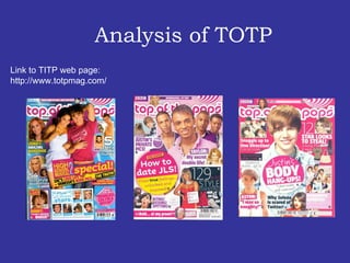
- 1. Analysis of TOTP Link to TITP web page: http://www.totpmag.com/
- 2. The masthead is written in bold writing, the font style is very appealing to the target audience. The header is in block capitals and it is in pink writing this could suggest that the target audience my be mainly female. The layout of the cover is quite messy, there a lot going on. There are several pictures. The main image takes over most of the page, this could imply that its more important then the other images . There are various amount if quotes on the cover, this could be a way of luring the target audience .
- 3. Analysis of the content page
- 4. Rule of Thirds The ‘TOTP’ contents page is pretty simple but it has a lot going on in it. Its set in three columns with several images on it and it has a lot of bold writing and colour. This intrigues the target audience. ‘ TOTP’ content pages is quite unusual because it doesn’t have the masthead on the contents page while most other magazines do. Also, its image lead which could suggest its directed at a younger age group.
- 5. Analysis of the DPS
- 6. The layout on ‘TOTP’ DPS is quite simple, its has 1 large image and a smaller image. It’s split into three columns. Both the text and images balance each other out. The simplicity could be used because of the target audience being from a younger age range. However because there’s a lot of colour used this could appeal to the target audience.