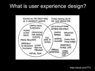
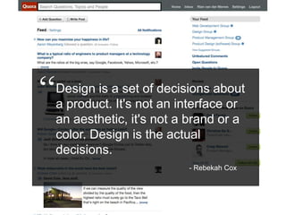
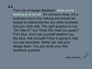
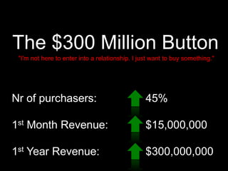
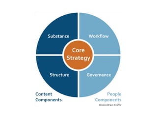
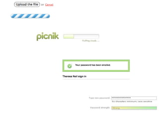
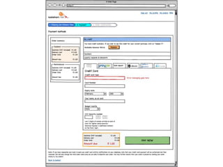
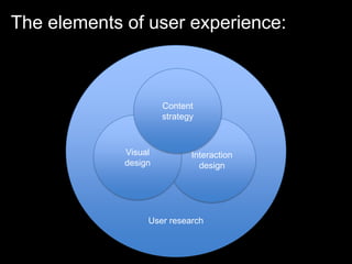
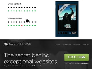
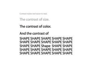
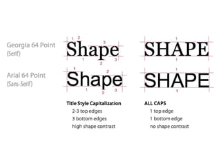
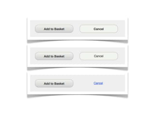
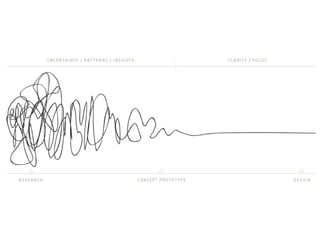
In this talk I give an overview of the elements of User Experience Design, and more importantly, why you should care about it. The goal is to provide some baseline knowledge of the user-centered design process to equip anyone to take those skills back to their desks and start applying it immediately. I discuss user experience research, content strategy, interaction design, and visual design, and how those elements work together to build great experiences.
1. An introduction to user experience design Rian van der Merwe twitter: @RianVDM web: elezea.com
2. What is user experience design? http://xkcd.com/773
3. “User experience” encompasses all aspects of the end-user's interaction with the company, its services, and its products. The first requirement for an exemplary user experience is to meet the exact needs of the customer, without fuss or bother. Next comes simplicity and elegance that produce products that are a joy to own, a joy to use. True user experience goes far beyond giving customers what they say they want, or providing checklist features. In order to achieve high-quality user experience in a company's offerings there must be a seamless merging of the services of multiple disciplines, including engineering, marketing, graphical and industrial design, and interface design. http://www.nngroup.com/about/userexperience.html
4. Or, to put it another way: “What a great thing for a father to do with his son. Patrick was so proud to be #1 in line. They made a big deal about it when they let him into the store first. That’s a memory that he’ll have the rest of his life. What a great dad to make that happen.”
5.
6. “ Design is a set of decisions about a product. It's not an interface or an aesthetic, it's not a brand or a color. Design is the actual decisions. - Rebekah Cox
7. “ First rule of design feedback: what you’re looking at is not art. It’s not even close. It’s a business tool in the making and should be looked at objectively like any other business tool you work with. The right question is not, “Do I like it?” but “Does this meet our goals?” If it’s blue, don’t ask yourself whether you like blue. Ask yourself if blue is going to help you sell sprockets. Better yet: ask your design team. You just wrote your first feedback question. - Mike Monteiro
8. Why is user experience design important? Improved requirements Faster time-to-market Increased value per user Extended application life
9. The $300 Million Button "I'm not here to enter into a relationship. I just want to buy something." Nr of purchasers: 1st Month Revenue: 1st Year Revenue: 45% $15,000,000 $300,000,000
11. “ A common mistake that people make when trying to design something completely foolproof is to underestimate the ingenuity of complete fools. - Douglas Adams
22. RITE testing on eBay Shopping Cart Iterative paper prototype testing: Uncover conceptual and interaction issues before the design Top Buyer, researcher, and “human computer”
23. Eye Tracking Eye tracking allows us to identify what participants look at (and don’t look at), and in what order. Sample scanning pattern Sample Heat map summarizing overall viewing pattern
24. An example of UCD: Redesigning kalahari.com checkout
25.
26. The elements of user experience: User research Content strategy Visual design Interaction design User research
35. Content strategy plans for the creation, delivery, and governance of content. Better content. Content people care about. Content that supports your business objectives and meets your users' goals. It's a long-term fix for content problems of all sizes. - Kristina Halvorson (@halvorson)
58. Interaction design defines the structure and behaviors of interactive products and services, and user interactions with those products and services. Interaction design is grounded in an understanding of real users (goals, tasks, experiences, needs, and wants) and balances these needs with business goals and technological capabilities. -IxDA
59. 10 heuristics for user interface design http://www.useit.com/papers/heuristic/heuristic_list.html Visibility of system status
60.
61.
62. 10 heuristics for user interface design http://www.useit.com/papers/heuristic/heuristic_list.html Visibility of system status Match between system and the real world
63.
64. 10 heuristics for user interface design http://www.useit.com/papers/heuristic/heuristic_list.html Visibility of system status Match between system and the real world User control and freedom
65.
66. 10 heuristics for user interface design http://www.useit.com/papers/heuristic/heuristic_list.html Visibility of system status Match between system and the real world User control and freedom Consistency and standards
67.
68.
69.
70.
71. 10 heuristics for user interface design http://www.useit.com/papers/heuristic/heuristic_list.html Visibility of system status Match between system and the real world User control and freedom Consistency and standards Error prevention
72.
73. 10 heuristics for user interface design http://www.useit.com/papers/heuristic/heuristic_list.html Visibility of system status Match between system and the real world User control and freedom Consistency and standards Error prevention Recognition rather than recall
74.
75. 10 heuristics for user interface design http://www.useit.com/papers/heuristic/heuristic_list.html Visibility of system status Match between system and the real world User control and freedom Consistency and standards Error prevention Recognition rather than recall Flexibility and efficiency of use
76.
77. 10 heuristics for user interface design http://www.useit.com/papers/heuristic/heuristic_list.html Visibility of system status Match between system and the real world User control and freedom Consistency and standards Error prevention Recognition rather than recall Flexibility and efficiency of use Aesthetic and minimalist design
78.
79.
80. 10 heuristics for user interface design http://www.useit.com/papers/heuristic/heuristic_list.html Visibility of system status Match between system and the real world User control and freedom Consistency and standards Error prevention Recognition rather than recall Flexibility and efficiency of use Aesthetic and minimalist design Help users recognize and recover from errors
81.
82.
83.
84.
85.
86.
87.
88.
89. 10 heuristics for user interface design http://www.useit.com/papers/heuristic/heuristic_list.html Visibility of system status Match between system and the real world User control and freedom Consistency and standards Error prevention Recognition rather than recall Flexibility and efficiency of use Aesthetic and minimalist design Help users recognize and recover from errors Help and documentation
96. The art and profession of selecting and arranging visual elements — such as typography, images, symbols, and colours — to convey a message to an audience. - Encyclopedia Brittannica
97. The principles of design Balance Proximity Alignment Consistency Contrast White space
99. “ A symmetrical object taps into the same neural machinery made to help the mind detect other people or predators. The more symmetrical and balanced something like a human face is, the more perceived beauty that is interpreted by the mind. No human face is perfectly symmetrical, however when the two sides are nearly equal, they are seen at a metacognitive level as more beautiful. Some scientists have argued this is because asymmetrical organisms are suffering from disease and the mind has evolved to recognize that. http://designinformer.com/designing-mind/
143. User experience is not rocket science. It’s not easy, but it’s not rocket science. And it requires a mind shift.
144. User experience is not rocket science. It’s not easy, but it’s not rocket science. And it requires a mind shift. Process. Rules. Science. And a healthy measure of art. But it is essential.
145. An introduction to user experience design Rian van der Merwe twitter: @RianVDM web: elezea.com
http://www.uie.com/articles/three_hund_million_button/45% of users had multiple accounts160,000/day clicked on “forgot password” – 75% of those never came backRegister Continue
An example of bad content – technical jargon that doesn’t mean much to the user. “Turnkey aggregated standardized branded end-to-end store.”
Simple content that matches the design. Focused on what they do, in language the user can understand.
Another site often shown as an example of good content. It’s financial software, but the language is not jargony at all, and explains what they do in simple language from the user’s perspective.
So many things wrong with this… Fake excitement, as if this is one of the best things you can find on the Internet Bad punctuation (Why all the exclamation points? Why hyphens on “ticket number” and “notice number”?) Rhetorical questions (question-talkers!): Already registered? New user? Red text that draws the eye (danger, danger!), but so long that very few visitors will read it Jargon (what’s AARTO, and why would users care?) Logout/login/Log In (innit caps)
Core strategy defines how your content will help you meet business objectives.Substance identifies what content is required to successfully execute implement your core strategy, including characteristics such as messaging architecture, intended audience(s), and voice and tone.Structure focuses on how content is prioritized, organized, and accessed. Although structure can include information architecture (IA), it focuses more deeply on the content itself, including mapping messages to content, content bridging, and creating detailed page tables.Workflow explains how people manage and maintain content on a daily basis, including the roles, tasks, and tools required throughout the content lifecycle.Governance describes the policies, standards, and guidelines that apply to content and its lifecycle, as well as how an organization will sustain and evolve its content strategy.
Voting paper from 10 April 1938. The text reads “Do you agree with the reunification of Austria with the German Empire that was enacted on 13 March 1938, and do you vote for the party of our leader Adolf Hitler?” The large circle is labeled “Yes” and the small circle is labeled “No”.
Low contrast typography – difficult to readAll caps – difficult to readLabels in form fields – recognition rather than recall (no idea what the field is once you’ve typed in it)Content – “sign in” in a signup pageVisual hierarchy of “Sign in” buttonConsistency – very different from home page