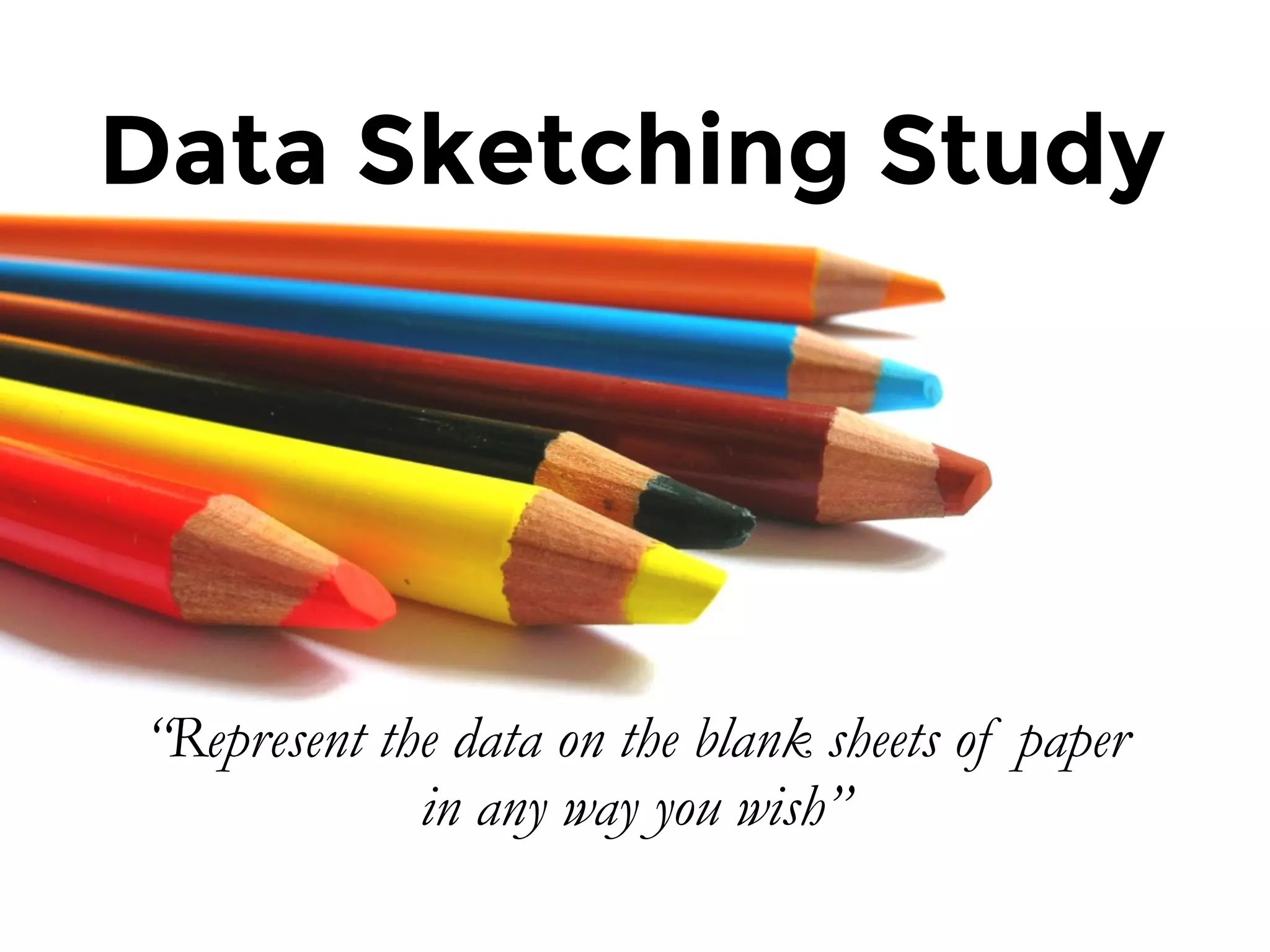
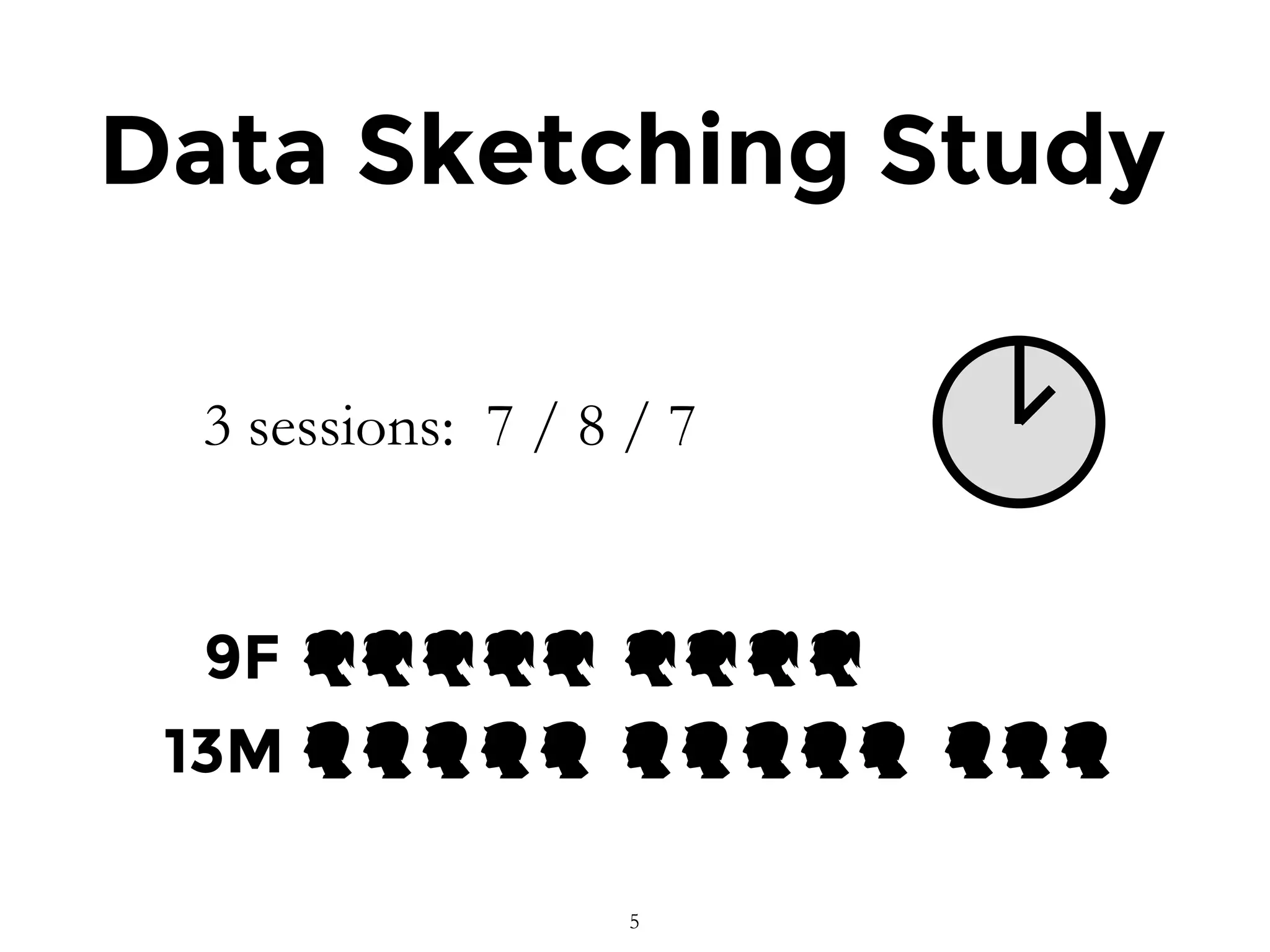
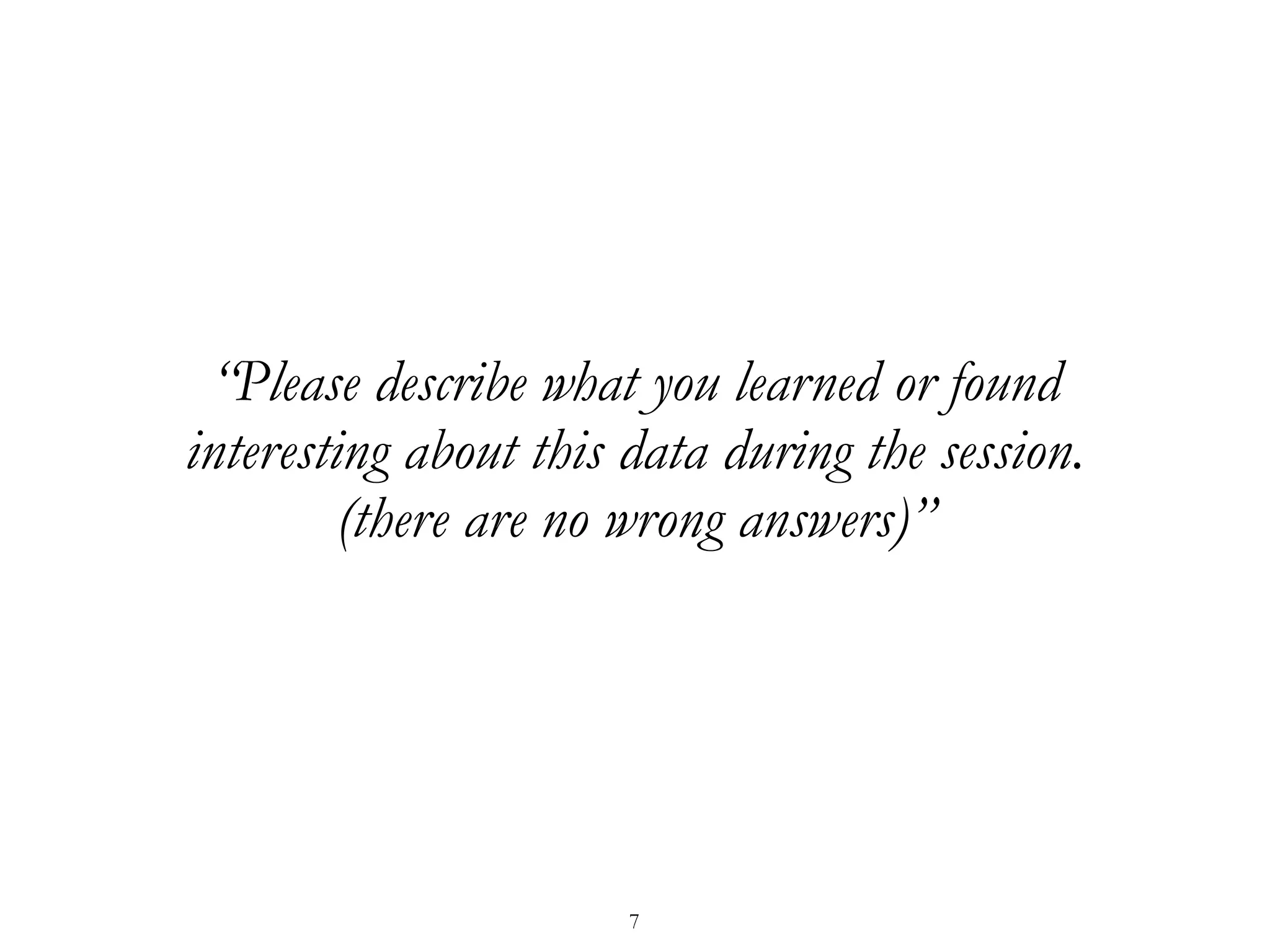
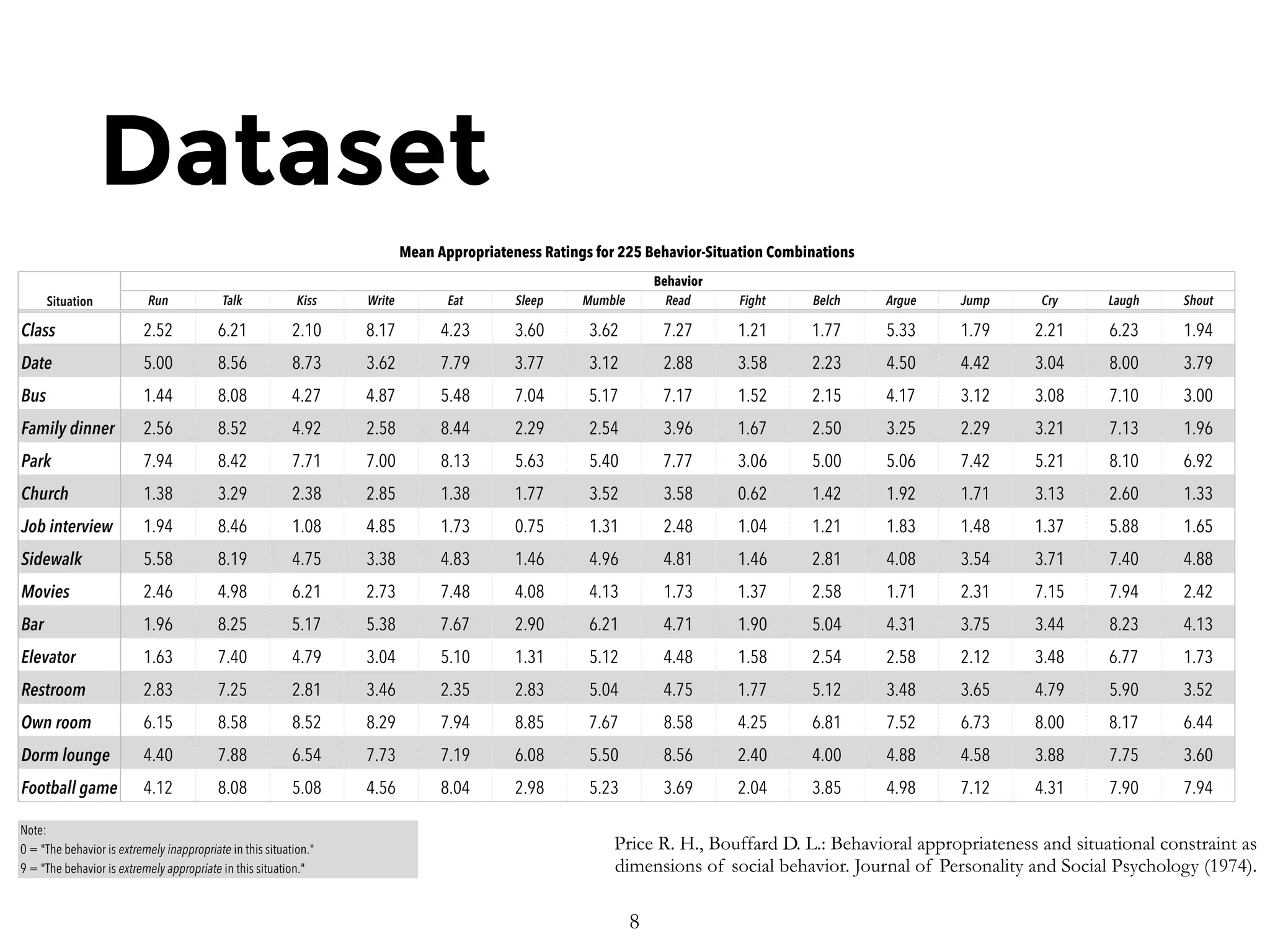
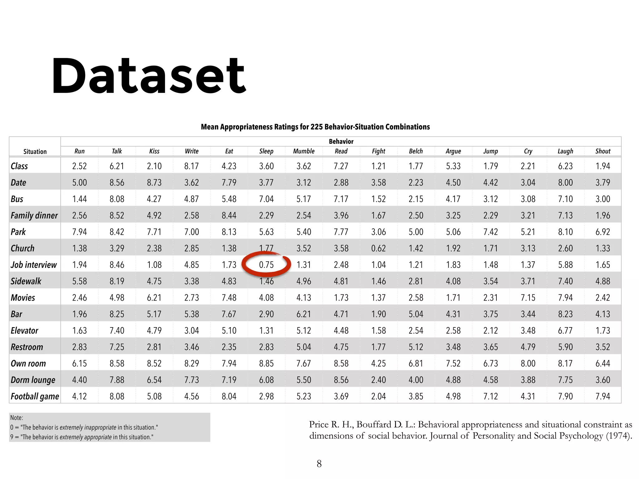
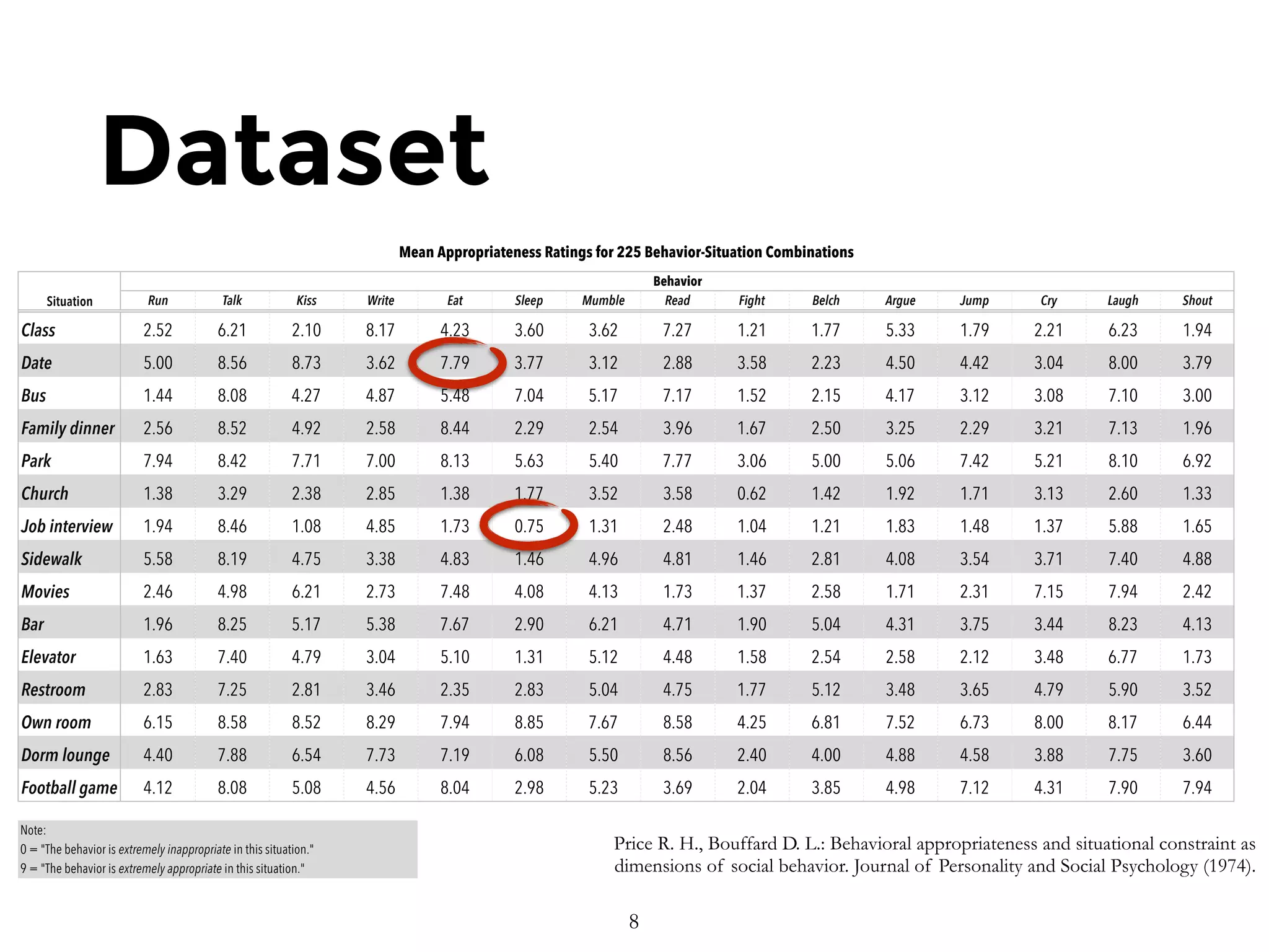
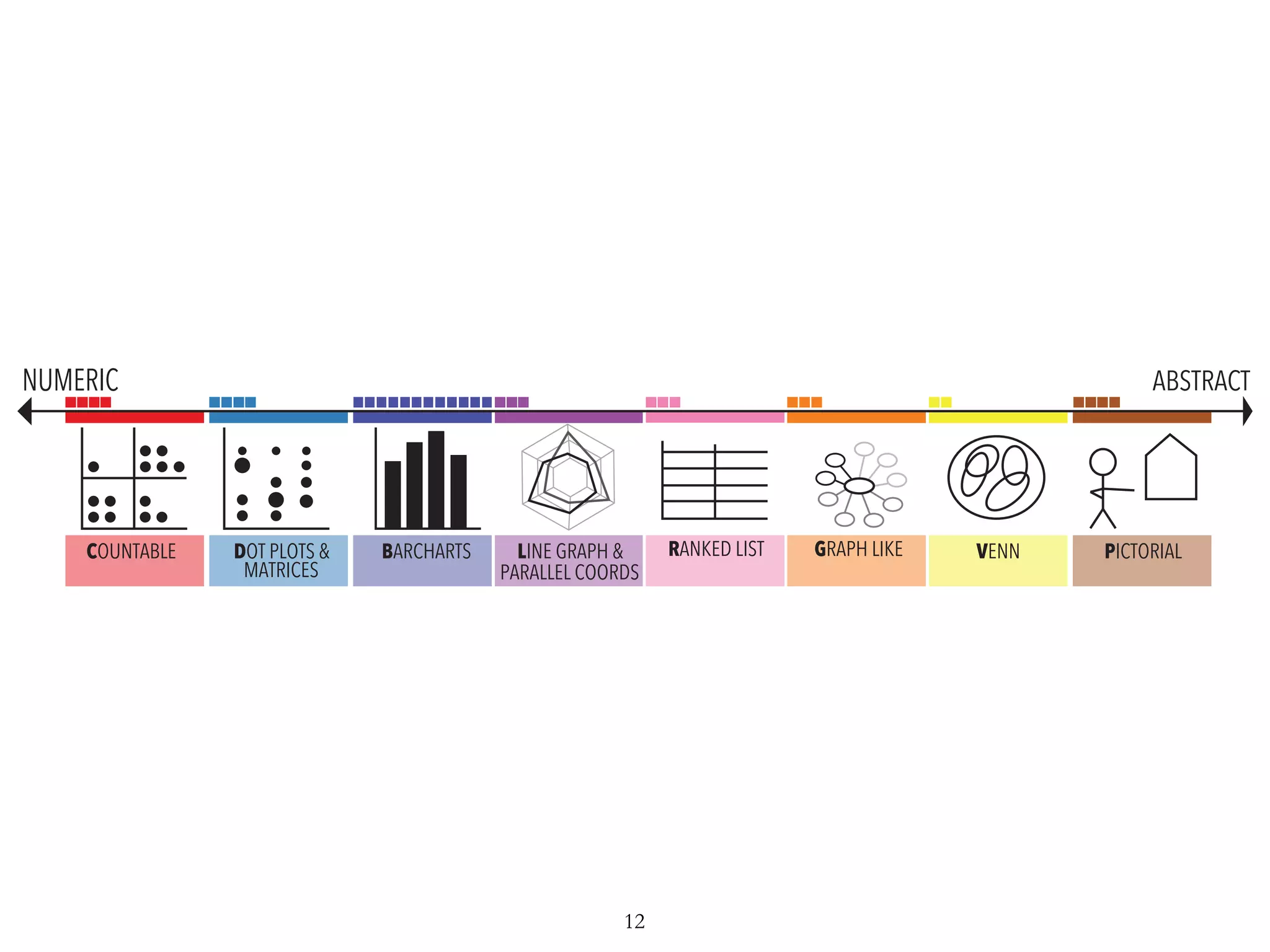
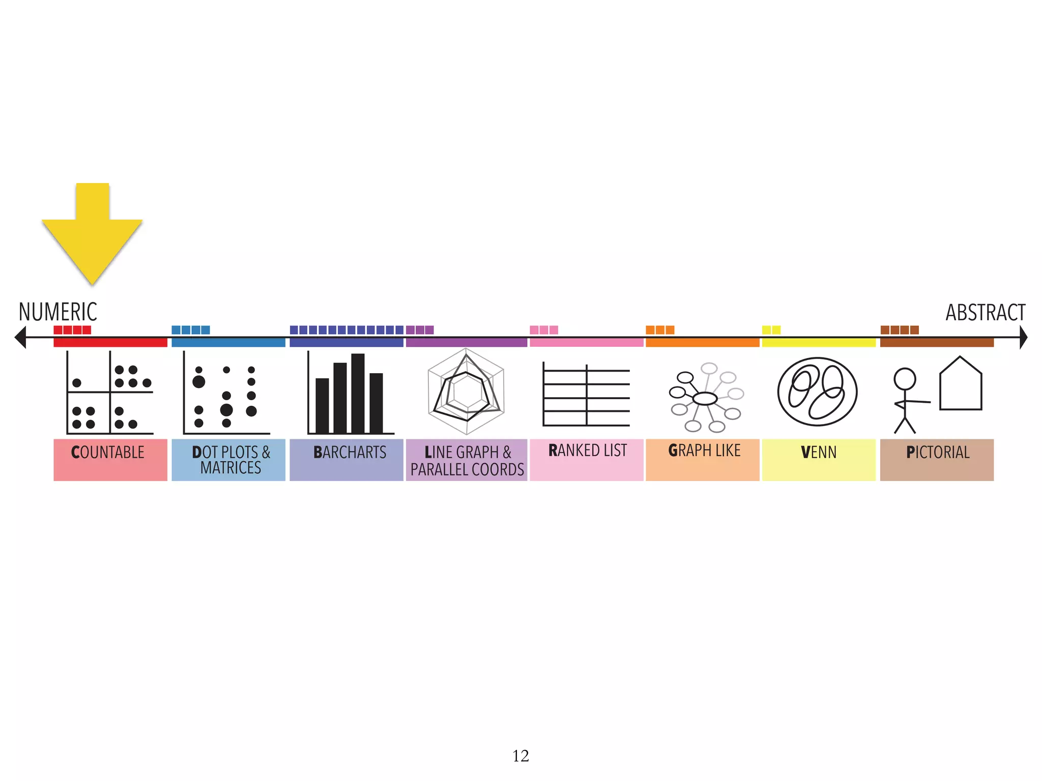
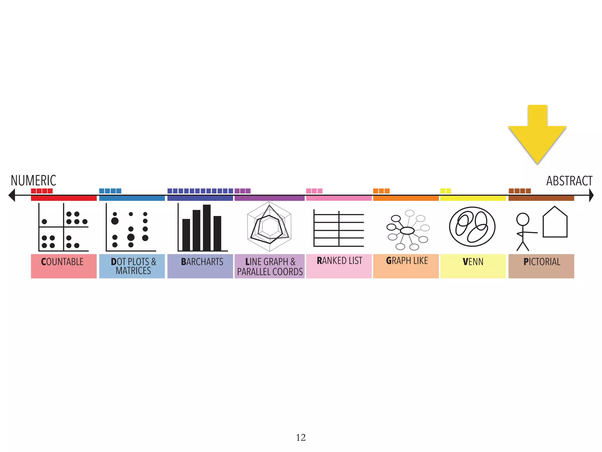
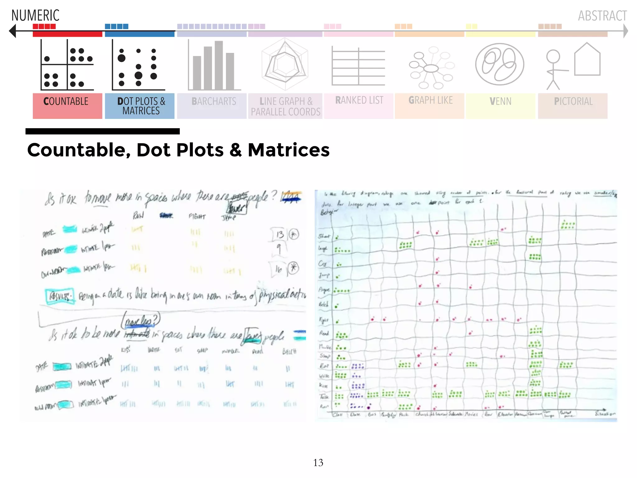
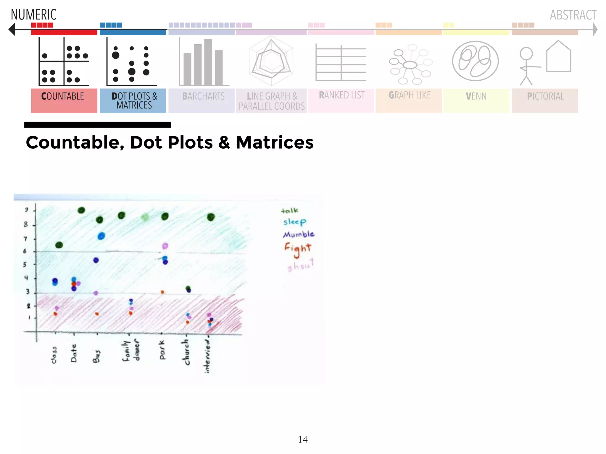
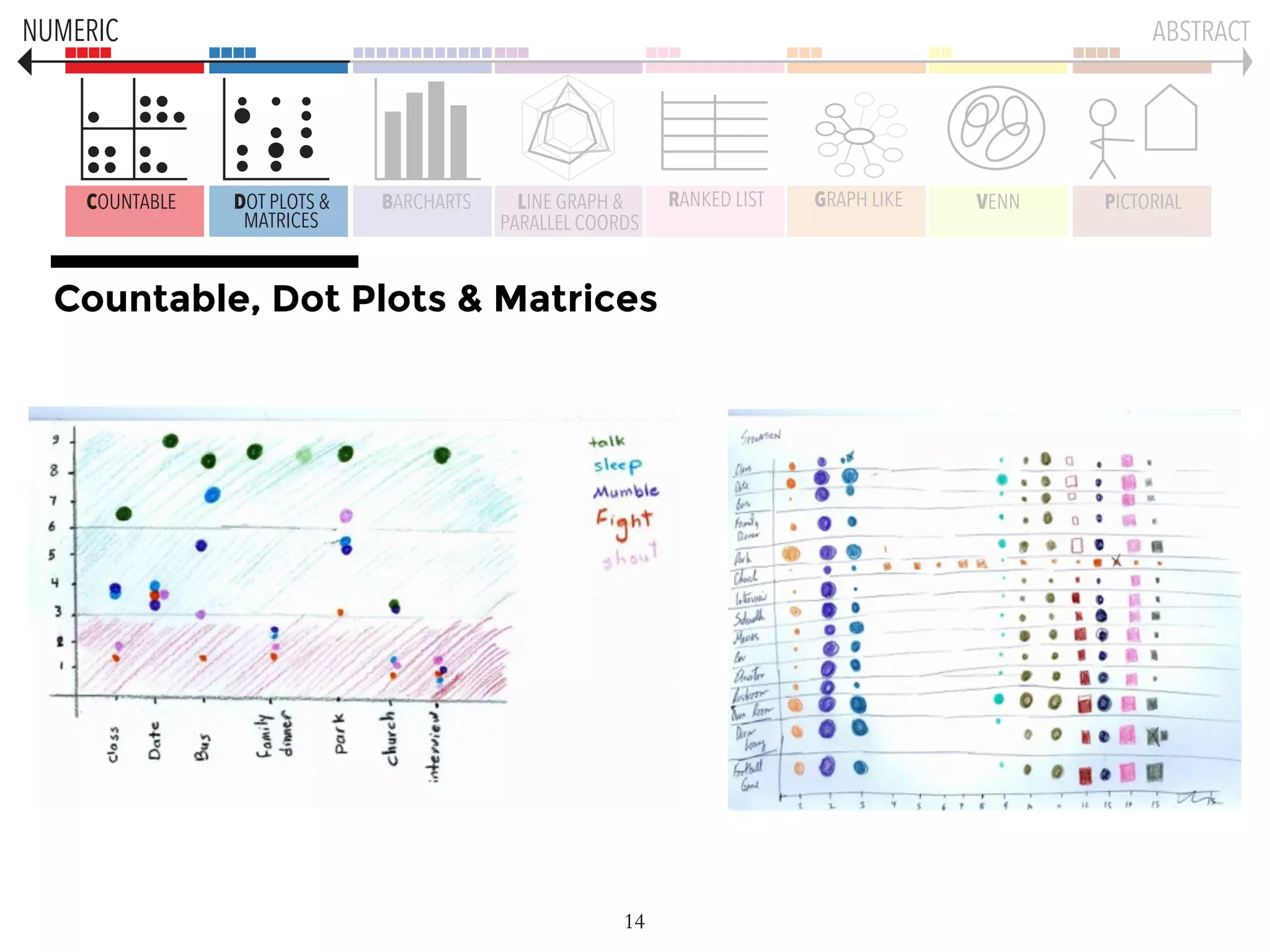
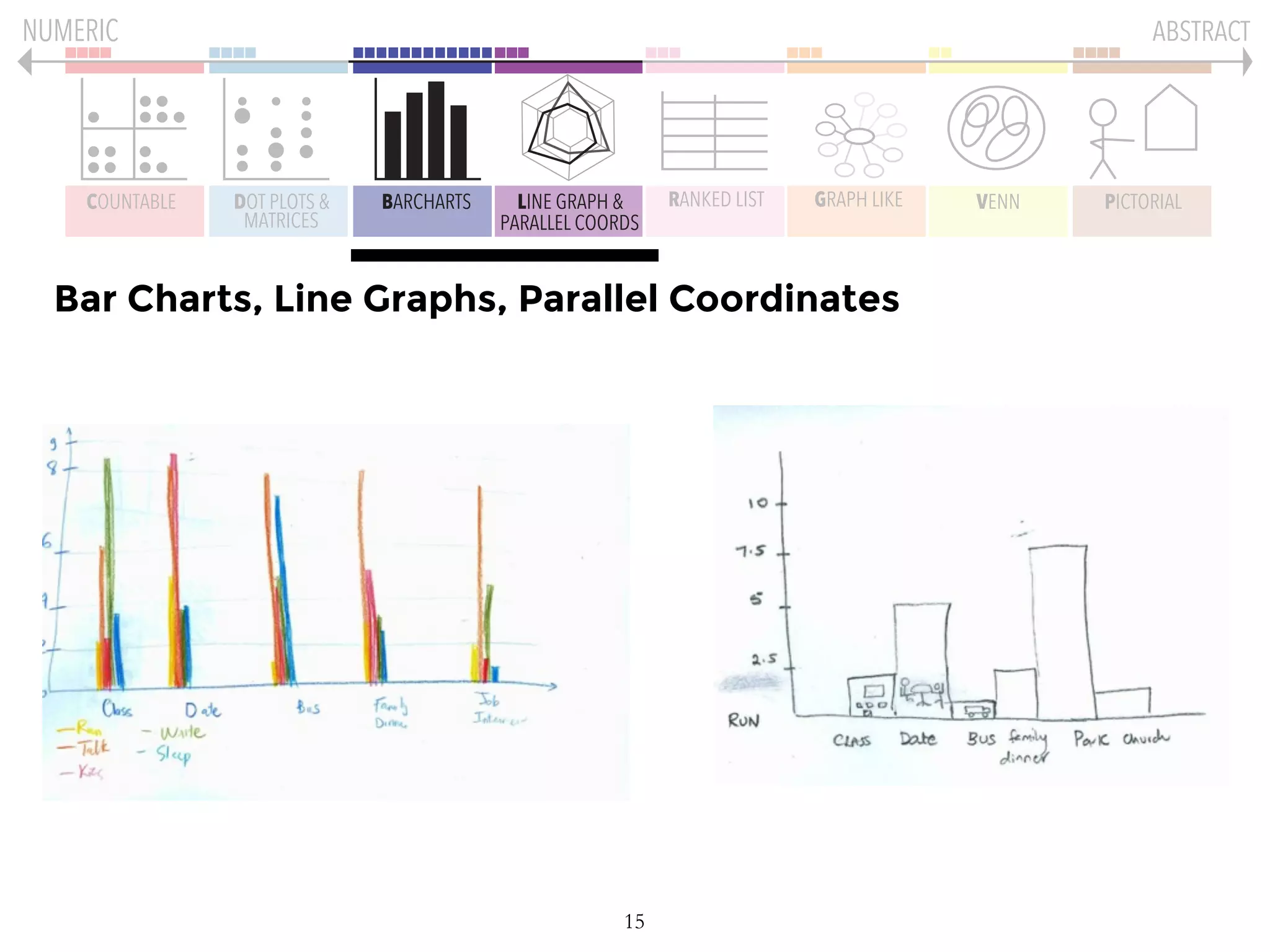
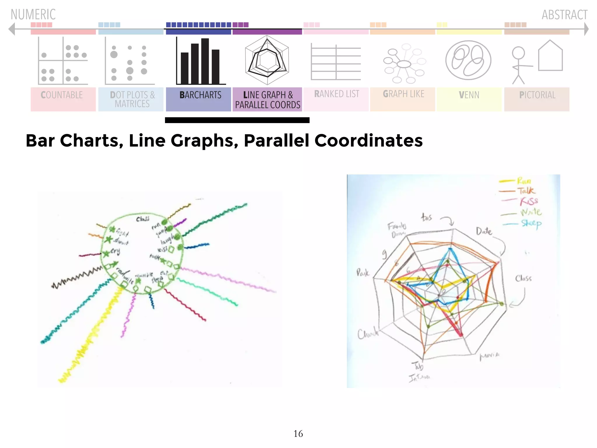
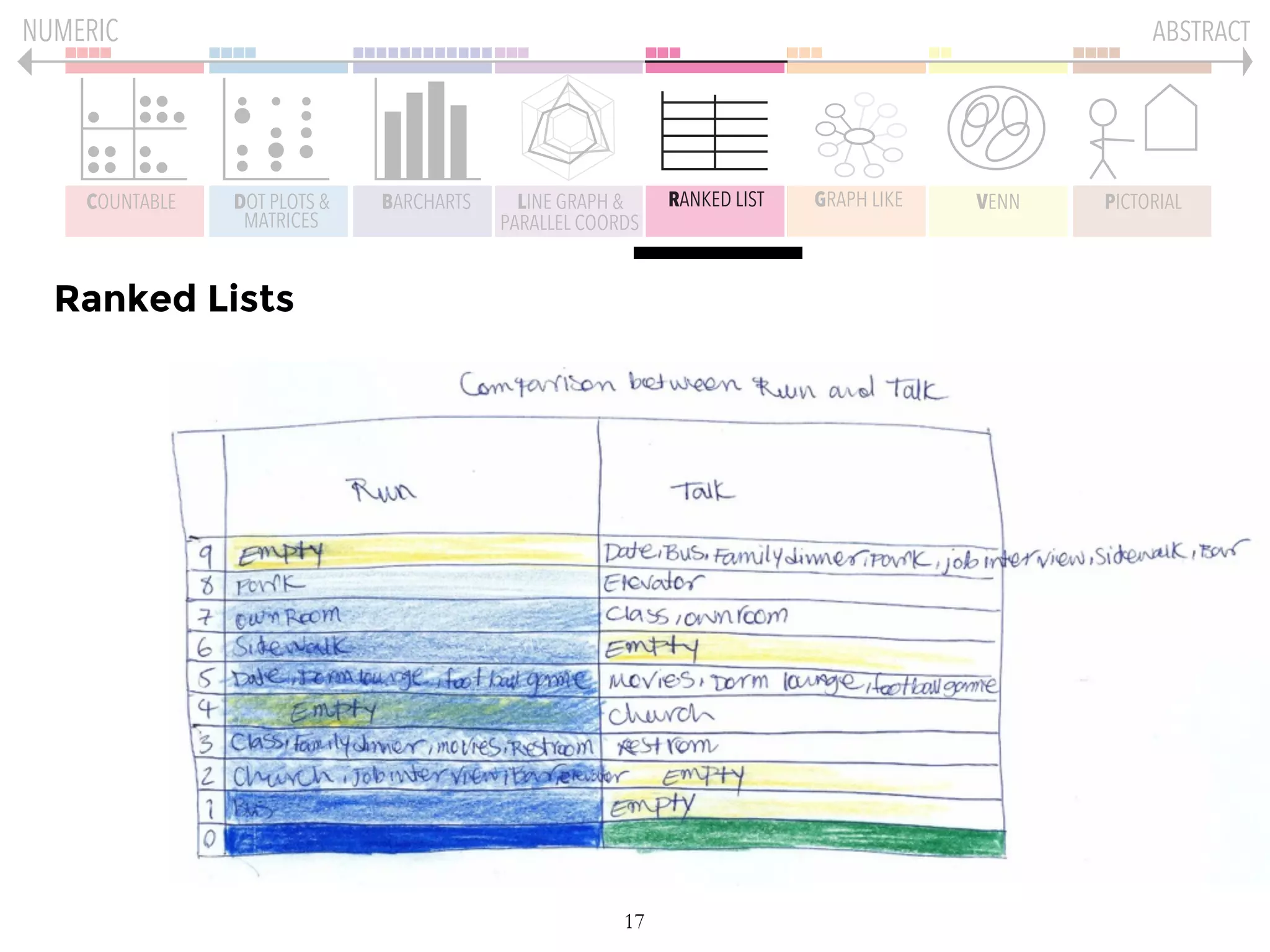
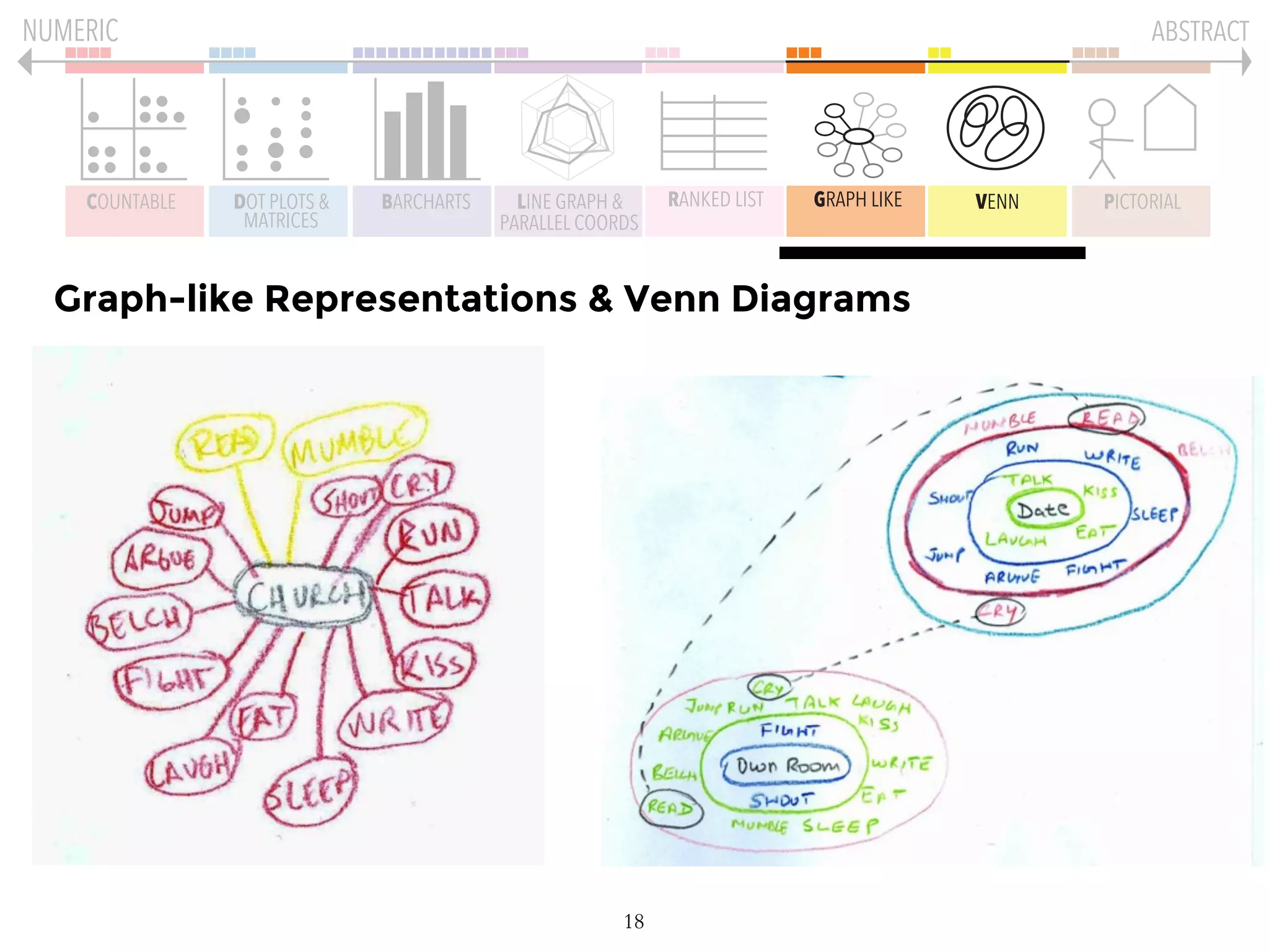
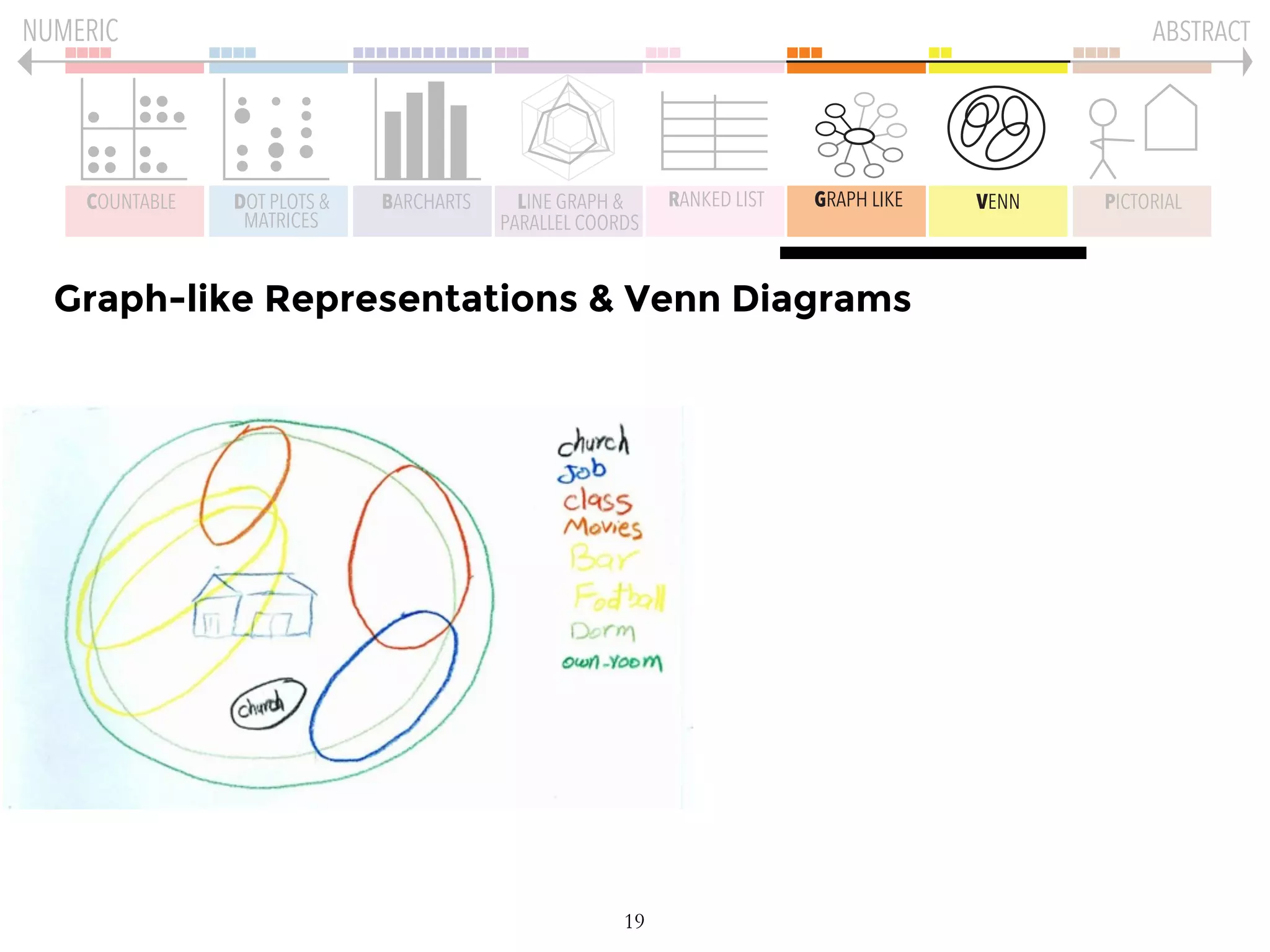
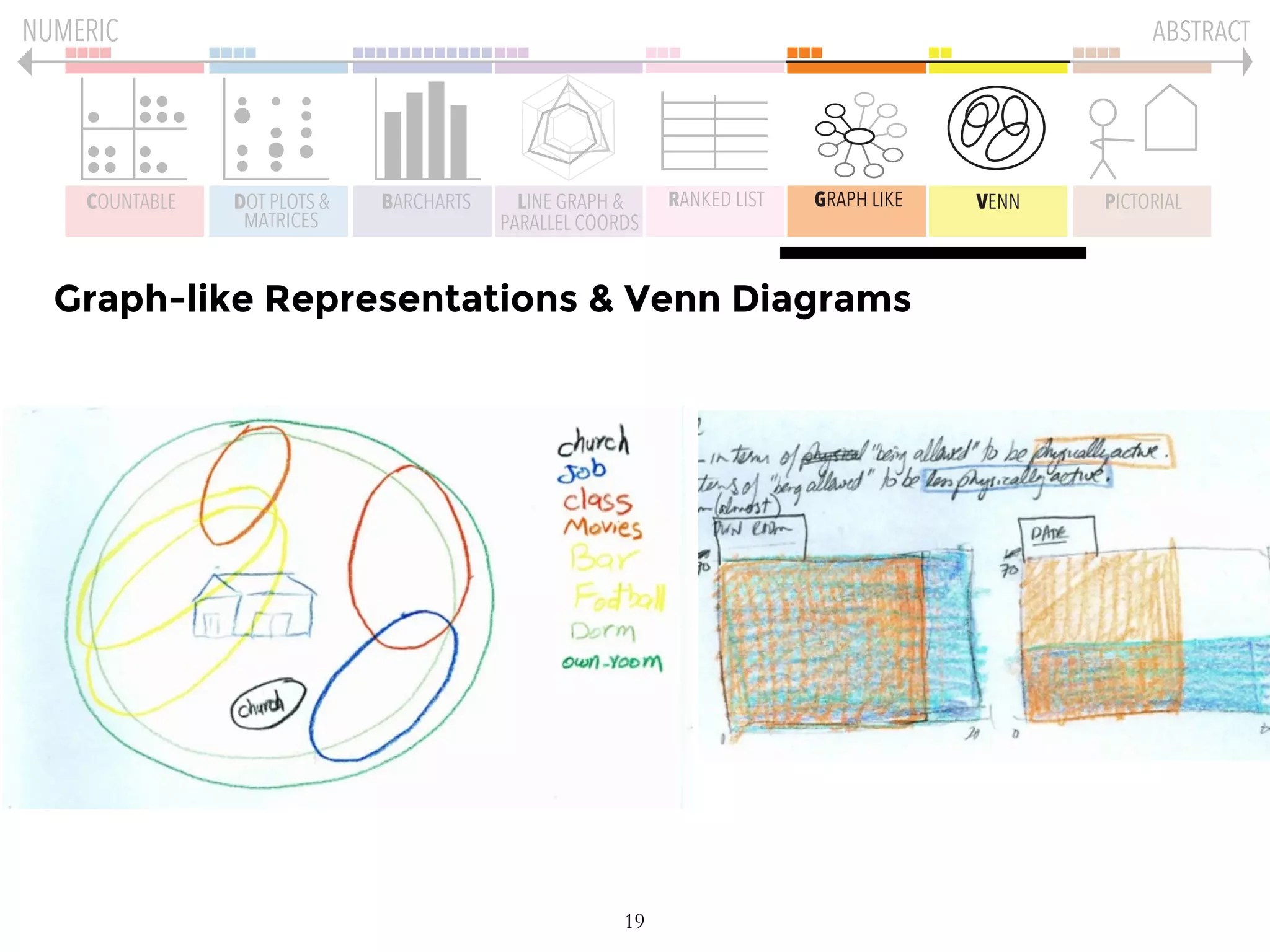
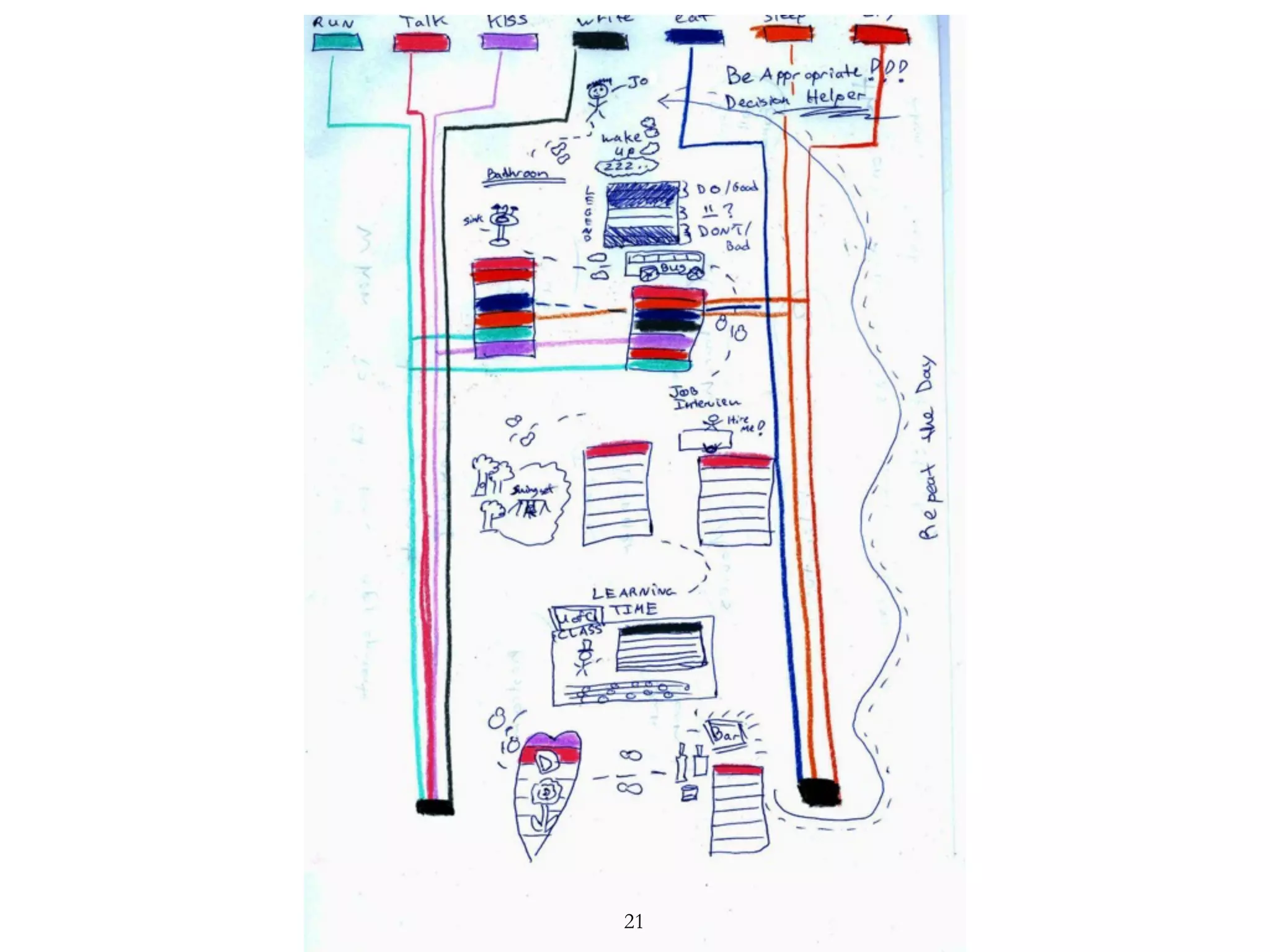
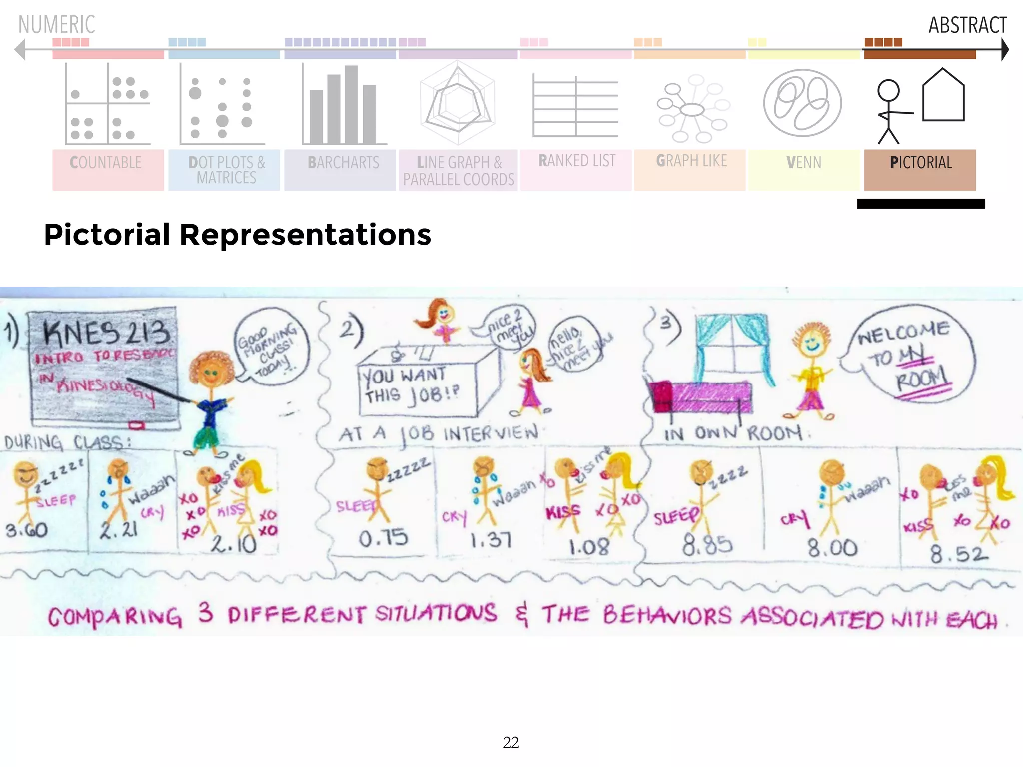
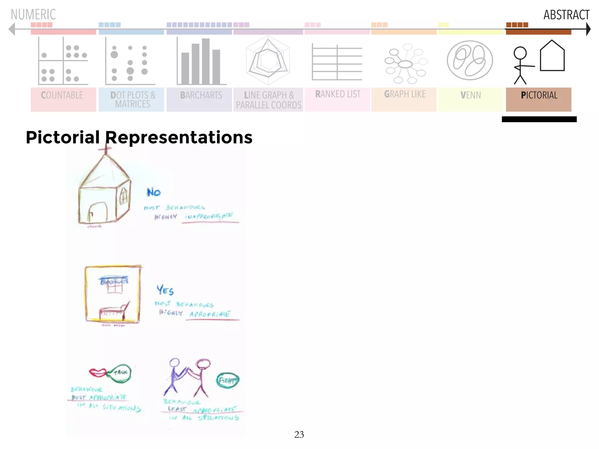
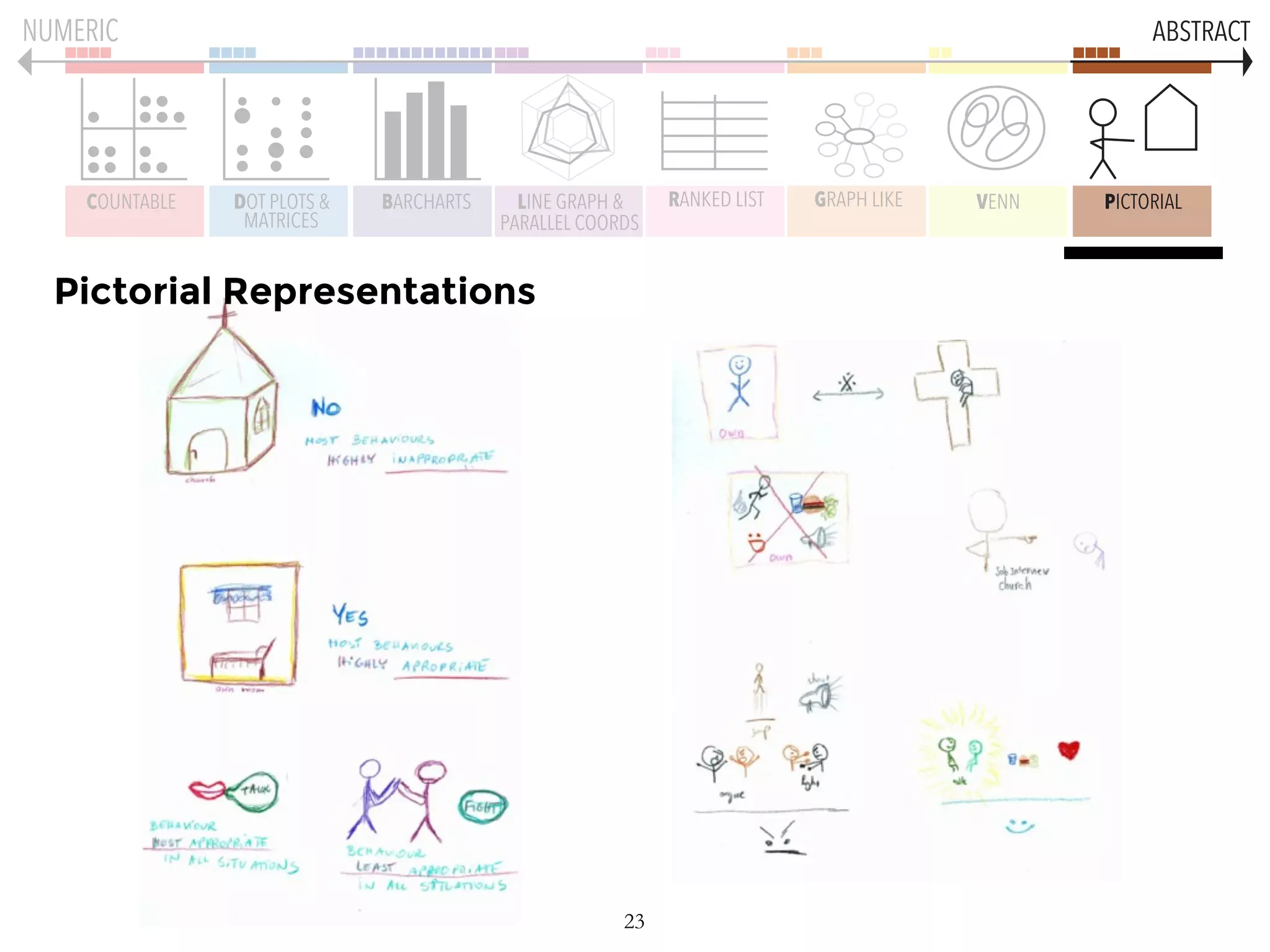
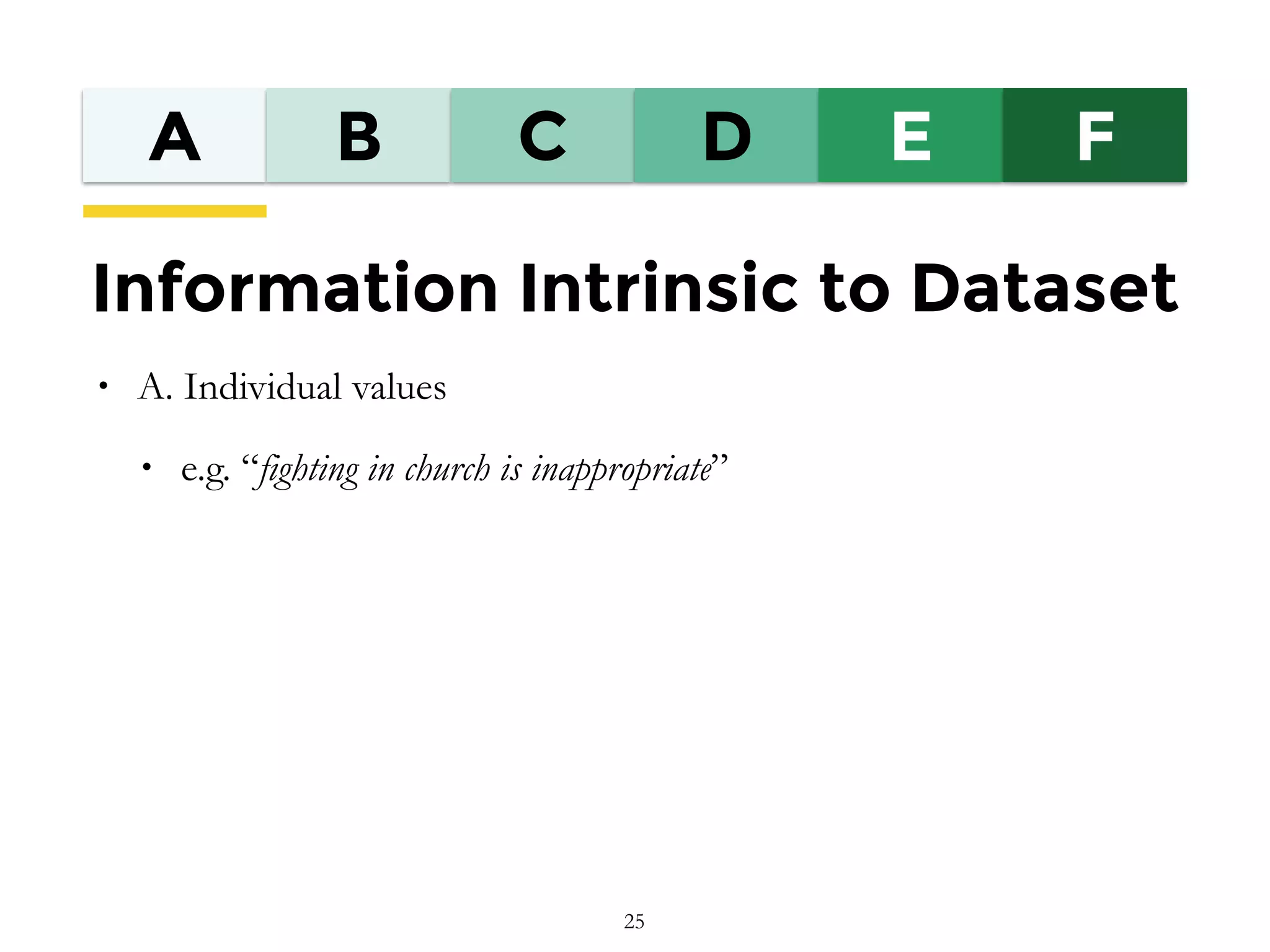
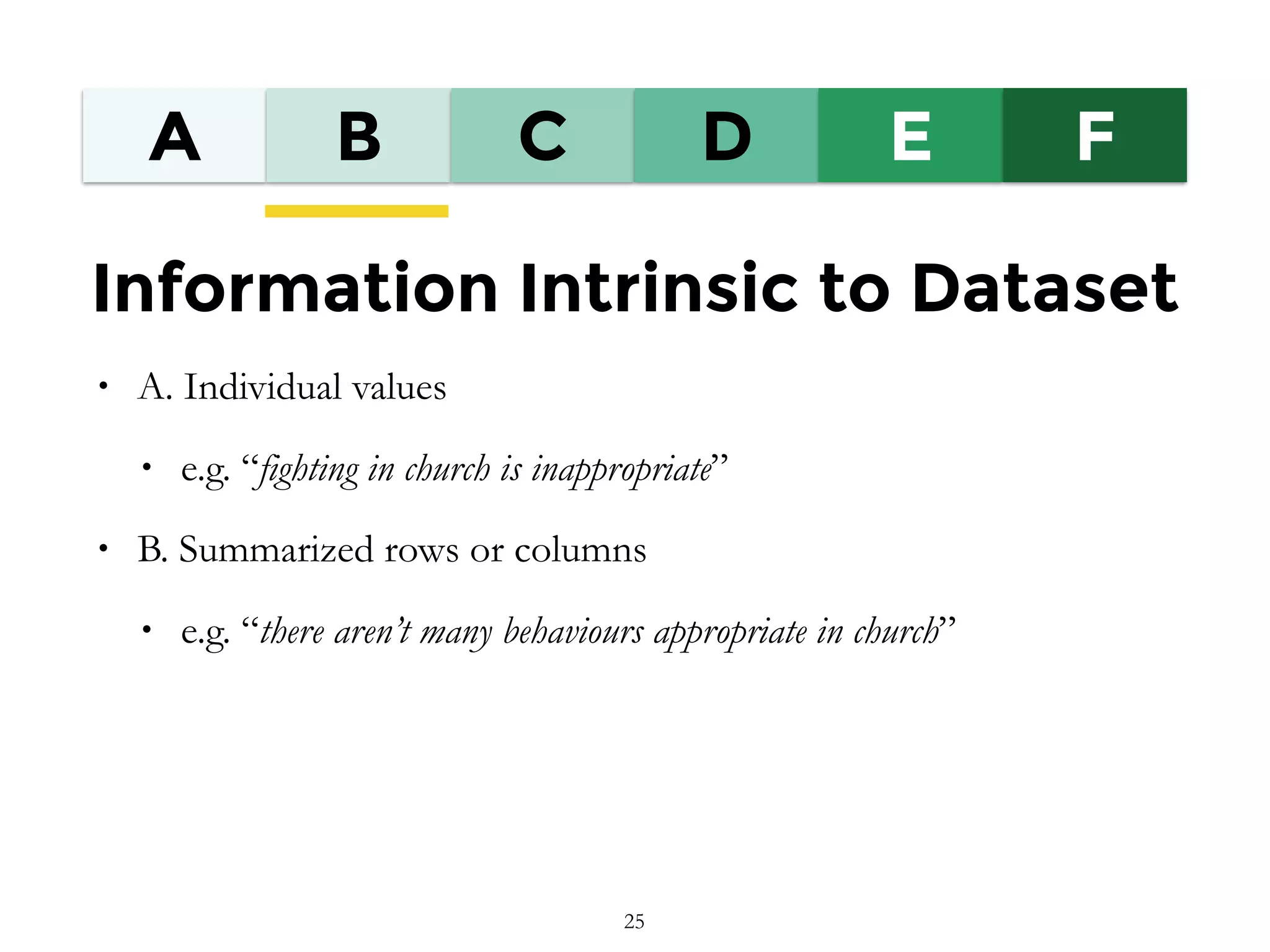
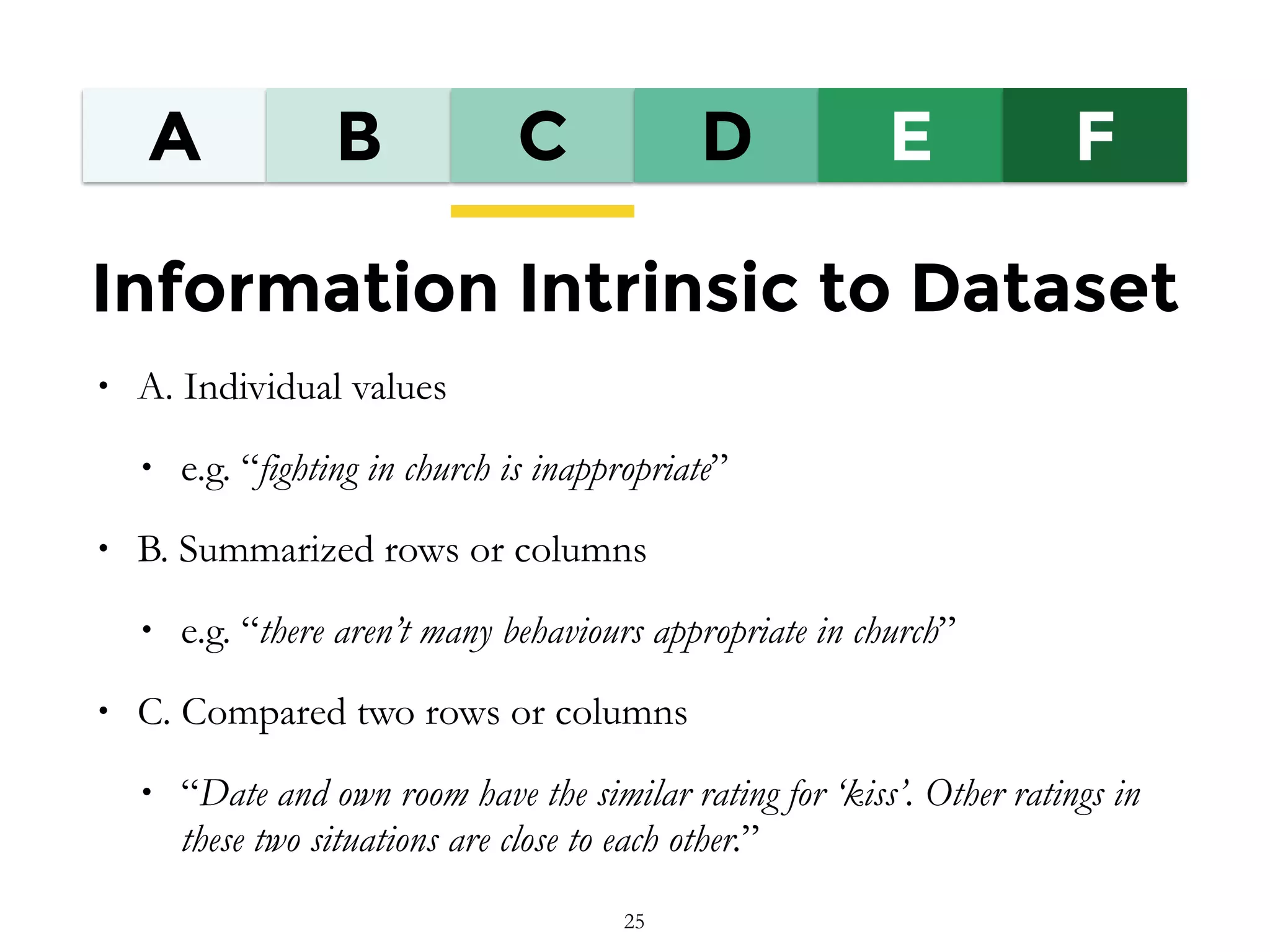
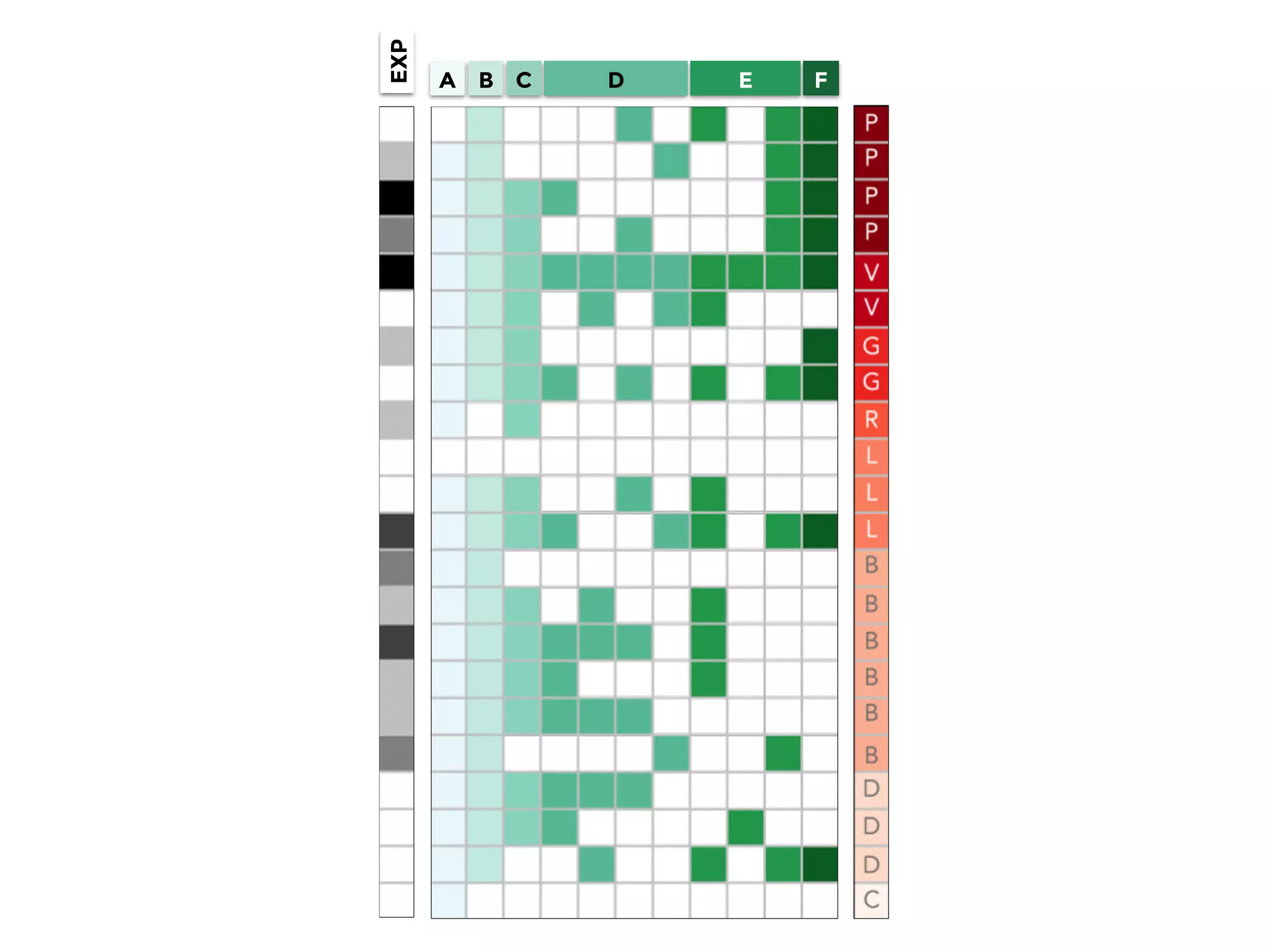
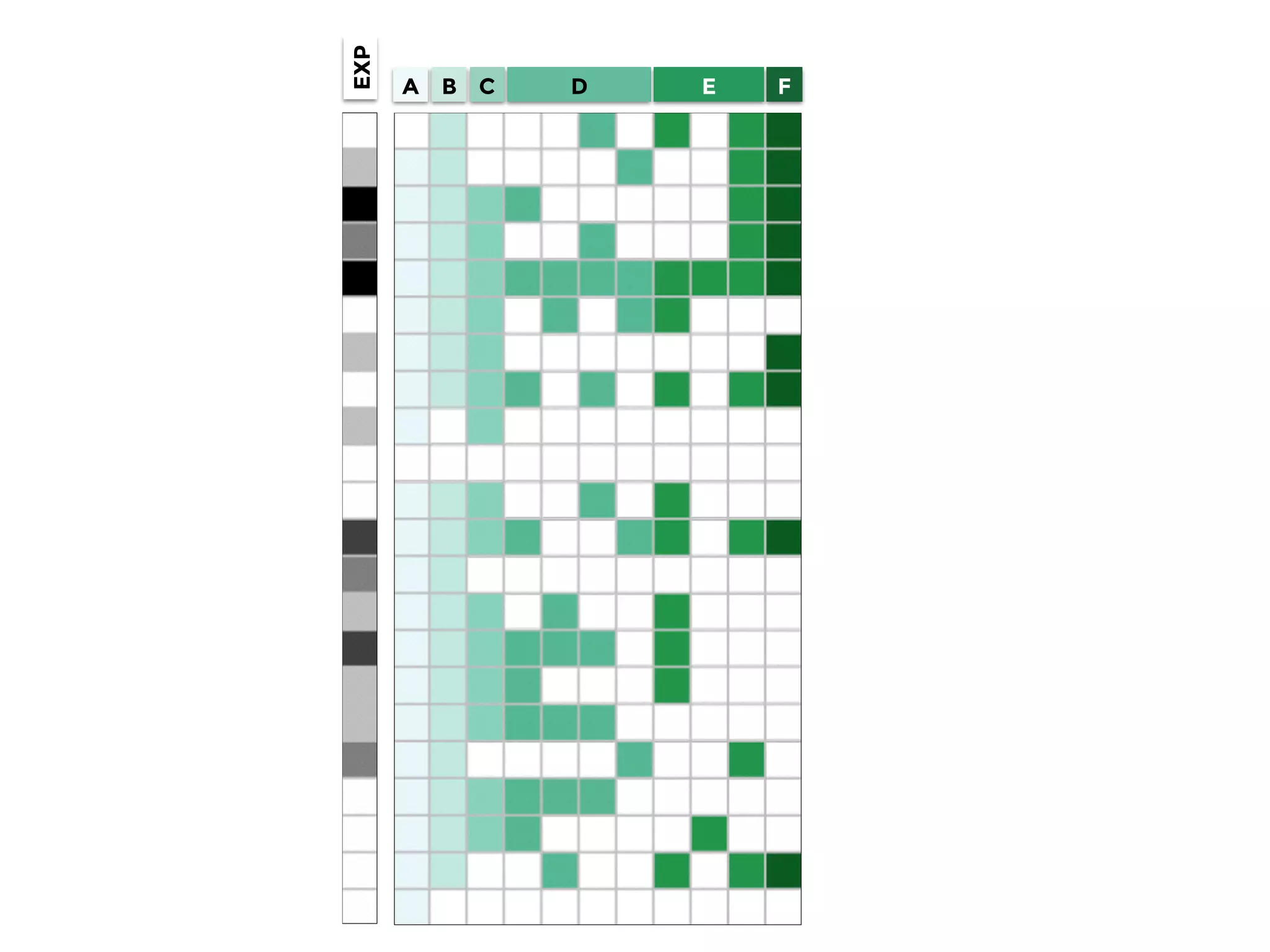
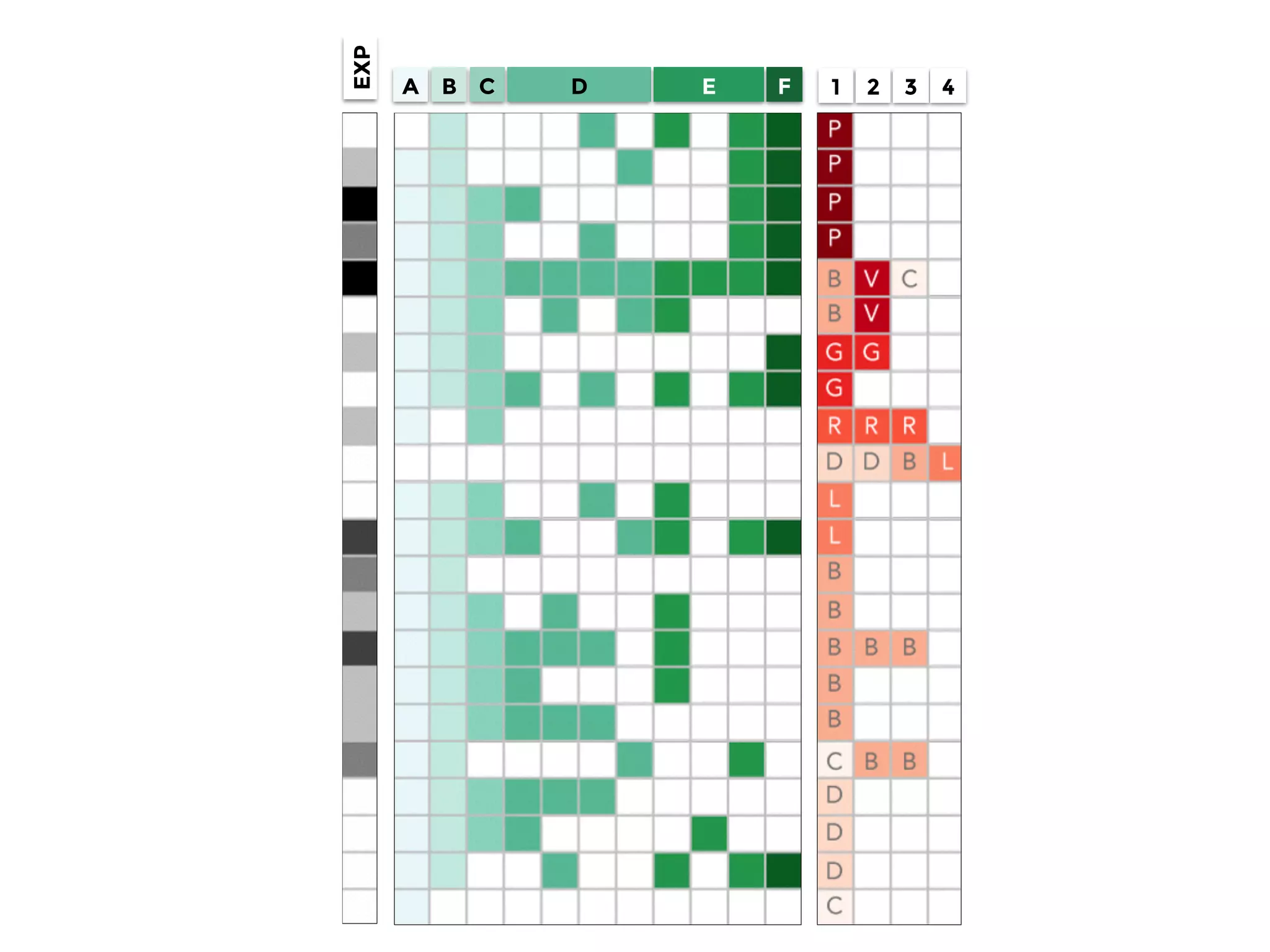
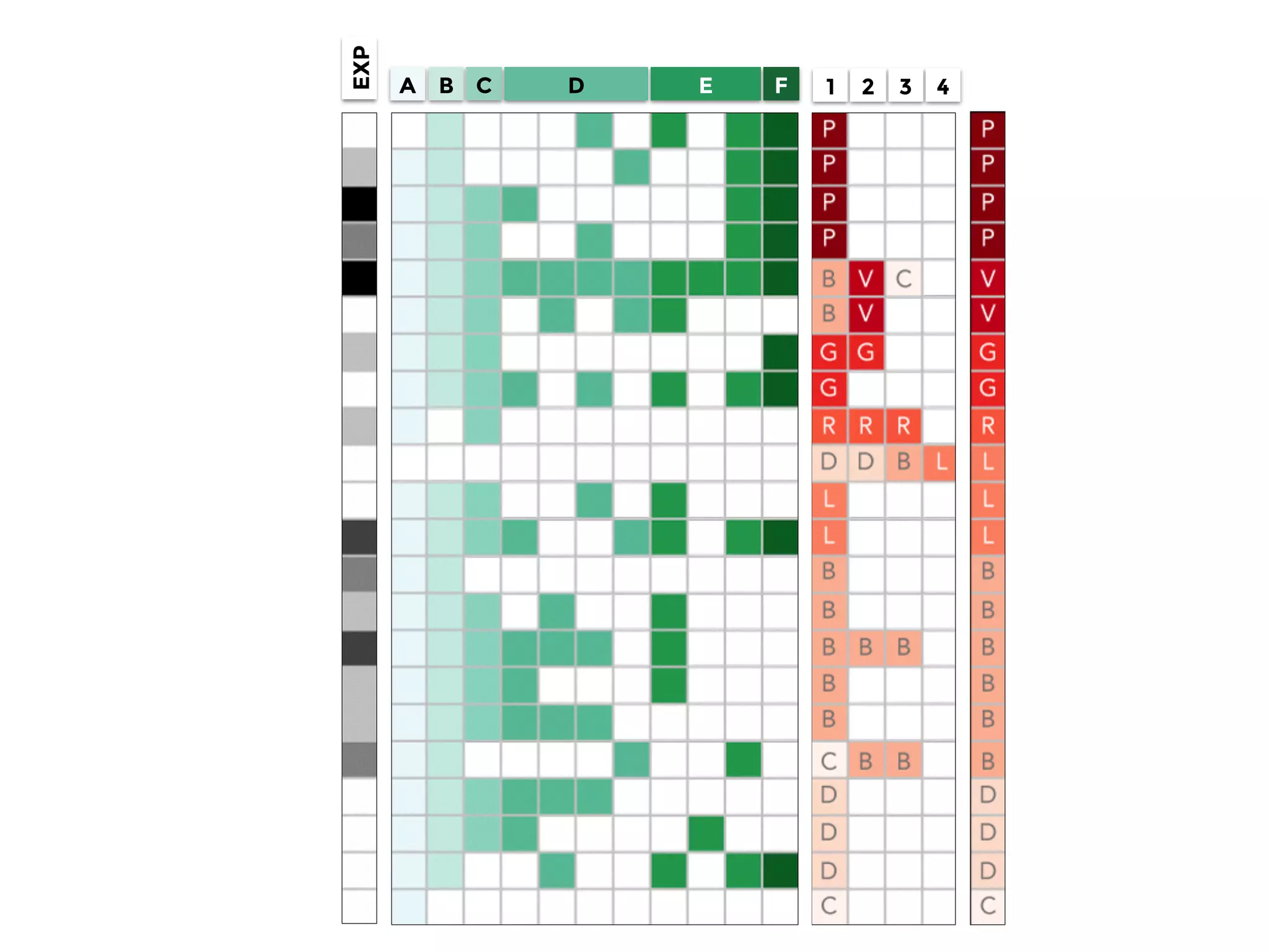
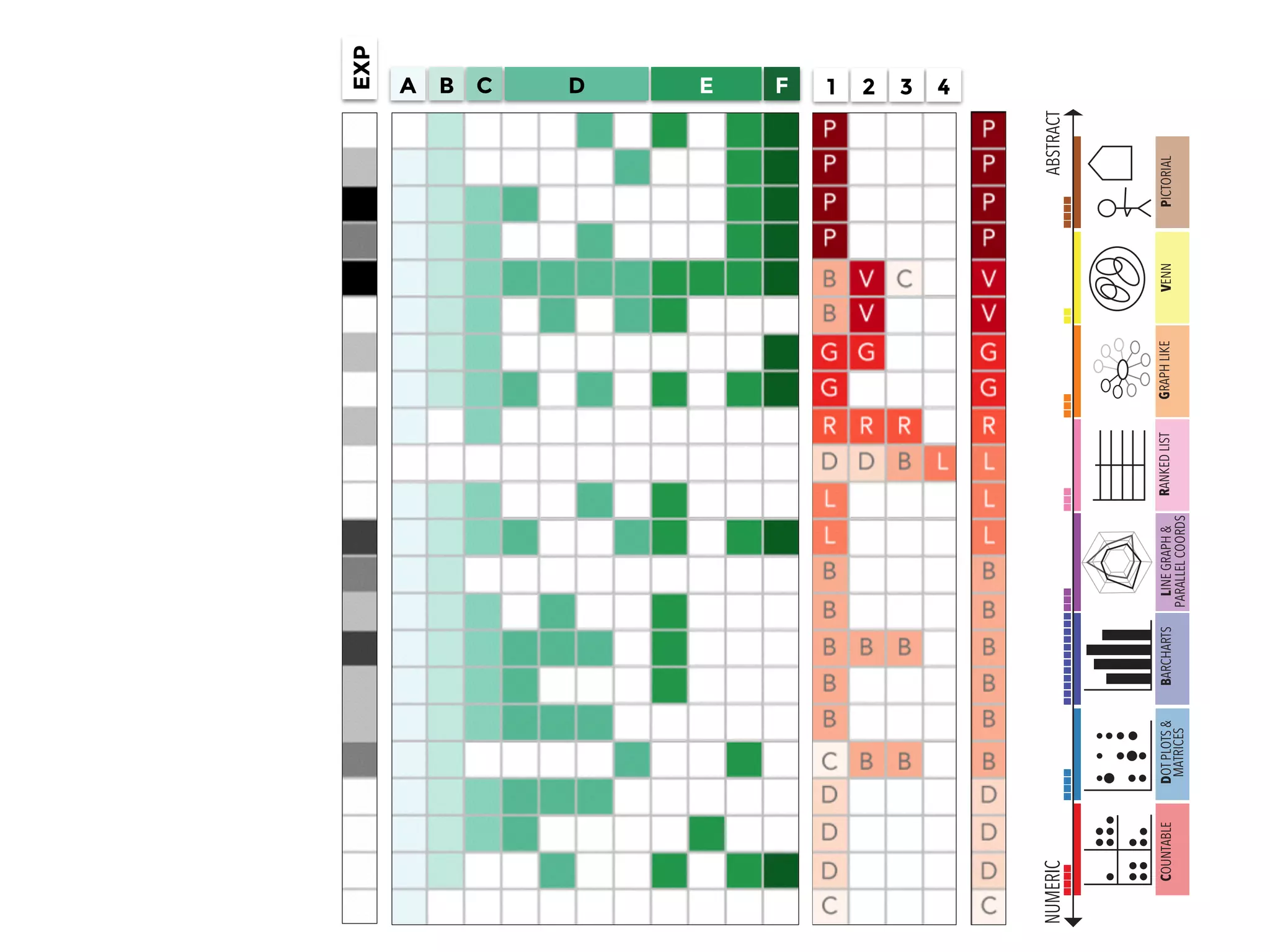
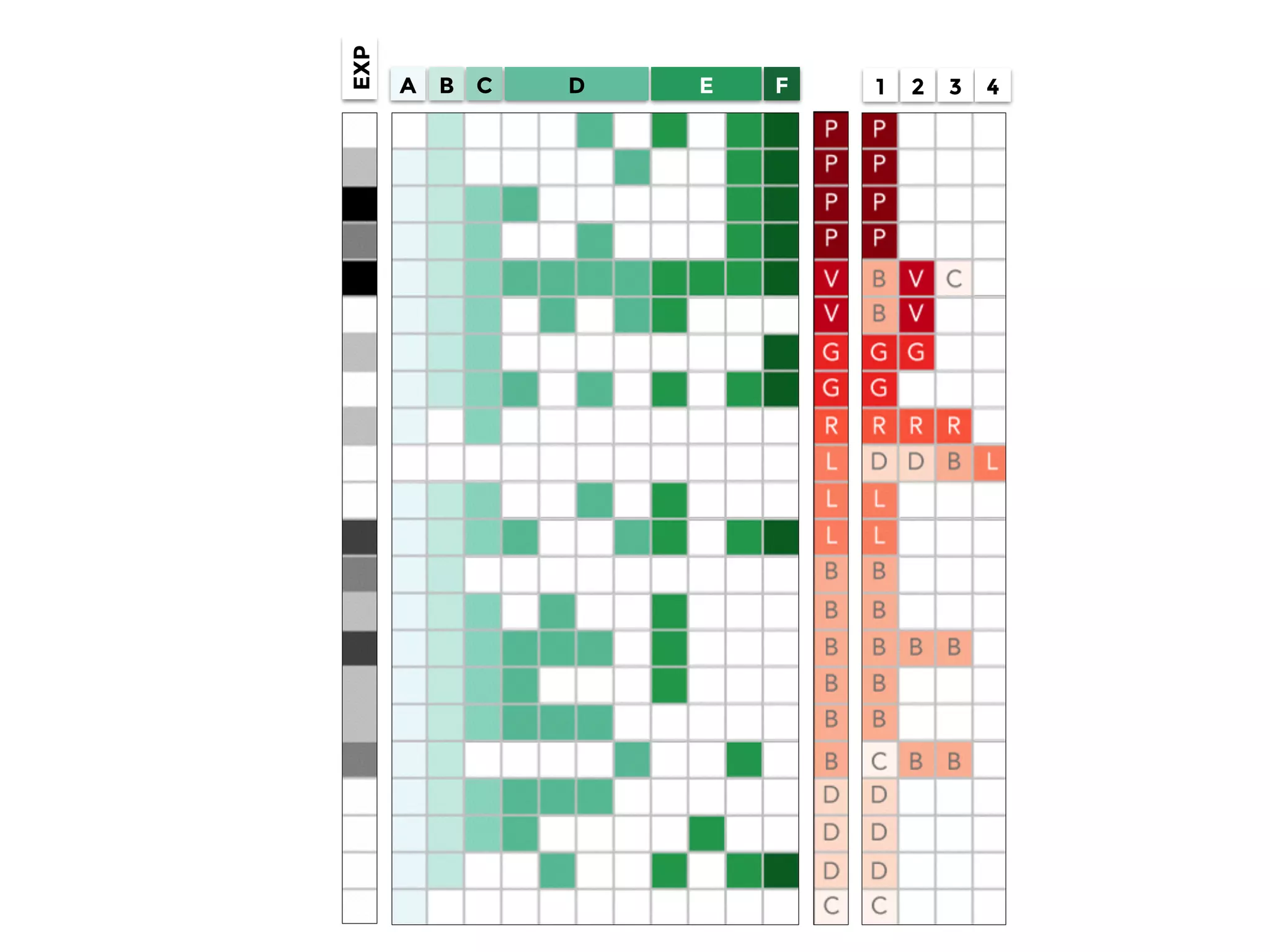
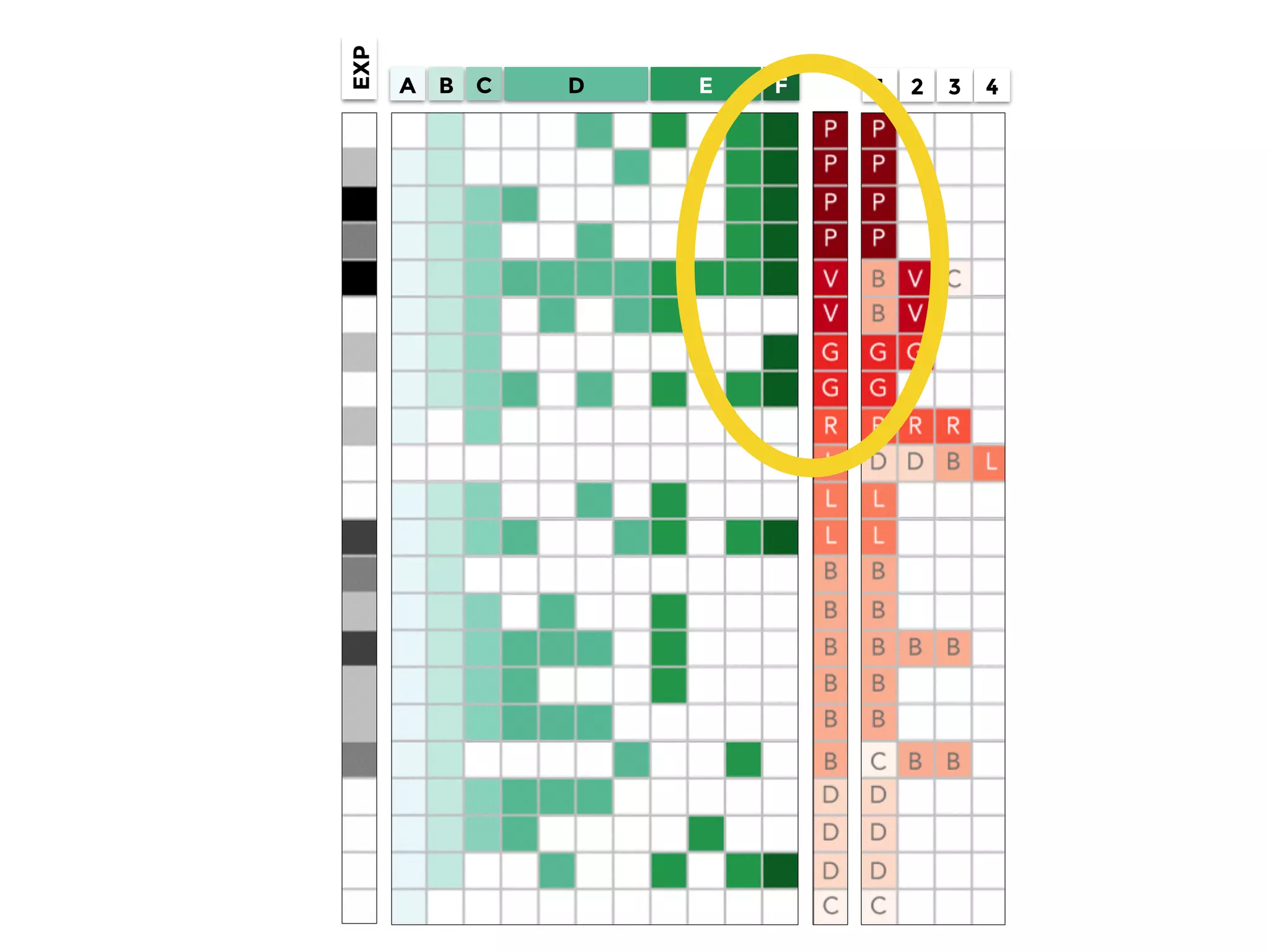
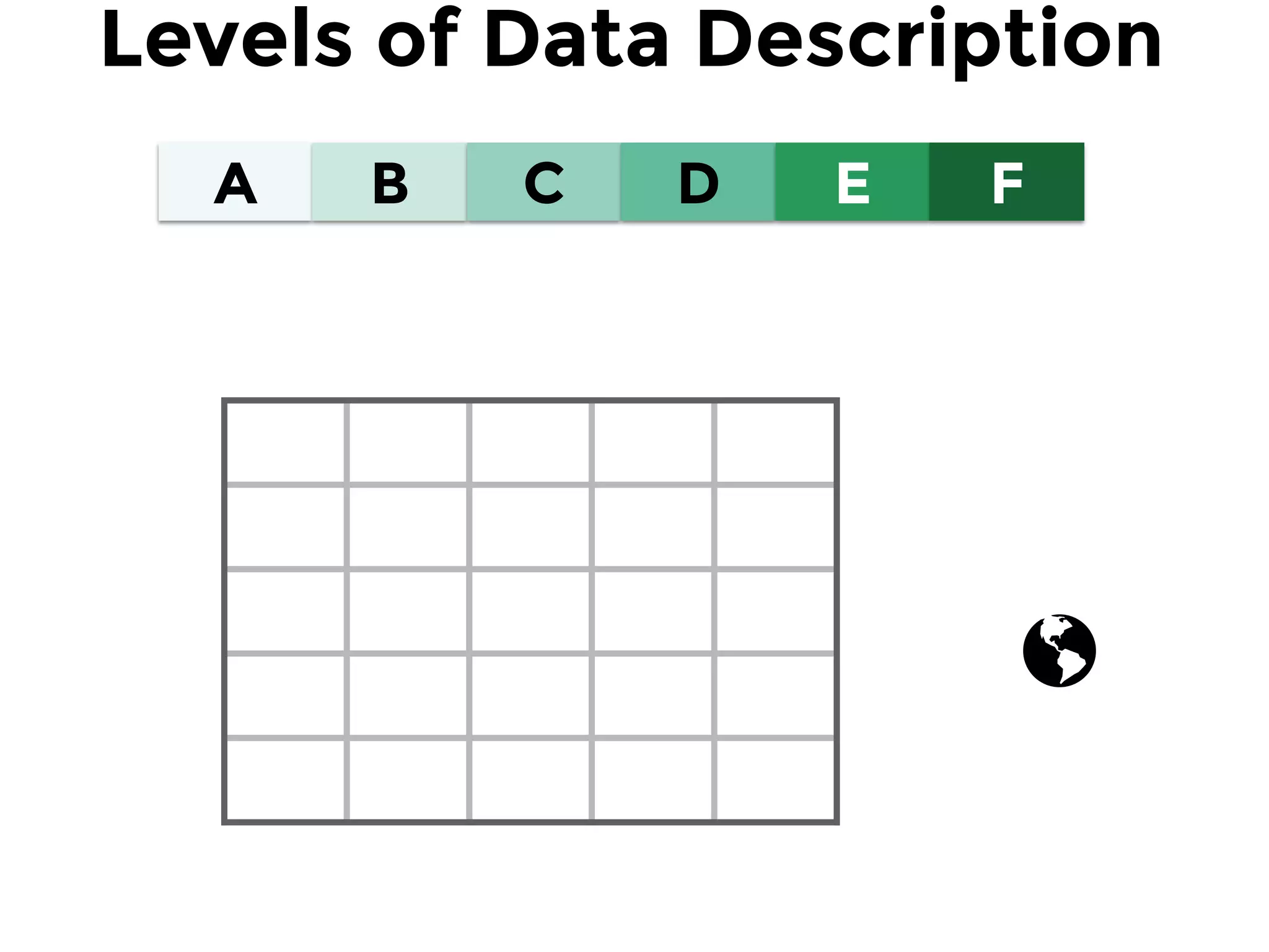
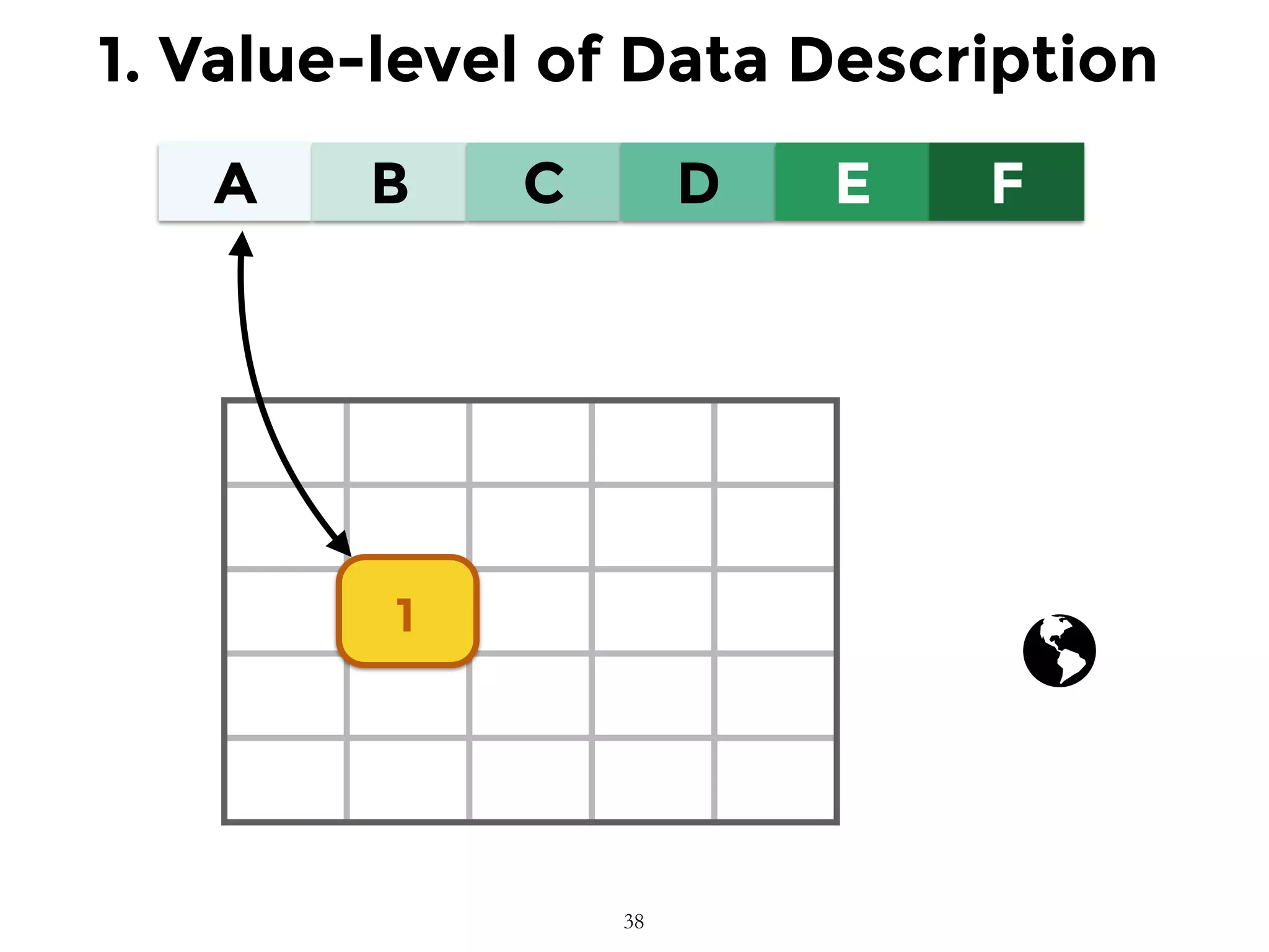
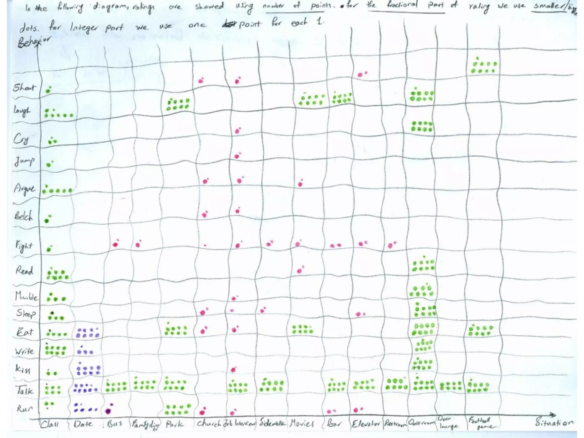
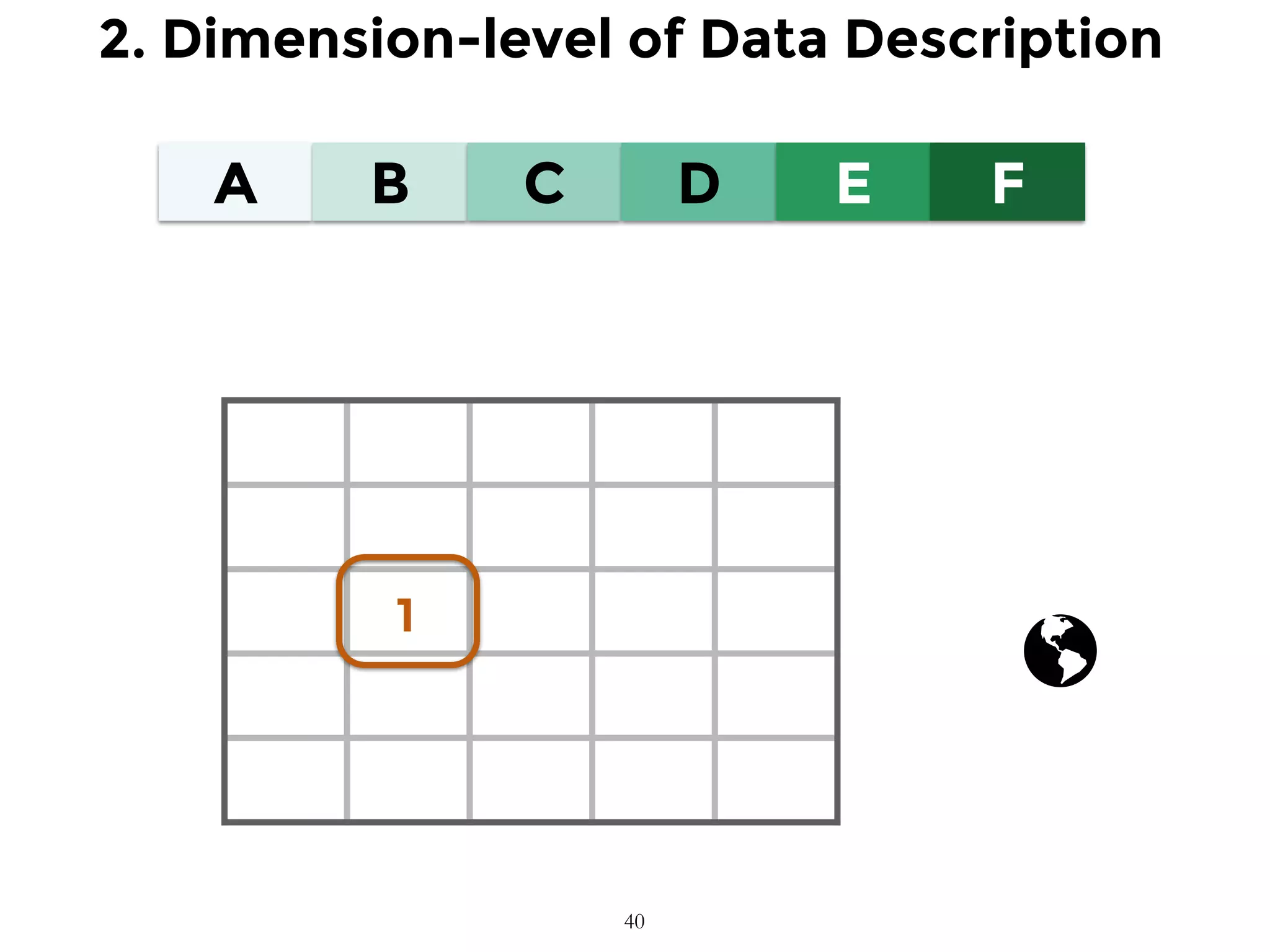
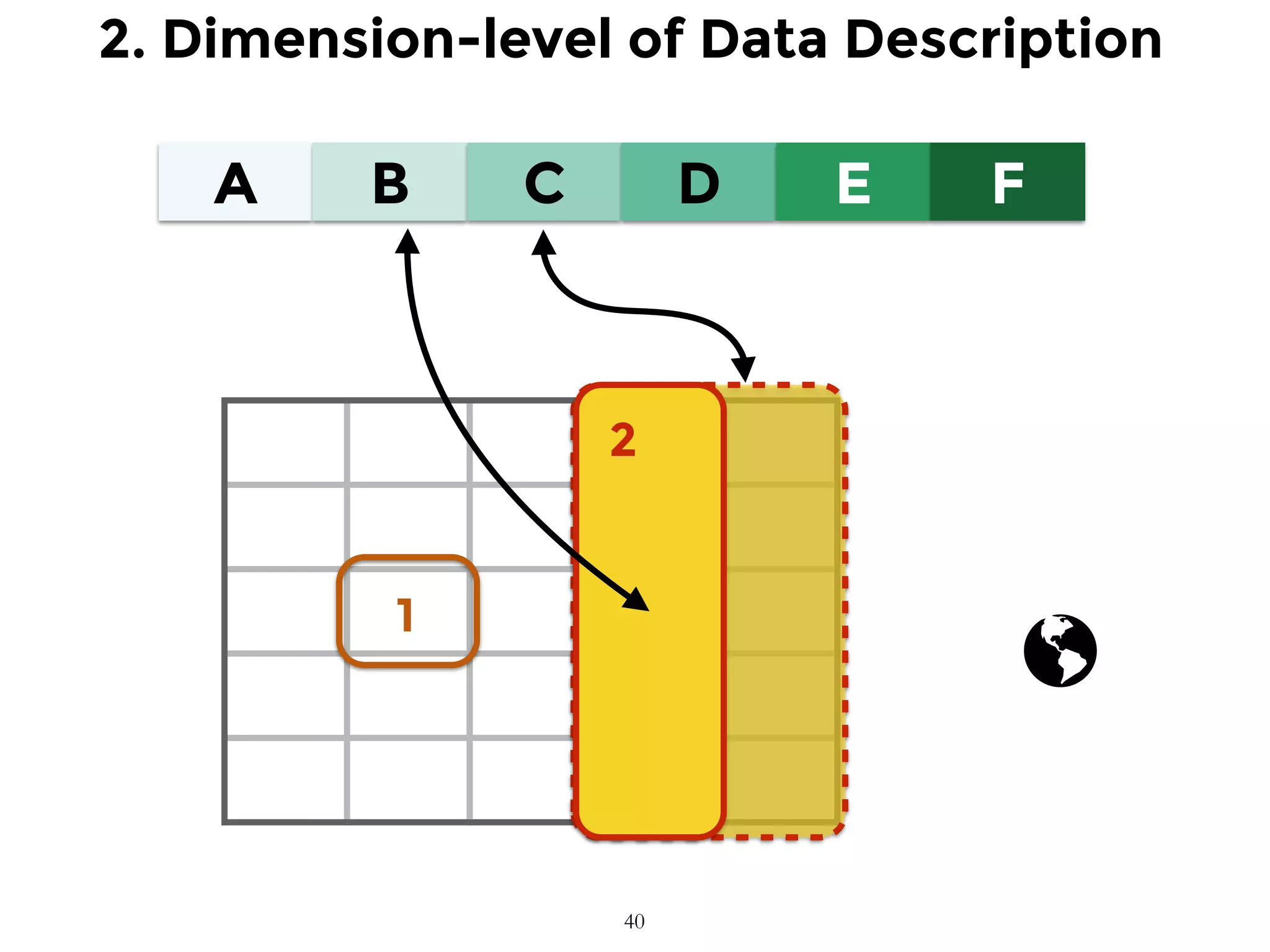
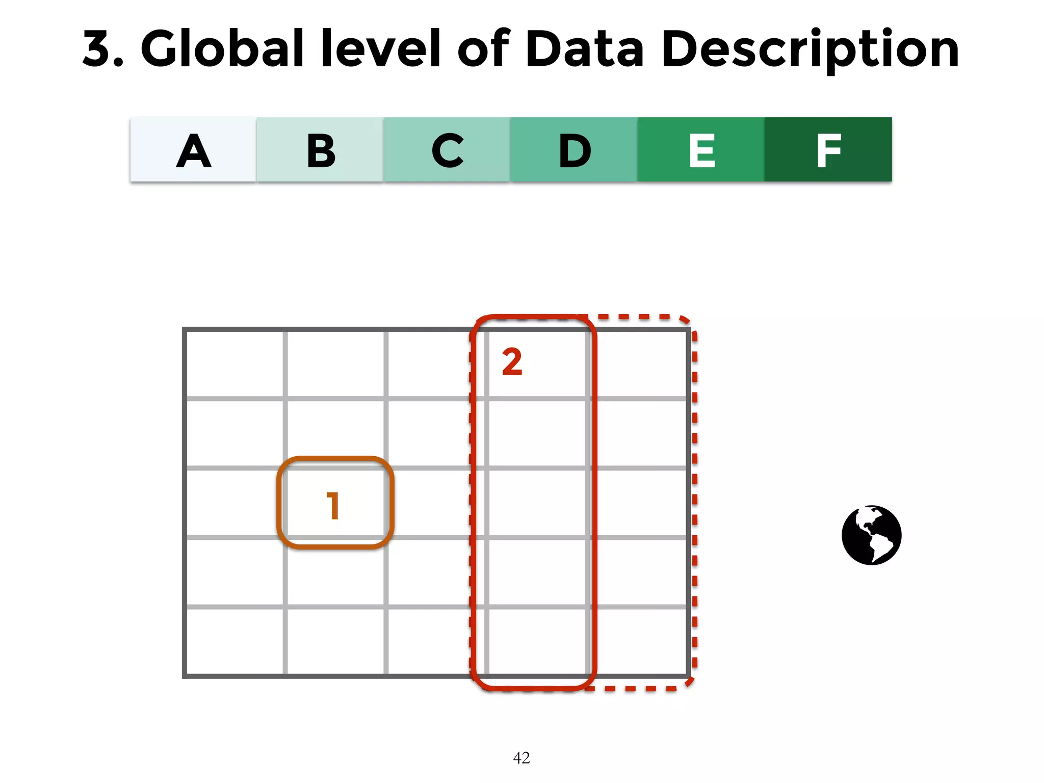
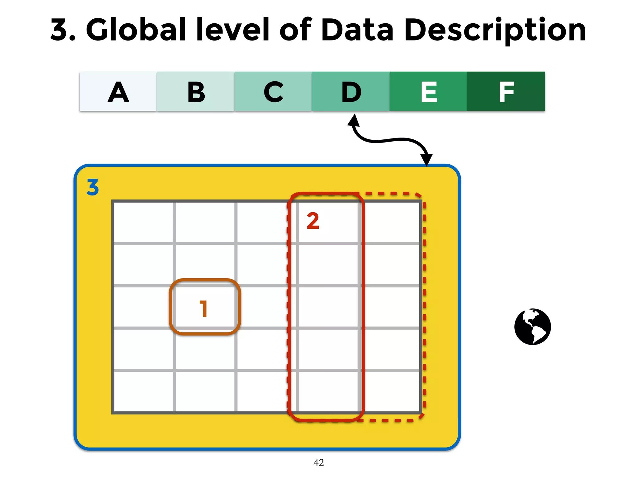
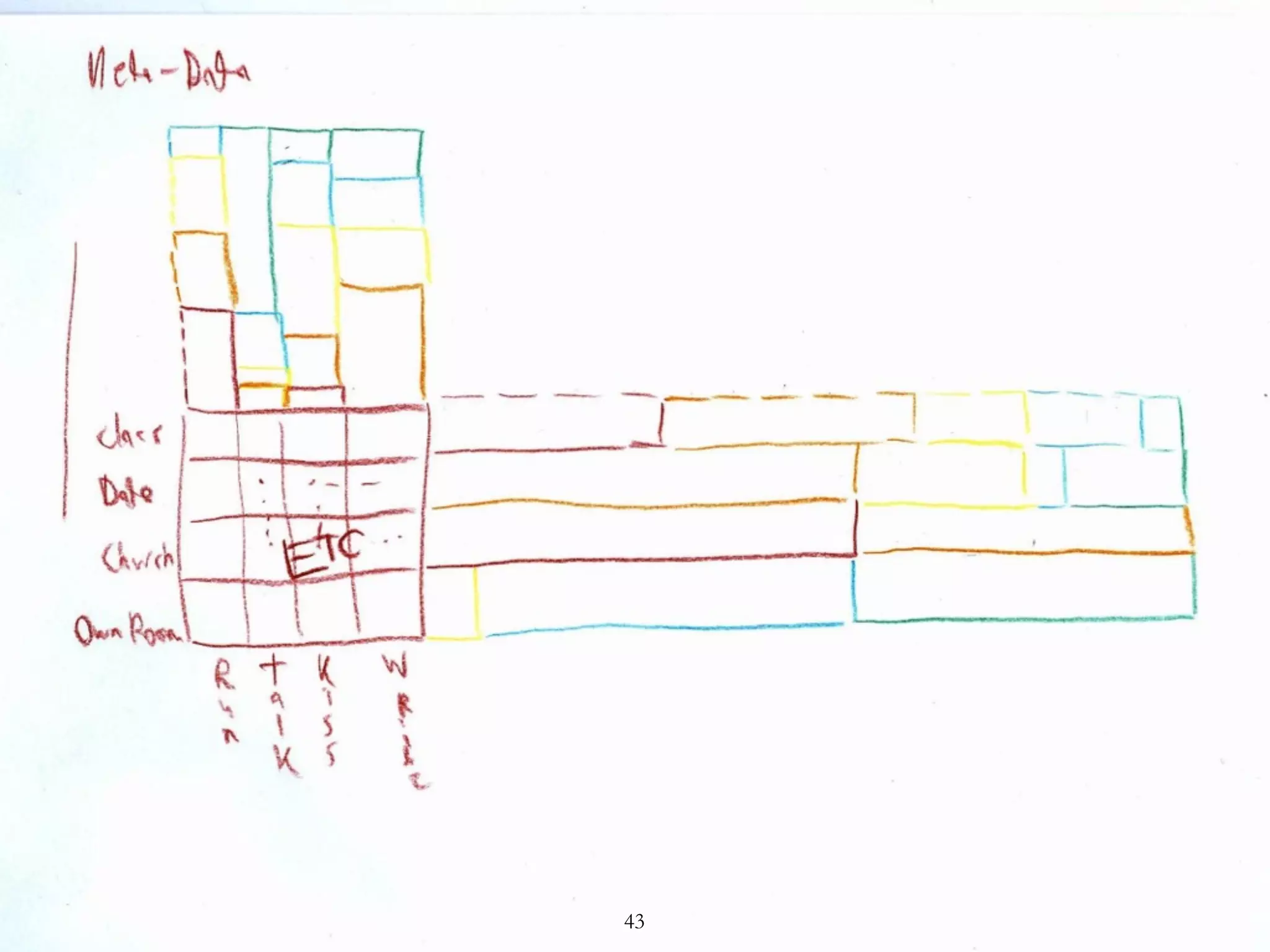
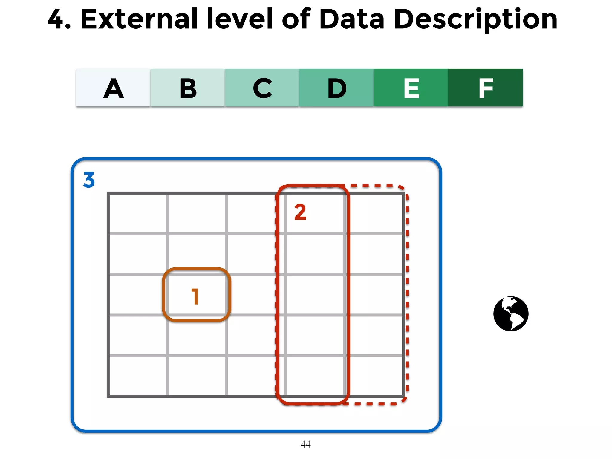
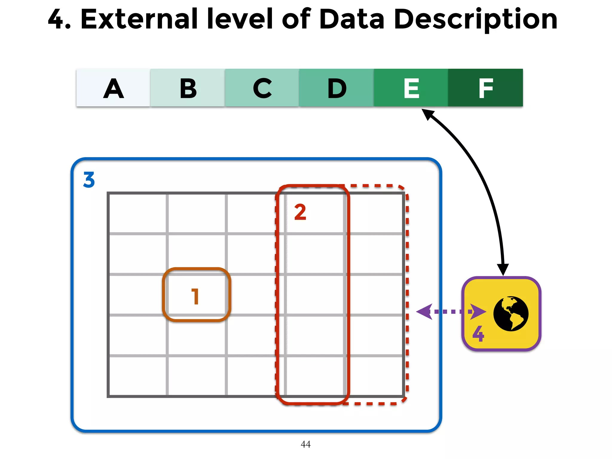
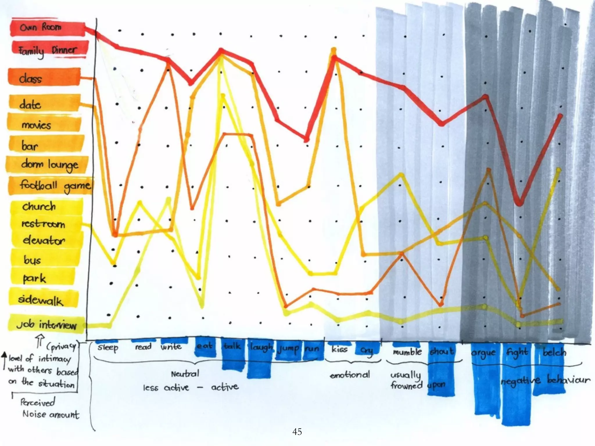
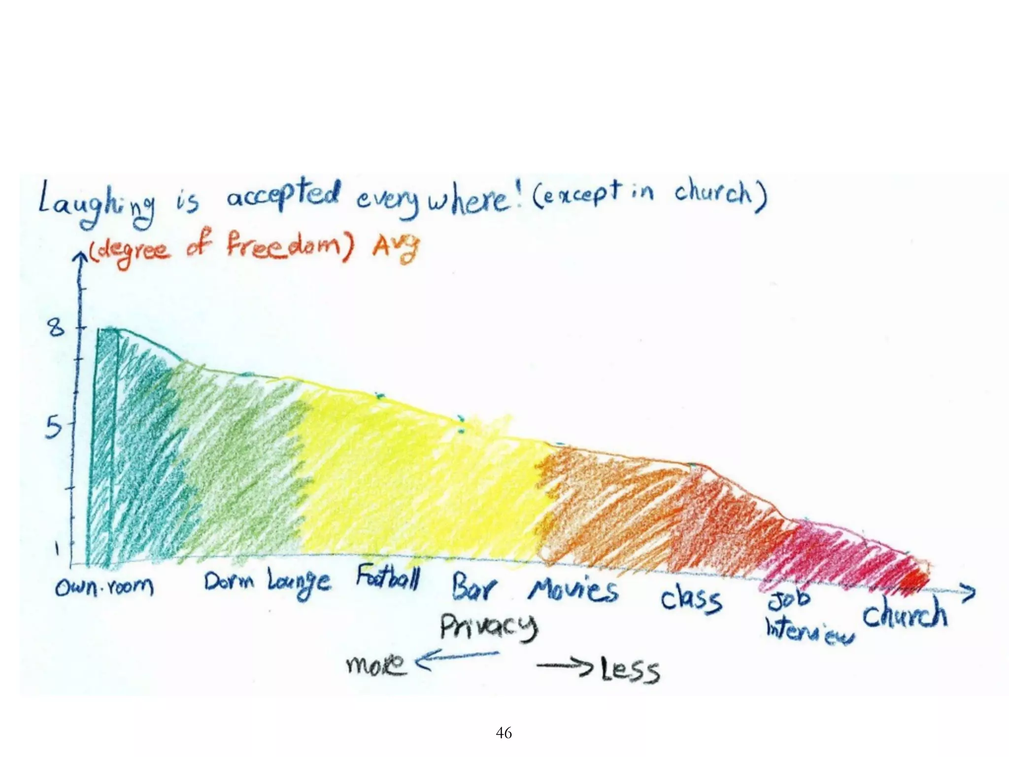
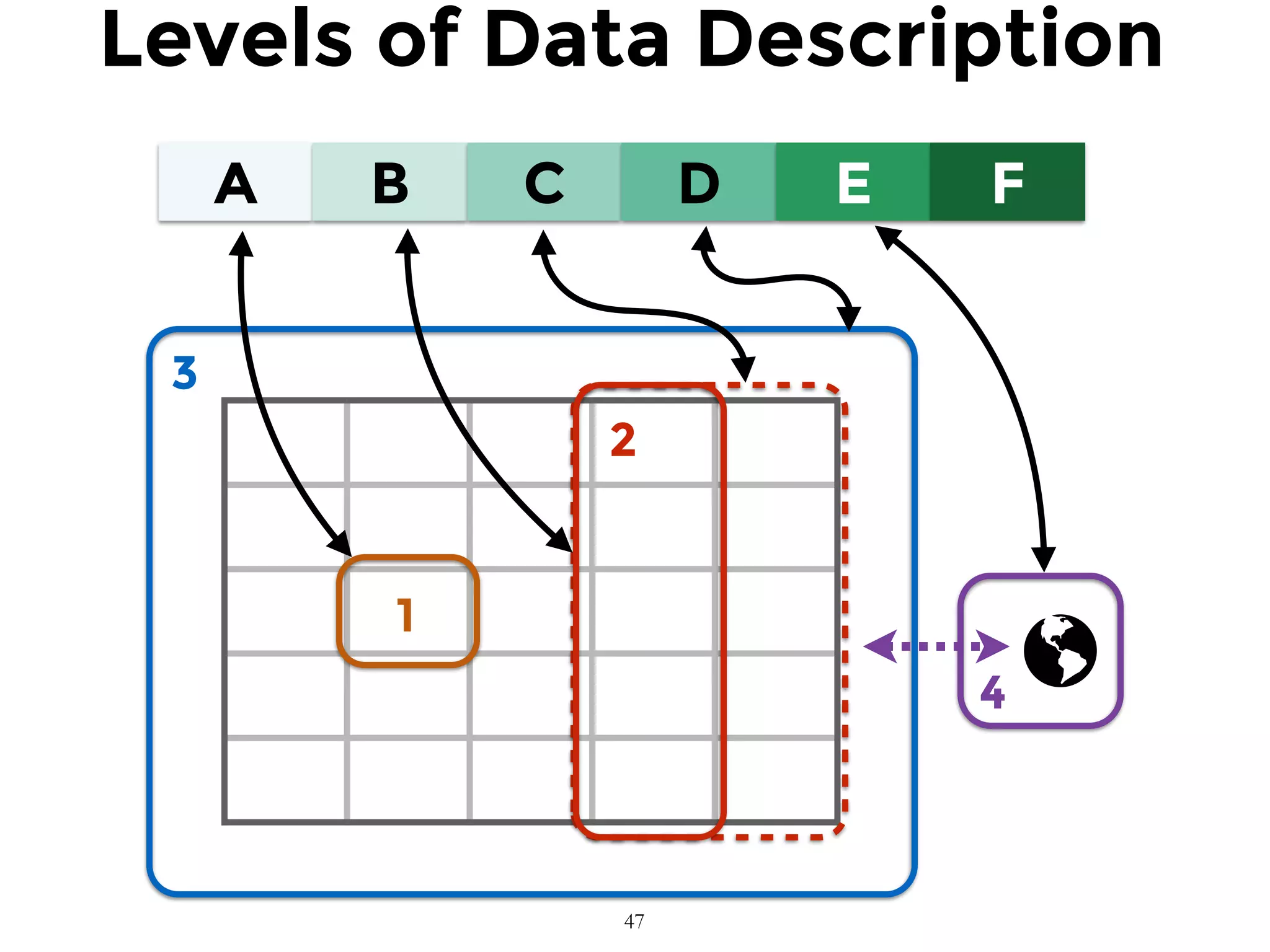
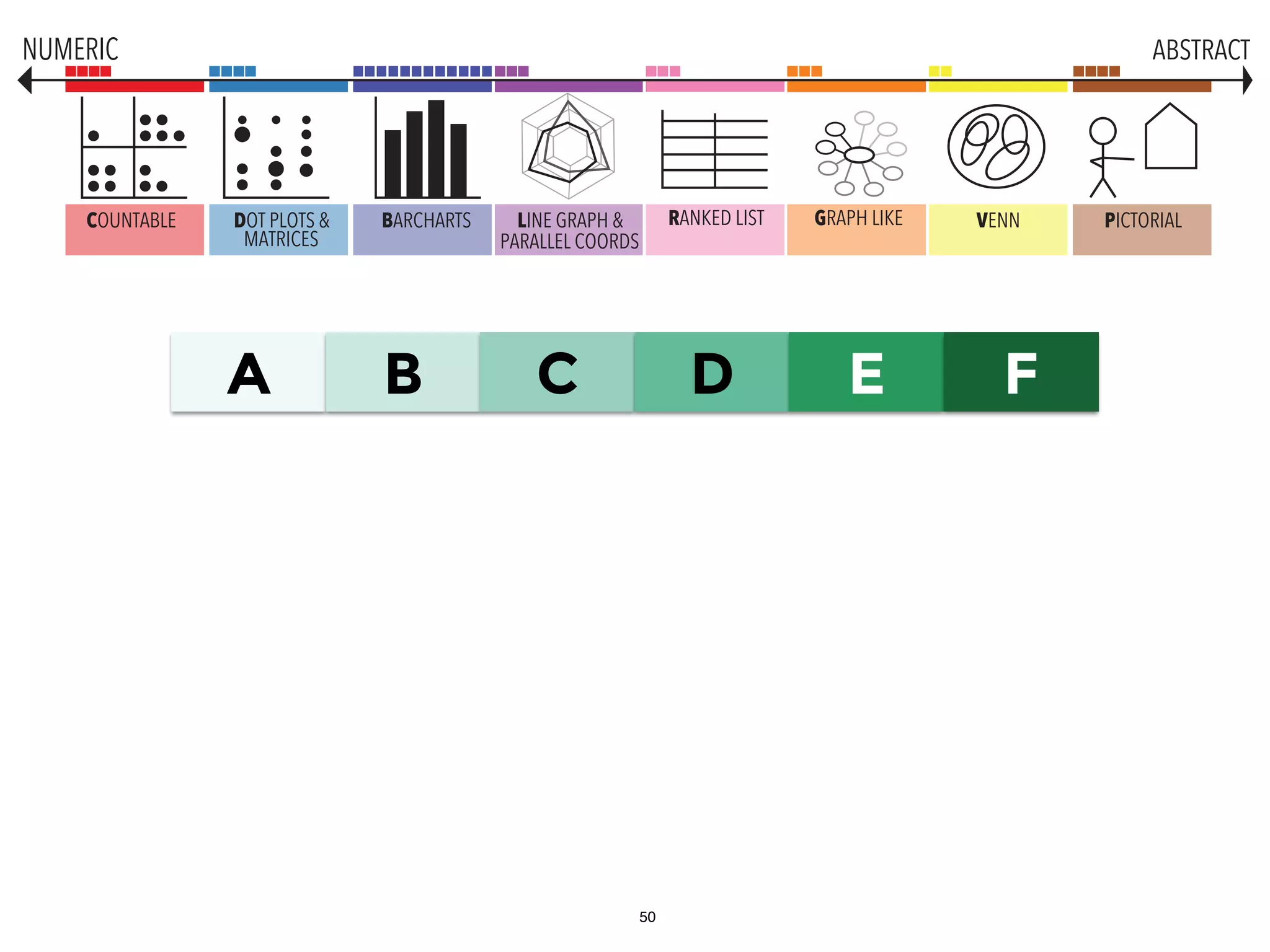
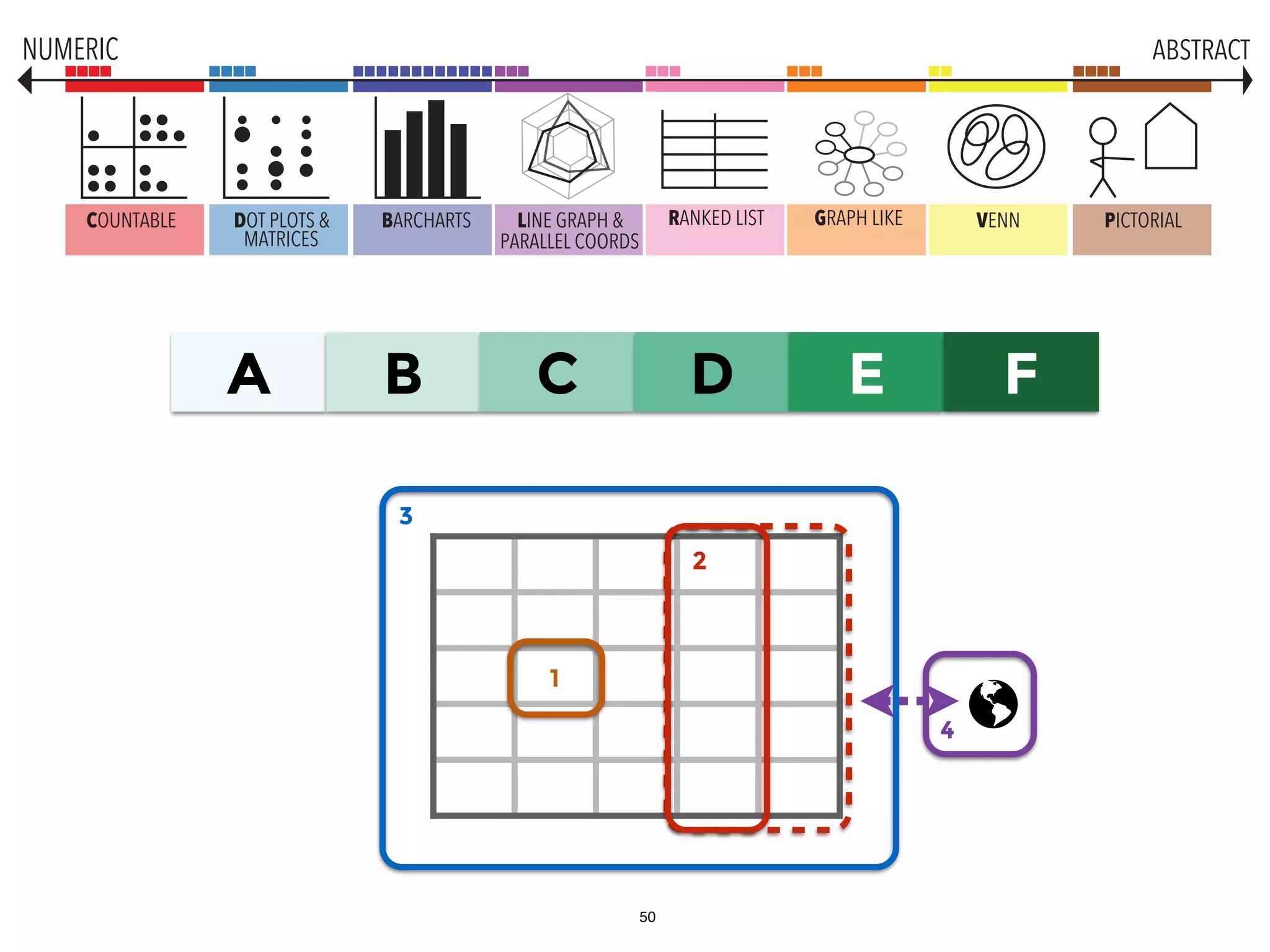
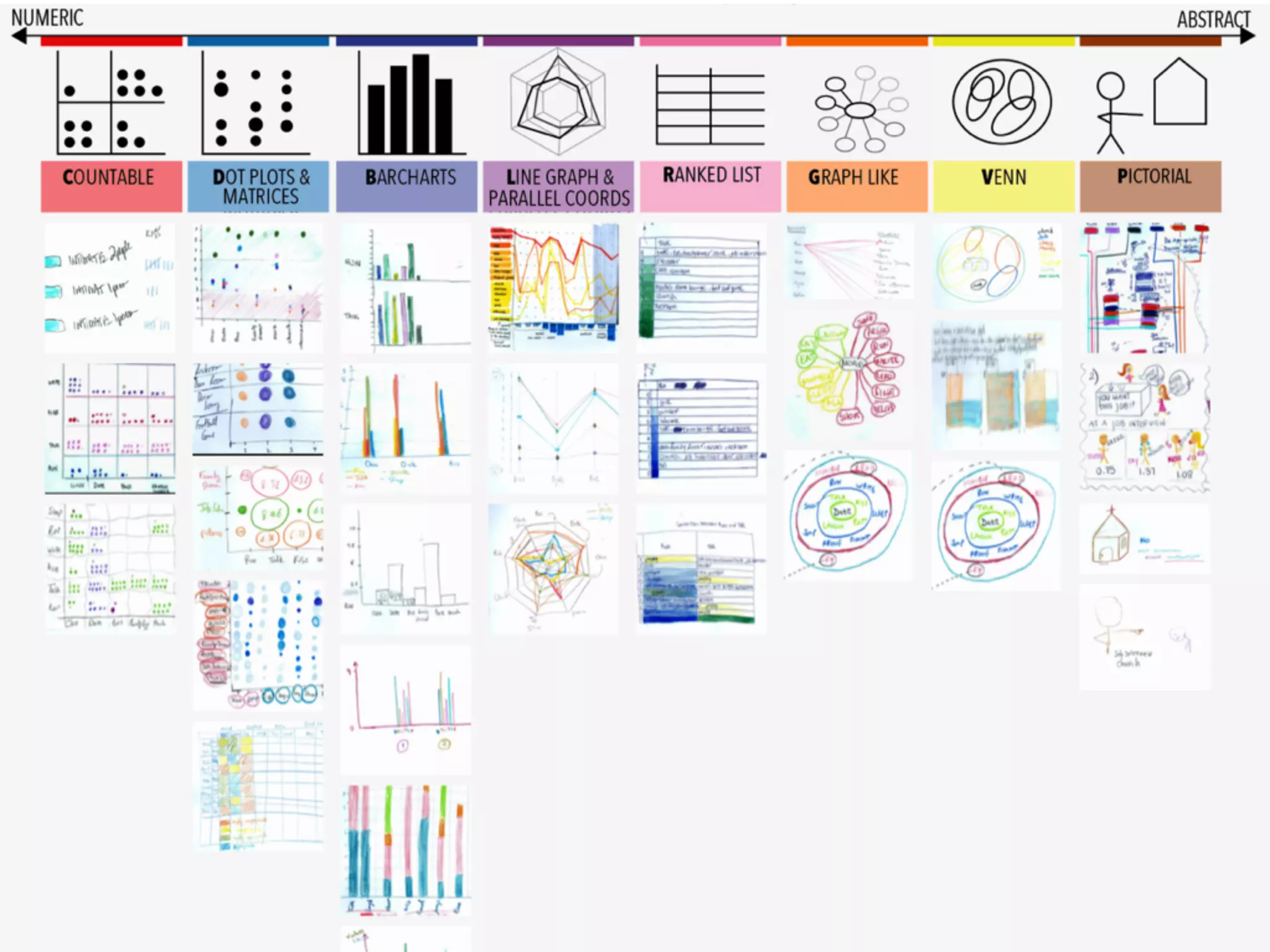
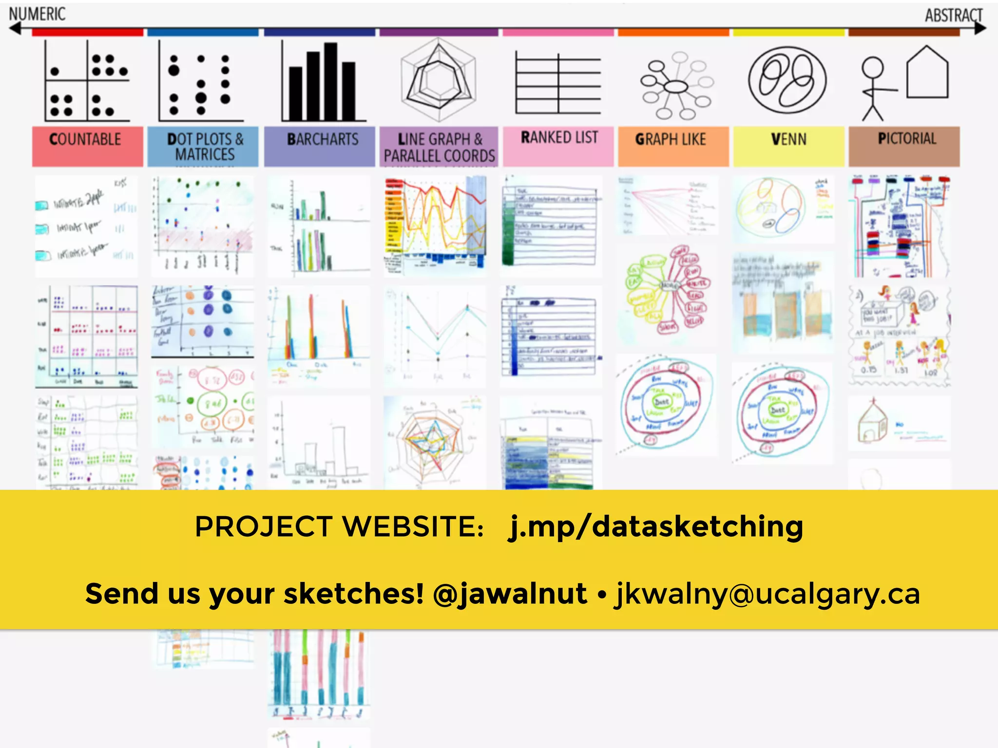
The document describes an exploratory study on data sketching for visual representation. Researchers conducted sessions where participants were asked to sketch representations of behavior-situation data on paper in any way they wished. Participants created a variety of representations ranging from numeric plots and matrices to more abstract pictorial designs. Analysis of the 35 sketches created a continuum from more numerically-focused and countable designs to more abstract visualizations. Common representation types included dot plots, matrices, bar charts, line graphs and parallel coordinates for more data-driven sketches and pictorial, graph-like and ranked list designs for more abstract sketches.
The document presents a data visualization challenge that asks the user 3 questions about a dataset within time limits, then repeats the challenge with simple visual cues to answer more quickly. It demonstrates how visualizing data can help identify patterns and insights more easily and quickly than just looking at the raw numbers. Visualizing data allows for consistent interpretation and conclusions to be drawn from the same dataset.
- This document is the copyright page for a puzzle book published in 2007 by Arcturus Publishing Limited.
- It details the copyright and reproduction restrictions for the content in the publication.
- Any unauthorized reproduction or use of the content may result in criminal prosecution or civil claims for damages.
The document contains grades for students in various subjects related to design and drawing. It lists each student's name and ID number along with their grades in categories like coherence, analysis, presentation, drawing of pieces, polygons, typography, and more. Their total scores and averages are also included. Some students received very high grades while a few received very low grades of 1 across several categories.
Note: Slideshare seems to have problems displaying some of the diagrams, but the downloaded PDF looks fine.
I gave this talk on November 20, 2014 at the 22nd ACM SIGSOFT International Symposium on the Foundations of Software Engineering. More information on our study: http://st.uni-trier.de/survey-sketches/.
This document discusses different uses and benefits of sketching. It notes that sketching can be used for documentation, discovery, creative expression, and giving form to ideas. Sketching can also be used as a way of thinking and communicating ideas through illustration, description, and persuasion. The document emphasizes using quick, clear, and playful sketches that evolve ideas without overworking them. It lists different sketching techniques like linework, perspective, iterative sketching, exploratory sketching, and representative rendering. Movement and contour lines are also mentioned.
Principles and Practices of Data VisualizationKianJazayeri1
"Principles of Data Visualization" by Asst. Prof. Dr. Kian Jazayeri offers a deep dive into effective data representation techniques. The presentation begins by underlining the importance of data visualization in revealing true data insights, avoiding errors, and facilitating knowledge sharing. It challenges the viewer to think beyond basic charts, highlighting that effective visualization requires sophisticated skills to accurately convey complex information.
The deck uses Anscombe's Quartet to illustrate the misleading nature of statistics without proper visual representation, showcasing how different data distributions can look when graphed, despite having identical statistical summaries. This example sets the stage for discussing the necessity of visual analysis to uncover the real story behind the data.
Art appreciation parallels are drawn to emphasize the importance of visual aesthetics in data visualization. By comparing renowned artworks, the slides suggest that, like art, data visualization requires a developed sense of design and aesthetics to communicate effectively and make an impact.
Edward Tufte's visualization principles are explored in depth, advocating for a high data-ink ratio, and warning against the lie factor—where the representation of data misleads more than it informs. The presentation also addresses chartjunk, encouraging the removal of unnecessary visual elements that do not add value to the data's understanding.
Dr. Jazayeri emphasizes graphical integrity, advising against scale distortion and advocating for accurate, clear labeling to maintain the data's true proportion and context. The concept of aspect ratios is discussed, advising a balance to avoid visual misrepresentation of trends.
Interactive elements within the slides engage viewers, prompting them to analyze different visualizations and understand how quickly and accurately data can be interpreted. This engagement highlights the "10-Second Rule," the idea that effective visualizations should allow quick and unambiguous data interpretation.
Color usage in data visualization is another focal point, with explanations on how different colors and their intensities can significantly affect data interpretation. Special attention is given to designing for color blindness, ensuring inclusivity in data communication.
Advanced topics include data maps, cartograms, scatter plots, and heatmaps, each discussed with their specific applications and potential for overplotting or misinterpretation. The presentation also critiques tabular data, suggesting improvements for clarity, comparison, and highlighting critical information.
Renowned works, like Minard's depiction of Napoleon's Russian campaign and Marey’s train schedule, are dissected to demonstrate how effective visual storytelling can enhance the comprehension of complex data narratives.
This document discusses data analysis and visual analytics. It provides examples of visualizing numeric data to find patterns and relationships. Key points covered include how visual perception works, Anscombe's quartet which shows that datasets can have identical properties but look very different, and the cycle of visual analysis which is an incremental, expressive, and unified process.
This document provides tips and strategies for solving different types of problems involving numbers, letters, and their arrangements. It discusses approaches for dancing digits and alphabets, number series, ratio and proportion, odd term out, matrices, and alphabet series. Key advice includes looking for patterns of repetition, rotation, differences, and relationships between terms. Mental calculations and trial and error are recommended over complex logic.
Notas décimo año de educación básica paralelo e 2014 - 2015.pdf 2 pLucrecia Rojas
This document contains a table summarizing student grades in the subject of Language and Literature for the first quarter of the 2014-2015 school year at Colegio Bachillerato Ricaurte. It lists 41 students and their scores on various assessments, quarterly averages calculated at 80% of assessments and 20% of an exam, and overall averages. On average, students scored 6.91, 7.12, and 7.57 on the first, second, and third periodic assessments, with an overall first quarter average of 3.85.
How To Make Multiplication Chart Without Knowing Your Times TablesWilliam Garrett
The document provides step-by-step instructions for creating a multiplication table on graph paper in two minutes or less. It explains how to fill in the numbers for the nines, fives, and twos rows by writing numbers in order or counting by the appropriate increments.
This document contains tables of critical values for various statistical tests including the z-distribution, t-distribution, chi-square distribution, and F-distribution. The z-distribution table lists critical values for the z-test across different levels of significance. Similarly, the other tables provide critical values for t-tests, chi-square tests, ANOVA, and other statistical analyses across different degrees of freedom and significance levels.
The document provides guidance on visualizing audit results for executives through the use of infographics and data visualization. It discusses capturing executives' attention through visuals, crystallizing insights, and compelling action. The presentation then provides tips on using basic data visualization techniques and tools for creating infographics without design skills.
This document summarizes a math teaching software package called Whiteboardmaths. It includes over 15,000 slides across 575 files on two CDs covering topics like fractions, angles, graphs, and mental math problems. A demo is shown containing excerpts from various lessons. The document encourages registering for a free account to download additional full presentations.
e-Portfolio for Lab-Based Statistics (PSYC 3100) part 2 (7.presentation)Ella Anwar
This document summarizes the results of a survey that measured levels of agreeableness and attitudes towards women. It provides statistics on the sample including minimum and maximum values for age, year of birth, agreeableness scores, and attitudes towards women scores. Frequency tables show the distribution of responses for gender, month of birth, and levels of agreeableness and attitudes.
The document summarizes three concepts for an in-vehicle table:
1) The most preferred concept is a center console back table.
2) The second most preferred concept is a seat back table.
3) The third most preferred concept is a center console front table.
It then provides details on concept selection criteria and customer surveys to identify preferred table features to include in the final concept.
Online Faculty Development Program-cum-certificate course on Research Analysis: Tools and Techniques Jointly organized by FGM Govt College Adampur, Hisar, GAD TLC, Khalsa College University of Delhi and #Heera Psychological Testing Research and Consultancy, Rewari.
Full presentation: https://youtu.be/VUglQZ8eoSk
Best Practices for Killer Data VisualizationQualtrics
There’s something special about simple, powerful visualizations that tell a story. In fact, 65% of people are visual learners.
Join Qualtrics and Sasha Pasulka from Tableau as we illuminate the world of data visualization and give you clear takeaways to help you tell a better story with data. Getting executive buy-in or that seat at the table may come down to who can visualize data in a way that excites and enlightens the audience.
THIS PRESENTATION ENCASES AN EFFECTIVE AND EFFICIENT PROBLEM SOLVING TECHNIQUE USING PARETO DIAGRAM
TEAM MEMBER 1:
GARIMA SRIVASTAVA
TEAM MEMBER 2:
TRINA GHOSH
Agree to Disagree: Improving Disagreement Detection with Dual GRUs. Presentation of our work on disagreement detection at ESSEM 2017. In this work, we show that by using a Siamese inspired architecture to encode the discussions, we no longer need to rely on hand-crafted features to exploit the meta thread structure. The research paper can be found at https://arxiv.org/abs/1708.05582
Here are the steps to solve indirect proportion problems:
1) If A is indirectly proportional to B and when A = 5, B = 6:
a) k = 5/6
b) A = k/B
c) A = 5/6 when B = 3 => A = 5/18
d) A = 5/6 when B = 15 => A = 1/15
e) B = 6 when A = 1 => B = 6
f) B = -6 when A = -3 => B = -6
2) If A is indirectly proportional to B and when A = 7, B = 12:
a) k = 7/12
b) A
Mental aptitude helps sharpen the mind, enhance problem solving abilities, and improve performance on competitive exams. It is important for getting placed in top companies. The document provides examples of different types of mental aptitude questions involving number series, letter series, counting figures, coding, and analytical reasoning. It encourages booking a free session with an online teacher to learn mental aptitude.
wealth age region
37 50 M
24 88 U
14 64 A
13 63 U
13 66 U
11.7 72 E
10 71 M
8.2 77 U
8.1 68 U
7.2 66 E
7 69 M
6.2 36 O
5.9 49 U
5.3 73 U
5.2 52 E
5 77 M
5 73 M
4.9 62 A
4.8 54 U
4.7 63 U
4.7 23 U
4.6 70 O
4.6 59 E
4.5 96 E
4.5 84 O
4.5 40 E
4.3 60 U
4 77 E
4 68 E
4 83 E
4 68 A
4 40 E
4 62 M
4 69 E
4 49 A
3.9 64 A
3.9 83 A
3.8 41 A
3.8 78 A
3.6 80 A
3.5 68 O
3.4 67 U
3.4 71 O
3.4 54 A
3.3 62 E
3.3 69 A
3.3 58 U
3.2 71 U
3.2 55 O
3 66 E
3 65 E
3 50 U
3 64 E
3 57 A
3 86 M
3 71 E
3 68 E
3 68 E
3 54 U
2.8 68 A
2.8 76 E
2.8 52 E
2.8 73 O
2.8 46 O
2.7 69 U
2.7 63 E
2.6 42 E
2.6 67 E
2.6 62 O
2.6 66 U
2.6 75 U
2.5 74 E
2.5 73 E
2.5 84 M
2.5 49 A
2.4 60 U
2.4 71 O
2.4 76 A
2.4 67 E
2.3 54 A
2.3 57 U
2.3 54 O
2.3 64 O
2.2 85 E
2.2 45 A
2.2 39 O
2.2 54 E
2.1 68 U
2.1 85 U
2 70 M
2 102 M
2 38 U
2 73 A
2 91 E
2 82 U
2 74 M
2 81 M
2 * U
2 62 E
2 62 U
2 67 U
2 80 O
2 68 M
2 80 U
2 * U
2 60 E
2 74 O
1.9 48 U
1.9 60 E
1.9 43 E
1.9 64 O
1.9 67 U
1.8 62 A
1.8 90 E
1.8 66 U
1.8 68 A
1.8 60 A
1.8 53 A
1.8 47 E
1.8 86 U
1.8 67 A
1.7 54 U
1.7 77 E
1.7 61 U
1.7 83 E
1.7 61 U
1.7 58 U
1.7 64 U
1.7 53 A
1.7 67 A
1.6 57 E
1.6 62 A
1.6 * E
1.6 64 O
1.6 69 A
1.6 71 E
1.6 54 U
1.6 78 A
1.5 45 U
1.5 69 U
1.5 59 U
1.5 * A
1.5 82 O
1.5 68 E
1.5 41 E
1.5 60 E
1.5 64 E
1.5 44 E
1.5 7 E
1.5 72 E
1.5 56 E
1.5 60 E
1.4 61 E
1.4 79 O
1.4 42 O
1.4 63 E
1.4 49 E
1.4 56 E
1.4 67 U
1.4 75 E
1.4 43 M
1.4 61 U
1.4 54 O
1.4 47 E
1.4 64 U
1.4 52 A
1.4 73 A
1.3 83 U
1.3 64 E
1.3 71 O
1.3 71 E
1.3 61 M
1.3 83 E
1.3 43 E
1.3 47 U
1.3 79 E
1.3 53 E
1.3 73 U
1.3 72 U
1.3 72 U
1.3 59 A
1.3 77 E
1.3 68 E
1.3 42 E
1.3 61 U
1.2 69 A
1.2 82 O
1.2 * E
1.2 56 U
1.2 42 M
1.2 63 U
1.2 75 U
1.2 * E
1.2 59 A
1.2 70 E
1.2 46 M
1.2 68 U
1.2 68 A
1.2 69 A
1.2 68 O
1.2 64 A
1.1 53 E
1.1 79 E
1.1 49 E
1.1 47 U
1.1 75 U
1.1 76 M
1.1 66 U
1.1 85 U
1.1 66 O
1.1 70 U
1.1 58 E
1.1 72 E
1.1 52 M
1 52 O
1 79 E
1 69 A
1 52 M
1 75 E
1 62 E
1 65 M
1 63 U
1 87 E
1 61 U
1 58 O
1 60 E
1 67 O
1 80 E
1 63 U
1 9 M
1 59 E
1 * E
1 * O
Sheet1DateExportRefinery OutputJan-04283.92246.01Feb-04241.7237.15Mar-04142.66249.35Apr-04331.02237.72May-04197.33269.92Jun-04210.95285.3Jul-04256.03227.27Aug-04268.59226.86Sep-04114.05129.92Oct-04203.37226.18Nov-04165.71220.87Dec-04308.34235.21Jan-05270230Feb-05137232Mar-05309250Apr-05184248May-05322270Jun-05199240Jul-05246250Aug-05237255Sep-05226236Oct-05287254Nov-05320261Dec-05313277Jan-06313229Feb-06216258Mar-06217260Apr-06316199May-06215226Jun-06200231Jul-06269248Aug-06216234Sep-06291219Oct-06234270Nov-06192277Dec-06275197Jan-07181219Feb-07176146Mar-07149238Apr-07270253May-07266230Jun-07196222Jul-07253141Aug-07237230Sep-07216176Oct-07112194Nov-07217191Dec-07187187Jan-08246191Feb-08157174Mar-08187187Apr-08160208May-08263208Jun-08195195Jul-08113177Aug-08240197Se.
Encuesta a niños y adolescentes sobre la radio y televisión peruana 2014 | Po...Andrinik Huaytalla Ramos
Encuesta realizada por el Consejo Consultivo de Radio y Televisión (Concortv) a niños y adolescentes sobre la radio y televisión peruana 2014. Encuesta por ciudades.
Educación Mediática ► http://www.mundoacesp.org/
This document provides an answer key for a 3rd grade mathematics curriculum on fractions as numbers on the number line. It includes answers for problem sets, exit tickets, sprints, and homework from 7 lessons. The lessons cover identifying fractions on number lines and fraction strips, comparing fractions, and representing fractions in different ways including with drawings.
4th Modern Marketing Reckoner by MMA Global India & Group M: 60+ experts on W...Social Samosa
The Modern Marketing Reckoner (MMR) is a comprehensive resource packed with POVs from 60+ industry leaders on how AI is transforming the 4 key pillars of marketing – product, place, price and promotions.
This document provides tips and strategies for solving different types of problems involving numbers, letters, and their arrangements. It discusses approaches for dancing digits and alphabets, number series, ratio and proportion, odd term out, matrices, and alphabet series. Key advice includes looking for patterns of repetition, rotation, differences, and relationships between terms. Mental calculations and trial and error are recommended over complex logic.
Notas décimo año de educación básica paralelo e 2014 - 2015.pdf 2 pLucrecia Rojas
This document contains a table summarizing student grades in the subject of Language and Literature for the first quarter of the 2014-2015 school year at Colegio Bachillerato Ricaurte. It lists 41 students and their scores on various assessments, quarterly averages calculated at 80% of assessments and 20% of an exam, and overall averages. On average, students scored 6.91, 7.12, and 7.57 on the first, second, and third periodic assessments, with an overall first quarter average of 3.85.
How To Make Multiplication Chart Without Knowing Your Times TablesWilliam Garrett
The document provides step-by-step instructions for creating a multiplication table on graph paper in two minutes or less. It explains how to fill in the numbers for the nines, fives, and twos rows by writing numbers in order or counting by the appropriate increments.
This document contains tables of critical values for various statistical tests including the z-distribution, t-distribution, chi-square distribution, and F-distribution. The z-distribution table lists critical values for the z-test across different levels of significance. Similarly, the other tables provide critical values for t-tests, chi-square tests, ANOVA, and other statistical analyses across different degrees of freedom and significance levels.
The document provides guidance on visualizing audit results for executives through the use of infographics and data visualization. It discusses capturing executives' attention through visuals, crystallizing insights, and compelling action. The presentation then provides tips on using basic data visualization techniques and tools for creating infographics without design skills.
This document summarizes a math teaching software package called Whiteboardmaths. It includes over 15,000 slides across 575 files on two CDs covering topics like fractions, angles, graphs, and mental math problems. A demo is shown containing excerpts from various lessons. The document encourages registering for a free account to download additional full presentations.
e-Portfolio for Lab-Based Statistics (PSYC 3100) part 2 (7.presentation)Ella Anwar
This document summarizes the results of a survey that measured levels of agreeableness and attitudes towards women. It provides statistics on the sample including minimum and maximum values for age, year of birth, agreeableness scores, and attitudes towards women scores. Frequency tables show the distribution of responses for gender, month of birth, and levels of agreeableness and attitudes.
The document summarizes three concepts for an in-vehicle table:
1) The most preferred concept is a center console back table.
2) The second most preferred concept is a seat back table.
3) The third most preferred concept is a center console front table.
It then provides details on concept selection criteria and customer surveys to identify preferred table features to include in the final concept.
Online Faculty Development Program-cum-certificate course on Research Analysis: Tools and Techniques Jointly organized by FGM Govt College Adampur, Hisar, GAD TLC, Khalsa College University of Delhi and #Heera Psychological Testing Research and Consultancy, Rewari.
Full presentation: https://youtu.be/VUglQZ8eoSk
Best Practices for Killer Data VisualizationQualtrics
There’s something special about simple, powerful visualizations that tell a story. In fact, 65% of people are visual learners.
Join Qualtrics and Sasha Pasulka from Tableau as we illuminate the world of data visualization and give you clear takeaways to help you tell a better story with data. Getting executive buy-in or that seat at the table may come down to who can visualize data in a way that excites and enlightens the audience.
THIS PRESENTATION ENCASES AN EFFECTIVE AND EFFICIENT PROBLEM SOLVING TECHNIQUE USING PARETO DIAGRAM
TEAM MEMBER 1:
GARIMA SRIVASTAVA
TEAM MEMBER 2:
TRINA GHOSH
Agree to Disagree: Improving Disagreement Detection with Dual GRUs. Presentation of our work on disagreement detection at ESSEM 2017. In this work, we show that by using a Siamese inspired architecture to encode the discussions, we no longer need to rely on hand-crafted features to exploit the meta thread structure. The research paper can be found at https://arxiv.org/abs/1708.05582
Here are the steps to solve indirect proportion problems:
1) If A is indirectly proportional to B and when A = 5, B = 6:
a) k = 5/6
b) A = k/B
c) A = 5/6 when B = 3 => A = 5/18
d) A = 5/6 when B = 15 => A = 1/15
e) B = 6 when A = 1 => B = 6
f) B = -6 when A = -3 => B = -6
2) If A is indirectly proportional to B and when A = 7, B = 12:
a) k = 7/12
b) A
Mental aptitude helps sharpen the mind, enhance problem solving abilities, and improve performance on competitive exams. It is important for getting placed in top companies. The document provides examples of different types of mental aptitude questions involving number series, letter series, counting figures, coding, and analytical reasoning. It encourages booking a free session with an online teacher to learn mental aptitude.
wealth age region
37 50 M
24 88 U
14 64 A
13 63 U
13 66 U
11.7 72 E
10 71 M
8.2 77 U
8.1 68 U
7.2 66 E
7 69 M
6.2 36 O
5.9 49 U
5.3 73 U
5.2 52 E
5 77 M
5 73 M
4.9 62 A
4.8 54 U
4.7 63 U
4.7 23 U
4.6 70 O
4.6 59 E
4.5 96 E
4.5 84 O
4.5 40 E
4.3 60 U
4 77 E
4 68 E
4 83 E
4 68 A
4 40 E
4 62 M
4 69 E
4 49 A
3.9 64 A
3.9 83 A
3.8 41 A
3.8 78 A
3.6 80 A
3.5 68 O
3.4 67 U
3.4 71 O
3.4 54 A
3.3 62 E
3.3 69 A
3.3 58 U
3.2 71 U
3.2 55 O
3 66 E
3 65 E
3 50 U
3 64 E
3 57 A
3 86 M
3 71 E
3 68 E
3 68 E
3 54 U
2.8 68 A
2.8 76 E
2.8 52 E
2.8 73 O
2.8 46 O
2.7 69 U
2.7 63 E
2.6 42 E
2.6 67 E
2.6 62 O
2.6 66 U
2.6 75 U
2.5 74 E
2.5 73 E
2.5 84 M
2.5 49 A
2.4 60 U
2.4 71 O
2.4 76 A
2.4 67 E
2.3 54 A
2.3 57 U
2.3 54 O
2.3 64 O
2.2 85 E
2.2 45 A
2.2 39 O
2.2 54 E
2.1 68 U
2.1 85 U
2 70 M
2 102 M
2 38 U
2 73 A
2 91 E
2 82 U
2 74 M
2 81 M
2 * U
2 62 E
2 62 U
2 67 U
2 80 O
2 68 M
2 80 U
2 * U
2 60 E
2 74 O
1.9 48 U
1.9 60 E
1.9 43 E
1.9 64 O
1.9 67 U
1.8 62 A
1.8 90 E
1.8 66 U
1.8 68 A
1.8 60 A
1.8 53 A
1.8 47 E
1.8 86 U
1.8 67 A
1.7 54 U
1.7 77 E
1.7 61 U
1.7 83 E
1.7 61 U
1.7 58 U
1.7 64 U
1.7 53 A
1.7 67 A
1.6 57 E
1.6 62 A
1.6 * E
1.6 64 O
1.6 69 A
1.6 71 E
1.6 54 U
1.6 78 A
1.5 45 U
1.5 69 U
1.5 59 U
1.5 * A
1.5 82 O
1.5 68 E
1.5 41 E
1.5 60 E
1.5 64 E
1.5 44 E
1.5 7 E
1.5 72 E
1.5 56 E
1.5 60 E
1.4 61 E
1.4 79 O
1.4 42 O
1.4 63 E
1.4 49 E
1.4 56 E
1.4 67 U
1.4 75 E
1.4 43 M
1.4 61 U
1.4 54 O
1.4 47 E
1.4 64 U
1.4 52 A
1.4 73 A
1.3 83 U
1.3 64 E
1.3 71 O
1.3 71 E
1.3 61 M
1.3 83 E
1.3 43 E
1.3 47 U
1.3 79 E
1.3 53 E
1.3 73 U
1.3 72 U
1.3 72 U
1.3 59 A
1.3 77 E
1.3 68 E
1.3 42 E
1.3 61 U
1.2 69 A
1.2 82 O
1.2 * E
1.2 56 U
1.2 42 M
1.2 63 U
1.2 75 U
1.2 * E
1.2 59 A
1.2 70 E
1.2 46 M
1.2 68 U
1.2 68 A
1.2 69 A
1.2 68 O
1.2 64 A
1.1 53 E
1.1 79 E
1.1 49 E
1.1 47 U
1.1 75 U
1.1 76 M
1.1 66 U
1.1 85 U
1.1 66 O
1.1 70 U
1.1 58 E
1.1 72 E
1.1 52 M
1 52 O
1 79 E
1 69 A
1 52 M
1 75 E
1 62 E
1 65 M
1 63 U
1 87 E
1 61 U
1 58 O
1 60 E
1 67 O
1 80 E
1 63 U
1 9 M
1 59 E
1 * E
1 * O
Sheet1DateExportRefinery OutputJan-04283.92246.01Feb-04241.7237.15Mar-04142.66249.35Apr-04331.02237.72May-04197.33269.92Jun-04210.95285.3Jul-04256.03227.27Aug-04268.59226.86Sep-04114.05129.92Oct-04203.37226.18Nov-04165.71220.87Dec-04308.34235.21Jan-05270230Feb-05137232Mar-05309250Apr-05184248May-05322270Jun-05199240Jul-05246250Aug-05237255Sep-05226236Oct-05287254Nov-05320261Dec-05313277Jan-06313229Feb-06216258Mar-06217260Apr-06316199May-06215226Jun-06200231Jul-06269248Aug-06216234Sep-06291219Oct-06234270Nov-06192277Dec-06275197Jan-07181219Feb-07176146Mar-07149238Apr-07270253May-07266230Jun-07196222Jul-07253141Aug-07237230Sep-07216176Oct-07112194Nov-07217191Dec-07187187Jan-08246191Feb-08157174Mar-08187187Apr-08160208May-08263208Jun-08195195Jul-08113177Aug-08240197Se.
Encuesta a niños y adolescentes sobre la radio y televisión peruana 2014 | Po...Andrinik Huaytalla Ramos
Encuesta realizada por el Consejo Consultivo de Radio y Televisión (Concortv) a niños y adolescentes sobre la radio y televisión peruana 2014. Encuesta por ciudades.
Educación Mediática ► http://www.mundoacesp.org/
This document provides an answer key for a 3rd grade mathematics curriculum on fractions as numbers on the number line. It includes answers for problem sets, exit tickets, sprints, and homework from 7 lessons. The lessons cover identifying fractions on number lines and fraction strips, comparing fractions, and representing fractions in different ways including with drawings.
Similar to An Exploratory Study of Data Sketching for Visual Representation - EuroVis 2015 (20)
4th Modern Marketing Reckoner by MMA Global India & Group M: 60+ experts on W...Social Samosa
The Modern Marketing Reckoner (MMR) is a comprehensive resource packed with POVs from 60+ industry leaders on how AI is transforming the 4 key pillars of marketing – product, place, price and promotions.
Build applications with generative AI on Google CloudMárton Kodok
We will explore Vertex AI - Model Garden powered experiences, we are going to learn more about the integration of these generative AI APIs. We are going to see in action what the Gemini family of generative models are for developers to build and deploy AI-driven applications. Vertex AI includes a suite of foundation models, these are referred to as the PaLM and Gemini family of generative ai models, and they come in different versions. We are going to cover how to use via API to: - execute prompts in text and chat - cover multimodal use cases with image prompts. - finetune and distill to improve knowledge domains - run function calls with foundation models to optimize them for specific tasks. At the end of the session, developers will understand how to innovate with generative AI and develop apps using the generative ai industry trends.
Orchestrating the Future: Navigating Today's Data Workflow Challenges with Ai...Kaxil Naik
Navigating today's data landscape isn't just about managing workflows; it's about strategically propelling your business forward. Apache Airflow has stood out as the benchmark in this arena, driving data orchestration forward since its early days. As we dive into the complexities of our current data-rich environment, where the sheer volume of information and its timely, accurate processing are crucial for AI and ML applications, the role of Airflow has never been more critical.
In my journey as the Senior Engineering Director and a pivotal member of Apache Airflow's Project Management Committee (PMC), I've witnessed Airflow transform data handling, making agility and insight the norm in an ever-evolving digital space. At Astronomer, our collaboration with leading AI & ML teams worldwide has not only tested but also proven Airflow's mettle in delivering data reliably and efficiently—data that now powers not just insights but core business functions.
This session is a deep dive into the essence of Airflow's success. We'll trace its evolution from a budding project to the backbone of data orchestration it is today, constantly adapting to meet the next wave of data challenges, including those brought on by Generative AI. It's this forward-thinking adaptability that keeps Airflow at the forefront of innovation, ready for whatever comes next.
The ever-growing demands of AI and ML applications have ushered in an era where sophisticated data management isn't a luxury—it's a necessity. Airflow's innate flexibility and scalability are what makes it indispensable in managing the intricate workflows of today, especially those involving Large Language Models (LLMs).
This talk isn't just a rundown of Airflow's features; it's about harnessing these capabilities to turn your data workflows into a strategic asset. Together, we'll explore how Airflow remains at the cutting edge of data orchestration, ensuring your organization is not just keeping pace but setting the pace in a data-driven future.
Session in https://budapestdata.hu/2024/04/kaxil-naik-astronomer-io/ | https://dataml24.sessionize.com/session/667627
Predictably Improve Your B2B Tech Company's Performance by Leveraging DataKiwi Creative
Harness the power of AI-backed reports, benchmarking and data analysis to predict trends and detect anomalies in your marketing efforts.
Peter Caputa, CEO at Databox, reveals how you can discover the strategies and tools to increase your growth rate (and margins!).
From metrics to track to data habits to pick up, enhance your reporting for powerful insights to improve your B2B tech company's marketing.
- - -
This is the webinar recording from the June 2024 HubSpot User Group (HUG) for B2B Technology USA.
Watch the video recording at https://youtu.be/5vjwGfPN9lw
Sign up for future HUG events at https://events.hubspot.com/b2b-technology-usa/
End-to-end pipeline agility - Berlin Buzzwords 2024Lars Albertsson
We describe how we achieve high change agility in data engineering by eliminating the fear of breaking downstream data pipelines through end-to-end pipeline testing, and by using schema metaprogramming to safely eliminate boilerplate involved in changes that affect whole pipelines.
A quick poll on agility in changing pipelines from end to end indicated a huge span in capabilities. For the question "How long time does it take for all downstream pipelines to be adapted to an upstream change," the median response was 6 months, but some respondents could do it in less than a day. When quantitative data engineering differences between the best and worst are measured, the span is often 100x-1000x, sometimes even more.
A long time ago, we suffered at Spotify from fear of changing pipelines due to not knowing what the impact might be downstream. We made plans for a technical solution to test pipelines end-to-end to mitigate that fear, but the effort failed for cultural reasons. We eventually solved this challenge, but in a different context. In this presentation we will describe how we test full pipelines effectively by manipulating workflow orchestration, which enables us to make changes in pipelines without fear of breaking downstream.
Making schema changes that affect many jobs also involves a lot of toil and boilerplate. Using schema-on-read mitigates some of it, but has drawbacks since it makes it more difficult to detect errors early. We will describe how we have rejected this tradeoff by applying schema metaprogramming, eliminating boilerplate but keeping the protection of static typing, thereby further improving agility to quickly modify data pipelines without fear.
STATATHON: Unleashing the Power of Statistics in a 48-Hour Knowledge Extravag...sameer shah
"Join us for STATATHON, a dynamic 2-day event dedicated to exploring statistical knowledge and its real-world applications. From theory to practice, participants engage in intensive learning sessions, workshops, and challenges, fostering a deeper understanding of statistical methodologies and their significance in various fields."
Open Source Contributions to Postgres: The Basics POSETTE 2024ElizabethGarrettChri
Postgres is the most advanced open-source database in the world and it's supported by a community, not a single company. So how does this work? How does code actually get into Postgres? I recently had a patch submitted and committed and I want to share what I learned in that process. I’ll give you an overview of Postgres versions and how the underlying project codebase functions. I’ll also show you the process for submitting a patch and getting that tested and committed.
An Exploratory Study of Data Sketching for Visual Representation - EuroVis 2015
1. AN EXPLORATORY STUDY
OF DATA SKETCHING
FOR VISUAL REPRESENTATION
Jagoda Walny, Samuel Huron, and Sheelagh Carpendale
InnoVis & Interactions Lab, University of Calgary
EuroVis 2015, Cagliari, Italy
32. 22
COUNTABLE DOT PLOTS &
MATRICES
BARCHARTS LINE GRAPH &
PARALLEL COORDS
GRAPH LIKE VENN PICTORIALRANKED LIST
NUMERIC ABSTRACT
Pictorial Representations
33. 23
COUNTABLE DOT PLOTS &
MATRICES
BARCHARTS LINE GRAPH &
PARALLEL COORDS
GRAPH LIKE VENN PICTORIALRANKED LIST
NUMERIC ABSTRACT
Pictorial Representations
34. 23
COUNTABLE DOT PLOTS &
MATRICES
BARCHARTS LINE GRAPH &
PARALLEL COORDS
GRAPH LIKE VENN PICTORIALRANKED LIST
NUMERIC ABSTRACT
Pictorial Representations
35. Spectrum of Data
Reports
“Please describe what you learned or
found interesting about this data during
the session.
(there are no wrong answers)”
36. A B C D E F
Information Intrinsic to Dataset
25
37. A B C D E F
Information Intrinsic to Dataset
• A. Individual values
• e.g. “fighting in church is inappropriate”
25
38. A B C D E F
Information Intrinsic to Dataset
• A. Individual values
• e.g. “fighting in church is inappropriate”
• B. Summarized rows or columns
• e.g. “there aren’t many behaviours appropriate in church”
25
39. A B C D E F
Information Intrinsic to Dataset
• A. Individual values
• e.g. “fighting in church is inappropriate”
• B. Summarized rows or columns
• e.g. “there aren’t many behaviours appropriate in church”
• C. Compared two rows or columns
• “Date and own room have the similar rating for ‘kiss’. Other ratings in
these two situations are close to each other.”
25
40. A B C D E F
Dataset-level Trends and Comparisons
26
41. A B C D E F
Dataset-level Trends and Comparisons
• Compare three or more rows/columns
26
42. A B C D E F
Dataset-level Trends and Comparisons
• Compare three or more rows/columns
• Group items by value
26
43. A B C D E F
Dataset-level Trends and Comparisons
• Compare three or more rows/columns
• Group items by value
• Make global comparisons
26
44. A B C D E F
Dataset-level Trends and Comparisons
• Compare three or more rows/columns
• Group items by value
• Make global comparisons
• E.g. “Several situations which have a similar rate for one specific behavior
tend to be similar for other behaviors.”
26
45. A B C D E F
Dataset-level Trends and Comparisons
• Compare three or more rows/columns
• Group items by value
• Make global comparisons
• E.g. “Several situations which have a similar rate for one specific behavior
tend to be similar for other behaviors.”
• E.g. Binning: “completely appropriate”, “somewhat appropriate”,
“highly inappropriate”
26
46. A B C D E F
Including Extrinsic Information
27
47. A B C D E F
Including Extrinsic Information
• Classify
• e.g. “comfortable”, “safe”, “aggressive”
27
48. A B C D E F
Including Extrinsic Information
• Classify
• e.g. “comfortable”, “safe”, “aggressive”
• Compare to expectations
• “mumbling + talking diverged more than expected.”
27
49. A B C D E F
Including Extrinsic Information
• Classify
• e.g. “comfortable”, “safe”, “aggressive”
• Compare to expectations
• “mumbling + talking diverged more than expected.”
• Explain in domain context
• “people care a lot in job interviews”
27
51. A B C D E F
Analytic Potential
• Hypotheses or conjectures about the reasons behind the
values in the dataset
28
52. A B C D E F
Analytic Potential
• Hypotheses or conjectures about the reasons behind the
values in the dataset
• E.g. “it appears the park might be the same as one's own
room... anonymity? “
28
53. A B C D E F
Analytic Potential
• Hypotheses or conjectures about the reasons behind the
values in the dataset
• E.g. “it appears the park might be the same as one's own
room... anonymity? “
• E.g. “I found out that there seem to be more women in
the dataset than men because most inappropriate
behaviours to men (i.e. Talking in the restroom) is still
above 5. ”
28
87. ➡ Viewing representations in terms of levels
of data description
➡ Understanding advantages of sketching
for representation and data understanding
49
88. COUNTABLE DOT PLOTS &
MATRICES
BARCHARTS LINE GRAPH &
PARALLEL COORDS
GRAPH LIKE VENN PICTORIALRANKED LIST
NUMERIC ABSTRACT
50
89. A B C D E F
COUNTABLE DOT PLOTS &
MATRICES
BARCHARTS LINE GRAPH &
PARALLEL COORDS
GRAPH LIKE VENN PICTORIALRANKED LIST
NUMERIC ABSTRACT
50
90. 1
2
3
4
A B C D E F
COUNTABLE DOT PLOTS &
MATRICES
BARCHARTS LINE GRAPH &
PARALLEL COORDS
GRAPH LIKE VENN PICTORIALRANKED LIST
NUMERIC ABSTRACT
50
91.
92. Thank you:
An Exploratory Study of Data Sketching for
Visual Representation
Jagoda Walny - jkwalny@ucalgary.ca
Samuel Huron - samuel.huron@cybunk.com
Sheelagh Carpendale - sheelagh@ucalgary.ca
PROJECT WEBSITE: j.mp/datasketching