Download to read offline
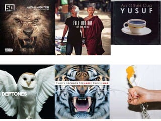
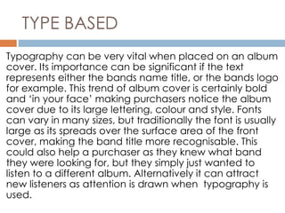
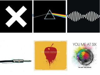

The document discusses trends in album artwork, including image-based covers that focus on a central photograph to draw attention, portrait covers that are popular for solo artists as it establishes their presence, photo manipulation covers that are bold and convey information about the artist's personality or message, type-based covers where the band or album name in large fonts makes it recognizable, and minimalistic covers that appeal to purchasers with open space but risk being too simple.