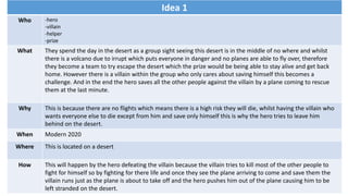
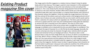
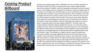
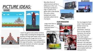
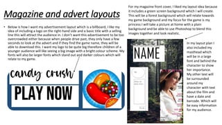
Here are a few key points about this magazine cover:
- It uses a medium shot to show two main characters, focusing attention on them. Having two characters engages the viewer more than just one.
- The woman is positioned slightly in front, closer to the camera, indicating she is likely the primary protagonist or "hero" of the story being promoted.
- Bold, large sans serif fonts are used for the title/masthead and cover lines to clearly communicate key information and grab attention.
- Saturated colors like red and yellow contrast well against the darker background for high visual impact. This makes the cover stand out on a shelf or rack.
- The characters' poses and facial expressions convey