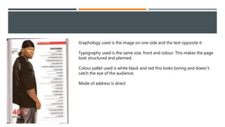
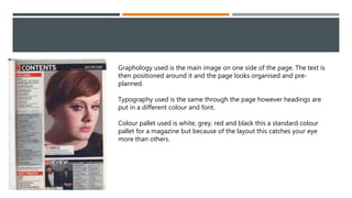
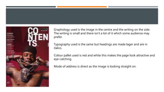
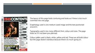
4 MUSIC CONTENTS PAGE
OWEN BAILEY
Graphology used is the image on one side and the text opposite it.
Typography used is the same size, front and colour. This makes the page
look structured and planned.
Colour pallet used is white black and red this looks boring and doesn’t
catch the eye of the audience.
Mode of address is direct
Graphology used is the main image on one side of the page. The text is
then positioned around it and the page looks organised and pre-
planned.
Typography used is the same through the page however headings are
put in a different colour and font.
Colour pallet used is white, grey, red and black this a standard colour
pallet for a magazine but because of the layout this catches your eye
more than others.
Graphology used is the image in the centre and the writing on the side.
The writing is small and there isn't a lot of it which some audience may
prefer.
Typography used is the same but headings are made lager and are in
italics.
Colour pallet used is red and white this makes the page look attractive and
eye-catching.
Mode of address is direct as the image is looking straight on.
The layout of this page looks confusing and looks as if there is too much
crammed into one page.
Graphology used is one medium sized image and the text positioned
around it.
Typography used is too many different font, colour and sizes. The page
looks as if it not been pre-planned.
Colour pallet used is black, white, yellow and red. These are all bold colour
but the page doesn’t standout because there's to much going on.

4 music contents page

  • 1.
    4 MUSIC CONTENTSPAGE OWEN BAILEY
  • 2.
    Graphology used isthe image on one side and the text opposite it. Typography used is the same size, front and colour. This makes the page look structured and planned. Colour pallet used is white black and red this looks boring and doesn’t catch the eye of the audience. Mode of address is direct
  • 3.
    Graphology used isthe main image on one side of the page. The text is then positioned around it and the page looks organised and pre- planned. Typography used is the same through the page however headings are put in a different colour and font. Colour pallet used is white, grey, red and black this a standard colour pallet for a magazine but because of the layout this catches your eye more than others.
  • 4.
    Graphology used isthe image in the centre and the writing on the side. The writing is small and there isn't a lot of it which some audience may prefer. Typography used is the same but headings are made lager and are in italics. Colour pallet used is red and white this makes the page look attractive and eye-catching. Mode of address is direct as the image is looking straight on.
  • 5.
    The layout ofthis page looks confusing and looks as if there is too much crammed into one page. Graphology used is one medium sized image and the text positioned around it. Typography used is too many different font, colour and sizes. The page looks as if it not been pre-planned. Colour pallet used is black, white, yellow and red. These are all bold colour but the page doesn’t standout because there's to much going on.