Download as PDF, PPTX


![From: Dat Visualisation: a successful design process. Andy Kirk.
Image (left) republished from the freely licensed media file repository Wikimedia Commons, source:
http://en.wikipedia.org/wiki/File:FrancePopulationDensity1968.png
Image (right) from "The Good and The Bad [2012]" (http://www.theusrus.de/blog/
the-good-the-bad-22012/) by Martin Theus](https://image.slidesharecdn.com/20130321datavisulisationppmemirjamschaap-140701072004-phpapp01/85/Visualisation-help-understand-and-communicate-19-320.jpg)


![credits
Structure and approach based on Information Visualisation MOOC, Indiana
University, Katy Börner
Guardian datablog
Albert Cairo’s MOOC data visualisation
London tube maps: http://randomwire.com/new-london-tube-map-proposal
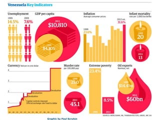
Venezuela key indicators infographic: Paul Scruton
9 Ways to Visualize Proportions – Nathan Yau http://flowingdata.com/2009/11/25/9-ways-to-visualize-proportions-a-guide/
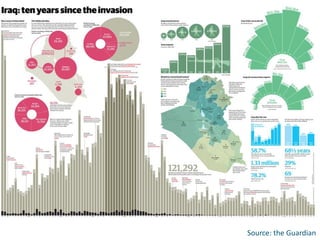
Iraq after the invasion http://www.guardian.co.uk/news/datablog/2013/mar/14/iraq-ten-years-visualised
Maps France: Image (left) republished from the freely licensed media file repository Wikimedia
Commons, source: ttp://en.wikipedia.org/wiki/File:FrancePopulationDensity1968.png Image from "The Good and The Bad [2012]" by
Martin Theus http://www.theusrus.de/blog/ the-good-the-bad-22012/](https://image.slidesharecdn.com/20130321datavisulisationppmemirjamschaap-140701072004-phpapp01/85/Visualisation-help-understand-and-communicate-27-320.jpg)


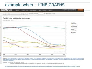
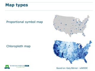
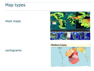
This document discusses using data visualization to help understand and communicate information more effectively. It provides examples of different types of visualizations including line graphs, histograms, maps, networks and word clouds. These visualization types can show temporal trends, geographic locations, relationships and topics. Elements like position, size, color, hue and saturation can be manipulated in visualizations. The document recommends several online resources for learning about and creating different types of data visualizations.


![[DSC Europe 25] Srba Markovic - From Pilot to Production: Overcoming AI Deplo...](https://cdn.slidesharecdn.com/ss_thumbnails/yjjmrtytmwbalxlba7px-4-srba-markovic-from-pilot-to-production-overcoming-ai-deployment-blockers-with-260114111931-4a892d44-thumbnail.jpg?width=640&height=640&fit=bounds)


![[DSC Europe 25] Danilo Djukanovic - From Vibes to KPIs: Turning Culture Into ...](https://cdn.slidesharecdn.com/ss_thumbnails/inqestws5wf0cik2glgv-3-danilo-djukanovic-from-vibes-to-kpis-presentation-260114111931-dacff81f-thumbnail.jpg?width=640&height=640&fit=bounds)
![[DSC Europe 25] Stefan Brankovic - #ResumeIsDead. AI-Powered Interviews and C...](https://cdn.slidesharecdn.com/ss_thumbnails/qnmbsv0xq3uysdrq3sev-2-stefan-brankovic-job-bolt-260114111931-a065aa3d-thumbnail.jpg?width=640&height=640&fit=bounds)

![[DSC Europe 25] Slobodan Dolinic - Smart and Intelligent Green Region.pptx](https://cdn.slidesharecdn.com/ss_thumbnails/0bribinjsp6ghwtvsvor-2-sigre-slobodan-dolinic-260115093812-c9c10e90-thumbnail.jpg?width=640&height=640&fit=bounds)


![[DSC Europe 25] Ivica Milaric - The Future of Gaming and AI Tools.pptx](https://cdn.slidesharecdn.com/ss_thumbnails/tijgzsmgse2kj2y5pzzp-5-ivica-milaric-the-future-of-gaming-x-ai-tools-260114111931-87c2b3ac-thumbnail.jpg?width=640&height=640&fit=bounds)


