Download as PDF, PPTX


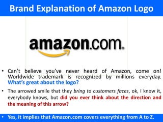
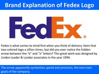
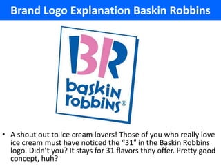
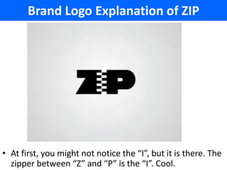


This document provides explanations for the hidden meanings behind 12 well-known logos. It describes logos for companies like Amazon, FedEx, Sony, Baskin Robbins, and more, highlighting subtle design elements that represent important aspects of each brand in clever ways, such as integration of technology, speed and precision in delivery, and variety of product offerings. The document aims to reveal these hidden messages to help readers better understand the thought and strategy behind iconic logo designs.


