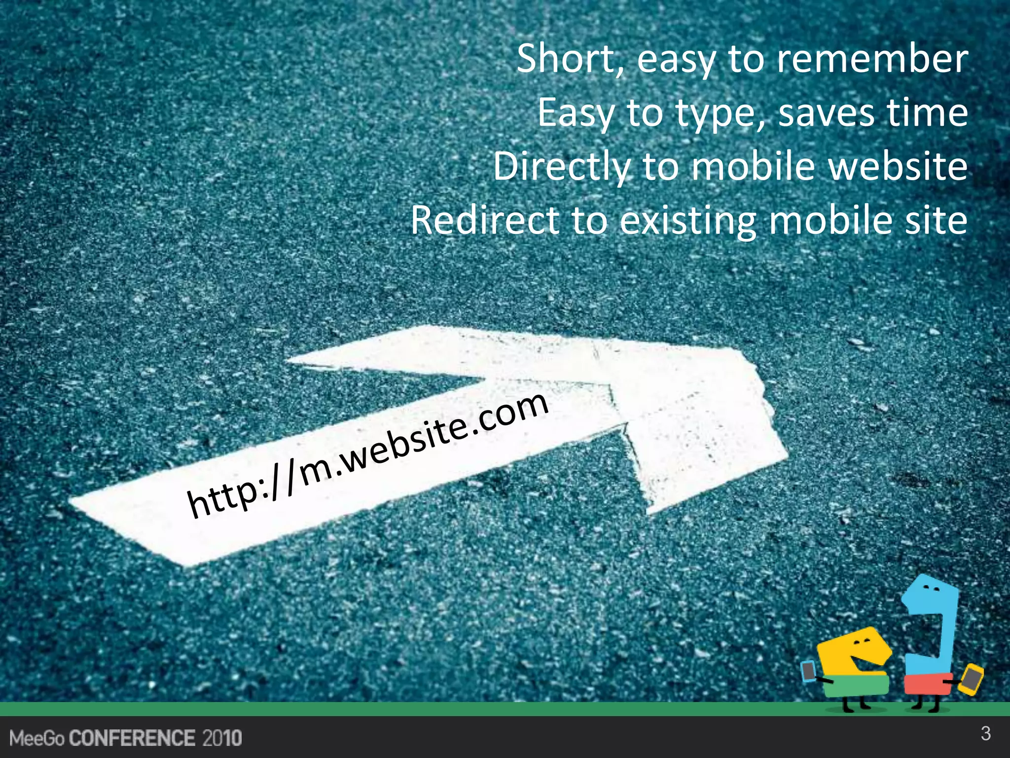
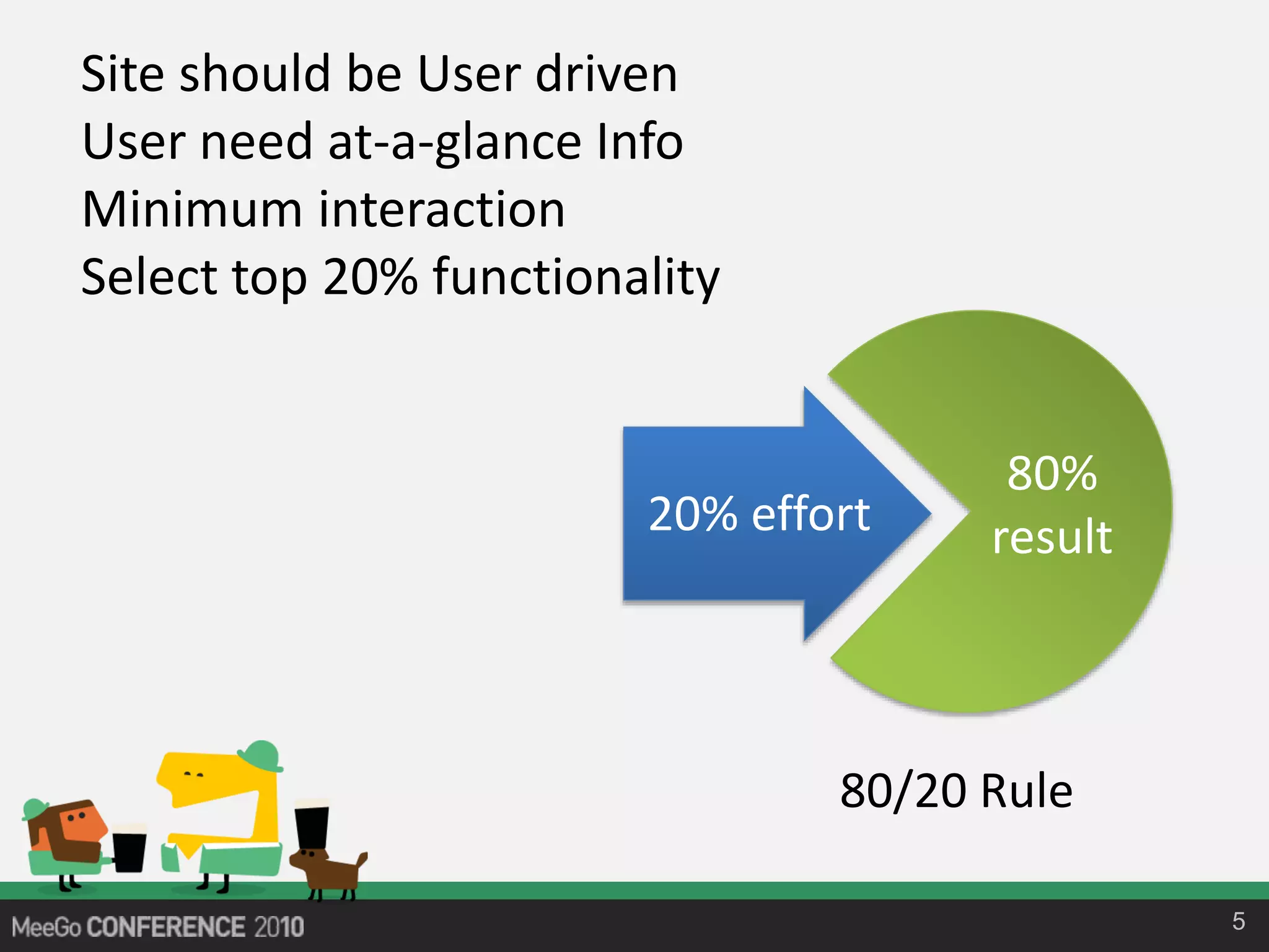
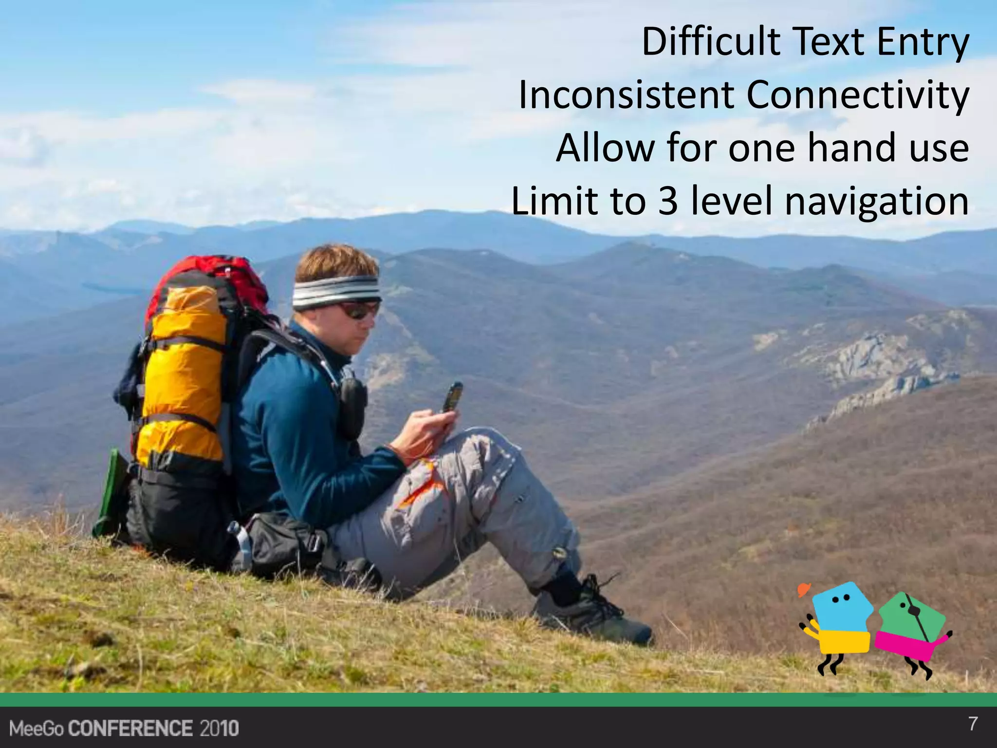
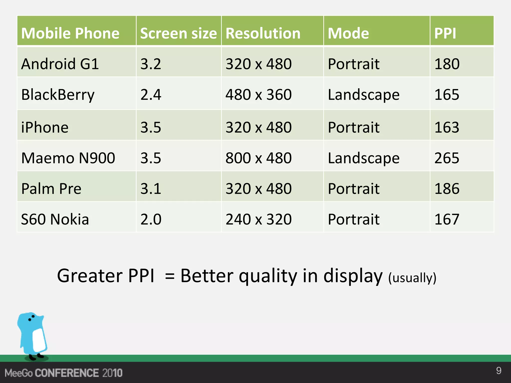
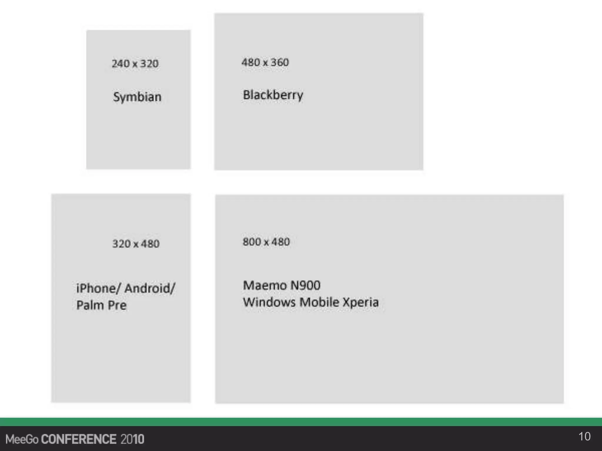
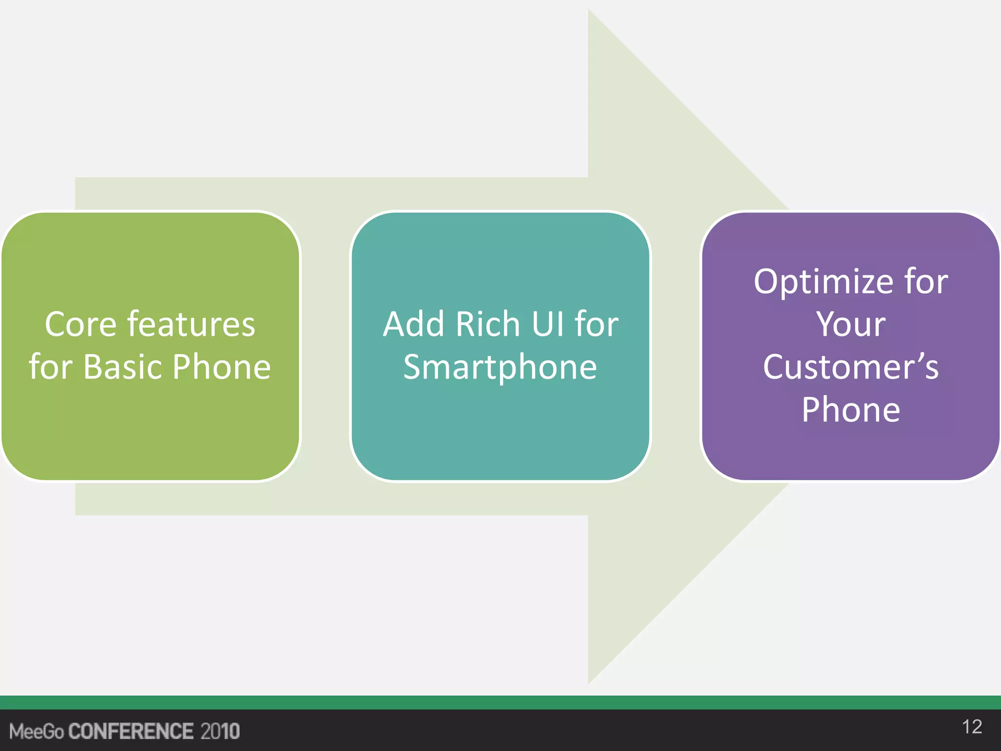
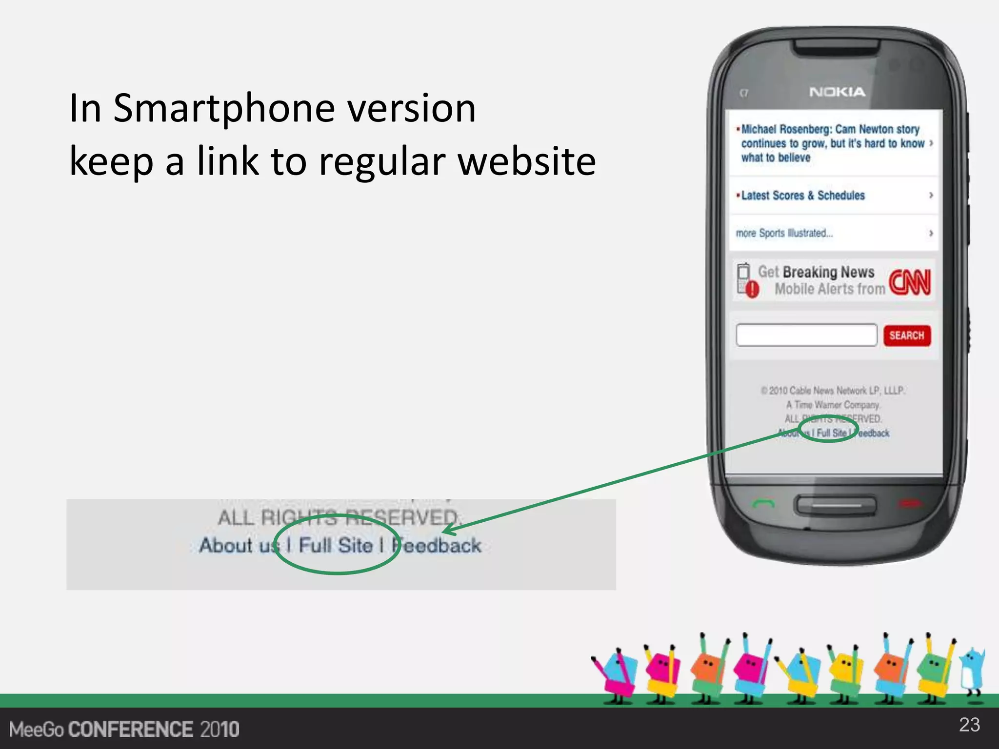
Ten Tips to design Mobile website for maximum number of users and devices in the least amount of time.
How to create a mobile version of your website? Do you need to optimize your current website for mobile devices or design a completely new website? Do you need to worry about different platforms, Windows Mobile, iPhone, Symbian, Blackberry, Linux, Brew, Android, Nokia and MeeGo? What resolution, what screen size you should target, and what is this PPI anyway? In this session, mobile web usability expert and co-author of Beginning Smartphone Web Development, Rajesh Lal will discuss ten pragmatic tips, for designing website for mobile devices.
Readmind Technologies is an Indian Based IT Company with excellent programmers and designers.
We are one among the leading companies in the field of website design, website development, mobile application development and internet marketing. Established in 2012. Our head office is at located in Pune, India with more than 10 staff.
Presentation for Department of Veteran Affairs
Learn the essentials of HTML5
• HTML5 Semantics
• Accessibility and ARIA
• CSS3 Styles and Animations
• Advanced Web APIs
• How to adapt your website for N-screens TV, PC, Mobile and Tablets
A digital picture frame has a frame bounding a touch screen that presents a user interface having first and second arcs of selector elements. The first are of selector elements is manipulable to establish an input genre root, and the second arc is manipulable to select an input branching from a genre root selected using an element in the first group. The arcs are rotatable to reveal previously unpresented selector elements when a person moves a hand along the respective arc.
http://www.google.com/patents/about?id=l_LWAAAAEBAJ
Why Toastmasters - The story of a fishermanRaj Lal
If you are wondering why should we do toastmasters, when you don't have to speak everyday and public speaking makes you nervous. This might be the story for you.
https://www.linkedin.com/pulse/why-toastmasters-story-fisherman-raj-lal
A User Interface for Mobile device inspired by Honeycomb structure with Hexagonal Grid
Here are the links to the two design patents:
http://www.google.com/patents?id=ltXKAAAAEBAJ
http://www.google.com/patents/about?id=wOfUAAAAEBAJ
Web In Extreme Environment: Beyond Cross BrowsingGreg SHIN
Web sites can more efficiently meet both goals when developers understand the significant overlap between making a Web site accessible for a mobile device and for people with disabilities.
Here's some of what it covers:
Mobile context
Mobile testing tools
Fixed vs. fluid layouts
Scalable layouts
Horizontal layouts
Designing for touch
Real-time content
10 Tips For Designing Mobile Widgets - Maemo Summit, Amsterdam, Oct 11, 2009 ...Raj Lal
Ten Tips For Designing Mobile Widgets Maemo Summit 2009 Amsterdam Netherlands
Do you know why only 1 percent of Mobile Widgets are successful ? What makes some widgets thrive and used by millions, and others with equal functionality bite the dust ? Make no mistakes, design of a widget is not about graphics, colour or fonts. This presentation will demystify this 'invisible' layer below the surface with 10 pragmatic tips. The tips will cover some of the most useful, and often ignored standard design principals and how to apply them in a mobile context.
- Rajesh Lal
5 Simple Actions to Make a Measurable Impact on Your Responsive Site5th Finger
Our President, Patrick Collins, presented at eTail East 2013 in Philadelphia, PA, on 5 Simple Actions to Make a Measurable Impact on Your Responsive Site. Listen to what he had to say, and contact him with any questions or comments at patrick.collins@5thfinger.com.
Best Mobile App Development Services in IndiaSteve Verma
CURIX INFOTECH - MOBILE APPLICATION DEVELOPMENT SERVICES
With every person having a smart phone in his hand, mobile applications have become great means to approach and convince wider range of audience. Whether you want to convey a social message or promote your business products, you can do this in an effective way through mobile applications. Curix Infotech develops mobile apps tailored to meet the requirements and objectives of different type clients.
We develop apps for following mobile platforms.
iOS app development
Android app development
Windows app development
They have a highly experienced team of mobile app developers who utilizes their expertise to develop innovative and suitable applications.
We offer following kinds of mobile app development services:
Responsive mobile website designing and development
Mobile advertisement
Custom mobile application development
Mobile game development
M-commerce application development
Cross-platform compatible applications
Mobile application testing and maintenance
Our team is capable of developing suitable mobile applications for any kind of business, industry, and organisation. We are ready to develop mobile applications for e-commerce portals, hotel industry, hospitals, banks, educational institutions, social networking sites, retail stores, and other types of businesses. Equipped with latest technologies, we are capable to cater to offshore companies and clients without any hassle. When you consider mobile app development services from Curix, you get following major benefits.
Key Benefits of Curix Mobile Development Services:
Top quality work
Applications with innovative features
Technical support
Most affordable charges
Extremely experienced developers
Use of latest technologies
On time completion of project
Free consultation
Besides a quick explanation of what responsive email design is; I take a look at what’s possible, going through some of the responsive layout patterns we’ve deployed. I’ve also got a section on tablets, touch, performance and techniques for dealing with clients that don’t support media queries. I finish up by looking at testing…hope you find it useful. You can watch the video that goes with deck here: http://www.youtube.com/watch?v=T6GajEVabP4
Empowering Multiscreen web and mobile applications with MobilespearShay Rosen (שי רוזן)
Presenting Mobile Spear - the new way to easily turn your website mobile friendly. Mobile Spear is a powerful tool that can turn any website into a mobile and tablet friendly site. It uses the same URL and no proxy and is perfect for SEO. Mobile Spear does not require new integration, Does not use a proxy server and fits especially large and complex websites, ecommerce websites and self service websites. It is operated on a SaaS model and it can be implemented in a couple of weeks with no server side development at all. mobilespear supports all popular browsers such as safari, chrome, firefox opera and Dolphin and all smartphone operating systems - iOs, Android, etc. Contact us on www.mobilespear.co.il for more information
Responsive & Adaptive Design @mLearnCon15 Nick FloroNick Floro
Responsive and adaptive designs are extremely popular in the world of mobile learning, but they are also very commonly misunderstood concepts. Today’s mobile learning professionals need to understand what responsive and adaptive designs really are in order to plan and implement them effectively with HTML5-based solutions.
Press Medit Kit and Brand Guidelines for TeamCalendar.Ai.
Our Press Kit. Check it out here.
https://xd.adobe.com/view/caf45a21-b9a0-46a9-57ce-9406fb230a46-bcc5/?fullscreen
Workshop Stanford University - 28th July 2018 on Website Optimization Raj Lal
A website can be an extremely effective tool for generating sales and achieving other business goals. But that assumes you’ve “optimized” your website—that you’ve learned the techniques that will let you effectively convert website visitors into customers, whether that means buying a product, downloading your app, signing up for a beta, or scheduling an appointment. There is an art and a science to optimizing your website—or what’s sometimes called Conversion Rate Optimization (CRO)—that can be tremendously useful for marketers, executives, and business owners. This one-day workshop will provide a concise and practical overview of optimization techniques, focusing on four key subjects: mining information from Google Analytics to understand data, users, and devices; analyzing competitors; heuristically reviewing your website for usability; and A/B testing your key content for conversion. Once you have this information you will be able to optimize the layout and remove the bottlenecks in your website that may be preventing your visitors from converting into customers. You will learn how to leverage the data to create a better user flow in your website and use the test-driven framework to continuously improve your website, acquire more customers, and increase your revenue.
https://continuingstudies.stanford.edu/courses/professional-and-personal-development/an-introduction-to-website-optimization-increase-roi-and-acquire-more-customers/20174_WSP-38
The art and science of website optimizationRaj Lal
Do you know 98% of your website visitors take their business elsewhere? You want to use your website more effectively to generate sales and achieve other business goals. There is an Art and Science to Website Optimization and is increasingly becoming an important field, that marketers and business owners need to know.
Website Optimization is a process of converting website visitors into customers, also referred to as Conversion Rate Optimization (CRO). It helps you to learn how to leverage people to use your website, buy your product, use your app, signup for beta, schedule an appointment and more. Raj Lal, the speaker for this event, last client got a 50% increase in their revenue within a week after optimizing their website. Imagine what will you do?
Raj will cover topics like:
Overview of Website Optimization
How to methodically approach optimizing your website for conversion
Start impacting your bottom line
Four main aspect of Website Optimization:
Mine information from Google Analytics to understand data, user and devices
Analyze competitors
Heuristically Review Website for Usability
A/B test your key content
In this Interactive workshop for entrepreneurs, learn the four essential steps to better User Experience for a website. The User research, the interaction design, Visual Design and functional Prototype. Raj Lal is at the founder and Principal User Experience Specialist at Pro UX Review, a silicon Valley UX Consulting firm where he helps companies with website conversion by increasing user engagement up to 50%. A website conversion means getting your website visitors do what they want to do and came to your website for, buy your product, use your app, learn more, signup for beta, register for your service, or schedule an appointment.
Build Amazing Camera Apps for Superphones - Silicon Valley Code Camp, 6 Oct, ...Raj Lal
Learn how to create an advanced camera app for 41 megapixel Lumia 1020, Windows Phone 8, using the state-of-the-art Imaging SDK. Know what design principles apply for such a high resolution camera, and what are the developers APIs available. With a demo see what are key constraints for developers, for creating for the next generation superphones.
Evolution of User Interface - Digital Web & Design Innovation Summit SFO 20 S...Raj Lal
Do you know about WIMP? The Natural or Organic Interface? Zooming Interface? And what the heck is the Intelligent UI? Where are all these interfaces coming from. What about the Gesture, Haptics, Pen based and touch and even multi touch interfaces?
In this session learn from the Author of Digital Design Essentials: 100 ways to Design better Desktop, Web and Mobile Interfaces, the intriguing story of the Digital Interface. How the digital Interface started from Command line to WIMP Interface to GUI and now became the most debated topic in the design industry, Skeumorphic Design or Modern UI. See how, with the revolution of devices digital interface took turn to Natural, Touch and Organic User Interfaces. See how User Interface has evolved in last twenty years. See how the current trends in touch screens, text to speech and AI are molding the mere fabric of the User Interface and how the user adoption still is the key to a successful User Interface Design.
http://theinnovationenterprise.com/summits/digital-design-sanfran-2013/event_activities/5129
Designing Killer Apps for Mobile Devices ModevUX May 9 2013 mclean VA - @iRajLalRaj Lal
Designing Killer Apps for Mobile devices! - Raj Lal
What makes a mobile app standout from the crowd? When we look at a successful App it seems like a "no brainer" but still so many developers struggle to to get the mobile design right. What's the secret ingredient to get the Mobile App design right. In this session go behind the scene of 10 successful Windows Phone app and see why Design is not how it looks but how it works. Learn ten essential tips for designing Mobile Apps, the Right Way.
http://ux13.gomodev.com/modevux-2013-home/conferences/workshops/#/raj-lal
Accessible design with html5 JS Everywhere 2012 Oct 26 Fairmont Hotel San Jos...Raj Lal
How to design an HTML5 website which supports people with disabilities, and know why its a good business decision.
The four major disabilities which will be covered, that effect user capabilities are visual, hearing, mobility (difficulty in using the mouse), and cognitive disabilities, which are related to learning abilities. Know how to use the latest technologies to accommodate these users in the user interface. An accessible web application gives maximum reach to your application’s information, functionalities and benefits, by allowing multiple input methods, different interaction models, and customization based on special needs and limited device supports.
What People Will Learn
- Understand the problem around designing interfaces for people with, disabilities
- Know concrete steps to design and develop web applications to, accommodate the four kinds of major disabilities in HTML5
- Know the business case for Accessibility, 4; Learn the standard practices and design guidelines for accessible, design in HTML5
Accessibility on Windows Phone - Windows Phone Meetup at Nokia - 16 October @...Raj Lal
Learn what accessibility means and how to develop your app and web pages to make it more accessible on mobile devices. An accessible app gives maximum reach to your information, functionality and benefits. The four major disabilities that effect user capabilities are visual, hearing, mobility (difficulty in using the mouse) and cognitive disabilities (which are related to learning abilities). Know how to use the latest HTML5 and Accessible technologies to create for mobile devices.
Accessible design - HOW Interactive Design Conference Washington DC SEPT 27-2...Raj Lal
Learn how to design an interface that supports people with disabilities—and explains why it’s a good business decision.
You’ll learn how to use the latest technologies to accommodate disabled users in the user interface, and see how an Accessible Interface gives maximum reach to your application’s information, functionalities and benefits by allowing multiple input methods, different interaction models, and customization based on special needs and limited device supports.
Accessible Design with HTML5 - HTML5DevConf.com May 21st San Francisco, 2012 ...Raj Lal
Learn how to design an HTML5 application which supports people with disabilities, and know why its a good business decision. An accessible web application gives maximum reach to your application's information, functionalities and benefits, by allowing multiple input methods, different interaction models, and customization based on special needs and limited device supports. The four major disabilities that effect user capabilities are visual, hearing, mobility (difficulty in using the mouse), and cognitive disabilities, which are related to learning abilities. Know how to use the latest technologies to accommodate these users in the user interface.
Developing Apps for Nokia Windows Phone VSLiv Conference May 15, 2012 @iRajLalRaj Lal
Learn to develop Mobile Apps for Nokia Windows Phone Lumia. See what's unique about the Nokia Windows Phone also known as the "First Real Windows Phone". Create some snazzy graphics and animation using XAML. The session with Live Demo on Nokia Windows Phone Lumia.
You will learn:
Windows Phone Development on Nokia Phone
Key features of Nokia Windows Phone Lumia
See a working demo with advanced graphics
Upgrade Your Website to HTML5 - VSLive Conference New York @iRajLalRaj Lal
Learn what you need to do, to upgrade your existing web application with HTML5. How and Where do you start? Learn how you capitalize on the State-of-the-Art HTML5 tags, Cutting edge graphics and animation with CSS3, and advanced HTML5 API and take your existing website to the next level of Web revolution.
You will learn:
Upgrade your current website with HTML5
Use advanced HTML5 APIs which gracefully degrade
Know how to enhance your website with the latest HTML5 goodies
Fun with QML and JavaScript: Embedded Linux Conference 11th April 2011, Hotel...Raj Lal
Learn to develop News, Social, Tools and Fun & Game Apps using QML and JavaScript on MeeGo devices. Know how to apply some advanced graphics and animations with simple QML and see how JavaScript allows you to create a feature rich application. No C++ required. A tutorial with live demos targeted to beginner to intermediate Mobile developers interested in developing mobile applications on Linux based Mobile Devices.
Build Cutting edge Mobile Apps using QML and JavaScript for MeeGo N9: Linux F...Raj Lal
Learn to create cutting-edge mobile applications using QML and JavaScript on MeeGo devices. Know how to apply some advanced graphics and animations with simple QML and see how JavaScript allows you to create a feature rich application. No C++ required. A tutorial with live demos targeted to beginner to intermediate Mobile developers interested in developing mobile applications on Linux based mobile devices.
QML & JavaScript on MeeGo: Flourish Conference 2nd Apr 2011, at UIC Chicago @...Raj Lal
Build cutting edge mobile applications using QML and JavaScript on MeeGo devices. Know how to apply some advanced graphics and animations with simple QML and see how JavaScript allows you to create a feature rich application. A tutorial with live demos targeted to beginner to intermediate Mobile developers interested in developing mobile applications on Linux based Mobile Devices. No C++ required.
UiPath Test Automation using UiPath Test Suite series, part 4DianaGray10
Welcome to UiPath Test Automation using UiPath Test Suite series part 4. In this session, we will cover Test Manager overview along with SAP heatmap.
The UiPath Test Manager overview with SAP heatmap webinar offers a concise yet comprehensive exploration of the role of a Test Manager within SAP environments, coupled with the utilization of heatmaps for effective testing strategies.
Participants will gain insights into the responsibilities, challenges, and best practices associated with test management in SAP projects. Additionally, the webinar delves into the significance of heatmaps as a visual aid for identifying testing priorities, areas of risk, and resource allocation within SAP landscapes. Through this session, attendees can expect to enhance their understanding of test management principles while learning practical approaches to optimize testing processes in SAP environments using heatmap visualization techniques
What will you get from this session?
1. Insights into SAP testing best practices
2. Heatmap utilization for testing
3. Optimization of testing processes
4. Demo
Topics covered:
Execution from the test manager
Orchestrator execution result
Defect reporting
SAP heatmap example with demo
Speaker:
Deepak Rai, Automation Practice Lead, Boundaryless Group and UiPath MVP
GraphRAG is All You need? LLM & Knowledge GraphGuy Korland
Guy Korland, CEO and Co-founder of FalkorDB, will review two articles on the integration of language models with knowledge graphs.
1. Unifying Large Language Models and Knowledge Graphs: A Roadmap.
https://arxiv.org/abs/2306.08302
2. Microsoft Research's GraphRAG paper and a review paper on various uses of knowledge graphs:
https://www.microsoft.com/en-us/research/blog/graphrag-unlocking-llm-discovery-on-narrative-private-data/
SAP Sapphire 2024 - ASUG301 building better apps with SAP Fiori.pdfPeter Spielvogel
Building better applications for business users with SAP Fiori.
• What is SAP Fiori and why it matters to you
• How a better user experience drives measurable business benefits
• How to get started with SAP Fiori today
• How SAP Fiori elements accelerates application development
• How SAP Build Code includes SAP Fiori tools and other generative artificial intelligence capabilities
• How SAP Fiori paves the way for using AI in SAP apps
Le nuove frontiere dell'AI nell'RPA con UiPath Autopilot™UiPathCommunity
In questo evento online gratuito, organizzato dalla Community Italiana di UiPath, potrai esplorare le nuove funzionalità di Autopilot, il tool che integra l'Intelligenza Artificiale nei processi di sviluppo e utilizzo delle Automazioni.
📕 Vedremo insieme alcuni esempi dell'utilizzo di Autopilot in diversi tool della Suite UiPath:
Autopilot per Studio Web
Autopilot per Studio
Autopilot per Apps
Clipboard AI
GenAI applicata alla Document Understanding
👨🏫👨💻 Speakers:
Stefano Negro, UiPath MVPx3, RPA Tech Lead @ BSP Consultant
Flavio Martinelli, UiPath MVP 2023, Technical Account Manager @UiPath
Andrei Tasca, RPA Solutions Team Lead @NTT Data
Pushing the limits of ePRTC: 100ns holdover for 100 daysAdtran
At WSTS 2024, Alon Stern explored the topic of parametric holdover and explained how recent research findings can be implemented in real-world PNT networks to achieve 100 nanoseconds of accuracy for up to 100 days.
Observability Concepts EVERY Developer Should Know -- DeveloperWeek Europe.pdfPaige Cruz
Monitoring and observability aren’t traditionally found in software curriculums and many of us cobble this knowledge together from whatever vendor or ecosystem we were first introduced to and whatever is a part of your current company’s observability stack.
While the dev and ops silo continues to crumble….many organizations still relegate monitoring & observability as the purview of ops, infra and SRE teams. This is a mistake - achieving a highly observable system requires collaboration up and down the stack.
I, a former op, would like to extend an invitation to all application developers to join the observability party will share these foundational concepts to build on:
GDG Cloud Southlake #33: Boule & Rebala: Effective AppSec in SDLC using Deplo...James Anderson
Effective Application Security in Software Delivery lifecycle using Deployment Firewall and DBOM
The modern software delivery process (or the CI/CD process) includes many tools, distributed teams, open-source code, and cloud platforms. Constant focus on speed to release software to market, along with the traditional slow and manual security checks has caused gaps in continuous security as an important piece in the software supply chain. Today organizations feel more susceptible to external and internal cyber threats due to the vast attack surface in their applications supply chain and the lack of end-to-end governance and risk management.
The software team must secure its software delivery process to avoid vulnerability and security breaches. This needs to be achieved with existing tool chains and without extensive rework of the delivery processes. This talk will present strategies and techniques for providing visibility into the true risk of the existing vulnerabilities, preventing the introduction of security issues in the software, resolving vulnerabilities in production environments quickly, and capturing the deployment bill of materials (DBOM).
Speakers:
Bob Boule
Robert Boule is a technology enthusiast with PASSION for technology and making things work along with a knack for helping others understand how things work. He comes with around 20 years of solution engineering experience in application security, software continuous delivery, and SaaS platforms. He is known for his dynamic presentations in CI/CD and application security integrated in software delivery lifecycle.
Gopinath Rebala
Gopinath Rebala is the CTO of OpsMx, where he has overall responsibility for the machine learning and data processing architectures for Secure Software Delivery. Gopi also has a strong connection with our customers, leading design and architecture for strategic implementations. Gopi is a frequent speaker and well-known leader in continuous delivery and integrating security into software delivery.
Smart TV Buyer Insights Survey 2024 by 91mobiles.pdf91mobiles
91mobiles recently conducted a Smart TV Buyer Insights Survey in which we asked over 3,000 respondents about the TV they own, aspects they look at on a new TV, and their TV buying preferences.
State of ICS and IoT Cyber Threat Landscape Report 2024 previewPrayukth K V
The IoT and OT threat landscape report has been prepared by the Threat Research Team at Sectrio using data from Sectrio, cyber threat intelligence farming facilities spread across over 85 cities around the world. In addition, Sectrio also runs AI-based advanced threat and payload engagement facilities that serve as sinks to attract and engage sophisticated threat actors, and newer malware including new variants and latent threats that are at an earlier stage of development.
The latest edition of the OT/ICS and IoT security Threat Landscape Report 2024 also covers:
State of global ICS asset and network exposure
Sectoral targets and attacks as well as the cost of ransom
Global APT activity, AI usage, actor and tactic profiles, and implications
Rise in volumes of AI-powered cyberattacks
Major cyber events in 2024
Malware and malicious payload trends
Cyberattack types and targets
Vulnerability exploit attempts on CVEs
Attacks on counties – USA
Expansion of bot farms – how, where, and why
In-depth analysis of the cyber threat landscape across North America, South America, Europe, APAC, and the Middle East
Why are attacks on smart factories rising?
Cyber risk predictions
Axis of attacks – Europe
Systemic attacks in the Middle East
Download the full report from here:
https://sectrio.com/resources/ot-threat-landscape-reports/sectrio-releases-ot-ics-and-iot-security-threat-landscape-report-2024/
Generative AI Deep Dive: Advancing from Proof of Concept to ProductionAggregage
Join Maher Hanafi, VP of Engineering at Betterworks, in this new session where he'll share a practical framework to transform Gen AI prototypes into impactful products! He'll delve into the complexities of data collection and management, model selection and optimization, and ensuring security, scalability, and responsible use.
Why You Should Replace Windows 11 with Nitrux Linux 3.5.0 for enhanced perfor...SOFTTECHHUB
The choice of an operating system plays a pivotal role in shaping our computing experience. For decades, Microsoft's Windows has dominated the market, offering a familiar and widely adopted platform for personal and professional use. However, as technological advancements continue to push the boundaries of innovation, alternative operating systems have emerged, challenging the status quo and offering users a fresh perspective on computing.
One such alternative that has garnered significant attention and acclaim is Nitrux Linux 3.5.0, a sleek, powerful, and user-friendly Linux distribution that promises to redefine the way we interact with our devices. With its focus on performance, security, and customization, Nitrux Linux presents a compelling case for those seeking to break free from the constraints of proprietary software and embrace the freedom and flexibility of open-source computing.
zkStudyClub - Reef: Fast Succinct Non-Interactive Zero-Knowledge Regex ProofsAlex Pruden
This paper presents Reef, a system for generating publicly verifiable succinct non-interactive zero-knowledge proofs that a committed document matches or does not match a regular expression. We describe applications such as proving the strength of passwords, the provenance of email despite redactions, the validity of oblivious DNS queries, and the existence of mutations in DNA. Reef supports the Perl Compatible Regular Expression syntax, including wildcards, alternation, ranges, capture groups, Kleene star, negations, and lookarounds. Reef introduces a new type of automata, Skipping Alternating Finite Automata (SAFA), that skips irrelevant parts of a document when producing proofs without undermining soundness, and instantiates SAFA with a lookup argument. Our experimental evaluation confirms that Reef can generate proofs for documents with 32M characters; the proofs are small and cheap to verify (under a second).
Paper: https://eprint.iacr.org/2023/1886
Elevating Tactical DDD Patterns Through Object CalisthenicsDorra BARTAGUIZ
After immersing yourself in the blue book and its red counterpart, attending DDD-focused conferences, and applying tactical patterns, you're left with a crucial question: How do I ensure my design is effective? Tactical patterns within Domain-Driven Design (DDD) serve as guiding principles for creating clear and manageable domain models. However, achieving success with these patterns requires additional guidance. Interestingly, we've observed that a set of constraints initially designed for training purposes remarkably aligns with effective pattern implementation, offering a more ‘mechanical’ approach. Let's explore together how Object Calisthenics can elevate the design of your tactical DDD patterns, offering concrete help for those venturing into DDD for the first time!
Standard practice accepted by most mobile users
Use content adaptation for phones
http://website.mobi
http://mobile.website.com
http://website.com/mobile
http://website.com/m
A mobile web site needs to be user-driven. Know why your user visits your web site and provide only those features in the mobile version. Be aware that mobile users need information with minimum interaction.
List the set of functions from the desktop web site you want to port to the device. My suggestion is to take only the top 20 percent of useful features from the desktop web site to the mobile web.
• List the most important features for which the mobile user will open the site while on the move; these should be part of the home page.
Difficult Text Entry so try to avoid and keep Website "Read Only" User most likely will use Mobile with one hand Battery Powered Inconsistent Connectivity
• Restrict your mobile web site to three levels of navigation. A mobile user has a very short span of time; try to get him what he is looking for as fast as possible. Standard search navigation is Search to Result to Detail page. If the user searches for a particular item, the navigation should be Search to Detail page, and at any page the search should be visible for reuse; the user should not need to go back three steps to get to the search.
• Save user settings. This is very important and gives a better user experience by minimizing user interaction. Use the browser cache effectively to remember the user’s last set of configurations.
• Make the functions accessible. Allow maximum interaction—even the basic mobile browser allows for access keys that map the phone keys to the navigation (see case study #4, Flickr). Use them to provide shortcut keys for navigation.
minimizing user interaction.
– cache Information / settings
for all popular mobiles
one basic version optimized for mass-market mobile device and a richer version for smartphones
• Start with a basic version for older mobile phone browsers and then add extra features for the smartphone version. This helps you identify the core features of the desktop web site that need to be ported to the mobile version. Use the 80/20 rule (80 percent of the results comes from 20 percent of the features) to identify the top 20 percent of features.
• Create only two mobile versions, one for the basic phone and one for smartphones, and then optimize the richer version according to your customer’s phone. If you know 80 percent of your users use Nokia phones, optimize the web site for that device and use 100-percent width, which accommodates all other similar devices. Use content adaptation for phones with similar browser capabilities but different dimensions to adapt to a particular device.
There are two simple goals in mobile web design—to accommodate the maximum number of users and devices, and to do that with the least amount of effort.
To achieve this, you have to start with a flexible reference design—the bare-minimum functionality you want in your mobile web page—and then use a standard layout that will work across the devices. Let’s take a closer look at those two concepts.
One Basic versions of a mobile web site optimized for mass-market mobile devices
One Rich Version to accommodates all the Smartphones
Both version optimized for bandwidth—plain text with optimized images.
• Optimize everything. Optimize images for size; a PNG image can be a good trade-off between quality and size. CSS and JavaScript should also be
optimized for size. A number of online optimization tools are available for this purpose. Don’t forget to test after optimization. If you are using JavaScript
libraries, try to reduce the size by removing the functions you don’t need.
• Reduce server trips by using image sprites and merging CSS and JavaScript in the same page, instead of using additional include files. Chapter 8 goes
into this subject in more detail.
Reduce Server Trips for better user experience
Try to include optimized css and JS in the page.
Standard Layout has Vertical Scroll
layout allows the information to flow linearly downward,
so users can scroll down for more news headlines.
With blocks of information that can be individually displayed on the mobile screen
Grouped into multiple categories
The layout allows the information to flow linearly downward,
so the user can scroll down for more news blocks, headlines, and so forth
no horizontal scroll like the desktop version.
Minimal or No Advertisement
Standard abbreviations are accepted
One Page One Idea
• Avoid the following: Pop-up windows, mouse-hover menus, auto refresh, auto redirects, external links, horizontal scrolling, and frames.
• Ajax functionality, or progressive enhancement, if used sparingly can give a great user experience.
• Testing should be done on actual devices.
There are online services like deviceanywhere.com that enable remote testing on different mobile devices.
• Simplify everything. Use clear, short, simple words for links, buttons, and menus. Standard abbreviations are accepted for titles.
• One idea on one page. Always focus on one idea on a mobile web page. For a news site, a category needs to have a page of its own; don’t try to accommodate everything on a single page with a large vertical scroll.
• Thematic consistency. Keep some level of consistency with the original web site, like logo and color themes to keep the “feel” of the desktop web site. Don’t make drastic changes to the mobile site. If you are targeting a particular phone, use the design guidelines for the phone.
• Color. When using color on a mobile web page, consider the sun, shade, contrast, and brightness a user might face on the move. Use color not only for style but also for function, such as red for alert. But don’t convey important information only by color. For example, even if an error is displayed with red, there should also be text to convey the message.
• Visual aesthetic. Make the mobile web pages visually pleasing. Use visual cues instead of raw data, spaces between sections, only a few colors. One of the suggestions I give to all is to have a high noise-to-signal ratio as your guiding principle. Noise-to-signal here refers to the contrast between unimportant information (the noise) and the important information (the signal). If your color scheme is drowning your important information amidst the unimportant information, change it. Make the color scheme so that the most important information stands out of the rest. It should be clearly visible and more attractive than the rest of the page.
No need for help. Although service web sites provide a simple help for beginners, a mobile web site should be intuitive enough on its own. If you must, keep
the help to one page. And keep text input to a minimum, replacing them with select items on forms where possible.
No need for help or one page help
Keep the width of the navigation set at 100 percent to accommodate devices of different dimensions.
The Smartphone version width is set to 100 percent to accommodate devices with different dimensions.
• Future-proof your mobile web site. Test the site for both portrait and landscape mode, and make necessary changes to ensure the site displays nicely
on both. Often, the proper use of styles (100 percent width) can solve this issue. This helps make the web site future-proof.