D E S I G N T A L K S # 4
web compilation
cover image by Inna Murzin
best practices of
form design
β€œfollowing design principles in forms helps
users achieve their goals"
β€œthe number of customers purchasing went up
by 45%. The extra purchases resulted in an
extra $15 million the first month. For the first
year, the site saw an additional $300 million.β€β€Š
The $300 Million Button - Jared Spool
so, why do users leave
apps and websites?
so, why do users leave
apps and websites?
too much form errors
they don’t want to register
unnecessary information
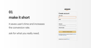
01
make it short
it saves user’s time and increases
the conversion rate.
ask for what you really need.
Image from β€œDesigning More Efficient Forms: Structure,
Inputs, Labels and Actions”, by Nick Babich.
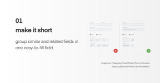
01
make it short
group similar and related fields in
one easy-to-fill field.
Image from β€œDesigning More Efficient Forms: Structure,
Inputs, Labels and Actions”, by Nick Babich.
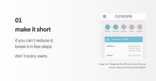
01
make it short
if you can`t reduce it,
break it in few steps.
don`t scary users.
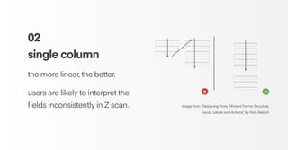
02
single column
the more linear, the better.
users are likely to interpret the
fields inconsistently in Z scan. Image from β€œDesigning More Efficient Forms: Structure,
Inputs, Labels and Actions”, by Nick Babich
02
single column
single-column form is faster
to complete.
users scan 15.4 seconds faster
than the multi-column form. Graphic from β€œForm Field Usability: Should You Use Single or Multi-
Column Forms? [Original Research]”, by Ben Labay
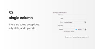
02
single column
there are some exceptions:
city, state, and zip code..
Graphic from β€œAmazon Sign up register form”.
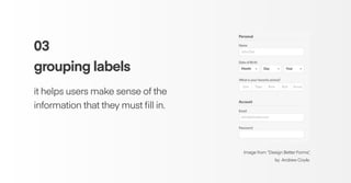
03
grouping labels
it helps users make sense of the
information that they must fill in.
Image from β€œDesign Better Forms”,
by Andrew Coyle.
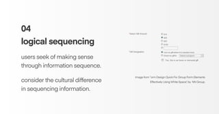
04
logical sequencing
users seek of making sense
through information sequence.
consider the cultural difference
in sequencing information.
Image from β€œorm Design Quick Fix: Group Form Elements
Effectively Using White Space”, by NN Group.
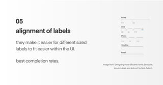
05
alignment of labels
β€Šthey make it easier for different sized
labels to fit easier within the UI.
β€Šbest completion rates.
Image from β€œDesigning More Efficient Forms: Structure,
Inputs, Labels and Actions”, by Nick Babich.
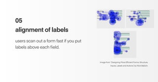
05
alignment of labels
users scan out a form fast if you put
labels above each field.
Image from β€œDesigning More Efficient Forms: Structure,
Inputs, Labels and Actions”, by Nick Babich.
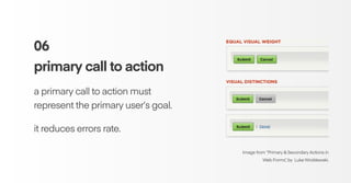
06
primary call to action
a primary call to action must
represent the primary user’s goal.
it reduces errors rate.
Image from β€œPrimary & Secondary Actions in
Web Forms”, by Luke Wroblewski.
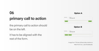
06
primary call to action
the primary call to action should
be on the left.
it has to be aligned with the
rest of the form.
Image from β€œPrimary & Secondary Actions in
Web Forms”, by Luke Wroblewski.
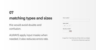
07
matching types and sizes
this would avoid doubts and
confusion.
ALWAYS apply input masks when
needed. it also reduces errors rate.
Image from β€œUse these top 10 tips when you design
for forms”, by Chaymae Lougmani.
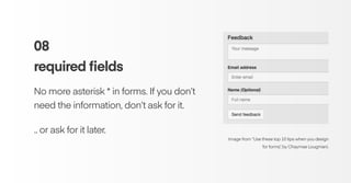
08
required fields
No more asterisk * in forms. If you don’t
need the information, don’t ask for it.
.. or ask for it later.
Image from β€œUse these top 10 tips when you design
for forms”, by Chaymae Lougmani.
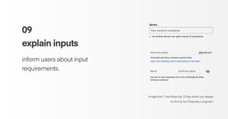
09
explain inputs
inform users about input
requirements.
Image from β€œUse these top 10 tips when you design
for forms”, by Chaymae Lougmani.
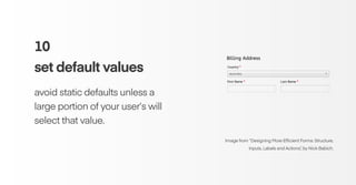
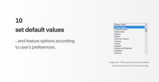
10
set default values
avoid static defaults unless a
large portion of your user’s will
select that value.
Image from β€œDesigning More Efficient Forms: Structure,
Inputs, Labels and Actions”, by Nick Babich.
10
set default values
.. and feature options according
to user’s preferences.
Image from β€œWhy are drop-downs and select
boxes bad for forms?”, by Formisimo blog.
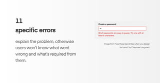
11
specific errors
explain the problem, otherwise
users won’t know what went
wrong and what’s required from
them.
Image from β€œUse these top 10 tips when you design
for forms”, by Chaymae Lougmani.
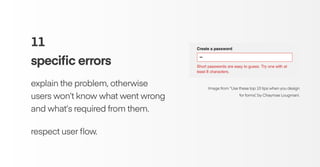
11
specific errors
explain the problem, otherwise
users won’t know what went wrong
and what’s required from them.
respect user flow.
Image from β€œUse these top 10 tips when you design
for forms”, by Chaymae Lougmani.
references
Designing More Efficient Forms: Structure, Inputs, Labels and Actions - Nick Babich
https://uxplanet.org/designing-more-efficient-forms-structure-inputs-labels-and-actions-e3a47007114f
Form Field Usability: Should You Use Single or Multi-Column Forms? [Original Research]
https://conversionxl.com/research-study/form-field-usability/
Primary & Secondary Actions in Web Forms - Luke Wroblewski
https://www.lukew.com/ff/entry.asp?571
Use these top 10 tips when you design for forms - Chaymae Lougmani
https://blog.prototypr.io/use-these-top-10-tips-when-you-design-forms-d095d6e3ab8a
: )

Form Design: Best practices

  • 1.
    D E SI G N T A L K S # 4 web compilation cover image by Inna Murzin best practices of form design
  • 2.
    β€œfollowing design principlesin forms helps users achieve their goals"
  • 3.
    β€œthe number ofcustomers purchasing went up by 45%. The extra purchases resulted in an extra $15 million the first month. For the first year, the site saw an additional $300 million.β€β€Š The $300 Million Button - Jared Spool
  • 4.
    so, why dousers leave apps and websites?
  • 5.
    so, why dousers leave apps and websites? too much form errors they don’t want to register unnecessary information
  • 6.
    01 make it short itsaves user’s time and increases the conversion rate. ask for what you really need.
  • 7.
    Image from β€œDesigningMore Efficient Forms: Structure, Inputs, Labels and Actions”, by Nick Babich. 01 make it short group similar and related fields in one easy-to-fill field.
  • 8.
    Image from β€œDesigningMore Efficient Forms: Structure, Inputs, Labels and Actions”, by Nick Babich. 01 make it short if you can`t reduce it, break it in few steps. don`t scary users.
  • 9.
    02 single column the morelinear, the better. users are likely to interpret the fields inconsistently in Z scan. Image from β€œDesigning More Efficient Forms: Structure, Inputs, Labels and Actions”, by Nick Babich
  • 10.
    02 single column single-column formis faster to complete. users scan 15.4 seconds faster than the multi-column form. Graphic from β€œForm Field Usability: Should You Use Single or Multi- Column Forms? [Original Research]”, by Ben Labay
  • 11.
    02 single column there aresome exceptions: city, state, and zip code.. Graphic from β€œAmazon Sign up register form”.
  • 12.
    03 grouping labels it helpsusers make sense of the information that they must fill in. Image from β€œDesign Better Forms”, by Andrew Coyle.
  • 13.
    04 logical sequencing users seekof making sense through information sequence. consider the cultural difference in sequencing information. Image from β€œorm Design Quick Fix: Group Form Elements Effectively Using White Space”, by NN Group.
  • 14.
    05 alignment of labels β€Štheymake it easier for different sized labels to fit easier within the UI. β€Šbest completion rates. Image from β€œDesigning More Efficient Forms: Structure, Inputs, Labels and Actions”, by Nick Babich.
  • 15.
    05 alignment of labels usersscan out a form fast if you put labels above each field. Image from β€œDesigning More Efficient Forms: Structure, Inputs, Labels and Actions”, by Nick Babich.
  • 16.
    06 primary call toaction a primary call to action must represent the primary user’s goal. it reduces errors rate. Image from β€œPrimary & Secondary Actions in Web Forms”, by Luke Wroblewski.
  • 17.
    06 primary call toaction the primary call to action should be on the left. it has to be aligned with the rest of the form. Image from β€œPrimary & Secondary Actions in Web Forms”, by Luke Wroblewski.
  • 18.
    07 matching types andsizes this would avoid doubts and confusion. ALWAYS apply input masks when needed. it also reduces errors rate. Image from β€œUse these top 10 tips when you design for forms”, by Chaymae Lougmani.
  • 19.
    08 required fields No moreasterisk * in forms. If you don’t need the information, don’t ask for it. .. or ask for it later. Image from β€œUse these top 10 tips when you design for forms”, by Chaymae Lougmani.
  • 20.
    09 explain inputs inform usersabout input requirements. Image from β€œUse these top 10 tips when you design for forms”, by Chaymae Lougmani.
  • 21.
    10 set default values avoidstatic defaults unless a large portion of your user’s will select that value. Image from β€œDesigning More Efficient Forms: Structure, Inputs, Labels and Actions”, by Nick Babich.
  • 22.
    10 set default values ..and feature options according to user’s preferences. Image from β€œWhy are drop-downs and select boxes bad for forms?”, by Formisimo blog.
  • 23.
    11 specific errors explain theproblem, otherwise users won’t know what went wrong and what’s required from them. Image from β€œUse these top 10 tips when you design for forms”, by Chaymae Lougmani.
  • 24.
    11 specific errors explain theproblem, otherwise users won’t know what went wrong and what’s required from them. respect user flow. Image from β€œUse these top 10 tips when you design for forms”, by Chaymae Lougmani.
  • 25.
    references Designing More EfficientForms: Structure, Inputs, Labels and Actions - Nick Babich https://uxplanet.org/designing-more-efficient-forms-structure-inputs-labels-and-actions-e3a47007114f Form Field Usability: Should You Use Single or Multi-Column Forms? [Original Research] https://conversionxl.com/research-study/form-field-usability/ Primary & Secondary Actions in Web Forms - Luke Wroblewski https://www.lukew.com/ff/entry.asp?571 Use these top 10 tips when you design for forms - Chaymae Lougmani https://blog.prototypr.io/use-these-top-10-tips-when-you-design-forms-d095d6e3ab8a
  • 26.