Stare at the orange circle for 30 seconds then move your eye to the right side of the screen. What do you see? (You should see a cyan or turquoise after image.)
Define afterimage and simultaneous contrast.
The two reds at the top are the same as the two reds at the bottom. Josef Albers’ theories just build on
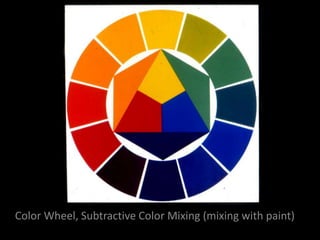
As you probably know, four-color printing uses the primaries Cyan, Magenta, Yellow and also Black (the K stands for Key which is another word for value. Adding darker values is all the black is for. The rest of the colors are made from the CM and the Y.) If the CMYK inks were mixed like paints, it would be impossible to get light values, without adding a white. It would also be pretty difficult to make a printer that could make all the different colors. Instead, CMYK inks are optically mixed. They are actually laid down in little dots…spread further apart for lighter colors, so more white of the paper can get through.
The impressionists are the first ones who really started using Optical Mixing in art. Optical mixing is when little bits of color are put next to each other so that they mix in our eyes. Note that the painting on the right, the orange and blue seem to shimmer more than turn into a muddy color. If you actually mixed orange and blue together it would look brown. By putting these colors (which are complements, or opposites on the color wheel) next to each other, Monet uses principles of afterimage and simultaneous contrast to create the feeling of dancing light.
These are pop artist Roy Lichtenstein’s take offs of Monet’s work. He is using a dot pattern called the Ben-Day dot pattern, which preceded the halftone dot patterns printers use now. It was commonly used in comic books. As a pop artist, Roy Lichtenstein was trying to bridge the gap between “low art” and “high art”.
Jeff Koons is a contemporary artist in the pop tradition.
Present assignment here. Andy Warhol was known for his polarized portraits of celebrities. Lichtenstein and Warhol were both pioneers in the Pop Art movement, which was in many way a reaction to the domination of non-objective art/pure abstraction.
This face is both broken into small areas like half-tone dots, and larger shapes of color clustered together. Clustering colors together is imperative so that you have enough room for your dots to optically mix!
Again, note all the patches of color.
Again, note all the patches of color.
This is a different project from several years ago. But it was started by tracing the different shapes of value and color in a photograph of the student’s face as yours should be as well!
If it’s hard to see colors and photos you can exaggerate the colors in Photoshop first (Image/adjustments/huesaturationvalue/….then increase the saturation.)