009 mind maps and big ideas
•
3 likes•1,109 views

1. The document provides instructions for creating icons by starting with verbal definitions, finding examples to illustrate the definitions, and creating examples that show strong uses of terms. 2. It also discusses adding metaphors to the icon creation process by mind mapping yourself to find metaphors you are familiar with from your interests and experiences. 3. Tips are provided for using thumbnail sketches and applying concepts like EOA/POD to review and clarify understandings, as well as placing historical periods on continua to better understand relationships over time.

Recommended
Recommended
More Related Content
Viewers also liked
Viewers also liked (15)
Similar to 009 mind maps and big ideas
Similar to 009 mind maps and big ideas (20)
009 mind maps and big ideas
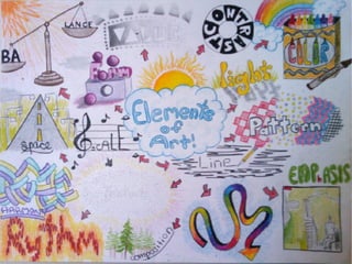
- 9. How to come up with icons Coming up with icons is easier to explain from the point of view from the EOAPOD vocabulary process. First, we start with verbal definitions. We have all done vocabulary lessons from the very early grades. We start with a definition and draw our first understanding by making the written definition into a visual definition. Next, we find an example and illustrate it. This shows that we can identify the vocabulary outside of the context of the lesson. Third, we find an example of the vocabulary word in action. After doing these first steps we then create an example that shows the strongest use of that term and draw that. Hey, you have an icon! Icons should contain cultural and historical information. This means that when you look at them they should work just like an icon on the computer, they should trigger the memory of what you have learned
- 13. Adding Metaphor Next you have to add metaphors to the process. One thing that can help you figure out your favorite metaphors is to do a mind map about yourself. To do this, create a bubble in the center of the paper. Then draw lines radiating from that center bubble to the main things in your life, home, activities, hobbies, entertainment, things you like to do and so on. When you map yourself out like this, you will probably see things that you like that can serve as a metaphor they will be things you know well because you like them, for example, comic books! A good metaphor is one that you like and that also creates relationships between the vocabulary words. Often, the first assignment we did on identity does this as well. So, look at your Ashley Bickerton portraits for ideas.
- 15. Big ideas are ideas that help us understand multiple phenomena (different things) as part of a general trend. These can be kinda complicated so I like to break them down as continua between opposites. As the saying goes, most things in life are neither black or white but shades of gray. So check these out and see if they help. Abstract----------------------------------------------------Naturalistic : Realism Religious---------------------------------------------------Secular : Religion Emotive/Metaphoric/Symbolic------------------------Narrative : Story Emotive----------------------------------------------------Logical : Kind of Message Abstract----------------------------------------------------Narrative : Interpretation Ideal Forms/archetypes---------------------------------Commodity : Intention Concept----------------------------------------------------Commodity : Intention Intention---------------------------------------------------Interpretation : Failure of Language Cooperation-----------------------------------------------Competition : Interrelationships Peace-------------------------------------------------------WAR : Cooperation or conflict Cultures----------------------------------------------------Artists (by name): Orientation to society War Heroes-----------------------------------------------Tyranny :Heroes Journey Tradition-------------------------------------------------Innovation : rate of change/progress Appeal---------------------------------------------------Threat : Propaganda Do this ------------------------------------------------- Don't do that : Persuasive Propaganda This happened-----------------------------------Happened this way : History Painting Prop. Other Big Ideas: Understanding of an art work is a process. Art is a verb. Art grows in understanding with outside information but can lead to inaccurate conclusions. Is there bad art? Is art whatever you want it to be? Can art be understood without outside information? Is Visual Thinking a different kind of thinking or just another “translation?”
- 16. Hints Use thumbnails to be more specific and to be doing more -- as opposed to less -- thinking in visual terms. Use EOA/POD to review and clarify your understandings by applying them to the art and why they are placed where they are along the continua. In order to really understand what is going on, place all the periods we studied on each of these continua (timeline mind map), but start with a big sheet of paper and/or small print. The Big Ideas are hard. You don't have to do x and y axis. So just rearrange the historical information on one left to right or top to bottom axis. If you can do both, well then you are truly an impressive thinker!!!!! I have a hard time doing this. I make two and then combine them. Not all of them work together.
- 17. Other Big Idea themes and ideas: What is it like to be human in different eras? What experiences are true for all times and what are specific to a culture in place and time? How does the external appearence of a time period look and how did it feel, how would today look to future or past generations and is that what it feels like to you? Is propaganda ever close to the truth of a time? Is there any one truth in a time period? To what degree does architecture influence behavior? What ideas can be built into a design to effect the ways people act? Has respect changed over time? Who gets respect in what periods and why? Why are artists mostly anonymous at some time periods and not at others? How come we know so much about generals but less about artists?
- 18. Creating Big Idea Maps Big Idea Maps divide the image frame into x (and y coordinates for the daring!) coordinates like a time line or continua. They are formed by taking a continua from the Big Ideas section (or those of your own choosing) and setting the ideas on either side of the page. In the next example online software made possible by the new Web 2.0 Framework is shown by how it works and what it is. The x axis is content that is shared--------filtered The y axis is online application-------------social networking So, the top left are widgets that share, the top right filters several sources or online applications, The bottom left is content sharing and the bottom right takes content and shares it from several sources meaning databases and other sites. Discourse in our world is becoming increasingly complex. This is a powerful way to convey a lot of information with a comparatively small amount of explanation.
- 29. How to come up with icons Coming up with icons is easier to explain from the point of view from the EOAPOD vocabulary process. First, we start with verbal definitions. We have all done vocabulary lessons from the very early grades. We start with a definition and draw our first understanding by making the written definition into a visual definition. Next, we find an example and illustrate it. This shows that we can identify the vocabulary outside of the context of the lesson. Third, we find an example of the vocabulary word in action. After doing these first steps we then create an example that shows the strongest use of that term and draw that. Hey, you have an icon! Icons should contain cultural and historical information. This means that when you look at them they should work just like an icon on the computer, they should trigger the memory of what you have learned 9
- 33. Adding Metaphor Next you have to add metaphors to the process. One thing that can help you figure out your favorite metaphors is to do a mind map about yourself. To do this, create a bubble in the center of the paper. Then draw lines radiating from that center bubble to the main things in your life, home, activities, hobbies, entertainment, things you like to do and so on. When you map yourself out like this, you will probably see things that you like that can serve as a metaphor they will be things you know well because you like them, for example, comic books! A good metaphor is one that you like and that also creates relationships between the vocabulary words. Often, the first assignment we did on identity does this as well. So, look at your Ashley Bickerton portraits for ideas. 13
- 36. Hints Use thumbnails to be more specific and to be doing more -- as opposed to less -- thinking in visual terms. Use EOA/POD to review and clarify your understandings by applying them to the art and why they are placed where they are along the continua. In order to really understand what is going on, place all the periods we studied on each of these continua (timeline mind map), but start with a big sheet of paper and/or small print. The Big Ideas are hard. You don't have to do x and y axis. So just rearrange the historical information on one left to right or top to bottom axis. If you can do both, well then you are truly an impressive thinker!!!!! I have a hard time doing this. I make two and then 16 combine them. Not all of them work together.
- 37. Other Big Idea themes and ideas: What is it like to be human in different eras? What experiences are true for all times and what are specific to a culture in place and time? How does the external appearence of a time period look and how did it feel, how would today look to future or past generations and is that what it feels like to you? Is propaganda ever close to the truth of a time? Is there any one truth in a time period? To what degree does architecture influence behavior? What ideas can be built into a design to effect the ways people act? Has respect changed over time? Who gets respect in what periods and why? Why are artists mostly anonymous at some time periods and not at others? How come we know so much about generals but less about artists? 17
- 38. Creating Big Idea Maps Big Idea Maps divide the image frame into x (and y coordinates for the daring!) coordinates like a time line or continua. They are formed by taking a continua from the Big Ideas section (or those of your own choosing) and setting the ideas on either side of the page. In the next example online software made possible by the new Web 2.0 Framework is shown by how it works and what it is. The x axis is content that is shared--------filtered The y axis is online application-------------social networking So, the top left are widgets that share, the top right filters several sources or online applications, The bottom left is content sharing and the bottom right takes content and shares it from several sources meaning databases and other sites. Discourse in our world is becoming increasingly complex. This is a powerful way to convey a lot of information with a comparatively small amount of explanation. 18
- 39. 19
- 40. 20