➥🔝 7737669865 🔝▻ dharamshala Call-girls in Women Seeking Men 🔝dharamshala🔝 ...
Digipak analysis - the xx
1. Digipak Analysis
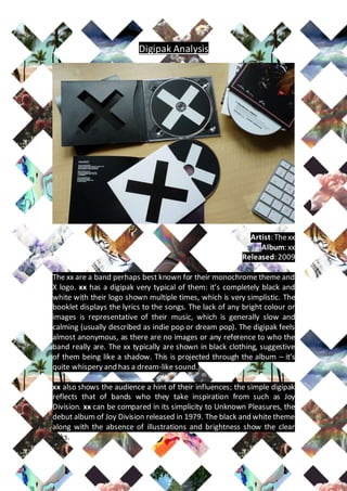
Artist: The xx
Album: xx
Released: 2009
The xx are a band perhaps best known for their monochrome theme and
X logo. xx has a digipak very typical of them: it’s completely black and
white with their logo shown multiple times, which is very simplistic. The
booklet displays the lyrics to the songs. The lack of any bright colour or
images is representative of their music, which is generally slow and
calming (usually described as indie pop or dream pop). The digipak feels
almost anonymous, as there are no images or any reference to who the
band really are. The xx typically are shown in black clothing, suggestive
of them being like a shadow. This is projected through the album – it’s
quite whispery and has a dream-like sound.
xx also shows the audience a hint of their influences; the simple digipak
reflects that of bands who they take inspiration from such as Joy
Division. xx can be compared in its simplicity to Unknown Pleasures, the
debut album of Joy Division released in 1979. The black and white theme
along with the absence of illustrations and brightness show the clear
links.
2. The back cover sticks with the same theme of black and white. Whilst
most digipaks will have diagrams or something similar on it at some
point, xx is still completely simple. This side of it features only the song
titles, the barcode, copyright and label information, and internet links.
The only thing we can consider an image here is the logo for Young
Turks, the record label xx was released on which is placed on the right of
the barcode. The legal information is shown in a small font, like it usually
is on any album release. All of the information is boxed in the bottom
left-hand corner as to group it altogether and not ruin the aesthetic of
their simplistic theme.
Whilst simple, I think this is a really good digipak because it reflects the
band well