
Recommended
More Related Content
Viewers also liked
More from shaunWhelan
More from shaunWhelan (17)
Recently uploaded
Recently uploaded (20)
Double page analysis
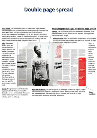
- 4. Big title.Itisina different colour whichis attractingmore viewersas thisstandsout a lot more.Thisthen meansmore people willwanttobuy thismagazine. Small textonthe right andleft corner of the page.Alsothistext followsthe colourscheme forthe magazine.WhichisBlackand Red. These tocolourscontrast which make it standout a lotmore. The main image of RitaOra splitsacrossthe double page spread.Thismeans thatthey have had to editthe image tomake sure that by doingthisitwouldnotsplitthe image too much. Againthere ismore writingonthe left bottomcorner whichfollowsthe same colour scheme. In the centre of the mainimage the lightingchanges.The lightinggets brighteras itgetscloserto Rita Ora. Andas it getsfurtherawayfrom the model itgetsdarkerto add ina bettereffect.