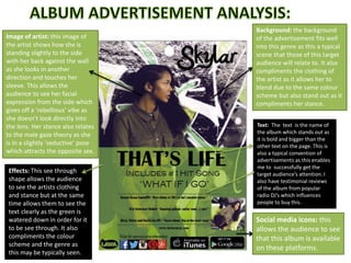
1. Image of artist: this image of
the artist shows how she is
standing slightly to the side
with her back against the wall
as she looks in another
direction and touches her
sleeve. This allows the
audience to see her facial
expression from the side which
gives off a ‘rebellious’ vibe as
she doesn’t look directly into
the lens. Her stance also relates
to the male gaze theory as she
is in a slightly ‘seductive’ pose
which attracts the opposite sex.
Effects: This see through
shape allows the audience
to see the artists clothing
and stance but at the same
time allows them to see the
text clearly as the green is
watered down in order for it
to be see through. It also
compliments the colour
scheme and the genre as
this may be typically seen.
Background: the background
of the advertisement fits well
into this genre as this a typical
scene that those of this target
audience will relate to. It also
compliments the clothing of
the artist as it allows her to
blend due to the same colour
scheme but also stand out as it
compliments her stance.
Text: The text is the name of
the album which stands out as
it is bold and bigger than the
other text on the page. This is
also a typical convention of
advertisements as this enables
me to successfully get the
target audience’s attention. I
also have testimonial reviews
of the album from popular
radio DJ’s which influences
people to buy this.
Social media icons: this
allows the audience to see
that this album is available
on these platforms.