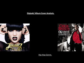
2. ‘Jessie J is a pseudonym of, at Jessie J: ‘the fashion whirlwind Jessie J is
least, two artists: 1. A singer yet another popstar hooked on changing
songwriter from the United her look. Far from keeping the public
Kingdom 2. A rapper from the interested, I'm bored with the wardrobe
United States – The Guardian ‘ carousel’
The direction of her eyes looking
straight onto the consumer is an
Jessie J has a direct connection immediate technique to sell
between her album cover and song herself, creating an immediate
titles, with the idea that her front relationship and to see what
cover gives off the implication of type of people would be
her being an empowered women attracted to the directness of the
and this having a direct connection album cover. The use of gold
with some of her song titles from lettering on the front cover in
“stand up” , “do it like a dude”, “I many ways has a connection
need this” all have strong meanings with the hip hop artist that
behind them just like her looking Jessie J is. Hip Hop having the
straight on at the audience on the characteristics of being bold and
front cover. The artist is seen having a relation to money and
without any musical instruments jewelry relates exactly to the
which allows the audience to come front cover of her album. The
to the assumption that the artist front cover is original and unique
relies on their voice alone to build but still implements and stays
on who they are., which also has with the conventions of hop-
significant meaning to her album hop. Therefore sticking to the
title ‘who you are’. conventions of hip-hop
appealing to the audience of a
The front cover entails a few contradictions of what it is trying to portray however this allows it hip hop.
to have its own unique passage, breaking the mould of what could be traditionally seen as a hip
hop album cover . They are not obvious contradictions but the contrast of colours of white
being the background possibly attempting to convey her pureness and virginity as this is her
first album and her really stepping into the hip-hip world, but then having the influence of black
and gold also is Jessie J showing who she really is. The three colours do in many ways work
together to really identify who she is, a pure young artist steeping into the fierce hip-hop world
and with the use of all three colours they all help to create her personal route in the hip-hop
world.
3. BACK COVER.
The order in which the When looking at the
songs go in also seems to back cover of the
have a direct action to who album, Jessie J and her
she is and how powerful record label have chosen
she is trying to be. Through
to go with a simple
actually listening to the
factor, with just a plain
whole album, Jessie J has a
discrete technique of white background, again
placing her most powerful with the pure reference
songs and who she really is and then having the
in the middle of the song titles in a simple
album, she has a build up black with casual font
before she reaches the and letting. Nothing on
middle part of the song list the back cover
on her album. She starts implements it being of a
the album track list quite hip-hop genre, which
basic and simple, but then
could be one of Jessie J’s
the album jumps into an up
techniques that she isn’t
tempo passage when it hits
to track 6, this conveys like every other hip-hop
who she really is and the artist, and even though
meaning of each song gets she is being classified
deeper after that, she under this type of music
closes the album with a who she is really matters
ballad to smooth the album – having a direct affect
over and slow it down but with her album cover
the final song comes name ‘Who You Are’ and
together with the rest of the final song her album.
the album and has an Jessie J wrote every single song her album and having only one track having
interlink with every other a featuring artist on it, and it being the first track on the album, every single
song, that once again puts song is a passage of being a build up on who she is and what she is trying to
together the puzzle pieces represent herself as being, yes in many ways her songs are still hip-hop, but
of who she is as an artist. she had full power in each song and this sets a new creation of what hip-hop
could be classed as breaking one of the biggest conventions of writing every
song on her album.
4. CD
The CD has a ‘simple girl factor’
to it and by that I mean you are
unaware to work out what type
of artist Jessie J is by the CD.
She has challenged the normal
conventions of a hip-hop CD by
once again stripping back from
what is expected of her and
having a clear and pure
approach. However the colour
of the lettering has a hint of hip-
hop in it being the colour silver With little things like this Jessie
relating to the money aspect of J is thanking her fan base for
the hip-hop world. This is also helping her to become who she
again a hidden strategy of the is, as she believes without her
record label and Jessie J for her fans she would still be an
to possibly grab her real undercover artist, possibly even
audience before she breaks into still trying to break through into
the hip-hop world. the music world.
BRITISH INVASION
This picture is placed on the inside of the album cover to show the real
Jessie J again and showing where she is coming from and who she is
really representing. This clouds around the idea of the British invasion of
urban music, even though she has been signed to a American Music
Label after 6 years of trying to break into the music world, she still has
her British roots which she believes curved her into who she is today.
The fact that the British flag and colours have been painted on her lips
has reference to her national identity and who she is always really
singing for and who has always supported her, and how even though she
is now a well known artist world wide she is always a British urban girl
who has just ripped and invaded into the hip-hop world. The fact that
the paint is still dripping from her lips gives us the assumption that she
isn’t stopping, and this is just the beginning of her helping the British
nation to really break into the hip-hop world, along side other British
artist too.
5. FRONT COVER.
The Album emits an immediate affect of The front cover also conveys a
being retro and this is due to the use of sophisticated atmosphere to it which
colours that are used to give it this could be very appealing to his main
impression. Everything is black and white target audience being females. The
except from Chris Brown himself. This back and front covers are also
draws all the attention to him and the monochrome’s. the front cover is very
audience will forget about all of the important as it is a chance for him to
external features of what is going on in show who he really is as a hip-hop
the background. The colour of his outfit artist. He is standing on top of a
can have a connotation of having a sense building almost as if he is looking down
of danger especially his red shirt. The fact on the people that admire him, but to
that his shirt is red can have so many also possibly show the position in
different meanings to it from danger to which the hip-hop genre withhold in
passion and to even love. All of these the music world. Also for the fact that
emotions could have a relevant he is standing on top of a building
connections to some of his song or even could be him showing his position that
his lyrics. he can take on the world, but also
conveying that he is the high figure at
this moment in time when this album
came out.
With only him being on the front cover he wants to steal the audiences attention. Him
looking away from the camera in comparison to Jessie J who looked straight on
symbolises that he is unaware of what is going on, but also the fact that he hasn’t
realised what type of music icon he has now become. The layout of the front cover has
similar ideas to one of a film set, the title is the one thing that grabs your attention
when first looking at the front cover. It being in bold red and white stands out from
everything else. The importance of the red title and the red shirt could represent what
his music is really about, whether it’s the hot passion or love that his music inflicts. The
direction in which he looks in which is back could be symbolic to him looking back on his
past, but showing that this Is the real new him, and this new album helps to support and
create who he really is.
6. BACK COVER.
The fact that he is wearing
sunglasses on the back
cover, gives us the impression The back cover works in
that he is a mysterious artist collaboration with the front
and doesn’t want to reveal all cover in the whole simple
that he is about to the idea of wanting to promote
audience straight away. There the real Chris Brown, or what
is also a short light that is used him and his record label
acting as a way of reflecting off want to promote him as.
him, drawing a spot light into This album cover works to
his attention making the main promote the new him as if
focus being on him and nothing he is a brand new artist that
else. The back and front cover has never been out
are also monochrome. The before, but really his record
front and back cover interlink label has created this album
in construction of creating a cover in a way of Chris
intersexuality of a James Bond Brown showing that he is
as he looks like a sort of high letting going of his past, and
class spy, which relates to this is supported by the two
impression that he is coming main positions that he is
across with, and newly fresh placed in on the album cover
artist that wants to keep his with him looking back
identity hidden until he wants signifying him letting go. This
too. album is like his second
The use of his outfit also helps to support the genre of which he is. The use chance in the music
of his sunglasses and the Rolex watch that he is wearing comes across as business, and at this part of
something which is inspirational for young boys as they nay want to aspire his music career this is his
to be like him – so he is being moulded into a young hip hop icon. second album as well.